President Donald J. Trump (the real market maker) There are traders… and then there’s Donald Trump, a man who could move multi-trillion-dollar markets without ever opening a Bloomberg terminal. For years, investors studied technicals, Fibonacci ratios, and order flow to predict direction. But from 2017 onward, one force bent all that — policy surprises and public statements from the U.S. President himself.
Trump’s influence didn’t end when he left office. Even in 2025, markets still respond instantly to his tariffs, trade policies, and economic commentary. He became, in every sense of the word, “The Real Market Mover.”
🧠 When Policy Became Price
Traditionally, markets move on data, GDP releases, CPI, interest rates, central bank minutes. But during Trump’s tenure and resurgence in 2025, words carried the same weight as data. Tweets, press briefings, and tariff announcements created knee-jerk reactions that dwarfed technical setups.
Price action no longer followed pure structure, structure reacted to political noise.
1️⃣ The Trade War Shock — May 2019
Event:
In early May 2019, Trump tweeted that tariffs on $200 billion worth of Chinese imports would increase from 10% to 25%. This came unexpectedly after months of optimism about trade negotiations.
Market Reaction:
The S&P 500 fell over 2% in two sessions.
USDJPY dropped as traders sought safety in the yen.
Gold (XAUUSD) spiked from around $1,270 to $1,300 in a matter of days.
Global equity markets — from Shanghai to Frankfurt — mirrored the sell-off.
chart : S&P 500
Lesson:
Fundamentals can erase weeks of technical buildup in hours. Chart structure provided direction, but timing belonged to policy.
2️⃣ Oil’s Verbal Rescue — April 2020
Event:
After the COVID-19 collapse sent oil below $20 a barrel, Trump publicly claimed he had spoken to both Vladimir Putin and Saudi Crown Prince Mohammed bin Salman, saying they agreed to large output cuts.
Market Reaction:
chart ; WTI gain
WTI Crude surged over 30% in a single day, one of the sharpest one-day gains in modern oil history.
Energy stocks rebounded aggressively.
CAD and NOK, both oil-linked currencies, caught strong bids.
Lesson:
Market psychology is as powerful as supply and demand. Traders weren’t just pricing crude — they were pricing hope.
3️⃣ Bitcoin’s “Not a Fan” Tweet — July 2019
Event:
On July 11, 2019, Trump tweeted:
“I am not a fan of Bitcoin and other cryptocurrencies, which are not money and whose value is highly volatile...”
Market Reaction:
chart : BTCUSD drop
BTCUSD dropped from $12,000 to below $9,000 within a week.
Altcoins mirrored the sell-off.
Volatility spiked across crypto derivatives exchanges like BitMEX and Deribit.
Lesson:
Even a decentralized market isn’t immune to centralized sentiment. In crypto, narrative drives volatility faster than fundamentals.
4️⃣ The Iran Strike — January 2020
Event:
On January 3, 2020, the U.S. conducted an airstrike that killed Iranian General Qassem Soleimani.
Geopolitical tension spiked overnight.
Market Reaction:
chart : GOLD gain
Gold (XAUUSD) jumped nearly 3%, touching $1,600, a level not seen since 2013.
Oil (WTI) surged over 4% on supply concerns.
Equities and risk currencies sold off sharply.
Lesson:
Geopolitical shocks move markets not because of numbers, but uncertainty. Traders price fear, not fundamentals.
5️⃣ The 2025 Tariff Shock & Crypto Liquidation
Event:
In October 2025, Trump announced 100% tariffs on all Chinese imports, alongside restrictions on software exports and AI-linked technology. The announcement came suddenly during a campaign rally and caught the market completely off guard.
Market Reaction:
chart : BITCOIN drop
Bitcoin fell by nearly 14% in 24 hours, triggering the largest liquidation in crypto history — over $19 billion in leveraged positions wiped out.
Nasdaq futures dropped over 3% pre-market.
Gold (XAUUSD) broke above $4,000 per ounce for the first time ever, peaking near $4,125, while Silver (XAGUSD) hit record highs above $45.
Yuan (USDCNH) weakened rapidly as investors rushed into the U.S. dollar and Japanese yen.
Lesson:
When macro meets emotion, liquidity vanishes. No technical setup can prepare you for a macro shock of that scale. The market doesn’t just move, it reprices reality.
6️⃣ “Phase One” Relief — December 2019
Event:
After months of trade tension, Trump announced that the U.S. and China had reached a “Phase One” trade deal.
Market Reaction:
The S&P 500 broke to new highs above 3,200.
USDJPY rose as risk appetite returned.
Gold briefly cooled off from safe-haven highs.
Lesson:
Fear creates liquidity gaps, but relief fills them even faster. Markets always overreact in both directions.
🔍 Final Word
Trump didn’t just comment on the economy, he is a market event.
Every tariff, tweet, and offhand remark had measurable price consequences.
In 2025, when Bitcoin collapsed and gold surged to $4,000+, traders witnessed once again that in modern markets, politics and price are inseparable.
For those who rely only on charts, remember:
“technicals shows where; fundamentals decide when.”
put together by : Pako Phutietsile as @currencynerd
Tumi_mokgosi

how i Predicted Bitcoin’s Historic crash“Sometimes, structure speaks louder than sentiment.”
When markets erupted after the Trump tariff tweetstorm and global risk sentiment turned on its head, Bitcoin experienced one of the sharpest liquidations in months. Traders across social media called it “impossible to predict” but the chart structure had already told the story.
This was my before chart, posted days prior to the collapse.
Price was trading around $121,000, testing a clear supply and demand confluence point (CP) at $123,796.00.
On the multi-timeframe framework (MTFA), several elements aligned:
Supply Zone overlapping with prior intraday imbalance
Fib retracement confluence of 61.8% and 50.0%, measured from the intraday swing high at $126,296.00 and swing low at $120,636.00
Price rejection wicks indicating institutional distribution activity
Liquidity pool between $121,115.33 and $121,523.68 acting as the near-term trap for late longs
This setup hinted at exhaustion of bullish momentum and possible short-term reversal.
⚙️ MTFA in Action: Reading Structure Across Timeframes
Multi-Timeframe Analysis (MTFA) isn’t about random levels, it’s about how structure nests across time horizons.
Weekly: Showed exhaustion candles near prior all-time highs (ATH) and extended momentum.
Daily: Confirmed lower-high formation inside distribution range.
4H: Provided precise entry trigger wick rejection at supply and liquidity sweep confirmation.
Even though a full OCHL close below liquidity hadn’t yet formed, the reaction wicks at the confluence zone were the early footprint of bears reclaiming control.
💥 Then It Happened
When the U.S. announced 100% tariffs on Chinese imports, markets sold off aggressively. Bitcoin followed suit cascading below liquidity, slicing through $118K, and finally tagging the $115,000 demand zone target drawn days before.
What most called a “black swan”, the chart had already mapped out.
📈 Lessons from the Setup
Structure leads news. Fundamentals create fuel; technical structure shows where it burns.
MTFA reveals timing. Without alignment across timeframes, entries lose context.
Respect confluence. When supply, fib, and liquidity all align probability spikes.
🔮 Looking Ahead
While Bitcoin later stabilized after the crash, the precision of this setup reinforced why chart structure remains the language of the market.
This was more than a trade, it was a live case study in how multi-timeframe logic captures market behavior before headlines do.
the analysis can be found on the 3rd section of the publication :
✍️ Final Nerdy Thoughts
This analysis wasn’t luck; it was structure.
Whether Bitcoin continues consolidating or seeks new highs, the “Trade of the Year” stands as proof that when fundamentals collide with perfect technical alignment, history doesn’t repeat, it rhymes in price action.
put together by : Pako Phutietsile as @currencynerd

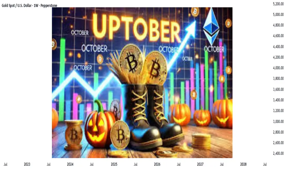
UPTOBER : what a time to be alive.Uptober: When Scarcity Meets Sentiment — The Bullish Convergence Across Global Assets
scarcity is rewriting value across the markets. We’re witnessing history in real time.
What a time to be alive as an investor. Uptober isn’t just a catchy phrase this year, it feels like the start of a new financial chapter. We’re witnessing history unfold in real time: Bitcoin and Gold pushing toward all-time highs, Silver stirring from years of compression, and capital flowing back into scarce, tangible assets. It’s a month where macro meets momentum, a new dawn for crypto, commodities, and conviction. The narratives of the past decade are converging into one truth: opportunity now belongs to those who recognize structural change before the headlines do. Uptober isn’t hype, it’s the manifestation of years of build-up across the global financial system.
Every October, traders whisper the same term with cautious optimism “Uptober.”
Historically, it’s the month when risk sentiment warms up, capital rotates back into growth and store-of-value assets, and liquidity begins to flow again after the quiet of September.
But this year, Uptober feels different.
This isn’t just optimism. It’s supply compression meeting rising demand across Bitcoin, Gold, Silver, and other commodities supported by both technical structure and fundamental scarcity.
Let’s decode what’s really happening beneath the charts.
⚪ Silver — The Hybrid Asset
Fundamentals:
Industrial demand boom: Solar, EV, and electronics demand surging.
Limited mine output: Many silver mines also produce copper and zinc, creating structural supply constraint.
Monetary tailwind: As gold rises, silver attracts secondary capital flows.
Undervalued ratio: Gold-to-silver ratio near historical extremes (~85–90) suggests mean reversion potential.
Narrative: When silver lags, it’s not weakness — it’s compression waiting for ignition.
🟤 Copper — The Quiet Pulse of Global Growth
Fundamentals:
Electrification demand: EVs, renewable infrastructure, and data centers accelerating consumption.
Supply bottlenecks: Political instability in Chile and Peru (key producers) constrains output.
Structural deficit: Inventories at multi-year lows — visible stocks <3 weeks of global demand.
Reindustrialization theme: Western economies rebuilding manufacturing capacity.
Narrative: Copper is not just metal — it’s electricity in solid form, and the world needs more of it.
🟢 Uranium — The Energy Transition Dark Horse
Fundamentals:
Nuclear renaissance: Global re-acceptance of nuclear power as clean base-load energy.
Mine depletion: Key mines in Kazakhstan and Canada struggling to ramp supply.
Inventory depletion: Utilities are now restocking aggressively after years of under-contracting.
New policy tailwinds: US, France, Japan, and China expanding nuclear capacity.
Narrative: Uranium’s bull market is what happens when ideology meets physics.
💠 Platinum & Palladium — The Industrial Precious Pair
Fundamentals:
Automotive catalyst demand: As emissions standards tighten, platinum group metals gain.
South African supply disruption: Power issues and strikes reduce consistency of exports.
Shift in substitution: Automakers gradually replacing expensive palladium with cheaper platinum.
Jewelry demand recovery: Especially from India and China.
Narrative: Platinum and palladium are quietly benefiting from both scarcity and industrial evolution.
💹 Global Equity Indices — The Liquidity Premium Returns
Fundamentals:
Rate cut expectations: Markets beginning to price in a softer Fed stance into 2025.
Earnings resilience: Mega-cap tech and AI-driven sectors outperforming.
Record buybacks: Corporations recycling profits into equity repurchases.
Retail inflows returning: October often marks seasonal optimism.
Inflation normalization narrative: “Soft landing” hopes sustain valuations.
Narrative: Equities are feeding on policy hope, not just earnings reality.
🪙 Ethereum & Layer-1 Ecosystem — Network Utility Meets Macro Recovery
Fundamentals:
Post-Merge supply deflation: ETH issuance net negative since the Merge.
Staking yield attractiveness: Staked ETH acts as yield-bearing “crypto bond.”
L2 ecosystem growth: Scaling solutions like Arbitrum and Base increasing on-chain activity.
DeFi revival: Stablecoin liquidity returning as macro confidence improves.
Institutional integration: ETH futures and ETFs widening exposure channels.
Narrative: Ethereum’s bull case is built on activity, not hype — it’s the digital economy’s backbone.
🪵 Agricultural Commodities — The Weather Premium
Fundamentals:
Climate irregularities: El Niño continues to disrupt crop yields globally.
Geopolitical logistics: Black Sea tensions and export restrictions tightening grain supply.
Biofuel demand: Corn and soy increasingly diverted to renewable energy production.
Inventory compression: Lower global reserves across wheat, corn, and soybeans.
Narrative: Food inflation is the quietest, most persistent form of monetary feedback.
🌐 Macro Synthesis — The Scarcity Supercycle
The connecting thread across all these assets is scarcity meeting fiscal expansion.
Governments are spending, central banks are cornered, and real assets, the ones you can’t print are being repriced accordingly.
Inflation may moderate in data, but structurally, cost of production and deglobalization pressures are lifting the floor on prices.
This cycle isn’t speculative; it’s revaluation through necessity.
🧭 Uptober as a Behavioral Catalyst
“Uptober” is more than a meme. It’s a behavioral shift in market posture — when optimism, liquidity, and narrative align just enough to turn potential energy into motion.
Traders re-enter after Q3 rebalancing.
Funds rotate back into risk and real assets.
Positive seasonality compounds sentiment.
When fundamentals already lean bullish, this sentiment loop can accelerate performance across asset classes.
🔮 CurrencyNerd’s Final Take
This Uptober is powered not by hope, but by structure:
Limited supply across metals, energy, and crypto.
Expanding demand from policy, technology, and demographic cycles.
Liquidity rotation from paper to tangible value.
The smartest trades this month aren’t emotional they’re observational.
“Markets don’t reward prediction; they reward preparation. Uptober is for those who saw the imbalance forming months ago.”
honourable mention :
BTCUSD/XAUUSD
put together by : Pako Phutietsile as @currencynerd
seeing the market in layers.. "A 3PART SERIES"The Art and Science of Timeframes (Part I): Matching Timeframes to Your Trading Style
Every trader operates within a different rhythm. Some thrive on fast scalps, others on slow swings. The secret is to match your personality to the right timeframe not the other way around.
1. Scalpers (1M–15M)
Term: Short
Characteristics: Lightning-fast execution, exploiting small intraday moves.
Pros: Frequent setups, many profit opportunities.
Cons: High stress, risk of overtrading, spreads and slippage matter.
Best For: Traders who enjoy instant feedback and thrive on volatility.
MTFA Tip: Use 15M for structure, 5M for setup, 1M for entries.
2. Day Traders (15M–1H)
Term: Short to Medium
Characteristics: Combine intraday technicals with small-scale structure.
Pros: Clear daily cycles, lower overnight risk.
Cons: Requires constant attention and discipline.
Best For: Traders with time during active sessions.
MTFA Tip: Use 1H for bias, 15M for setup, 5M for execution.
3. Swing Traders (1H–4H)
Term: Medium
Characteristics: Ride waves lasting several days to weeks.
Pros: Less screen time, cleaner structure.
Cons: Exposure to weekend gaps and news spikes.
Best For: Professionals balancing trading with other commitments.
MTFA Tip: Use Daily for bias, 4H for setup, 1H for execution.
4. Position Traders (Daily–Weekly)
Term: Long
Characteristics: Focus on macro trends and fundamentals.
Pros: Larger reward potential, fewer decisions.
Cons: Patience required; drawdowns can be larger.
Best For: Investors and macro traders.
MTFA Tip: Use Weekly for trend, Daily for confirmation, 4H for entries.
The Takeaway: Timeframes as a Symphony
Think of the market as a piece of music, each timeframe a different instrument. The higher timeframe sets the melody, the mid-timeframe adds rhythm, and the lower timeframe provides texture and precision. When they play in harmony, your trades flow with the market instead of fighting it.
The Art and Science of Timeframes (Part II): The Multi-Timeframe Edge
Every price candle tells a story but no single timeframe tells the whole story. To trade with clarity instead of confusion, you need to see how the market breathes across multiple scales. That’s where Multi-Timeframe Analysis (MTFA) becomes a trader’s most powerful lens.
Most beginners lock themselves into a single chart, maybe a 15-minute or 1-hour and miss the broader context that defines the real opportunity. Professionals, on the other hand, zoom in and out like astronomers switching between telescopes, observing both the vast structure and the fine detail of price action.
Let’s break down the science behind this art.
1. Choose Your Timeframes
The key is to pick two to three timeframes that serve different purposes:
Higher Timeframe (HTF) → defines the trend and macro structure.
Mid Timeframe (MTF) → helps you spot setups and consolidation zones.
Lower Timeframe (LTF) → fine-tunes entries and exits.
Example for a swing trader:
Trend: Daily (D1)
Setup: 4H
Entry: 1H or 15M
Each timeframe acts like a different layer of resolution from the forest down to the individual leaves.
2. Analyze the Higher Timeframe (HTF)
Always begin from the top down. The higher timeframe shows the path of least resistance.
Ask:
Is price trending or ranging?
Where are the key supply/demand or support/resistance zones?
What is the dominant direction of institutional flow?
This framework prevents you from buying into resistance or shorting into demand. Remember: the HTF is the map; the LTF is the magnifying glass.
3. Study the Mid Timeframe (MTF)
This is where traders plan their battlefield. The MTF captures structure, accumulation, and distribution phases.
You might see:
Trend continuation flags
Range breakouts
Retests and confluence zones
It bridges the macro and micro perspectives. When the HTF is bullish, you look for higher-low formations or break-and-retest setups on the MTF to align with the major flow.
4. Drop to the Lower Timeframe (LTF)
The LTF is where precision lives. Here, you look for:
Candlestick confirmations
Liquidity sweeps
Minor structure breaks
But precision means little without context. Always ensure your LTF entries echo the HTF narrative. When the HTF trend and LTF setup agree, your probability improves dramatically.
5. Align All Timeframes
Confluence is your compass. If all your timeframes tell a consistent story, say, higher highs on the D1, bullish structure on the 4H, and breakout retests on the 15M, the trade idea gains strength.
If they conflict, patience is the best position. Misalignment breeds confusion, and confusion costs money.
6. Confirm with Indicators (Optional)
Multi-timeframe analysis is primarily price-action-based, but technical indicators can complement your judgment.
Think of RSI, MACD, or moving averages as secondary confirmation tools not decision-makers.
7. Plan and Execute
With all layers aligned, define your:
Entry
Stop-loss
Take-profit levels
Ensure a risk-reward ratio of at least 1:2, ideally better. Plan your trade on the MTF, execute it on the LTF, and manage it according to the HTF.
Part III : The Multi-Timeframe Breakdown
In the next last section of the publication, I’ll apply this framework to a real market showing how multiple timeframes converge to shape high-probability setups on a live chart. We’ll analyze BTCUSD class step by step from the MONTHLY map to the 4HR trigger.
remember: timeframes don’t just measure time; they reveal structure.
1MONTH CHART :
Starting off on the monthly chart, first highlighted the all time high @ 126296.00 based on the exchange i used and the supply CP represented by the orange horizontal line of proximal price @ 115,697.37 and also significant previous high @ 100,390.00 and also identified liquidity pool represented by rectangle zone ranging from @ 96429.84 to 93354.22..
WEEKLY
weekly i only added a rectangle zone which connects recent supply level and the supply cp and trendline indicating current market still having bullish momentum and daily i had no levels to mark...
4HR
4hr we found support at liquidity pool connecting recent high and low @ 121,115.33 and 121523.68 with possible shorts at 123,796.00 which is supply and also demand cp and also there is fib retracement of 61.9% and 50.0% taken from intraday high 126296.00 and low 120,636.00 with price currently reacting to the 38.2% which can cause price to drop without having to go to the supply level...
another alternative the support can hold and cause price to rise to the all time high and maybe create a new ath as shown below..
There are reasons to support both upside and downside for Bitcoin currently. What matters is weighting the signals (technical + on-chain + macro) and letting price confirm. Below I’ll lay out bullish evidence, bearish risks, and how a trader might synthesize these into a balanced view.
Bullish Evidence (Reasons Bitcoin might rise)
Record ETF and institutional inflows
Bitcoin and crypto ETFs recently attracted $5.95 billion in a week, with a large share into Bitcoin.
The rally is being underpinned by institutional demand rather than pure speculative retail flow.
Reuters
Deepening institutional participation tends to anchor support and reduce volatility (if sustained).
New all-time highs & momentum breakout
Bitcoin has pushed to new highs (above ~ USD 125,000) in recent trading days.
Price breaking past a resistance level often triggers fresh buying (breakout momentum).
Analysts see the market in a “decisive phase” after breaking above prior peaks.
Macro tailwinds / safe-haven rotation
As the U.S. dollar shows signs of pressure and economic uncertainty looms (e.g. U.S. government shutdown), investors are leaning into safe-haven / non-correlated assets like gold and Bitcoin.
Bitcoin’s narrative as “digital gold” gains more weight in such contexts.
Messaging from major banks (e.g. Deutsche Bank) that Bitcoin is approaching reserve-asset status adds psychological weight.
Barron's
Technical structure — retest and consolidation
Even though price has surged, many analysts suggest that after the breakout, Bitcoin might pause or retrace slightly (to ~ USD 118k) before continuing upward.
That kind of “breakout → retest → continuation” structure is common in strong trends.
Also, technicals show that if support levels hold, there is room for extension.
Maturing volatility trend / more stable regime
Over time, Bitcoin’s volatility (on a yearly scale) has shown a decreasing trend, which suggests the market may be maturing.
Fidelity Digital Assets
A somewhat calmer environment can attract more risk capital and reduce fear of large intraday drawdowns.
Bearish Risks / Evidence to Watch (Reasons Bitcoin might drop or pull back)
Overbought conditions / exhaustion
After such a rapid rally, markets often pause or correct. Momentum traders may already be booking profits.
Some crypto news sources refer to a loss of momentum or a slide after the recent highs.
Leverage, liquidations, and risk unwinds
Crypto markets are still sensitive to leveraged positions. A sharp reversal could trigger cascades of liquidations.
In prior sessions, large liquidations contributed to dips.
Macroeconomic policy / central bank moves
If central banks (especially the U.S. Fed) surprise markets with hawkish tone, less rate cuts, or quantitative tightening, that could strengthen the dollar and put downward pressure on crypto.
Uncertainty in fiscal policy (e.g. government shutdown) could cut toward risk-off flows.
Support breakdown / structural failure
If Bitcoin fails to hold key support zones (for instance, if the retest fails, or prior swing support is broken), it might reverse more aggressively.
Analysts warn of consolidation or retracement if momentum stalls.
Regulation / policy risk
Though not as immediate lately, regulatory shifts especially in major jurisdictions (U.S., EU, China) can swing sentiment violently.
Balanced View: What the Evidence Suggests Right Now
Given all this, one can’t confidently predict either direction with certainty but we can lean. Here’s how a well-calibrated, probability-based view might look:
Primary base case (moderately bullish): Bitcoin continues upward, but with intermittent pullbacks or consolidation phases. The recent breakout is validated by institutional flows, and the macro weather is somewhat favorable. If the retest (e.g. ~ USD 118k) holds, it could become a launchpad to new highs.
Alternate bear scenario (guarded): If the retest fails and support breaks, or macro sentiment shifts hawkish, we could see a deeper correction possibly toward older support zones.
Invalidation / risk threshold: A break and close below major structural support (on a daily / weekly chart) would weaken the bullish thesis. That becomes a warning zone.
put together by : Pako Phutietsile as @currencynerd

XAU(shows the world’s fear) - BTC(shows the world's hope) What’s Fueling Bitcoin and Gold to All-Time Highs
“Where macro meets momentum.”
Intro: The Tale of Two Safe Havens
Gold and Bitcoin — one ancient, one digital — are both rewriting history.
While their origins could not be more different, their current trajectory reveals something deeper about the state of global liquidity, trust, and capital flow.
Gold has pushed through multi-decade resistance to print new all-time highs. Bitcoin, often dubbed “digital gold”, isn’t far behind, revisiting historical peaks and attracting institutional capital again.
So, what’s fueling this synchronized surge?
1. Monetary Easing Expectations: The Silent Fuel
One of the strongest forces behind both rallies is expectation specifically, the market’s expectation that interest rates have peaked and liquidity will expand again.
When central banks signal easing, real yields fall.
That hurts cash and bonds, but benefits assets with no yield but high scarcity, like gold and Bitcoin.
US10Y Real Yield versus XAUUSD weekly — note how gold rallies as real yields decline.
You can overly Bitcoin which often lags slightly, then accelerates as liquidity broadens.
“When yield curves flatten and central banks pivot, gold rallies first, Bitcoin later joins the party.”
2. Liquidity & Global Balance Sheet Expansion
Both assets thrive on liquidity expansion.
Look at central bank balance sheets from the Fed, PBoC, and ECB, and you’ll see that total liquidity is creeping higher again, even amid rate-hike talk.
Gold reacts to real rates. Bitcoin reacts to real liquidity.
Both react to trust in the monetary system.
3. Inflation Hedge and the “Trust Crisis”
Gold has always been the metal of mistrust, when confidence in paper weakens, it shines.
Bitcoin inherited that narrative during the post-2008 era and strengthened it through decentralization and scarcity.
Now, both are beneficiaries of the same phenomenon:
The erosion of confidence in fiat systems.
Persistent inflation, record debt, and fiscal expansion across G7 nations are reviving the demand for hard assets.
4. Institutional Rotation and ETF Demand
For Bitcoin, 2024–2025 marked a structural change, the ETF era.
Institutional investors now have a compliant, liquid gateway to Bitcoin exposure, which has quietly unlocked billions in passive inflows.
Gold went through this same transformation in the early 2000s with the launch of SPDR Gold Shares (GLD).
The parallel is uncanny ETFs legitimize and absorb demand from new classes of investors.
Compare GLD inflows (2004–2008) vs. BTC Spot ETF inflows (2024–2025).
“The same story, told 20 years apart, first in metal, now in code.”
Institutions love narratives backed by liquidity.
Bitcoin is now walking the same path gold paved two decades ago.
5. Momentum and Market Memory
Markets remember levels — and they respond to them emotionally.
Gold’s prior high near $2,100 acted as psychological resistance for years. Once broken, momentum algos and portfolio reallocations accelerated the move, a textbook resistance-turned-support dynamic.
Bitcoin behaves similarly. Each breakout past an old high (20K in 2017, 69K in 2021) sets off a new wave of belief, often followed by an equal wave of disbelief (profit-taking, skepticism, corrections).
Markets are living memories.
They don’t forget where pain and profit once lived.
6. Correlation Cycles: From Divergence to Convergence
Historically, gold and Bitcoin don’t always move together, their correlation cycles alternate.
But during periods of global liquidity shifts or macro stress, they tend to align.
When fear and liquidity meet, gold and Bitcoin speak the same language — scarcity.
7. The Human Factor: Psychology & Narrative
Ultimately, charts move because people do.
Fear of missing out (FOMO), fear of loss, greed, disbelief, these emotional waves are as much a part of this rally as any macro variable.
Gold buyers think in decades. Bitcoin traders think in blocks.
But both respond to the same core emotion: the need for certainty in uncertain times.
8. What Could Derail the Rally
Every fuel has a flash point.
Delayed rate cuts → Higher real yields hurt both assets.
Liquidity drain → QT or fiscal tightening can pause flows.
Strong USD cycles → Historically inverse correlation to both BTC and XAU.
Regulatory tightening → Can impact Bitcoin specifically, as seen in 2021–2022.
Gold and Bitcoin thrive when dollars are cheap, trust is low, and liquidity is high.
Conclusion: Two Mirrors, One Message
Gold tells us where the world’s fear lies.
Bitcoin tells us where the world’s hope lies.
Both reaching all-time highs together is not coincidence, it’s signal.
A signal that liquidity, inflation, and trust are converging in ways unseen since the 1970s and early 2010s.
So whether you prefer the metal or the math, remember this:
“When scarcity assets rise together, the world is quietly pricing in the cost of confidence.”
my takeaway is :
Stay curious.
Study the cause, not just the price.
And remember, what’s fueling the rally is not hype.
It’s trust being re-priced.
put together by : Pako Phutietsile as @currencynerd

the market trinity ( power of 3 )The Hidden Phases of Smart Money: Accumulation, Manipulation, and Distribution
Markets don’t move randomly, they move in cycles. Behind the price action, smart money (institutions, market makers, and big players) follow a playbook designed to take liquidity from retail traders. If you learn to spot these phases, you can stop trading against smart money and start aligning with it.
The three key stages are: Accumulation, Manipulation, and Distribution.
🔹 1. The Accumulation Phase
The Accumulation Phase is where smart money builds positions quietly. Price consolidates in a range, creating the illusion of indecision. To the untrained eye, this looks like “choppy sideways action,” but it’s a setup.
What happens here?
Price ranges sideways.
Stop-losses build up below range lows (for bullish traders) and above range highs (for bearish traders).
Liquidity pools form on both sides of the consolidation.
Think of this phase as the “loading zone.” Institutions want to accumulate without driving price too high too quickly. The range traps traders into thinking the market is stagnant, while in reality, it’s building energy for the next move.
🔹 2. The Manipulation Phase
Once enough orders are sitting around the range, smart money springs the trap.
A false breakout occurs:
If price breaks below the range → it triggers stop-losses of longs and tempts new shorts to enter.
If price breaks above the range → it traps shorts and invites fresh longs to jump in.
This is where retail traders get shaken out. The breakout looks convincing, but it’s engineered to harvest liquidity.
Why does this happen?
Markets need liquidity to move. By manipulating price beyond obvious levels, smart money collects the orders they need to fuel the real move.
🔹 3. The Distribution Phase
After manipulation, the real direction of the market becomes clear. Smart money now drives price in the intended direction, often opposite to what retail traders expect.
If the manipulation was a false downside break, the distribution phase will be a strong bullish rally.
If the manipulation was a false upside break, distribution unfolds as a bearish decline.
This is where the largest and cleanest moves happen. Retail traders who fell for the trap are either stopped out or forced to chase the market at worse prices, fueling the move further.
🎯 Why Understanding These Phases Matters
Most traders lose because they trade the manipulation, not the distribution. They see a breakout and jump in exactly when smart money is unloading positions.
If you want to flip the script:
Identify Accumulation: Watch for tight ranges where liquidity builds.
Anticipate Manipulation: Don’t get baited by the first breakout.
Ride Distribution: Once the trap is set and reversed, that’s your chance to align with the smart money move.
Nerdy Thoughts
Trading isn’t just about indicators or chart patterns, it’s about psychology and liquidity. The Accumulation → Manipulation → Distribution cycle reveals the hidden structure behind price action.
Next time you see a range, don’t just ask, “Which way will it break?” Instead, think, “Where is smart money likely to trap the crowd before the real move begins?”
That shift in perspective could be the difference between trading against the tide and riding with it.
💡 Nerd Note: If you start spotting these cycles on multiple timeframes, you’ll notice how fractal the market really is, the same phases repeat inside bigger phases. The market is a story of traps within traps, and your job as a trader is to read the script, not fall for it.
put together by : Pako Phutietsile as @currencynerd

market memory, the many faces of support and resistance.Every trader is introduced to support and resistance (S&R) early on. At first, it looks simple: support is where price stops falling, and resistance is where price stops rising. But the more screen time you log, the clearer it becomes that this tool is not just a “line on the chart.”
It comes and is taught in many forms: sometimes sharp and obvious, other times hidden and subtle. The challenge for traders is to recognize which form the market is respecting at any given moment.
Let’s go deeper into the different types of support and resistance, how they work, and why they matter.
but first there is one golden rule of support and resistance, past support turns into resistance and vice versa, try to look closely at the chart examples i will present and watch how price reacts to the S&R zones and levels, and how this plays out...
1. Horizontal Support and Resistance – Market Memory in its Purest Form
The most classic form of S&R is drawn horizontally at prior swing highs and lows. Price touches a level multiple times, and traders begin to see it as significant.
Why it works: Markets are driven by collective memory. If price was rejected at 1.1000 three times before, traders naturally hesitate around that level again. Buy orders cluster below old lows, and sell orders cluster near old highs.
How to trade:
Bounce trade: Wait for price to retest the zone; enter on confirmation (pin bar, engulfing bar, volume spike). Place stop beyond the opposite edge of the zone or beyond the reaction candle wick.
Break & retest: When a level breaks with conviction, wait for price to retest it from the other side. That retest becomes a new entry with confluence (volume, SMA, trendline).
Use RR (reward:risk) based on the zone width. Don’t expect perfect fills — treat zones as areas.
Pitfalls & pro tips:
Fakeouts are common: institutional players sweep stops to gather liquidity. Expect occasional whipsaws.
Vertical significance matters: daily/weekly horizontals are more reliable.
Volume or momentum at the reaction adds conviction. A horizontal with no volume is weaker.
chart example :
the chart above is represented by candlesticks and for beginner traders it might be hard to spot the support and resistance levels from that chart but one hack is to use the line chart because the line chart shows only the closing price and candlestick shows extreme highs and lows that can be misleading. the chart below represents the same chart above but as a line chart.
you want to plot your s&r levels around levels where price is making peaks and valleys like i have highlighted in the chart
when you turn your chart type back to candlesticks after plotting on the line chart you are able to clearly see the levels.. on the recent above chart i have shown the resistance price reactions (support holding up)
below is the same chart representing support
another example is the golden rule i mentioned above being in play, here previous resistance later holds up as support
chart example 2: highs and lows
this shows how previous day high of day 1 acts as resistance on day 2
2. Trendline Support and Resistance – Dynamic Barriers in Motion
Unlike horizontals, trendlines are angled. By connecting higher lows in an uptrend or lower highs in a downtrend, you create a slope the market respects.
Why it works: In trending markets, buyers and sellers don’t step in at fixed prices—they react to rhythm. Trendlines capture that rhythm and act as visual guides for momentum.
The nuance: Trendlines are highly subjective. Two traders may draw slightly different lines, and both might be “right.” The key is consistency—decide whether you draw them on candle bodies or wicks and stick to it.
How to trade:
Lean with the trend: buy touches of ascending trendline with tight confirmation.
Channel trades: buy near lower band, target midline or upper band; sell vice versa.
Breaks: a decisive break of a trendline with retest is often a momentum shift; trade the retest for continuation in the new direction.
Pitfalls & pro tips:
Lines are subjective — treat trendlines as a tool, not gospel.
Re-draw only on new confirmed swings; avoid redrawing every candle.
Combine with volume, moving averages or structure breaks for stronger signals.
chart example :
4. Fibonacci Retracements & Extensions – Ratios of Market Psychology
Fibonacci levels (38.2%, 50%, 61.8%, etc.) are not magical numbers; they are psychological checkpoints where traders expect pullbacks.
Why it works: Fib levels are used globally, and like MAs, they become self-fulfilling. Many institutional algos also use ratios in trade planning, reinforcing their influence.
How to identify:
Choose structural swings—the most recent meaningful high and low.
Treat levels as zones, not exact lines.
Prefer Fib confluence: a Fib level that overlaps a horizontal, MA, or trendline is far more actionable.
How to trade:
Retracement entries: watch for price to pull into a Fib zone and show price-action confirmation (pin, absorbtion, heavy volume).
Extensions as targets: use 127%/161.8% as extension targets once trend resumes.
Combine with timeframe analysis: a 61.8% on the daily aligned with a weekly level is strong.
Pitfalls & pro tips:
Picking the wrong swing yields worthless Fib levels—choose structural points.
Never trade Fib in isolation. It’s a confluence tool, not a standalone system.
chart example
identify high and low, because price was trading to the downside i will draw my fib levels from the high to the low
i did not add the other fib levels because the chart did not look clear and only highlighted the significant level that price reacted to which is the 38.2% fib level.
3. Supply and Demand Zones – Where Imbalance Rules
Supply and demand trading zooms out from single lines to zones. A sudden rally from a base suggests excess demand, while a sharp drop suggests excess supply.
Why it works: Big players (banks, funds) often leave unfilled orders in these zones. When price returns, those orders trigger, causing strong reactions.
Look for sharp moves with little overlap (big green/red candles leaving a base).
Identify the base (consolidation) before the move and mark the zone from the high to the low of that base.
Strong zones have speed and size in the move away (single big candle or sequence with increasing momentum).
How to trade:
Wait for retest: enter when price returns to the zone and shows absorption/buying interest.
Use limit entries at the edge of the zone and stop beyond the zone’s opposite edge.
Size position according to zone width — wide zones → larger stop → smaller position.
Pitfalls & pro tips:
Zones can be wide and ambiguous; tighten criteria by requiring a clean move away.
Supply/Demand pairs well with orderflow or volume profile for institutional confirmation.
chart example
rally base rally, CP (continuation pattern) - demand
chart 2
rally base drop - supply (PEAK)
4. Psychological and Round Numbers – Human Bias on the Chart
Markets are human-driven, and humans love round numbers. EUR/USD at 1.2000, gold at $2000, Dow at 40,000—these levels attract attention.
Why it works: Traders place stop-losses, take-profits, and pending orders around round figures. Liquidity clusters here, making them magnets for price.
Round numbers are less about “holding” price and more about being zones where reactions happen. Price often overshoots before reversing, because stop-hunts occur just beyond these figures.
How to identify:
These are obvious: whole figures, halves, quarters (1.2000, 1.2500, 1.5000).
Watch the tighter structural closeness: a round number that sits exactly on a daily swing is stronger.
How to trade:
Fade or follow: some traders fade the hesitation around a round number (fade the hesitation wick), others ride through on breakout if momentum is strong.
Use round numbers as confluence, pair them with horizontal, Fib, or MA for stronger setups.
Pitfalls & pro tips:
Round numbers attract stop clusters; expect overshoots. Don’t assume a clean bounce every time.
Big figures on high-liquidity pairs (EUR/USD) behave differently from lower-liquidity assets.
chart example :
resistance price : 3,700.000
support price : 3,680.000
Liquidity Pools – Advanced Market Microstructure
liquidity pools to me are not levels but zones on a price chart where a large volume of pending buy stop-loss orders and sell stop-loss orders have accumulated. i identify them by connecting highs and lows / significant levels that are close together but not close to be connected by a singular line.
Why it works: Institutions need liquidity to fill massive orders. They manipulate price into zones where retail traders’ stops sit. Once liquidity is captured, the real move begins.
The nuance: Order blocks and liquidity pools require skill to read. They are not always obvious and can trap new traders who misinterpret them.
Pitfalls & pro tips:
This discipline is subtle; misreading an order block is common. Backtest and annotate many examples.
chart example :
The Bigger Picture – One Concept, Many Faces
Support and resistance is not one tool, it is a family of tools. From clean horizontals to hidden liquidity pools, each type reflects a different aspect of market psychology.
The real skill is not memorizing them all, but asking:
Which type of support or resistance is the market respecting right now?
When you start seeing markets this way, S&R stops being “lines on a chart” and becomes a living, breathing map of trader behavior.
put together by : Pako Phutietsile as @currencynerd

when human error causes institutional chaos WHEN THE HOUSE OF CARDS FELL
a concise look at history’s largest trading disasters.
Intro
Markets make fortunes, and erase them. Some of the largest drawdowns in modern financial history weren’t caused by market moves alone, but by human error, hubris, weak controls, or leverage run amok. Below are the most instructive episodes.
1) Nick Leeson — Barings Bank (1995)
What was traded: Futures and options on the Nikkei 225 and other Asian equity derivatives (hidden in an error account).
Losses: ~£827 million (the final number widely reported; Barings collapsed and was bought by ING).
Why it happened: Unauthorized speculative bets, concealed losses in a hidden account, and complete breakdown of segregation between front and back office responsibilities.
Lesson for traders: Always enforce separation of duties, log and reconcile trades daily, and respect position-size limits. Small hidden losses compound quickly when someone doubles down to "recover."
2) Long-Term Capital Management (LTCM) (1998)
What was traded: Highly leveraged fixed-income arbitrage and complex derivatives (relative-value trades across bonds and swaps).
Losses: About $4.6 billion in a few months and a near-collapse that required a $3.65 billion private-sector bailout organized under the Federal Reserve’s supervision.
Why it happened: Massive leverage, concentrated positions, reliance on models that assumed low tail risk, and liquidity drying up after the 1997–98 crises.
Lesson for traders: Models are only as good as their assumptions. Always stress-test for extreme events and never confuse historical volatility for guaranteed stability.
3) Amaranth Advisors — Brian Hunter (2006)
What was traded: Natural gas futures and swaps (directional bets on gas prices).
Losses: Around $6.6 billion (almost the entire fund).
Why it happened: A massive one-way bet in a single commodity market, extreme exposure during a short time window, and insufficient risk checks on position concentrations.
Lesson for traders: Diversify exposure, cap concentration per market, and use stop rules — particularly with volatile commodities.
4) Société Générale — Jérôme Kerviel (2008)
What was traded: Large, unauthorized equity index and delta-hedging derivatives positions.
Losses: €4.9 billion reported by the bank.
Why it happened: A junior trader built enormous notional exposure hidden behind falsified trades and offsets; internal controls failed to detect the pattern early.
Lesson for traders: Strong surveillance, automated alerts for notional buildup and mismatches between booking and market flows are mandatory. No trader should have the ability to both create and hide offsets.
5) JPMorgan Chase — "The London Whale" (2012)
What was traded: Complex credit derivatives (CDS indices and related structured trades) booked by the Chief Investment Office.
Losses: Approximately $6 billion (publicly reported as the headline figure).
Why it happened: Large, illiquid positions taken under the guise of hedging; risk management misclassification and insufficient oversight of the desk’s activity.
Lesson for traders: Question “official” hedges and track mark-to-market transparency. Size matters — large positions in illiquid markets behave unpredictably.
6) UBS — Kweku Adoboli (2011)
What was traded: Equity derivatives and ETFs; fraudulent booking to hide true exposures.
Losses: About $2.3 billion for UBS.
Why it happened: Unauthorized trading far beyond limits, with fictitious trades used to mask losses.
Lesson for traders: Controls matter: independent confirmations, reconciliation of booked trades with exchange/clearing records, and strong escalation procedures.
7) Sumitomo Corporation — Yasuo Hamanaka (1990s)
What was traded: Copper futures and long-running attempts to corner the copper market.
Losses/impact: Reported losses and claims ran into the billions (estimates vary), with major disruption to the LME and legal fallout.
Why it happened: Single-commodity domination attempts, manipulation, and weak counterparty surveillance.
Lesson for traders: Markets punish attempts to dominate a price. Avoid attempting to influence markets and respect regulatory/ethical boundaries.
8) Archegos Capital Management (2021)
What was traded: Highly leveraged equity positions via total return swaps and prime broker financing.
Losses: Bank losses linked to Archegos exceeded $10 billion across multiple counterparties.
Why it happened: Extreme use of leverage through opaque swap structures, concentrated bets, and inadequate margining/aggregation across prime brokers.
Lesson for traders: Leverage can be hidden — counterparties and traders must track true economic exposure. Concentration plus leverage is the most dangerous combination.
Common themes across disasters
Leverage + Concentration = Catastrophe. Almost every case involved outsized positions funded with borrowed money.
Control failures matter more than market moves. Rogue behavior and poor internal controls are repeated patterns.
Liquidity risk is underestimated. Markets that look liquid in calm times can evaporate in stress.
Model humility. Models help, but they don’t replace common sense or scenario thinking.
Actionable rules for retail traders (quick checklist)
Limit leverage and set absolute position-size caps.
Use stop losses and pre-defined exit rules.
Reconcile trades daily with your broker statements.
Stress-test your portfolio for extreme but plausible moves.
Keep a trading log and review losing trades objectively.
outro: memory from history
Big losses make for great cautionary tales. Whether you trade FX, futures, or equities, the mechanics are the same: manage size, diversify, and build systems that work for you.
put together by : Pako Phutietsile as @currencynerd

retail trading strategies **review**Intro :
Over the past two decades retail forex traders have gathered around a handful of trading methods, some taught by personalities, other emerging from various trading online communities. These strategies range from rules-based technical systems to conceptual frameworks and mostly try to explain large institutional behavior. Most of these strategies are the ones that i have come across in my trading journey.
What this is not : a promise of riches, holy grail system, It's a technical and practical review so you can evaluate, backtest, and adapt.
1) Beat the Market Maker — Steve Mauro
(i) Overview: Popularized by Steve Mauro, this approach claims that major institutions (market makers) manipulate retail orderflow to generate liquidity. The method focuses on identifying accumulation/distribution phases and the ensuing directional move.
Core ideas & rules:
Identify periods of consolidation where "market makers" are believed to be accumulating.
Look for shakeouts (false-breaks) designed to hit stop clusters, then trade the ensuing impulse move.
Use support/resistance, liquidity pools (highs/lows), and structure breaks as confirmation.
Key tools: structure (swing highs/lows), volume spikes (if using a data feed that shows volume), and range breakout fails.
Strengths: Provides a narrative for why false breakouts occur and where liquidity sits.
2) ICT (Inner Circle Trader) Concepts — Michael Huddleston
Overview: ICT is a comprehensive set of market concepts and tactics covering market structure, institutional orderflow, liquidity, and time-of-day edges (e.g., London Open, New York Open). It mixes SMC ideas with very specific rules (split tests, fair value gaps, breaker blocks). It also important to know it's always evolving.
Core elements:
Market structure shifts (MSH/MSL)
Fair Value Gaps (FVG) — price imbalances to be filled
Order blocks — candles/areas where institutions allegedly placed big orders
Optimal trade entry (OTE) using Fibonacci retracements, often 61.8–79%
Time-based edges and correlation analysis
Strengths: Detailed playbook with clear confluence rules — useful for disciplined traders.
3) Smart Money Concepts (SMC)
Overview: SMC is an umbrella term (overlapping heavily with ICT) used to describe approaches that try to model institutional behaviour: liquidity grabs, order blocks, fair value gaps, and structure breaks.
Typical rules:
Wait for liquidity sweeps (wick hunts) that break obvious swing highs/lows.
Identify the return to an order block or imbalance as a high-probability entry.
Only take trades in the direction of higher timeframe structure.
Strengths: Emphasizes risk management and trading with institutional flow.
4) Supply and Demand Trading ( my personal favorite)
Overview: Basically this is the imbalance between buyers and sellers, the greater the imbalance, the greater the move. A widely used retail approach that focuses on identifying institutional footprints. The idea is that price tends to revisit these levels because unfilled orders remain.
Core ideas:
Supply zones: areas where heavy selling originated, typically sharp moves away from consolidation.
Demand zones: areas where aggressive buying originated.
Trade the first return to these zones with stop-loss beyond the zone, with the entry being the proximal price and stop loss just a few pips from the distal price.
Strengths: Provides clear areas of interest for entries/exits, often aligning with institutional footprints.
5) Price Action (Naked Trading) & Candlestick Patterns
Overview: Pure price action traders use raw price and candle formations (pin bars, inside bars, engulfing patterns) rather than indicators.
Core ideas:
Read support/resistance structure
Use rejected wicks/pin bars as entry signals
Combine with orderflow context (higher timeframe structure)
Strengths: Lightweight, transferable across markets, robust if rules are clear.
6) Wyckoff Method
Overview: A classic institutional-style framework (dating earlier than 20 years but widely revived) focusing on accumulation, markup, distribution, and markdown phases.
Core ideas:
Identify phases (A–E) and spring/spring failures
Volume and price structure show the footprints of large operators
Strengths: Provides a stage-based map of market cycles; excellent for swing traders.
7) Order Flow / Volume Profile (Footprint-style thinking)
Overview: Order-flow traders analyze where traded volume clusters and how price reacts to those clusters. In spot forex, exact volume data is limited, traders use tick volume or correlated markets.
Core ideas:
Volume Profile shows value areas, POC (point of control), and high-volume nodes
Rejections from value areas often lead to directional moves
Strengths: Gives a textured read of where supply/demand imbalance exists.
8) Trend-following & Moving Average Systems
Overview: Simple, time-tested approach using moving averages, breakouts, and momentum to ride sustained trends.
Core ideas:
EMA crossovers (e.g., 8/21/55) or price above/below a long MA
Use ADX or RSI to confirm trend strength
Strengths: Low subjectivity, easy to automate, works well in trending markets.
9) Grid & Martingale (Controversial retail staples)
Overview: Grid and martingale methods place multiple orders at fixed intervals or double down after losses.
Core ideas:
Grid: place buy/sell orders at intervals to capture mean reversion.
Martingale: increase position size after losses to recover.
Strengths: Can generate small, steady returns in low-volatility ranges.
10) Fibonacci & Harmonic Trading
Overview: Fibonacci retracement/extension levels and harmonic patterns (Gartley, Bat, Butterfly) are price geometry approaches used for precision entries.
Core ideas:
Use Fibonacci retracement for pullback entries (38.2 / 50 / 61.8)
Harmonic patterns require precise ratios to qualify, the same fib levels.
Strengths: Clear entry/target geometry; widely taught, backed by math gods (hahaha)
nerdy advice:
Backtest before you believe. Use TradingView’s strategy tester or export historical bars for offline testing.
Define objective rules. Ambiguity kills consistency; translate concepts (e.g., "order block" or "demand zone") into a reproducible rule set.
Risk management is king. Use fixed fractional sizing, stop-loss placement based on structure, and stress-test for tail events.
Simplicity beats complexity. Too many overlapping rules reduce clarity and make optimization fragile.
Document setups. Save your @TradingView ideas with full annotation so you can later audit winners and losers.
put together by : Pako Phutietsile as @currencynerd
*** i also like supply and demand because most these strategies use supply and demand but under different titles, for example an ict trader calls supply and deand CP,s order blocks..
superstition meets charts + free Fibonacci day trading strategymagic arts of finance
The financial markets are often portrayed as cold, logical, and ruthlessly efficient. But let’s be honest sometimes they feel more like a scene out of a fantasy novel than a spreadsheet. Traders have long whispered about strange patterns, uncanny coincidences, and borderline mystical forces shaping price action.
here as some of which i have come across :
🌕 Moon Phases and Market Moves ( sentiment )
It may sound crazy, but research papers and trader folklore alike suggest that full moons and new moons can influence investor sentiment. Some studies claim risk appetite increases around new moons, while full moons see investors turn cautious. Are we ruled by lunar cycles—or are we just night-trading zombies looking for meaning in the stars?
📊 Chart idea: Overlay the S&P 500 or Bitcoin with full moon/new moon markers—watch how eerily often turning points cluster around them.
🍂 The September Effect
Statistically, September has been the worst month for equities for over 100 years. No one knows why maybe it’s tax adjustments, portfolio rebalancing, or just collective fear. Some traders avoid opening new positions in September altogether, calling it the “Market’s Bermuda Triangle.”
chart above shows average monthly returns of U.S stocks and September being the worst performing month..
i recently did a publication on it :
🧙 The Magic of Numbers
Ever heard of the “Rule of 7,” “Golden Ratios,” or Fibonacci retracements? These mystical-sounding formulas often align eerily well with market moves. Whether it’s real order-flow dynamics or just collective belief making it true, traders treat these numbers like sacred spells.
Markets love Fibonacci retracements and extensions. Whether it’s 38.2%, 50%, or 61.8%, prices bounce and stall around these “magic ratios.” Do traders actually create the self-fulfilling prophecy by believing in it? Or is math really the language of the market gods?
on the above chart image of CADCHF, i highlighted the trading day of 03 september 2025 and i took fib retracement from high to low of the day to give following day pivot points or important levels, see how price reacts on the 0.786 or 78.6% making the start of the most significant move for the current day from the fib level and the other notice the reaction on 0.618 or 61.8% is it perfect science or market voodoo?
example 2 :
bitcoin
take the chart above: price climbed, touched the 23.6% retracement (the so-called 0.236 spell), and then began its sharp descent. To the uninitiated, this looks like coincidence. To Fibonacci devotees, it’s evidence that markets bend to the rhythm of sacred ratios.
23.6% → A quick rejection zone, where trend reversals often begin.
38.2% & 50% → Balance points, tested like checkpoints before continuation.
🍀 Lucky & Cursed Superstitions
Some of the strangest trading floor beliefs include:
🔮 The Friday Curse
Many traders avoid holding large positions over the weekend, especially in volatile markets like crypto or FX. The logic: markets can gap when they reopen on Monday due to news or events that happen while markets are closed. Over time, this caution has morphed into a superstition “bad things happen to open trades on Fridays.” Even if nothing mystical is going on, enough people believe it, so Friday liquidity sometimes dries up faster.
🙊 “Never Say Crash”
Similar to how actors won’t say “Macbeth” in a theater, traders avoid saying “crash” out loud, especially in bullish markets. The superstition is that simply naming the disaster can “manifest” it. While rational minds know it’s just psychology, there is a kernel of truth: negative language can amplify fear and spread panic among traders effectively becoming a self-fulfilling prophecy.
🚫 Ticker Taboos
Certain tickers or assets get reputations as cursed—think of infamous stocks that destroyed portfolios (Lehman Brothers in 2008, or meme stocks that wiped out retail traders). Some traders flat-out refuse to touch those names again, no matter how good the setup looks. It’s not unlike avoiding a blackjack table after losing your shirt there once it’s part memory, part superstition.
🧦 Trading Socks & Charms
On trading floors (and now in home offices), you’ll find lucky ties, socks, pens, or even figurines. Traders treat them like talismans to bring good fortune during the session. Statistically, socks don’t move markets but the ritual helps build confidence, and psychology is half the battle in trading. (If you’ve ever put on your “interview shirt” before a big meeting, you understand the vibe.)
🏈 The Super Bowl Indicator
This classic Wall Street superstition claims:
NFC team wins → Stocks rise.
AFC team wins → Stocks fall.
It started because early correlations were spooky-accurate (like 90%+ for several decades). Of course, correlation is not causation, and the pattern eventually broke. Still, it gets dusted off every February as a lighthearted market omen.
☿️ Mercury Retrograde
Astrology believers say Mercury retrograde messes with communication, travel, and technology. In trading, this gets blamed for weird market moves, glitches, or periods of irrational volatility. While pros don’t build strategies around star charts, it highlights an important truth: when markets move strangely and we can’t explain it, humans love to assign cosmic causes.
which superstitions have you heard or come across?
These superstitions blend psychology, history, and trader folklore. Even if they aren’t “real,” they influence behaviour and behaviour is what moves markets.
put together by : Pako Phutietsile as @currencynerd
september effect: why markets seem to catch a cold every fall📉 The September Effect
chart example:
average monthly returns of the S&P500 since 1928
Every year, as summer ends and September rolls in, traders brace themselves. Why? Because the “September Effect” is notorious for turning even the steadiest markets into a rollercoaster. Understanding this seasonal quirk can make the difference between a smooth ride and a portfolio wipeout.
📊 What Is the September Effect?
The September Effect is the observed tendency of financial markets to underperform during September. Historically, it’s one of the worst months for equities, currencies, and even commodities. Some reasons behind it:
Institutional Moves: Big players return from summer breaks, recalibrating portfolios. Expect sudden spikes in activity and volatility.
Quarter-End Adjustments: September marks the end of Q3, often triggering rebalancing or profit-taking.
Economic Releases: Important data (jobs, inflation, trade figures) often drop in September, leading to sharp market reactions.
🌍 How It Hits Global Markets
The effect isn’t just local—it ripples across the globe:
Equities: Indices like the S&P 500 and FTSE historically trend lower more often in September than other months.
Currencies: Pairs involving USD, EUR, and JPY can swing wildly as traders reposition ahead of data releases.
Commodities: Gold, oil, and other commodities may see sudden shifts based on sentiment, hedging, or macroeconomic expectations.
🔍 Navigating September Without Panic
You don’t have to fear September—it just requires smarter strategies:
Tight Risk Management: Stop-losses, hedging, and diversification are your best friends.
Stay Updated: Economic reports, geopolitical events, and central bank actions can set the tone.
Chart Smarts: Technical patterns and indicators can guide better entries and exits amid the volatility.
above chart shows the historical average of major indicies..
The Takeaway
The September Effect is real, but it’s not a doom prophecy. Recognizing it allows traders to plan, protect, and even profit from seasonal swings. The markets may shiver in September—but with the right strategy, your portfolio doesn’t have to.
put together by : @currencynerd

timeline of GeniusThe Greatest Financial Minds Who Shaped the Trading Industry
In trading, we often obsess over charts, entries, and exits, forgetting that the very foundation of our craft was built by great thinkers who saw beyond their time. These financial minds left behind legacies that continue to guide us every time we analyze a chart, hedge a risk, or speculate on a macro event. Let’s revisit some of these giants and unpack how they shaped the industry we trade in today.
1. Charles Dow – The Father of Technical Analysis
Charles Dow wasn’t just a journalist; he was the architect of modern charting. By co-founding the Dow Jones & Company and creating the Dow Jones Industrial Average, he gave traders the first roadmap for analyzing price trends. His Dow Theory established concepts like market phases, primary vs. secondary trends, and the importance of volume. Without Dow, many of the indicators we use today would never exist.
Impact: Every trader who draws a trendline, identifies a trend, or follows market cycles is echoing Dow’s work.
Nerd Note: Dow didn’t just invent an index, he invented the idea of reading psychology through price.
2. Jesse Livermore – The Legendary Speculator
Known as the "Boy Plunger," Jesse Livermore became one of the most famous traders of the early 20th century. He made (and lost) fortunes multiple times, most notably shorting the 1929 crash. His trading principles, cutting losses quickly, pyramiding into winners, and following the tape remain timeless.
Impact: Livermore’s lessons on discipline and emotional control still serve as the blueprint for risk management today.
Nerd Note: His trading diary might be 100 years old, but it still sounds like conversations on @TradingView today.
3. John Maynard Keynes – The Economist Who Traded
Keynes wasn’t just an economist who reshaped government policy; he was also an active trader. He pioneered the idea that markets are not always rational famously saying, “The market can stay irrational longer than you can stay solvent.” His insights on market psychology and long-term investment influenced both central banks and portfolio managers.
Impact: Keynes helped bridge economics and market behavior, reminding traders to respect liquidity and irrationality.
Nerd Note: Keynes wasn’t just about theories, he pioneered diversification and professional portfolio management.
4. Paul Tudor Jones – The Modern Macro Trader
Paul Tudor Jones became legendary for predicting and profiting from the 1987 crash. His trading style blends technical analysis with global macro themes, proving that successful trading is both art and science. He also emphasized risk management, famously never risking more than a small percentage of capital on one trade.
Impact: His approach paved the way for today’s macro hedge funds and continues to inspire traders balancing fundamentals with charts.
Nerd Note: PTJ is proof that charts + macro = a lethal combo.
5. Richard Dennis – The Turtle Trader Experiment
Richard Dennis believed that trading could be taught. To prove it, he trained a group of novices later called the Turtle Traders and turned them into millionaires using a simple trend-following system. This experiment became proof that discipline and systemization can outperform emotion and intuition.
Impact: Dennis democratized trading, showing that rules-based strategies could be replicated and mastered.
Nerd Note: If you think rules-based trading is “too mechanical,” Dennis showed why systems often outperform emotions.
6. George Soros – The Man Who Broke the Bank of England
Soros etched his name in history by shorting the British pound in 1992, making over $1 billion in a single trade. But his real genius was in reflexivity theory the idea that market participants’ biases can influence fundamentals, creating feedback loops.
Impact: Soros expanded how we think about market psychology and global macro risk-taking.
Nerd Note: Soros reminds us that market psychology isn’t just noise it’s a driver.
7. Edward Thorp – The Quant Pioneer
A math professor turned investor, Edward Thorp applied probability theory to both blackjack and the stock market. His book Beat the Dealer revolutionized casinos, while Beat the Market introduced quantitative trading strategies. He was one of the first to use options pricing models profitably before Black-Scholes became mainstream.
Impact: Thorp laid the foundation for quantitative trading and hedge funds, influencing everything from algorithmic trading to derivatives pricing.
Nerd Note: Thorp’s legacy is alive every time an algo executes a trade in milliseconds.
Outro
The trading industry wasn’t built overnight it stands on the shoulders of visionaries who combined intellect, courage, and sometimes sheer audacity. Whether you’re drawing lines on a chart, running a trading bot, or hedging a portfolio, you’re applying principles these financial minds helped craft.
As traders, we don’t just inherit their ideas we adapt them, test them, and carry them forward into the markets of tomorrow.
Nerd’s final Take: Trading is not just about screens and signals; it’s a living history. Every trade you take is part science, part psychology, and part homage to the legends who paved the way.
Which of these financial giants do you think shaped trading the most and who should we as traders study harder today?
put together by : Pako Phutietsile as @currencynerd

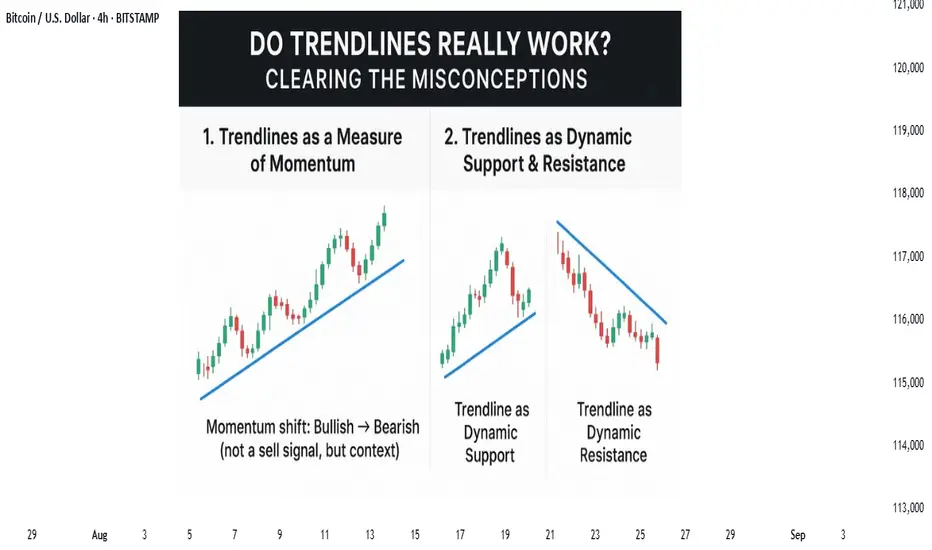
separating Myth from MethodTrendlines: The Most Misused Tool in Trading
If I had a pip for every time a trader got faked out by a “trendline breakout,” I’d probably have more profits than most retail traders combined. Trendlines are one of the simplest, oldest, and most powerful tools in technical analysis yet they’re also one of the most misused.
Most traders rely on what they’ve been taught in books, courses, or quick YouTube tutorials without putting in the hours of backtesting and screen time. And as every trader eventually learns: theory is a different game than practice.
A book may say:
Buy the breakout of a bearish trendline.
But in practice? Price fakes out, you get stopped, and frustration builds.
Or:
Sell at the touch of a bearish trendline.
Then price rallies and breaks the line. Again, stopped out.
The problem? Markets love to trap traders here. False breakouts, wicks, and algo-driven liquidity hunts chew up traders who rely only on “trendline piercing.” If that’s your main strategy, you’re not trading the market, the market is trading you.
But here’s the truth: trendlines aren’t the problem. The way traders use them is.
This doesn’t mean the trendline is invalid. It means the application is shallow.
For me, trendlines are non-negotiable when analysing. But I don’t take trades just because of a line. I use them in specific, tested ways that give structure to my trading and reduce false signals.
Here are the two core methods I use trendlines in my trading:
1. Trendlines as a Measure of Momentum
Momentum is the speed of price, not just the price itself. And trendlines can act as leading indicators of momentum shifts.
For example:
A break of a bullish trendline doesn’t instantly mean “sell.”
It means momentum has shifted from bullish to bearish. That’s my cue to look for sell setups that align with my strategy.
As long as price respects a bullish trendline, it signals buyers are in control, and I look for buy setups. Vice versa for bearish lines.
Think of trendline breaks not as signals but as context for setups. They tell you where the wind is blowing, not when to set sail.
For me, a trendline break means nothing unless a full OHCL candle (Open, High, Close, Low) forms entirely above or below the line.
Why?
Because a wick through a trendline is just noise, it’s the market testing liquidity, not shifting momentum. A confirmed close beyond the trendline signals that the crowd has moved, and the trend’s character is changing.
This approach drastically reduces false signals. Instead of jumping at the first poke through the line, I wait for commitment. Think of it like waiting for the market to sign the contract rather than just flirt with the idea.
chart example :
2. Trendlines as Dynamic Support & Resistance
The second use is less about breakouts and more about reaction levels. A clean, well-respected trendline acts like a dynamic S/R zone, guiding how price reacts when tested.
In uptrends, I look for bounces off the rising trendline as opportunities to join the momentum.
In downtrends, I treat the falling trendline as overhead resistance a zone to fade rallies or time entries.
What makes trendlines powerful here is context: they’re not static like horizontal levels but move with the market’s rhythm adapting as price makes new highs or lows. When combined with volume, candlestick structure, or confluence with horizontals, they create highly reliable zones.
Yes, false breaks happen but this is where order flow, confluence, and top-down analysis come in. The more aligned factors you stack with a trendline, the higher the probability of a valid setup.
chart example :
the other great thing about this is that the law for support and resistance also applies here where previous support acts as resistance and vice versa
chart example :
nerdy conclusion :
trendlines alone won’t make you money. They aren’t buy or sell signals by themselves. But used correctly, they’re an incredibly powerful map of momentum and dynamic structure.
Most importantly, don’t throw them out just because a few breakouts failed. That’s not the trendline’s fault, it’s the method.
The smarter nerdy approach is:
Wait for full OHCL confirmation beyond the line before calling it a momentum shift.
Use trendlines as dynamic support/resistance to trade with structure, not noise.
put together by : Pako Phutietsile as @currencynerd
courtesy of : @TradingView
from Rice to Robots, evolution of TA The History and Origin of Technical Analysis
Every chart we study today. Every candlestick, moving average, or RSI indicator is built on centuries of market wisdom. While many believe technical analysis began with Charles Dow in the 1800s, its origins reach much further back, to Amsterdam’s bustling spice markets in the 1600s and Japan’s rice exchanges in the 1700s.
Let’s take a journey through time and see how technical analysis evolved into the powerful tool traders and investors use today.
17th Century: The First Signs of Charting
1. Dutch East India Company Traders (1602)
The Dutch East India Company, established in Amsterdam in 1602, became the first publicly traded company. Its shares were bought and sold on the world’s first stock exchange, the Amsterdam Stock Exchange. Early traders began tracking price fluctuations in simple graphical forms — the very first steps toward technical analysis.
2. Joseph de la Vega (1650–1692)
A Spanish diamond merchant and philosopher, Joseph de la Vega, authored Confusión de Confusiones (1688), the earliest known book on stock markets. He described investor behavior, speculative patterns, and even outlined concepts resembling modern puts, calls, and pools. His insights captured both the psychology of markets and the primitive beginnings of technical analysis.
18th Century: Japan’s Candlestick Revolution
Homma Munehisa (1724–1803)
In Osaka’s Dōjima Rice Exchange, Japanese rice merchant Homma Munehisa created what remains one of the most widely used charting methods in history: the Japanese Candlestick (then called Sakata Charts).
His book The Fountain of Gold – The Three Monkey Record of Money detailed not only price charts but also market psychology, emotions, and crowd behavior. Today, candlestick patterns remain a cornerstone of technical analysis worldwide.
Late 19th & Early 20th Century: The Modern Foundations
Charles Dow (1851–1902)
Often called the father of modern technical analysis, Charles Dow co-founded Dow Jones & Company and The Wall Street Journal in 1889. His market observations led to:
The Dow Jones Industrial Average and Transportation Average
The Dow Theory, which identified three types of trends: primary, secondary, and minor.
Dow believed markets reflect the overall health of the economy, and his work inspired generations of analysts, including William Hamilton, Robert Rhea, George Schaefer, and Richard Russell.
Ralph Nelson Elliott (1871–1948)
Building on Dow’s ideas, Elliott studied 75 years of stock market data and developed the Elliott Wave Theory, arguing that markets move in recurring wave patterns driven by crowd psychology. In March 1935, he famously predicted a market bottom and the Dow Jones indeed hit its lowest point the following day, cementing his theory’s credibility.
20th Century: The Rise of Indicators
The computer era supercharged technical analysis. Mathematically driven technical indicators were developed to analyze price, volume, and momentum on a scale that manual charting could never achieve.
Example: RSI (Relative Strength Index)
Developed by J. Welles Wilder Jr. in 1978, RSI measures the speed and magnitude of price changes on a scale of 0–100.
Above 70 = Overbought (potential sell signal)
Below 30 = Oversold (potential buy signal)
Other popular indicators soon followed, such as Moving Averages, MACD, and Bollinger Bands, giving traders an expanding toolbox to forecast market movements.
21st Century: From Charts to Algorithms and AI
Today, technical analysis has evolved far beyond hand-drawn charts:
Algorithmic Trading: Automated systems use indicators and strategies to execute trades at lightning speed.
AI Trading Bots: Artificial intelligence combines both technical and fundamental analysis, processing massive datasets to generate signals and even execute trades.
Platforms like TradingView: Empower traders worldwide to build custom indicators, test strategies and share insights, democratizing access to advanced market tools.
nerdy thoughts
From Amsterdam’s first stock traders to Osaka’s candlestick pioneers, from Charles Dow’s theories to AI-powered trading bots, technical analysis has always been about one thing: decoding price to understand human behavior in markets.
It’s a discipline born from centuries of observation, innovation, and adaptation, one that continues to evolve every day.
“Life is a moving, breathing thing. We have to be willing to constantly evolve. Perfection is constant transformation.”
put together by: Pako Phutietsile ( @currencynerd )
courtesy of : @TradingView
this is inspired by a publication i once posted this is the revamped edition...

1,064-Day Crypto Cycle coming.. Oct 06 2025Are We Nearing a Macro Turning Point?
Markets may look chaotic on the surface, but zoom out far enough and a rhythm begins to emerge. For Bitcoin and the broader crypto market, one of the most compelling patterns traders track is the 1,064-day cycle, a rough cadence of boom and bust that has repeated across multiple market eras.
With October 2025 approaching, many analysts are asking: Is another turning point on the horizon?
Why 1,064 Days?
The number isn’t arbitrary. Crypto markets, especially Bitcoin, have displayed a recurring rhythm tied loosely to halvings, liquidity cycles, and investor psychology. Roughly every 1,064 days (about 2.9 years), Bitcoin seems to align with a macro peak or trough.
Cycle 1 (2011–2014): BTC surged from a few dollars to over $1,000 before collapsing in late 2013.
Cycle 2 (2014–2017): The next expansion drove prices to $20,000 by December 2017 — almost exactly 1,064 days later.
Cycle 3 (2018–2021): From the 2018 bear bottom, Bitcoin reached $69,000 in November 2021 — again within the 1,064-day window.
The cycle doesn’t work like clockwork, but the cadence is eerily consistent, suggesting that investor flows, halvings, and liquidity injections may move in long, repeating arcs.
Mapping Today’s Position
If we anchor the most recent cycle to the November 2021 peak, the 1,064-day marker points us toward October 2025.
This timeline aligns uncomfortably well with two forces:
Halving Lag Effect – Historically, the real bull accelerations occur 12–18 months after a halving event (the next one being April 2024). That would put late 2025 squarely in the “froth” zone.
Liquidity Rotation – Global central banks are currently balancing inflation with growth concerns. By late 2025, markets may expect easing, a perfect storm for risk-on assets like crypto.
What the Charts Suggest?
Looking at long-term Bitcoin charts, cycle expansions follow a similar arc:
A steep bull phase fueled by retail and institutional adoption.
A distribution top marked by extreme leverage, retail euphoria, and inflows into speculative altcoins.
A macro correction that wipes out 70–85% of value before a new base forms.
If history rhymes, the 2025 cycle top could be the most significant yet, not just in terms of price, but in market maturity. Institutional ETFs, regulatory frameworks, and global adoption add layers of credibility that were absent in past cycles.
Why Traders Should Care
Cycle mapping is not about prediction with surgical precision, it’s about framing risk and opportunity.
For long-term investors: Understanding that late 2025 could coincide with a major top helps avoid FOMO and plan exits with discipline.
For swing traders: These cycles offer context for positioning. Bull legs tend to accelerate in the 6–12 months before the cycle peak.
For macro thinkers: If crypto follows this cycle, it could front-run global liquidity shifts, making it a leading indicator for risk appetite.
nerdy thoughts : The Clock Is Ticking
The 1,064-day cycle isn’t prophecy. But its consistency across three full eras of crypto history makes it hard to dismiss. As October 2025 approaches, traders would do well to watch for echoes of past patterns: accelerating inflows, leverage buildup, and sentiment peaking.
Because in crypto, time doesn’t just pass, it compounds into cycles. And those cycles often whisper what comes next.
put together by: @currencynerd
courtesy of : @TradingView
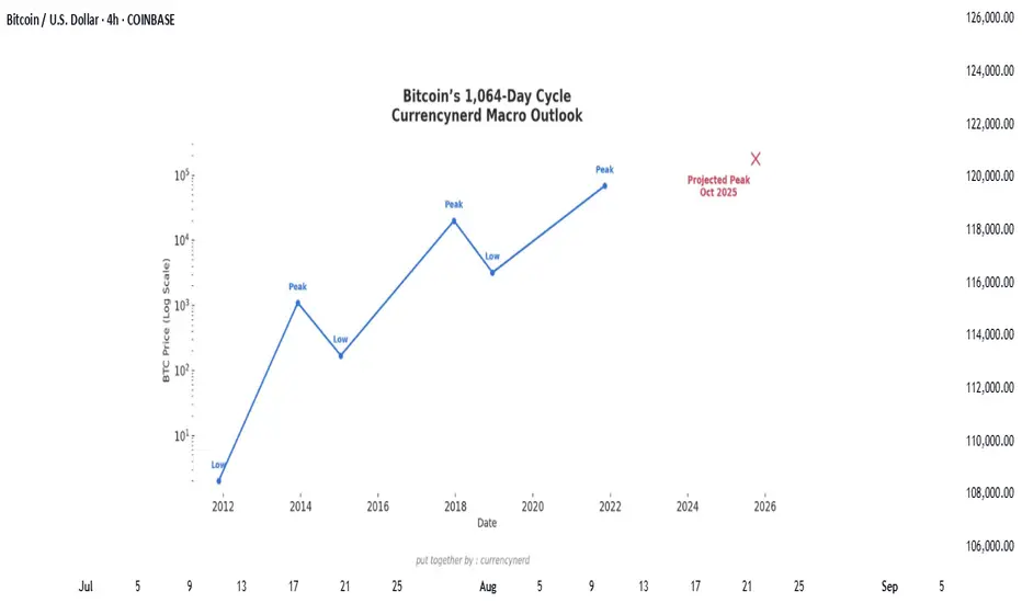
wall Street has set camp on Satoshi's backyard...Bitcoin didn’t just wake up and choose violence. It chose velocity.
As BTC blasts through the six-figure ceiling and fiddles $120k with laser precision, everyone’s pointing to “the halving” like it’s some magical switch. But let's be real, Bitcoin bull runs don’t run on fairy dust and hope. They run on liquidity, macro dislocations, structural demand shifts, and a pinch of regulatory chaos.
Here’s the nerdy breakdown of what’s really driving the Bitcoin Rocketship (and why this one’s different):
1. The Halving Effect (Not Just the Halving)
Yes, the April 2024 halving slashed miner rewards from 6.25 to 3.125 BTC. But this time, the reflexivity is louder. Miners now have to sell less, and buyers (especially ETFs) have to beg for more.
Miners = Reduced Sell Pressure.
ETFs = Constant Buy Pressure.
That’s a one-way order book squeeze. Simple math, but powerful dynamics.
2. ETF Flows: The "Spot" That Launched a Thousand Rallies
When the SEC finally gave the green light to Bitcoin spot ETFs, TradFi didn’t walk in—they stormed in.
Think BlackRock, Fidelity, and friends becoming daily buyers. It's not retail FOMO anymore, it's Wall Street with billions in dry powder doing dollar-cost averaging with institutional consistency.
🧠 Nerd Note: The top 5 U.S. spot ETFs alone are now hoarding more BTC than MicroStrategy.
3. Dollar Liquidity is Leaking Again
Despite Fed jawboning, real rates are still under pressure and global liquidity is quietly creeping back. Look at the TGA drawdowns, reverse repo usage, and China’s stealth QE.
Bitcoin, being the apex predator of liquidity, smells it from a mile away.
“In a world flooded with fiat, Bitcoin doesn’t float. It flies.”
4. Sovereigns Are Quietly Watching
El Salvador lit the match. Now, Argentina, Turkey, and even Gulf countries are tiptoeing toward a Bitcoin pivot, hedging USD exposure without broadcasting it to CNN.
Central banks don’t need to love BTC to stack it. They just need to fear the dollar system enough.
5. Scarcity Narrative Goes 3D
With 99% of BTC supply already mined and over 70% HODLed for over 6 months, every new buyer is bidding for a smaller slice of the pie. ETFs and institutions are trying to drink from a faucet that only drips.
This is not a market with elastic supply. This is financial physics with a scarcity twist.
6. Market Microstructure is Fragile AF
Order books are thin. Real liquidity is fragmented. And the sell-side has PTSD from getting blown out at $70k.
This creates a “skateboard-on-a-freeway” scenario, when a few billion in inflows hit, prices don’t just rise. They gap.
Nerdy Bonus: The Memecoin Effect (No, Really)
The memecoin mania on Solana, Base, and Ethereum has been injecting dopamine into degens—and their profits are increasingly flowing into the OG digital gold.
It’s the 2021 cycle all over again, just with more liquidity bridges and fewer inhibitions.
Nerdy Insight: The Bull Run Has Layers
What’s driving BTC to $120,000 isn’t a single headline. It’s a stacked convergence of macro, structure, psychology, and coded scarcity.
Bitcoin isn’t “going up” just because of hope or halving hype. It’s going up because it’s the cleanest asset in a dirty system, and now both retail and institutions agree.
Still shorting? That’s not “fading the crowd.” That’s fighting thermodynamics.
Stay nerdy, stay sharp.
put together by : @currencynerd as Pako Phutietsile
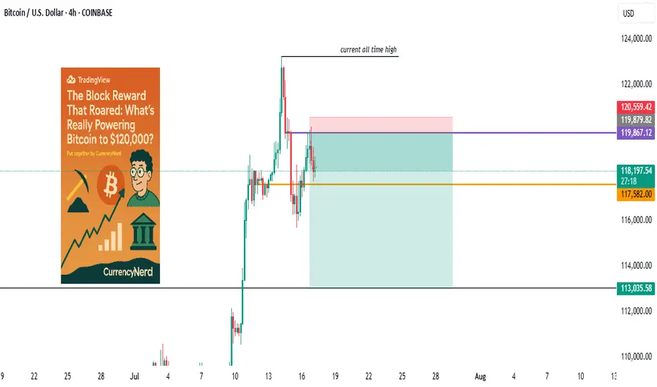
watch the laws, not just the charts.stablecoins were once the rebels of finance—anchored to fiat yet untethered from traditional banking laws, but the tides are turning. Across major economies, lawmakers are drawing up legal frameworks that place stablecoins inside the banking sector rather than outside of it. This shift could be the most pivotal regulatory development since Bitcoin was born.
But what does this really mean for traders, investors, and markets?
In this @TradingView blog we’ll unpack the new laws on stablecoins entering the banking realm, and what their ripple effect might look like, using past regulatory shifts as a lens to foresee market behavior.
🧾 Section 1: What the New Stablecoin Laws Say
Many regions—especially the EU, UK, Japan, and the US—are moving toward a model where stablecoin issuers must register as banks or hold full banking licenses, or at minimum, comply with banking-like oversight.
Key pillars of these laws include:
Full reserve requirements (1:1 backing in liquid assets)
Audited transparency on reserves and redemptions
KYC/AML compliance for users and issuers
Supervision by central banks or financial regulators
In the US, the House Financial Services Committee recently advanced a bill that would make the Fed the ultimate overseer of dollar-backed stablecoins.
In the EU, MiCA (Markets in Crypto-Assets) requires issuers of e-money tokens to be regulated financial institutions.
Japan now allows banks and trust companies to issue stablecoins under strict regulations.
💥 Section 2: Why This Is a Big Deal
Bringing stablecoins into the banking system could change how liquidity flows, how DeFi operates, and how capital moves across borders.
Potential market impacts:
Increased trust = more institutional money entering stablecoins and crypto markets.
DeFi restrictions = protocols may face scrutiny if they allow unverified stablecoin usage.
Flight from algorithmic or offshore stables to regulated, bank-issued stablecoins (e.g., USDC, PYUSD).
On-chain surveillance increases, potentially limiting pseudonymous finance.
Think of it as crypto’s "Too Big To Ignore" moment—where stablecoins become infrastructure, not outlaws.
📉 Section 3: Past Laws That Shaped Crypto Markets
Let’s examine how previous regulations have affected crypto markets—offering clues about what to expect.
🧱 1. China’s Crypto Ban (2017–2021)
Kicked off a massive market crash in 2018.
Pushed mining and trading activity overseas, especially to the US and Southeast Asia.
Resulted in more global decentralization, ironically strengthening Bitcoin’s resilience.
🪙 2. SEC Lawsuits Against XRP & ICO Projects
Ripple’s XRP lawsuit caused delistings and volatility.
Set a precedent for how tokens are treated under securities law.
Resulted in more structured token launches (via SAFEs, Reg D, etc.).
🧮 3. MiCA Regulation in Europe (2023 Onward)
Provided regulatory clarity, prompting institutions to engage more with regulated entities.
Boosted legitimacy of Euro-backed stablecoins like EURS and Circle’s Euro Coin.
Sparked a race among exchanges to gain EU registration (e.g., Binance France, Coinbase Ireland).
Each of these regulatory waves caused temporary volatility, followed by long-term growth—as clarity invited capital.
📊 Section 4: The Possible Scenarios for the Market
Here’s how things might play out as stablecoin laws become mainstream:
Golden Path-Regulated stablecoins coexist with DeFi; innovation meets compliance - Bullish for crypto adoption and capital inflows.
Walled Garden-Only bank-issued stablecoins are allowed; DeFi stifled -Neutral or bearish short-term, bullish long-term.
Backlash-Overregulation pushes stables offshore or into non-compliant zones - Bearish, liquidity fragmentation returns.
🔍 Nerdy Conclusion:
Stablecoins are no longer just tools for traders—they’re becoming the backbone of digital finance. Their formal entrance into banking law marks a turning point that traders must understand.
While regulation has historically caused short-term fear, it often leads to long-term maturity in crypto markets. The stablecoin laws now in motion could unlock the next chapter of institutional adoption, cross-border finance, and perhaps, the integration of crypto into the real-world economy at scale.
💡 Nerdy Thought:
When a technology becomes systemically important, it stops being ignored—it gets integrated. Stablecoins have reached that level.
put together by : @currencynerd as Pako Phutietsile
Price action is the vehicle—but these charts show the road aheadIn the world of trading, technical analysis often gets the spotlight—candlesticks, moving averages, and indicators. But beneath every price movement lies a deeper current: macroeconomic forces. These forces shape the environment in which all trades happen.
Great traders don’t just react to price—they understand the context behind it. That context is found in macro charts: the financial “weather maps” of markets. These charts reveal whether capital is flowing toward risk or safety, whether inflation is heating up or cooling down, and whether liquidity is expanding or shrinking.
In this post, we’ll explore 10 macro charts that can elevate your edge, backed by proven examples of how they’ve helped traders stay on the right side of the market. These aren't just charts—they’re market truths in visual form.
1️⃣ DXY – U.S. Dollar Index
Why it matters:
The U.S. dollar affects everything: commodities, stocks, global trade, and especially forex. The DXY measures its strength against major currencies.
📉 Chart Reference:
In 2022, DXY surged past 110 due to aggressive Fed rate hikes. This crushed EURUSD, pressured gold, and triggered a global risk-off move. Traders who tracked DXY rode USD strength across the board.
💡 Use it to: Confirm trends in FX and commodities. Strong DXY = bearish pressure on gold and risk assets.
2️⃣ US10Y – 10-Year Treasury Yield
Why it matters:
This is the benchmark for interest rates and inflation expectations. It guides borrowing costs, equity valuations, and safe-haven flows.
📉 Chart Reference:
In 2023, the 10Y spiked from 3.5% to nearly 5%, leading to weakness in growth stocks and boosting USD/JPY. Bond traders saw it first—equities followed.
💡 Use it to: Anticipate moves in growth vs. value stocks, and confirm macro themes like inflation or deflation.
3️⃣ Fed Dot Plot
Why it matters:
This is the Fed’s forward guidance in visual form. Each dot shows where a policymaker expects interest rates to be in the future.
📉 Chart Reference:
In Dec 2021, the dot plot signaled a faster pace of hikes than the market expected. Those who caught the shift front-ran the USD rally and equity correction in early 2022.
💡 Use it to: Predict future rate policy and align your macro bias with the Fed's path.
4️⃣ M2 Money Supply (US)
Why it matters:
This chart tracks the amount of money in the system. More liquidity = fuel for risk. Less = tightening conditions.
📉 Chart Reference:
After COVID hit, M2 exploded, leading to a major bull run in stocks and crypto. When M2 began contracting in 2022, asset prices peaked and reversed.
💡 Use it to: Gauge macro liquidity conditions. Expansion is bullish; contraction is dangerous.
5️⃣ Copper/Gold Ratio
Why it matters:
Copper is a growth metal; gold is a fear hedge. Their ratio acts as a risk-on/risk-off indicator.
📉 Chart Reference:
In 2021, the copper/gold ratio surged—signaling growth and optimism. This preceded strong gains in cyclical equities and commodity currencies like AUD and CAD.
💡 Use it to: Confirm risk sentiment and lead equity or FX trends.
6️⃣ VIX – Volatility Index
Why it matters:
VIX tracks expected volatility in the S&P 500. It's often called the "fear index."
📉Chart Reference :
In March 2020, VIX spiked to nearly 90 as COVID panic set in. This extreme fear was followed by one of the greatest buying opportunities of the decade.
💡 Use it to: Time entries and exits. High VIX = fear = possible reversal. Low VIX = complacency = caution.
7️⃣ Real Yields (10Y TIPS - CPI)
Why it matters:
Shows the inflation-adjusted return on bonds. Real yields affect gold, tech, and risk appetite.
📉Chart Reference :
In 2022, real yields went from deeply negative to positive—crushing gold and high-growth stocks.
💡 Use it to: Confirm direction in gold, NASDAQ, and broad macro trends.
8️⃣ Oil Prices (WTI or Brent)
Why it matters:
Oil is both a growth and inflation input. Rising prices mean higher costs and often precede policy tightening.
📉Chart Reference :
Oil’s rally in early 2022 foreshadowed CPI spikes and led central banks to turn hawkish. Traders who tracked it saw inflation risks building early.
💡 Use it to: Forecast inflation, assess energy-related equities, and understand global demand.
9️⃣ Global PMIs (Purchasing Managers’ Indexes)
Why it matters:
Leading indicator of economic health. PMIs above 50 = expansion. Below 50 = contraction.
📉 Chart Reference:
In 2023, China’s PMI consistently printed below 50—signaling manufacturing weakness and global demand concerns. This helped traders avoid overexposure to emerging markets.
💡 Use it to: Gauge growth momentum globally and regionally.
🔟 SPX vs. Equal-Weighted SPX (Breadth Divergence)
Why it matters:
Shows whether the S&P 500 rally is broad-based or just driven by a few megacaps.
📉Chart Reference :
In early 2024, the index made new highs—but the equal-weighted version lagged badly. That divergence warned traders of a fragile rally.
💡 Use it to: Detect weakness beneath the surface and avoid false confidence in rallies.
🧠 Nerdy Tip: Macro Is the Invisible Hand
These charts don’t give you trade entries—but they give you conviction, timing, and perspective.
When you combine macro context with technical setups, you trade in sync with the market’s deeper rhythm.
So before you place your next trade, ask yourself:
What are yields doing?
Is liquidity expanding or drying up?
Is risk appetite rising or falling?
put together by : @currencynerd as Pako Phutietsile
when Jerome says spike, the markets asks how low/high"Watch what they do, but also how they say it."
In the high-stakes world of central banking, few things move markets like the subtle wording of a Fed statement, But beyond the headlines and soundbites, one market absorbs this information faster—and with greater clarity—than almost any other: the bond market.
💬 What Is "Fed Speak"?
"Fed speak" refers to the nuanced and often deliberately vague language used by U.S. Federal Reserve officials when communicating policy expectations. It includes:
FOMC statements
Dot plot projections
Press conferences
Individual speeches from Fed officials
nerdy tip: the Fed aims to influence expectations without committing to specific outcomes, maintaining flexibility while steering market psychology.
📈 The Bond Market as a Decoder
The bond market, particularly the U.S. Treasury market, is where real-time interpretation of Fed policy plays out. Here's how it typically reacts:
1. Short-Term Yields (2Y, 3M) = Fed Expectation Barometer
These are the most sensitive to near-term interest rate expectations. If the Fed sounds hawkish (more rate hikes), short-term yields jump. If dovish (hinting cuts), they fall. At the May 7, 2025 FOMC meeting, the 2-year Treasury yield (US02Y) experienced a modest but clear reaction:
Just before the release, yields were hovering around 3.79%.
In the first hour following the 2:00 PM ET (20:00 UTC+2) statement, the yield ticked up by approximately +8 basis points, temporarily reaching about 3.87%.
Later that day, it eased back to around 3.79%, ending the day roughly unchanged—a sharp, immediate spike followed by a reversion.
2. Long-Term Yields (10Y, 30Y) = Growth + Inflation Expectations
Longer-dated yields reflect how the market sees the economy unfolding over time. After a Fed speech:
Rising long-term yields = stronger growth/inflation expected
Falling yields = fears of recession, disinflation, or policy over-tightening
3. The Yield Curve = Market's Policy Verdict
One of the best tools to read the bond market's verdict is the yield curve—specifically, the spread between 10Y and 2Y yields.
Steepening curve → Market thinks growth is picking up (Fed may be behind the curve)
Flattening or Inversion → Market believes the Fed is too aggressive, risking a slowdown or recession
📉 Example: After Jerome Powell’s hawkish Jackson Hole speech in 2022, the 2Y-10Y spread inverted deeply—markets were pricing in recession risks despite a strong Fed tone.
🧠 Why Traders Must Watch Bonds After Fed Speak
🪙 FX Traders:
Higher yields = stronger USD (carry trade advantage)
Falling yields = weaker USD (lower return for holding)
📈 Equity Traders:
Rising yields = pressure on tech/growth stocks (higher discount rates)
Falling yields = relief rally in risk assets
📊 Macro Traders:
The MOVE Index (bond volatility) often spikes around FOMC events
Forward guidance shifts = big rotation opportunities (e.g., bonds > gold > dollar)
(BONUS NERDY TIP) 🔍 How to Analyze Fed Speak Through Bonds
✅ Step 1: Watch the 2Y Yield
First responder to new rate expectations.
✅ Step 2: Check the Fed Funds Futures
Compare market pricing pre- and post-statement.
✅ Step 3: Look at Yield Curve Movement
Steepening or inversion? That’s the market’s macro take.
✅ Step 4: Track TLT or 10Y Yield on Your Chart
Bond ETFs or Treasury yields reveal sentiment instantly.
🧭 Final Nerdy Thought : Bonds React First, Talk Later
When the Fed speaks, don't just read the words. Read the yields. The bond market is often the first to interpret what the Fed really means—and the first to price in what comes next.
So next FOMC meeting, instead of watching only Powell’s facial expressions or CNBC pundits, open a chart of the 2Y and 10Y. That’s where the smart money’s listening.
put together by : @currencynerd as Pako Phutietsile
courtesy of : @TradingView
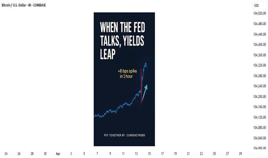
are you the Messi or Ronaldo of trading“In football, some say Messi was born with it, and Ronaldo built it. In trading, the same debate lives on—are the best naturally gifted, or relentlessly crafted?”
The Messi vs Ronaldo debate is more than just about football. It’s a lens into how we perceive greatness:
Messi, the effortless genius, gliding past defenders like he was born with a ball at his feet.
Ronaldo, the relentless machine, forged through discipline, self-belief, and sheer work ethic.
Both legends. Both dominant. But two very different paths to mastery.
And that same question echoes loudly in the world of trading:
Are great traders born with a gift—or made through grind, loss, and experience?
The “Natural” Trader : Messi
There’s a romantic idea that some traders just have it:
They “see” the market differently.
They time entries perfectly.
They stay calm in chaos.
But what we often overlook is that this perceived instinct is usually refined intuition, earned through thousands of chart hours, hard-won lessons, and deep emotional work.
Just like Messi has trained for decades—even the gifted must still grow.
The Ronaldo Blueprint: Greatness Is Built
Cristiano Ronaldo is often cited as the perfect example of what's possible through obsession, sacrifice, and discipline. Every goal, every leap, every sprint—is a result of work. And in trading, that blueprint is more common than you think.
Here’s how great traders are built:
Through structured process. Clear rules, risk protocols, and systems that remove emotion.
Through deep reflection. Journaling trades, studying behavior patterns, reviewing psychology—not just price.
Through emotional mastery. Remaining centered during drawdowns and not getting high off wins.
Through resilience. Getting back up after losses, blown accounts, bad calls, and still showing up.
This is the Ronaldo of trading. And it’s replicable—if you’re willing to put in the reps.
Talent Helps—but It’s Never Enough
Yes, some traders may be “wired” with certain advantages:
Pattern recognition, mathematical intuition, calm under pressure. But just like talent in sports, without discipline, it fades. Without consistency, it cracks.
In truth, most consistently profitable traders you’ll meet are not the flashiest or most “gifted.”
They’re the most adaptable, the most disciplined, and the most reflective.
So… Which One Are You?
It doesn’t matter. Because the bigger question is:
Are you willing to grow into the trader you want to become?
Great traders are not born or made.
They are choosing to evolve—every day.
They put ego aside and put in the work.
They trade with intention, not impulse.
Nerd Tip:
You might start your journey as a “Messi” or a “Ronaldo,” but in the markets, the path is yours to shape.
The charts don’t care where you begin—they respond only to how you show up.
So whether you’re gifted or grinding—
Keep sharpening the edge. Keep showing up.
Because in this game, consistency beats brilliance.
Stay disciplined. Stay dangerous.
put together by : Pako Phutietsile as @currencynerd

Beneath the Blocks: The Real Tech That Powers CryptoCrypto is more than coins and charts. That’s the surface most traders never look beyond.
It's a stack of revolutionary technologies working together to build the future of finance, data, and trust.
But if you’re serious about understanding crypto’s long-term value—or timing its major shifts—you need to grasp what lies beneath.
Here’s your deep-dive into the true foundations of the crypto ecosystem:
🔸 1. DeFi (Decentralized Finance)
DeFi is crypto’s answer to traditional banking—without banks.
Instead of loan officers or custodians, you interact with smart contracts that handle everything from borrowing, lending, to trading.
Protocols like Aave, Compound, and Uniswap allow users to earn interest, provide liquidity, or borrow assets— permissionlessly.
No KYC. No intermediaries. Just wallets and smart contracts.
Total Value Locked (TVL) across DeFi platforms has been a major leading indicator for altcoin seasons.
📚 Why it matters: DeFi is crypto's real-world use case—and its biggest battleground for regulation.
🔸 2. Proof of Work (PoW)
PoW is Bitcoin’s original consensus mechanism.
It secures the network by requiring miners to solve complex math problems (hashes). Whoever solves the block gets rewarded with BTC.
This is energy-intensive, but it’s what makes Bitcoin nearly impossible to attack.
It aligns incentives: miners secure the network in return for rewards.
📚 Why it matters: PoW is the most proven security model in crypto—but it’s also under pressure for its energy costs.
🔸 3. Proof of Stake (PoS)
PoS replaces miners with validators—chosen based on how much crypto they “stake” (lock up) as collateral.
Used by Ethereum 2.0, Solana, Avalanche, Cardano, and many others.
It’s energy-efficient and enables faster, cheaper transactions.
Validators get rewarded in native tokens (e.g., ETH) for proposing and verifying blocks.
📚 Why it matters: PoS is scalable and green, but centralization risks arise if large players control too much stake.
🔸 4. Energy Consumption
PoW networks like Bitcoin consume significant electricity due to mining.
Critics argue this is wasteful.
Proponents argue it's essential for decentralized security and global financial sovereignty.
Solutions being explored:
Renewable-powered mining
Off-grid operations
Transitioning to PoS (as Ethereum did)
📚 Why it matters: Sustainability is a battleground narrative—especially as institutional adoption grows.
🔸 5. Hash (Hash Function)
A hash is a one-way cryptographic function that transforms any input (a transaction or block) into a fixed-length output.
Bitcoin uses SHA-256.
Changing just one character in the input changes the entire hash—making tampering obvious.
📚 Why it matters: Hashes secure every block, transaction, and address—forming the cryptographic backbone of all blockchains.
🔸 6. Smart Contracts
Smart contracts are self-executing agreements written in code, deployed on-chain.
“If X happens, do Y.” No lawyers, no third parties.
Enabled NFTs, DeFi, DAOs, and much more.
Popular platforms:
Ethereum (Solidity)
Solana, Avalanche, BNB Chain, etc.
📚 Why it matters: Smart contracts are what make blockchains programmable. This is the difference between BTC (digital gold) and ETH (Web3 platform).
🔸 7. Distributed Ledger
A distributed ledger is a database that is shared, synchronized, and accessible across multiple nodes.
Every node stores a full copy of the blockchain.
Consensus ensures all copies are aligned.
Immutable: You can only add to it, not edit or delete.
📚 Why it matters: This is what decentralization looks like. No single point of failure. Trust is built into the architecture.
🔸 8. Blockchain Technology
Think of blockchain as a chain of blocks, where each block stores transaction data and a hash of the previous block.
It’s:
Transparent: Anyone can audit it.
Secure: Tampering with one block invalidates the chain.
Decentralized: Run by thousands of nodes worldwide.
📚 Why it matters: Blockchain is the foundational tech. Coins come and go—but the architecture is the real revolution.
💡 Nerdy Tip:
Don’t just trade what you see. Learn what drives it.
The real edge in crypto comes from understanding the mechanics—before they show up in price action.
put together by : Pako Phutietsile as @currencynerd

BTC to run out by year 2140, who is the biggest whale?bitcoin whales are individuals or entities that hold/own the most amount of the digital XAU, to achieve this financial status one has to own at least 1000 BTC, with the coin's supply being infinite to 21 million (also known as HARD CAP), meaning that only 21 million bitcoins can ever be created. it's important to know who the big players are in the market also to keep track of the left supply.
one of the important reasons i think why the supply was capped at 21 million was to ensure no risk of inflation even though the Bitcoin creator 'SATOSHI NAKAMOTO' disclosed once that him capping it at 21 million was just an "educated guess"
in order to control supply, there is what is called Bitcoin halving which is the process by which the reward for mining BTC by half hence the term halving. the first ever halving was November 28, 2012 this was the start of a historic run of BTC as a deflationary asset and the most recent was this year APRIL 19, with the reward for mining a single block cut from 6.25 BTC to 3.125 BTC. this event happens when 210,000 are added to the blockchain.
this also reduces the rate at which new coins are created maintaining scarcity which results in an increase in value.
with all that said, WH0 OWNS THE MOST BITCOIN?
top 5 public cooperation's that hold most Bitcoin
* MICROSTRATEGY - U.S company - holds 214,400 est. Value - $13.5B
* MARATHON DIGITAL - U.S company - hold 17,631 est. Value - $1.1B
* TESLA - U.S company - holds 9,720 est. Value - $600M
* HUT 8 - CANADA company - holds 9,109 est. Value - $574.1M
* COINBASE - U.S company - holds 9,000 est. Value - $567.2M
top 5 countries that hold most Bitcoin
* USA - holds 207,189 est. Value - GETTEX:13B
* CHINA - holds 194,000 est. Value - $12.2B
* UK - holds 61,000 est. Value - $3.8B
* GERMANY - holds 50,000 est. Value - $3.1B
* UKRAIN - holds 46,351 est. Value - $2.9B
top 5 private companies that hold most Bitcoin
* Mt. Gox - holds 200,000 est. Value - $12.6B
* Block.one - holds 140,000 est. Value - $8.8B
* Tether holdings - holds 75,354 est. Value - $4.7B
* Xapo Bank - holds 38,931 est. Value - $2.4B
* BitMEX - holds 36,794 est. Value - $2.3B
then there are other investors that are involved in the BITCOIN market without directly purchasing it but through bitcoin related assets. these are :
*Grayscale Bitcoin Trust
holds 291,802 est. Value - $18.3B
*iShares Bitcoin Trust
holds 274,322 est. Value - $17.2B
*Fidelity Wise Origin Bitcoin Fund
holds 152,880 est. Value - $9.6B
*CoinShares/XBT Provider
holds 48,466 est. Value SEED_TVCODER77_ETHBTCDATA:3B
*ARK 21Shares Bitcoin ETF
holds 43,470 est Value - $2.7B
top individuals that hold the most BTC.
*SATOSHI NAKAMOTO
1.1MILLION BTC
*THE WINKLEVOSS TWINS
70,000 BTC
*TIM DRAPER
29,500 BTC
*MICHAEL SAYLOR
17,732 BTC
researched and put together by : Pako Phutietsile as @currencynerd
