FinEco For Dummies | The Economic Eco-System Simplified🟢 Intro For Financial Economics & The Financial Eco-Sytem For Dummies
This little book is not about predictions or strategies.
It’s about understanding how financial markets connect, interact, and move together.
If you can read capital flows, risk appetite, and macro relationships,
markets stop feeling random and start making sense.
Financial markets are a system.
Money flows between assets based on risk, growth, inflation, and policy.
This book explains those relationships in simple terms,
so you can understand the environment before making decisions.
Most traders focus on charts.
Few understand the environment those charts live in.
This little book lays out a simple framework for reading market conditions,
capital rotation, and risk behavior, without strategies or hype.
This is a foundation, not a strategy.
A simple guide to how stocks, bonds, currencies, commodities, and crypto
fit together inside the global financial system.
Markets are not random.
They react to incentives, risk, and expectations.
This book helps you see those forces clearly.
🟢 1 - The Big Picture: Markets as a Flow System
Before charts, indicators, or trades, financial markets should be understood as a system of flows, not isolated instruments. Every market, stocks, bonds, currencies, commodities, crypto, etc is simply capital moving between buckets. Nothing trades in a vacuum. When money flows into one place, it must flow out of another.
-
➡️ The Core Idea
Markets are a constant process of:
- Allocation
- Re-allocation
- Risk assessment
Investors are always asking, consciously or not:
“Where do I want my money to park right now?”
The answer changes with:
- Economic expectations
- Central bank policy
- Inflation / deflation fears
- Financial stability
- Geopolitical stress
- Liquidity conditions
Price is just the result of those decisions.
Risk Is the Organizing Principle
At the highest level, all markets organize around risk.
Capital rotates between:
- Risk-on assets → growth, leverage, expansion
- Risk-off assets → safety, preservation, defense
This is not emotional.
It is structural.
Institutions manage:
- Mandates
- Drawdowns
- Volatility targets
- Capital requirements
They must rotate.
-
➡️ The Two Master Regimes
Most market behavior can be simplified into two regimes:
➡️ 1. Risk-On Environment
Characteristics:
- Optimism about growth
- Liquidity is abundant
- Credit flows easily
- Volatility is tolerated
Money prefers:
- Equities (especially growth)
- High beta sectors
- Small & mid caps
- Emerging markets
- Cyclical commodities
➡️ 2. Risk-Off Environment
Characteristics:
- Uncertainty or stress
- Liquidity tightens
- Credit risk rises
- Volatility is avoided
Money prefers:
- Government bonds
- Strong reserve currencies
- Defensive equities
- Gold
- Cash equivalents
Most of the time, markets live between these two, rotating, not flipping instantly.
➡️ Why This Matters for Trading
If you don’t know which regime you’re in, technical setups lose meaning.
A perfect long breakout:
- Works beautifully in risk-on
- Fails constantly in risk-off
A short breakdown:
- Accelerates in risk-off
- Gets absorbed in risk-on
Your job is not to predict the future.
Your job is to identify the current state.
-
🟢 2 - Capital Rotation: How Money Actually Moves
Markets do not rise or fall as one unified object.
They rotate.
Capital is constantly shifting between:
- Sectors
- Asset classes
- Regions
- Risk profiles
This rotation is not random. It follows incentives.
-
➡️ Rotation vs Direction
A common beginner mistake is thinking:
“The market is bullish or bearish.”
In reality, markets are often:
- Bullish somewhere
- Bearish somewhere else
While headlines say “stocks are flat,” money may be:
- Leaving defensives
- Entering growth
- Rotating from large caps into small caps
- Moving from bonds into equities
- Or the opposite
Understanding where money is going matters more than knowing the index direction.
-
➡️ Why Rotation Exists
Large institutions:
- Cannot move all at once
- Cannot hold everything
- Must rebalance constantly
They rotate because of:
- Changing growth expectations
- Interest rate shifts
- Inflation outlook
- Volatility targets
- Risk management rules
This creates waves, not straight lines.
-
➡️ The Economic Cycle (Simplified)
While real life is messy, capital often behaves as if it follows a loose cycle:
Early Expansion
- Rates low or falling
- Liquidity improving
- Confidence returning
Capital prefers:
- Small caps
- Cyclicals
- Growth sectors
- High beta assets
Mid-Cycle
- Growth strong
- Earnings expanding
- Rates stable or slowly rising
Capital prefers:
- Large caps
- Technology
- Industrials
- Consumer discretionary
Late Cycle
- Inflation concerns
- Rates restrictive
- Margins pressured
Capital rotates into:
- Energy
- Materials
- Value
- Financials (if yield curve allows)
Stress / Contraction
- Growth uncertainty
- Credit risk rising
- Liquidity tightening
Capital hides in:
- Defensives
- Bonds
- Gold
- Cash (Liquidity tightening)
This is not a checklist, it’s a lens.
-
➡️ Why Broad Sector ETFs Matter
Broad ETFs allow you to:
- Observe rotation in real time
- See what is being rewarded
- Identify what is being abandoned
They act as market thermometers.
A single stock can lie.
A sector rarely does.
-
➡️ Relative Strength Is the Tell
The most important question is not:
“Is this going up?”
But:
“Is this outperforming other places capital could go?”
Outperformance = demand
Underperformance = avoidance
This relative behavior often appears before major market pivots.
-
➡️ Setting the Stage
From here, we’ll start breaking the market into functional blocks:
- Broad indices
- Sector ETFs
- Bonds
- Currencies
- Hard assets
- Others
Each block tells a different part of the story.
-
🟢 3 - Broad Market Structure: Who Leads, Who Follows
Before zooming into sectors, it’s critical to understand the hierarchy of the equity market itself.
Not all stocks matter equally.
Not all indices send the same signal.
Markets have leaders and followers.
-
➡️ The US Equity Market as a Pyramid
At the top of the pyramid sit the largest, most liquid companies.
At the bottom sit smaller, more fragile, higher-risk firms.
Large Caps
- Highly liquid
- Globally owned
- Institutional core holdings
They represent:
- Stability
- Capital preservation with growth
- Confidence in the system
Mid Caps
- More domestic exposure
- More growth-sensitive
- Less balance-sheet protection
They represent:
- Expansion
- Risk tolerance
- Economic optimism
Small Caps
- Least liquid
- Most rate-sensitive
- Highly dependent on credit conditions
They represent:
- Risk appetite
- Liquidity abundance
- Speculation tolerance
-
➡️ Why Size Matters
When confidence rises:
- Capital flows down the pyramid
- Large → Mid → Small
When stress appears:
- Capital flows up the pyramid
- Small → Mid → Large → Cash
This movement often happens before headlines change.
➡️ Reading the Market Through Indices
Broad indices act as regime filters:
SPY (S&P 500)
Represents large-cap US equity exposure
- Dominated by mega-cap tech and financials
Strength here means:
- Core capital is comfortable staying invested
- The system is stable enough to hold risk
RSP (Equal-Weight S&P 500)
Removes mega-cap dominance
- Shows participation breadth
If SPY rises but RSP lags:
- Leadership is narrow
- Risk is concentrated
- The rally is fragile
If RSP leads:
- Participation is broad
- Confidence is healthy
- Moves are more sustainable
-
➡️ Breadth Is Not a Detail - It’s a Warning System
Strong markets:
- Many stocks participating
- Many sectors contributing
- Leadership rotates smoothly
Weak markets:
- Few leaders
- Defensive hiding
- Sudden rotation spikes
Breadth deterioration often appears long before price collapses.
-
➡️ Why This Matters for Everything Else
Equity leadership sets the tone for:
- Sector performance
- Currency flows
- Bond behavior
- Commodity demand
If equities are unhealthy internally, risk assets elsewhere struggle to hold gains.
-
➡️ Key Takeaway
Markets don’t break all at once.
They weaken from the inside out.
If you learn to read:
- Size
- Breadth
- Leadership
You stop reacting and start anticipating.
-
🟢 4 - Sector ETFs: Reading the Economy Through Capital
KRE — Regional Banks
US regional banks, credit-sensitive, domestic lending.
Best in: Early recovery, rate cuts, steepening yield curve.
Struggles in: Tight liquidity, stress, rising defaults.
ITB — Homebuilders
US residential construction and housing demand.
Best in: Falling rates, easing financial conditions.
Struggles in: Rising yields, affordability stress.
SMH — Semiconductors
Global chipmakers, cyclical growth, capex-driven.
Best in: Expansion, liquidity growth, tech-led cycles.
Struggles in: Hard slowdowns, demand shocks.
XME — Metals & Mining
Steel, miners, raw materials.
Best in: Reflation, infrastructure cycles, USD weakness.
Struggles in: Deflation, global slowdown.
XLRE — Real Estate
REITs, income and rate-sensitive assets.
Best in: Falling yields, stable growth.
Struggles in: Rising rates, credit stress.
XLY — Consumer Discretionary
Non-essential spending (retail, autos, leisure).
Best in: Strong consumer, expansion phases.
Struggles in: Recessions, confidence drops.
EBIZ — E-Commerce / Digital Consumption
Online retail and digital consumer platforms.
Best in: Growth + digital shift, USD weakness.
Struggles in: Consumer pullbacks, tightening liquidity.
XLK — Technology
Large-cap US tech, growth and duration exposure.
Best in: Liquidity expansion, falling rates.
Struggles in: Tight policy, rising real yields.
XLE — Energy
Oil & gas producers and services.
Best in: Reflation, supply constraints, USD weakness.
Struggles in: Demand destruction, growth shocks.
XLB — Materials
Chemicals, construction materials, inputs.
Best in: Early-cycle recovery, reflation.
Struggles in: Late-cycle slowdowns.
RSP — Equal-Weight S&P 500
Broad market without mega-cap dominance.
Best in: Healthy, broad-based expansions.
Struggles in: Narrow leadership, defensive markets.
SPY — S&P 500
US large-cap benchmark.
Best in: Most regimes, reflects overall risk appetite.
Struggles in: Systemic shocks.
XLI — Industrials
Manufacturing, transport, capital goods.
Best in: Expansion, infrastructure, global growth.
Struggles in: Recessions, trade slowdowns.
XLF — Financials
Banks, insurers, financial services.
Best in: Steep yield curve, economic growth.
Struggles in: Credit stress, inverted curves.
XLC — Communication Services
Media, telecom, platforms.
Best in: Growth environments, ad spending cycles.
Struggles in: Economic slowdowns.
IGV — Software
Enterprise software and digital services.
Best in: Liquidity expansion, productivity cycles.
Struggles in: Rate shocks, valuation compression.
XLV — Healthcare
Pharma, biotech, medical services.
Best in: Defensive regimes, late cycle.
Struggles in: High-risk-on rotations.
XLU — Utilities
Regulated utilities, income-focused.
Best in: Risk-off, falling yields.
Struggles in: Rising rates, strong growth cycles.
XLP — Consumer Staples
Essentials (food, household goods).
Best in: Defensive, late-cycle, risk-off.
Struggles in: Strong risk-on rotations.
Once you understand broad market structure, the next layer is sectors.
Sector ETFs are not just industries.
They are expressions of economic belief.
Each sector answers a different question:
- Growth or safety?
- Inflation or deflation?
- Rates up or rates down?
- Confidence or caution?
By watching sector behavior, you can see what investors are preparing for, not what they are reacting to.
-
➡️ Sectors as Economic Sensors
Sectors move differently because:
- They respond differently to rates
- They depend differently on credit
- They react differently to inflation and demand
This makes them ideal tools for:
- Identifying rotation
- Confirming or rejecting index moves
- Spotting regime changes early
➡️ 1. Risk-Oriented Sectors (Risk-On)
These sectors perform best when:
- Liquidity is abundant
- Growth expectations are rising
- Investors are willing to take risk
Technology - XLK / IGV / EBIZ
- Growth-driven
- Highly rate-sensitive
- Dependent on future earnings
Strength implies:
- Falling or stable rates
- Confidence in innovation and growth
- Risk-on environment
Weakness implies:
- Rising real yields
- Liquidity stress
- De-risking behavior
Consumer Discretionary - XLY
- Depends on consumer confidence
- Sensitive to employment and credit
Strength implies:
- Healthy consumers
- Economic expansion
- Optimism about income growth
Weakness implies:
- Caution
- Demand slowdown
- Household stress
➡️ Cyclical / Expansion Sectors
These sectors benefit from economic activity itself.
Industrials - XLI
- Linked to manufacturing and infrastructure
- Sensitive to growth and capex cycles
Strength implies:
- Expansion
- Business investment
- Trade and logistics activity
Materials - XLB / Metals & Mining - XME
- Sensitive to inflation and construction
- Linked to global demand
Strength implies:
- Rising inflation expectations
- Commodity demand
- Late-cycle or reflation themes
Energy - XLE
- Tied to inflation and geopolitics
- Sensitive to supply constraints
Strength implies:
- Inflation pressure
- Tight energy markets
- Often late-cycle behavior
-
➡️ 2. Defensive Sectors (Risk-Off)
These sectors attract capital when:
- Growth is uncertain
- Volatility rises
- Preservation matters more than return
Healthcare - XLV
- Inelastic demand
- Stable cash flows
Strength implies:
- Defensive rotation
- Risk reduction
- Uncertainty ahead
Consumer Staples - XLP
- Everyday necessities
- Low growth but high stability
Strength implies:
- Capital hiding
- Caution
- Late-cycle or stress environment
Utilities - XLU
- Yield-oriented
- Rate-sensitive
Strength implies:
- Demand for safety and income
- Falling rates or risk-off mood
-
➡️ Interest-Rate Sensitive Sectors
Some sectors are less about growth and more about rates.
Real Estate - XLRE
- Highly sensitive to interest rates
- Dependent on financing costs
Strength implies:
- Falling or stabilizing rates
- Yield-seeking behavior
Weakness implies:
- Rising rates
- Credit stress
Financials - XLF / KRE
- Banks reflect system health
- Credit creation and yield curve dependent
Strength implies:
- Healthy lending environment
- Confidence in the financial system
Weakness implies:
- Credit stress
- Yield curve pressure
- Systemic caution
-
➡️ Breadth and Rotation Inside Sectors
A healthy market:
- Multiple sectors leading
- Smooth rotation
- No single sector carrying the index
An unhealthy market:
- Narrow leadership
- Defensive outperformance
- Violent sector rotations
-
➡️ Key Takeaway
Sectors tell you why the market is moving.
Index price tells you that it moved.
Sector behavior tells you what investors believe.
-
➡️ Market Regime Cheat-Sheet
How to Read Sector ETFs in Context
🟢 Risk-On / Expansion
Liquidity flowing, growth rewarded
SMH — Semiconductors (cyclical tech leadership)
XLK — Technology (liquidity + duration)
IGV — Software (productivity, growth)
XLY — Consumer Discretionary (strong consumer)
EBIZ — E-Commerce (digital spending)
XLC — Communication Services (ads, platforms)
Macro backdrop:
- Falling or stable rates
- Easy financial conditions
- Weak or stable USD
- Strong equity breadth
-
🟡 Reflation / Early Cycle
Growth + inflation expectations rising
XLE — Energy (oil, supply constraints)
XME — Metals & Mining (raw materials)
XLB — Materials (inputs, construction)
XLI — Industrials (capex, infrastructure)
ITB — Homebuilders (rate relief + demand)
Macro backdrop:
- Inflation stabilizing or rising
- USD weakness
- Yield curve steepening
- Commodity strength
-
🔵 Broad & Healthy Market
Participation matters more than leaders
RSP — Equal-Weight S&P 500
SPY — Market benchmark
Macro backdrop:
- Balanced growth
- No extreme policy pressure
- Internal market strength
- Rotation instead of liquidation
-
🟠 Financial Sensitivity
Rates, credit, curve shape matter
XLF — Financials (steep curve, growth)
KRE — Regional Banks (credit health)
XLRE — Real Estate (rate sensitivity)
Macro backdrop:
Rate cuts help
Credit stability required
Stress shows early here
-
🔴 Defensive / Risk-Off
Capital preservation, not growth
XLV — Healthcare
XLP — Consumer Staples
XLU — Utilities
Macro backdrop:
- Tight liquidity
- Economic uncertainty
- Rising volatility
- Capital rotates, doesn’t disappear
How to Use This Cheat-Sheet:
- Leadership = regime signal
- Rotation ≠ crash
- Defensives leading = caution
- Cyclicals + tech leading = expansion
- Banks & housing weaken first in stress
-
🟢 5 - Bonds and Central Banks: The Gravity of Markets
If equities are the expression of confidence,
bonds are the constraint.
No market ignores bonds for long.
Interest rates determine:
- The cost of money
- The price of leverage
- The value of future cash flows
- The tolerance for risk
This makes bonds the gravitational force of financial markets.
-
➡️ Why Bonds Matter More Than Headlines
Stocks can stay irrational for a while.
Bonds can not.
Bond markets are dominated by:
- Institutions
- Governments
- Pension funds
- Central banks
They reflect:
- Inflation expectations
- Growth expectations
- Trust in policymakers
When bonds move, everything else eventually follows.
-
➡️ US Treasuries - The Global Benchmark
US Treasuries are the foundation of:
- Global pricing
- Risk-free rates
- Collateral systems
Rising yields mean:
- Tighter financial conditions
- Higher discount rates
- Pressure on growth assets
Falling yields mean:
- Easier conditions
- Support for risk-taking
- Relief for leveraged assets
-
➡️ Short-Term vs Long-Term Yields
The shape of the yield curve matters.
Rising short-term yields:
- Reflect central bank tightening
- Increase funding stress
- Pressure equities and credit
Rising long-term yields:
- Reflect inflation or growth expectations
- Hurt duration-sensitive assets
- Strengthen the currency
Falling long-term yields:
- Signal slowing growth or stress
- Support defensives and gold
-
➡️ The Federal Reserve - Liquidity Manager
The Fed does not control markets directly.
It controls liquidity conditions.
Through:
- Policy rates
- Balance sheet operations
- Forward guidance
The Fed influences:
- Risk appetite
- Credit creation
- Volatility tolerance
Markets often move in anticipation of Fed actions, not after them.
-
➡️ Japan: The Silent Anchor (BoJ & JGBs)
Japan plays a unique role in global markets.
- Ultra-low rates
- Yield curve control history
- Massive domestic savings
Japanese bonds (JGBs) act as:
- A funding benchmark
- A pressure valve for global yields
When Japanese yields rise:
- Global yields tend to follow
- Yen strengthens
- Risk assets feel pressure
This is why Japan matters even if you don’t trade it directly.
-
➡️ Fed vs BoJ - A Critical Relationship
When:
- US rates rise
- Japanese rates stay suppressed
Capital flows:
- Into USD
- Out of JPY
- Into risk assets funded by cheap yen
When that gap narrows:
- Carry trades unwind
- Volatility increases
- Risk assets struggle
-
➡️ Key Takeaway
Bonds tell you:
- How tight or loose the system is
- Whether risk-taking is rewarded or punished
- When markets are approaching stress
Ignore bonds, and everything else becomes noise.
-
🟢 6 - Currencies and FX Indexes: The Language of Capital Flows
Currencies are often misunderstood as “forex trades.”
In reality, currencies are statements of preference.
They show:
- Where capital feels safest
- Where returns are most attractive
- Which economies are trusted
- Which risks are being avoided
Currencies don’t move because of opinions.
They move because of flows.
-
➡️ Why Currencies Matter Even If You Don’t Trade FX
Every asset is priced in a currency.
That means:
- Stocks
- Bonds
- Commodities
- Crypto (later)
Are all influenced by currency strength and weakness.
If you ignore currencies, you miss:
- Hidden tailwinds
- Silent headwinds
- False breakouts caused by FX pressure
-
➡️ The US Dollar (DXY) - Global Liquidity Thermometer
The US dollar is:
- The world’s reserve currency
- The primary funding currency
- The denominator for global trade
A rising USD usually means:
- Tighter global liquidity
- Pressure on risk assets
- Stress for emerging markets
- Headwinds for commodities
A falling USD usually means:
- Easier financial conditions
- Support for equities
- Tailwinds for commodities and risk assets
The dollar is not “bullish” or “bearish.”
It is restrictive or permissive.
-
➡️ Safe-Haven Currencies - JPY and CHF
Some currencies strengthen not because of growth, but because of fear.
Japanese Yen (JPY)
- Historically used for funding
- Ultra-low rate environment
JPY strength implies:
- Risk-off behavior
- Carry trade unwinds
- Stress in global markets
JPY weakness implies:
- Risk-on
- Leverage expansion
- Yield chasing
Swiss Franc (CHF)
- Capital preservation currency
- Financial system trust play
CHF strength implies:
- Capital hiding
- Defensive positioning
- Systemic caution
Risk-Sensitive Currencies
Other currencies strengthen when:
- Growth is strong
- Commodities are in demand
- Risk appetite is healthy
These act as confirmation tools, not drivers.
Weakness here alongside strong equities is often a warning sign.
-
➡️ Currency Indexes as Regime Filters
Watching individual FX pairs can be noisy.
Indexes simplify the message.
Currency indexes help you:
- Identify broad strength or weakness
- Avoid pair-specific distortions
- See regime shifts early
If:
- USD strengthens
- JPY strengthens
- CHF strengthens
That combination rarely supports sustained risk-on behavior.
➡️ Currencies and Equity Behavior
Healthy risk environments usually show:
- Weak or stable USD
- Weak JPY
- Broad equity participation
Stress environments often show:
- Strong USD
- Strong JPY or CHF
- Narrow or defensive equity leadership
Currencies often lead equities, not the other way around.
➡️ Key Takeaway
Currencies are the nervous system of global markets.
They transmit:
- Stress
- Confidence
- Liquidity shifts
If you listen to them, markets stop surprising you.
-
➡️ Currency Regime Cheat-Sheet
*How to Read XY Indices in a Macro Context
-
USDX / DXY — US Dollar Index
Global reserve, liquidity gauge
Strong DXY → global liquidity tightens
Weak DXY → risk assets breathe
Strength signals:
- Risk-off
- Higher real yields
- Global stress
Weakness signals:
- Risk-on
- Commodity support
- EM + crypto tailwind
-
JXY — Japanese Yen Index
Carry trade & volatility trigger
Weak JPY → leverage, risk-taking
Strong JPY → carry unwind, stress
Watch for:
- USDJPY turning points
- BoJ policy shifts
- Global volatility spikes
Yen strength often precedes:
- Equity pullbacks
- Tech weakness
- Crypto drawdowns
-
CXY — Canadian Dollar Index
Commodity & energy proxy
Tracks oil, metals, global growth
Pro-cyclical currency
Strength signals:
- Risk-on
- Commodity demand
- Inflation expectations
Weakness signals:
- Growth slowdown
- Commodity pressure
-
EXY — Euro Index
Growth vs stability balance
Sensitive to global trade
Often moves opposite DXY
Strength signals:
- Global growth optimism
- Risk-on rotation
Weakness signals:
Fragmentation risk
- Banking stress
- Energy shocks
-
BXY — British Pound Index
High beta developed-market currency
Volatile, sentiment-driven
Sensitive to rates & growth
Strength signals:
- Risk-on
- Hawkish BoE expectations
Weakness signals:
- Risk-off
- Political or fiscal stress
-
AXY — Australian Dollar Index
China & global growth barometer
Closely tied to commodities & China
One of the best early growth signals
Strength signals:
- Expansion
- Commodity demand
- Risk-on
Weakness signals:
- China slowdown
- Risk aversion
-
NXY — New Zealand Dollar Index
Pure risk appetite signal
Thin liquidity, high beta
Amplifies global sentiment
Strength signals:
- Risk-on extremes
- Yield-seeking behavior
Weakness signals:
- Flight to safety
- Liquidity stress
-
➡️ How to Read *XYs Together
DXY + JXY rising → risk-off, deleveraging
DXY down + CXY / AXY up → reflation, commodities
JPY leading strength → early warning
AUD / CAD leading → growth confidence
Currencies move first.
Assets react later.
-
➡️ Key Takeaway
XY indices are not trades.
They are context engines.
If you know which currencies are gaining strength,
you know where capital is moving — and why.
Context first.
Positioning second.
-
🟢 7 - Gold and Hard Assets: Trust, Fear, and Real Value
Gold is not a growth asset.
It is not a risk asset.
It is not a productive asset.
Gold is a belief asset.
It reflects:
- Trust in money
- Confidence in institutions
- Fear of debasement
- Desire for permanence
➡️ Why Gold Exists in Modern Markets
Gold does not compete with stocks.
It competes with currencies and bonds.
Gold becomes attractive when:
- Real yields fall
- Currency purchasing power is questioned
- Financial stability is doubted
It is an alternative to:
- Paper promises
- Credit systems
- Central bank credibility
-
➡️ Gold vs Nominal Yields (Coupon rate on a bond)
A common mistake is watching gold against nominal rates.
Gold responds primarily to:
- Real yields (rates minus inflation)
- Currency strength, especially USD
Rising real yields:
- Pressure gold
- Favor cash and bonds
Falling real yields:
- Support gold
- Signal hidden stress or easing
Gold often rises before inflation becomes obvious.
- Gold and the US Dollar
- Gold and USD often move inversely.
Strong USD:
- Makes gold expensive globally
- Reduces gold demand
Weak USD:
- Supports gold
- Signals easier financial conditions
When gold rises despite a strong USD:
- That is a warning signal
- Stress or distrust is increasing
-
➡️ Gold as a Stress Barometer
Gold strength often appears when:
- Financials weaken
- Credit risk rises
- Volatility increases
- Central banks lose control narratives
Gold does not panic.
It prepares.
-
➡️ Hard Assets Beyond Gold
Other hard assets (commodities, metals) behave differently:
- They depend on demand
- They are growth-sensitive
- They can fall in deflationary stress
Gold is unique because:
- It does not depend on growth
- It does not default
- It does not dilute
-
➡️ Gold in a Healthy Market
In strong risk-on environments:
- Gold often lags
- Capital prefers productive assets
In unstable or late-cycle environments:
- Gold begins to lead
- Quietly at first
Gold strength during equity rallies is often a yellow flag.
-
➡️ Key Takeaway
Gold measures confidence in the system itself.
It does not chase returns.
It waits for doubt.
If gold starts outperforming while risk assets struggle, the market is telling you something important.
-
🟢 8 - Silver, Copper, and Oil: The Economy’s Lie Detectors
If gold measures trust,
Industrial commodities measure reality.
Silver, copper, and oil don’t care about narratives.
They respond to:
- Demand
- Production
- Energy use
- Industrial activity
They tell you whether the economy is actually functioning, not whether markets hope it is.
-
➡️ Silver - The Hybrid Asset
Silver sits between two worlds:
- Monetary metal
- Industrial commodity
Because of this, silver often behaves as:
- A leveraged version of gold when confidence is high
- An industrial proxy when growth is strong
Silver strength implies:
- Inflation expectations
- Manufacturing demand
- Liquidity abundance
Silver weakness implies:
- Industrial slowdown
- Deflationary pressure
- Liquidity stress
Silver usually:
- Lags gold in early stress
- Leads gold in reflation
Gold moves on fear.
Silver moves when fear meets demand.
-
➡️ Dr. Copper - The Doctor of the Economy
Copper is often called:
“The metal with a PhD in economics”
That’s because copper demand is tied directly to:
- Construction
- Infrastructure
- Manufacturing
- Electrification
Copper strength implies:
- Real economic activity
- Capital investment
- Expansionary conditions
Copper weakness implies:
- Demand destruction
- Growth slowdown
- Recession risk
Copper rarely lies.
If equities rally while copper falls, something is off.
-
➡️ Copper vs Equities
Healthy expansions usually show:
- Rising equities
- Rising copper
- Rising industrial demand
Danger zones appear when:
- Equities rise
- Copper falls
- Liquidity-driven rallies dominate
That divergence often precedes:
- Growth disappointments
- Equity corrections
- Risk repricing
-
➡️ Oil - The Lifeblood of the System
Oil is not just a commodity.
It is energy, and energy underpins everything.
Oil prices reflect:
- Global demand
- Transportation activity
- Industrial throughput
- Geopolitical stress
Rising oil can mean:
- Strong demand
- Inflation pressure
- Supply constraints
Falling oil can mean:
- Demand destruction
- Economic slowdown
- Deflationary forces
Context matters more than direction.
-
➡️ Oil and Inflation
Oil spikes often:
- Pressure consumers
- Hurt margins
- Force central bank responses
Sustained high oil prices:
- Act like a tax on growth
- Accelerate late-cycle dynamics
Oil collapses often:
- Signal recession
- Precede central bank easing
Putting Them Together
- Gold asks: Do you trust the system?
- Silver asks: Is inflation and demand building?
- Copper asks: Is the economy actually growing?
- Oil asks: Can the system afford this energy cost?
When all agree, markets trend smoothly.
When they diverge, volatility follows.
-
➡️ Key Takeaway
Commodities expose the difference between financial optimism and economic reality.
Equities can float on liquidity.
Commodities need demand.
If hard assets stop confirming financial markets, risk is being mispriced.
-
🟢 9 - Volatility and Options: Stress Beneath the Surface
Price tells you where markets go.
Volatility tells you how they feel about it.
The VIX and the options market are not predictors.
They are emotion and insurance markets.
They show:
- Fear
- Complacency
- Protection demand
- Risk tolerance
-
➡️ What the VIX Actually Is
The VIX measures:
- Expected volatility in the S&P 500
- Derived from option prices
- Forward-looking, not historical
Think of the VIX as:
- The price of fear
- The cost of insurance
High fear = expensive protection
Low fear = cheap protection
-
➡️ What High and Low VIX Mean
Low VIX
- Complacency
- Confidence
- Cheap leverage
- Risk-taking encouraged
This usually aligns with:
- Risk-on environments
- Strong equity trends
- Narrow pullbacks
But extremely low VIX can mean:
- Fragility
- Overconfidence
- Vulnerability to shocks
High VIX
- Fear
- Demand for protection
- Forced hedging
This usually aligns with:
- Risk-off environments
- Equity stress
- Violent price moves
But high VIX can also mean:
- Capitulation
- Opportunity
- Panic already priced in
-
➡️ Context matters.
Why VIX Is a Confirmation Tool, Not a Signal
The VIX should not be traded as a direction indicator.
Instead, it helps answer questions like:
- Is fear rising or falling?
- Is this move relaxed or stressed?
- Are investors hedging or chasing?
Examples:
- Rising equities + rising VIX = unhealthy
- Falling equities + falling VIX = complacent risk
- Falling equities + spiking VIX = stress or panic
-
➡️ Broad Options Market: Insurance Demand
Options markets reflect:
- Where traders fear losses
- Where institutions hedge exposure
- Where risk is concentrated
Heavy put demand implies:
- Protection seeking
- Defensive positioning
Heavy call demand implies:
- Speculation
- Momentum chasing
You don’t need details.
You just need to know which side is desperate.
-
➡️ Volatility and Market Regimes
Healthy markets usually show:
- Moderate or declining volatility
- Predictable rotations
- Orderly pullbacks
Unhealthy markets show:
- Volatility spikes
- Sudden regime shifts
- Failed breakouts
Volatility often changes first, price follows later.
-
➡️ Why This Belongs in the Foundation
VIX and options help you:
- Avoid false confidence
- Recognize fragile rallies
- Respect stressed markets
- Adjust expectations
They don’t tell you what to trade.
They tell you how careful to be.
-
➡️ Key Takeaway
Volatility measures psychology under pressure.
When price and volatility agree, trends persist.
When they diverge, caution is warranted.
Used simply, volatility adds clarity, not noise.
-
🟢 10 - Crypto: Liquidity, Speculation, and Confidence
Crypto is not a replacement for money.
It is not a hedge like gold.
It is not a stock.
Crypto is a reflection of liquidity, trust, and speculative appetite.
To understand crypto, you must stop asking:
“Is it valuable?”
And start asking:
“Why does capital flow here now?”
-
➡️ What Crypto Represents in the Financial Ecosystem
Crypto sits at the edge of the system.
It attracts capital when:
- Liquidity is abundant
- Trust in traditional systems weakens
- Speculation is rewarded
- Regulation feels distant
It loses capital when:
- Liquidity tightens
- Risk appetite falls
- Funding costs rise
- Fear replaces optimism
Crypto does not create liquidity.
It absorbs excess liquidity.
-
➡️ Crypto Is a Risk-On Asset
Despite its narratives, crypto behaves mostly as:
- High beta (volatile)
- Leverage-sensitive
- Confidence-dependent
Strong crypto markets usually align with:
- Weak or falling USD
- Easy financial conditions
- Tech leadership
- High risk tolerance
Weak crypto markets usually align with:
- Strong USD
- Rising yields
- Liquidity stress
- Risk aversion
Crypto exaggerates what markets already feel.
-
➡️ Bitcoin vs the Rest
Bitcoin often behaves differently from smaller crypto assets.
Bitcoin represents:
- The most liquid crypto asset
- A proxy for crypto confidence
- A store of belief, not value
Smaller crypto assets represent:
- Speculation
- Excess risk appetite
- Leverage
In stress:
- Bitcoin holds better
- Smaller assets collapse
This mirrors:
- Large caps vs small caps in equities
-
➡️ Crypto and Trust
Crypto rallies often coincide with:
- Distrust in institutions
- Banking stress
- Monetary uncertainty
- Policy confusion
But unlike gold:
- Crypto requires liquidity
- Crypto requires participation
- Crypto collapses without buyers
Gold survives fear.
Crypto needs belief and liquidity.
-
➡️ Crypto as a Timing Tool
Crypto often:
- Moves early in risk-on phases
- Peaks before broader markets
- Collapses faster in risk-off events
This makes crypto useful as:
- A sentiment amplifier
- A liquidity stress detector
Crypto rarely causes market turns.
It reveals them.
-
➡️ Why Crypto Should Be Side-eyed as Traditional Investor
Crypto helps answer:
- Are people willing to speculate?
- Is liquidity leaking out of the system?
- Is confidence rising or cracking?
Crypto is not the center of the system.
It is the canary at the edge.
-
➡️ Key Takeaway
Crypto measures belief under abundance.
When money is cheap and confidence is high, crypto thrives.
When money tightens or fear rises, crypto breaks first.
It is not a leader.
It is a mirror.
-
🟢 11 - High Impact News & The Weekly Economic Calendar
Financial markets don’t move randomly.
They move around expectations and those expectations are challenged by scheduled news.
High impact news is not about surprise headlines.
It’s about known events that can change how markets price the future.
-
➡️ What Is “High Impact” News?
High impact news is data or events that can:
- Shift central bank policy expectations
- Reprice interest rates
- Change currency flows
- Alter risk-on / risk-off behavior
Traders don’t trade the number itself.
They trade the difference between expectations and reality.
-
➡️ Why the Weekly Calendar Matters
The economic calendar tells you:
- When volatility risk is highest
- When trends can accelerate or break
- When fakeouts are more likely
Markets are often quiet before big releases
and violent after them.
Knowing the calendar helps you:
- Avoid bad timing
- Size risk correctly
- Understand sudden moves
-
➡️ Tier 1 - The Market Movers
These events can move everything at once.
Central Bank Rate Decisions (Fed, ECB, BoJ, etc.)
What they control:
- Interest rates
- Liquidity conditions
- Financial stability
Why they matter:
- Rates affect currencies
- Rates affect bonds
- Rates affect equity valuations
Markets react more to:
- Forward guidance
- Tone of communication
- Changes in wording
Rates don’t need to change for markets to move.
-
➡️ Non-Farm Payrolls (NFP)
What it measures:
- US job creation
- Labor market strength
Why it matters:
- Direct input for Fed policy
- Strong labor supports higher rates
Key components:
- Wage growth
- Participation rate
- Unemployment rate
Typical reactions:
- Strong NFP → USD up, yields up
- Weak NFP → USD down, yields down
Equities react based on what it means for rates, not jobs.
-
➡️ CPI / Inflation Data
What it measures:
- Price pressure in the economy
Why it matters:
- Determines rate direction
- Affects real yields
- Impacts purchasing power
Typical reactions:
- Hot CPI → bonds down, USD up, equities pressured
- Cool CPI → bonds up, USD down, equities supported
Inflation surprises ripple across all markets.
-
➡️ Tier 2 - Growth & Activity Signals
These shape the broader macro narrative.
➡️ PMI / ISM Data
What it measures:
- Business activity
- Economic momentum
Key level:
- Above 50 = expansion
- Below 50 = contraction
Implications:
- Strong PMI → cyclicals, commodities, equities benefit
- Weak PMI → defensives, bonds, safe havens benefit
-
➡️ Retail Sales
What it measures:
- Consumer demand
Why it matters:
- Consumption drives growth
- Confirms economic strength or slowdown
Strong sales support growth narratives
Weak sales raise recession risk.
-
➡️ GDP
What it measures:
- Overall economic output
Why it matters:
- Confirms trends already in motion
GDP rarely shocks markets.
Markets usually price it before it’s released.
➡️ Tier 3 - Context & Confirmation
These rarely move markets alone but add depth.
Includes:
- Housing data
- Consumer sentiment
- Trade balance
- Regional surveys
Useful for:
- Macro confirmation
- Long-term assessment
- Narrative validation
-
➡️ How Traders Actually Use High Impact News
Professionals focus on:
- Expectations vs outcomes
- Market reaction, not logic
- Yield and currency response first
They often:
- Reduce risk before events
- Wait for post-news structure
- Trade continuation, not the spike
-
➡️ Key Takeaways
High impact news:
- Sets volatility windows
- Tests market narratives
- Exposes weak positioning
The calendar doesn’t tell you what to trade.
It tells you when risk is highest.
If you know:
- What’s coming
- Why it matters
- Who it affects
You’re already ahead of most participants.
-
🟢 12 - Politics & Policy (For Dummies)
Politics matters to markets only when it affects:
- Growth
- Inflation
- Liquidity
- Confidence
Markets do not care about ideology.
They care about impact.
-
➡️ The Three Policy Buckets That Move Markets
1. Monetary Policy (Central Banks)
Handled by:
- Federal Reserve (US)
- ECB (Europe)
- BOJ (Japan)
- Others
Main tools:
- Interest rates
- Balance sheet size (QE / QT)
- Forward guidance
Typical market reactions:
- Rate cuts → risk-on, weaker currency, bonds up
- Rate hikes → risk-off, stronger currency, bonds down
- Dovish tone → equities up
- Hawkish tone → equities down
-
➡️ This is the most powerful policy lever.
2. Fiscal Policy (Governments)
Handled by:
- Governments
- Parliaments
- Treasuries
Includes:
- Government spending
- Tax cuts or hikes
- Stimulus packages
- Infrastructure plans
- Defense budgets
Typical market reactions:
- Stimulus → growth assets up, inflation expectations up
- Austerity → growth slows, defensive assets favored
- Large deficits → bond supply pressure, currency sensitivity
Fiscal policy works slower than monetary policy but lasts longer.
-
➡️ 3. Regulatory & Geopolitical Policy
Includes:
- Trade policy
- Sanctions
- Industrial policy
- Energy policy
- Tech regulation
Typical reactions:
- Protectionism → inflation risk, supply chain stress
- Deregulation → sector-specific rallies
- Geopolitical tension → commodities, defense, USD strength
- Stability → risk assets favored
Markets price uncertainty, not morality.
-
➡️ Key Takeaway
Politics matters only through:
- Rates
- Spending
- Rules
- Stability
Ignore the noise.
Track the economic consequences.
-
🟢 13 - Transmission Channels (Final)
Now you understand the engine.
This section explains where the effects show up.
-
➡️ Housing Markets
Sensitive to:
- Interest rates
- Credit availability
- Employment
Why it matters:
- Major household asset
- Wealth effect on consumption
- Banking system exposure
Typical signals:
- Falling housing → economic slowdown
- Rising housing → consumer confidence
-
➡️ Pensions & Long-Term Capital
Sensitive to:
- Bond yields
- Equity performance
- Demographics
Why it matters:
- Forces long-term asset allocation
- Drives demand for bonds and equities
- Creates slow, structural flows
Pensions don’t trade headlines.
They rebalance trends.
-
➡️ Government Debt
Sensitive to:
- Rates
- Inflation
- Confidence in institutions
Why it matters:
- Competes with private capital
- Influences currency credibility
- Affects future policy flexibility
Debt becomes a problem when:
- Growth < interest costs
- Confidence weakens
-
➡️ Trade & Global Capital Flows
Sensitive to:
- Currency strength
- Relative growth
- Yield differentials
Why it matters:
- Explains currency trends
- Explains sector winners
- Explains regional outperformance
Money flows where:
- Returns are higher
- Risk is perceived lower
-
➡️ Putting It All Together
Markets are not random.
They are a feedback system between:
- Policy
- Growth
- Inflation
- Risk appetite
- Capital flows
If you understand:
- Who controls liquidity
- Where growth is accelerating
- Which assets signal stress
You don’t need predictions.
You read the system!
The end.
Tutorial

Why Traders Freeze Even With a Profitable StrategyOne of the most misunderstood challenges in trading is freezing under uncertainty. Many traders assume the problem comes from missing skills, weak discipline, or an incomplete strategy. In practice, freezing rarely originates from technical shortcomings. It emerges from how the human nervous system reacts when outcomes are uncertain.
Most traders who freeze are prepared. They have a defined system, tested rules, and a clear execution plan. The difficulty arises at the moment where a decision must be made without knowing the result. Preparedness and uncertainty tolerance are separate skills. One can exist without the other. Many traders know exactly what to do, yet struggle to act because the outcome cannot be guaranteed.
Freezing follows a predictable pattern. A trader builds a system, tests it, and recognizes valid setups in real time. When execution becomes necessary, hesitation appears. The hand pauses, the mind begins negotiating, and small delays feel justified. Waiting for more confirmation appears rational, but often reflects discomfort with uncertainty rather than patience. The trade moves without execution, followed by frustration rooted in inaction rather than loss.
Over time, freezing erodes execution consistency. Valid setups are skipped, entries become late, and price is chased instead of anticipated. Statistical performance becomes unreliable because execution no longer matches the system. Confidence weakens, not because the method fails, but because the trader fails to apply it consistently. This often leads to misplaced blame on market conditions, strategy selection, or external factors, while the underlying issue remains unresolved.
Under uncertainty, logic loses influence. Even when traders understand probabilities, risk distribution, and long-term expectancy, the nervous system responds as if uncertainty represents personal threat. Stress responses override analytical thinking. Decision-making shifts from structured execution to self-protection. This biological response persists unless explicitly trained for.
Habitual freezing changes behavior. Missed trades generate frustration, which leads to forced entries and impulsive decisions. The trader oscillates between inactivity and overreaction. Rules remain written but lose authority during live execution. Discipline appears intact externally, while internal decision-making is driven by fear and relief rather than process.
Progress begins when confidence is no longer treated as a prerequisite for action. Confidence develops after consistent execution, not before it. Trading becomes more manageable when framed as participation rather than control. Outcomes remain uncertain, but execution remains consistent. Each decision becomes a simple question of alignment with rules, independent of emotional state.
Practical improvement comes from shifting focus toward probabilities, cultivating curiosity instead of judgment, and building tolerance through repetition. Emotional stability develops through exposure, not motivation. Each executed trade reinforces functional behavior under uncertainty.
Markets continuously test a trader’s relationship with uncertainty. Progress depends on the ability to execute despite incomplete information. Some traders wait for certainty that never arrives. Others act according to plan and accept uncertainty as part of the process. Trading rewards consistency under uncertainty. Functioning within it is the skill that separates stalled progress from long-term development.

Why The Asian Session MattersThe Asian session is often dismissed as slow or irrelevant, but it plays a critical role in shaping the trading day. It does not usually deliver large directional moves, yet it lays the groundwork for what follows. Traders who ignore it miss important information about liquidity, positioning, and intent.
During the Asian session, liquidity is thinner and participation is more selective. This environment favors balance rather than expansion. Price often rotates within a defined range, building inventory and establishing short-term equilibrium. These ranges are not meaningless. They become reference points for later sessions, especially when London and New York enter with increased volume.
One of the key functions of the Asian session is liquidity placement. Equal highs, equal lows, and compressed ranges formed overnight attract attention during the active sessions. These levels act as magnets. When London opens, price often targets Asian highs or lows to access resting orders before choosing direction. Traders who understand this stop treating these moves as randomness and start seeing them as preparation.
The Asian session also reveals early bias. A market that holds above key levels overnight shows different intent than one that grinds lower into them. While this does not confirm direction, it provides context. Strong acceptance or repeated rejection during low participation hints at where larger players may later apply pressure.
Volatility behavior matters as well. Because ranges are typically tighter, breakouts during Asia often lack follow-through. Traders who chase them provide liquidity. Traders who wait use the session to define boundaries and plan execution for higher-volume hours. This improves timing and reduces unnecessary drawdown.
Another overlooked aspect is risk calibration. The Asian session shows how price behaves when participation is limited. If structure already weakens or levels fail during Asia, continuation during active sessions becomes less likely. If structure remains intact, probability improves once volume returns.
The Asian session is not about trading aggressively. It is about observation and preparation. It defines levels, reveals early behavior, and sets traps for impatience. Traders who respect its role enter the main sessions with clearer context, better location, and fewer emotional decisions.

Price ActionPrice action focuses on how price behaves as buyers and sellers interact in real time. Every candle reflects a negotiation between participation, urgency, and resistance. The size of the body, the length of the wick, and the way candles form in sequence reveal intent that cannot be captured by indicators alone. When observed within proper context, price action becomes a direct expression of market behavior rather than a derived interpretation.
Individual candles carry limited information in isolation. Their relevance depends on what preceded them and where they appear within the broader structure. A rejection only becomes meaningful when it occurs near a level where liquidity has been taken or where the market previously made a decision. Context transforms movement into information by tying price behavior to location and sequence.
The relationship between candles matters more than their individual appearance. Strong impulses followed by shallow, orderly pullbacks show that one side is willing to defend progress. Overlapping candles, repeated wicks, and slow advancement indicate hesitation and balanced pressure. When price struggles to advance despite repeated attempts, tension builds beneath the surface. When price moves cleanly with little opposition, control is visible without further confirmation.
Shifts in price action often precede visible reversals. Momentum gradually weakens, extensions fail to follow through, and ranges begin to compress. These changes develop over time and reflect evolving participation rather than abrupt transitions. Traders who focus on static patterns often miss these developments because they emerge through subtle changes in sequence and tempo.
Alignment across timeframes provides clarity. Lower timeframe price action reveals execution detail and entry precision, while higher timeframes define context and directional bias. Reading lower timeframe behavior without reference to higher timeframe structure leads to unnecessary activity and inconsistent outcomes. When both align, execution becomes cleaner and decision-making stabilizes.
Price action communicates how the market is behaving in the present moment. It shows where effort is being absorbed, where pressure is building, and where participation is thinning. Interpreting these signals requires patience, repetition, and structured review. Over time, this process sharpens the ability to recognize active conditions, uncertain phases, and emerging opportunities before they become obvious.
This skill develops through observation and feedback rather than shortcuts. As familiarity with price behavior deepens, reactions give way to informed responses, and execution becomes more deliberate. That progression marks the transition from reactive trading to structured decision-making grounded in how the market actually moves.

Why Revenge Trading Feels Logical.. But isn'tWhy Revenge Trading Feels Logical.. But Isn’t
Welcome everyone to another educational article.
Someone recently DM’d me. They requested a post on revenge trading , so to you, this one’s for you! Enjoy mate.
Revenge trading is one of the best ways to ruin months or years of progress. Blood, sweat and tears.
What makes it deadly is that in the moment, it actually feels logical.
But it is not.
(DEFINITION) What Is Revenge Trading?
Revenge trading is the process of trading based on negative emotions rather than logic or probability. ( As you are supposed too. )
It usually takes place after the following:
• A losing trade
• A losing streak
• A missed opportunity
It shows up as:
• Increasing risk (Doubling margins)
• Forcing trades (Impatience)
• Trading without confirmation (Forcing Trades)
• Trying to “make back” what was lost (Revenge)
• Ignoring your trading plan (No longer following)
Revenge trading is not a strategy problem, it’s a psychology problem.
It happens when emotion overrides discipline.
Why Revenge Trading Feels Logical
After a loss, your brain wants relief, not stress. ( DOPAMINE )
You think:
• “I just need one good trade.”
• “I know the market owes me.”
• “If I double my size, I’ll recover faster.”
This feels logical because:
• You are still focused on the market
• You may even see a valid setup
• You are trying to restore balance emotionally, not financially
But this is not the rational side of you making decisions.
Professional traders do not increase risk after losses.
They reduce it or stop trading entirely.
Even if you see an A+ setup after five losses, that trade does not guarantee recovery & success.
If you break your system to take it, even breakeven, that is still a loss
because discipline was broken. (Talk about negative, and positive wins & losses in my previous posts)
Why Revenge Trading Is Not Logical
Revenge trading assumes:
• The market cares about your losses
• You’re “due” for a win
• Increasing risk increases certainty
None of these are true, and never will be.
The market does not know you exist.
Doubling down does not recover losses, it amplifies them.
Revenge trading replaces probability with hope, and hope is not a strategy.
How to Avoid Revenge Trading
Revenge trading cannot be eliminated but it can be controlled.
1. Add Hard Limits to Your Trading
Use tools that lock you out after a set number of trades or losses.
• Example: After 3 losing trades, you are done for the day
• Tools like Magic Keys allow this
Removing access removes temptation.
2. Use Accountability
Have someone hold you accountable:
• A trading buddy
• A shared performance log
• Daily updates on discipline, not profit
Shame & humility is a powerful discipline tool when used correctly. It is also required to grow.
3. Control Your Deposits
Most banks allow:
• Fixed recurring deposits
• Locked accounts
• Delayed transfers
Limit how much damage emotion can do in one day.
4. Fall Back to Paper Trading
If you keep losing real money:
• Stop using real money
• Paper trade
• Rebuild discipline
If you cannot control emotion without money, you will not control it with more money.
5. Replace Anger With Physical Action
Revenge trading is fueled by anger and stress.
Physical activity regulates stress hormones and releases:
• Endorphins
• Endocannabinoids
These reduce frustration and calm the nervous system.
Conclusion
Revenge trading will always exist.
It will come back again and again.
What matters is how you face it and how you respond.
Unchecked revenge trading destroys:
• Savings
• Accounts
• Confidence
• Lifetimes of work
Most people don’t realize how serious it is until it’s too late.
Trade safe.
Stay disciplined.
Thanks for reading.

"Macro Maps" - Most Underrated TradingView ToolThis Tool is called "Macro Maps", and have never seen anyone cover this gem on yt or anywhere else. So thanks to Macro Maps, you can view multiple macroeconomic indicators such as interest rates, inflation, or unemployment on the world map without spending any time researching for each individual country. You just have to hover through each country and it will pop up the current, for example, interest rate of that specific country. In addition, it can even show third world countries which are really hard to find on Google through your own research. As such, as day traders, as investors, or as any participant in the financial markets, this map is very important as in seconds, you can find out the interest rate, the inflation rate, or the GDP, or even the unemployment rate of any country on the world map. Of course, there are some exceptions like maybe North Korea, as some countries are secluded. Lastly, what you can also do is compare the change in inflation and other metrics through time. So the map allows you to go from 2025 and compare those metrics, for example, to 1980s for all the countries on the world map. And that's very useful as it helps us not waste time searching for all these macroeconomic metrics.
Disclaimer:
This analysis is for informational and educational purposes only and does not constitute financial advice, investment recommendation, or an offer to buy or sell any securities. Asset prices, valuations, and performance metrics are subject to change and may be outdated. Always conduct your own due diligence and consult with a licensed financial advisor before making investment decisions. The information presented may contain inaccuracies and should not be solely relied upon for financial decisions. I am not a licensed financial advisor or professional trader. I am not personally liable for your own losses; this is not financial advice.

Fear vs Greed which actually loses you more moneyWelcome everyone, to another educational article for anyone who wants to grasp the concepts of trading and the trader’s mind.
Today we will look at Fear Vs Greed.
Summary:
Fear and greed, they interlock. They are the two strongest emotions in trading, and in psychology of trading.
A majority of traders blame the market, their broker, their computer. The truth is though, nearly each loss happens because of their own decision making.
Today we will break down:
- What fear and greed really mean in trading
- How each one can cause losses, or continuous losses
- Which emotion actually costs the trader more money
Definitions: Fear in Trading
The emotion “ Fear ” in trading, is a natural response to potential losses, or misses.
It displays itself as:
- Hesitation
- Fear of missing out (Also known as FOMO)
- Doubt
- Anxiety
- Fear of being incorrect
Fear usually causes traders to act too late in the game or not act at all.
This can cause losses.
Definitions: Greed in Trading
The emotion “ Greed ” in trading, is also a natural response. It is the desire for more, than what the set plan allows.
It displays itself as:
- Overtrading
- Breaking Risk Management rules
- Holding trades for too long
- Overleveraging
- Breaking risk management rules
Greed causes the trader to take TO much risk.
Fear and Greed, how they link to Trading Psychology
Both Fear and Greed come from the same place and mind. ( Psychology )
They are natural responses too certain stages of “ Uncertainty ”
- Fear, aims to protect you from the pain of losses.
- Greed, aims to maximize the pleasure from wins.
Neither of which belong in a probability-based environment.
How Traders lose money to FEAR
Fear causes losses in many silent ways.
Traders lose money when fear causes them to:
- Leave valid setups
- Exit trades early
- Miss entries due to multiple losses
- Chasing FOMO prices at the top
Fear is not always passive, but it looks like impulsive buying, driven by the fear of missing out.
Both hesitation and FOMO are just fear based decisions.
How Traders lose money to GREED
Greed causes losses in more “ aggressive ” ways, often a bit more destructive.
Traders lose money when greed causes them to:
- Hold trades with no defined take profit zone, (during short or longs)
- Ignore stop losses when price breaks below
- Increase risk after wins (Ego takes over)
- Overleveraging positions
The emotion of Greed, can convince traders that “ just one more ” or “ a little more ” is worth breaking the plan.
When really, greed blows up the account faster than bad entries every could.
Which loses more money?
The answer depends on the trader.
Some traders lose more from Fear, others.. Greed.
But in the end, the core problem is the same.
Both come from:
- Weak Psychological control
- Lack of discipline
- Poor or ignored risk management
As always, the market doesn’t punish emotions, it punishes emotional behavior.
Same as if it’s to reward, it rewards positive behavior like patience, discipline, psychological control
Final Conclusion | How to Reduce Emotional Losses
Fear and Greed, will forever exist.
The goal is not to terminate them, but to control them.
Ways to reduce these emotional losses are:
- Use demo or paper trading to build confidence without financial pressure
- Trade with money you can afford to lose
- Define risk before entering every trade
- Follow fixed position sizing
- Focus on Process, not profit (Mentioned this in my previous guides)
Imagine the money you trade with, as money that is being burned in front of you.
If you cannot accept that outcome before entering a trade, you should not be in a trade.
Emotions disappear when risk is respected.
I'd like to thank every one of you for your support over the last few months, I greatly appreciate it and I am happy to see that my posts are benefitting most of you during your trading journey.
If you have any questions, or requests for the next post. Let me know in the comments below!

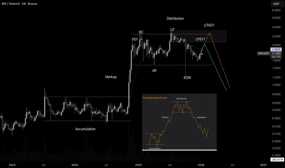
The XRP chart is like from a textbook! Wyckoff tutorialWelcome! When finance professionals are watching, you can expect solid analytics and real education.
Today we’re going to break down Wyckoff market cycles using the XRP chart in real time.
Wyckoff cycles are not just theory - they are an established concept that works in all markets. This is a model of price behavior based on the actions of large players ("smart money"). It shows how professionals accumulate positions, drive the market, and distribute assets, creating repeating phases of growth and decline.
Any market moves cyclically. Wyckoff identified two major cycles:
Bull market cycle (Accumulation → Markup → Distribution → Markdown)
Bear market cycle (the mirror reflection of the first)
Each cycle consists of four phases:
-Accumulation
-Markup (Growth)
-Distributio
-Markdown (Decline)
Phase 1. Accumulation
This is the phase when "smart money" buys the asset in large volumes while trying not to push the price too high. Conditions are created where regular market participants do not want to buy the asset, and may even sell it near market lows. Usually during this period there is bad news, lack of confidence, etc. Large players quietly buy up all this negativity.
Phase 2. Markup (Growth)
An impulsive upward movement begins - a trend that everyone notices when it is already too late. The crowd starts to wake up and enters the market at high prices.
Phase 3. Distribution
The price again enters a trading range, but now major participants sell their positions to retail traders who come in euphoric after the rise. Usually, the news is excellent here, everyone expects further growth, there is general euphoria, people load into the asset to the maximum while large players quietly unload their positions.
Phase 4. Markdown (Decline)
Professionals have sold everything they wanted, and now the market goes down almost without resistance. Retail - back to the factory.
CVD and Open Interest DivergenceOpen Interest answers a simple but critical question: are traders committing new risk, or are they exiting existing positions? When price rises while Open Interest increases, new contracts are being added in the direction of the move. This confirms expansion and signals that the market is willing to fund higher prices. When price rises while Open Interest falls, positions are being closed into strength. That behavior reflects distribution rather than continuation. The same logic applies on the downside. Falling price with rising Open Interest signals aggressive short participation. Falling price with declining Open Interest signals profit-taking, not fresh selling pressure.
Cumulative Volume Delta adds context to this positioning data. It measures whether aggressive market orders are driving price or being absorbed by passive liquidity. When price prints higher highs but CVD fails to confirm, buying pressure is weakening despite higher prices. Participants are lifting offers with less urgency, and absorption is occurring. When price stalls or compresses while CVD continues to rise, it suggests that aggressive buyers are being absorbed by larger passive sellers. The move looks strong on price, but commitment is thinning.
These divergences become most meaningful when they appear at structurally relevant locations. Inside ranges, they frequently expose failed breakouts where price briefly escapes but participation does not follow. At highs and lows, they reveal exhaustion, where liquidity has been collected but no new initiative remains. During established trends, they help differentiate healthy continuation from late-stage rotation, where the trend persists visually but weakens internally.
The highest-quality environments occur when structure and participation align. A clean break of structure followed by expanding Open Interest and confirming CVD indicates that the market has accepted the new direction. Risk is being added, not removed, and aggressive flow supports price discovery. When one of these components is missing, vulnerability increases. Breaks without Open Interest expansion often fade. Moves with Open Interest but no CVD confirmation frequently stall or retrace.
Many traders struggle because they trade direction without measuring commitment. They react to candles instead of assessing whether the move is being funded. CVD and Open Interest shift the focus from where price moved to why it moved. This perspective reduces overtrading, filters false momentum, and clarifies when patience is required.
Used correctly, these tools are not predictive indicators. They do not call tops or bottoms. They expose when a market narrative is weakening before structure fully changes. That awareness improves timing, limits unnecessary exposure, and prevents chasing moves already sustained by trapped or exiting participants. In leveraged markets, understanding participation is not an edge. It is a requirement for survival.

How RSI Actually Works in Trending vs Ranging MarketsRSI behaves very differently depending on how the market is structured. Traders who treat it the same way in every condition usually end up confused, taking trades that look justified on the indicator but make little sense on price.
In a trending market, price moves with intent. Higher highs and higher lows in an uptrend, or the opposite in a downtrend, create sustained directional pressure. In these conditions, RSI tends to stabilize within a higher or lower zone rather than oscillating between traditional extremes. Pullbacks in RSI often reflect pauses in momentum while the trend resets, not signals that the move is ending. Many traders mistake these pauses for reversals and repeatedly trade against the trend.
This is why strong trends often feel “overbought” or “oversold” for long periods. Momentum stays elevated because participation remains consistent. RSI mirrors that persistence. When price structure remains intact, fading RSI extremes usually means fighting the dominant flow.
Ranging markets operate under a different logic. Price rotates between established highs and lows, liquidity is built on both sides, and directional commitment is limited. Momentum naturally expands near the edges of the range and contracts near the middle. In this environment, RSI tends to swing more symmetrically, and extreme readings often align with temporary exhaustion rather than continuation.
Problems arise when traders fail to identify which environment they are in. Applying range-based RSI logic during trends leads to early exits and repeated stop-outs. Applying trend-based logic during ranges leads to overholding and missed rotations. The indicator is not changing. The market is.
RSI becomes meaningful once structure is defined. Start by identifying whether price is expanding or rotating. Then observe how RSI behaves within that context. Over time, patterns emerge that are far more reliable than fixed levels or generic rules. Understanding this relationship turns RSI from a source of noise into a tool for alignment and patience.

The trend is your friendHello everyone. I’m a financier and this is educational post that might help you get closer to consistent profitability (if you actually get the point).
Today I want to talk about trend trading. Yes - that very “best friend of a trader” that every book and every course keeps repeating. And after years in the market I can say: it’s not just a cliché - it really works.
I’ve been through plenty of strategies: classic TA, Elliott Waves, Smart Money Concepts, Williams’ trading chaos - you name it. I’ve traded with the trend, against it, and inside ranges.
Honestly, the results were average. My monthly win rate was about 30–40%. Not terrible, but I wanted fewer mistakes and more stability.
Eventually I set one hard rule for myself:
👉 I only trade in the direction of the trend.
And statistically, that mostly means trading the uptrend.
Here’s the logic. Any asset can drop around 99.99% - the downside is capped. But to the upside there is no limit. An asset can grow 2x, 5x, 10x and more. So statistically, longs are more favorable. I still take shorts when the market structure is bearish, but lately most assets are trending up.
So what’s the real advantage of trading with the trend?
The market has its own momentum. It’s simply easier to move with that flow than to fight it. I stopped trying to outsmart the market or predict every reversal. I don’t obsess over overbought/oversold signals. I just wait for my setup - the same repeatable scenario - and I trade it in the direction of the trend.
I’m a boring trader - and that’s exactly why I’m a profitable trader.
On social platforms my job is to share analysis and possible scenarios. But trading itself is different: the goal is not to predict, the goal is to execute. If the setup plays out - great. If not -no problem, I wait for the next one. I’m no longer a hostage to my own forecasts, which only kill objectivity.
Trend filters out a huge number of bad trades. It instantly removes about half of all random entries. After I really internalized that, my win rate improved, my psychology inside trades got much cleaner, less FOMO, less second-guessing. I stopped guessing - and started systematically executing.
So my takeaway for today:
👉 Trend really is your friend.
Try focusing only on trend trading and then tell me in the comments how it changed your results and mindset.

The one thing that destroys tradersEmotional inflation is a measurable drag on trading performance, particularly in crypto where momentum cycles are short, liquidity is thin, and feedback loops are fast. After a trader strings together strong wins, confidence often expands faster than process. The trader begins to treat recent outcomes as a new baseline for risk. This leads to size increases, earlier entries, or skipping structural confirmation because the mind assumes the market will continue to cooperate. It feels logical in the moment, but it is not rooted in market behavior. The market eventually tests this inflated confidence through liquidity sweeps, compressed volatility, or reclaiming defensive structure. The result is capital giveback, distorted expectations, and emotional volatility that exceeds price volatility.
The cost of emotional inflation is not that it creates bad trades. The cost is that it removes the conditions that made your best trades possible. When confidence accelerates exposure before the market proves continuation through structure and liquidity, you are no longer trading opportunity. You are trading assumption. Crypto punishes assumption faster than most markets because liquidity leaves quickly, bid depth changes abruptly, and breakout traders provide easy fuel for counter moves.
Inflation becomes visible in three repeatable behaviors: increasing size during expansion phases instead of compression phases, entering at the first touch of a level instead of after a structural transition, and treating recent wins as proof of future market cooperation. These behaviors are not personality flaws. They are pattern loops that can be corrected with objective rules and sequencing.
To counter emotional inflation, you need guardrails that do not depend on feelings. The first guardrail is a fixed sizing model tied to volatility conditions, not P&L conditions. Size should increase only when volatility tightens, liquidity aligns cleanly, and structure confirms control. In expansion phases, size must stay anchored to predefined limits because invalidation distance widens when liquidity thins. This keeps risk mathematically stable while confidence psychologically fluctuates.
The second guardrail is daily narrative rebuilding. Bias is constructed from the higher timeframe story, not the previous trade’s outcome. If the weekly and daily structure have not changed, your job is to wait for liquidity incentives and micro-structural permission before expanding exposure. A trader who rebuilds bias every session stays psychologically neutral when the market is structurally neutral.
The third guardrail is retest discipline. A retest is not a candle. It is acceptance. The retest validates participation, reduces invalidation distance, and reveals whether the market internalized the structural break or sweep. Entering before the retest is entering during the liquidity hunt. Entering after the retest is entering after participation is proven. This is where professionals position, not because they are late, but because they are validated. Retests compress emotional cycles because they remove the need to hope a level will hold.
The fourth guardrail is execution quality scoring.
Track trades by sequence: liquidity taken first, structure broken second, displacement confirmed third, retest respected fourth. Grade your execution on fill precision, conditional sizing, and narrative alignment. This shifts confidence from results to behavior, which compounds careers instead of compressing them.
A journal becomes a solution only when it measures variables that lead to intervention, not reflection. Measure session volatility, invalidation distance, average R:R delivered, liquidity incentives present, and whether the entry occurred inside premium or discount relative to equilibrium. This reveals inflation risks before they hit your equity curve.
Emotional inflation loses its power when you treat streaks as feedback, not permission. The best funded crypto traders do not compound because they avoid risk. They compound because they only expand risk when the market contracts volatility, aligns liquidity, and confirms structure. Confidence should drive preparation, not replace it.
Calibration compounds. Inflation decays. Careers are built by traders who stay calibrated longer than they stay confident temporarily.

Trading Liquidity – Quick Guide in 5 StepsWelcome back everyone to another guide, today we will speed run "Trading Liquidity" in a quick 5 step guide. Be sure to like, follow and join the community!
1) Identify Liquidity:
- Equal highs or cluster of highs (Buy-side Liquidity)
- Equal lows or cluster of lows (Sell-side Liquidity)
- Obvious highs & lows
2) Identify Liquidity Direction (Price moves towards liquidity first):
- Equal highs > Price is likely to sweep above
- Equal lows > Price is likely to sweep below
3) Wait for Liquidity Sweeps
- Price takes out lows
- Stops get triggered
- Look for rejection or close back inside
Do NOT enter before the sweep or before the confirmation.
4) Enter Trade:
Enter after confirmation, away from liquidity
- Stop loss: Longs > Below Swept Lows
- Stop loss: Shorts > Above Swept Highs
5) Take Profits:
- Take Profit: Nearest opposing liquidity
- Take Profit: Previous high/low
- Take Profit: Range boundaries
RESULTS:
Liquidity sweep > confirmation > clean move
Thank you all so much for reading! Hopefully this is a useful guide in the future or present! If you would like me to make any simplified guides, articles or tutorials, let me know in the comment section down below - or even contact me through trading view.
Thank you!
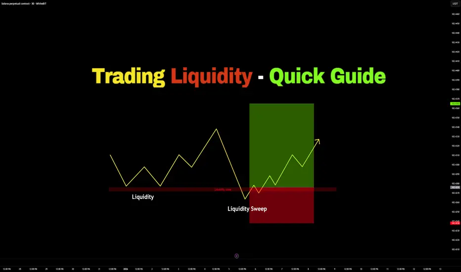
The Most Common Entry Mistake Traders Never NoticeMost traders do not lose because their strategy is flawed. They lose because they enter trades before the market has actually shown its intent. This mistake is subtle, easy to justify in the moment, and repeated so often that it becomes invisible. Over time, it slowly erodes consistency and confidence.
The problem usually starts with anticipation. Price approaches a key level, a wick forms, or a candle closes in the expected direction. The setup looks familiar, so the trader assumes the market is ready to move. But at that stage, nothing has been decided. The market is still neutral. What feels like early positioning is often just guessing inside uncertainty.
Markets do not move to reward speed. They move to collect liquidity. Before any meaningful expansion, price typically sweeps highs or lows, triggers stops, and tests obvious areas of interest. Traders who enter too early place themselves directly in this process. When price reverses and stops them out, it feels like bad timing, but structurally the market was doing exactly what it needed to do.
A key misunderstanding is believing that a level being touched equals intent. It does not. A reaction alone is not direction. Real intent only appears after the market responds with structure. This means a clear break in micro structure, decisive movement away from the level, and follow through that shows one side has taken control.
Another common trap is confusing speed with strength. Fast candles into a level can feel convincing, but aggressive moves without confirmation often lead to exhaustion rather than continuation. Strength is not defined by how quickly price reaches a level, but by what it does after that level is tested.
Confirmed entries are patient. Liquidity is taken first. Structure shifts second. Momentum expands third. Often, price returns to retest the area and prove acceptance. This sequence lowers risk and removes emotional pressure from execution.
Early entries are built on hope. Confirmed entries are built on evidence. Waiting does not make you late. It keeps you out of trades that were never ready to work.

The Boredom Stage of Trading - Why Most Traders Quit HereGood morning, all, thank you all for coming today.
Today we will be looking into the “ Boredom ” Phase of trading, and why most new traders quit because of it. Lets begin.
What Is the Boredom stage during Trading?
Boredom in trading is the stage where the excitement goes away, but the results have not arrived yet.
You are no longer a beginner filled with hype, joy and excitement.
You are aware of, and understand the basics, you have a strategy, and you know what you should be doing.
Yet progress feels slow , repetitive , and unrewarding .
There are less trades, fewer emotional highs, and long stages of patiently waiting.
This is where trading begins to feel boring , and for many traders, boredom feels like failure, it feels like they are failing since they are not “ doing anything. ”
This phase is not a sign you are doing something wrong it is a sign you are doing something right .
How the Boredom stage Affects Traders
Boredom secretly ruins traders because it does not feel dangerous.
During this period, traders will often:
• Start forcing trades just to feel active or “ alive ” like they are doing something.
• Break rules out of impatience ( breaking their own system )
• Abandon strategies that are working ( same as above )
• Chase excitement instead of probability ( they seek the 100x return )
• Confuse “ no trades ” with “ no progress ” ( If you follow your system and wait, you are making progress )
The market rewards patience, but boredom pushes traders toward action.
This creates losses, frustration, and eventually self-doubt. ( Which no one wants )
Many traders do not fail because they lack knowledge or skill. They fail because they cannot tolerate stillness. ( They psychology weakens when they face boredom. )
Why the stage Phase Occurs
The boredom phase takes place when trading becomes process-driven instead of emotion-driven. ( It becomes mechanical )
Early trading is exciting because:
• Everything feels new
• Wins feel euphoric
• Losses feel catastrophic
• The market feels fast and you feel uncertain
• You are eager to learn more
As you improve, your trading becomes:
• More selective and tight
• More rule-based and systematic like
• Slower and quieter ( calm )
• Less emotionally stimulating
This shift removes chaos, but it also removes excitement.
The market hasn’t changed.
You have.
And most people mistake this emotional flatline as a sign that something is missing.
( This is where “ The market rewards patience ” comes in. The market rewards those who wait. )
How to Overcome the Boredom stage
The key to overcoming boredom is understanding that trading is not meant to entertain you. ( It is just like a 9-5, you must follow rules, a system. Just in your own routine. )
Practical ways to handle this phase:
• Reduce screen time once your plan is complete. ( Do not over trade )
• Focus on execution quality, not trade quantity. ( Quality over quantity )
• Track rule-following instead of PnL. ( Did you follow your system? )
• Journal boredom-triggered decisions. ( Losses from impatience? )
• Accept that waiting is part of the job. ( Strengthen your mind by waiting. )
Professionals do not trade more and when they are bored, they trade less.
The goal is not to feel engaged and hyped up.
The goal is to remain consistent and disciplined.
Why the Boredom stage Is a Filter, not a Problem
The boredom stage exists to separate traders who want excitement from traders who want results. ( Splits Gamblers from Real Traders )
Most people quit and give up here because:
• There is no longer any dopamine .
• Progress feels slow, painful or invisible.
• Social media makes others look “ active ” when it is actually not.
• Patience feels unproductive since the mind is sitting “ idle .”
But this stage is where real traders are built.
If you can:
• Follow rules without excitement. ( Follow your system )
• Sit through days with no trades. ( Accept the process of waiting )
• Trust your edge without constant validation. ( Ensure to backtest to prove this. )
• Stay disciplined when nothing happens. ( Do not give in to FOMO. )
You have already passed a major psychological barrier.
The boredom phase is not a dead end it is a gateway that sits at the end of a long run.
Those who quit here were never meant to last.
Those who stay quietly move closer to consistency and mental freedom.
Final Thoughts
Every profitable trader has survived the boredom phase.
Most failed traders quit during it because of weak psychology.
If trading feels boring, repetitive, and uneventful, that is good.
That means emotions are leaving and structure is taking its place.
The market does not reward excitement.
It rewards endurance, patience, discipline, consistency and proper risk management.

Why Most Backtests Fail in Live MarketsBacktests often look convincing because they operate in a world that does not exist in live trading. Historical data is clean, fills are perfect, and execution is assumed to be instant. In reality, markets are driven by liquidity, friction, and uncertainty, none of which show up properly in hindsight testing.
The first failure point is liquidity. Backtests assume you can enter and exit at any price shown on the chart. Live markets do not work that way. At key levels, price accelerates, spreads widen, and partial fills occur. What looks like a precise entry in a backtest often becomes slippage or a missed fill in real time, especially during news, session opens, or liquidity sweeps.
The second issue is spread and fees. Many strategies survive on thin margins. A few ticks of spread expansion or commissions per trade are enough to flip a positive expectancy into a losing one. Backtests that ignore realistic costs create false confidence and encourage overtrading systems that cannot survive friction.
Execution timing is the third blind spot. In hindsight, confirmation is obvious. Live, confirmation unfolds candle by candle. Strategies that rely on exact closes, perfect retests, or instant reactions break down when hesitation, latency, or human execution enters the process.
To stress-test ideas realistically, remove precision. Add slippage assumptions, widen stops slightly, delay entries by one candle, and test during different market regimes. If a strategy only works under ideal conditions, it is not robust. Robust strategies survive imperfection.
Backtests are not useless, but they are incomplete. They should test logic, not profitability. Live viability comes from understanding how liquidity, cost, and execution pressure reshape every idea once real money is involved.

Mastering MACDTurning a Popular Indicator Into a Structured Decision Tool
Many traders use MACD as a simple signal generator. They see a crossover, enter a trade, and later realise the result does not match the expectation. MACD becomes useful only when it is applied inside a clear framework built on trend, momentum, and timing. Its real value lies in reading shifts in participation rather than delivering standalone entry signals.
Understanding what the indicator represents is the first step. MACD measures the relationship between two moving averages and reveals how fast price is accelerating or slowing down. The histogram shows the rate of change. When used with intent, MACD helps you read the strength behind a move instead of trying to predict direction. Momentum confirms structure and brings clarity to the decision process.
Define the market environment before looking at MACD. Trending markets and ranging markets produce different behaviours. In a trend, a rising histogram often supports continuation and helps you judge whether a pullback is healthy or the start of a deeper rotation. In a range, the histogram moves around the zero line and highlights areas where momentum is fading. Without this context, MACD signals tend to mislead more than they help.
The next step is aligning MACD with the locations your system already relies on. Use it as part of the confluence, not as a trigger. When price reaches a higher-timeframe level, a liquidity area, or a clear structural pivot, the histogram can show whether momentum is shifting in your favour. You are not asking MACD to discover the trade. You are using it to confirm the logic you have prepared.
With structure and location in place, create specific decision rules for MACD behaviour. Examples include shrinking momentum when price approaches a level, expansion that supports a breakout, crossovers that match the higher-timeframe direction, or divergences that signal exhaustion at important zones. Every rule needs to serve a practical purpose. Reacting to every crossover removes discipline and weakens the system. Well-defined conditions make MACD a reliable filter.
Risk management remains outside the indicator. MACD does not define stops, invalidation, or how much to risk. Those rules come from structure. Stops should respect swing highs or lows, well-defined invalidation areas, or volatility-based distances. Combining this approach with MACD’s momentum read protects you from chasing trades that lack strength and reduces over-engagement during slow conditions.
Validation closes the loop. Backtest the exact behaviours you rely on, not the indicator as a whole. Study how histogram shifts behave at your chosen levels. Compare momentum against structure. Track how timing improves when MACD is used to refine execution instead of generate entries. When the data confirms the rules across different market conditions, the system gains stability.
MACD becomes a valuable asset when integrated into a disciplined process. On its own, it produces too much noise. Inside a structured system, it sharpens momentum reading, filters out weak trades, and builds cleaner execution. Traders who use MACD to support their framework instead of driving it achieve far greater consistency over time.

Why Every Trend Begins and Ends With LiquidityEvery trend in crypto begins and ends with liquidity. Before a trend can move with force, the market must collect the stop orders that provide the fuel for expansion. These orders sit above equal highs, below equal lows, inside inefficiencies, and around obvious retail breakout levels. Price does not trend because sentiment magically aligns.
It trends because the market clears liquidity at one side of the structure and then expands toward the next pool. The earliest phase of any trend usually starts with a sweep: price reaches beyond a key high or low, triggers stops, absorbs the resting orders, and immediately snaps back. This wick is the first sign that the breakout attempt failed and that larger participants have used the liquidity to take positions.
Once liquidity is taken, the market shifts into structural progression. Higher highs and higher lows form not because traders collectively decide to buy, but because the market now has trapped sellers below the sweep, providing momentum as price moves toward the next logical liquidity target.
Structure becomes the visible footprint of this process. Impulse legs show aggression after liquidity collection, and pullbacks tend to remain orderly because the directional objective has not yet been completed.
Every trend is essentially a journey from one liquidity pool to the next, with structure simply describing how that journey unfolds.
The end of a trend is equally tied to liquidity. A trend rarely dies from weakening momentum alone. Instead, it typically completes when price reaches a major pool of opposing liquidity, often equal highs in an uptrend or equal lows in a downtrend.
The final move into that level is usually fast and dramatic, designed to trigger breakout traders while simultaneously running the stops of those holding late in the trend. Once the liquidity is collected, the market loses incentive to continue and snaps back inside the level, exposing the sweep as a terminal event rather than a continuation. This reversal wick marks the end of one trend and the beginning of the liquidity cycle in the opposite direction.
From there, the process repeats. Liquidity is taken. Structure shifts. Displacement confirms intention. A retest provides the entry. And the new trend begins by targeting the next liquidity pool in line.
When traders understand this cycle, trends become far easier to read. Direction is no longer based on hope, indicators, or isolated candles. It is built on recognising how liquidity motivates movement and how structure validates that movement.
Liquidity shows where the market wants to travel, structure shows how it gets there, and together they form a practical framework for identifying when trends are forming, when they are maturing, and when they are preparing to reverse.

Market Phases Explained: Accumulation, Expansion, Distribution🔵 Market Phases Explained: Accumulation, Expansion, Distribution, Reset
Difficulty: 🐳🐳🐳🐳🐋 (Advanced)
Markets do not move randomly. They rotate through repeatable phases driven by liquidity, psychology, and participation. Understanding market phases helps traders stop forcing strategies and start trading in alignment with the current environment.
🔵 WHY MARKET PHASES MATTER
Most traders struggle not because their strategy is bad, but because they apply it in the wrong market phase.
Breakout strategies fail in accumulation
Mean-reversion fails during expansion
Trend-following fails in distribution
Reversal trading fails before reset is complete
Market phases explain when a strategy works, not just how .
Price action, indicators, and volume behave differently in each phase.
🔵 THE FOUR MARKET PHASES
Markets move in a repeating cycle:
Accumulation
Expansion
Distribution
Reset
Each phase has unique characteristics, risks, and opportunities.
🔵 1. ACCUMULATION (QUIET POSITIONING)
Accumulation occurs after a decline or prolonged sideways movement.
This is where smart money builds positions quietly.
Key characteristics:
Price moves sideways in a range
Volatility is low
Breakouts frequently fail
Volume is stable or slightly rising
What is really happening:
Large players accumulate positions without moving price too much. Liquidity is absorbed.
Indicator behavior:
RSI oscillates between 40 and 60
MACD hovers near the zero line
Volume spikes are quickly absorbed
Best strategies:
Range trading
Mean reversion
Patience and preparation
🔵 2. EXPANSION (TREND DEVELOPMENT)
Expansion begins when price breaks out of accumulation with conviction.
This is where trends are born.
Key characteristics:
Strong directional movement
Increasing volatility
Pullbacks are shallow
Breakouts follow through
What is really happening:
Accumulated positions are now leveraged. Momentum attracts participation.
Indicator behavior:
RSI holds trend zones (40–80 or 20–60)
MACD expands away from zero
Volume increases during impulse moves
Best strategies:
Trend-following
Pullback entries
Breakout continuation
🔵 3. DISTRIBUTION (QUIET EXITING)
Distribution occurs after an extended trend.
Price may still rise, but momentum starts to weaken.
Key characteristics:
Higher highs with weaker follow-through
Increased wicks and failed breakouts
Volatility becomes unstable
Late buyers get trapped
What is really happening:
Smart money distributes positions to late participants while maintaining the illusion of strength.
Indicator behavior:
RSI diverges or fails to make new highs
MACD histogram shows lower highs above zero
Volume spikes near highs
Best strategies:
Profit protection
Reduced position size
Waiting for confirmation of weakness
🔵 4. RESET (LIQUIDITY CLEARING)
Reset is when the previous trend fully unwinds.
This phase clears excess leverage and weak hands.
Key characteristics:
Sharp moves against prior trend
Stop-loss cascades
Emotional price action
High volatility without clear direction
What is really happening:
Leverage is flushed. Weak positions are forced out.
Indicator behavior:
RSI reaches extreme levels
MACD crosses zero decisively
Volume spikes dramatically
Best strategies:
Capital preservation
Waiting for stabilization
Avoiding prediction
🔵 HOW TO IDENTIFY THE CURRENT PHASE
Ask these questions:
Is price trending or ranging?
Are breakouts succeeding or failing?
Is momentum expanding or contracting?
Are indicators confirming or diverging?
No indicator works in all phases. Phase identification is the real edge.
🔵 COMMON MISTAKES
Forcing trend strategies during accumulation
Chasing breakouts during distribution
Trading reversals before reset completes
Ignoring momentum deterioration
Most losses come from being right about direction but wrong about phase.
🔵 CONCLUSION
Markets move in cycles because human behavior and liquidity move in cycles.
Accumulation builds positions
Expansion rewards patience
Distribution traps late entries
Reset clears the board
When you learn to identify market phases, you stop fighting the market and start working with it.
Which market phase do you find hardest to trade? Accumulation, expansion, distribution, or reset? Share your thoughts below.

HOW TO WATCHLIST ADVANCED VIEW IN TRADINGVIEWHOW TO OPEN ADVANCED VIEW IN TRADINGVIEW
**AND WHAT FEATURES IT PROVIDES**
✅ HOW TO OPEN ADVANCED VIEW IN TRADINGVIEW
Follow these steps:
1️⃣ Open the Watchlist Panel
➣ On the right side of the Trading-View interface, find the Watchlist panel.
➣ If it is hidden, click the small arrow on the right edge to reveal it.
2️⃣ Find the Layout Icons at the Bottom
➣ At the bottom of the watchlist, you will see multiple icons such as:
➣ List View
➣ Table View
➣ Advanced View (usually an expanded grid-style icon)
3️⃣ Click on “Advanced View”
➣ Click the Advanced View icon.
➣ Your watchlist will switch from the simple list to a more detailed, data-rich layout.
➣ That’s it — Advanced View is now active.
✅ FEATURES OF ADVANCED VIEW IN TRADINGVIEW
The Advanced View provides more detailed market information without needing to open charts.
Here are the key features:
1️⃣ Multiple Data Columns
➣ You can view several data points directly in the watchlist, such as:
➣ Last Price
➣ Price Change
➣ Change %
➣ Volume
➣ High / Low
➣ Bid / Ask
➣ Time / Session Data
➣ Fundamentals (if applicable)
This gives a snapshot of key market info in one place.
2️⃣ Add / Remove Columns
You can customize your watchlist:
➣ Click Add Column (+) to insert new data fields
➣ Click the three-dot menu (⋮) → Remove to delete any column
3️⃣ Reorder Columns
➣ Drag and drop column headers
➣ Arrange symbols in the order that works best for you
4️⃣ Sorting by Any Data
Click any column header to sort:
➣ One click → ascending
➣ Second click → descending
Useful for sorting:
➣ Highest volume
➣ Biggest % movers
➣ Highest price
➣ Top gainers / losers
5️⃣ Expandable Rows
(Some advanced layouts allow expanded detail per symbol.)
This helps you see:
➣ Additional stats
➣ Extended session data
➣ More fundamentals
6️⃣ Cleaner Multi-Symbol Comparison
Advanced View is ideal when watching:
➣ Indices
➣ Futures
➣ Forex pairs
➣ Commodities
➣ Multiple stocks at once
It becomes easier to compare signals and market movements.
7️⃣ Switch Back Anytime
To return to normal view:
➣ Click the List View icon at the bottom
➣ Watchlist returns to default layout
🎯 Summary
➣ Advanced View gives you a more powerful, professional watchlist layout
➣ Perfect for comparing multiple symbols quickly
➣ Provides more data in a structured table-style format
➣ Fully customizable with columns, sorting & layout tools

HOW TO WATCHLIST TABLE-VIEW VOLUME & EXTENDED HOURSComplete Process: HOW TO WATCHLIST TABLE-VIEW VOLUME & EXTENDED HOURS
1️⃣ Open the Watchlist Panel
➺ The Watchlist panel is located on the right side of the Trading-View interface.
➺ If it is hidden, click the small arrow on the right edge to open it.
2️⃣ Locate the Table-View Tool
➺ At the top of the watchlist panel, you will see three dot icon.
➺ This icon opens the table-view tool inside the watchlist.
3️⃣ Open the Table-View
Step-by-step:
➺ Click the table icon at the bottom of the watchlist.
➺ The watchlist will switch from the normal list-view to the table-view layout.
4️⃣ Understanding the Table-View Layout
The table-view displays additional columns and organized data in a tabular format.
Typical columns include:
⤷ Symbol
⤷ Last Price
⤷ Change (%)
⤷ Volume
⤷ High / Low
⤷ Session Data
⤷ Custom fields (depending on settings)
The table-view allows users to compare multiple symbols more clearly.
5️⃣ How to Add Columns in Table-View
Step-by-step:
➺ Hover on the column header area.
➺ Click the plus (+) icon or “Add Column” option.
➺ Choose the data you want to add:
⤷ Price
⤷ Change
⤷ Bid / Ask
⤷ Volume
⤷ Open Interest
⤷ Fundamentals (if supported)
⤷ Other available fields
The selected column will appear immediately.
6️⃣ How to Remove Columns
Step-by-step:
➺ Hover over the column header you want to remove.
➺ Click the three-dot menu (⋮) on that column.
➺ Select “Remove Column”.
➺ The column will be removed from the table.
7️⃣ How to Reorder Columns
Step-by-step:
➺ Click and hold the column header.
➺ Drag it left or right.
➺ Release to place it in the new position.
This helps personalize the table layout.
8️⃣ Sorting Symbols in Table-View
Step-by-step:
➺ Click any column name (for example: Price, Change %, Volume).
➺ Clicking once sorts the column ascending.
➺ Clicking again sorts descending.
➺ A small arrow appears showing the sort direction.
9️⃣ Switch Back to Normal Watchlist View
Step-by-step:
➺ Click the same table icon at the bottom again.
➺ The watchlist returns to the default list-view.
🎯 Short Summary (Optional for Captions)
⤷ Open Table-View → Bottom table icon
⤷ Add Columns → Add Column option
⤷ Remove Columns → Three-dot menu → Remove
⤷ Reorder → Drag column headers
⤷ Sort → Click column name
⤷ Return to List → Click table icon again

The Bell Curve: Understanding Normal Distribution in TradingMost traders have seen the “bell curve” at some point, but very few actually use it when they think about risk and returns.
If you really understand the normal distribution, you’re already thinking more like a risk manager than a gambler.
1. What is the normal distribution?
The normal distribution is a probability distribution that describes how values tend to cluster around an average.
If you plotted a huge number of outcomes (for example, daily returns or P&L per trade), the shape you’d get would often look like a symmetric bell :
- Most observations are close to the center.
- As you move away from the center in either direction, outcomes become less frequent.
- Extreme gains and losses are possible, but they’re relatively rare.
Mathematically, a normal distribution is usually written as N(μ, σ):
μ (mu) is the mean – the average outcome.
σ (sigma) is the standard deviation – a measure of how widely the outcomes are spread around that mean.
In trading terms:
If your returns roughly follow a normal distribution, you should expect many small wins and losses clustered near zero, and only occasional large moves in either direction.
2. Mean (μ): the “drift” of your system
The mean is the point at the center of the distribution. On a chart of returns, this is where the bell is highest.
If μ > 0, the bell is shifted slightly to the right → your system is profitable on average.
If μ < 0, it’s shifted to the left → your system slowly loses money over time.
For a trading strategy, μ is basically your edge. It doesn’t need to be huge. Even a small positive mean return, if it’s consistent and combined with disciplined risk management, can compound strongly over the long run.
3. Standard deviation (σ): volatility in one number
The standard deviation controls how wide or narrow the bell curve is.
- A small σ gives a tall, narrow bell → outcomes are tightly clustered around the mean.
- A large σ gives a short, wide bell → outcomes are more spread out, with bigger swings away from the mean.
Think of σ as a statistical way to describe volatility:
- For an asset: how much its price typically moves relative to its average change.
- For your strategy: how much your returns or daily P&L fluctuate.
Two systems can have the same mean return but very different σ:
- System A: μ = 0.2%, σ = 0.5% → relatively smooth ride.
- System B: μ = 0.2%, σ = 2% → same edge, but a wild equity curve and deeper drawdowns.
Same average, totally different emotional and risk profile.
4. The 68–95–99.7 rule
One of the most useful features of the normal distribution is how predictable it is. Roughly:
- About 68.2% of observations lie within ±1σ of the mean.
- About 95.4% lie within ±2σ.
- About 99.7% lie within ±3σ.
So if daily returns of an asset were approximately normal with:
- Mean μ = 0.1%
- Standard deviation σ = 1%
Then under that model you’d expect:
- Roughly 68% of days between –0.9% and +1.1%
- Roughly 95% of days between –1.9% and +2.1%
- Only about 0.3% of days beyond ±3%
Anything far outside that ±3σ range is, in theory, a very rare event. In practice, that’s often the kind of day everyone remembers.
5. Why this matters for traders
Even with all its limitations, the normal distribution is a powerful framework for thinking about risk:
Position sizing
If you know (or estimate) the standard deviation of your returns, you can form an idea of what “normal” daily or weekly swings look like, and size positions so those swings are survivable.
Stop-loss logic
Stops that sit right in the middle of the usual noise (within about ±1σ) will get hit constantly.
Stops closer to the ±2σ–3σ region are more aligned with “something unusual is happening, I want to be out.”
Expectation management
Most days and most trades will fall inside the “boring” part of the bell curve.
Understanding that prevents you from overtrading while you wait for the edges of the distribution – the bigger opportunities.
6. The catch: markets are not perfectly normal
Real markets often break the textbook assumptions:
- Returns tend to have fat tails → extreme moves happen more often than a normal distribution would predict.
- Distributions are often skewed → one side (usually the downside) has more frequent or more severe extreme events.
That means:
- A move that looks like a “5σ event” under a normal model might actually be something that happens every few years.
- Risk models based strictly on normal assumptions usually underestimate crash risk.
- Strategies like option selling can look very safe when you only think in terms of a normal distribution, but they are very sensitive to those fat tails.
So the normal distribution should be treated as a baseline model, not as reality itself.
7. Quick recap
The normal distribution is the classic bell curve that describes how values cluster around an average.
It’s parameterized by μ (mean) and σ (standard deviation).
Roughly 68% / 95% / 99.7% of observations lie within 1σ / 2σ / 3σ of the mean in a perfectly normal world.
Markets only approximate this; they usually show fat tails and skew, so extreme events are more common than the simple model suggests.
Even with those limitations, it’s a very useful tool for thinking about returns, drawdowns, and the range of outcomes you should be prepared for.
Mastering Divergence in Technical AnalysisIn technical analysis, a divergence (also called a “momentum divergence” or “price/indicator disagreement”) is one of the most powerful early warning signals available to traders. In simple terms, divergence occurs when price and a momentum indicator (such as RSI, MACD, or Awesome Oscillator etc.) move in opposite directions.
This disagreement often signals that the current trend is losing strength and that a pause, pullback, or full reversal may be approaching.
1. What Is Divergence?
Normally, in a healthy trend:
In an uptrend, price makes higher highs and momentum indicators also make higher highs.
In a downtrend, price makes lower lows and momentum indicators also make lower lows.
A divergence appears when this alignment breaks.
Typical example with RSI or MACD:
Price makes a higher high,
But the indicator makes a lower high.
This tells us that, although price has pushed to a new extreme, the underlying momentum is weaker. Smart money may be taking profits, and the late participants are driving the final leg of the move.
2. Types of Divergence
There are two main families of divergence:
Regular (classic) divergence – often associated with potential trend reversals.
Hidden divergence – often associated with trend continuation after a correction.
Within each family, we have bullish and bearish versions.
2.1 Regular Bullish Divergence – Potential Trend Reversal Up
This suggests that sellers are still pushing price to new lows, but momentum is no longer confirming the strength of this selling pressure. The downtrend is weakening and a bullish reversal may develop.
Context where it’s most powerful:
After a prolonged downtrend.
At or near a higher-timeframe support level (daily/weekly support, major demand zone, trendline, or Fibonacci confluence).
2.2 Regular Bearish Divergence – Potential Trend Reversal Down
This signals that buyers are still able to push price higher, but each new high is supported by less momentum. The uptrend is aging, and a bearish reversal or deeper correction becomes more likely.
Context where it’s most powerful:
After a strong, extended uptrend.
Around major resistance levels, supply zones, or upper trendlines.
2.3 Hidden Bullish Divergence – Trend Continuation Up
Here, price structure still shows an uptrend (higher lows), but the indicator has overshot to the downside. This often appears during pullbacks within an uptrend, suggesting that the correction is driven more by short-term emotion than by real structural weakness.
Interpretation:
Hidden bullish divergence indicates trend continuation. Bulls remain in control, and the pullback may provide an opportunity to join the uptrend at a better price.
2.4 Hidden Bearish Divergence – Trend Continuation Down
Price structure still favors the bears (lower highs), but the indicator has spiked higher, often due to a sharp counter-trend rally. This suggests that the bounce is corrective rather than the start of a new uptrend.
Interpretation:
Hidden bearish divergence favors continuation of the downtrend and often appears before the next impulsive bearish leg.
3. Which Indicators to Use?
Divergence can be spotted on many oscillators, but the most commonly used are:
RSI (Relative Strength Index) – very popular for spotting overbought/oversold zones and divergences.
MACD (and its histogram) – useful for trend and momentum, especially on higher timeframes.
Stochastic Oscillator – often used in range-bound environments.
Awesome Oscillator, CCI, etc. – alternative momentum tools, depending on your preference.
The concept is the same: price and indicator should generally confirm each other. If not, you have a divergence.
4. Timeframes and Reliability
Divergences can be found on all timeframes, but their reliability increases with higher timeframes:
On M5–M15, divergences are frequent but often short-lived. Better for scalpers.
On H1–H4, signals have more weight and can lead to multi-session moves.
On Daily/Weekly, divergences can mark major tops and bottoms, but they may take longer to play out.
A good practice is to:
Identify major divergences on higher timeframes (H4, Daily).
Refine entries on lower timeframes (M15, M30, H1) using structure and price action.
5. How to Trade Divergences (Practical Framework)
Divergence by itself is not a complete trading system. It is a signal of potential imbalance, which should be combined with:
Key levels (support, resistance, supply/demand zones).
Trend structure (higher highs/lows or lower highs/lows).
Price action confirmations (reversal candles, break of structure, etc.).
Risk management (position sizing, stop loss, invalidation level).
6. Common Mistakes When Using Divergences
- Trading every divergence blindly.
Not every divergence leads to a big reversal. Many will result in only minor pullbacks.
- Ignoring the trend.
Regular divergences against a strong trend can fail multiple times before a real top or bottom forms. Hidden divergences are often more reliable in trending markets.
- Forcing divergences where they don’t exist.
Only connect clear, obvious swing highs and lows on both price and indicator. If you have to “stretch” the lines, the signal is probably weak.
- No risk management.
A divergence is just a probability edge, not a guarantee. Always define invalidation and manage position size accordingly.
7. Best Practices
Combine divergence with market structure (trendlines, channels, higher highs/lows).
Use higher-timeframe context and drop to lower timeframes for refined entries.
Pay attention to confluence:
Divergence + key level + candlestick signal is stronger than any single factor.
Keep a trading journal of divergence setups, including screenshots from your charts. Over time, you will see which conditions work best for your style.
Divergences are not magic, but they are one of the cleanest ways to see when price and momentum disagree. Used correctly, they can:
Help you avoid entering late in a trend,
Alert you to potential reversals before they are obvious to the crowd, and
Provide high-probability continuation entries via hidden divergences within strong trends.