Nasdaq : 24,000 Holds Strong — Next Stop 25,800?Price action on the Nasdaq 100 is telling a clear story: 24,000 (AVWAP + HVN confluence + Round number) is acting like a magnet for institutional buyers.
This suggests that accumulation is happening at these levels, positioning for a potential run toward 25,800 if momentum holds.
Are we front-running a breakout, or should we wait for confirmation above 25,000 first?
Volumeanalysis

USDCAD: Buyers Defend Support — Recovery Ahead?USDCAD is reacting firmly inside a high-value support pocket, where the channel baseline, prior demand, and heavy volume clustering align — a classic area where sentiment often shifts.
Despite the market already pricing in December Fed rate cuts, short-term price behavior on this pair remains resilient. The latest bounce suggests that buyers are stepping back in, keeping my near-term outlook tilted to the upside, with room for a rotation toward the 1.4080 zone if momentum continues to build. However, if price breaks below the current support zone, USDCAD could slide even further, opening the door to a deeper corrective leg.
The real question now is:
Are we witnessing the beginning of a genuine recovery leg, or just a temporary relief move before direction resets?
Based on :
- fundamental analysis
- volume and quantitative analysis

HOW TO WATCHLIST TABLE-VIEW VOLUME & EXTENDED HOURSComplete Process: HOW TO WATCHLIST TABLE-VIEW VOLUME & EXTENDED HOURS
1️⃣ Open the Watchlist Panel
➺ The Watchlist panel is located on the right side of the Trading-View interface.
➺ If it is hidden, click the small arrow on the right edge to open it.
2️⃣ Locate the Table-View Tool
➺ At the top of the watchlist panel, you will see three dot icon.
➺ This icon opens the table-view tool inside the watchlist.
3️⃣ Open the Table-View
Step-by-step:
➺ Click the table icon at the bottom of the watchlist.
➺ The watchlist will switch from the normal list-view to the table-view layout.
4️⃣ Understanding the Table-View Layout
The table-view displays additional columns and organized data in a tabular format.
Typical columns include:
⤷ Symbol
⤷ Last Price
⤷ Change (%)
⤷ Volume
⤷ High / Low
⤷ Session Data
⤷ Custom fields (depending on settings)
The table-view allows users to compare multiple symbols more clearly.
5️⃣ How to Add Columns in Table-View
Step-by-step:
➺ Hover on the column header area.
➺ Click the plus (+) icon or “Add Column” option.
➺ Choose the data you want to add:
⤷ Price
⤷ Change
⤷ Bid / Ask
⤷ Volume
⤷ Open Interest
⤷ Fundamentals (if supported)
⤷ Other available fields
The selected column will appear immediately.
6️⃣ How to Remove Columns
Step-by-step:
➺ Hover over the column header you want to remove.
➺ Click the three-dot menu (⋮) on that column.
➺ Select “Remove Column”.
➺ The column will be removed from the table.
7️⃣ How to Reorder Columns
Step-by-step:
➺ Click and hold the column header.
➺ Drag it left or right.
➺ Release to place it in the new position.
This helps personalize the table layout.
8️⃣ Sorting Symbols in Table-View
Step-by-step:
➺ Click any column name (for example: Price, Change %, Volume).
➺ Clicking once sorts the column ascending.
➺ Clicking again sorts descending.
➺ A small arrow appears showing the sort direction.
9️⃣ Switch Back to Normal Watchlist View
Step-by-step:
➺ Click the same table icon at the bottom again.
➺ The watchlist returns to the default list-view.
🎯 Short Summary (Optional for Captions)
⤷ Open Table-View → Bottom table icon
⤷ Add Columns → Add Column option
⤷ Remove Columns → Three-dot menu → Remove
⤷ Reorder → Drag column headers
⤷ Sort → Click column name
⤷ Return to List → Click table icon again

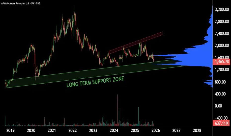
AAVAS: Hidden Gem Turning Into a MultibaggerThis is the weekly timeframe chart of AAVAS.
The stock is currently trending near its long-term support zone of ₹1400–₹1200.
The volume indicator also suggests significant accumulation around the ₹1350 range.
This zone acts as a major demand area, and the stock is likely to attempt a reversal from this region.
Thank you.
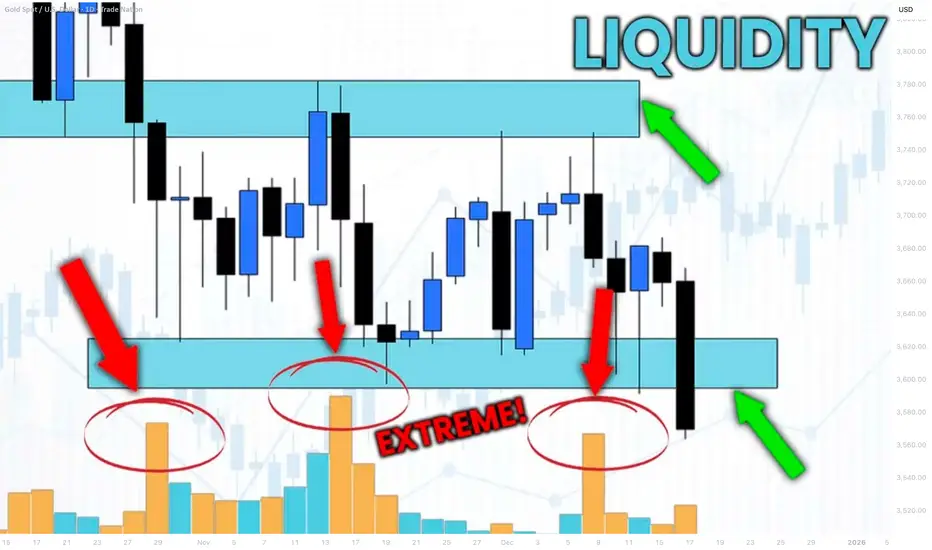
How to Identify Liquidity in Chart with VOLUME Indicator
Smart Money Concept is all about finding the liquidity .
Liquidity analysis is the essential element of profitable trading SMC.
In this article, I will teach you how to use volume indicator to identify liquidity - supply/demand clusters and hidden zones that move the market.
First, let's discuss what exactly we mean by liquidity.
Analysing any forex pair, you should know that orders of the market participants are not equally distributed among all the price levels.
While some levels and the zones will lack the interest of the market players, some will attract huge trading volumes.
We will call such zones - liquidity zones.
To find these zones, you can execute volume analysis.
By using volume indicator, we will look for volume spikes - it will indicate strong buying and selling activity.
Examine NZDUSD chart on a daily time frame with default volume indicator being added.
I highlighted a recent volume spike.
The elevated volume level confirms that there was strong institutional participation in the formation of this candle.
But you can see that this particular candle has quite a wide rage.
So how do we know where exactly and on what levels liquidity concentrates?
We will need to use another indicator to find liquidity zones - a volume profile.
Here is what this indicator does.
Think of the chart as a battlefield. The Volume Profile shows you exactly where the major fighting between buyers and sellers is taking place. It reveals the price levels where the most orders have been executed.
While a classic volume indicator shows when volume occurred, it lights up the specific price levels where the most trading activity is concentrated.
Analyzing Volume Profile on NZDUSD, we can easily find the exact zone where liquidity was concentrated.
We simply take the entire range of a high volume candle and look for a volume profile spike within.
To identify other liquidity zones, continue searching for volume spikes in Volume indicator.
By the way, adding a Simple Moving Average on your Volume indicator will help you find these spikes easier.
Here are 4 significant liquidity zones that I found using this method.
Please, note that there are 3 high volume candles that were formed within the same liquidity zone.
A combination of a classic Volume indicator and Volume Profile will help you to accurately identify the exact moments of volume increase and the price levels where this rise occurred.
That will be a reliable strategy to find important liquidity zones.
❤️Please, support my work with like, thank you!❤️
I am part of Trade Nation's Influencer program and receive a monthly fee for using their TradingView charts in my analysis.
Gold Looks Heavy,Downside Break Loading?📰 What’s happening:
Gold is losing strength because the market thinks rate cuts are not coming soon.
Strong USD = weak gold.
Simple.
📉 What the chart is showing:
Selling pressure is stacking up.
Market structure is leaning bearish.
We’re sitting right on a major support zone: $4,200
⚠️ Why this matters:
If this support cracks, gold could slide fast into the $4,100zone — that’s the next clean liquidity area.
📌 My view:
I’m watching for a break → retest → continuation to the downside.
Buyers look tired. Sellers look hungry.

3-Year Range Breakout in MotionXYZ is shaping up for a potential breakout after nearly three years of range-bound accumulation and it looks like it wants to push through relatively soon. Granted there is a key supply structure just above (marked), which should be respected, but given the duration of the base, a clean push through wouldn’t be surprising.
We’re watching for how price reacts in this zone:
A clean breakout could trigger a swift move toward higher levels.
A rejection would likely lead to a rebuild phase before another attempt.
Either way, the structure remains bullish.
Trade Scenario
Entry: Current price
Stop Loss: Below the LPS, with room for potential wicks
Take Profit:
TP1: Near the equilibrium of the supply zone (first reaction zone)
TP2: Near the all-time high
TP3: Trail stop below each new swing low to capture extended move

PRO Relief Rally? Price has been locked in a persistent downtrend for over a year, showing little relief. However, November’s candle tested a key demand zone and attracted a strong bid. This reaction suggests the downtrend may be nearing completion. While we don’t yet have full confirmation of a trend reversal, the risk‑to‑reward profile is compelling.
Trade Scenario
• Keep the approach straightforward: the initial target sits at the yearly S1 pivot.
• Should price break through that level with conviction, the next objective would be the 50% retracement zone. Projected from the start of the downtrend and November low.
Should the November low give way, expect a sharp push lower. If this move is followed by a monthly bullish hammer or doji candle close above the pivot, the setup remains valid with an even more favorable risk‑to‑reward dynamic.

HOW TO USE "Price Volume Correlation (PVC) IndicatorPVC Indicator – Sideways Market, Weak Bullish Volume & Liquidity Sweeps at Range High
📌 Market Context (BTCUSDT – 15m)
Bitcoin continues to trade in a well-defined sideways range, with price oscillating between the previous day’s High, Low, Close, and VWAP levels.
What stands out is that most short-term moves — especially bullish attempts — lack meaningful volume confirmation. On the PVC indicator, this shows up as gray candles, which indicate no correlation between price direction and volume participation.
This lack of price-volume alignment is typical of a range-bound market, where price fluctuates but institutional participation remains muted.
⸻
1️⃣ Multi-Day OHLC Levels Acting as Strong Support & Resistance
The Multi-Day OHLC module plotted on the chart is playing a major role in revealing why the market has been stuck in a range:
• Previous Day High (PDH) → Strong Resistance
Price repeatedly tapped and rejected from PDH, showing liquidity hunts and seller absorption, especially during the large top-side sweep.
• Previous Day Low (PDL) → Reliable Support
The market bounced multiple times from the PDL region, confirming buyers defending the lower boundary of this range — but without strong volume, which prevents any sustained rally.
• Previous Day Close & VWAP → Mid-Range Magnet
These acted as mean reversion points:
• Price frequently returned to Daily Close/VWAP
• PVC candles stayed gray
• No volume expansion occurred
This behavior confirms that the market is rotating inside a fair value zone, not trending.
Conclusion from OHLC Levels:
The repeated interaction with these levels — without breakout volume — indicates classic sideways behavior, where price respects previous day key levels and rotates between them without a directional follow-through.
⸻
2️⃣ Liquidity Sweep at the Top – Clear Stop-Hunt & Reversal
A clean bearish liquidity sweep formed at the top of the range:
• Price spiked above PDH
• Collected stop-losses
• Closed back inside the range
• PVC turned red with strong volume alignment
This confirms the sweep was real, and sellers stepped in exactly at a major resistance level.
⸻
3️⃣ Weak Bullish Volume → No Momentum Follow-Through
Across the last 24 hours:
• Very few green PVC candles (True Bull Moves)
• Majority of candles remain neutral/gray
• BUY signals trigger but lack follow-through because volume does not expand
This indicates no aggressive demand — price moves up occasionally, but without participation.
⸻
4️⃣ Bearish Moves Have Volume Support
Interestingly, PVC shows:
• Red candles where volume rises during declines
• SELL signals aligning with volume spikes
• Bearish sweeps occurring at key resistance
This means sellers are more active than buyers, even though the overall structure is sideways.
⸻
🎯 Summary
• Market: Sideways / Range-bound
• OHLC Behavior: Daily High–Low–Close acting as clean support & resistance
• Top Sweep: Strong rejection from PDH with volume confirmation
• Volume Trend: Weak on bullish moves, stronger on declines
• PVC Reading: Mostly gray → no real correlation → low conviction environment
• Bias: Neutral to slightly bearish until PVC prints green confirmation (Price Up + Volume Up)
PVC helps to clearly distinguish between fake rotations and true momentum, while the OHLC levels provide a structural map of where liquidity sits.
This analysis is for educational and informational purposes only. Not financial advice.
TCS: SMA 200 for long positionHello traders,
The stock we are going to watch is $NSE:TCS. This stock is related to IT sector. This stock is mostly moving in an upward direction. Currently, it is taking some additional support of SMA200 in 4h time frame. This stock can shoot upwards at anytime.
If you're a option trader, consider buying the premium which is having the liquidity. Consider exiting near 4100 to protect your profits.
Thanks & regards,
Alpha Trading Station

Market Makers Exposed : BAT VWAP Structure Points to 0.36The volume is the source, the price is the advertiser, and the time is the regulator and all three are currently aligned.
👉The highlighted box represents the price expected on November 30, 23:59.
This move is not random. It is simply price reacting to volume and VWAP structure.

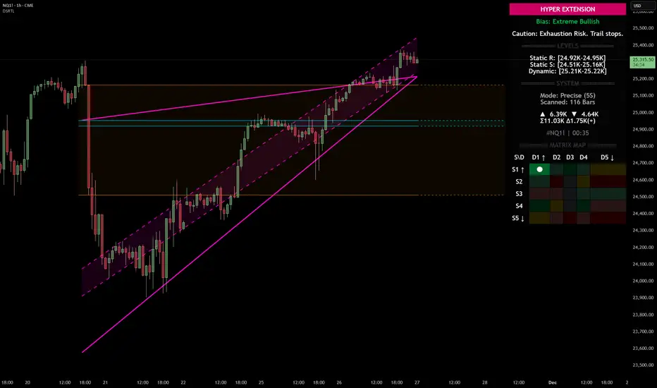
Nasdaq 100 (NQ): Hyper-Extended Momentum – Breakout or Exhaust
Category: Trend Analysis / Support & Resistance
Ticker: NQ1! (CME)
Analysis:
We are looking at the Nasdaq 100 Futures (NQ1!) on the 1H timeframe using the Dynamic Support & Resistance (DSRTL) system. The market is currently displaying a textbook example of a high-momentum breakout that has pushed into statistical extremes.
Here is the breakdown of the current technical landscape based on the indicator's Matrix Logic:
1. The "Hyper Extension" State (S1 / D1)
The indicator’s dashboard has triggered a "HYPER EXTENSION" alert. This specific state occurs when two conditions are met simultaneously:
• Static Breakout (S1): Price has cleared the horizontal resistance structures (indicated by the volume clusters).
• Dynamic Overextension (D1): Price has pierced above the upper limit of the dynamic trend channel (the purple trendlines).
2. Bias: Extreme Bullish
The current bias is rated as "Extreme Bullish". The trend is undeniably strong, confirmed by the positive Volume Delta (+965) shown on the dashboard. The price action is aggressive, creating a steep angle of ascent that has moved away from the mean.
3. The Warning Signal: Exhaustion Risk
While the trend is up, the system issues a cautionary note: "Exhaustion Risk. Trail stops."
In technical terms, when price action moves into "D1" (Dynamic Overextension), it indicates that the asset is trading significantly above its standard deviation or channel geometry. Historically, markets often seek mean reversion or consolidation after such rapid expansions to sustain the trend.
Key Levels to Watch:
• Dynamic Support (Immediate): The top of the purple channel (approx. 25,220) acts as the first layer of defense. A retest of this level is common after a breakout.
• Static Support (Structural): The breakdown level of the previous resistance, now turning into support around the 24.95K region.
Scenario Conclusion:
This is a pure momentum play. Traders should be aware that while the path of least resistance is up, the probability of a "snap-back" or consolidation increases the further price stretches above the dynamic channel. This is not a signal to short the trend immediately, but rather a signal to manage risk tightly on existing long positions.
Disclaimer: This analysis is for educational purposes only and explains the logic of the DSRTL technical indicator. It does not constitute financial advice.
TWLO | Big Moves Coming After 3 Year Consolidation | LONGTwilio, Inc. engages in the development of communications software, cloud-based platforms, and services. It operates through Twilio Communications and Twilio Segments. The Twilio Communications segment includes the platforms Messaging and Voice. The Twilio Segment involves Segment, Engage, Flex, Email, and others. The company was founded by John Wolthuis, Jeffery G. Lawson, and Evan Cooke in March 2008 and is headquartered in San Francisco, CA.

Re-entry Long idea on ETHUSDBased on :
-quantitative analysis
-Volume analysis
-Option flow analysis

ETH: Might have another chance to long!Hello Traders .
okay, this was the volume profile of ETH of the Binance! Any reaction to it could activate our buy option!

GBPAUD: volume Profile and Static levelsHello everyone!
This is the daily chart!
As you can see, there 2 channels here. One bearish and the other one is bullish. In coincide of two supports of them we see a strong previous S&R!
V.P of October is out strong resistance! We see a great momentum after it. There is middle of the bearish channel around too.
If we see a weak upward move, we can enter a short trade around the volume profile POC.
The TP is just over the static support and around the dynamic support.
You can also buy from support if we see a weakness in bears.

XAUUSD- Strength near 4000 key InflectionThe Support Level
The 4000 zone has acted as a key inflection point, both as support and resistance, since October. Price has been oscillating around this level, consistently finding strength above it and struggle below it.
At present, the market is once again retesting this crucial level. As price approaches 4000, several technical cues are signaling potential underlying strength.
Loss of Downside Momentum
To begin with, there is a clear loss of downside momentum. We witnessed a sharp 100-point decline from the 13 Nov swing high in just three candles. This was followed by a -179 point slide over six candles (acceptable) but then a much slower -106 point drop stretched across 18 candles.
Why did the market suddenly take significantly longer to cover a similar distance from the 14 Nov highs?
This deceleration suggests waning bearish momentum as price nears support.
This observation is further validated by a bullish RSI divergence forming at the lows.
Decreasing Volumes
Additionally, the recent downswing from 4054 has been accompanied by declining volume- a classic sign of seller exhaustion. When falling price is not supported by expanding volume, it often hints at an impending reversal or at least a relief bounce.
Potential for Buy
Structurally, the market is still in a short-term downtrend, printing lower highs and lower lows since the 13 Nov peak. Aggressive traders may look for a bullish reversal signal in the 4000 demand zone, while conservative traders might prefer waiting for a confirmed shift in market structure, a higher high followed by a higher low on lower timeframes, before positioning long.
At this juncture, it’s difficult to justify a fresh short, given the confluence of support, momentum divergence, and volume behavior.
How do you usually evaluate the market when it approaches major support or resistance zones?
📣Disclaimer:
Everything shared here is meant for education and general awareness only. It’s not financial advice, nor a recommendation to buy, sell, or hold any asset. Do your own research, manage your risk, and make sure you understand what you’re getting into.

W | Big Gains Coming to This Retailer | LONGWayfair, Inc. engages in an online home furnishing store. It operates through the U.S. and International segments. The U.S. segment consists of amounts earned through product sales through the company's five distinct sites in the U.S. and through websites operated by third parties in the U.S. The International segment is composed of earnings through product sales in international sites. The company was founded by Steven K. Conine and Niraj S. Shah in May 2002 and is headquartered in Boston, MA.

HOW-TO: Analyze Support, Resistance & Short-Term DirectionHOW-TO: Analyze Support, Resistance & Short-Term Direction Using Volume Scope Pro (1H Example)
Introduction
This HOW-TO explains how to use the Volume Scope Pro — Order Flow Volume Analysis indicator to identify support and resistance, interpret order-flow signals such as absorption and distribution, evaluate buyer/seller strength, and determine a short-term market bias on the 1-hour timeframe.
1 — Chart Settings & Data Inputs
• Main timeframe: 1H
• LTF (Low-Timeframe data): 15-second volume blocks
• LTF coverage: ~115 bars
• Instrument: MES1! (CME Micro E-mini S&P 500)
This setup provides a high-resolution view of order flow behind each hourly candle by aggregating ultra-low timeframe volume behavior.
2 — Buy & Sell Volume Behavior
BUY Side:
• Buy Current Amount ≈ 18.539K
• 20-period Buy Average ≈ 54.044K
→ Buyers are significantly below their normal activity level.
→ Interpretation: Buyers are NOT supporting current price levels.
SELL Side:
• Sell Current Amount ≈ 17.073K
• 20-period Sell Average ≈ 50.857K
→ Sellers are also below average, but buyer weakness is far more pronounced.
Summary:
In higher timeframes like 1H, lack of buyer activity is often more important than strong selling. Here, buyers are too weak to create a sustained bottom.
3 — Trend Angle Convergence & Divergence (Trend θ)
BUY:
• Price vs Buy Volume (3 and 20 periods) = Divergent
→ Price attempts to hold or bounce are NOT backed by buyer aggression.
SELL:
• Price vs Sell Volume (3-period) = Convergent
→ Short-term movement is driven by sellers, strengthening the bearish bias.
4 — Delta Analysis
• Current Delta ≈ +1.46K
• Global Delta (100 candles):
– Positive Δ Sum ≈ 273.812K
– Negative Δ Sum ≈ 225.671K
Interpretation:
Although short-term delta is positive and long-term delta slightly favors buyers, the price structure does NOT reflect bullish dominance.
This type of delta behavior often indicates absorption rather than a trend shift — meaning buyers are active but ineffective at moving price.
5 — Support & Resistance Zones (SR Engine)
Volume Scope Pro identifies two main zones:
• Resistance Zone: 6880.75 ~ 6885.25
• Support Zone: 6707.75 ~ 6766.75
Current Position:
Price is holding inside the upper boundary of the Support Zone.
There was a minor bounce, but the reaction lacked strength and failed to break structural highs.
6 — Order-Flow Overlay Signals (OB / Distribution / Absorption)
• Multiple OB and Distribution labels appear near upper structure → clear signs of supply, selling pressure, and exhaustion at highs.
• OS and ABS signals at support did not result in meaningful continuation → weak follow-through from buyers.
Combined with weak buy volume, the market shows bearish intent.
7 — Short-Term Projection
Given:
✓ Weak buy volume compared to averages
✓ Sellers showing short-term dominance
✓ Converging sell-side angles
✓ Price reacting weakly to support
✓ Strong supply clusters above
✓ Delta showing ineffective buying
→ Short-term bearish continuation is the more probable scenario.
As shown on the chart, the Short Position tool highlights:
• Entry around the upper support boundary
• Stop above the minor pullback high
• Target near the lower support boundary
This forms a clear, structured bearish setup with defined R:R.
Disclaimer
This publication is for educational purposes only. Volume Scope Pro does not guarantee profit or certainty of market direction. Traders must perform independent risk management and verification at all times.

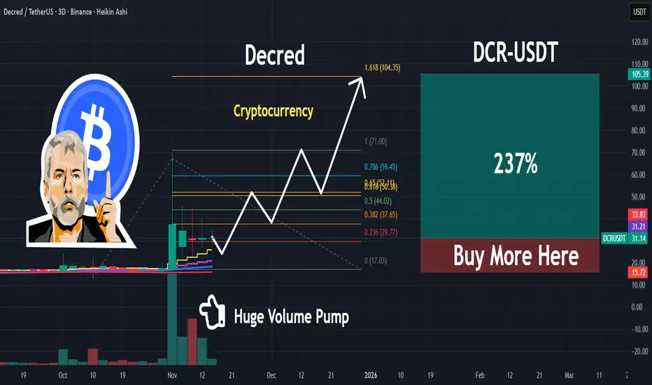
DCR | This Crypto Is About To Pop | LONGDecred is Money Evolved.
By combining battle tested Proof-of-Work with an innovative take on Proof-of-Stake that places coin holders in charge of shaping the future, Decred is able to adapt to challenges and innovate at a rapid pace. You acquire influence in Decred by putting “skin in the game”.
Decred’s security, privacy, scalability, and decentralized treasury empower stakeholders and provides them with the tools needed to enhance their financial sovereignty.
NBCC at Support — Bullish Action BeginsThis is the daily timeframe chart of NBCC.
NBCC is taking support near the lower boundary of the parallel channel, and the Supertrend indicator is also providing confirmation in the same zone. The support area lies around 104–108, while the immediate resistance is near 121.
If the support zone holds, the stock may move higher toward the channel’s upper levels near 121, with the final resistance placed around the 145–150 zone.
Thank you!


Good zones o work with, nasdaq 11-11-25Low volume nodes and gaps, usually are good zones to work with.
