Explaining the Lower Timeframe Function and Its Role in Trading Introduction
Candlesticks on higher timeframes summarize long periods of trading activity, but they hide the internal balance of buying and selling. A daily candle, for instance, may show only a strong close, while in reality buyers and sellers may have fought much more evenly. To uncover this hidden structure, Pine Script offers the requestUpAndDownVolume() function, which retrieves up-volume, down-volume, and delta from a chosen lower timeframe (LTF).
Function in Practice
By applying this function, traders can measure how much of a move was supported by genuine buying pressure and how much came from selling pressure. The function works across timeframes: when analyzing a daily chart, one can select a one-minute or one-second LTF to see how the volume was distributed within each daily bar . This approach reveals details that are invisible on the higher timeframe alone.
Helper for Data Coverage
Lower-timeframe data comes with strict limitations. A one-second chart may only cover a few hours of history, while a one-minute chart can stretch much further back. To make this limitation transparent, a helper was implemented in our code: it shows explicitly how far the available LTF data extends . Instead of assuming full coverage, the trader knows the exact portion of the higher bar that is represented.
//══════════════
// Volume — Lower TF Up/Down
//══════════════
int global_volume_period = input.int(20, minval=1, title="Global Volume Period", tooltip="Shared lookback for ALL volume calculations (e.g., averages/sums).", group=grpVolume)
bool use_custom_tf_input = input.bool(true, "Use custom lower timeframe", tooltip="Override the automatically chosen lower timeframe for volume calculations.", group=grpVolume)
string custom_tf_input = input.timeframe("1", "Lower timeframe", tooltip="Lower timeframe used for up/down volume calculations.", group=grpVolume)
import TradingView/ta/10 as tvta
resolve_lower_tf(bool useCustom, string customTF) =>
useCustom ? customTF :
timeframe.isseconds ? "1S" :
timeframe.isintraday ? "1" :
timeframe.isdaily ? "5" : "60"
get_up_down_volume(string lowerTf) =>
= tvta.requestUpAndDownVolume(lowerTf)
var float upVolume = na
var float downVolume = na
var float deltaVolume = na
string lower_tf = resolve_lower_tf(use_custom_tf_input, custom_tf_input)
= get_up_down_volume(lower_tf)
upVolume := u_tmp
downVolume := d_tmp
deltaVolume := dl_tmp
//──── LTF coverage counter — counts chart bars with valid Up/Down (non-na) 〔Hazel-lite〕
var int ltf_total_bars = 0
var int last_valid_bar_index = na // new: remember the bar_index of the last valid LTF bar
if not na(deltaVolume)
ltf_total_bars += 1
last_valid_bar_index := bar_index
int ltf_safe_window = ltf_total_bars
var label ltf_cov_label = na // label handle for the “coverage” marker
Use in Strategy Development
Because both the main function and the helper for data coverage have been implemented in our work, we use the Hazel-nut BB Volume strategy here as a practical example to illustrate the subject. This strategy serves only as a framework to show how lower-timeframe volume analysis affects higher-timeframe charts. In the following sections, several charts will be presented and briefly explained to demonstrate these effects in practice.
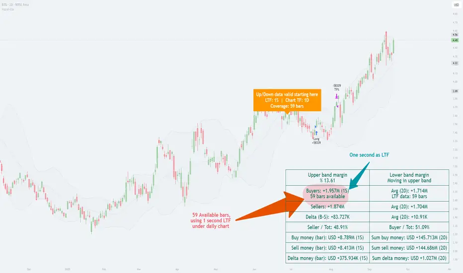
In this example, the daily chart is used as the main timeframe, while a one-second lower timeframe (LTF) has been applied to examine the internal volume distribution. The helper clearly indicates that only 59 one-second bars are available for this daily candle. This is critical, because it shows the analysis is based on a partial window of intraday data rather than a full day.
The up/down volume split reveals that buyers accounted for about 1.957 million units versus sellers with 1.874 million, producing a positive delta of roughly +83,727. In percentage terms, buyers held a slight edge (≈51%), while sellers were close behind (≈49%). This near balance demonstrates how the daily candle’s bullish appearance was built on only a modest dominance by buyers.
By presenting both the margin values (e.g., upper band margin 13.61%) and the absolute money flow, the chart connects higher-timeframe Bollinger Band context with the micro-timeframe order flow. The annotation “Up/Down data valid starting here” reinforces the importance of the helper: it alerts the user that valid LTF volume coverage begins from a specific point, preventing misinterpretation of missing data.
In short, this chart illustrates how choosing a very fine LTF (1 second) can reveal subtle buyer–seller dynamics, while at the same time highlighting the limitation of short data availability. It is a practical case of the principle described earlier—lower-timeframe insight enriches higher-timeframe context, but only within the boundary of available bars.
Analysis with One-Minute LTF
In this chart, the daily timeframe remains the base, but the lower timeframe (LTF) has been shifted to one minute. The helper indicates that data coverage extends across 353 daily bars, a much deeper historical window than in the one-second example. This means we can evaluate buyer/seller balance over nearly a full year of daily candles rather than just a short slice of history.
The up/down split shows buyers at ≈2.019M and sellers at ≈1.812M, producing a positive delta of +206,223. Here, buyers hold about 52.7%, compared to sellers at 47.3%. This stronger bias toward buyers contrasts with the previous chart, where the one-second LTF produced only a slim delta of +83,727 and ratios closer to 51%/49%.
Comparison with the One-Second LTF Chart
Data coverage: 1s gave 59 daily bars of usable history; 1m extends that to 353 bars.
Delta magnitude: 1s produced a modest delta (+83k), reflecting very fine-grained noise; 1m smooths those micro-fluctuations into a larger, clearer delta (+206k).
Interpretation: The 1s chart highlighted short-term balance, almost evenly split. The 1m chart, backed by longer history, paints a more decisive picture of buyer strength.
Key Takeaway
This comparison underscores the trade-off: the lower the LTF, the higher the detail but the shorter the history; the higher the LTF, the broader the historical coverage but at the cost of microscopic precision. The helper function bridges this gap by making the coverage explicit, ensuring traders know exactly what their analysis is built on.
Impact of TradingView Plan Levels
Another factor shaping the use of this function is the user’s access to data. TradingView accounts differ in how much intraday history they provide and which intervals are unlocked.
◉ On the free plan, the smallest available interval is one minute, with a few months of intraday history.
◉ Paid plans unlock second-based charts, but even then, history is measured in hours or days, not months.
◉ Higher tiers extend the number of bars that can be loaded per chart, which becomes relevant when pulling large volumes of lower-timeframe data into higher-timeframe studies
Conclusion
With requestUpAndDownVolume(), it becomes possible to see how each symbol behaves internally across different timeframes. The helper function makes clear where the data stops, preventing misinterpretation. By applying this setup within strategies like Hazel-nut BB Volume, one can demonstrate how changing the lower timeframe directly alters the picture seen on higher charts. In this way, the function is not just a technical option but a bridge between detail and context.
Volumeanalysis
Walk This Way...This S. Korean company focuses on treatment of cystic fibrosis and chronic kidney disease, et al. Future Medicine, Limited.
Godspeed to this company as they search for cures for primary biliary cirrhosis; colorectal, prostate, and lung cancers and rheumatoid arthritis, et al. They target metabolic cancers, inflammatory and autoimmune diseases, to produce anticancer drugs, anti-fibrotics and antiviral remedies. Not only persistent, but painful diseases, as well. Who on earth wouldn't want this company to succeed ?
Selling Volume has completely Dried-up and the stock is in the process of setting Higher-Lows. MACD, StochasticsRSI, Rate-of-Change, and %r are all additive tenets of confirmation for the astute and intrepid investor.
Go Long.... it's at the 20... the 10... the 5... and Touchdown
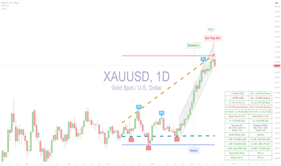
Gold Analysis using ATAI Volume Pressure AnalyzerIntroduction:
In this analysis, we use the ATAI Volume Pressure Analyzer indicator , which is based on the logic of separating buy/sell volume. The indicator retrieves volume data from a lower timeframe and reconstructs it on the host timeframe. This is achieved using the internal function, TradingView/ta/10 → tvta.requestUpAndDownVolume(lowerTF) , which extracts Up Volume, Down Volume, and Delta from the selected lower timeframe, enabling aggregation and evaluation of market pressure. One-tick data provides the highest precision but is limited in historical coverage; conversely, higher timeframes provide more historical depth but with relative accuracy.
In this daily chart, to calculate 20-period volume averages, the lowest timeframe that both preserved relative accuracy and provided sufficient historical data for 20 candles was 30 seconds , which was selected. This choice is reflected in the corresponding rows of the left and right columns of the HUD panel. It should be noted that in the gold market, the actual traded contract volume is not centrally available; therefore, the volume used in this method is based on tick volume (the count of price changes within each bar) . This serves as a proxy for activity and order flow intensity rather than absolute turnover. Accordingly, aggregates and deltas are interpreted on a relative basis and used to identify acceleration, volume spikes, and breakouts alongside price structure.
Trendlines and Market Direction
Beyond volume-based calculations, the indicator also visualizes directional bias through adaptive trendlines. The dotted orange and turquoise lines are drawn from successive pivot highs and lows over a 50-bar window, effectively capturing the slope of price movement. In the chart, these diagonals clearly reveal the transition: price has broken out of a mid-range accumulation zone and established a sequence of higher highs and higher lows, confirming a structural uptrend.
Complementing this, the blue horizontal line marks the base of the prior accumulation (support), while the red line highlights the resistance level at the top. The breakout above this framework, supported by bullish volume ratios shown in the HUD, validates that the market has shifted from neutrality into a sustained upward trend.
Labels and Market Conditions
The labels displayed on the chart — such as Accum, Breakout ↑, Sharp ↑, and Bull Trap Risk — are derived from explicit quantitative rules inside the indicator. These rules combine price levels, buy/sell volume deltas, and moving aggregates. Below, each label is explained with both its coding logic and its mathematical interpretation in plain language.
Accum (Accumulation)
Logic: |Δ| < ε ∧ Var(ΣV) → min
Meaning: The difference between buy and sell volume (Δ) is close to zero, and the variance of total volume ΣV is minimal over the chosen window. In simple terms, this marks a balanced market where buyers and sellers are matched, forming a neutral accumulation zone.
Breakout ↑
Logic: Pt > max(Pacc) ∧ Δ > 0 ∧ ΣV20 ↑
Meaning: The closing price Pt breaks above the maximum price of the accumulation zone (Pacc), while buy volume is greater than sell volume (Δ > 0), and the 20-bar aggregate volume ΣV20 is increasing. In simple terms, this confirms that buyers dominate and the market is breaking upward with sufficient volume support.
Sharp ↑
Logic: ΔP / Δt > θ
Meaning: The slope of price change (ΔP per unit time) exceeds a defined threshold θ. In simple terms, this indicates an accelerated move upward — a breakout with unusually strong momentum.
Bull Trap Risk
Logic: Pt < Pbreakout ∧ Δ ↓ ∧ ΣV20 ↓
Meaning: After an initial breakout, the price Pt falls back below the breakout level, while buy volume weakens (Δ decreases) and the 20-bar aggregate volume ΣV20 declines. In simple terms, this signals that the breakout has lost support and may have trapped buyers — hence the label Bull Trap Risk.
Trendlines and Guidance
The dotted trendlines are constructed from the slope of price and aligned with recent pivot highs (HH) and lows (LL). Mathematically, the slope is defined as:
m = (P_pivot2 − P_pivot1) / (t2 − t1)
where P_pivot are the price levels at successive pivots, and t are their bar indices. A positive slope (m > 0) indicates an upward trend, while m < 0 indicates a downward trend.
In this chart, the slope of the mid-band is clearly positive, and the label HH1 is printed at the breakout of the upper boundary. This confirms that the market has transitioned out of a ranging phase and into a structural uptrend characterized by higher highs and higher lows.
Horizontal Lines
The horizontal guidance lines (support and resistance) are calculated from the extremes over the last N = 50 bars:
S = min(P_t), R = max(P_t) for t ∈
The blue line marks support at the lowest low, and the red line marks resistance at the highest high. Together, these dynamic references highlight where order flow has historically concentrated and provide anchors for interpreting future price reactions.
Each of these labels therefore reflects a mathematical condition expressed both in code and in statistical terms. Together they describe a sequence of phases: balanced accumulation, directional breakout, acceleration, and potential failure traps. This structured approach translates raw volume and price data into actionable signals.
Conclusion: XAUUSD Market Outlook
The recent chart action combines signals from the ATAI Volume Pressure Analyzer with a secondary tool, the 20-period Linear Regression channel. This multi-tool perspective highlights the importance of cross-validation in market analysis.
Key Observations
- Volume Pressure Analyzer Signals: After a strong breakout and sharp upward momentum, the indicator has now triggered the label Bull Trap Risk . This label reflects weakening buy-side dominance, declining delta values, and a potential failure of the breakout to sustain order-flow support.
- Linear Regression (20-period): The regression channel illustrates a clear ascending path starting from the former accumulation zone. The latest red candle has closed outside the channel to the downside, confirming a loss of alignment with the prior uptrend.
- Structural Divergence: The combination of volume weakness (as flagged by VPRC) and structural channel break creates a divergence. Price remains elevated but lacks the necessary buy-side reinforcement, raising the probability of a correction or a full trend reversal.
Interpretation
This scenario indicates a transition risk: from a sharp bullish phase into either a corrective pullback or a potential distribution phase. The decisive factor remains the behavior of buyers and sellers in the next candles — whether buyers can reclaim the channel or sellers consolidate control.
Disclaimer
This XAUUSD analysis has been conducted using the ATAI Volume Pressure Analyzer indicator in conjunction with the supporting Linear Regression (20-period) tool. It does not constitute any form of financial advice regarding buying, selling, or holding positions. The analysis solely illustrates the dynamics of buyer and seller behavior in the market.
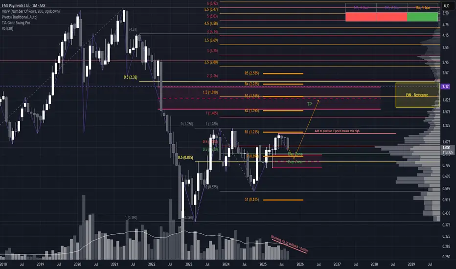
Small-Cap Setup with Big PotentialAnother promising setup is forming on EML. As always, keep in mind this is a small-cap play, so risk management is key. While the monthly uptrend isn’t yet fully established, the current structure offers multiple trade scenarios worth watching.
Trade Scenarios
1. Conservative Breakout Entry For those preferring confirmation, a long entry could be triggered on a clean break and close above $1.195 (as highlighted on the chart).
Stop Loss: Below the newly formed swing low
Target: $1.825, where notable resistance resides
2. Ideal Pullback Entry The optimal setup would be a pullback into a strong Area of Interest, supported by:
50% range retracement
Yearly pivot
Demand structure from the large April wick
If price forms a hammer/bullish candle in this zone, it could signal a high-probability reversal and offer a strong entry point.
SL placement depends on candle structure, but should invalidate below the demand zone
🎯 TP remains at $1.825, aligning with historical resistance
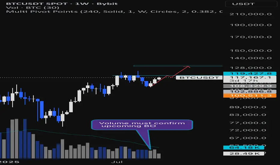
BTCUSDT Weekly Chart Analysis | Bullish V-Pattern Breakout ?BTCUSDT Weekly Chart Analysis | Bullish V-Pattern Breakout Possible
🔍 Let’s dive into the Bitcoin/USDT weekly setup and map out the current momentum, focusing on a key bullish scenario as price nears decisive levels.
⏳ Weekly Overview
Bitcoin is trading near $119,427, just below a major resistance zone at $119,430. A confirmed weekly close above this level, accompanied by sustained volume, would activate a textbook bullish V-pattern breakout. The V bottom structure is recognized for its aggressive buying pressure — price first sharply reverses from the support zone, then rallies as bulls take control, validated by both price and volume signals.
🔺 Long Setup:
A strong volume-backed weekly close above $119,430 unlocks a 10% move at RR1, projecting further upside toward the next reachable target at $130,000, which acts as a Potential Reversal Zone (PRZ). The setup relies on clean confirmation: breakout, high volume on the weekly, and consolidation above resistance for sustained momentum.
📊 Key Highlights:
- Weekly V-pattern maturation can drive a strong bullish leg if confirmed above $119,430.
- Volume confirmation is vital: look for above-average weekly bars to validate breakout strength.
- Target zone sits at $130k, an area with clustering past liquidity and technical importance (PRZ).
- If the breakout stalls or is rejected, expect price to retest lower bands; first support now sits at $113,000–115,000.
🚨 Conclusion:
A bullish scenario is building, hinging on a weekly close with volume above $119,430. Such confirmation would validate a breakout from the V-pattern and set sights on $130k, where trend participants may look to realize or reassess positioning. Failure at this level could reload bids at key lower supports. Stay sharp for volume cues and structural follow-through.
AUDJPY – SHORTA short position is proposed upon price rejection from the key resistance area. This area is defined by the confluence of the Supply Zone's POC level and a Dynamic Gann Resistance angle. The target is at the POC level within the next significant Demand Zone.
AUDJPY – SHORT
ENTRY PRICE - 98.150
SL - 99.400
TP - 94.400
Always follow the 6 Golden Rules of Money Management:
1. Protect your gains and never enter into a position without setting a stop loss.
2. Always trade with a Risk-Reward Ratio of 1 to 1.5 or better.
3. Never over-leverage your account.
4. Accept your losses, move on to the next trade and trust the software.
5. Make realistic goals that can be achieved within reason.
6. Always trade with money you can afford to lose.
Please leave your comment and support me with like if you agree with my idea. If you have a different view, please also share with me your idea in the comments.
Have a nice day!

GOLD ANALYSIS TODAY – CURRENT PRICE 3681 I SEP/17/2025(Uptrend still in control)
- Gold continues its bullish momentum after breaking the short-term downtrend, forming clear support zones at Demand 3675–3661 and still aiming for the upside target of 3700–3705.
✅ Scenario 1: BUY at Demand zone 3675–3677
📌 Entry condition: Wait for price to retrace to the Demand zone 3675–3677 and form a bullish confirmation candle (e.g., bullish pin bar, engulfing on H1/M30).
🎯 Target: 3700–3705 (H1 VaH zone)
🛑 Stop Loss: 3660
🧭 Reason:
- Price is still maintaining the main uptrend with Higher High – Higher Low structure.
- The 3675 zone is a strong Demand zone, likely to attract liquidity before another rally.
- Volume Profile shows this as a Low-Volume Node (LVN) – ideal for a bounce reaction.
⚠️ Scenario 2: BUY at Val Zone 3661–3663
📌 Entry condition: If price breaks below 3675 and continues to drop toward Val Zone 3661–3663, wait for buying pressure/Volume increase.
🎯 Target: 3685–3700
🛑 Stop Loss: 3650
🧭 Reason:
- This is the lower edge of the value area, fitting the strategy “Buy low in an uptrend”.
- Also aligns with H1 trendline and VAL zone from Volume Profile.
- A low-risk BUY setup if price “wicks” down and bounces back.
⚔️ Scenario 3: SELL reaction from VaH 3689–3703
📌 Entry condition: If price retests the Supply zone / VaH 3689–3703 and forms rejection signals such as a fakey or bearish pin bar.
🎯 Target: 3670–3665
🛑 Stop Loss: 3708
🧭 Reason:
This zone had strong selling pressure earlier – potential for sellers to re-enter.
Volume Profile confirms this is VaH (upper edge of value area) → prone to short-term rejection.
Counter-trend SELL setup → requires clear confirmation signals.
🚀 Scenario 4: BUY on strong Breakout above 3705
📌 Entry condition: Price breaks strongly above 3705 with an H1 candle close on high volume and no rejection signs.
🎯 Target: 3720–3725
🛑 Stop Loss: 3695
🧭 Reason:
- If price breaks the strong resistance at 3705, further upside expansion is likely.
- This area previously triggered strong selling – if broken, the bullish trend gains more confirmation.
- High volume + H1 close above supply zone = valid breakout sig

$Sol Daily Bearish Divergence with Key Supports at $220Solana is flashing some important signals across multiple timeframes right now.
On the daily chart, a clear bearish divergence has formed while buying volume is steadily declining. This setup usually points toward a healthy correction phase. At the moment, SOL looks like it could slide toward the $225–$220 zone, where we might see the first reaction.
If SOL manages to hold above $200 support, this pullback could simply turn into a higher low, setting the stage for continuation upward. But here’s the caution: losing $200 means breaking the last structural support, which could flip the trend and open the doors for a new lower low — potentially triggering a much larger dump.
👉 In short: Watch the $225–$220 range for short-term correction targets. Keep a close eye on the $200 level, because that’s the line between a healthy pullback and a bearish breakdown.
Trade safe and don’t chase candles — let the levels confirm the story.
VTI 1D: breakout on the daily within a long-term weekly uptrend On the daily chart, VTI (Vanguard Total Stock Market ETF) has broken through the key $303.5 resistance level with strong volume. This breakout occurs within a larger weekly uptrend channel, highlighting a continuation of the long-term bullish structure.
Volume profile shows a clear path ahead: $321.7 (1.272 Fibo) and $345 (1.618 Fibo). The golden cross (MA50 crossing MA200 from below) further supports the bullish case.
Fundamentally, VTI represents the entire U.S. equity market - large to small caps - and benefits from economic resilience, declining inflation, and passive inflows. It’s a logical macro play for trend continuation.
Tactical plan:
— Entry by market or after retest $303.5
— TP1: $321.7
— TP2: $345
— Invalidation below $300
The whole market breaking out? That’s not noise — it’s the signal.

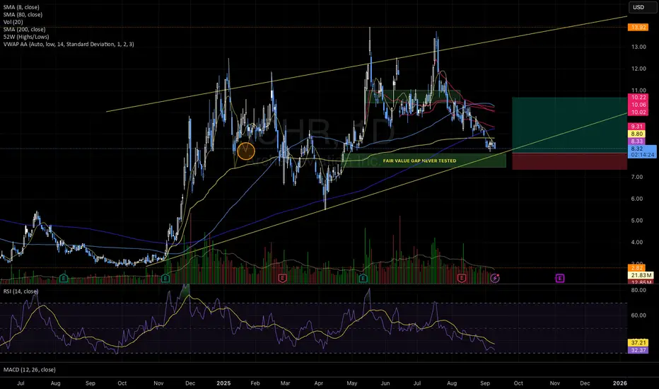
Bullish Setup Forming: Approaching Untested FVG + Oversold RSIACHR is setting up for a potential bounce based on multiple confluences:
Price is heading straight into a fair value gap that was never tested — could be a solid bounce spot;
Daily RSI is oversold (~32), often a sign the move down is stretched;
It’s also right on top of a rising trendline that has held for almost a year;
Volume is drying up, which might mean sellers are losing steam;
🎯 First target: $10.91
🏁 Final target: $12.00
❌ Stop-loss: just under the FVG zone, in case it breaks down.
Watching closely 👀
And remember: respect both your stop loss and position sizing.
Bitcoin: Pullback Expected Into Prior Consolidation Zone
After a strong markup phase, Bitcoin has now formed a buying climax near the $113K level. Price action shows signs of distribution, with stacked imbalances above acting as a liquidity magnet. I expect price to first sweep this overhead liquidity, trapping breakout buyers and creating the conditions for a reversal.
Once the sweep is complete, confirmation will come if price fails back below the buying climax zone. This would indicate true seller pressure and a shift in market structure. At that point, I will be watching for a retest of the prior POC (Point of Control) to establish short positions.
Trade Plan:
Entry trigger: Sweep of buying climax → bearish rejection → retest of supply / POC.
Stop loss: Above the sweep high (invalidates distribution scenario).
Targets: Previous consolidation levels and liquidity pools below ($111K–$110K zones).
This setup aligns Wyckoff distribution structure with orderflow and liquidity logic. As long as the sweep fails and sellers regain control, I expect a pullback into the prior consolidation zone.
⚠️ Invalidation: Sustained acceptance above the buying climax would cancel the short bias.

High-Risk, High-Reward Setup at Critical Confluence ZoneSTP is offering a compelling—but extremely high-risk—opportunity. As a nanocap stock with no confirmed uptrend, risk management must be the top priority.
Price has retraced into a major Fair Value Gap (FVG) from August 2023, and notably, the August 2025 candle printed a strong demand wick on elevated volume. This zone aligns with:
The 200% Fibonacci extension from the double top at 1.940
The 50% extension from the 1.900 swing high to the April 25 low
A 74-week decline from the 1.950 high, marking a significant Gann time support—a detail seasoned time-cycle traders will appreciate
This confluence suggests a structurally significant support zone where price may be preparing for a reversal.
Trade Scenarios
Option 1: Wait for a Wick Retest Price may revisit the demand wick/yearly s2 pivot, offering a more refined entry with improved risk-to-reward. Look for a strong daily or weekly bullish candle off the retest, with the stop-loss placed just below the wick.
Option 2: Enter Now with Wick as Anchor Aggressive entry at current levels, using the base of the large demand wick as your stop-loss. This approach allows price to develop organically while maintaining a defined risk profile and if there is a retest of the wick then could add more to the position (must be in line with your risk appetite) but just food for some thought.
Option 3: Liquidity Sweep & Reversal Price could sweep the lows of the demand structure, triggering stop-losses and trapping late shorts. A sharp reversal from this move would confirm a classic liquidity grab—ideal for reactive entries once momentum shifts.
This setup is rich with technical nuance and timing precision. Whether you're trading the wick, the sweep, or the structure itself, the key is disciplined execution and respect for volatility.
MPWR | Another Long Term Runner | LONGMonolithic Power Systems, Inc. designs, develops, and markets integrated power semiconductor solutions and power delivery architectures for computing and storage, automotive, industrial, communications, and consumer applications markets. It offers direct current (DC) to DC integrated circuits (ICs) that are used to convert and control voltages of various electronic systems, such as portable electronic devices, wireless LAN access points, computers and notebooks, monitors, infotainment applications, and medical equipment. The Firm also provides lighting control ICs for backlighting that are used in systems, which provide the light source for LCD panels in notebook computers, monitors, car navigation systems, and televisions, as well as for general illumination products. The company was founded by Michael R. Hsing, and James C. Moyer on August 22, 1997, and is headquartered in Kirkland, WA.

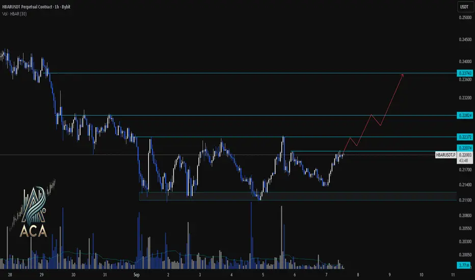
HBARUSDT 1H Chart Analysis | Bullish Structure in PlayHBARUSDT 1H Chart Analysis | Bullish Structure in Play
🔍 Let’s break down the recent price action for the HBAR/USDT perpetual contract and outline the roadmap for potential bullish continuation.
⏳ 1-Hour Overview
The 1-hour chart shows HBAR recovering from a strong demand zone near $0.21100, pushing upward with notable momentum. Price action is now challenging immediate resistance at $0.22372, with higher levels at $0.22824 and $0.23743 presenting the next bullish targets.
🔺 Long Setup:
A decisive close and hold above $0.22372 could fuel further upside, targeting the $0.22824 resistance next. Sustained bullish volume and higher lows may pave the way for an extension up to $0.23743, aligning with the drawn projection path.
📊 Key Highlights:
- Strong defense of the $0.21100 support region led to a sharp rebound.
- Immediate resistance stands at $0.22372, with the bullish path mapped toward $0.22824 and $0.23743.
- Volume spikes on upward candles indicate increasing buyer interest and potential for trend follow-through.
🚨 Conclusion:
HBARUSDT is building a bullish structure above local support, with momentum favoring continued upside if $0.22372 flips into support. Watching volume and reaction at key resistance areas remains crucial for confirming the next leg higher.
Gold potential long From the daily chart, Gold has been in a tough squeeze that has just popped to the upside.
Bullish on Gold and there is never a high price to buy gold.
I have described the setup on the chart, now we wait. Though today is labour day.
I have found good edge with Price and volume and a decent win rate on gold. Now we wait.
A million things could happen. But I can't promise you that any of them will. I can't
give you any reasons and I can't tell fortunes

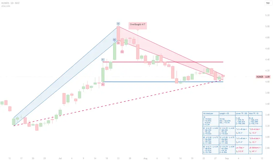
HUNER (1D) — Seller Bias After OB Cluster; Descending BA SlopesHUNER (1D) — Seller Bias After OB Cluster; Descending BA Slopes, 4.00 Support Under Test
Executive read (VPA, 55-bar window)
◉ OB/OS: An OverBought 4/7 tag printed at the apex; no confirmed OS on the right edge. That OB cluster preceded the entire red B→A leg and frames the current risk.
◉ Ranked volume peaks (Top-3):
- B1 (H 4.35/L 4.00) ↑ 68.33M, ↓ 53.3M, Δ +15.03M.
- B2 (H 5.00/L 4.75) ↑ 56.06M, ↓ 44.72M, Δ +11.34M.
- B3 (H 4.71/L 4.39) ↑ 49.81M, ↓ 33.61M, Δ +16.19M.
- S3 (H 4.79/L 4.59) ↑ 41.05M, ↓ 34.1M, Δ +6.95M.
Takeaway: Buying peaks were heavy, but subsequent price action failed to sustain higher highs; sellers have since controlled the B→A leg.
◉ Segment diagnostics:
- C→B advance: top/bottom slopes +22.3° / +21.0° → mature but constructive.
- B→A decline: top/bottom slopes –12.3° / –10.1° → persistent downside pressure.
- Orientation at B: α 212.9° (red) / β 147.1° (red) confirm the bearish state of the current swing geometry.
◉ Levels & structure:
- Support: the S1 low ≈ 4.00 is the active horizontal shelf repeatedly defended.
- Resistance: 4.35 (B1/S1 pivot), 4.71–4.79 (B3/S3 band), then 5.00 (B2). The descending B→A trendline caps bounces before these levels.
Actionable interpretation (educational):
Bias stays bearish-to-neutral while price trades beneath the B→A upper line and below 4.35. A credible shift would require (i) a fresh B-ranked bar with positive Δ near the right edge, and (ii) a close back above the B→A top. Failure to reclaim 4.35 after bounces leaves 4.00 vulnerable; a daily close below 4.00 would validate extension into the S-zones. Conversely, an OS print near 4.00 coupled with flattening BA slopes would set up a tactical mean-reversion toward 4.35 → 4.71/4.79.
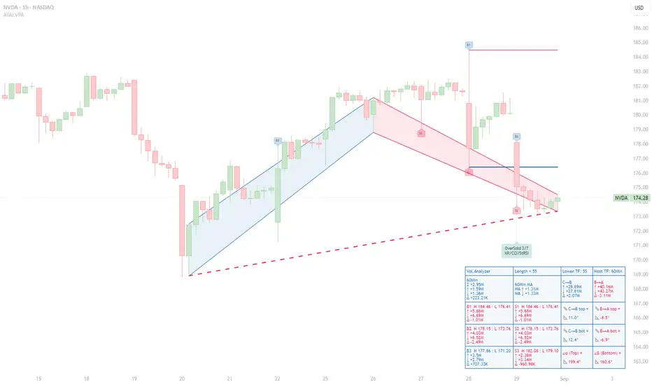
NVDA Under Pressure: Sellers Dominate as Volume Spikes Fail NVDA Under Pressure: Sellers Dominate as Volume Spikes Fail to Sustain Price Gains
Context – This 60‑minute NVDA chart uses the ATAI Volume Pressure Analyzer (VPA) on a 55‑bar window. The indicator plots an A→B→C structure: the blue C→B segment tracks the preceding advance and the red B→A segment the subsequent pull‑back. Up‑volume and down‑volume are calculated on a lower time frame and then aggregated into host‑time‑frame bars to expose buying and selling pressure.
Volume ranking – Within this window the indicator labels the three largest buying and selling bars (B1–B3 and S1–S3) and reports their statistics in a HUD. The most prominent bar, B1, spans H 184.46 to L 176.41 and shows 5.68 M up‑volume versus 6.69 M down‑volume, producing a –1.01 M delta. B2 (H 178.15–L 173.76) is even more bearish, with 4.03 M up‑volume and 6.52 M down‑volume (delta –2.49 M). B3 (H 177.86–L 171.20) is the only buying bar with a positive delta: 3.50 M up‑volume, 2.79 M down‑volume and a +0.71 M surplus. On the sell side, S1 and S2 coincide with B1 and B2 and mirror their negative deltas. S3 (H 182.08–L 179.10) registers 2.38 M up‑volume against 3.34 M down‑volume for a –0.96 M delta. Collectively, the pattern shows that peaks in buying volume have not yielded higher closes; sellers control all but one of the ranked bars.
Segment behaviour – The C→B rally accumulated roughly 29.89 M up‑volume versus 27.81 M down‑volume, a modest +2.07 M delta. In contrast, the B→A decline logged 40.16 M up‑volume against 43.27 M down‑volume, giving a –3.11 M deficit. The slopes of the trend lines accentuate the story: the advance has gentle positive slopes (~+11° top, +12.4° bottom), whereas the pull‑back slopes downward (–8.5° and –6.9°). Sellers have pushed prices lower more decisively than buyers previously drove them higher.
Price structure and implications – Price currently trades around 174.28 USD. Resistance sits near 178.15 (B2/S2) and 184.46 (B1/S1). As long as price remains beneath these pivot highs and subsequent B‑ranked bars fail to show a positive delta, the selling bias persists. The red dashed guide, connecting recent lows, continues to slope downward, confirming the bearish tilt. Only a flattening or reversal of this guide—coupled with a new B‑ranked bar sporting a positive delta—would hint at a shift in momentum.
Risk management – This analysis is intended for educational purposes. It illustrates how separating up‑ and down‑volume on lower time frames can reveal hidden pressures in intraday charts. It is not a recommendation to buy or sell NVDA stock. Always consult your own trading plan and risk tolerance before acting.
Seller Strength Evident as Volume Peaks Fail to Propel Price HigAnalysis
Context – This 1D chart uses the ATAI Volume Pressure Analyzer to study the A→B→C structure over the last 11 trading sessions. Segment C→B captures the advance (blue), while B→A captures the subsequent decline (red). Each bar’s up‑ and down‑volume is measured on a lower timeframe to detect buying and selling pressure.
Volume ranking – Within this 11‑bar window, the indicator identifies the three largest buying (B1–B3) and selling (S1–S3) bars. Although the B1 bar shows the highest buying volume (~10.29 M units), its selling volume (~12.52 M) exceeds buying, resulting in a negative delta of ‑2.23 M. B2 is the only buyer bar with a positive delta (+1.87 M), while B3 again shows sellers in control (‑0.90 M). The seller bars S1–S3 all display net negative deltas, with S3 registering the heaviest selling (‑4.03 M). This pattern shows that peaks in buying volume are not producing higher closes and that sellers are consistently overwhelming buyers.
Segment behaviour – The C→B segment (the rally) totals approximately +28.9 M up‑volume versus +36.7 M down‑volume, a net deficit of about ‑7.74 M. The subsequent decline (B→A) is even more one‑sided: +26.9 M up‑volume versus +41.4 M down‑volume, yielding a ‑14.5 M delta. The slopes of the segment trend lines reinforce this narrative: the rise from C to B has a shallow positive slope (~ 5° on the upper line), whereas the decline from B to A has a steeper negative slope (‑12° on the upper line). Sellers are pushing the price lower more aggressively than buyers previously pushed it higher.
Price structure – Price currently trades near TRY 3.45,where resistance resides near the recent pivot highs around TRY 3.65 and TRY 3.73 (where B1 and S1 occur). As long as the price remains below these levels and buying peaks fail to translate into higher highs, the bearish bias remains. The red dashed line is not a fixed support; it dynamically connects the lows of the current C→A leg and updates with each new candle’s low. Its red colour confirms the bearish slope of this segment. As long as this guide remains red and slopes downward, the downtrend is intact. A meaningful sign of shifting momentum would be a flattening or reversal of this guide (e.g., changing colour) accompanied by a new B‑ranked bar that shows a positive delta.
Risk management – This analysis is provided for educational purposes and does not constitute investment advice. Always consider your own risk tolerance and trading plan before entering a position.

Don’t Sleep on AQZ: Smart Money May Already Be PositionedAQZ — 4-Year Reaccumulation + Bullish Doji = Strategic Long Setup
AQZ is looking primed for a long play. Price has been reaccumulating for ~4 years, and June printed a bullish monthly doji—a classic liquidity sweep. Price pierced the major fair value gap (FVG) from the May 2020 pump candle, tested the yearly S2 pivot, and found support right on the EQ of the range. That’s a trifecta of demand confluence.
Entry Scenarios Based on Risk Profile
Aggressive Entry Enter now with a tighter stop loss around $2.29, which aligns with two EQ zones: the June 2025 demand structure and the channel EQ. This setup suits high conviction traders looking to front-run the breakout.
Conservative Entry Use a wider stop beneath the Last Point of Support (LPS) for more breathing room. This protects against deeper retests while still respecting the bullish structure.
Preferred Entry (Low Risk, High Confluence) Wait for price to break and retest the channel, then consolidate above it. This would also confirm a break of the major 50% resistance projected from the all-time low to all-time high—a powerful signal of trend continuation.
Strategic Overlay
This setup blends long-term structural strength with tactical precision:
4-Year Base = Institutional accumulation
Doji Sweep = Smart money absorption
Multi-level confluence = High-probability AOI
If price rallies from this zone, expect momentum to build quickly. But as always—one step at a time. Let price confirm before scaling in.
*please note, arrows are not time analysis just pathing
RELAXO FOOTWEARS A GOOD 2X CANDIDATE Relaxo Footwears Ltd, one of India’s leading footwear companies
👟 Brand Portfolio
Relaxo operates under several well-known sub-brands:
- Sparx – Sporty and casual shoes
- Flite – Lightweight slippers and sandals
- Bahamas – Youth-centric flip-flops
- Schoolmate – School shoes
- Boston, Belle, Mary Jane, Kid’s Fun – Niche and seasonal offering
🌍 Market Position
- Largest footwear manufacturer in India by volume
- Second-largest by revenue
- Ranked among India’s Top 500 Most Valuable Companies
- Strong presence in value segment (non-leather products like EVA/rubber slippers and canvas shoes)
TECHNICAL
- Momentum: Strong short-term bullish breakout
- Trend: Above key moving averages with RSI and MFI confirming strength
- Watch Zone: 500–510 for resistance; 470–480 as support
SHORT TERM TGT- 575-600
LONG TERMG TGT- 750-900

ORI Setup: Watching for Pullback into Accumulation ZonesOn the weekly timeframe, ORI has printed a 10-week rally straight into a key supply zone—aligning cleanly with Gann’s 7–10 bar exhaustion principle within a single swing. This move suggests we’re nearing a potential inflection point. There’s still room for a final extension toward the second major supply structure around $25, but any push into that zone would likely be met with selling pressure and a corrective phase.
On the monthly, price has been advancing aggressively—but notably on declining volume, hinting at underlying weakness and possible buyer fatigue. If price stalls or rejects around current levels, it sets the stage for a layered accumulation opportunity at the zones highlighted on the chart.
Should price consolidate and absorb supply in these areas, the setup opens the door for a breakout to all-time highs, offering a compelling Risk-to-Reward profile for strategic positioning.
Setup Invalidation: A decisive break and close below $14.89 would invalidate the thesis, confirming a macro higher low breakdown. However, wicks into this zone are acceptable as part of a liquidity sweep or shakeout.
Denison Mines: A very bullish chartDenison Mines is on the verge of breaking a 14 years consolidation.
The whole sector of uranium has been very strong in 2025 but the price of uranium itself hasn't moved that much and neither most of the small and mid cap names in the space. I'm expecting those to start waking up soon and when they do, their moves can be very powerful.
"The longer the range, the bigger the breakout" is a famous quote in trading. Let say how this one plays out above $2.45.

SUSDT 4H Chart Analysis | Channel Breakdown LoomsSUSDT 4H Chart Analysis | Channel Breakdown Looms
🔍 Let’s break down the recent price action on the S/USDT 4-hour chart, focusing on the pivotal ascending channel structure and its implications for the next move.
⏳ 4-Hour Overview
S/USDT has been moving within a well-defined ascending channel, marked by higher highs and higher lows. Price is now testing the lower boundary of this channel, making the 0.3127 support a crucial level. The recent uptick in volume during the downward leg hints at mounting bearish pressure.
🔻 Short Setup:
A confirmed breakdown (BO) below 0.3127 would signal an exit from the ascending channel, opening the door to accelerated downside. With channel support breached, the next key target sits at 0.2710, in line with historical liquidity and the channel’s projected lower range.
📊 Key Highlights:
- Price action is currently at the channel’s lower boundary, with a breakdown below 0.3127 required to confirm bearish momentum.
- Volume has increased on the recent downward move, supporting the idea of a channel exit and follow-through selling.
- Downside target stands at 0.2710 if the channel fails, providing a clear roadmap for action.
🚨 Conclusion:
Bulls must defend the ascending channel at 0.3127, or risk seeing S/USDT cascade toward 0.2710. Watch for volume confirmation—an exit below channel support could shift sentiment quickly.
