Bearish Divergence Playing Well!KSE100 Closed at 182338.12 (29-01-2026)
Bearish Divergence played well. Also there is Bearish Divergence in volumes.
Immediate Support seems around 179500 - 181000
Weekly Closing above blue trendline may bring some positivity in upcoming week.
Index still has the potential to touch 195,000 - 200,000 & then 210,000 but only
if it Crosses & Sustains 190000 -191500 with Good Volumes.
Volumes

Technical Analysis – Meta Platforms Inc (META)Meta Platforms needs little introduction. The company continues to show strong long-term growth and has been one of the best-performing stocks in the market over the past few years.
The stock comes from a major bullish phase that started in 2023, during which it gained over +600%, with healthy pullbacks occurring within the dominant uptrend.
Market Structure & Volume Analysis
Over the past few months, the stock has entered a retracement phase, which remains technically well-controlled.
Key points:
the correction was contained at the first Point of Control (POC_1), calculated using volume from the top distribution area
price reacted both at POC_1 and at the ascending weekly trendline
two strong bullish reactions occurred in this confluence area (yellow circles), confirming it as a key support zone
Bullish Scenario
For a bullish continuation scenario, price needs to:
break above the descending weekly trendline, which is currently being challenged
ideally confirm the breakout with a pullback (retest), turning the trendline into dynamic support
A successful retest would strengthen the probability of trend continuation in line with the primary bullish trend.
⚠️ Trading Note
As long as price holds above POC_1 and the ascending weekly trendline, the broader bullish bias remains intact.
Failure to decisively break the descending weekly trendline would keep the stock in a consolidation/correction phase.

Structural Compression Phase🔎 Overview
This idea focuses on identifying potential bullish expansion after a multi-day price consolidation inside the EMA 100 High–Low Band.
The structure highlights range compression, swing-based trendline pressure, and rising volume during consolidation, which together can signal a market preparing for directional movement rather than random noise.
────────────────────────────
📘 Core Components
EMA 100 High–Low Band
• The EMA 100 High–Low Band represents fair value and balance.
• Price consolidating inside this band suggests indecision and energy buildup, not trend weakness.
Pivot High–Low Swings
• Pivot Highs and Pivot Lows are used to map internal market structure.
• Two swing-based trendlines are drawn:
• One connecting lower highs
• One connecting higher lows
This creates a structure squeeze within value.
────────────────────────────
🛠 Market Structure Concept
Consolidation & Compression
• Price has remained inside the EMA High–Low Band for multiple sessions.
• Swing highs are compressing downward while swing lows are compressing upward.
• This reflects decreasing volatility and controlled price action, often seen before expansion.
────────────────────────────
📐 Trendline Structure
• Upper trendline connects progressively lower swing highs.
• Lower trendline connects progressively higher swing lows.
• Both trendlines converge, indicating structural pressure.
This is not direction — it is preparation.
────────────────────────────
📊 Volume Behavior
• Volume is above average while price remains in consolidation.
• Rising participation without range expansion suggests absorption, not exhaustion.
• This behavior often precedes directional acceptance, not immediate rejection.
────────────────────────────
📈 Bullish Expansion Context (Structure-Based)
• A clean acceptance above the upper swing trendline
• Followed by price sustaining above recent structure highs
• While remaining supported outside the EMA High–Low Band
This sequence would indicate resolution of compression rather than a false breakout.
────────────────────────────
🧭 Validation, Devalidation & Projection Framework
Validation Line (Strength Confirmation)
• A candle close above the validation line confirms structural acceptance.
• This signals that the compression phase has resolved with strength, not noise.
Devalidation Line (Structure Failure)
• A candle close below the devalidation line invalidates the setup.
• This indicates failure of compression logic and negates the structural thesis.
Target Line (Maximum Structural Projection)
• Once validated, the target line represents the maximum expected structural expansion based on current compression range.
• This is a projection reference, not a prediction.
Devalidation as Protection
• After validation, the Devalidation level acts as a structure protection zone.
• A sustained close below this level signals loss of acceptance and invalidates continuation logic.
────────────────────────────
📝 Summary
• EMA 100 High–Low Band defines balance and value.
• Price consolidates inside the band for multiple sessions.
• Swing-based trendlines show structural compression.
• Volume expands during consolidation, indicating participation.
• Validation and devalidation lines define acceptance and failure zones.
• Target and revalidation levels provide structured projection and protection.
• The idea focuses on structure resolution, not prediction.
• Direction is assessed only after acceptance, not anticipation.
────────────────────────────
⚠️ Disclaimer
📘 For educational purposes only.
🙅 Not SEBI registered.
❌ Not a buy/sell recommendation.
🧠 Purely a learning resource.
📊 Not Financial Advice.

BTC/USDT Analysis. Signs of Activity
Hello everyone! This is the CryptoRobotics trader-analyst with a daily market update.
Yesterday, Bitcoin tested the technical level at $88,400, where another wave of selling emerged. However, the decline did not develop further — selling pressure was absorbed by relatively strong buying activity.
At the moment, price is attempting to consolidate above this level. From a chart perspective, buyer momentum looks solid, but cluster analysis shows that the majority of volume is concentrated higher, within the $88,800–$89,300 range.
The key focus now is how this volume zone will be realized. If the price fails to break through and sellers show active defense, a continuation of the decline toward the nearest strong support becomes likely.
If sellers remain inactive and the $88,800–$89,300 zone is broken, we expect a test of $90,000. In that case, pullbacks toward the now-mirrored support at $89,300–$88,800 can be considered for long positions.
Buy zones
$86,000–$84,800 — anomalous activity
$84,000–$82,000 — volume anomalies
Sell zones
$90,000 — local resistance
~$92,400 — local sell zone
$94,000–$97,500 — volume zone
$101,000–$104,000 — accumulated volume
This publication is not financial advice.

Volume EPO – One bar, seven volume stories Volume EPO – One bar, seven volume stories (VAKFN, Borsa Istanbul)
This idea illustrates how different volume-classification methods can produce very different interpretations of the same bar. The Volume EPO overlay is used as a research tool to display seven methods side by side in a compact HUD.
The example is taken from VAKFN on Borsa Istanbul. On this market, TradingView provides extended intrabar volume data (BIST volume data plan), which allows the Intrabar row of the table to be built from lower-timeframe up/down volume and used as a high-precision benchmark.
Price is shown on the daily chart inside an ascending channel. The last daily bar in that structure is analyzed with the Volume EPO table on the right. Total volume on that bar is the same for every row (66.49M), but each method splits it into buy / sell / delta differently:
- Intrabar (Ref) – lower-timeframe up/down volume
≈ 36.66M buy vs 29.83M sell → delta +6.83M (moderate net buying; benchmark “truth layer”).
- BVC (Smart) – probabilistic split via normal CDF on normalized price change
Delta ≈ +7.61M, very close to Intrabar (Diff ≈ 1.1%), confirming a mild buy imbalance.
- Tick Rule – classic uptick/downtick classifier
Because the close is above the previous close, the whole 66.49M is classified as buy volume
→ delta +66.49M (Diff ≈ 90%), an extremely bullish reading.
- Lee-Ready Style – delayed midpoint quote test with Tick fallback
On this bar the close falls on the sell side of the delayed midpoint, so the entire volume is classified as selling
→ delta −66.49M (Diff ≈ 110%), the exact opposite of Tick Rule.
- Wick Imbalance – geometric supply/demand from upper vs lower wicks
A strong upper wick and weak close again lead to a full sell reading
→ delta −66.49M (Diff ≈ 110%).
- ML-Logit – logistic model of normalized return and volume deviation
Shows only a small negative imbalance
→ delta ≈ −1.38M (Diff ≈ 12.1%), close to neutral flow.
- Geometry – legacy CLV-style candle approximation
With the close near the low of the range, more volume is assigned to sellers
→ delta ≈ −33.25M (Diff ≈ 60.1%), strong selling.
On this single daily bar of VAKFN, the conclusions range from “mild net buying” (Intrabar, BVC) to “massive buying” (Tick Rule), “massive selling” (Lee-Ready Style, Wick Imbalance), “almost neutral” (ML-Logit), and “strong selling” (Geometry).
Only the Intrabar row uses actual lower-timeframe up/down volume from TradingView; all other rows are models built on top of OHLCV. Access to deeper intrabar history on small timeframes (such as 1s/5s, depending on data plan and subscription level for BIST) strengthens this benchmark layer and makes it easier to see which methods stay close to the underlying flow and which ones drift away.
This idea is presented as a research and educational example on VAKFN, not as a trade signal or financial advice.

Btc/Usdt - Trendline Break With Order Block RejectionBitcoin has tapped into a well-defined order block where buyers previously stepped in, and the market is showing a clear bullish reaction from that zone. After a prolonged move down under a descending resistance trendline, price has now broken above this trendline, suggesting a potential shift in short-term momentum from bearish to bullish.
The break of the trendline indicates that sellers are losing control, and buyers are starting to gain strength. If price holds above the breakout level and continues forming bullish structure, we could see a continuation toward the next liquidity area. The projected path points to a move toward the 103.8–104K target zone, where previous liquidity and fair-value areas may attract price.
Points to watch:
✅ Strong reaction from the order-block zone
✅ Trendline breakout confirming bullish pressure
✅ Potential higher lows forming to support an upward move
✅ Next target zone sits around 103.8–104K
As long as Bitcoin remains above the broken trendline and maintains bullish structure, upside continuation remains likely.
(Not financial advice.)

Seller Strength Evident as Volume Peaks Fail to Propel Price HigAnalysis
Context – This 1D chart uses the ATAI Volume Pressure Analyzer to study the A→B→C structure over the last 11 trading sessions. Segment C→B captures the advance (blue), while B→A captures the subsequent decline (red). Each bar’s up‑ and down‑volume is measured on a lower timeframe to detect buying and selling pressure.
Volume ranking – Within this 11‑bar window, the indicator identifies the three largest buying (B1–B3) and selling (S1–S3) bars. Although the B1 bar shows the highest buying volume (~10.29 M units), its selling volume (~12.52 M) exceeds buying, resulting in a negative delta of ‑2.23 M. B2 is the only buyer bar with a positive delta (+1.87 M), while B3 again shows sellers in control (‑0.90 M). The seller bars S1–S3 all display net negative deltas, with S3 registering the heaviest selling (‑4.03 M). This pattern shows that peaks in buying volume are not producing higher closes and that sellers are consistently overwhelming buyers.
Segment behaviour – The C→B segment (the rally) totals approximately +28.9 M up‑volume versus +36.7 M down‑volume, a net deficit of about ‑7.74 M. The subsequent decline (B→A) is even more one‑sided: +26.9 M up‑volume versus +41.4 M down‑volume, yielding a ‑14.5 M delta. The slopes of the segment trend lines reinforce this narrative: the rise from C to B has a shallow positive slope (~ 5° on the upper line), whereas the decline from B to A has a steeper negative slope (‑12° on the upper line). Sellers are pushing the price lower more aggressively than buyers previously pushed it higher.
Price structure – Price currently trades near TRY 3.45,where resistance resides near the recent pivot highs around TRY 3.65 and TRY 3.73 (where B1 and S1 occur). As long as the price remains below these levels and buying peaks fail to translate into higher highs, the bearish bias remains. The red dashed line is not a fixed support; it dynamically connects the lows of the current C→A leg and updates with each new candle’s low. Its red colour confirms the bearish slope of this segment. As long as this guide remains red and slopes downward, the downtrend is intact. A meaningful sign of shifting momentum would be a flattening or reversal of this guide (e.g., changing colour) accompanied by a new B‑ranked bar that shows a positive delta.
Risk management – This analysis is provided for educational purposes and does not constitute investment advice. Always consider your own risk tolerance and trading plan before entering a position.

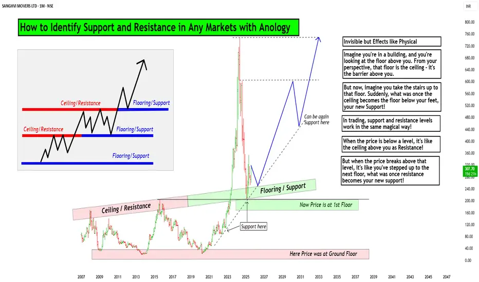
How to Identify Support and Resistance in Markets with AnologyHello Friends,
Welcome to RK_Chaarts,
Today we are going to learn & understand real work of Supports and Resistances in markets,
and Market structure with very good examples (Educational Post)
The Market's Architecture: Support and Resistance
This is an excellent analogy for understanding two of the most worthful concepts in technical analysis: support and resistance. By thinking of the market as a multi-story building, we can visualize how price moves and what happens when it hits certain levels.
- The Core Analogy: The Building and the Elevator
- Imagine the market as a large building with many floors. The price of an asset (like a stock or a cryptocurrency) is like an elevator moving up and down within this structure. The floors and ceilings of the building are not physical barriers but represent specific price points that the market has collectively agreed upon as important.
- The Floor (Support)
The floor of a building provides a solid base and prevents the elevator from falling further. In the market, this is called a support level. A support level is a price point where buying pressure is strong enough to stop the price from declining. When the "elevator" (price) reaches the floor, it finds enough buyers to give it a lift, preventing a deeper fall. A strong support level is like a thick concrete floor—it has been tested multiple times and holds firm, showing that there is significant demand for the asset at that price.
- The Ceiling (Resistance)
- The ceiling of a building sets the upper limit for the elevator's movement on a given floor. This is the market's resistance level. A resistance level is a price point where selling pressure is strong enough to prevent the price from rising further. When the "elevator" hits the ceiling, it encounters a large number of sellers who are ready to take profits, pushing the price back down. A strong resistance level is like a low ceiling—the price hits it and retreats, indicating that many investors believe the asset is overvalued at that point.
Breaking Through: New Levels
The most dynamic part of the analogy is what happens when the elevator breaks through a floor or ceiling.
Breakout (Breaking the Ceiling):
When the price has enough momentum to push through the resistance level (the ceiling), it has essentially moved to a new, higher floor. This is a significant event. The old ceiling, which was previously a barrier, now becomes the new floor. This is a key trading principle: old resistance often becomes new support. The market has established a new, higher trading range, and if the price falls back to that level, it will likely find buyers there, who now see it as a good value.
Breakdown (Breaking the Floor):
Once if price falls from that floor (Support level) which is called as Breakdown in technical language, then lower floor can be the next stop for elevator (Next Support for price), The old floor, which once provided support, now becomes a new ceiling. This is the reverse principle: old support often becomes new resistance. If the price tries to rally back up, it will likely get stuck at this old support level, as it's now seen as a good place to sell.
Structural Integrity (Volume)
Think of market Volume like a construction team. When a lot of people are involved (high volume), the structure is stronger.
Imagine a ceiling in the market. If lots of buyers (high volume) break through it, that's like a robust construction team building a new floor. It's unlikely to collapse.
On the other hand, if sellers break through a floor with high volume, that's a strong sign they're serious about the downward move.
But if the volume is low, it's like a weak construction team. Even if they break through, the move might not last. It's like a flimsy wall that could easily be reversed.
So, volume gives us a sense of whether the market's moves are strong and reliable, or weak and likely to change.
I am not Sebi registered analyst.
My studies are for educational purpose only.
Please Consult your financial advisor before trading or investing.
I am not responsible for any kinds of your profits and your losses.
Most investors treat trading as a hobby because they have a full-time job doing something else.
However, If you treat trading like a business, it will pay you like a business.
If you treat like a hobby, hobbies don't pay, they cost you...!
Hope this post is helpful to community
Thanks
RK💕
Disclaimer and Risk Warning.
The analysis and discussion provided on in.tradingview.com is intended for educational purposes only and should not be relied upon for trading decisions. RK_Chaarts is not an investment adviser and the information provided here should not be taken as professional investment advice. Before buying or selling any investments, securities, or precious metals, it is recommended that you conduct your own due diligence. RK_Chaarts does not share in your profits and will not take responsibility for any losses you may incur. So Please Consult your financial advisor before trading or investing.
It seems like no one likes non-panic morning posts...Futures are like a rented Ferrari, spot is like a purchased Mercedes.
There are hidden reserves under the melting volumes. What do you think about the current denouement?

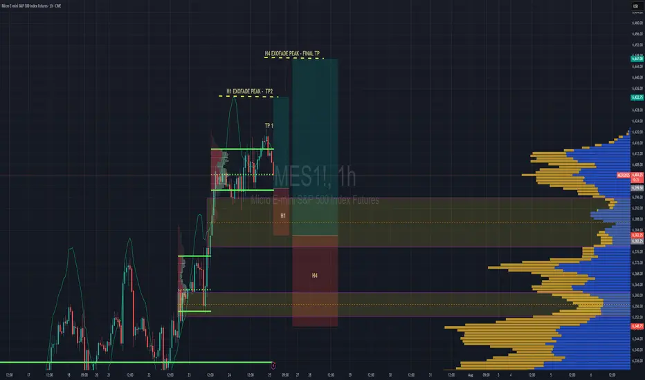
S&P 500 Intraday & Swing Entries H1 entry is close to getting activated for intraday.
If you want a swing trade then wait for H4 entry (you might be waiting a while obviously)
Reason for entries - We have broken out of Balance since July 25th and currently in a trend phase until we establish a new value area, or return to the one we broke out from.
So since Trend and Momentum is UP, then we should find Low Volume Areas to enter in the direction of the trend for a classic pullback entry trade.
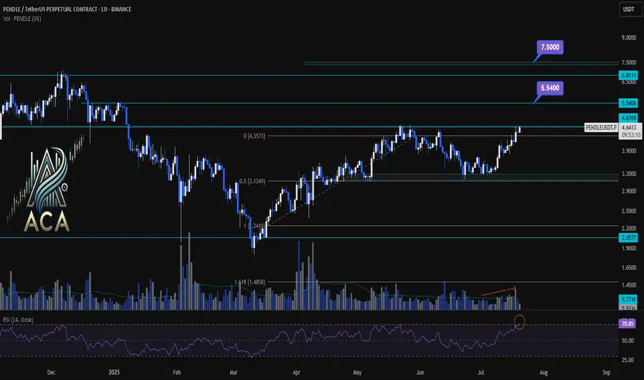
PENDLEUSDT 1D Chart Analysis|Bullish Breakout Eyes Higher TargetPENDLEUSDT 1D Chart Analysis | Bullish Breakout Eyes Higher Targets
🔍 Let’s break down the PENDLE/USDT daily chart, focusing on breakouts above key resistance, Fibonacci retracement dynamics, RSI momentum, and volume confirmation for a comprehensive bullish setup.
⏳ Daily Overview
PENDLE has staged a powerful recovery after pulling back to the 0.5 Fibonacci retracement level (around $3.12). Price is now testing the critical $4.68 resistance—the ceiling from the last corrective wave. RSI has jumped above 71, entering the overbought zone, a classic precursor to strong momentum moves. Volume is rising as bulls attempt a breakout, confirming participation behind the price action.
📈 Technical Convergence and Trend Structure
- Fibonacci Structure: The correction held the 0.5 retracement, a textbook bullish reversal zone in rising trends.
- Resistance Breakout: Price is challenging the $4.68 resistance. A daily close above, especially with high volume, would confirm the breakout and trigger bullish continuation.
- RSI Indicator: RSI has cleared the 70 mark, reinforcing strong momentum. Overbought RSI often supports further rallies when backed by breakout moves and rising volume.
- Volume Confirmation: Volume surged as PENDLE reclaimed lost ground and is now accelerating into the resistance test, suggesting trend conviction and confirming the move.
🔺 Bullish Setup & Targets
- First target: $5.54 — the next resistance based on historical supply and Fibonacci extension.
- If macro conditions like interest rate cuts align, the next potential target: $7.50 — the major extension target where price discovery is likely.
- Key trigger: A strong daily (or weekly) close above $4.68, combined with breakout volume, is likely to ignite the next leg up.
📊 Key Highlights
- Correction held at the 0.5 Fibo, signaling trend health and resetting momentum.
- A bullish daily structure aligned with a weekly breakout confluence.
- RSI and price action both making new local highs — strong uptrend indication.
- Volume confirming the move—a real breakout is underway, not a false start.
🚨 Conclusion
PENDLE/USDT looks primed for continuation higher. The blend of a successful 0.5 retracement retest, breakout attempt above $4.68, robust RSI, and volume surge all point to bullish follow-through. Watch for a confirmed close above resistance as the catalyst for further upside, with $5.54 and $7.50 the next logical targets if momentum persists.
Gold. 14.07.2025. The plan for the next few days.The nearest resistance zones are where it's interesting to look for sales. It's not certain that there will be a big reversal, but I think we'll see a correction. We're waiting for a reaction and looking for an entry point.
The post will be adjusted based on any changes.
Don't forget to click on the Rocket! =)

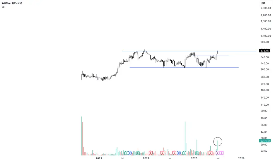
SYRMA Weekly Breakout | High Volume + 1.5-Year Base Structure🚨 Breakout Alert on SYRMA (Weekly)
After 1.5 years of sideways consolidation, SYRMA has finally broken out with strong conviction. The breakout is supported by the highest weekly volume seen in months — signaling smart money accumulation.
📊 Technical Setup:
🔹 1.5-year base formation now broken
🔹 Breakout candle closed above resistance with strength
🔹 Volume spike confirms breakout validity (HVE)
🔹 Structure resembles classic Stage 2 breakout
🟢 Ideal retest zone: ₹670–₹680
🛑 Support zone: ₹635–₹645
Fundamental Snapshot:
✅ Revenue: ₹2,000 Cr → ₹3,800 Cr in 2 years
✅ Net Profit up 50% YoY
✅ EPS (TTM): ₹9.57
✅ Promoter holding: ~46%
✅ Dominant player in EMS & IoT hardware
⚡Macro trend supports domestic electronics manufacturing — still early in the cycle.
You Haven’t Missed It**⏰ Timeframe: 1H**
**🛠 Tools Used: Dow Theory, Support & Resistance, Volume, RSI**
**📈 Market Overview**
Bitcoin BINANCE:BTCUSDT is currently trading at **110,982**. After hitting a new all-time high at **12K**, the price is undergoing a mild correction. Despite the retracement, price remains supported by both volume and the 25-period moving average.
Yesterday, BTC broke through the **110,267** resistance level with a strong bullish candle, but encountered aggressive selling from market makers and is now consolidating with weak candles below the **12K** mark.
Typically, in such market phases, it’s advisable to close previous positions and consider new entries. However, given the likelihood of **interest rate cuts** and the fact that price is holding near its ATH, keeping previous **long positions** open may be wise, as a **strong upward move** is still on the table.
**⚙️ Technical Analysis**
Yesterday’s breakout above **110,267** was met with seller pressure near **12K**, leading to a shallow correction.
**BTC Dominance (BTC.D)** has broken above **65.04** and **64.69**, moving toward **64.51** resistance. However, a weakening candle structure is visible on both **4H and 1H** timeframes. This indicates that while long opportunities on bullish **BTC pairs** may still exist, we might see a lower high forming above **64.51** and below **64.69**, followed by another move back toward **64.51**.
Meanwhile, **USDT Dominance (USDT.D)** broke below the **4.75** support with a strong candle and is now ranging above **4.63**, suggesting a possible pause or rest phase here.
The **Total Market Cap** shows a similar pattern to **BTCUSDT**, reflecting consolidation with slight bullish bias.
The **Others** chart (excluding BTC & ETH) shows a healthy uptrend and is now facing resistance at **248.68**. A breakout above this level could pave the way for stronger performance among altcoins with bullish BTC pairs.
**🧭 Potential Scenarios**
📗 **Bullish Scenario:**
If BTC forms a **higher low above 110,654**, an entry could be considered above **12,000**, with a stop-loss placed below the higher low (based on the 1H timeframe). Volume confirmation is necessary to support the move.
📕 **Bearish Scenario:**
As long as the price remains **above 109,409**, **short positions are not recommended**.
**💡 Conclusion, Warnings & General Suggestion**
Bitcoin is currently in a **healthy bullish phase**.
The **key resistance at 111K** has been broken, and price is pulling back toward that level.
The structure remains bullish, supported by **sufficient volume** and **no clear bearish divergence**.
If current support holds, there’s potential for continuation toward the **113,500–114,000** range.
⚠️ **Warnings:**
* If the pullback turns into a breakdown (falling below **110,200**, then **109,000**), it would signal **buyer weakness**, and strategy must be reconsidered.
* Watch for **RSI divergences** or **declining volume** during further rallies—they may indicate caution.
* Prolonged consolidation **below broken resistance** could also indicate market weakness.

EUR/USD Price Retrace and Reaction to RejectionQuite a significant rejection of price at around the 11256 level. Didn't think much of it at first, however there is a surprisingly large volume node at 11268.7. This has been resistance in the recent past.

Follow the Flow: Trading with Liquidity ZonesLiquidity is where the market breathes. The Liquidity Zones indicator by BigBeluga helps traders visualize where large players may be hiding orders—revealing the zones where price is most likely to react, reverse, or accelerate.
Let’s break down how this tool works, how we use it at Xuantify, and how you can integrate it into your own strategy.
🔍 What Is the Liquidity Zones Indicator?
This open-source tool identifies pivot highs and lows filtered by volume strength and plots them as liquidity zones —highlighting areas where buy/sell orders are likely to accumulate.
Key Features:
Volume-filtered pivot detection (Low, Mid, High)
Dynamic or static liquidity zone boxes
Color intensity based on volume strength
Liquidity grab detection with visual cues
These zones act as magnets for price , helping traders anticipate where reactions, reversals, or stop hunts may occur.
🧠 How We Use It at Xuantify
We use Liquidity Zones as a contextual map for structure and execution.
1. Entry & Exit Planning
We align entries near untested liquidity zones and use them as targets for exits—especially when confirmed by structure or momentum.
2. Liquidity Grab Detection
When price pierces a zone and reverses, it often signals a liquidity sweep . We use this as a trigger for reversal setups.
3. Volume Context
Zones with higher volume intensity are prioritized. These are more likely to attract institutional activity and generate stronger reactions.
🧭 Dynamic vs. Static Zones
The indicator offers both dynamic and static zone modes:
Dynamic : Box height adjusts based on normalized volume, showing how much liquidity is likely present.
Static : Consistent box size for cleaner visuals and easier backtesting.
Why this matters:
Dynamic zones reflect real-time volume strength
Static zones offer simplicity and clarity
Both modes help visualize where price is likely to “grab” liquidity
⚙️ Settings That Matter
To get the most out of this tool, we recommend:
Volume Strength = Mid or High for cleaner zones
Enable Dynamic Mode when trading volatile assets
Use Color Intensity to quickly spot high-liquidity areas
🔗 Best Combinations with This Indicator
We pair Liquidity Zones with:
Market Structure Tools – BOS/CHOCH for context
Momentum Indicators – Like RSI or MACD for confirmation
Fair Value Gaps (FVGs) – For precision entries near liquidity
This layered approach helps us trade into liquidity , not against it.
⚠️ What to Watch Out For
Liquidity zones are not signals —they’re context . In fast-moving or low-volume markets, price may ignore zones or overshoot them. Always combine with structure and confirmation.
🔁 Repainting Behavior
The Liquidity Zones indicator is designed to be non-repainting . However, due to waiting for pivot confirmation, the zones are plotted in hindsight. This makes it suitable for real-time execution .
⏳ Lagging or Leading?
This tool is partially lagging —it waits for pivot confirmation and volume validation before plotting a zone. However, once plotted, these zones often act as leading levels , helping traders anticipate where price may react next.
🚀 Final Thoughts
The Liquidity Zones indicator by BigBeluga is a powerful visual tool for traders who want to understand where the market is likely to move—not just where it’s been. Whether you’re trading reversals, breakouts, or mean reversion, this tool helps you stay aligned with the market’s hidden intent.
Add it to your chart, test it, and see how it sharpens your edge.

EURUSD. Weekly trading levels 14 - 18.04.2025During the week you can trade from these price levels. Finding the entry point into a transaction and its support is up to you, depending on your trading style and the development of the situation. Zones show preferred price ranges WHERE to look for an entry point into a trade.
If you expect any medium-term price movements, then most likely they will start from one of the zones.
Levels are valid for a week, the date is in the title. Next week I will adjust the levels based on new data and publish a new post.
! Please note that brokers have a difference in quotes, take this into account when trading.
The history of level development can be seen in my previous posts. They cannot be edited or deleted. Everything is fair. :)
----------------------------------------------
I don’t play guess the direction (that’s why there are no directional arrows), but zones (levels) are used for trading. We wait for the zone to approach, watch the reaction, and enter the trade.
Levels are drawn based on volumes and data from the CME. They are used as areas of interest for trading. Traded as classic support/resistance levels. We see the reaction to the rebound, we trade the rebound. We see a breakout and continue to trade on a rollback to the level. The worst option is if we revolve around the zone in a flat.
Do not reverse the market at every level; if there is a trend movement, consider it as an opportunity to continue the movement. Until the price has drawn a reversal pattern.
More information in my RU profile.
Don't forget to like Rocket and Subscribe!!! Feedback is very important to me!

Wait for a Proper Support!Wait for some Bullish Candles to appear at Support level with Good Volumes.

Strength on HPQ ChartHP Inc., stock approaches the bottom of the sideways channel (black horizontal lines) from which it may bounce again.
During the May 29, 2024 bar, professionals bought (blue rectangle), and since then, whenever the price reached this zone, they were buying more.
It should be noted that the buying around the bottom of the sideways is much bigger than the selling around its top which is bullish behaviour. Wyckoff's Spring on the recent activity adds to strength too. Another good sign for bulls is the decreasing volume on the down move, which indicates an absence of professional interest in lowering prices.
The testing process is ongoing as of today. If the price reaches the buying zone and no supply reappears, there is a big probability for a move up towards $37.30 - $ 39.29 with minor resistance around $34.62 - $34.72.
If supply reappears and the price breaks the bottom of the sideways channel ($32.41) we may see another leg down to $29.00 - $30.00 for more buying.

Strength on PCAR stock Paccar Inc. stock looks strong. We can see that since October 2024, the largest volume occurred after publishing earnings reports or on ex-dividend dates. Please note that:
- All bars on those days are down with the closing price in the middle of the bar which in Volume Spread Analysis (VSA) indicates strength.
- The volume on the October 22nd 2024 daily bar is the largest till now and the current price is above it.
- All professional activity after October 2024 is happening around the buying zone created during the October 22nd bar (blue rectangle $104.38 - $104.91).
- Recent buying (February 12th) breaks the previous low ($102.64) and recovers above that level which is a Wyckoff's Spring.
This all is very bullish. Still, the last testing showed the presence of supply.
If professionals can absorb the supply, we may expect a rally towards $116.01 - $117.83 with potential resistance in the $112.18 - $114.73 zone. Otherwise, another leg down to $100.01 for more buying is possible.

Strength on FMC stockAfter publishing the February 5th 2025 earnings report, the FMC Corporation stock gapped down, losing almost 34% of its value. Moreover, nowadays, the company is under serious pressure after being accused of publishing false Sales and Inventory information and downgrading shares from "Buy" to "Neutral" by some analytic companies (e.g. Redburn). Logically, in such circumstances, prices should continue down, but as a matter of fact, it is not the case. Why?
First, the February 5th bar is a down bar on a huge (largest in the last 15 years) volume, which, according to Volume Spread Analysis (VSA), indicates professional buying. Then, 2 days later, professionals bought again and the market responded by the higher prices.
Finally, the gapped-down bar reached the level of the previous support (blue rectangle on the daily and weekly charts), which adds strength.
Even though it looks very bullish on the daily chart, the price should be tested before the rally. Therefore, we may expect a shallow correction to $35.13 - $36.34 or, if supply is still there, to $30.80-33.73.
If testing is successful and the up move begins, the potential resistance on the way up will be around $48.06-$48.73 and $52.65 - $54.54 areas.

Weakness on HOOD stockRobinhood Markets, Inc. (NASDAQ: HOOD) shares appear to have sold off after publishing its February 12th earnings report. Following the report's good news, the market gapped up on opening and triggered a buying surge, allowing professionals to sell. The next day, the price recovered on a significantly lower volume, indicating absence of the professional interest on the upside (weakness). Then, on February 18th, another selling took place, which absorbed the remaining demand and pushed the price below the low of the gapped-up bar. This is bearish behaviour.
It has to be noted that there were a few more selling activities in December 2024/January 2025 (red rectangles), making the overall situation on the stock even weaker.
Despite the serious weakness, we may still see a retracement up into the $62.09 - $65.21 area for either more selling or retesting of demand, after which a move down to the $41.04-$42.66 zone could be expected. In this case, the support might reappear around the $52.96 level and at the $49.56 - $50.19 area.

HNT/USDT Trading ScenarioThe price chart of the asset shows a significant increase in trading volumes within a broad range from $2.875 to $11.153. From a volume analysis perspective, despite pronounced volatility, market participants continue to accumulate the asset within the current price corridor. At the moment, the asset's price is below the POC (Point of Control) level and has bounced off the support level at $2.875, which marks the lower boundary of the active range.
Given the current dynamics, a gradual price movement toward the upper boundary of the range can be expected, which may lead to a breakout of this level and further development of the upward trend. Such scenarios are supported by the fact that increasing trading volumes in the direction of the current trend typically signal its stability and the likelihood of continuation.
