Liquidity grab short ideaCOINBASE:BTCUSD so I’m sure you can all see the giant ascending triangle on Bitcoin. In my statistics the only reliably relevant patterns that work on Bitcoin are descending triangles with a 68% hit rate. So with that in mind I’m already skeptical. It’s also not a secret that the weekly dmi is rising (volatility and momentum rising on indicators) while price is tanking. I’ve been trading this range and just recently we’ve gotten two equal highs above triangle where there’s definitely untapped liquidity. My plan is to sell my long above the equal highs and place a short on rejection tp 1 below last weeks lows at least.
X-indicator

Does this look bullish to you? Limit Sell (Short): 93,400
Stop Loss: 95,200
Target: 83,700
Leverage: 7x
Good Luck!

IREN to 25 NASDAQ:IREN
in my opnion iren cant hold this up
its must go down to get up
fair price is 25-27
good luck

QQQ, Consolidation. Reversal, Continuation. All suggestions!(RED LINE) PREMARKET TOP OF DAY (TOD) price action refers to significant price movements and volume spikes in stocks before the 9:30 AM ET market open
-
(GREEN LINE) In premarket trading, the PREMARKET BOTTOM OF DAY price action refers to the lowest price a stock reaches during the extended-hours session (typically 4:00 AM to 9:30 AM ET)
-
(GREEN LINE & ZONE) An ASCENDING TREND LINE connecting the pre-market low and subsequent higher lows during the regular session is used by traders to identify an uptrend and potential support levels.
-
(RED LINE & ZONE) A DESCENDING TREND LINE connecting the premarket high and subsequent market session lower highs is a technical analysis indicator of persistent selling pressure, often forming part of a descending triangle pattern.
-
(BLUE LINE) The "PREVIOUS DAY'S HIGHEST PRICE" (PDH) is a key technical indicator showing the peak price of a stock or asset from the last trading session, used by traders for support/resistance levels, identifying breakouts (price moving above it), trend confirmation, and setting stop-loss/take-profit points
-
(BLUE LINE) The "PREVIOUS DAY'S LOWEST PRICE" (PDL) is the absolute minimum price a stock or security traded at during the last complete trading session, acting as crucial support for intraday traders to gauge market weakness or find bargain entry points
-
(YELLOW ZONE) The term "MARKET OPENING CANDLE" generally refers to the first candlestick that forms when a financial market opens for a new trading session (e.g., the first 5-minute candle of the day, or the daily candle for a new trading day). Traders use its characteristics and subsequent price action to gauge initial market sentiment and potential direction

ZScaler reversal? NASDAQ:ZS Deep Wave 4 into demand. High-probability reversal zone. Wave 5 potential ramp back to:
•0.382 = $307 area
•0.5 = $329 area
•0.618 = $350 NASDAQ:ZS

ZEC/USDT breakout likely?Hello,
Price continues to move within a well-defined upward channel, showing a series of higher lows and controlled pullbacks.
At the moment, price is consolidating into a small symmetrical triangle just below the 470–480 resistance zone.
So far, there has been no strong rejection, and bullish momentum remains intact.
Resistance : Immediate resistance at 470–480. A breakout above could trigger the next leg up.
Major target zone : 540–550 remains a significant higher-timeframe supply area.
My plan
Entry: 458.13, SL: 386.59, TP: 530
The idea behind this setup is that a breakout above 470–480 could lead to a continuation move toward the 540–550 zone, with 530 as an intermediate target.

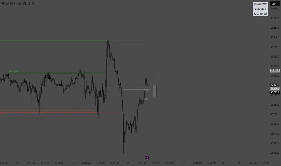
Going long on qqqGoing long on qqq today. It tapped into the fair value gap and got a strong buy signal from my algorithm. I am targeting the recent highs with a stop below the strong bullish candle.

TECHNICAL ANALYSIS BNB/USDT1️⃣ Market Structure and Trend
The chart shows a long-term uptrend, confirmed by a very clean ascending trendline (orange), which has been acting as dynamic support for over a year.
After a strong breakout to ~1380, the price began a correction but still hasn't broken the higher low structure → the uptrend is intact.
2️⃣ Key Levels (exactly from your chart)
🟢 Resistance Levels (green):
~1018 USDT
~1150 USDT
~1249 USDT
These are potential targets for a renewed uptrend.
🔴 Support Levels (red):
~879 USDT – the closest important support
~838 USDT – a key defensive level
~683 USDT – deep support / last HTF trendline
The price is currently trading directly above the first support level.
3️⃣ Trendline (orange)
Your trendline is:
strong, multi-point
drawn on the D1 timeframe
currently around 850–880 USDT
➡️ If the price falls, the trendline perfectly aligns with the 838–879 zone, strengthening this zone as a "must defend."
4️⃣ Oscillators – Stoch RSI (bottom)
Currently:
The oscillator is in a high zone (above 80) → indicating local overbought
However, there is no clear downward crossover yet.
Meaning:
👉 Upward momentum is still active, but we are closer to a local high than a low.
5️⃣ Scenarios
🟢 Upside scenario (more likely as long as the trendline holds)
Condition: Maintaining the 879/838 levels and the trendline.
Targets:
1018 USDT – first resistance
1150 USDT – important medium-term resistance
1249 USDT – main HTF target
The longer the price consolidates above the orange trendline, the greater the chance of a renewed attack on 1150–1249.
🔴 Downside scenario (less likely, but crucial)
Condition: Downside breakout of 838 USDT and closing of the D1 candle below the trendline.
Then:
the market could enter a deeper correction phase
the target would be the 683 USDT level – this is also the main support level, where reactions were previously strong
This is a "capitulation" scenario, but it doesn't seem to be dominant given the current price action.
6️⃣ What can we see on the chart "here and now"?
✔️ The price has rebounded from the local low
✔️ It is still between support at 879 and resistance at 1018
✔️ The uptrend is intact
✔️ A potential HTF higher low has formed
✔️ The Stoch RSI shows momentum, but caution is warranted
➡️ The market is consolidating within the uptrend, with a high chance of a breakout upwards – provided support is maintained.

EURUSD previous "Swing High" support at 1.1680The EURUSD remains in a bullish trend, with recent price action showing signs of a breakout within the broader uptrend.
Support Zone: 1.1680 – a key level from previous consolidation. Price is currently testing or approaching this level.
A bullish rebound from 1.1680 would confirm ongoing upside momentum, with potential targets at:
1.1760 – initial resistance
1.1790 – psychological and structural level
1.1813 – extended resistance on the longer-term chart
Bearish Scenario:
A confirmed break and daily close below 1.1680 would weaken the bullish outlook and suggest deeper downside risk toward:
1.1660 – minor support
1.1637 – stronger support and potential demand zone
Outlook:
Bullish bias remains intact while the EUPUSD holds above 1.1680. A sustained break below this level could shift momentum to the downside in the short term.
This communication is for informational purposes only and should not be viewed as any form of recommendation as to a particular course of action or as investment advice. It is not intended as an offer or solicitation for the purchase or sale of any financial instrument or as an official confirmation of any transaction. Opinions, estimates and assumptions expressed herein are made as of the date of this communication and are subject to change without notice. This communication has been prepared based upon information, including market prices, data and other information, believed to be reliable; however, Trade Nation does not warrant its completeness or accuracy. All market prices and market data contained in or attached to this communication are indicative and subject to change without notice.

Another bad day for price action in the Nasdaq
BAD DAY TO TRADE
Nasdaq is very choppy today just as it has been for the entire year. London session already dealt with very high FOMC push so if it went more Bearish on the day I wouldn't be surprised. However the price action for December has been absolutely abysmal. Pre-Market stocks are looking overall Bearish as of 1 Hour before open however that doesn't mean much with how many reversals have been happening lately. London session also broke sellside liquidity but not buyside so that could mean a bullish break of structure but FOMC messed up liquidity bad and it is still recovering so I am overall neutral on the day.
TRADELINEOFMINESOLUSD is now trying to go up trend but becareful, Market makers behind this now and playing seriously with millions, always watch this move, if you do not want to lose your money, this is not the time of set it and forget it. I had 139.00 long with TP 145.00 and keep watching.

SOL looking Spicy... Keep an eye on the structure. Solana is still trapped inside a tight range, but momentum is quietly shifting.
Price continues to reject the same major resistance zone, while buyers are stepping in at the bottom of the range with repeated bullish signals on the lower indicators. Each pullback is showing less downside follow-through, and the oscillators are beginning to build higher lows.
The key level remains unchanged: SOL needs a clean breakout above the range high to open up that much larger volume gap toward the mid-140s. Until then, this is a consolidation with tightening compression.
Hold the range - breakout potential.
Lose the range - $116 becomes the next major support.
Watching this setup closely, SOL looks like it's preparing for a bigger move.
What’s your outlook here?

Order Block Rejection Toward Liquidity TargetsThis 4-hour USD/JPY chart shows a recent bearish shift after price rejected an identified Order Block and partially filled a Fair Value Gap (FVG) before continuing downward. The broader context includes a previously broken descending channel and a current retracement into a supply zone, suggesting bearish continuation. The chart highlights a clean inefficiency zone (FVG) serving as a potential mitigation point, from which sellers appear to be stepping in. Price is currently trading around 155.20, with projected downside continuation toward two marked liquidity levels.
Targets
1st Target: 154.058
2nd Target: 152.999

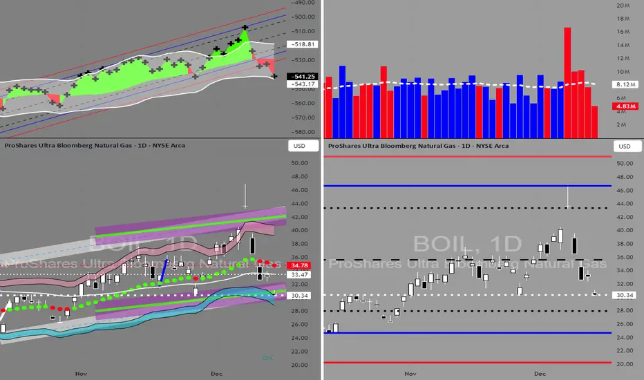
BOIL in BUY ZONEMy trading plan is very simple.
I buy or sell when at either of these events happen:
* Price tags the top or bottom of parallel channel zones
* Money flow volume spikes beyond it's Bollinger Bands
So...
Here's why I'm picking this symbol to do the thing.
Price in buying zone at bottom of channels
Money flow momentum is spiked negative and at bottom of Bollinger Band
Entry at $30.25
Target is upper channel around $42
May take profit or exit around $36
EURUSD Pauses at 1.1600 as Traders Await FED SignalsHello everyone,
EURUSD remains in a delicate consolidation around 1.1600, with the market awaiting the outcome of the upcoming FED meeting. The Volume Profile highlights 1.1650 as a key resistance due to concentrated sell orders, while 1.1550 provides immediate support with increased buyer activity. Fair Value Gaps around 1.1580–1.1650 suggest potential retests before a clear direction emerges. Despite hovering above the Ichimoku cloud, the thin red cloud ahead signals weak bullish momentum.
Fundamentally, USD pressure persists following weaker US labor data and slowing PMI, while ECB hesitance supports EUR moderately. Short-term sentiment swings are limited by macro uncertainties, keeping the pair trapped in the current range. The most plausible scenario is a minor retracement towards 1.1570–1.1590 before buyers push EURUSD toward 1.1650–1.1670. A break below 1.1550 could see a deeper correction, yet as long as higher lows hold, the medium-term uptrend remains intact.

DASH Breakout: Reversal or Trap?
Yello Paradisers, is this the beginning of a massive DASH reversal or just another fakeout that will punish impatient bulls?
💎#DASHUSDT has just broken out of a well-defined Falling Wedge formation, a classic bottoming pattern that often signals the end of a correction and the start of a new bullish phase. The move comes after a strong bounce from the major demand zone around $45–46, a level that has consistently attracted buyers and proven itself as a high-liquidity reaction area.
💎The breakout above the descending trendline shows that sellers are losing control, but the structure still demands confirmation. What matters now is whether the market delivers a clean retest. Ideally, a pullback toward the broken trendline or a dip back into the upper portion of the $45–46 demand zone would serve as a strong confirmation and potential entry trigger for the next impulsive move.
💎If buyers step in with strength on the retest, #DASH could start grinding higher toward the first resistance around $49–50, and if momentum sustains, the price may even push toward the more significant resistance region near $55.
💎That said, this structure is still fragile. A failure to hold the demand zone, particularly if price breaks below $44, would invalidate the bullish scenario and put DASH back at risk of deeper downside.
It’s not about being early, it’s about being right. Stay sharp and don’t let emotions dictate your trades. That’s the only way you make it far in this game.
MyCryptoParadise
iFeel the success🌴

USDJPY breakout supported at 155.60The USDJPY remains in a bullish trend, with recent price action showing signs of a corrective pullback within the broader uptrend.
Support Zone: 155.60 – a key level from previous consolidation. Price is currently testing or approaching this level.
A bullish rebound from 155.60 would confirm ongoing upside momentum, with potential targets at:
158.00 – initial resistance
159.00 – psychological and structural level
159.70 – extended resistance on the longer-term chart
Bearish Scenario:
A confirmed break and daily close below 155.60 would weaken the bullish outlook and suggest deeper downside risk toward:
155.00 – minor support
154.60 – stronger support and potential demand zone
Outlook:
Bullish bias remains intact while the USDJPY holds above 155.60. A sustained break below this level could shift momentum to the downside in the short term.
This communication is for informational purposes only and should not be viewed as any form of recommendation as to a particular course of action or as investment advice. It is not intended as an offer or solicitation for the purchase or sale of any financial instrument or as an official confirmation of any transaction. Opinions, estimates and assumptions expressed herein are made as of the date of this communication and are subject to change without notice. This communication has been prepared based upon information, including market prices, data and other information, believed to be reliable; however, Trade Nation does not warrant its completeness or accuracy. All market prices and market data contained in or attached to this communication are indicative and subject to change without notice.

BUY IDEA - GOLDLooking for price to come around the first or second demand zone (depending on PA) for a bullish continuation supporting yesterday's fundamentals.

Mastering MACD: A Complete Guide to Momentum🔵 Mastering MACD: A Complete Guide to Momentum, Trend Phases, Reversals & Professional Signals
Difficulty: 🐳🐳🐳🐳🐋 (Advanced)
This article goes far beyond simple MACD crossovers. You will learn where MACD comes from, why it was created, and how professionals use it to read momentum, trend phases, acceleration, deceleration, and early reversals.
🔵 THE ORIGINS OF MACD (A SHORT HISTORY)
The MACD (Moving Average Convergence Divergence) indicator was developed in the late 1970s by Gerald Appel , a technical analyst and investor.
At that time, traders relied heavily on moving averages to identify trends. While useful, moving averages alone could not explain one critical question:
Is momentum strengthening or weakening inside the trend?
Gerald Appel solved this by measuring the distance between two moving averages and tracking how that distance expands and contracts.
This simple idea allowed traders to:
Detect trend acceleration and deceleration
Spot momentum exhaustion before reversals
Combine trend direction and momentum in one tool
Later, in the 1980s, Thomas Aspray introduced the MACD histogram , making momentum pressure visible instead of hidden inside lines.
This transformed MACD from a crossover tool into a true momentum phase indicator .
MACD still works today because institutions, funds, and algorithms continue to rely on moving averages.
🔵 WHY MOST TRADERS MISUSE MACD
Most traders reduce MACD to one idea:
Buy when MACD crosses above the signal line
Sell when MACD crosses below the signal line
While MACD crossovers are frequently used to signal potential trend reversals, their effectiveness improves when they occur at extreme MACD levels, far above or below the zero line, where momentum exhaustion is more likely.
MACD is not a buy or sell button.
MACD is a momentum and trend phase analyzer .
To master MACD, you must understand:
Zero-line regimes
Histogram pressure
Momentum expansion and contraction
Divergences
Continuation behavior
Structure confirmation
Multi-timeframe alignment
MACD shows how momentum changes around trend, not where price will go next.
🔵 MACD STRUCTURE (WHAT IT IS REALLY MEASURING)
MACD consists of three components:
MACD line = difference between fast EMA and slow EMA
Signal line = smoothed average of MACD
Histogram = distance between MACD and signal line
Because of this construction, MACD measures the rate of change between trends .
Expanding MACD means momentum is accelerating.
Contracting MACD means momentum is fading.
🔵 ZERO-LINE REGIMES (TREND PHASE IDENTIFICATION)
The zero line is the most important level in MACD.
Bullish MACD Regime
MACD stays above zero
Pullbacks stall near zero
Histogram remains mostly positive
Bearish MACD Regime
MACD stays below zero
Rallies fail near zero
Histogram remains mostly negative
Professional rule: Trade in the direction of the zero-line regime. Ignore signals against it.
🔵 HISTOGRAM PRESSURE (THE REAL EDGE)
The histogram reveals momentum pressure before crossovers appear.
Expanding histogram = momentum acceleration
Contracting histogram = momentum deceleration
Below the zero line, higher histogram lows indicate weakening bearish momentum and a potential bullish shift
Above the zero line, lower histogram highs indicate fading bullish momentum and a potential bearish shift
Histogram turning points often precede:
Trend pauses
Pullbacks
Reversals
The histogram is the heartbeat of MACD.
🔵 MOMENTUM DIVERGENCES (EARLY WARNING SYSTEM)
Bearish Divergence
Price makes higher high
MACD or histogram makes lower high
Momentum weakens before price
Bullish Divergence
Price makes lower low
MACD or histogram makes higher low
Selling pressure fades
Divergences work best:
After extended trends
Near major structure levels
When histogram contracts sharply
🔵 MACD AS A TREND CONTINUATION TOOL
MACD excels at trading pullbacks in strong trends.
Bullish Continuation
MACD above zero
Histogram pulls back toward zero
Histogram turns positive again
Bearish Continuation
MACD below zero
Histogram retraces upward
Histogram turns negative again
This is the professional way to use MACD inside trends.
🔵 MACD + PRICE STRUCTURE CONFLUENCE
MACD becomes powerful when aligned with structure.
Higher highs + rising MACD = healthy trend
Higher highs + flat MACD = weakening momentum
Break of structure + MACD zero-line flip = regime change
Structure retest + histogram expansion = high-probability entry
MACD filters false breakouts by revealing momentum behind price.
🔵 MULTI-TIMEFRAME MACD ALIGNMENT
Professional rule:
Lower timeframe setups must align with higher timeframe MACD regime.
HTF MACD above zero = long-only bias
HTF MACD below zero = short-only bias
HTF histogram expanding = trend acceleration
This alignment significantly improves consistency.
🔵 EXAMPLE TRADING FRAMEWORK
Bullish Setup Checklist
MACD above zero
Histogram contracts then expands
Price forms higher low
Bearish Setup Checklist
MACD below zero
Histogram retraces then expands negatively
Price forms lower high
🔵 COMMON MACD MISTAKES
Trading every crossover blindly
Ignoring zero-line regime
Using MACD without structure context
Overreacting to small histogram changes
Treating MACD as a prediction tool
🔵 CONCLUSION
MACD is not a simple crossover indicator. When mastered, it becomes a complete framework for:
Reading momentum strength
Identifying trend phases
Detecting exhaustion early
Trading continuation setups
Confirming structure shifts
Aligning multi-timeframe bias
MACD does not predict price.
It reveals how momentum evolves around trend.
How do you use MACD? Histogram pressure, zero-line regimes, or divergences? Share your approach below.

XAG/USD: Major Resistance Cleared, What Comes Next?🥈 XAG/USD — SILVER VS U.S. DOLLAR
Metals Market • Swing / Day Trade Opportunity Guide 🧭📈
⚙️ Market Outlook — Bullish Confirmation
Silver has broken through a major resistance zone, shifting momentum firmly into bullish territory.
This breakout signals the presence of strong buyers stepping in, making the market attractive for both short-term and swing-trade setups.
🎯 Trade Plan
📌 Entry:
Enter at any available level after the confirmed breakout retest.
Bullish continuation patterns are forming, giving us a clean pathway to the upside.
🛡️ Stop Loss — Thief Style SL @ 57.000
Dear Ladies & Gentlemen (Thief OG’s), secure your capital wisely.
Adjust SL according to your personal system, risk appetite, and style.
I do not recommend copying my SL blindly — your strategy = your rules.
🎯 Target — Profit With Precision @ 62.000
We have:
🧱 Strong resistance zone
🔥 Overbought conditions expected
🎭 Potential bull-trap areas above
So escape with profits once the market hits our zone.
Dear Ladies & Gentlemen (Thief OG’s), your TP is also your choice — manage your profits with discipline.
🔗 Correlated & Related Pairs to Watch ($ Versions Included)
Tracking these helps confirm momentum, spot divergences, and follow overall metals sentiment.
1️⃣ XAU/USD (Gold vs USD) — TVC:GOLD
Why watch?
Gold and Silver often move together due to safe-haven demand.
When Gold surges strongly while Silver lags, Silver usually follows.
If Gold rejects from resistance, Silver may also cool off.
Key Point:
Gold strength = higher probability continuation in Silver’s bullish wave.
2️⃣ XAU/XAG (Gold-to-Silver Ratio) — $GoldSilverRatio
Why watch?
A falling ratio means Silver is gaining strength faster than Gold.
A rising ratio signals Silver weakness.
Key Point:
A drop in the ratio supports our bullish Silver narrative.
3️⃣ DXY (US Dollar Index) — TVC:DXY
Why watch?
Silver is priced in USD.
When DXY drops, metals typically rise due to USD weakening.
Key Point:
If TVC:DXY shows bearish momentum → Silver bullish continuation is more confident.
4️⃣ XAG/EUR (Silver vs Euro) — OANDA:XAGEUR
Why watch?
Useful to understand Silver’s global demand, not just USD-denominated.
If Silver is bullish across currencies, then the trend is fundamentally strong.
Key Point:
Multi-currency strength confirms genuine Silver demand.
5️⃣ Copper Futures (HG) — CAPITALCOM:COPPER
Why watch?
Silver has partial industrial demand.
When copper rises, it signals industrial activity strength → bullish for Silver.
Key Point:
Copper strength = supportive macro backdrop for Silver.
🧠 Final Outlook
A clean breakout, supportive cross-metal correlations, and favorable USD weakness give Silver an attractive path toward 62.000.
Trade smart, protect your capital, lock in profits, and execute like true Thief OG’s. 🥷📊

EUR/JPY Looking sell from key supply zone 📉 EURJPY Trade Idea – Short Setup Activated!
Price is reacting from a key supply zone around 182.500, giving a clean sell opportunity on the 1H timeframe.
Structure is forming an ascending triangle breakdown pattern, aligning with a potential downside move. 🔻📊
🎯 Technical Targets:
1️⃣ 182.000
2️⃣ 181.400
3️⃣ 180.200
⚠️ Risk Management Reminder:
Always use proper SL & position sizing to protect your capital! 🛡️💼
If you found this analysis helpful—
👍 Like • 💬 Comment • 🔁 Share • 🔔 Follow for more setups!

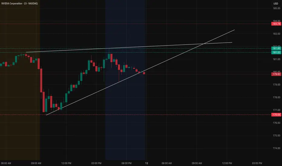
NVDA Dec 12 Market Structure and Options. Driven Levels
NVDA 15-Min Market Structure
NVDA has been riding a steady intraday trendline from the morning rebound, but the most recent candles show price slipping underneath that trendline. This shift tells us momentum is slowing, and the market is waiting for a key directional trigger.
Above price, the intraday resistance band near 181.50–182 has rejected multiple times. Until NVDA can claim and hold above that zone, the chart leans neutral-to-slightly-heavy.
Below current levels, the lower trendline (local rising support) interacts with 179.50–180 — a zone that has already acted as a short-term pivot. If this area breaks cleanly, a deeper correction becomes more likely.
Now Look at How Options Positioning (GEX) below That Aligns With the Chart:
Looking at the options landscape, NVDA shows concentrated call-side resistance stacked from 182.5 up toward 187.5–190. These levels often behave like “upper gravity zones” — price may approach them, but if call positioning is dense, dealers tend to hedge in a way that suppresses sharp upside.
This aligns well with the technical rejection seen around 181.50–182. The market had multiple chances to break through but failed, confirming that supply is reinforced by options positioning.
On the downside, the negative GEX region around 177–175 marks where put positioning thickens. These zones often act as stabilization areas during pullbacks because dealer hedging can slow the decline as price approaches them.
This creates a very clean structure:
* Resistance and upside hesitation: 181.5 → 182.5 → 187.5
* Neutral zone: 180–179.5
* Downside absorption: 177 → 175
Technically and options-wise, NVDA sits in a narrow decision range. Breakout above 182.5 could open room toward 185 and possibly 187.5 if momentum builds. Break below 179.5 puts 177 and 175 into play.
Directional Thoughts for Dec 12
* Bullish Case:
NVDA must break above 181.5–182.5 and hold. If achieved, the next push could target 185, with an extension toward 187.5 where another cluster of call resistance sits.
* Bearish Case:
A clean breakdown under 179.5 shifts momentum firmly downward. In that scenario, price may gravitate toward 177 first, then 175 where options positioning suggests downside may slow.
Why This Setup Is Interesting
NVDA’s chart is not moving on pure price action alone — the intraday reactions line up almost perfectly with the major GEX concentrations. When technical structure and options-based levels reinforce each other, markets often behave more predictably because both chart traders and hedging flows are interacting at the same spots.
This makes NVDA one of the cleaner names to watch on Dec 12.
Disclaimer
This analysis is for educational purposes only and does not constitute financial advice. Always perform your own research and manage risk according to your individual trading plan.
GBPUSD | Bullish movement began? (READ THE CAPTION!)As you can see, GBPUSD reacted to the FVG and it surged in price because of FOMC, reaching as high as 1.33920, just 8 pip short of the 1.34000 that I had previously talked about.
At the moment, GBPUSD is dealing with supply zone, I expect it to go higher, somewhere around 1.34300, right at the bottom of the next supply zone, and then we have to wait and see how it reacts to that level.
