KA Weekly Open (Apertura Semanal)KA Weekly Open (Current Week Only)
This indicator automatically plots a horizontal line at the weekly opening price on your chart.
The line updates each week with the new weekly open.
Historical weekly lines remain fixed (not extended).
The current week’s line extends to the left, and the price label is shown on the right side of the chart, near the price scale.
You can adjust the label’s offset from the scale using the input settings.
Breadth Indicators

VWAPs Ancoradas📊 Indicator: Multiple Anchored VWAPs
This indicator plots up to 5 anchored VWAPs (Volume Weighted Average Price) from different customizable starting dates, allowing traders to track the volume-weighted average price from key moments on the chart.
🔎 What is VWAP?
VWAP is one of the most widely used institutional indicators to identify fair value areas. It represents the average price weighted by volume, helping traders spot dynamic support and resistance levels.
⚙️ How the indicator works:
Define up to 5 different anchor dates (e.g., yearly open, quarterly open, major economic events, asset launches, etc.).
From each anchor date, VWAP is recalculated and plotted on the chart.
Each VWAP has a customizable color and label, making it easy to organize.
In addition to the line, the indicator shows the VWAP name on the last bar, with a clean text display (no background box).
Text color can be adjusted in the settings (default is black).
🎯 Practical applications:
Track yearly, quarterly, monthly, or weekly VWAPs.
Compare price behavior across different time periods.
Identify where price stands relative to the average cost of institutional players.
Combine with price action for better entry and exit timing.
✅ Key features:
Up to 5 simultaneous VWAPs.
Fully customizable anchor dates.
Clear colored lines and labels on chart.
Minimalistic and clean layout, without visual clutter.

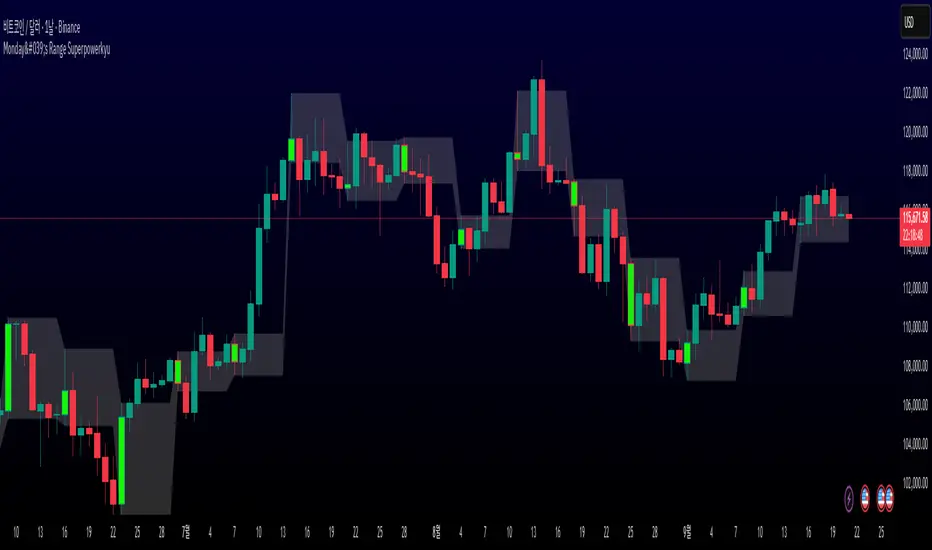
Monday's Range Superpowerkyu🔔 Settings
You can customize the colors and toggle ON/OFF in the indicator settings.
Works on daily, hourly, and minute charts.
Easily visualize Monday’s high, low, and mid-line range.
📌 1. Support & Resistance with Monday’s Range
Monday High: Acts as the first resistance of the week.
◽ Example: If price breaks above Monday’s high after Tuesday, it signals potential bullish continuation → long setup.
Monday Low: Acts as the first support of the week.
◽ Example: If price breaks below Monday’s low, it signals bearish continuation → short setup.
📌 2. Mid-Line Trend Confirmation
Monday Mid-Line = average price of Monday.
Price above mid-line → bullish bias.
Price below mid-line → bearish bias.
Use mid-line breaks as entry confirmation for long/short positions.
📌 3. Breakout Strategy
Break of Monday’s High = bullish breakout → long entry.
Break of Monday’s Low = bearish breakout → short entry.
Place stop-loss inside Monday’s range for a conservative approach.
📌 4. False Breakout Strategy
If price breaks Monday’s high/low but then falls back inside Monday’s range, it is a False Breakout.
Strategy: Trade in the opposite direction.
◽ False Breakout at High → short.
◽ False Breakout at Low → long.
Stop-loss at the wick (extreme point) of the failed breakout.
📌 5. Range-Based Scalping
Use Monday’s high and low as a trading range.
Sell near Monday’s High, buy near Monday’s Low, repeat until breakout occurs.
📌 6. Weekly Volatility Forecast
Narrow Monday range → higher chance of strong trend later in the week.
Wide Monday range → lower volatility expected during the week.
📌 7. Pattern & Trend Analysis within Monday Range
Look for candlestick patterns around Monday’s High/Low/Mid-Line.
◽ Example: Double Top near Monday’s High = short setup.
◽ Repeated bounce at Mid-Line = strong long opportunity.
✅ Summary
The Monday’s Range (Superpowerkyu) Indicator helps traders:
Identify weekly support & resistance
Confirm trend direction with Mid-Line
Trade breakouts & false breakouts
Apply range scalping strategies
Forecast weekly volatility
⚡ Especially, the False Breakout strategy is powerful as it captures failed moves and sudden sentiment reversals.
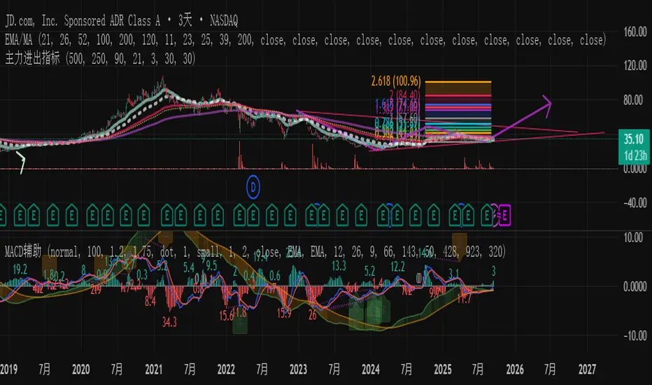
主力资金进出监控器Main Capital Flow Monitor-MEWINSIGHTMain Capital Flow Monitor Indicator
Indicator Description
This indicator utilizes a multi-cycle composite weighting algorithm to accurately capture the movement of main capital in and out of key price zones. The core logic is built upon three dimensions:
Multi-Cycle Pressure/Support System
Using triple timeframes (500-day/250-day/90-day) to calculate:
Long-term resistance lines (VAR1-3): Monitoring historical high resistance zones
Long-term support lines (VAR4-6): Identifying historical low support zones
EMA21 smoothing is applied to eliminate short-term fluctuations
Dynamic Capital Activity Engine
Proprietary VARD volatility algorithm:
VARD = EMA
Automatically amplifies volatility sensitivity by 10x when price approaches the safety margin (VARA×1.35), precisely capturing abnormal main capital movements
Capital Inflow Trigger Mechanism
Capital entry signals require simultaneous fulfillment of:
Price touching 30-day low zone (VARE)
Capital activity breaking recent peaks (VARF)
Weighted capital flow verified through triple EMA:
Capital Entry = EMA / 618
Visualization:
Green histogram: Continuous main capital inflow
Red histogram: Abnormal daily capital movement intensity
Column height intuitively displays capital strength
Application Scenarios:
Consecutive green columns → Main capital accumulation at bottom
Sudden expansion of red columns → Abnormal main capital rush
Continuous fluctuations near zero axis → Main capital washing phase
Core Value:
Provides 1-3 trading days early warning of main capital movements, suitable for:
Medium/long-term investors identifying main capital accumulation zones
Short-term traders capturing abnormal main capital breakouts
Risk control avoiding main capital distribution phases
Parameter Notes: Default parameters are optimized through historical A-share market backtesting. Users can adjust cycle parameters according to different market characteristics (suggest extending cycles by 20% for European/American markets).
Formula Features:
Multi-timeframe weighted synthesis technology
Dynamic sensitivity adjustment mechanism
Main capital activity intensity quantification
Early warning function for capital movements
Suitable Markets:
Stocks, futures, cryptocurrencies and other financial markets with obvious main capital characteristics.
指标名称:主力资金进出监控器
指标描述:
本指标通过多周期复合加权算法,精准捕捉主力资金在关键价格区域的进出动向。核心逻辑基于三大维度构建:
多周期压力/支撑体系
通过500日/250日/90日三重时间框架,分别计算:
长期压力线(VAR1-3):监控历史高位阻力区
长期支撑线(VAR4-6):识别历史低位承接区
采用EMA21平滑处理,消除短期波动干扰
动态资金活跃度引擎
独创VARD波动率算法:
当价格接近安全边际(VARA×1.35)时自动放大波动敏感度10倍,精准捕捉主力异动
资金进场触发机制
资金入场信号需同时满足:
价格触及30日最低区域(VARE)
资金活跃度突破近期峰值(VARF)
通过三重EMA验证的加权资金流:
资金入场 = EMA / 618
可视化呈现:
绿色柱状图:主力资金持续流入
红色柱状图:当日资金异动量级
柱体高度直观显示资金强度
使用场景:
绿色柱体连续出现 → 主力底部吸筹
红色柱体突然放大 → 主力异动抢筹
零轴附近持续波动 → 主力洗盘阶段
核心价值:
提前1-3个交易日预警主力资金动向,适用于:
中长线投资者识别主力建仓区间
短线交易者捕捉主力异动突破
风险控制规避主力出货阶段
参数说明:默认参数经A股历史数据回测优化,用户可根据不同市场特性调整周期参数(建议欧美市场延长周期20%)

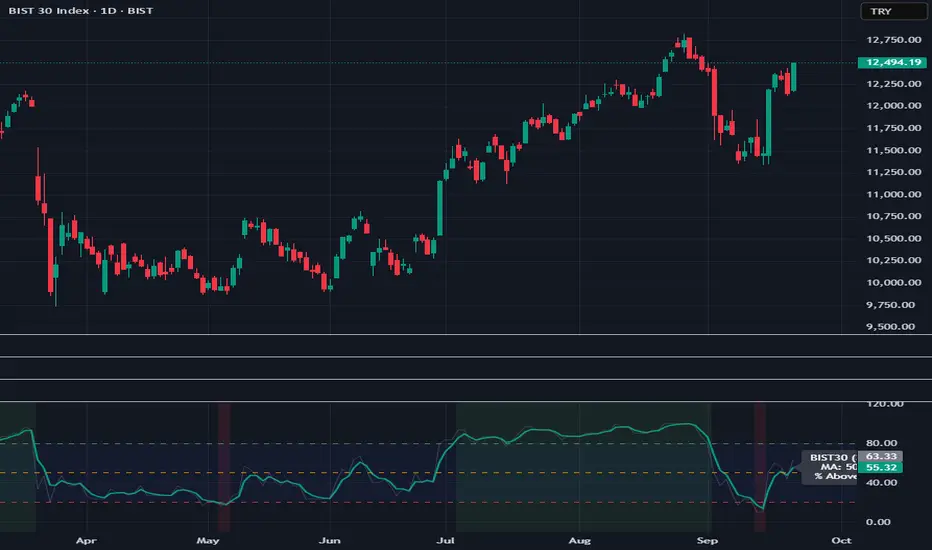
BIST30 % Above Moving Average (Breadth)
BIST30 % Above Moving Average (Breadth)
This indicator shows the percentage of BIST30 stocks trading above a selected moving average.
It is a market breadth tool, designed to measure the overall health and participation of the market.
How it works
By default, it uses the 50-day SMA.
You can switch between SMA/EMA and choose different periods (5 / 20 / 50 / 200).
The script checks each BIST30 stock individually and counts how many are closing above the chosen MA.
Interpretation
Above 80% → Overbought zone (short-term correction likely).
Below 20% → Oversold zone (potential rebound).
Around 50% → Neutral / indecisive market.
If the index (BIST:XU030) rises while this indicator falls → the rally is narrow-based, led by only a few stocks (a warning sign).
Use cases
Short-term traders → Use MA=5 or 20 for momentum signals.
Swing / Medium-term investors → Use MA=50 for market health.
Long-term investors → Use MA=200 to track bull/bear market cycles.
Notes
This script covers only BIST30 stocks by default.
The list can be updated for BIST100 or specific sectors (e.g., banks, industrials).
Breadth indicators should not be used as standalone buy/sell signals — combine them with price action, volume, and other technical tools for confirmation.
DTrend & Volume Strong BUY Signal: Look for a green WMA, combined with a green circle and a blue triangle.

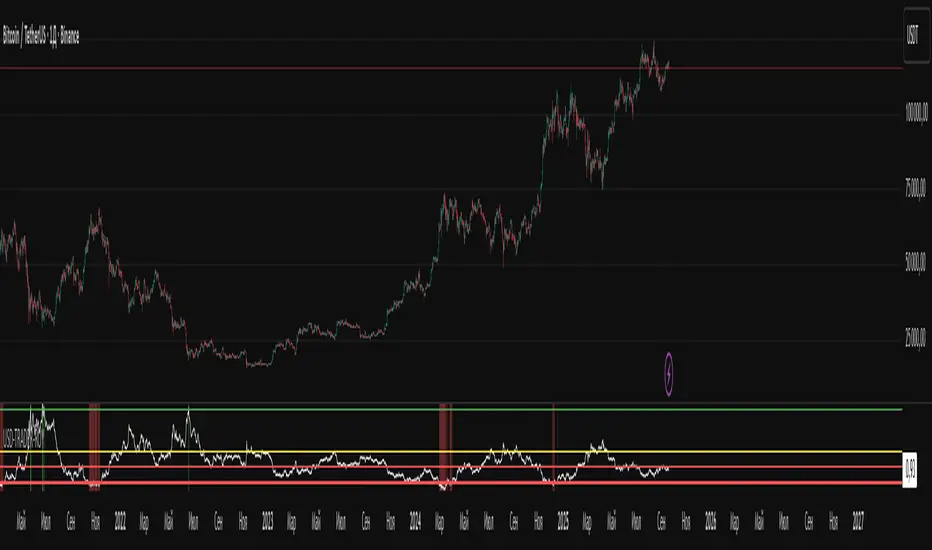
USD-TRADER-ROYThe USD-TRADER-ROY is a custom TradingView indicator designed for crypto and USD market analysis. It tracks a smoothed ratio between USDT dominance and historical averages (similar to the Puell Multiple concept) to highlight potential buy or sell zones.
Key features include:
Dynamic Buy/Sell Zones: Visual horizontal levels to indicate potential accumulation or profit-taking areas.
Visual Feedback: Colored backgrounds and bar colors to quickly show whether conditions suggest caution, accumulation, or potential selling.
Custom Alerts: Built-in alert conditions that notify traders when the market approaches critical thresholds, making it easier to act on opportunities without constant monitoring.
Flexible Parameters: Adjustable inputs for thresholds and risk levels to suit different strategies or risk tolerances.
This tool is aimed at traders who want a visual, alert-based system for gauging market extremes and managing entries/exits efficiently. It works best when combined with your own analysis and risk management.
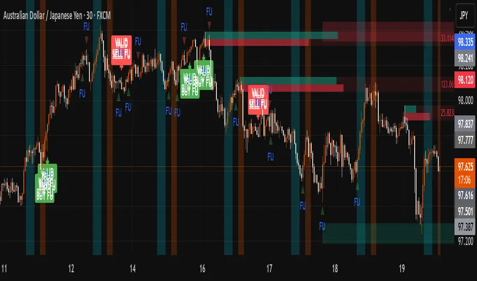
FU + SMI Validator (Proper FU, 30m)Overview
The FU + SMI Validator is a sophisticated technical analysis indicator designed to detect Proper FU (Fakeouts or Liquidity Sweeps) on the 30-minute timeframe. This tool aims to help traders identify high-probability reversal setups that occur when price briefly breaks key levels (sweeping liquidity), then reverses with momentum confirmation.
Fakeouts are common market events where price action “hunts stops” before reversing direction. Correctly identifying these events can offer excellent entry points with defined risk. This indicator combines price action logic with momentum and volatility filters to provide reliable signals.
Core Concepts
Proper FU (Fakeout) Detection
At its core, the script identifies proper fakeouts by checking if the current bar’s price:
For bullish fakeouts: dips below the previous bar’s low (sweeping stops) and then closes above the previous bar’s high
For bearish fakeouts: spikes above the previous bar’s high and then closes below the previous bar’s low
This ensures that the breakout is a true sweep rather than just a one-sided close.
Optionally, the script can require one additional confirmation bar after the FU, ensuring that the momentum is sustained and reducing false signals.
SMI-style Momentum Validation
To improve the quality of signals, the indicator uses a proxy for the Stochastic Momentum Index (SMI) by calculating the difference between current and past linear regression slopes of price. This momentum check helps ensure that fakeouts occur alongside actual directional strength.
Key points:
Momentum must be increasing in the direction of the FU signal.
Momentum filters can be enabled or disabled based on user preference.
Squeeze Condition to Avoid Low-Volatility Traps
The script includes a volatility filter based on a squeeze-like condition:
It compares Bollinger Bands (BB) and Keltner Channels (KC).
When BB bands contract inside KC bands, the market is in a squeeze state, signaling low volatility.
Fakeouts during squeeze conditions are often unreliable; the script can filter these out to reduce false alarms.
Killzone Session Timing Filter
Recognizing that liquidity and volatility vary by session, this tool supports optional filtering for:
London Killzone: 09:00 to 10:30 (UK time)
New York Killzone: 13:00 to 14:30 (UK time)
Signals only trigger during these high-activity windows if enabled, helping traders focus on periods with the best liquidity and market participation.
Note: For Killzone filtering to work accurately, your TradingView chart must be set to the UK timezone.
Features & Benefits
Robust FU detection ensures the breakout price action is meaningful, reducing noise.
Momentum filter via linear regression slope captures trend strength in a smooth, mathematically sound way.
Low-volatility squeeze avoidance helps reduce false signals in choppy or range-bound markets.
Killzone timing filter focuses your attention on the most liquid and active market hours.
Optional confirmation bar increases signal reliability.
Raw FU markers allow visualization of all detected fakeouts for pattern recognition and manual analysis.
Alerts built-in for both valid buy and sell FU setups, enabling real-time notification and quicker decision-making.
Customization Options
Killzone usage: Enable or disable the session timing filter.
Sessions: Configure London and New York killzone time ranges.
Momentum alignment: Enable or disable momentum filter based on SMI proxy.
Volatility filter: Avoid signals during squeeze or low-volatility conditions.
FU confirmation: Option to require one additional confirming candle after the initial FU.
Squeeze and momentum parameters: Adjust Bollinger Bands length and multiplier, Keltner Channel length and ATR multiplier.
Raw FU markers: Show or hide all detected fakeouts regardless of filters.
How to Use This Indicator
Apply to 30-minute charts for forex pairs, indices, cryptocurrencies, or other instruments.
Set your chart timezone to UK time if using Killzone filters.
Adjust input parameters based on your preferred sessions and risk tolerance.
Look for green “VALID BUY FU” labels below bars for bullish fakeout entries.
Look for red “VALID SELL FU” labels above bars for bearish fakeout entries.
Use the alert system to receive notifications on setups.
Combine with your existing analysis or risk management strategy for entries, stops, and profit targets.
Why Use FU + SMI Validator?
Fakeouts are some of the most lucrative but tricky setups for many traders. Without proper filters, they can lead to false entries and losses. This script integrates price action, momentum, volatility, and session timing into one package, providing a robust tool to spot high-quality fakeout opportunities and improve trading confidence.
Limitations
Requires chart to be set to UK timezone for session filters.
Designed specifically for 30-minute timeframe — performance on other timeframes may vary.
Momentum is a proxy, not a direct SMI calculation.
Like all indicators, best used in conjunction with sound risk management and other analysis tools.
Potential Enhancements
Conversion into a full strategy script for backtesting entries and exits.
Addition of other momentum indicators (RSI, MACD) or volume filters.
Customizable time zones or auto time zone detection.
Multi-timeframe analysis capabilities.
Visual dashboard for summary of signal stats.
Buy Signal 50-200 EMA & RSI25 (Alert)Buy signal generate when all given condition achieved Risk to reward ratio is 1:2 minimum

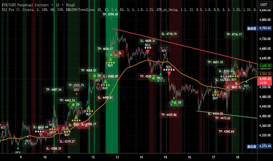
Precision AI Trading ProPrecision AI Trading Pro — TradingView Indicator
EN / 中文雙語說明(No promo, high-level logic, originality stated)
What it does |用途
EN
Trend-aligned entries on 5m/15m (and higher) using multi-layer confirmations. It emphasizes confirmation over prediction, then derives adaptive TP/SL from volatility and recent structure.
中文
在 5/15 分鐘(與更高時框)進行趨勢對齊進場,重確認、不猜轉折;並依波動與近期結構自適應計算 TP/SL。
Why it’s original & useful |原創性與價值
EN
This script implements a custom 11-filter confluence engine and a volatility-aware exit model. Filters are designed to complement each other: HTF context narrows bias, LTF structure checks timing, momentum/volume validate strength, and regime gates avoid chop. Exits use ATR- and swing-based distances with caps to keep results realistic.
中文
本腳本自研 11 重共振濾網 與 隨波動調整的出場模型:HTF 提供方向偏好,LTF 結構掌握時點;動能/量能驗證有效性;型態/趨勢強度門檻過濾震盪;出場以 ATR 與擺動區間計算距離並設上限,使績效更貼近實際。
How it works (high-level) |高層級運作
EN
HTF alignment: EMA(3/8/21) + RSI/MACD on a higher timeframe (confirmed bars only) sets directional bias.
LTF structure: Requires local EMA(3/8/21) alignment, Structure Breakout (recent swing ± ATR buffer), and optional Pullback to EMA8/21.
Regime checks: ADX gate and EMA band width filter out low-trend conditions; Volume confirms pressure.
Risk layer: Peak Guard (overheat/new-high/surge) blocks extended entries.
Trendline/EMA200: Optionally require EMA200 or TL breakout with ATR tolerance.
Exits: SL = max(ATR×k, swing buffer, % floor); TP = min(R×SL, ATR/% caps).
No look-ahead: HTF uses confirmed bars; pivots only annotate context, not used as entry triggers.
中文
HTF 共振:高階時框 EMA(3/8/21)+RSI/MACD(僅採用確認棒)決定方向偏好。
LTF 結構:要求本階 EMA(3/8/21) 一致、結構突破(近期高低點 ± ATR 緩衝),並可選 回踩 EMA8/21。
市況門檻:ADX 閘 與 EMA 帶寬 排除低趨勢環境;量能 驗證推進力。
風險層:Peak Guard(過熱/創高/急漲)避免追價。
趨勢線/EMA200:可選擇要求 EMA200 或趨勢線突破(含 ATR 容忍帶)。
出場:SL = max(ATR×k, 擺動緩衝, % 下限);TP = min(R×SL, ATR/% 上限)。
避免前視:HTF 僅用確認棒;樞紐點僅作標註,不作入場條件。
Filters (11) |濾網(11 項)
HTF Trend / Bright Zone (RSI) / LTF EMA(3/8/21) / MACD / Volume / ADX Gate / Structure Breakout / Pullback to EMA / EMA Band Width / Peak Guard / Trendline or EMA200 Confirmation
(高階趨勢/RSI 亮區/本階 EMA 結構/MACD/量能/ADX 閘/結構突破/回踩 EMA/EMA 窄帶/高位防護/趨勢線或 EMA200 確認)
User can define required passes (default 7).|可自訂需通過的濾網數(預設 7)。
Features |功能
Multi-market presets (Crypto / Gold / US Futures / Forex)|多市場預設
Adaptive TP/SL with labels (dynamic R:R)|自適應 TP/SL(含標註)
Risk-based star rating (0★–5★)|風險星級評分
Signal modes: Conservative / Balanced / Aggressive|訊號模式:保守/平衡/積極
Peak Guard toggle|高位防護可切換
How to use |使用方式
Pick market preset; start with 5m/15m.
Set required filters (default 7) and enable HTF confirmed bars.
Tune TP/SL and risk per symbol/timeframe; use star rating as visual guidance.
In choppy markets, raise ADX min and EMA-band threshold; in trend, relax them slightly.
選擇市場預設(建議 5/15 分鐘起)。
設定需通過的濾網數(預設 7),並啟用 HTF 確認棒。
依商品/時框微調 TP/SL 與風險;以星級作視覺參考。
震盪市提高 ADX 與帶寬門檻;趨勢市可適度放寬。
Notes |注意
Backtest behavior depends on bar resolution and fill rules; intrabar path may differ from live fills.
Educational use only; not financial advice.
No ads/links/contacts.
Changelog |版本紀錄(示例,請用「Update」維護)
2025-09-05: Reversal v2.1 scoring & 2-step confirmation; TL rejection/OB-touch trigger (optional); EMA8 recapture via close; Peak Guard integrated; BTC/ETH/SOL presets refined; alerts expanded; label params cleaned.
2025-08-28: Fixed decimal bug; tuned presets for four markets; kept auto RR/SL logic.


Ultimate Sniper Entry - Pivot PerfectionT2R📌 Description
The Ultimate Sniper Entry – Pivot Perfection is a precision trading tool designed to identify high-probability pivot points and generate early buy/sell entries with strong confirmation. By combining pivot detection, volume spikes, momentum filters (RSI), candle patterns, and EMA trend alignment, this system helps traders capture market reversals and trend continuation setups with improved accuracy.
It offers:
Smart Pivot Detection with adjustable sensitivity.
Multi-layer Confirmation: volume, momentum, candle structure, and EMA trend filter.
Non-Repainting Signals: arrows plotted only after pivot confirmation.
Visual Aids: buy/sell arrows, optional pivot markers, background trend shading.
Alerts: instant notifications for sniper buy/sell entries.
Info Panel: quick reference guide directly on chart.
Ideal for traders who want structured, rules-based entries while avoiding false signals, the Ultimate Sniper Entry system adapts to multiple markets and timeframes.
