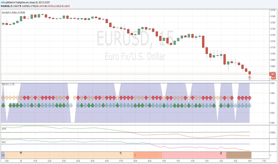
Chande Kroll R-Squared IndexChande Kroll R-Squared Index script.
This indicator was originally developed by Tushar S. Chande and Stanley Kroll (see their book `The New Technical Trader`, Chapter 2: `Linear Regression Analysis`).
Correlation

Multiple Markets CorrelationThis script provides the opportunity to setup multiple symbols and summerize their correlation values. Each correlation value can be weighted. The result will be a correlation score, which gives you a hint if markets show a divergence.
If you want access send me a PM.
CorrelationDetects if there is a correlation between two securities. It shows a positive level when they have been moving together and a negative level when they have been moving in opposite directions.

Dollar / Stocks Correlation OscillatorMakes visual the theory that "a strong dollar is bullish for equities/stocks"
...but oh man, these two are definitely not that strongly correlated.
What's the deal with that? Still learning. Glad for any comments.

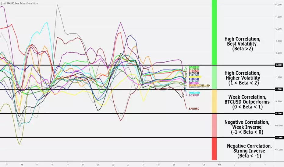
Bitfinex USD Pairs: Betas and Correlations [checkm8]Hello and welcome to my beta and correlation indicator!
This indicator is meant to be used to assess trading alternatives to BTCUSD on Bitfinex, examining alt-USD pairs that can be traded on margin. This list is as follows:
ETHUSD
LTCUSD
EOSUSD
NEOUSD
OMGUSD
XRPUSD
IOTUSD
BCHUSD
SANUSD
ETPUSD
ETCUSD
XMRUSD
ZECUSD
DSHUSD
Before dwelling further on the script, let's revisit the definitions of beta and correlation:
Beta is a statistical measure of a %-change in an asset relative to a 1% change in a benchmark. In our case - this is BTCUSD. For example, if the beta is 1.5, it means that the particular asset moves 1.5% in the same direction as the 1% change of the benchmark. If the beta is negative, the asset is moving in opposite direction of the benchmark. Note: beta is not confined to any range.
Correlation is a statistical measure of the relationship between two assets, from a range of +1 to -1, where a score of +1 implies perfect positive correlation (prices move in the same direction), -1 implies perfect negative correlation (inverse relationship), and 0 implies no relationship in price changes.
For the calculations, BITFINEX:BTCUSD is used as the benchmark.
Through the script's settings:
You can select whether to plot betas or the correlations
You can select the desired length to be used in the measure of beta and correlations
You can enable smoothing for less choppy results. This is accompanied by options to modify the smoothing length and the smoothing method, where SMA, EMA, RMA, and WMA are available.
You can enable and disable individual alt pairs from being displayed (ie. if you do not want LTCUSD plotted, you can turn it off)
Below is an example of the correlation setting.
I would recommend using a smoothing input of 3-6, on SMA, and the 4-hour timeframe for good results. I use this indicator for help in deciding what alt pairs to trade on a particular day, where you will want to trade alts with the highest correlations. Note: be weary of less liquid markets, such as ETP and SAN.
Also note: the labels shown in the snapshot are for presentation purposes only. You can enable Indicator Labels by right clicking the oscillator -> "Price Scale" -> "Indicator Labels".
Please let me know if you have any questions, suggestions, or concerns.
Happy trading!
For additional information as to why you should be using this indicator and trading alts instead of BTCUSD, please refer to my study:
GDAX Coin CorrelationPretty viz of how correlated/uncorrelated price of coins BTC ETH LTC BCH are on GDAX.
From the ref:
"Correlation coefficient. Describes the degree to which two series tend to deviate from their sma values."

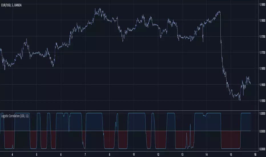
Logistic CorrelationLogistic Correlation is a correlation oscillator using a logistic function.
A Logistic Function is a Sigmoid Function who stabilize the variance of data.The logistic function have the same function as the inverse fisher transform but with an advantage over it, the k constant can control the steepness of the curve, lowers k's will preserve the original form of the data while highers one will transform it into a more square shaped form.
10 k
20 k
Index Adaptive Keltner Channels [DW]This study is an experiment in adaptive filtering. The process in this study was inspired by KAMA and ZLEMA filtering techniques.
First, data is given an optional modification for lag reduction.
Then, an adaptive filter of your choice is calculated. There are 6 different adaptive filters to choose from in this study:
-Commodity Channel Index Adaptive Moving Average (CCIAMA)
-Relative Strength Index Adaptive Moving Average (RSIAMA)
-%R Adaptive Moving Average (%RAMA)
-Klinger Volume Oscillator Adaptive Moving Average (KVOAMA)
-Money Flow Index Adaptive Moving Average (MFIAMA)
-Correlation Coefficient Adaptive Moving Average (CCAMA)
Next, ATR is calculated using the specified adaptive filter.
A set of ranges is calculated by multiplying ATR by the square root of the sampling period, then dividing it by 2 and 4.
And Finally, the ranges are added to and subtracted from the adaptive filter to generate the channels.
Custom bar colors are included. The formula for the color scheme is based on filter direction and price.

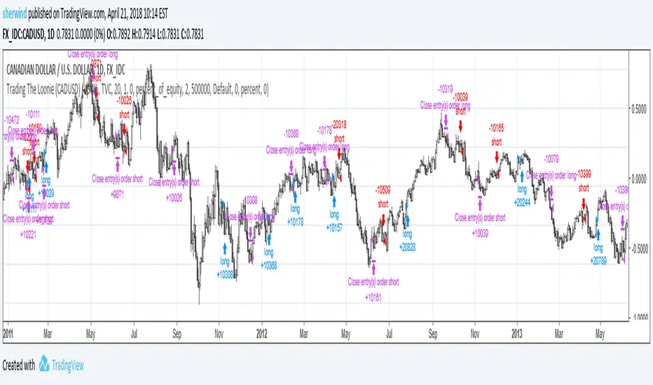
Trading The Loonie (CADUSD)A port of the trading strategy described at technical.traders.com
"In “Trading The Loonie,” which appeared in the December 2015 issue of STOCKS & COMMODITIES, author Markos Katsanos
explains the heavy correlation between the Canadian dollar and crude oil. He then goes on to describe how one could
trade this correlation. Using similar logic as that employed in Bollinger Bands, Katsanos has built a study to
provide buy and sell signals for trading the Canadian dollar future."
See Also:
- Backtesting and forwardtesting (of TradingView Strategies)
- 9 Mistakes Quants Make that Cause Backtests to Lie (blog.quantopian.com)
- When Backtests Meet Reality (financial-hacker.com)
- Why MT4 backtesting does not work (www.stevehopwoodforex.com)
BTC CorrelationA simple script to display how correlated the current ticker is to Bitcoin.
Inputs are the number of bars to check correlation for (default 10) and the the ticker to use for BTC comparison (default is BITFINEX:BTCUSD)
Values of 1 are highly correlated (i.e. bitcoin moves up, so does your current ticker), values of -1 are inversely correlated (i.e. bitcoin moves up, your current ticker moves down).
See: www.babypips.com for some more details on correlation

CBR - USD CorrelationFundamentals
The idea for this script is based on Fundamentals.
I wanted to verify the strength/weakness of the US dollar against other major economies
This will keep me on the right side of the "trend" .. bullish or bearish ?
In short, because Fundamentals Analysis are reflected via economic updates which influences what the price will be doing for the next couple of days
I think it is fair to have an "Indy" that will look at the moving averages across these pairs, because if the dollar sentiment changes, this will be reflected across the major economies
How to use it
This is not a buy/sell entry "Indy", nor a RSI type "Indy" where I tried to calculate overbought/oversold areas..
In fact, when this indy hits anything over 5 to max ( which is 12 ) ..that is a very strong signal and should be seen as such..bearish or bullish
If you want to test it out, I would suggest use a plain chart ( naked chart ) with a 20 or 50 MA ( depending on your TF) and see how the currency pair e.g EUR/USD correlates with this indy. The default pairs are AUD/USD, NZD/USD, GBP/USD and USD/JPY, with a main chart on EUR/USD
Timeframes
1m and 5m charts, change the MA values to 3 ( short), 20 ( medium), 50 ( long) or even more, else there are too many false positives.
1H and higher timeframes works well with the current default values.
I

Correlate 3 - Correlation IndicatorThe code in contains a simple correlation indicator that can be used as an alternative to Tradingview’s built-in “Correlation Coefficient” indicator. The indicator allows users to correlate up to 3 separate instruments on the same subplot. This allows you, for example, to easily see the correlation of your instrument with stocks, bonds and FX. Alternatively, a user can also see the correlation with sector, industry peers or any other data available in Tradingview.
Features
Level Guides to easily see the key correlation coefficient levels
Multi-instrument:


Correlation Coefficient [DW]This is a simple study designed to visualize price correlation coefficients between multiple securities.
Correlation Candles [DW]This is a simple study designed to visualize price correlations between securities.
Bitcoin momentum correlation This is a pretty simple indicator, it measures the momentum of bitcoin as compared to usd,eur,eth,dash, and ltc, which you can see in all of the blue lines. If the red line is above zero then it means the overall value of btc is going up, opposite for down. The Ema_window controls how smooth the signal is. If you shorten the Ema_window parameter and open this on higher timeframe btc charts then the zero crossing gives pretty solid signals, despite being pretty choppy. A good way to interpret this is that if all the blue lines are moving in the same direction at once without disagreement, then the value of bitcoin has good momentum.
Mildly more technically:
Momentum is measured in the first derivative of an EMA for each ticker. To normalize the different values against each other they are all divided by their local maximums, which can be chosen in the parameter window, but shouldn't make a huge difference. All the checked values are then summed, as shown in the red line. To include a value into the red line simply keep it checked. Take a look at the script, it's kind of easy on the eyes.
It's pretty handy to look at, but doesn't seem too worthwhile to pursue much further. If someone wants much more out of the script then feel free to message me.
Remember rules #1 & #2
Don't lose money.
Happy trading
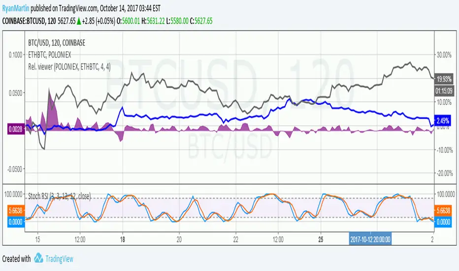
Price relation viewer - add percent change of two symbols (BETA)This script is very much beta!
This is a simple script to visualize how two symbols move in relation to each other. For example if the underlying symbol is a 2x Gold ETF (meaning the ticker moves at 2x the spot price of gold---if gold goes up 3% this ticker should go up 6%) and the comparison symbol is an 2x inverse gold ETF (at gold up 3% this should move down 6%). If these ETFs were 100% accurate at tracking the price of gold then this tool would report a value of zero at all times.
Day 1
Ticker - $10
Comparison - $10
Day 2
Ticker - $12
Comp - $11
This tool value - |20%| + -|10%| = 10%
It uses a short simple moving average to smooth things out a bit (see inputs). It is important to keep your axis scale in mind when using this! Two symbols that are always near zero mean they are offsetting each other very well but the value displayed might range from 0 to 0.005, but the graphed area can make it look extreme if autoscaled.
This is a tool with very specific uses : comparing how one digital currency moves in relation to bitcoin's price, comparing how gold moves in relation to silver, etc.
CorrelationGraph shows level of correlation between current source and another one and track current value of it. User can select source for comparison, graph period and number of candles for calculation, enter level of significal correlation (+-0.65 by default). Grapf contains 4 plots: Correlation - current level of correlation, Zero line , +Corr_level - minimum level of significant positive correlation, -Corr_level -maximum level of significant negative correlation between 2 sources.
Free BirdShows the move of the symbol When not correlated with the source index. Gives the upward or downward tendency when symbol moves uncorrelated that can be used to determine the flow.
The flow curve gives an general idea while the move is more precise showing pure price action.
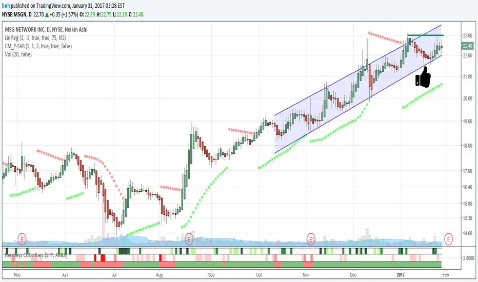
Hersheys CoCo BarsThis is my latest attempt to show price movement differences between symbols. I want to see the buying and selling pressure... is that price movement going with the market or is it moving alone? It's VERY interesting to watch this indicator and see how things play out!
In my previous versions the arrows on the chart were too much clutter, while the single row of color under the chart was not enough info. Also, I removed the calculations to build a world index because the correlation between US and world markets is a hard nut to crack, plus it took many seconds to calculate.
So here is "CoCo Bars", which clearly show price moves with or against another symbol. The default symbol is the US index SPY. The coolest thing here is there are three rows of data in ONE INDICATOR! Many thanks to user rollas for helping with that code.
"CoCo" stands for correlation coefficient, which is what I was studying when I got the idea for this project.
GREEN bars in row #1 = Symbol up, US up, Symbol up more than US
RED bars in row #2 = Symbol down, US down, Symbol down more than US
In rows 1 and 2 the color intensity is based on the biggest difference, light, medium and dark colors.
green/red colors in bottom row are a 7 period average of the sum of price changes of both symbol and index, green = positive, red = negative
Enjoy, and good trading!
Brian Hershey

Hersheys CoCo World"CoCo World" helps to answer the following question... Is this stock moving alone or with other markets? No stock is an island, so it's important to see what everyone else is doing!
With limited screen real estate, I want to see as much info as possible as I'm evaluating US equities and deciding to pull the trigger to buy and sell. My "CoCo World" indicator packs a lot of info into a small space! I got the idea when looking at some Correlation Coefficient studies, hence the name "CoCo".
First I build three series to compare percent price changes...
#1 = Stock = Your chart symbol
#2 = US Index = SPY
#3 = World Index = This is an index of the top 10 world economies using the iShares country indexes. They are weighted by GDP and then the percent price change from last to current tick are summed together. For example, the US makes up 37%, China 22%, etc.
Why use iShares instead of the world markets directly, like the China SSE or Japan Nikkei? The iShares indexes are traded live at the same time as US markets. Measuring money flow in and out of these funds should naturally reflect broad sentiment about each country.
There are Green/Red bars in the indicator space under your chart, also Green/Red background colors.
Green Bar = Stock, US and World are UP, Stock up more than US, US up more than World.
Red Bar = Stock, US and World are DOWN, Stock down more than US, US down more than World.
Green Background = positive 7 period combined average direction of Symbol/US/World
Red Background = negative 7 period combined average direction of Symbol/US/World
This indicator works great all the way down to 1-minute bars... watch for green bars at the end of down-trends and red bars signalling the end of up-trends. Use caution if entering long trades while the background is red, this means the markets are against you!
Use "CoCo World" with your other favorite indicators to get a more complete picture.
Knowledge is POWER!
Good trading, and follow me for updates!
Brian Hershey

DXY SIGNALDXY Correlation indicator Version 2. Added adjustable parameters. Correlation factor is how many bars back for the colleration cumputing. Threshold adjusts the minimum correlation level to give signals. Default is 0.9. Value 1 equals %50 correlation while 2 is %100 correlation.