Cycle Forecast + MACD Divergence (Kombi v6 FULL)This indicator merges two powerful analytical models:
🔮 1. Dominant Cycle Forecasting
The script automatically identifies major structural market cycles by detecting significant swing highs and lows.
It then fits a sinusoidal wave (amplitude, phase, and period) to the dominant cycle and projects it into the future.
Features:
Automatically extracts large, dominant cycles (no noise, no small swings)
Smooth sinusoidal historical cycle visualization
Future cycle projection for 1–2 upcoming cycle periods
Dynamic amplitude and phase alignment based on market structure
Helps anticipate cycle tops and bottoms for long-term timing
📉 2. MACD Divergence Detection
Full divergence detection engine using MACD or MACD Histogram.
Detects:
Bullish Divergence
Price ↓ while MACD (or Histogram) ↑
→ Possible trend reversal upward
Bearish Divergence
Price ↑ while MACD (or Histogram) ↓
→ Possible trend reversal downward
Features:
Pivot-based divergence confirmation (no repaint)
Choice of MACD Line or Histogram as divergence source
Labels + connecting divergence lines
Works across all markets and timeframes
⚙️ Smart Auto-Pivot System
The indicator optionally adjusts pivot sensitivity based on timeframe:
Weekly → tighter pivots
Daily → medium pivots
Intraday → wider pivots
Ensures stable, meaningful divergence signals even on higher timeframes.
🎯 Use cases
Identify upcoming cycle highs/lows
Spot major trend reversals early
Improve swing entries with MACD divergences near cycle turns
Combine forecasting with momentum exhaustion
Suitable for crypto, stocks, indices, forex & commodities
🧠 Why this indicator is powerful
This tool blends time-based cycle forecasting with momentum-based divergence signals, giving you a unique perspective of where the market is likely to turn.
Cycles reveal when a move may occur.
Divergences reveal why a move may occur.
Combined, they offer highly effective market timing.
Forecasting

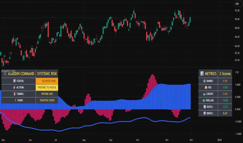
@Aladdin's Trading Web – Command CenterThe indicator uses standard Pine Script functionality including z-score normalization, standard deviation calculations, percentage change measurements, and request.security calls for multiple predefined symbols. There are no proprietary algorithms, external data feeds, or restricted calculation methods that would require protecting the source code.
Description:
The @Aladdin's Trading Web – Command Center indicator provides a composite market regime assessment through a weighted combination of multiple intermarket relationships. The indicator calculates normalized z-scores across several key market components including banks, volatility, the US dollar, credit spreads, interest rates, and alternative assets.
Each component is standardized using z-score methodology over a user-defined lookback period and combined according to configurable weighting parameters. The resulting composite measure provides a normalized assessment of the prevailing market environment, with the option to invert rate relationships for specific market regime conditions.
The indicator focuses on capturing the synchronized behavior across these interconnected market segments to provide a unified view of systemic market conditions.
ES-VIX Expected Daily MoveThis indicator calculates the expected daily price movement for ES futures based on current volatility levels as measured by the VIX (CBOE Volatility Index).
Formula:
Expected Daily Move = (ES Price × VIX Price) / √252 / 100
The calculation converts the annualized VIX volatility into an expected daily move by dividing by the square root of 252 (the approximate number of trading days per year).
Features:
Real-time calculation using current ES futures price and VIX level
Histogram visualization in a separate pane for easy trend analysis
Information table displaying:
Current ES futures price
Current VIX level
Expected daily move in points
Expected daily move as a percentage

Futures Position Size Calculator (NQ/ES)DISCLAIMER:
This indicator is provided solely for informational and educational purposes. It calculates position sizing based on user-defined inputs such as entry and stop-loss levels, but it does not provide trading signals, recommendations, or financial advice . All trading decisions are made at the sole discretion of the user.
By using this indicator, you acknowledge that you are fully responsible for your own trades and risk management . The developer/publisher of this indicator assumes no liability for any losses, damages, or financial consequences that may arise from its use.
Features:
• Position size calculator (based on Entry & Stop Loss)
• Reward ratio calculator (1R, 2R, 3R, etc.)
• Supports: NQ / MNQ / ES / MES
Usage:
When you first add the script to your chart (on any supported futures symbol), you will be prompted to set the Entry Price and Stop Loss Price on the chart using draggable lines .
After setup, you can freely move the price lines, and the indicator will automatically update:
• Position size
• Reward targets
• Direction (long/short is auto-detected)
RISK Settings:
You can calculate position size using either:
1. Account Percent
Select "Percent" in the Risk Method dropdown and enter the percent of your account you want to risk per trade.
2. Fixed Dollar Amount
Select "Fixed Dollar" in the Risk Method dropdown and enter the dollar amount you want to risk.
You may set separate values for: NQ, MNQ, ES, and MES.
Reward Calculator:
Enable the checkbox "Show Reward Targets" in the Reward Ratio section to display projected targets (1R, 2R, etc.).
You can also choose how many R-levels are displayed on the chart.

RSI Forecast Colorful [DiFlip]RSI Forecast Colorful
Introducing one of the most complete RSI indicators available — a highly customizable analytical tool that integrates advanced prediction capabilities. RSI Forecast Colorful is an evolution of the classic RSI, designed to anticipate potential future RSI movements using linear regression. Instead of simply reacting to historical data, this indicator provides a statistical projection of the RSI’s future behavior, offering a forward-looking view of market conditions.
⯁ Real-Time RSI Forecasting
For the first time, a public RSI indicator integrates linear regression (least squares method) to forecast the RSI’s future behavior. This innovative approach allows traders to anticipate market movements based on historical trends. By applying Linear Regression to the RSI, the indicator displays a projected trendline n periods ahead, helping traders make more informed buy or sell decisions.
⯁ Highly Customizable
The indicator is fully adaptable to any trading style. Dozens of parameters can be optimized to match your system. All 28 long and short entry conditions are selectable and configurable, allowing the construction of quantitative, statistical, and automated trading models. Full control over signals ensures precise alignment with your strategy.
⯁ Innovative and Science-Based
This is the first public RSI indicator to apply least-squares predictive modeling to RSI calculations. Technically, it incorporates machine-learning logic into a classic indicator. Using Linear Regression embeds strong statistical foundations into RSI forecasting, making this tool especially valuable for traders seeking quantitative and analytical advantages.
⯁ Scientific Foundation: Linear Regression
Linear regression is a fundamental statistical method that models the relationship between a dependent variable y and one or more independent variables x. The general formula for simple linear regression is:
y = β₀ + β₁x + ε
where:
y = predicted variable (e.g., future RSI value)
x = explanatory variable (e.g., bar index or time)
β₀ = intercept (value of y when x = 0)
β₁ = slope (rate of change of y relative to x)
ε = random error term
The goal is to estimate β₀ and β₁ by minimizing the sum of squared errors. This is achieved using the least squares method, ensuring the best linear fit to historical data. Once the coefficients are calculated, the model extends the regression line forward, generating the RSI projection based on recent trends.
⯁ Least Squares Estimation
To minimize the error between predicted and observed values, we use the formulas:
β₁ = Σ((xᵢ - x̄)(yᵢ - ȳ)) / Σ((xᵢ - x̄)²)
β₀ = ȳ - β₁x̄
Σ denotes summation; x̄ and ȳ are the means of x and y; and i ranges from 1 to n (number of observations). These equations produce the best linear unbiased estimator under the Gauss–Markov assumptions — constant variance (homoscedasticity) and a linear relationship between variables.
⯁ Linear Regression in Machine Learning
Linear regression is a foundational component of supervised learning. Its simplicity and precision in numerical prediction make it essential in AI, predictive algorithms, and time-series forecasting. Applying regression to RSI is akin to embedding artificial intelligence inside a classic indicator, adding a new analytical dimension.
⯁ Visual Interpretation
Imagine a time series of RSI values like this:
Time →
RSI →
The regression line smooths these historical values and projects itself n periods forward, creating a predictive trajectory. This projected RSI line can cross the actual RSI, generating sophisticated entry and exit signals. In summary, the RSI Forecast Colorful indicator provides both the current RSI and the forecasted RSI, allowing comparison between past and future trend behavior.
⯁ Summary of Scientific Concepts Used
Linear Regression: Models relationships between variables using a straight line.
Least Squares: Minimizes squared prediction errors for optimal fit.
Time-Series Forecasting: Predicts future values from historical patterns.
Supervised Learning: Predictive modeling based on known output values.
Statistical Smoothing: Reduces noise to highlight underlying trends.
⯁ Why This Indicator Is Revolutionary
Scientifically grounded: Built on statistical and mathematical theory.
First of its kind: The first public RSI with least-squares predictive modeling.
Intelligent: Incorporates machine-learning logic into RSI interpretation.
Forward-looking: Generates predictive, not just reactive, signals.
Customizable: Exceptionally flexible for any strategic framework.
⯁ Conclusion
By combining RSI and linear regression, the RSI Forecast Colorful allows traders to predict market momentum rather than simply follow it. It's not just another indicator: it's a scientific advancement in technical analysis technology. Offering 28 configurable entry conditions and advanced signals, this open-source indicator paves the way for innovative quantitative systems.
⯁ Example of simple linear regression with one independent variable
This example demonstrates how a basic linear regression works when there is only one independent variable influencing the dependent variable. This type of model is used to identify a direct relationship between two variables.
⯁ In linear regression, observations (red) are considered the result of random deviations (green) from an underlying relationship (blue) between a dependent variable (y) and an independent variable (x)
This concept illustrates that sampled data points rarely align perfectly with the true trend line. Instead, each observed point represents the combination of the true underlying relationship and a random error component.
⯁ Visualizing heteroscedasticity in a scatterplot with 100 random fitted values using Matlab
Heteroscedasticity occurs when the variance of the errors is not constant across the range of fitted values. This visualization highlights how the spread of data can change unpredictably, which is an important factor in evaluating the validity of regression models.
⯁ The datasets in Anscombe’s quartet were designed to have nearly the same linear regression line (as well as nearly identical means, standard deviations, and correlations) but look very different when plotted
This classic example shows that summary statistics alone can be misleading. Even with identical numerical metrics, the datasets display completely different patterns, emphasizing the importance of visual inspection when interpreting a model.
⯁ Result of fitting a set of data points with a quadratic function
This example illustrates how a second-degree polynomial model can better fit certain datasets that do not follow a linear trend. The resulting curve reflects the true shape of the data more accurately than a straight line.
⯁ What Is RSI?
The RSI (Relative Strength Index) is a technical indicator developed by J. Welles Wilder. It measures the velocity and magnitude of recent price movements to identify overbought and oversold conditions. The RSI ranges from 0 to 100 and is commonly used to identify potential reversals and evaluate trend strength.
⯁ How RSI Works
RSI is calculated from average gains and losses over a set period (commonly 14 bars) and plotted on a 0–100 scale. It consists of three key zones:
Overbought: RSI above 70 may signal an overbought market.
Oversold: RSI below 30 may signal an oversold market.
Neutral Zone: RSI between 30 and 70, indicating no extreme condition.
These zones help identify potential price reversals and confirm trend strength.
⯁ Entry Conditions
All conditions below are fully customizable and allow detailed control over entry signal creation.
📈 BUY
🧲 Signal Validity: Signal remains valid for X bars.
🧲 Signal Logic: Configurable using AND or OR.
🧲 RSI > Upper
🧲 RSI < Upper
🧲 RSI > Lower
🧲 RSI < Lower
🧲 RSI > Middle
🧲 RSI < Middle
🧲 RSI > MA
🧲 RSI < MA
🧲 MA > Upper
🧲 MA < Upper
🧲 MA > Lower
🧲 MA < Lower
🧲 RSI (Crossover) Upper
🧲 RSI (Crossunder) Upper
🧲 RSI (Crossover) Lower
🧲 RSI (Crossunder) Lower
🧲 RSI (Crossover) Middle
🧲 RSI (Crossunder) Middle
🧲 RSI (Crossover) MA
🧲 RSI (Crossunder) MA
🧲 MA (Crossover)Upper
🧲 MA (Crossunder)Upper
🧲 MA (Crossover) Lower
🧲 MA (Crossunder) Lower
🧲 RSI Bullish Divergence
🧲 RSI Bearish Divergence
🔮 RSI (Crossover) Forecast MA
🔮 RSI (Crossunder) Forecast MA
📉 SELL
🧲 Signal Validity: Signal remains valid for X bars.
🧲 Signal Logic: Configurable using AND or OR.
🧲 RSI > Upper
🧲 RSI < Upper
🧲 RSI > Lower
🧲 RSI < Lower
🧲 RSI > Middle
🧲 RSI < Middle
🧲 RSI > MA
🧲 RSI < MA
🧲 MA > Upper
🧲 MA < Upper
🧲 MA > Lower
🧲 MA < Lower
🧲 RSI (Crossover) Upper
🧲 RSI (Crossunder) Upper
🧲 RSI (Crossover) Lower
🧲 RSI (Crossunder) Lower
🧲 RSI (Crossover) Middle
🧲 RSI (Crossunder) Middle
🧲 RSI (Crossover) MA
🧲 RSI (Crossunder) MA
🧲 MA (Crossover)Upper
🧲 MA (Crossunder)Upper
🧲 MA (Crossover) Lower
🧲 MA (Crossunder) Lower
🧲 RSI Bullish Divergence
🧲 RSI Bearish Divergence
🔮 RSI (Crossover) Forecast MA
🔮 RSI (Crossunder) Forecast MA
🤖 Automation
All BUY and SELL conditions can be automated using TradingView alerts. Every configurable condition can trigger alerts suitable for fully automated or semi-automated strategies.
⯁ Unique Features
Linear Regression Forecast
Signal Validity: Keep signals active for X bars
Signal Logic: AND/OR configuration
Condition Table: BUY/SELL
Condition Labels: BUY/SELL
Chart Labels: BUY/SELL markers above price
Automation & Alerts: BUY/SELL
Background Colors: bgcolor
Fill Colors: fill
Linear Regression Forecast
Signal Validity: Keep signals active for X bars
Signal Logic: AND/OR configuration
Condition Table: BUY/SELL
Condition Labels: BUY/SELL
Chart Labels: BUY/SELL markers above price
Automation & Alerts: BUY/SELL
Background Colors: bgcolor
Fill Colors: fill

LazyTradeLazyTrade is a clean, high-confidence trend-following indicator built on TradingView’s non-repainting SuperTrend V6 engine. It adds intelligent RSI confirmation, profit-tracking labels, trend-flip markers, and optional background shading to highlight momentum shifts. Designed for intraday and swing traders who want fast, reliable signals without chart clutter.
Features:
• Non-repainting Buy/Sell signals
• Smart RSI confirmation (Aggressive / Standard / Conservative)
• Auto P&L between opposite signals
• Trend-flip circles and transparent background zones
• Clean visual structure optimized for daily and leveraged ETF trading
A simple, intuitive tool that keeps you aligned with the dominant trend—no noise, no over-complication.

Heikin Ashi Background Color for candles highlights the back ground candle with the corresponding heiken ashi candle colour
while still showing the exact japanese candle stick price action
Prev/Current Day Open & Close (RamtinFX)Draws three transparent vertical lines marking the previous day’s close, the current day’s open, and the current day’s close.

Exhaustion Zone [by rukich]🟠 OVERVIEW
The indicator shows asset exhaustion — an area of interest where potential buying opportunities can be considered.
🟠 COMPONENTS
The indicator is based on a combination of fundamental tools designed to properly react to price movement and volatility.
It is displayed on the chart as a green line. When the price touches the indicator line, the candle lights up and is highlighted in green.
🟠 HOW TO USE
The best timeframes for using the indicator: 1D and 3D.
Since the indicator is used on higher timeframes, the price rarely reaches the indicator line, but it often shows a strong reaction when it does, which suggests that the indicator can be used for investment purposes.
Since the zone suggests potential buying opportunities, it’s best to act from the zone only when a reaction is confirmed. Confirmation may include a candle close beyond nearby fractals or the invalidation of the nearest resistance zone.
🟠 CONCLUSION
The indicator highlights an area of interest where, upon confirmation of a reaction, buying opportunities may be considered.

4H Bias: Previous Candle FocusStructural Bias Confirmation Checklist
Has price broken a significant swing high/low on the 4HR?
Has price held beyond this level for at least one complete 4HR
candle?
Does the candle anatomy (OHLC vs OLHC pattern) confirm
directional intent?
Are subsequent 4HR candles showing continued momentum in
the bias direction?
Has a liquidity sweep occurred into the previous structure before
the continuation?

Smart Adaptive Double Patterns [The_lurker]Smart Adaptive Double Patterns
This is an advanced technical indicator that combines two of the strongest and most renowned classical price reversal patterns:
✅ Double Bottom Pattern — a bullish reversal pattern that forms after a downtrend
✅ Double Top Pattern — a bearish reversal pattern that forms after an uptrend
The indicator does not merely detect patterns — it provides a fully integrated, intelligent system that includes:
✅ Precise quality scoring for each pattern using 5 technical criteria
✅ Automatic price target calculation at three levels (Conservative, Balanced, Aggressive)
✅ Multi-layer dynamic filtering to avoid false signals
✅ Live pattern tracking from formation to target achievement or failure
✅ Comprehensive alert system covering all possible trading scenarios
🎯 Why Is This Indicator Unique?
1️⃣ High Detection Accuracy
Unlike traditional indicators that rely on simple rules, this one applies 5 strict structural conditions to confirm pattern validity:
A clear trend must precede the pattern
High symmetry between the two bottoms or two tops
No break of critical price levels during formation
Logical spacing between key points
Technical confirmation from ADX, ATR, and Volume
2️⃣ Advanced Quality Scoring System
Each pattern is scored out of 100 based on 5 weighted criteria:
Symmetry (30%): How closely the two bottoms or tops match
Trend Strength (20%): Strength of the prior trend
Volume Behavior (20%): Trading activity at critical points
Pattern Depth (15%): Vertical distance between neckline and bottom/top
Structural Integrity (15%): Full compliance with structural rules
3️⃣ Smart Target Management
Separate targets for bullish (Double Bottom) and bearish (Double Top) patterns
Separate projections for success and failure cases
Multiple options: Conservative (0.618) / Balanced (1.0) / Aggressive (1.618)
Live tracking with dynamic moving lines
4️⃣ Professional Failure Handling
Failed patterns are not ignored — they are turned into counter-trend opportunities:
Failed Double Bottom → triggers a bearish signal with downside targets
Failed Double Top → triggers a bullish signal with upside targets
Automatic color change for clear visual distinction
5️⃣ Full Customization Flexibility
Enable/disable each pattern independently
22+ adjustable settings
Unique colors for each pattern and quality level
Full bilingual support (Arabic / English)
📐 Pattern Details
🟦 Double Bottom Pattern
Sequence of points:
🔹 Point 1: Peak marking the start of a strong downtrend
🔹 Point 2 (Bottom 1): First low — first key bounce
🔹 Point 3: Intermediate high — forms the neckline (resistance)
🔹 Point 4 (Bottom 2): Second low — should closely match Bottom 1
🔹 Point 5: Breakout point — pattern confirmation
Mandatory Conditions:
✅ Clear downtrend before Point 2
✅ Bottoms 2 & 4 nearly identical (≤1.5% difference by default)
✅ Point 3 higher than both bottoms
✅ Neither bottom is broken during formation
✅ Sufficient time between points (≥10 candles by default)
✅ Success Scenario
→ Price breaks above the neckline (Point 3)
→ Point 5 is plotted at breakout candle
→ Dashed vertical line drawn from Point 5 to target
→ Horizontal dashed line tracks price toward target
→ Dashboard shows: Pattern Type | Quality | Rating | Target | Status
→ When target hits: line turns green + ✅ appears
🎯 Target Calculation
Pattern Height = Point 3 − Point 4
• Conservative: Point 3 + (Height × 0.618 × Quality Factor)
• Balanced: Point 3 + (Height × 1.0 × Quality Factor)
• Aggressive: Point 3 + (Height × 1.618 × Quality Factor)
❌ Failure Scenario
→ Price breaks below both Bottom 1 or Bottom 2 before neckline breakout
Visual Changes:
All lines turn red
Red ✖ appears at breakdown candle
Neckline stops expanding
Red dashed vertical line from breakdown point to bearish target
Red horizontal tracking line follows price
Dashboard updates to:
⚠ Failed Bottom – Bearish
→ Shows new bearish target
→ Indicates target mode for failure case
→ Status: Bearish Reversal
→ Fully red display
🟥 Double Top Pattern
Sequence of points:
🔹 Point 1: Trough marking the start of a strong uptrend
🔹 Point 2 (Top 1): First peak — first key resistance
🔹 Point 3: Intermediate low — forms the neckline (support)
🔹 Point 4 (Top 2): Second peak — should closely match Top 1
🔹 Point 5: Breakdown point — pattern confirmation
Mandatory Conditions:
✅ Clear uptrend before Point 2
✅ Tops 2 & 4 nearly identical (≤1.5% difference by default)
✅ Point 3 lower than both tops
✅ Neither top is breached during formation
✅ Sufficient time between points (≥10 candles by default)
✅ Success Scenario
→ Price breaks below the neckline (Point 3)
→ Point 5 is plotted at breakdown candle
→ Dashed vertical line drawn to target
→ Horizontal tracking line moves with price
→ Dashboard updates accordingly
→ Green line + ✅ on hit
🎯 Target Calculation
Pattern Height = Point 4 − Point 3
• Conservative: Point 3 − (Height × 0.618 × Quality Factor)
• Balanced: Point 3 − (Height × 1.0 × Quality Factor)
• Aggressive: Point 3 − (Height × 1.618 × Quality Factor)
❌ Failure Scenario
→ Price breaks above either Top 1 or Top 2 before neckline breakdown
Visual Changes:
All lines turn cyan (light blue)
Cyan ✖ appears at breakout candle
Neckline stops expanding
Cyan dashed vertical line to bullish target
Cyan horizontal tracking line follows price
Dashboard updates to:
⚠ Failed Top – Bullish
→ Shows new bullish target
→ Indicates target mode for failure case
→ Status: Bullish Reversal
→ Fully cyan display
🎯 Upside Target (after Double Top failure)
Max Top = max(Point 2, Point 4)
Height = Max Top − Point 3
• Conservative: Max Top + (Height × 0.618)
• Balanced: Max Top + (Height × 1.0)
• Aggressive: Max Top + (Height × 1.618)
📊 Quality Scoring System (0–100)
1️⃣ Symmetry (30%)
Measures price match between the two bottoms or two tops.
High score (25–30): Near-perfect symmetry → very strong pattern
Medium (15–24): Good match → reliable signal
Low (5–14): Weak symmetry → use caution
Zero: No symmetry → invalid pattern
2️⃣ Trend Strength (20%)
Uses ADX and DI indicators.
20 pts: Strong trend confirmed (e.g., ADX ≥ 20 + correct DI alignment)
10 pts: Trend filter disabled
6 pts: Weak or sideways trend
3️⃣ Volume Behavior (20%)
Declining volume on second touch is a positive sign (shows exhaustion).
15–20 pts: Clear volume drop → strong signal
10 pts: Neutral volume
6 pts: Rising volume → higher risk of continuation
4️⃣ Pattern Depth (15%)
Deeper patterns = stronger reversals.
12–15 pts: Deep → high reversal power
8–11 pts: Medium → acceptable
<8 pts: Shallow → weak signal
5️⃣ Structural Integrity (15%)
Checks logical structure (e.g., Point 1 > Point 3 in Double Bottom).
12–15 pts: Ideal structure
8–11 pts: Minor flaws
<8 pts: Poor setup
📈 Final Quality Rating & Colors
• 85–100 → ⭐ Excellent
→ Double Bottom: Cyan #00BCD4
→ Double Top: Light Red #FF5252
• 75–84 → ✨ Very Good
• 65–74 → ✓ Good
• 60–64 → ○ Acceptable
→ All use Amber #FFC107
• <60 → ❌ Rejected (not shown)
→ Gray #9E9E9E
🔧 Dynamic Filters
1️⃣ ATR Filter (Volatility Check)
Rejects patterns in abnormally high volatility periods.
→ If current ATR > 1.8 × 50-period ATR MA → pattern rejected
✅ Recommended for crypto, small caps
❌ Optional for calm markets (gold, bonds)
2️⃣ ADX Filter (Trend Confirmation)
Ensures a real trend exists before the pattern.
→ If ADX < 14 (70% of default 20) → pattern rejected
✅ Strongly recommended (keep ON)
3️⃣ Volume Filter (Behavior Validation)
Not used to reject patterns, but strongly affects quality score.
✅ Best for liquid markets (Forex majors, large stocks)
❌ Optional for illiquid assets
⚙️ Key Settings Explained
🔘 General Settings
• Language: Arabic / English
• Show Previous Patterns: Yes / No
→ “No” keeps chart clean; “Yes” for historical review
🔘 Pattern Selection
• Enable Double Bottom: ✅ / ❌
• Enable Double Top: ✅ / ❌
→ Use combinations:
✅✅ → Full reversal scanning
✅❌ → Long setups only
❌✅ → Short setups only
❌❌ → Indicator OFF
🔘 Detection Parameters
• Pivots Left (1–20): Higher = more reliable, fewer patterns
• Pivots Right (1–20): Lower = faster signals
• Min Width (5–100): Min candles between Bottom/Top 1 & 2
• Tolerance % (0.1%–5%): Max allowed price difference
• Min Arm (5–50): Min candles between pivot & neckline
• Min Trend (5–50): Min candles in prior trend
• Trend Lookback (50–500): How far back to detect trend start
• Extension Multiplier (1.0–5.0): How long to wait for breakout
🔘 Quality Settings
• Min Quality Score (0–100):
→ Conservative: 75–85
→ Balanced: 60–70
→ Flexible: 50–55
• Custom Weights: Adjust based on market (e.g., increase Volume weight in Forex)
🔘 Target Settings
• Bottom Bullish Target: Conservative / Balanced / Aggressive
• Bottom Bearish Target: (used on failure)
• Top Bearish Target: Conservative / Balanced / Aggressive
• Top Bullish Target: (used on failure)
🔘 Visual Settings
• Label Size: Small / Normal / Large / Huge
• Pattern Colors: Fully customizable
• Table: Show/Hide + Size (Small/Normal/Large) + Position (Top-Right / Top-Left / Bottom-Right / Bottom-Left)
• Fill Transparency: 70%–95% (default: 85%)
🔔 Alert System (8 Independent Alerts)
📌 Double Bottom Alerts
Bullish Breakout → “Double Bottom Breakout – Bullish!”
Bullish Target Hit → “Bullish Target Achieved!”
Failure (Bearish) → “Double Bottom Failed – Bearish!”
Bearish Target Hit → “Bearish Target Achieved (Failure)!”
📌 Double Top Alerts
Bearish Breakdown → “Double Top Breakdown – Bearish!”
Bearish Target Hit → “Bearish Target Achieved!”
Failure (Bullish) → “Double Top Failed – Bullish!”
Bullish Target Hit → “Bullish Target Achieved (Failure)!”
Each alert can be enabled/disabled independently and supports pop-ups, emails, or webhooks.
⚠️ Disclaimer:
This indicator is for educational and analytical purposes only. It does not constitute financial, investment, or trading advice. Use it in conjunction with your own strategy and risk management. Neither TradingView nor the developer is liable for any financial decisions or losses.

VaCs Pro Max by CS (Final Version - V9)VaCs Pro Max by CS (Final Version - V9) – TradingView Indicator Overview
Introduction:
The VaCs Pro Max indicator is a comprehensive, all-in-one technical analysis tool designed for traders who seek a clear, visual, and flexible overview of market trends, levels, sessions, and key signals. This advanced TradingView script integrates multiple technical indicators, market level trackers, session visualizations, and the innovative AlphaTrend module to provide actionable insights across any timeframe.
1. Technical Indicators:
This module combines essential trend-following and market momentum tools:
VWAP (Volume Weighted Average Price): Shows the average price weighted by volume, helping traders identify key support/resistance levels. Customizable color allows easy chart visibility.
EMAs (Exponential Moving Averages): Two EMAs (fast and long) track short-term and long-term price trends. Traders can adjust lengths and colors for personalized analysis.
Parabolic SAR: Highlights potential trend reversals with dots above/below candles. Step and maximum settings allow fine-tuning for sensitivity.
S2F Bands (Stock-to-Flow): A dynamic band system representing mid, upper, and lower levels derived from EMA. Useful for identifying overbought/oversold zones.
Logarithmic Growth Channel (LGC): Provides logarithmic regression channels, highlighting long-term price structure and growth trends. Adjustable length and band colors.
Linear Regressions: Two regression lines (short and long) detect trend directions and deviations over customizable periods.
Liquidity Zones: Highlights recent highs/lows over a defined lookback period, showing potential support/resistance clusters.
SMC Markers (Swing Market Context): Marks pivot highs and lows using visual labels, helping identify swing points and trend continuation patterns.
2. Market Levels:
Track weekly and Monday high/low levels for precise intraday and swing trading decisions:
Weekly Levels: Highlight the previous week’s high and low for reference.
Monday Levels: Focus on the day’s opening range, particularly useful for weekly breakout strategies.
3. Session Boxes (UTC):
Visual boxes mark major trading sessions (London, New York) in UTC time:
London Session Box: Highlights market activity between 08:00–16:30 UTC.
New York Session Box: Highlights market activity between 13:30–20:00 UTC.
Boxes automatically adjust to session highs and lows for clear intraday structure visualization.
4. Vertical Session Lines (Turkey Time – UTC+3):
These vertical lines provide an easy-to-read visualization of key market opens and closes:
US (NYSE), EU (LSE), JP (TSE), CN (SSE) lines: Color-coded and labeled, showing market opening and closing times in Turkish local time.
Ideal for identifying session overlaps and liquidity spikes.
5. AlphaTrend Module:
The AlphaTrend module is a dynamic trend-following system offering both visual guidance and trade signals:
Trend Calculation: Uses ATR and RSI/MFI logic to determine dynamic trend levels.
Signals: Generates BUY and SELL markers based on trend crossovers.
Customizable Settings: Multiplier, period, source input, and volume data modes allow tailored sensitivity.
Visuals: Filled areas between main and lag lines highlight trend direction, making it easy to interpret market bias at a glance.
Alerts: Includes multiple alert conditions such as potential and confirmed BUY/SELL, and price crossovers, suitable for automated notifications.
Usage & Benefits:
All modules have on/off toggles in the input panel, allowing users to customize the chart view without losing performance.
Color-coded visuals, session boxes, and trend channels improve readability, especially during high volatility.
Suitable for day trading, swing trading, and long-term analysis due to multi-timeframe adaptability.
The combination of trend indicators, liquidity zones, and session analysis provides a holistic view of market structure.
Alerts enable traders to automate monitoring without constantly staring at the chart.
Conclusion:
VaCs Pro Max by CS (V9) is designed for both professional and semi-professional traders who want an all-inclusive, visually intuitive, and highly configurable TradingView indicator. It merges classical technical indicators with modern trend and session analysis tools, making it an indispensable tool for informed trading decisions.

BURAK KRİPTO AL - SAT BOTUBURAK CRYPTO BUY-SELL BOT — Designed for high performance in crypto markets!This strategy is built on a powerful algorithm optimized with years of real trading experience. It follows trends while perfectly catching buy-at-the-bottom and sell-at-the-top opportunities.Main Features:
Trend direction detection with EMA + SMA combination
Overbought/oversold filters using RSI and Stochastic
Volume confirmation (volume breakout filter included)
ATR-based dynamic stop loss and take profit
Sideways market filter — prevents unnecessary trades
Works on all cryptocurrencies (BTCUSDT, ETHUSDT, SOLUSDT, XRPUSDT, etc.)
Both long and short signals (can be turned off separately)
High win rate and excellent profit factor in backtests Who is it for?Daily and swing traders
Spot and futures traders
Those who want to run fully automated bots (easily connected via alerts to 3Commas, Pionex, Bitsgap, etc.)
How to use:Add the script to your chart
Create an alert → “Alert on BURAK CRYPTO BUY-SELL BOT”
In the alert message field, write: For buy: BUY {{ticker}}
For sell: SELL {{ticker}}
Connect to your bot and let it do the rest automatically!
Disclaimer: No strategy guarantees 100% profit. Always apply your own risk management. Past performance is not indicative of future results.If you like it, don’t forget to hit the Like button and leave a comment! ♡
Any questions? Drop them in the comments — I reply as fast as possible!#crypto #bitcoin #tradingbot #tradingview #signals #altsat

Pivot Points by Pangusandhai.comPivot Points by Pangusandhai.com
This PP will usefull only for pangusandhai.com clients.
because they only know about how to use it for intraday, swing & investment purpose.

2-Year Real RateThe 2-year real rate is the inflation-adjusted yield on a 2-year U.S. Treasury—essentially the market’s expectation for short-term “true” interest rates after subtracting expected inflation (often approximated as nominal 2Y yield – breakeven inflation).
It matters because it reflects the actual cost of capital and is one of the cleanest gauges of the Fed’s effective stance: rising real rates mean tightening financial conditions, falling real rates mean loosening. In trading, the 2Y real rate is a powerful macro risk-on/risk-off indicator—equities, long-duration tech, crypto, and EM FX generally weaken when real rates rise, while USD and front-end rate-sensitive trades tend to strengthen. Watching inflections in the 2Y real rate helps you time shifts in liquidity, gauge how aggressively the market is pricing Fed moves, and position for cross-asset trends driven by changes in real funding conditions.

The Consolidator [Pattern Foresight]Overview
This Consolidator script uses detection logic to chart bullish and bearish consolidation markers and to chart shaded high/low price range lines (with green shading between the bottom range line and the price for bullish trends and with red shading between the top range line and the price for bearish trends). A consolidation point is telling you: “Price has gone quiet here. Expect expansion—likely a breakout—once volume returns.” Low volatility squeezes often lead to a breakout.
The Consolidator attempts to identify periods where the price is moving sideways, compressing into a tighter range, forming a base or coil, or preparing for a trend continuation or reversal.
Bullish Consolidation Markers - Bullish consolidation occurs when the price is coiling but buyers are in control. These are useful to help detect bull flags, ascending triangles, tight bases before breakouts.
Bearish Consolidation Markers - These are useful to help detect bear flags, descending triangles, distribution periods.
Why this indicator is unique
The Consolidator attempts to be a predictive pattern-recognition system, not a simple channel indicator by measuring consolidation tightness and high/low price ranges. The range lines help visualize the “coil” where price is compressing. Consolidation markers classify which side of the coil price is leaning toward: bullish pressure or bearish pressure. The script attempts to detect structural bullish patterns with breakout intelligence.
Usage
Consolidation Lookback - Controls how many bars are examined when determining the consolidation “box.” Think of it as: “How wide of a window do you want to search for a sideways range?” Shorter lookback (10–20): Tighter, more sensitive consolidations, faster signals, more false positives, and useful for scalping and day trading. Longer lookback (30–60): Larger, more stable consolidation zones, fewer false positives, and better for swing trading.
Tolerance Percent - Defines how “flat” highs/lows must be to qualify as consolidation. This is the key part of compression detection. Lower tolerance (0.3–0.6%): Only very tight ranges qualify with fewer but higher-quality consolidation zones. Higher tolerance (0.7–1.5%): wider ranges and more consolidation signals. Small changes to tolerance drastically change the number of consolidation markers (higher = more consolidation markers).
Disclaimer:
This script is for informational purposes only. Nothing contained herein should be construed as financial, investment, or trading advice. The author is not a financial advisor and is not providing personalized recommendations. All trading involves risk, including the potential loss of principal. The author makes no assurances of accuracy, performance, or future results. History may not reflect future performance. You are solely responsible for your own investment decisions and agree to use this script entirely at your own risk.

Unentangle – Probability‑Based Trend Indicator using Chan TheoryUnentangle – Probability‑Based Trend Indicator using Chan Theory
**Overview:**
Unentangle is a custom TradingView indicator inspired by Chan Theory (Chanlun).
It automatically detects and visualizes market structures such as Bi (Trend Stroke), Xian (Line Segment), and Pivot.
By combining structural recognition with statistical analysis of historical patterns, the script provides traders with probability-based buy/sell signals.
This helps traders make more confident, data-driven decisions rather than relying solely on alerts.
Why "Unentangle"?
Market data often looks tangled and chaotic, making it hard to see clear structures and its trend.
This indicator is designed to "un-entangle" the data, revealing Chan Theory patterns and its trend probability so traders can view the market more clearly and make confident decisions.
**Key Features:**
- Automatic recognition of Chanlun structures Bi(Trend Stroke), Xian(Line Segment), Pivot
- Visual drawing of Chanlun elements directly on the chart
- Probability calculations for up and down trends based on historical Chanlun top and bottom patterns
**How It Works:**
The script analyzes price movements to identify Chanlun structures.
It then visually draws Chanlun elements, making it easier to follow Chan Theory without manual plotting.
Once structures are detected, it calculates the statistical probability of signals based on similar historical Chanlun top and bottom setups.
This allows traders to evaluate the confidence level of trades based on current price action.
**Usage:**
Apply the indicator to a clean chart.
The script will automatically display Chanlun structures and probability-based signals.
Traders can use these signals as part of their decision-making process, combining them with their own strategies and risk management rules.
On the chart, a green box indicates an uptrend and a red box indicates a downtrend.
The percentage inside the box shows how much of the current trend has progressed.
For example, “83%” in a green box means the uptrend has already advanced 83%, with only 17% potential space remaining for up trend.
**Notes:**
- This script is closed-source, but its logic is based on Chan Theory principles and statistical analysis of historical Chanlun top/bottom price patterns.
- It is intended for educational and analytical purposes, not as financial advice.
Unentangle – 基于缠论结构的趋势概率指标
**概述:**
Unentangle 是一个基于缠论的 TradingView 自定义指标。
它能够自动识别并可视化市场结构,包括笔、线段和中枢。
通过结合结构识别与历史数据的统计分析,该脚本可以生成基于概率的买卖信号,
帮助交易者在决策时更有依据,而不仅仅依赖提示。
为什么叫 “Unentangle”?
市场数据常常像一团乱麻,难以看清结构。
这个指标的目的就是“解缠”,让缠论的结构及其概率清晰呈现,
帮助交易者更直观地理解市场并做出更有依据的决策。
**功能亮点:**
- 自动识别缠论结构(笔、线段、中枢)
- 在图表上直观绘制缠论元素
- 基于历史顶底数据的趋势概率计算
- 提供信号可信度评估,辅助交易决策
**工作原理:**
脚本会分析价格走势以识别缠论结构。
识别完成后,它会自动绘制缠论元素,使得学习和应用缠论更加直观,无需手动绘制。
同时,脚本会基于历史顶底形态计算趋势的统计概率,
帮助交易者评估当前价格下的交易可信度。
**使用方法:**
将指标应用到干净的图表上。
脚本会自动显示缠论结构和基于概率的信号。
交易者可以将这些信号作为决策参考,并结合自己的策略与风险管理规则。
在图表中,绿色方框表示当前处于上升趋势,红色方框表示下降趋势。
方框中的百分比表示当前趋势的进展程度。
例如,绿色方框显示“83%”意味着当前上升趋势已经完成了 83%,仅剩 17% 的上涨空间。
**注意事项:**
- 本脚本为闭源,但逻辑基于缠论原理与历史数据的统计分析。
- 本脚本仅用于教育与分析目的,不构成任何投资建议。

Low-Volume Trend Reversal ProLow-Volume Trend Reversal Pro 的核心设计目标,是让交易者能更容易识别“低量变盘”与“高量趋势衰竭”这两类极其关键的市场信号。在趋势的发展过程中,最早发生变化的往往不是价格,而是成交量,也就是市场参与者的真实意愿。当量能突然变得极低时,通常意味着市场在当前价位已经不愿意继续推动趋势,无论是买方还是卖方都表现出明显的“无兴趣”,这种状态往往会发生在趋势进入末期、震荡前夕、反转开始之前。很多顶部和底部在价格上看起来依旧正常,但量能已经率先“退潮”,而这种低量行为正是行情准备改变方向的标志之一。通过对这些异常区域的高亮和标记,指标让交易者更早察觉趋势内部正在失去动力。
与低量信号相反,另一类值得高度关注的结构是“高量趋势结束”。极端高量看起来像是强势,但在趋势后半段,它往往代表的是趋势的耗尽、最后的冲刺或终结点。高量常出现在突破失败之前、反转前最后一跳、以及主力出货或吸引散户接盘的阶段。当市场在单一区域短时间内出现过高密度的成交,意味着大部分力量已经在此释放,后续难以再延续相同速度的趋势。这类高量行为往往不是趋势开始,而是趋势即将终结的信号。指标通过视觉化处理,将这些“过度活跃”的时刻从普通放量中区分出来,让交易者能更准确判断趋势是否仍然健康。
无论是极低量还是极高量,它们都揭示了“价格背后真实的交易意愿”。价格只是表面结果,而量能代表的是参与者是否愿意继续投入资金。当参与度下降时,趋势会在内部先断层;当参与度过度集中时,也往往意味着趋势已经走得太远。Low-Volume Trend Reversal Pro 的作用,就是把这种隐藏在价格背后的“真实态度变化”以最直观的方式呈现出来,而不是预测市场未来方向。对于使用趋势、结构、量价分析的交易者来说,它提供了一套稳定、客观的观察框架,让你在趋势即将结束时更及时警觉,也能在趋势健康时更有底气地持仓。
Low-Volume Trend Reversal Pro is designed with one goal in mind: to help traders identify two critical but often overlooked signals—low-volume reversal conditions and high-volume trend exhaustion. During the life cycle of a trend, volume often shifts earlier than price, revealing the true intentions of market participants before any visible price reaction. When volume collapses to unusually low levels, it often indicates that neither buyers nor sellers are willing to push the market further. This lack of commitment tends to appear near the end of a trend, ahead of consolidation phases, or before a reversal begins. Many tops and bottoms look completely normal on price, yet internally the market has already “gone quiet.” By highlighting these moments, the indicator helps traders detect fading momentum and weakening structure long before it becomes obvious to the crowd.
On the opposite end of the spectrum, extreme high-volume behavior can signal the exhaustion of a mature trend rather than strength. When participation becomes too concentrated within a short window, it often reflects the final push of buyers or sellers, peak activity, aggressive profit-taking, or even distribution to late participants. These high-volume spikes frequently appear right before failed breakouts, last-minute surges, or transition points into reversal. They do not represent healthy continuation but rather the final stage of an overextended move. The indicator visually distinguishes this type of abnormal activity from ordinary volume expansion, helping traders judge whether a trend is accelerating or burning out.
Both low-volume and high-volume signals offer insight into something price alone cannot reveal: the willingness of market participants to continue driving the trend. Price is only the final outcome; volume expresses actual intent. When participation fades, trends weaken internally before price reacts. When participation peaks excessively, the trend becomes unsustainable. Low-Volume Trend Reversal Pro does not predict future movements. Instead, it surfaces these underlying shifts in a clean and objective way, giving traders a clearer understanding of trend quality. For those who rely on structure, trend analysis, or volume-based decision-making, it adds a valuable layer of confirmation and helps improve timing around potential turning points.

RSI Divergence Pro | Instant & Confirmed RSI Divergence Pro 是一个专为实盘交易打造的专业级背离系统,它的设计目标很明确:更快、更准、更稳定。在长期交易美股、A 股与加密货币的过程中,我发现市面上大多数背离指标都有明显缺陷:传统背离确认太慢,动不动延迟 3~8 根 K;快速背离虽然及时,但基本都重绘,复盘好看、实盘没法用;复杂的背离工具则逻辑混乱,视觉杂乱,很难在实盘中形成稳定的执行体系。因此,我希望创建一个真正能反映市场动能变化、适用于实盘、且结构清晰的背离系统。最终形成了 RSI Divergence Pro:即时背离(预测模型)与确认背离(零重绘)双引擎架构。
这个指标由两个核心引擎构成。第一个是即时背离,它基于 RSI 的二阶动能变化来捕捉拐点,无需等待枢轴成型,因此信号非常提前。它能在 K 线创新低但 RSI 不再同步时提醒你,也能在市场动能逐渐衰竭的早期阶段发出信号。即时背离以虚线呈现,可能重绘,但这种“重绘本质上是预判”,可以让你比传统背离提前 1~5 根 K 观察到趋势反转的可能性。第二个是确认背离,它采用“左宽右窄”的不对称枢轴结构:左端保持足够的结构宽度,确保信号含金量;右端使用极窄宽度,让确认信号比传统枢轴快很多。同时确认背离完全不重绘,非常适合实盘与策略回测,所有信号都以实线表现,稳定可靠。
除了核心结构,RSI Divergence Pro 提供了清晰直观的视觉呈现:背离连线、可选文字标签、右端短尾增强设计,使得信号的方向性更明确。它支持所有周期,从 1 分钟到周线都可以使用,同时包含四种提醒触发(即时多、即时空、确认多、确认空),适合自动化或半自动化交易体系。它的逻辑充分考虑了实际交易中“反应速度”与“信号可靠性”的平衡,因此尤其适用于短线交易者、波段交易者、结构分析者以及基于 RSI 建模的量化策略用户。
它带来的价值并不仅仅是“画背离线”,而是在帮助交易者理解市场深层的动能变化。无论是避免追高杀跌、确认趋势衰竭、识别顶部底部结构,还是减少情绪化操作——背离在交易系统中扮演的是风险过滤器和反转预警器的角色。即时背离让你看到别人看不到的早期信号,而确认背离为执行提供可靠依据,从而形成一个可复制、可执行的交易框架。
需要强调的是,即时背离属于预测模型,会因为动能变化而重绘,这是正常的;确认背离则完全不重绘,可以放心用于实盘与回测。背离是信号,不是指令,需结合趋势与结构判断使用。
总结来说,RSI Divergence Pro 的核心价值在于“快、稳、清晰、专业”。它不是为了炫技,而是为了让你在市场结构变化的关键位置更早、更准地获得信息。如果你长期依赖 RSI 或动能分析,它会成为一个真正值得加入工具库的专业级指标。
RSI Divergence Pro is a professional-grade divergence system designed specifically for real trading. Its purpose is simple: to be faster, more accurate, and more stable than traditional divergence tools. After years of trading equities and crypto, I realized that most divergence indicators share the same major weaknesses: classic divergence signals come far too late, often 3–8 bars after the structure forms; fast divergence tools repaint heavily, making them unsuitable for live trading; and more complex indicators are visually cluttered and difficult to execute in real time. I wanted a tool that reveals momentum shifts clearly, works in live markets, and helps traders build a consistent execution framework. That led to the creation of RSI Divergence Pro, a dual-engine system that combines predictive divergence with fully confirmed, non-repainting divergence.
The first engine is Instant Divergence. It is built on RSI momentum inflection rather than pivot structures, allowing signals to appear far earlier. It detects moments when price makes a new low but RSI no longer follows, or when momentum begins to weaken before it becomes visually obvious. Instant signals are drawn with dashed lines and may repaint, because they are predictive by design. This enables early detection 1–5 bars ahead of traditional divergence tools, giving traders an informational edge in momentum reversal scenarios.
The second engine is Confirmed Divergence. It uses an asymmetric pivot model with a wider left side and a narrow right side. The left width preserves structural integrity, while the small right width accelerates signal confirmation, making it significantly faster than standard pivot divergence. All confirmed divergences are fully non-repainting and displayed with solid lines, making them ideal for both live trading and backtesting.
Beyond the core logic, RSI Divergence Pro includes clean and intuitive visual elements: divergence lines, optional labels, and mini stub extensions to highlight direction and momentum. It supports all timeframes—from 1-minute scalping to weekly swing analysis—and provides four types of alert conditions (instant bull, instant bear, confirmed bull, confirmed bear). It is especially suitable for scalpers, swing traders, structural traders, and quantitative traders who rely on RSI-based momentum modeling.
The true value of this tool is not simply drawing divergence lines. It helps traders understand deeper momentum shifts within market structure. It prevents chasing tops and bottoms, identifies trend exhaustion, provides context for reversals, and reduces emotional trading. Instant divergence shows what most traders cannot see, while confirmed divergence provides stable validation, forming a consistent and repeatable execution framework.
It is important to clarify that instant divergence repaints by design—this is part of its predictive nature. Confirmed divergence does not repaint at all and is safe for strategy testing. Divergence is a signal, not a command, and should be interpreted alongside market structure and trend context.
In summary, RSI Divergence Pro focuses on what matters: speed, stability, clarity, and professional-level reliability. It is not built to be flashy but to help traders receive actionable information at the exact moments when momentum and structure begin to shift. For traders who rely on RSI or momentum analysis, this indicator is a powerful addition to any serious trading toolkit.

MACD Divergence Pro | Zero-Lag • No-Repaint中文介绍
MACD 背离 · 快速实时 / 不重绘 · 基于直方图(CN)
多数“MACD 背离”指标要么重绘严重(回测很漂亮、实盘不靠谱),要么触发很滞后(等几根 K 线后才给线/给提醒)。
这个脚本是我在十几版迭代中打磨出的方案(还是跟我的印度导师):在保持收盘级别不重绘的同时,尽可能把信号“提前到条内”,并且把“提前”和“稳健”两种需求拆开、让你按场景选择。
这款脚本为什么更好?
双模式,实盘&回测都可靠
确认模式(不重绘):只在枢轴成立时(上一根确认为顶/底)画线并提醒,收盘后不会改变,适合回测与稳健交易。
预判预览(零延迟,可选):条内一旦出现“价格创更高/更低而柱值更低/更高”的背离形态,就即时画“临时预判线”并提醒;如果形态被否定,会在本根内自动撤回。该模式给你“更早的入场观察”,但可能被取消。
基于 MACD 直方图:直接比较“柱值高/低”和“价格高/低”,不靠模糊的平滑线,背离定义清晰、可见性强。
多重背离/三背离:支持向前连接多段峰/谷,不是只找最近一段,把分层背离也抓出来。
分段规则可控
同侧最小间隔(柱):避免“同一段内频繁连线”。
可选“跨色分段(红→绿→红 / 绿→红→绿)”:只在真正换势后才允许下一段,显著减少“同色内伪背离”。
即时提醒,严格对齐
预判提醒:只有当图表上真的画出了“临时预判线”时才触发,不会“响了但没线”。
确认提醒:当正式背离线落地的那一刻触发,用于“信号确认”。
视觉简洁:顶背离线=红色,底背离线=绿色;标签可开关,不挡柱不抢视线。
通用:适配任意周期、任意交易品种;参数默认即可用,也可按策略微调。
如何使用(建议)
做回测/稳健交易:仅开“确认提醒”,并把“即时模式(条内)”关闭,得到严格不重绘的标注与提醒。
做超短线/埋伏:打开即时模式 + 零延迟预览,启用预判提醒;当预判线出现就会立马提醒(未确认时可能被撤回)。
如想减少“跨段过远”的连线,可调大同侧最小间隔或打开跨色分段。
需要三背离/多背离,可把“最多向前连接几段”设为 3 或更高。
提示:预判是“更早但可能被否定”,确认是“稳健且不重绘”。两者结合,既看得早,也落得稳。
English Description
MACD Divergence • Fast Live / No-Repaint • On Histogram
Most “MACD divergence” indicators either repaint heavily (great in hindsight, unreliable in live trading) or lag badly (you get lines/alerts several bars late).
This script has gone through 10+ iterations to strike the right balance: deliver earlier signals in real-time while keeping a truly no-repaint confirmation path. You decide when you need early preview or strict confirmation.
What makes it different?
Two operating modes—choose per scenario
Confirmation mode (No-Repaint): Lines/alerts are printed only when the pivot is confirmed (previous bar), and they never change after close. Perfect for backtesting and conservative trading.
Zero-Lag Preview (optional): As soon as an in-bar divergence forms on the histogram (price makes a higher high/lower low while the bar value fails), a temporary preview line is drawn immediately and an alert is fired; if invalidated before the bar closes, it’s removed. Earlier visibility with the right caveat.
Histogram-based logic: We compare bar heights against price highs/lows—clear definition and strong visual readability.
Multi-link divergences (incl. triple): Not limited to the nearest swing—you can extend lines across multiple prior pivots to capture stacked divergences.
Controllable segmentation
Minimum bars between same-side pivots to avoid noisy over-linking.
Optional cross-color segmentation (red→green→red / green→red→green) to reduce false divergences within a same-color run.
Alerts that match what you see
Preview alert fires only when a preview line is actually drawn—no more alerts without lines.
Confirmation alert fires when the final line is committed.
Clean visuals: Bearish lines = red, Bullish lines = green; labels are optional to keep the histogram unobstructed.
Works everywhere: Any symbol, any timeframe. Defaults are sensible; parameters can be tuned to your workflow.
Suggested workflow
Backtest / conservative execution: Use Confirmation alerts only, turn Live (in-bar) evaluation off to ensure strict no-repaint behavior.
Scalping / early entries: Turn Live mode + Zero-Lag Preview on and enable Preview alerts—you’ll be notified the moment a preview line appears (it may retract before close).
Increase Min same-side spacing or enable Cross-color segmentation to limit stretched links.
Raise Max links to capture double/triple divergences.
TL;DR: Preview = earlier but retractable. Confirmation = slower but rock-solid. Combine both to see early and act with confidence.

4H-1H Channel Confluence StrategyA powerful multi-timeframe trend-following system based on 4H & 1H Donchian channels.
• 4H defines the main trend (green/red/yellow)
• 1H confirms short-term momentum
• Entries only at 4H channel support/resistance confluence
• Real support/resistance levels from high-volume candles only
• Clear LONG/SHORT signals on chart + info table
• Fully customizable colors and parameters

Omega Correlation [OmegaTools]Omega Correlation (Ω CRR) is a cross-asset analytics tool designed to quantify both the strength of the relationship between two instruments and the tendency of one to move ahead of the other. It is intended for traders who work with indices, futures, FX, commodities, equities and ETFs, and who require something more robust than a simple linear correlation line.
The indicator operates in two distinct modes, selected via the “Show” parameter: Correlation and Anticipation. In Correlation mode, the script focuses on how tightly the current chart and the chosen second asset move together. In Anticipation mode, it shifts to a lead–lag perspective and estimates whether the second asset tends to behave as a leader or a follower relative to the symbol on the chart.
In both modes, the core inputs are the chart symbol and a user-selected second symbol. Internally, both assets are transformed into normalized log-returns: the script computes logarithmic returns, removes short-term mean and scales by realized volatility, then clips extreme values. This normalisation allows the tool to compare behaviour across assets with different price levels and volatility profiles.
In Correlation mode, the indicator computes a composite correlation score that typically ranges between –1 and +1. Values near +1 indicate strong and persistent positive co-movement, values near zero indicate an unstable or weak link, and values near –1 indicate a stable anti-correlation regime. The composite score is constructed from three components.
The first component is a normalized return co-movement measure. After transforming both instruments into normalized returns, the script evaluates how similar those returns are bar by bar. When the two assets consistently deliver returns of similar sign and magnitude, this component is high and positive. When they frequently diverge or move in opposite directions, it becomes negative. This captures short-term co-movement in a volatility-adjusted way.
The second component focuses on high–low swing alignment. Rather than looking only at closes, it examines the direction of changes in highs and lows for each bar. If both instruments are printing higher highs and higher lows together, or lower highs and lower lows together, the swing structure is considered aligned. Persistent alignment contributes positively to the correlation score, while repeated mismatches between the swing directions reduce it. This helps differentiate between superficial price noise and structural similarity in trend behaviour.
The third component is a classical Pearson correlation on closing prices, computed over a longer lookback. This serves as a stabilising backbone that summarises general co-movement over a broader window. By combining normalized return co-movement, swing alignment and standard price correlation with calibrated weights, the Correlation mode provides a richer view than a single linear measure, capturing both short-term dynamic interaction and longer-term structural linkage.
In Anticipation mode, Omega Correlation estimates whether the second asset tends to lead or lag the current chart. The output is again a continuous score around the range. Positive values suggest that the second asset is acting more as a leader, with its past moves bearing informative value for subsequent moves of the chart symbol. Negative values indicate that the second asset behaves more like a laggard or follower. Values near zero suggest that no stable lead–lag structure can be identified.
The anticipation score is built from four elements inspired by quantitative lead–lag and price discovery analysis. The first element is a residual lead correlation, conceptually similar to Granger-style logic. The script first measures how much of the chart symbol’s normalized returns can be explained by its own lagged values. It then removes that component and studies the correlation between the residuals and lagged returns of the second asset. If the second asset’s past returns consistently explain what the chart symbol does beyond its own autoregressive behaviour, this residual correlation becomes significantly positive.
The second element is an asymmetric lead–lag structure measure. It compares the strength of relationships in both directions across multiple lags: the correlation of the current symbol with lagged versions of the second asset (candidate leader) versus the correlation of lagged values of the current symbol with the present values of the second asset. If the forward direction (second asset leading the first) is systematically stronger than the backward direction, the structure is skewed toward genuine leadership of the second asset.
The third element is a relative price discovery score, constructed by building a dynamic hedge ratio between the two prices and defining a spread. The indicator looks at how changes in each asset contribute to correcting deviations in this spread over time. When the chart symbol tends to do most of the adjustment while the second asset remains relatively stable, it suggests that the second asset is taking a greater role in determining the equilibrium price and the chart symbol is adjusting to it. The difference in adjustment intensity between the two instruments is summarised into a single score.
The fourth element is a breakout follow-through causality component. The script scans for breakout events on the second asset, where its price breaks out of a recent high or low range while the chart symbol has not yet done so. It then evaluates whether the chart symbol subsequently confirms the breakout direction, remains neutral, or moves against it. Events where the second asset breaks and the first asset later follows in the same direction add positive contribution, while failed or contrarian follow-through reduce this component. The contribution is also lightly modulated by the strength of the breakout, via the underlying normalized return.
The four elements of the Anticipation mode are combined into a single leading correlation score, providing a compact and interpretable measure of whether the second asset currently behaves as an effective early signal for the symbol you trade.
To aid interpretation, Omega Correlation builds dynamic bands around the active series (correlation or anticipation). It estimates a long-term central tendency and a typical deviation around it, plotting upper and lower bands that highlight unusually high or low values relative to recent history. These bands can be used to distinguish routine fluctuations from genuinely extreme regimes.
The script also computes percentile-based levels for the correlation series and uses them to track two special price levels on the main chart: lost correlation levels and gained correlation levels. When the correlation drops below an upper percentile threshold, the current price is stored as a lost correlation level and plotted as a horizontal line. When the correlation rises above a lower percentile threshold, the current price is stored as a gained correlation level. These levels mark zones where a historically strong relationship between the two markets broke down or re-emerged, and can be used to frame divergence, convergence and spread opportunities.
An information panel summarises, in real time, whether the second asset is behaving more as a leading, lagging or independent instrument according to the anticipation score, and suggests whether the current environment is more conducive to de-alignment, re-alignment or classic spread behaviour based on the correlation regime. This makes the tool directly interpretable even for users who are not familiar with all the underlying statistical details.
Typical applications for Omega Correlation include intermarket analysis (for example, index vs index, commodity vs related equity sector, FX vs bonds), dynamic hedge sizing, regime detection for algorithmic strategies, and the identification of lead–lag structures where a macro driver or benchmark can be monitored as an early signal for the instrument actually traded. The indicator can be applied across intraday and higher timeframes, with the understanding that the strength and nature of relationships will differ across horizons.
Omega Correlation is designed as an advanced analytical framework, not as a standalone trading system. Correlation and lead–lag relationships are statistical in nature and can change abruptly, especially around macro events, regime shifts or liquidity shocks. A positive anticipation reading does not guarantee that the second asset will always move first, and a high correlation regime can break without warning. All outputs of this tool should be combined with independent analysis, sound risk management and, when appropriate, backtesting or forward testing on the user’s specific instruments and timeframes.
The intention behind Omega Correlation is to bring techniques inspired by quantitative research, such as normalized return analysis, residual correlation, asymmetric lead–lag structure, price discovery logic and breakout event studies, into an accessible TradingView indicator. It is intended for traders who want a structured, professional way to understand how markets interact and to incorporate that information into their discretionary or systematic decision-making processes.
