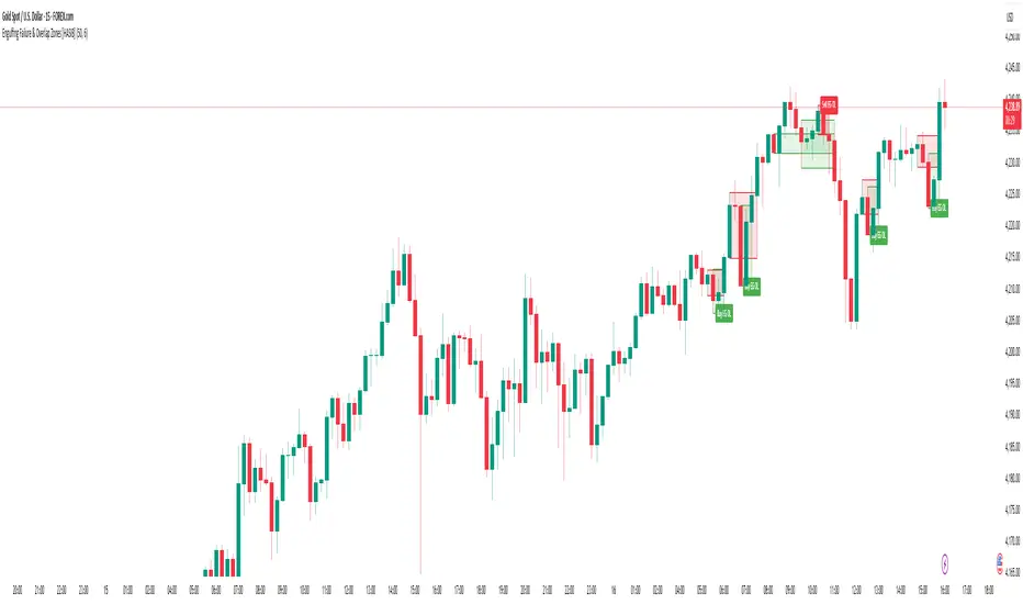
ICT Killzones x FVGs @dancizyeaaICT Killzones x FVGs Indicator
Last update: 19-SEP-2025
Creator: dancizyeaa
This indicator targets key session highs and lows combined with Fair Value Gaps (FVGs) visualization on TradingView charts. It integrates multiple market sessions (Asia, London, New York), drawing killzones, session separators, and key price levels with user-configurable alerts and filtering. It supports dynamic timeframe limits, coloring by FVG size, moving averages, and labels.
The ICT Killzones x FVGs indicator highlights major session high and low price zones with added fair value gaps, assisting traders in identifying potential reversal or breakout areas. It automatically draws session lines, pivot points, and dynamically colors FVG rectangles by size. It includes options for timezone offsets, alert setups for pivot breaks, and versatile visual configuration for clear session segmentation and market structure awareness.
Detailed Function Descriptions
Session Time and Date Handling:
Manages time offsets and date components to correctly align session boundaries and day separators considering timezone differences, including a weekday naming system for chart labeling.
FVG Detection and Coloring:
Detects bullish and bearish Fair Value Gaps based on recent candles, calculates gap size, and colors gaps differently if they are small or normal size to highlight relevant market inefficiencies.
Killzone (Session High/Low Zone) Management:
Creates and updates boxes, lines, and labels representing important market session zones from Asia to New York, including the ability to extend or limit these objects across timeframes and manage range averages.
Pivot Points and Midpoint Labels:
Draws session-specific pivot highs/lows and optional midpoint lines with alert conditions when these levels are broken, allowing traders to track and be notified of key market moves.
Session Separators and Open Lines:
Draws vertical and horizontal lines marking daily, weekly, and monthly open prices and session start/end boundaries with customizable styling, enhancing chart structure clarity.
Moving Average Overlay:
Optionally plots a user-defined simple moving average line for trend analysis, with customizable length and color.
Alert System:
Provides user-configurable alerts on pivot breaks and other key events, ensuring timely trading signals.
User Inputs and Settings:
Extensive input options to customize timezone offset, session visibility, line styles, transparency, label sizes and positions, and filter parameters for FVGs for a tailored trading experience.
Ict
ICT levels (PDL,PWL,PQL,PYL) PDHThis indicator plots ICT reference levels for multiple timeframes, including:
Daily (DO, DH, DL, PDO, PDH, PDL)
Weekly (WO, WH, WL, PWO, PWH, PWL)
Monthly (MO, MH, ML, PMO, PMH, PML)
Quarterly (QO, QH, QL, PQO, PQH, PQL)
Yearly (YO, YH, YL, PYO, PYH, PYL)
🔹 Custom Target (NYO or user-defined):
The script also lets you display a special target level (e.g. New York Open) at a user-defined hour:minute with selectable timezone.
🔹 Day of Week levels (DoW):
You can choose a specific weekday (e.g. Tuesday Open/High/Low/Close) with adjustable timezone, allowing flexible session-based analysis.
🔹 Display & Style Options:
Extend lines (None, Right, Left, Both)
Line style (Solid, Dashed, Dotted)
Font type (Default, Monospace)
Label position (Top or Middle, with spacing adjustment)
Offset bars for labels
Merge labels if levels are too close (threshold % configurable)
🔹 Priority Handling:
Includes High Timeframe Priority (TFP) option so higher-TF levels overwrite lower ones when overlapping.
🔹 Customization:
Global text and line colors
Individual colors for Day, Week, Month, Quarter, Year, DoW, and Target
Option to show/hide prices next to labels in different styles
Opening Range Gaps [LEG]📌 Opening Range Gaps
Are you tired of indicators that don’t show the correct opening price on CFDs, or that fail to capture the true 09:30 open or the 16:14 on Nasdaq futures?
Or worse… tools that only work on the 1-minute chart?
👉 This script was built to fix that.
🔑 Why this indicator?
Unlike most gap tools, Opening Range Gaps :
Works seamlessly on both CFDs and Futures for Nasdaq.
Captures the exact 16:14 close (the CFD session end) and the true 09:30 open using M1 data aggregation, even if you’re on a higher timeframe.
Works reliably on any intraday timeframe — not just the 1-minute chart, but all the way up to the timeframe you set in the Timeframe Limit (default: 30m).
⚙️ Features:
Gap Detection with Precision
Uses the close of the 16:14 bar (last CFD session minute) as the reference.
Captures the specific open at 09:30 (not approximated by session).
Plots the gap as a shaded box with customizable colors.
Quarter Levels Inside the Gap
Automatically divides the gap into 25%, 50%, and 75% levels for precision trading.
Customization
Show/hide vertical session delimitations.
Choose whether to track the reference price throughout the session.
Extend boxes to the right for context.
Keep only the last “n” gaps on your chart (default: 10).
Works Across Timeframes
Thanks to request.security_lower_tf, all logic is based on 1-minute data, so even if you’re on 5m, 15m, or 30m, the gap will always plot with exact levels.
🧭 Use Cases
Spot the true overnight gap between CFD close (16:14) and futures open (09:30).
Track how Nasdaq fills (or fails to fill) gaps during the day.
Use quarter levels for partial fills, rejection points, or continuation setups.
Combine with ICT concepts or price action strategies to identify liquidity-driven moves.
ICT NY Opens (Midnight, 7:30 & 8:30) True📌 ICT NY Opens Fixed (Midnight, 7:30 & 8:30) TRUE
This indicator is designed for traders following ICT (Inner Circle Trader) concepts and provides precise reference levels for the most relevant New York session opens. It automatically captures and plots the opening price for Midnight (00:00 NY), 7:30 AM, and 8:30 AM (configurable), letting you use them as liquidity anchors, manipulation zones, or institutional reference points.
🔑 Key Features
Fixed New York Opens (configurable)
Midnight (00:00 NY), 7:30 AM (NY), 8:30 AM (NY) — each open is captured from the first bar of the configured session.
Sessions are editable: the indicator exposes input.session fields for each open, so you can change the exact hour/minute (e.g., set 00:00 → 23:30 or 08:30 → 08:00). The lines and levels will follow the chosen session times.
Extension & Custom Hours (explicit)
Preset extensions: 1 Day or 2 Days (the horizontal line spans that period).
Directional extension: Right (extend to the right) or Both (left & right).
Custom Hours option: enable a custom-hours toggle and enter a specific number of hours (1–23). When enabled, horizontal lines extend for the exact number of hours you enter instead of the preset day lengths.
Labels are positioned relative to the extension setting (anchored at the open or after the extension depending on the selected mode).
Customizable visuals
Show/hide each open individually.
Independent color and line-style (solid / dotted / dashed) for each open.
Separate text color for labels.
Automatic Labels & Vertical Line
Each drawn level includes an automatic label with the open name and the exact opening price.
A dedicated vertical line option exists for the Midnight open (visual daily separator).
⚙️ How it behaves (precision & workflow)
The script detects the first bar inside the session you configure and records that bar's open as the session Open price.
If you change the session string/time in settings, the indicator will use the new time going forward and draw the corresponding level at that session's opening bar.
Extensions respect either the preset days or the custom hours you specify, so you can make lines last a precise number of hours (useful for intraday setups).
🧭 Use Cases
Pinpoint liquidity clusters and anticipate stop hunts near session opens.
Use as range anchors to measure intraday deviations.
Monitor reactions around economic releases and futures opens (7:30 / 8:30).
Integrate into ICT-based scalping or swing setups where precise session timing matters.
Day + HTF Separators + Midnight OpenOverview
The Day + HTF Separators + Midnight Open indicator is a versatile and easy-to-use tool for traders who want to track key price levels and time-based market events. It draws vertical lines to mark the start of each day, 4-hour period, and 1-hour period, adds labels to show the day of the week, and plots a horizontal line at a customizable hourly open price (defaulting to midnight, referred to as the "Time-Designated Open" or TDO). This indicator is perfect for day traders, swing traders, and anyone analyzing price action in Futures, forex, cryptocurrencies, or other markets on TradingView.
Designed for intraday charts (e.g., 1-minute, 5-minute, or 1-hour), this indicator offers extensive customization options, letting you toggle features, change colors, adjust line styles, and position labels. It’s built to be lightweight, ensuring smooth performance even on charts with lots of historical data.
Key Features
1. Daily Separators
What It Does: Draws a vertical line at the start of each new trading day to help you see daily boundaries clearly.
How It Works:
Places a vertical line at the beginning of each day, spanning the full price range of the opening moment.
Lines extend across the chart, making it easy to spot daily transitions.
Keeps up to 300 past daily lines visible, automatically managing older ones to stay within TradingView’s limits.
Customization:
Show/Hide: Always shown on intraday charts but tied to the "Show Days of Week Labels" setting for consistency.
Color: Choose any color (default: a medium gray).
Style: Pick Solid, Dashed, or Dotted lines (default: Dotted).
Why Use It: Helps you track daily price ranges, identify daily open/close levels, and plan trades around daily market cycles.
2. Day of the Week Labels
What It Does: Displays the day of the week (e.g., "MON" for Monday) at a specific hour each day, making it easy to know which day you’re analyzing.
How It Works:
Shows labels like "MON", "TUE", "WED", "THU", "FRI", "SAT", or "SUN" at the bottom of the chart.
Labels appear at a user-chosen hour (default: 5:00 AM) each day.
Only works on intraday charts (e.g., 5-minute or 1-hour).
Customization:
Show/Hide: Turn on/off with "Show Days of Week Labels" (default: on).
Color: Set the label text color (default: dark gray).
Hour: Choose any hour from 0:00 to 23:00 for label placement (default: 5:00 AM).
Why Use It: Great for traders who need to track specific days for events like economic releases or to spot weekly patterns in price action.
3. 4-Hour Separators
What It Does: Marks the start of each 4-hour period with a vertical line, ideal for aligning with higher timeframe trends.
How It Works:
Draws vertical lines every 4 hours, covering the price range of the starting moment.
Lines extend across the chart for clear visibility.
Stores up to 100 past 4-hour lines, reusing older ones for efficiency.
Customization:
Show/Hide: Enable/disable with "Show 4H Separator" (default: off).
Color: Choose any color (default: gray, slightly transparent).
Style: Select Solid, Dashed, or Dotted lines (default: Dotted).
Why Use It: Perfect for swing traders or those combining intraday trading with 4-hour chart analysis, such as identifying key support or resistance levels.
4. 1-Hour Separators
What It Does: Draws vertical lines to mark the start of each hour, helping short-term traders track hourly price movements.
How It Works:
Places a vertical line at the start of each hour, spanning the price range.
Lines extend across the chart and support up to 100 historical lines.
Customization:
Show/Hide: Enable/disable with "Show 1H Separator" (default: off).
Color: Pick any color (default: a light gray, slightly transparent).
Style: Choose Solid, Dashed, or Dotted lines (default: Dotted).
Why Use It: Ideal for scalpers or day traders focusing on hourly trends, session changes, or short-term price action.
5. Time-Designated Open (TDO) Lines
What It Does: Plots a horizontal line at the opening price of a chosen hour (default: midnight, 00:00) each day, with an optional label to mark the price level, helping you track key price points across multiple days.
How It Works:
Draws a horizontal line at the open price of the selected hour (e.g., midnight) in your chosen timezone (default: New York time).
Lines start at the chosen hour and extend to the current moment on the chart (or a few bars beyond, based on settings) or until 5:00 PM New York time (market close for Futures).
Supports up to 100 past TDO lines, keeping historical opens visible for comparison.
Adds a label (e.g., "TDO") at the end or start of the line, which is invisible by default due to full transparency.
Lines and labels only appear if both the main toggle and TDO-specific toggle are enabled.
Customization:
Show/Hide Line and Label: Turn on/off with "Enable Candle Open Line/Label" and the TDO-specific toggle (both default: on).
Show/Hide Label: Enable/disable the label separately with "Enable Candle Open Label" (default: on).
Hour: Select any hour from 00:00 to 23:00 (default: 00:00).
Label Text: Customize the label name (default: "TDO").
Line Color: Choose any color (default: light cyan).
Line Style: Pick Solid, Dashed, or Dotted (default: Solid).
Label Text Color: Set the label text color (default: gray, fully transparent).
Label Background Color: Choose the label background color (default: black).
Label Transparency: Adjust transparency for both label text and background (default: fully transparent, invisible).
Label Size: Select Tiny, Small, Normal, or Large (default: Small).
Label Position: Place the label at the right or left of the line with "Stick Label to Right" (default: right) and adjust spacing with "Label Padding" (default: 1 bar).
Line Length: Shorten the left side with "Enable Left-Side Trimming" (default: off) and set the trim length with "Left Trim Bars" (default: 8 bars). Extend the right side with "Line Padding" (default: 2 bars).
Timezone: Choose from New York, UTC, London, Paris, Tokyo, Shanghai, Singapore, or Sydney (default: New York).
Max History: Set how many past TDO lines to show (default: 100).
Multi-Day Plotting:
Plots a TDO line for the chosen hour (e.g., 00:00) each day, based on historical data.
Each line starts at the open price of that hour and extends to the current moment or 5:00 PM New York time (for Futures).
Past TDO lines stay visible, letting you compare daily open prices over time (up to 100 days, adjustable).
How to Use
Add to Your Chart:
Add the indicator to an intraday chart (e.g., 1-minute, 5-minute, or 1-hour) for any market (Futures, forex, crypto, etc.).
It works best on intraday timeframes to show all features.
Customize Settings:
Open the settings panel in TradingView.
Turn on/off features like daily separators, DOW labels, 1-hour/4-hour separators, or TDO lines.
Adjust colors, line styles, and label positions to fit your chart’s look.
Set the TDO hour (e.g., 00:00 for midnight or 03:00 for London open) and timezone to match your market.
Make TDO labels visible by reducing "Label Transparency" or changing "Label Text Color" to an opaque color.
Analyze the Chart:
Use daily separators to spot daily price ranges and key levels.
Check DOW labels to track specific days for trading events or weekly trends.
Use 1-hour/4-hour separators to align with short-term or higher timeframe strategies.
Monitor TDO lines to identify key opening price levels across days, useful for support/resistance or breakout trading.
Test and Adjust:
Toggle the main TDO switch or specific TDO toggle to hide/show the TDO line.
Reduce "Label Transparency" to 0 or change "Label Text Color" to make TDO labels visible.
Performance: The indicator is optimized to handle up to 300 daily lines, 100 4-hour lines, 100 1-hour lines, and 100 TDO lines, ensuring it runs smoothly on long charts.
Markets: Best for intraday charts. The 5:00 PM New York close is designed for futures; switch to UTC for forex or crypto.
Labels: TDO labels are invisible by default (fully transparent). Adjust "Label Transparency" or "Label Text Color" to make them visible.
Time Context: As of September 17, 2025, 6:08 PM EDT, TDO lines on stock charts stop updating at 5:00 PM New York time. Use historical data or change the timezone for continuous markets.
Limitations
Only works on intraday charts (e.g., 1-minute to 1-hour).
TDO lines stop at 5:00 PM New York time for Futures; adjust the timezone for 24/7 markets.
TDO labels are hidden by default (fully transparent); change transparency or color to see them.
Limited to 500 total lines and labels due to TradingView’s restrictions, managed automatically.
Feedback
If something isn’t working (e.g., missing lines or labels), please share:
The market and timeframe (e.g., EUR/USD, 5-minute).
Your settings (e.g., TDO hour, timezone, transparency).
A description or screenshot of the issue. This indicator is designed to make your trading easier with clear visuals for time-based analysis. Happy trading!
CISD SDICT CISD SD – Manipulation Swing Standard Deviations for Change in State of Delivery
Overview:
The ICT CISD SD indicator is a professional ICT tool designed to define the Manipulation Swing and automatically plot its Standard Deviation levels. Focused on intraday ICT analysis, this script dynamically updates toward the current bar, giving traders precise visual guidance on key swing levels and projected targets.
Key Features:
Define ICT Manipulation Swing:
Set the start and end time to define the Manipulation Swing.
Choose your timezone for accurate ICT intraday tracking.
Automatically calculates the High, Low, and optional Equilibrium (EQ) level of the Manipulation Swing.
Dynamic ICT Manipulation Lines:
Plots High, Low, and optional EQ lines of the Manipulation Swing.
Lines update dynamically with each new bar.
Fully customizable line color, style (solid, dashed, dotted), and width.
Labels feature configurable text color, background color, transparency, size, and placement.
Optional left-side trimming keeps charts clean and readable.
Manipulation Swing Standard Deviation Levels:
Automatically plots Standard Deviation levels as multipliers of the Manipulation Swing range (0.5x to 4.5x by default).
Levels can be plotted up from the swing low or down from the swing high, giving probabilistic target areas or key support/resistance zones.
Customizable line and label styling for all Standard Deviation levels, including color, transparency, width, style, and size.
Optional Shading for Visual Clarity:
Shade areas between the Manipulation Swing and a chosen Standard Deviation level for easy visualization.
Customizable shading color and opacity.
Professional ICT Usability:
Designed for clarity and minimal chart clutter.
Stick labels to the right of the current bar for maximum readability.
Dynamically adjusts with new bars, keeping all Manipulation Swing lines and Standard Deviation levels up-to-date.
Ideal For:
ICT intraday traders analyzing Manipulation Swings for Change in State of Delivery.
Traders seeking visual Standard Deviation levels for breakout, reversal, or continuation strategies.
Analysts who want clean, professional charts with full control over Manipulation Swing and Standard Deviation visualization.
How It Works:
User defines the ICT Manipulation Swing time to identify the swing.
The script calculates the High, Low, and optional EQ of the swing.
Swing lines are drawn and dynamically updated.
Standard Deviation levels are plotted based on user-defined multipliers.
Optional shading can highlight areas from the Manipulation Swing to selected Standard Deviation levels.
Customization Options Include:
ICT Manipulation Swing time and timezone.
Line and label styling for Manipulation Swing and Standard Deviation levels.
Left-side trimming to reduce chart clutter.
Enable/disable EQ line, Standard Deviation levels, and shading.
Direction of Standard Deviation levels (up from low or down from high).
Multipliers and shading transparency for professional ICT charting.
Conclusion:
The ICT CISD StdDev indicator offers a complete, professional solution for ICT intraday analysis, allowing traders to define the Manipulation Swing and visualize its Standard Deviation levels dynamically, enhancing precision and clarity in real-time trading.
Cozys Black Van CandlesDescription:
Cozys Black Van Candles is a versatile, fully customizable overlay indicator designed to visually highlight multiple key candle structures on your chart. It allows traders to track precise OHLC levels and midpoints for a series of user-defined candles, offering a clear visual representation of market action. The indicator is optimized for clarity, flexibility, and session-based analysis.
This indicator is inspired by the unique trading methodology of ᴵᶜᵗ 👑 Cøzy🦁Bæb¹⁷ 💚. It is designed to visually represent multiple candle bodies along with their open, high, low, and close (OHLC) levels, allowing traders to monitor key price zones and session dynamics. The tool also features a settlement-level overlay, which dynamically extends throughout the session, providing a clear reference for decision-making. With customizable colors, line styles, and label settings, this indicator offers flexibility for both analysis and chart readability, making it suitable for professional traders seeking precise visual cues and enhanced market awareness.
Key Features:
Multiple Candle Visualization: Plot multiple custom candles on your chart with independent toggles for each, allowing full control over which candles are displayed.
OHLC & Midpoint Levels: Each candle displays its Open, High, Low, Close, and Midpoint levels using dedicated lines for accurate reference.
Dynamic Boxes & Lines: Candle ranges are highlighted with semi-transparent boxes and lines that expand in real-time, providing clear visualization of active sessions and historical candle structure.
Session Expansion: Candle boxes and lines automatically extend throughout the session until a defined cutoff, ensuring continuous visual tracking of each candle’s range.
Customizable Styles & Colors: Users can fully customize the colors, line styles (solid, dotted, dashed), and widths of all OHLC lines, midpoints, and candle boxes for maximum chart readability.
Labeling: Each candle can be labeled at its midpoint with customizable text, background, and size, providing instant identification without cluttering the chart.
Independent PD-Like Settlement Candle: The indicator supports a special, session-based candle with fully independent OHLC and midpoint plotting, including dynamic expansion and labeling, without affecting main candle plots.
Timezone Support: All candles and session-based calculations respect a user-defined timezone, ensuring accurate plotting across different markets and trading sessions.
Replay & Real-Time Compatible: All plotted boxes, lines, and labels expand correctly in both real-time and replay mode, providing reliable historical analysis and session review.
Performance Optimized: Designed with efficient use of Pine Script objects to avoid conflicts and maximize chart responsiveness.
Flexible Session Reset: Main candles and session-based candles can reset automatically at the start of a new trading session for a clean chart display.
Use Cases:
Visualize key intraday candles for reference in scalping or day trading strategies.
Track precise OHLC and midpoint levels for multiple candles simultaneously.
Overlay session-based structures without interfering with price action.
Enhance chart readability with labeled candle ranges and dynamic boxes.
Highlights:
Plot multiple candles simultaneously with independent toggles.
Track precise OHLC and midpoint levels at a glance.
Dynamic boxes and lines expand through the session automatically.
Fully customizable colors, line styles, widths, and labels.
Session-based candle plotting without affecting main candles.
Works in real-time and replay mode.
Timezone-aware for accurate market session tracking.
Perfect for day traders, scalpers, and anyone who wants a clean, visual overview of intraday candle action!
ICT Time Based Liquidity Levels [Mariinus]Indicator Overview – Inspired by ICT Concepts
This indicator helps you spot where liquidity rests and where major price moves are likely to begin or end — giving you clarity for both entries and exits.
Inspired by the teachings of the Inner Circle Trader (ICT), this tool builds on his philosophies and principles that have reshaped how traders view price action. One of the most powerful lessons that stuck with me personally is his quote:
"Time & Price, where it is Time first and then Price”
Another fundamental concept that underpins this tool is the idea that:
"Price is constantly moving in cycles from Premium to Equilibrium, from Equilibrium to Discount from Discount back to Premium."
With these core ideas in mind, this indicator was developed to help traders who are already using an ICT-based framework and focus on Kill Zones and by this on Time Based Liquidity.
In addition to plotting Session Highs and Lows on your chart, the ICT Time Based Liquidity Levels indicator also includes derived levels that provide deeper market insight. These include the Equilibrium of the full Session Range (High to Low) as well as the Equilibrium of the Wicks – offering a more nuanced view of price balance and potential turning points, in line with ICT’s core concepts.
To make sure your chart is not cluttered with lines, you can select which levels to show – and more importantly – you can plot Session Candles next to your Chart. Unlike standard time-based candles (e.g. 4H candles), these are “true” Session Candles that reflect the actual OHLC of trading Sessions, making it easier and clearer to see how Sessions interact with each other.
Next to Intraday Highs and Lows, the indicator will also plot Daily and Weekly Liquidity Pools above and below the Market, giving you insights to where Price is most likely heading towards.
You can set Alerts that trigger whenever one of these key levels is tagged, so you stay focused without staring at the screen all day.
⚠️ Important Disclaimer:
This is not a standalone trading plan.
This is not a buy or sell signal generator.
Instead, this tool is designed to support traders who follow ICT principles by helping them identify higher-probability PD Arrays – the key levels where setups are more likely to occur. If your trading plan includes looking for specific PD Arrays and structural frameworks taught by ICT, then this indicator is a visual aid to refine and focus your attention on the areas where your framework has a higher probability of playing out.
⚙️ Explanation of the Settings
You can combine up to 6 Sessions to monitor their respective levels while operating on a lower timeframe. You can define the timings and a long and short naming of those Sessions.
In the Days Section you can Set a lookback period to control how far back you want to calculate levels. Next to that you can select which Daily and or Weekly Levels you want to have shown on your Charts together with choosing their coloring, style and width.
In the Candles Section you can define how the Session Candles will look like which are plotted next to your Chart. When you have multiple Days of Session Candles it can come in handy to mirror image the Candles which will plot the Candles from right to left instead of the default left to right. In addition you can control how far the distance is between the Candles and your chart, the distance between Candles and Days and the thickness of those Candles. Next you can show or hide the Equilibrium of the total Session Range and the Equilibrium of the Wicks.
In the Lines Section you can specify which Session Levels you want to see on your Chart together with choosing their coloring, style and width.
In the Labels Section you can specify which Labels you want to show and how you want to show them.
In the Openings Section you can specify to show the Midnight Open and or Weekly Open. In addition you can add a divider to be able to distinguish between multiple Days or Weeks.
In the Alert Section you can specify for which Sessions you want to get notified when Key Levels are tagged. After setting this up, you need to set an alert via the Tradingview Alert function to really activate the Alert Function. Be aware that when you change your Alert setup, you need to setup the Tradingview Alert function again.
💡 Example Use Cases
These examples are for educational purposes only. This tool is not financial advice and should always be used in conjunction with your own trading plan—whether it involves Fair Value Gaps, Order Blocks, or a custom combination of ICT-based elements.
NX - ICT PD ArraysThis Pine Script indicator identifies and visualizes Fair Value Gaps (FVGs) and Order Blocks (OBs) based on refined price action logic.
FVGs are highlighted when price leaves an imbalance between candles, while Order Blocks are detected using ICT methodology—marking the last opposing candle before a displacement move.
The script dynamically tracks and updates these zones, halting box extension once price interacts with them. Customizable colors and lookback settings allow traders to tailor the display to their strategy.
NX - ICT LiquidityThis indicator identifies liquidity zones based on ICT concepts, highlighting swing highs (BSL) and swing lows (SSL) with dynamic detection and mitigation logic. It also plots key institutional levels from the previous day, week, and month—including High, Low, Open, and Close—customizable by timeframe.
Designed for precision and clarity, it helps traders visualize potential sweep setups and reaction points with minimal chart clutter.
NX - ICT Kill ZonesThis indicator highlights the three main ICT Kill Zones — Asian, London, and New York — directly on your chart using New York time (UTC‑4 with automatic DST adjustment).
Each zone is color‑coded for quick visual reference and only appears on intraday timeframes of 1 hour or less. The tool helps traders quickly identify high‑probability trading windows aligned with institutional market activity.
ICT Fair Value Gap (FVG) DetectorFair Value Gap (FVG) Indicator
Purpose: Highlights price gaps between three consecutive candles, which signal areas of imbalance that may later act as support or resistance.
How It Works: The script looks for a gap between the high of two bars ago and the low of the current bar (bullish FVG) or the low of two bars ago and the high of the current bar (bearish FVG).
Visuals: These gaps are marked as transparent boxes on the chart, extended to the right until they are "filled" or mitigated by price returning into the gap.
Customization: You can adjust which gaps show, their colors, thresholds, and other display options.
ICT Fractal HTF Candles [TFR]ICT HTF Fractal Candles
This indicator overlays higher timeframe (HTF) candles directly on your current chart for better multi-timeframe analysis. It plots up to the last 4 candles from a user-selected timeframe (5m, 15m, 1h, 4h, or 1D) with customizable body and border colors.
Features:
Displays the last 4 higher timeframe candles (open, high, low, close) on your current chart.
Customizable bullish, bearish, and inside close candle colors.
Optional midpoint wick lines (top and bottom) for precision reference, with extendable length for clarity.
Optional candle midpoint line for additional confluence.
Overlay mode allows you to see HTF structure without switching chart timeframes.
Timeframe label display so you always know which HTF is being plotted.
Offset control for shifting candle position.
Use Case:
This tool helps traders apply ICT concepts like PO3, midpoint reference levels, and multi-timeframe confirmation without constantly switching between charts. It’s particularly useful for identifying liquidity zones, midpoint reactions, and higher timeframe market structure while executing on a lower timeframe.
ICT Daily+Weekly BiasPrevious Day & Week Levels — Daily+Weekly Bias Visualizer
Plots previous-day (PDH/PDL/PDEQ) and previous-week (PWH/PWL) reference levels.
Use them to frame bias and identify the Draw on Liquidty.
Definitions
• PDH/PDL: Prior day high/low.
• PDEQ: Prior day equilibrium = (PDH + PDL) / 2.
• PWH/PWL: Prior week high/low.
Features
• PDH/PDL lines with optional labels at left or right edge.
• PDEQ line (0.5 of PD Range) with optional label.
• PWH/PWL lines with optional labels.
• Custom colors, styles, and width controls.
• Optional Price Labels
• Timeframe visibility limit.
• Lines extend and stop on mitigation (when breached).
*Also included in ICT ULT (All In One) Indicator
*Feel free to suggest improvement in the comments
ICT NDOG/NWOGICT NDOG / NWOG — Opening Gap Visualizer
Plots daily (NDOG) and weekly (NWOG) opening gaps.
An opening gap is the price range between the previous close and the new session’s open.
Features:
• Optional border lines at gap high/low.
• Optional Consequent Encroachment line (50%).
• Optional Quadrant lines (25% and 75%).
• Color customization
• Custom NDOG and NWOG amount (separated)
*Also included in ICT ULT (All In One) Indicator
*Feel free to suggest improvement in the comments
Custom Time Range HighlightThis indicator highlights specific time ranges on your TradingView chart with customizable background colors and labels, making it easier to identify key trading sessions and ICT (Inner Circle Trader) Killzones. It is designed for traders who want to mark important market hours, such as major sessions (Asia, New York, London) or high-volatility Killzones, with full control over activation, timing, colors, and transparency.
Features
Customizable Time Ranges: Define up to 9 different time ranges, including one custom range, three major market sessions (Asia, New York, London), and five ICT Killzones (Asia, NY Open, NY Close, London Open, London Close).
Individual Activation: Enable or disable each time range independently via checkboxes in the settings. By default, only the ICT Killzones are active.
Custom Colors and Transparency: Set unique background and label colors for each range, with adjustable transparency for both.
Labeled Time Ranges: Each active range is marked with a customizable label at the start of the period, displayed above the chart for easy identification.
Priority Handling: If multiple ranges overlap, the range with the higher number (e.g., Asia Killzone over Custom Range) determines the background color.
CET Time Zone: Time ranges are based on Central European Time (CET, Europe/Vienna). Adjust the hours and minutes to match your trading needs.
Settings
The indicator settings are organized into three groups for clarity:
Custom Range: A flexible range (default: 15:30–18:00 CET) for user-defined periods.
Session - Asia, NY, London: Major market sessions (Asia: 01:00–10:00, New York: 14:00–23:00, London: 09:00–18:00 CET).
ICT Killzones - Asia, NY, London: High-volatility periods (NY Open: 13:00–16:00, NY Close: 20:00–23:00, London Open: 08:00–11:00, London Close: 16:00–18:00, Asia: 02:00–05:00 CET).
For each range, you can:
Toggle activation (default: only ICT Killzones enabled).
Adjust start and end times (hours and minutes).
Customize the label text.
Choose background and label colors with transparency levels (0–100).
How to Use
Add the indicator to your chart.
Open the settings to enable/disable specific ranges, adjust their times, or customize colors and labels.
The chart will highlight active time ranges with the selected background colors and display labels at the start of each range.
Use it to focus on key trading periods, such as ICT Killzones for high-probability setups or major sessions for market analysis.
Notes
Ensure your time ranges align with your trading instrument’s session times.
Overlapping ranges prioritize higher-numbered ranges (e.g., Asia Killzone overrides London Session).
Ideal for day traders, scalpers, or ICT strategy followers who need clear visual cues for specific market hours.
Feedback
If you have suggestions for improvements or need help with customization, feel free to leave a comment or contact the author!
HTF Power of Three+ Limitless by Supreme
This indicator provides a high fidelity lens into the market's fundamental fractal rhythm.
For the professional trader who understands every candle is a story of accumulation manipulation and distribution this tool transcends the limitations of linear time analysis.
It offers an institutional grade panoramic dashboard of the Power of Three archetype operating seamlessly across any timeframe without constraint.
The core limitation of standard chart analysis is the boundary between timeframes.
This tool dissolves these walls presenting a fluid four dimensional view of market dynamics directly on your chart.
It transforms your perception by offering a continuous unbroken context of the higher timeframe narrative that governs all lower timeframe price action.
This is not merely another visualization tool.
It is a complete solution to the problem of temporal dissonance that plagues most traders.
The standard chart presents a flat fragmented reality.
You are forced to switch between timeframes losing your place and breaking your cognitive flow.
This constant friction degrades the quality of analysis and leads to missed opportunities or flawed execution.
The market is a fractal an infinitely repeating pattern across all scales of time.
Lower timeframe price movements are not random events.
They are the direct consequence of the objectives being pursued on higher timeframes.
To trade without this higher timeframe context is to navigate a storm without a compass guided only by the immediate chaotic waves.
This indicator provides that compass.
The Power of Three is the narrative structure embedded within every candle.
This concept posits that smart money engineers price through a deliberate three phase process.
First is the accumulation phase.
This is a period of relative equilibrium typically around the opening price where large institutions quietly build their positions.
It is the balance before the imbalance the coiling of a spring.
Second is the manipulation phase.
This is the critical judas swing or stop hunt designed to engineer liquidity.
Price is intentionally driven against the true intended direction to trip stop loss orders from breakout traders and induce uninformed participants to take the wrong side of the market.
Their selling becomes the liquidity for institutions to buy at better prices and vice versa.
Third is the distribution phase.
This is the true expansion move where price travels rapidly in the direction of institutional intent.
This is the clean efficient price leg that most trend following systems attempt to capture often after the most advantageous entry point has passed.
Understanding this three part structure is the key to aligning your trades with smart money flow.
This tool makes that entire process visible.
The current live higher timeframe candle is projected onto your chart as it forms.
This is not a static snapshot but a living representation of the ongoing campaign.
Every tick on your lower timeframe chart now has context.
You can see precisely if price is in the initial accumulation phase giving you time to prepare.
You can identify the manipulation phase as it happens allowing you to avoid being trapped or to position yourself for the reversal.
You can confirm the beginning of the distribution phase providing the confidence to engage with the true market move.
The indicator also displays the three previously completed higher timeframe candles.
This is not just historical data.
It is the immediate narrative context.
These three candles reveal the established order flow and the key price levels that matter.
The highs and lows of these candles are not arbitrary points.
They are institutional reference points magnets for liquidity and critical levels for targeting or invalidation.
A manipulation move will often seek the high or low of the previous candle before reversing.
The expansion move will often target the liquidity resting beyond a high or low from two candles prior.
This four candle panoramic view allows for sophisticated narrative construction.
You can build a high probability thesis for the trading session based on the interrelationship of these candles.
For example after a series of strong bullish higher timeframe closes a brief manipulative dip below the prior candle's open becomes a very high probability long entry.
Conversely a failure to expand above the previous candle's high after a strong run may signal exhaustion and an impending reversal.
The tool's architecture is built on a state of the art non redrawing framework.
All visual elements are created once and only their parameters are updated.
This eliminates redraw lag entirely ensuring a fluid instantaneous and seamless experience.
Your analytical environment will remain sharp responsive and completely unburdened even during extreme market volatility.
The engine is unbound by time.
Its logic is perfectly fractal.
A scalper on a one minute chart using a fifteen minute context gains the same clarity and follows the same principles as a swing trader on a daily chart using a weekly context.
The pattern is universal.
This tool makes its application universally accessible.
This is for the trader who is no longer satisfied with looking at the market through a keyhole.
It is for the analyst who demands a complete limitless and flawlessly performing view of the price delivery process.
-
By installing this indicator you move from a fragmented view of price to a holistic four dimensional understanding of the market.
You achieve temporal coherence seeing the cause on the higher timeframe and the effect on the lower timeframe as a single unified process.
You begin to operate without the constraints of conventional charting.
Multi TF - HTF→LTF OrderblocksMulti TF — HTF→LTF Orderblocks
Identify higher-timeframe (HTF) order blocks and project them onto your lower-timeframe (LTF) chart—clean, fast, and publication-ready.
The script automatically detects swing breaks on your chosen HTF, builds the originating order block, and renders that zone on your current chart so you can execute on lower timeframes with higher-timeframe context.
--------------------
How it works
HTF swing structure is tracked via pivot highs/lows and a user-selected break confirmation (Close or Wick).
On a valid break, the script backtracks to the last opposite candle and creates the HTF order block (wick-to-wick or body-only depending on your setting).
The OB is projected to the LTF and extended bar-by-bar until:
Mitigation: price penetrates at least 50% of the zone → the box is marked “old” (dimmed) or optionally auto-deleted.
Close-break: price closes beyond the far edge → zone is optionally removed immediately.
Each zone includes a centerline and an inside label showing the original HTF (e.g., “M15”, “H1”).
Key features
True HTF→LTF overlay: trade M1/M5 with M15/H1/H4 context.
Mitigation logic (≥50%): first meaningful touch turns the zone “old” or deletes it (your choice).
Close-break handling: auto-remove zones broken by close, to keep charts clean.
Overlap control: choose how to handle overlapping zones on the same side:
Keep Latest, Union (merge), or Intersection (refine).
Wicks vs. Bodies: build zones from full candle range or just the body.
Lightweight UI: only the relevant inputs in the panel; sensible defaults.
Alert included: fires on the first 50% mitigation of any fresh zone.
Performance-friendly limits: cap the number of active zones to fit Pine limits.
Inputs (quick overview)
HTF for Order Blocks: timeframe to scan (e.g., 15, 60, 240, D).
Swing Length (Pivot L/R): pivot sensitivity for structure.
Break Confirmation: Close (recommended) or Wick.
Zones use Wicks: on/off for wick-to-wick zones.
OB Lookback before Break: how far to search for the opposite candle.
Max Active Zones: hard cap for chart cleanliness & performance.
Delete on Close-Break: remove zones that are invalidated by a close.
Delete after Mitigation: remove once a 50% touch occurs.
Handle Overlap: None, Keep Latest, Union (merge), Intersection (refine).
Colors & Border: fresh/old zone colors (default ~35% opacity) and optional borders.
Default profile (as shipped):
Break by Close, zones use wicks, Union overlap handling, 250 lookback, 250 max zones, borders off, and HTF label printed inside each zone.
How to use (suggested workflow)
Pick an HTF (e.g., H1 for intraday) and drop to your execution TF (e.g., M5/M1).
Wait for price to tap ≥50% of a fresh OB → look for your LTF trigger (CHOCH, iFVG, PA).
Place SL beyond the zone (or beyond the LTF swing) and manage to your targets (e.g., 2R–3R or to the next HTF OB).
Keep charts clean by enabling Delete on Close-Break and (optionally) Delete after Mitigation.
Alerts
“OB: Zone berührt (Erstkontakt)” — triggers on the first ≥50% mitigation of any fresh zone.
Create additional TradingView alerts with this condition to get notified in real time.
Notes & limitations
Built with request.security(..., lookahead_off) to avoid future-bar peeking; zones only form after a confirmed HTF break.
As with all pattern-based tools, use alongside your risk management and a defined entry model.
Pine has strict limits on drawings; use Max Active Zones to balance coverage and performance.
Credits
Designed for traders who want HTF precision with LTF execution—a clean, opinionated OB overlay that focuses on what matters: fresh zones, first touch, and invalidation.
𝙵𝚛𝚊𝚖𝚎𝚠𝚘𝚛𝚔|[𝙰|𝛺]This indicator was designed and coded by me, providing a clean and efficient adaptation of the teachings from Inner Circle Trading (ICT). The tool is intended to display various data points that help streamline and simplify your trading process. However, it does not generate signals or recommendations for trade execution.
It is designed to automatically display different components according to the timeframe you are analyzing. From the Hourly chart down to the seconds, you will be able to visualize a wide range of time-based data points in one indicator.
On the Hourly timeframe, the indicator begins with the Weekly Profile using the True Day . You will be able to visualize Monday’s price extended throughout the entire week, as well as each individual day of the week separately.
You can also visualize the equilibrium and quadrants of each individual day, if desired.
ICT 3-Day Protocol: This feature extends the highs and lows of the previous two days up to the current candle. These levels can serve as potential draws on liquidity or reference points for identifying opportunities on lower timeframes.
M15 Timeframe
On this timeframe, you will be able to visualize the previously mentioned elements, with the addition of the Asian and London sessions. These are included to help outline the potential intraday profile, as well as the highs and lows of these sessions, since they represent relevant data points.
You will also have the option to display projections of these ranges. These projections are useful for anticipating potential price manipulation and distribution levels, using Midnight Open as the reference point for the Daily PO3 .
You will also be able to visualize different Opens , including:
• 00:00
• 08:30
• 09:30
• 13:30
• Previous day’s Settlement Price
These levels represent relevant data points that can be used to frame implied discount or premium conditions relative to the Time of Day .
M1 and Seconds
On this timeframe, you will be able to see the previously mentioned elements, along with additional features.
Market Session Dividers: These are included to provide a clear and organized visual reference of which session the market is currently in, as well as the separation between one session and another.**
Opening Ranges: This feature allows you to visualize the Opening Range of the AM and PM sessions, along with their respective projections. You can also choose whether to extend these ranges over time or keep them limited to their formation period.
First Presentations: This feature allows you to visualize the initial imbalance of the Regular Trading Hours session, including both the AM and PM sessions.
Additionally, an option is included in the menu to indicate if the current day has high-impact news before the 09:30 open, allowing you to consider including the formation of the First Presented Gap from 09:29, as recommended by ICT.
You can also enable alerts to be notified each time a First Presentation is formed.
Table: This feature displays a table with the various Openings mentioned earlier. It shows the price and indicates whether the market is at a Discount or Premium relative to these levels using an arrow.
The table also displays the size of the Opening Range Gap and, with an arrow, indicates whether it is a Premium or Discount Gap.
It provides different possible protocols based on the gap size and other elements taught by ICT to help anticipate certain market scenarios.
Additionally, it shows the current time and changes the color of the time indicator depending on whether you are within a macro session or not. This keeps your chart clean while still allowing you to know if the market is in a macro session.
All elements of the indicator are customizable . You can personalize virtually every component to suit your preferences.
The Engineer.
High Probability Order Blocks [AlgoAlpha]🟠 OVERVIEW
This script detects and visualizes high-probability order blocks by combining a volatility-based z-score trigger with a statistical survival model inspired by Kaplan-Meier estimation. It builds and manages bullish and bearish order blocks dynamically on the chart, displays live survival probabilities per block, and plots optional rejection signals. What makes this tool unique is its use of historical mitigation behavior to estimate and plot how likely each zone is to persist, offering traders a probabilistic perspective on order block strength—something rarely seen in retail indicators.
🟠 CONCEPTS
Order blocks are regions of strong institutional interest, often marked by large imbalances between buying and selling. This script identifies those areas using z-score thresholds on directional distance (up or down candles), detecting statistically significant moves that signal potential smart money footprints. A bullish block is drawn when a strong up-move (zUp > 4) follows a down candle, and vice versa for bearish blocks. Over time, each block is evaluated: if price “mitigates” it (i.e., closes cleanly past the opposite side and confirmed with a 1 bar delay), it’s considered resolved and logged. These resolved blocks then inform a Kaplan-Meier-like survival curve, estimating the likelihood that future blocks of a given age will remain unbroken. The indicator then draws a probability curve for each side (bull/bear), updating it in real time.
🟠 FEATURES
Live label inside each block showing survival probability or “N.E.D.” if insufficient data.
Kaplan-Meier survival curves drawn directly on the chart to show estimated strength decay.
Rejection markers (▲ ▼) if price bounces cleanly off an active order block.
Alerts for zone creation and rejection signals, supporting rule-based trading workflows.
🟠 USAGE
Read the label inside each block for Age | Survival% (or N.E.D. if there aren’t enough samples yet); higher survival % suggests blocks of that age have historically lasted longer.
Use the right-side survival curves to gauge how probability decays with age for bull vs bear blocks, and align entries with the side showing stronger survival at current age.
Treat ▲ (bullish rejection) and ▼ (bearish rejection) as optional confluence when price tests a boundary and fails to break.
Turn on alerts for “Bullish Zone Created,” “Bearish Zone Created,” and rejection signals so you don’t need to watch constantly.
If your chart gets crowded, enable Prevent Overlap ; tune Max Box Age to your timeframe; and adjust KM Training Window / Minimum Samples to trade off responsiveness vs stability.
The Quasar Strategy Magic LevelsThis indicator plots key market levels that remain valid from 4:00pm New York close until the next day’s 4:00pm close.
The core logic combines:
A custom Goldbach-inspired range,
Circuit breaker percentages,
And hidden PO3 overlays.
These levels often act as magnets, targets, and later as support or resistance zones.
The central line of the whole range is what I call “the restaurant” — a strong attraction point where prices tend to gravitate, especially after the 9:30 a.m. opening.
Since these levels are based on a certain fixed price in a %, they will change over time. Then I will updated the indicator.
Use these levels as a confluence with your own trading strategy for entries and exits.
Valid Monthly LevelsValid Monthly Levels (No Sweeps) + Smart Labels
This tool automatically plots the highs and lows of each completed monthly candle and tracks their validity in real time. A level is considered valid until it has been swept (price trades strictly beyond that high or low). Once swept, the line and label can either be removed or dimmed depending on your settings.
Key features:
Monthly highs and lows: Each month’s range is marked with horizontal levels that extend forward.
Valid vs. swept logic: Levels are only valid until breached; swept levels can be hidden or kept as dotted/grey lines.
Smart labels: Each level is labeled with the month and year (e.g., Sep ’25 H/L). On higher timeframes, labels sit at the candle; on lower timeframes, labels automatically shift to the right edge so they don’t disappear off-screen.
Customizable appearance: Choose colors for highs, lows, and swept levels; adjust line styles; and limit how many past months are shown.
Clutter control: Cap the maximum number of labels, so your chart stays readable even on small intraday timeframes.
This indicator is useful for traders who track monthly supply/demand extremes, liquidity sweeps, and higher-timeframe context when executing on lower timeframes.
ICT FVG Buy/Sell SignalsThis bot is built on ICT (Inner Circle Trader) concepts such as:
Fair Value Gaps (FVGs) – imbalance zones between candles.
Consequent Encroachment (CE) – the midpoint of a gap.
Premium / Discount Arrays – dealing ranges split into premium (sell-side) and discount (buy-side) zones.
Displacement candles – strong impulsive moves that confirm intent.
The bot scans for FVGs, marks CE levels, and waits for price to return to these levels.
When price revisits a valid FVG zone with displacement confirmation and in the correct PD array, the bot generates a BUY or SELL signal.
✅ Signal Rules
Buy Signal
Price trades back into a Bullish FVG.
Current bar shows bullish displacement (large bullish body relative to ATR).
Price is in discount territory of the current dealing range (if PD filter is enabled).
Close is above the CE line of the FVG.
Sell Signal
Price trades back into a Bearish FVG.
Current bar shows bearish displacement.
Price is in premium territory of the current dealing range.
Close is below the CE line of the FVG.
🎯 What You’ll See on the Chart
Green “BUY” labels below candles when long signals trigger.
Red “SELL” labels above candles when short signals trigger.
Shaded background:
Red = Premium zone (sell side).
Teal = Discount zone (buy side).
Yellow line = dealing range midpoint (equilibrium).
Dots on CE lines = midpoints of the latest bullish/bearish FVG.
🔔 Alerts
ICT Buy → Triggers when a bullish setup confirms.
ICT Sell → Triggers when a bearish setup confirms.
You can connect these alerts to:
TradingView notifications.
Webhooks (for brokers or bots like MetaTrader, NinjaTrader, or Discord).
⚙️ Settings
Swing length – how many bars to use when detecting swing highs/lows for the dealing range.
Use PD filter – toggle ON/OFF for requiring discount/premium alignment.
Displacement ATR multiple – how strong the candle body must be compared to ATR to count as a displacement.
ATR length – used for displacement filter.
📈 Supported Markets
Works on all symbols and timeframes.
Commonly applied to:
NASDAQ (NQ, QQQ)
S&P500 (ES, SPX, SPY)
Forex pairs
Crypto (BTC, ETH, etc.)
⚠️ Disclaimer
This bot is for educational purposes only. It does not guarantee profits and should be tested on demo accounts first.
Always apply proper risk management before trading live.


