ADX Cross 30 & EMA 20 Touch SignalHOLY GRAIL: ADX Cross 30 & EMA 20 Touch Signal
This TradingView script is a powerful tool designed to help traders identify high-probability trend-following opportunities, drawing inspiration from the renowned "HOLY GRAIL" strategy outlined in the Street Smarts book by Linda Bradford Raschke and Laurence A. Connors. It combines the Average Directional Index (ADX) with the Exponential Moving Average (EMA) to generate precise trading signals directly on your chart.
How it Works (Inspired by the "HOLY GRAIL" Strategy):
The script generates a "Buy Signal" when two crucial technical conditions align simultaneously on the same price bar, mirroring the core principles of the "HOLY GRAIL" setup:
ADX Trend Strength Confirmation (ADX Cross Above 30):
The ADX indicator, which measures the strength of a trend (regardless of its direction), crosses above the 30 level.
An ADX reading above 30 typically indicates that a strong and well-defined trend is developing and gaining momentum. This condition filters out choppy or range-bound markets, focusing on clear trending environments, as emphasized in the "HOLY GRAIL" approach.
Price Retest/Interaction with EMA (EMA 20 Touch):
The current price candle (its body or wick) touches or encompasses the 20-period Exponential Moving Average (EMA). This means the low of the candle is at or below the EMA, and the high of the candle is at or above the EMA.
This condition identifies moments within a strong trend where price retraces or consolidates to interact with the EMA, which often acts as a dynamic support or resistance level. This interaction, a key component of the "HOLY GRAIL" strategy, can signal a potential entry point for a continuation of the prevailing trend.
The combination of these two conditions aims to provide a robust signal for trend continuation, ensuring both strong trend presence and a favorable entry point, as per the strategy's design.
Key Features & On-Chart Visuals:
Customizable Parameters:
ADX Length: Easily adjust the lookback period for the ADX calculation (default: 14).
EMA Length: Customize the length of the Exponential Moving Average (default: 20).
20 EMA Plot: The 20-period EMA is clearly plotted on your main price chart as a prominent dark blue line, making it easy to observe price interaction.
Combined Buy Signal: When both the ADX cross above 30 and the EMA touch conditions are met, a green upward-pointing triangle (▲) is displayed directly below the relevant price bar, indicating a confirmed buy signal.
Background Highlight: The background of the chart is subtly highlighted in a soft green color when a combined buy signal is active, drawing your attention to the signal bar for quick identification.
Debugging & Analysis Aids:
To assist traders in understanding the individual components of the signal and for fine-tuning the indicator, the script includes two helpful debugging plots:
"ADX Cross Only" (Orange Circle (●) above bar): This small orange circle appears above the price bar when only the ADX has crossed above 30, but the EMA touch condition was not met. This helps identify periods of strong trend development without an EMA retest.
"EMA Touch Only" (Purple Square (■) above bar): A small purple square is plotted above the price bar when only the price has touched the 20 EMA, but the ADX has not yet crossed above 30. This highlights instances of EMA interaction without strong trend confirmation.
These debugging plots are invaluable for refining your understanding of the script's logic and for optimizing input parameters for different market conditions.
Important Recommendation for Users:
To gain a deeper insight into the ADX and its directional components (+DI and -DI) and to cross-reference the script's signals, it is strongly recommended to:
Navigate to your TradingView chart.
Click on the "Indicators" or "fx" icon.
Search for and add the built-in "ADX / DMI" indicator to a separate pane below your main chart.
Ensure that its "Length" setting is synchronized with the ADX Length input you are using in this custom script (default 14).
This will provide a clear visual representation of the ADX indicator itself, which is crucial for comprehensive analysis and informed decision-making based on the "HOLY GRAIL" principles.
M-oscillator
Chaikin Bull-Power OscillatorThis indicator is given with much love and care to the community to help you in your trading operations.
How to use the "Chaikin-Bull-PW" Indicator
The Chaikin-Bull-PW is an oscillator based on the Accumulation/Distribution (AD) line smoothed by different methods, called here the "Hull Chaikin Oscillator." It compares two smoothed averages of the AD line — a short period and a long period — to indicate the strength and direction of buying and selling pressure in the market.
Adjustable Parameters:
Short Period: Number of bars used to calculate the short smoothed average of the AD line. Shorter periods make the indicator more sensitive.
Long Period: Number of bars used to calculate the long smoothed average of the AD line. Longer periods smooth the indicator more.
Background Offset: Controls the offset of the chart’s background color.
Smoothing Type: Choose the smoothing method for the AD line among HMA, SMA, SMMA, EMA, WMA, and JMA. This affects how the averages are calculated and how the oscillator responds to price.
Indicator Interpretation:
The oscillator is the difference between the short and long smoothed averages of the AD line.
When the oscillator is above zero (green), it indicates increasing buying pressure, suggesting an uptrend.
When the oscillator is below zero (red), it indicates increasing selling pressure, suggesting a downtrend.
The zero line acts as a reference for trend changes.
Usage Suggestions:
Use the oscillator crossing the zero line to identify potential entry or exit points.
Combine with other indicators or chart analysis to confirm signals.
Adjust the periods and smoothing type to fit your asset and timeframe.
BB Oscillator - Price Relative to Bollinger BandsThis Bollinger Band Oscillator visualizes where the current price sits relative to its Bollinger Bands, scaled between 0 and 100. It helps identify overbought and oversold conditions based on the price’s position within the bands and provides dynamic signals when momentum shifts occur.
Features
Price Relative to Bollinger Bands
The main oscillator plots the price’s relative position within the Bollinger Bands on a scale from 0 (lower band) to 100 (upper band), giving an intuitive view of where price stands.
Customizable Moving Average Overlay
An optional moving average (SMA or EMA) smooths the oscillator for trend analysis, with adjustable length and color options.
Crossover & Crossunder Signals
Alerts and background highlights trigger when the oscillator crosses over or under its moving average, signaling potential momentum shifts or trend changes.
Fully Customizable Colors
Choose your preferred colors for the oscillator line, moving average and crossover signals to match your charting style.
This tool offers a unique oscillator view of Bollinger Bands, combining volatility context with momentum signals for clearer decision-making.

Market Strength Buy Sell Indicator [TradeDots]A specialized tool designed to assist traders in evaluating market conditions through a multifaceted analysis of relative performance, beta-adjusted returns, momentum, and volume—allowing you to identify optimal points for long or short trades. By integrating multiple benchmarks (default S&P 500) and percentile-based thresholds, the script provides clear, actionable insights suitable for both day trading and higher-level timeframe assessments.
📝 HOW IT WORKS
1. Multi-Factor Composite Score
Relative Performance (RS Ratio): Compares your asset’s performance to a chosen benchmark (default: SPY). Values above 1.0 indicate outperformance, while below 1.0 suggest underperformance.
Beta-Adjusted Returns: Checks the ticker’s excess movement relative to expected market-related moves. This helps distinguish pure “alpha” from broad market effects.
Volume & Correlation: Volume spikes often confirm the momentum behind a move, while correlation measures how closely the asset tracks or diverges from its benchmark.
These components merge into a 0–100 composite score. Scores above 50 frequently imply bullish strength; drops below 50 often point to underperformance—potentially flagging short opportunities.
2. Intraday & Day Trading Focus
Monitoring Below 50: During the trading day, the script calculates live data against the benchmark, offering an intraday-sensitive composite score. A dip under 50 may indicate a short bias for that session, especially when accompanied by high volume or momentum shifts.
3. Higher Timeframe Monitoring
Daily Strategies: On daily or weekly charts, the script reveals overall relative strength or weakness compared to the S&P 500. This higher-level perspective helps form broader trading biases—crucial for swing or position trades spanning multiple days.
Long/Short Thresholds: Persistent readings above 50 on a daily chart typically reinforce a long bias, while consistent dips below 50 can sustain a short or cautious outlook.
4. Pair Trading Applications
Custom Benchmark Selection: By setting a specific ticker pair as your benchmark instead of the default S&P 500, you can identify spread trading opportunities between two correlated assets. This allows you to go long the outperforming asset while shorting the underperforming one when the spread reaches extreme levels.
4. Color-Coded Signals & Alerts
Visual Zones (25–75): Color-coded bands highlight strong outperformance (above 75) or pronounced underperformance (below 25).
Alerts on Strong Shifts: Automatic alerts can notify you of sudden entries or exits from bullish or bearish zones, so you can potentially act on new market information without delay.
⚙️ HOW TO USE
1. Select Your Timeframe: For scalping or day trading, lower intervals (e.g., 5-minute) offer immediate data resets at the session’s start. For multi-day insight, daily or weekly charts reveal broader performance trends.
2. Watch Key Levels Around 50: Intraday dips under 50 may be a cue to consider short trades, while bounces above 50 can confirm renewed strength.
3. Assess Benchmark Relationships: Compare your asset’s score and signals to the broader market. A stock falling below its pair’s relative strength line might lag overall market momentum.
4. Combine Tools & Validate: This script excels when integrated with other technical analysis methods (e.g., support/resistance, chart patterns) and fundamental factors for a holistic market view.
❗ LIMITATIONS
No Direction Guarantee: The indicator identifies relative strength but does not guarantee directional price moves.
Delayed Updates: Since calculations update after each bar close, sudden intrabar changes may not immediately reflect.
Market-Specific Behaviors: Some assets or unusual market conditions may deviate from typical benchmarks, weakening signal reliability.
Past ≠ Future: High or low relative strength in the past may not predict continued performance.
RISK DISCLAIMER
All forms of trading and investing involve risk, including the possible loss of principal. This indicator analyzes relative performance but cannot assure profits or eliminate losses. Past performance of any strategy does not guarantee future results. Always combine analysis with proper risk management and your broader trading plan. Consult a licensed financial advisor if you are unsure of your individual risk tolerance or investment objectives.

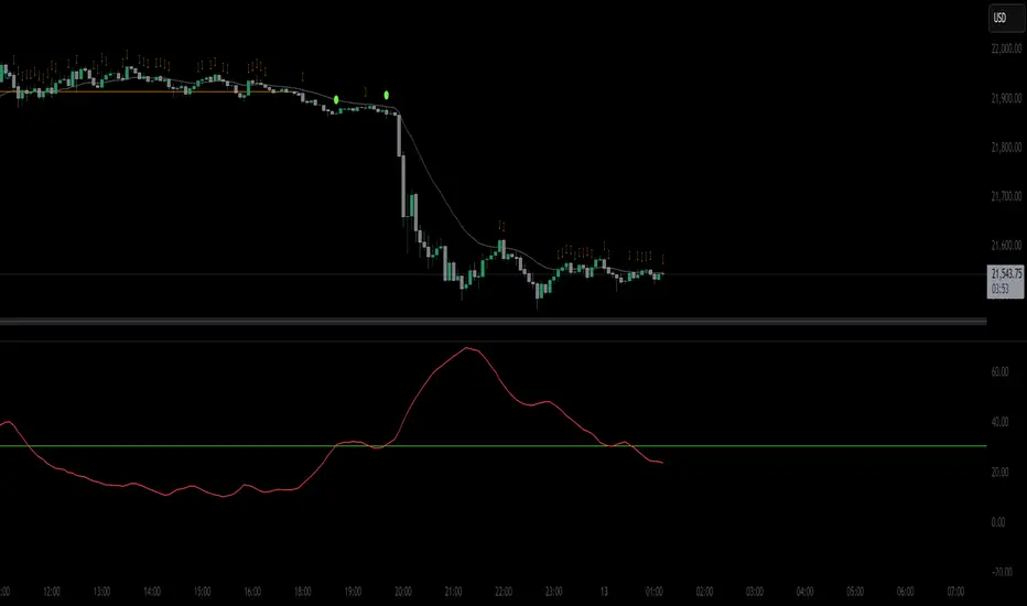
TradeQUO Herrick Payoff RSIHerrick Payoff Index RSI (HPI-RSI) with Signal Line
An advanced oscillator that measures market strength not just by price, but by "smart money flow."
This indicator is not a typical RSI. Instead of applying the Relative Strength Index to price alone, it calculates it on the cumulative Herrick Payoff Index (HPI) . This creates a unique oscillator that reflects the underlying sentiment and capital flow in the market.
What is the Herrick Payoff Index (HPI)?
The HPI is a classic sentiment indicator that combines three crucial elements to determine if money is flowing into or out of an asset:
Price Change: The direction and momentum of the market.
Trading Volume: The conviction behind the price movement.
Open Interest (OI): The total number of open contracts (mainly in futures), which indicates if new capital is entering the market.
By combining these factors, the HPI provides a more comprehensive picture of market strength than indicators based solely on price.
How This Indicator Works
The script follows a logical, multi-step process:
It calculates the raw Herrick Payoff Index for each bar.
It creates a cumulative sum of this index to generate a continuous money flow value.
This cumulative value is smoothed with a short-period EMA to reduce noise.
The RSI is then applied to this smoothed HPI value.
An additional, configurable signal line (moving average) is added to facilitate trading signals.
Interpretation and Application
You can use this indicator much like a standard RSI, but with the added context of money flow:
Overbought/Oversold: Values above 70 suggest an overbought condition, while values below 30 signal an oversold condition.
Signal Line Crossovers: A cross of the HPI-RSI line above the signal line can be seen as a bullish signal. A cross below can be seen as a bearish signal.
Divergences: Look for divergences between the indicator and the price. A bullish divergence (price makes a lower low, indicator makes a higher low) can indicate an upcoming move to the upside. A bearish divergence (price makes a higher high, indicator makes a lower high) can signal a potential move to the downside.
Settings
The indicator has been deliberately kept simple:
HPI Smoothing Length: Smoothing length (1-5) for the cumulative HPI.
RSI Length: The lookback period for the RSI calculation.
Signal Line Settings: Here you can enable/disable the signal line and customize its type and length.
Display Settings: Adjust the colors of the RSI and signal lines to your preference.
This indicator is a tool for analysis and should always be used in combination with other methods and a solid risk management strategy. Happy trading!
StochFusion – Multi D-LineStochFusion – Multi D-Line
An advanced fusion of four Stochastic %D lines into one powerful oscillator.
What it does:
Combines four user-weighted Stochastic %D lines—from fastest (9,3) to slowest (60,10)—into a single “Fusion” line that captures both short-term and long-term momentum in one view.
How to use:
Adjust the four weights (0–10) to emphasize the speed of each %D component.
Watch the Fusion line crossing key zones:
– Above 80 → overbought condition, potential short entry.
– Below 20 → oversold condition, potential long entry.
– Around 50 → neutral/midline, watch for trend shifts.
Applications:
Entry/exit filter: Only take trades when the Fusion line confirms zone exits.
Trend confirmation: Analyze slope and cross of the midline for momentum strength.
Multi-timeframe alignment: Use on different chart resolutions to find confluence.
Tips & Tricks:
Default weights give more influence to slower %D—good for trend-focused strategies.
Equal weights provide a balanced oscillator that mimics an ensemble average.
Experiment: Increase the fastest weight to capture early reversal signals.
Developed by: TradeQUO — inspired by DayTraderRadio John
“The best momentum indicator is the one you adapt to your own trading rhythm.”

Open Interest-RSI + Funding + Fractal DivergencesIndicator — “Open Interest-RSI + Funding + Fractal Divergences”
A multi-factor oscillator that fuses Open-Interest RSI, real-time Funding-Rate data and price/OI fractal divergences.
It paints BUY/SELL arrows in its own pane and directly on the price chart, helping you spot spots where crowd positioning, leverage costs and price action contradict each other.
1 Purpose
OI-RSI – measures conviction behind position changes instead of price momentum.
Funding Rate – shows who pays to hold positions (longs → bull bias, shorts → bear bias).
Fractal Divergences – detects HH/LL in price that are not confirmed by OI-RSI.
Optional Funding filter – hides signals when funding is already extreme.
Together these elements highlight exhaustion points and potential mean-reversion trades.
2 Inputs
RSI / Divergence
RSI length – default 14.
High-OI level / Low-OI level – default 70 / 30.
Fractal period n – default 2 (swing width).
Fractals to compare – how many past swings to scan, default 3.
Max visible arrows – keeps last 50 BUY/SELL arrows for speed.
Funding Rate
mode – choose FR, Avg Premium, Premium Index, Avg Prem + PI or FR-candle.
Visual scale (×) – multiplies raw funding to fit 0-100 oscillator scale (default 10).
specify symbol – enable only if funding symbol differs from chart.
use lower tf – averages 1-min premiums for smoother intraday view.
show table – tiny two-row widget at chart edge.
Signal Filter
Use Funding filter – ON hides long signals when funding > Buy-threshold and short signals when funding < Sell-threshold.
BUY threshold (%) – default 0.00 (raw %).
SELL threshold (%) – default 0.00 (raw %).
(Enter funding thresholds as raw percentages, e.g. 0.01 = +0.01 %).
3 Visual Outputs
Sub-pane
Aqua OI-RSI curve with 70 / 50 / 30 reference lines.
Funding visualised according to selected mode (green above 0, red below 0, or other).
BUY / SELL arrows at oscillator extremes.
Price chart
Identical BUY / SELL arrows plotted with force_overlay = true above/below candles that formed qualifying fractals.
Optional table
Shows current asset ticker and latest funding value of the chosen mode.
4 Signal Logic (Summary)
Load _OI series and compute RSI.
Retrieve Funding-Rate + Premium Index (optionally from lower TF).
Find fractal swings (n bars left & right).
Check divergence:
Bearish – price HH + OI-RSI LH.
Bullish – price LL + OI-RSI HL.
If Funding-filter enabled, require funding < Buy-thr (long) or > Sell-thr (short).
Plot arrows and trigger two built-in alerts (Bearish OI-RSI divergence, Bullish OI-RSI divergence).
Signals are fixed once the fractal bar closes; they do not repaint afterwards.
5 How to Use
Attach to a liquid perpetual-futures chart (BTC, ETH, major Binance contracts).
If _OI or funding series is missing you’ll see an error.
Choose timeframe:
15 m – 4 h for intraday;
1 D+ for swing trades.
Lower TFs → more signals; raise Fractals to compare or use Funding filter to trim noise.
Trade checklist
Funding positive and rising → longs overcrowded.
Price makes higher high; OI-RSI makes lower high; Funding above Sell-threshold → consider short.
Reverse logic for longs.
Combine with trend filter (EMA ribbon, SuperTrend, etc.) so you fade only when price is stretched.
Automation – set TradingView alerts on the two alertconditions and send to webhooks/bots.
Performance tips
Keep Max visible arrows ≤ 50.
Disable lower-TF premium aggregation if script feels heavy.
6 Limitations
Some symbols lack _OI or funding history → script stops with a console message.
Binance Premium Index begins mid-2020; older dates show na.
Divergences confirm only after n bars (no forward repaint).
7 Changelog
v1.0 – 10 Jun 2025
Initial public release.
Added price-chart arrows via force_overlay.

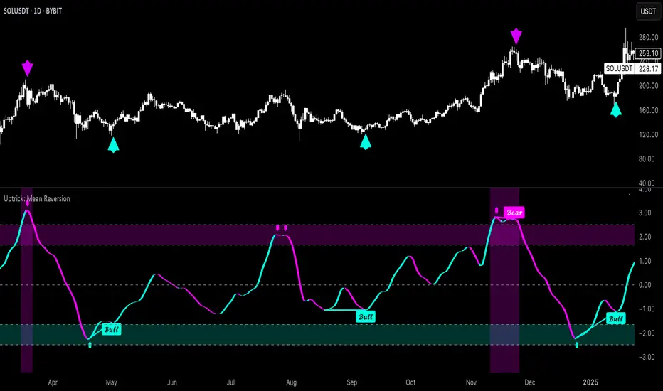
Uptrick: Mean ReversionOverview
Uptrick: Mean Reversion is a technical indicator designed to identify statistically significant reversal opportunities by monitoring market extremes. It presents a unified view of multiple analytical layers—momentum shifts, extreme zones, divergence patterns, and a multi-factor bias dashboard—within a single pane. By translating price momentum into a normalized framework, it highlights areas where prices are likely to revert to their average range.
Introduction
Uptrick: Mean Reversion relies on several core concepts:
Volatility normalization
The indicator rescales recent market momentum into a common scale so that extreme readings can be interpreted consistently across different assets and timeframes.
Mean reversion principle
Markets often oscillate around an average level. When values stray too far beyond typical ranges, a return toward the mean is likely. Uptrick: Mean Reversion detects when these extremes occur.
Momentum inflection
Sharp changes in momentum direction frequently presage turning points. The indicator watches for shifts from upward momentum to downward momentum (and vice versa) to help time entries and exits.
Divergence
When price trends and internal momentum readings move in opposite directions, it can signal weakening momentum and an impending reversal. Uptrick: Mean Reversion flags such divergence conditions directly on the indicator pane.
Multi-factor sentiment
No single metric tells the entire story. By combining several independent sentiment measures—price structure, momentum, oscillators, and external market context—Uptrick: Mean Reversion offers a more balanced view of overall market bias.
Purpose
Uptrick: Mean Reversion was created for traders who focus on countertrend opportunities rather than simply following established trends. Its main objectives are:
Spot extreme conditions
By normalizing momentum into a standardized scale, the indicator clearly marks when the market is in overbought or oversold territory. These conditions often align with points where a snapback toward average is more probable.
Provide reversal signals
Built-in logic detects when momentum shifts direction within extreme zones and displays clear buy or sell markers to guide countertrend entries and exits.
Highlight hidden divergences
Divergence between price and internal momentum can suggest underlying weakness or strength ahead of actual price moves. Uptrick: Mean Reversion plots these divergences directly, allowing traders to anticipate reversals earlier.
Offer contextual bias
A dynamic dashboard aggregates multiple independent indicators—based on recent price action, momentum readings, common oscillators, and broader market context—to produce a single sentiment label. This helps traders determine whether mean reversion signals align with or contradict overall market conditions.
Cater to lower timeframes
Mean reversion tends to occur more frequently and reliably on shorter timeframes (for example, 5-minute, 15-minute, or 1-hour charts). Uptrick: Mean Reversion is optimized for these nimble environments, where rapid reversals can be captured before a larger trend takes hold.
Originality and Uniqueness
Uptrick: Mean Reversion stands out for several reasons:
Proprietary normalization framework
Instead of relying on raw oscillator values, it transforms momentum into a standardized scale. This ensures that extreme readings carry consistent meaning across different assets and volatility regimes.
Inflection-based signals
The indicator waits for a clear shift in momentum direction within extreme zones before plotting reversal markers. This approach reduces false signals compared to methods that rely solely on fixed threshold crossings.
Embedded divergence logic
Divergence detection is handled entirely within the same pane. Rather than requiring a separate indicator window, Uptrick: Mean Reversion identifies instances where price and internal momentum readings do not align and signals those setups directly on the chart.
Adjustable sensitivity profiles
Traders can choose from predefined risk profiles—ranging from very conservative to very aggressive—to automatically adjust how extreme a reading must be before triggering a signal. This customization helps balance between capturing only the most significant reversals or generating more frequent, smaller opportunities.
Multi-factor bias dashboard
While many indicators focus on a single metric, Uptrick: Mean Reversion aggregates five distinct sentiment measures. By balancing price-based bias, momentum conditions, and broader market context, it offers a more nuanced view of when to take—or avoid—countertrend trades.
Why Indicators Were Merged
Proprietary momentum oscillator
A custom-built oscillator rescales recent price movement into a normalized range. This core component underpins all signal logic and divergence checks, allowing extreme readings to be identified consistently.
Inflection detection
By comparing recent momentum values over a configurable lookback interval, the indicator identifies clear shifts from rising to falling momentum (and vice versa). These inflection points serve as a prerequisite for reversal signals when combined with extreme conditions.
Divergence framework
Local peaks and troughs are identified within the normalized oscillator and compared to corresponding price highs and lows. When momentum peaks fail to follow price to new extremes (or vice versa), a divergence alert appears, suggesting weakening momentum ahead of a price turn.
Classic price bias
Recent bar structures are examined to infer whether the immediate past price action was predominantly bullish, bearish, or neutral. This provides one piece of the overall sentiment picture.
Smoothed oscillator bias
A secondary oscillator reading is smoothed and compared to a central midpoint to generate a simple bullish or bearish reading.
Range-based oscillator bias
A familiar range-bound oscillator is used to detect oversold or overbought readings, contributing to the sentiment score.
Classic momentum crossover bias
A traditional momentum check confirms whether momentum currently leans bullish or bearish.
External market trend bias
The indicator monitors a major currency’s short-term trend to gauge broader market risk appetite. A falling currency—often associated with higher risk tolerance—contributes a bullish bias point, while a rising currency adds a bearish point.
All these elements run concurrently. Each piece provides a “vote” toward an overall sentiment reading. At the same time, the proprietary momentum oscillator drives both extreme-zone detection and divergence identification. By merging these inputs, the final result is a single pane showing both precise reversal signals and a unified market bias.
How It Works
At runtime, the indicator proceeds through the following conceptual steps:
Read user inputs (risk profile, lookback index, visual mode, color scheme, background highlighting, bias table display, divergence toggles).
Fetch the latest price data.
Process recent price movement through a proprietary normalization engine to produce a single, standardized momentum reading for each bar.
Track momentum over a configurable lookback interval to detect shifts in direction.
Compare the current momentum reading to dynamically determined extreme thresholds (based on the chosen risk profile).
If momentum has flipped from down to up within an oversold area, display a discrete buy marker. If momentum flips from up to down within an overbought area, display a sell marker.
Identify local peaks and troughs in the proprietary momentum series and compare to price highs and lows over a configurable range. When divergence criteria are met, display bullish or bearish divergence labels
Evaluate five independent sentiment measures—price bar bias, smoothed oscillator bias, range oscillator bias, traditional momentum crossover bias, and an external market trend bias—and assign each a +1 (bullish), –1 (bearish), or 0 (neutral) vote.
Average the five votes to produce an overall sentiment score. If the average exceeds a positive threshold, label the bias as bullish; if it falls below a negative threshold, label it as bearish; otherwise label it neutral.
Update the on-screen bias table at regular intervals, showing each individual metric’s value and vote, as well as the combined sentiment label.
Apply color fills to highlight extreme zones in the background and draw horizontal guideline bands around those extremes.
In complex visual mode, draw a cloud-like band that instantly changes color when momentum shifts. In simple mode, plot only a clean line of the normalized reading in a contrasting color.
Expose alert triggers whenever a buy/sell signal, divergence confirmation, or bias flip occurs, for use in automated notifications.
Inputs
Here is how each input affects the indicator:
Trading Style (very conservative / conservative / neutral / aggressive / very aggressive)
Determines how sensitive the indicator is to extreme readings. Conservative settings require more pronounced market deviations before signaling a reversal; aggressive settings signal more frequently at smaller deviations.
Slope Detection Index (integer)
Controls how many bars back the indicator looks to compare momentum for inflection detection. Lower numbers respond more quickly but can be noisy; higher numbers smooth out short-term fluctuations.
Visual Mode (simple / complex)
Simple mode plots only the normalized momentum line, colored according to the chosen palette. Complex mode draws a candle-style block for each bar—showing the range of momentum movement within that bar—with colored fills that switch instantly when momentum direction changes.
Color Scheme (multiple themes)
Select from preset color palettes to style bullish vs. bearish elements (fills, lines, labels). Options include bright neon tones, classic contrasting pairs, dark-mode palettes, and more, ensuring signals stand out against any chart background.
Enable Background Highlighting (true / false)
When true, extreme overbought or oversold zones are shaded in a semi-transparent color behind the main pane. This helps traders “see” when the market is in a normalized extreme state without relying solely on lines or markers.
Show Helper Scale Lines (true / false)
When true, hidden horizontal lines force the vertical scale to include a fixed range of extreme values—even if the indicator rarely reaches them—so traders always know where the most extreme limits lie.
Enable Divergence Detection (true / false)
Toggles whether the script looks for divergences between price and the proprietary momentum reading. When enabled, bullish/bearish divergence markers appear automatically whenever defined conditions are met.
Pivot Lookback Left & Pivot Lookback Right (integers)
Define how many bars to the left and right the indicator examines when identifying a local peak or trough in the momentum reading. Adjust these to capture divergences on different swing lengths.
Minimum and Maximum Bars Between Pivots (integers)
Set the minimum and maximum number of bars allowed between two identified peaks or troughs for a valid divergence. This helps filter out insignificant or overly extended divergence patterns.
Show Bias Table (true / false)
When enabled, displays a small table in the upper-right corner summarizing five independent sentiment votes and the combined bias label. Disable to keep the pane focused on only the momentum series and signals.
Features
1. Extreme-zone highlighting
Overbought and oversold areas appear as colored backgrounds when the proprietary momentum reading crosses dynamically determined thresholds. This gives an immediate visual cue whenever the market moves into a highly extreme condition.
2. Discrete reversal markers
Whenever momentum shifts direction within an extreme zone, the indicator plots a concise “Buy” or “Sell” label directly on the normalized series. These signals combine both extreme-zone detection and inflection confirmation, reducing false triggers.
3. Dynamic divergence flags
Local peaks and troughs of the proprietary momentum reading are continuously compared to corresponding price points. Bullish divergence (momentum trough rising while price trough falls) and bearish divergence (momentum peak falling while price peak rises) are flagged with small labels and lines. These alerts help traders anticipate reversals before price charts show clear signals.
4. Multi-factor sentiment dashboard
Five independent “votes” are tallied each bar:
• Price bar bias (based on recent bar structure)
• Smoothed oscillator bias (based on a popular momentum oscillator)
• Range oscillator bias (based on an overbought/oversold oscillator)
• Traditional momentum crossover bias (whether momentum is above or below its own smoothing)
• External market trend bias (derived from a major currency index’s short-term trend)
Each vote is +1 (bullish), –1 (bearish), or 0 (neutral). The average of these votes produces an overall sentiment label (Bullish, Bearish, or Neutral). The table updates periodically, showing each metric’s value, its vote, and the combined bias.
5. Versatile visual modes
Simple mode: Plots a single normalized momentum line in a chosen color. Ideal for clean charts.
Complex mode: Renders each bar’s momentum range as a candle-like block, with filled bodies that immediately change color when momentum direction flips. Edge lines emphasize the high/low range of momentum for that bar. This mode makes subtle momentum shifts visually striking.
6. Configurable sensitivity profiles
Five risk profiles (very conservative → very aggressive) automatically adjust how extreme the momentum reading must be before signaling. Conservative traders can wait for only the most dramatic reversals, while aggressive traders can capture more frequent, smaller mean-reversion moves.
7. Customizable color palettes
Twenty distinct color themes let users match the indicator to any chart background. Each theme defines separate colors for bullish fills, bearish fills, the momentum series, and divergence labels. Options range from classic contrasting pairs to neon-style palettes to dark-mode complements.
8. Unified plotting interface
Instead of scattering multiple indicators in separate panes, Uptrick: Mean Reversion consolidates everything—normalized momentum, background shading, threshold bands, reversal labels, divergence flags, and bias table—into a single indicator pane. This reduces screen clutter and places all relevant information in one view.
9. Built-in alert triggers
Six alert conditions are exposed:
Mean reversion buy signal (momentum flips in oversold zone)
Mean reversion sell signal (momentum flips in overbought zone)
Bullish divergence confirmation
Bearish divergence confirmation
Bias flip to bullish (when combined sentiment shifts from non-bullish to bullish)
Bias flip to bearish (when combined sentiment shifts from non-bearish to bearish)
Traders can attach alerts to any of these conditions to receive real-time notifications.
10. Scale anchoring
By forcing invisible horizontal lines at fixed extreme levels, the indicator ensures that the vertical axis always includes those extremes—even if the normalized reading rarely reaches them. This constant frame of reference helps traders judge how significant current readings are.
Line features:
Conclusion
Uptrick: Mean Reversion offers a layered, all-in-one approach to spotting countertrend opportunities. By converting price movement into a proprietary normalized momentum scale, it highlights extreme overbought and oversold zones. Inflection detection within those extremes produces clear reversal markers. Embedded divergence logic calls out hidden momentum weaknesses. A five-factor sentiment dashboard helps gauge whether a reversal signal aligns with broader market context. Users can tailor sensitivity, visual presentation, and color schemes, making it equally suitable for minimalist or richly detailed chart layouts. Optimized for lower timeframes, Uptrick: Mean Reversion helps traders anticipate statistically significant mean reversion moves.
Disclaimer
This indicator is provided for informational purposes only. It does not guarantee any trading outcome. Trading carries inherent risks, including the potential loss of invested capital. Users should perform their own due diligence, apply proper risk management, and consult a financial professional if needed. Past performance does not ensure future results.
Market Arterial PressureIndicator Description: Pulse-Market – Market Blood Pressure
"I slept and had a dream."
In that dream, I wore a white lab coat and shiny black pointed shoes. I felt like a doctor—not of traditional medicine, but of the financial market itself. My mission was clear: to measure the market's blood pressure and diagnose its health.
With this vision, I decided to turn the dream into code. Thus, Pulse-Market was born: an indicator designed to listen to the heartbeat of the blockchain, capturing signs of vitality or collapse, and anticipating the pulse of the next trend.
But the journey did not stop there. At the core of this creation, I incorporated a profound theory: the cycle of existence — Alpha, Beta, and Omega — concepts that resonate both in science and sacred scriptures.
Alpha (α) represents the beginning: the primary impulse, the market's accelerated pulse.
Beta (β) symbolizes the middle: the vital rhythm, the stabilizing cadence of prices.
Omega (Ω) indicates the end: structural collapse, the exhaustion of a cycle.
This logical and symbolic triad forms the foundation of Pulse-Market — the beginning, middle, and end of every market cycle.
How to Use the Indicator
Pulse-Market works as a dynamic oscillator composed of three main forces:
Alpha Pulse (α)
Measures recent price acceleration. The stronger the pulse, the more intense the market movement.
Beta Rhythm (β)
Controls the smoothing of the price rhythm and can be adjusted in four modes:
Fast – quick reactions with more sensitivity
Normal – standard smoothing (simple moving average)
Slow – slow and consistent movements
Accelerated – Hull method: reactive and smooth
Omega Collapse (Ω)
Combines entropy and reversals to detect structural collapses where the market may be losing strength.
Visual Interpretation
Green line above zero: healthy pulse, buying pressure in control.
Red line below zero: strong selling pressure, possible exhaustion.
Crossing the zero line: potential trend reversal.
Settings and Customization
In the indicator settings panel, you can calibrate the pressure reading sensitivity:
Systolic Pressure (α): controls the reaction to rapid price impulses.
Increase to highlight aggressive moves; decrease to smooth spikes.
Diastolic Pressure (β): regulates the importance of the underlying rhythm.
Increase for smooth trends; decrease for quicker responses.
Pulse Pressure (Ω): sensitivity to structural collapses and volatility.
Increase to detect reversals; decrease to ignore market noise.
Practical Applications
Confirm entry and exit signals based on the balance between Alpha and Omega.
Adjust the indicator to your trading style: scalper, day trader, or swing trader.
Use on any asset: cryptocurrencies, stocks, indices, forex.
Integrated Philosophy
We live limited by time and matter, but markets, like life, follow natural cycles: they are born, mature, collapse, and are reborn.
Pulse-Market is not just a technical indicator — it is a spiritual and analytical stethoscope that listens to the heartbeat of volatility and tries to anticipate what the eyes cannot see, but time always reveals.
Original Creator
This indicator was created by Canhoto-Medium, the sole inventor and namer of this tool. As long as time goes on, no other indicator will exist with this essence or name.

CCI Orbiting-VenusIndicator Description: CCI Orbiting-Venus
This is a customized version of the Commodity Channel Index (CCI) that measures the price deviation relative to its smoothed moving average to help identify overbought or oversold market conditions.
What does it do?
Calculates the CCI based on various price sources (such as close, open, high, low, and several price averages).
Applies customizable smoothing to the CCI using different types of moving averages (SMA, EMA, WMA, Hull, JMA, and SMMA).
Visually highlights the CCI direction with different colors:
Purple when CCI is above zero (positive momentum)
Orange when CCI is below zero (negative momentum)
Shows reference lines at +100 and -100 to help identify overbought and oversold zones.
How to use this indicator?
CCI Period Setting (CCI Period):
Adjust the number of periods used to calculate the CCI. Lower values make the indicator more sensitive, while higher values smooth out fluctuations.
Price Source (CCI Price Source):
Choose which price to base the calculation on: close, open, high, low, or weighted averages. This allows you to adapt the indicator to your trading style or strategy.
Smoothing Type (CCI Smoothing Type):
Select from different smoothing methods for the CCI calculation, which affects how the indicator behaves:
SMA (Simple Moving Average) – basic and traditional.
EMA, WMA, Hull, JMA (more advanced averages) – provide different noise filtering or faster response to price movements.
Interpreting CCI values:
Values above +100 suggest the asset may be overbought and could be near a downward reversal.
Values below -100 suggest the asset may be oversold and could be near an upward reversal.
Crossing the zero line indicates a potential change in trend or momentum.
Practical usage:
Look for buy signals when CCI moves up from the oversold region (-100) and crosses above zero, turning purple (positive).
Look for sell signals when CCI moves down from the overbought region (+100) and crosses below zero, turning orange (negative).
Combine with other indicators or chart analysis to confirm signals and avoid false entries.
Advantages of this custom indicator
Flexibility in choosing the price source and smoothing method.
Intuitive visual cues with colors indicating momentum direction.
Clear reference lines for quick assessment of extreme conditions.

RSI-GringoRSI-Gringo — Stochastic RSI with Advanced Smoothing Averages
Overview:
RSI-Gringo is an advanced technical indicator that combines the concept of the Stochastic RSI with multiple smoothing options using various moving averages. It is designed for traders seeking greater precision in momentum analysis, while offering the flexibility to select the type of moving average that best suits their trading style.
Disclaimer: This script is not investment advice. Its use is entirely at your own risk. My responsibility is to provide a fully functional indicator, but it is not my role to guide how to trade, adjust, or use this tool in any specific strategy.
The JMA (Jurik Moving Average) version used in this script is a custom implementation based on publicly shared code by TradingView users, and it is not the original licensed version from Jurik Research.
What This Indicator Does
RSI-Gringo applies the Stochastic Oscillator logic to the RSI itself (rather than price), helping to identify overbought and oversold conditions within the RSI. This often leads to more responsive and accurate momentum signals.
This indicator displays:
%K: the main Stochastic RSI line
%D: smoothed signal line of %K
Upper/Lower horizontal reference lines at 80 and 20
Features and Settings
Available smoothing methods (selectable from dropdown):
SMA — Simple Moving Average
SMMA — Smoothed Moving Average (equivalent to RMA)
EMA — Exponential Moving Average
WMA — Weighted Moving Average
HMA — Hull Moving Average (manually implemented)
JMA — Jurik Moving Average (custom approximation)
KAMA — Kaufman Adaptive Moving Average
T3 — Triple Smoothed Moving Average with adjustable hot factor
How to Adjust Advanced Averages
T3 – Triple Smoothed MA
Parameter: T3 Hot Factor
Valid range: 0.1 to 2.0
Tuning:
Lower values (e.g., 0.1) make it faster but noisier
Higher values (e.g., 2.0) make it smoother but slower
Balanced range: 0.7 to 1.0 (recommended)
JMA – Jurik Moving Average (Custom)
Parameters:
Phase: adjusts responsiveness and smoothness (-100 to 100)
Power: controls smoothing intensity (default: 1)
Tuning:
Phase = 0: neutral behavior
Phase > 0: more reactive
Phase < 0: smoother, more delayed
Power = 1: recommended default for most uses
Note: The JMA used here is not the proprietary version by Jurik Research, but an educational approximation available in the public domain on TradingView.
How to Use
Crossover Signals
Buy signal: %K crosses above %D from below the 20 line
Sell signal: %K crosses below %D from above the 80 line
Momentum Strength
%K and %D above 80: strong bullish momentum
%K and %D below 20: strong bearish momentum
With Trend Filters
Combine this indicator with trend-following tools (like moving averages on price)
Fast smoothing types (like EMA or HMA) are better for scalping and day trading
Slower types (like T3 or KAMA) are better for swing and long-term trading
Final Tips
Tweak RSI and smoothing periods depending on the time frame you're trading.
Try different combinations of moving averages to find what works best for your strategy.
This indicator is intended as a supporting tool for technical analysis — not a standalone decision-making system.

SMI-DarknessIndicator Description: SMI-Darkness
The SMI-Darkness is an indicator based on the Stochastic Momentum Index (SMI), designed to help identify the strength and direction of an asset's trend, as well as potential buy and sell signals. It displays a smoothed SMI using multiple moving average options to customize the indicator’s behavior according to the user’s trading style.
Main Features
Smoothed SMI: Calculates the traditional SMI and smooths it using a user-configurable moving average, improving signal clarity.
Signal Line: Displays a smoothed signal line to identify crossovers with the SMI, generating potential entry or exit points.
Histogram: Shows the difference between the smoothed SMI and the signal line, visually highlighting trend strength. Blue bars indicate buying strength, while yellow bars indicate selling strength.
Horizontal Lines: Includes overbought (+40) and oversold (-40) levels, plus a neutral zero level to aid interpretation.
Indicator Parameters
SMI Short Period: Sets the short period used to calculate the SMI (default 5). Lower periods make the indicator more sensitive.
SMI Signal Period: Sets the period to smooth the signal line (default 5). Adjust to control the signal line's smoothness.
Moving Average Type: Choose the moving average type to smooth the SMI and signal line. Options include:
SMA (Simple Moving Average)
SMMA (Smoothed Moving Average)
EMA (Exponential Moving Average)
WMA (Weighted Moving Average)
HMA (Hull Moving Average)
JMA (Jurik Moving Average) — Note: This is not an original or proprietary moving average but a publicly available open-source version created by TradingView users.
VWMA (Volume-Weighted Moving Average)
KAMA (Kaufman Adaptive Moving Average)
How to Use
Trend Identification: Observe the position of the smoothed SMI relative to the signal line and the histogram values.
When the histogram is positive (blue bars), momentum is bullish.
When the histogram is negative (yellow bars), momentum is bearish.
Buy and Sell Signals:
A crossover of the smoothed SMI above the signal line may indicate a buy signal.
A crossover of the smoothed SMI below the signal line may indicate a sell signal.
Overbought/Oversold Levels:
SMI values above +40 suggest potential overbought conditions, signaling caution on long positions.
Values below -40 suggest potential oversold conditions, indicating possible buying opportunities.
Customization: Adjust the parameters to balance sensitivity and noise, choosing the moving average type that best fits your trading style.
MACD Full [Titans_Invest]MACD Full — A Smarter, More Flexible MACD.
Looking for a MACD with real customization power?
We present one of the most complete public MACD indicators available on TradingView.
It maintains the classic MACD structure but is enhanced with 20 fully customizable long entry conditions and 20 short entry conditions , giving you precise control over your strategy.
Plus, it’s fully automation-ready, making it ideal for quantitative systems and algorithmic trading.
Whether you're a discretionary trader or a bot developer, this tool is built to seamlessly adapt to your style.
⯁ WHAT IS THE MACD❓
The Moving Average Convergence Divergence (MACD) is a technical analysis indicator developed by Gerald Appel. It measures the relationship between two moving averages of a security’s price to identify changes in momentum, direction, and strength of a trend. The MACD is composed of three components: the MACD line, the signal line, and the histogram.
⯁ HOW TO USE THE MACD❓
The MACD is calculated by subtracting the 26-period Exponential Moving Average (EMA) from the 12-period EMA. A 9-period EMA of the MACD line, called the signal line, is then plotted on top of the MACD line. The MACD histogram represents the difference between the MACD line and the signal line.
Here are the primary signals generated by the MACD:
Bullish Crossover: When the MACD line crosses above the signal line, indicating a potential buy signal.
Bearish Crossover: When the MACD line crosses below the signal line, indicating a potential sell signal.
Divergence: When the price of the security diverges from the MACD, suggesting a potential reversal.
Overbought/Oversold Conditions: Indicated by the MACD line moving far away from the signal line, though this is less common than in oscillators like the RSI.
⯁ ENTRY CONDITIONS
The conditions below are fully flexible and allow for complete customization of the signal.
______________________________________________________
🔹 CONDITIONS TO BUY 📈
______________________________________________________
• Signal Validity: The signal will remain valid for X bars .
• Signal Sequence: Configurable as AND or OR .
🔹 MACD > Signal Smoothing
🔹 MACD < Signal Smoothing
🔹 Histogram > 0
🔹 Histogram < 0
🔹 Histogram Positive
🔹 Histogram Negative
🔹 MACD > 0
🔹 MACD < 0
🔹 Signal > 0
🔹 Signal < 0
🔹 MACD > Histogram
🔹 MACD < Histogram
🔹 Signal > Histogram
🔹 Signal < Histogram
🔹 MACD (Crossover) Signal
🔹 MACD (Crossunder) Signal
🔹 MACD (Crossover) 0
🔹 MACD (Crossunder) 0
🔹 Signal (Crossover) 0
🔹 Signal (Crossunder) 0
______________________________________________________
______________________________________________________
🔸 CONDITIONS TO SELL 📉
______________________________________________________
• Signal Validity: The signal will remain valid for X bars .
• Signal Sequence: Configurable as AND or OR .
🔸 MACD > Signal Smoothing
🔸 MACD < Signal Smoothing
🔸 Histogram > 0
🔸 Histogram < 0
🔸 Histogram Positive
🔸 Histogram Negative
🔸 MACD > 0
🔸 MACD < 0
🔸 Signal > 0
🔸 Signal < 0
🔸 MACD > Histogram
🔸 MACD < Histogram
🔸 Signal > Histogram
🔸 Signal < Histogram
🔸 MACD (Crossover) Signal
🔸 MACD (Crossunder) Signal
🔸 MACD (Crossover) 0
🔸 MACD (Crossunder) 0
🔸 Signal (Crossover) 0
🔸 Signal (Crossunder) 0
______________________________________________________
______________________________________________________
🤖 AUTOMATION 🤖
• You can automate the BUY and SELL signals of this indicator.
______________________________________________________
______________________________________________________
⯁ UNIQUE FEATURES
______________________________________________________
Signal Validity: The signal will remain valid for X bars
Signal Sequence: Configurable as AND/OR
Condition Table: BUY/SELL
Condition Labels: BUY/SELL
Plot Labels in the Graph Above: BUY/SELL
Automate and Monitor Signals/Alerts: BUY/SELL
Signal Validity: The signal will remain valid for X bars
Signal Sequence: Configurable as AND/OR
Table of Conditions: BUY/SELL
Conditions Label: BUY/SELL
Plot Labels in the graph above: BUY/SELL
Automate & Monitor Signals/Alerts: BUY/SELL
______________________________________________________
📜 SCRIPT : MACD Full
🎴 Art by : @Titans_Invest & @DiFlip
👨💻 Dev by : @Titans_Invest & @DiFlip
🎑 Titans Invest — The Wizards Without Gloves 🧤
✨ Enjoy!
______________________________________________________
o Mission 🗺
• Inspire Traders to manifest Magic in the Market.
o Vision 𐓏
• To elevate collective Energy 𐓷𐓏

Adaptive MACD Deluxe [AlgoAlpha]OVERVIEW
This script is an advanced rework of the classic MACD indicator, designed to be more adaptive, visually informative, and customizable. It enhances the original MACD formula using a dynamic feedback loop and a correlation-based weighting system that adjusts in real-time based on how deterministic recent price action is. The signal line is flexible, offering several smoothing types including Heiken Ashi, while the histogram is color-coded with gradients to help users visually identify momentum shifts. It also includes optional normalization by volatility, allowing MACD values to be interpreted as relative percentage moves, making the indicator more consistent across different assets and timeframes.
CONCEPTS
This version of MACD introduces a deterministic weight based on R-squared correlation with time, which modulates how fast or slow the MACD adapts to price changes. Higher correlation means smoother, slower MACD responses, and low correlation leads to quicker reaction. The momentum calculation blends traditional EMA math with feedback and damping components to create a smoother, less noisy series. Heiken Ashi is optionally used for signal smoothing to better visualize short-term trend bias. When normalization is enabled, the MACD is scaled by an EMA of the high-low range, converting it into a bounded, volatility-relative indicator. This makes extreme readings more meaningful across markets.
FEATURES
The script offers six distinct options for signal line smoothing: EMA, SMA, SMMA (RMA), WMA, VWMA, and a custom Heiken Ashi mode based on the MACD series. Each option provides a different response speed and smoothing behavior, allowing traders to match the indicator’s behavior to their strategy—whether it's faster reaction or reduced noise.
Normalization is another key feature. When enabled, MACD values are scaled by a volatility proxy, converting the indicator into a relative percentage. This helps standardize the MACD across different assets and timeframes, making overbought and oversold readings more consistent and easier to interpret.
Threshold zones can be customized using upper and lower boundaries, with inner zones for early warnings. These zones are highlighted on the chart with subtle background fills and directional arrows when MACD enters or exits key levels. This makes it easier to spot strong or weak reversals at a glance.
Lastly, the script includes multiple built-in alerts. Users can set alerts for MACD crossovers, histogram flips above or below zero, and MACD entries into strong or weak reversal zones. This allows for hands-free monitoring and quick decision-making without staring at the chart.
USAGE
To use this script, choose your preferred signal smoothing type, enable normalization if you want MACD values relative to volatility, and adjust the threshold zones to fit your asset or timeframe. Use the colored histogram to detect changes in momentum strength—brighter colors indicate rising strength, while faded colors imply weakening. Heiken Ashi mode smooths out noise and provides clearer signals, especially useful in choppy conditions. Use alert conditions for crossover and reversal detection, or monitor the arrow markers for entries into potential exhaustion zones. This setup works well for trend following, momentum trading, and reversal spotting across all market types.
Trending Indicator: Price % of Pivots# Price % of Pivots Indicator
## Overview
A trend-following indicator that measures current price position relative to recent pivot highs and lows as percentages, providing normalized trend analysis across all timeframes and instruments.
## Key Features
- **Real-time trend table** with live signal updates (Strong Bullish/Bearish, Leaning Bullish/Bearish, Neutral)
- **Dual percentage tracking**: Price % of high pivot and low pivot % of current price
- **Universal compatibility** - works on any timeframe and asset class
- **Faster than some other trend indicators** - catches trend changes earlier with less lag
## Trading Signals
- **Bullish bias**: When price % of high pivot > low pivot % of price
- **Bearish bias**: When low pivot % of price > price % of high pivot
- **Customizable thresholds** (default 99%) with alert system
- **Color-coded backgrounds** for immediate visual confirmation
## Configuration
- Adjustable pivot lookback period (5-100 bars)
- Customizable left/right bars for pivot confirmation
- Threshold settings from 50-110% with 0.5% increments
- Full color customization for all elements
## Advantages
- **Speed**: More responsive than traditional ATR-based indicators
- **Clarity**: Clean percentage-based display with professional info table
- **Alerts**: Multiple conditions for automated and manual trading
- **Versatility**: Effective for day trading, swing trading, and multi-timeframe analysis
Perfect for traders seeking a fast, reliable trend indicator that works consistently across all markets and timeframes.
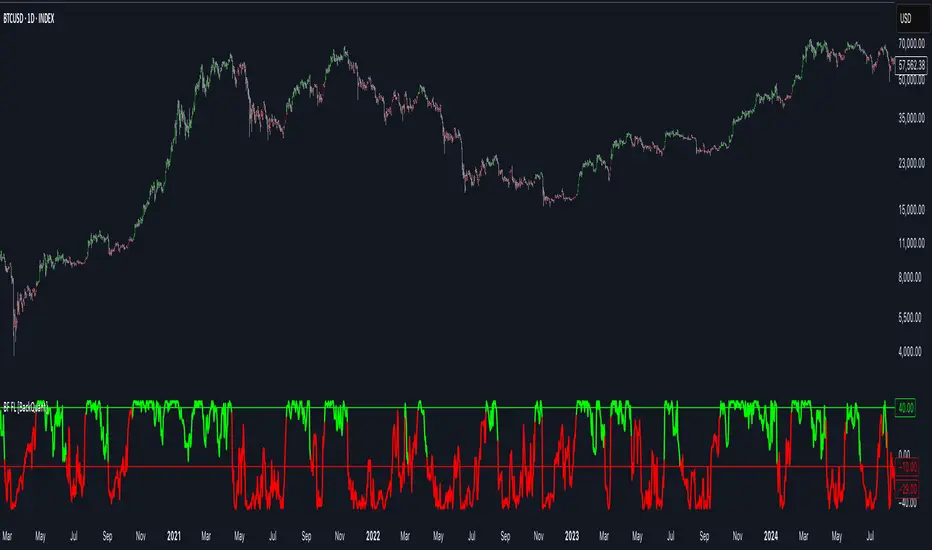
Bilateral Filter For Loop [BackQuant]Bilateral Filter For Loop
The Bilateral Filter For Loop is an advanced technical indicator designed to filter out market noise and smooth out price data, thus improving the identification of underlying market trends. It employs a bilateral filter, which is a sophisticated non-linear filter commonly used in image processing and price time series analysis. By considering both spatial and range differences between price points, this filter is highly effective at preserving significant trends while reducing random fluctuations, ultimately making it suitable for dynamic trend-following strategies.
Please take the time to read the following:
Key Features
1. Bilateral Filter Calculation:
The bilateral filter is the core of this indicator and works by applying a weight to each data point based on two factors: spatial distance and price range difference. This dual weighting process allows the filter to preserve important price movements while reducing the impact of less relevant fluctuations. The filter uses two primary parameters:
Spatial Sigma (σ_d): This parameter adjusts the weight applied based on the distance of each price point from the current price. A larger spatial sigma means more smoothing, as further away values will contribute more heavily to the result.
Range Sigma (σ_r): This parameter controls how much weight is applied based on the difference in price values. Larger price differences result in smaller weights, while similar price values result in larger weights, thereby preserving the trend while filtering out noise.
The output of this filter is a smoothed version of the original price series, which eliminates short-term fluctuations, helping traders focus on longer-term trends. The bilateral filter is applied over a rolling window, adjusting the level of smoothing dynamically based on both the distance between values and their relative price movements.
2. For Loop Calculation for Trend Scoring:
A for-loop is used to calculate the trend score based on the filtered price data. The loop compares the current value to previous values within the specified window, scoring the trend as follows:
+1 for upward movement (when the filtered value is greater than the previous value).
-1 for downward movement (when the filtered value is less than the previous value).
The cumulative result of this loop gives a continuous trend score, which serves as a directional indicator for the market's momentum. By summing the scores over the window period, the loop provides an aggregate value that reflects the overall trend strength. This score helps determine whether the market is experiencing a strong uptrend, downtrend, or sideways movement.
3. Long and Short Conditions:
Once the trend score has been calculated, it is compared against predefined threshold levels:
A long signal is generated when the trend score exceeds the upper threshold, indicating that the market is in a strong uptrend.
A short signal is generated when the trend score crosses below the lower threshold, signaling a potential downtrend or trend reversal.
These conditions provide clear signals for potential entry points, and the color-coding helps traders quickly identify market direction:
Long signals are displayed in green.
Short signals are displayed in red.
These signals are designed to provide high-confidence entries for trend-following strategies, helping traders capture profitable movements in the market.
4. Trend Background and Bar Coloring:
The script offers customizable visual settings to enhance the clarity of the trend signals. Traders can choose to:
Color the bars based on the trend direction: Bars are colored green for long signals and red for short signals.
Change the background color to provide additional context: The background will be shaded green for a bullish trend and red for a bearish trend. This visual feedback helps traders to stay aligned with the prevailing market sentiment.
These features offer a quick visual reference for understanding the market's direction, making it easier for traders to identify when to enter or exit positions.
5. Threshold Lines for Visual Feedback:
Threshold lines are plotted on the chart to represent the predefined long and short levels. These lines act as clear markers for when the market reaches a critical threshold, triggering a potential buy (long) or sell (short) signal. By showing these threshold lines on the chart, traders can quickly gauge the strength of the market and assess whether the trend is strong enough to warrant action.
These thresholds can be adjusted based on the trader's preferences, allowing them to fine-tune the indicator for different market conditions or asset behaviors.
6. Customizable Parameters for Flexibility:
The indicator offers several parameters that can be adjusted to suit individual trading preferences:
Window Period (Bilateral Filter): The window size determines how many past price values are used to calculate the bilateral filter. A larger window increases smoothing, while a smaller window results in more responsive, but noisier, data.
Spatial Sigma (σ_d) and Range Sigma (σ_r): These values control how sensitive the filter is to price changes and the distance between data points. Fine-tuning these parameters allows traders to adjust the degree of noise reduction applied to the price series.
Threshold Levels: The upper and lower thresholds determine when the trend score crosses into long or short territory. These levels can be customized to better match the trader's risk tolerance or asset characteristics.
Visual Settings: Traders can customize the appearance of the chart, including the line width of trend signals, bar colors, and background shading, to make the indicator more readable and aligned with their charting style.
7. Alerts for Trend Reversals:
The indicator includes alert conditions for real-time notifications when the market crosses the defined thresholds. Traders can set alerts to be notified when:
The trend score crosses the long threshold, signaling an uptrend.
The trend score crosses the short threshold, signaling a downtrend.
These alerts provide timely information, allowing traders to take immediate action when the market shows a significant change in direction.
Final Thoughts
The Bilateral Filter For Loop indicator is a robust tool for trend-following traders who wish to reduce market noise and focus on the underlying trend. By applying the bilateral filter and calculating trend scores, this indicator helps traders identify strong uptrends and downtrends, providing reliable entry signals with minimal market noise. The customizable parameters, visual feedback, and alerting system make it a versatile tool for traders seeking to improve their timing and capture profitable market movements.
Thus following all of the key points here are some sample backtests on the 1D Chart
Disclaimer: Backtests are based off past results, and are not indicative of the future.
INDEX:BTCUSD
INDEX:ETHUSD
CRYPTO:SOLUSD