Adaptive For LoopAdaptive For Loop (AFL | MisinkoMaster)
The Adaptive For Loop is an innovative trend-following indicator designed to deliver fast and reliable signals while minimizing false positives. By dynamically assessing the relationship between current and historical price data across multiple price components—open, high, low, and close—this tool filters out noise and highlights the strongest trend signals.
Unlike traditional indicators that rely on a single price input, Adaptive For Loop harnesses the combined strength of multiple price points, intelligently selecting the most relevant signal to adapt to changing market conditions. This approach helps traders identify genuine trend momentum with clarity and speed.
🔍 Concept & Idea
The idea behind Adaptive For Loop is to improve trend detection by simultaneously evaluating multiple price sources instead of just one. Each price component (open, high, low, close) undergoes a scoring process comparing the current price to a series of historical prices within a user-defined lookback range.
Since different price points may exhibit varying degrees of noise or trend clarity at different times, the indicator selects the source with the strongest directional signal based on absolute scoring. This adaptive selection reduces noise and enhances signal reliability while maintaining fast responsiveness.
⚙️ How It Works
The indicator performs a looped comparison for each price series (open, high, low, close) over a range specified by the user (from start to end bars ago).
For each bar in the range, it increments or decrements a score depending on whether the current price is higher or lower than the compared historical price.
After scoring all four price sources, the indicator selects the score with the greatest absolute value to represent the dominant market momentum.
This dominant score is then evaluated against user-defined upper and lower thresholds to determine the market trend state:
Above the upper threshold: bullish/uptrend signal
Below the lower threshold: bearish/downtrend signal
Between thresholds: neutral/no clear trend
The indicator plots the score, thresholds, and highlights the trend visually, including colored candlesticks representing the detected trend.
🧩 Inputs Overview
From (start) – Defines the start bar offset for the lookback range in the for loop (default 0).
To (end) – Defines the end bar offset for the lookback range in the for loop (default 45).
Upper Threshold – Score level above which an uptrend signal is triggered (default 39).
Lower Threshold – Score level below which a downtrend signal is triggered (default -12).
📌 Usage Notes
Adaptive Selection: The indicator adapts by selecting the price source with the strongest trend signal, reducing false signals caused by noisy individual price inputs.
Speed and Noise: Designed for fast execution and minimal noise, making it especially useful in volatile markets such as BTCUSD.
Visual Clarity: Colored candlesticks and score plots help traders quickly identify trend direction and strength.
Customization: Users can adjust the lookback range and thresholds to fit different assets and timeframes.
Complementary Tool: Best used alongside other confirmation indicators and sound risk management practices.
Backtesting Recommended: Always backtest and validate settings on historical data to optimize performance for your specific market.
⚠️ Disclaimer
This indicator is provided for educational and analytical purposes only and does not constitute financial advice. Trading involves significant risk, and users should perform their own due diligence before making any investment decisions.
Enjoy trading with Adaptive For Loop!
Ohlc

[LJ] RSIM + ICT KillzonesIndicator Summary
This Pine Script indicator is a comprehensive, all-in-one toolkit designed for traders utilizing Inner Circle Trader (ICT) concepts. It visually maps out crucial time-based trading sessions, killzones, and key opening price levels directly on the chart. Alongside the time and price tools, it features a real-time "RSIM" (MTF RSI Monitor) dashboard to track market momentum across multiple timeframes, all while maintaining a lag-free chart through automated drawing cleanup.
Core Functionalities
ICT Killzones & Silver Bullets:
Visually demarcates specific high-probability trading windows—including the Asian, London, and New York (AM & PM) killzones, as well as the UK and US "Silver Bullet" times—using vertical lines and colored background highlights.
Key Opening Price Levels:
Automatically plots horizontal lines for significant opening prices, such as the New York Midnight Open (often used as true day open), CME Open, and NY AM/PM Opens. It also includes Higher Time Frame (HTF) levels for Weekly and Monthly opens.
Session High/Low Tracking:
Actively tracks and draws horizontal price levels for the High and Low of the current day, previous day, and individual Globex, Asian, London, and NY sessions.
Multi-Timeframe RSI Dashboard (RSIM):
An on-chart table that displays the current Relative Strength Index (RSI) values and a live countdown timer ("time to close") for the 5-minute, 15-minute, 1-hour, 4-hour, Daily, and Weekly timeframes.
Lunch "No-Trade-Zone":
Specifically highlights the New York Lunch period, visually warning traders of potential low-volume or erratic price action.
Automated Housekeeping:
A built-in memory management system that automatically deletes drawings (lines and labels) older than a user-defined number of days to prevent chart clutter and performance lag.
Built-in Debug Logger:
An optional on-chart logging table that tracks session triggers and script events, helping traders verify that times and levels are plotting correctly for their selected asset.


1337 v1.4 [Abrhm]In the center of the circle, there lies a small, perfectly smooth stone, unlike any natural rock. It's as if it's been shaped by hands long ago, though no one can recall who might have carved it. Every time you try to focus on it, the stone seems to shimmer and shift, just out of the corner of your eye. Some say it's an artifact from a lost civilization, others believe it’s a relic from another world entirely. {0}

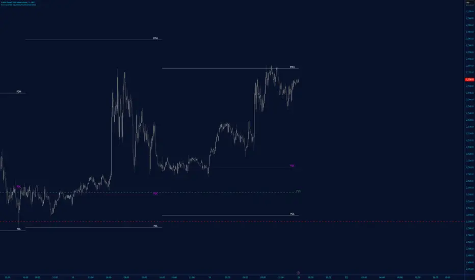
Daily OHLC + Current High/LowThis indicator is a Dynamic Daily Levels Tracker designed to provide a clean, uncluttered view of significant price milestones from the previous and current trading days.
Unlike standard indicators that draw "staircase" lines across your entire chart history, this tool uses Pine Script's drawing engine to display levels only on the current live bar, extending them across the screen for a professional, high-end look.
Key Features
- Previous Day OHLC: Automatically fetches and plots the High, Low, Open, and Close from the previous daily candle.
- Current Day H/L: Tracks the real-time High and Low of the ongoing trading day.
- Full-Width Visualization: Lines extend across the entire chart (left-to-right), ensuring the levels are always visible regardless of where you are scrolling.
Dual Labeling System:
-On-Chart Labels: Names of the levels (e.g., "Previous High") are placed directly above the lines for instant identification.
- Price Axis Labels: The exact price values are reflected in color-coded bubbles on the right-hand Y-axis, matching the aesthetic of professional trading platforms.
- Customizable: Users can change the color, line thickness, and text size for every level to match their specific chart theme.
Why Traders Use This
These levels are often viewed as "psychological pivots." The Previous Day High and Low, in particular, are frequently used as areas of support and resistance or as triggers for breakout and mean-reversion strategies. By keeping only the most recent data visible, the indicator helps you focus on current price action without the distraction of historical lines.

TradeCraftly - Previous OHLC Levels📌 TradeCraftly – Previous OHLC Levels
TradeCraftly OHLC plots the most important higher-timeframe price levels directly on your chart, helping you identify key support, resistance, and reference zones with clarity.
🔹 What this indicator shows
Previous Day OHLC (High, Low, Open, Close)
Previous Week OHLC
Previous Month OHLC
Today’s Open (no historical clutter)
All levels are drawn as clean horizontal rays and extend only into the current session, keeping the chart focused and readable.
🔹 Key Features
Individual enable / disable controls for Day, Week, and Month levels
No historical clutter – only the most relevant levels are shown
Labels aligned to today’s first candle for quick level identification
Custom line width, color, and style (solid / dashed / dotted)
Works seamlessly on all intraday and higher timeframes
🔹 Why use Previous OHLC levels?
Previous period OHLC levels are widely used by:
Intraday traders
Swing traders
Index & futures traders
They often act as:
Strong support & resistance
Liquidity zones
Breakout / rejection levels
🔹 Best Use Cases
Market open bias using Today’s Open
Intraday trades around PDH / PDL
Weekly range reactions near PWH / PWL
Higher-timeframe context using Monthly levels
⚠️ Disclaimer
This indicator is for educational purposes only and does not provide trading signals or financial advice. Always manage risk and confirm with your own analysis.

OHLC for future# OHLC for Futures
## Overview
This indicator helps traders identify key price levels from previous trading sessions. It displays the previous session's High, Low, Close, and the current session's Open as reference points on your chart.
I believe the day's opening price is crucial, while yesterday's opening price is irrelevant.
I haven't found a suitable OHLC indicator for futures trading, so I spent some time developing this one myself. As I'm currently migrating my trading from other platforms to TradingView, I need to create many indicators. Due to time constraints, there might be some bugs. If you encounter any issues or have suggestions for improvement, feel free to leave a comment or send me a private message.
## Key Features
- Displays previous session OHLC levels as dot markers
- Supports Sunday evening session start for futures markets
- Automatically handles half-day trading and weekend gaps
- Optional display of current session's developing High/Low
- Works on any timeframe
### Gap Detection
The indicator automatically handles:
- Half-day trading when market closes early
- Weekend gaps from Friday to Monday
- Any unexpected day changes during active sessions
## Settings
### Time Configuration
**Start Weekday Session**: Enter time in HHMM format (example: 830 for 8:30 AM)
- Used for Monday through Saturday
**Start Sunday Session**: Enter time in HHMM format (example: 1700 for 5:00 PM)
- Used for Sunday evening sessions
**End Session**: Enter time in HHMM format (example: 1515 for 3:15 PM)
- When the trading session officially ends
**Important**: Recommended to set chart timezone to "Exchange" for best results.
## Setup Examples
### ES or NQ Futures
```
Start Weekday Session: 830
Start Sunday Session: 1700
End Session: 1515
Chart Timezone: America/Chicago
```
## Common Trading Applications
**Support and Resistance**
Previous High and Low often act as key levels where price may reverse or pause.
**Opening Range**
The opening price frequently serves as a pivot point during the trading session.
**Gap Trading**
Compare current Open to previous Close to identify gap situations.
**Range Analysis**
Use previous day's range to assess current volatility and potential targets.
## Tips for Best Results
1. Set your chart timezone to match the exchange timezone
2. Use 5-minute or 15-minute timeframes for clear visibility
3. Verify session times match your futures contract specifications
## Version Information
Current Version: 1.0
## Future Development
Planned enhancements:
- Alert system for price crossing OHLC levels
- Trading system integration with entry/exit signals
- Additional statistical analysis tools
## Notes
- This indicator is designed specifically for futures markets
## Disclaimer
This indicator is for educational and informational purposes only. Always conduct your own analysis and implement proper risk management before trading.
---
For questions, suggestions, or bug reports, please leave a comment below.

VWAP Multi Sessions + EMA + TEMA + PivotThis indicator combines several technical tools in one, designed for both intraday and swing traders to provide a complete view of market dynamics.
- VWAP Multi Sessions: calculates and plots five independent VWAPs, each based on a specific time range. This allows you to better identify value zones and price evolution during different phases of the trading day.
- Moving Averages (EMA): three strategic EMAs (55, 144, and 233 periods) are included to track the broader trend and highlight potential crossovers.
- TEMA (Triple Exponential Moving Average): two TEMAs (144 and 233 periods) offer a more responsive alternative to EMAs, reducing lag while filtering out some market noise.
- Daily Levels: the previous day’s open, close, high, and low are plotted as key support and resistance references.
- Pivot Point (P): also included is the classic daily pivot from the previous session, calculated as (High + Low + Close) / 3, which acts as a central level around which price often gravitates.
In summary, this indicator combines:
- intraday value references (session VWAPs),
- trend indicators (EMA and TEMA),
- and daily reference points (OHLC and Pivot).
It is particularly suited for intraday, scalping, and swing trading strategies, helping traders anticipate potential reaction zones in the market more effectively.

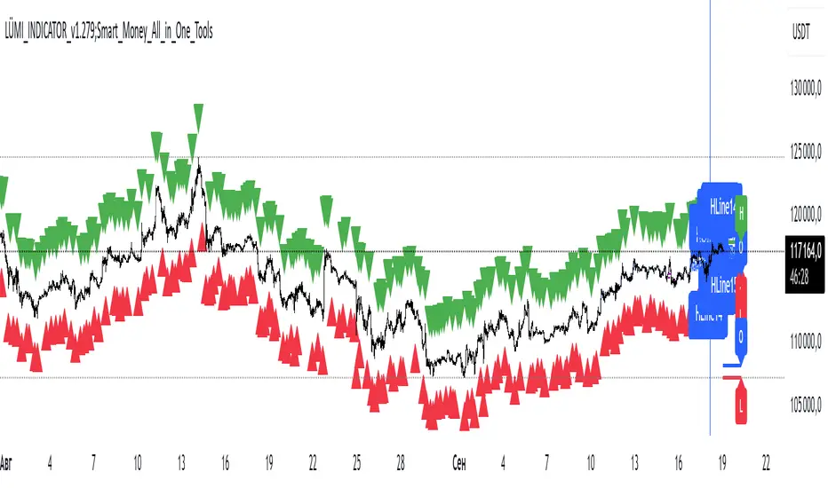
LÜMI_INDICATOR_v1.279_Smart_Money_All_in_One_Tools!!!Русский перевод внизу!!!!
Before using it, go to the settings and uncheck all the boxes!!!
And only then after that deal with this indicator, what you need from there, then add.
In the future, I will release a COMPLETE guide to this indicator with screenshots, so throw it to your favorites, don't waste it.
This version is still raw, but WORKING. There will be improvements in the structure of the indicator so that you can intuitively understand what each of the 100+(!) indicator settings is responsible for.
What's inside:
1. Session indicator. 15 Fully customizable time boxes, for any needs, and sessions. Enter your time zone, the time of your session, and that's it. There are also a couple of unexpected bonuses in this part of the indicator))
2. A set of horizontal lines of lines that come out at the right time for you. It is convenient to designate NYM, NYSE OPEN RANge, and other events on the chart that occur strictly on time. It can be widely used if you know what to look for.
3. Like the 2nd item, only vertical.
4. Fractal indicator.
5. OHL levels for
5.1. Current day
5.2. Current week
5.3. Current month.
6. Vertical chart dividers by opening levels
6.1 Days
6.2. Weeks
6.3. Months.
This feature is ideal for those who trade forex price delivery profiles or indices.
!!! Перед использованием зайдите в настройки и поснимайте все галочки!!!
И только потом после этого разбирайтесь с этим индюком, что вам оттуда нужно, то и добавляйте.
В дальнейшем выпущу ПОЛНЕЙШИЙ гайд на этот индюк со скриншотами, так что кидайте в избранное, не теряйте
Версия пока сырая, но РАБОЧАЯ. Будут доработки в структуре индикатора, чтобы можно было интуитивно понять, за что отвечает каждая из 100+(!) настроек индикатора
Что внутри:
1. Индикатор сессий. 15полностью настраиваемых боксов по времени, под любые нужды, и сессии. Вводите свой часовой пояс, время вашей сессии и всё. В этой части индикатора также есть пара неожиданных бонусов))
2. Набор горизонтальных линий линий, выходят в нужное для вас время. Удобно обозначать NYM, NYSE OPEN RANge, и другие события на графике, которые происходят строго по времени. Применение можно найти широкое, если знать, что искать
3. Как 2 пункт, только вертикальные.
4. Индикатор фракталов.
5. Уровни OHL для
5.1. Текущего дня
5.2. Текущей недели
5.3. Текущего месяца.
6. Вертикальные разделители графика по уровням открытия
6.1 Дня
6.2. Недели
6.3. Месяца.
Эта функция идеальна для тех, кто торгует профили доставки цены форекс или индексов.
Cozys Black Van CandlesDescription:
Cozys Black Van Candles is a versatile, fully customizable overlay indicator designed to visually highlight multiple key candle structures on your chart. It allows traders to track precise OHLC levels and midpoints for a series of user-defined candles, offering a clear visual representation of market action. The indicator is optimized for clarity, flexibility, and session-based analysis.
This indicator is inspired by the unique trading methodology of ᴵᶜᵗ 👑 Cøzy🦁Bæb¹⁷ 💚. It is designed to visually represent multiple candle bodies along with their open, high, low, and close (OHLC) levels, allowing traders to monitor key price zones and session dynamics. The tool also features a settlement-level overlay, which dynamically extends throughout the session, providing a clear reference for decision-making. With customizable colors, line styles, and label settings, this indicator offers flexibility for both analysis and chart readability, making it suitable for professional traders seeking precise visual cues and enhanced market awareness.
Key Features:
Multiple Candle Visualization: Plot multiple custom candles on your chart with independent toggles for each, allowing full control over which candles are displayed.
OHLC & Midpoint Levels: Each candle displays its Open, High, Low, Close, and Midpoint levels using dedicated lines for accurate reference.
Dynamic Boxes & Lines: Candle ranges are highlighted with semi-transparent boxes and lines that expand in real-time, providing clear visualization of active sessions and historical candle structure.
Session Expansion: Candle boxes and lines automatically extend throughout the session until a defined cutoff, ensuring continuous visual tracking of each candle’s range.
Customizable Styles & Colors: Users can fully customize the colors, line styles (solid, dotted, dashed), and widths of all OHLC lines, midpoints, and candle boxes for maximum chart readability.
Labeling: Each candle can be labeled at its midpoint with customizable text, background, and size, providing instant identification without cluttering the chart.
Independent PD-Like Settlement Candle: The indicator supports a special, session-based candle with fully independent OHLC and midpoint plotting, including dynamic expansion and labeling, without affecting main candle plots.
Timezone Support: All candles and session-based calculations respect a user-defined timezone, ensuring accurate plotting across different markets and trading sessions.
Replay & Real-Time Compatible: All plotted boxes, lines, and labels expand correctly in both real-time and replay mode, providing reliable historical analysis and session review.
Performance Optimized: Designed with efficient use of Pine Script objects to avoid conflicts and maximize chart responsiveness.
Flexible Session Reset: Main candles and session-based candles can reset automatically at the start of a new trading session for a clean chart display.
Use Cases:
Visualize key intraday candles for reference in scalping or day trading strategies.
Track precise OHLC and midpoint levels for multiple candles simultaneously.
Overlay session-based structures without interfering with price action.
Enhance chart readability with labeled candle ranges and dynamic boxes.
Highlights:
Plot multiple candles simultaneously with independent toggles.
Track precise OHLC and midpoint levels at a glance.
Dynamic boxes and lines expand through the session automatically.
Fully customizable colors, line styles, widths, and labels.
Session-based candle plotting without affecting main candles.
Works in real-time and replay mode.
Timezone-aware for accurate market session tracking.
Perfect for day traders, scalpers, and anyone who wants a clean, visual overview of intraday candle action!

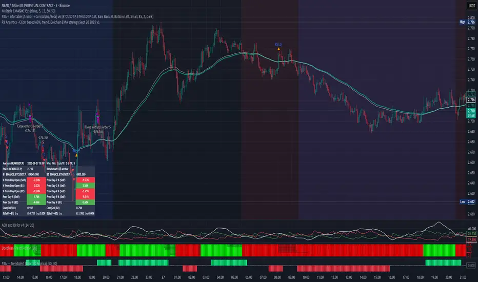
PPP – Info Table (Anchor + Corr/Alpha/Beta) v3PPP – Info Table (Anchor + Corr/Alpha/Beta)
- By P3 Analytics, run by Puranam Pradeep Picasso Sharma
🔎 Overview
This indicator creates a clean, dynamic information table on your chart that lets you quickly analyze how your chosen asset is performing relative to BTC, ETH, or any other benchmarks.
With a single glance, you can see:
% change from today’s open (for the anchor asset, BTC, and ETH)
Previous day % change (self + benchmarks)
Correlation, Beta, and Alpha statistics for the selected window (1W, 1M, 1Y)
Anchor values at any bar you choose (via Bars Back or Anchor Time)
Perfect for traders who want to measure coin strength vs benchmarks and make better rotation, risk, or hedging decisions.
📊 Key Metrics
Correlation (Corr): How closely the asset moves with the benchmark.
+1 = moves together, 0 = no relation, -1 = moves opposite.
Beta (β): Sensitivity of returns vs the benchmark.
β = 1 → moves 1:1 with BTC.
β > 1 → more volatile (amplifies BTC moves).
β < 1 → less volatile (defensive).
Alpha (α): Excess return beyond what Beta predicts.
Positive α = outperforming benchmark-adjusted expectation.
Negative α = underperforming.
⚙️ Features
Flexible Anchor Mode:
Bars Back → quickly step through bars.
Time → pin analysis to a specific historical candle.
Customizable Benchmarks: Default BTC & ETH (futures), but replaceable with any ticker.
Adjustable Stats Window:
1 Week, 1 Month, 1 Year (auto-scales if using chart timeframe).
Compact Mode for a smaller table layout.
Dark/Light Theme, font size, corner placement, transparency, and decimal control.
Runs efficiently with minimal chart clutter.
🧑💻 About P3 Analytics
This indicator is developed under P3 Analytics, a research & trading technology initiative led by Puranam Pradeep Picasso Sharma.
P3 Analytics builds tools that merge machine learning, statistics, and trading strategy into accessible products for traders across crypto, equities, forex, and commodities.
✅ How to Use
Add indicator to your chart.
In settings:
Pick your benchmarks (default = BTCUSDT.P, ETHUSDT.P).
Choose your anchor (Bars Back or Time).
Set window length for correlation/alpha/beta.
Read the table:
Left side = your asset.
Right side = benchmarks.
Colors: Green = positive % change, Red = negative.
🚀 Why Use This?
Quickly compare your asset vs BTC/ETH without juggling multiple charts.
Spot whether a coin is truly leading or just following BTC.
Identify outperformance (alpha) coins for rotation or trend plays.
Manage risk by knowing which assets are high beta (high leverage-like moves).
✦ Indicator by P3 Analytics
✦ Created & published by Puranam Pradeep Picasso Sharma
OHLC Lines – Yesterday & Today (Minimalist Option)This indicator draws horizontal lines representing the Open, High, Low, and Close (OHLC) levels of yesterday and today directly on your chart. It automatically updates each day, showing only the lines for the previous day and the current day, keeping your chart clean and focused.
Features:
Display Yesterday’s OHLC levels.
Display Today’s OHLC levels.
Optional Minimalist Mode with customizable color, width, and line style.
Lines automatically update each day and remove old lines.
Fully customizable colors, visibility, and line width for each OHLC level.
Use Case:
Perfect for traders who want to monitor key daily price levels, identify support/resistance zones, or incorporate OHLC levels into intraday strategies.

FX4M by fx4_livingFX4M Simplified by fx4_living
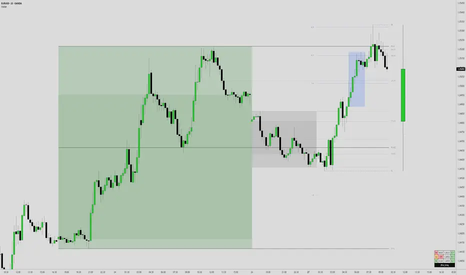
1. Previous Period Framework
Selectable Period: Prior Daily, Weekly, or Monthly.
Range Box: Full high-to-low span of the prior period, shaded by up/down close.
Body Box: Open-to-close section within the range box.
High/Low Lines: Horizontal lines at the previous period’s high/low.
Equilibrium Line: Midpoint between the previous high and low.
2. Intraday Opening Lines
Plots reference price lines for:
Daily Open
(00:00 New York) Midnight Open
09:30 AM Open
13:30 PM Open
Current-Hour Open; plus Weekly/Monthly Opens when Weekly/Monthly is selected.
Each line has its own color, style, and time/price label.
3. Intraday High/Low Tracking
Marks the current day’s highest and lowest prices.
“D-H” and “D-L” labels with time in tooltip.
4. Accumulation Range
Definition: First one-third of the selected reference period.
Shows full range (high-to-low) and body (open-to-close), shaded by up/down close.
After it ends, the Accumulation High/Low/EQ are drawn as horizontal lines.
Optional alerts mark the first time the Accumulation High or Low is reached.
5. Accumulation Range Deviation Levels
After the Accumulation period ends, horizontal levels are drawn at ±0.5, ±1.0, ±1.5 … ±3.5 of the Accumulation range size from its High/Low. Optional small labels show the level value.
Optional alerts mark the first time each deviation level is reached.
6. Previous Period Hit Detection
Marks the first time price reaches the prior period’s High, Low, or Equilibrium during the current period.
Optional alerts are possible.
7. Pre-Market Zone
Marks 05:00–06:59 New York time with a shaded box and dotted midline; color reflects up/down close. The midline can extend forward.
Displayed on intraday charts up to 15 minutes.
8. Status Table
Daily High (time & price)
Daily Equilibrium (current deviation % and price)
Daily Low (time & price)
MWD Institutional order flow (optional): shows Daily/Weekly/Monthly closes vs. their respective opens (directional arrows in colored cells).
Customizable Watermark (optional).
Enjoy
fx4_living
RTH Standard Deviation+RTH Standard Deviation+ Indicator
Overview
The RTH Standard Deviation+ (RTH SD+) indicator is a versatile tool designed for traders to visualize key price levels based on the Regular Trading Hours (RTH) session.
It calculates and displays the high, low, equilibrium (midpoint), and standard deviation-based levels derived from the RTH session's price range.
This indicator is ideal for day traders and swing traders looking to identify potential support, resistance, and breakout zones.
Features
Customizable Session Window: Define the RTH session based on your preferred time window and timezone.
Key Price Levels: Displays high, low, equilibrium, 25%/75% quartile levels, and standard deviation levels (±0.5, ±1.0, ±1.33, ±1.66, ±2.0, and optional extended levels up to ±4.0).
Visual Elements: Includes horizontal lines, labels, boxes, and vertical lines to highlight key levels and session boundaries.
Flexible Styling: Customize line styles, colors, thicknesses, and visibility for all elements.
Extended Levels: Optional display of additional standard deviation levels (±2.25, ±2.33, ±2.5, ±2.66, ±2.75, ±3.0, ±3.25, ±3.33, ±3.5, ±3.66, ±3.75, ±4.0).
Deviation Boxes: Visualize specific standard deviation ranges (±0.1, ±1.33/1.66, ±2.33/2.66, ±3.33/3.66) with customizable colors.
Inputs
Session Window: Set the RTH session time (default: 06:00–09:00).
Timezone: Select the appropriate timezone (default: UTC-4).
Label Offset: Adjust the horizontal offset for price level labels (default: 5 bars).
Line Offset: Set the length of horizontal lines extending from the session end (default: 20 bars).
Show SD Levels: Toggle visibility of standard deviation lines (±0.5, ±1.0, ±1.33, ±1.66, ±2.0).
Show SD Labels: Enable or disable labels for standard deviation levels.
Show SD Boxes: Display shaded boxes for specific standard deviation ranges (e.g., ±1.33/1.66).
Show ±0.1 Dev Boxes: Highlight smaller deviation ranges (±0.1) with boxes.
Vertical Line: Toggle a vertical line at the session end, with customizable color, style, and thickness.
High/Low, Equilibrium, 25%/75%, ±0.1 Dev, ±1.33/1.66: Toggle visibility and customize colors, styles, and thicknesses for these levels.
Extended Levels: Enable additional standard deviation levels (e.g., ±2.25, ±2.5, etc.) for advanced analysis.
How It Works
Session Tracking: The indicator identifies the user-defined RTH session based on the specified time window and timezone.
It tracks the high, low, and equilibrium (midpoint) of the session's price action.
Price Range Calculation: At the session's end, the indicator calculates the price range (high - low) and uses it to compute standard deviation levels relative to the high, low, or equilibrium.
Level Visualization:
High/Low Lines: Display the session's high and low prices as horizontal lines, extended beyond the session end.
Equilibrium Line: Shows the midpoint of the session range.
Quartile Lines: Plots 25% and 75% levels within the session range.
Standard Deviation Lines: Displays levels at ±0.5, ±1.0, ±1.33, ±1.66, and ±2.0 standard deviations, with optional extended levels up to ±4.0.
Deviation Boxes: Shaded boxes highlight specific ranges (e.g., ±1.33/1.66) for quick reference.
±0.1 Deviation Lines/Boxes: Optional smaller deviation levels for precise analysis.
Dynamic Updates: During the session, high and low lines update in real-time. At session end, all levels are finalized and extended forward for post-session analysis.
Clearing Mechanism: When a new session begins, previous drawings are cleared to avoid clutter.
Usage
Add to Chart: Apply the indicator to your TradingView chart via the Pine Editor or Indicator menu.
Configure Settings:
Adjust the session window and timezone to match your market (e.g., 09:30–16:00 UTC-4 for US equities RTH).
Customize visibility, colors, styles, and thicknesses to suit your chart preferences.
Enable extended levels for deeper analysis or disable them for simplicity.
Interpret Levels:
High/Low: Act as potential support/resistance or breakout levels.
Equilibrium: Represents the session's midpoint, often a pivot point.
25%/75% Quartiles: Indicate intermediate levels within the session range.
Standard Deviation Levels: Highlight statistically significant price zones for potential reversals or breakouts.
Boxes: Emphasize key zones for quick visual reference.
Trading Application: Use levels to identify entry/exit points, set stop-losses, or gauge market volatility.
For example, ±1.0 standard deviation levels often act as strong support/resistance, while ±2.0 levels may indicate overextension.
Notes
Ensure the session window aligns with the market’s trading hours for accurate calculations.
The indicator is designed for intraday and post-session analysis but can be adapted for other timeframes.
Use in conjunction with other technical analysis tools for comprehensive decision-making.
Extended levels (±2.25 and beyond) are disabled by default to reduce chart clutter but can be enabled for specific strategies.
TradingView House Rules Compliance
This indicator contains no copyrighted material and adheres to TradingView’s Pine Script guidelines.
This indicator was approved and created with @TIMELESS1_

Multi-Timeframe OHLC Levels█ OVERVIEW
A fully customizable multi-timeframe indicator that independently plots levels based on the open, previous close, previous high, previous low, and previous mid-price.
This tool is ideal for traders who require a high level of tailoring and usability.
█ FEATURES
Multi-timeframe
Select the timeframe for each level separately. The indicator shows higher timeframe levels down to the 1-second chart.
Multi-source
Choose the source for each level individually from the current open, previous close, previous high, previous low, and previous mid-price.
Past levels
Manage the number of relevant levels displayed on historical bars for trading or backtesting.
Projections
Extend the levels to the current price action with clear and clean options.
Styling
Adjust the appearance according to your preferences and screen size using options for color, line style, line thickness, custom name, and text size.
█ NOTES
This is a PREMIUM indicator.
You may also find my free Daily Weekly Monthly Yearly Opens and Previous Day Week Highs & Lows indicators helpful.

ICT Sensitive Key Levels [Mariinus]Indicator Overview – Inspired by ICT Concepts
This indicator is inspired by the teachings of Inner Circle Trader (ICT), whose philosophies and principles have greatly shaped the way I view price action. One of the most powerful lessons that stuck with me is his quote:
"All you need is OHLC."
Another fundamental concept that underpins this tool is the idea that:
"Price is constantly moving in cycles from Premium or Discount to Equilibrium, from Equilibrium to Discount to Premium."
With these core ideas in mind, this indicator was developed to help traders who are already using an ICT-based framework. In addition to plotting the standard OHLC levels, the ICT Sensitive Key Levels indicator also includes derived levels that provide deeper Market insight. These include the Equilibrium of the full candle range (High to Low) as well as the Equilibrium of the wicks – offering a more nuanced view of price balance and potential turning points, in line with ICT’s core concepts.
⚠️ Important Disclaimer:
This is not a standalone trading plan.
This is not a buy or sell signal generator.
Instead, this tool is designed to support traders who follow ICT principles by helping them identify higher-probability PD Arrays – the key zones where setups are more likely to occur. If your trading plan includes looking for specific PD Arrays and structural frameworks taught by ICT, then this indicator is a visual aid to refine and focus your attention on the areas where your framework has a higher probability of playing out.
🔁 Backtesting & Daily Preparation
In addition to improving your real-time analysis, this indicator is also a valuable tool for accelerated backtesting . Rather than manually drawing out levels, the indicator automatically provides them, allowing you to analyze past price action faster and more efficiently .
It’s also ideal for preparing your trading day . By loading the indicator before the session starts, you get a clear visual of key levels that may play a role in your strategy. And if you find the chart too cluttered with lines, simply copy the ones that matter to you, draw them manually, and then turn the indicator off to keep your chart clean while keeping your zones intact.
⚙️ Explanation of the Settings
You can combine up to 4 timeframes to monitor their respective levels while operating on a lower timeframe. For each timeframe, you can:
• Set a lookback period to control how far back you want to calculate levels.
• Choose to display or hide the levels of the current candle , which helps you monitor intra-candle ebbs and flows.
Each level (e.g., High, Low, Open, Close, Equilibrium) can be customized:
• Color
• Line style
• Line width
• To hide a level , simply set its opacity to zero.
You can also enable dividers to clearly mark the start and end of higher timeframe candles on your lower timeframe chart. These dividers are also fully customizable:
• Color
• Style
• Width
• And again, if you prefer a cleaner chart, you can set the opacity to zero to hide them completely.
This setup gives you full control over how much or how little visual data you want to see, aligning the tool with your personal trading workflow.
💡 Example Use Cases
These examples are for educational purposes only. This tool is not financial advice and should always be used in conjunction with your own trading plan—whether it involves Fair Value Gaps, Order Blocks, or a custom combination of ICT-based elements.
• Example 1: A 1H Bearish Fair Value Gap overlapping with the Equilibrium Key Level of the Previous Day's Range – a high-probability zone for reaction.
• Example 2: A 1H Bullish Fair Value Gap in Discount, overlapping with the Equilibrium of Two Days Ago, followed by a move into a 1H Bearish Order Block that coincides with the Previous Day’s Equilibrium.
• Example 3: The same 1H PD Arrays viewed from a 4H chart, alongside Weekly Price Levels – giving you a higher timeframe context that supports or invalidates lower timeframe setups.
• Example 4: A combination of two timeframes for added context. A 4H Bullish Fair Value Gap is nested inside the current Weekly Equilibrium Key Level . On the 15M chart , we observe a reaction that creates an Inversion Fair Value Gap , which aligns with the Equilibrium Key Level of the previous 4H candle .
This indicator doesn’t replace your trading plan—it enhances your ability to execute it. It’s a precision tool made for ICT traders who understand context, structure, and probability.

Multi TF Oscillators Screener [TradingFinder] RSI / ATR / Stoch🔵 Introduction
The oscillator screener is designed to simplify multi-timeframe analysis by allowing traders and analysts to monitor one or multiple symbols across their preferred timeframes—all at the same time. Users can track a single symbol through various timeframes simultaneously or follow multiple symbols in selected intervals. This flexibility makes the tool highly effective for analyzing diverse markets concurrently.
At the core of this screener lie two essential oscillators: RSI (Relative Strength Index) and the Stochastic Oscillator. The RSI measures the speed and magnitude of recent price movements and helps identify overbought or oversold conditions.
It's one of the most reliable indicators for spotting potential reversals. The Stochastic Oscillator, on the other hand, compares the current price to recent highs and lows to detect momentum strength and potential trend shifts. It’s especially effective in identifying divergences and short-term reversal signals.
In addition to these two primary indicators, the screener also displays helpful supplementary data such as the dominant candlestick type (Bullish, Bearish, or Doji), market volatility indicators like ATR and TR, and the four key OHLC prices (Open, High, Low, Close) for each symbol and timeframe. This combination of data gives users a comprehensive technical view and allows for quick, side-by-side comparison of symbols and timeframes.
🔵 How to Use
This tool is built for users who want to view the behavior of a single symbol across several timeframes simultaneously. Instead of jumping between charts, users can quickly grasp the state of a symbol like gold or Bitcoin across the 15-minute, 1-hour, and daily timeframes at a glance. This is particularly useful for traders who rely on multi-timeframe confirmation to strengthen their analysis and decision-making.
The tool also supports simultaneous monitoring of multiple symbols. Users can select and track various assets based on the timeframes that matter most to them. For example, if you’re looking for entry opportunities, the screener allows you to compare setups across several markets side by side—making it easier to choose the most favorable trade. Whether you’re a scalper focused on low timeframes or a swing trader using higher ones, the tool adapts to your workflow.
The screener utilizes the widely-used RSI indicator, which ranges from 0 to 100 and highlights market exhaustion levels. Readings above 70 typically indicate potential pullbacks, while values below 30 may suggest bullish reversals. Viewing RSI across timeframes can reveal meaningful divergences or alignments that improve signal quality.
Another key indicator in the screener is the Stochastic Oscillator, which analyzes the closing price relative to its recent high-low range. When the %K and %D lines converge and cross within the overbought or oversold zones, it often signals a momentum reversal. This oscillator is especially responsive in lower timeframes, making it ideal for spotting quick entries or exits.
Beyond these oscillators, the table includes other valuable data such as candlestick type (bullish, bearish, or doji), volatility measures like ATR and TR, and complete OHLC pricing. This layered approach helps users understand both market momentum and structure at a glance.
Ultimately, this screener allows analysts and traders to gain a full market overview with just one look—empowering faster, more informed, and lower-risk decision-making. It not only saves time but also enhances the precision and clarity of technical analysis.
🔵 Settings
🟣 Display Settings
Table Size : Lets you adjust the table’s visual size with options such as: auto, tiny, small, normal, large, huge.
Table Position : Sets the screen location of the table. Choose from 9 possible positions, combining vertical (top, middle, bottom) and horizontal (left, center, right) alignments.
🟣 Symbol Settings
Each of the 10 symbol slots comes with a full set of customizable parameters :
Enable Symbol : A checkbox to activate or hide each symbol from the table.
Symbol : Define or select the asset (e.g., XAUUSD, BTCUSD, EURUSD, etc.).
Timeframe : Set your desired timeframe for each symbol (e.g., 15, 60, 240, 1D).
RSI Length : Defines the period used in RSI calculation (default is 14).
Stochastic Length : Sets the period for the Stochastic Oscillator.
ATR Length : Sets the length used to calculate the Average True Range, a key volatility metric.
🔵 Conclusion
By combining powerful oscillators like RSI and Stochastic with full customization over symbols and timeframes, this tool provides a fast, flexible solution for technical analysts. Users can instantly monitor one or several assets across multiple timeframes without opening separate charts.
Individual configuration for each symbol, along with the inclusion of key metrics like candlestick type, ATR/TR, and OHLC prices, makes the tool suitable for a wide range of trading styles—from scalping to swing and position trading.
In summary, this screener enables traders to gain a clear, high-level view of various markets in seconds and make quicker, smarter, and lower-risk decisions. It saves time, streamlines analysis, and boosts overall efficiency and confidence in trading strategies.

Candle Range Trading (CRT) with Alerts
📌 Description:
The Candle Range Trading (CRT) indicator identifies potential reversal or continuation setups based on specific two-candle price action patterns.
It analyzes pairs of candles to detect Bullish or Bearish CRT patterns and provides visual signals (triangles) and alert notifications to support scalp or swing trading strategies.
🔍 How It Works:
🔻 Bearish CRT Pattern:
Candle 1 is bullish
Candle 2 is bearish
Candle 2's high > Candle 1's high
Candle 2 closes within Candle 1’s range
🔺 Red triangle above candle
🔺 Bullish CRT Pattern:
Candle 1 is bearish
Candle 2 is bullish
Candle 2's low < Candle 1's low
Candle 2 closes within Candle 1’s range
🔻 Green triangle below candle
📈 Visual Features:
🔺 Red triangle = Bearish CRT
🔻 Green triangle = Bullish CRT
📏 Optional box showing CRT High and CRT Low
🔔 Built-in Alerts:
Bullish CRT Alert: "Bullish CRT Pattern Detected"
Bearish CRT Alert: "Bearish CRT Pattern Detected"
Set alerts to get notified instantly when a pattern is detected.
⚠️ Note:
Use in conjunction with trend filters, support/resistance, or volume for best results.
Ideal for scalping or short-term trades.
Avoid trading in choppy or low-volume markets.
⚠️ Disclaimer:
This script was generated with the assistance of ChatGPT by OpenAI and is intended for educational and informational purposes only.
All strategies, alerts, and signals derived from this indicator should be thoroughly backtested and validated before using in live trading.
Trading involves substantial risk, and past performance is not indicative of future results. The author and ChatGPT bear no responsibility for any trading losses or financial decisions made using this script.
Users are solely responsible for the risks associated with their trading actions. Always apply proper risk management and perform your own due diligence before making any financial decisions.

Clean OHLC Lines | BaksPlots clean, non-repainting OHLC lines from higher timeframes onto your chart. Ideal for tracking key price levels (open, high, low, close) with precision and minimal clutter.
Core Functionality
Clean OHLC Lines = Historical Levels + Non-Repainting Logic
• Uses lookahead=on to anchor historical lines, ensuring no repainting.
• Displays OHLC lines for customizable timeframes (15min to Monthly).
• Optional candlestick boxes for visual context.
Key Features
• Multi-Timeframe OHLC:
Plot lines from 15min, 30min, 1H, 4H, Daily, Weekly, or Monthly timeframes.
• Non-Repainting Logic:
Historical lines remain static and never recalculate.
• Customizable Styles:
Adjust colors, line widths (1px-4px), and transparency for high/low/open/close lines.
• Candle Display:
Toggle candlestick boxes with bull/bear colors and adjustable borders.
• Past Lines Limit:
Control how many historical lines are displayed (1-500 bars).
User Inputs
• Timeframe:
Select the OHLC timeframe (e.g., "D" for daily).
• # Past Lines:
Limit historical lines to avoid overcrowding (default: 10).
• H/L Mode:
Draw high/low lines from the current or previous period.
• O/C Mode:
Anchor open/close lines to today’s open or yesterday’s close.
• Line Styles:
Customize colors, transparency, and styles (solid/dotted/dashed).
• Candle Display:
Toggle boxes/wicks and adjust bull/bear colors.
Important Notes
⚠️ Alignment:
• Monthly/weekly timeframes use fixed approximations (30d/7d).
• For accuracy, ensure your chart’s timeframe ≤ the selected OHLC timeframe (e.g., use 1H chart for daily lines).
⚠️ Performance:
• Reduce # Past Lines on low-end devices for smoother performance.
Risk Disclaimer
Trading involves risk. OHLC lines reflect historical price levels and do not predict future behavior. Use with other tools and risk management.
Open-Source Notice
This script is open-source under the Mozilla Public License 2.0. Modify or improve it freely, but republishing must follow TradingView’s House Rules.
📈 Happy trading!
Vortex Candle MarkerVortex Candle Marker
The Vortex Candle Marker is a specialized TradingView indicator designed to identify and highlight **Vortex Candles**—candles that momentarily form without wicks on either the high or low. This unique price behavior can signal potential price retracements or reversals, aligning with the **Power of Three (PO3)** concept in price action theory.
Indicator Logic:
A candle is classified as a **Vortex Candle** if either of these conditions is met during its formation:
1. **Vortex Top:** The **high** equals either the **open** or **close**, indicating no upper wick.
2. **Vortex Bottom:** The **low** equals either the **open** or **close**, indicating no lower wick.
When a Vortex Candle is detected, the indicator changes the **candle border color** to **aqua**, making it easy to identify these significant price moments.
Market Insight & PO3 Interpretation:
In typical price behavior, most candles exhibit both upper and lower wicks, representing price exploration before settling at a closing value. A candle forming without a wick suggests **strong directional intent** at that moment. However, by the **Power of Three (PO3)** concept—Accumulation, Manipulation, and Distribution—such wickless formations often imply:
- **Price Reversion Likelihood:** When a candle temporarily forms without a wick, it suggests the market may **revisit the opening price** to establish a wick before the candle closes.
- **Liquidity Manipulation:** The absence of a wick may indicate a **stop-hunt** or liquidity grab, where the price manipulates one side before reversing.
- **Entry Triggers:** Identifying these moments can help traders anticipate potential **retracements** or **continuations** within the PO3 framework.
Practical Application
- **Early Reversal Detection:** Spot potential price reversals by observing wickless candles forming at key levels.
- **Breakout Validation:** Use Vortex Candles to confirm **true breakouts** or **false moves** before the price returns.
- **Liquidity Zones:** Identify areas where the market is likely to revisit to create a wick, signaling entry/exit points.
This indicator is a powerful tool for traders applying **Po3** methodologies and seeking to capture price manipulation patterns.

CandelaCharts - OHLC Range Map 📝 Overview
Explore the intricate art of candlestick analysis with the OHLC Range Map!
Elevate your TradingView experience by integrating this dynamic tool into your trading strategies with actionable insights. This cutting-edge indicator transcends standard OHLC visuals, leveraging Inner Circle Trader (ICT) concepts to dissect accumulation, manipulation, and distribution on a candle-by-candle basis.
ICT traders recognize manipulation through the wick extending opposite the candle’s close. This movement often serves to mislead market participants into taking positions in the "wrong" direction, signaling potential manipulation legs. Analysts can use these insights to anticipate a candle’s distribution phase. During distribution, price extends to higher or lower levels, offering key clues for identifying liquidity draws, potential retracements, or reversals.
These levels offer valuable insights into order flow, highlighting how price interacts with them and the sequence of its delivery.
To enhance price mapping, the tool also charts the average timing for the completion of manipulation and distribution phases. This feature empowers traders to combine historical timing patterns with the price levels associated with manipulation and distribution for a deeper analysis.
Like all tools based on historical data, this indicator does not guarantee that past patterns will replicate in future market conditions. Designed with a data-driven edge, it highlights moments when candles are likely to reverse following manipulation phases or retrace after completing defined distributions, helping analysts spot potential turning points.
📦 Features
This tool offers a range of powerful features to enhance your trading analysis:
Average Range Accuracy : Simplify candlestick analysis with advanced lines and labels to pinpoint manipulation, distribution, and time pivots. Graph average ranges for your chosen timeframe to navigate market volatility and uncover key support and resistance zones.
Custom Timeframe Selection : Align your analysis with your trading strategy by choosing a timeframe that highlights the candle’s manipulation, distribution, and key timing.
Real-time Data Feed : Stay updated with live candlestick stats, with each new candle updating OHLC data and performing ongoing historical calculations, even on sub-minute timeframes.
Historical Mapping : Backtest past market scenarios with ease using the historical mapping feature. Traders can revisit and analyze previous data, refine strategies, and customize label displays for journaling flexibility.
User-Friendly Interface : Designed for advanced traders, the intuitive interface allows easy navigation and customization of display settings, offering a personalized experience for data-driven analysis.
⚙️ Settings
Timeframe: Sets the timeframe to which will be drawn.
Period: Controls period length in days.
Algorithm: Sets the desired calculation algorithm.
History: Display Range Map drawings for previous sessions.
Timezone: Dsiplay the data based on the selected timezone.
Use NY Midnight Open: Controls from where a Range Map will start detection.
Opn: Style for Open line.
Man: Style for Manipulation line.
Dis: Style for Distribution line.
Time: Style for Timeline.
Labels: Controls the size and abbreviations.
Line Position: Manage the Range Map line position
Table Position: Manage the Range Map table position
⚡️ Showcase
Here’s a visual showcase of the tool in action, highlighting its key features and capabilities:
Manipilation & Distribution
Time
📒 Usage
Here’s how you can use the OHLC Range Map to enhance your analysis:
Add OHLC Range Map to your Tradingview chart.
Select a timeframe and customize the styles to fit your preferences.
Watch as calculated manipulation, distribution, and delivery times align with your analysis.
Combine this data with other models and insights to strengthen your trading strategy.
Example 1
Example 2
By following these steps, you'll unlock powerful insights to refine and elevate your trading strategies.
🔹 Notes
On Bullish candles:
Manipulation: Open - Low
Distribution: Open - High
On Bearish candles:
Manipulation: Open - High
Distribution: Open - Low
Available calculation methods:
Mean
Median
Price patterns on OHLC Range Map:
Open - -Man - +Dis
Open - -Man - Open - +Dis
Open - -Man - +Man - +Dis
Open - -Man - +Man - -Dis
Open - +Man - -Dis
Open - +Man - Open - -Dis
Open - +Man - -Man - -Dis
Open - +Man - -Man - +Dis
🚨 Alerts
The indicator does not provide any alerts!
⚠️ Disclaimer
These tools are exclusively available on the TradingView platform.
Our charting tools are intended solely for informational and educational purposes and should not be regarded as financial, investment, or trading advice. They are not designed to predict market movements or offer specific recommendations. Users should be aware that past performance is not indicative of future results and should not rely on these tools for financial decisions. By using these charting tools, the purchaser agrees that the seller and creator hold no responsibility for any decisions made based on information provided by the tools. The purchaser assumes full responsibility and liability for any actions taken and their consequences, including potential financial losses or investment outcomes that may result from the use of these products.
By purchasing, the customer acknowledges and accepts that neither the seller nor the creator is liable for any undesired outcomes stemming from the development, sale, or use of these products. Additionally, the purchaser agrees to indemnify the seller from any liability. If invited through the Friends and Family Program, the purchaser understands that any provided discount code applies only to the initial purchase of Candela's subscription. The purchaser is responsible for canceling or requesting cancellation of their subscription if they choose not to continue at the full retail price. In the event the purchaser no longer wishes to use the products, they must unsubscribe from the membership service, if applicable.
We do not offer reimbursements, refunds, or chargebacks. Once these Terms are accepted at the time of purchase, no reimbursements, refunds, or chargebacks will be issued under any circumstances.
By continuing to use these charting tools, the user confirms their understanding and acceptance of these Terms as outlined in this disclaimer.

Previous Key Levels (fadi)Previous Key Levels indicator is a highly configurable OHLC levels tool designed to provide traders with the ability to plot multiple levels while minimizing screen clutter. This indicator is perfect for those who want to monitor various timeframes simultaneously without overloading their charts with unnecessary information.
How to Use It
This indicator offers traders the flexibility to track up to 6 higher timeframes (HTFs) and multiple candles for each timeframe. For example, a trader can choose to monitor the OHLC of the last four 4-hour candles, providing a comprehensive view of significant price levels over different periods.
Key Features
Highly Configurable: Customize the number of timeframes and candles to suit your trading strategy.
Minimal Screen Clutter: Efficiently plot multiple levels without overwhelming your chart.
Flexible Application: Ideal for identifying support and resistance levels, liquidity sweeps, target levels, and more, adapting to various trading styles.
Traders have diverse trading styles and preferences. Some may use these levels to identify support and resistance zones, while others might look for liquidity sweeps or set target levels. By offering a high degree of customization, the Previous Key Levels indicator caters to the unique needs of individual traders, helping them make informed decisions based on historical price action across multiple timeframes.
Timeframe Settings
Toggle to track 6 HTF settings and the number of candles to track for each.
Limit to next HTFs only can be used to limit the HTF levels displayed based on the current timeframe.
Hide Above will disable the indicator above the specified interval.
Offset to Left and Right are used to specify where the level line starts and ends based on the current candle.
Offset between HTFs extends HTF levels to become more readable.
HTF Settings
Choice of the OHLC levels to track.
Specify the color, line style, and line width for each level.
Mark the start of that level, for example, draw a vertical line where the 4H candle has started.
Trace back to draw optional lines to track back to the origin of the level.
Label Settings
Highly configurable labels that allow traders to customize the labels to their liking.
Label color, background, and size.
Customize using up to 9 configurable parts.
Fading Levels
To prevent clutter, the indicator offers the option to change the transparency of the levels based on their distance from the current price. The distance is calculated based on a configurable Average True Range (ATR).
Change Transparency to a percentage of its current color.
Range should be within X candles will fade any level that is X candles length away from the current price.
ATR length used in calculation will calculate the average size of candles in the calculation.
