𝑨𝒔𝒕𝒂𝒓 - TyrAstar – Tyr is a dynamic RSI system with adaptive EMA and divergence detection.
@v1.0
Dynamic RSI period adjusts to volatility & market activity
Adaptive EMA smooths RSI with variable length
Optional Gaussian Kernel smoothing for noise reduction
Highlights bullish & bearish divergences automatically
Clean visualization with color coding and fills
Works in real time with no repainting
Oscillators

Aljane's 1348ema strategy13/48ema crossover powerful setup
EMAs (13, 48, 200)
VWAP
buy/sell labels
Candles turn white on bullish , red on bearish
Ideal for traders who want a simplified but powerful chart setup without clutter.

Momentum Index [BigBeluga]The Momentum Index is an innovative indicator designed to measure the momentum of price action by analyzing the distribution of positive and negative momentum values over a defined period. By incorporating delta-based calculations and smoothing techniques, it provides traders with a clear and actionable representation of market momentum dynamics.
🔵 Key Features:
Delta-Based Momentum Analysis:
Calculates the momentum of price by comparing its current state to its value from a defined number of bars back.
Inside a loop, it evaluates whether momentum values are above or below zero, producing a delta value that reflects the net momentum direction and intensity.
Double EMA Smoothing:
Smooths the raw delta-based momentum values with a double EMA filter, reducing noise and providing a clearer trend signal.
tmi(len) =>
sum = 0.0
sum1 = 0.0
above = 0.0
below = 0.0
src_ = src - src
for i = 0 to len
sum := sum + (src_ > nz(src_ ) ? 1 : -1)
sum1 := sum1 + (sum > 0 ? 1 : -1)
sum1 := emaEma(sum1, 10)
for i = 1 to len
above := above + (sum1 > 0 ? 1 : 0)
below := below + (sum1 > 0 ? 0 : 1)
Directional Momentum Signals:
Generates momentum shift signals and displays them on both the oscillator and the main chart:
- △ Aqua Triangles: Represent upward momentum shifts.
- ▽ Red Triangles: Represent downward momentum shifts.
Dynamic Gradient Display:
Highlights momentum zones with gradient fills:
- Aqua shades for positive momentum (above zero).
- Red shades for negative momentum (below zero).
Dashboard Display:
A dashboard summarizing the count of momentum values above and below zero for the defined period (Sentiment Length e.g. 100), helping traders assess market sentiment at a glance.
🔵 How It Works:
The indicator takes price momentum as its source and evaluates the number of momentum values above and below zero within a defined period.
The delta calculation aggregates this information, providing a net representation of the prevailing market momentum.
A double EMA filter is applied to the delta values, smoothing the momentum line and enhancing signal clarity.
Momentum shifts are highlighted with visual signals on the oscillator and price chart, while the gradient display provides a visual representation of intensity.
🔵 Use Cases:
Momentum Tracking: Identify whether market momentum is predominantly bullish or bearish.
Signal Confirmation: Use chart-based signals to confirm potential trend reversals or continuation.
Analyze Market Strength: Leverage the dashboard to quickly assess the distribution of momentum over the chosen period.
Overbought/Oversold Conditions: Utilize gradient zones to detect areas of momentum extremes and possible price exhaustion.
Momentum Index offers a refined approach to analyzing momentum dynamics, combining delta-based calculations with smoothing techniques and intuitive visuals, making it an essential tool for traders looking to anticipate market movements effectively.

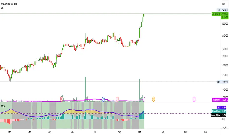
Artharjan ADXArtharjan ADX (AADX) by Rrahul Desai @Artharjan
📌 Overview
The Artharjan ADX (AADX) is an advanced implementation of the Average Directional Index (ADX) with customizable moving averages, momentum thresholds, and visually intuitive grading of bullish and bearish strength.
Unlike the standard ADX indicator that only shows trend strength, AADX adds graded bullish/bearish conditions, alerts, smoothed DI signals, histogram visualizations, and background color fills to help traders quickly interpret market conditions.
It is designed for traders who want early detection of trend strength, clean visual cues, and automated alert triggers for both bullish and bearish momentum setups.
⚙️ Key Features
🔹 Customizable Calculations
DI Length (default 13) – controls sensitivity of directional indicators.
+/- DI Smoothing – smooths DI signals with user-selected MA.
Multiple Moving Average Types – SMA, EMA, WMA, RMA, VWMA, ALMA, Hull, SWMA, SMMA, TMA.
ADX Smoothing – define how smooth/fast the ADX reacts.
🔹 Flexible Display
Toggle between line plots or histogram view.
Adjustable plot thickness.
Option to plot averages of ADX, +DI, -DI for confirmation.
Configurable background fills:
ADX above/below momentum threshold.
ADX rising/falling color shading.
Trend-grade based color intensity.
🔹 Momentum & Thresholds
Momentum Level (default 25) → defines “strong trend” zone.
Crossover Threshold (default 15) → helps detect early DI crossovers.
Color-coded histogram bars for +DI vs -DI difference:
Above/below zero.
Rising/falling momentum.
🔹 Bullish & Bearish Grading System
The indicator assigns grades from 1 to 5 for both bullish and bearish setups, based on DI and ADX conditions:
Bullish Grades
Grade 1 → Very Weak Bullish
Grade 2 → Weak Bullish
Grade 3 → Moderate Bullish
Grade 4 → Strong Bullish
Grade 5 → Very Strong Bullish
Bearish Grades
Grade 1 → Very Weak Bearish
Grade 2 → Weak Bearish
Grade 3 → Moderate Bearish
Grade 4 → Strong Bearish
Grade 5 → Very Strong Bearish
Labels are automatically plotted above bars to indicate the active grade.
🔹 Alerts
Bullish Alert → when +DI crosses above its average below the threshold OR bullish conditions are met.
Bearish Alert → when -DI crosses above its average below the threshold OR bearish conditions are met.
These alerts make it possible to automate trading signals for scalping, intraday, and swing trading.
📊 Use Cases
Trend Strength Measurement
Spot when markets shift from range-bound to trending.
Confirm the reliability of breakouts with strong ADX readings.
Bullish vs Bearish Control
Compare +DI vs -DI strength to gauge trend direction.
Identify trend reversals early with DI slope changes.
Momentum Confirmation
Use ADX rising + DI grades to validate trade entries.
Filter false breakouts with weak ADX.
Trade Grading System
Enter aggressively on Grade 4–5 signals.
Stay cautious on Grade 1–2 signals.
Automated Alerts & Screening
Combine AADX alerts with strategy rules.
Build scanners to highlight strong ADX setups across multiple stocks.
🎯 Trader’s Advantage
More powerful than standard ADX → Adds slope, grading, alerts, and visualization.
Adaptable to any style → Works for intraday scalping, swing trading, and positional analysis.
Visual clarity → Color fills, histograms, and labels simplify decision-making.
Customizable smoothing → Adjusts to fast or slow markets.
✅ Closing Note
The Artharjan ADX (AADX) transforms the traditional ADX into a complete trend and momentum analyzer. It helps traders detect, confirm, and act on directional strength with clarity and confidence.
With Thanks,
Rrahul Desai
@Artharjan
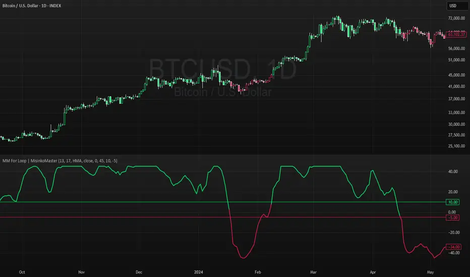
High For Loop | MisinkoMasterThe High For Loop is a new Trend Following tool designed to give traders smooth and fast signals without being too complex, overfit or repainting.
It works by finding how many bars have a higher high than the current high, how many have a lower high, and scores it based on that. This provides users with easy and accurate signals, allowing for gaining a large edge in the market.
It is pretty simple but you can still play around with it pretty well and improve uppon your strategies.
For any backtests using strategies, I left many comments and tried to make it as easy as possible to backtest.
Enjoy G´s

MA-Median For Loop | MisinkoMasterThe MA-Median For Loop is a new Trend Following tool that gives the user smooth yet responsive trend signals, allowing you to see clear and accurate trends by combining the Moving Average & Median in a For Loop concept.
How does it work?
1. Select user defined inputs
=> Adjust it to your liking, everyone can set it to their liking.
2. Calculate the MA and the Median
=> Simple, but important
3. Calculate the For Loop
=> For every bar back where the median or ma of that bar is higher than the current median or ma subtract 0.5 from the trend score, and for every bar back where the current median/ma is higher than the previous one add 0.5 to the trend score.
This simple yet effective approach enhances speed, decreases noise, and produces accurate signals everyone can utilize to get an edge in the market
Enjoy G´s
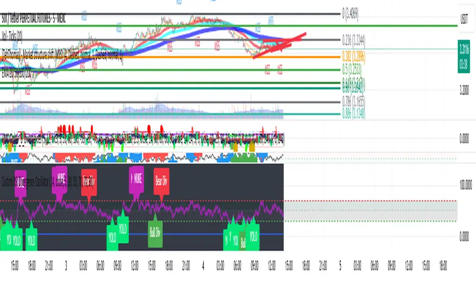
Custom RSI Divergence OscillatorStill work in progress, but wanted the RSI indicator to look nicer and to be easier and more fun to use.
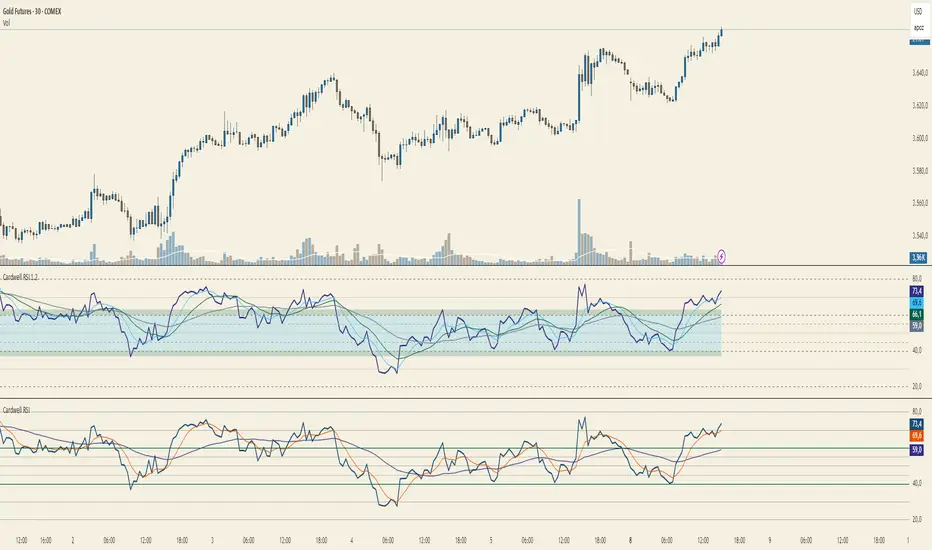
Cardwell RSI by TQ📌 Cardwell RSI – Enhanced Relative Strength Index
This indicator is based on Andrew Cardwell’s RSI methodology , extending the classic RSI with tools to better identify bullish/bearish ranges and trend dynamics.
In uptrends, RSI tends to hold between 40–80 (Cardwell bullish range).
In downtrends, RSI tends to stay between 20–60 (Cardwell bearish range).
Key Features :
Standard RSI with configurable length & source
Fast (9) & Slow (45) RSI Moving Averages (toggleable)
Cardwell Core Levels (80 / 60 / 40 / 20) – enabled by default
Base Bands (70 / 50 / 30) in dotted style
Optional custom levels (up to 3)
Alerts for MA crosses and level crosses
Data Window metrics: RSI vs Fast/Slow MA differences
How to Use :
Monitor RSI behavior inside Cardwell’s bullish (40–80) and bearish (20–60) ranges
Watch RSI crossovers with Fast (9) and Slow (45) MAs to confirm momentum or trend shifts
Use levels and alerts as confluence with your trading strategy
Default Settings :
RSI Length: 14
MA Type: WMA
Fast MA: 9 (hidden by default)
Slow MA: 45 (hidden by default)
Cardwell Levels (80/60/40/20): ON
Base Bands (70/50/30): ON
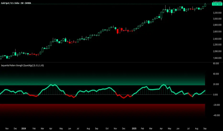
Sequential Pattern Strength [QuantAlgo]🟢 Overview
The Sequential Pattern Strength indicator measures the power and sustainability of consecutive price movements by tracking unbroken sequences of up or down closes. It incorporates sequence quality assessment, price extension analysis, and automatic exhaustion detection to help traders identify when strong trends are losing momentum and approaching potential reversal or continuation points.
🟢 How It Works
The indicator's key insight lies in its sequential pattern tracking system, where pattern strength is measured by analyzing consecutive price movements and their sustainability:
if close > close
upSequence := upSequence + 1
downSequence := 0
else if close < close
downSequence := downSequence + 1
upSequence := 0
The system calculates sequence quality by measuring how "perfect" the consecutive moves are:
perfectMoves = math.max(upSequence, downSequence)
totalMoves = math.abs(bar_index - ta.valuewhen(upSequence == 1 or downSequence == 1, bar_index, 0))
sequenceQuality = totalMoves > 0 ? perfectMoves / totalMoves : 1.0
First, it tracks price extension from the sequence starting point:
priceExtension = (close - sequenceStartPrice) / sequenceStartPrice * 100
Then, pattern exhaustion is identified when sequences become overextended:
isExhausted = math.abs(currentSequence) >= maxSequence or
math.abs(priceExtension) > resetThreshold * math.abs(currentSequence)
Finally, the pattern strength combines sequence length, quality, and price movement with momentum enhancement:
patternStrength = currentSequence * sequenceQuality * (1 + math.abs(priceExtension) / 10)
enhancedSignal = patternStrength + momentum * 10
signal = ta.ema(enhancedSignal, smooth)
This creates a sequence-based momentum indicator that combines consecutive movement analysis with pattern sustainability assessment, providing traders with both directional signals and exhaustion insights for entry/exit timing.
🟢 Signal Interpretation
Positive Values (Above Zero): Sequential pattern strength indicating bullish momentum with consecutive upward price movements and sustained buying pressure = Long/Buy opportunities
Negative Values (Below Zero): Sequential pattern strength indicating bearish momentum with consecutive downward price movements and sustained selling pressure = Short/Sell opportunities
Zero Line Crosses: Pattern transitions between bullish and bearish regimes, indicating potential trend changes or momentum shifts when sequences break
Upper Threshold Zone: Area above maximum sequence threshold (2x maxSequence) indicating extremely strong bullish patterns approaching exhaustion levels
Lower Threshold Zone: Area below negative threshold (-2x maxSequence) indicating extremely strong bearish patterns approaching exhaustion levels
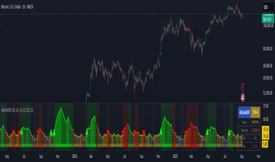
AlphaADX Trend Meter - Enhanced ADX VisualizationTechnical Overview
This indicator enhances the traditional Average Directional Index (ADX) with advanced visualization techniques and adaptive threshold management. It demonstrates several Pine Script programming concepts including dynamic color gradients, conditional plotting, and real-time information display systems.
Mathematical Methodology
Core ADX Calculation
Uses standard DMI (Directional Movement Index) calculation: ta.dmi(diLength, adxSmoothing)
Applies configurable smoothing to reduce noise while preserving trend signals
Maintains mathematical integrity of Welles Wilder's original ADX formula
Dynamic Color System
Gradient Implementation:
pinecolor.from_gradient(adxValue, minThreshold, maxThreshold, startColor, endColor)
Color Logic:
Strong trends (ADX > 25): Bright colors (green for bullish, red for bearish)
Weak trends (15 < ADX ≤ 25): Muted colors with transparency
Choppy markets (ADX ≤ 15): Gray coloring to indicate low directional movement
Gradient mode creates smooth color transitions based on ADX intensity
Adaptive Threshold Framework
While maintaining standard ADX interpretation levels, the indicator allows customization of:
Strong trend threshold (default: 25)
Weak trend threshold (default: 20)
Chop zone threshold (default: 15)
This flexibility accommodates different market conditions and trading styles.
Technical Features
1. Multi-Layer Visualization
Primary ADX Line: Color-coded based on strength and direction
Histogram Display: Shows ADX momentum with transparency effects
Trend Meter Bar: Simplified visual reference at bottom of chart
Background Zones: Subtle shading for strong trends and chop zones
2. Signal Generation
Automatic Detection:
Strong trend emergence (ADX crosses above strong threshold)
Chop zone entry warnings (ADX falls below chop threshold)
Trend direction changes in strong trending markets
Visual Markers:
Triangle arrows for strong trend signals
Cross markers for chop zone warnings
Color-coded based on bullish/bearish bias
3. Information Dashboard
Real-time table displaying:
Current ADX value with dynamic background coloring
Trend status classification (Strong/Weak/Neutral/Choppy)
Directional bias (Bullish ↑/Bearish ↓)
DI+ and DI- values for detailed analysis
4. Alert System
Programmatic alerts for:
Strong trend emergence
Entry into consolidation zones
Trend reversals during strong directional moves
Breakouts from choppy conditions
Programming Techniques Demonstrated
Advanced Pine Script Concepts:
Dynamic Color Functions: Custom color selection based on multiple conditions
Conditional Plotting: Different visual elements based on user preferences
Table Implementation: Real-time information display with formatting
Alert Integration: Multiple condition monitoring system
Input Validation: Parameter bounds and logical constraints
Visual Enhancement Methods:
Gradient color transitions for smooth visual feedback
Transparency effects to reduce visual clutter
Multi-component display system for comprehensive analysis
Customizable visual elements for user preference accommodation
Educational Value
This indicator serves as a learning tool for:
Enhanced ADX Implementation: Shows how to extend built-in indicators with additional functionality
Visual Design Principles: Demonstrates effective use of colors, transparency, and layout
User Interface Development: Table creation and information display techniques
Alert System Design: Comprehensive condition monitoring and notification
Configuration Options
ADX Parameters:
ADX Length: Period for directional movement calculation
DI Length: Directional indicator smoothing period
ADX Smoothing: Additional smoothing for noise reduction
Threshold Levels:
Strong Trend Level: Threshold for identifying strong directional movement
Weak Trend Level: Moderate trend identification threshold
Chop Zone Level: Low directional movement threshold
Visual Controls:
Trend Meter: Toggle bottom reference bar
Histogram: Show/hide ADX momentum bars
Signal Arrows: Enable/disable trend change markers
Info Table: Display/hide real-time information panel
Gradient Mode: Switch between smooth gradients and solid colors
Use Cases and Applications
Market Analysis:
Trend Identification: Determine current market directional strength
Regime Classification: Distinguish between trending and ranging markets
Timing Analysis: Identify optimal periods for trend-following strategies
Risk Management:
Environment Assessment: Avoid trading during low-ADX choppy periods
Position Sizing: Adjust trade size based on trend strength
Strategy Selection: Choose appropriate techniques based on market regime
Educational Purposes:
ADX Understanding: Visual representation of directional movement concepts
Pine Script Learning: Example of advanced indicator development techniques
Market Behavior: Observation of trend strength patterns across different timeframes
Limitations and Considerations
Technical Limitations:
ADX is a lagging indicator that confirms existing trends rather than predicting them
Requires sufficient price movement data for meaningful calculations
May generate false signals in very low volatility environments
Threshold levels may need adjustment for different asset classes
Usage Guidelines:
Most effective when combined with other forms of technical analysis
Consider market context and fundamental factors
Use appropriate timeframes for intended trading approach
Regular parameter review for optimal performance
Performance Notes:
Calculations optimized for real-time analysis
Visual elements designed to minimize chart clutter
Alert system prevents excessive notifications through condition filtering
Disclaimer
This indicator is designed for educational and analytical purposes. It demonstrates enhanced visualization of the ADX indicator and various Pine Script programming techniques. Users should understand that past performance does not guarantee future results and should always employ proper risk management practices. The indicator should be used as part of a comprehensive trading approach rather than as a standalone decision-making tool.
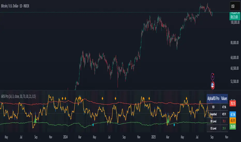
AlphaRSI Pro - Adaptive RSI with Trend AnalysisOverview
AlphaRSI Pro is a technical analysis indicator that enhances the traditional RSI by incorporating adaptive overbought/oversold levels, trend bias analysis, and divergence detection. This indicator addresses common limitations of standard RSI implementations through mathematical adaptations to market volatility.
Technical Methodology
1. Smoothed RSI Calculation
Applies weighted moving average smoothing to standard RSI(14)
Reduces noise while preserving momentum signals
Configurable smoothing period (default: 3)
2. Adaptive Level System
Mathematical Approach:
Calculates ATR-based volatility ratio: volatility_ratio = current_ATR / average_ATR
Applies dynamic adjustment: adaptive_level = base_level ± (volatility_ratio - 1) × 20
Bounds levels between practical ranges (15-35 for oversold, 65-85 for overbought)
Purpose: Adjusts RSI sensitivity based on current market volatility conditions rather than using fixed 70/30 levels.
3. Trend Bias Integration
Uses Simple Moving Average slope analysis over configurable period
Calculates trend strength: |slope / price| × 100
Provides visual background shading for trend context
Filters RSI signals based on underlying price trend direction
4. Signal Generation Logic
Entry Conditions:
Bullish: RSI crosses above adaptive oversold level
Bearish: RSI crosses below adaptive overbought level
Strong signals: Include trend bias confirmation
Enhancement over standard RSI: Reduces false signals in choppy markets by requiring trend alignment for "strong" signals.
5. Divergence Detection
Automated identification of regular bullish/bearish divergences
Uses 5-bar lookback for pivot detection
Compares price highs/lows with corresponding RSI highs/lows
Plots divergence markers when conditions are met
Key Features
Real-time adaptive levels based on volatility
Trend-filtered signals to improve reliability
Built-in divergence scanner
Information dashboard showing current values
Comprehensive alert system
Clean visual presentation with customizable colors
Usage Guidelines
This indicator works best when:
Combined with proper risk management
Used in conjunction with other technical analysis
Applied to liquid markets with sufficient volatility data
Configured appropriately for the selected timeframe
Input Parameters
RSI Period: Standard RSI calculation length (default: 14)
Smoothing Period: WMA smoothing for noise reduction (default: 3)
Volatility Lookback: Period for ATR volatility calculation (default: 50)
Base OB/OS Levels: Starting points for adaptive adjustment (70/30)
Trend Period: Moving average length for trend bias (default: 21)
Alert Conditions
Bullish Signal: RSI crosses above adaptive oversold
Bearish Signal: RSI crosses below adaptive overbought
Strong Bullish/Bearish: Signals with trend confirmation
Divergence Alerts: Automated divergence detection
Educational Value
This indicator demonstrates several advanced Pine Script concepts:
Dynamic level calculation using mathematical formulas
Multi-timeframe analysis integration
Conditional signal filtering based on market state
Table display for real-time information
Comprehensive alert system implementation
Limitations
Requires sufficient historical data for volatility calculations
May generate fewer signals in very low volatility environments
Trend bias effectiveness depends on selected MA period
Divergences may not always lead to immediate reversals
Disclaimer
This indicator is for educational and analysis purposes. Past performance does not guarantee future results. Always use proper risk management and consider multiple forms of analysis before making trading decisions.
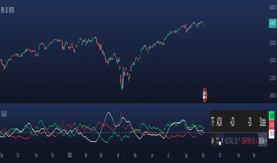
ADX MTF mura visionOverview
ADX MTF — mura vision measures trend strength and visualizes a higher-timeframe (HTF) ADX on any chart. The current-TF ADX is drawn as a line; the HTF ADX is rendered as “step” segments to reflect closed HTF bars without repainting. Optional soft fills highlight the 20–25 (trend forming) and 40–50 (strong trend) zones.
How it works
ADX (current TF) : Classic Wilder formulation using DI components and RMA smoothing.
HTF ADX : Requested via request.security(..., lookahead_off, gaps_off).
When a new HTF bar opens, the previous value is frozen as a horizontal segment.
The current HTF bar is shown as a live moving segment.
This staircase look is expected on lower timeframes.
Auto timeframe mapping
If “Auto” is selected, the HTF is derived from the chart TF:
<30m → 60m, 30–<240m → 240m, 240m–<1D → 1D, 1D → 1W, 1W/2W → 1M, ≥1M → same.
Inputs
DI Length and ADX Smoothing — core ADX parameters.
Higher Time Frame — Auto or a fixed TF.
Line colors/widths for current ADX and HTF ADX.
Fill zone 20–25 and Fill zone 40–50 — optional light background fills.
Number of HTF ADX Bars — limits stored HTF segments to control chart load.
Reading the indicator
ADX < 20: typically range-bound conditions; trend setups require extra caution.
20–25: trend emergence; breakouts and continuation structures gain validity.
40–50: strong trend; favor continuation and manage with trailing stops.
>60 and turning down: possible trend exhaustion or transition toward range.
Note: ADX measures strength, not direction. Combine with your directional filter (e.g., price vs. MA, +DI/−DI, structure/levels).
Non-repainting behavior
HTF values use lookahead_off; closed HTF bars are never revised.
The only moving piece is the live segment for the current HTF bar.
Best practices
Use HTF ADX as a regime filter; time entries with the current-TF ADX rising through your threshold.
Pair with ATR-based stops and a MA/structure filter for direction.
Consider higher thresholds on highly volatile altcoins.
Performance notes
The script draws line segments for HTF bars. If your chart becomes heavy, reduce “Number of HTF ADX Bars.”
Disclaimer
This script is for educational purposes only and does not constitute financial advice. Trading involves risk.

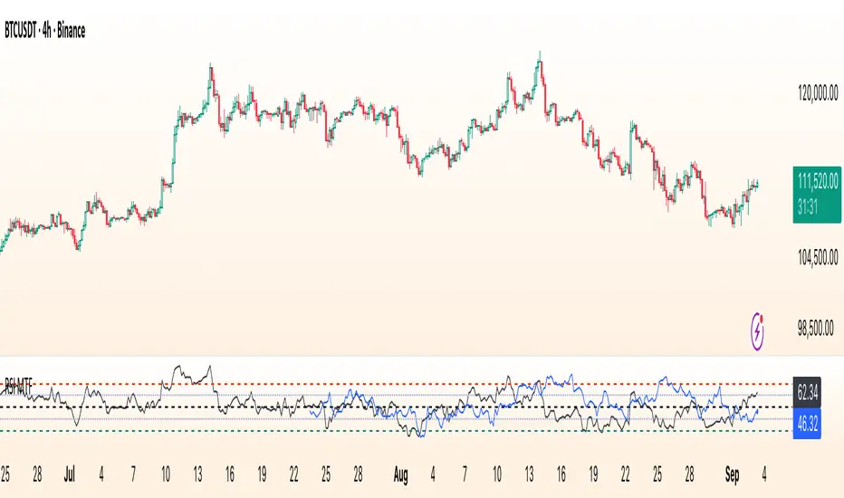
RSI Multi Time FrameWhat it is
A clean, two-layer RSI that shows your chart-timeframe RSI together with a higher-timeframe (HTF) RSI on the same pane. The HTF line is drawn as a live segment plus frozen “steps” for each completed HTF bar, so you can see where the higher timeframe momentum held during your lower-timeframe bars.
How it works
Auto HTF mapping (when “Auto” is selected):
Intraday < 30m → uses 60m (1-hour) RSI
30m ≤ tf < 240m (4h) → uses 240m (4-hour) RSI
240m ≤ tf < 1D → uses 1D RSI
1D → uses 1W RSI
1W or 2W → uses 1M RSI
≥ 1M → keeps the same timeframe
The HTF series is requested with request.security(..., gaps_off, lookahead_off), so values are confirmed bar-by-bar. When a new HTF bar begins, the previous value is “frozen” as a horizontal segment; the current HTF value is shown by a short moving segment and a small dot (so you can read the last value easily).
Visuals
Current RSI (chart TF): solid line (color/width configurable).
HTF RSI: same-pane line + tiny circle for the latest value; historical step segments show completed HTF bars.
Guides: dashed 70 / 30 bands, dotted 60/40 helpers, dashed 50 midline.
Inputs
Higher Time Frame: Auto or a fixed TF (1, 3, 5, 10, 15, 30, 45, 60, 120, 180, 240, 360, 480, 720, D, W, 2W, M, 3M, 6M, 12M).
Length: RSI period (default 14).
Source: price source for RSI.
RSI / HTF RSI colors & widths.
Number of HTF RSI Bars: how many frozen HTF segments to keep.
Reading it
Alignment: When RSI (current TF) and HTF RSI both push in the same direction, momentum is aligned across frames.
Divergence across frames: Current RSI failing to confirm HTF direction can warn about chops or early slowdowns.
Zones: 70/30 boundaries for classic overbought/oversold; 60/40 can be used as trend bias rails; 50 is the balance line.
This is a context indicator, not a signal generator. Combine with your entry/exit rules.
Notes & limitations
HTF values do not repaint after their bar closes (lookahead is off). The short “live” segment will evolve until the HTF bar closes — this is expected.
Very small panels or extremely long histories may impact performance if you keep a large number of HTF segments.
Credits
Original concept by LonesomeTheBlue; Pine v6 refactor and auto-mapping rules by trading_mura.
Suggested use
Day traders: run the indicator on 5–15m and keep HTF on Auto to see 1h/4h momentum.
Swing traders: run it on 1h–4h and watch the daily HTF.
Position traders: run on daily and watch the weekly HTF.
If you find it useful, a ⭐ helps others discover it.
Top and Bottom Probability
The top and bottom probability oscillator is an educational indicator that estimates the probability of a local top or bottom using four ingredients:
price extension since the last RSI overbought/oversold,
time since that OB/OS event,
RSI divergence strength,
Directional Momentum Velocity (DMV) — a normalized, signed trend velocity.
It plots RSI, two probability histograms (Top %, Bottom %), and an optional 0–100 velocity gauge.
How to read it
RSI & Levels: Standard RSI with OB/OS lines (70/30 by default).
Prob Top (%): Red histogram, 0–100. Higher values suggest increasing risk of a local top after an RSI overbought anchor.
Prob Bottom (%): Green histogram, 0–100. Higher values suggest increasing chance of a local bottom after an RSI oversold anchor.
Velocity (0–100): Optional line. Above 50 = positive/upward DMV; below 50 = negative/downward DMV. DMV pushes Top risk when trending down and Bottom chance when trending up.
These are composite, scale-free scores, not certainties or trade signals.
What the probabilities consider
Price Delta: How far price has moved beyond the last OB (for tops) or below the last OS (for bottoms). More extension → higher probability.
Time Since OB/OS: Longer time since the anchor → higher probability (until capped by the “Time Normalization (bars)” input).
Oscillator Divergence: RSI pulling away from its last OB/OS reading in the opposite direction implies weakening momentum and increases probability.
Directional Momentum Velocity (DMV):
Computes a regression slope of hlc3 vs. bar index, normalized by ATR, then squashed with tanh.
Downward DMV boosts Top probability; upward DMV boosts Bottom probability.
Toggle the velocity plot and adjust its sensitivity with Velocity Lookback, ATR Length, and Velocity Gain.
All four terms are blended with user-set weights. If Normalize Weights is ON, weights are rescaled to sum to 1.
Inputs (most useful)
RSI Length / OB / OS: Core RSI setup.
Time Normalization (bars): Sets how quickly the “time since OB/OS” term ramps from 0→1.
Weights:
Price Delta, Time Since OB/OS, Osc Divergence, Directional Velocity.
Turn Normalize Weights ON to keep the blend consistent when you experiment.
Settings:
Velocity Lookback: Window for slope estimation (shorter = more reactive).
ATR Length: Normalizes slope so symbols/timeframes are comparable.
Velocity Gain: Steepens or softens the tanh curve (higher = punchier extremes).
Show Velocity (0–100): Toggles the DMV display.
Tip: If you prefer momentum measured on RSI rather than price, in the DMV block replace hlc3 with rsi (concept stays identical).
Practical tips
Use Top/Bottom % as context, not triggers. Combine with structure (S/R), trend filters, and risk management.
On strong trends, expect the opposite probability (e.g., Top % during an uptrend) to stay suppressed longer.
Calibrate weights: e.g., raise Osc Divergence on mean-reversion symbols; raise Velocity in trending markets.
For lower noise: lengthen Velocity Lookback and ATR Length, or reduce Velocity Gain.

FibADX MTF Dashboard — DMI/ADX with Fibonacci DominanceFibADX MTF Dashboard — DMI/ADX with Fibonacci Dominance (φ)
This indicator fuses classic DMI/ADX with the Fibonacci Golden Ratio to score directional dominance and trend tradability across multiple timeframes in one clean panel.
What’s unique
• Fibonacci dominance tiers:
• BULL / BEAR → one side slightly stronger
• STRONG when one DI ≥ 1.618× the other (φ)
• EXTREME when one DI ≥ 2.618× (φ²)
• Rounded dominance % in the +DI/−DI columns (e.g., STRONG BULL 72%).
• ADX column modes: show the value (with strength bar ▂▃▅… and slope ↗/↘) or a tier (Weak / Tradable / Strong / Extreme).
• Configurable intraday row (30m/1H/2H/4H) + D/W/M toggles.
• Threshold line: color & width; Extended (infinite both ways) or Not extended (historical plot).
• Theme presets (Dark / Light / High Contrast) or full custom colors.
• Optional panel shading when all selected TFs are strong (and optionally directionally aligned).
How to use
1. Choose an intraday TF (30/60/120/240). Enable D/W/M as needed.
2. Use ADX ≥ threshold (e.g., 21 / 34 / 55) to find tradable trends.
3. Read the +DI/−DI labels to confirm bias (BULL/BEAR) and conviction (STRONG/EXTREME).
4. Prefer multi-TF alignment (e.g., 4H & D & W all strong bull).
5. Treat EXTREME as a momentum regime—trail tighter and scale out into spikes.
Alerts
• All selected TFs: Strong BULL alignment
• All selected TFs: Strong BEAR alignment
Notes
• Smoothing selectable: RMA (Wilder) / EMA / SMA.
• Percentages are whole numbers (72%, not 72.18%).
• Shorttitle is FibADX to comply with TV’s 10-char limit.
Why We Use Fibonacci in FibADX
Traditional DMI/ADX indicators rely on fixed numeric thresholds (e.g., ADX > 20 = “tradable”), but they ignore the relationship between +DI and −DI, which is what really determines trend conviction.
FibADX improves on this by introducing the Fibonacci Golden Ratio (φ ≈ 1.618) to measure directional dominance and classify trend strength more intelligently.
⸻
1. Fibonacci as a Natural Strength Threshold
The golden ratio φ appears everywhere in nature, growth cycles, and fractals.
Since financial markets also behave fractally, Fibonacci levels reflect natural crowd behavior and trend acceleration points.
In FibADX:
• When one DI is slightly larger than the other → BULL or BEAR (mild advantage).
• When one DI is at least 1.618× the other → STRONG BULL or STRONG BEAR (trend conviction).
• When one DI is 2.618× or more → EXTREME BULL or EXTREME BEAR (high momentum regime).
This approach adds structure and consistency to trend classification.
⸻
2. Why 1.618 and 2.618 Instead of Random Numbers
Other traders might pick thresholds like 1.5 or 2.0, but φ has special mathematical properties:
• φ is the most irrational ratio, meaning proportions based on φ retain structure even when scaled.
• Using φ makes FibADX naturally adaptive to all timeframes and asset classes — stocks, crypto, forex, commodities.
⸻
3 . Trading Advantages
Using the Fibonacci Golden Ratio inside DMI/ADX has several benefits:
• Better trend filtering → Avoid false DI crossovers without conviction.
• Catch early momentum shifts → Spot when dominance ratios approach φ before ADX reacts.
• Consistency across markets → Because φ is scalable and fractal, it works everywhere.
⸻
4. How FibADX Uses This
FibADX combines:
• +DI vs −DI ratio → Measures directional dominance.
• φ thresholds (1.618, 2.618) → Classifies strength into BULL, STRONG, EXTREME.
• ADX threshold → Confirms whether the move is tradable or just noise.
• Multi-timeframe dashboard → Aligns bias across 4H, D, W, M.
⸻
Quick Blurb for TradingView
FibADX uses the Fibonacci Golden Ratio (φ ≈ 1.618) to classify trend strength.
Unlike classic DMI/ADX, FibADX measures how much one side dominates:
• φ (1.618) = STRONG trend conviction
• φ² (2.618) = EXTREME momentum regime
This creates an adaptive, fractal-aware framework that works across stocks, crypto, forex, and commodities.
⚠️ Disclaimer : This script is provided for educational purposes only.
It does not constitute financial advice.
Use at your own risk. Always do your own research before making trading decisions.
Created by @nomadhedge
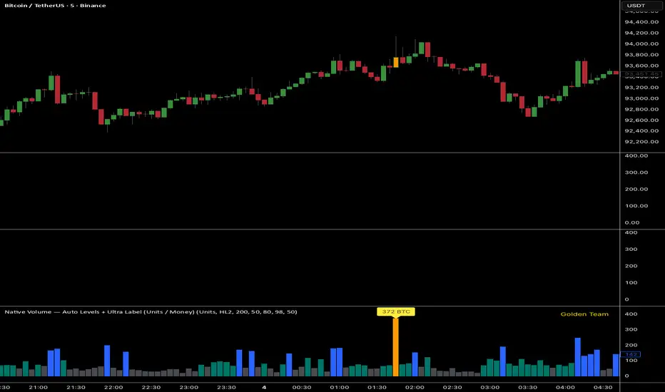
Ultra Volume DetectorNative Volume — Auto Levels + Ultra Label
What it does
This indicator classifies volume bars into four categories — Low, Medium, High, and Ultra — using rolling percentile thresholds. Instead of fixed cutoffs, it adapts dynamically to recent market activity, making it useful across different symbols and timeframes. Ultra-high volume bars are highlighted with labels showing compacted values (K/M/B/T) and the appropriate unit (shares, contracts, ticks, etc.).
Core Logic
Dynamic thresholds: Calculates percentile levels (e.g., 50th, 80th, 98th) over a user-defined window of bars.
Categorization: Bars are colored by category (Low/Med/High/Ultra).
Ultra labeling: Only Ultra bars are labeled, preventing chart clutter.
Optional MA: A moving average of raw volume can be plotted for context.
Alerts: Supports both alert condition for Ultra events and dynamic alert() messages that include the actual volume value at bar close.
How to use
Adjust window size: Larger windows (e.g., 200+) provide stable thresholds; smaller windows react more quickly.
Set percentiles: Typical defaults are 50 for Medium, 80 for High, and 98 for Ultra. Lower the Ultra percentile to see more frequent signals, or raise it to isolate only extreme events.
Read chart signals:
Bar colors show the category.
Labels appear only on Ultra bars.
Alerts can be set up for automatic notification when Ultra volume occurs.
Why it’s unique
Adaptive: Uses rolling statistics, not static thresholds.
Cross-asset ready: Adjusts units automatically depending on instrument type.
Efficient visualization: Focuses labels only on the most significant events, reducing noise.
⚠️ Disclaimer: This tool is for educational and analytical purposes only. It does not provide financial advice. Always test and manage risk before trading live