Optimized 1st Touch 10SMA After RunThis indicator is designed to identify strong stocks that have recently made a meaningful rally and are now experiencing their first controlled pullback to the 10-day simple moving average (10SMA). It scans for stocks that have moved at least 10% over the past 10 trading days, maintained upward momentum by riding above the 10SMA during the advance, and are trading within a broader uptrend. The signal triggers only when price makes its first touch of the 10SMA since the rally and closes back above it, indicating potential support and trend continuation rather than weakness. Additional filters such as volume contraction and higher-timeframe trend alignment help isolate high-quality setups where strong stocks are digesting gains before a potential next leg higher.
Indicators and strategies

SMI Trigger System - Lower - NPR21/ChatGPTSMI Trigger System (Lower) — Buy Low / Hrugu (Modified)
This indicator is a modified version of the original SMI Trigger System created by Buy Low, with later enhancements by Hrugu, published with permission.
The script is a lower-pane Smoothed Stochastic Momentum Index (SMI) designed to deliver clear, visually intuitive momentum signals without unnecessary clutter. This version focuses exclusively on SMI behavior and removes auxiliary indicators to keep signals clean, readable, and consistent across timeframes.
Key Features
Smoothed SMI line with dynamic color changes based on momentum direction
Raw SMI line for additional reference
Zero-line split cloud shading for quick bullish/bearish momentum identification
Upper and lower SMI reference levels for overbought/oversold context
Exact-bar SMI color-flip triangle markers for immediate visual confirmation
Adjustable triangle size and offset so markers do not overlap the SMI line
Fully customizable colors for:
Zero line
Smoothed SMI (up/down)
Raw SMI
Cloud above and below zero
Upper and lower SMI levels
How to Use
This indicator is designed to highlight momentum shifts, not to predict price. It works best when combined with price structure, trend context, or higher-timeframe bias.
1. SMI Line & Color Changes
The smoothed SMI line changes color based on momentum direction:
Up color → momentum strengthening
Down color → momentum weakening
A color change often signals a potential momentum shift.
2. SMI Color-Flip Triangles
Green ▲ triangle below the SMI
Appears when the smoothed SMI turns upward (bearish → bullish momentum).
Red ▼ triangle above the SMI
Appears when the smoothed SMI turns downward (bullish → bearish momentum).
Triangles are plotted on the same bar the SMI changes color and are offset so they do not overlap the SMI line.
These markers are intended as visual confirmations, not standalone trade signals.
3. Zero Line & Cloud
The zero line separates bullish and bearish momentum regimes.
Cloud above zero → bullish momentum bias
Cloud below zero → bearish momentum bias
Stronger signals often occur when SMI flips in the direction of the cloud.
4. Upper & Lower SMI Levels
Upper and lower reference levels help identify extended momentum.
Momentum flips near or beyond these levels may indicate:
Exhaustion
Potential pullbacks
Trend continuation setups when aligned with higher-timeframe direction
5. Best Practices
Use this indicator as a confirmation tool, not a prediction tool.
Combine with:
Market structure
Support and resistance
Trend direction
Volume or price action
Works well on tick charts, intraday timeframes, and higher-timeframe analysis.
Additional Notes
Triangles do not repaint
All visual elements are user-configurable
No ADX or Awesome Oscillator components
Designed for clarity, speed, and ease of interpretation
This script is intended for analytical and educational purposes only and does not constitute trading advice.

Sustained 200 SMA Cross (Locked to Daily)For individuals looking to track trend changes against the 200 day simple moving average. We are measuring 5 consecutive days changing from the above or below the 200 day SMA as a flag for a potential shift in trend.

Wavelet Candlestick Slope Follower-Master Edition Here is a short description of this script:
This is a **Trend Following strategy** that utilizes advanced mathematics—the **Wavelet Transform**—to filter out market noise.
**Key Features:**
1. **Synthetic Candles:** The script does not analyze raw prices. Instead, it constructs "Wavelet Candles"—smoothed candles created through mathematical convolution of prices with a specific wavelet "kernel" (e.g., Mexican Hat, Morlet, Haar).
2. **Auto-Correction (Normalization):** This is the most critical technical feature of this code. The script automatically normalizes the weights. This ensures that even when using complex mathematical shapes (like the Mexican Hat), the output price remains accurate to the real chart scale and is not distorted.
3. **Strategy Logic:** The logic is very straightforward—the system enters a **Long** position when the smoothed closing price (`w_close`) is rising, and closes the position when it starts to fall.
4. **Visualization:** It draws new, cleaner candles (green/red) on the chart, revealing the "true" trend structure after filtering out temporary fluctuations.
This is a example of use idea of wavelet candle

CT Market Fragility & Systemic Risk Monitor v1.0CT ⊕ Market Fragility & Systemic Risk Monitor v1.0
Systemic Stress & Market Regime Monitor
OVERVIEW
Wall Street-grade structural monitoring now open-source.
CT ⊕ Market Fragility & Systemic Risk Monitor v1.0 is a real-time systemic risk tool designed to detect fragility before it hits price. Built by former institutional traders, it delivers structural insight typically reserved for desks inside hedge funds and global macro desks.
This isn’t about finding entries or exits, it’s about understanding the environment you're trading in, and recognizing when it's shifting.
WHAT IT DOES
• Monitors six key market domains: Equities, Rates/Credit, FX (USD stress), Commodities, Crypto, and Macro
• Detects volatility stress, cross-domain coupling, and regime synchronization
• Classifies market structure into Normal → Fragile → Critical
• Shows a live dashboard with scores, coupling levels, and structural state
• Plots event markers (T1, T2, T3) for structural transitions
• Implements hysteresis logic to model post-stress 'memory
• Supports both single-domain ("Local Mode") and system-wide monitoring
HOW IT WORKS
This engine does not rely on traditional TA. No moving averages. No MACD. No patterns. No guesswork.
Instead, it measures how markets are behaving beneath price detecting when stress is:
• Building internally
• Spreading across domains
• Synchronizing into systemic fragility
T1 (🟠) — Early instability: acceleration in market coupling
T2 (🔵) — Fragile regime: multiple domains simultaneously stressed
T3 (🔴) — Critical regime: synchronized, system-wide stress
These are not buy/sell signals. They are structural regime alerts, the same kind used by institutions to cut risk before stress cascades.
WHY IT MATTERS
Most retail tools are reactive. They interpret surface-level patterns after the move.
This tool is different. It’s proactive – measuring pressure before it breaks structure.
Institutions have used structural fragility models like this for years. This script helps close that gap, giving everyday traders the same early warnings that pros use to reduce exposure and sidestep systemic blowups.
It’s not about finding the edge.
It’s about not getting crushed when the system breaks.
Whether you trade crypto, stocks, FX, or macro, this engine helps answer:
• Is the system stable right now?
• Are stress levels rising across markets?
• Is it time to tighten risk?
Institutions don’t wait for breakouts. They monitor structure.
Now, you can too.
KEY FEATURES
• Works on any asset class and any timeframe
• Fully customizable domain selection
• Three-tier structural alert system (T1–T3)
• Real-time dashboard: stress scores, states, and coupling levels
• Hysteresis modeling: post-stress “memory” detection
• Supports single-domain (local) or multi-domain (systemic) monitoring
• PineScript alerts built-in
RECOMMENDED USE
Active traders - all asset classes
Use the dashboard and T1–T3 alerts to stay aware of structural risk in real time.
Track multi-timeframe alignment to detect where risk originates and how it spreads across markets.
Crypto trader s
Monitor upstream domains (Equities, FX, Rates, Macro) to detect pressure before it reaches crypto.
Identify reflexive stress before Bitcoin reacts — and stay ahead of contagion events.
Macro & systematic traders
Use T1–T3 transitions as volatility filters, exposure governors, or dynamic risk overlays.
Build regime-aware models that adapt to shifting systemic conditions.
Examples & Visuals
Question: Would it have helped to know that at 9:30 on October 9th and again at 10:00 on October 10th that critical states were detected in the structural behavior of Bitcoin? Take a look:
30 min chart BTC shows two distinct T3 (critical) regime detections October 9th and 10:30 October 10th
5m BTC chart reveals high frequency instability for the same period, identifying instability, fragility, criticality
The 30minute BTC chart at 16:30 Friday October 10th,, a few hours after first detecting critical systemic risk
RISK DISCLAIMER
This is a structural analysis tool, not a predictive signal. It does not provide financial advice, trade entries, or forecasts. Use at your own risk. Full disclaimer embedded in the script.
Complexity Trading - From Wall St to Main St
No patterns. No repainting. No mysticism. Just logic, math, science and market structure - now made accessible to everyone.
Developer of LPPL Critical Pulse (LPPLCP), the Temporal Phase Model (TPM) and other
other advanced structural and attractor based systems inspired by Sornette’s LPPL framework and other differentiated thinkers.
Note on Methodology
This tool is not predictive, and not designed for academic publication.
It is a real-time structural monitoring system inspired by academically established concepts,
including LPPL attractor dynamics, cross-asset coupling, reflexivity, and phase regime transitions, implemented within the real-time constraints of PineScript, and intended for visual, exploratory, and diagnostic use.

Wavelet Candle Constructor (Inc. Morlet) 2Here is the detailed description of the **Wavelet Candle** construction principles based on the code provided.
This indicator is not a simple smoothing mechanism (like a Moving Average). It utilizes the **Discrete Wavelet Transform (DWT)**, specifically the Stationary variant (SWT / à Trous Algorithm), to separate "noise" (high frequencies) from the "trend" (low frequencies).
Here is how it works step-by-step:
###1. The Wavelet Kernel (Coefficients)The heart of the algorithm lies in the coefficients (the `h` array in the `get_coeffs` function). Each wavelet type represents a different set of mathematical weights that define how price data is analyzed:
* **Haar:** The simplest wavelet. It acts like a simple average of neighboring candles. It reacts quickly but produces a "boxy" or "jagged" output.
* **Daubechies 4:** An asymmetric wavelet. It is better at detecting sudden trend changes and the fractal structure of the market, though it introduces a slight phase shift.
* **Symlet / Coiflet:** More symmetric than Daubechies. They attempt to minimize lag (phase shift) while maintaining smoothness.
* **Morlet (Gaussian):** Implemented in this code as a Gaussian approximation (bell curve). It provides the smoothest, most "organic" effect, ideal for filtering noise without jagged edges.
###2. The Convolution EngineInstead of a simple average, the code performs a mathematical operation called **convolution**:
For every candle on the chart, the algorithm takes past prices, multiplies them by the Wavelet Kernel weights, and sums them up. This acts as a **digital low-pass filter**—it allows the main price movements to pass through while cutting out the noise.
###3. The "à Trous" Algorithm (Stationary Wavelet Transform)This is the key difference between this indicator and standard data compression.
In a classic wavelet transform, every second data point is usually discarded (downsampling). Here, the **Stationary** approach is used:
* **Level 1:** Convolution every **1** candle.
* **Level 2:** Convolution every **2** candles (skipping one in between).
* **Level 3:** Convolution every **4** candles.
* **Level 4:** Convolution every **8** candles.
Because of this, **we do not lose time resolution**. The Wavelet Candle is drawn exactly where the original candle is, but it represents the trend structure from a broader perspective. The higher the `Decomposition Level`, the deeper the denoising (looking at a wider context).
###4. Independent OHLC ProcessingThe algorithm processes each component of the candle separately:
1. Filters the **Open** series.
2. Filters the **High** series.
3. Filters the **Low** series.
4. Filters the **Close** series.
This results in four smoothed curves: `w_open`, `w_high`, `w_low`, `w_close`.
###5. Geometric Reconstruction (Logic Repair)Since each price series is filtered independently, the mathematics can sometimes lead to physically impossible situations (e.g., the smoothed `Low` being higher than the smoothed `High`).
The code includes a repair section:
```pinescript
real_high = math.max(w_high, w_low)
real_high := math.max(real_high, math.max(w_open, w_close))
// Same logic for Low (math.min)
```
This guarantees that the final Wavelet Candle always has a valid construction: wicks encapsulate the body, and the `High` is strictly the highest point.
---
###Summary of ApplicationThis construction makes the Wavelet Candle an **excellent trend-following tool**.
* If the candle is **green**, it means that after filtering the noise (according to the selected wavelet), the market energy is bullish.
* If it is **red**, the energy is bearish.
* The wicks show volatility that exists within the bounds of the selected decomposition level.
Here is a descriptive comparison of **Wavelet Candles** against other popular chart types. As requested, this is a narrative explanation focusing on the differences in mechanics, interpretation philosophy, and the specific pros and cons of each approach.
---
###1. Wavelet Candles vs. Standard (Japanese) CandlesThis is a clash between "the raw truth" and "mathematical interpretation." Standard Japanese candles display raw market data—exactly what happened on the exchange. Wavelet Candles are a synthetic image created by a signal processor.
**Differences and Philosophy:**
A standard candle is full of emotion and noise. Every single price tick impacts its shape. The Wavelet Candle treats this noise as interference that must be removed to reveal the true energy of the trend. Wavelets decompose the price, reject high frequencies (noise), and reconstruct the candle using only low frequencies (the trend).
* **Wavelet Advantages:** The main advantage is clarity. Where a standard chart shows a series of confusing candles (e.g., a long green one, followed by a short red one, then a doji), the Wavelet Candle often draws a smooth, uniform wave in a single color. This makes it psychologically easier to hold a position and ignore temporary pullbacks.
* **Wavelet Disadvantages:** The biggest drawback is the loss of price precision. The Open, Close, High, and Low values on a Wavelet candle are calculated, not real. You **cannot** place Stop Loss orders or enter trades based on these levels, as the actual market price might be in a completely different place than the smoothed candle suggests. They also introduce lag, which depends on the chosen wavelet—whereas a standard candle reacts instantly.
###2. Wavelet Candles vs. Heikin AshiThese are close cousins, but they share very different "DNA." Both methods aim to smooth the trend, but they achieve it differently.
**Differences and Philosophy:**
Heikin Ashi (HA) is based on a simple recursive arithmetic average. The current HA candle depends on the previous one, making it react linearly.
The Wavelet Candle uses **convolution**. This means the shape of the current candle depends on a "window" (group) of past candles multiplied by weights (Gaussian curve, Daubechies, etc.). This results in a more "organic" and elastic reaction.
* **Wavelet Advantages:** Wavelets are highly customizable. With Heikin Ashi, you are stuck with one algorithm. With Wavelet Candles, you can change the kernel to "Haar" for a fast (boxy) reaction or "Morlet" for an ultra-smooth, wave-like effect. Wavelets handle the separation of market cycles better than simple HA averaging, which can generate many false color flips during consolidation.
* **Wavelet Disadvantages:** They are computationally much more complex and harder to understand intuitively ("Why is this candle red if the price is going up?"). In strong, vertical breakouts (pumps), Heikin Ashi often "chases" the price faster, whereas deep wavelet decomposition (High Level) may show more inertia and change color more slowly.
###3. Wavelet Candles vs. RenkoThis compares two different dimensions: Time vs. Price.
**Differences and Philosophy:**
Renko completely ignores time. A new brick is formed only when the price moves by a specific amount. If the market stands still for 5 hours, nothing happens on a Renko chart.
The Wavelet Candle is **time-synchronous**. If the market stands still for 5 hours, the Wavelet algorithm will draw a series of flat, small candles (the "wavelet decays").
* **Wavelet Advantages:** They preserve the context of time, which is crucial for traders who consider trading sessions (London/New York) or macroeconomic data releases. On a wavelet chart, you can see when volatility drops (candles become small), whereas Renko hides periods of stagnation, which can be misleading for options traders or intraday strategies.
* **Wavelet Disadvantages:** In sideways trends (chop), Wavelet Candles—despite the smoothing—will still draw a "snake" that flips colors (unless you set a very high decomposition level). Renko can remain perfectly clean and static during the same period, not drawing any new bricks, which for many traders is the ultimate filter against overtrading in a flat market.
###Summary**Wavelet Candles** are a tool for the analyst who wants to visualize the **structure of the wave and market cycle**, accepting some lag in exchange for noise reduction, but without giving up the time axis (like in Renko) or relying on simple averaging (like in Heikin Ashi). It serves best as a "roadmap" for the trend rather than a "sniper scope" for precise entries.

Hybrid Strategy: Trend/ORB/MTFHybrid Strategy: Trend + ORB + Multi-Timeframe Matrix
This script is a comprehensive "Trading Manager" designed to filter out noise and identify high-probability breakout setups. It combines three powerful concepts into a single, clean chart interface: Trend Alignment, Opening Range Breakout (ORB), and Multi-Timeframe (MTF) Analysis.
It is designed to prevent "analysis paralysis" by providing a unified Dashboard that confirms if the trend is aligned across 5 different timeframes before you take a trade.
How it Works
The strategy relies on the "Golden Trio" of confluence:
1. Trend Definition (The Setup) Before looking for entries, the script analyzes the immediate trend. A bullish trend is defined as:
Price is above the Session VWAP.
The fast EMA (9) is above the slow EMA (21). (The inverse applies for bearish trends).
2. The Signal (The Trigger) The script draws the Opening Range (default: first 15 minutes of the session).
Buy Signal: Price breaks above the Opening Range High while the Trend is Bullish.
Sell Signal: Price breaks below the Opening Range Low while the Trend is Bearish.
3. The Confirmation (The Filter) A signal is only valid if the Higher Timeframe (default: 60m) agrees with the direction. If the 1m chart says "Buy" but the 60m chart is bearish, the signal is filtered out to prevent false breakouts.
Key Features
The Matrix Dashboard A zero-lag, real-time table in the corner of your screen that monitors 5 user-defined timeframes (e.g., 5m, 15m, 30m, 60m, 4H).
Trend: Checks if Price > EMA 21.
VWAP: Checks if Price > VWAP.
ORB: Checks if Price is currently above/below the Opening Range of that session.
D H/L: Warns if price is near the Daily High or Low.
PD H/L: Warns if price is near the Previous Daily High or Low.
Visual Order Blocks The script automatically identifies valid Order Blocks (sequences of consecutive candles followed by a strong explosive move).
Chart: Draws Green/Red zones extending to the right, showing where price may react.
Dashboard: Displays the exact High, Low, and Average price of the most recent Order Blocks for precision planning.
Risk Management (Trailing Stop) Once a trade is active, the script plots Chandelier Exit dots (ATR-based trailing stop) to help you manage the trade and lock in profits during trend runs.
Visual Guide (Chart Legend)
⬜ Gray Box: Represents the Opening Range (first 15 minutes). This is your "No Trade Zone." Wait for price to break out of this box.
🟢 Green Line: The Opening Range High. A break above this line signals potential Bullish momentum.
🔴 Red Line: The Opening Range Low. A break below this line signals potential Bearish momentum.
🟢 Green / 🔴 Red Zones (Boxes): These are Order Blocks.
🟢 Green Zone: A Bullish Order Block (Demand). Expect price to potentially bounce up from here.
🔴 Red Zone: A Bearish Order Block (Supply). Expect price to potentially reject down from here.
⚪ Dots (Trailing Stop):
🟢 Green Dots: These appear below price during a Bullish trend. They represent your suggested Stop Loss.
🔴 Red Dots: These appear above price during a Bearish trend.
🏷️ Buy / Sell Labels:
BUY: Triggers when Price breaks the Green Line + Trend is Bullish + HTF is Bullish.
SELL: Triggers when Price breaks the Red Line + Trend is Bearish + HTF is Bearish.
Settings
Session: Customizable RTH (Regular Trading Hours) to filter out pre-market noise.
Matrix Timeframes: 5 fixed slots to choose which timeframes you want to monitor.
Order Blocks: Adjust the sensitivity and lookback period for Order Block detection.
Risk: Customize the ATR multiplier for the trailing stop.
Disclaimer
This tool is for educational purposes only. Past performance does not guarantee future results. Always manage your risk properly.

Displacement## Displacement Indicator (Institutional Momentum Filter)
This indicator highlights **true price displacement** — candles where price moves with **abnormal force relative to recent volatility**.
It is designed to help traders distinguish **real momentum** from normal market noise.
Displacement often precedes:
- Breaks of structure
- Fair Value Gaps (FVGs)
- Strong continuation or meaningful pullbacks
This tool focuses on **confirmation**, not prediction.
---
### 🔍 How Displacement Is Defined
A candle is marked as *displacement* only when **all conditions are met**:
• Candle body is larger than a multiple of ATR (volatility-adjusted)
• Candle body makes up a high percentage of the full candle (strong close)
• Directional conviction (bullish or bearish close)
This filters out:
- Small or average candles
- Wick-heavy indecision
- Low-quality breakouts
---
### 🎯 What This Indicator Is Best Used For
✔ Confirming impulsive moves
✔ Validating structure breaks
✔ Anchoring Fair Value Gaps
✔ Filtering low-probability setups
✔ Identifying institutional participation
Works best on **M5, M15, and H1**, especially during **London and NY sessions**.
---
### ⚠️ Important Notes
• This is **not** a buy/sell signal by itself
• Best used with trend, structure, or liquidity context
• Not designed for ranging or low-volatility markets
Think of this indicator as a **momentum truth filter** —
if displacement is missing, conviction is likely missing too.
---
### ⚙️ Inputs Explained
• ATR Length – defines normal volatility
• ATR Multiplier – how aggressive displacement must be
• Minimum Body % – ensures strong candle closes
All inputs are adjustable to fit different markets and styles.
---
### 🧠 Philosophy
Displacement reflects **commitment**, not anticipation.
This tool helps you wait for **proof**, not hope.
---
If you want, I can:
- Tighten this for **ICT-style language**
- Rewrite for **beginner clarity**
- Add a **“How I personally use it”** section
- Optimize it for **TradingView algorithm visibility**
**Tell me which you want changed.**

SMI Trigger System The SMI Trigger System is a lower-pane momentum indicator based on a Hull-smoothed Stochastic Momentum Index (SMI). It is designed to assist in identifying potential momentum shifts by highlighting signal alignment and level interactions.
This indicator is intended to be used as part of a broader analysis framework. Confluence between trend, structure, and higher-timeframe context defines the setup, while SMI signal behavior may be used for confirmation.
The script can be applied across multiple timeframes and markets. It does not generate trade signals on its own and should be used alongside additional analysis and risk management techniques.
For educational purposes only. Not financial advice.

EMA Slope Angle V2 Auto Threshold# EMA Slope Angle Indicator
## Overview
The EMA Slope Angle Indicator visualizes the Exponential Moving Average (EMA) slope as an angle in degrees, providing traders with a clear, quantitative measure of trend strength and direction. The indicator features **automatic threshold calculation based on Gaussian distribution**, making it adaptive to any market and timeframe.
## Key Features
### 🎯 **Automatic Threshold Calculation (NEW!)**
- **Gaussian Distribution-Based**: Automatically calculates optimal thresholds from the 50% interquartile range (IQR) of historical angle data
- **Asset-Adaptive**: Thresholds adjust to each instrument's unique volatility and price characteristics
- **No Manual Tuning Required**: Simply enable "Use Auto Thresholds" and let the indicator optimize itself
### 📊 **Dynamic EMA Coloring**
- **Color Intensity**: EMA line color intensity reflects slope strength
- **Visual Feedback**:
- Green shades for uptrends (darker = stronger)
- Red shades for downtrends (darker = stronger)
- Gray for flat/neutral conditions
### 📈 **Regime Detection**
- **Three Regimes**: RISING, FALLING, and FLAT
- **Smart Classification**: Based on statistical distribution of angles
- **Non-Repainting**: All calculations use confirmed bars only
### 🔔 **Trend-Shift Signals**
- **Visual Arrows**: Automatic signals when transitioning from FLAT to RISING/FALLING
- **Configurable**: Enable/disable signals as needed
- **Reliable**: Only triggers on significant regime changes
### 📋 **KPI Dashboard**
- **Real-Time Metrics**: Current angle, regime, and last signal
- **Auto-Threshold Display**: Shows calculated thresholds when auto-mode is active
- **Statistics**: Optional angle distribution statistics
- **Clean Layout**: Top-right corner, non-intrusive
### 📊 **Angle Statistics (Optional)**
- **Distribution Analysis**: Histogram of angle ranges
- **Dynamic Buckets**: Automatically adjusts to data distribution when auto-mode is enabled
- **Percentage Breakdown**: See how often each angle range occurs
## Settings
### Main Settings
- **EMA Length**: Period for the Exponential Moving Average (default: 50)
- **Slope Lookback Bars**: Number of bars to calculate slope over (default: 5)
### Angle Settings
- **Use Auto Thresholds**: Enable automatic threshold calculation (recommended!)
- **Analysis Period**: Number of bars to analyze for distribution (default: 500)
- **Manual Thresholds**: Flat, Rising, and Falling triggers (used when auto-mode is off)
- **Max Angle for Color Saturation**: Maximum angle for color intensity scaling
### Display Options
- **Colors**: Customize uptrend, downtrend, and flat colors
- **Show Signals**: Enable/disable trend-shift arrows
- **Show Statistics**: Display angle distribution table
- **Show Dashboard**: Toggle KPI dashboard visibility
## How It Works
### Angle Calculation
The indicator calculates the angle between the current EMA value and the EMA value N bars ago:
```
Angle = arctan((EMA_now - EMA_then) / lookback) × 180° / π
```
### Auto-Threshold Calculation
When enabled, the indicator:
1. Analyzes historical angle data over the specified period
2. Calculates mean and standard deviation
3. Determines thresholds based on the 50% interquartile range (IQR):
- **Flat Threshold**: ±0.674σ (middle 50% of data)
- **Rising Trigger**: 75th percentile (mean + 0.674σ)
- **Falling Trigger**: 25th percentile (mean - 0.674σ)
### Regime Classification
- **FLAT**: Angle within ±Flat Threshold
- **RISING**: Angle ≥ Rising Trigger
- **FALLING**: Angle ≤ Falling Trigger
## Use Cases
### Trend Following
- Identify strong trends (high angle values)
- Spot trend reversals (regime changes)
- Filter trades based on trend strength
### Range Trading
- Detect flat/consolidation periods
- Avoid trading during choppy markets
- Enter when regime shifts from FLAT to RISING/FALLING
### Multi-Timeframe Analysis
- Apply to different timeframes for confirmation
- Use higher timeframe for trend direction
- Use lower timeframe for entry timing
## Tips for Best Results
1. **Enable Auto-Thresholds**: Let the indicator adapt to your instrument
2. **Adjust Analysis Period**: Use more bars for stable markets, fewer for volatile ones
3. **Combine with Price Action**: Use regime changes as confirmation, not standalone signals
4. **Multi-Timeframe**: Check higher timeframes for trend context
5. **Backtest First**: Test settings on historical data before live trading
## Technical Details
- **Non-Repainting**: All calculations use `barstate.isconfirmed`
- **Pine Script v6**: Latest version for optimal performance
- **Efficient**: Minimal computational overhead
- **Customizable**: Extensive settings for fine-tuning
## Version History
**v2.0** (Current)
- Added automatic threshold calculation based on Gaussian distribution
- Dynamic bucket adjustment for statistics
- Enhanced dashboard with auto-threshold display
- Improved regime detection using IQR method
**v1.0**
- Initial release with manual thresholds
- Basic EMA coloring
- Trend-shift signals
- KPI dashboard
## Support
For questions, suggestions, or bug reports, please leave a comment or contact the author.
---
**Disclaimer**: This indicator is for educational purposes only. Past performance does not guarantee future results. Always use proper risk management and never risk more than you can afford to lose.
**Keywords**: EMA, slope, angle, trend, automatic thresholds, Gaussian distribution, regime detection, non-repainting, adaptive

SCOTTGO - RVOL Bull/Bear Painter (Real-Time) SCOTTGO - RVOL Bull/Bear Painter (Real-Time Momentum Detection)
📌Overview
The RVOL Bull/Bear Painter is a Pine Script indicator designed to instantly highlight high-momentum candles driven by significant Relative Volume (RVOL).
It provides a clear visual signal (bar color, shape, and label) when a candle's volume exceeds its average by a user-defined threshold, confirming strong bullish or bearish interest in real-time. This helps traders quickly identify potential institutional accumulation/distribution or breakout/breakdown attempts.
✨ Key Features
Relative Volume (RVOL) Calculation: Automatically calculates the ratio of the current bar's volume to its moving average (SMA or EMA) over a customizable lookback period.
Momentum Confirmation: Paints the candle green (bullish) or red (bearish) only when both price direction and high RVOL criteria are met.
Real-Time Detection: Uses a plotshape method to display the signal triangle as soon as the RVOL and direction conditions are met on the currently forming candle, aiming for faster alerts than bar-close coloring.
Customizable Threshold: Easily adjust the RVOL multiplier (e.g., 1.5x, 2.0x, 3.0x) to filter out noise and only focus on truly significant volume events.
Labels and Alerts: Displays a volume multiplier label (e.g., BULL 2.55x) and includes pre-configured alert conditions for automated notifications.
🛠️ How to Use It
1. Identify High-Conviction Moves
Look for the painted candles and the corresponding labels. A candle painted green with a BULL label (e.g., BULL 2.5x) indicates that buyers stepped in with 2.5 times the typical volume to drive the price higher.
2. Configure Your Sensitivity
The power of the script lies in customizing the inputs:
RVOL Lookback Period: Determines the length of the volume moving average.
Shorter periods (e.g., 9-20) make the indicator more reactive to recent volume changes.
Longer periods (e.g., 50-200) require a much larger volume spike to trigger a signal.
RVOL Threshold: This is the multiplier.
Lower values (e.g., 1.5) will generate more signals.
Higher values (e.g., 3.0) will generate fewer, but generally higher-conviction, signals.
3. Set Up Alerts
Use the pre-configured alert conditions (Bullish RVOL Signal and Bearish RVOL Signal) in TradingView's alert menu. Crucially, set the alert frequency to "Once per bar" or "Once per minute" to receive notifications as soon as the high RVOL event occurs, without waiting for the bar to close.

EM Levelsstdv levels for you using VIX and VXN for ES and NQ so hopefully it helps you try it out and have fun

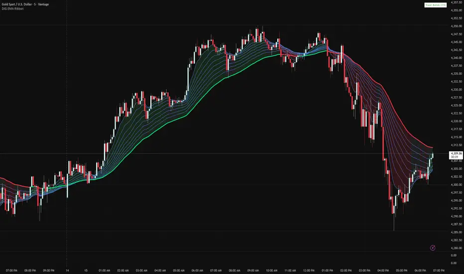
Danny Gee EMA Trend RibbonDanny Gee EMA Trend Ribbon - Multi-Timeframe Trend Analysis
A sophisticated 9-EMA ribbon system designed to visualize trend strength and direction with precision. This indicator creates a dynamic color-coded ribbon that adapts to market conditions, making trend identification effortless.
Key Features:
9 Customizable EMAs - Default periods: 8, 14, 20, 26, 32, 38, 44, 50, and 60
Intelligent Ribbon Coloring - Automatically displays bullish (green), bearish (red), or neutral (gray) based on EMA consensus
Smoothing Control - Adjustable smoothing period (default 2) reduces noise and false signals
Real-Time Trend Status - Live dashboard showing current trend state and EMA agreement count (e.g., "Bullish 8/9")
Visual Clarity - Color-coded EMA lines with the 60 EMA highlighted for key support/resistance
How It Works:
The indicator analyzes the slope direction of all 9 EMAs. When 7 or more EMAs agree on direction, the ribbon displays a clear bullish or bearish color. This consensus-based approach helps filter out weak or conflicting trends, keeping you focused on high-probability setups.
Best Used For:
✓ Identifying strong trending conditions
✓ Avoiding choppy, sideways markets
✓ Confirming trade direction with other indicators
✓ Multi-timeframe analysis (works on any chart timeframe)
Customization Options:
Adjust all EMA periods to match your trading style
Customize ribbon colors for personal preference
Toggle ribbon visibility on/off
Modify smoothing sensitivity
Perfect for swing traders, scalpers, and day traders looking for a clean, reliable trend filter that works across all markets - forex, crypto, stocks, and indices.
Raeinex Momentum Liquidity IndexEntry arrow signals with volumetric momentum (buying and selling pressure) and the possibility to use all entry signals as liquidity area for price retest.

Session HeatmapIntraday Seasonality
Overview
Analyzes historical patterns by time of day. Identifies when volatility, volume, and open interest changes tend to be highest or lowest.
Features
Multiple Metrics: TR (volatility), Volume, and Open Interest changes
Flexible Grouping: View patterns by weekday or month to spot day-of-week or seasonal effects
Heatmap Visualization: Blue (low) to Red (high) color scale for quick pattern recognition
Percentile Mode: Reduces outlier impact by using 5th-95th percentile range
Timezone Support: Display in UTC alongside your local time
Metrics Explained
TR: Volatility - when markets move most
Volume: Liquidity - when participation is highest
OI Increase: When new positions are opened
OI Decrease: When positions are closed
OI Net: Net open interest change
Usage
Set your timezone and preferred slot size (30min/1H)
Choose a date range (relative or custom)
Select a metric to analyze
Use "Group By" to see weekday or monthly patterns
Switch to Percentile color scale if outliers dominate
Notes
Chart timeframe should be equal to or smaller than Slot Size
OI metrics require Binance Perpetual symbols
DST is not automatically adjusted; consider seasonal shifts for US/EU sessions

Probability-Based Adaptive Detection🙏🏻 PBAD (Probability-Based Adaptive Detection) : adaptive control tool for outliers || novelty detection, made for worst case data & processes, for the highest time complexity O(n^2) compared with the alternatives (would be explained in a sec). Thresholds are completely data driven and axiomatic, no need in provided hyperparameters, are not learned or optimized. The method accepts multiple weights, e.g. both temporal and volatility weights.
Method briefly explained (I can go deeper if any1 asks explicitly):
Performs weighted KDE on initial input data, finds KDE global maximum (mode), creates new “residuals” dataset by centering initial data around this value;
Performs weighted KDE on residuals, uses sigmoid based probability mass targets with increasing probability coverage to construct a set of non-disjoint High Density Intervals (also called HDR, HPD in Bayesian terms);
Uses these intervals to calculate analogs of centralized & standardized moments;
Uses these ^^ moments to construct a set of control thresholds. The scheme used in PBAD is not only based on a central threshold, or on neighboring ones, it utilizes all previous thresholds, gaining more information.
...
The most important part is to understand whether you really need PBAD. Because even tho it seems to be the best one given highest algocomplexity, irl it would work worse in cases when it’s not required by your data.
Here’s the menu (aka taxonomy omg) of methods you can use that would let you make the right choice:
Moment-Based Adaptive Detection (MBAD) :
Norm: L2
Time complexity: original O(n), successfully reduced to O(1) in online version
Use case: default, general purpose
Based on: method of moments (powers of residuals from mean)
Thresholds architecture: centralized
Quantile-Based Adaptive Detection (QBAD):
Norm: L1
Time complexity: O(nlogn)
Use case: either bad data Or process instability
Based on: quantile moments (dyadic percentiles of residuals from median)
Thresholds architecture: chained/recursive/sequential
Probability-Based Adaptive Detection (PBAD):
Norm: L0
Time complexity: O(n^2)
Use case: both bad data And process instability
Based on: probability moments (target probability masses of residuals from KDE mode)
Thresholds architecture: decentralized (for lack of a better name xd, the idea is that these thresholds gain information from the all other threshold and are Not exclusively based on the central or neighboring thresholds)
...
Examples of true use cases:
^^ an appropriate financial instrument to use PBAD
^^ and another one
...
Additional details about how to use it:
Keep the student5 kernel, it’s the best you can do. I added others mostly for comparisons and if you want to use the tool Not for its primary purpose (on a fine data)
“Calculate for N bars” and “Starting at bar N” options allow to reduce calculation period only on the N number of last bars or next bars from a chosen one. It's vital, because calculations here are heavy
Keep plotting offset at 1 (allows to visually compare current bar with the previous threshold values). This is the way it should be done on price data.
HLC3 is the optimal source input, unless you want to use your own better one point estimate of each datapoint (in the best case done by using PBAD itself on OHLC+ values).
In essence it should be used just like MBAD or QBAD, fade/push extensions and limit, fade/push/skip deviations & basis, or other strategies of your. Again, the only reason for 3 methods to exist is to be chosen for according data characteristics.
Btw:
This is the initial version, I don’t consider it perfected tbh, even tho it works as expected, however this method is very situational anyways.
In this script KDE function is modified to ensure the outcoming probabilities Do sum up to 1. I didn’t do this normalization in Weighted KDE Mode script , but there it’s not required since we just need a KDE global max.
see ya
∞

Box Indicator - Auto Draw Previous Day's - High / Midline / LowThis indicator draws a box around the previous day’s high and low, calculates the midline, and displays them on the current day’s chart. It helps visualize key support/resistance levels from the prior trading day.
This script gives you a static reference box from the prior day’s trading range, including a midpoint. It’s useful for spotting potential reversal zones, breakout levels, or intraday targets based on yesterday’s price action.

15min Candle > 20% of Daily ATRThis Pine Script® (v6) indicator, titled "15min Candle > 20% of Daily ATR", detects unusually large 15-minute candles by comparing their size (full range or body) to a user-defined percentage (default 20%) of the previous day's Average True Range (ATR, default 14-period).

Current and Previous Period Anchored VWAPanchored VVWAPS and previous month VWAP extend out into the following month. Includes 1SD for both

Selected Days Indicator V3-TrDoes the stock drop every Wednesday? Do March months always move similarly? Does the 1st week of the month behave differently?
Do you ever say "it always makes this move in these months"? Don't you want to see more clearly whether it actually makes this move or not? Don't you want to see and test periodically repeating price patterns?
Hisse her Çarşamba düşüyor mu? Mart ayları hep benzer mi hareket ediyor? Ayın 1. haftası farklı mı davranıyor?
Bazen "bu aylarda hep bu hareketi yapıyor" dediğiniz oluyor mu? Gerçekten de bu hareketi yapıp yapmadığını daha net görmek istemez misiniz? Periyodik tekrarlayan fiyat kalıplarını görmek ve test etmek istemiyor musunuz?
1. Problem
Some stocks or crypto assets exhibit systematic behaviors on certain days, weeks, or months. But it's hard to see - everything is mixed together on the chart. This indicator isolates the days/weeks/months you want and shows only them. Hides everything else.
2. How It Works
Three-layer filter: Day (Monday, Tuesday...), Week (1st, 2nd, 3rd week of the month), Month (January, February...). Select what you want, let the rest disappear. Example: Show only Thursdays of March-June-September. Or compare every 1st week of the month. View as candlestick, line, or column chart.
3. What's It Good For?
Test "end-of-month effect". Find "day-of-the-week anomaly". Analyze crypto volatility by days. See seasonality in commodities. Discover patterns specific to your own strategy. Past data doesn't guarantee the future but provides statistical advantage.

Box Theory StrategyHere is an explanation of the Box Theory trading strategy.
The Core Philosophy
This strategy is based on the idea that the market is a battle between buyers and sellers, and that these groups often defend the same price levels they used previously. Instead of trying to predict every move, this method focuses on trading only at the "extremes" where the probabilities are highest, while avoiding the middle of the chart where price action is random.
1. The Setup: Drawing the Box
To use this strategy, you must define the "playing field" for the day before you take any trades.
Top of the Box: Draw a line at the Previous Day’s High.
Bottom of the Box: Draw a line at the Previous Day’s Low.
Center Line: Draw a line roughly in the middle of these two points.
This box represents the established range where the market recently found value.
2. The Three Zones & Rules
Once the box is drawn, the chart is divided into three zones. Each zone dictates a specific action.
Zone 1: The Top (Resistance / Sell Zone)
What it represents: This is where sellers previously stepped in and pushed the price down. It is a known area of supply.
The Rule: NO BUYING.
If the price rallies to this level, you should look for Short/Sell opportunities.
Why? Buying here means purchasing at a price that was previously rejected. The probability of a reversal (price going down) is high.
Zone 2: The Bottom (Support / Buy Zone)
What it represents: This is where buyers previously stepped in and pushed the price up. It is a known area of demand.
The Rule: NO SELLING.
If the price drops to this level, you should look for Long/Buy opportunities.
Why? Selling here means shorting into support. The probability of a bounce (price going up) is high.
Zone 3: The Middle (Indecision Zone)
What it represents: This is the area of noise and confusion. Neither buyers nor sellers have clear control here.
The Rule: DO NOT TRADE.
Why? In the middle of the range, the odds of the price going up or down are roughly 50/50. Trading here is considered gambling because you do not have a statistical edge.
3. Execution: How to Trade
The Entry
Short Setup: Wait for the price to touch or slightly pierce the Top of the Box. Enter a short position when you see the price failing to break out (e.g., leaving a wick and closing back inside the box).
Long Setup: Wait for the price to touch or slightly pierce the Bottom of the Box. Enter a long position when you see the price failing to break down (e.g., bouncing off the level).
Stop Loss (Risk Management)
This strategy offers a very clear invalidation point.
For Shorts: Place your Stop Loss just above the box.
For Longs: Place your Stop Loss just below the box.
Logic: If the price clearly breaks out of the box, the range is broken, and you want to exit the trade immediately with a small loss.
Take Profit (Targets)
First Target: The Center Line. This is a safe place to take some profit or move your stop loss to breakeven.
Main Target: The opposite side of the box (e.g., if you sold at the top, target the bottom).
4. Handling Gaps (The "Cheater Box")
If the market opens significantly higher or lower than the previous day's range (a large gap), the original box may be too far away to be useful.
Adjustment: In this scenario, you can draw a new box using the highest and lowest price points of the current trading session so far.
Once this new range is established, apply the same rules: Sell the high, Buy the low, and avoid the middle.

Tails and WicksTails and Wicks 📊
A clean price action tool that spots strong wick rejection candles and draws semi-transparent colored boxes around their high-to-low range. 🔍
Boxes extend forward to highlight potential S/R zones – perfect for pinbars, hammers, shooting stars & indecision dojis! 🚀
Features:
• 🟢 Bullish tails (long lower wick – default green)
• 🔴 Bearish tails (long upper wick – default red)
• 🟠 Indecision (both long wicks – default orange)
• Independent toggles & custom colors 🎨
• Adjustable wick % threshold (default 60%)
• Fixed or infinite right extension ➡️
• Limit recent zones per type (default 4) to keep charts tidy 🧹
• Pure visual – no text clutter (disable "Labels on price scale" in indicator Style tab if needed)
Lightweight, customizable, and great for clean price action trading! 💹

SHAP-Aligned BUY Signal (Daily, Edge-Triggered)Based on the XGBoost + SHAP interpretation report, I'll explain which indicators to monitor for buying NVO. However, I must emphasize that this model performed poorly (47.5% accuracy) and should NOT be used for actual trading! That said, here's what the model learned (for educational purposes):
📊 Top Indicators to Monitor for BUY Signals
1. Days_Since_Low (Most Important - 1.264)
Direction: BULLISH ↑
Interpretation: Higher values → UP prediction
What to monitor: Track how many days since the stock hit its recent low
Buy signal: When the stock has been recovering for an extended period (e.g., 100+ days from low)
Why it matters: The model learned that stocks in long-term recovery tend to continue rising
2. SMA_50 (50-day Moving Average) (0.413)
Direction: BULLISH ↑
Interpretation: Higher absolute SMA_50 values → UP prediction
What to monitor: The 50-day simple moving average price level
Buy signal: When SMA_50 is at higher levels (e.g., above $80-90)
Why it matters: Higher moving averages indicate stronger long-term trends
3. SMA_200 (200-day Moving Average) (0.274)
Direction: BULLISH ↑
Interpretation: Higher SMA_200 → UP prediction
What to monitor: The 200-day simple moving average
Buy signal: When SMA_200 is trending upward and at elevated levels
Why it matters: Long-term trend indicator; golden cross (SMA_50 > SMA_200) is traditionally bullish
4. BB_Width (Bollinger Band Width) (0.199)
Direction: BULLISH ↑
Interpretation: WIDER Bollinger Bands → UP prediction
What to monitor: The distance between upper and lower Bollinger Bands
Buy signal: When BB_Width is expanding (increasing volatility often precedes trend moves)
Why it matters: Widening bands can signal the start of a new trend
5. Price_SMA_50_Ratio (0.158)
Direction: BULLISH ↑
Interpretation: When price is ABOVE the 50-day MA → UP prediction
What to monitor: Current price ÷ SMA_50
Buy signal: When ratio > 1.0 (price is above the 50-day average)
Why it matters: Price above moving averages indicates uptrend
6. Momentum_21D (21-day Momentum) (0.152)
Direction: BULLISH ↑
Interpretation: Positive 21-day momentum → UP prediction
What to monitor: 21-day rate of change
Buy signal: When momentum is positive and increasing
Why it matters: Positive momentum suggests continuation
7. Stoch_K (Stochastic Oscillator) (0.142)
Direction: BULLISH ↑
Interpretation: Higher Stochastic K → UP prediction
What to monitor: Stochastic oscillator (0-100 scale)
Buy signal: When Stoch_K is rising from oversold (<20) or in mid-range (40-60)
Why it matters: Measures momentum and overbought/oversold conditions
