Daily Premium/Discount MapThis indicator plots Daily High, Daily Low, and Daily Equilibrium (midpoint) using a New York (ET) calendar day, giving traders a clear and consistent view of premium and discount price zones.
Each day is defined midnight-to-midnight ET, with levels calculated only from active trading sessions. Holidays and low-liquidity sessions are intentionally ignored to keep the structure clean and relevant.
What’s plotted:
Daily High — Red
Daily Low — Green
Daily Midpoint (Equilibrium) — Gold
Vertical Midnight ET marker to separate trading days
All levels are derived from the true daily range and displayed in a way that keeps price structure easy to read.
Why this indicator?
Quickly identify premium vs discount
Clean daily structure without unnecessary noise
Ideal reference for mean reversion, continuation, and range-based setups
Designed for clarity and execution, not clutter
Best use cases:
Futures and index traders (NQ, ES, YM, RTY, DXY, etc.)
Intraday and short-term swing trading
30-minute charts (works on other intraday timeframes as well)
How I use it:
I use a dedicated chart solely for this indicator on the 30-minute timeframe. This allows me to clearly read the market narrative and determine whether price is trading in a premium or discount relative to the day’s range. Once that context is established, I shift to execution and look only for entries that align with my directional bias.
Important notes:
Uses Eastern Time (ET), which automatically adjusts for daylight saving
Levels are finalized at the start of each new ET day
Holiday and weekend sessions may not produce levels by design
This tool is meant to complement your execution model and risk management — not replace them.
Premiumdiscount

SMC Statistical Liquidity Walls [PhenLabs]📊 SMC Statistical Liquidity Walls
Version: PineScript™ v6
📌 Description
The SMC Statistical Liquidity Walls indicator is designed to visualize market volatility and potential reversal zones using advanced statistical modeling. Unlike traditional Bollinger Bands that use simple lines, this script utilizes an “Inverted Sigmoid” opacity function to create a “fog of war” effect. This visualizes the density of liquidity: the further price moves from the equilibrium (mean), the “harder” the liquidity wall becomes.
This tool solves the problem of over-trading in low-probability areas. By automatically mapping “Premium” (Resistance) and “Discount” (Support) zones based on Standard Deviation (SD), traders can instantly see when price is overextended. The result is a clean, intuitive overlay that helps you identify high-probability mean reversion setups without cluttering your chart with manual drawings.
🚀 Points of Innovation
Inverted Sigmoid Logic: A custom mathematical function maps Standard Deviation to opacity, creating a realistic “wall” density effect rather than linear gradients.
Dynamic “Solidity”: The indicator is transparent at the center (Equilibrium) and becomes visually solid at the edges, mimicking physical resistance.
Separated Directional Bias: distinct Red (Premium) and Green (Discount) coding helps SMC traders instantly recognize expensive vs. cheap pricing.
Smart “Safe” Deviation: Includes fallback logic to handle calculation errors if deviation hits zero, ensuring the indicator never crashes during data gaps.
🔧 Core Components
Basis Calculation: Uses a Simple Moving Average (SMA) to determine the market’s equilibrium point.
Standard Deviation Zones: Calculates 1SD, 2SD, and 3SD levels to define the statistical extremes of price action.
Sigmoid Alpha Calculation: Converts the SD distance into a transparency value (0-100) to drive the visual gradient.
🔥 Key Features
Automated Premium/Discount Zones: Red zones indicate overbought (Premium) areas; Green zones indicate oversold (Discount) areas.
Customizable Density: Users can adjust the “Steepness” and “Midpoint” of the sigmoid curve to control how fast the walls become solid.
Integrated Alerts: Built-in alert conditions trigger when price hits the “Solid” wall (2SD or higher), perfect for automated trading or notifications.
Visual Clarity: The center of the chart remains clear (high transparency) to keep focus on price action where it matters most.
🎨 Visualization
Equilibrium Line: A gray line representing the mean price.
Gradient Fills: The space between bands fills with color that increases in opacity as it moves outward.
Premium Wall: Upper zones fade from transparent red to solid red.
Discount Wall: Lower zones fade from transparent green to solid green.
📖 Usage Guidelines
Range Period: Default 20. Controls the lookback period for the SMA and Standard Deviation calculation.
Source: Default Close. The price data used for calculations.
Center Transparency: Default 100 (Clear). Controls how transparent the middle of the chart is.
Edge Transparency: Default 45 (Solid). Controls the opacity of the outermost liquidity wall.
Wall Steepness: Default 2.5. Adjusts how aggressively the gradient transitions from clear to solid.
Wall Start Point: Default 1.5 SD. The deviation level where the gradient shift begins to accelerate.
✅ Best Use Cases
Mean Reversion Trading: Enter trades when price hits the solid 2SD or 3SD wall and shows rejection wicks.
Take Profit Targets: Use the Equilibrium (Gray Line) as a logical first target for reversal trades.
Trend Filtering: Do not initiate new long positions when price is deep inside the Red (Premium) wall.
⚠️ Limitations
Lagging Nature: As a statistical tool based on Moving Averages, the walls react to past price data and may lag during sudden volatility spikes.
Trending Markets: In strong parabolic trends, price can “ride” the bands for extended periods; mean reversion should be used with caution in these conditions.
💡 What Makes This Unique
Physics-Based Visualization: We treat liquidity as a physical barrier that gets denser the deeper you push, rather than just a static line on a chart.
🔬 How It Works
Step 1: The script calculates the mean (SMA) and the Standard Deviation (SD) of the source price.
Step 2: It defines three zones above and below the mean (1SD, 2SD, 3SD).
Step 3: The custom `get_inverted_sigmoid` function calculates an Alpha (transparency) value based on the SD distance.
Step 4: Plot fills are colored dynamically, creating a seamless gradient that hardens at the extremes to visualize the “Liquidity Wall.”
💡 Note
For best results, combine this indicator with Price Action confirmation (such as pin bars or engulfing candles) when price touches the solid walls.

Opening Prices by RiseOpening Prices by Rise - Multi-Timeframe Key Level Tracker
This comprehensive indicator identifies and displays critical opening price levels across multiple timeframes and customizable time-based intervals, providing traders with essential reference points for intraday and swing trading strategies.
The indicator systematically tracks opening prices from various market sessions and timeframe candles, creating persistent horizontal reference levels that extend forward on the chart. These levels represent institutional positioning points and psychological price zones where significant market reactions frequently occur.
Following level establishment, the indicator provides extensive visualization tools including customizable line styles, colors, widths, and optional vertical session markers. Advanced configuration options allow traders to display historical levels from previous trading days, implement custom time-based levels, and track higher timeframe candle opens—all within a single, streamlined interface.
This powerful solution delivers unmatched functionality for traders seeking to identify and monitor key opening price levels across multiple dimensions. Unlike basic session markers that display only current day levels, this indicator combines three distinct tracking systems—pre-configured key times, dynamic higher timeframe candle opens, and fully customizable time-based levels—into one cohesive tool. With its robust customization engine, historical multi-day tracking, and industry-leading custom level creation system, it provides capabilities that dramatically surpass conventional opening price indicators by offering complete control over every visual and functional aspect.
What are Opening Price Levels?
Opening prices represent the first traded price at the beginning of a specific time period. These levels are critical reference points because they often act as support or resistance zones throughout the trading session. The indicator tracks three primary categories:
Key Time-Based Opens
Pre-configured opening prices at strategically important times:
Daily Open -> The first price when the trading day begins
Midnight Open (00:00) -> Session start in 24-hour markets
New York Open (09:30) -> Major market session beginning
Higher Timeframe Candle Opens
Opening prices from larger timeframe candles that provide multi-timeframe context:
Monthly Open -> Beginning of each monthly candle
Weekly Open -> Start of each weekly period
4-Hour Open -> Intraday structural reference points
Each timeframe level can display multiple historical opens, allowing traders to see how price interacts with previous period opening levels.
Custom Time Levels
This indicator features a revolutionary custom level system that allows users to define unlimited time-based opening prices with complete control over styling and display options. Unlike other indicators with rigid preset times, this text-area based system provides unparalleled flexibility—simply add new levels using an intuitive comma-separated format. Each custom level has independent control over display type, line style, color, and width, making this the most versatile opening price tracking system available.
Historical Display
The indicator provides optional historical tracking, displaying opening price levels from previous trading days. This feature is invaluable for identifying recurring support/resistance zones and understanding how current price action relates to prior session opens. Most competing indicators only show current day levels, limiting their analytical value.
What Makes This Indicator Different?
Unified Multi-System Approach -> Combines time-based, candle-based, and custom levels in one indicator instead of requiring multiple tools
Advanced Historical Tracking -> Display previous days of opening levels, unlike competitors limited to current day only
Intelligent Timeframe Detection -> Automatically prevents display issues on incompatible chart timeframes for clean visualization
Industry-Leading Custom System -> Text-area based custom level creation with full parameter control per level—unmatched flexibility
Dual Display Options -> Every level can show horizontal price lines, vertical time markers, or both simultaneously
Complete Style Control -> Individual color, style, width, and text formatting for each level type
Multi-Timeframe Candle Tracking -> Display multiple previous opens from any timeframe (show last 1-5 occurrences)
Professional Label System -> Customizable text display with font, size, format, and alignment options
Smart Extension Logic -> Configurable forward extension with automatic endpoint detection
Dual Display Mode
Each opening level can be displayed as:
Horizontal price line showing the opening level
Vertical time marker indicating when the open occurred
Both simultaneously for complete context
Input Settings:
This tool offers extensive customizable options, which could be overwhelming to some users. Below you will find an in-depth definition of every input's purpose to complement the tooltips that can be found directly in the indicator's settings.
Historical 📜
Number of previous trading days to display opening levels for (0-50). Setting this to 25 or higher displays all available historical data. When set to 0, only the current day's levels are shown.
Offset 📏
Amount of bars to extend horizontal price lines past the current bar (0-50). This creates forward-looking reference levels that extend beyond the most recent price action.
Key Levels 🔑
Pre-configured opening times with individual controls for each level:
Daily -> Trading day open (typically midnight or session start)
00:00 -> Midnight open for 24-hour markets
09:30 -> New York market open
For each key level:
Checkbox -> Enable/disable this level
Type -> Display as "Open Price" (horizontal line), "Vertical Line" (time marker), or "Both"
Color -> Custom color selection
Style -> Line style (Solid, Dashed, or Dotted)
Width -> Line thickness (1-3)
Candle Levels 🕯️
Higher timeframe candle opening prices with enhanced controls:
Checkbox -> Enable/disable this timeframe
Name -> Custom label text for the level
Timeframe -> Select any timeframe (1M, 1W, 240, etc.)
Show Last -> Number of previous timeframe opens to display (1-5)
Type -> Display mode (Open Price, Vertical Line, or Both)
Color -> Custom color selection
Style -> Line style (Solid, Dashed, or Dotted)
Width -> Line thickness (1-3)
Text ✏️
Label configuration for all displayed levels:
Label -> Display "Time" (HH:mm format), "Name" (custom text), or "None"
Size -> Text size (Tiny, Small, Normal, Large, or Huge)
Font -> Font style (Default or Monospace)
Format -> Text formatting (Default, Bold, or Italic)
Align -> Vertical positioning (Top, Middle, or Bottom) and horizontal alignment (Left, Center, or Right)
Custom Levels ⚙️
Advanced custom level creation system using comma-separated parameters:
Format:
HHmmss,Label Text,Type,Style,Color,Width
Parameters:
Time -> HHmmss format (e.g., 060000 for 6:00 AM)
Text -> Custom label for this level
Type -> "Open Price", "Vertical Line", or "Both"
Style -> "Solid", "Dotted", or "Dashed"
Color -> "Red", "Green", "Blue", "Yellow", "Orange", "Purple", "Pink", "White", or "Black"
Width -> Line thickness (1-3)
Example:
060000, ,Open Price,Dotted,Blue,1
083000, ,Both,Solid,Green,2
140000, ,Vertical Line,Dashed,Orange,1
Each custom level must be on a separate line. The text area accepts multiple custom levels for maximum flexibility.
Use Cases:
Identify key support and resistance levels from session opens
Track institutional positioning zones across multiple timeframes
Establish reference points for range-bound trading strategies
Monitor previous day opens for gap trading opportunities
Create custom session markers for specific trading strategies
Analyze price reactions at higher timeframe opening levels
Build systematic entry and exit strategies around opening prices
This indicator is for educational and informational purposes only. Past performance and historical patterns do not guarantee future results. Trading involves substantial risk of loss and is not suitable for all investors. Always conduct your own analysis and consider your financial situation before making any trading decisions. The identification of patterns does not constitute trading advice.
For any additional questions and/or feedback related to this indicator, users can comment below!

Ranges by TraderHaroThis indicator highlights a custom price range for a selected date/time period on your chart. It draws key levels (0.00, 0.25, 0.50, 0.75, 1.00) within the range, visually marking the Premium Zone (upper range) and Discount Zone (lower range).
Features:
- Define a specific date/time range for the analysis.
- Optional fill between top and bottom levels with customizable color and transparency.
- Shows mid-levels (0.25, 0.50, 0.75) for additional guidance.
- Lines and fill can be extended to the right side of the chart.
- Labels for levels can be displayed or hidden.
Use Case:
Quickly identify where price is trading relative to a defined range, visualize potential zones of premium (resistance) and discount (support), and make better-informed trading decisions.

Premium Discount Range ProPremium Discount Range Pro
Short Description / Summary:
An advanced, all-in-one toolkit for traders who utilize Smart Money Concepts (SMC) and institutional price action analysis. The "Premium Discount Range Pro" automatically identifies the current higher timeframe (HTF) dealing range, visualizes the Premium, Discount, and Equilibrium zones, and provides a multi-timeframe dashboard to see where the current price stands across the market.
This indicator is built to streamline your analysis, helping you to quickly identify high-probability areas for entries by adhering to the core institutional principle: look for buys in a discount and sells in a premium.
Key Features:
Automatic HTF Range Detection: The indicator automatically detects the most recent significant swing high and swing low on your chosen Higher Timeframe (e.g., 4H, Daily) to define the current dealing range.
Premium & Discount Zone Visualization: Clear, color-coded boxes are drawn to represent the Premium (sell zone), Discount (buy zone), and the crucial Equilibrium (50%) level. These boxes extend into the future so you can anticipate future price action.
Customizable Fibonacci Levels: Plot key Fibonacci retracement levels within the defined range. You can customize which levels you want to see (e.g., 0.62, 0.79, etc.) to pinpoint specific points of interest.
Multi-Timeframe Confluence Table: A powerful, on-screen dashboard that shows you the status of the current price relative to the P&D zones on up to 5 different timeframes simultaneously. Instantly see if the price is in a Premium or Discount zone on the 15m, 1H, 4H, and Daily charts at a single glance.
Built-in Alerts: Never miss an opportunity. Set up alerts to be notified the moment the price enters the Premium or Discount zone on your chosen HTF, allowing you to prepare for potential trade setups.
Fully Customizable: Take full control over the indicator's appearance. Adjust pivot lookback periods, colors of the zones and Fibs, and select which timeframes appear in your dashboard to match your personal trading plan.
Disclaimer
This indicator is provided for educational and informational purposes only and should not be considered as financial or investment advice. Trading and investing in financial markets, including but not limited to stocks, forex, and cryptocurrencies, involves a substantial risk of loss and is not suitable for every investor.
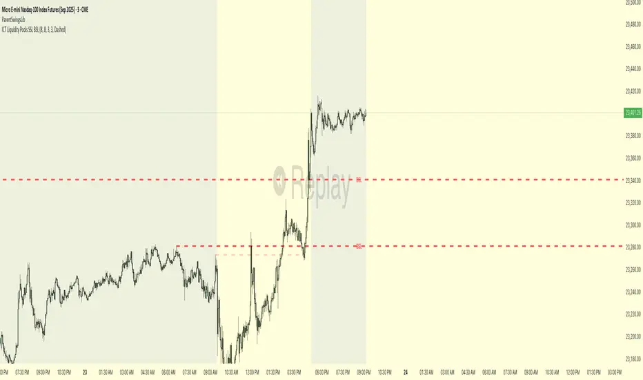
ICT Liquidity Pools SSL BSLParent Swings - ICT Liquidity Pools (BSL & SSL)
This indicator is designed to cut through the noise of the market and identify truly significant swing points. Instead of marking every minor high and low, it uses the powerful logic of ICT (Inner Circle Trader) breaker patterns to validate and draw only the "Parent Swings" that matter. These are the key liquidity pools that often act as the market's next target.
The Concept: Price Moves from Pool to Pool
A core concept taught by ICT is that price doesn't move randomly; it moves with purpose. The market is engineered to move from one pool of liquidity to the next.
Buy Side Liquidity (BSL): This is a pool of stop-loss orders resting just above a significant swing high. The market is often drawn upwards to "sweep" this liquidity.
Sell Side Liquidity (SSL): This is a pool of stop-loss orders resting just below a significant swing low. The market is often drawn downwards to sweep this liquidity.
This indicator identifies these key BSL and SSL levels after they have been confirmed by a shift in market structure, giving you a clear map of potential targets.
How It Works
The indicator doesn't just look for any swing high or low. It waits for a specific sequence of events to confirm that a swing is a "Parent Swing" and a valid liquidity pool:
Liquidity Sweep: First, it looks for a classic liquidity raid. For a significant high (BSL), it needs to see a swing high get taken out by a higher high. For a significant low (SSL), it needs to see a swing low get taken out by a lower low.
Market Structure Shift (MSS): After the liquidity sweep, the indicator waits for confirmation that the market's intention has changed. This happens when price breaks aggressively in the opposite direction, creating a breaker block pattern.
Confirmation: Only when both the liquidity sweep and the market structure shift are confirmed does the indicator draw the line, marking the swing as a valid BSL or SSL level.
How to Use This Indicator
The primary use for this indicator is to identify targets. Once a BSL (red line) or SSL (green line) is established, you can anticipate that the market will eventually make a run for that level.
If you are in a long position, the next BSL line above you can serve as a logical take-profit target.
If you are in a short position, the next SSL line below you can serve as a logical take-profit target.
The labels (BSL/SSL) will always stay with the current price action for active levels, making it easy to see your targets at a glance.
Settings
Pivot Lookback: Controls the sensitivity of the swing detection. A higher number will find larger, more significant liquidity pools.
Invalidation Threshold (Crossings): This is a key feature. It sets how many times the price must cross through a liquidity level before it's considered "used up" or invalidated. Once invalidated, the line will dim and the label will disappear, keeping your chart clean.
Disclaimer: This is a tool for technical analysis and should not be considered financial advice. Always use proper risk management and integrate this indicator with your own trading strategy.
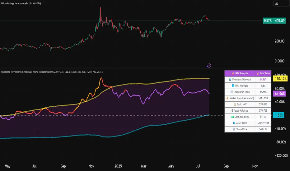
Market to NAV Premium Arbitrage Alpha IndicatorBitcoin treasury companies such as Microstrategy are known for trading at significant premiums. but how big exactly is the premium? And how can we measure it in real time?
I developed this quantitative tool to identify statistical mispricings between market capitalization and net asset value (NAV), specifically designed for arbitrage strategies and alpha generation in Bitcoin-holding companies, such as MicroStrategy or Sharplink Gaming, or SPACs used primarily to hold cryptocurrencies, Bitcoin ETFs, and other NAV-based instruments. It can probably also be used in certain spin-offs.
KEY FEATURES:
✅ Real-time Premium/Discount Calculation
• Automatically retrieves market cap data from TradingView
• Calculates precise NAV based on underlying asset holdings (for example Bitcoin)
• Formula: (Market Cap - NAV) / NAV × 100
✅ Statistical Analysis
• Historical percentile rankings (customizable lookback period)
• Standard deviation bands (2σ) for extreme value detection (close to these values might be seen as interesting points to short or go long)
• Smoothing period to reduce noise
✅ Multi-Source Market Cap Detection
• You can add the ticker of the NAV asset, but if necessary, you can also put it manually. Priority system: TradingView data → Calculated → Manual override
✅ Advanced NAV Modeling
• Basic NAV: Asset holdings + cash.
• Adjusted NAV: Includes software business value, debt, preferred shares. If the company has a lot of this kind of intrinsic value, put it in the "cash" field
• Support for any underlying asset (BTC, ETH, etc.)
TRADING APPLICATIONS:
🎯 Pairs Trading Signals
• Long/Short opportunities when premium reaches statistical extremes
• Mean reversion strategies based on historical ranges
• Risk-adjusted position sizing using percentile ranks
🎯 Arbitrage Detection
• Identifies when market pricing significantly deviates from fair value
• Quantifies the magnitude of mispricing for profit potential
• Historical context for timing entry/exit points
CONFIGURATION OPTIONS:
• Underlying Asset: Any symbol (default: COINBASE:BTCUSD) NEEDS MANUAL INPUT
• Asset Quantity: Precise holdings amount (for example, how much BTC does the company currently hold). NEEDS MANUAL INPUT
• Cash Holdings: Additional liquid assets. NEEDS MANUAL INPUT
• Market Cap Mode: Auto-detect, calculated, or manual
• Advanced Adjustments: Business value, debt, preferred shares
• Display Settings: Lookback period, smoothing, custom colors
IT CAN BE USED BY:
• Quantitative traders focused on statistical arbitrage
• Institutional investors monitoring NAV-based instruments
• Bitcoin ETF and MSTR traders seeking alpha generation
• Risk managers tracking premium/discount exposures
• Academic researchers studying market efficiency (as you can see, markets are not efficient 😉)
Asset Premium/Discount Monitor📊 Overview
The Asset Premium/Discount Monitor is a tool for analyzing the relative value between two correlated assets. It measures when one asset is trading at a premium or discount compared to its historical relationship with another asset, helping traders identify potential mean reversion opportunities, or pairs trading opportunities.
🎯 Use Cases
Perfect for analyzing:
NASDAQ:MSTR vs CRYPTO:BTCUSD - MicroStrategy's premium/discount to Bitcoin
NASDAQ:COIN vs BITSTAMP:BTCUSD - Coinbase's relative value to Bitcoin
NASDAQ:TSLA vs NASDAQ:QQQ - Tesla's premium to tech sector
Regional banks AMEX:KRE vs AMEX:XLF - Individual bank stocks vs financial sector
Any two correlated assets where relative value matters
Example of a trade: MSTR vs BTC - When indicator shows MSTR at 95% percentile (extreme premium): Short MSTR, Buy BTC. Then exit when the spread reverts to the mean, say 40-60% percentile.
🔧 How It Works
Core Calculation
Ratio Analysis: Calculates the price ratio between your asset and the correlated asset
Historical Baseline: Establishes the "normal" relationship using a 252-day moving average. You can change this.
Premium Measurement: Measures current deviation from historical average as a percentage
Statistical Context: Provides percentile rankings and standard deviation bands
The Math
Premium % = (Current Ratio / Historical Average Ratio - 1) × 100
🎨 Customization Options
Correlated Asset: Choose any symbol for comparison
Lookback Period: Adjust historical baseline (50-1000 days)
Smoothing: Reduce noise with moving average (1-50 days)
Visual Toggles: Show/hide bands and percentile lines
Color Themes: Customize premium/discount colors
📊 Interpretation Guide
Premium/Discount Reading
Positive %: Asset trading above historical relationship (premium)
Negative %: Asset trading below historical relationship (discount)
Near 0%: Asset at fair value relative to correlation
Percentile Ranking
90%+: Near recent highs - potential selling opportunity
10% and below: Near recent lows - potential buying opportunity
25-75%: Normal trading range
Signal Classifications
🔴 SELL PREMIUM: Asset expensive relative to recent range
🟡 Premium Rich: Moderately expensive, monitor for reversal
⚪ NEUTRAL: Fair value territory
🟡 Discount Opportunity: Moderately cheap, potential accumulation zone
🟢 BUY DISCOUNT: Asset cheap relative to recent range
🚨 Built-in Alerts
Extreme Premium Alert: Triggers when percentile > 95%
Extreme Discount Alert: Triggers when percentile < 5%
⚠️ Important Notes
Works best with highly correlated assets
Historical relationships can change - monitor correlation strength
Not investment advice - use as one factor in your analysis
Backtest thoroughly before implementing any strategy
🔄 Updates & Future Features
This indicator will be continuously improved based on user feedback. So... please give me your feedback!

Session Range ProjectionsSession Range Projections
Purpose & Concept:
Session Range Projections is a comprehensive trading tool that identifies and analyzes price ranges during user-defined time periods. The indicator visualizes high-probability reversal zones and profit targets by projecting Fibonacci levels from custom session ranges, making it ideal for traders who focus on time-based market structure analysis.
Key Features & Calculations:
1. Custom Time Range Analysis
- Define any time period for range calculation - from traditional sessions (Asian, London, NY) to custom periods like opening ranges, hourly ranges, or 4-hour blocks
- Automatically captures the highest and lowest prices within your specified timeframe
- Supports multiple timezone selections for global market analysis
- Flexible enough for intraday scalping ranges or longer-term swing trading setups
2. Premium & Discount Zones
- Automatically divides the range into premium (above 50%) and discount (below 50%) zones
- Visual differentiation helps identify institutional buying and selling areas
- Color-coded boxes clearly mark these critical price zones
3. Optimal Trade Entry (OTE) Zones
- Highlights the 79-89% retracement zone in premium territory
- Highlights the 11-21% retracement zone in discount territory
- These zones represent high-probability reversal areas based on institutional order flow concepts
4. Fibonacci Projections
- Projects 11 customizable Fibonacci extension levels from the range extremes
- Levels extend both above and below the range for symmetrical analysis
- Each level can be individually toggled and color-customized
- Default levels include common retracement ratios: -0.5, -1.0, -2.0, -2.33, -2.5, -3.0, -4.0, -4.5, -6.0, -7.0, -8.0
How to Use:
Set Your Time Range: Input your desired session start and end times (24-hour format)
Select Timezone: Choose the appropriate timezone for your trading session
Customize Display: Toggle various visual elements based on your preferences
Monitor Price Action: Watch for reactions at projected levels and OTE zones
Set Alerts: Configure sweep alerts for when price breaks above/below range extremes
Input Parameters Explained:
Time Range Settings
Range Start/End Hour & Minute: Define your analysis period
Time Zone: Ensure accurate session timing across different markets
Visual Settings
Range Box: Toggle the premium/discount zone visualization
Horizontal Lines: Customize high/low line appearance
Internal Range Levels: Show/hide equilibrium and OTE zones
Labels: Configure text display for key levels
Fibonacci Projections: Enable/disable extension levels
Display Settings
Historical Ranges: Show up to 10 previous session ranges
Alert Type: Choose between high sweep, low sweep, or both
Trading Applications:
Session-Based Trading: Analyze specific market sessions (Asian, London, New York, opening ranges, hourly ranges)
Reversal Trading: Identify high-probability reversal zones at OTE levels
Breakout/Reversal Trading: Monitor range breaks/reversals with built-in sweep alerts
Risk Management: Use Fibonacci projections as profit targets or rejection areas
Multi-Timeframe Analysis: Apply to any timeframe for various trading styles
Important Notes:
This indicator is for educational purposes only and should not be considered financial advice
Past performance does not guarantee future results
Always use proper risk management when trading
The indicator automatically manages historical data to maintain chart performance
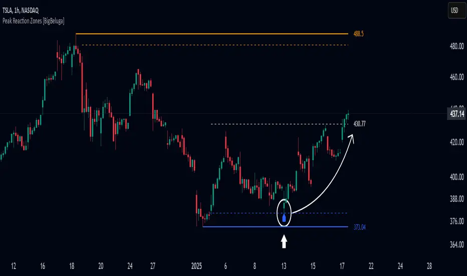
Peak Reaction Zones [BigBeluga]Peak Reaction Zones is an advanced Smart Money Concept (SMC) indicator that identifies the most recent swing high and swing low zones, helping traders determine premium and discount areas for optimal trade positioning.
🔵 Key Features:
Swing High & Low Zones:
Automatically detects the latest swing high and swing low levels.
Helps traders identify key reaction points where price is likely to respond.
Premium & Discount Concept:
The high zone represents a premium area, where price is overextended and may reverse.
The low zone represents a discount area, where price is undervalued and may bounce.
The midline dynamically marks the equilibrium of the range.
Adjustable Zone Width:
Users can fine-tune the width of the zones to match their trading style.
Wider zones capture broader reaction ranges, while narrower zones focus on precise levels.
Zone Retest Signals:
Blue markers appear when price retests the lower reaction zone, signaling potential support.
Orange markers appear when price retests the upper reaction zone, indicating possible resistance.
Price Labels for Key Levels:
Displays the price value of the swing high, swing low, and midline for quick reference.
Helps traders recognize major reaction points at a glance.
🔵 Usage:
Smart Money Trading: Utilize the premium and discount concept to align trades with institutional order flow.
Zone Reactions: Watch for price tests of reaction zones and use the retest signals to confirm potential reversals.
Midline Confirmation: If price holds above or below the midline, it can indicate directional bias.
Scalping & Swing Trading: Short-term traders can look for zone rejections, while swing traders can use the levels for trend continuation setups.
Peak Reaction Zones is a must-have tool for traders looking to trade with Smart Money Concepts, allowing for precise entries and exits based on key liquidity areas and market structure.
Discount/Premium OTE LevelsThis indicator is created to identify discount/premium areas to provide additional confluence to trades taken. The underlying theory is that the trades taken in discounted areas are likely to have less risk due to a smaller stop loss and a higher reward/risk ratio.
The indicator operates by first identifying a zone between the last major swing high and low. These highs and lows are determined as price points that at the extremes within the number of bars to the left, as defined by the "Swing Sensitivity" setting.
Once a price zone is established, the indicator verifies that the zone meets the minimum size in points as configured via the "Minimum size" setting to be considered tradable. Zones that are too small may not provide a sufficient range even for scalping. The default value is 42 points based on Nasdaq, which means that the distance between inner most OTE levels (0.382 and 0.618) is at least 10 points.
When a valid zone is identified, it is then subdivided into areas of interest based on OTE levels, which can be configured/adjusted via the "Levels to Draw" setting. These levels represent the midpoint (50%), which distinguishes between premium and discount, and the three OTE levels 0.79, 0.705, 0.618, above the 50% for discount and below the 50% for premium.
For example, if a zone is formed initially by a swing low followed by a swing high with the assumption that the draw is higher, the indicator can be used to formulate long positions from below the 50% level starting at 0.38 OTE level, or ideally at 0.295 OTE level using 0 as a stop loss. Alternatively, if the 50% level is not yet tapped, short scalp positions can be made from 0.79-0.618 OTE levels with 50% as a partial or TP target.
See for long/short example
Typically, the indicator will show only a single zone. However, there may be cases with two zones: one larger parent zone containing a smaller, valid price zone within itself.
The indicator will automatically invalidate and remove the zone once the high/low of the zone is invalidated.
Configuration:
The indicator provides several visualization options for customization, including:
Color settings for OTE levels, with separate settings for edge/50% color, premium, and discount levels.
Settings for line style for OTE levels.
Settings to determine whether to show prices on level labels.
Settings to decide if lines should be extended to the right.

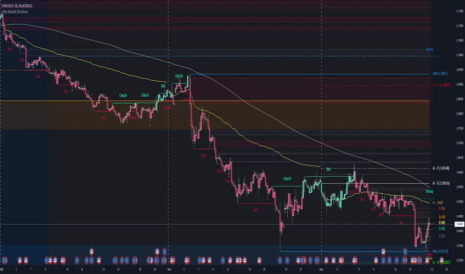
Ultra Market StructureThe Ultra Market Structure indicator detects key market structure breaks, such as Break of Structure (BoS) and Change of Character (CHoCH), to help identify trend reversals. It plots lines and labels on the chart to visualize these breakpoints with alerts for important signals.
Introduction
This script is designed to help traders visualize important market structure events, such as trend breaks and reversals, using concepts like Break of Structure (BoS) and Change of Character (CHoCH). The indicator highlights internal and external price levels where the market shifts direction. It offers clear visual signals and alerts to keep traders informed of potential changes in the market trend.
Detailed Description
The indicator focuses on detecting "market structure breaks," which occur when the price moves past significant support or resistance levels, suggesting a potential reversal or continuation of the trend.
.........
Type of structure
Internal Structure: Focuses on smaller, shorter-term price levels within the current market trend.
External Structure: Focuses on larger, longer-term price levels that may indicate more significant shifts in the market.
.....
Key events
Break of Structure (BoS): A market structure break where the price surpasses a previous high (bullish BoS) or low (bearish BoS).
Change of Character (CHoCH): A shift in market behavior when the price fails to continue in the same direction, indicating a possible trend reversal.
Once a break or shift is detected, the script plots lines and labels on the chart to visually mark the breakpoints.
It also provides alerts when a BoS or CHoCH occurs, keeping traders informed in real-time.
The indicator can color the background and candles based on the market structure, making it easy to identify the current trend.
.....
Special feature
At news events or other momentum pushes most structure indicators will go into "sleep mode" because of too far away structure highs/lows. This indicator has a structure reset feature to solve this issue.
.........
Detects Break of Structure (BoS) and Change of Character (CHoCH) signals.
Marks internal and external support/resistance levels where market trends change.
Provides visual cues (lines, labels) and real-time alerts for structure breaks.
Offers background and candle color customization to highlight market direction.
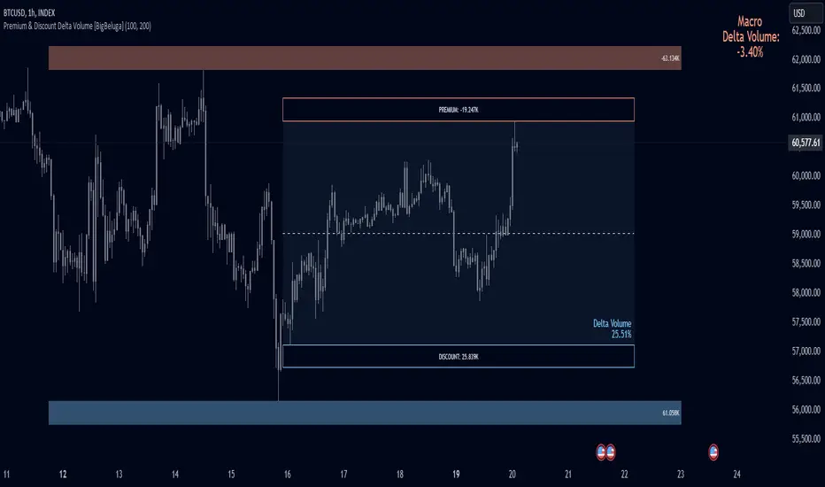
Premium & Discount Delta Volume [BigBeluga]Premium & Discount Delta Volume is an advanced volume-based tool that helps traders identify zones of market imbalances by using the concepts of premium and discount pricing, commonly taught by ICT trader. It calculates and highlights periods where the market is trading at a premium (selling pressure is stronger) or a discount (buying pressure is stronger) and dynamically plots these zones over time. The indicator also calculates delta volume between buying and selling within these zones, showing shifts in market sentiment and potential areas for reversals or continuations.
🔵 IDEA
The Premium & Discount Delta Volume indicator is rooted in the ICT (Inner Circle Trader) concept of premium and discount zones. This concept divides the price action into two key zones:
Premium Zone : This area is where the market is trading at a level where sellers dominate, leading to more selling pressure. The idea is that the price is overvalued, and a potential drop could occur as the market reverts to a balanced state.
Discount Zone : This area is where the market is undervalued, with buyers dominating and applying upward pressure. Prices in this area often indicate opportunities to buy into strength as the market moves back to equilibrium.
At the core of the indicator is the delta volume, which measures the difference between buying and selling pressure within the premium and discount zones. When the delta volume is negative, it signals a downtrend with more selling pressure, while a positive delta volume signals an uptrend with more buying pressure. These zones and their associated delta values update dynamically, providing traders with real-time insights into market strength and potential price reversals.
The equilibrium in the middle of the premium and discount zones represents the balance point between buyers and sellers. When price moves away from equilibrium, it either enters the premium zone (potentially overbought) or the discount zone (potentially oversold), helping traders make more informed decisions based on volume and price structure.
🔵 KEY FEATURES & USAGE
Premium & Discount Zones:
The indicator automatically identifies and plots premium and discount zones on the chart. Premium zones count only negative (selling) volume, while discount zones count only positive (buying) volume. These zones are key areas of interest for identifying potential price reversals or continuations based on volume pressure.
Dynamic Delta Volume Calculation:
The indicator calculates delta volume between the premium and discount zones, showing the imbalance between buyers and sellers. A positive delta volume inside the discount zone suggests strong buying pressure, while a negative delta inside the premium zone suggests strong selling pressure. This helps traders quickly identify trends or market exhaustion.
Up Trend:
Down Trend:
Real-time Updates & Equilibrium Line:
The zones update dynamically every 100 bars or after price crosses them, ensuring that traders always have the most relevant market data. The equilibrium line in the middle of the zones helps traders gauge whether the market is balanced or moving into overbought (premium) or oversold (discount) territory.
Macro and Local Period Calculations:
The indicator allows traders to customize two different periods for analysis: a smaller lookback period (e.g., 50 bars) for short-term price action and a macro period (e.g., 200 bars) for larger trends. Each period has its own premium and discount zones, allowing for a multi-timeframe view of market strength.
Macro:
Both:
Color-coded background for Volume Pressure:
The background color of the smaller period premium and discount box changes based on delta volume. A positive delta turns the background blue, indicating higher buy pressure, while a negative delta turns the background red, signaling higher sell pressure.
🔵 CUSTOMIZATION
Toggle Premium & Discount: Traders can choose to display support and resistance levels based on the high and low points of the premium and discount zones.
Premium & Discount Lookback Period: Traders can adjust the lookback period to define the length of price action to be analyzed for premium and discount zones. A shorter period focuses on more recent market activity, while a longer period provides a broader view of trends.
Macro Highs/Lows Period: The indicator also offers a macro lookback period for identifying larger market trends and key levels of buying or selling volume.
Toggle Macro Levels: Macro levels help identify long-term price extremes, and traders can toggle this feature on or off as needed.
Key Times & Opening Prices [Olitrades]This indicator plots key time's (opening prices) with the possibility of vertical separators. It was initially created to utilize on the indices futures market, utilizing ICT logic.
These opening prices are often utilized to determine if price is currently at a premium or a discounted value.
The default times include:
Daily Open (18:00 PM)
Midnight (00:00 AM)
Settlement (15:00 PM)
7:30 AM
8:30 AM
9:30 AM (Equities Open)
10:00 AM (Morning 4h Candle Open)
14:00 PM (Afternoon 4h Candle Open)
Along with up to three custom time slots.
All times used in the indicator are Eastern Standard time (New York local time) and will automatically adjust no matter your time zone.
Historical
When in historical mode, the indicator will keep the previous levels so you can easily visualize them and their relation to price.
You can also choose how many past levels you want to see. This allows you to back test only specific days/weeks.
Other Inputs
The indicator contains an adjustable offset, to modify how far the line extends depending on the current timeframe.
Each one of the above-mentioned levels can be turned on and off, including the custom times. You can also choose between plotting just the opening price, a vertical line separator, or both! All of these lines have adjustable styles (dotted, dashed or solid) and width.
They also have custom cut offs. You may choose specific cut off times for custom time slots (when to stop extending the lines), as well as for AM (before noon) default levels and PM (after noon) default levels.
The indicator also allows to show text labels next to these lines, which is set by default but can be turned off. Custom times also include custom text options.

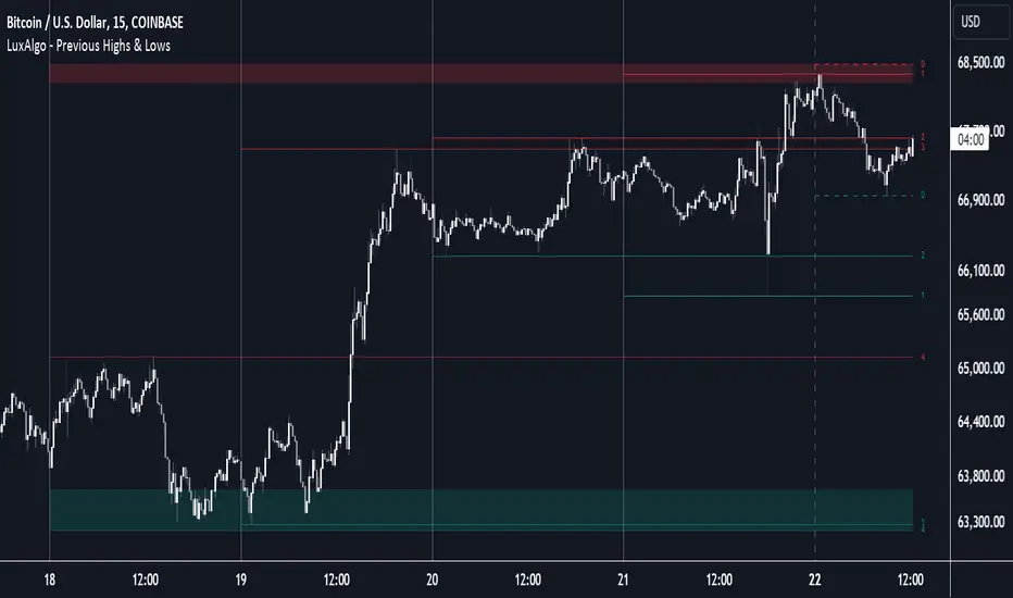
Previous Highs & Lows [LuxAlgo]The Previous Highs & Lows indicator highlights a user-set amount of previous maximum/minimum prices made within specific intervals, these are displayed as levels customizable levels.
Additionally, one upper and lower zone constructed from the previously displayed highs/lows is included, providing support/resistance areas.
🔶 USAGE
Previous highs/lows are often perceived as key trading levels with the potential of generating multiple reactions upon being reached.
While the daily interval is more commonly used, users can use different intervals, with the indicator supporting hourly, daily, weekly, monthly, and yearly intervals. Using higher intervals on low timeframes can return more distant levels relative to the most recent price, which might not be relevant.
Each level is numbered, with more recent previous highs/lows having a lower number associated with them, users can also highlight more recent levels through a transparency gradient.
Users can control the amount of previous highs/lows displayed using the "Show Last" settings, with a higher value providing more potential support/resistance. Returned previous highs/lows can eventually be filtered out based on their position by enabling the "Filter Based On Position" setting, only keeping previous highs above the current closing price and previous lows below the current closing price, giving more relevant levels as a result.
🔹 Previous High/Low Areas
The indicator includes two areas constructed from the respective percentiles of the returned previous highs/lows. These can be useful as more general support/resistance areas.
Wider areas are often indicative of a group of previous highs or lows being more dispersed, resulting in areas that are easier to reach. Wider areas can also be obtained by increasing the "Areas Width" setting.
Note: Areas will only be displayed if "Show Last" is greater than 1
🔶 SETTINGS
Show Last: Determines the amount of more recent previous highs and previous low levels displayed by the indicator.
Interval: Interval used to capture maximum/minimum price values,
Areas Width: Width of the displayed top/bottom areas, with higher values returning wider areas.
Filter Based On Position: When enabled only display previous highs above the current closing price and previous lows below the current closing price.
🔹 Style
Minimum Gradient Transparency: Minimum transparency value applied to the colors of the oldest displayed previous highs/lows levels.
ICT opening price lineShows you the opening price of a certain time of day. I will show as line starting from the time selected and ending a few bars into the future. Available times are the ones ICT said are relevant for framing a premium and discount using opening prices: 00:00, 8:30 and 13:30. To show all 3 you have to add the indicator 3 times.
The script offers some customization on how the line should look line and if you want a label telling the time of it after the line.

Seasonal Tendencies - SMC IndicatorsA Seasonal Tendency refers to a historical price action behaviour that tends to repeat during specific times of the year, month over month.
It's a roadmap to navigate price action on the daily chart to help determine the medium to long-term bias.
Seasonal Tendencies are NOT an exact prediction of future price action but rather serve as a guideline for spotting high-probability opportunities when combined with other elements of SMC Price Action analysis, such as Order Blocks, Fair Value Gaps, etc...
The Seasonal Tendencies Indicator has been tested to match what ICT has taught in his lectures. It can be applied to any Market or Asset. However, it's limited by the maximum number of years available on tradingview.
Traders can use this Seasonal Tendencies indicator to support their already existing analysis as an added confirmation tool. This indicator should not be used as a main reason to enter a trade idea.
The Seasonal Tendencies Indicator can be used in 2 ways:
1) To look for potential points of long-term reversals during specific times of the year.
2) To look for confirmation and align with an existing long-term trend.
So how does it work?
The Seasonal Tendencies Indicator takes the averages of the last 30, 10, and 5 years' prices by default and compares them to the current year's price action (Green Line).
However, the number of years chosen for the averages can be modified in the indicator's setting.
When looking at the historical price action lines, generally, the price tends to make the lows and highs during specific times of the year.
Note that we should not look at the exact dates these lows and highs form, but we take time periods conceptually instead.
In the example below, the SP500 5-year average made the low on 14 March, and the SP500 10-year average made the low on 23 March.
This gives us the idea that "generally" SP500 makes the low of the year around the 2nd to 3rd week of March every year.
So, IF the trader's analysis was pointing out that SP500 is Bullish, then we use the information that we derived from the Seasonal Tendencies Indicator to look for long setups around the 2nd to 3rd week of March for medium to long-term swing trades.
The Seasonal Tendencies Indicator can also be useful for day traders as it helps support their daily bias to look for trades within the direction of the higher timeframe trend.
How do we measure the strength of the Seasonal Tendencies?
When using the Seasonal Tendencies Indicator, it's important to look for periods where the averages converge and get closer to each other. This usually indicates that during those specific periods, there is a high probability for the price to behave in a certain way.
So the closer the averages are to each other, the more likely the price would respect the Seasonal Tendencies.
Bonus Feature
Premium Discount Range
As a bonus feature, split the Seasonal Tendencies Indicator's Range into 4 quarters to indicate when the price is at a Premium (above the 50% level in Red) and when the price is at a Discount (below the 50% level in blue).
Each Premium and Discount range is also split into 2 halves.
Those levels can also be used to identify potential turning points when comparing the Current Year's price positioning in the Yearly Range to historical price action.
As you can see from the example below, most major turning points happen at around key price levels.

itradesize /\ IPDA Look Back - for any timeframeThe script automatically calculates the 20-40-60 look-back periods and their premium and discount ranges.
The base concept is from ICT’s IPDA which should be applied to the daily timeframe but now you can use that same concept on the lower timeframes .
The higher the timeframes you use the more reliable it will be ( when we are talking about lower timeframes than Daily ).
- With the use of the indicator you can apply it on any timeframe with ease.
- You can customize the coloring of premium & discount, frame lines, and even the look of it.
- Hide or show the EQ levels
Below the IPDA texts the indicator shows the actual percentage of the selected range based on the current price fluctuations.
The script handles the 20-40-60 days look-back as fractals so it can be applied on lower timeframes.
The basics:
- The Interbank Price Delivery Algorithm (IPDA): The algorithm creates a shift on the daily chart every 20, 40, and 60 trading days.
- These are the IPDA look-back periods. Every 20 trading days or so there is a new liquidity pool forming on both sides of the market based on ICT concepts.
- Determine the IPDA Data Range of the land 20 trading days.
- Note the highest high & lowest low in the past 20 trading days. Identify the institutional order flow and mark the relevant PD arrays in the selected IPDA look-back period we deemed useful for our trading style.
- This is your current dealing range.
- If the price consolidates for 20 days, consider switching to a 40-day look back.
Inside this dealing range, we look for the next draw on liquidity. Is it reaching for a liquidity pool or is it looking to rebalance at a particular PD Array. This is going to the Bias.
Which IPDA data range should you use?
IPDA20 can be our Short Term range - fit for intraday traders at most
IPDA40 can be our Swing Trade range - have a clear indication of the market profile
IPDA60 can be our range for position trading - have a clear indication of the market profile

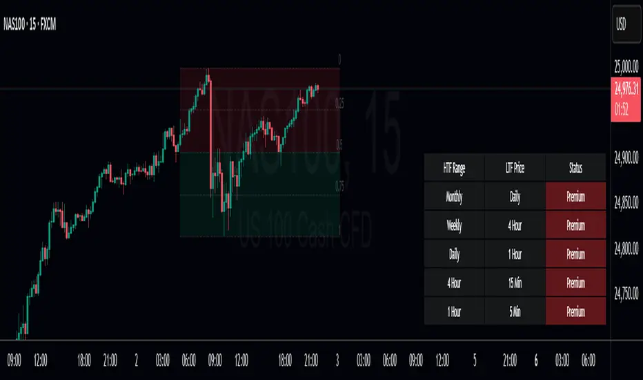
Premium Dashboard [TFO]The purpose of this indicator is to serve as a scanner/dashboard for several symbols across multiple timeframes. At the time of release, the scanner looks for the following criteria on all selected timeframes:
- Whether price is in a Fair Value Gap (FVG)
- Whether price is in an Order Block (OB)
- Current Market Structure
- Nearest Liquidity Pivots
- Proximity to said Liquidity Pivots
For FVGs, the user selects a Displacement Strength to validate FVGs from the selected timeframes; larger values require greater displacement. The table will indicate whether price is presently trading in a valid bullish FVG, bearish FVG, or none.
With OBs, the user selects a similar Displacement Strength to validate OBs from the selected timeframes. Again, larger values require greater displacement to validate an OB. The table will indicate whether price is presently trading in a bullish OB, bearish OB, or none.
For Market Structure, the table will indicate whether the current structure is bullish or bearish on each respective timeframe. A pivot strength parameter is used to determine which swing highs and swing lows warrant valid Market Structure Shifts (reversals) or Breaks of Structure (continuations).
The Liquidity section of the dashboard displays the nearest Buyside and Sellside Liquidity (major highs and lows) from each respective timeframe. A similar pivot strength parameter is used to determine how "strong" the highs and lows must be in order to be considered valid.
The Premium / Discount section offers an alternative view of the nearest Liquidity Pivots, where it will instead display a percent value to describe how close price is to Buyside or Sellside Liquidity. Values approaching 100% imply price is trading close to the nearest Buyside Liquidity, while values approaching 0% imply price is trading close to Sellside Liquidity.
Users can also choose to show any of the above features on their current chart: FVGs, OBs, cumulative Market Structure, and Liquidity, all from the various selected timeframes.
Omega AnalystThe Omega Analyst is a toolkit designed to help both experienced and new traders with their trading decisions.
This indicator is a part of the omega toolkit, and his creation method is based on the concept that every trading strategy should have a way to determine the trend, or the bias, that answers the question “long or short?”; the location, which identifies the best price level to enter into a position and to exit, both in profit and in loss, and that will decide the final risk-to-reward ratio of the trade you take; the signal, which is useful to determine the best moment to enter into a position and that if paired with the trend point, his purpose is to identify when the large trend picture is in confluence with the small term; and last but not least the filter point, the filter is used to have another way to have an additional confluence with the trade you want to take, and it’s important to reduce the number of false signals and to increase the win rate.
This tool aims to help traders with the identification of the location points, thanks to different technical analysis tools that allow determining objectively if the price is in a discount area or in a premium area, to evaluate both entry and exit points. It’s important to note that indicator and technical analysis is only one of the several different ways to analyze an asset.
One of the main things to keep in mind when working with the financial markets is that not every asset, every historical phase, and every market condition is the same, this is why this tool can be highly personalized and adjustable and provide different overlay tools in order to allow traders to choose the best settings considering this variable and your backtests.
This tool, thanks to the previously cited characteristics, can work on any market and any horizontal time frame, and it has different features:
- 7 different tools of technical analysis to analyze the market, some of them with multiple variants.
- An additional tool to display the open price of different sessions
- Easy setup: You can easily choose which indicator to display in order to analyze the markets the best.
- Easy to use and easy to adjust: common settings for all the indicators are easily configurable in the settings with the length or the size parameter. Note that not all the indicators use both parameters, in particular: the indicator mode works for the consolidation levels, the range of motion, the sr zones, and the regression line; the continuous length parameter changes the settings to the consolidation levels, the range of motion, the sr zones, the Fibonacci area, and the regression line; the interval size parameter change the anchor to the volume price, the pivot points and the range of motion.
- Common aesthetics: You can easily change the default premium, discount, and average color in order to have the best view of the indicators together with the line width, or choose to have the monochrome setting to have a more minimalistic style.
- Common usage: Every one of these uses has the same functionality: determine if the price is the fair value, in a premium situation, or in the discount area.
- Automatic settings: The indicator can be used in “Auto” mode if it works with resets like the range of motion interval, the VWAP, the pivot points, and the open prices. This way the indicator will automatically adjust itself to show the optimal results for the analysis you want to make on your chosen timeframe.
The first tool is called Consolidation levels, and it’s a great tool to use during ranging markets.
The consolidation levels are support and resistance levels and zones automatically displayed on the chart to identify the range of bargaining, that adapts considering the price volatility and automatically moves once the price has broken the extreme levels.
This tool has two variants. The fixed variants have, just like the name says, all fixed levels that stay the same until the price doesn’t break one of them.
The Adaptive variants of the Consolidation levels tool have a unique feature that makes the support and resistance zones move considering the price volatility and standard deviation.
The second tool is called “Range of Motion” and it comes in two different versions, called “Continuous” and “Interval”. The difference is just that the “Interval” version stays the same for the whole duration of the interval length you choose.
The range of motion indicator allows the user to see the level that works like support and resistance and the area that works like premium and discount areas. The levels are calculated using the ATR indicator on the mean center line.
On the fixed variant of the range of motion indicator, these levels, once plotted, stay the same until the end of the chosen time frame in the interval size setting to plot the indicator. This way it’s easier to adopt a kind of analysis that uses passive orders like limit buy and limit sell orders. The interval range of motion indicator works like fixed extension levels that display the optimal range of bargaining of that specific asset.
The third tool is the Support and Resistance zones. With this tool, you'll see automatic support and resistance based on past prices and pivot data.
The area and the least efficient levels can be disabled using the "Interval" indicator mode.
The color area automatically changes looking at the effective support or resistance purpose of that area. The area also changes with the "Continuous length" parameter.
The fourth tool is the Fibonacci zones, which display the area of discount and premium pricing using the quartile theory, showing the 25% and the 75% of the current swings as area and the golden zone as a standard line, that includes the space between the 61.8% and the 38.2%, with the 50% line in the middle. This tool works like a Donchian Channel but it shows areas instead of simple lines. The usage of this indicator is both for trend following and for mean reversal, the general definition is that it shows attention zones.
Now in the photo, you can see the fifth tool which is the Anchored VWAP, under the name of "Volume Price". The Volume-weighted average price is a powerful indicator that aims to give the average price of a determined time period and can be used, combined with the standard deviation, to find not only support and resistance levels but also the volume-objective premium and discount zone.
This specific indicator displays 5 lines: the VWAP, the first upper and lower deviation, and the first and second upper deviation lines, that create the previously mentioned zone.
The sixth tool is the Pivot Points standard. This tool is a popular indicator that displays key levels for a determined period of time.
The levels for each interval time are five different lines. The middle one, colored by default in gray, should be the prediction, based on the key price levels of the previous period chosen, of the fair value. The other one, called S1 and R1 are respectively the first level of support and resistance and are great if used as exit points and when combined with other S/R tools, the same is valid for the S2 and R2 levels, on the extreme part of the indicator.
Between the R1 and the R2, and between the S1 and S2 lines there are the previously mentioned Discount and Premium zones.
The seventh tool is the Regression Line. This indicator will show the deviation bands from the standard regression line. Given the fact that the usual linear regression channels available are repainting, and so they don't give realistic outcomes, this tool will give you past results based on the data of the channel in that price moment, being non-repainting. This tool also has an extension that aims to be a prediction about future outcomes in terms of volatility and direction of the price, and this extension can be disabled using the "Continuous" mode.
Just like other tools in this indicator, the linear regression channel will display the middle line and the two premium and discount zones.
The last tool of the Omega Analyst is the open prices.
With this simple-to-read tool, you will see plotted as dotted lines the open prices of the period you have chosen.
The open prices are common support and resistance level and can be used both for entry and exit points. Additionally, on higher timeframes, such as the open prices of the different months, these levels can be further extended to the recent days to have more support and resistance levels.
This tool needs to be adjusted based on your time zone in order to have the best results and can be done directly in the settings of the indicator under the Open prices section, just simply write down at what time it’s midnight in your country watching the desired hour on the chart.
In order to determine the premium or discount area with this tool, you’ll need to pay attention if the current open price indicator is higher or lower than the previous one plotted, if it’s higher you can assume that the price is in an up trend and this way the zone under the current dotted line is the discount zone.
The lines you’ll see plotted are either in the chosen discount or premium color, based if the price is above or below the current open prices indicator plotted.
Risk Disclaimer:
All content and scripts provided are purely for informational & educational purposes only and do not constitute financial advice or a solicitation to buy or sell any securities of any type. Past performance does not guarantee future results. Trading can lead to a loss of the invested capital in the financial markets. I will not accept liability for any loss or damage, including without limitation any loss of profit, which may arise directly or indirectly from the use of or reliance on such information. All investments involve risk, and the past performance of a security, industry, sector, market, financial product, trading strategy, backtest, or individual's trading does not guarantee future results or returns. Investors are fully responsible for any investment decisions they make. Such decisions should be based solely on an evaluation of their financial circumstances, investment objectives, risk tolerance, and liquidity needs.

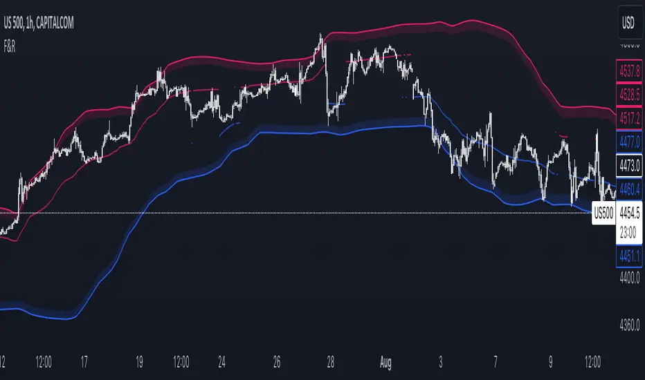
Floor and Roof IndicatorThe Floor and Roof indicator is a tool developed to help traders identify potential areas of support and resistance both for trend following and for mean reversal trading decisions.
The indicator plots the "Roof" which is the main level of resistance, and the "Floor" which is the main level of support. These lines are calculated on the "Lenght" parameter and smoothed by the "Smooth" parameter, and they use both the volatility and the main market structure as calculation methods.
Additionally, this indicator plots an area that can be modified by the "Zone width" parameter and two other lines, called "Second floor" and "Second roof" respectively, which are plotted only whenever they are significant to the price current level.
This indicator can be used in several ways:
- In a clear trend, you could wait for a break of the second floor or roof as an indication of a change in the market direction
- As the price goes out of the reversal zones, this can be an indication of a reversal
- In a clear trend, you can wait for the price to bounce on the second floor or roof lines to enter a trade
SME Backtesting [TFO]This strategy script is an extension of my Smart Money Essentials (SME) indicator and aims to provide a simplified means of backtesting complex trade models that incorporate a variety of Smart Money Concepts.
Among other things, Smart Money Essentials contains logic for:
- Market structure
- Fair Value Gaps
- Order Blocks
- Breaker Blocks
- Optimal Trade Entries
- HTF Market Structure
The Confluence section can then be utilized to build and test trade models from any combination of the included factors. As a basic example, we could test a strategy that only utilizes market structure. With Manual Exit turned off, we would simply be flipping long on bullish market structure shifts, and reversing short on bearish market structure shifts for the duration of the user-defined session.
As one might expect, such a simple strategy isn't expected to produce very reliable results by itself. However, we could build on these ideas by adding extra layers of Confluence, like looking for entries where Market Structure aligns with Order Block interactions. We could also turn on Manual Exit with a 40 tick stop loss and 80 tick profit target (10 points and 20 points, respectively, for ES futures), for more defined exit criteria.
One could expand on these ideas by adding factors like Fair Value Gaps, HTF Market Structure, etc. Any of the core pieces of SME can be used to build and backtest strategies that would otherwise be extremely tedious to do by hand, and as the SME indicator grows, so too will this backtesting script. Ultimately, the purpose of this is to make Smart Money Concepts more objective and easily testable so that users may better understand where these concepts may perform best.

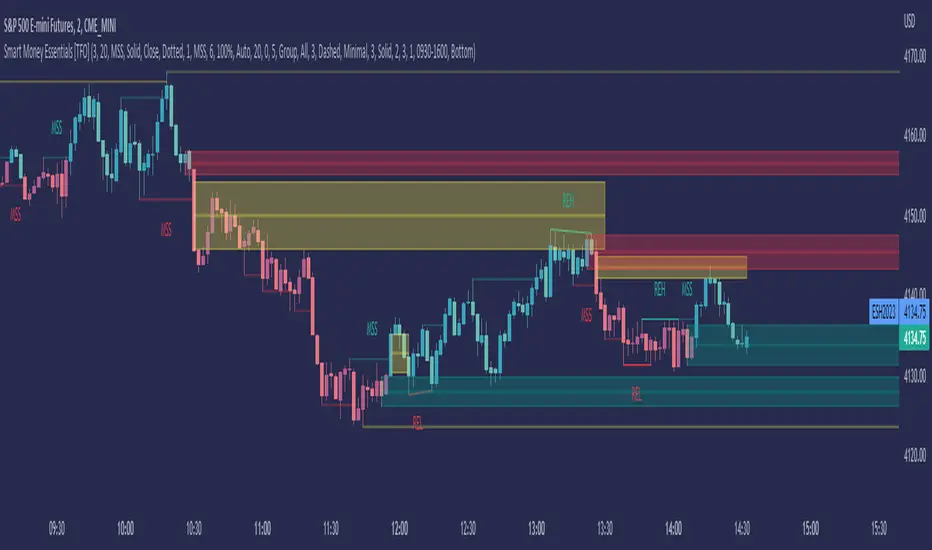
Smart Money Essentials [TFO]This indicator utilizes “Smart Money Concepts” like liquidity, order blocks, premium & discount, and more to analyze price action.
What’s included in the initial release:
Market Structure
Liquidity
Displacement
Order Blocks
Premium / Discount
Confluence Table
Alerts
Market structure logic objectively identifies whether the current trend is bullish or bearish, based on swing highs and lows. Liquidity levels offer insight into major pivots where we can assume many traders may place their stop loss, which can also serve as areas where “Smart Money” may be accumulating or distributing positions.
Displacement adds to this by spotting rapid price movement, often accompanied by imbalances where price may come back to before continuing in the direction of the displacement. These can be filtered based on whether the imbalance is accompanied by a Break of Structure (BOS) or Market Structure Shift (MSS), which may give additional insight into the draw on liquidity.
Order blocks (OB’s) are detected and treated as areas that may offer support for price in an uptrend or resistance in a downtrend. Premium and discount zones are essentially fitted by an “auto-fib” retracement that looks at recent liquidity levels, and optionally offers areas to look for an Optimal Trade Entry (OTE) where price retraces between 62-79% of the preceding displacement leg.
The confluence table provides an organized place to visualize and identify where any of the above concepts may be present at or around the same time. We can implement a threshold where, if the number of selected factors meets or exceeds this threshold, we can potentially identify bullish and bearish opportunities where multiple layers of confluence are overlapping.
And of course, alerts are built in for all significant events related to the above concepts, for example: runs on liquidity, BOS and MSS, rejections from OB and OTE, etc.