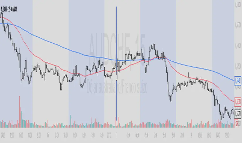
Pine Script® indicator
Search in scripts for "Cycle"
Folded RSIFolded RSI: Spectral-Adaptive Momentum Oscillator
A cycle-responsive RSI that automatically tunes its calculation period based on real-time spectral correlation analysis, featuring gradient-visualized momentum extremes.
Overview
The Folded RSI revolutionizes traditional momentum analysis by replacing static periods with dynamic, data-driven adaptation. Using phase-invariant spectral correlation , the indicator measures how closely price action aligns with theoretical cyclical patterns, then adjusts the RSI length accordingly. When markets exhibit strong cyclical structure, the RSI compresses to capture rapid oscillations; during chaotic or trendless periods, it expands to filter noise.
Key Features
Phase-Invariant Cycle Detection: Calculates Pearson correlation against pure sine/cosine waves to detect cyclical strength regardless of phase position (uses quadrature sum of sin/cos correlations)
Dual-Harmonic Analysis: Optionally evaluates both the target period and its 2× harmonic, automatically selecting the stronger correlation for optimal adaptation
Nonlinear Length Mapping: Maps correlation magnitude (0-1) to RSI length through a power function—strong cycles produce fast, responsive RSI; weak cycles produce smooth, lagged readings
Pure Mathematical Implementation: Custom Wilder RSI using dynamic smoothing factors (alpha = 1/length) and custom EMA—zero dependency on built-in TA functions
Gradient Visual System: Dynamic color transitions from neutral blue to hot red (overbought) or cool green (oversold) with gradient fills showing momentum intensity
Extreme Level Markers: Automatic visual alerts when RSI crosses above 70 (red markers) or below 30 (green markers)
Real-Time Diagnostics: On-chart table displaying current correlation magnitude, adaptive length, and detected dominant period
How It Works
1. Spectral Analysis
The indicator computes correlation between price returns and synthetic sinusoidal basis functions over the Cycle Window . By testing both sine and cosine components simultaneously, it achieves phase-invariance —detecting cyclical presence regardless of whether the cycle is currently at a peak, trough, or zero-crossing.
2. Harmonic Selection
When enabled, the algorithm compares correlation strength at both the Target Period and its octave (2× length), selecting whichever exhibits stronger statistical alignment with price action.
3. Adaptive Length Calculation
The correlation magnitude determines the RSI period through the formula:
High correlation → Shorter length (minimum setting)
Low correlation → Longer length (maximum setting)
Adjustable nonlinearity (power) curve to emphasize or flatten the response
4. Dynamic RSI Computation
A custom Wilder-style RSI calculates using the adaptive length, with optional post-smoothing EMA to reduce whipsaws.
Settings Guide
Cycle Window: Lookback bars for correlation calculation (40+ recommended for statistical significance)
Target Sine Period: Expected dominant cycle in bars (e.g., 20 for monthly cycles on daily charts)
RSI Length Min/Max: Bounds for adaptive calculation (5-50 standard range)
Nonlinearity (Power): Response curve shape—>1.0 emphasizes strong cycles, <1.0 creates more gradual transitions
Invert Mapping: Reverses logic (strong cycles → longer RSI) for contrarian strategies
Post Smoothing: EMA period applied to raw RSI output (1 = no smoothing)
Visual Interpretation
▼ Red Markers: RSI above 70 (potential overbought)
▲ Green Markers: RSI below 30 (potential oversold)
Diagnostics Table: Top-right display showing:
Current RSI value
Correlation magnitude (higher % = stronger cyclical structure)
Current adaptive length
Best detected period (base or harmonic)
Monitor the correlation magnitude in the diagnostics table to gauge indicator confidence—values above 60% indicate strong cyclical behavior where the adaptive length is optimized for current market conditions. Values below 30% suggest the market is in a non-cyclical state (trending or chaotic), triggering longer, smoother RSI periods.
Pine Script® indicator
Goertzel Browser [Loxx]As the financial markets become increasingly complex and data-driven, traders and analysts must leverage powerful tools to gain insights and make informed decisions. One such tool is the Goertzel Browser indicator, a sophisticated technical analysis indicator that helps identify cyclical patterns in financial data. This powerful tool is capable of detecting cyclical patterns in financial data, helping traders to make better predictions and optimize their trading strategies. With its unique combination of mathematical algorithms and advanced charting capabilities, this indicator has the potential to revolutionize the way we approach financial modeling and trading.
█ Brief Overview of the Goertzel Browser
The Goertzel Browser is a sophisticated technical analysis tool that utilizes the Goertzel algorithm to analyze and visualize cyclical components within a financial time series. By identifying these cycles and their characteristics, the indicator aims to provide valuable insights into the market's underlying price movements, which could potentially be used for making informed trading decisions.
The primary purpose of this indicator is to:
1. Detect and analyze the dominant cycles present in the price data.
2. Reconstruct and visualize the composite wave based on the detected cycles.
3. Project the composite wave into the future, providing a potential roadmap for upcoming price movements.
To achieve this, the indicator performs several tasks:
1. Detrending the price data: The indicator preprocesses the price data using various detrending techniques, such as Hodrick-Prescott filters, zero-lag moving averages, and linear regression, to remove the underlying trend and focus on the cyclical components.
2. Applying the Goertzel algorithm: The indicator applies the Goertzel algorithm to the detrended price data, identifying the dominant cycles and their characteristics, such as amplitude, phase, and cycle strength.
3. Constructing the composite wave: The indicator reconstructs the composite wave by combining the detected cycles, either by using a user-defined list of cycles or by selecting the top N cycles based on their amplitude or cycle strength.
4. Visualizing the composite wave: The indicator plots the composite wave, using solid lines for the past and dotted lines for the future projections. The color of the lines indicates whether the wave is increasing or decreasing.
5. Displaying cycle information: The indicator provides a table that displays detailed information about the detected cycles, including their rank, period, Bartel's test results, amplitude, and phase.
This indicator is a powerful tool that employs the Goertzel algorithm to analyze and visualize the cyclical components within a financial time series. By providing insights into the underlying price movements and their potential future trajectory, the indicator aims to assist traders in making more informed decisions.
█ What is the Goertzel Algorithm?
The Goertzel algorithm, named after Gerald Goertzel, is a digital signal processing technique that is used to efficiently compute individual terms of the Discrete Fourier Transform (DFT). It was first introduced in 1958, and since then, it has found various applications in the fields of engineering, mathematics, and physics.
The Goertzel algorithm is primarily used to detect specific frequency components within a digital signal, making it particularly useful in applications where only a few frequency components are of interest. The algorithm is computationally efficient, as it requires fewer calculations than the Fast Fourier Transform (FFT) when detecting a small number of frequency components. This efficiency makes the Goertzel algorithm a popular choice in applications such as:
1. Telecommunications: The Goertzel algorithm is used for decoding Dual-Tone Multi-Frequency (DTMF) signals, which are the tones generated when pressing buttons on a telephone keypad. By identifying specific frequency components, the algorithm can accurately determine which button has been pressed.
2. Audio processing: The algorithm can be used to detect specific pitches or harmonics in an audio signal, making it useful in applications like pitch detection and tuning musical instruments.
3. Vibration analysis: In the field of mechanical engineering, the Goertzel algorithm can be applied to analyze vibrations in rotating machinery, helping to identify faulty components or signs of wear.
4. Power system analysis: The algorithm can be used to measure harmonic content in power systems, allowing engineers to assess power quality and detect potential issues.
The Goertzel algorithm is used in these applications because it offers several advantages over other methods, such as the FFT:
1. Computational efficiency: The Goertzel algorithm requires fewer calculations when detecting a small number of frequency components, making it more computationally efficient than the FFT in these cases.
2. Real-time analysis: The algorithm can be implemented in a streaming fashion, allowing for real-time analysis of signals, which is crucial in applications like telecommunications and audio processing.
3. Memory efficiency: The Goertzel algorithm requires less memory than the FFT, as it only computes the frequency components of interest.
4. Precision: The algorithm is less susceptible to numerical errors compared to the FFT, ensuring more accurate results in applications where precision is essential.
The Goertzel algorithm is an efficient digital signal processing technique that is primarily used to detect specific frequency components within a signal. Its computational efficiency, real-time capabilities, and precision make it an attractive choice for various applications, including telecommunications, audio processing, vibration analysis, and power system analysis. The algorithm has been widely adopted since its introduction in 1958 and continues to be an essential tool in the fields of engineering, mathematics, and physics.
█ Goertzel Algorithm in Quantitative Finance: In-Depth Analysis and Applications
The Goertzel algorithm, initially designed for signal processing in telecommunications, has gained significant traction in the financial industry due to its efficient frequency detection capabilities. In quantitative finance, the Goertzel algorithm has been utilized for uncovering hidden market cycles, developing data-driven trading strategies, and optimizing risk management. This section delves deeper into the applications of the Goertzel algorithm in finance, particularly within the context of quantitative trading and analysis.
Unveiling Hidden Market Cycles:
Market cycles are prevalent in financial markets and arise from various factors, such as economic conditions, investor psychology, and market participant behavior. The Goertzel algorithm's ability to detect and isolate specific frequencies in price data helps trader analysts identify hidden market cycles that may otherwise go unnoticed. By examining the amplitude, phase, and periodicity of each cycle, traders can better understand the underlying market structure and dynamics, enabling them to develop more informed and effective trading strategies.
Developing Quantitative Trading Strategies:
The Goertzel algorithm's versatility allows traders to incorporate its insights into a wide range of trading strategies. By identifying the dominant market cycles in a financial instrument's price data, traders can create data-driven strategies that capitalize on the cyclical nature of markets.
For instance, a trader may develop a mean-reversion strategy that takes advantage of the identified cycles. By establishing positions when the price deviates from the predicted cycle, the trader can profit from the subsequent reversion to the cycle's mean. Similarly, a momentum-based strategy could be designed to exploit the persistence of a dominant cycle by entering positions that align with the cycle's direction.
Enhancing Risk Management:
The Goertzel algorithm plays a vital role in risk management for quantitative strategies. By analyzing the cyclical components of a financial instrument's price data, traders can gain insights into the potential risks associated with their trading strategies.
By monitoring the amplitude and phase of dominant cycles, a trader can detect changes in market dynamics that may pose risks to their positions. For example, a sudden increase in amplitude may indicate heightened volatility, prompting the trader to adjust position sizing or employ hedging techniques to protect their portfolio. Additionally, changes in phase alignment could signal a potential shift in market sentiment, necessitating adjustments to the trading strategy.
Expanding Quantitative Toolkits:
Traders can augment the Goertzel algorithm's insights by combining it with other quantitative techniques, creating a more comprehensive and sophisticated analysis framework. For example, machine learning algorithms, such as neural networks or support vector machines, could be trained on features extracted from the Goertzel algorithm to predict future price movements more accurately.
Furthermore, the Goertzel algorithm can be integrated with other technical analysis tools, such as moving averages or oscillators, to enhance their effectiveness. By applying these tools to the identified cycles, traders can generate more robust and reliable trading signals.
The Goertzel algorithm offers invaluable benefits to quantitative finance practitioners by uncovering hidden market cycles, aiding in the development of data-driven trading strategies, and improving risk management. By leveraging the insights provided by the Goertzel algorithm and integrating it with other quantitative techniques, traders can gain a deeper understanding of market dynamics and devise more effective trading strategies.
█ Indicator Inputs
src: This is the source data for the analysis, typically the closing price of the financial instrument.
detrendornot: This input determines the method used for detrending the source data. Detrending is the process of removing the underlying trend from the data to focus on the cyclical components.
The available options are:
hpsmthdt: Detrend using Hodrick-Prescott filter centered moving average.
zlagsmthdt: Detrend using zero-lag moving average centered moving average.
logZlagRegression: Detrend using logarithmic zero-lag linear regression.
hpsmth: Detrend using Hodrick-Prescott filter.
zlagsmth: Detrend using zero-lag moving average.
DT_HPper1 and DT_HPper2: These inputs define the period range for the Hodrick-Prescott filter centered moving average when detrendornot is set to hpsmthdt.
DT_ZLper1 and DT_ZLper2: These inputs define the period range for the zero-lag moving average centered moving average when detrendornot is set to zlagsmthdt.
DT_RegZLsmoothPer: This input defines the period for the zero-lag moving average used in logarithmic zero-lag linear regression when detrendornot is set to logZlagRegression.
HPsmoothPer: This input defines the period for the Hodrick-Prescott filter when detrendornot is set to hpsmth.
ZLMAsmoothPer: This input defines the period for the zero-lag moving average when detrendornot is set to zlagsmth.
MaxPer: This input sets the maximum period for the Goertzel algorithm to search for cycles.
squaredAmp: This boolean input determines whether the amplitude should be squared in the Goertzel algorithm.
useAddition: This boolean input determines whether the Goertzel algorithm should use addition for combining the cycles.
useCosine: This boolean input determines whether the Goertzel algorithm should use cosine waves instead of sine waves.
UseCycleStrength: This boolean input determines whether the Goertzel algorithm should compute the cycle strength, which is a normalized measure of the cycle's amplitude.
WindowSizePast and WindowSizeFuture: These inputs define the window size for past and future projections of the composite wave.
FilterBartels: This boolean input determines whether Bartel's test should be applied to filter out non-significant cycles.
BartNoCycles: This input sets the number of cycles to be used in Bartel's test.
BartSmoothPer: This input sets the period for the moving average used in Bartel's test.
BartSigLimit: This input sets the significance limit for Bartel's test, below which cycles are considered insignificant.
SortBartels: This boolean input determines whether the cycles should be sorted by their Bartel's test results.
UseCycleList: This boolean input determines whether a user-defined list of cycles should be used for constructing the composite wave. If set to false, the top N cycles will be used.
Cycle1, Cycle2, Cycle3, Cycle4, and Cycle5: These inputs define the user-defined list of cycles when 'UseCycleList' is set to true. If using a user-defined list, each of these inputs represents the period of a specific cycle to include in the composite wave.
StartAtCycle: This input determines the starting index for selecting the top N cycles when UseCycleList is set to false. This allows you to skip a certain number of cycles from the top before selecting the desired number of cycles.
UseTopCycles: This input sets the number of top cycles to use for constructing the composite wave when UseCycleList is set to false. The cycles are ranked based on their amplitudes or cycle strengths, depending on the UseCycleStrength input.
SubtractNoise: This boolean input determines whether to subtract the noise (remaining cycles) from the composite wave. If set to true, the composite wave will only include the top N cycles specified by UseTopCycles.
█ Exploring Auxiliary Functions
The following functions demonstrate advanced techniques for analyzing financial markets, including zero-lag moving averages, Bartels probability, detrending, and Hodrick-Prescott filtering. This section examines each function in detail, explaining their purpose, methodology, and applications in finance. We will examine how each function contributes to the overall performance and effectiveness of the indicator and how they work together to create a powerful analytical tool.
Zero-Lag Moving Average:
The zero-lag moving average function is designed to minimize the lag typically associated with moving averages. This is achieved through a two-step weighted linear regression process that emphasizes more recent data points. The function calculates a linearly weighted moving average (LWMA) on the input data and then applies another LWMA on the result. By doing this, the function creates a moving average that closely follows the price action, reducing the lag and improving the responsiveness of the indicator.
The zero-lag moving average function is used in the indicator to provide a responsive, low-lag smoothing of the input data. This function helps reduce the noise and fluctuations in the data, making it easier to identify and analyze underlying trends and patterns. By minimizing the lag associated with traditional moving averages, this function allows the indicator to react more quickly to changes in market conditions, providing timely signals and improving the overall effectiveness of the indicator.
Bartels Probability:
The Bartels probability function calculates the probability of a given cycle being significant in a time series. It uses a mathematical test called the Bartels test to assess the significance of cycles detected in the data. The function calculates coefficients for each detected cycle and computes an average amplitude and an expected amplitude. By comparing these values, the Bartels probability is derived, indicating the likelihood of a cycle's significance. This information can help in identifying and analyzing dominant cycles in financial markets.
The Bartels probability function is incorporated into the indicator to assess the significance of detected cycles in the input data. By calculating the Bartels probability for each cycle, the indicator can prioritize the most significant cycles and focus on the market dynamics that are most relevant to the current trading environment. This function enhances the indicator's ability to identify dominant market cycles, improving its predictive power and aiding in the development of effective trading strategies.
Detrend Logarithmic Zero-Lag Regression:
The detrend logarithmic zero-lag regression function is used for detrending data while minimizing lag. It combines a zero-lag moving average with a linear regression detrending method. The function first calculates the zero-lag moving average of the logarithm of input data and then applies a linear regression to remove the trend. By detrending the data, the function isolates the cyclical components, making it easier to analyze and interpret the underlying market dynamics.
The detrend logarithmic zero-lag regression function is used in the indicator to isolate the cyclical components of the input data. By detrending the data, the function enables the indicator to focus on the cyclical movements in the market, making it easier to analyze and interpret market dynamics. This function is essential for identifying cyclical patterns and understanding the interactions between different market cycles, which can inform trading decisions and enhance overall market understanding.
Bartels Cycle Significance Test:
The Bartels cycle significance test is a function that combines the Bartels probability function and the detrend logarithmic zero-lag regression function to assess the significance of detected cycles. The function calculates the Bartels probability for each cycle and stores the results in an array. By analyzing the probability values, traders and analysts can identify the most significant cycles in the data, which can be used to develop trading strategies and improve market understanding.
The Bartels cycle significance test function is integrated into the indicator to provide a comprehensive analysis of the significance of detected cycles. By combining the Bartels probability function and the detrend logarithmic zero-lag regression function, this test evaluates the significance of each cycle and stores the results in an array. The indicator can then use this information to prioritize the most significant cycles and focus on the most relevant market dynamics. This function enhances the indicator's ability to identify and analyze dominant market cycles, providing valuable insights for trading and market analysis.
Hodrick-Prescott Filter:
The Hodrick-Prescott filter is a popular technique used to separate the trend and cyclical components of a time series. The function applies a smoothing parameter to the input data and calculates a smoothed series using a two-sided filter. This smoothed series represents the trend component, which can be subtracted from the original data to obtain the cyclical component. The Hodrick-Prescott filter is commonly used in economics and finance to analyze economic data and financial market trends.
The Hodrick-Prescott filter is incorporated into the indicator to separate the trend and cyclical components of the input data. By applying the filter to the data, the indicator can isolate the trend component, which can be used to analyze long-term market trends and inform trading decisions. Additionally, the cyclical component can be used to identify shorter-term market dynamics and provide insights into potential trading opportunities. The inclusion of the Hodrick-Prescott filter adds another layer of analysis to the indicator, making it more versatile and comprehensive.
Detrending Options: Detrend Centered Moving Average:
The detrend centered moving average function provides different detrending methods, including the Hodrick-Prescott filter and the zero-lag moving average, based on the selected detrending method. The function calculates two sets of smoothed values using the chosen method and subtracts one set from the other to obtain a detrended series. By offering multiple detrending options, this function allows traders and analysts to select the most appropriate method for their specific needs and preferences.
The detrend centered moving average function is integrated into the indicator to provide users with multiple detrending options, including the Hodrick-Prescott filter and the zero-lag moving average. By offering multiple detrending methods, the indicator allows users to customize the analysis to their specific needs and preferences, enhancing the indicator's overall utility and adaptability. This function ensures that the indicator can cater to a wide range of trading styles and objectives, making it a valuable tool for a diverse group of market participants.
The auxiliary functions functions discussed in this section demonstrate the power and versatility of mathematical techniques in analyzing financial markets. By understanding and implementing these functions, traders and analysts can gain valuable insights into market dynamics, improve their trading strategies, and make more informed decisions. The combination of zero-lag moving averages, Bartels probability, detrending methods, and the Hodrick-Prescott filter provides a comprehensive toolkit for analyzing and interpreting financial data. The integration of advanced functions in a financial indicator creates a powerful and versatile analytical tool that can provide valuable insights into financial markets. By combining the zero-lag moving average,
█ In-Depth Analysis of the Goertzel Browser Code
The Goertzel Browser code is an implementation of the Goertzel Algorithm, an efficient technique to perform spectral analysis on a signal. The code is designed to detect and analyze dominant cycles within a given financial market data set. This section will provide an extremely detailed explanation of the code, its structure, functions, and intended purpose.
Function signature and input parameters:
The Goertzel Browser function accepts numerous input parameters for customization, including source data (src), the current bar (forBar), sample size (samplesize), period (per), squared amplitude flag (squaredAmp), addition flag (useAddition), cosine flag (useCosine), cycle strength flag (UseCycleStrength), past and future window sizes (WindowSizePast, WindowSizeFuture), Bartels filter flag (FilterBartels), Bartels-related parameters (BartNoCycles, BartSmoothPer, BartSigLimit), sorting flag (SortBartels), and output buffers (goeWorkPast, goeWorkFuture, cyclebuffer, amplitudebuffer, phasebuffer, cycleBartelsBuffer).
Initializing variables and arrays:
The code initializes several float arrays (goeWork1, goeWork2, goeWork3, goeWork4) with the same length as twice the period (2 * per). These arrays store intermediate results during the execution of the algorithm.
Preprocessing input data:
The input data (src) undergoes preprocessing to remove linear trends. This step enhances the algorithm's ability to focus on cyclical components in the data. The linear trend is calculated by finding the slope between the first and last values of the input data within the sample.
Iterative calculation of Goertzel coefficients:
The core of the Goertzel Browser algorithm lies in the iterative calculation of Goertzel coefficients for each frequency bin. These coefficients represent the spectral content of the input data at different frequencies. The code iterates through the range of frequencies, calculating the Goertzel coefficients using a nested loop structure.
Cycle strength computation:
The code calculates the cycle strength based on the Goertzel coefficients. This is an optional step, controlled by the UseCycleStrength flag. The cycle strength provides information on the relative influence of each cycle on the data per bar, considering both amplitude and cycle length. The algorithm computes the cycle strength either by squaring the amplitude (controlled by squaredAmp flag) or using the actual amplitude values.
Phase calculation:
The Goertzel Browser code computes the phase of each cycle, which represents the position of the cycle within the input data. The phase is calculated using the arctangent function (math.atan) based on the ratio of the imaginary and real components of the Goertzel coefficients.
Peak detection and cycle extraction:
The algorithm performs peak detection on the computed amplitudes or cycle strengths to identify dominant cycles. It stores the detected cycles in the cyclebuffer array, along with their corresponding amplitudes and phases in the amplitudebuffer and phasebuffer arrays, respectively.
Sorting cycles by amplitude or cycle strength:
The code sorts the detected cycles based on their amplitude or cycle strength in descending order. This allows the algorithm to prioritize cycles with the most significant impact on the input data.
Bartels cycle significance test:
If the FilterBartels flag is set, the code performs a Bartels cycle significance test on the detected cycles. This test determines the statistical significance of each cycle and filters out the insignificant cycles. The significant cycles are stored in the cycleBartelsBuffer array. If the SortBartels flag is set, the code sorts the significant cycles based on their Bartels significance values.
Waveform calculation:
The Goertzel Browser code calculates the waveform of the significant cycles for both past and future time windows. The past and future windows are defined by the WindowSizePast and WindowSizeFuture parameters, respectively. The algorithm uses either cosine or sine functions (controlled by the useCosine flag) to calculate the waveforms for each cycle. The useAddition flag determines whether the waveforms should be added or subtracted.
Storing waveforms in matrices:
The calculated waveforms for each cycle are stored in two matrices - goeWorkPast and goeWorkFuture. These matrices hold the waveforms for the past and future time windows, respectively. Each row in the matrices represents a time window position, and each column corresponds to a cycle.
Returning the number of cycles:
The Goertzel Browser function returns the total number of detected cycles (number_of_cycles) after processing the input data. This information can be used to further analyze the results or to visualize the detected cycles.
The Goertzel Browser code is a comprehensive implementation of the Goertzel Algorithm, specifically designed for detecting and analyzing dominant cycles within financial market data. The code offers a high level of customization, allowing users to fine-tune the algorithm based on their specific needs. The Goertzel Browser's combination of preprocessing, iterative calculations, cycle extraction, sorting, significance testing, and waveform calculation makes it a powerful tool for understanding cyclical components in financial data.
█ Generating and Visualizing Composite Waveform
The indicator calculates and visualizes the composite waveform for both past and future time windows based on the detected cycles. Here's a detailed explanation of this process:
Updating WindowSizePast and WindowSizeFuture:
The WindowSizePast and WindowSizeFuture are updated to ensure they are at least twice the MaxPer (maximum period).
Initializing matrices and arrays:
Two matrices, goeWorkPast and goeWorkFuture, are initialized to store the Goertzel results for past and future time windows. Multiple arrays are also initialized to store cycle, amplitude, phase, and Bartels information.
Preparing the source data (srcVal) array:
The source data is copied into an array, srcVal, and detrended using one of the selected methods (hpsmthdt, zlagsmthdt, logZlagRegression, hpsmth, or zlagsmth).
Goertzel function call:
The Goertzel function is called to analyze the detrended source data and extract cycle information. The output, number_of_cycles, contains the number of detected cycles.
Initializing arrays for past and future waveforms:
Three arrays, epgoertzel, goertzel, and goertzelFuture, are initialized to store the endpoint Goertzel, non-endpoint Goertzel, and future Goertzel projections, respectively.
Calculating composite waveform for past bars (goertzel array):
The past composite waveform is calculated by summing the selected cycles (either from the user-defined cycle list or the top cycles) and optionally subtracting the noise component.
Calculating composite waveform for future bars (goertzelFuture array):
The future composite waveform is calculated in a similar way as the past composite waveform.
Drawing past composite waveform (pvlines):
The past composite waveform is drawn on the chart using solid lines. The color of the lines is determined by the direction of the waveform (green for upward, red for downward).
Drawing future composite waveform (fvlines):
The future composite waveform is drawn on the chart using dotted lines. The color of the lines is determined by the direction of the waveform (fuchsia for upward, yellow for downward).
Displaying cycle information in a table (table3):
A table is created to display the cycle information, including the rank, period, Bartel value, amplitude (or cycle strength), and phase of each detected cycle.
Filling the table with cycle information:
The indicator iterates through the detected cycles and retrieves the relevant information (period, amplitude, phase, and Bartel value) from the corresponding arrays. It then fills the table with this information, displaying the values up to six decimal places.
To summarize, this indicator generates a composite waveform based on the detected cycles in the financial data. It calculates the composite waveforms for both past and future time windows and visualizes them on the chart using colored lines. Additionally, it displays detailed cycle information in a table, including the rank, period, Bartel value, amplitude (or cycle strength), and phase of each detected cycle.
█ Enhancing the Goertzel Algorithm-Based Script for Financial Modeling and Trading
The Goertzel algorithm-based script for detecting dominant cycles in financial data is a powerful tool for financial modeling and trading. It provides valuable insights into the past behavior of these cycles and potential future impact. However, as with any algorithm, there is always room for improvement. This section discusses potential enhancements to the existing script to make it even more robust and versatile for financial modeling, general trading, advanced trading, and high-frequency finance trading.
Enhancements for Financial Modeling
Data preprocessing: One way to improve the script's performance for financial modeling is to introduce more advanced data preprocessing techniques. This could include removing outliers, handling missing data, and normalizing the data to ensure consistent and accurate results.
Additional detrending and smoothing methods: Incorporating more sophisticated detrending and smoothing techniques, such as wavelet transform or empirical mode decomposition, can help improve the script's ability to accurately identify cycles and trends in the data.
Machine learning integration: Integrating machine learning techniques, such as artificial neural networks or support vector machines, can help enhance the script's predictive capabilities, leading to more accurate financial models.
Enhancements for General and Advanced Trading
Customizable indicator integration: Allowing users to integrate their own technical indicators can help improve the script's effectiveness for both general and advanced trading. By enabling the combination of the dominant cycle information with other technical analysis tools, traders can develop more comprehensive trading strategies.
Risk management and position sizing: Incorporating risk management and position sizing functionality into the script can help traders better manage their trades and control potential losses. This can be achieved by calculating the optimal position size based on the user's risk tolerance and account size.
Multi-timeframe analysis: Enhancing the script to perform multi-timeframe analysis can provide traders with a more holistic view of market trends and cycles. By identifying dominant cycles on different timeframes, traders can gain insights into the potential confluence of cycles and make better-informed trading decisions.
Enhancements for High-Frequency Finance Trading
Algorithm optimization: To ensure the script's suitability for high-frequency finance trading, optimizing the algorithm for faster execution is crucial. This can be achieved by employing efficient data structures and refining the calculation methods to minimize computational complexity.
Real-time data streaming: Integrating real-time data streaming capabilities into the script can help high-frequency traders react to market changes more quickly. By continuously updating the cycle information based on real-time market data, traders can adapt their strategies accordingly and capitalize on short-term market fluctuations.
Order execution and trade management: To fully leverage the script's capabilities for high-frequency trading, implementing functionality for automated order execution and trade management is essential. This can include features such as stop-loss and take-profit orders, trailing stops, and automated trade exit strategies.
While the existing Goertzel algorithm-based script is a valuable tool for detecting dominant cycles in financial data, there are several potential enhancements that can make it even more powerful for financial modeling, general trading, advanced trading, and high-frequency finance trading. By incorporating these improvements, the script can become a more versatile and effective tool for traders and financial analysts alike.
█ Understanding the Limitations of the Goertzel Algorithm
While the Goertzel algorithm-based script for detecting dominant cycles in financial data provides valuable insights, it is important to be aware of its limitations and drawbacks. Some of the key drawbacks of this indicator are:
Lagging nature:
As with many other technical indicators, the Goertzel algorithm-based script can suffer from lagging effects, meaning that it may not immediately react to real-time market changes. This lag can lead to late entries and exits, potentially resulting in reduced profitability or increased losses.
Parameter sensitivity:
The performance of the script can be sensitive to the chosen parameters, such as the detrending methods, smoothing techniques, and cycle detection settings. Improper parameter selection may lead to inaccurate cycle detection or increased false signals, which can negatively impact trading performance.
Complexity:
The Goertzel algorithm itself is relatively complex, making it difficult for novice traders or those unfamiliar with the concept of cycle analysis to fully understand and effectively utilize the script. This complexity can also make it challenging to optimize the script for specific trading styles or market conditions.
Overfitting risk:
As with any data-driven approach, there is a risk of overfitting when using the Goertzel algorithm-based script. Overfitting occurs when a model becomes too specific to the historical data it was trained on, leading to poor performance on new, unseen data. This can result in misleading signals and reduced trading performance.
No guarantee of future performance: While the script can provide insights into past cycles and potential future trends, it is important to remember that past performance does not guarantee future results. Market conditions can change, and relying solely on the script's predictions without considering other factors may lead to poor trading decisions.
Limited applicability: The Goertzel algorithm-based script may not be suitable for all markets, trading styles, or timeframes. Its effectiveness in detecting cycles may be limited in certain market conditions, such as during periods of extreme volatility or low liquidity.
While the Goertzel algorithm-based script offers valuable insights into dominant cycles in financial data, it is essential to consider its drawbacks and limitations when incorporating it into a trading strategy. Traders should always use the script in conjunction with other technical and fundamental analysis tools, as well as proper risk management, to make well-informed trading decisions.
█ Interpreting Results
The Goertzel Browser indicator can be interpreted by analyzing the plotted lines and the table presented alongside them. The indicator plots two lines: past and future composite waves. The past composite wave represents the composite wave of the past price data, and the future composite wave represents the projected composite wave for the next period.
The past composite wave line displays a solid line, with green indicating a bullish trend and red indicating a bearish trend. On the other hand, the future composite wave line is a dotted line with fuchsia indicating a bullish trend and yellow indicating a bearish trend.
The table presented alongside the indicator shows the top cycles with their corresponding rank, period, Bartels, amplitude or cycle strength, and phase. The amplitude is a measure of the strength of the cycle, while the phase is the position of the cycle within the data series.
Interpreting the Goertzel Browser indicator involves identifying the trend of the past and future composite wave lines and matching them with the corresponding bullish or bearish color. Additionally, traders can identify the top cycles with the highest amplitude or cycle strength and utilize them in conjunction with other technical indicators and fundamental analysis for trading decisions.
This indicator is considered a repainting indicator because the value of the indicator is calculated based on the past price data. As new price data becomes available, the indicator's value is recalculated, potentially causing the indicator's past values to change. This can create a false impression of the indicator's performance, as it may appear to have provided a profitable trading signal in the past when, in fact, that signal did not exist at the time.
The Goertzel indicator is also non-endpointed, meaning that it is not calculated up to the current bar or candle. Instead, it uses a fixed amount of historical data to calculate its values, which can make it difficult to use for real-time trading decisions. For example, if the indicator uses 100 bars of historical data to make its calculations, it cannot provide a signal until the current bar has closed and become part of the historical data. This can result in missed trading opportunities or delayed signals.
█ Conclusion
The Goertzel Browser indicator is a powerful tool for identifying and analyzing cyclical patterns in financial markets. Its ability to detect multiple cycles of varying frequencies and strengths make it a valuable addition to any trader's technical analysis toolkit. However, it is important to keep in mind that the Goertzel Browser indicator should be used in conjunction with other technical analysis tools and fundamental analysis to achieve the best results. With continued refinement and development, the Goertzel Browser indicator has the potential to become a highly effective tool for financial modeling, general trading, advanced trading, and high-frequency finance trading. Its accuracy and versatility make it a promising candidate for further research and development.
█ Footnotes
What is the Bartels Test for Cycle Significance?
The Bartels Cycle Significance Test is a statistical method that determines whether the peaks and troughs of a time series are statistically significant. The test is named after its inventor, George Bartels, who developed it in the mid-20th century.
The Bartels test is designed to analyze the cyclical components of a time series, which can help traders and analysts identify trends and cycles in financial markets. The test calculates a Bartels statistic, which measures the degree of non-randomness or autocorrelation in the time series.
The Bartels statistic is calculated by first splitting the time series into two halves and calculating the range of the peaks and troughs in each half. The test then compares these ranges using a t-test, which measures the significance of the difference between the two ranges.
If the Bartels statistic is greater than a critical value, it indicates that the peaks and troughs in the time series are non-random and that there is a significant cyclical component to the data. Conversely, if the Bartels statistic is less than the critical value, it suggests that the peaks and troughs are random and that there is no significant cyclical component.
The Bartels Cycle Significance Test is particularly useful in financial analysis because it can help traders and analysts identify significant cycles in asset prices, which can in turn inform investment decisions. However, it is important to note that the test is not perfect and can produce false signals in certain situations, particularly in noisy or volatile markets. Therefore, it is always recommended to use the test in conjunction with other technical and fundamental indicators to confirm trends and cycles.
Deep-dive into the Hodrick-Prescott Fitler
The Hodrick-Prescott (HP) filter is a statistical tool used in economics and finance to separate a time series into two components: a trend component and a cyclical component. It is a powerful tool for identifying long-term trends in economic and financial data and is widely used by economists, central banks, and financial institutions around the world.
The HP filter was first introduced in the 1990s by economists Robert Hodrick and Edward Prescott. It is a simple, two-parameter filter that separates a time series into a trend component and a cyclical component. The trend component represents the long-term behavior of the data, while the cyclical component captures the shorter-term fluctuations around the trend.
The HP filter works by minimizing the following objective function:
Minimize: (Sum of Squared Deviations) + λ (Sum of Squared Second Differences)
Where:
The first term represents the deviation of the data from the trend.
The second term represents the smoothness of the trend.
λ is a smoothing parameter that determines the degree of smoothness of the trend.
The smoothing parameter λ is typically set to a value between 100 and 1600, depending on the frequency of the data. Higher values of λ lead to a smoother trend, while lower values lead to a more volatile trend.
The HP filter has several advantages over other smoothing techniques. It is a non-parametric method, meaning that it does not make any assumptions about the underlying distribution of the data. It also allows for easy comparison of trends across different time series and can be used with data of any frequency.
However, the HP filter also has some limitations. It assumes that the trend is a smooth function, which may not be the case in some situations. It can also be sensitive to changes in the smoothing parameter λ, which may result in different trends for the same data. Additionally, the filter may produce unrealistic trends for very short time series.
Despite these limitations, the HP filter remains a valuable tool for analyzing economic and financial data. It is widely used by central banks and financial institutions to monitor long-term trends in the economy, and it can be used to identify turning points in the business cycle. The filter can also be used to analyze asset prices, exchange rates, and other financial variables.
The Hodrick-Prescott filter is a powerful tool for analyzing economic and financial data. It separates a time series into a trend component and a cyclical component, allowing for easy identification of long-term trends and turning points in the business cycle. While it has some limitations, it remains a valuable tool for economists, central banks, and financial institutions around the world.
Pine Script® indicator
Trend & Pullback Toolkit (Expo)█ Overview
The Trend & Pullback Trading Toolkit is an all-encompassing suite of tools designed for serious traders who want a comprehensive trend approach. It empowers traders to align their strategies with prevailing market trends, thereby mitigating risk while maximizing profit potential.
The Toolkit helps traders spot, analyze, and react to market trends, pullbacks, and significant trends. It combines multiple trading methodologies, such as the Elliott Wave theory, cyclical analysis, retracement analysis, strength analysis, volatility analysis, and pivot analysis, to provide a thorough understanding of the market. All these tools can help traders detect trends, pullbacks, and major shifts in the overall trend. By integrating different methodologies, this toolkit offers a multifaceted approach to analyzing market trends.
In essence, the Trend & Pullback Toolkit is the complete package for traders seeking to detect, evaluate, and act upon market trends and pullbacks while being prepared for major trend shifts.
The Trend & Pullback Toolkit works in any market and timeframe for discretionary analysis and includes many oscillators and features, but first, let us define what a cycle is:
█ What is a cycle
This involves the analysis of recurring patterns or events in the market that repeat over a specific period. Cycles can exist in various time frames and can be identified and analyzed with various tools, including some types of oscillators or time-based analysis methods.
Traders must also be aware that cycles do not always repeat perfectly and can often shift, evolve, or disappear entirely.
█ Features & How They Work
Elliott Wave Cycles: This is a method of technical analysis that traders use to analyze financial market cycles and forecast market trends. Elliott Wave theory asserts that markets move in repetitive cycles, which traders can analyze to predict future price movement. The core principle behind the theory is that market prices alternate between an impulsive, or driving phase, and a corrective phase on all time scales of trend. This pattern forms a fractal, meaning it's a self-similar pattern that repeats regardless of the degree or size of the waves.
The Elliott Wave Cycle Feature uses the principle of the Elliott Wave to identify trends and pullbacks in real-time.
Ratio Wave Cycle: This method elaborates on the concept of how negative volatility, or the degree of variation in the negative returns of a financial instrument, influences the effectiveness of a relative price move. Essentially, it delves into the relationship between the negative fluctuations in the market and the resulting relative price change, exploring how the two aspects interact with each other.
The central concept is that trends are generally more stable and predictable than rapid retracements. Therefore, the indicator calculates the relationship between these two market movements. By doing so, it establishes a trend-based identification system. This system aids in forecasting future market movements, allowing traders to make informed decisions based on these predictions. Essentially, it uses the calculated relationship to discern the overall direction (trend) of the market despite temporary counter-movements (retracements), thereby providing a more robust trading signal.
Periodic Wave Cycle: Thi refers to patterns or events in price action that recur over a specific time period. Periodic cycles can range from short-term intraday cycles (like the tendency for stock market volatility to be high at the opening and close of trading) to long-term cycles trend cycles. Traders use this to predict future price movements and trends.
By identifying the phases of a cycle, traders can predict key turning points in the market.
Retracement Cycles: Retracements are temporary price reversals that occur within a larger trend. These retracements are a common occurrence in all markets and timeframes, representing a pause or counter-move within a larger prevailing trend. Retracements can be driven by a variety of factors, including profit-taking, market uncertainty, or a change in market fundamentals. Despite these periodic reversals, the overall trend (upwards or downwards) often continues after the retracement is complete.
Fibonacci retracement functions are primarily used to identify potential retracement levels.
Volatility Cycle: A volatility cycle refers to the periodic changes in the degree of dispersion or variability of a security's returns, expressed as a standard deviation or variance. This feature uses both measures.
Strength Cycle: Gauges the power of a market trend and its inherent impulses. This feature offers a broad perspective on the cyclical nature of markets, which alternate between periods of strength, often referred to as bull markets, and periods of weakness, known as bear markets. It effectively tracks the direction, intensity, and cyclic patterns of market behavior.
Let us define the difference between strength and impulse:
Strength: This refers to the power or force behind a price move. In trading, this refers to the momentum or volume supporting a price move.
Impulse: In the context of trading, an impulse usually refers to a strong move in price. Impulse moves are typically followed by corrective moves against the trend.
Pivot Cycles: Pivot cycles refer to the observation of recurring price patterns or turning points in the market. Pivots can be defined as significant highs or lows that act as potential reversal or support/resistance points. Pivot point analysis helps traders understand the prevailing market sentiment. Overall, pivot cycles provide traders with a framework to identify potential market turning points and price levels of interest.
█ How to use the Trend & Pullback Toolkit
Elliott Wave Cycles
Ratio Wave Cycle
Periodic Wave Cycle
Retracement Cycles
Volatility Cycle:
Strength Cycle
Pivot Cycles
█ Why is this Trend & Pullback Toolkit Needed?
The core philosophy of this toolkit revolves around the popular adage in trading circles: "The trend is your friend." This toolkit ensures that you are always in sync with the trend, thereby increasing the chances of successful trades.
Here's an overview of the key benefits:
Trend Identification: The toolkit includes sophisticated algorithms and indicators that help identify the prevailing trend in the market. These algorithms analyze price patterns, momentum, volume, and other factors to determine the direction and strength of the trend.
Risk Reduction: By enabling traders to trade with the trend, this toolkit reduces the risk of betting against market momentum.
Profit Maximization: Trading with the trend increases the likelihood of successful trades.
Advanced Analysis Tools: The toolkit includes tools that provide a deeper insight into market dynamics. These tools enable a multi-dimensional analysis of market trends, from Elliott Wave cycles and period cycles to retracement cycles, ratio wave cycles, pivot cycles, and strength cycles.
User-friendly Interface: Despite its sophistication, the toolkit is designed with user-friendliness in mind. It allows for customization and presents data in easy-to-understand formats.
Versatility: The toolkit is versatile and can be used across different markets - stocks, forex, commodities, and cryptocurrencies. This makes it a valuable resource for all types of traders.
█ Any Alert Function Call
This function allows traders to combine any feature and create customized alerts. These alerts can be set for various conditions and customized according to the trader's strategy or preferences.
█ In conclusion, The Trading Toolkit is a powerful ally for any trader, offering the capabilities to navigate the complexities of the market with ease. Whether you're a novice or an experienced trader, this toolkit provides a structured and systematic approach to trading.
-----------------
Disclaimer
The information contained in my Scripts/Indicators/Ideas/Algos/Systems does not constitute financial advice or a solicitation to buy or sell any securities of any type. I will not accept liability for any loss or damage, including without limitation any loss of profit, which may arise directly or indirectly from the use of or reliance on such information.
All investments involve risk, and the past performance of a security, industry, sector, market, financial product, trading strategy, backtest, or individual's trading does not guarantee future results or returns. Investors are fully responsible for any investment decisions they make. Such decisions should be based solely on an evaluation of their financial circumstances, investment objectives, risk tolerance, and liquidity needs.
My Scripts/Indicators/Ideas/Algos/Systems are only for educational purposes!
Pine Script® indicatorPaid script
PXX Levels by AlgoKingsPXX Levels by AlgoKings
RISK DISCLAIMER: This indicator is an analytical tool for educational purposes only, not financial advice. Trading carries substantial risk of loss. This tool does not guarantee profitable trades. Always use proper risk management and never risk more than you can afford to lose.
WHAT ARE PXX LEVELS?
PXX (Previous X High/Low) displays key support and resistance levels from completed market cycles. Unlike standard pivot indicators that use fixed bars, this tool calculates levels using natural market rhythms (sessions, 90-minute institutional windows, true daily periods) that align with institutional trading behavior.
Example: Previous Day High at 15,200 acts as resistance. Previous London session Low at 15,150 acts as support.
UNDERLYING METHODOLOGY
This indicator combines four analytical layers:
1. CYCLE-BASED PERIOD DETECTION
Tracks 10 cycle types across swing and intraday timeframes:
SWING CYCLES:
- Yearly: 12-month institutional rebalancing highs/lows
- Quarterly: 3-month earnings cycle extremes
- Monthly: Calendar month highs/lows
- Weekly: 7-day swing extremes
- Daily: Standard 18:00-18:00 EST bars
- TrueDay: 00:00-00:00 EST for 24-hour markets (futures, forex, crypto)
INTRADAY CYCLES:
- Session: Asia (18:00-02:00), London (02:00-08:30), NY AM (08:30-12:00), NY PM (12:00-17:00) EST
- 90m: Three 90-minute institutional windows (LN 1/2/3, AM 1/2/3, PM 1/2/3)
- 30m: 30-minute cycle extremes
- 10m: 10-minute cycle extremes
Technical implementation:
- TrueDay calculation: Detects candle closes at exactly 00:00 EST using time modulo arithmetic on 24-hour markets
- Session detection: Pattern matching on hour:minute timestamps (e.g., hr==2 and mn==30 triggers London session end at 02:30)
- 90m subdivision: Three 90-minute windows per session identified by specific time boundaries
- Cycle completion: Uses request.security with lookahead_on to detect when previous period (high , low ) closes
2. LEVEL TRACKING AND STATE MANAGEMENT
Proprietary state machine for each level:
LEVEL STATES:
- Live: Current cycle forming, level updates bar-by-bar as new highs/lows form
- Final: Cycle completed, level locked at cycle's high/low
- Taken: Price has touched/exceeded the level (mitigation)
- Extended: Level continues displaying after cycle completion or mitigation
State transitions:
- New cycle detected → Create Live level at current high/low
- Cycle completes → Transition Live to Final, lock coordinates
- Price touches level → Mark as Taken, optional removal from chart
- History limit reached → Purge oldest levels
Technical components:
- Level Object: Tracks y-price, x-start time, x2-current extension, isFinal/isTaken/isLive/isExtend flags
- Dynamic extension: Levels extend to current bar (x2 = time) until finalized or taken
- Mitigation detection: Compares current high >= level for resistance, low <= level for support
3. OFF-CHART LEVEL BACKFILL
Handles higher timeframe levels that formed before chart data:
When chart timeframe is lower than cycle period (e.g., 5m chart showing Daily levels), the indicator backfills up to 4 historical cycles using nested request.security calls (high , low , high , low , etc.). These off-chart levels are marked with tag in tooltips.
Anchor detection: If price matches an off-chart level's value, the indicator anchors it to the current bar time, removing the off-chart designation and making it actionable.
4. OVERLAP CONSOLIDATION AND PURGE HIERARCHY
Advanced filtering to prevent chart clutter:
OVERLAP DETECTION:
When multiple cycles produce identical levels (same y-price and x2-extension), the indicator combines them into a single visual with merged labels. Example: "P D, P W H" shows Previous Day and Previous Week High coincide.
Algorithm compares all levels at barstate.islast, identifies duplicates by y-coordinate and x2-endpoint, undraws lower precedence levels, and appends their names to higher precedence level's tooltip.
PURGE HIERARCHY:
- "Purge 10m/30m on new 90m Cycle": When 90m cycle completes, removes all 10m and 30m sub-cycle levels from chart
- "Purge 90m on new Session Cycle": When Session cycle completes, removes all 90m levels from chart
- This prevents clutter by automatically cleaning sub-levels when parent cycle resets
Implementation uses array-based tracking where higher cycle types (Session, 90m) hold references to lower cycle Pxx objects, allowing cascading purge operations on cycle completion.
WHY CLOSED-SOURCE?
This script protects proprietary algorithms:
- Cycle boundary detection: Custom logic for TrueDay (00:00 EST detection), Session identification (time-based pattern matching for 5 sessions), 90m subdivision (9 windows per day with specific time triggers), requiring complex hour/minute arithmetic
- Off-chart backfill system: Nested request.security calls to retrieve 4 historical cycles with isOffChart flagging and dynamic anchor detection when price revisits historical levels
- Level state machine: Multi-state tracking (Live/Final/Taken/Extended) with transition logic, including dynamic y-coordinate updates during Live state and precise finalization timing
- Overlap consolidation algorithm: Compares all active levels at each bar using y-coordinate and x2-endpoint matching, merges duplicate levels, preserves highest precedence visual while concatenating names
- Purge hierarchy system: Parent-child relationships between cycle types (Session→90m→30m/10m) with cascading cleanup operations triggered on cycle completion events
Standard support/resistance indicators show fixed pivot points. This script provides institutional-level cycle tracking with intelligent state management and visual optimization.
TECHNICAL COMPONENTS
Core structures:
- Cycle Object: Tracks cycle type, period string, current bar data, and array of historical CycleBar objects (up to 5 cycles deep)
- CycleBar Object: Stores high/low values, timestamps (open, close, high-time, low-time), cycle name, and off-chart status
- Level Object: Contains y-price, start/end coordinates, state flags (isFinal, isTaken, isLive, isExtend, isOffChart, isCurrent), and drawing objects (line, labels)
- Pxx Object: Manages array of high levels and array of low levels for one cycle type, handles updates/extensions/purging
Cycle detection:
- TrueDay: Tests hour==0 and minute==0 at time_close OR dayofweek change (excluding Monday for non-crypto)
- Session: Matches hour:minute pairs (17:00=ASIA, 02:30=LN, 07:00=AM, 11:30=PM, 16:00=VOID)
- 90m: Nine specific time boundaries from 02:30 to 16:00 EST
- Default cycles: Uses previous period close time (time ) from request.security
HOW TO USE
Setup:
1. Apply to any chart (works on all symbols and timeframes)
2. Enable/disable cycle types in settings (Swing Cycles, Intraday Cycles)
3. Configure History count for each cycle (how many previous levels to show)
4. Enable "Live" to see current cycle levels forming in real-time
5. Enable "Extend" to keep levels visible after mitigation
Chart Timeframe Requirements:
- Swing cycles: Chart TF must be <= cycle period and divide evenly (e.g., Daily requires 1H or lower)
- Intraday cycles: Chart TF must divide evenly into cycle (e.g., Session/90m/30m require 30m or lower, 10m requires 10m or lower)
- TrueDay: Automatically used instead of Daily on 1H and below for 24-hour markets
Interpretation:
- Horizontal lines show Previous High (resistance) and Previous Low (support) from completed cycles
- "P" prefix = Previous cycle (e.g., "P D H" = Previous Day High)
- No prefix = Current cycle forming (e.g., "LN 2 L" = Current London 2nd 90m Low)
- Dotted line = Level has been taken (mitigated)
- Solid line = Level still active
- Dot at left = Level formation point
- Label at right = Cycle name and high/low designation
- in tooltip = Level formed before chart data, not yet anchored
SETTINGS EXPLAINED
Time Cycles (Each cycle has 5 settings):
- Checkbox: Enable/disable cycle
- Color: Line color for this cycle's levels
- History: Number of previous cycles to display (1-4, or higher for intraday)
- Extend: Keep level visible after mitigation
- Live: Show current cycle's level as it forms bar-by-bar
Swing Cycles Available:
Year, Quarter, Month, Week, Day (uses TrueDay automatically on 1H and below for 24h markets)
Intraday Cycles Available:
Session (5 sessions per day), 90m (9 windows per day), 30m, 10m
Options:
- Line Width: Thickness of level lines (default: 1)
- Label: Show/hide text labels with size and color options
- Show Mitigated: Keep levels on chart after taken (shows as dotted) or remove them
- Purge 10m/30m on new 90m Cycle: Auto-remove sub-levels when 90m completes
- Purge 90m on new Session Cycle: Auto-remove 90m levels when Session completes
Common Configurations:
- Scalping: Enable 10m, 30m, 90m with History=1-3, Live=true, Extend=false
- Day Trading: Enable Session, 90m, Day with History=1-4, Live=true
- Swing Trading: Enable Day, Week, Month with History=1-2, Extend=true
- Position Trading: Enable Week, Month, Quarter, Year with Extend=true
UPDATES
This script is actively maintained. Updates released through TradingView's native update system. For technical questions, use the comment section below.
Pine Script® indicator
cephxs / Opening Prices + True Opens [Pro +]TRUE OPENS
One concept. Five cycles. Zero complexity.
THE CONCEPT
True Opens are simple: the opening price of Q2 in any cycle . Based on Quarterly Theory.
That's it.
Every cycle divides into quarters. Q1 sets the range. Q2 establishes the True Open—the price institutions reference for the remainder of the cycle. Q3 and Q4 play out relative to that anchor.
This indicator plots True Opens across five nested cycles, from micro to monthly. No signals, no oscillators, no noise—just clean price levels that matter.
Credit: The True Open concept was developed and shared publicly by Daye . This indicator is an implementation of that framework.
THE FIVE CYCLES
Micro TO: ~22.5-minute quarters (64 sessions/day). Ultra-short-term reference for scalpers.
90m TO: Four macro sessions—Asia, London, NY, PM. Each session's Q2 (the second 90 minutes) gives you Asia TO, London TO, NY TO, and PM TO.
Daily TO: 6-hour quarters (18:00-00:00, 00:00-06:00, 06:00-12:00, 12:00-18:00 ET). The "True Day" is midnight—the opening price of the 00:00-06:00 session.
Weekly TO: Monday = Q1, Tuesday = Q2 (True Week), Wednesday = Q3, Thursday = Q4. The "True Week" is Tuesday's daily open.
Monthly TO: Week 1 = Q1, Week 2 = Q2 (True Month), Week 3 = Q3, Week 4 = Q4 (+ distortion days 29-31). The "True Month" is the Monday open of the second trading week.
HOW TO USE
Add to chart: Enable the cycles relevant to your timeframe. Auto mode handles visibility—lower timeframes see more granular TOs, higher timeframes see only the larger cycles.
Watch price relative to TO: Price above TO = bullish bias for that cycle. Price below = bearish bias. Simple.
Layer multiple cycles: When micro, 90m, and daily TOs align on the same side, you have confluence across timeframes.
Use as magnets: Price often returns to True Opens before continuing. They act as equilibrium points within cycles.
Frame your trades: Know which cycle you're trading. Scalping? Reference the micro TO. Swing trading? The weekly TO is your anchor.
WHAT MAKES THIS SIMPLE
Auto Mode: The indicator automatically shows only the TOs relevant to your chart timeframe—no manual configuration needed
Clean Labels: Each TO is labeled by session (Asia TO, London TO, True Day, True Week, True Month)
Visual Clarity: Dashed lines while Q2 is active, solid lines once confirmed. You always know which TOs are still forming.
No Clutter: Historical TOs auto-cleanup by default. Only the current cycle's TO is shown unless you want history.
INPUTS
Master Toggles
Show Micro/90m/Daily/Weekly/Monthly TO: Enable or disable each cycle independently
Show 8:30 Open: Plots the 8:30 ET open (economic news reference)
Show 9:30 Open: Plots the equity market open (RTH reference)
Display Mode
Auto: Uses sensible TF ranges per cycle (recommended)
Custom: Define your own TF visibility ranges for each cycle
Label Preset
Auto: Session-specific labels (Asia TO, London TO, True Day, etc.)
Custom Names: Use your own text for each level
Time: Shows the bar time (HH:mm) when the TO was captured
Line Style
Auto: Dashed while Q2 is active, solid after Q2 closes
Custom: Choose solid, dashed, or dotted for all lines
Colors
Customizable colors for each cycle level
Separate colors for 8:30 and 9:30 opens
Settings
Active Line Bar Offset: How far the line extends past current bar
Show Historical True Opens: Keep all TOs visible instead of auto-cleanup
KEY FEATURES
Five Nested Cycles: Micro, 90m, Daily, Weekly, Monthly—all using the same Q2 principle
Auto TF Visibility: Each cycle appears only on appropriate timeframes
Trading Day Detection: Works correctly for futures, forex, and crypto with different session opens
DST-Aware: Uses America/Toronto timezone for automatic daylight saving adjustments
Crypto Support: Monthly TO correctly uses Monday's open for 24/7 markets
8:30 & 9:30 Opens: Bonus levels for news and equity open references
BEST PRACTICES
Start with Auto mode—it's tuned for the most common use cases
On 1-5m charts, focus on 90m TOs (Asia, London, NY, PM)
On 15m-1H charts, the Daily TO (True Day) becomes your primary reference
On 4H+ charts, Weekly and Monthly TOs provide swing trade anchors
True Opens work best when combined with other ICT concepts (liquidity, FVGs, order blocks)
DISCLAIMER
This indicator is for educational purposes only and does not constitute financial advice. True Opens provide context, not signals—always use proper risk management and confirm with your own analysis. Past performance does not guarantee future results.
CREDITS
True Open concept by Daye (TraderDaye), publicly shared on social media. Implementation by cephxs.
Made with ❤️ by cephxs
Pine Script® indicator
Ichimoku Theories [LuxAlgo]The Ichimoku Theories indicator is the most complete Ichimoku tool you will ever need. Four tools combined into one to harness all the power of Ichimoku Kinkō Hyō.
This tool features the following concepts based on the work of Goichi Hosoda:
Ichimoku Kinkō Hyō: Original Ichimoku indicator with its five main lines and kumo.
Time Theory: automatic time cycle identification and forecasting to understand market timing.
Wave Theory: automatic wave identification to understand market structure.
Price Theory: automatic identification of developing N waves and possible price targets to understand future price behavior.
🔶 ICHIMOKU KINKŌ HYŌ
Ichimoku with lines only, Kumo only and both together
Let us start with the basics: the Ichimoku original indicator is a tool to understand the market, not to predict it, it is a trend-following tool, so it is best used in trending markets.
Ichimoku tells us what is happening in the market and what may happen next, the aim of the tool is to provide market understanding, not trading signals.
The tool is based on calculating the mid-point between the high and low of three pre-defined ranges as the equilibrium price for short (9 periods), medium (26 periods), and long (52 periods) time horizons:
Tenkan sen: middle point of the range of the last 9 candles
Kinjun sen: middle point of the range of the last 26 candles
Senkou span A: middle point between Tankan Sen and Kijun Sen, plotted 26 candles into the future
Senkou span B: midpoint of the range of the last 52 candles, plotted 26 candles into the future
Chikou span: closing price plotted 26 candles into the past
Kumo: area between Senkou pans A and B (kumo means cloud in Japanese)
The most basic use of the tool is to use the Kumo as an area of possible support or resistance.
🔶 TIME THEORY
Current cycles and forecast
Time theory is a critical concept used to identify historical and current market cycles, and use these to forecast the next ones. This concept is based on the Kihon Suchi (translating to "Basic Numbers" in Japanese), these are 9 and 26, and from their combinations we obtain the following sequence:
9, 17, 26, 33, 42, 51, 65, 76, 129, 172, 200, 257
The main idea is that the market moves in cycles with periods set by the Kihon Suchi sequence.
When the cycle has the same exact periods, we obtain the Taito Suchi (translating to "Same Number" in Japanese).
This tool allows traders to identify historical and current market cycles and forecast the next one.
🔹 Time Cycle Identification
Presentation of 4 different modes: SWINGS, HIGHS, KINJUN, and WAVES .
The tool draws a horizontal line at the bottom of the chart showing the cycles detected and their size.
The following settings are used:
Time Cycle Mode: up to 7 different modes
Wave Cycle: Which wave to use when WAVE mode is selected, only active waves in the Wave Theory settings will be used.
Show Time Cycles: keep a cleaner chart by disabling cycles visualisation
Show last X time cycles: how many cycles to display
🔹 Time Cycle Forecast
Showcasing the two forecasting patterns: Kihon Suchi and Taito Suchi
The tool plots horizontal lines, a solid anchor line, and several dotted forecast lines.
The following settings are used:
Show time cycle forecast: to keep things clean
Forecast Pattern: comes in two flavors
Kihon Suchi plots a line from the anchor at each number in the Kihon Suchi sequence.
Taito Suchi plot lines from the anchor with the same size detected in the anchored cycle
Anchor forecast on last X time cycle: traders can place the anchor in any detected cycle
🔶 WAVE THEORY
All waves activated with overlapping
The main idea behind this theory is that markets move like waves in the sea, back and forth (making swing lows and highs). Understanding the current market structure is key to having realistic expectations of what the market may do next. The waves are divided into Simple and Complex.
The following settings are used:
Basic Waves: allows traders to activate waves I, V and N
Complex Waves: allows traders to activate waves P, Y and W
Overlapping waves: to avoid missing out on any of the waves activated
Show last X waves: how many waves will be displayed
🔹 Basic Waves
The three basic waves
The basic waves from which all waves are made are I, V, and N
I wave: one leg moves
V wave: two legs move, one against the other
N wave: Three legs move, push, pull back, and another push
🔹 Complex Waves
Three complex waves
There are other waves like
P wave: contracting market
Y wave: expanding market
W wave: double top or double bottom
🔶 PRICE THEORY
All targets for the current N wave with their calculations
This theory is based on identifying developing N waves and predicting potential price targets based on that developing wave.
The tool displays 4 basic targets (V, E, N, and NT) and 3 extended targets (2E and 3E) according to the calculations shown in the chart above. Traders can enable or disable each target in the settings panel.
🔶 USING EVERYTHING TOGETHER
Please DON'T do this. This is not how you use it
Now the real example:
Daily chart of Nasdaq 100 futures (NQ1!) with our Ichimoku analysis
Time, waves, and price theories go together as one:
First, we identify the current time cycles and wave structure.
Then we forecast the next cycle and possible key price levels.
We identify a Taito Suchi with both legs of exactly 41 candles on each I wave, both together forming a V wave, the last two I waves are part of a developing N wave, and the time cycle of the first one is 191 candles. We forecast this cycle into the future and get 22nd April as a key date, so in 6 trading days (as of this writing) the market would have completed another Taito Suchi pattern if a new wave and time cycle starts. As we have a developing N wave we can see the potential price targets, the price is actually between the NT and V targets. We have a bullish Kumo and the price is touching it, if this Kumo provides enough support for the price to go further, the market could reach N or E targets.
So we have identified the cycle and wave, our expectations are that the current cycle is another Taito Suchi and the current wave is an N wave, the first I wave went for 191 candles, and we expect the second and third I waves together to amount to 191 candles, so in theory the N wave would complete in the next 6 trading days making a swing high. If this is indeed the case, the price could reach the V target (it is almost there) or even the N target if the bulls have the necessary strength.
We do not predict the future, we can only aim to understand the current market conditions and have future expectations of when (time), how (wave), and where (price) the market will make the next turning point where one side of the market overcomes the other (bulls vs bears).
To generate this chart, we change the following settings from the default ones:
Swing length: 64
Show lines: disabled
Forecast pattern: TAITO SUCHI
Anchor forecast: 2
Show last time cycles: 5
I WAVE: enabled
N WAVE: disabled
Show last waves: 5
🔶 SETTINGS
Show Swing Highs & Lows: Enable/Disable points on swing highs and swing lows.
Swing Length: Number of candles to confirm a swing high or swing low. A higher number detects larger swings.
🔹 Ichimoku Kinkō Hyō
Show Lines: Enable/Disable the 5 Ichimoku lines: Kijun sen, Tenkan sen, Senkou span A & B and Chikou Span.
Show Kumo: Enable/Disable the Kumo (cloud). The Kumo is formed by 2 lines: Senkou Span A and Senkou Span B.
Tenkan Sen Length: Number of candles for Tenkan Sen calculation.
Kinjun Sen Length: Number of candles for the Kijun Sen calculation.
Senkou Span B Length: Number of candles for Senkou Span B calculation.
Chikou & Senkou Offset: Number of candles for Chikou and Senkou Span calculation. Chikou Span is plotted in the past, and Senkou Span A & B in the future.
🔹 Time Theory
Show Time Cycle Forecast: Enable/Disable time cycle forecast vertical lines. Disable for better performance.
Forecast Pattern: Choose between two patterns: Kihon Suchi (basic numbers) or Taito Suchi (equal numbers).
Anchor forecast on last X time cycle: Number of time cycles in the past to anchor the time cycle forecast. The larger the number, the deeper in the past the anchor will be.
Time Cycle Mode: Choose from 7 time cycle detection modes: Tenkan Sen cross, Kijun Sen cross, Kumo change between bullish & bearish, swing highs only, swing lows only, both swing highs & lows and wave detection.
Wave Cycle: Choose which type of wave to detect from 6 different wave types when the time cycle mode is set to WAVES.
Show Time Cycles: Enable/Disable time cycle horizontal lines. Disable for better performance.
how last X time cycles: Maximum number of time cycles to display.
🔹 Wave Theory
Basic Waves: Enable/Disable the display of basic waves, all at once or one at a time. Disable for better performance.
Complex Waves: Enable/Disable complex wave display, all at once or one by one. Disable for better performance.
Overlapping Waves: Enable/Disable the display of waves ending on the same swing point.
Show last X waves: 'Maximum number of waves to display.
🔹 Price Theory
Basic Targets: Enable/Disable horizontal price target lines. Disable for better performance.
Extended Targets: Enable/Disable extended price target horizontal lines. Disable for better performance.
Cycle Phase & ETA Tracker [Robust v4]
Cycle Phase & ETA Tracker
Description
The Cycle Phase & ETA Tracker is a powerful tool for analyzing market cycles and predicting the completion of the current cycle (Estimated Time of Arrival, or ETA). It visualizes the cycle phase (0–100%) using a smoothed signal and displays the forecasted completion date with an optional confidence band based on cycle length variability. Ideal for traders looking to time their trades based on cyclical patterns, this indicator offers flexible settings for robust cycle analysis.
Key Features
Cycle Phase Visualization: Tracks the current cycle phase (0–100%) with color-coded zones: green (0–33%), blue (33–66%), orange (66–100%).
ETA Forecast: Shows a vertical line and label indicating the estimated date of cycle completion.
Confidence Band (±σ): Displays a band around the ETA to reflect uncertainty, calculated using the standard deviation of cycle lengths.
Multiple Averaging Methods: Choose from three methods to calculate average cycle length:
Median (Robust): Uses the median for resilience against outliers.
Weighted Mean: Prioritizes recent cycles with linear or quadratic weights.
Simple Mean: Applies equal weights to all cycles.
Adaptive Cycle Length: Automatically adjusts cycle length based on the timeframe or allows a fixed length.
Debug Histogram: Optionally displays the smoothed signal for diagnostic purposes.
Setup and Usage
Add the Indicator:
Search for "Cycle Phase & ETA Tracker " in TradingView’s indicator library and apply it to your chart.
Configure Parameters:
Core Settings:
Track Last N Cycles: Sets the number of recent cycles used to calculate the average cycle length (default: 20). Higher values provide stability but may lag market shifts.
Source: Selects the data source for analysis (e.g., close, open, high; default: close price).
Use Adaptive Cycle Length?: Enables automatic cycle length adjustment based on timeframe (e.g., shorter for intraday, longer for daily) or uses a fixed length if disabled.
Fixed Cycle Length: Defines the cycle length in bars when adaptive mode is off (default: 14). Smaller values increase sensitivity to short-term cycles.
Show Debug Histogram: Enables a histogram of the smoothed signal for debugging signal behavior.
Cycle Length Estimation:
Average Mode: Selects the method for calculating average cycle length: "Median (Robust)", "Weighted Mean", or "Simple Mean".
Weights (for Weighted Mean): For "Weighted Mean", chooses "linear" (moderate emphasis on recent cycles) or "quadratic" (strong emphasis on recent cycles).
ETA Visualization:
Show ETA Line & Label: Toggles the display of the ETA line and date label.
Show ETA Confidence Band (±σ): Toggles the confidence band around the ETA, showing the uncertainty range.
Band Transparency: Adjusts the transparency of the confidence band (0 = fully transparent, 100 = fully opaque; default: 85).
ETA Color: Sets the color for the ETA line, label, and confidence band (default: orange).
Interpretation:
The cycle phase (0–100%) indicates progress: green for the start, blue for the middle, and orange for the end of the cycle.
The ETA line and label show the predicted cycle completion date.
The confidence band reflects the uncertainty range (±1 standard deviation) of the ETA.
If a warning "Insufficient cycles for ETA" appears, wait for the indicator to collect at least 3 cycles.
Limitations
Requires at least 3 cycles for reliable ETA and confidence band calculations.
On low timeframes or low-volatility markets, zero-crossings may be infrequent, delaying ETA updates.
Accuracy depends on proper cycle length settings (adaptive or fixed).
Notes
Test the indicator across different assets and timeframes to optimize settings.
Use the debug histogram to troubleshoot if the ETA appears inaccurate.
For feedback or suggestions, contact the author via TradingView.
Cycle Phase & ETA Tracker
Описание
Индикатор Cycle Phase & ETA Tracker предназначен для анализа рыночных циклов и прогнозирования времени завершения текущего цикла (ETA — Estimated Time of Arrival). Он отслеживает фазы цикла (0–100%) на основе сглаженного сигнала и отображает предполагаемую дату завершения цикла с опциональной доверительной полосой, основанной на стандартном отклонении длин циклов. Индикатор идеально подходит для трейдеров, которые хотят выявлять циклические закономерности и планировать свои действия на основе прогнозируемого времени.
Ключевые особенности
Фазы цикла: Визуализирует текущую фазу цикла (0–100%) с цветовой кодировкой: зеленый (0–33%), синий (33–66%), оранжевый (66–100%).
Прогноз ETA: Показывает вертикальную линию и метку с предполагаемой датой завершения цикла.
Доверительная полоса (±σ): Отображает зону неопределенности вокруг ETA, основанную на стандартном отклонении длин циклов.
Гибкие методы усреднения: Поддерживает три метода расчета средней длины цикла:
Median (Robust): Медиана, устойчивая к выбросам.
Weighted Mean: Взвешенное среднее, где недавние циклы имеют больший вес (линейный или квадратичный).
Simple Mean: Простое среднее с равными весами.
Адаптивная длина цикла: Автоматически подстраивает длину цикла под таймфрейм или позволяет задать фиксированную длину.
Отладочная гистограмма: Опционально отображает сглаженный сигнал для анализа.
Настройка и использование
Добавьте индикатор:
Найдите "Cycle Phase & ETA Tracker " в библиотеке индикаторов TradingView и добавьте его на график.
Настройте параметры:
Core Settings:
Track Last N Cycles: Количество последних циклов для расчета средней длины (по умолчанию 20). Большие значения дают более стабильные результаты, но могут запаздывать.
Source: Источник данных (по умолчанию цена закрытия).
Use Adaptive Cycle Length?: Включите для автоматической настройки длины цикла по таймфрейму или отключите для использования фиксированной длины.
Fixed Cycle Length: Длина цикла в барах, если адаптивная длина отключена (по умолчанию 14).
Show Debug Histogram: Включите для отображения сглаженного сигнала (полезно для отладки).
Cycle Length Estimation:
Average Mode: Выберите метод усреднения: "Median (Robust)", "Weighted Mean" или "Simple Mean".
Weights (for Weighted Mean): Для режима "Weighted Mean" выберите "linear" (умеренный вес для новых циклов) или "quadratic" (сильный вес для новых циклов).
ETA Visualization:
Show ETA Line & Label: Включите для отображения линии и метки ETA.
Show ETA Confidence Band (±σ): Включите для отображения доверительной полосы.
Band Transparency: Прозрачность полосы (0 — полностью прозрачная, 100 — полностью непрозрачная, по умолчанию 85).
ETA Color: Цвет для линии, метки и полосы (по умолчанию оранжевый).
Интерпретация:
Фаза цикла (0–100%) показывает прогресс текущего цикла: зеленый — начало, синий — середина, оранжевый — конец.
Линия и метка ETA указывают предполагаемую дату завершения цикла.
Доверительная полоса показывает диапазон неопределенности (±1 стандартное отклонение).
Если отображается предупреждение "Insufficient cycles for ETA", дождитесь, пока индикатор соберет минимум 3 цикла.
Ограничения
Требуется минимум 3 цикла для надежного расчета ETA и доверительной полосы.
На низких таймфреймах или рынках с низкой волатильностью пересечения нуля могут быть редкими, что замедляет обновление ETA.
Эффективность зависит от правильной настройки длины цикла (fixedL или адаптивной).
Примечания
Протестируйте индикатор на разных таймфреймах и активах, чтобы подобрать оптимальные параметры.
Используйте отладочную гистограмму для анализа сигнала, если ETA кажется неточным.
Для вопросов или предложений по улучшению свяжитесь через TradingView.
Pine Script® indicator
Kemet Capital [PRO+]█████████████████████████████████████████████████████████████
█─▄▄▄▄█▄─█─▄█▄─▄▄─█─▄▄▄▄█▄─▄▄─█▄─▄█▄─▄─▀█▄─▄█─▄▄▄▄█▄─▀█▀─▄█─▄▄▄█
█─██▄─██▄─▄███▄▄▄─█▄▄▄▄─██▄▄▄─██─███─▄─▀██─██─██▄─██─█▄█─██▄▄▄──█
▀▄▄▄▄▄▀▀▄▄▄▀▀▄▄▄▄▀▀▄▄▄▄▄▀▄▄▄▄▄▀▄▄▄▀▄▄▄▄▀▀▄▄▄▀▄▄▄▄▄▀▄▄▄▀▄▄▄▀▄▄▄▄▄▀
🔺 KEMET CAPITAL 🔺
Advanced ICT Quarterly Theory & Sequential SMT Suite
━━━━━━━━━━━━━━━━━━━━━━━━━━━━━━━━━━━━━━━━━━━━━━━━━━━━━━━━━━━━━━━━
📖 OVERVIEW
Kemet Capital is a comprehensive trading toolkit built on ICT (Inner Circle Trader) concepts, specifically designed around Quarterly Theory and Sequential SMT (Smart Money Technique) divergences. This indicator provides institutional-grade analysis by tracking correlations between related assets and identifying high-probability reversal zones.
━━━━━━━━━━━━━━━━━━━━━━━━━━━━━━━━━━━━━━━━━━━━━━━━━━━━━━━━━━━━━━━━
⚡ KEY FEATURES
🔷 QUARTERLY THEORY CYCLES
━━━━━━━━━━━━━━━━━━━━━━━━━
The market operates in fractal time cycles. This indicator divides each session into four quarters (Q1-Q4), allowing you to identify:
• Accumulation (Q1) - Smart money builds positions
• Manipulation (Q2) - False moves to trap retail
• Distribution (Q3) - The main directional move
• Reversion/Continuation (Q4) - Profit-taking or trend continuation
Cycles available:
◉ Micro Cycles (22.5 min quarters)
◉ 90-Minute Cycles (Session quarters)
◉ Daily Cycles (6-hour quarters)
◉ Weekly Cycles (Daily quarters)
◉ Monthly Cycles (Weekly quarters)
🔷 SEQUENTIAL SMT (SMART MONEY TECHNIQUE)
━━━━━━━━━━━━━━━━━━━━━━━━━━━━━━━━━━━━━━━━
SMT divergences occur when correlated assets fail to make the same highs or lows, signaling institutional activity.
This indicator tracks TWO types of SMT:
◉ Normal SMT - Divergence on wicks (highs/lows)
◉ Hidden SMT - Divergence on candle bodies (opens/closes)
Auto-correlation pairs include:
• Indices: NQ/ES/YM, US100/US500/US30
• Metals: XAU/XAG/XPT (Gold/Silver/Platinum)
• Crypto: BTC/ETH/ADA
• Forex: EUR/GBP/AUD vs USD
📐 Lines automatically anchor to candle wicks and update in real-time!
🔷 TRUE OPENS
━━━━━━━━━━━━━
Key reference levels based on Quarterly Theory:
◉ TMO - True Month Open (Week 2 open)
◉ TWO - True Week Open (Tuesday 00:00 NY)
◉ TDO - True Day Open (00:00 NY / Midnight)
◉ TSO - True Session Open (Q2 of each session)
◉ TMSO - True Micro Session Open
These levels act as magnets for price and key support/resistance zones.
🔷 CISD (CHANGE IN STATE OF DELIVERY)
━━━━━━━━━━━━━━━━━━━━━━━━━━━━━━━━━━━━━
CISD marks the exact level where the market confirms a change in direction after an SMT divergence.
Features:
◉ Normal CISD - Standard confirmation level
◉ HP (High Probability) CISD - Aligned with higher timeframe bias
◉ Auto-invalidation after 2-3 candle body breaks
◉ Pending color (orange) when level is being tested
🔷 STANDARD DEVIATIONS / DEFINING RANGE (DFR)
━━━━━━━━━━━━━━━━━━━━━━━━━━━━━━━━━━━━━━━━━━━━
Projects expansion targets from the Defining Range:
• ±1 Standard Deviation
• ±2 Standard Deviations
• ±2.5 Standard Deviations
• ±4 Standard Deviations
Available for 90m, Daily, and Weekly cycles.
━━━━━━━━━━━━━━━━━━━━━━━━━━━━━━━━━━━━━━━━━━━━━━━━━━━━━━━━━━━━━━━━
🎯 HOW TO USE
1️⃣ IDENTIFY THE CYCLE
Look at the Q1-Q4 labels to understand where you are in the current cycle.
• Q1/Q2 = Wait for manipulation to complete
• Q3 = Look for entries in the direction of the move
• Q4 = Consider taking profits or trailing stops
2️⃣ WAIT FOR SMT DIVERGENCE
When you see an SMT line appear, it signals that correlated assets are diverging - a sign of institutional activity.
3️⃣ CONFIRM WITH CISD
Once price breaks the reference candle (creating a CISD level), you have confirmation of the reversal.
4️⃣ TRADE WITH CONFLUENCE
Best setups occur when:
• SMT appears in Q2 (manipulation phase)
• CISD confirms in Q3 direction
• Price respects True Open levels
• HP CISD aligns with HTF bias
━━━━━━━━━━━━━━━━━━━━━━━━━━━━━━━━━━━━━━━━━━━━━━━━━━━━━━━━━━━━━━━━
⚙️ SETTINGS
🎨 Theme: Dark / Light mode support
📊 Cycles: Toggle each timeframe independently
🔀 SSMT: Enable/disable Normal and Hidden SMT per cycle
🎯 True Opens: Show/hide each level
📐 DFR: Configure standard deviation projections
⚡ CISD: Control max lines and HP filtering
🤝 Correlation: Auto or Manual pair selection
━━━━━━━━━━━━━━━━━━━━━━━━━━━━━━━━━━━━━━━━━━━━━━━━━━━━━━━━━━━━━━━━
📌 RECOMMENDED TIMEFRAMES
◉ Micro Cycles: 1m - 2m
◉ 90m Cycles: 3m - 10m
◉ Daily Cycles: 15m - 30m
◉ Weekly Cycles: 1H - 12H
◉ Monthly Cycles: 4H - 1W
━━━━━━━━━━━━━━━━━━━━━━━━━━━━━━━━━━━━━━━━━━━━━━━━━━━━━━━━━━━━━━━━
⚠️ DISCLAIMER
This indicator is a technical analysis tool and should not be considered financial advice. Past performance does not guarantee future results. Always use proper risk management and never risk more than you can afford to lose. Trading involves substantial risk of loss.
━━━━━━━━━━━━━━━━━━━━━━━━━━━━━━━━━━━━━━━━━━━━━━━━━━━━━━━━━━━━━━━━
🏛️ CREDITS
Concepts based on ICT (Inner Circle Trader) methodology.
Quarterly Theory framework by Daye.
Developed by Kemet Capital.
━━━━━━━━━━━━━━━━━━━━━━━━━━━━━━━━━━━━━━━━━━━━━━━━━━━━━━━━━━━━━━━━
📬 SUPPORT
For questions, suggestions, or custom modifications, please reach out through TradingView private messages.
━━━━━━━━━━━━━━━━━━━━━━━━━━━━━━━━━━━━━━━━━━━━━━━━━━━━━━━━━━━━━━━━
#ICT #QuarterlyTheory #SMT #SmartMoney #Divergence #CISD #TrueOpen #InstitutionalTrading #PriceAction
Pine Script® indicator
Daye Quarterly Theory by toodegrees> Introduction and Acknowledgements
The Daye Quarterly Theory° tool encompasses the cyclical Time aspect of the markets as studied and developed by Daye (traderdaye on Twitter).
I am not the creator of this Theory, and I do not hold the answers to all the questions you may have; I suggest you to study it from Daye's tweets and material.
I collaborated directly with Daye to bring a comprehensive Time tool to Tradingview.
S/O to @a1tmaniac and @joshuuu for their previous works on this Theory.
> Tool Description
This is purely a graphical aid for traders to be able to quickly determine Daye's Quarterly Cycles, and save Time while on the charts.
The disruptive value of this tool is that it reliably plots forwards in Time, allowing you to strategize and tape read efficiently; as well as calculating all the Cycles, from Micro Sessions, to the Year.
> Quarterly Theory by Daye
The underlying idea is that Time is to be divided in Quarters for correct interpretation of Market Cycles. The specific starting point of a Cycle will depend on the Timeframe at hand.
Daye being one of the most prominent Inner Circle Trader students, these ideas stem from ICT's concepts themselves, and are to be used hand in hand (PD Array Matrix, PO3, Institutional Price Levels, ...).
These Quarters represent:
A - Accumulation (required for a cycle to occur)
M - Manipulation
D - Distribution
X - Reversal/Continuation
The latter are going to always be in this specific sequence; however the cycle can be transposed to have its beginning in X, trivially followed by A, M, and finally D.
This feature is not automatic and at the subjective discretion of the Analyst.
Note: this theory has been developed on Futures, hence its validity and reliability may change depending on the market Time.
This tool does provide a dynamic and auto-adapting aspect to different market types and Times, however they must be seen as experimental.
> Quarterly Cycles
The Quarterly Cycles currently supported are: Yearly, Monthly, Weekly, Daily, 90 Minute, Micro Sessions.
– Yearly Cycle:
Analogously to financial quarters, the year is divided in four sections of three months each
Q1 - January, February, March
Q2 - April, May, June (True Open, April Open)
Q3 - July, August, September
Q4 - October, November, December
Note: this Cycle is the most difficult to optimize as Timeframes become more granular due to the sheer length of its duration. With Time and advancements it will become more accurate. This is the only Cycle for which accuracy is not 100%.
– Monthly Cycle:
Considering that we have four weeks in a month, we start the cycle on the first month’s Monday (regardless of the calendar Day).
Q1 - Week 1, first Monday of the month
Q2 - Week 2, second Monday of the month (True Open, Daily Candle Open Price)
Q3 - Week 3, third Monday of the month
Q4 - Week 4, fourth Monday of the month
– Weekly Cycle:
Daye determined that although the trading week is composed by 5 trading days, we should ignore Friday, and the small portion of Sunday’s price action.
Q1 - Monday
Q2 - Tuesday (True Open, Daily Candle Open Price)
Q3 - Wednesday
Q4 - Thursday
– Daily Cycle:
The Day can be broken down into 6H quarters. These Times roughly define the sessions of the Trading Day, reinforcing the Theory’s validity.
Q1 - 18:00 - 00:00, Asian Session
Q2 - 00:00 - 06:00, London Session (True Open, Midnight New York Time)
Q3 - 06:00 - 12:00, NY Session
Q4 - 12:00 - 18:00, PM Session
Note: these Times are based on Futures Trading in New York Time, these will vary depending on the market type (experimental).
– 90 Minute Cycle:
Merely dividing one of the Daily Cycle’s Quarters we obtain 90 minute quarters. The first one in a Trading Day – 90min Cycles of the Asian Session – follows as an example, in New York Time.
Q1 - 18:00 - 19:30
Q2 - 19:30 - 21:00 (True Open)
Q3 - 21:00 - 22:30
Q4 - 22:30 - 00:00
– Micro Cycle:
Lastly, dividing a 90 Minute Cycle yields 22.5 Minute Quarters, known as Micro Sessions. An example breaking down the 90 Minute Cycle from 18:00 to 19:30 follows.
Q1 - 18:00 - 18:22:30
Q2 - 18:22:30 - 18:45 (True Open)
Q3 - 18:45 - 19:07:30
Q4 - 19:07:30 - 19:30
Note: trivially, these may not be exact unless the Timeframe is in the seconds, to correctly account for the half minute in each quarter – this said the tool is able to plot these anyways, although slight inaccuracy needs to be taken account depending on the Timeframe.
It is important to remember and be aware that the current chart’s Timeframe will heavily impact the plotted Time Cycles. This tool is in its initial form and it will be improved and adapted as traders start using it on a daily basis.
> Tool Settings
Plot Settings:
"Plot Type" will allow you to decide how the Cycles will be displayed. Out of the box the tool will be plotted on a separate pane, at the bottom of the chart; you can decide the orientation of the cycles from longest cycle at the bottom (Bottom Pane), or top (Top Pane). Alternatively you can move the tool to the chart and have the cycles plot on price (Move To -> Existing Pane Above), specifically above price (Top), or below (Bottom). The cycles will auto adjust their position based on the visible price action.
"Historical Cycles" will show previous Historical Cycles, up to where available in terms of script memory.
"Plot Size" will allow you to vary the height of the Cycle’s boxes
"Show Labels" will give you an auto-adapting legend which will help you determine which Cycle is which if you get lost.
The remaining Settings are self explanatory, allowing you to change colors, and choose which Cycles to see.
The source of the code is hidden due to the use of private libraries of mine. Happy to answer any questions in terms of code, where I will not be able to divulge any detail that concerns said libraries. Thank you for understanding!
Major thanks to Daye for his Time and Knowledge, it was a pleasure to collaborate and work together on this tool.
GLGT!
Pine Script® indicator
Aetherium Institutional Market Resonance EngineAetherium Institutional Market Resonance Engine (AIMRE)
A Three-Pillar Framework for Decoding Institutional Activity
🎓 THEORETICAL FOUNDATION
The Aetherium Institutional Market Resonance Engine (AIMRE) is a multi-faceted analysis system designed to move beyond conventional indicators and decode the market's underlying structure as dictated by institutional capital flow. Its philosophy is built on a singular premise: significant market moves are preceded by a convergence of context , location , and timing . Aetherium quantifies these three dimensions through a revolutionary three-pillar architecture.
This system is not a simple combination of indicators; it is an integrated engine where each pillar's analysis feeds into a central logic core. A signal is only generated when all three pillars achieve a state of resonance, indicating a high-probability alignment between market organization, key liquidity levels, and cyclical momentum.
⚡ THE THREE-PILLAR ARCHITECTURE
1. 🌌 PILLAR I: THE COHERENCE ENGINE (THE 'CONTEXT')
Purpose: To measure the degree of organization within the market. This pillar answers the question: " Is the market acting with a unified purpose, or is it chaotic and random? "
Conceptual Framework: Institutional campaigns (accumulation or distribution) create a non-random, organized market environment. Retail-driven or directionless markets are characterized by "noise" and chaos. The Coherence Engine acts as a filter to ensure we only engage when institutional players are actively steering the market.
Formulaic Concept:
Coherence = f(Dominance, Synchronization)
Dominance Factor: Calculates the absolute difference between smoothed buying pressure (volume-weighted bullish candles) and smoothed selling pressure (volume-weighted bearish candles), normalized by total pressure. A high value signifies a clear winner between buyers and sellers.
Synchronization Factor: Measures the correlation between the streams of buying and selling pressure over the analysis window. A high positive correlation indicates synchronized, directional activity, while a negative correlation suggests choppy, conflicting action.
The final Coherence score (0-100) represents the percentage of market organization. A high score is a prerequisite for any signal, filtering out unpredictable market conditions.
2. 💎 PILLAR II: HARMONIC LIQUIDITY MATRIX (THE 'LOCATION')
Purpose: To identify and map high-impact institutional footprints. This pillar answers the question: " Where have institutions previously committed significant capital? "
Conceptual Framework: Large institutional orders leave indelible marks on the market in the form of anomalous volume spikes at specific price levels. These are not random occurrences but are areas of intense historical interest. The Harmonic Liquidity Matrix finds these footprints and consolidates them into actionable support and resistance zones called "Harmonic Nodes."
Algorithmic Process:
Footprint Identification: The engine scans the historical lookback period for candles where volume > average_volume * Institutional_Volume_Filter. This identifies statistically significant volume events.
Node Creation: A raw node is created at the mean price of the identified candle.
Dynamic Clustering: The engine uses an ATR-based proximity algorithm. If a new footprint is identified within Node_Clustering_Distance (ATR) of an existing Harmonic Node, it is merged. The node's price is volume-weighted, and its magnitude is increased. This prevents chart clutter and consolidates nearby institutional orders into a single, more significant level.
Node Decay: Nodes that are older than the Institutional_Liquidity_Scanback period are automatically removed from the chart, ensuring the analysis remains relevant to recent market dynamics.
3. 🌊 PILLAR III: CYCLICAL RESONANCE MATRIX (THE 'TIMING')
Purpose: To identify the market's dominant rhythm and its current phase. This pillar answers the question: " Is the market's immediate energy flowing up or down? "
Conceptual Framework: Markets move in waves and cycles of varying lengths. Trading in harmony with the current cyclical phase dramatically increases the probability of success. Aetherium employs a simplified wavelet analysis concept to decompose price action into short, medium, and long-term cycles.
Algorithmic Process:
Cycle Decomposition: The engine calculates three oscillators based on the difference between pairs of Exponential Moving Averages (e.g., EMA8-EMA13 for short cycle, EMA21-EMA34 for medium cycle).
Energy Measurement: The 'energy' of each cycle is determined by its recent volatility (standard deviation). The cycle with the highest energy is designated as the "Dominant Cycle."
Phase Analysis: The engine determines if the dominant cycles are in a bullish phase (rising from a trough) or a bearish phase (falling from a peak).
Cycle Sync: The highest conviction timing signals occur when multiple cycles (e.g., short and medium) are synchronized in the same direction, indicating broad-based momentum.
🔧 COMPREHENSIVE INPUT SYSTEM
Pillar I: Market Coherence Engine
Coherence Analysis Window (10-50, Default: 21): The lookback period for the Coherence Engine.
Lower Values (10-15): Highly responsive to rapid shifts in market control. Ideal for scalping but can be sensitive to noise.
Balanced (20-30): Excellent for day trading, capturing the ebb and flow of institutional sessions.
Higher Values (35-50): Smoother, more stable reading. Best for swing trading and identifying long-term institutional campaigns.
Coherence Activation Level (50-90%, Default: 70%): The minimum market organization required to enable signal generation.
Strict (80-90%): Only allows signals in extremely clear, powerful trends. Fewer, but potentially higher quality signals.
Standard (65-75%): A robust filter that effectively removes choppy conditions while capturing most valid institutional moves.
Lenient (50-60%): Allows signals in less-organized markets. Can be useful in ranging markets but may increase false signals.
Pillar II: Harmonic Liquidity Matrix
Institutional Liquidity Scanback (100-400, Default: 200): How far back the engine looks for institutional footprints.
Short (100-150): Focuses on recent institutional activity, providing highly relevant, immediate levels.
Long (300-400): Identifies major, long-term structural levels. These nodes are often extremely powerful but may be less frequent.
Institutional Volume Filter (1.3-3.0, Default: 1.8): The multiplier for detecting a volume spike.
High (2.5-3.0): Only registers climactic, undeniable institutional volume. Fewer, but more significant nodes.
Low (1.3-1.7): More sensitive, identifying smaller but still relevant institutional interest.
Node Clustering Distance (0.2-0.8 ATR, Default: 0.4): The ATR-based distance for merging nearby nodes.
High (0.6-0.8): Creates wider, more consolidated zones of liquidity.
Low (0.2-0.3): Creates more numerous, precise, and distinct levels.
Pillar III: Cyclical Resonance Matrix
Cycle Resonance Analysis (30-100, Default: 50): The lookback for determining cycle energy and dominance.
Short (30-40): Tunes the engine to faster, shorter-term market rhythms. Best for scalping.
Long (70-100): Aligns the timing component with the larger primary trend. Best for swing trading.
Institutional Signal Architecture
Signal Quality Mode (Professional, Elite, Supreme): Controls the strictness of the three-pillar confluence.
Professional: Loosest setting. May generate signals if two of the three pillars are in strong alignment. Increases signal frequency.
Elite: Balanced setting. Requires a clear, unambiguous resonance of all three pillars. The recommended default.
Supreme: Most stringent. Requires perfect alignment of all three pillars, with each pillar exhibiting exceptionally strong readings (e.g., coherence > 85%). The highest conviction signals.
Signal Spacing Control (5-25, Default: 10): The minimum bars between signals to prevent clutter and redundant alerts.
🎨 ADVANCED VISUAL SYSTEM
The visual architecture of Aetherium is designed not merely for aesthetics, but to provide an intuitive, at-a-glance understanding of the complex data being processed.
Harmonic Liquidity Nodes: The core visual element. Displayed as multi-layered, semi-transparent horizontal boxes.
Magnitude Visualization: The height and opacity of a node's "glow" are proportional to its volume magnitude. More significant nodes appear brighter and larger, instantly drawing the eye to key levels.
Color Coding: Standard nodes are blue/purple, while exceptionally high-magnitude nodes are highlighted in an accent color to denote critical importance.
🌌 Quantum Resonance Field: A dynamic background gradient that visualizes the overall market environment.
Color: Shifts from cool blues/purples (low coherence) to energetic greens/cyans (high coherence and organization), providing instant context.
Intensity: The brightness and opacity of the field are influenced by total market energy (a composite of coherence, momentum, and volume), making powerful market states visually apparent.
💎 Crystalline Lattice Matrix: A geometric web of lines projected from a central moving average.
Mathematical Basis: Levels are projected using multiples of the Golden Ratio (Phi ≈ 1.618) and the ATR. This visualizes the natural harmonic and fractal structure of the market. It is not arbitrary but is based on mathematical principles of market geometry.
🧠 Synaptic Flow Network: A dynamic particle system visualizing the engine's "thought process."
Node Density & Activation: The number of particles and their brightness/color are tied directly to the Market Coherence score. In high-coherence states, the network becomes a dense, bright, and organized web. In chaotic states, it becomes sparse and dim.
⚡ Institutional Energy Waves: Flowing sine waves that visualize market volatility and rhythm.
Amplitude & Speed: The height and speed of the waves are directly influenced by the ATR and volume, providing a feel for market energy.
📊 INSTITUTIONAL CONTROL MATRIX (DASHBOARD)
The dashboard is the central command console, providing a real-time, quantitative summary of each pillar's status.
Header: Displays the script title and version.
Coherence Engine Section:
State: Displays a qualitative assessment of market organization: ◉ PHASE LOCK (High Coherence), ◎ ORGANIZING (Moderate Coherence), or ○ CHAOTIC (Low Coherence). Color-coded for immediate recognition.
Power: Shows the precise Coherence percentage and a directional arrow (↗ or ↘) indicating if organization is increasing or decreasing.
Liquidity Matrix Section:
Nodes: Displays the total number of active Harmonic Liquidity Nodes currently being tracked.
Target: Shows the price level of the nearest significant Harmonic Node to the current price, representing the most immediate institutional level of interest.
Cycle Matrix Section:
Cycle: Identifies the currently dominant market cycle (e.g., "MID ") based on cycle energy.
Sync: Indicates the alignment of the cyclical forces: ▲ BULLISH , ▼ BEARISH , or ◆ DIVERGENT . This is the core timing confirmation.
Signal Status Section:
A unified status bar that provides the final verdict of the engine. It will display "QUANTUM SCAN" during neutral periods, or announce the tier and direction of an active signal (e.g., "◉ TIER 1 BUY ◉" ), highlighted with the appropriate color.
🎯 SIGNAL GENERATION LOGIC
Aetherium's signal logic is built on the principle of strict, non-negotiable confluence.
Condition 1: Context (Coherence Filter): The Market Coherence must be above the Coherence Activation Level. No signals can be generated in a chaotic market.
Condition 2: Location (Liquidity Node Interaction): Price must be actively interacting with a significant Harmonic Liquidity Node.
For a Buy Signal: Price must be rejecting the Node from below (testing it as support).
For a Sell Signal: Price must be rejecting the Node from above (testing it as resistance).
Condition 3: Timing (Cycle Alignment): The Cyclical Resonance Matrix must confirm that the dominant cycles are synchronized with the intended trade direction.
Signal Tiering: The Signal Quality Mode input determines how strictly these three conditions must be met. 'Supreme' mode, for example, might require not only that the conditions are met, but that the Market Coherence is exceptionally high and the interaction with the Node is accompanied by a significant volume spike.
Signal Spacing: A final filter ensures that signals are spaced by a minimum number of bars, preventing over-alerting in a single move.
🚀 ADVANCED TRADING STRATEGIES
The Primary Confluence Strategy: The intended use of the system. Wait for a Tier 1 (Elite/Supreme) or Tier 2 (Professional/Elite) signal to appear on the chart. This represents the alignment of all three pillars. Enter after the signal bar closes, with a stop-loss placed logically on the other side of the Harmonic Node that triggered the signal.
The Coherence Context Strategy: Use the Coherence Engine as a standalone market filter. When Coherence is high (>70%), favor trend-following strategies. When Coherence is low (<50%), avoid new directional trades or favor range-bound strategies. A sharp drop in Coherence during a trend can be an early warning of a trend's exhaustion.
Node-to-Node Trading: In a high-coherence environment, use the Harmonic Liquidity Nodes as both entry points and profit targets. For example, after a BUY signal is generated at one Node, the next Node above it becomes a logical first profit target.
⚖️ RESPONSIBLE USAGE AND LIMITATIONS
Decision Support, Not a Crystal Ball: Aetherium is an advanced decision-support tool. It is designed to identify high-probability conditions based on a model of institutional behavior. It does not predict the future.
Risk Management is Paramount: No indicator can replace a sound risk management plan. Always use appropriate position sizing and stop-losses. The signals provided are probabilistic, not certainties.
Past Performance Disclaimer: The market models used in this script are based on historical data. While robust, there is no guarantee that these patterns will persist in the future. Market conditions can and do change.
Not a "Set and Forget" System: The indicator performs best when its user understands the concepts behind the three pillars. Use the dashboard and visual cues to build a comprehensive view of the market before acting on a signal.
Backtesting is Essential: Before applying this tool to live trading, it is crucial to backtest and forward-test it on your preferred instruments and timeframes to understand its unique behavior and characteristics.
🔮 CONCLUSION
The Aetherium Institutional Market Resonance Engine represents a paradigm shift from single-variable analysis to a holistic, multi-pillar framework. By quantifying the abstract concepts of market context, location, and timing into a unified, logical system, it provides traders with an unprecedented lens into the mechanics of institutional market operations.
It is not merely an indicator, but a complete analytical engine designed to foster a deeper understanding of market dynamics. By focusing on the core principles of institutional order flow, Aetherium empowers traders to filter out market noise, identify key structural levels, and time their entries in harmony with the market's underlying rhythm.
"In all chaos there is a cosmos, in all disorder a secret order." - Carl Jung
— Dskyz, Trade with insight. Trade with confluence. Trade with Aetherium.
Pine Script® indicator
AlgoCados x Gann Toolkit AnalysisAlgoCados x Gann Toolkit Analysis
The "AlgoCados x Gann Toolkit Analysis" is an advanced TradingView indicator combining the principles of W.D. Gann’s methodologies with the power of custom anchor points and time cycles. Tailored for traders seeking precision in market timing and price-level analysis, this toolkit integrates the Anchored Square of 9, customizable Gann Fans, and Time cycles. It offers unparalleled flexibility, allowing users to apply Gann’s techniques across different market assets and timeframes by squaring the chart, providing insights into support, resistance, and potential trend reversals.
CME_MINI:NQH2025
# Core Functionalities
# Gann’s Square of 9 Price Projections
This indicator applies Gann’s Square of 9 principles, allowing traders to anchor price projections at significant highs, lows, opens, or closes. By following the Gann Wheel methodology, it calculates critical support and resistance levels through angular shifts, providing accurate projections based on the chosen anchor point. Traders can adjust the anchor to align with various market conditions, refining their analysis according to their preferred starting price.
# Gann’s Cycles Time Projection
Incorporating Gann’s natural cycles of 144 and 360, this indicator utilizes bar index logic to project time cycles, best suited for unit-based timeframes (e.g., 1 minute, 1 hour, 1 day). These time projections are plotted dynamically, adapting in real time to new data and offering a structured view of Gann’s cyclical approach to market timing.
# Customizable Gann Fans
The toolkit includes a flexible Gann Fan module that lets traders scale ratios around a user-defined “1x1” ratio, making it adaptable across different assets and timeframes. With seven standard fan lines (1x1, 2x1, 4x1, 8x1, 1x2, 1x4, 1x8), each line is drawn dynamically based on the selected anchor point, providing insights into price action direction and potential support/resistance zones. These fans can be positioned for both bullish and bearish setups.
# Square of 4 Projections
By dividing Gann’s 360° cycles into four 90° segments, the indicator generates additional projections for more granular analysis. These divisions highlight key support/resistance levels, allowing traders to observe market responses at each 90° increment and identify potential reversal points. By default users will view larger cycles, up to 5760°, to capture significant long-term trends.
# Dynamic Labeling and Visualization
The indicator features customizable line styles (solid, dotted, dashed) and labeling options (Levels, Prices, Levels + Prices). This flexibility allows traders to create clear, structured chart visuals that reflect their analytical needs. Dynamic labels display degrees and prices for each projection, helping traders understand price movements at a glance.
CME_MINI:NQH2025
# Mathematical Foundation and Indicator Logic
# Anchor Point Calculation
The selected anchor (High, Low, Open, or Close) serves as the baseline for Gann calculations, determining all subsequent projections. Users can control the anchor time and adjust for offsets to optimize alignment with key market events.
# Angular Shifts and Square Root Scaling
Projections are calculated by applying angular shifts to the square root of the anchor price, with the toolkit generating both positive and negative deviations. This method reveals potential price levels by mapping out a series of support and resistance points based on Gann’s cyclic philosophy.
# Time Cycle Analysis_ 144 & 360 Cycles
Utilizing the bar index logic, the indicator plots time projections aligned with Gann’s 144 and 360 cycles, which apply best to unit-based timeframes like 1 minute, 1 hour, 1 day, etc. Time cycles are labeled and extended dynamically, ensuring the chart reflects real-time market shifts as new bars are added.
# Key Features and Customization Options
# Adjustable Angular Shifts and Cycles
Angular shifts from 360° to 5760° are available, offering detail from intraday to long-term trends. The Square of 4 cycles enhance analysis by dividing the 360° Gann Wheel into four equal parts, revealing critical resistance/support points within each cycle.
# Fully Customizable Projection Lines
Projection lines are customizable by style (solid, dotted, dashed) and color, ensuring a clear distinction between equilibrium, support, and resistance levels. The toolkit also includes separate settings for upper and lower deviations, allowing traders to focus on specific market directions.
# Flexible Input Settings for Time and Price
Users can set anchor points, time cycles, line styles, and labels with precision, tailoring the indicator to any asset, timeframe, or market condition.
# Dynamic Labeling and Offsets
Each projection line displays dynamic labels that show angular shifts and associated prices, enhancing readability and ease of analysis. Labels can be offset to avoid chart clutter, creating a clean and user-friendly chart.
CME_MINI:NQH2025
# Recommended Usage
# Time Cycles for Key Market Events
Anchor points should align with major highs or lows to reflect accurate time cycles. The toolkit’s flexibility in time cycle selection (1x1, 144, or 360 cycles) ensures precision in market timing analysis. Ideal for unit-based timeframes such as 1 minute, 1 hour, 1 day, 1 week, or 1 month.
# Price Levels with Gann Fans
Set anchor points on significant highs or lows to apply the Gann Fan tool effectively, projecting key price levels across multiple timeframes; the default fan is set on 1x1 (one price unit for one time unit), the ratio can be manually changed based on the chart specifics.
# Square of 4 Analysis
Dividing Gann Wheels into 90° segments allows traders to identify critical support and resistance levels within each 360° cycle. This feature is ideal for pinpointing intraday reversals or aligning with long-term trend cycles.
# Technical Overview
Indicator Name : AlgoCados x Gann Toolkit Analysis
Platform Compatibility : TradingView
Version : Pine Script v6
License: Mozilla Public License 2.0
Author : AlgoCados, © 2025
Overlay : True (overlays directly on price chart)
Core Functions : Anchored Square of 9, Customizable Gann Fans, and Time-Cycles projections
Customizable Settings : Anchor time/point, Angular shifts, Time cycles, Fan ratios, Label styles
Maximize Gann Analysis Precision with AlgoCados; Healthy with Your Trading!
Pine Script® indicator
SFC Smart Money Manipulation - Time, Advanced Market StructureThis indicator shows the market structure in more advanced way and different time cycles.
Markets moves in cycles and swings. The indicator will help to determine these cycles and swings by time and price. These are the two columns of the market understanding. The third one is volume/ momentum, but it will not be discussed here.
Advanced Market Structure
According to ICT and Larry Williams Market Structure is not only Highs and Lows.
They present more advanced understanding of the MS:
-Short Term Highs/ Lows
-Intermediate Term Highs/ Lows
-Long Term Highs/ Lows
Rules of how to determine the Swing Points according to Larry Williams:
"A market has made a short-term low when we have a day (or bar if you are using different time periods) that has a higher low on both sides. By the same token a short-term high will be a day (or bar) that has lower bars on both sides of it."
"A short-term high with lower short-term highs on both sides is an intermediate- term high. By the same token, a short-term low with higher short-term lows on both sides is an intermediate-term low."
"An intermediate-term high with lower intermediate-term highs on both sides of it is just naturally a long-term high by our definition, thanks to understanding market structure.
An intermediate-term low with higher intermediate-term lows on both sides of it is just naturally a long-term low by our definition, thanks to understanding market structure."
If the Highs and Lows are labeled properly there is high probability to predict the next High or Low. In this way the trader will know how the current trend is changing and what kind of retracement is coming - deep or shallow.
Timing
Market moves in time cycles.
There is a theory that the swings are equal by time and length. This is not always the case, but very very often.
Indicator time features:
- Swing Trading days - how many time market needed to form a swing. Only Long term(main) Swings are measured. This will help trader to label T-formations.
" T Formations is cyclically related for formations that can be drawn to project the time frame of likely turning points. Basically T-formations are based on the concept that the time distance between the starting low/high of the cyclical wave and its peak is likely to be subsequently repeated between that peak and the final low/high of that cycle."
- Seasonality - theoretically an asset should go up or down in particular yearly quarter. Practically the direction not always match to quarters. Thats why the indicator shows the theoretical seasonal direction and historical real direction.
Seasonal direction is automatically displayed or XAUUSD, XAGUSD, EURUSD, AUDUSD, GBPUSD. There is a ways to set the seasonality manually.
- Earnings Season - This time is very important for Stocks and Indices. Most of the time the assets are in bullish trend during the Earnings Seasons.
- Monthly separator - Shows the monthly time cycle
- Gold bullish months - There are studies on Gold market. They shows that Gold is very bullish in particular months. These are displayed.
The indicator works only on Daily Time Frame.
Pine Script® indicator
Harmonic Frequency Visualizer [BackQuant]Harmonic Frequency Visualizer
Overview
Harmonic Frequency Visualizer is a cycle-analysis and cross-asset resonance tool that uses a simplified Discrete Fourier Transform (DFT) to measure how strongly specific cycle periods are present in price. It is not a “trend indicator” and it is not trying to predict direction by itself. Its job is to quantify rhythm: which repeating periods (in bars) are currently dominant, whether those cycles are expanding or contracting (phase direction), and whether multiple instruments are sharing the same dominant periods at the same time (resonance).
This indicator has two main output modes:
Spectrum : a frequency “snapshot” showing amplitude at each tested period for up to five instruments.
Spectrogram : a history heatmap showing how the spectrum evolves through time (for the chart instrument).
Spectrum
Spectrogram
On top of that, it produces a Dominant Cycle Oscillator derived from the dominant cycle’s phase, which gives a continuous cycle position metric (peak/trough style zones) without repainting.
This is designed for traders who want cycle context the same way they want volatility context: not as a magic signal, but as structure.
What “frequency” and “cycles” mean in trading terms
A cycle period (say 21 bars) means: “a repeating pattern that tends to complete one full oscillation every 21 bars.” If price contains such a pattern, the DFT will detect a strong correlation between price and a 21-bar sine/cosine wave.
Markets do not have perfectly stable periodic motion, but they often show:
Mean-reverting swings around value.
Trend pulses with pullback cadence.
Volatility clustering that creates rhythmic expansions and contractions.
Cycle tools are trying to measure those repeating components, and DFT is the standard mathematical way to do it.
Where DFT comes from (the core idea)
The Discrete Fourier Transform comes from Fourier analysis, a foundational signal processing concept:
Fourier’s idea : any sufficiently well-behaved signal can be expressed as a sum of sine and cosine waves at different frequencies, each with:
An amplitude (how strong that wave is).
A phase (where you are within the wave cycle).
In continuous math you get the Fourier Transform. In sampled data (like candles) you use the Discrete Fourier Transform. It converts a time series (price over time) into a frequency description (strength of different cycles).
In markets:
Time domain: candles and price series.
Frequency domain: cycle periods and their strengths.
Why sine and cosine, not just sine
A sine wave alone cannot represent every phase alignment cleanly. DFT uses both cosine and sine components because together they form an orthogonal basis that can represent any phase shift.
You can think of it like this:
Cosine component captures “in-phase” alignment with the cycle.
Sine component captures “quadrature” (90-degree shifted) alignment.
Combining them gives full information: amplitude + phase.
Mathematically, a single frequency component can be written as:
A * cos(ωt + φ)
But DFT estimates A and φ by separately accumulating cosine and sine projections.
How this script implements the DFT (and what it is actually measuring)
This is not a full-spectrum FFT across every frequency. It is a targeted DFT across a fixed set of cycle periods:
Tested periods
The script tests 8 predefined periods:
5, 8, 13, 21, 34, 55, 89, 120
These are Fibonacci-like cycle candidates commonly used in cycle/market structure work. The point is not that Fibonacci is magic. The point is that these represent a reasonable spread from short to long rhythms without needing hundreds of frequencies (which would be heavy in Pine).
Normalization step (important)
Before computing the DFT, the script normalizes the series:
mn = SMA(src, lookback)
sd = stdev(src, lookback)
norm = (src - mn) / sd (if sd != 0)
Why normalize:
DFT amplitude depends on the scale of the input series.
If you compare BTC and TLT raw prices, the magnitude is meaningless.
Z-score normalization makes amplitude more comparable across instruments and regimes.
So the spectrum is measuring “cyclical structure in standardized deviations,” not raw dollars.
Projection onto cosine and sine
For each tested period P:
ω = 2π / P (angular frequency for that period)
Compute:
- sCos = Σ(norm * cos(ωk))
- sSin = Σ(norm * sin(ωk))
Interpretation:
You are correlating the last window of normalized price with a cosine wave of period P.
And also correlating it with a sine wave of period P.
If the price has a strong P-bar rhythm, these sums grow in magnitude.
Window length detail
The script uses:
window = min(lookback - 1, 99)
So even if lookback is 200, the internal DFT accumulation caps at 100 bars for performance stability. This is a deliberate trade: stable computation in Pine, while still letting you define normalization lookback and overall context.
Amplitude computation
Once sCos and sSin are computed:
raw magnitude = sqrt(sCos² + sSin²)
This is the length of the vector (sCos, sSin). That vector length is the standard way to combine the orthogonal components into one strength metric.
Then it scales it into a 0–100 “display amplitude”:
amp = sqrt(sCos² + sSin²) / lookback * 100 * sensitivity
amp is capped to 100
So:
Higher amplitude means stronger alignment with that cycle period.
Sensitivity is a user control to amplify or damp the display scaling.
Important: amplitude here is not a probability, and it is not guaranteed “signal quality.” It is a standardized “how much of that cycle exists in the recent window” metric.
Phase computation
Phase is computed using atan2(sSin, sCos). That matters because:
A simple atan(sin/cos) fails in different quadrants.
atan2 correctly resolves the angle from -π to +π.
Phase tells you where you are within the cycle:
Two cycles can have same amplitude but opposite phase.
Phase is what lets you infer “approaching peak vs trough” behavior.
Dominant cycle selection
The script chooses the dominant cycle as the period with the highest amplitude among the tested periods:
domIdx = argmax(amp )
domAmp = max amplitude
domPhase = phase at domIdx
This dominant cycle is used for:
Spectrogram history matrix (chart symbol).
Dominant cycle oscillator.
Data window outputs (dominant period, oscillator value).
Spectrum View: what you see and how to read it
In Spectrum mode, the indicator draws a frequency snapshot for up to five instruments. Each instrument gets a spectrum line (or bars/area depending on style) plotted across the 8 periods on the x-axis, with amplitude (0–100) on the y-axis.
X-axis meaning
Each x position corresponds to a period (5 → 120 bars). You are not looking at “frequency in Hz.” You are looking at “period in bars,” which is more intuitive in trading.
Y-axis meaning
Amplitude is a scaled measure of how strongly that period is present in the recent normalized data. Higher means stronger.
Plot styles
Waveform: connects amplitude points into a continuous shape, best for seeing spectrum shape.
Bars: draws vertical bars per period, best for quick comparison.
Area: similar to waveform but filled toward baseline for emphasis.
Dominant peaks and phase direction labels
The script highlights dominant cycles per symbol (if enabled):
If max amplitude > 20, it labels that peak with the symbol name.
If Show Phase Direction is enabled, it appends ▲ or ▼.
Phase direction logic:
rising = sin(phase) < 0
▲ means cycle is in a “rising” phase segment
▼ means cycle is in a “falling” phase segment
This is not “price will rise now.” It is “the dominant cycle’s instantaneous phase suggests you are on the upward vs downward half of that oscillation.” In real markets, you use this as context, not as a standalone trade trigger.
It also draws small ▲/▼ markers on secondary peaks (amp > 15) to show phase direction of other meaningful cycles, giving you a richer picture than “one dominant period.”
Resonance Zones: cross-asset harmonic alignment
Resonance is where this tool becomes more than a single-chart curiosity.
What resonance means here
A resonance zone is flagged when at least 3 out of 5 instruments have strong amplitude at the same tested period. Mechanically:
For each period i:
- Count instruments with amp > 30
- If count >= 3, mark resonance at that period
When resonance is detected:
A vertical highlight box is drawn behind that period.
A ⚡ marker is printed at the top.
Interpretation:
Multiple assets are expressing a similar cycle length at the same time.
This can indicate macro rhythm, shared liquidity timing, or cross-market synchronization.
This is especially useful when your instrument set includes:
Rates proxy (TLT), commodities (oil, gold), and crypto indices.
You can visually spot when markets are “vibrating” together at a shared period.
Resonance is not automatically bullish or bearish. It is telling you “cycle length agreement,” which can help with timing models and contextual trade planning.
Spectrogram View: frequency over time
Spectrum mode is a snapshot. Spectrogram mode adds time evolution.
What a spectrogram is
A spectrogram is a 2D heatmap where:
Rows = different periods (frequency bands).
Columns = time history (bars ago → now).
Color = amplitude strength.
This allows you to see:
Which cycles are persistent vs fleeting.
When dominant cycle shifts occur (energy moves from one period to another).
Cycle regime transitions (short cycles dominating in chop vs longer cycles dominating in trend).
How the script builds the spectrogram matrix
It maintains a matrix with:
NUM_PERIODS rows (8 periods)
histBars columns (history length)
Each bar:
Remove the oldest column.
Append the newest amplitude array from chartSpec.
So the spectrogram is always a rolling history of the chart symbol’s cycle amplitudes. It does not attempt to store five symbols (too heavy), it focuses on the active chart for time evolution.
Heat coloring
Amplitude values map to a custom gradient:
Low = dark blue
Mid = blue/cyan to orange
High = yellow
This makes dominant energy bands visually obvious. A stable bright band means persistent cycle dominance.
Dominant Cycle Oscillator: phase mapped to a 0–100 oscillator
The oscillator is derived from the dominant cycle phase (chart symbol):
oscRaw = cos(domPhase)
oscValue = 50 + 50 * oscRaw (maps -1..1 into 0..100)
Interpretation:
When cos(phase) ≈ +1, oscillator near 100 (cycle peak zone).
When cos(phase) ≈ -1, oscillator near 0 (cycle trough zone).
Midline 50 corresponds to the quarter-cycle transition points.
It also colors the oscillator by phase direction:
oscRising = sin(domPhase) < 0
Rising phase = green-ish
Falling phase = red-ish
This gives you a clean timing reference:
The dominant period tells you the cycle length.
The oscillator tells you where you are within that cycle.
It is not forecasting price. It is telling you the current phase position of the strongest detected cycle component.
Alerts and practical timing usage
Alerts are based on the oscillator:
Cross above 80: dominant cycle entering peak zone.
Cross below 20: dominant cycle entering trough zone.
Cross 50: midline cross (phase transition).
In practice, you use these as “timing context” alerts, for example:
If your trend model is bullish and cycle oscillator enters trough zone, it can hint at a favorable pullback timing window.
If you are mean-reversion trading and cycle peak zone aligns with resistance, that confluence matters.
Again: cycle timing needs structure confirmation. The oscillator alone is not a trade system.
Multi-instrument design and non-repaint behavior
The indicator requests five external instruments via request.security. It uses:
close with lookahead_on
This forces the data to be “previous confirmed close” so the spectral calculations do not repaint intra-bar. That matters because cycle measures can change drastically within a bar if you let them use live values.
So:
Spectra for external symbols are based on confirmed historical closes.
Chart symbol spectrogram and oscillator are also stable in the sense they depend on confirmed series values (dominant phase updates bar-to-bar).
Key parameters and how they change behavior
Analysis Lookback
Affects normalization and the DFT window cap:
Higher lookback stabilizes mean/stdev normalization and reduces random shifts.
Lower lookback makes the tool more reactive but more prone to regime noise.
Because the inner DFT accumulation caps at 100 bars, very high lookback mostly affects normalization rather than the raw projection length.
Sensitivity
Scales displayed amplitude:
Higher sensitivity makes peaks stand out more.
Lower sensitivity compresses amplitude.
It is a display control, not a physics constant.
View Mode
Spectrum: cross-asset snapshot comparison, resonance detection.
Spectrogram: time evolution of cycle energy for chart symbol.
Show Phase Direction
Adds ▲/▼ markers derived from sin(phase). Useful for quick cycle position intuition, but do not treat ▲ as “buy.”
Show Resonance Zones
Marks periods where many instruments share strong energy. Useful for macro rhythm alignment.
Highlight Dominant Cycles
Labels peaks. If you disable it, the chart becomes cleaner but less informative.
Spectrogram History
Controls how many columns are stored. Higher makes a longer heatmap but costs more drawing.
Limitations and what not to assume
This tool is honest DSP applied to market data, but market data is not a stationary sine wave generator. Key limitations:
Cycles drift. Dominant period can shift as regime changes.
The tool only tests 8 candidate periods. If the true dominant period is 30, it will express as energy near 34 or distributed across neighbors.
Normalization helps comparability, but does not make amplitude “absolute truth.”
DFT assumes a stable frequency over the window. Markets often violate that.
Phase-based oscillators are timing aids, not predictors.
This is why the indicator is best used as:
Context for entries/exits, not a standalone system.
A way to see when cycle energy concentrates or disperses.
A way to detect when multiple markets share a timing rhythm.
How to use it properly (workflows)
1) Cycle regime identification
If short periods (5–13) dominate, market is often choppy, reactive, and mean-reverting.
If mid periods (21–55) dominate, market often shows swing structure.
If long periods (89–120) dominate, market can be in slower macro drift, trend legs, or compressed volatility regimes.
2) Timing layer for an existing strategy
Use your trend model to decide direction.
Use dominant cycle oscillator to decide timing within that direction.
Use spectrogram to avoid trading when dominant period is unstable or flipping rapidly.
3) Cross-asset confirmation
If you see resonance at a period, watch whether your main instrument is also showing strength there.
Resonance can justify holding a cycle-based timing thesis with more confidence because it is not isolated.
4) Expectation management
If the spectrum is flat (no peaks above threshold), that is information:
No clean dominant cycle, randomness dominates.
Cycle-based timing will be unreliable.
Summary
Harmonic Frequency Visualizer uses a targeted Discrete Fourier Transform across predefined cycle periods to measure amplitude and phase of cyclical components in price. It supports multi-instrument spectrum comparison, resonance detection when several markets share strong energy at the same periods, and a spectrogram heatmap for the chart instrument showing how cycle dominance evolves over time. A dominant cycle oscillator maps phase into a 0–100 timing readout with alerts for peak/trough/midline transitions. It is a cycle context engine designed to complement trend, structure, and risk models, not replace them.
Pine Script® indicator
Quinn-Fernandes Fourier Transform of Filtered Price [Loxx]Down the Rabbit Hole We Go: A Deep Dive into the Mysteries of Quinn-Fernandes Fast Fourier Transform and Hodrick-Prescott Filtering
In the ever-evolving landscape of financial markets, the ability to accurately identify and exploit underlying market patterns is of paramount importance. As market participants continuously search for innovative tools to gain an edge in their trading and investment strategies, advanced mathematical techniques, such as the Quinn-Fernandes Fourier Transform and the Hodrick-Prescott Filter, have emerged as powerful analytical tools. This comprehensive analysis aims to delve into the rich history and theoretical foundations of these techniques, exploring their applications in financial time series analysis, particularly in the context of a sophisticated trading indicator. Furthermore, we will critically assess the limitations and challenges associated with these transformative tools, while offering practical insights and recommendations for overcoming these hurdles to maximize their potential in the financial domain.
Our investigation will begin with a comprehensive examination of the origins and development of both the Quinn-Fernandes Fourier Transform and the Hodrick-Prescott Filter. We will trace their roots from classical Fourier analysis and time series smoothing to their modern-day adaptive iterations. We will elucidate the key concepts and mathematical underpinnings of these techniques and demonstrate how they are synergistically used in the context of the trading indicator under study.
As we progress, we will carefully consider the potential drawbacks and challenges associated with using the Quinn-Fernandes Fourier Transform and the Hodrick-Prescott Filter as integral components of a trading indicator. By providing a critical evaluation of their computational complexity, sensitivity to input parameters, assumptions about data stationarity, performance in noisy environments, and their nature as lagging indicators, we aim to offer a balanced and comprehensive understanding of these powerful analytical tools.
In conclusion, this in-depth analysis of the Quinn-Fernandes Fourier Transform and the Hodrick-Prescott Filter aims to provide a solid foundation for financial market participants seeking to harness the potential of these advanced techniques in their trading and investment strategies. By shedding light on their history, applications, and limitations, we hope to equip traders and investors with the knowledge and insights necessary to make informed decisions and, ultimately, achieve greater success in the highly competitive world of finance.
█ Fourier Transform and Hodrick-Prescott Filter in Financial Time Series Analysis
Financial time series analysis plays a crucial role in making informed decisions about investments and trading strategies. Among the various methods used in this domain, the Fourier Transform and the Hodrick-Prescott (HP) Filter have emerged as powerful techniques for processing and analyzing financial data. This section aims to provide a comprehensive understanding of these two methodologies, their significance in financial time series analysis, and their combined application to enhance trading strategies.
█ The Quinn-Fernandes Fourier Transform: History, Applications, and Use in Financial Time Series Analysis
The Quinn-Fernandes Fourier Transform is an advanced spectral estimation technique developed by John J. Quinn and Mauricio A. Fernandes in the early 1990s. It builds upon the classical Fourier Transform by introducing an adaptive approach that improves the identification of dominant frequencies in noisy signals. This section will explore the history of the Quinn-Fernandes Fourier Transform, its applications in various domains, and its specific use in financial time series analysis.
History of the Quinn-Fernandes Fourier Transform
The Quinn-Fernandes Fourier Transform was introduced in a 1993 paper titled "The Application of Adaptive Estimation to the Interpolation of Missing Values in Noisy Signals." In this paper, Quinn and Fernandes developed an adaptive spectral estimation algorithm to address the limitations of the classical Fourier Transform when analyzing noisy signals.
The classical Fourier Transform is a powerful mathematical tool that decomposes a function or a time series into a sum of sinusoids, making it easier to identify underlying patterns and trends. However, its performance can be negatively impacted by noise and missing data points, leading to inaccurate frequency identification.
Quinn and Fernandes sought to address these issues by developing an adaptive algorithm that could more accurately identify the dominant frequencies in a noisy signal, even when data points were missing. This adaptive algorithm, now known as the Quinn-Fernandes Fourier Transform, employs an iterative approach to refine the frequency estimates, ultimately resulting in improved spectral estimation.
Applications of the Quinn-Fernandes Fourier Transform
The Quinn-Fernandes Fourier Transform has found applications in various fields, including signal processing, telecommunications, geophysics, and biomedical engineering. Its ability to accurately identify dominant frequencies in noisy signals makes it a valuable tool for analyzing and interpreting data in these domains.
For example, in telecommunications, the Quinn-Fernandes Fourier Transform can be used to analyze the performance of communication systems and identify interference patterns. In geophysics, it can help detect and analyze seismic signals and vibrations, leading to improved understanding of geological processes. In biomedical engineering, the technique can be employed to analyze physiological signals, such as electrocardiograms, leading to more accurate diagnoses and better patient care.
Use of the Quinn-Fernandes Fourier Transform in Financial Time Series Analysis
In financial time series analysis, the Quinn-Fernandes Fourier Transform can be a powerful tool for isolating the dominant cycles and frequencies in asset price data. By more accurately identifying these critical cycles, traders can better understand the underlying dynamics of financial markets and develop more effective trading strategies.
The Quinn-Fernandes Fourier Transform is used in conjunction with the Hodrick-Prescott Filter, a technique that separates the underlying trend from the cyclical component in a time series. By first applying the Hodrick-Prescott Filter to the financial data, short-term fluctuations and noise are removed, resulting in a smoothed representation of the underlying trend. This smoothed data is then subjected to the Quinn-Fernandes Fourier Transform, allowing for more accurate identification of the dominant cycles and frequencies in the asset price data.
By employing the Quinn-Fernandes Fourier Transform in this manner, traders can gain a deeper understanding of the underlying dynamics of financial time series and develop more effective trading strategies. The enhanced knowledge of market cycles and frequencies can lead to improved risk management and ultimately, better investment performance.
The Quinn-Fernandes Fourier Transform is an advanced spectral estimation technique that has proven valuable in various domains, including financial time series analysis. Its adaptive approach to frequency identification addresses the limitations of the classical Fourier Transform when analyzing noisy signals, leading to more accurate and reliable analysis. By employing the Quinn-Fernandes Fourier Transform in financial time series analysis, traders can gain a deeper understanding of the underlying financial instrument.
Drawbacks to the Quinn-Fernandes algorithm
While the Quinn-Fernandes Fourier Transform is an effective tool for identifying dominant cycles and frequencies in financial time series, it is not without its drawbacks. Some of the limitations and challenges associated with this indicator include:
1. Computational complexity: The adaptive nature of the Quinn-Fernandes Fourier Transform requires iterative calculations, which can lead to increased computational complexity. This can be particularly challenging when analyzing large datasets or when the indicator is used in real-time trading environments.
2. Sensitivity to input parameters: The performance of the Quinn-Fernandes Fourier Transform is dependent on the choice of input parameters, such as the number of harmonic periods, frequency tolerance, and Hodrick-Prescott filter settings. Choosing inappropriate parameter values can lead to inaccurate frequency identification or reduced performance. Finding the optimal parameter settings can be challenging, and may require trial and error or a more sophisticated optimization process.
3. Assumption of stationary data: The Quinn-Fernandes Fourier Transform assumes that the underlying data is stationary, meaning that its statistical properties do not change over time. However, financial time series data is often non-stationary, with changing trends and volatility. This can limit the effectiveness of the indicator and may require additional preprocessing steps, such as detrending or differencing, to ensure the data meets the assumptions of the algorithm.
4. Limitations in noisy environments: Although the Quinn-Fernandes Fourier Transform is designed to handle noisy signals, its performance may still be negatively impacted by significant noise levels. In such cases, the identification of dominant frequencies may become less reliable, leading to suboptimal trading signals or strategies.
5. Lagging indicator: As with many technical analysis tools, the Quinn-Fernandes Fourier Transform is a lagging indicator, meaning that it is based on past data. While it can provide valuable insights into historical market dynamics, its ability to predict future price movements may be limited. This can result in false signals or late entries and exits, potentially reducing the effectiveness of trading strategies based on this indicator.
Despite these drawbacks, the Quinn-Fernandes Fourier Transform remains a valuable tool for financial time series analysis when used appropriately. By being aware of its limitations and adjusting input parameters or preprocessing steps as needed, traders can still benefit from its ability to identify dominant cycles and frequencies in financial data, and use this information to inform their trading strategies.
█ Deep-dive into the Hodrick-Prescott Fitler
The Hodrick-Prescott (HP) filter is a statistical tool used in economics and finance to separate a time series into two components: a trend component and a cyclical component. It is a powerful tool for identifying long-term trends in economic and financial data and is widely used by economists, central banks, and financial institutions around the world.
The HP filter was first introduced in the 1990s by economists Robert Hodrick and Edward Prescott. It is a simple, two-parameter filter that separates a time series into a trend component and a cyclical component. The trend component represents the long-term behavior of the data, while the cyclical component captures the shorter-term fluctuations around the trend.
The HP filter works by minimizing the following objective function:
Minimize: (Sum of Squared Deviations) + λ (Sum of Squared Second Differences)
Where:
1. The first term represents the deviation of the data from the trend.
2. The second term represents the smoothness of the trend.
3. λ is a smoothing parameter that determines the degree of smoothness of the trend.
The smoothing parameter λ is typically set to a value between 100 and 1600, depending on the frequency of the data. Higher values of λ lead to a smoother trend, while lower values lead to a more volatile trend.
The HP filter has several advantages over other smoothing techniques. It is a non-parametric method, meaning that it does not make any assumptions about the underlying distribution of the data. It also allows for easy comparison of trends across different time series and can be used with data of any frequency.
Another significant advantage of the HP Filter is its ability to adapt to changes in the underlying trend. This feature makes it particularly well-suited for analyzing financial time series, which often exhibit non-stationary behavior. By employing the HP Filter to smooth financial data, traders can more accurately identify and analyze the long-term trends that drive asset prices, ultimately leading to better-informed investment decisions.
However, the HP filter also has some limitations. It assumes that the trend is a smooth function, which may not be the case in some situations. It can also be sensitive to changes in the smoothing parameter λ, which may result in different trends for the same data. Additionally, the filter may produce unrealistic trends for very short time series.
Despite these limitations, the HP filter remains a valuable tool for analyzing economic and financial data. It is widely used by central banks and financial institutions to monitor long-term trends in the economy, and it can be used to identify turning points in the business cycle. The filter can also be used to analyze asset prices, exchange rates, and other financial variables.
The Hodrick-Prescott filter is a powerful tool for analyzing economic and financial data. It separates a time series into a trend component and a cyclical component, allowing for easy identification of long-term trends and turning points in the business cycle. While it has some limitations, it remains a valuable tool for economists, central banks, and financial institutions around the world.
█ Combined Application of Fourier Transform and Hodrick-Prescott Filter
The integration of the Fourier Transform and the Hodrick-Prescott Filter in financial time series analysis can offer several benefits. By first applying the HP Filter to the financial data, traders can remove short-term fluctuations and noise, effectively isolating the underlying trend. This smoothed data can then be subjected to the Fourier Transform, allowing for the identification of dominant cycles and frequencies with greater precision.
By combining these two powerful techniques, traders can gain a more comprehensive understanding of the underlying dynamics of financial time series. This enhanced knowledge can lead to the development of more effective trading strategies, better risk management, and ultimately, improved investment performance.
The Fourier Transform and the Hodrick-Prescott Filter are powerful tools for financial time series analysis. Each technique offers unique benefits, with the Fourier Transform being adept at identifying dominant cycles and frequencies, and the HP Filter excelling at isolating long-term trends from short-term noise. By combining these methodologies, traders can develop a deeper understanding of the underlying dynamics of financial time series, leading to more informed investment decisions and improved trading strategies. As the financial markets continue to evolve, the combined application of these techniques will undoubtedly remain an essential aspect of modern financial analysis.
█ Features
Endpointed and Non-repainting
This is an endpointed and non-repainting indicator. These are crucial factors that contribute to its usefulness and reliability in trading and investment strategies. Let us break down these concepts and discuss why they matter in the context of a financial indicator.
1. Endpoint nature: An endpoint indicator uses the most recent data points to calculate its values, ensuring that the output is timely and reflective of the current market conditions. This is in contrast to non-endpoint indicators, which may use earlier data points in their calculations, potentially leading to less timely or less relevant results. By utilizing the most recent data available, the endpoint nature of this indicator ensures that it remains up-to-date and relevant, providing traders and investors with valuable and actionable insights into the market dynamics.
2. Non-repainting characteristic: A non-repainting indicator is one that does not change its values or signals after they have been generated. This means that once a signal or a value has been plotted on the chart, it will remain there, and future data will not affect it. This is crucial for traders and investors, as it offers a sense of consistency and certainty when making decisions based on the indicator's output.
Repainting indicators, on the other hand, can change their values or signals as new data comes in, effectively "repainting" the past. This can be problematic for several reasons:
a. Misleading results: Repainting indicators can create the illusion of a highly accurate or successful trading system when backtesting, as the indicator may adapt its past signals to fit the historical price data. This can lead to overly optimistic performance results that may not hold up in real-time trading.
b. Decision-making uncertainty: When an indicator repaints, it becomes challenging for traders and investors to trust its signals, as the signal that prompted a trade may change or disappear after the fact. This can create confusion and indecision, making it difficult to execute a consistent trading strategy.
The endpoint and non-repainting characteristics of this indicator contribute to its overall reliability and effectiveness as a tool for trading and investment decision-making. By providing timely and consistent information, this indicator helps traders and investors make well-informed decisions that are less likely to be influenced by misleading or shifting data.
Inputs
Source: This input determines the source of the price data to be used for the calculations. Users can select from options like closing price, opening price, high, low, etc., based on their preferences. Changing the source of the price data (e.g., from closing price to opening price) will alter the base data used for calculations, which may lead to different patterns and cycles being identified.
Calculation Bars: This input represents the number of past bars used for the calculation. A higher value will use more historical data for the analysis, while a lower value will focus on more recent price data. Increasing the number of past bars used for calculation will incorporate more historical data into the analysis. This may lead to a more comprehensive understanding of long-term trends but could also result in a slower response to recent price changes. Decreasing this value will focus more on recent data, potentially making the indicator more responsive to short-term fluctuations.
Harmonic Period: This input represents the harmonic period, which is the number of harmonics used in the Fourier Transform. A higher value will result in more harmonics being used, potentially capturing more complex cycles in the price data. Increasing the harmonic period will include more harmonics in the Fourier Transform, potentially capturing more complex cycles in the price data. However, this may also introduce more noise and make it harder to identify clear patterns. Decreasing this value will focus on simpler cycles and may make the analysis clearer, but it might miss out on more complex patterns.
Frequency Tolerance: This input represents the frequency tolerance, which determines how close the frequencies of the harmonics must be to be considered part of the same cycle. A higher value will allow for more variation between harmonics, while a lower value will require the frequencies to be more similar. Increasing the frequency tolerance will allow for more variation between harmonics, potentially capturing a broader range of cycles. However, this may also introduce noise and make it more difficult to identify clear patterns. Decreasing this value will require the frequencies to be more similar, potentially making the analysis clearer, but it might miss out on some cycles.
Number of Bars to Render: This input determines the number of bars to render on the chart. A higher value will result in more historical data being displayed, but it may also slow down the computation due to the increased amount of data being processed. Increasing the number of bars to render on the chart will display more historical data, providing a broader context for the analysis. However, this may also slow down the computation due to the increased amount of data being processed. Decreasing this value will speed up the computation, but it will provide less historical context for the analysis.
Smoothing Mode: This input allows the user to choose between two smoothing modes for the source price data: no smoothing or Hodrick-Prescott (HP) smoothing. The choice depends on the user's preference for how the price data should be processed before the Fourier Transform is applied. Choosing between no smoothing and Hodrick-Prescott (HP) smoothing will affect the preprocessing of the price data. Using HP smoothing will remove some of the short-term fluctuations from the data, potentially making the analysis clearer and more focused on longer-term trends. Not using smoothing will retain the original price fluctuations, which may provide more detail but also introduce noise into the analysis.
Hodrick-Prescott Filter Period: This input represents the Hodrick-Prescott filter period, which is used if the user chooses to apply HP smoothing to the price data. A higher value will result in a smoother curve, while a lower value will retain more of the original price fluctuations. Increasing the Hodrick-Prescott filter period will result in a smoother curve for the price data, emphasizing longer-term trends and minimizing short-term fluctuations. Decreasing this value will retain more of the original price fluctuations, potentially providing more detail but also introducing noise into the analysis.
Alets and signals
This indicator featues alerts, signals and bar coloring. You have to option to turn these on/off in the settings menu.
Maximum Bars Restriction
This indicator requires a large amount of processing power to render on the chart. To reduce overhead, the setting "Number of Bars to Render" is set to 500 bars. You can adjust this to you liking.
█ Related Indicators and Libraries
Goertzel Cycle Composite Wave
Goertzel Browser
Fourier Spectrometer of Price w/ Extrapolation Forecast
Fourier Extrapolator of 'Caterpillar' SSA of Price
Normalized, Variety, Fast Fourier Transform Explorer
Real-Fast Fourier Transform of Price Oscillator
Real-Fast Fourier Transform of Price w/ Linear Regression
Fourier Extrapolation of Variety Moving Averages
Fourier Extrapolator of Variety RSI w/ Bollinger Bands
Fourier Extrapolator of Price w/ Projection Forecast
Fourier Extrapolator of Price
STD-Stepped Fast Cosine Transform Moving Average
Variety RSI of Fast Discrete Cosine Transform
loxfft
Pine Script® indicator
dmn's ICT AMD-Goldbach█ OVERVIEW
This script is built on ICT time & price theory and the theory of algorithmic market maker models, and visualizes the intraday divided using powers of three into accumulation, manipulation and distribution cycles.
It also includes an automatically calculated and plotted Goldbach level (a.k.a. IPDA level or Huddleston level) overlay, to help visualize where in the current market maker profile price is in relation to the AMD cycles, and where it might trade to.
█ CONCEPTS
Accumulation, Manipulation, Distribution Cycles
A 24 hour day, with the default set to start at 20:00 CET (the start of the Forex CLS Settlement operational timeline) is split in three parts - 9, 6 and 9 hours for the three cycles (roughly corresponding with Asia, London Open and New York + London Close sessions).
Since charts are fractals, there's also intra-cycle time fibs available in the script, to highlight the smaller fractal equivalents in each cycle.
These cycles are used to visualize the three phases (AMD) for easier identification of the current daily profile by analyzing during what cycle highs and lows of the day are made.
An example of a bullish day could be price rallying before making a low during the accumulation cycle, being manipulated higher and retracing to form an optimal trade entry during the manipulation cycle, expanding and creating the high of the day before selling off during the distribution cycle, with a potential reversal before it ends.
Goldbach levels
The Goldbach levels are based on the size of a price range (or price swing, if you will) expressed as a factor of power of three (3^n).
To decide what number to tell the script to use for the calculation, we look at what 3^n number best fits an average swing on the preferred timeframe we're trading.
For example; PO3 27 (3^3)might be fit for scalping, while PO3 243 (3^5) may correspond to the daily or weekly range, depending on the asset.
The script then calculates a range high and a range low using a power of three formula based on the current price and divides it into levels using Goldbach numbers.
At these levels one might expect to see price form various "blocks" as defined in concept by Michael J. Huddleston.
The blocks that correspond to the Goldbach levels are labeled with abbreviations as follows:
Ext = External range
Low = Range low
High = Range high
FVG = Fair value gap
RB = Rejection block
OB = Order block
LV = Liquidity void
BR = Breaker
MB = Mitigation block
Using these levels and said blocks we identify where in the current running market maker profile price is offered, and trade the preferred timeframe in line with the AMD cycles accordingly.
█ FEATURES
Custom AMD time cycles session times.
Custom time fib for fractal cycles.
Color and style customization.
Show only current or also historical cycles.
Equilibrium mode for Goldbach levels (show only high/low and midpoint)
Autodetection of asset type, with manual override.
█ NOTE
The default timings for the AMD cycles are set up for Forex pairs. For other asset types, such as indices, other timings are nessecary for optimal results.
Goldbach levels requires the correct symbol type setting for the calculation to work properly. Disable the script's autodetection and enable/disable the Forex option according to the type of chart if it fails.
Pine Script® indicator
StatX's TT | AMD | Goldbach | Fractal [Beta v2] - For FreeStatX's TT | AMD | Goldbach | Fractal
|TT|AMD|GB|Fractal| By StatX is a comprehensive institutional trading toolkit that combines advanced price grid mathematics with time-based delivery cycles. This indicator merges the statistical power of the MXGB Engine (Automatic Power of 3 calculations) with a fully customizable AMD (Accumulation, Manipulation, Distribution) session overlay.
This tool is designed to frame the market in both Price (using algorithmic grids) and Time (using session-based cycles), providing a complete roadmap for price delivery.
1. The MXGB Statistical Engine (Auto PO3)
At the heart of the indicator is the MXGB Engine, which automatically detects the volatility of the asset and assigns the correct "Power of 3" (PO3) grid size.
Hybrid Calculation: Intelligently combines Timeframe analysis with Statistical Volatility (ATR/Volume) to find the perfect grid size (e.g., 27, 81, 243).
Adaptability: Works seamlessly on Forex, Crypto (BTC/ETH), and Indices (NAS100/US30) without manual tweaking.
Manual Override: You can force specific PO3 presets (1/3, 9, 27, 81, 243, etc.) if you have a specific thesis.
2. GB & TT Grid Systems
The indicator projects horizontal levels based on mathematical ratios used in algorithmic pricing.
GB (Goldbach/Standard): The classic grid dividing ranges into quadrants and octants. Perfect for standard range trading.
TT (Twin Towers): A specialized grid variation with unique node ratios (0.14, 0.26, 0.60, etc.) designed for specific algo-delivery signatures.
IPDA Labels: Levels are labeled with institutional terminology (Premium/Discount, Old High/Low, EQ, Rejection Blocks, etc.) rather than just numbers.
3. AMD (Accumulation, Manipulation, Distribution)
A brand new, fully customizable Time-Price section.
Projected Sessions: As soon as a session starts (e.g., London Open), the indicator draws a box projected to the end of that session. This frames the "Playing Field" for the current session instantly.
Time Cycles: Vertical lines are drawn within the session box at specific harmonic time intervals (0.375, 0.625, 0.81, etc.). These act as "Time Kill Zones" where price reversals or accelerations often occur.
Settlement Time Zone: Defines the day start based on a specific exchange time (default: Europe/Stockholm), ensuring session alignments are correct regardless of your local chart time.
Wicks vs. Bodies: Choose whether the session High/Low is defined by candle wicks (standard) or bodies (closing price).
4. Enigma Zones (OFG)
A secondary overlay layer that highlights "Order Flow Grids." These are specific zones calculated from higher timeframe volatility, often acting as "magentic" zones where price consolidates before expanding.
How to Use (Workflow)
Step 1: Grid Setup (Price)
Add the indicator to your chart.
In GB Settings, set Calc Mode to "Hybrid". The indicator will automatically draw the correct grid size (e.g., 243 points).
Observe price respect at the 0.0 (Low), 0.5 (EQ), and 1.0 (High) levels.
Toggle TT if you are trading assets that respect the Twin Tower nodes (0.14/0.86) more strictly.
Step 2: AMD Timing (Time)
Go to AMD Settings and configure your session times (e.g., Accumulation: 20:00-04:59, Manipulation: 05:00-10:59, Distribution: 11:00-19:59).
Live Trading: When a session starts, look at the Time Cycle (Vertical Lines).
# Scenario: If price is Accumulating, look for a "Judas Swing" (Manipulation) to trigger near the 0.375 or 0.625 time vertical.
# Use the Projected Box to see where the current High/Low stands relative to the session duration.
Step 3: Confluence
Combine the GB Horizontal Levels with the AMD Vertical Times.
Example: If price hits a GB +1 Level (Price Resistance) exactly at the AMD 0.625 Time Cycle (Time Resistance) during the Manipulation phase, this is a high-probability reversal setup.
Settings Overview
GB Settings: Controls the main horizontal grid, PO3 numbers, and Line styles.
PD Customization: Toggles specific colored backgrounds for Premium/Discount arrays (OB, FVG, etc.) within the grid.
AMD Settings:
# Settlement Time Zone: Crucial for aligning the day correctly.
# A / M / D Groups: Enable/Disable boxes, set colors, and toggle History.
# Time Cycles: Customize the vertical time harmonic ratios.
Enigma Lv: Toggles the secondary OFG zone layer.
Pine Script® indicator
Thiru 369 LabelsThiru 369 Labels
**Thiru 369 Labels** is a sophisticated time-based indicator that calculates the numerical sum of time digits and displays visual labels when the sum matches harmonic values (3, 6, or 9). Based on the mathematical principles popularized by Nikola Tesla, this indicator helps traders identify potential market timing opportunities during major trading sessions.
📊 What It Does
This indicator monitors the current time (hour and minute) and calculates the sum of all digits, reducing it to a single digit. When this final sum equals 3, 6, or 9, a label is displayed on the chart. The indicator specifically focuses on three major trading sessions:
- **London Session**: 02:30 - 07:00 (GMT-5)
- **NY AM Session**: 07:00 - 11:30 (GMT-5)
- **NY PM Session**: 11:30 - 16:00 (GMT-5)
🔢 How It Works
### Time Sum Calculation
The indicator uses a standard mathematical reduction method:
1. **Extract Digits**: Takes the hour and minute (e.g., 09:51)
2. **Sum All Digits**: Adds all digits together (0 + 9 + 5 + 1 = 15)
3. **Reduce to Single Digit**: Continues reducing until single digit (15 → 1 + 5 = 6)
4. **Check Match**: If result equals 3, 6, or 9, displays label
Examples:
- **03:30** → 0 + 3 + 3 + 0 = **6** ✅ (Perfect 6)
- **12:06** → 1 + 2 + 0 + 6 = **9** ✅ (Perfect 9)
- **09:51** → 0 + 9 + 5 + 1 = 15 → 1 + 5 = **6** ✅
- **14:22** → 1 + 4 + 2 + 2 = 9 ✅ (Perfect 9)
Session Detection
The indicator automatically detects when the current time falls within active trading sessions and only displays labels during these periods. This ensures you're only seeing relevant timing signals during market hours.
Cycle Detection
The indicator can also detect different time cycles within sessions:
- **90-minute cycles**: Major session periods
- **30-minute cycles**: Sub-cycles within sessions
- **10-minute cycles**: Detailed intervals
🎯 Key Features
✅ Time Sum Detection
- Calculates time sum using standard 369 method
- Displays labels when sum matches 3, 6, or 9
- Customizable target sums (default: 3, 6, 9)
✅ Session Monitoring
- London Session (02:30 - 07:00)
- NY AM Session (07:00 - 11:30)
- NY PM Session (11:30 - 16:00)
- Enable/disable individual sessions
✅ Cycle Detection
- 90-minute cycles
- 30-minute cycles
- 10-minute cycles
- Optional cycle information display
✅ Visual Customization
- Label size options (Auto, Tiny, Small, Normal, Large, Huge)
- Custom colors for each sum (3, 6, 9)
- Session-based colors (Purple=London, Green=NY AM, Blue=NY PM)
- Label transparency control
- Text-only labels (no background box)
✅ Display Options
- Show/hide time text
- Show/hide cycle information
- Drawing limit options (Current Day, Last 2/3/5 Days, All Days)
- Debug table for real-time monitoring
✅ Advanced Settings
- Timezone selection (27 timezone options)
- Swing sensitivity for label positioning
- Label offset control
- Confirmed bars only option
📖 How to Use
Step 1: Add Indicator to Chart
1. Open TradingView
2. Click "Indicators" button
3. Search for "Thiru 369 Labels"
4. Click to add to chart
Step 2: Configure Basic Settings
**Time Sum Settings:**
- Enable Time Sum Detection: ✅ (default: ON)
- Target Sums: "3,6,9" (default)
- Label Size: Choose your preferred size
- Drawing Limit: "All Days" (default) or limit to specific periods
**Session Settings:**
- Monitor London Session: ✅ (default: ON)
- Monitor NY AM Session: ✅ (default: ON)
- Monitor NY PM Session: ✅ (default: ON)
**Cycle Settings:**
- 90 Minute Cycles: ✅ (default: ON)
- 30 Minute Cycles: ✅ (default: ON)
- 10 Minute Cycles: ✅ (default: ON)
Step 3: Customize Appearance
**Label Colors:**
- Use Custom Sum Colors: OFF (default) - Uses session colors
- OR Enable to use: Blue (3), Red (6), Maroon (9)
**Display Settings:**
- Label Transparency: Adjust as needed
- Show Time Text: Optional
- Show Cycle Information: Optional
- Show Debug Table: ✅ (recommended for monitoring)
Step 4: Set Timezone
**General Settings:**
- Session Timezone: Select your timezone (default: GMT-5)
- Choose from 27 timezone options
Step 5: Monitor Labels
- Labels will automatically appear when:
- Time sum equals 3, 6, or 9
- Current time is within an active session
- Drawing limit allows it
💡 Use Cases
1. Market Timing Entries
Use 3, 6, 9 labels as potential entry signals when combined with other technical analysis:
- Wait for label to appear
- Confirm with price action
- Enter trade with proper risk management
2. Session Analysis
Identify optimal trading times within sessions:
- Monitor which sessions show most labels
- Track label frequency per session
- Plan trading around high-frequency periods
3. Cycle Recognition
Understand market rhythm patterns:
- 90-minute cycles for major moves
- 30-minute cycles for intermediate moves
- 10-minute cycles for precise timing
4. Time-Based Confirmation
Use labels to confirm other indicators:
- Combine with price action
- Use with support/resistance levels
- Confirm with volume analysis
⚙️ Settings Overview
Time Sum Settings
- **Enable Time Sum Detection**: Master switch for the indicator
- **Target Sums**: Comma-separated list of target values (default: "3,6,9")
- **Label Size**: Size of displayed labels
- **Show Time Text**: Display time along with sum
- **Show Cycle Information**: Display cycle type (90m, 30m, 10m)
- **Drawing Limit**: Limit labels to specific time periods
- **Show Debug Table**: Real-time monitoring table
- **Only Show on Confirmed Bars**: Wait for bar confirmation
Session Settings
- **Monitor London Session**: Enable/disable London session (02:30-07:00)
- **Monitor NY AM Session**: Enable/disable NY AM session (07:00-11:30)
- **Monitor NY PM Session**: Enable/disable NY PM session (11:30-16:00)
Cycle Settings
- **90 Minute Cycles**: Enable 90-minute cycle detection
- **30 Minute Cycles**: Enable 30-minute cycle detection
- **10 Minute Cycles**: Enable 10-minute cycle detection
Display Settings
- **Label Transparency**: Control label background transparency
Label Colors
- **Color for Sum 3**: Custom color for sum = 3
- **Color for Sum 6**: Custom color for sum = 6
- **Color for Sum 9**: Custom color for sum = 9
- **Use Custom Sum Colors**: Toggle between custom and session colors
General Settings
- **Session Timezone**: Select timezone for calculations (27 options)
- **Swing Sensitivity**: Bars for swing detection
- **Label Offset**: Vertical spacing for labels
🔍 Debug Table
The debug table provides real-time information:
- **Time**: Current time with seconds
- **Sum**: Calculated time sum
- **Session**: Active session (London, NY AM, NY PM, or None)
- **Cycle**: Active cycle (90min, 30min, 10min, or None)
- **Status**: Match status (MATCH! or No Match)
- **Targets**: Configured target sums
- **Next**: Next potential sum value
Enable the debug table to monitor the indicator's calculations in real-time.
📊 Examples
Example 1: Perfect 6
**Time**: 03:30
**Calculation**: 0 + 3 + 3 + 0 = 6
**Result**: Label "6" appears (if in active session)
Example 2: Perfect 9
**Time**: 12:06
**Calculation**: 1 + 2 + 0 + 6 = 9
**Result**: Label "9" appears (if in active session)
Example 3: Reduced to 6
**Time**: 09:51
**Calculation**: 0 + 9 + 5 + 1 = 15 → 1 + 5 = 6
**Result**: Label "6" appears (if in active session)
Example 4: Reduced to 3
**Time**: 11:10
**Calculation**: 1 + 1 + 1 + 0 = 3
**Result**: Label "3" appears (if in active session)
🎨 Visual Features
Label Display
- **Text Only**: Clean text labels without background boxes
- **Color Coded**: Different colors for different sums or sessions
- **Smart Positioning**: Labels positioned above/below candles based on swing detection
- **Adaptive Offset**: Automatic spacing to avoid overlap
Session Colors (Default)
- **London Session**: Purple labels
- **NY AM Session**: Green labels
- **NY PM Session**: Blue labels
Custom Colors (Optional)
- **Sum 3**: Blue
- **Sum 6**: Red
- **Sum 9**: Maroon
📜 License & Attribution
**Copyright**: © 2025 ThiruDinesh
**License**: Mozilla Public License 2.0
**Contact**: TradingView @ThiruDinesh
This indicator is based on mathematical principles of numerical reduction and harmonic numbers, concepts popularized by Nikola Tesla and used in various trading methodologies.
Pine Script® indicator
Multi-Asset Trend Background [SwissAlgo]Multi-Asset Trend Background
---------------------------------------------------------
Purpose
This indicator colors the chart background green (uptrend) or red (downtrend) to show the broad phases of a selected asset or ratio (for example SP500, or Gold), regardless of the current ticker on the chart (for example BTC).
The aim is not to generate signals, but to show when the selected asset (such as SP500 or Gold) was in a sustained uptrend or downtrend, so you can compare another chart (for example BTC) against that backdrop.
It helps frame price action in context, highlighting how macro drivers often align with or diverge from other markets.
From mid-2016 to late-2017, the SP500 was in a clear uptrend — Bitcoin rallied strongly in the same period, showing alignment between equities and crypto risk-taking.
When Gold trended higher, the SP500 often weakened, reflecting their tendency to move inversely in longer cycles.
As HYG/TLT turned down in early 2020, QQQ also struggled — illustrating how credit risk appetite is linked to equity performance.
During periods of DXY strength, Gold frequently showed the opposite trend, consistent with the historical dollar–gold relationship.
When RSP/SPY trended down, rallies in the S&P 500 were driven by a narrow group of large-cap stocks, while a rising ratio indicated broad market participation.
---------------------------------------------------------
Why it May Help You
Provides context for asset correlations.
Helps identify whether a chart is moving with or against its macro environment.
Useful for cycle mapping and historical study of market phases.
Filters noise and emphasizes established trends rather than short swings.
---------------------------------------------------------
How it Works
You select an asset or ratio from a dropdown.
The script calculates a mid-term moving average, then measures its slope, slope change, and slope acceleration to quantify the trend’s direction and consistency.
A longer-term moving average filter defines whether the long-term backdrop is bullish or bearish.
Background Coloring rules:
Green = slope strongly positive in line with long-term uptrend, or downtrend showing constructive reversal signs.
Red = slope strongly negative in line with long-term downtrend, or uptrend showing weakening slope.
No shading = neutral or mixed conditions.
This slope-based approach avoids the limitations of simple MA crosses, aiming to capture broad, consistent trend phases across different assets, with a mid/long-term view.
---------------------------------------------------------
Assets You Can Select
EQUITIES – good reference to gauge risk appetite in financial markets
SP500 = broad benchmark. Uptrend = strength in US equities signalling risk-on conditions; downtrend = weakness, risk-off market phase.
NASDAQ = tech and growth stocks. Uptrend = technology/growth leadership, risk appetite; downtrend = tech underperformance and fading risk appetite.
DOW = industrial and value stocks. Uptrend = industrial/value strength/economic strength; downtrend = weakness in traditional sectors and potential economic downturn.
RUSSELL2000 = small caps. Uptrend = typical in risk-on environments and FOMO; downtrend = small-cap underperformance, "flight to safety".
COMMODITIES – proxies for inflation, industry, and safe-haven demand.
GOLD = safe-haven. Uptrend = defensive demand rising/risk-off/inflation fears; downtrend = weaker demand for safety.
SILVER = partly industrial, partly safe-haven. Uptrend = stronger industrial cycle, or precious metals demand and risk appetite.
COPPER = industrial barometer. Uptrend = stronger industrial activity; downtrend = economic slowdown concerns.
CRUDE OIL = energy prices. Uptrend = rising energy/inflation pressures; downtrend = weaker demand or supply relief.
NATURAL GAS = volatile energy prices. Uptrend = higher energy costs and inflation pressure; downtrend = easing energy conditions.
BONDS / FX – monetary policy, credit, and risk appetite signals.
TLT = long-term US bonds. Uptrend = falling yields (bond demand)/flight to safety; downtrend = rising yields (risk on)
HYG = high-yield credit. Uptrend = strong credit appetite; downtrend = risk aversion in credit markets.
DXY = US dollar index. Uptrend = dollar strength (weaker EUR, GBP, SEK, etc); downtrend = dollar weakness.
USDJPY = carry trade proxy. Uptrend = stronger USD vs JPY (risk appetite); downtrend = JPY strength (risk-off).
CHFUSD = Swiss franc. Uptrend = franc strength (defensive flow); downtrend = franc weakness.
YIELD INVERSION = US10Y–US02Y. Uptrend = curve steepening; downtrend = inversion deepening (higher recession risk).
HOME BUILDERS = US housing sector. Uptrend = housing sector strength (risk on); downtrend = weakness (risk off).
EURUSD = euro vs dollar. Uptrend = euro strength (risk appetite); downtrend = euro weakness (risk aversion).
CRYPTO – digital asset benchmarks.
BITCOIN = digital gold. Uptrend = BTC strength; downtrend = BTC weakness.
CRYPTO_TOTAL = entire crypto market cap. Uptrend = broad crypto growth; downtrend = contraction.
CRYPTO_ALTS = altcoin market cap. Uptrend = altcoin expansion (often “alt season”); downtrend = contraction.
RATIOS – relative measures to extract macro signals.
COPPER/BTC = compares industrial cycle vs Bitcoin cycle. Uptrend = copper outperforming BTC; downtrend = BTC outperforming copper. Seems aligned with BTC macro tops and bottoms in the mid/long run.
RSP/SPY = market breadth (equal-weight vs cap-weighted). Uptrend = strong broad participation in market growth; downtrend = narrow leadership (fewer stocks leading the growth).
PCE/CPI = Fed’s inflation measure (PCE) vs consumer perceived inflation (CPI). Uptrend = PCE rising faster than CPI; downtrend = CPI running hotter than PCE. Fluctuates around 1; values above 1 may indicate hawkish Fed stands, values < 1 may indicate more dovish Fed stands.
HYG/TLT = credit vs bonds. Uptrend = risk appetite (high-yield outperforming long-term
treasury bonds); downtrend = risk aversion.
GOLD/SILVER = defensive vs cyclical metals. Uptrend = gold outperforming (risk-off tilt); downtrend = silver outperforming (risk-on tilt).
EURUSD/BTC = fiat vs crypto. Uptrend = EUR strengthening vs BTC; downtrend = BTC strengthening vs EUR. In general, the BTC trend is aligned EUR/USD trend.
---------------------------------------------------------
Limitations
Trend detection may lag by design to reduce noise.
Ratios rely on the availability and session rules of their components.
Background colors update on bar close; intra-bar values may differ.
Parameters are fixed and may not suit all assets equally.
---------------------------------------------------------
Disclaimer
This script is for educational and research purposes only. It does not provide financial advice or trade recommendations. Historical trend alignment does not guarantee future outcomes. Use with additional independent analysis.
Pine Script® indicator
BTI - Bitcoin (BTC) Top Indicator [Logue]Bitcoin top indicator. This indicator is a combination of multiple on-chain and seasonality BTC macro cycle top indicators, plus the Pi-Cycle top moving average. Because there is no magic single indicator to detect macro cycle tops in bitcoin, the BTI detects confluence of multiple indicators to select tops of each BTC macro cycle. The individual indicators used for the BTI are:
1) Cumulative Value Days Destroyed (CVDD) - The CVDD was created by Willy Woo and is the ratio of the cumulative value of Coin Days Destroyed in USD and the market age (in days). While this indicator is used to detect bottoms normally, an extension is used to allow detection of BTC tops. When the BTC price goes above the CVDD extension, BTC is generally considered to be overvalued. Because the "strength" of the BTC tops has decreased over the cycles, a logarithmic function for the extension was created by fitting past cycles as log extension = slope * time + intercept. This indicator is triggered when the BTC price is above the CVDD extension.
2) Net Unrealized Profit Loss (NUPL) - The NUPL measures the profit state of the bitcoin network to determine if past transfers of BTC are currently in an unrealized profit or loss state.
Values above zero indicate that the network is in overall profit, while values below zero indicate the network is in overall loss. Highly positive NUPL values indicate overvaluation of the BTC network. Based on decreasing "strength" of BTC tops, a decreasing linear function (trigger = slope * time + intercept) was fit to past cycle tops. Therefore, future trigger values can be calculated over time. This indicator is triggered when the NUPL is above the trigger value.
3) Market Value-Realized Value Z-score (MVRV-Z) - The MVRV-Z measures the value of the bitcoin network by comparing the market cap to the realized value and dividing by the standard deviation of the market cap (market cap – realized cap) / std(market cap)). When the market value is significantly higher than the realized value, the bitcoin network is "overvalued". Very high values have signaled cycle tops in the past. This indicator is triggered when the MVRVZ value is above 55.
4) Puell multiple (PUELL) - PUELL is the ratio between the daily coin issuance in USD and its 365-day moving average. This multiple helps to measure miner profitability. When the PUELL goes to extremely high values relative to historical values, it indicates the profitability of the miners is very high and a top may be near. This indicator triggers when the PUELL is above 3.33.
5) Calendar Seasonality Index (CSI) - The CSI takes advantage of the consistency of BTC cycles. Past cycles have formed macro tops every four years between October 21st and December 12th. Therefore, this indicator triggers at set times that are marked every four years between these two dates.
6) Halving Seasonality Index (HSI) - The HSI, as with the CSI, takes advantage of the consistency of BTC cycles following the major event that is the halving. Aside from the first halving cycle, cycles have formed macro tops approximately 538 days after each halving. Therefore, this indicator triggers at set times that are marked 528 to 548 days (i.e., 538 +- 10 days) after each halving.
7) Polylog Regression (PLR) - The BTC cycle tops and bottoms were separately fit using a polynomial regression for the PLR. The bottom band was fit on much more data than the top band, so is likely to be more reliable. The shape of the regression into the future was estimated, so may not be accurate into the future, but is the best fit of tops and bottoms to date. This indicator is used to estimate when tops and bottoms are near when the price goes into the top or bottom bands. This triggers when the BTC price is inside or above the upper polylog regression channel.
8) Realized Price (RP) - The RP is summation of the value of each BTC when it last moved divided by the total number of BTC in circulation. This gives an estimation of the average "purchase" price of BTC on the bitcoin network based on when it was last transacted. This indicator tells us if the average network participant is in a state of profit or loss. This indicator is normally used to detect BTC bottoms, but an extension can be used to detect when the bitcoin network is "highly" overvalued. Because the "strength" of the BTC tops has decreased over the cycles, a logarithmic function for the extension was created by fitting past cycles as log extension = slope * time + intercept. This indicator triggers when the BTC price is above the realized price extension.
9) Pi-cycle Top (PCT) - The PCT indicator is simply the cross of the 111-day moving average above a 2x multiple of the 350-day moving average of the BTC price. While there is no fundamental reasoning behind why this works, it has worked to indicate previous bitcoin tops by taking advantage of the cyclicality of the BTC price and measurement overextension of BTC price. This indicator triggers when the fast moving average (111-day) crosses above the 2x multiple of the slow moving average (350-day).
10) Transaction Fee Spike (TFS) - Transaction fees on the bitcoin network can signal a mania phase when they increase well above historical values. This mania phase may indicate we are near a top in the BTC price. The daily transaction fee total in USD is divided by the number of daily transactions to calculate the average transaction fee paid on the bitcoin network. The transaction fees increasing above $40 trigger this indicator.
The on-chain indicators (CVDD, NUPL, MVRV-Z, PUELL, RP, and TFS) work together to give a health check of the BTC price as compared to its network health. The seasonality indicators (CSI, HSI, and PLR) work together to map the macro cycles of BTC. The PCT gives a view of the overvaluation of the BTC price. Each of these indicators is weighted evenly when selected and if over 45% of the indicators are triggering on a candle (i.e., at least 5 of 10), the overall BTI indicator prints a clear signal -- a red dot with a white middle portion between the white horizontal lines at the top of the indicator. This signal is meant to indicate when the macro cycle top is likely already hit or is near. Each of the individual indicators used for the BTI are proven macro top indicators over multiple cycles.
Each of the individual indicators are shown in their own rows to visualize which indicators are triggering. You are able to deselect any indicator you do not wish to have considered and select it back again. To prepare you for indicators triggering, the BTI shows dark blue or dark green when the indicator is close to triggering (i.e., generally around 20% from the trigger value, a less intense background will appear, and 10% from the trigger value, a more intense background will appear). The color of the individual indicators turns pink when they are triggered. The background color of the BTI becomes blue when at least 30% of the indicators considered are triggering and it becomes purple/pink when the BTI fully triggers. See the BTC chart above the indicator showing the performance of the indicator in picking out macro top regions (red dots with white middle portion). Because not all daily data for BTC can be shown on one chart, ensure you also play with the indictor yourself. The BLX is most appropriate, but the indicator works on all BTC/USD charts. Because of the limits imposed by TradingView, the indicator doesn't work on time frames lower than 4 h or higher than the weekly.
You can use this indicator to help you understand when the BTC price is more likely topping based on past performance of these indicators. This indicator pairs with the BBI (Bitcoin (BTC) Bottom Indictor) and the BTB (Bitcoin Top and Bottom indicator).
Use this indicator at your own risk. I make no assertions that this indicator will work to detect any future top since we all know that past performance is no guarantee of future results.
Pine Script® indicator
BBI - Bitcoin (BTC) Bottom Indicator [Logue]This indicator is a combination of multiple on-chain and seasonality BTC macro cycle bottom indicators. Because there is no magic single indicator to detect macro cycle bottoms in bitcoin, the BBI detects confluence of multiple indicators to select bottoms of each BTC macro cycle. The individual indicators used for the BBI are:
1) Cumulative Value Days Destroyed (CVDD) - The CVDD was created by Willy Woo and is the ratio of the cumulative value of Coin Days Destroyed in USD and the market age (in days). When the BTC price goes below this value, BTC is generally considered to be undervalued. This indicator is triggered when the BTC price is below the CVDD.
2) Net Unrealized Profit Loss (NUPL) - The NUPL measures the profit state of the bitcoin network to determine if past transfers of BTC are currently in an unrealized profit or loss state.
Values above zero indicate that the network is in overall profit, while values below zero indicate the network is in overall loss. Highly negative NUPL values indicate an undervaluation of the BTC network. This indicator is triggered when the NUPL is below -15.
3) Market Value-Realized Value Z-score (MVRV-Z) - The MVRV-Z measures the value of the bitcoin network by comparing the market cap to the realized value and dividing by the standard deviation of the market cap (market cap – realized cap) / std(market cap)). When the market value is significantly lower than the realized value, the bitcoin network is "undervalued". Very low values have signaled cycle bottoms in the past. This indicator is triggered when the MVRVZ value is below 4.
4) Puell multiple (PUELL) - PUELL is the ratio between the daily coin issuance in USD and its 365-day moving average. This multiple helps to measure miner profitability. When the PUELL goes to extremely low values relative to historical values, it indicates the profitability of the miners is low and a bottom may be near. This indicator triggers when the PUELL is below 0.4.
5) Calendar Seasonality Index (CSI) - The CSI takes advantage of the consistency of BTC cycles. Past cycles have formed macro bottoms every four years between December and February. Therefore, this indicator triggers at set times that are marked every four years in December, January, or February.
6) Halving Seasonality Index (HSI) - The HSI, as with the CSI, takes advantage of the consistency of BTC cycles following the major event that is the halving. Past cycles have formed macro bottoms approximately 948 days after each halving. Therefore, this indicator triggers at set times that are marked 903-993 days (i.e., 948 +- 45 days) after each halving.
7) Polylog Regression (PLR) - The BTC cycle tops and bottoms were separately fit using a polynomial regression for the PLR. The bottom band was fit on much more data than the top band, so is likely to be more reliable. The shape of the regression into the future was estimated, so may not be accurate into the future, but is the best fit of tops and bottoms to date. This indicator is used to estimate when tops and bottoms are near when the price goes into the top or bottom bands. This triggers when the BTC price is inside or below the lower polylog regression channel.
8) Realized Price (RP) - The RP is summation of the value of each BTC when it last moved divided by the total number of BTC in circulation. This gives an estimation of the average "purchase" price of BTC on the bitcoin network based on when it was last transacted. This indicator tells us if the average network participant is in a state of profit or loss. This indicator triggers when the BTC price is below the realized price.
9) Hash Rate Capitulation (HRC) - The HRC indicator measures the rate of change of the hash rate. Steadily increasing hash rate is a sign of health of the bitcoin network. This indicator uses moving averages (20- and 100-day) of the hash rate to indicate when a decrease in the rate of change is has occurred (i.e., the 20-day MA goes below the 100-day MA). This indicator triggers when the 20-day moving average of the hash rate going below the 100-day moving average.
The on-chain indicators (CVDD, NUPL, MVRV-Z, PUELL, RP, and HRC) work together to give a health check of the BTC price as compared to its network health. The seasonality indicators (CSI, HSI, and PLR) work together to map the macro cycles of BTC. Each of these indicators is weighted evenly when selected and if over 40% of the indicators are triggering on a candle (i.e., at least 4 of 9), the overall BBI indicator prints a clear signal -- a green dot with a white middle portion between the white horizontal lines at the top of the indicator. This signal is meant to indicate when the macro cycle bottom is likely already hit or is near. Each of the individual indicators used for the BBI are proven macro bottom indicators over multiple cycles.
Each of the individual indicators are shown in their own rows to visualize which indicators are triggering. You are able to deselect any indicator you do not wish to have considered and select it back again. To prepare you for indicators triggering, the BBI shows dark blue or dark green when the indicator is close to triggering (i.e., generally around 20% from the trigger value, a less intense background will appear, and 10% from the trigger value, a more intense background will appear). The color of the individual indicators turns pink when they are triggered. The background color of the BBI becomes blue when at least 30% of the indicators considered are triggering and it becomes green when the BBI fully triggers. See the BTC chart above the indicator showing the performance of the indicator in picking out macro bottom regions (green dots with white middle portion). Because not all daily data for BTC can be shown on one chart, ensure you also play with the indictor yourself. The BLX is most appropriate, but the indicator works on all BTC/USD charts. Because of the limitations of moving averages in TradingView, the indicator doesn't work on time frames lower than 4 h.
You can use this indicator to help you understand when the BTC price is more likely bottoming based on past performance of these indicators. This indicator pairs with the BTI (Bitcoin (BTC) top indictor) and the BTB (Bitcoin top and bottom) indicators.
Use this indicator at your own risk. I make no assertions that this indicator will work to detect any future bottom since we all know that past performance is no guarantee of future results.
Pine Script® indicator
Optimist Pulse Wave [RC]
Optimist Pulse Wave
Optimist Pulse Wave is a closed-source oscillator that analyzes market momentum and internal price energy using a structured multi-wave and multi-filter framework. The indicator is intended to help traders assess momentum strength, phase transitions, and potential exhaustion areas across different market conditions.
Data Sources and Technical Components
The script is derived from price OHLC data and internally incorporates commonly known technical elements, including:
Simple Moving Averages (SMA)
Exponential Moving Averages (EMA)
Relative Strength Index (RSI)
Moving Average Convergence Divergence (MACD)
and used proprietary algorithm to make price and volume data to waves
These elements are not used or displayed in their standard standalone form. They are combined, transformed, and normalized to construct a layered momentum model.
Conceptual Framework
Market momentum develops in layers and degrees of strength. Rather than producing a single oscillator output, this indicator decomposes momentum into multiple wave types, and then evaluates each wave through progressive strength filters.
Wave Types
The script models momentum using five wave types, each representing a different time-response of price:
1. Pulse Wave | Short-term momentum and rapid price acceleration
2. Swing Wave | Intermediate momentum capturing swing-level movements
3. Trend Wave | Broader directional momentum reflecting trend persistence
4. Cycle Wave | Dominant rhythm of price over extended periods
5. Epoch Wave | Long-duration structural momentum used to contextualize regime changes or
prolonged conditions
Strength Filters
Each wave type is further evaluated using five internal strength filters, representing increasing levels of momentum confirmation:
Base | Minimal momentum conditions for the wave
Enhanced | Improved momentum quality with reduced noise
Strong | Sustained momentum with higher consistency
Dominant | Momentum aligned across multiple internal measures
Absolute | Extreme or fully developed momentum state
These filters help distinguish weak signals from structurally strong conditions.
Normalization and Zones
All wave and filter outputs are normalized to a fixed 0–100 scale, allowing comparison across symbols and timeframes.
The oscillator is visually divided into:
Green / Lower Zone : (Low Energy / Accumulation) Weak or rebuilding momentum
Middle Zone : Transitional or balanced conditions
Red / Upper Zone : (High Energy / Distribution / Exhaustion)Strong momentum or potential exhaustion
Zone interpretation is context-dependent.
Visual Trade Signals
✔ Green markers → Pulse-based BUY zones (energy expansion from lows)
✔ Red markers → Pulse-based SELL zones (energy exhaustion from highs)
Visual Markers
Visual markers appear when specific wave-and-filter combinations indicate:
Momentum expansion from low-strength conditions
Momentum deterioration after extended strength
Markers are intended as analytical references, not automated trade instructions.
🌍 Works Across All Markets & Timeframes
✔ Index (NIFTY, BANKNIFTY)
✔ Stocks
✔ Forex
✔ Crypto
✔ Scalping, Intraday to Positional
Usage Guidelines
This indicator may assist traders in:
Evaluating trend quality and momentum health
Timing entries during pullbacks
Identifying momentum exhaustion
Avoiding low-energy or sideways conditions
It should be used in conjunction with price action and contextual analysis.
Important Notes
The script uses commonly known technical components in a non-standard, composite structure
No predictive certainty or profitability claims are made
All outputs require user interpretation and confirmation
Settings and Training Videos available in followed folder
drive.google.com
Pine Script® indicator
BTB - Bitcoin (BTC) Top and Bottom Indicator [Logue]This indicator is a combination of multiple on-chain, seasonality, and momentum BTC macro cycle bottom and top indicators. The BTB detects confluence of multiple indicators to select bottoms and tops of each BTC macro cycle. More detail can be seen on the BTI and BBI indicators. The BTB indicators are:
1) Cumulative Value Days Destroyed (CVDD) - The CVDD is the ratio of the cumulative value of coin days destroyed in USD and the market age (in days). When the BTC price goes below this value, BTC is generally considered to be undervalued. The bottom indicator is triggered when the BTC price is below the CVDD or above the CVDD extension. Because the "strength" of the BTC tops has decreased over the cycles, a logarithmic function for the extension was created by fitting past cycles as log extension = slope * time + intercept.
2) Net Unrealized Profit Loss (NUPL) - The NUPL measures if past transfers of BTC are currently in an unrealized profit or loss state. Historically positive or negative NUPL values indicate an over/undervaluation of the BTC network. The bottom indicator is triggered when the NUPL is below -15 and the top is triggered above an adjusted value based on decreasing "strength" of BTC tops. A decreasing linear function (trigger = slope * time + intercept) was fit to past cycle tops and used to determine overvaluation.
3) Market Value-Realized Value Z-score (MVRV-Z) - The MVRV-Z measures the value of the bitcoin network by comparing the market cap to the realized value and dividing by the standard deviation of the market cap (market cap – realized cap) / std(market cap)). The bottom indicator is triggered when the MVRVZ value is below 4 and tops are above 55.
4) Puell multiple (PUELL) - PUELL is the ratio between the daily coin issuance in USD and its 365-day moving average. This multiple helps to measure miner profitability. Extremes in PUELL may indicate tops or bottoms. The bottom indicator triggers when the PUELL is below 0.4 and top is triggered above 3.33.
5) Calendar Seasonality Index (CSI) - The CSI takes advantage of the consistency of BTC cycles. Past cycles have formed macro bottoms every four years between December and February which triggers the bottom indicator. Past cycles have formed macro tops every four years between October 21st and December 12th, triggering the top indicator.
6) Halving Seasonality Index (HSI) - Past cycles have formed macro bottoms approximately 948 days after each halving, triggering this indicator at set times, 948 +- 45 days, after each halving. Aside from the first halving, cycles have formed macro tops approximately 538 days after each halving. Therefore, this indicator triggers at 538 +- 10 days after each halving.
7) Polylog Regression (PLR) - The BTC cycle tops and bottoms were separately fit using a polynomial regression. The shape of the regression into the future was estimated and a fit was used to estimate when tops and bottoms are near. This triggers when the BTC price is inside or below the lower polylog regression channel and when the BTC price is inside or above the upper polylog regression channel.
8) Realized Price (RP) - The RP is summation of the value of each BTC when it last moved divided by the total number of BTC in circulation. This gives an estimation of the average "purchase" price of BTC. This indicator triggers when the BTC price is below the realized price or above an RP extension. Because the "strength" of the BTC tops has decreased over the cycles, a logarithmic function for the extension was created by fitting past cycles as log extension = slope * time + intercept.
9) Plus Directional Movement (PDM) weekly index - The PDM is a momentum indicator that measures the strength of a trend in the positive direction. The weekly PDM is calculated by determining the difference between the week's high price and the previous week's high price smoothed by a 14-period moving average. Higher PDM values indicate higher momentum in the positive (higher price) direction. Based on decreasing "strength" of BTC tops, a decreasing linear function (trigger = slope * time + intercept) was fit to past cycle tops for this indicator. This indicator is triggered when the PDM is above the trigger value or below 14.
10) Logarithmic Moving Average Convergence Divergence (LMACD) weekly indicator - The LMACD is a momentum indicator that measures the strength of a trend using the difference of the log values of the 12-period and 26-week exponential moving averages. Larger positive numbers indicate a larger positive momentum. Based on decreasing "strength" of BTC tops, a decreasing linear function (trigger = slope * time + intercept) was fit to past cycle tops for this indicator. This indicator is triggered when the PDM is above the trigger value or below -0.06.
11) Hash Rate Capitulation (HRC) - The HRC indicator measures the rate of change of the hash rate. Steadily increasing hash rate is a sign of health of the bitcoin network. This indicator uses moving averages (20- and 100-day) of the hash rate to indicate when a decrease in the rate of change is has occurred (i.e., the 20-day MA goes below the 100-day MA). This indicator triggers when the 20-day moving average of the hash rate going below the 100-day moving average.
12) Pi-cycle Top (PCT) - The PCT indicator is simply the cross of the 111-day moving average above a 2x multiple of the 350-day moving average of the BTC price. While there is no fundamental reasoning behind why this works, it has worked to indicate previous bitcoin tops by taking advantage of the cyclicality of the BTC price and measurement overextension of BTC price. This indicator triggers when the fast moving average (111-day) crosses above the 2x multiple of the slow moving average (350-day).
13) Transaction Fee Spike (TFS) - Transaction fees on the bitcoin network can signal a mania phase when they increase well above historical values. This mania phase may indicate we are near a top in the BTC price. The daily transaction fee total in USD is divided by the number of daily transactions to calculate the average transaction fee paid on the bitcoin network. The transaction fees increasing above $40 trigger this indicator.
The on-chain indicators (CVDD, NUPL, MVRV-Z, PUELL, RP, and HRC) work together to give a health check of the BTC price as compared to its network health. The seasonality indicators (CSI, HSI, and PLR) work together to map the macro cycles of BTC. The momentum indicators (PDM and LMACD) give the strength of the BTC trend. Each of these indicators is weighted evenly when selected and if over 45% of the indicators are triggering on a candle, the overall BTB indicator prints a clear signal. This signal is meant to indicate when the macro cycle bottom or top is likely hit or is near.
You are able to deselect any indicator you do not wish to have considered and select it back again. To prepare you for indicators triggering, the BTB shows dark blue or dark green when the indicator is close to triggering. The background color of the BBI becomes blue when at least 30% of the indicators considered are triggering and it becomes green when the BBI fully triggers. The BLX is most appropriate chart, but the indicator works on all BTC/USD charts. Because of the limitations of TradingView, the indicator doesn't work on time frames lower than 4 h or over one week.
Use this indicator at your own risk. I make no assertions that this indicator will work to detect any future bottom or top since we all know that past performance is no guarantee of future results.
Pine Script® indicator


