Single Prints - Session Initial BalancesDisclaimer: Expose yourself to the knowledge of different trading methods. If you are unaware of what a Single Print is then do some research and broaden your knowledge.
This indicator has only been tested on BTCUSDT Binance pair. This indicator is meant to be used on the 30 minute timeframe to highlight Single Prints.
The calculations are base on 0000 UTC and what Single Prints are created during that day.
Single Prints
Single Prints are where prices moves to fast through an area (on a 30 minute timeframe), in the case of this indicator in $50 intervals, where the price has not yet cross back past, represented as orange lines. If you were viewing this on a Time Price Opportunity Chart (TPO) each $50 would be represented as a square with a letter in it. If price has only been through that area once, within that 24 hour period, then it is called a Single Print. If however the Single Print is on the lower wick of the candle it is called a Buying Tail and on the Upper Wick a Selling Tail.
Single Prints leave low volume nodes with liquidity gaps, these inefficient moves tend to get filled, and we can seek trading opportunities once they get filled, or we can also enter before they get filled and use these single prints as targets.
Single Prints are a sign of emotional buying or selling as very little time was spent at those levels and thus there is no value there.
The endpoints of single print sections are considered to be potential support or resistance points and or get filled (like a CME gap).
The above is only a very short summary, to understand Single Prints, Buying Tails and Selling Tails more please do your own research (DYOR).
References:
Trading Riot Volume Profile - Website
TOROS TPO Charts Explained - Youtube
Session Boxes
Session Boxes are the high and low of that markets session before the new market session opens. I used the data from the website Trading Hours for the time input.
White box – Start of day UTC 0000 to Market Close UTC 2000
Purple box – Asia Start UTC 0130 to London Start UTC 0700
Yellow box – London Start UTC 0700 to New York Start UTC 1330
Blue box – New York Start UTC 1330 to Market Close UTC 2000
Red box – Market Close UTC 2000 to End of day UTC 2359
References:
Trading Hours - Website
Initial Balance
The Initial Balance is the market range between the high and low of the first hour of trading for the market. In the case of crypto when is the Initial Balance if it is 24/7.
Context of Initial Balance:
The Initial Balance is traditionally the range of prices transacted in the first hour of trade. Many regard the Initial Balance as a significant range because, especially for the index futures which are tied to the underlying stocks, orders entered overnight or before the open are typically executed prior to the end of the first hour of trade. Some use it to understand how the rest of the day may develop, while others use it as a span of time to avoid trading altogether because of its potential volatility.
For this indicator I have coded the Initial Balance time as below:
White Box - To appear for the first hour of the day 0000 to 0100 UTC .
Purple Box - To appear for the first hour of the day 0130 to 0230 UTC .
Yellow Box - To appear for the first hour of the day 0700 to 0800 UTC .
Blue Box - To appear for the first hour of the day 1330 to 1430 UTC .
Red Box - To appear for the first hour of the day 2000 to 2100 UTC .
The diagram above shows some examples:
How price (white arrows) retraces the single prints.
How price (red arrows) uses the single prints as S/R.
References:
Not Hard Trading – Website
My Pivots Initial Balance - Website
Thanks go to:
StackOverFlow Bjorn Mistiaen
Trading View user mvs1231
Please message me if you have any feedback/questions.
I am looking at developing this indicator further in the future.
Search in scripts for "Volume Profile"

Close and Open for Volume Profile AnalysisThis script adds arrows to where Open and/or Close are.
It is usually better to study seasonal volume with candles off, yet it is worth knowing where the closing price is.

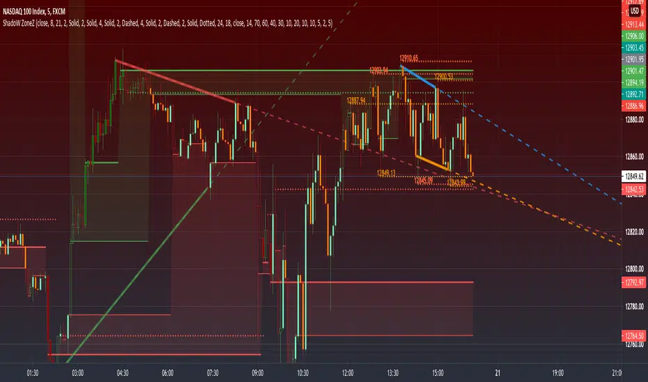
PRIME - ShadoW ZoneZ with RSI LevelsIn This experimental study, we've taken RSI data, Volume Profile, and Trend analysis, combining them into one unique package that will allow a trader to analyze market trend lines and their proposed channels, trend momentum through candle color augmentation similar to "Pulse", and Visible Volume index price levels on chart for the current sequence. Below are explanations of each function within the system.
The Semafor is used to spot future multi-level Supports and Resistance zones.
It is also useful to spot HL or LL or HH or LH zones at different Depth settings.
The red zones are the extreme places where the market has a higher chance of reversing while the green zones have the lowest setting with lower chances of the market reversal
Automatic Trend Lines
The indicator takes in 2 timeframes to detect High and Low values from which to draw the trend lines of each timeframe.
As the values change with price movement, the lines are updated. They are color coded for uptrend and downtrend based on the direction of each individual line. Trend lines can be set up to color with only the default value on the configurations panel.
- Toggle on/off Color Coded
- Change Default, Uptrend, Downtrend color
- Change Line Width
- Change Line Style
- Toggle on/off Line Extensions
- Change Extended Line Width
- Change Extended Line Style
- Toggle On/Off labels for 7 data points of each timeframe
Automatic Trend Sights
This is a neat feature that may help you get a better feel for the direction the current movement is heading towards in correlation with the short or medium length timeframe trends. The sight draws a line from the middle vertical point of the trend coordinates towards the current price. They are toggled off by default but can be enabled in the configurations panel.
- Toggle on/off sight on each timeframe
- Change Width
- Change Line Style
Support & Resistance Levels, the main aim of the study. Level calculations are based on Relative Strength Index ( RSI ) threshold levels of oversold/overbought and bull/bear zones, where all threshold values are customizable through the user dialog box. Background of the levels can be colored optionally.
RSI Weighted Colored Bars and/or Mark Overbought/Oversold Bars , Bar colors can be painted to better emphasis RSI values. Darker colors when the oscillator is in oversold/overbought zones, light colors when oscillator readings are below/above the bull/bear zone respectively, and remain unchanged otherwise. Besides the colors, with “Display RSI Overbought/Oversold Price Bars” option little triangle shapes can be plotted on top or bottom of the bars when RSI is in oversold/overbought zones .
Disclaimer:
Trading success is all about following your trading strategy and the indicators should fit within your trading strategy, and not to be traded upon solely
The script is for informational and educational purposes only. Use of the script does not constitute professional and/or financial advice. You alone have the sole responsibility of evaluating the script output and risks associated with the use of the script. In exchange for using the script, you agree not to hold dgtrd TradingView user liable for any possible claim for damages arising from any decision you make based on use of the script
Mean Deviation Detector - Throw Out All Other IndicatorsI set out this morning to create a script that searches out price moves that went too far too fast relative to historical pricing, given that such situations often result in the most profitable trading opportunities. I came up with the mean deviation detector. This script should be used as a means of judging how far a price is trading, in percent terms, from it's "average trading zone".
This is extremely helpful in a couple scenarios.
First, it can be used to judge a move's volatility relative to it's previous volatility. Put simply, a 5% move in the stock of Coca Cola is a lot more meaningful than a 5% move in the stock of Tesla, and the detector puts moves into historical (visual) perspective.
Second, the indicator can be used in real time as a means of determining when the chances of mean reversion are high or low. Extreme values are unsustainable and often lead to EITHER A.) price mean reversion or B.) time mean reversion. Put simply, prices either went too far and are due to fall back to a historical mean, or they need more time to digest a potentially new pricing zone.
Without getting too deep into volume profile analysis, the MDD can be a simple way of telling that a stock has moved into an "air pocket", where prices will either come back to the previous volume node (price mean reversion) or set up shop in a new, uncharted area (time mean reversion).
An extreme value doesn't always mean a trading opportunity, but it means that something interesting is happening in the stock / instrument.
I use this indicator to help me trade covered calls. Lots of high yielding weekly opportunities are stocks that have moved too far too fast, and I like to use this indicator as a means of either a.) scooping up stocks that have gotten beat up from a historical mean perspective & have likely seen the risk already "beaten" out of them, or to b.) stay away from stocks that have a very high chance of price correcting lower. In situations where I say that the risk has been "beaten" out of something, it doesn't mean that the stock won't continue to fall, it simply means that the degree and acceleration of the fall has peaked and that risk premiums in selling options will / should easily pay for continued losses. In the event that it's a price correction and not a time correction, you also increase your bat rate because you get auto-liquidated at a max profit. It's a really valuable tool in my kit.
You can also feel free to put a Keltner Chanel overlay onto the MDD to filter out noise, identify "extreme" values, and place mean reversion trades if you expect price mean reversion is likely, if you want to use this as the basis of a proper trading strategy. For a high extreme value, you could sell short term OTM call spreads, for example.
The MDD is adaptable to your own trading style & preferences.

BE-QuantFlow: Adaptive Momentum Trading█ Overview: QuantFlow: Adaptive Momentum Trading
QuantFlow is a sophisticated algorithmic momentum trading method designed specifically for indices and high-beta stocks. However, its logic is universal; with appropriate parameter tuning, it adapts to various asset classes and timeframes.
While the standard momentum indicators (like RSI or MACD) simply measure how fast price is moving (Velocity), QuantFlow analyzes the quality and conviction of the trend . Features like Dynamic Volatility Filtering and Trend Shielding, combined with volatility weighting and a "Dual-Line" approach to distinguish between a sustainable institutional trend and a temporary retail spike, make the indicator unique and more powerful.
█ Why QuantFlow ?
Quant (The Engine): This replaces subjective guessing with objective math.
Instead of just seeing that the price is "up," we measure "how it got there". For example, a stock that rises 1 currency value every day for 10 days (smooth trend) gets a much higher score than a stock that jumps 10 currency value in one minute and does nothing else (erratic noise). This mathematical rigor provides the structure.
█ Core Logic & Philosophy
To understand how QuantFlow calculates momentum, imagine a "Tug-of-War" between Buyers (Bulls) and Sellers (Bears). Most indicators (like RSI) use a single line. If RSI is at 50, it means "Neutral." But "Neutral" can mean two very different things:
Peace: Nothing is happening. No one is buying or selling.
War: Buyers are pushing hard, but Sellers are pushing back equally hard. Volatility is massive.
A single line hides this reality. QuantFlow splits the market into two separate scores:
Bull Score (Green Line): How hard are the buyers pushing?
Bear Score (Red Line): How hard are the sellers pushing?
The Layman's Advantage:
If both lines are low = Sleepy Market (Avoid).
If Green is high and Red is low = Clean Uptrend (Buy).
If Red is high and Green is low = Clean Downtrend (Sell).
If both lines are high = Chaos/War Zone (Wait).
█ How it Weight "Sustenance" (The Critical Quality Check)
This is the most unique aspect of QuantFlow: Trend direction alone is not enough; Sustenance is weighed equally . Standard indicators treat every 10 currency value movements the same way with no distinction. However, QuantFlow asks, "Did you hold the ground you gained?"
Scenario A (High Sustenance) : A stock opens at 100, marches to 110, and closes at 110.
Verdict : Buyers pushed up and sustained the price.
QuantFlow Weight : 100%. This is a high-quality move.
Scenario B (Low Sustenance) : A stock opens at 100, spikes to 110, but gets sold off to close at 102.
Verdict : Buyers pushed up (Trend is Up), but failed to sustain it (Long Wick).
QuantFlow Weight : 20%. This is treated as "Noise" or a trap.
By mathematically weighing the Close Location Value (where the candle closes relative to its high/low), QuantFlow filters out "Gap-and-Fade" traps and exhaustion spikes that fool traditional indicators.
Comparisons: QuantFlow vs. The Rest
Calculation Logic : Standard RSI/MACD measures simple price change over time. QuantFlow measures Price Change 'times (x)' Conviction (Sustenance Weighting).
Visual Output : Standard tools show a single line (0-100), often hiding market conflict. QuantFlow displays Dual Lines (Bull vs Bear Intensity) to reveal the true state of the battle.
Trap Handling : Standard indicators are often fooled by sharp spikes. QuantFlow ignores "Gap-and-Fade" moves with poor closing conviction.
Adaptability : Standard tools use static levels (e.g., Overbought > 70). QuantFlow uses Dynamic Bands that adjust automatically to recent volatility.
█ Dynamic Volatility Filtering
Unlike standard indicators that use fixed levels (e.g., "Buy if RSI > 50"), QuantFlow acknowledges that "50" means something different in a quiet market versus a crashing market. This section explains the statistical engine driving the signals.
The Problem with Static Levels : In a low-volatility environment, a momentum score of 55 might indicate a massive breakout. In a high-volatility environment, a score of 55 might just be random noise. A fixed threshold cannot handle both scenarios.
The Solution: Adaptive Statistics : The script maintains a memory of the Momentum Events. It doesn't just look at price; it looks at where the momentum occurred in the past and draws a "Noise Zone" (Grey Band). This logic acts as a "Smart Gatekeeper" for trade entries:
Scenario A: Inside the Noise (The Filter)
If a new momentum signal happens inside the Noise Zone, the script assumes it is likely chop or noise.
Action : It forces a wait period. The signal is delayed until the trend sustains itself for Confirm Bars; else the signal is cancelled. This filters out ~70% of false signals in sideways markets.
Scenario B: Outside the Noise (The Breakout)
If a new momentum signal happens outside the Noise Zone (or the momentum score smashes through the Upper Band), it is statistically significant (an outlier event).
Action: It triggers an Immediate Entry. No waiting is required because the move is powerful enough to escape the historical noise zone.
█ The ⚠️ "Warning" System (Heads-up for Smart Reversals)
While you are directional if there is potential reversal signal, it provides the heads-up warning for a better decision-making
█ Special Utility: Ghost Mode
For intraday traders, the biggest disruption to "Flow" is the mandatory broker square-off at 3:15 PM (considering Indian Market). Often, a trend continues overnight, and the trader misses the gap-up opening the next morning because their algo was flat.
Ghost Mode is a unique feature that runs silently in the background:
At Square-off: The strategy closes your official position to satisfy the broker.
In the Background: It keeps the trade "alive" virtually (Ghost).
Next Morning: If the market opens in the trend's favor, the strategy re-enters the trade automatically. This approach ensures you capture the full swing of the trend, even if you are forced to exit at the previous session.
█ Advice on this indicator:
Parameter Calibration: The default settings are optimized for BankNifty on 5-minute charts. If you trade stocks, crypto, commodities, or any higher timeframes (e.g., 15-min or hourly), you must adjust these.
Low Volatility Assets: Reduce Stop Multiplier to 2.0.
High Volatility Assets: Increase Momentum Lookback to 50 to filter noise.
Confluence (Additional Confirmation): While QuantFlow is a complete system, using it alongside Key Support/Resistance Levels or Volume Profile provides the highest probability setups.

Hull DMI - MattesHull DMI - Mattes
A Directional Movement Index enhanced with Hull Moving Average smoothing for refined trend detection.
This indicator reimagines the classic Directional Movement Index (DMI) by incorporating Hull Moving Average (HMA) smoothing on high and low prices. It calculates the +DI and -DI components based on changes in these hulled values, then derives the ADX for trend strength. The core plot displays the difference between +DI and -DI, colored to indicate bullish (blue) or bearish (purple) dominance when ADX is rising. Additionally, it overlays colored candles on the price chart to visually represent the prevailing trend direction.
Key Features:
Hull-Smoothed Inputs: Applies HMA to highs and lows before computing directional changes, reducing noise and lag compared to standard DMI.
Customizable Lengths: Adjustable periods for HMA, DI, and ADX smoothing to suit various timeframes and assets.
Trend Visualization: Plots DI difference with dynamic coloring and overlays trend-colored candles for at-a-glance analysis.
Alert Conditions: Built-in alerts for long (bullish) and short (bearish) signals when conditions shift.
How It Differs from Standard DMI/ADX:
Unlike the traditional DMI, which uses raw price changes and true range, this version employs Hull Moving Averages on highs and lows for smoother, more responsive directional calculations. This minimizes whipsaws in choppy markets while preserving sensitivity to genuine trends. The ADX is integrated to filter signals, ensuring color changes and alerts only occur during strengthening trends, setting it apart from basic oscillator-based indicators. Why It's Useful:
Enhanced Trend Identification: The HMA smoothing provides clearer signals in volatile environments, helping traders spot emerging trends earlier.
Visual Clarity: Colored DI plot and candle overlays make it easy to interpret market bias without cluttering the chart.
Versatility: Suitable for stocks, forex, crypto, and more; excels in trend-following strategies or as a filter for other systems.
Risk Management Aid: By focusing on ADX-confirmed moves, it reduces false signals, potentially improving win rates in systematic trading.
This Hull DMI variant offers several practical advantages that can directly improve trading decisions and performance:
Reduced Lag with Smoother Signals: By applying Hull Moving Average smoothing to highs and lows, the indicator responds faster to genuine trend changes than the standard DMI while filtering out much of the noise that causes false signals in ranging or choppy markets. Traders get earlier entries into trending moves without excessive whipsaws.
Built-in Trend Strength Filter: The optional ADX confirmation (enabled by default) ensures bullish signals and blue coloring only activate when trend strength is increasing (ADX rising). This helps traders avoid entering long positions during weakening or sideways trends, focusing capital on higher-probability setups.
Clear Visual Bias at a Glance: The single oscillator line (+DI – -DI) centered on zero, combined with dynamic blue/purple coloring and full candle overlay on the price chart, instantly shows the dominant trend direction. No need to interpret multiple lines—traders can quickly assess market bias across multiple charts or timeframes.
Versatile Across Markets and Styles: Works effectively on stocks, forex, futures, and cryptocurrencies. Trend-following traders can use it standalone for entries/exits, swing traders can use it for bias confirmation, and scalpers/day traders benefit on lower timeframes due to the reduced lag.
Improved Risk Management: By prioritizing ADX-confirmed directional moves, the indicator naturally filters low-conviction setups. This can lead to higher win rates and better risk-reward ratios when used systematically, especially when combined with proper stop-loss placement below/above recent swings.
Easy Integration: Built-in alert conditions and simple long/short logic make it straightforward to incorporate into automated strategies, watchlists, or as a confirming filter alongside other indicators (e.g., moving averages, RSI, volume profile).
Customizable Sensitivity: Separate inputs for Hull length, DI period, and ADX smoothing allow traders to optimize the indicator for specific assets, volatility regimes, or personal trading horizons—making it adaptable rather than one-size-fits-all.
Signals & Interpretation
The oscillator plots the difference between +DI and -DI (positive = bullish dominance, negative = bearish).
Bullish Signal (Long): +DI crosses above -DI, and (if ADX confirmation enabled) ADX is rising — triggers blue coloring, candle overlay, and long alert.
Bearish Signal (Short): -DI crosses above +DI — triggers purple coloring, candle overlay, and short alert.
Zero line acts as neutrality; crossings indicate potential trend shifts.
Best used in trending markets; ADX rising filter helps avoid whipsaws.
// Example Usage in Strategy
strategy("Hull DMI Strategy Example", overlay=true)
if L
strategy.entry("Long", strategy.long)
if S
strategy.entry("Short", strategy.short)
Great Inventions Require great care
Disclaimer: This indicator is provided for educational and informational purposes only and should not be considered as financial advice. Past performance is not indicative of future results. Always backtest thoroughly on your specific assets and timeframes, and consult a qualified financial advisor before making trading decisions. The author assumes no responsibility for any losses incurred from its use.

SMC + VP Pro with POC Confluence [MR.M] V.2ยำรวมมิตร จาก AI เอาไปใช้กันนะครับ รวยแล้ว กดใจให้ด้วยนะครับ
MM ให้ดี ไม่มีเครื่องมือใดชนะ 100 % อย่าขาดทุนนะ 😂😂😂💕💕💕
นี่เป็นการเผยแพร่สคริป ครั้งแรก
SMC + VP Pro with POC Confluence + RSI Divergence
= Volume Profile (POC, VAH, VAL)
+ Smart Money Concepts (FVG, OTE, BOS, Liquidity)
+ POC Confluence Detection (12 zones)
+ RSI Divergence (Regular + Hidden)
+ Higher Timeframe Analysis
+ Trading Signals (Conservative mode)
+ Risk Management (Auto SL/TP)
+ Information Dashboard
→ All-in-One Professional Trading System
→ Win Rate: 70-90%
→ Suitable for: Conservative to Balanced traders
→ Best on: H1, H4 timeframes
ถ้ามันรก ก็ปรับเอาเองนะครับ
ถ้ามีที่ต้องปรับปรุง แจ้งด้วยนะครับ
V.2 ปรับปรุงเพียงเล็กน้อย คือ ปรับ✅ ควรเห็น VAH VAL Label เดียว (ราคาล่าสุด) จากที่ค้างไม่ลบอัตโนมัติ

SMC + VP Pro with POC Confluence [MR.M]ยำรวมมิตร จาก AI เอาไปใช้กันนะครับ รวยแล้ว กดใจให้ด้วยนะครับ
MM ให้ดี ไม่มีเครื่องมือใดชนะ 100 % อย่าขาดทุนนะ 😂😂😂💕💕💕
นี่เป็นการเผยแพร่สคริป ครั้งแรก
SMC + VP Pro with POC Confluence + RSI Divergence
= Volume Profile (POC, VAH, VAL)
+ Smart Money Concepts (FVG, OTE, BOS, Liquidity)
+ POC Confluence Detection (12 zones)
+ RSI Divergence (Regular + Hidden)
+ Higher Timeframe Analysis
+ Trading Signals (Conservative mode)
+ Risk Management (Auto SL/TP)
+ Information Dashboard
→ All-in-One Professional Trading System
→ Win Rate: 70-90%
→ Suitable for: Conservative to Balanced traders
→ Best on: H1, H4 timeframes
ถ้ามันรก ก็ปรับเอาเองนะครับ
ถ้ามีที่ต้องปรับปรุง แจ้งด้วยนะครับ

Cody Order Block FinderCody Order Block Finder
Free Telegram Trading Community t.me
Overview
A professional order block detection indicator that identifies institutional supply and demand zones on any timeframe. This tool helps traders spot key reversal areas where institutional orders are likely placed, providing strategic levels for limit order entries.
Key Features
🔍 Smart Order Block Detection
Bullish Order Blocks: Identifies the last bearish candle before consecutive bullish candles
Bearish Order Blocks: Identifies the last bullish candle before consecutive bearish candles
Configurable Sensitivity: Adjust the number of consecutive candles required (1-50 periods)
Minimum Move Filter: Set percentage threshold to filter only significant moves
🎨 Visual Customization
Multiple Color Schemes: Choose from DARK, BRIGHT, or NEON themes
Customizable Display: Show/hide bullish/bearish channels
Line Extension: Extend OB lines to current bar for better visibility
Historical View: Toggle between showing all historical OBs or only the latest ones
📊 Advanced Filtering
OB Size Filter: Set minimum and maximum order block size as percentage of price
ATR Filter: Filter OBs based on Average True Range multiples
OB Strength Indicator: Color-coded OBs based on subsequent price move strength
Wick/Body Selection: Choose to mark OBs using whole candle range or body only
🔔 Alert System
Real-time Alerts: Get notified immediately when new order blocks form
Customizable Messages: Set your own alert messages
Once-per-OB Option: Prevent alert spam with single alert per OB
📈 Display Features
Three-Line Channels: Shows high, low, and average levels for each OB
Visual Shapes: Clear triangle markers above/below candles
Info Panel: Displays latest OB statistics in a clean table format
Data Window Info: View OB levels in TradingView's data window
How to Use
Setup
Add indicator to your chart
Configure periods (default: 5) - higher values = fewer but stronger OBs
Set minimum % move (default: 0%) to filter significant moves
Choose color scheme for your preference
Trading Applications
Limit Order Placement: Place buy limits at bullish OB lows, sell limits at bearish OB highs
Stop Loss Reference: Set stops beyond OB extremes
Reversal Confirmation: Use OBs as confluence with other indicators
Support/Resistance: OB levels often act as future support/resistance
Advanced Tips
Combine with volume profile for higher probability zones
Use on higher timeframes (4H, Daily) for more significant levels
Look for OBs at key Fibonacci levels for added confluence
Monitor price reactions when revisiting OBs
Technical Details
Programming Language: Pine Script v6
Overlay: Yes (draws directly on price chart)
Max Lines: 500 (prevents chart clutter)
Timeframe Compatibility: All timeframes (1min to Monthly)
Market Compatibility: Forex, Stocks, Crypto, Futures
Input Parameters
Basic Settings
Relevant Periods: Number of consecutive candles required (1-50)
Min. Percent move: Minimum % move to validate OB (0.0-100.0)
Color Scheme: DARK, BRIGHT, or NEON color themes
Display Options
Show latest Bullish/Bearish Channel: Toggle channel display
Extend OB lines to right: Extend lines to current bar
Show all historical OBs: Display all OBs or only latest
Use whole range: Use High/Low or Open/Close for OB marking
Advanced Filters
Min/Max OB size (%): Filter by order block size
Use ATR filter: Filter based on volatility
Show OB Strength: Color code by subsequent move strength
Alert Configuration
Create alerts directly from the indicator by clicking "Create Alert" button on chart:
Bullish OB alerts when green triangle appears
Bearish OB alerts when red triangle appears
Includes price and OB level information
Best Practices
Higher Timeframes First: Start on daily/4H to identify major levels
Multiple Confluence: Combine with trend lines, Fibonacci, or moving averages
Patience: Wait for price to return to OB levels for entries
Risk Management: Always use appropriate position sizing and stops
Support & Updates
For updates and support, visit the script page. The indicator is regularly maintained for optimal performance across all markets and timeframes.
Perfect for: Swing traders, position traders, institutional traders, and anyone looking to trade with the "smart money" flow using order flow concepts.
Trading Styles: Works with all styles - scalping, day trading, swing trading, and investing.
Experience Level: Suitable for beginners to advanced traders with clear visual cues and customizable settings.

Auction Session Ranges (AMT Edition) [ Alerts] Auction Session Ranges (AMT Edition)
► Overview
The Session Ranges ( AMT Edition) is a session-based market structure and auction analysis tool designed to visually reveal acceptance, rejection, imbalance, and continuation across the Asia, London, and New York CME trading sessions.
Unlike typical indicators, this script is grounded in Auction Market Theory (AMT) and session-based structure, focusing on how price behaves at session extremes rather than relying on lagging calculations, oscillators, or predictive algorithms. Its purpose is to highlight areas where the market has earned the right to be traded, providing traders with a clear, rules-based framework for high-probability directional trades.
Important for backtesting: To properly backtest session extremes, Interaction Lines, and Closest Opposite Extreme Lines, you must use TradingView’s replay mode, as real-time bar-by-bar progression is required to observe how the market interacts with session extremes over time.
► Key Innovations
This is not a conventional session high/low indicator. Its originality comes from several unique design elements:
Differentiates interaction from true acceptance: Price touching an extreme does not automatically indicate directional intent.
Separates directional confirmation from range-bound indecision: Only confirmed crossings beyond the Interaction Line signal actionable bias.
Tracks failed auctions and partial acceptance: No volume profile or order book data required.
Visual, rule-based trade permission: Signals are objective, minimizing subjective interpretation.
Interaction & Closest Opposite Extreme Lines: Together, these lines map how far an auction progresses after an extreme is tested, highlighting continuation, partial acceptance, or failed auctions.
► Core Concepts Explained
1. Session Highs & Lows (Solid Lines)
Plotted continuously for each CME session (Asia, London, New York).
Represent the current auction boundaries for that session.
2. True Interaction Lines (Thick Dotted Lines)
Drawn when price touches or breaks a session extreme:
Touching session high → dotted line at the low of that candle
Touching session low → dotted line at the high of that candle
Auction context:
Touching alone ≠ acceptance
Acceptance occurs only when price moves beyond the Interaction Line and holds
Trading principle:
Price has not crossed → no directional bias → do not trade
Price crosses and holds → directional bias established
3. Acceptance vs Rejection
Accepted direction: Price crosses and holds beyond the Interaction Line
Rejected direction: Price crosses the line but immediately reverses
Neutral / No-Trade: Price trapped between extreme and Interaction Line
Important: Acceptance is conditional and dynamic. Each time price crosses back over the Interaction Line, acceptance is lost.
4. New Extremes = Continuation
Once an Interaction Line is crossed, each new session extreme in that direction reinforces the trend.
Traders should only look for continuation setups along the established directional bias.
AMT interpretation:
Repeated new extremes → directional imbalance
Failure to make new extremes → potential balance or rotation
5. Closest Opposite Extreme Lines (Thin Dotted Lines)
After acceptance, the script tracks price progress toward the opposite session extreme.
Plotted only if price reaches a user-defined percentage of the session range.
Helps identify:
Full acceptance (price reaches opposite extreme)
Partial acceptance (price stalls)
Failed auctions (price cannot progress meaningfully)
Trading guidance once Closest Lines appear:
Partial acceptance: Price stalls near the Closest Line but does not fully reach the opposite extreme → bias remains valid, but the move may be weakening; consider scaling out or tightening stops.
Full acceptance: Price reaches the opposite extreme → directional auction fully confirmed; bias continues, but expect potential rotation or balance afterward.
Failed auction (cannot progress meaningfully): Price reverses before reaching the Closest Line → signals exhaustion; avoid chasing the move and treat as potential trend failure.
Note: Only relevant after Interaction Line is crossed; if price never crosses the Interaction Line, Closest Lines have no trading significance.
► Step-by-Step Usage
Wait for a session extreme
Let price interact with the session high or low.
Observe the Interaction Line
No cross → do not trade
Cross and hold → directional bias established
Trade in the direction of new extremes only
Ignore counter-trend trades unless the Interaction Line is lost
Manage risk using structure
Interaction Line acts as a dynamic invalidation level
Use Closest Lines for context
Partial acceptance → bias valid, watch for weakening
Full acceptance → bias strong, continuation likely
Failed attempt → potential exhaustion, do not chase
Useful for trade management, scaling, and expectation setting
► Price Retests & Pullbacks
Scenario:
Price crosses above the Interaction Line (e.g., from a low interaction).
Over the next 3–4 15-minute bars, price dips back toward the Interaction Line, with wicks touching it but no decisive close below.
Interpretation:
Initial Acceptance Confirmed: Bias remains valid while price holds above/below the line.
Temporary Pullback / Retest: Market is re-evaluating the auction; testing participant agreement.
Wicks Touching the Line: Partial probing or liquidity sweep; market still respects original acceptance.
Trading Implication:
Continuation bias remains intact.
Pullbacks near the Interaction Line offer lower-risk entries.
Decisive close below → acceptance lost, signaling trend failure or invalidation.
Market Psychology:
Healthy auction behavior: extreme tested → acceptance confirmed → boundary retested for liquidity → continuation.
Failure to hold above signals weak acceptance or exhaustion.
✅ Key Takeaways:
Holding above Interaction Line → bias intact, pullback = opportunity
Closing below Interaction Line → acceptance lost, bias invalidated
Wicks touching only → normal retest, still valid
► No-Trade Conditions
Avoid trading when:
Price never crosses the Interaction Line
Price remains trapped between the extreme and the Interaction Line
Market rotates without forming new extremes
These indicate balance, not directional opportunity.
► Alerts
Optional alerts trigger when price crosses an Interaction Line for:
Asia session
London session
New York session
Alerts signal possible acceptance, not automatic trade entries.
► Who This Script Is For
Best suited for traders who:
Trade session structure in futures, indices, or FX
Follow Auction Market Theory principles
Prefer objective, rules-based confirmation
Want fewer but higher-quality trade opportunities
Not intended for:
Indicator stacking
Predictive trading
High-frequency scalping without structure
► Final Notes
This script does not tell you when to buy or sell.
It shows where the market has earned the right to be traded.
Use it as a decision filter, not a prediction engine.

Daily MA — Higher-Timeframe Daily Moving Average OverlayThis indicator plots a clean, higher-timeframe daily moving average directly on any chart, so you can always see where price sits relative to the daily trend — even while trading on lower timeframes (1m, 5m, etc.).
It’s designed to be:
Simple – a single, configurable daily MA line
Consistent – always anchored to the 1D timeframe
Flexible – choose EMA or SMA and customize line width/color
⸻
What This Indicator Does
Pulls the 1-Day (1D) moving average of the current symbol, regardless of your chart timeframe.
Lets you choose between EMA (Exponential Moving Average) or SMA (Simple Moving Average).
Plots that daily MA as a smooth overlay on your current chart.
Keeps the line visually clean and continuous, making it easy to see daily trend and dynamic support/resistance.
This is not a signals/strategy script. It doesn’t generate buy/sell arrows or backtest logic. It’s a context tool for visualizing the daily trend while you execute your own strategy.
⸻
Why a Daily MA Overlay Is Useful
Traders commonly use a daily moving average to:
Anchor intraday trades to the higher-timeframe trend
Longs when price is holding above the Daily MA
Shorts or caution when price is rejecting from the Daily MA
Identify dynamic support/resistance
Price often reacts around well-watched daily MAs (e.g., 50, 100, 200)
Filter setups
Only take long setups when price is above the daily trend line
Avoid counter-trend trades when price is extended far from the Daily MA
Because this script forces the MA to always be computed on 1D, you don’t have to switch back and forth between intraday and daily charts to keep track of the bigger picture.
⸻
Inputs & Settings
MA Length
Default: 200
Any positive integer (min 1)
Common examples: 50, 100, 200 for trend structure
MA Type
EMA – reacts faster to recent price (default)
SMA – smoother, slower, more “classic” feel
Line Width
Default: 2
Range: 1 to 10
Increase if you want the Daily MA to stand out clearly against other indicators
Color
Default: Purple tone
Fully customizable – pick any color that works with your chart theme
⸻
How to Use It in Your Workflow
Intraday traders (scalpers/day-traders):
Apply the indicator to your 1m/5m/15m charts.
Use the Daily MA as a trend filter :
Only look for long scalps when price is above the Daily MA.
Be more cautious with longs or consider shorts when price is below it.
Swing traders :
Use it on 1H/4H charts to see where price sits relative to a longer-term daily trend.
Watch for:
Pullbacks to the Daily MA in an uptrend as potential demand zones.
Rejections at the Daily MA in a downtrend as potential supply zones.
Risk management & context :
Avoid chasing extended moves far from the Daily MA.
Mark confluence with other tools (support/resistance, volume profile, etc.) around the Daily MA.
⸻
Notes & Limitations
The moving average itself is calculated from daily candles , then displayed on your current timeframe.
This is a visual aid only . It does not guarantee future performance or provide financial advice.
Always combine this indicator with your own analysis, risk management, and trading plan.
⸻
Disclaimer :
This script is provided for educational and informational purposes only. It is not financial advice and does not constitute a recommendation to buy or sell any financial instrument. Always do your own research and trade at your own risk.

Week Start/End Bar CoordinatesGive the Bar Index for the First and Last of the Week,
input the coordinates directly into the Fixed Range Volume Profile

EMA / WMA RibbonMomentum Flow Ribbon
Unlock a clear, visual edge in identifying short-term momentum shifts with the Momentum Flow Ribbon.
This indicator was born from a simple yet powerful concept: to visually represent the dynamic relationship between a fast-reacting Exponential Moving Average (EMA) and the smoother, more methodical Wilder's Moving Average (WMA). While both moving averages use the same length, their unique calculation methods cause them to separate and cross, creating a "ribbon" that provides an immediate and intuitive gauge of market momentum.
This tool is designed for the disciplined trader who values clean charts and actionable signals, helping you to execute your strategies with greater confidence and precision.
How It Works
The script plots an EMA and a Wilder's Moving Average (referred to as rma in Pine Script) of the same length. The space between these two lines is then filled with a colored ribbon:
Bullish Green/Teal: The ribbon turns bullish when the faster EMA crosses above the slower Wilder's MA, indicating that short-term momentum is strengthening to the upside.
Bearish Red: The ribbon turns bearish when the EMA crosses below the Wilder's MA, signaling that short-term momentum is shifting to the downside.
The inherent "lag" of the Wilder's MA, a feature designed by J. Welles Wilder Jr. himself, acts as a steady baseline against which the more sensitive EMA can be measured. The result is a simple, zero-lag visual that filters out insignificant noise and highlights meaningful changes in trend direction.
Key Features
Customizable Length and Source: Easily adjust the moving average length and price source (close, hl2, etc.) to fit your specific trading style and the instrument you are trading, from futures like MES and MNQ to cryptocurrencies and forex.
Customizable Colors: Tailor the ribbon's bullish and bearish colors to match your personal chart aesthetic.
Built-in Alerts: The script includes pre-configured alerts for both bullish (EMA crosses above WMA) and bearish (EMA crosses below WMA) signals. Never miss a potential momentum shift again.
Clean & Lightweight: No clutter. Just a simple, effective ribbon that integrates seamlessly into any trading system.
Practical Application for the Discerning Trader
For a futures trader, timing is everything. This ribbon is not just another indicator; it's a tool for confirmation.
Imagine you've identified a key level—a Volume Profile POC, the previous day's low, or a critical accumulation zone. As price approaches this level pre-London session, you're watching for a sign of institutional activity. A flip in the ribbon's color at that precise moment can provide the powerful confirmation you need to enter a trade, trusting that you are aligning with the building liquidity and momentum heading into the New York open.
This is a tool for those who aspire to greatness in their trading—who understand that the edge is found not in complexity, but in the flawless execution of a simple, well-defined plan.
Add the Momentum Flow Ribbon to your chart and start seeing momentum in a clearer light.

Daily HOD / LOD Anchored VWAP (24/7 Markets)mart Daily HOD/LOD Anchored VWAP (Auto Detect + Alerts)
This indicator automatically anchors VWAP at the High of Day (HOD) and Low of Day (LOD) for each session/day.
No more manual anchoring — the script tracks intraday highs and lows in real-time and resets cleanly at the start of each trading day or session.
✨ Features
✅ Auto-anchored AVWAP at daily High and Low
✅ Works for stock markets (with fixed sessions) and crypto markets (24/7)
✅ Clean reset every session/day
✅ Separate AVWAP lines for HOD and LOD
✅ Customizable colors & line widths
✅ Alerts included 🚨 (get notified instantly when a new High/Low AVWAP starts)
📈 Use Cases
Spot true intraday support/resistance levels
Track where institutions may be defending positions
Combine with price action, orderflow, or volume profile strategies
Perfect for intraday trading, scalping, and swing entries
⚡ Alerts
New HOD AVWAP → Fires when price makes a fresh high of day, starting a new anchored VWAP.
New LOD AVWAP → Fires when price makes a fresh low of day, starting a new anchored VWAP.
🛠️ Settings
Show/hide HOD or LOD VWAP
Customize line colors and thickness
Works seamlessly across stocks, futures, forex, and crypto
💡 Pro Tip:
AVWAP from the high and low of the day often acts as a magnet for price. Watch how price reacts when revisiting these levels — confluence with other indicators = high-probability setups.
⚠️ Disclaimer:
This script is for educational purposes only. It is not financial advice. Always manage your own risk.
SCTI-D1SCTI-D1 Indicator Introduction / 指标简介
The SCTI-D1 (Smart Composite Trading Indicator - Daily) is a comprehensive, multi-feature trading tool designed for serious traders who demand depth, flexibility, and clarity in their market analysis. This indicator combines several powerful concepts into one seamless workflow, including:
Multiple EMA Systems with customizable lengths and visibility
PMA (Projected Moving Average) with fill options between lines
VWAP with configurable anchors and deviation bands
Divergence Detection for MACD and Histogram
Volume Profile with node detection (peaks, troughs, highs, lows)
Smart Money Concepts including order blocks, fair value gaps, equal highs/lows, and market structure shifts
Whether you trade stocks, forex, or cryptocurrencies, the SCTI-D1 helps you identify key levels, track institutional activity, and spot high-probability reversal signals—all in one clean, customizable interface.
SCTI-D1 指标简介
SCTI-D1(智能综合交易指标 - 日线版)是一款功能全面的交易工具,专为需要深度、灵活性和清晰市场分析的专业交易者设计。该指标将多种强大概念融合在一个流畅的工作流程中,包括:
多组EMA系统,可自定义长度和显示
PMA(投影移动平均线),支持均线间填充色
VWAP,可配置锚定周期和偏差带
背离检测,支持MACD和柱状图
成交量分布,支持节点检测(峰值、谷值、最高、最低)
聪明钱概念,包括订单块、公允价值缺口、等高/等低和市场结构转换
无论您交易股票、外汇还是加密货币,SCTI-D1 都能帮助您识别关键水平、跟踪机构资金动向并发现高概率反转信号——所有功能均集成在一个清晰可定制的界面中。

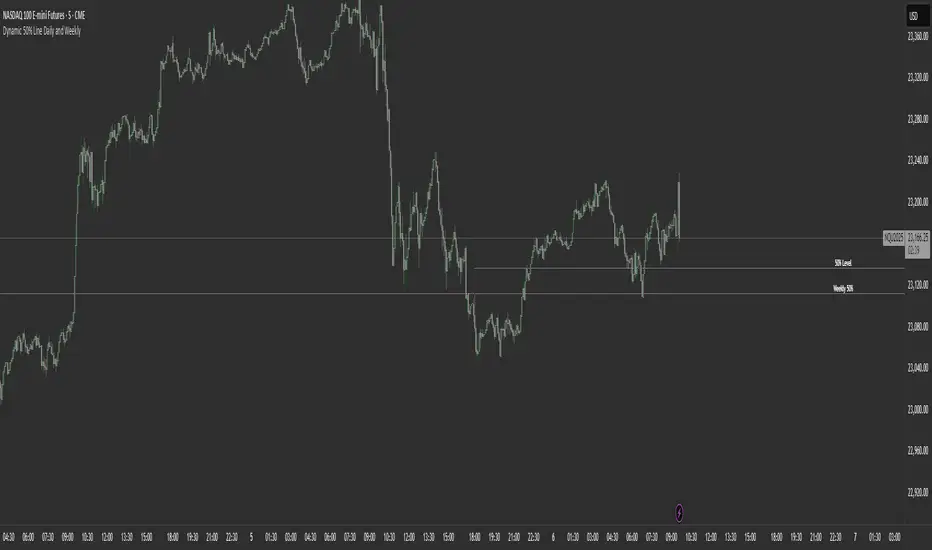
Dynamic 50% Line [Daily and Weekly Range]This indicator automatically plots the 50% retracement level (midpoint) of the daily and weekly trading ranges. It helps traders identify key support/resistance zones where price may react, offering insights into potential reversal or continuation areas.
Auction Market Theory & the 50% Level
At its core, this indicator is built on Auction Market Theory (AMT), which views price movement as an ongoing auction process where buyers and sellers compete to establish value. The 50% midpoint represents fair value—the equilibrium where price is most likely to balance before continuing its trend or reversing.
When price deviates too far from this level, it often returns to balance (mean reversion) or accepts new value (breakout). By tracking the daily and weekly 50% lines, traders can:
Identify high-probability reversal zones (where price may reject fair value).
Spot trend continuation areas (where price accepts higher/lower value).
Align with institutional order flow, as large players often use these levels for execution.
This makes the indicator particularly powerful for traders who follow volume profile, order flow, or ICT concepts, as it visually maps the market’s ongoing auction process.
Features:
✅ Automated Daily & Weekly Midpoints – Calculates the 50% level from the high/low of each session.
✅ Customizable Line Styles – Choose between solid, dotted, or dashed lines for better visibility.
✅ Clear Labeling – Optional text labels show "50% Level" or custom text at your preferred position (left, middle, or right).
✅ Flexible Styling – Adjust line colors, thickness, and text size to match your chart theme.
How It Works:
Daily 50% Line: Resets at 6 PM NY time (new trading day).
Weekly 50% Line: Resets on Sunday at 6 PM NY time (new trading week).
The midpoint is calculated as:
(High + Low) / 2
Lines extend 500 bars forward for easy visibility.
Why Use This Indicator?
Unlike static Fibonacci tools, this dynamic indicator auto-updates the 50% level as new highs/lows form, saving time and improving accuracy. Whether you trade forex, stocks, or crypto, these levels often act as strong magnets for price action.
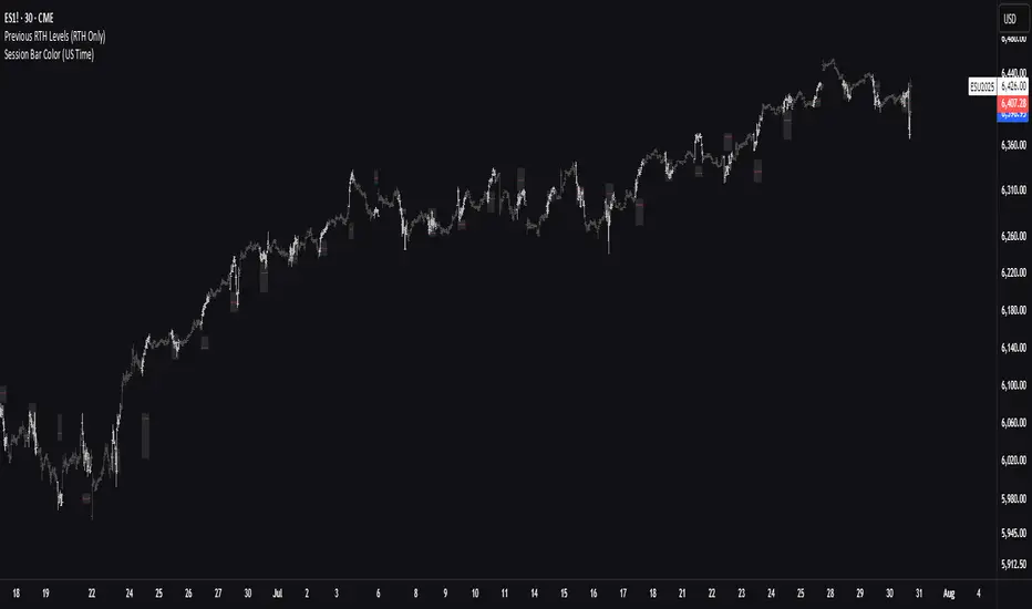
Previous RTH Levels (RTH Only)Previous RTH Levels on current session (RTH Only)
This indicator calculates key volume profile levels from the previous Regular Trading Hours (RTH) session and projects them onto the current RTH session. It is designed to provide traders with significant historical price levels—Point of Control (POC), Value Area High (VAH), and Value Area Low (VAL)—to use as potential support, resistance, and pivot points for intraday trading.
Instead of just plotting lines, this script highlights the entire Value Area (VA) between the VAH and VAL, offering a clear visual reference for the prior day's zone of price agreement.
Prev Week POC Buy/Sell Signals
Hi, I’m Edward. I created a straightforward strategy for swing traders (4hr or 8hr timeframe users). This strategy is for traders that are not interested to look at charts all day long, 2 times a day max, but still be profitable.
The indicator:
Print a buy signal when the price closes above the previous week's Point of Control (POC).
Stay in the trade until the price closes below the previous week's POC, then print a sell signal.
The indicator calculates the weekly POC using a basic volume profile method, then tracks the previous week's POC for signals.
Previous week POC is valid from Monday to Thursday. By close of business on Thursday, the current week trend and POC should be well established and should be used make buy or sell decisions. Enjoy!

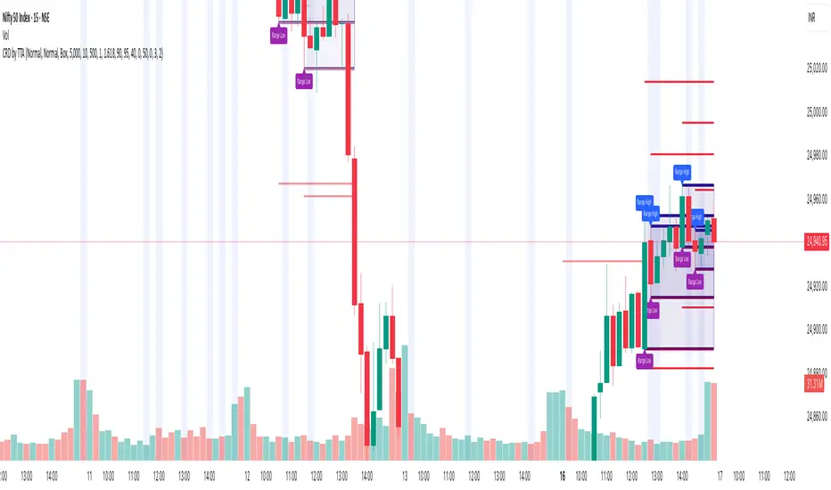
Candle Range Detector by TradeTech AnalysisCandle Range Detector by TradeTech Analysis
This advanced indicator identifies and visualizes price compression zones based on inside bar formations, then tracks how price behaves around those zones — offering valuable insights into liquidity sweeps, range expansions, and trap/mitigation behavior.
The script builds upon the foundational concept of range-based price action, commonly used by institutional traders, and adds automation, mitigation tracking, and sweep detection to map how price reacts around these critical ranges.
🔍 How It Works:
• Range Formation: A new range is detected when the current candle forms entirely within the high and low of the previous candle (i.e., an inside bar). This behavior often indicates price compression and potential breakout zones.
• Range Extension: Once a range is confirmed, the script projects upper and lower boundaries (using either a percentage-based multiplier or Fibonacci log extension), providing context for expected breakout zones.
• Mitigation Tracking: The script continuously monitors whether price breaks above or below the projected extensions, marking that range as mitigated — useful for confirming whether liquidity was absorbed.
• Sweep Detection: If price re-visits a mitigated zone and shows signs of a liquidity sweep (via wick + close behavior), the indicator triggers visual sweep labels and optional alerts.
🧠 Optional Visual Enhancements:
• Highlight range-forming candles with light blue background (toggle on/off)
• Midpoint dotted line for symmetry analysis
• Labels for “Range High” and “Range Low” for visual clarity
• Dynamic box drawing that adapts upon mitigation or continuation
⚙️ Customizable Features:
• Choose between Normal and Fibonacci-based detection modes
• Toggle visibility of range boxes, extension lines, and sweep markers
• Configure sweep alerts, mitigation window size, and visual transparency
⸻
🧪 Use Cases
• Identify consolidation zones before major price moves
• Confirm liquidity sweeps for entry/exit traps
• Visualize and test mitigation behavior of past zones
• Combine with Order Flow or Volume Profile tools to enhance context
⸻
⚠️ This is a fully original implementation that goes beyond classical inside-bar scanners by incorporating mitigation, extension projection, and liquidity sweeps — making it a powerful tool for intraday, swing, and even Smart Money-based trading setups.
IPDA with Order Blocks [Enhanced]Summary of the Code
This script plots IPDA Standard Deviations on a price chart, helping traders visualize potential support and resistance levels based on a series of user-defined deviations. It uses swing high/low points and time-based fractal lookbacks (monthly, weekly, daily, or intraday) to define price anchors and compute deviation lines.
Key features include:
Deviations: It calculates and plots deviation levels based on the distance between swing highs and lows, which traders can use as price targets or zones of interest.
Timeframes:
Monthly (higher timeframe analysis)
Weekly (medium-term analysis)
Daily and Intraday (shorter-term precision)
Customization:
Choose which deviation levels (e.g., 0, 1, -1, -2) to display.
Hide labels or adjust their sizes for cleaner charts.
Option to remove invalidated deviation levels dynamically.
Visual Cleanliness: Automatically removes clutter by hiding or deleting invalid deviation levels and focusing on active price zones.
How to Utilize It for Intraday Trading to Make $1,000
Here’s how to effectively use the indicator to optimize intraday trading:
1. Set the Right Timeframe:
Use the 15-minute or 1-hour chart for intraday setups.
Ensure the "Intraday" lookback option is enabled to focus on shorter-term swings.
2. Interpret the Levels:
Bearish Order Blocks: Look for red lines (bearish deviation) as potential resistance zones where the price may reverse downward.
Bullish Order Blocks: Look for green lines (bullish deviation) as potential support zones where the price may bounce upward.
3. Plan Entries and Exits:
Entry: Buy near a green order block or short near a red order block, confirming the trade with additional signals (e.g., candlestick patterns, momentum indicators).
Stop Loss: Place your stop below the green line (for buys) or above the red line (for shorts).
Profit Targets: Use deviation levels as targets (e.g., from the 0 level to +1 or -1).
4. Combine with Market Context:
Use the script alongside volume profile, trend indicators, or news events for confirmation.
Avoid trading during major news events unless aligned with deviations.
5. Position Sizing for $1,000 Goal:
Trade liquid instruments like Nasdaq futures (NQ) or major forex pairs.
Risk 1-2% of your capital on each trade and scale into positions if confirmed.
Target a profit of 10-20 points per trade on Nasdaq futures, with 1-2 trades daily.
6. Monitor Key Timeframes:
Pre-market (before 9:30 AM EST): Mark deviation levels to predict market open behavior.
Midday & Power Hour (3-4 PM EST): Watch for breakouts or retests around key deviation levels.
By combining this tool with disciplined risk management and a clear trading plan, you can systematically work toward your profit target while minimizing unnecessary risks

BIN Based Support and Resistance [SS]This indicator presents a version of an alternative way to determine support and resistance, using a method called "Bins".
Bins provide for a flexible and interesting way to determine support and resistance levels.
First off, let's discuss BINS:
Bins are ranges or containers into which your data points can be sorted. For example, if you're grouping ages, you might have bins like 0–18, 19–35, 36–50, and 51+. Any data point within these intervals gets placed in the corresponding bin.
Binning simplifies complex data sets by grouping values into categories. This is useful for such things as
Visualizing data in histograms or bar charts.
Reducing noise and highlighting trends.
This indicator groups the price action into 10 separate bins. It determines the Support / Resistance level by averaging the values in the Bins to find an iteration of the "central tendency" or average reoccurring value.
Pros and Cons
Since this is a different approach to support and resistance, I think its important to highlight some of the pros and advantages, but also be open about the cons.
First off the PROS
Bin Based Support and Resistance Levels dynamically adjust to ranges as opposed to hard / fast peaks and valleys. This makes them better at analyzing price action vs simply drawing lines at random peaks and valleys.
Because Bins are analyzing ALL PA within a period's max and min range, Bin Support and Resistance can actually be used similar to Volume profile, where you are able to identify a pseudo-POC, or areas where price tends to consolidate. Take a look at this example on SPY:
You can see these 2 SR lines are close together. This represents that this general price range is an area where price likes to accumulate/consolidate. You can see the SPY ended up coming back to this range and consolidating there for a bit.
This is a strength of using a BIN based approach to calculating support and resistance, because as indicated before, it looks at price action vs peaks and valleys.
As a tip, these areas are areas you want to wait for a break in one direction or the other.
The indicator provides for backtest results of the support and resistance lines, to see how many times certain areas acted as resistance or support. Because this is analyzing and distributing PA evenly throughout the period's max and min, the indicator can tell you which areas tend to have higher rejection zones and which have higher support zones.
Now the CONS
Because bin based SR take an average approach, the SR lines can sometimes be slightly broken before the ticker finds rejection:
To combat this, make sure there is confirmed support. How the indicator actually backtests these lines is by waiting to see if the ticker has 3 consecutive closes above the support line or below the resistance line. So these are things to be mindful of.
It doesn't consider pivots. Most support and resistance indicators either identify max and min peaks and valleys or use pivot points. Pivot points are a great way to identify peaks and valleys and thus by extension support and resistance. However, this is also somewhat of a strength, as using BINS forces the indicator to consider ALL price action and not just the extremes (highs and lows).
Can be slightly skewed in highly volatile environments. Any time there is a massive drop or rally, it can skew the indicator to give extreme ranges to both ends. For example, the Tariff news collapse on ES1!:
Owning to limitations in lookback length, sometimes the min and max range can be exceeded and other traditional areas of support / resistance is where a ticker will find support.
Using the indicator
Here are some basic use/functionalities of the indicator:
Selecting display of backtest results: You can select to have the backtest results shown in a table:
Or directly on the lines:
Inversely, you can toggle them off completely:
You can modify the lookback length. The suggested lookback length is between 250 to 500 candles on smaller timeframes. I also suggest 252 on daily timeframes (which represents 1 trading year).
And that's the indicator!
It is very easy to use, so you should pick it up in no time!
Enjoy and as always, 🚀🚀 safe trades! 🚀🚀

TICK Bias Timer with EMA Position📌 Description
This indicator tracks the time in minutes that the Exponential Moving Average (EMA) of the NYSE USI:TICK remains above or below the zero line. It serves as a powerful market breadth confirmation tool to support your intraday directional bias.
Rather than focusing on momentary TICK spikes, this tool emphasizes duration and persistence of buying/selling pressure across the entire NYSE – helping traders stay on the right side of the flow.
🔧 Features
✅ Measures how long the EMA of TICK stays above or below 0
✅ Visual plots of upward and downward pressure duration (in minutes)
✅ Background color changes based on EMA position relative to 0
✅ Automatic daily reset at a customizable time (e.g. 15:30 for RTH open)
✅ Gap filter to avoid spikes during overnight or weekend sessions
✅ Clean, minimalist design – built for real-time decision making
🎯 How to Use
EMA > 0 for 10+ minutes → sustained bullish breadth → intraday bullish bias
EMA < 0 for 10+ minutes → sustained bearish breadth → intraday bearish bias
Frequent flip between sides → uncertain or choppy market → trade with caution
Can be used in confluence with Volume Profile, VWAP, price action, and Bookmap to reinforce trade setups.
💡 Ideal For:
Scalpers looking for flow confirmation
Day traders who want to filter fake strength/weakness
Professionals using TICK, USI:ADD , USI:VOLD , and other internals for decision-making

Flow Optimized Moving AverageOverview
The Flow Optimized Moving Average (Flow OMA) is an advanced adaptive moving average designed to dynamically adjust smoothing factors based on market efficiency and volatility. By integrating the Efficiency Ratio (ER) with an Adaptive Moving Average (AMA) and leveraging ATR-based bands, this indicator provides traders with a refined tool for identifying trend direction, strength, and potential reversal zones.
Key Features
Adaptive Moving Average (AMA)
Adjusts to price action based on the Efficiency Ratio (ER), reducing lag in trending markets while smoothing noise in ranging conditions.
Efficiency Ratio (ER)
Measures the effectiveness of price movement over a defined lookback period.
Helps in dynamically adjusting the smoothing constant of the AMA.
ATR-Based Volatility Bands
Creates upper and lower dynamic bands based on the Average True Range (ATR).
Expands in high volatility and contracts in low volatility, providing traders with a contextual understanding of price action.
Slope-Based Trend Strength
Normalizes the moving average slope relative to ATR.
Generates a trend strength score, which influences band opacity, making strong trends visually distinguishable.
Dynamic Color Coding
Bullish Trends: Cyan/Turquoise (#00e2ff)
Bearish Trends: Blue (#003ff5)
Neutral Trends: Gray
The transparency of the bands dynamically adjusts based on trend strength.
Fill Zone Effect
The area between the ATR bands is filled with a gradient-like effect, giving a clear visual representation of trend strength and transitions.
Indicator Components
Inputs (User Settings)
ER Lookback Period: Defines how many bars are used in the Efficiency Ratio calculation (default: 10).
Fast & Slow Periods: Control the sensitivity of the Adaptive Moving Average (default: 2 & 30).
ATR Period: Defines the lookback for Average True Range (default: 14).
Band Multiplier: Determines the width of ATR-based bands (default: 1.5).
Slope Average Period: Smooths trend slope for more stable trend assessment (default: 5).
Efficiency Ratio Calculation
Measures how effectively price moves in a straight line compared to its total movement.
A higher ER value suggests strong trend momentum, while a lower value implies consolidation.
Adaptive Moving Average (AMA)
Dynamically adjusts its smoothing factor based on ER.
Uses a smoothing constant that ranges between the fastest and slowest specified values.
Volatility-Based Bands
Constructed using the ATR multiplier.
Expand and contract dynamically in response to market volatility.
Trend Strength & Direction
Computed using the normalized slope of AMA against ATR.
Positive slope = Bullish trend, Negative slope = Bearish trend.
Visual Enhancements
Colored Adaptive MA Line: Changes based on trend direction.
ATR Bands with Gradient Fill: Visual representation of market conditions.
Dynamic Opacity: Highlights trend strength through transparency.
How to Use the Flow OMA Indicator
Trend Identification
When the Adaptive MA is rising and colored cyan, a bullish trend is in play.
When the Adaptive MA is falling and colored blue, a bearish trend is present.
Trend Strength Assessment
A stronger trend results in more opaque band fills, indicating a clear directional bias.
Weaker trends or consolidations result in fainter fills, signaling a loss of momentum.
Reversal Signals
If price touches the upper band in a bullish move and starts reversing, it can indicate potential profit-taking areas.
If price approaches the lower band in a bearish move and rebounds, a short-term reversal may be imminent.
Volatility Insights
Narrow bands indicate low volatility and possible breakout conditions.
Wider bands suggest increased volatility, warning traders of potential price swings.
Best Practices
✅ Combine with Other Indicators
Use RSI, MACD, or Volume Profile for confirmation before executing trades.
✅ Apply to Multiple Timeframes
Works effectively in higher timeframes (1H, 4H, Daily) for trend trading.
Can be utilized in lower timeframes (5m, 15m) for scalping setups.
✅ Adjust Parameters Based on Asset Volatility
Increase ATR Period for stocks with high volatility.
Reduce ATR Multiplier for forex pairs to avoid excessive band width.
The Flow Optimized Moving Average (Flow OMA) is a powerful trend-following tool designed for both swing and intraday traders. Its adaptive nature allows it to efficiently track trends while minimizing false signals. By incorporating dynamic volatility bands and trend-sensitive color coding, this indicator enhances traders' ability to read price action effectively. Whether used standalone or in combination with other indicators, Flow OMA provides a significant edge in trend analysis.
