Monster Breakout IndexThis is the coolest indicator I have ever made to date so far.
The Monster Breakout Index is a completely original idea that I came up with.
MBI is a breakout indicator with one parameter. MBI lives up to its name because of how robust the index is. It gives very little signals, which means that the signals that it does generate are very high quality.
How to Interpret:
Green - Buy
Red - Sell
Would you like to know how this indicator works?
Of course you do! Well here it is...(in steps):
1) Calculate the median price (hl2 price) of each bar over n periods (n is the parameter).
2) Is the current bar's close higher than the highest median? Yes = Buy signal , No = proceed to step 3
3) Is the current bar's close lower than the lowest median? Yes = Sell signal , No = No signal
Recommended setting: 12
If you found this indicator, good job because its a true force to reckon with, its what I would call.....a monster.
Good luck traders, and hit the like button!
Search in scripts for "breakout"

Moving High & Low (2 Time Frames)===========
Moving High & Low (2 Time Frames)
===========
A simple line set indicator displaying the highs and lows of the previous selected timeframe upon a lower timeframe chart (2 line sets available).
e.g. Displaying the Highs & Lows of the last week and/or month on the 1D chart
-----------
Useful for 2 very different approaches to trading markets -
Finding Breakout Points:
For example - When candlestick closes above or below highs from previous week/month it may be a good time to go long as if the trend continues it may well go on for a long time making lots of pips along the way!
Finding SAR points within a range:
For example - When price starts ranging within horizontal line sets that aren't moving either way too much it may be a good idea to place long/short orders at appropriate key levels dictated by these range extremities, anticipating the price to reach these levels and deflect (Stop & Reverse) back the other way.
Either way we would recommend you NOT use this indicator alone, this is very much a confirmation tool or as an aid to find key levels of support/resistance.
Good Luck and Happy Trading!

Bollinger Band - Keltner Squeeze - Failed Volatility BreakoutThis simple script provides Bollinger Band and Keltner Channel indicators, and will highlight areas where the Bollinger Bands enter into the Keltner Channel.
This script is based on the Failed Volatility Breakout (FVBO) System used by professional trader ChrisD_Macro. The default plot styles for the indicators in this script are based on Chris's setup, but visual styles as well as BB and Kelt settings (length, standard deviation, etc...) can all be easily customized with the user interface in the indicator settings.
You can also choose whether you want the condition to be triggered by just one Bollinger Band entering the Keltner Channel, or if it has to be both bands entering the channel.
This script is very useful when manually back testing the FVBO strategy, as it clearly highlights the BB-Kelt squeezes instead of having to constantly scroll in and out looking for them.
It can also be useful live as it has the ability to trigger TradingView alerts using the condition "BB-Kelt Squeeze".
Hope it's helpful
- JDC
Side Notes:
With Forex / Currencies this indicator I usually use this indicator on the 1 Day time frame.
Keep in mind that the script includes the Bollinger Bands and Keltner Channels, so if you already have your own version of these indicators on your chart, it will get really messy. (Just hide the other indicators while you get to know this one).

Range MovementRange Movement is an indicator I created to help me determine a few things:
1. the mood of the market makers and market participants
2. the price trend
What I found after creating the indicator is that it is extremely helpful in finding "EXTREME SENTIMENT" when this line has moved up dramatically and price has too, but then RgMov diverges and signals a weakening support for the stock. When Range Movement surges it reveals extreme optimism and powerful upward movement in price, which can draw in momentum investors and create a blow-off peak in price. So in this instance, RgMov is an overbought, oversold indicator.
What I also found is that when a stock is stuck in a range for a long time that RgMov will breakout FIRST to give an early indicator of the future price move to follow. This can be true for rallies or declines.
In the example I show $TSLA Tesla shares which broke out in RgMov well ahead of the stock price in October 2019. See example on chart.
What is RgMov or Range Movement?
Range Movement, aka "RgMov" is derived from open-high-low-close price data. If the market has moved up more than it has moved down during a given bar, the line will move up. Tracking the cumulative movement of the line over time creates the pattern.
You can use RgMov in many ways. Here's how I created it to be used for the daily trend in any stock or index:
Uptrend = New high over 44 days
Downtrend = New low over 44 days
As long as the trend is up on the 44-day time frame, I use shorter term (11-days, for example) oversold conditions as entry points to buy and go with the uptrend.
If the trend turns down, then I use shorter term (11-days, for example again) overbought readings to go short to trade with the downtrend.

Uber SSL Indicator [UTS]The SSL Indicator is the non-chart overlay version of the well known SSL Channel.
It is considered as a mighty breakout and trend-following indicator and also assumed as TOP 100 Forex indicator and was featured by VP of No Nonsense Forex.
General Usage
A zero-line cross (color changes as well) is assumed as ENTRY signal and the trader can open a LONG/SHORT position following the trend direction.
Such a signal is also always an EXIT signal for currently active trades
Display Style
Three different display styles are available:
Area
Histogram (default)
Line Break
Moving Averages
16 different Moving Averages are available:
ALMA (Arnaud Legoux Moving Average)
DEMA (Double Exponential Moving Average)
EMA (Exponential Moving Average)
FRAMA (Fractal Adaptive Moving Average)
HMA (Hull Moving Average)
JURIK (Jurik Moving Average)
KAMA (Kaufman Adaptive Moving Average)
Kijun (Kijun-sen / Tenkan-sen of Ichimoku)
LSMA (Least Square Moving Average)
RMA (Running Moving Average)
SMA (Simple Moving Average)
SuperSmoothed (Super Smoothed Moving Average)
TEMA (Triple Exponential Moving Average)
VWMA (Volume Weighted Moving Average)
WMA (Weighted Moving Average)
ZLEMA (Zero Lag Moving Average)
A freely determinable length allows for sensitivity adjustments that fits your own requirements.
Alerts
Traders can easily use the trend change signals to trigger alerts from:
Up Signal
Down Signal
Those values are > zero if a condition is triggered.
Alert condition example: "Up Signal" - "GreaterThan" - "0"

ChaosSN Breakout SignalsThis signal indicator combines some key turning points including Fractals, Volume , Moving average and Momentum to try and pinpoint the moments a breakout or reversal is likely.
Purple Arrows:
Shows a possible breakout/breakdown is pending. Wait for the close and only pay attention to the most recent arrows. Place a long/short sell above or below the purple price line which will be generated at the time of the signal generated.
An ideal setup will include watching the AO/AC/Oscillator to make sure they align with the direction of the entry.
v2:
-Added labels to arrows
-Added optional rules for stricter fractal identification
-Added more toggling options to help with cleaner charting

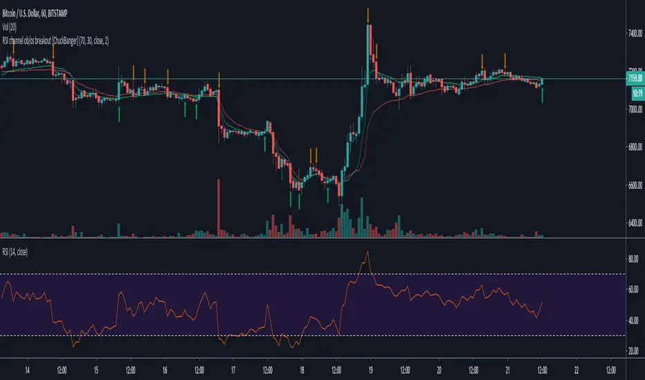
RSI channel ob/os breakout [ChuckBanger]This is a breakout signal script based on reverse engineering of RSI. It shows a channel of overbought and oversold readings that the trader can sett in settings. When low crosses under lower line it shows bullish signal and when high is crossing upper line it shows a bearish signal. The script also has wilder's moving average as filter instead of high/low.
Good luck traders!
TradewithPuneet: Pro-PatternsThe Pro-Patterns strategy is designed to trade classic chart patterns. At present, it identifies the Ascending Triangle patterns and Weekly Inside Bars patterns and takes Long or Short entries, as the case may be.
Ascending Triangle patterns:
- The strategy identifies ascending triangle patterns ranging from 40 to 120 days.
- BUY signals are generated on the breakout of the horizontal resistance line. No SHORT signal is generated on the breakdown of the rising trend line.
- The importance is given to higher lows, instead of attempting to make a perfectly straight rising trend line. Hence, the drawing of the rising trend line is skipped.
- The strategy gives BUY signals on continuation as well as reversal patterns.
- Users can choose exit rules either on the breakdown of a certain number of days or based on ATR.
- The Ascending triangle patterns can be seen on Daily timeframes only.
Weekly Inside Bars
- The strategy identifies inside bars on weekly charts with three candles. This means, that Weekly Inside Bars pattern is said to be formed when the current week's candle is inside the previous week and the previous week's candle is inside the week prior to it.
- A BUY or SHORT signal is generated next week on breakout or breakdown of high or low of third week’s candle.
- The importance is given to a decrease in volume on second & third weeks’ candles.
- The strategy gives BUY or SHORT signals on continuation as well as reversal patterns. However, users can choose to see trading signals on continuation patterns only.
- Users can choose exit rule on breakdown or breakout of a certain number of weeks in case of BUY & SHORT signals respectively.
- The Weekly Inside Bars patterns can be seen on Weekly timeframes only.
The strategy guides you the price level at which to BUY / SHORT and EXIT. It is intended for short to medium-term traders. It is important for the security to close beyond the trigger point for the signal to remain in force.

Swing and Breakout System [ChuckBanger]This is a swing trading script based on price action of a higher time frames. You should always select a higher time frame settings then what your chart you analyse have.
If the price is above the gray line (the breakout line) you should only take long positions and if price goes below you take short positions. The blue dotted lines is displaying the swing entry points and the targets is the yellow dotted lines.
The main trend is made by the gray line that is based on daily average of open and close. It is recommended to trade on 1h to 15m time frame if you have selected 1D settings, for small time frames you can select smaller than 1D.
The ”High/Low Channel, Bars Back” setting is for the blue and orange bands. 40 for example is the highest and lowest bars 40 bars back. ¤0 is OK for 1h and smaller time frames.

Crypto Ingenius Breakout w AlertsThis is the study version with working alerts of the Crypto Ingenius Breakout Strategy since alerts only work in studies

Price Volume BreakoutThis indicator signals you when a breakout occurs with a volume that is a predetermined multiple of the moving average volume.

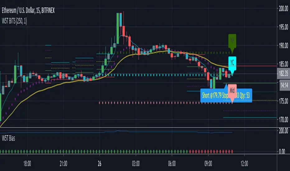
W5T BiasThe Bias indicator is a sub-chart allowing the users of the main B.I.T.S (Breakout Intelligent Trading Signals Indicator) suite. This Bias indicator automatically looks at a higher timeframe and indicates bullish , neutral and bearish Bias. This is respect to our 3 points of control EMA´s.
Check out our signature to learn more!
Extended Recursive Bands - Maximum Efficiency With Extra OptionsIntroducing A New Calculation For Efficient Bands Calculation !
Here it is ! The Recursive Bands Indicator, an indicator specially created to be extremely efficient, i think you already know that calculation time is extra important in algorithmic trading, and this is the principal motivation for the creation of the proposed indicator. Originally described in my paper "Pierrefeu, Alex (2019): Recursive Bands - A New Indicator For Technical Analysis" , the indicator framework has been widely used in my previous uploaded indicators, however it would have been a shame to not upload it, however user experience being a major concern for me, i decided to add extra options, which explain the term "extended".
On The Indicator Calculation
You can skip this part if it doesn't interest you. The calculation of the indicator is based on recursion, but i want to explain the mathematical formula described in the paper.
I've seen some users trying to remake it from the calculations, however there was always something weird, and i understand, mathematical notations are always a bit weird, even myself don't always write them correctly/understand them, however this one is relatively simple to understand.
First lets explain each elements of the calculation :
α = smoothing constant, or 2/(length+1)
max/min = maximum and minimum function, max return the greatest input value while min return the lowest one, for example :
max(4,2) = 4 while min(4,2) = 2
the "||" notation mean taking the absolute value, for example : |-1| = abs(-1) = 1
The calculation after the max/min function is called the correction factor, and is the core of the indicator. The last two variables are just here to provide an initial value for upper and lower, basically when we start our calculations we will assign the value of the closing price for upper and lower.
The motivation behind using a smoothing constant in range of (0,1) was to tell the reader that the indicator is easily made adaptive, this is what i did on my adaptive trailing stop indicator by using the efficiency ratio as smoothing variable, the user can use 1/length instead of the provided calculation for alpha.
If you interested on the indicator main logic, it is actually really simple, by using upper = max(price,upper) and lower = min(price,lower) we would get the maximum/minimum price value at time t , therefore upper can only be greater or equal than its precedent value, while lower can only be lower or equal than its precedent value, in order to fix that we subtract/sum upper/lower with a value, this allow the upper band to be lower than its precedent value and lower to be greater than its precedent value, this is the role of the correction factor.
The Indicator
The indicator display one upper and one lower band, every common usages applied to bands indicators such as support/resistance, breakout, trailing stop...etc, can also be applied to this one. length control how reactive the bands are, higher values of length will make the bands cross the price less often.
In order to provide more flexibility for the user i added the option to use various methods for the calculation of the indicator, therefore the indicator can use the average true range, standard deviation, average high-low range, and one totally exclusive method specially designed for this indicator.
Classic Method
This option make the indicator use its classical calculation, this is the most efficient method of all.
Atr Method (atr)
This method use the average true range as correction factor, notice that lower values of length can still produce wide band.
Standard Deviation Method (stdev)
This method use a biased estimate of the standard deviation as correction factor.
The method produce smoother bands that converge more slowly toward the price in comparison with the classic correction factor.
Average High-Low Range Method (ahlr)
This method use the average of the high-low range as correction factor, extremely similar to the average true range.
Rising Falling Volatility (rfv) Method
A new method created for this indicator, this correction factor use the absolute prices changes when price value is greater/lower than any length past values of the price, this allow to have more boxy shaped bands, work best with greater values of length.
The bands can be in contact with this method, a possible fix in the future.
Conclusion
The recursive band indicator is one of my greatest indicators in my opinion (i would love to have yours), as you can see the idea behind it is extremely simple and allow for a super efficient band indicator, which was the original motivation behind it, in order to provide more fun for the users i also added more option for the correction factor, this allow the user to be creative and not get stuck with the original calculation.
Like the trend step indicator family we have almost ended our series on the recursive band framework, 1 more trailing stop will be added in the future, and then we'll have more "boring" stuff until i find something cool again, it shouldn't be long ;)
Thanks for reading !

5 Bollinger Heat Bands - EMA/Breakout OptionsBollinger Bands are a technical analysis tool, specifically they are a type of trading band or envelope . Trading bands and envelopes serve the same purpose, they provide relative definitions of high and low that can be used to create rigorous trading approaches, in pattern. recognition, and for much more.
The uniqueness in these bands is that you can enable the breakout alerts and even change from the basic sma bollinger bands to ema bands. The application of 5 bands is unique to certain strategies.
