Average Daily % Change by Weekday📊 Average Daily % Change by Weekday
This script calculates and displays the average daily percentage change for each weekday (Monday through Sunday) based on historical price data. It helps traders analyze which days tend to be bullish or bearish over a selected backtest date range.
✅ Features:
Customizable date range (From Year/Month/Day to To Year/Month/Day)
Calculates average % change for each weekday (Mon–Sun)
Supports assets that trade 7 days (e.g., crypto)
Color-coded outputs (green = positive, red = negative)
Final results shown as a table in the bottom-right corner
Works only on the 1D timeframe (daily)
🧠 How it works:
For each day within the selected date range:
The script calculates the % change as: (Close - Open) / Open * 100
Then, it groups the data by weekday and averages the values
This gives you insight into how each day of the week behaves historically for the current asset.
⚠️ Notes:
This script only works on daily (1D) timeframes.
For most accurate results, use it on assets with long trading history (e.g., BTCUSD).
Designed for educational and statistical analysis purposes.
Search in scripts for "change"

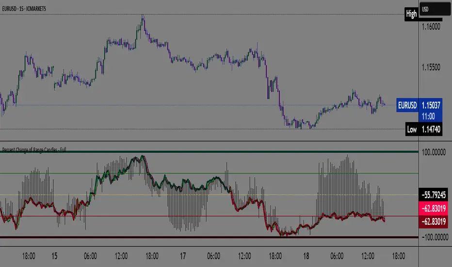
Percent Change of Range Candles - FullPercent Change of Range Candles – Full (PCR Full)
Description:
PCR Full is a custom momentum indicator that measures the percentage price change relative to a defined range, offering traders a unique way to evaluate strength, direction, and potential reversals in price movement.
How it works:
The main value (PCR) is calculated by comparing the price change over a selected number of candles (length) to the range between the highest high and lowest low in the same period.
This percentage change is normalized and visualized with dynamic candles on the subgraph.
Reference levels at +100, +50, 0, -50, and -100 serve as key zones to indicate potential overbought/oversold conditions, continuation, or neutrality.
How to read the indicator:
1. Trend continuation:
When PCR breaks above +50 and holds, it often confirms a strong bullish move.
Similarly, values below -50 and staying low signal a bearish continuation.
2. Wick behavior (volatility insight):
Long wicks on PCR candles suggest uncertainty or failed breakout attempts.
Short or no wicks with strong body color show stable momentum and conviction.
On the chart, multiple long wicks near -50 suggest bulls are attempting to push price upward, but lack the strength — until a confirmed breakout.
3. Polarity transition (Bearish to Bullish or vice versa):
A transition from negative PCR values to above zero shows that the market is possibly turning.
Especially if PCR climbs gradually and stabilizes above zero, it indicates a developing bullish phase.
Components:
Main PCR line: Color-coded (green for rising, red for falling).
Open Average (gray line): Smooths recent PCR values, indicating balance.
High/Low adaptive bands: Adjust dynamically to PCR polarity.
PCR Candles: Visualize OHLC of PCR data for enhanced interpretation.
Suggested use cases:
Enter trend trades when PCR crosses +50 or -50 with volume or price confirmation.
Watch for reversal signs near ±100 if PCR fails to break further.
Use 0 line as a neutral zone — markets hovering near 0 are often in consolidation.
Combine with price action or oscillators like RSI/MACD for additional signals.
Customization:
The length input allows users to define the range for PCR calculations, making it adjustable to various timeframes and strategies (scalping, intraday, swing).
Float, Daily % Change & Short %This TradingView Pine Script displays a compact table on your chart showing four key metrics for any stock:
📊 What It Shows:
Float – Number of publicly available shares, formatted in K/M/B.
Daily % Change – Price change from yesterday’s close to the current price.
Intraday % Change – Price change from today’s open to the current price.
Short Volume % – Estimated short volume as a percentage of total daily volume.
⚙️ How to Use:
Add the script to your TradingView chart.
Choose table size and screen position from the settings panel.
The values update in real-time on the latest candle only, so they stay out of the way but always visible.
Ideal for momentum traders, short float hunters, and day traders who need quick access to real-time float, price action, and short volume stats.

Stock vs SPY % ChangeStock vs SPY % Change Indicator
This Pine Script indicator helps you compare a stock's price performance to the S&P 500 (using SPY ETF) over a user-defined period. It calculates the percentage price change of the stock and SPY, then displays the difference as a relative performance metric. A positive value (plotted in green) indicates the stock is outperforming SPY (e.g., dropping only 3% while SPY drops 10%), while a negative value (plotted in red) shows underperformance.
Features:
Adjustable lookback period (default: 20 days) to analyze recent performance.
Visual plot with green/red coloring for quick interpretation.
Zero line to clearly separate outperformance from underperformance.
How to Use:
Apply the indicator to your stock's chart.
Set the "Lookback Period" in the settings (e.g., 20 for ~1 month).
Check the plot:
Green (above 0) = Stock's % change is better than SPY's.
Red (below 0) = Stock's % change is worse than SPY's.
Use on daily or weekly charts for best results.
Ideal for identifying stocks that hold up better during market downturns or outperform in uptrends. Perfect for relative strength analysis and to spot accumulation.

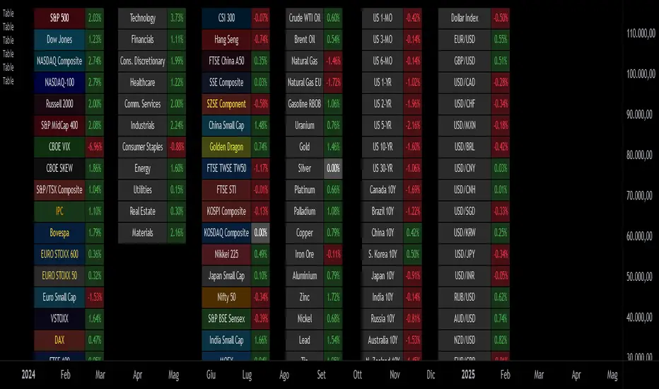
Custom Performance TableThis script generates a table designed to provide a concise yet highly customizable overview of the performance of multiple financial instruments, displayed directly on the chart. The table can include up to 40 tickers, each individually configurable, with values updated in real time based on either the current chart timeframe or a specific user-selected timeframe.
NOTE : The update frequency of the table values depends on the refresh rate of the chart's main ticker to which the indicator is applied. To ensure a consistent and reliable data feed, especially when monitoring heterogeneous instruments, it is recommended to apply the indicator to a highly liquid and continuously traded asset, such as BTCUSD.
PERFORMANCE CALCULATION MODES
You can choose from three different performance calculation modes:
1) Change % (Percentage Change)
Displays the percentage change of the current price compared to the previous candle within the selected timeframe.
(Current Price - Previous Price) / Previous Price * 100
This mode provides an immediate and straightforward measure of each instrument's percentage movement, useful for quick visual comparisons of relative strength among assets.
2) Z-Score
The Z-Score measures how much the current price variation deviates from the historical average variation, relative to the standard deviation of those variations.
(Current Variation - Average Variation) / Standard Deviation of Variations
The result indicates how statistically unusual a movement is:
- Values near 0 suggest normal variations.
- Values above ±2 indicate statistically significant deviations.
This is a valuable tool for identifying overbought/oversold conditions or market stress events and is often used in mean reversion strategies.
NOTE : Due to technical constraints, Z-Score can only be calculated when the selected timeframe matches the chart's timeframe exactly.
3) RAROC (Risk-Adjusted Return on Capital)
RAROC expresses an asset's performance in relation to the risk taken, measured through its volatility (standard deviation of price).
Percentage Change / Standard Deviation of Price
It allows for an assessment of return efficiency in relation to volatility.
A high RAROC value indicates a high return relative to the risk, making it a useful tool for comparing assets with different risk profiles. It is especially suitable for portfolio selection and allocation purposes.
TABLE CONFIGURATION
Each ticker can be customized with its own label, colors, and position in the table.
Each row can display the ticker name or a custom label, which, at the user's discretion, can either replace the name or be shown as an informational tooltip.
The table can be placed anywhere on the chart using horizontal and vertical offset parameters. Thanks to offset support, you can, for example, create financial market overview layouts. This can be done by completely “cleaning” the chart from price and indicators using TradingView settings, and then displaying multiple tables simultaneously (see the example chart published here).
Advanced customization options are also available for the table's appearance, including font settings, colors, borders, and more.
CALCULATION TIMEFRAME
The indicator allows the user to force a specific timeframe (Daily, Weekly, Monthly, Yearly) when applied to intraday charts.
However, for Z-Score mode, the selected timeframe must match the chart's timeframe exactly to ensure correct computation. Otherwise, the script will halt until settings are properly adjusted.
USAGE NOTES
Custom Performance Table is a flexible and adaptable tool, suitable for both intraday operations and medium- to long-term analysis. It is designed for traders and analysts who need to compare assets based on quantitative metrics, whether simple (like percentage change) or more advanced and risk-adjusted (such as Z-Score and RAROC).
Yearly Percentage ChangeThe "Yearly Percentage Change" indicator analyzes the long-term performance of an asset over the past year (252 trading days). It helps traders identify the strength of an asset at first glance by the color of the drawing.
It calculates two key values:
The percentage change from the closing price 252 days ago (Year-over-Year performance).
The percentage change from the lowest price of the last 252 days.
These values are visualized with colored lines and a performance label.
📊 Features & Benefits
1️⃣ Yearly Percentage Change (YoY)
Compares the current closing price with the closing price from 252 days ago.
Draws a solid line from the previous year’s close to the current price.
Line color indicates market performance:
🔴 Red → Price increased up to 100%.
🟡 Yellow → Price increased between 100% and 200%.
🟢 Green → Price increased more than 200%.
2️⃣ 252-Day Low & Its Performance
Identifies the lowest price in the last 252 days.
Draws a dashed line from this low to the current price.
Line color reflects the performance since the low:
🔴 Red → Price increased up to 100%.
🟡 Yellow → Price increased between 100% and 200%.
🟢 Green → Price increased more than 200%.
3️⃣ Informative Performance Label
Displays two key values:
"YoY" → Percentage change from the closing price 252 days ago.
"Low252" → Percentage change from the lowest price in the past 252 days.
Label color depends on the YoY movement.

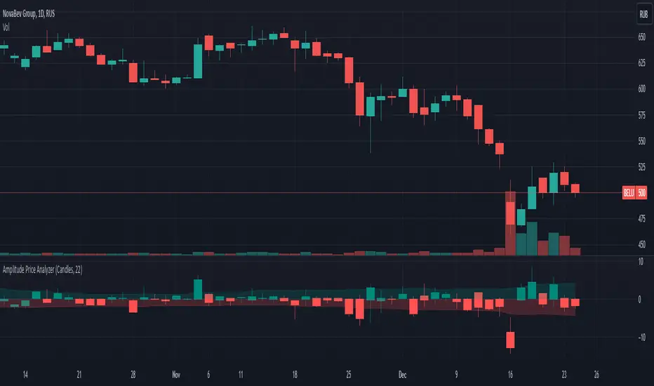
Price Changes Relative to Previous CloseThis script displays the price values in percentages (open, high, low, and close) of the current bars relative to the previous bar's close. This helps visualize the amplitude of price movements. Depending on the user's choice, the display can be in the form of candles or bars.
Main steps of the script
Retrieves the previous bar's closing price.
Calculates the percentage changes in the open, high, low, and close prices of the current bar relative to the previous bar's close.
Sets the colors for bullish (green) and bearish (red) candles/bars.
Allows the user to choose the display type (candles or bars).
Displays the candles or bars on the chart.
Creates arrays to store the highs and lows of the last 252 bars and filters them based on the current bar's close.
Calculates the average values of the highs and lows for the filtered bars and displays them on the chart.
Изменение цен относительно предыдущего закрытия
Этот скрипт отображает значения цен в процентах (открытие, высокие, низкие и закрытие) текущих баров относительно закрытия предыдущего бара. Это помогает визуализировать амплитуду движений цен. В зависимости от выбора пользователя, отображение может быть в виде свечей или баров.
Основные шаги скрипта
Получает цену закрытия предыдущего бара.
Вычисляет процентные изменения открытой, высокой, низкой и закрытой цен текущего бара относительно закрытия предыдущего бара.
Настраивает цвета для бычьих (зелёных) и медвежьих (красных) свечей/баров.
Позволяет пользователю выбирать тип отображения (свечи или бары).
Отображает свечи или бары на графике.
Создаёт массивы для хранения максимумов и минимумов за последние 252 бара и фильтрует их в зависимости от закрытия текущего бара.
Вычисляет средние значения максимумов и минимумов для отфильтрованных баров и отображает их на графике.
TASC 2024.03 Rate of Directional Change█ OVERVIEW
This script implements the Rate of Directional Change (RODC) indicator introduced by Richard Poster in the "Taming The Effects Of Whipsaw" article featured in the March 2024 edition of TASC's Traders' Tips .
█ CONCEPTS
In his article, Richard Poster discusses an approach to potentially reduce false trend-following strategy entry signals due to whipsaws in forex data. The RODC indicator is central to this approach. The idea behind RODC is that one can characterize market whipsaw as alternating up and down ZigZag segments. By counting the number of up and down segments within a lookback window, the RODC indicator aims to identify if the window contains a significant whipsaw pattern:
RODC = 100 * Segments / Window Size (bars)
Larger RODC values suggest elevated whipsaw in the calculation window, while smaller values signify trending price activity.
█ CALCULATIONS
• For each price bar, the script iterates through the lookback window to identify up and down segments.
• If the price change between subsequent bars within the window is in the direction opposite to the current segment and exceeds the specified threshold , the calculation interprets the condition as a reversal point and the start of a new segment.
• The script uses the number of segments within the window to calculate RODC according to the above formula.
• Finally, the script applies a simple moving average to smoothen the RODC data.
Users can change the length of the lookback window , the threshold value, and the smoothing length in the "Inputs" tab of the script's settings.

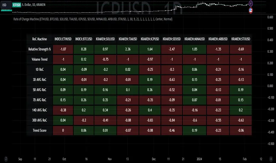
Rate of Change MachineRate of Change Machine
Author: RWCS_LTD
Disclaimer: This script is provided for informational purposes only and should not be considered financial advice. Trading involves substantial risk, and past performance is not indicative of future results. Always conduct your own research and consult with a qualified financial advisor before making any investment decisions.
Introduction:
The Rate of Change Machine is a script designed to assist traders in analyzing multiple cryptocurrency trading pairs simultaneously. This comprehensive indicator offers a holistic view of the rate of change and related metrics, aiding traders in making informed decisions.
Asset Selection:
The script enables users to select up to nine different cryptocurrency trading pairs for in-depth analysis.
Volume Calculation:
Volume plays a crucial role in the analysis, with customizable parameters for volume weighting and length.
Relative Strength Calculation:
Relative Strength is determined through two Exponential Moving Averages (EMA) with user-defined lengths.
Timeframe Weightings:
Different timeframes (1D, AVG 3D, AVG 5D, AVG 7D, AVG 14D, AVG 30D) are assigned weightings to calculate a comprehensive trend score.
Weighted Average and Individual Rate of Change (RoC) Calculation:
The getWeightedAvgAndIndividualROC function calculates the RoC for each selected trading pair based on the given timeframes and weights.
Table Setup:
A table is created to display the results for each trading pair, including relative strength, volume trend, RoC for different timeframes, and a weighted trend score.
Table Formatting:
The table is formatted with different colors indicating positive or negative values for easier interpretation.
Table Position and Size:
Users can customize the position and size of the table on the chart.
Data Retrieval:
The script retrieves the calculated values for each trading pair using the request.security function.
Output:
The final output is a table on the chart, showing relevant information for the selected trading pairs, aiding traders in making informed decisions based on the rate of change and other factors. This indicator provides a comprehensive view of the rate of change and related metrics for multiple trading pairs, assisting traders in identifying potential trends and making informed trading decisions.
Z-score changeAs a wise man once said that:
1. beginners think in $ change
2. intermediates think in % change
3. pros think in Z change
Here is the "Z-score change" indicator that calculates up/down moves normalized by standard deviation (volatility) displayed as bar chart with 1,2 and 3 stdev levels.

Central Bank Liquidity YOY % ChangeThis shows the percent change from a year ago (YOY%) in Central Bank Liquidity
It's important to the study rate of change data in this liquidity metric and compare it to the nominal chart.
When this chart is accelerating, liquidity is being added, meaning it's a good time to be in assets.
When this chart is declining, liquidity is being removed, meaning it's a good time to be in cash.
Bottoms in markets coincide with the rate of change of liquidity going from negative (below the zero line) to positive (above zero)
Central Bank Liquidity = Total value of the assets of all Federal Reserve Banks - Overnight Reverse Repurchase Agreements (RRP) - The Treasury General Account (TGA)

Nasan Rate of Change (ROC)**NOTE: FOR COMPARISON TRADITIONAL ROC IS PLOTTED WITH THE SAME ROC LENGTH OF 9. IT IS NOT PART OF THE INDICATOR"
The Nasan ROC indicator is smoothed version of the of the traditional ROC indicator. The Nasna ROC uses a triple pass moving average differencing strategy. A cumulative sum of the deviations obtained from the moving average differencing provides a smooth "noise free" trend and this cumulative sum of deviations is used for calculating ROC.
Let's break down the components and understand the indicator we discussed earlier:
Sequential Triple Pass Filter:
Three filters with lengths specified by length1, length2, and length3 are applied to the closing prices (close).
The filters involve calculating the cumulative sum of the differences between the closing prices and their respective moving averages.
The idea is to detrend the data and accumulate the deviations from the average over time, emphasizing longer-term trends.
Calculation of Rate of Change (ROC) of Cumulative Sum:
The Rate of Change (ROC) of the cumulative sum (rocCumulativeSum) is calculated using the ta.roc function with a specified length (rocLength).
ROC measures the percentage change in the cumulative sum over a specified period.
The ROC histogram provides insights into the momentum of the detrended series. Positive values suggest increasing momentum, while negative values suggest decreasing momentum.
Pay attention to the color of the histogram bars.
The histogram bars are colored green if the current ROC value is greater than or equal to the previous ROC value, and red otherwise.
This coloring is based on the concept that a positive ROC suggests upward momentum, while a negative ROC suggests downward momentum.
Volatility - Volume Impact:
The Average True Range (ATR) is calculated with a period of 14.
Volume strength is calculated as a factor (VCF) that considers the ratio of the simple moving average (SMA) of the current volume to the SMA of the volume over a longer period (144).
This volume factor (VCF) is then multiplied by ATR, creating a synergy with volatility and volume.
Visualization with Background Color Gradient:
A background color gradient is applied to the chart based on the calculated volume strength (f1).
The gradient color ranges from black (indicating low ATR and volume strength) to purple (indicating high ATR and volume strength). A low value indicates a ranging market with no significant price movements and it is safter to avoid signals generated from ROC histogram in these region.
Synergy of ROC and Volume Strength:
Observe how the ROC signals align with the background color gradient. For example, confirm whether positive ROC aligns with periods of high ATR and volume strength.
This synergy can provide confirmation or divergence signals, adding another layer of analysis.

Average Percentage ChangeThis indicator computes the average percentage change between Simple Moving Averages (SMAs) of high and low prices over a specified lookback length.
The 'length' input determines the period for calculating the SMAs.
The resulting line, represented by 'AVG', displays the percentage change, indicating potential shifts or trends in price momentum.
Traders can use this indicator to identify periods of potential volatility or significant price movements.
Note for Traders:
- Adjust the 'length' input for different analysis periods.
- Watch for crossovers or divergences between the AVG line and price action for potential trading signals.
- Combine with other indicators or analysis techniques for comprehensive market insights.
Originality and Usefulness:
This script provides a unique perspective by evaluating the average percentage change, derived from SMAs of high and low prices, offering traders insights into potential price momentum shifts.

Percent ResearchPercent Research is an indicator that will plot a color / column on the chart in case custom requirements are met.
The requirements are:
- Price : Price requirement (equal or above input).
- Change % Up : Amount the price have moved up in percent (equal or above input).
- Change % Down : Amount the price have moved down in percent (equal or below input).
- Change Interval : Amount of bars the above move happened over.
- Volume : Volume requirement (equal or above input).
- Volume Interval : Amount of bars in a row that each require the above volume.
Example: In case one wants to plot whenever price has made a 20 percent move up or down in a week with minimum 100 000 volume for each of the last 2 days one can use.
Change % Up: 20
Change % Down: -20
Change Interval: 5
Volume: 100 000
Volume Interval: 2
The indicator will plot a color on the chart whenever the requirements are met, which then can be used to look into price action for each colored time period.
The values can be customized dependent on preference, example 100% movers over a month or 20% movers over a week etc.

Adaptive Fisherized ROCIntroduction
Hello community, here I applied the Inverse Fisher Transform, Ehlers dominant cycle determination and smoothing methods on a simple Rate of Change (ROC) indicator
You have a lot of options to adjust the indicator.
Usage
The rate of change is most often used to measure the change in a security's price over time.
That's why it is a momentum indicator.
When it is positive, prices are accelerating upward; when negative, downward.
It is useable on every timeframe and could be a potential filter for you your trading system.
IMO it could help you to confirm entries or find exits (e.g. you have a long open, roc goes negative, you exit).
If you use a trend-following strategy, you could maybe look out for red zones in an in uptrend or green zones in a downtrend to confirm your entry on a pullback.
Signals
ROC above 0 => confirms bullish trend
ROC below 0 => confirms bearish trend
ROC hovers near 0 => price is consolidating
Enjoy! 🚀
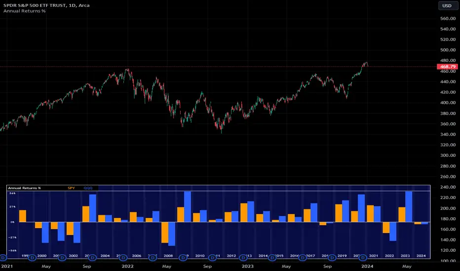
Annual Returns % Comparison [By MUQWISHI]Overview
The Annual Returns % Comparison indicator aimed to compare the historical annual percentage change of any two symbols. The indicator output shows a column-plot that was developed by two using a pine script table, so each period has pair columns showing the yearly percentage change for entered symbols.
Features
- Enter date range.
- Fill up with any two symbols.
- Choose the output data whether adjusted or not.
- Change the location of the table plot
- Color columns by a symbol.
- Size the height and width of columns.
- Color background, border, and text.
- The tooltip of the column value appears once the cursor sets above the specific column. As it seen below.
Let me know if you have any questions.
Thanks.
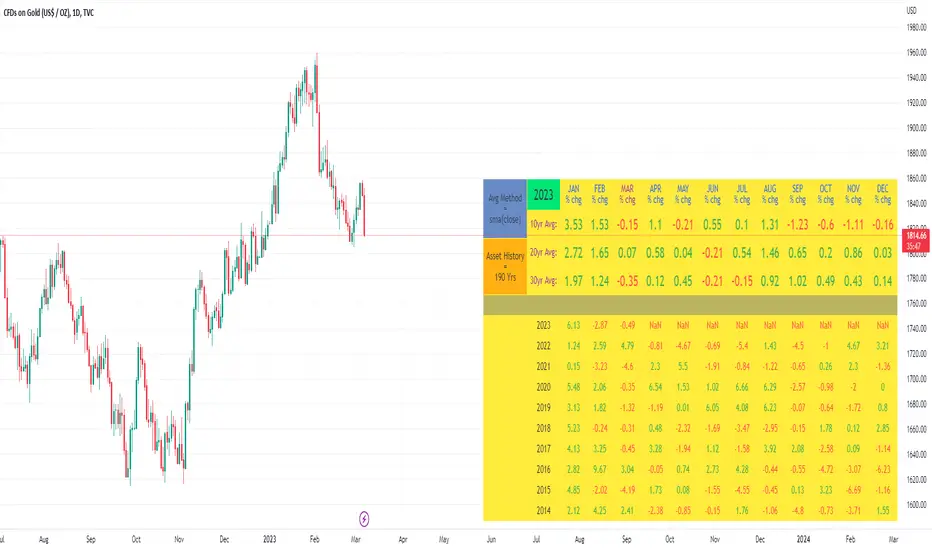
10yr, 20yr, 30yr Averages: Month/Month % Change; SeasonalityCalculates 10yr, 20yr and 30yr averages for month/month % change
~shows seasonal tendencies in assets (best in commodities). In above chart: August is a seasonally bullish month for Gold: All the averages agree. And January is the most seasonally bullish month.
~averages represent current month/previous month. i.e. Jan22 average % change represents whole of jan22 / whole of dec21
~designed for daily timeframe only: I found calling monthly data too buggy to work with, and I thought weekly basis may be less precise (though it would certainly reduce calculation time!)
~choose input year, and see the previous 10yrs of monthly % change readings, and previous 10yrs Average, 20yr Average, 30yr Average for the respective month. Labels table is always anchored to input year.
~user inputs: colors | label sizes | decimal places | source expression for averages | year | show/hide various sections
~multi-yr averges always print, i.e if only 10yrs history => 10yr Av = 20yr Av = 30yr Av. 'History Available' label helps here.
Based on my previously publised script: "Month/Month Percentage % Change, Historical; Seasonal Tendency"
Publishing this as seperate indicator because:
~significantly slower to load (around 13 seconds)
~non-premium users may not have the historical bars available to use 20yr or 30yr averages =>> prefer the lite/speedier version
~~tips~~
~after loading, touch the new right scale; then can drag the table as you like and seperate it from price chart
##Debugging/tweaking##
Comment-in the block at the end:
~test/verifify specific array elements elements.
~see the script calculation/load time
~~other ideas ~~
~could tweak the array.slice values in lines 313 - 355 to show the last 3 consecutive 10yr averages instead (i.e. change 0, 10 | 0,20 | 0, 30 to 0, 10 | 10, 20 | 20,30)
~add 40yr average by adding another block to each of the array functions, and tweaking the respective labels after line 313 (though this would likely add another 5 seconds to the load time)
~use alternative method for getting obtaining multi-year values from individual month elements. I used array.avg. You could try array.median, array.mode, array.variance, array.max, array.min (lines 313-355)
Moving Average Convergence Divergence with Rate of Change
Purpose - MACD is an awesome indicator. However, I felt I could improve the existing MACD indicator by also letting it visualize the rate of change (ROC) of the histogram (whether rate of change is increasing or decreasing - just like a derivative). By doing so, the indicator will better show the rate of change of the trend.
How It's Done - To the original MACD indicator, I have added a bit more conditional statements that automatically calculates the ROC in MACD histogram and visualizes through 8 different colors.
Interpretation - While the histogram is above 0, darker color indicates the stronger up trend, and lighter the color, weaker the up trend and potentially indicates the bears are overtaking, and vice versa for the case where the histogram is below 0.
MTF Price/Volume % [Anan]Hello friends,
This is a multi-timeframe table with these features:
Display price change percentage compared with the last timeframe candle close.
Display price change percentage compared with the last timeframe candle close MA.
Displays change percentage compared with the last timeframe candle volume.
Displays change percentage compared with the last timeframe candle volume MA.
Change type/length of MA for Price/Volume.
Full control of Panel position and size.
Full control of displaying any row or column.

[blackcat] L1 Vitali Apirine Rate Of Change With BandsLevel: 1
Background
Vitali Apirine introuced this RoC indicator of “Rate Of Change With Bands” on March 2021.
Function
In Vitali Apirine's article “Rate Of Change With Bands” , the author introduces a concept of identifying overbought and oversold levels based on calculating standard deviation bands of the rate of change (ROC) momentum oscillator. The rate of change bands widen and narrow as the ROC deviation increases and decreases. The author proposes using this indicator in conjunction with other technical analysis methods to determine if the instrument is overbought or oversold.
Key Signal
UpperBand --> overbought threshold
oMARoc --> Output RoC Moving Average
LowerBand --> oversold threshold
Labels
L --> Long
S --> Short
XL --> Close Long
XS --> Close Short
Pros and Cons
100% Vitali Apirine definition translation, even variable names are the same. This help readers who would like to use pine to read his article.
Remarks
The 1st script for Blackcat1402 Vitali Apirine series publication.
Readme
In real life, I am a prolific inventor. I have successfully applied for more than 60 international and regional patents in the past 12 years. But in the past two years or so, I have tried to transfer my creativity to the development of trading strategies. Tradingview is the ideal platform for me. I am selecting and contributing some of the hundreds of scripts to publish in Tradingview community. Welcome everyone to interact with me to discuss these interesting pine scripts.
The scripts posted are categorized into 5 levels according to my efforts or manhours put into these works.
Level 1 : interesting script snippets or distinctive improvement from classic indicators or strategy. Level 1 scripts can usually appear in more complex indicators as a function module or element.
Level 2 : composite indicator/strategy. By selecting or combining several independent or dependent functions or sub indicators in proper way, the composite script exhibits a resonance phenomenon which can filter out noise or fake trading signal to enhance trading confidence level.
Level 3 : comprehensive indicator/strategy. They are simple trading systems based on my strategies. They are commonly containing several or all of entry signal, close signal, stop loss, take profit, re-entry, risk management, and position sizing techniques. Even some interesting fundamental and mass psychological aspects are incorporated.
Level 4 : script snippets or functions that do not disclose source code. Interesting element that can reveal market laws and work as raw material for indicators and strategies. If you find Level 1~2 scripts are helpful, Level 4 is a private version that took me far more efforts to develop.
Level 5 : indicator/strategy that do not disclose source code. private version of Level 3 script with my accumulated script processing skills or a large number of custom functions. I had a private function library built in past two years. Level 5 scripts use many of them to achieve private trading strategy.

RS.ROC | Relative Strength - Rate of Changes - 4CR CUPFor completeness of Relative Strength studies, the Relative Strength based on rate of changes (ROC) with weighting is coded and presented as well.
The RS.ROC is similar to the formulation of RS by IBD before rank among all the stocks in the market.
The lookback period is relaxed for customizing. Once you set the total lookback period, representing the 4Q, in the indicator, the other shorter lookback periods will be auto-calculated, namely, 1Q, 2Q, 3Q.
A simple moving average of the RS.ROC is also added for your easier analysis on the trend development of the strength.
To use it later at your charting later,
1. Favorite it;
2. Select from your favorite list.

High Low Rate Of ChangeAn experimental indicator using Pine Script Arrays. The indicators measures the rate of change of the highest highs and lowest lows. I call it the "High Low Rate of Change".
The H/L Rate of Change indicator finds the delta between the current highest high and previous highest high and after some filtering places these values into an array.
Same goes for the lowest lows.
In the end Sum it all up into the Histogram with optional smoothing using Exponential moving average (EMA).
==Colors==
Green: Up Trending.
Light Green: Weakening up trend.
Red: Down Trending.
Light Red Weakening Down Trending.
==Notes==
Bar colors are disabled by default.
Supports EMA smoothing (enabled by default).
Like if you Like and Enjoy!
Follow up for upcoming indicators: www.tradingview.com

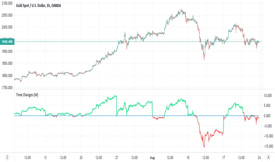
Time ChangesThis is very cool and simple script
I just play around with non security MTF and this is the end result:)
buy period is lime, sell period is red
since it based on the changes of the MTF by time it give us very nice signal of bullish or bearish period
since no security is here so no repaint fear..
if you use 1 hour candle choose either daily (better for crypto ) or weekly MTF (better for stocks ) or even higher
if you use lower TF then try to see which MTF is best suited for it
simple and nice I think :)
here on tesla
facebook
boeing
nifty
forex
etc