Realtime FootprintThe purpose of this script is to gain a better understanding of the order flow by the footprint. To that end, i have added unusual features in addition to the standard features.
I use "Real Time 5D Profile by LucF" main engine to create basic footprint(profile type) and added some popular features and my favorites.
This script can only be used in realtime, because tradingview doesn't provide historical Bid/Ask date.
Bid/Ask date used this script are up/down ticks.
This script can only be used by time based chart (1m, 5m , 60m and daily etc)
This script use many labels and these are limited max 500, so you can't display many bars.
If you want to display foot print bars longer, turn off the unused sub-display function.
Default setting is footprint is 25 labels, IB count is 1, COT high and Ratio high is 1, COT low and Ratio low is 1 and Delta Box Ratio Volume is 1 , total 29.
plus UA , IB stripes , ladder fading mark use several labels.
///////// General Setting ///////////
Resets on Volume / Range bar
: If you want to use simple time based Resets on, please set Total Volume is 0.
Your timeframe is always the first condition. So if you set Total Volume is 1000, both conditions(Volume >= 1000 and your timeframe start next bar) must be met. (that is, new footprint bar doesn't start at when total volume = exactly 1000).
Ticks per row and Maximum row of Bar
: 1 is minimum size(tick). "Maximum row of Bar" decide the number of rows used in one footprint. 1 row is created from 1 label, so you need to reduce this number to display many footprints (Max label is 500).
Volume Filter and For Calculation and Display
: "Volume Filter" decide minimum size of using volume for this script.
"For Calculation and Display" is used to convert volume to an integer.
This script only use integer to make profile look better (I contained Bid number and Ask number in one row( one label) to saving labels. This require to make no difference in width by the number of digits and this script corresponds integers from 0 to 3 digits).
ex) Symbol average volume size is from 0.0001 to 0.001. You decide only use Volume >= 0.0005 by "Volume Filter".
Next, you convert volume to integer, by setting "For Calculation and Display" is 1000 (0.0005 * 1000 = 5).
If 0.00052 → 5.2 → 5, 0.00058 → 5.8 → 6 (Decimal numbers are rounded off)
This integer is used to all calculation in this script.
//////// Main Display ///////
Footprint, Total, Row Delta, Diagonal Delta and Profile
: "Footprint" display Ask and Bid per row. "Total" display Ask + Bid per row.
"Row Delta" display Ask - Bid per row. "Diagonal Delta" display Ask(row N) - Bid(row N -1) per row.
Profile display Total Volume(Ask + Bid) per row by using Block. Profile Block coloring are decided by Row Delta value(default: positive Row Delta (Ask > Bid) is greenish colors and negative Row Delta (Ask < Bid) is reddish colors.)
Volume per Profile Block, Row Imbalance Ratio and Delta Bull/Bear/Neutral Colors
: "Volume per Profile Block" decide one block contain how many total volume.
ex) When you set 20, Total volume 70 display 3 block.
The maximum number of blocks that can be used per low is 20.
So if you set 20, Total volume 400 is 20 blocks. total volume 800 is 20 blocks too.
"Row Imbalance Ratio" decide block coloring. The row imbalance is that the difference between Ask and Bid (row delta) is large.
default is x3, x2 and x1. The larger the difference, the brighter the color.
ex) Ask 30 Bid 10 is light green. Ask 20 Bid 10 is green. Ask 11 Bid 10 is dark green.
Ask 0 Bid 1 is light red. Ask 1 Bid 2 is red. ask 30 Bid 59 is dark green.
Ask 10 Bid 10 is neutral color(gray)
profile coloring is reflected same row's other elements(Ask, Bid, Total and Delta) too.
It's because one label can only use one text color.
/////// Sub Display ///////
Delta, total and Commitment of Traders
: "Delta" is total Ask - total Bid in one footprint bar. Total is total Ask + total Bid in one footprint bar.
"Commitment of traders" is variation of "Delta". COT High is reset to 0 when current highest is touched. COT Low is opposite.
Basic concept of Delta is to compare price with Delta. Ordinary, when price move up, delta is positive. Price move down is negative delta.
This is because market orders move price and market orders are counted by Delta (although this description is not exactly correct).
But, sometimes prices do not move even though many market orders are putting pressure on price , or conversely, price move strongly without many market orders.
This is key point. Big player absorb market orders by iceberg order(Subdivide large orders and pretend to be small limit orders.
Small limit orders look weak in the order book, but they are added each time you fill, so they are more powerful than they look.), so price don't move.
On the other hand, when the price is moving easily, smart players may be aiming to attract and counterattack to a better price for them.
It's more of a sport than science, and there's always no right response. Pay attention to the relationship between price, volume and delta.
ex) If COT Low is large negative value, it means many sell market orders is coming, but iceberg order is absorbing their attack at limit order.
you should not do buy entry, only this clue. but this is one of the hints.
"Delta, Box Ratio and Total texts is contained same label and its color are "Delta" coloring. Positive Delta is Delta Bull color(green),Negative Delta is Delta Bear Color
and Delta = 0 is Neutral Color(gray). When Delta direction and price direction are opposite is Delta Divergence Color(yellow).
I didn't add the cumulative volume delta because I prefer to display the CVD line on the price chart rather than the number.
Box Ratio , Box Ratio Divisor and Heavy Box Ratio Ratio
: This is not ordinary footprint features, but I like this concept so I added.
Box Ratio by Richard W. Arms is simple but useful tool. calculation is "total volume (one bar) divided by Bar range (highest - lowest)."
When Bull and bear are fighting fiercely this number become large, and then important price move happen.
I made average BR from something like 5 SMA and if current BR exceeds average BR x (Heavy Box Ratio Ratio), BR box mark will be filled.
Box Ratio Divisor is used to good looking display(BR multiplied by Box Ratio Divisor is rounded off and displayed as an integer)
Diagonal Imbalance Count , D IB Mark and D IB Stripes
: Diagonal Imbalance is defined by "Diagonal Imbalance Ratio".
ex) You set 2. When Ask(row N) 30 Bid(row N -1)10, it's 30 > 10*2, so positive Diagonal Imbalance.
When Ask(row N) 4 Bid(row N -1)9, it's 4*2 < 9, so negative Diagonal Imbalance.
This calculation does not use equals to avoid Ask(row N) 0 Bid(row N -1)0 became Diagonal Imbalance.
Ask(row N) 0 Bid(row N -1)0, it's 0 = 0*2, not Diagonal Imbalance. Ask(row N) 10 Bid(row N -1)5, it's 10 = 5*2, not Diagonal Imbalance.
"D IB Mark" emphasize Ask or Bid number which is dominant side(Winner of Diagonal Imbalance calculation), by under line.
"Diagonal Imbalance Count" compare Ask side D IB Mark to Bid side D IB Mark in one footprint.
Coloring depend on which is more aggressive side (it has many IB Mark) and When Aggressive direction and price direction are opposite is Delta Divergence Color(yellow).
"D IB Stripes" is a function that further emphasizes with an arrow Mark, when a DIB mark is added on the same side for three consecutive row. Three consecutive arrow is added at third row.
Unfinished Auction, Ratio Bounds and Ladder fading Mark
: "Unfinished Auction" emphasize highest or lowest row which has both Ask and Bid, by Delta Divergence Color(yellow) XXXXXX mark.
Unfinished Auction sometimes has magnet effect, price may touch and breakout at UA side in the future.
This concept is famous as profit taking target than entry decision.
But, I'm interested in the case that Big player make fake breakout at UA side and trapped retail traders, and then do reversal with retail traders stop-loss hunt.
Anyway, it's not stand alone signal.
"Ratio Bounds" gauge decrease of pressure at extreme price. Ratio Bounds High is number which second highest ask is divided by highest ask.
Ratio Bounds Low is number which second lowest bid is divided by lowest bid. The larger the number, the less momentum the price has.
ex)first footprint bar has Ratio Bounds Low 2, second footprint bar has RBL 4, third footprint bar has RBL 20.
This indicates that the bear's power is gradually diminishing.
"Ladder fading mark" emphasizes the decrease of the value in 3 consecutive row at extreme price. I added two type Marks.
Ask/Bid type(triangle Mark) is Ask/Bid values are decreasing of three consecutive row at extreme price.
Row Imbalance type(Diamond Mark) are row Imbalance values are decreasing of three consecutive row at extreme price.
ex)Third lowest Bid 40, second lowest Bid 10 and lowest Bid 5 have triangle up Mark. That is bear's power is gradually diminishing.
(This Mark only check Bid value at lowest price and Ask value at highest price).
Third highest row delta + 60, second highest row delta + 5, highest delta - 20 have diamond Mark. That is Bull's power is gradually diminishing.
Sub display use Delta colors at bottom of Sub display section.
////// Candle & POC /////////
candle and POC
: Ordinary, "POC" Point of Control is row of largest total volume, but this script'POC is volume weighted average.
This is because the regular POC was visually displayed by the profile ,and I was influenced LucF's ideas.
POC coloring is decided in relation to the previous POC. When current POC is higher than previous POC, color is UP Bar Color(green).
In the opposite case, Down Bar color is used.
POC Divergence Color is used when Current POC is up but current bar close is lower than open (Down price Bar),or in the opposite case.
POC coloring has option also highlight background by Delta Divergence Color(yellow). but bg color is displayed at your time frame current price bar not current footprint bar.
The basic explanation is over.
I add some image to promote understanding basic ideas.
Search in scripts for "poc"

DeltaFlow Volume Profile [BigBeluga]🔵 OVERVIEW
The DeltaFlow Volume Profile builds a compact volume profile next to price and enriches every bin with flow context : bullish vs. bearish participation (%), a per-bin Delta % , an optional Delta Heat Map , and a PoC band with the bin’s absolute volume. This lets you see not just where volume clustered, but who (buyers or sellers) dominated inside each price slice.
🔵 CONCEPTS
Binned Volume Profile : Price range over a user-defined LookBack is split into Bins ; each bin aggregates traded volume.
Bull/Bear Split : Within every bin, volume is separated by candle direction into Bull Volume and Bear Volume , then normalized to % of the bin’s displayed size.
Delta % : The difference between Bull % and Bear % for the bin. Positive = buyer dominance; negative = seller dominance.
Delta Heat Map : Bin background shading that scales with both total volume strength and delta bias.
PoC (Point of Control) : The most significant bin gets a PoC band and a label with its absolute volume.
🔵 FEATURES
Profile with Flow : A clean horizontal volume bar per bin plus stacked Bull % and Bear % .
Per-Bin Delta Label : A readable “Δ xx%” tag at the start of each bin shows dominance at a glance.
Delta Heat Map : Optional gradient that intensifies with higher volume and stronger delta.
PoC Highlight : Optional PoC band colored separately, labeled with absolute volume (e.g., “1.23M”).
Configurable Inputs : LookBack, number of Bins (10–100), toggles for Delta, Heat Map, Volume Bars, and PoC color.
Readable Colors : Separate inputs for bullish (volume +) and bearish (volume –) hues.
🔵 HOW TO USE
Set the window : Choose LookBack and Bins to balance detail vs. performance (more bins = finer resolution).
Enable “Volume Bars” to display the bull/bear split as two stacked percent bars inside each bin.
High Bull % near support → constructive demand.
High Bear % near resistance → active supply.
Use Δ labels (toggle “Delta”) to quickly spot bins with clear buyer/seller control; combine with price position for confluence.
Turn on Delta Heat Map to prioritize areas with both large volume and strong imbalance.
Watch the PoC : The PoC band marks the most traded (and often magnet) level; its label shows absolute size for context.
Trade ideas :
Breakout continuation when Δ stays positive across consecutive upper bins.
Reversion risk when price enters a large bearish-Δ cluster below.
Manage risk around the PoC; reactions there can be sharp.
🔵 CONCLUSION
DeltaFlow Volume Profile upgrades a classic profile with flow intelligence. The bull/bear split, explicit Δ %, heat-weighted backdrop, and PoC volume label make dominant participation and key price shelves obvious. Use it to filter levels, time entries with imbalance, and validate breakouts or fades with objective volume-flow evidence.

IDKFAIDKFA - Advanced Order Blocks & Volume Profile with Market Structure Analysis
Why IDKFA?
Named after the legendary DOOM cheat code that gives players "all weapons and full ammo," IDKFA provides traders with a comprehensive arsenal of market analysis tools. Just as the cheat code arms players with everything needed for combat, this indicator equips traders with essential market structure tools: Order Blocks, Volume Profile, LVN/HVN areas, Fibonacci retracements, and intelligent buy/sell signals - all in one unified system.
Core Features
Order Blocks Detection
Automatically identifies institutional order blocks using pivot high/low analysis
Extends blocks dynamically until price interaction occurs
Bullish blocks (demand zones) and bearish blocks (supply zones)
Customizable opacity and extend functionality
Advanced Volume Profile
Real-time volume profile calculation for multiple session types
Point of Control (POC), Value Area High (VAH), and Value Area Low (VAL)
Mode 1: Side-by-side bull/bear volume display
Mode 2: Overlapped volume display with percentage analysis
Shows buying vs selling pressure at each price level
LVN/HVN Area Detection
Low Volume Nodes (LVN): Areas below VAL where price moves quickly
High Volume Nodes (HVN): Areas above VAH with strong resistance
NPOC (Naked Point of Control): Single print areas within Value Area
Volume-based gradient coloring shows relative activity levels
Smart Fibonacci Retracements
Auto-detects trend direction for proper fibonacci orientation
Dynamic color coding: Red levels in uptrends, Gold in downtrends
Special 88.6% level turns lime green in downtrends
Key levels: 23.6%, 38.2%, 50%, 61.8%, 65%, 78.6%, 88.6%
Intelligent Signal System
Works best on higher timeframes
Identifies high-probability reversal setups at key levels
Buy signals: Large bearish rejection followed by bullish reclaim
Sell signals: Large bullish rejection followed by bearish breakdown
Signals only trigger near significant support/resistance areas
Signal Analysis & Usage Guidelines
Buy Signal Mechanics
The buy signal triggers when:
Previous candle shows significant bearish movement (minimum ATR multiplier)
Current candle reclaims a configurable percentage of the previous candle's range
Price is near a key support level (order blocks, fibonacci, volume levels)
Sell Signal Mechanics
The sell signal triggers when:
Previous candle shows significant bullish movement (minimum ATR multiplier)
Current candle rejects below a configurable percentage of the previous candle's range
Price is near a key resistance level (order blocks, fibonacci, volume levels)
When to TAKE Signals
High Probability Buy Signals:
Signal appears AT or BELOW the VAL (Value Area Low)
Signal occurs at bullish order block confluence
Price is in LVN area below VAL (momentum acceleration zone)
Signal aligns with fibonacci 61.8% or 78.6% support
Multiple session POC levels provide support confluence
Previous session's VAL acting as current support
High Probability Sell Signals:
Signal appears AT or ABOVE the VAH (Value Area High)
Signal occurs at bearish order block confluence
Price is in HVN area above VAH (heavy resistance zone)
Signal aligns with fibonacci 61.8% or 78.6% resistance
Multiple session POC levels provide resistance confluence
Previous session's VAH acting as current resistance
When to AVOID Signals
Avoid Buy Signals When:
Signal appears ABOVE the VAH (buying into resistance)
Price is in HVN red zones (high volume resistance areas)
No clear support structure below current price
Volume profile shows heavy selling pressure (high bear percentages)
Signal occurs during low-volume periods between major sessions
Multiple bearish order blocks exist below current price
Avoid Sell Signals When:
Signal appears BELOW the VAL (selling into support)
Price is in LVN green zones (momentum could continue)
No clear resistance structure above current price
Volume profile shows heavy buying pressure (high bull percentages)
Signal occurs during Asian session ranges without clear direction
Multiple bullish order blocks exist above current price
Volume Profile Context for Signals
Understanding Bull/Bear Percentages:
70%+ Bull dominance at a level = Strong support expected
70%+ Bear dominance at a level = Strong resistance expected
50/50 Split = Neutral zone, less predictable
Use percentages to gauge conviction behind moves
POC (Point of Control) Interactions:
Signals above POC in uptrend = Higher probability
Signals below POC in downtrend = Higher probability
Signals against POC bias require extra confirmation
POC often acts as magnetic level for price return
Trading Strategies
Strategy 1: VAL/VAH Bounce Strategy
Wait for price to approach VAL (support) or VAH (resistance)
Look for signal confirmation at these critical levels
Enter with tight stops beyond the Value Area
Target opposite boundary or next session's levels
Strategy 2: Order Block + Volume Confluence
Identify order block alignment with VAL/VAH
Wait for signal within the confluence zone
Enter on signal with stop beyond order block
Use LVN areas as acceleration zones for targets
Strategy 3: LVN/HVN Strategy
LVN (Green) Areas: "Go Zones" - expect quick price movement through low volume
HVN (Red) Areas: "Stop Zones" - expect resistance and potential reversals
NPOC Areas: "Fill Zones" - price often returns to fill single print gaps
Strategy 4: Multi-Session Analysis
Use Daily/Weekly for major structure context
Use 4H for intermediate levels
Use 1H for precise entry timing
Ensure all timeframes align before taking signals
Strategy 5: Fibonacci + Volume Profile
Buy signals at 61.8% or 78.6% fibonacci near VAL
Sell signals at 61.8% or 78.6% fibonacci near VAH
Use 88.6% level as final support/resistance before major moves
50% level often aligns with POC for confluence
Signal Quality Assessment
Grade A Signals (Highest Probability):
Signal at VAL/VAH with order block confluence
Fibonacci level alignment (61.8%, 78.6%)
Volume profile shows 70%+ dominance in signal direction
Multiple timeframe structure alignment
Signal occurs during high-volume sessions (London/NY)
Grade B Signals (Moderate Probability):
Signal near POC with some confluence
Fibonacci 50% or 38.2% alignment
Mixed volume profile readings (50-70% dominance)
Some timeframe alignment present
Signal during overlap sessions
Grade C Signals (Lower Probability):
Signal with minimal confluence
Weak fibonacci alignment or none
Volume profile neutral or against signal
Conflicting timeframe signals
Signal during low-volume periods
Risk Management Guidelines
Position Sizing Based on Signal Quality:
Grade A: Standard position size
Grade B: Reduced position size (50-75%)
Grade C: Minimal position size (25%) or skip entirely
Stop Loss Placement:
Beyond order block boundaries
Outside Value Area (VAL/VAH)
Below/above fibonacci confluence levels
Account for session volatility ranges
Profit Targets:
First target: Opposite VAL/VAH boundary
Second target: Next session's key levels
Final target: Major order blocks or fibonacci extensions
Credits & Attribution
Original components derived from:
Market Sessions & Volume Profile by © Leviathan (Mozilla Public License 2.0)
Volume Profile elements inspired by @LonesomeTheBlue's volume profile script
Pivot Order Blocks by TradingWolf / © MensaTrader (Mozilla Public License 2.0)
Auto Fibonacci Retracement code (public domain)
Significant enhancements and modifications include:
Advanced LVN/HVN detection and visualization
Bull/Bear percentage analysis for Mode 2/3
Comprehensive alert system with market context
Integrated buy/sell signals at key levels
Performance optimizations and extended session support
Enhanced Mode 2/3 with percentage pressure analysis
Important Disclaimers
This indicator is a technical analysis tool designed for educational purposes. It does not provide financial advice, investment recommendations, or trading signals that guarantee profits. All trading involves substantial risk of loss, and past performance does not guarantee future results. Users should conduct their own research, understand the risks involved, and consider consulting with qualified financial advisors before making trading decisions. The signals and analysis provided are based on historical price patterns and volume data, which may not predict future market movements accurately.
Best Practices
Never trade signals blindly - always consider volume profile context
Wait for confluence between multiple tools before entering
Respect the Value Area - avoid buying above VAH or selling below VAL
Use session context - Asian ranges vs London/NY breakouts
Practice proper risk management - position size based on signal quality
Understand the bigger picture - use multiple timeframes for context
Remember: Like the IDKFA cheat code, having all the tools doesn't guarantee success. The key is learning to use them together effectively and understanding when NOT to take a signal is often more important than knowing when to take one.

DSMS - DeltaSurge Matrix Station - 1M Scalping [SurgeGuru]DSMS - DeltaSurge Matrix Station
HOW TO READ THE CHART
=====================================
This guide explains every visual element you see on the chart.
DSMS is a volume profile + order flow indicator built for 1-minute Bitcoin scalping.
It shows WHERE institutional money is sitting and WHERE price is likely to react next.
=====================================
1. THE VOLUME PROFILE (left side of chart)
=====================================
The colored horizontal bars extending left from the candles are the volume profile.
Each bar represents a price level (called a "bin") and shows how much volume traded there.
LONGER BAR = more volume at that price.
BAR COLOR tells you who is in control:
- Green/teal bar = buyers dominated that level (bullish delta)
- Red/orange bar = sellers dominated that level (bearish delta)
- The more intense the color, the stronger the imbalance
SPLIT BARS (bull/bear breakdown):
If enabled, each bar splits into two halves showing exact buy vs sell volume.
Top half = sell volume, bottom half = buy volume.
HEATMAP (wide faded bars behind the profile):
The large transparent boxes behind the profile bars are the heatmap.
They show the same delta information but stretched wider for quick visual scanning.
Bright = high conviction. Faded = low conviction.
=====================================
2. KEY PRICE LEVELS ON THE PROFILE
=====================================
POC (Point of Control):
The bin outlined with a bright border is the POC -- the single price level
with the MOST volume. Price tends to gravitate back to the POC.
A small label shows the POC price and context like "EQUILIBRIUM" or "BULL ATK".
POC FLASH LINE:
A short dashed cyan line appears at the POC when a bounce is detected.
Trigger conditions: price is at the POC, the current candle is bullish after
a bearish candle, and volume is at least 1.2x average. This signals that
the POC is acting as active support and price is reacting to it in real time.
VA HIGH / VA LOW (Value Area lines):
Two horizontal lines mark the top and bottom of the Value Area -- the price range
where approximately 70% of volume traded. These act as support and resistance.
- VA High = resistance when price is below, breakout level when price pushes above
- VA Low = support when price is above, breakdown level when price drops below
When a breakout happens, the line turns green (up) or red (down) and gets thicker.
=====================================
3. LABELS ON PROFILE BINS
=====================================
Each profile bin can show a small text label. These describe what is happening
at that specific price level. Here is what each label means:
ABS (with up/down arrow):
"ABS▼ 7b" = Absorption detected. Institutional players are absorbing selling
pressure at this level (likely accumulating). The "7b" means it held for 7 bars.
ABS▼ = absorbing sells (bullish). ABS▲ = absorbing buys (bearish).
FLOW (with arrow):
"FLOW↑" or "FLOW↓" = A flow shift happened here. The delta direction reversed,
meaning buyers took over from sellers or vice versa. This is a momentum change signal.
FAIL (with arrow):
"FAIL↑" or "FAIL↓" = A flow shift was detected but FAILED to confirm.
The reversal started but price did not follow through. Shown in orange.
Often means the opposing side absorbed the move.
INVAL / INVALID:
"INVAL" or "INVALID" = A previously confirmed flow shift was invalidated.
Price reversed back through the shift level, canceling the signal.
Shown in orange. Treat the original shift direction as no longer valid.
BULL EXH / BEAR EXH:
"BULL EXH" or "BEAR EXH" = Exhaustion zone. Extreme delta (above 65%) combined
with FADING volume. The dominant side pushed too hard and is running out of fuel.
Shown in gold. Often precedes a reversal. Higher delta + lower volume = more exhausted.
IMBALANCE RATIO (number:1):
"4:1" = The ratio of buy volume to sell volume (or vice versa) at this bin.
A 4:1 ratio means one side has 4x the volume of the other.
Only shown when the imbalance exceeds the configured threshold.
ICE:
"ICE" = Iceberg order detected in this bin. High volume traded but price barely
moved, suggesting a large hidden order was absorbing all the activity.
CONFL / CONF+ / CONF-:
Confluence detected. Multiple signals (structure + order flow) agree on direction.
CONF+ = bullish confluence. CONF- = bearish confluence.
CONFLICT:
Structure says one thing, order flow says another. Be cautious.
STK (with multiplier):
"STK x3" = Imbalance stack. Three or more consecutive bins all lean the same
direction. Shows institutional pressure building across multiple price levels.
OB (with arrow):
"OB↑" or "OB↓" = This bin overlaps with an active Order Block (see section 6).
FVG (with arrow):
"FVG↑" or "FVG↓" = This bin overlaps with an active Fair Value Gap (see section 7).
"uFVG↑" or "uFVG↓" = Same but for a micro-level FVG (smaller gap detected
within the profile structure rather than on-chart candle gaps).
uSR:
Micro structure level. A price level that has been tested multiple times with
high volume -- acts as local support or resistance.
EQUILIBRIUM / BULL ATK / BEAR DEF / etc:
Context labels that describe the state of the bin:
- EQUILIBRIUM = balanced buyers and sellers
- BULL ATK = buyers attacking with increasing volume
- BULL DEF = buyers holding but volume fading
- BEAR ATK = sellers attacking with increasing volume
- BEAR DEF = sellers holding but volume fading
CONFIDENCE SCORE (number at end of label):
Example: "ABS▼ CONFL "
The number in brackets is a confidence score from 0-100.
Higher = more signals agreeing. Above 70 is strong.
DWELL TIME:
"8d" at the end means price spent 8 bars dwelling at this level.
More time at a level = stronger support/resistance.
=====================================
4. ARROWS ON PROFILE BINS
=====================================
Small arrows may appear to the right of profile bars:
DELTA ARROWS (^^):
Show if buying/selling pressure is accelerating or decelerating.
pointing up = bullish momentum gaining speed
pointing down = bearish momentum gaining speed
VOLUME ARROWS:
Show if volume is increasing or decreasing at each level.
Up arrow = volume building. Down arrow = volume fading.
VELOCITY BANDS:
Small colored boxes to the right of the profile.
Green = volume accelerating. Red = volume decelerating.
Only appears on high-volume bins.
=====================================
5. CVD LINE (curved line inside the profile)
=====================================
The colored line running through the profile area is the CVD
(Cumulative Volume Delta) line.
It tracks the running total of buy volume minus sell volume across the session.
- Line going UP = buyers accumulating over time
- Line going DOWN = sellers accumulating over time
HOW THE LINE COLOR WORKS:
The line color is NOT random. It checks the CVD value against 5 moving averages
(EMA 8, 13, 21, 34, and 55). Each EMA that CVD is ABOVE scores +1. Each EMA
that CVD is BELOW scores -1. The total score (-5 to +5) sets the color:
+5 (above ALL 5 EMAs) = deep forest green -- strong bullish momentum
+3 to +4 = bright green -- solid bullish
+1 to +2 = light green -- lean bullish
0 = gray -- neutral, no clear direction
-1 to -2 = light red -- lean bearish
-3 to -4 = bright red -- solid bearish
-5 (below ALL 5 EMAs) = deep dark red -- strong bearish momentum
In practice: when the line shifts from red to green, it means CVD has crossed
above its moving averages -- buying pressure is accelerating. When green turns
red, selling pressure is taking over. A gray section means CVD is choppy and
sitting between its averages with no conviction.
CVD LABEL (at the right end of the line):
"CVD +1.2K +5"
First number = raw CVD value (+1,200 net buy volume)
Second number = confirmation count (+5 means 5 consecutive bars where the
adaptive reset system confirmed the bullish direction)
The label color uses a separate gradient based on the confirmation count:
Deep green = many consecutive bullish confirmations
Deep red = many consecutive bearish confirmations
Yellow/gray = few or mixed confirmations
=====================================
6. ORDER BLOCKS (OBs) - colored boxes on candles
=====================================
Order Blocks are zones where institutions placed large orders.
They appear as colored boxes around groups of candles.
ACTIVE OBs (not yet tested):
- Green/teal box = bullish OB (expect support when price returns)
- Red box = bearish OB (expect resistance when price returns)
- Solid fill, extends rightward from the origin candles
BROKEN OBs (breakers):
- Same colors but with a transparent fill and border outline only
- A bullish OB becomes a breaker when price closes below its bottom
- A bearish OB becomes a breaker when price closes above its top
- Once broken, the OB flips role: old support becomes resistance and vice versa
- A dotted midline shows the 50% level of the broken OB
- If price then closes through the breaker in the new direction, it is removed entirely
Two detection methods run simultaneously:
- Fast: simple 3-bar pivot swings for reactive OBs near current price
- Deep: ICS-style fractal depth swings for structural OBs from further back
The "Detection Depth" setting controls the fractal depth (Short/Intermediate/Long Term).
=====================================
7. FAIR VALUE GAPS (FVGs) - striped zones on candles
=====================================
FVGs are gaps in the price action where one side (buyers or sellers) was so
dominant that price skipped over a range. Price tends to come back and fill these gaps.
They appear as small striped/hatched boxes at the gap location.
- Purple-ish stripes = the gap zone
- Each individual stripe is deleted when price crosses through its midpoint,
so the gap visually erodes from the inside out as price fills it
- After 21 bars, remaining unfilled stripes fade to show the gap is aging
- Once every stripe is filled, the FVG is fully removed from the chart
- Maximum 30 FVGs tracked at once (oldest removed first if exceeded)
=====================================
8. MULTI-TIMEFRAME BOXES (2m / 5m / 15m)
=====================================
Colored boxes extending behind and slightly ahead of the current candles.
These show FVGs and Order Blocks detected on HIGHER timeframes (2-minute,
5-minute, 15-minute charts) projected onto your 1-minute chart.
HOW TO TELL THEM APART:
Border style:
- Dashed border = FVG (Fair Value Gap)
- Solid border = OB (Order Block)
Thickness and length:
- Thin border, extends 20 bars back = 2-minute timeframe
- Thin border, extends 30 bars back = 5-minute timeframe
- Thick border, extends 50 bars back = 15-minute timeframe
Color:
- Cyan/teal = bullish (expect support)
- Orange = bearish (expect resistance)
When your 1-minute price touches a higher-timeframe structure, it carries
more weight because institutions watch those levels.
=====================================
9. PREDICTIVE CONFLUENCE ZONES (projected boxes)
=====================================
These are the "ZONE S x3" and "ZONE R x2" boxes that project AHEAD of current price
(to the right of the last candle).
They appear when multiple structures from different sources cluster at the
same price area:
- 1m Order Blocks + 1m FVGs + 2m structures + 5m structures + 15m structures
The system scans all unmitigated levels, finds where they overlap, and projects
a high-probability reaction zone.
"ZONE S x3" = Support zone, 3 structures converge here (green box)
"ZONE R x2" = Resistance zone, 2 structures converge here (red box)
Higher count = stronger zone. These are the highest-conviction levels on the chart.
=====================================
10. SIGNAL LABELS ON CANDLES
=====================================
These labels appear directly on or near candles when specific conditions are met:
SWEEP LABELS (cyan/magenta bubbles):
Example: "VA High 8"
A liquidity sweep happened -- price wicked past a key level and reversed.
The name shows which level was swept. The number is a quality score.
Higher score = more reliable sweep. Cyan = bullish sweep. Magenta = bearish.
ICE (cyan/red squares):
Small squares below (bull) or above (bear) candles.
"ICE 2.3x" = Iceberg order detected. Volume was 2.3x average but price
barely moved. A hidden large order was absorbing all activity.
COILED:
"COILED " = Price has been compressing (low volatility) for 4 bars
while sitting near a wall of support/resistance. Like a spring ready to release.
Green = bullish coil (expect breakout up). Red = bearish coil (expect breakdown).
!!SR (with arrow and count):
"!!SR 5x" = A wall of 5 micro-structure levels stacked at this price.
Strong support (arrow down, green) or resistance (arrow up, red).
CVD DIV:
"CVD DIV (up arrow)" = Bullish CVD divergence. Price is making lower lows but CVD
is improving -- hidden buying.
"CVD DIV (down arrow)" = Bearish CVD divergence. Price making higher highs but CVD
declining -- hidden selling.
VA BREAK:
"VA BREAK (up arrow)" or "VA BREAK (down arrow)" = Price just broke out of the Value Area.
A thick green or red line extends forward showing the breakout level.
This is a high-momentum signal.
VOLUME SPIKE:
"x3.2" = Volume on this candle is 3.2x the average. Shows in magenta above the candle.
REJECT:
"REJECT (arrow)" = Price momentum is pushing into a wall of support or resistance.
Warns of a potential rejection/reversal at that wall.
=====================================
11. SEQUENCE PATTERNS (triangles)
=====================================
These track a full institutional flow sequence through 4 stages:
1. ABSORPTION = institution absorbs orders at a level
2. FLOW SHIFT = delta reverses confirming direction
3. SWEEP = liquidity grab confirms intent
4. BREAKOUT = Value Area breakout completes the pattern
PROGRESS LABELS (small, during build-up):
"SEQ:SHIFT" or "SEQ:SWEEP" = Sequence is building, currently at that stage.
COMPLETED SEQUENCE (large triangle + label):
Hot pink triangle (up or down) with "SEQ BULL " or "SEQ BEAR ".
The number is the sequence score. This is the highest-confidence signal in DSMS.
A full 4-stage institutional sequence just completed.
=====================================
12. CANDLE TECH (colored candle borders)
=====================================
Certain candles get a colored border and a small label:
- Green border = bullish pattern detected (hammer, bullish engulfing, etc.)
- Red border = bearish pattern detected (shooting star, bearish engulfing, etc.)
The label shows:
"R 5" = Reversal pattern, score 5
"(up arrow) 3" = Continuation pattern, score 3
Higher score = more confirming factors (CVD alignment, volume surge, trend direction).
Thicker border = stronger pattern.
=====================================
13. LIQUIDITY VOID LINES
=====================================
Yellow dashed horizontal lines extending left from the profile.
These mark price levels with very low volume -- gaps where price moved
through quickly without much trading. When price returns to these levels,
it tends to move through them fast again or react sharply.
=====================================
14. STATE OF THE ARENA TABLE (corner dashboard)
=====================================
The table in the corner of the chart is the real-time scoring dashboard.
It combines all signals into one weighted score from -100 (max bearish) to +100 (max bullish).
HEADER ROW:
Shows the overall market state and final score.
States: BREAKOUT, TRENDING, COMPRESSED, CONTESTED, or NEUTRAL.
COMPONENT ROWS (each scored -100 to +100, weighted into final score):
Delta Flow (10%) -- raw buying vs selling pressure on current bar
CVD Flow (10%) -- cumulative volume delta trend and EMA band position
Flow Shift (9%) -- recent delta direction reversals
Absorption (9%) -- institutional stop hunt detection
Sequence (8%) -- institutional flow sequence progress
Confluence (7%) -- structural + psychological signal agreement
OB/FVG (7%) -- nearest order block or gap bias
Sweep (7%) -- recent liquidity grab signals
MTF (6%) -- multi-timeframe alignment (2m/5m/15m)
Volume (6%) -- spike detection
Walls (6%) -- support/resistance cluster strength
Accel (5%) -- delta acceleration (2nd derivative of momentum)
Iceberg (4%) -- hidden institutional order detection
Candle (3%) -- pattern recognition score
POC Shift (3%) -- value area migration direction
The final score is the weighted sum, clamped to -100 to +100.
70+ or below -70 = STRONG conviction
40-69 = MEDIUM conviction
15-39 = WEAK conviction
Below 15 = no clear direction
Each row shows a text status, numeric score, and a visual bar made of blocks.
Green blocks = bullish. Red blocks = bearish. More blocks = stronger signal.
SIGNAL SECTION (bottom of table):
Shows the single highest-priority actionable signal right now.
"Key" = what the signal is based on
"Action" = suggested stance (BUY / SELL / HOLD / CAUTION)
"Watch" = what to watch for next
=====================================
QUICK REFERENCE - COLOR GUIDE
=====================================
Cyan/Teal ......... Bullish structures, support, buy signals
Red/Orange ........ Bearish structures, resistance, sell signals
Green ............. Bullish momentum, buyers winning
Red ............... Bearish momentum, sellers winning
Yellow ............ Liquidity voids, caution zones
Purple ............ FVG gap zones
Hot Pink .......... Completed sequence patterns
Magenta ........... Volume spikes, sweep highlights
Gold .............. Predictive zone projections
White text ........ All on-chart signal labels
=====================================
ALERTS
=====================================
DSMS has 6 built-in alerts you can set from TradingView's alert menu:
Flow Shift -- delta direction reversed at a price level
Volume Spike -- volume exceeds threshold with bin concentration
VA Breakout -- price broke out of the Value Area
Strong Confluence -- multiple signals align above the confluence threshold
Absorption -- institutional absorption pattern detected
Sequence Complete -- full 4-stage institutional sequence finished
To set an alert: click the alarm clock icon in TradingView, select DSMS as
the condition source, pick the alert type, and choose your notification method.
Each alert can be toggled on/off in the settings panel.
=====================================
SETTINGS OVERVIEW
=====================================
Everything is toggleable. The main groups in settings are:
Core Settings -- lookback period, number of bins, profile width
Display Options -- toggle heatmap, delta flow, volume breakdown, POC
1M Scalping -- CVD line, zoomed-out mode, volume trend arrows
Signal Settings -- enable/disable each signal type
Advanced Tuning -- compression bars, confidence thresholds
OB/FVG Settings -- order block depth, FVG stripe count, max blocks
Candle Tech -- pattern detection and scoring
Liquidity Sweeps -- wick ratio, volume requirement, score display
Tier 3: Flow Intel -- sequence patterns, multi-timeframe (2m/5m/15m), predictive zones
Colors -- customize every major visual element
State of the Arena -- table position, size, and which components to show

FVG Volume Profile [ChartPrime]⯁ OVERVIEW
FVG Volume Profile is a smart volume analysis tool that identifies Fair Value Gaps (FVGs) and overlays a volume profile inside each gap using data from lower timeframes. The indicator automatically selects the best time resolution or allows for manual control, giving traders deeper insight into the volume structure within each imbalance. POC levels and total volumes gives a full microstructure view inside every FVG.
⯁ KEY FEATURES
Fair Value Gap Detection (Bullish & Bearish)
Detects price gaps where inefficiency exists using a 3-bar structure.
-Bullish Gaps: Low > High with confirming middle bar.
-Bearish Gaps: High < Low with confirming middle bar.
Only significant gaps (filtered by standard deviation) are plotted to avoid noise.
Multi-Timeframe Volume Profiling
Pulls granular candle and volume data from a lower timeframe —
In Auto Mode, uses a resolution ~10x lower than the current chart.
In Manual Mode, lets the user select a custom timeframe.
This ensures accurate intra-gap volume distribution.
Dynamic Volume Binning
Each FVG is divided into vertical volume bins based on the Resolution input.
Each bin displays relative volume intensity as a horizontal box, scaled by percentage of the max bin volume.
Point of Control (PoC) Line & Label
The bin with the maximum volume inside each FVG is marked with:
A horizontal line (PoC) extending from the left to right side.
A label showing the absolute volume of that bin.
Color-coded to match bullish or bearish FVGs.
Total Volume Label Inside FVG
Each FVG displays the total volume sum from its profile:
For bullish FVGs , shown in the bottom-right corner.
For bearish FVGs , shown in the top-right corner.
Auto-Removal of Invalid Gaps
If price fully closes the gap (crosses its bounds), the FVG, profile, and PoC are deleted automatically.
This keeps the chart clean and focused only on active zones.
Toggleable Volume Profile Display
User can show or hide the volume profiles within FVGs using the "Display" toggle under the "FVG Volume Profile" group.
Only the PoC and FVG boxes remain visible if toggled off.
Volume Resolution Customization
Control the number of bins used for each FVG profile.
Higher resolution = more bins and finer volume analysis. (default 15)
Auto Timeframe Validation Warning
If the selected lower timeframe isn’t actually lower than the chart's, the script shows a visible warning label prompting adjustment.
Helps prevent calculation errors.
⯁ USAGE
Use this tool to identify active imbalance zones (FVGs) with embedded volume context.
Look for PoC positioning inside gaps — near top may indicate absorption or reversal zones.
Combine with price action at the PoC level for precision entries.
Hide volume profile for a cleaner view while retaining key POC and FVG boxes.
Use resolution controls to zoom into fine-grained profiles inside large gaps.
Consider Auto mode for seamless multi-timeframe analysis, or switch to Manual for full control.
⯁ CONCLUSION
FVG Volume Profile transforms raw imbalance detection into actionable insight by embedding lower-timeframe volume structure inside each Fair Value Gap. With PoC highlights, total volume labels, and customizable bin resolution, this indicator is essential for traders who want to understand not just where the gap is — but what volume did inside it .

Dynamic Volume Trace Profile [ChartPrime]⯁ OVERVIEW
Dynamic Volume Trace Profile is a reimagined take on volume profile analysis. Instead of plotting a static horizontal histogram on the side of your chart, this indicator projects dynamic volume trace lines directly onto the price action. Each bin is color-graded according to its relative strength, creating a living “volume skeleton” of the market. The orange trace highlights the current Point of Control (POC)—the price level with maximum historical traded volume within the lookback window. On the right side, the tool builds a mini profile, showing absolute volume per bin alongside its percentage share, where the POC always represents 100% strength .
⯁ KEY FEATURES
Dynamic On-Chart Bins:
The range between highest high and lowest low is split into 25 bins. Each bin is drawn as a horizontal trace line across the lookback chart period.
Gradient Color Encoding:
Trace lines fade from transparent to teal depending on relative volume size. The more intense the teal, the stronger the historical traded activity at that level.
Automatic POC Highlight:
The bin with the highest aggregated volume is flagged with an orange line . This POC adapts bar-by-bar as volume distribution shifts.
Right-Side Volume Profile:
At the chart’s right edge, the script prints a box-style profile. Each bin shows:
• Total volume (absolute units).
• Percentage of max volume, in parentheses (POC bin = 100%).
This gives both raw and normalized context at a glance.
Adjustable Lookback Window:
The lookback defines how many bars feed the profile. Increase for stable HTF zones or decrease for responsive intraday distributions.
POC Toggle & Styling:
Optionally toggle POC highlighting on/off, adjust colors, and set line thickness for better integration with your chart theme.
⯁ HOW IT WORKS (UNDER THE HOOD)
Step Sizing:
over last 100 bars is divided by to calculate bin height.
Volume Aggregation:
For each bar in the , the script checks which bin the close falls into, then adds that bar’s volume to the bin’s counter.
Gradient Mapping:
Bin volume is normalized against the max volume across all bins. That value is mapped onto a gradient from transparent → teal.
POC Logic:
The bin with highest volume is colored orange both on the dynamic trace and in the right-side profile.
Right-Hand Profile:
Boxes are drawn for each bin proportional to volume / maxVolume × 50 units, with text labels showing both absolute volume and normalized %.
⯁ USAGE
Use the orange trace as the dominant “magnet” level—price often gravitates to the POC.
Watch for clusters of strong teal traces as areas of high acceptance; thin or faint zones mark low-liquidity gaps prone to fast moves.
On intraday charts, tighten lookback to reveal session-based distributions . For swing or position trading, expand lookback to surface more durable volume shelves.
Compare the right-side profile % to judge how “top-heavy” or “bottom-heavy” the current distribution is.
Use bright, intense color traces as context for confluence with structure, OBs, or liquidity hunts.
⯁ CONCLUSION
Dynamic Volume Trace Profile takes the traditional volume profile and fuses it into the body of price itself. Instead of a fixed sidebar, you see gradient traces layered directly on the chart, giving real-time context of where volume concentrated and where price may be drawn. With built-in POC highlighting, normalized % readouts, and an adaptive right-side profile, it offers both precision levels and market structure awareness in a cleaner, more intuitive form.

Dual Range Volume Profile█ OVERVIEW
“Dual Range Volume Profile” is a volume analysis indicator that displays two independent volume profiles simultaneously:
- Main Profile – a profile built from the entire visible chart range
- Pivot Profile – a profile calculated from the most recent significant pivot (swing high / swing low)
This allows the trader to see at the same time:
- where the market accumulated volume in the broader structural context,
- and where price equilibrium is forming within the current move.
The indicator draws a volume-by-price histogram, POC, Value Area (VA), and an information table with key levels. It combines macro and micro context in one tool.
█ CONCEPTS
Volume Profile shows at which price levels the highest trading activity occurred — in other words, where the market actually built positions.
Main Profile
This profile is calculated from the entire visible chart range. It provides a broad context:
- historical market balance
- areas of position building
- levels that often act as price magnets
It represents the structural balance of the market.
Pivot Profile
This profile begins at the most recent confirmed pivot (swing high / swing low). It shows the volume distribution inside the current impulse and helps evaluate:
- where new positions are being built
- whether the move is supported by volume
- where a new balance is forming
It represents the context of the current move.
POC – Point of Control
The price level with the highest volume. It often acts as:
- the center of balance
- a price magnet
- a reaction level during retests
Value Area (VA)
The price range where a defined percentage of total volume occurred. VA represents the area of balance between buyers and sellers.
█ FEATURES
- Two volume profiles working simultaneously (global + pivot-based)
- Separate POC for each profile
- Value Area displayed as a box and VA High / VA Low lines
- Configurable VA percentage
- Automatic pivot detection with “Last PH/PL” label
- Volume gradient from low to high
- Full visual customization and an info table with levels
█ HOW TO USE
The Main Profile helps determine where price stands relative to the broader market balance — whether it trades above, inside, or below value.
The Pivot Profile shows how volume is distributed within the current move and whether the impulse is truly supported by market activity. Retests of the pivot POC often behave as local support or resistance.
█ APPLICATIONS
In practice, the indicator is best used for working with price reaction zones and evaluating move quality.
POC and Value Area boundaries often behave like dynamic support and resistance because they represent price levels where the market spent the most activity and participation. After a strong impulse, price frequently returns to the pivot POC or VA boundaries, where the market decides between continuation or a return to balance.
Value Area can also serve a different role — as a compression zone before a move. When price consolidates inside VA for an extended period, the market is in balance. A breakout beyond VA signals a shift from balance to imbalance (volatility expansion). If the breakout is followed by a retest of the VA boundary from the outside, accompanied by increased volume, this often creates an opportunity to enter in the breakout direction.
Particularly strong zones appear when multiple contexts align: Main POC is close to Pivot POC, both Value Areas overlap, and the level coincides with market structure (swings, OB, FVG, higher timeframe levels, etc.). This combination of structure and two layers of volume creates areas with increased probability of price reaction.
The indicator also helps assess move quality — if price moves aggressively but the Pivot Profile does not build meaningful volume, the move may be weak and prone to pullbacks.
█ NOTES
When the chart is heavily zoomed in, both profiles may appear very similar. This can lead to the false conclusion that a zone is exceptionally strong, while it is only the effect of a narrowed data range. Profiles should always be interpreted from a broader perspective, aligned with your trading horizon.
The indicator is not suitable for markets where volume does not reflect real traded activity (e.g., tick volume, synthetic volume, or aggregated data without true liquidity). The quality of volume data directly affects the quality of the levels.
There are also markets where no real volume data exists at all. In such environments, the indicator cannot function properly, as its calculations depend entirely on meaningful volume information.

Volume Profile - Density of Density [DAFE]Volume Profile - Density of Density
The Art & Science of Market Architecture: An AI-Enhanced Volume Profile & Order Flow Engine with a Revolutionary Visualization Core.
█ PHILOSOPHY: BEYOND THE PROFILE, INTO THE DENSITY
Standard Volume Profile shows you a one-dimensional story: where volume was traded. It shows you the first layer of density. But this is like looking at a galaxy and only seeing the stars, completely missing the gravitational forces, the dark matter, and the nebulae that give it structure.
Volume Profile - Density of Density (VP-DoD) is a revolutionary leap forward. It was engineered to analyze the second order of market data: the properties of the density itself . We don't just ask "Where did volume trade?" We ask " Why did it trade there? What was the character of that volume? What is the statistical significance of its shape? What is the probability of what happens next?"
This is a complete, institutional-grade analytical framework built on the DAFE principle: Data Analysis For Execution . It fuses a higher-timeframe structural engine, a proprietary microstructure delta engine, and a Bayesian AI into a single, cohesive intelligence system. It is designed to transform your chart from a flat, lagging record of the past into a living, three-dimensional map of market structure and intention.
█ WHAT MAKES VP-DoD ULTIMATE UNLIKE ANY OTHER PROFILE TOOL?
This is not just another volume profile script. It stands apart due to a suite of proprietary features previously unseen on this platform.
Higher Timeframe (HTF) Core: While other profiles are trapped by the noise of your current chart, VP-DoD builds its foundation on a higher timeframe of your choice (e.g., Daily data on a 15m chart). This is its greatest strength. It filters out intraday noise to reveal the true, macro architectural levels where institutions have built their positions.
Microstructure Hybrid Delta Engine: Standard delta is primitive. Our engine provides a far more accurate picture of order flow by simulating tick data and analyzing the battle between candle bodies (aggression) and wicks (absorption). It sees the hidden story inside the volume.
Bayesian AI Confidence Model: This is not a simple weighted score. VP-DoD incorporates a genuine Bayesian inference model. It starts with a neutral "belief" about the market and continuously updates its Bullish/Bearish Confidence percentage based on new evidence from delta, POC velocity, and price action. It thinks like a professional quant, providing you with a real-time statistical edge.
Advanced Statistical Analysis: It calculates metrics found nowhere else, such as Profile Entropy (a measure of market disorder) and Volatility Skew (a measure of fear vs. greed from the derivatives market), and normalizes them with Z-Scores for universal applicability.
Revolutionary Visualization Engine: Data should be intuitive and beautiful. VP-DoD features 14 distinct, animated, and theme-aware rendering modes . From "Nebula Plasma" and "Liquid Metal" to "DNA Helix" and "Constellation Map," you can transform raw data into interactive data art, allowing you to perceive market structure in a way that resonates with your unique analytical style.
█ THE ART OF ANALYSIS: A REVOLUTIONARY VISUALIZATION CORE
Data is useless if it isn't intuitive. VP-DoD shatters the mold of boring, static indicators with a state-of-the-art visualization engine. This is where data analysis becomes data art.
The Profile Itself: 14 Modes of Perception
Choose how you want to see the market's architecture:
Nebula Plasma & Quantum Matrix: Futuristic, cyberpunk aesthetics with vibrant glow effects that make HVNs and POCs pulse with energy.
Thermal Vision & Heat Shimmer: Renders the profile as a heatmap, instantly drawing your eye to the "hottest" zones of institutional liquidity.
Liquid Metal & Crystalline: Creates a tangible, almost physical representation of volume with metallic sheens, animated light flows, and faceted structures.
3D Depth Map & Prismatic Refraction: Uses layering and color channel separation to create a stunning illusion of depth, separating the profile into its core components.
Particle Field & Constellation Map: Abstract, beautiful data art modes that represent volume as animated particles or glowing stars, connecting major nodes like celestial bodies.
DNA Helix & Magnetic Field: Dynamic, animated modes that visualize the forces of attraction and repulsion around the POC and Value Area, representing the market's underlying code.
The POC & Value Area: A Living, Breathing Structure
The POC and VA are no longer static lines. They are a dynamic, interactive system designed for immediate contextual awareness:
Multi-Layered Glow Effects: The POC and VA lines are rendered with multiple layers of glowing, pulsating light, giving them a vibrant, three-dimensional presence on your chart.
Dynamic Labels & Badges: Each key level (POC, VAH, VAL) features an advanced label block showing not just the price, but the real-time distance from the current price, and a status badge (e.g., "▲ ABOVE", "◆ INSIDE") that changes color and text based on price interaction.
Intelligent Color Adaptation: The color of the VAH and VAL lines dynamically changes. A VAH line will glow bright green when price is breaking above it, but will appear dim and neutral when price is far below it, providing instant visual cues about market context.
█ ACTIONABLE INTELLIGENCE: THE SIGNAL & ALERT SYSTEM
VP-DoD is not just an analytical tool; it's a complete trading framework with a built-in, context-aware signal system.
Absorption/Distribution Signals (🏦): The "Whale Signal." Triggers when price and delta are in stark divergence, indicating large passive orders are absorbing the market—a classic institutional maneuver.
Coiling Signals (⚡): A high-probability setup that alerts you when the market is compressing (VA contracting, low entropy), storing energy for a significant breakout.
POC Shift & VA Breakout Signals: Trend-initiation signals that fire when value is migrating and the market breaks out of its established balance area with conviction.
Delta Extreme Signals: Contrarian reversal signals that detect capitulation at the extremes of buying or selling pressure, often marking key turning points.
█ THE DASHBOARD: YOUR INSTITUTIONAL COMMAND CENTER
The professional-grade dashboard provides a real-time, comprehensive overview of the market's hidden state.
Market Regime: Instantly know if the market is BALANCED, COILING, TRENDING , or VOLATILE .
Advanced Metrics: Monitor Entropy (disorder), Volatility Skew (fear/greed), and a composite Risk Score .
Institutional Score: See the calculated Liquidity Score and Conviction Level , grading the quality of the current market structure.
Bayesian AI: The crown jewel. See the real-time, AI-calculated Bull vs. Bear Confidence percentages, giving you a statistical edge on the probable direction of the next move.
Breakout Gauge: A forward-looking metric that calculates the Breakout Probability and its likely Bias (Bullish/Bearish).
█ DEVELOPMENT PHILOSOPHY
VP-DoD Ultimate was created out of a passion for revealing the hidden architecture of the market. We believe that the most profound truths are found at the intersection of rigorous science and intuitive art. This tool is the culmination of thousands of hours of research into market microstructure, statistical analysis, and data visualization. It is for the trader who is no longer satisfied with lagging indicators and seeks a deeper, more contextual understanding of the market auction. It is for the trader who believes that analysis should be not only effective but also beautiful.
VP-DoD Ultimate is designed to help you ride the trend with confidence, but more importantly, to give you the data-driven intelligence to anticipate that final, critical bend.
█ DISCLAIMER AND BEST PRACTICES
CONTEXT IS KING: This is an advanced contextual tool, not a simple "buy/sell" signal indicator. Use its intelligence to frame your trades within your own strategy.
RISK MANAGEMENT IS PARAMOUNT: All trading involves substantial risk. The signals and levels provided are based on historical data and statistical probability, not guarantees.
HTF IS YOUR GUIDE: For the highest probability setups, use the HTF feature (e.g., 240m or Daily) to identify macro structure. Then, execute trades on a lower timeframe based on interactions with these key macro levels.
ALIGN WITH THE REGIME: Pay close attention to the "Regime" and "Entropy" readouts on the dashboard. Trading a breakout strategy during a high-entropy "RANGING" regime is a low-probability endeavor. Align your strategy with the market's current state.
"The trend is your friend, except at the end where it bends."
— Ed Seykota, Market Wizard
Taking you to school. - Dskyz, Trade with Volume. Trade with Density. Trade with DAFE

Volume ProfileVolume Profile — Daily & Weekly Levels
This indicator plots session-based Volume Profile levels directly on the chart, focusing on Daily and Weekly structures.
It is designed to help visualize areas where trading activity was most concentrated during the current and previous periods.
The script calculates and displays the following levels:
POC (Point of Control) — price level with the highest traded volume
VAH (Value Area High) — upper boundary of the value area
VAL (Value Area Low) — lower boundary of the value area
Features
Today’s Volume Profile
POC, VAH, and VAL updated in real time during the current trading day
Yesterday’s Volume Profile
Previous day’s POC, VAH, and VAL extended forward as reference levels
Current Weekly Volume Profile
Live weekly POC, VAH, and VAL
Previous Weekly Volume Profile
Last week’s completed POC, VAH, and VAL
Configurable Inputs
Adjustable number of volume bins (rows)
Custom value area percentage
Toggle visibility for daily, yesterday, weekly, and previous weekly levels
Optional labels with configurable horizontal offset
How it works
The indicator builds a custom volume distribution by aggregating volume across price bins within each session (daily or weekly).
From this distribution, it identifies:
The price level with maximum volume (POC)
The value area surrounding the POC based on the selected percentage
All calculations are performed locally using historical bar data, without external data sources.
Alerts
An alert condition is included that triggers when price crosses any visible Volume Profile level (POC, VAH, or VAL).
Notes
This indicator is designed for market structure and volume analysis.

Smart Trader, Episode 03, by Ata Sabanci, Candles and TradelinesA volume-based multi-block analysis system designed for educational purposes. This indicator helps traders understand their current market situation through aggregated block analysis, volumetric calculations, trend detection, and an AI-style narrative engine.
━━━━━━━━━━━━━━━━━━━━━━━━━━━━━━━━━━━━━━━━━━━
DESIGN PHILOSOPHY: CLEAN CHART, RICH DASHBOARD
Traditional indicators often clutter charts with dozens of support/resistance lines, making it difficult to see price action clearly. This indicator takes a different approach:
The Chart:
Displays only the most meaningful, nearest levels (1 up, 1 down) that have not been consumed by price. This keeps your chart clean and focused on what matters right now.
The Dashboard:
Contains all detailed metrics, calculations, and analysis. Instead of drawing 20 lines on your chart, you get comprehensive data in an organized table format.
Why this approach?
• A clean chart allows you to see price action without visual noise
• Fewer but more meaningful levels help focus attention on immediate reference points
• The dashboard provides depth without sacrificing chart clarity
• Beginners can learn chart reading with an uncluttered view while accessing detailed analysis when needed
━━━━━━━━━━━━━━━━━━━━━━━━━━━━━━━━━━━━━━━━━━━
1. BLOCK SEGMENTATION
What it does:
Divides the analysis window into fixed-size blocks. Each block contains multiple bars that are analyzed as a single unit.
Why:
Individual bars contain noise. A single red candle in an uptrend might cause unnecessary concern, but when you view 5-10 bars as one block, the overall direction becomes clear. Block segmentation filters out bar-to-bar noise and reveals the underlying structure.
Benefit:
• Clearer view of market structure at a higher aggregation level
• Enables comparison between time periods (Block 1 vs Block 2 vs Block 3)
• Creates the foundation for composite candles and trend detection
• Reduces emotional reaction to single-bar movements
━━━━━━━━━━━━━━━━━━━━━━━━━━━━━━━━━━━━━━━━━━━
2. COMPOSITE CANDLES (FRACTAL CONCEPT)
What it does:
Each block generates a "ghost candle" representing aggregated OHLC:
• Open: First bar's open in the block
• High: Highest high across all bars in the block
• Low: Lowest low across all bars in the block
• Close: Last bar's close in the block
Why:
This is essentially a FRACTAL view of the market. The same candlestick patterns that appear on a daily chart also appear on hourly charts, and on 5-minute charts. By aggregating bars into composite candles, you create a synthetic higher timeframe view without changing your actual timeframe.
Benefit:
• See higher timeframe patterns while staying on your preferred timeframe
• Identify block-level candlestick patterns (Doji, Hammer, Marubozu, Engulfing, etc.)
• Compare composite candle relationships: Does Block 1 engulf Block 2? Is Block 1 an inside bar relative to Block 2?
• Recognize patterns that individual bars obscure due to noise
Fractal Nature:
A hammer pattern means the same thing whether it appears on a 1-minute chart or a weekly chart: price tested lower levels and was rejected. Composite candles let you see these patterns at your chosen aggregation level, providing a multi-scale view of market behavior.
━━━━━━━━━━━━━━━━━━━━━━━━━━━━━━━━━━━━━━━━━━━
3. VOLUME ENGINE
What it does:
This indicator is 100% VOLUME-BASED. It separates total volume into buying volume and selling volume using two methods:
Method 1 - Geometric (Approximation):
• Buy Volume = Total Volume × ((Close - Low) / Range)
• Sell Volume = Total Volume × ((High - Close) / Range)
Method 2 - Intrabar LTF (Precise):
Uses actual tick-level or lower timeframe data to determine real buy/sell distribution.
Why:
Raw volume tells you HOW MUCH was traded, but not WHO was aggressive. A large volume bar could mean heavy buying, heavy selling, or both. By separating buy and sell volume, you can identify which side is driving the market.
Benefit:
• Identify whether buyers or sellers are more aggressive
• Detect when volume contradicts price direction (divergence)
• Measure accumulation (buying into weakness) vs distribution (selling into strength)
• Quantify the delta (buy minus sell) to see net pressure
Why Delta Matters:
If price is rising but delta is negative, sellers are actually more aggressive despite the price increase. This divergence often precedes reversals because the price movement lacks volume confirmation.
━━━━━━━━━━━━━━━━━━━━━━━━━━━━━━━━━━━━━━━━━━━
4. PIN ANALYSIS (WICK MEASUREMENT)
What it does:
Calculates average upper pin (wick) and lower pin sizes for each block, then tracks how these change across consecutive blocks.
Why:
Upper pins represent price levels that were tested but rejected by sellers. Lower pins represent price levels that were tested but rejected by buyers. The size and direction of pins reveal rejection strength at specific price zones.
Benefit:
• Large upper pins = strong selling pressure at higher levels
• Large lower pins = strong buying support at lower levels
• Increasing upper pins across blocks = intensifying selling pressure
• Decreasing lower pins across blocks = weakening buying support
Why Track Pin Changes:
Pin behavior often changes before price direction changes. If lower pins are shrinking while price is still rising, the buying support that was defending dips is weakening. This is observable data, not prediction.
━━━━━━━━━━━━━━━━━━━━━━━━━━━━━━━━━━━━━━━━━━━
5. TREND CHANNEL DETECTION
What it does:
Identifies trend direction using block-level price structure:
• UPTREND: Block highs are higher than previous block highs, AND block lows are higher than previous block lows (HH/HL pattern)
• DOWNTREND: Block highs are lower than previous block highs, AND block lows are lower than previous block lows (LH/LL pattern)
• RANGE: No consistent directional pattern
Once detected, the system draws upper and lower channel boundaries by connecting extreme points within each trend segment.
Why:
HH/HL and LH/LL are the classical definitions of trend. By applying this logic to composite candles (blocks) rather than individual bars, the trend detection becomes more stable and less prone to whipsaws from single-bar noise.
Benefit:
• Clear visual boundaries showing the current trend channel
• Upper channel line = dynamic resistance based on actual price structure
• Lower channel line = dynamic support based on actual price structure
• Channel angle indicates trend strength (steeper = stronger)
• Channel width indicates volatility
Why Lock Trend States:
Once a block's trend classification is determined, it locks and does not change on subsequent recalculations. Without locking, the same block could flip between UP and DOWN repeatedly, creating inconsistent analysis. Locking ensures stability.
Why Project Lines Forward:
Channel lines can be projected into the future to show where support/resistance would be if the current trend continues at the same angle. This is not a prediction; it is a visual reference showing the trend's trajectory.
━━━━━━━━━━━━━━━━━━━━━━━━━━━━━━━━━━━━━━━━━━━
6. CORE LEVELS: POC, MAX BUY, MAX SELL
What it does:
Identifies key price levels within each block based on volume data:
POC (Point of Control):
The price level where the highest total volume occurred within the block.
MAX BUY Level:
The bar with the highest buying volume. The HIGH of this bar marks the level.
MAX SELL Level:
The bar with the highest selling volume. The LOW of this bar marks the level.
MIN BUY/SELL Levels:
Optional levels showing where minimum buy/sell volume occurred.
Why:
High volume at a specific price means many participants entered positions there. These participants have a vested interest in that price level. If price returns to that area, those same participants may act to defend their positions.
Benefit:
• POC acts as a volume-based magnet; price tends to revisit high-volume areas
• MAX BUY level shows where buyers committed most aggressively
• MAX SELL level shows where sellers committed most aggressively
• These levels are based on actual transaction data, not arbitrary calculations
Why Consumed Levels Disappear:
When price crosses through a level, that level has been "tested." Keeping consumed levels on the chart creates visual clutter and suggests they are still relevant when they may no longer be. Removing them keeps focus on levels that have not yet been tested.
Why Show Only Nearest Levels:
If you have 20 blocks, you could have 60+ potential levels (POC, MAX BUY, MAX SELL for each). Displaying all of them makes the chart unreadable. Showing only the nearest untested level above and below current price keeps the chart clean while providing immediate reference points.
━━━━━━━━━━━━━━━━━━━━━━━━━━━━━━━━━━━━━━━━━━━
7. QUALITY SCORE AND TREND INTELLIGENCE
What it does:
Calculates a quality score (0-100) for the current trend based on multiple factors:
• Angle steepness (stronger trends have steeper angles)
• Delta consistency (does volume support the trend direction?)
• Volume momentum (is participation increasing or decreasing?)
• Body expansion (are candle bodies growing or shrinking?)
• Pin alignment (do pins support the trend direction?)
• Contradiction count (how many factors disagree?)
Why:
Not all trends are equal. A trend with consistent volume support, expanding bodies, and aligned pins is healthier than a trend with contradicting signals. The quality score quantifies this.
Benefit:
• HIGH quality (80+): Multiple factors confirm the trend
• MEDIUM quality (60-79): Some factors confirm, some neutral
• LOW quality (below 60): Multiple contradictions exist
• Strength rating based on channel angle: VERY STRONG, STRONG, MODERATE, WEAK
━━━━━━━━━━━━━━━━━━━━━━━━━━━━━━━━━━━━━━━━━━━
8. NARRATIVE ENGINE
What it does:
Generates a text-based market analysis by synthesizing all calculated data into readable sentences.
How it works:
1. Analyzes current candle: pattern type (Doji, Hammer, Marubozu, etc.), body/wick ratios, range vs ATR
2. Analyzes composite candle: Block 1 pattern and relationship to Block 2 (Engulfing, Inside, Outside)
3. Evaluates trend context: direction, duration, quality, transitions
4. Examines volume data: delta, dominance, momentum direction
5. Checks proximity to key levels: channel boundaries, POC, core levels
6. Identifies divergences: when price and volume directions contradict
7. Produces a coherent narrative describing the current situation
Why:
Numbers and charts require interpretation. The narrative engine translates calculated data into plain language, helping traders understand what the data means in context. This is especially valuable for beginners learning to read charts.
Benefit:
• Synthesizes multiple data points into a coherent story
• Explicitly flags divergences and contradictions
• Describes the current situation without making predictions
• Educational: shows how different factors relate to each other
What the Narrative Does NOT Do:
The narrative describes what IS, not what WILL BE. It does not predict future price movement. It reports the current candle pattern, the current trend state, the current volume situation, and the current proximity to levels.
━━━━━━━━━━━━━━━━━━━━━━━━━━━━━━━━━━━━━━━━━━━
9. SMART DASHBOARD
What it does:
Displays all metrics in an organized table with multiple sections.
Sections:
• Volume Engine: Calculation method, data availability, current candle buy/sell/delta
• Trend Volumetrics: Aggregated buy/sell/delta across the current trend, trend type
• Pressure and Momentum: Average pins, pin change percentages, body expansion status
• Trend Channel Boundaries: Upper/lower levels with exact prices, distances, percentages
• Trend Intelligence: Quality score, confidence level, strength rating, volume momentum
Why:
All the detailed calculations need to live somewhere without cluttering the chart. The dashboard provides comprehensive data in a structured format.
Benefit:
• All metrics in one place
• Organized by category for easy reference
• Hover over any label to see a tooltip explaining that metric
• No need to draw dozens of lines on the chart
TIP: Hover over dashboard headers and labels to see tooltips explaining each metric.
━━━━━━━━━━━━━━━━━━━━━━━━━━━━━━━━━━━━━━━━━━━
10. LANGUAGE SUPPORT
The indicator supports three languages:
• English
• Türkçe (Turkish)
• हिन्दी (Hindi)
Why only three languages?
Each additional language requires duplicate strings throughout the code, increasing memory usage and compilation time. To keep the script optimized and responsive, language options are limited to these three.
━━━━━━━━━━━━━━━━━━━━━━━━━━━━━━━━━━━━━━━━━━━
11. DATA ACCURACY AND LIMITATIONS
This indicator is 100% VOLUME-BASED and requires Lower Timeframe (LTF) intrabar data for accurate calculations.
DATA ACCURACY LEVELS:
• 1T (Tick): Most accurate, real volume distribution per tick
• 1S (1 Second): Reasonably accurate approximation
• 15S (15 Seconds): Good approximation, longer historical data available
• 1M (1 Minute): Rough approximation, maximum historical data range
BACKTEST AND REPLAY LIMITATIONS:
• Replay mode results may differ from live trading due to data availability
• For longer backtest periods, use higher LTF settings (15S or 1M)
• Not all symbols/exchanges support tick-level data
• Crypto and Forex typically have better LTF data availability than stocks
A NOTE ON DATA ACCESS:
Higher TradingView plans provide access to more historical intrabar data, which directly impacts the accuracy of volume-based calculations. More precise volume data leads to more reliable calculations.
━━━━━━━━━━━━━━━━━━━━━━━━━━━━━━━━━━━━━━━━━━━
12. SETTINGS OVERVIEW
Main Settings:
• Window Bars: Total bars to analyze
• Group Count: Number of blocks to create
• Calculation Basis: Current bar (live updates) or Closed bar (stable, no repaint)
Block Analytics:
• Show Composite Candle: Toggle ghost candles on/off
• Composite Candle Transparency: Adjust visibility
• Dim Original Candles: Fade original candles when composites are shown
Volume Engine:
• Calculation Method: Geometric (approx) or Intrabar (precise)
• Lower Timeframe: Select LTF for intrabar calculations
Multi-Segment Trend:
• Enable Trend Detection: Toggle trend channels on/off
• Range Angle Threshold: Angle below which trend is classified as RANGE
• Line colors, width, and style
• Project to Future: Extend trend lines forward
Core Calculation:
• Enable Core Calculation: Toggle POC and core levels
• Show POC Nearest Up/Down: Display nearest untested POC levels
• Include MAX/MIN Buy/Sell Levels: Toggle extremes display
• Nearest Only: Show only the closest level above and below price
Market Narrative:
• Enable Market Narrative: Toggle narrative text
• Language selection
• Show Educational Disclaimer: Toggle disclaimer in dashboard
━━━━━━━━━━━━━━━━━━━━━━━━━━━━━━━━━━━━━━━━━━━
EDUCATIONAL PURPOSE
This indicator is designed to help traders:
1. Understand their current market situation at a glance
2. Learn chart reading through block analysis and composite candles
3. See how volume relates to price movement
4. Recognize when technical factors align or contradict
5. Focus on meaningful levels without chart clutter
Whether you are a beginner learning to read charts or an experienced trader seeking a cleaner analytical view, this tool provides structured data to support your analysis.
━━━━━━━━━━━━━━━━━━━━━━━━━━━━━━━━━━━━━━━━━━━
IMPORTANT DISCLAIMER
This indicator is for EDUCATIONAL PURPOSES ONLY and does not constitute investment advice. Always conduct your own research and consult with a qualified financial advisor before making investment decisions.
This disclaimer is also displayed within the indicator itself. If you prefer a cleaner chart, you can disable it in Settings under Market Narrative by unchecking Show Educational Disclaimer.

LTF Distribution Analyzer█ OVERVIEW
LTF Distribution Analyzer reveals the hidden price distribution and order flow within each candle by sampling lower timeframe data. It visualizes where prices concentrated, how volume was distributed between buyers and sellers, and identifies divergences between price action and actual market participation.
Unlike traditional candlesticks showing only OHLC, this indicator exposes the statistical structure of price movement using quartile-based visualization combined with delta analysis.
█ CONCEPTS
The indicator is built on two core concepts:
1 — Statistical Price Distribution
Each candle contains many lower timeframe bars. By analyzing these bars, we calculate:
• Q1 (25th percentile) - 25% of prices traded below this level
• Q3 (75th percentile) - 75% of prices traded below this level
• Median - The middle price value
• IQR (Interquartile Range) - The Q3-Q1 spread containing 50% of all prices
2 — Volume Delta Analysis
Delta measures buying vs selling pressure:
• Delta = Buy Volume − Sell Volume
• Positive delta = More aggressive buying
• Negative delta = More aggressive selling
• Delta Ratio normalizes this as a percentage
█ HOW IT WORKS
The indicator fetches lower timeframe data using request.security_lower_tf() and processes it to create a statistical summary:
Step 1: Timeframe Calculation
• Auto mode: Chart timeframe ÷ Auto Divisor = LTF
• Example: 1H chart ÷ 1000 = ~3.6 second sampling
• Manual mode: User-specified timeframe
Step 2: Data Collection
• Collects all close prices from LTF bars within current candle
• Aggregates volume by candle direction (bullish/bearish)
Step 3: Statistical Analysis
• Calculates quartiles (Q1, Q3), median, and boundaries
• Identifies outliers using 1.5× and 3× IQR fences
• Finds Volume POC (price with highest volume)
Step 4: Delta Calculation
• Sums buy volume (from bullish LTF bars)
• Sums sell volume (from bearish LTF bars)
• Computes delta ratio for color determination
█ VISUAL ELEMENTS
┌─────────────────────────────────────────┐
│ ▲ Extreme outlier (3× IQR) │
│ △ Mild outlier (1.5× IQR) │
│ ─ Upper whisker cap │
│ ┊ Whisker line (dashed) │
│ ▄ IQR Box (Q1 to Q3 range) │
│ ━ Volume POC (highest volume) │
│ ● Median (green=bull, red=bear) │
│ ┊ Whisker line (dashed) │
│ ─ Lower whisker cap │
│ ▽ Mild outlier │
│ ▼ Extreme outlier │
└─────────────────────────────────────────┘
█ COLOR SYSTEM
Colors indicate the relationship between candle direction and order flow:
🟢 TEAL (Positive Flow)
Bullish candle + Positive delta
→ Strong buying confirmation
→ Trend continuation signal
🔴 RED (Negative Flow)
Bearish candle + Negative delta
→ Strong selling confirmation
→ Trend continuation signal
🟠 ORANGE (Mixed Signal A)
Bullish candle + Negative delta
→ Price up but sellers dominated
→ Potential weakness/reversal warning
🔵 BLUE (Mixed Signal B)
Bearish candle + Positive delta
→ Price down but buyers dominated
→ Potential accumulation/reversal signal
█ SETTINGS
Timeframe Settings
• LTF Mode — Auto or Manual selection
• Manual Timeframe — Specific LTF when in Manual mode
• Auto Divisor — Higher = finer granularity (default: 1000)
• Allow Sub-Minute — Requires Premium subscription
Visual Style
• Positive/Negative Flow colors — Customize the 4 flow colors
• Box Transparency — Opacity of the quartile box (0-100%)
Statistics Display
• Show Statistics Panel — Toggle on-chart stats table
• Show Timeframe Badge — Toggle LTF indicator badge
• Panel Position — Choose corner placement
• Panel Size — Text size selection
█ HOW TO USE
1. Divergence Detection
Look for color mismatches:
• Orange bars in uptrend = weakness, potential reversal
• Blue bars in downtrend = strength, potential reversal
• Multiple consecutive divergent bars strengthen signal
• Wait for confirmation before entry
2. Volume POC Trading
• POC marks where most volume traded
• POC clusters at similar levels = strong S/R zone
• Price often returns to POC before continuing
• Use POC for entry/exit targeting
3. Trend Confirmation
• Consecutive teal = strong uptrend
• Consecutive red = strong downtrend
• Median position shows intrabar momentum
• Wide boxes indicate high volatility
4. Outlier Analysis
• Extreme markers (▲▼) often mark stop hunts
• Consider fading extremes at key levels
• Mild markers (△▽) = areas to watch
█ RECOMMENDED SETTINGS
For different chart timeframes:
│ Chart TF │ Auto Divisor │ Resulting LTF │
├──────────┼──────────────┼───────────────┤
│ 15M │ 1500 │ ~1M │
│ 1H │ 1000 │ ~3-4s │
│ 4H │ 600 │ ~24s │
│ Daily │ 500 │ ~2-3M │
Tip: Check the TF badge to confirm active sampling timeframe.
█ BEST PRACTICES
Do:
✓ Use "Bars" chart style for cleanest display
✓ Combine with support/resistance analysis
✓ Wait for confirmation bars
✓ Note POC clusters across multiple bars
✓ Adjust divisor based on your timeframe
Avoid:
✗ Trading single bar signals alone
✗ Using during low volume periods
✗ Trading immediately after news releases
✗ Ignoring overall market context
█ LIMITATIONS
• Requires adequate market liquidity for reliable signals
• Sub-minute timeframes need Premium subscription
• Historical data depth depends on TradingView's data availability
• Delta calculation assumes volume direction matches candle direction
█ NOTES
This indicator works best on liquid markets (forex majors, major indices, popular stocks/crypto) where volume data is meaningful.
The gray dotted vertical line marks where LTF data becomes available - bars before this line won't display the indicator.
For questions or suggestions, leave a comment below.

Accumulation And Distribution Zones (Zeiierman)█ Overview
Accumulation And Distribution Zones (Zeiierman) is a structural zone indicator that highlights where the market has recently been absorbing sell pressure (Accumulation) or releasing buy pressure (Distribution).
The indicator tracks a refined sequence of swing highs and lows and measures how these swings tighten, expand, or step directionally. When they form staircase-style structures such as higher lows with compressing highs for Accumulation or lower highs with compressing lows for Distribution, the script marks these areas as shifts in market control.
Once the full pattern completes, the indicator converts it into an Accumulation or Distribution zone. Each zone is based on a confirmed structural sequence rather than a single point, making it more reliable and reflective of actual market behavior.
The indicator can also display a mini-volume profile within each zone and extend POC levels forward, showing where trading activity clustered most. Combined, these features reveal areas where price has recently shown acceptance, absorption, or rejection, helping you understand whether current price action is reacting to, breaking from, or retesting these important structural regions.
█ How It Works
⚪ Swing Structure
The indicator builds its foundation by detecting swing highs and lows using a configurable Swing Detection Window. Each confirmed swing is stored with its price, time, bar index, and direction. If two consecutive swings share the same direction, only the more extreme one is kept. This produces a clean structural sequence that removes noise and keeps only meaningful turning points.
⚪ Accumulation vs Distribution Pattern Logic
Using the refined swing sequence, the script looks for staircase-style formations that signal shifts in control:
Accumulation (bottoming): higher lows combined with compressing highs.
Distribution (topping): lower highs combined with compressing lows.
Two detection modes are available:
Quick for compact 4-swing formations
Slow for broader 6-swing structures
When a full structural pattern completes, the indicator marks the zone and resets the swing buffer for the next formation.
⚪ Volume Profile Construction
The price range between the zone’s upper and lower boundary is divided into several Rows. For every bar within the zone’s swing range, the bar’s volume is added to the appropriate price row.
Volume is classified as:
Bullish volume when close > open
Bearish volume when close < open
Each row is drawn as two horizontal segments (bull and bear), colored with smooth gradients based on your bull/bear color settings. This creates a compact profile that reveals where trading activity is concentrated inside the zone and whether buyers or sellers dominate those price levels.
█ How to Use
The indicator is designed to provide context and confluence, not raw buy/sell signals.
⚪ Spot Fresh Accumulation & Distribution
Use newly printed zones as a map of where the market has recently:
Absorbed selling and formed a floor (Accumulation below price).
Absorbed buying and formed a cap (Distribution above price).
In a trending environment, fresh accumulation zones below price are often areas to watch for pullbacks, while distribution zones above price can act as sell zones or targets.
⚪ Volume Profile
Longer horizontal bars show where the market traded the most volume inside the zone.
Bull-leaning rows inside an accumulation zone often signal strong buying interest during the formation.
Bear-leaning rows inside a distribution zone highlight concentrated selling pressure.
By combining this volume distribution with the zone label and the broader trend context, you can judge whether the structure is more likely to hold, break, or retest as the price approaches it again.
⚪ POC (Point of Control) Trading
Extended POC zones (Regular or Faded) can be treated as dynamic support/resistance rails:
When price revisits a prior accumulation POC and rejects it from above, the level may act as support. When price retests a distribution POC from below and fails to break through, it can act as resistance.
⚪ Combine with Your Own Strategy
The script does not decide direction for you. You get the most value by combining it with:
Your own trend filters (moving averages, higher timeframe structure, volatility measures).
Your preferred entry models (reversal candles, momentum breaks, liquidity grabs, etc.).
Higher-timeframe mapping.
Think of this tool as a map of where the market did meaningful business. You decide how to trade around those areas.
█ Settings
Acc/Dist Ranges – Master switch for drawing all Accumulation and Distribution zones. Turn this off to temporarily hide boxes while leaving supporting logic active.
Pattern – Shows or hides the swing-based pattern outline that formed each zone. Good for structural debugging and education.
Pattern Sensitivity
Quick – more responsive, detects smaller compact structures.
Slow – stricter, focuses on wider and more established zones.
Swing Detection Window – Pivot width used to confirm swing highs and lows. Larger values filter noise and produce bigger zones; smaller values pick up more minor structures.
Volume Profile – Enables the embedded volume profile inside each zone.
Rows – Number of price slices used to aggregate volume in the zone. Higher values give more detail but increase visual density.
Switch Order – Flips the horizontal order of bull vs bear volume segments within each row.
Extend Zones – Behaviour of POC and zone extension:
None – No forward extension.
Faded Zones – Store and draw up to four past POC zones as faded horizontal levels.
Regular Zones – Extend POC boxes forward until price breaks out.
-----------------
Disclaimer
The content provided in my scripts, indicators, ideas, algorithms, and systems is for educational and informational purposes only. It does not constitute financial advice, investment recommendations, or a solicitation to buy or sell any financial instruments. I will not accept liability for any loss or damage, including without limitation any loss of profit, which may arise directly or indirectly from the use of or reliance on such information.
All investments involve risk, and the past performance of a security, industry, sector, market, financial product, trading strategy, backtest, or individual's trading does not guarantee future results or returns. Investors are fully responsible for any investment decisions they make. Such decisions should be based solely on an evaluation of their financial circumstances, investment objectives, risk tolerance, and liquidity needs.

Trend Pivots Profile [BigBeluga]🔵 OVERVIEW
The Trend Pivots Profile is a dynamic volume profile tool that builds profiles around pivot points to reveal where liquidity accumulates during trend shifts. When the market is in an uptrend , the indicator generates profiles at low pivots . In a downtrend , it builds them at high pivots . Each profile is constructed using lower timeframe volume data for higher resolution, making it highly precise even in limited space. A colored trendline helps traders instantly recognize the prevailing trend and anticipate which type of profile (bullish or bearish) will form.
🔵 CONCEPTS
Pivot-Driven Profiles : Profiles are only created when a new pivot forms, aligning liquidity analysis with market structure shifts.
Trend-Contextual : Profiles form at low pivots in uptrends and at high pivots in downtrends.
Lower Timeframe Data : Volume and close values are pulled from smaller timeframes to provide detailed, high-resolution profiles inside larger pivot windows.
Adaptive Bin Sizing : Bin size is automatically calculated relative to ATR, ensuring consistent precision across different markets and volatility conditions.
Point of Control (PoC) : The highest-volume level within each profile is marked with a PoC line that extends until the next pivot forms.
Trendline Visualization : A wide, semi-transparent line follows the rolling average of highs and lows, colored blue in uptrends and orange in downtrends.
🔵 FEATURES
Pivot Length Control : Adjust how far back the script looks to detect pivots (e.g., length 5 → profiles cover 10 bars after pivot).
Pivot Profile toggle :
On → draw the filled pivot profile + PoC + pivot label.
Off → hide profiles; show only PoC level (clean S/R mode).
Trend Length Filter : Smooths trendline detection to ensure reliable up/down bias.
Precise Volume Distribution : Volume is aggregated into bins, creating a smooth volume curve around the pivot range.
PoC Extension : Automatically extends the most active price level until a new pivot is confirmed.
Profile Visualization : Profiles appear as filled shapes anchored at the pivot candle, colored based on trend.
Trendline Overlay : Thick, semi-transparent trendline provides visual guidance on directional bias.
Automatic Cleanup : Old profiles are deleted once they exceed the chart’s capacity (default 25 stored profiles).
🔵 HOW TO USE
Spotting Trend Liquidity : In an uptrend, monitor profiles at low pivots to see where buyers concentrated. In downtrends, use high-pivot profiles to spot sell-side pressure.
Watch the PoC : The PoC line highlights the strongest traded level of the pivot structure—expect reactions when price retests it.
Anticipate Trend Continuation/Reversal : Use the trendline (blue = bullish, orange = bearish) together with pivot profiles to forecast directional momentum.
Combine with HTF Context : Overlay with higher timeframe structure (order blocks, liquidity zones, or FVGs) for confluence.
Fine-Tune with Inputs : Adjust Pivot Length for sensitivity and Trend Length for smoother or faster trend shifts.
🔵 CONCLUSION
The Trend Pivots Profile blends pivot-based structure with precise volume profiling. By dynamically plotting profiles on pivots aligned with the prevailing trend, highlighting PoCs, and overlaying a directional trendline, it equips traders with a clear view of liquidity clusters and directional momentum—ideal for anticipating reactions, pullbacks, or breakouts.

Candle Volume Profile Marker# 📊 Candle Volume Profile Marker (CVPM)
**Transform your chart analysis with precision volume profile levels on every candle!**
The Candle Volume Profile Marker displays key volume profile levels (POC, VAH, VAL) for individual candles, giving you granular insights into price acceptance and rejection zones at the micro level.
## 🎯 **Key Features**
### **Core Levels**
- **POC (Point of Control)** - The price level with highest volume concentration
- **VAH (Value Area High)** - Upper boundary of the value area
- **VAL (Value Area Low)** - Lower boundary of the value area
- **Customizable Value Area** - Adjust percentage from 50% to 90%
### **Flexible Display Options**
- **Current Candle Only** or **Historical Lookback** (1-50 candles)
- **Multiple Visual Styles** - Lines, dots, crosses, triangles, squares, diamonds
- **Smart Line Extensions** - Right only, both sides, or left only
- **4 Line Length Modes** - Normal, Short, Ultra Short, Micro (for ultra-clean charts)
- **Full Color Customization** - Colors, opacity, line width
- **Adjustable Marker Sizes** - Tiny to Large
### **Advanced Calculation Methods**
Choose your POC calculation:
- **Weighted** - Smart estimation based on volume distribution (default)
- **Close** - Uses closing price
- **Middle** - High-Low midpoint
- **VWAP** - Volume weighted average price
### **Professional Tools**
- **Real-time Info Table** - Current levels display
- **Smart Alerts** - POC crosses and Value Area breakouts
- **Highlight Current Candle** - Extended dotted lines for current levels
- **Developing Levels** - Real-time updates for active candle
## 🚀 **Why Use CVPM?**
### **Precision Trading**
- Identify exact support/resistance on each candle
- Spot volume acceptance/rejection zones
- Plan entries and exits with micro-level precision
### **Clean & Customizable**
- Lines extend only right (eliminates confusion)
- Ultra-short line options for minimal chart clutter
- Professional appearance with full customization
### **Multiple Timeframes**
- Works on any timeframe from 1-minute to monthly
- Historical analysis with adjustable lookback
- Real-time developing levels
## 📈 **Perfect For**
- **Day Traders** - Micro-level entry/exit points
- **Swing Traders** - Key levels for position management
- **Volume Analysis** - Understanding price acceptance zones
- **Support/Resistance Trading** - Precise level identification
- **Breakout Trading** - Value area breakout alerts
## ⚙️ **Easy Setup**
1. Add indicator to your chart
2. Choose your preferred visual style (lines/dots)
3. Select line extension (right-only recommended)
4. Adjust line length (try "Ultra Short" for clean charts)
5. Customize colors and enable alerts
## 🎨 **Customization Groups**
- **Display Options** - What to show and how many candles
- **Calculation** - POC method and value area percentage
- **POC Visual** - Style, color, width, length for Point of Control
- **Value Area Visual** - Style, color, width, length for VAH/VAL
- **Line Settings** - Extension direction and length modes
- **Size** - Marker sizes and opacity
## 🔔 **Built-in Alerts**
- Price crosses above/below POC
- Value Area breakouts (up/down)
- Fully customizable alert messages
## 💡 **Pro Tips**
- Use "Right Only" extension to avoid confusion about which candle owns the levels
- Try "Ultra Short" or "Micro" line modes for cleaner charts
- Enable "Highlight Current Candle" for extended reference lines
- Combine with volume indicators for enhanced analysis
- Use different colors for easy POC/VAH/VAL identification
---
**Transform your volume analysis today with the most flexible and customizable candle-level volume profile indicator available!**
*Perfect for traders who demand precision and clean, professional charts.*
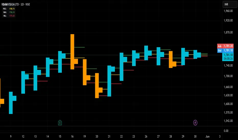
AMT Institutional Model v2What This Indicator Does
This indicator implements Fabio Valentini's Auction Market Theory (AMT) model — the same framework used by a verified World Cup Trading Championship competitor who achieved 218% audited returns in a single competition year.
The core principle is simple: The market is an auction. It moves between two states — Balance (choppy, no edge) and Imbalance (trending, tradeable). Most traders lose because they trade inside balance. This indicator tells you when to sit out and when conditions are aligned for entry.
It is a MODEL, not a strategy. It does not give buy/sell signals. It gives you the 3 conditions Valentini requires before any trade, and visually shows you when all 3 align.
The 3 Conditions (ALL Must Be True Before Entry)
Valentini's rule: "If even one is missing, you stay flat."
#ConditionWhat the indicator shows1Market State — Is the market OUT of balance?Background color: Yellow = Balance (DO NOT TRADE). Blue/Red = Imbalance (OK to look)2Location — Is price at a meaningful level?LVN lines (magenta), Support/Resistance (green/red dashes), HVN (yellow), POC (orange)3Aggression — Are large participants executing?Blue circles below bar = Buyer aggression. Red circles above bar = Seller aggression
When all 3 align, a green diamond (bull) or red diamond (bear) appears. This is the confluence signal — the premium setup.
How To Read The Chart — Step by Step
STEP 1 — Check the Balance Box (yellow dashed rectangle)
This is the Value Area where 70% of volume was traded. Think of it as a "no-fly zone."
Price INSIDE the box → Info table says "Inside VA - Skip" → Do nothing
Price OUTSIDE the box → Now you can start looking for setups
Valentini: "Market is usually in balance. That is why traders take a streak of stop-losses." The Balance Box keeps you out of the chop.
STEP 2 — Check the Background Color
🟡 Yellow tint = Balance. Market is compressed. Stay flat.
🔵 Blue tint = Imbalance Bullish. Trend is up. Look for longs only.
🔴 Red tint = Imbalance Bearish. Trend is down. Look for shorts only.
You need BOTH: price outside the Balance Box AND background showing Imbalance.
STEP 3 — Find Your Level
Look for price approaching one of these levels:
LVN (magenta dashed) — Low Volume Nodes. Price rejected here before and will likely react again. These are Valentini's primary entry zones. When price revisits an LVN, it either rips through (continuation) or bounces (reversal). Wait for aggression to confirm which one.
HVN (yellow solid) — High Volume Nodes. Price accepted here = consolidation zones. Good for targets, not entries.
POC (orange thick) — Point of Control. Highest volume price = "fair value." Strong magnet. Good for mean-reversion targets.
30m S/R (green/red dashed) — Auction pivot structure from the 30-minute timeframe.
Weekly/Daily/4H levels — Institutional reference levels. Confluence of multiple levels = stronger zone.
Fibonacci levels — Labeled with source timeframe (D = Daily, W = Weekly) so you always know where the level comes from.
STEP 4 — Wait for Aggression
Do NOT enter just because price is at a level. Wait for the circles (bubbles):
🔵 Blue circle below bar = Buyer aggression (volume spike + bullish close)
🔴 Red circle above bar = Seller aggression (volume spike + bearish close)
Circle size = intensity (small → normal → large = 2x → 3.5x → 5x+ volume)
Valentini: "When there is direction, location, and aggression — your ability to READ is 100%."
Entry Checklist (Long Example)
✅ Background is blue (Imbalance Bullish)
✅ Price is outside the Balance Box (above VAH or pulled back below VAL)
✅ Price is at or near an LVN, Support level, or Fibonacci level
✅ A blue circle appears below the bar (buyer aggression confirmed)
✅ 30-min trend line is blue (uptrend structure)
Enter long. Stop below the LVN / support level.
For shorts, mirror everything: red background, near resistance/LVN, red circle above bar, red trend line.
Exit Rules
Exit TypeWhenPrimary targetThe POC (orange line). Valentini: "Target the previous balance POC — 70% of the time, price reverses from it."Secondary targetThe next HVN (yellow line). Price tends to slow down and consolidate at HVNs. Take partial profits here.Structural targetThe next major Weekly/Daily level or Fibonacci level in the direction of your trade.Failed auction exitIf you're long and an X cross appears above your bar — this means aggressive buyers failed. The sellers won. Close immediately.Re-entry of Balance BoxIf price re-enters the Value Area after breaking out, the breakout may have failed. Tighten stop or exit. This is Valentini's Mean Reversion Model — the snap-back.Opposite aggressionLarge red circles appearing in your long trade = institutional selling. Reduce size or exit.
What Each Module Does
Module A — 30-Min Trend (blue/red step-line)
Auction-based trend structure from 30-minute Higher-Highs/Higher-Lows. Not a moving average — this is structural.
Module B — 30-Min S/R (green/red dashed)
Pivot-based support and resistance from 30-minute auction structure. Sensitivity setting controls how many levels appear.
Module C — Aggression Bubbles (circles + X crosses)
Volume spike detection with directional body filter. 3 size tiers. X crosses mark failed auctions — when aggression fails and price reverses.
Module D — MTF Levels (colored horizontal lines)
Weekly, Daily, 4H, Hourly OHLC levels + Daily/Weekly Fibonacci retracements (labeled with source TF) + 20/50 SMA + Psychological round numbers. All line colors and widths fully customizable.
Module E — Balance/Imbalance (background color)
ATR compression ratio detects whether market is ranging or trending. Yellow = stay out. Blue/Red = conditions forming.
Module F — Volume Profile (HVN/LVN/POC/Balance Box)
Bin-based volume distribution over configurable lookback. Same methodology as ATAS, Sierra Chart, and TradingView's own SVP. Draws the Value Area box (skip trades inside), POC, and all significant volume nodes.
Settings Guide
Sensitivity — The single most important setting.
Low = Strict. Fewer levels, fewer bubbles, only the strongest signals. For experienced traders who want a clean chart.
Medium = Balanced. Recommended default.
High = Sensitive. More signals, catches weaker setups. Good for learning or scalping.
Futures vs ETF — Futures (NQ/ES/YM) have concentrated RTH volume so lower multipliers work. ETFs (SPY/QQQ) need higher thresholds to filter dark-pool noise.
Label Mode — "Detailed" for learning, "Short" for clean charts once you know the levels.
Label Size — Auto/Tiny/Small/Normal/Large. All labels respect this setting.
Important Limitations
⚠️ No true order flow. TradingView does not provide tick-by-tick data, DOM, or executed vs. limit order differentiation. Aggression bubbles are a volume-spike proxy, not true order flow. For real order flow, use platforms like Bookmap, ATAS, or Sierra Chart alongside this indicator.
⚠️ Volume profile is approximated. Each bar's volume is proportionally distributed across its price range. Real volume-at-price requires tick data. This is the standard approximation used by all Pine Script volume profile implementations.
⚠️ This is a model, not a strategy. It shows conditions. You make the decision. No indicator replaces screen time and discretion.
Alerts Available (12 total, all configurable ON/OFF)
Bull Confluence | Bear Confluence | Failed Buy Auction | Failed Sell Auction | Huge Buy Volume (5x+) | Huge Sell Volume (5x+) | Balance/Imbalance Shift | 30-Min Trend Change | Any Aggression | Price at Key Level | Price Exits Value Area | Price at POC
Built for NQ/ES futures day trading. Works on any liquid instrument with volume data. Not financial advice.

INSTITUTIONAL VOLUME PROFILE + FIBONACCI + ENHANCED SIGNALS🎯 INSTITUTIONAL VOLUME PROFILE + FIBONACCI + ENHANCED SIGNALS
A professional-grade indicator combining Volume Profile analysis, Fibonacci retracements, Anchored VWAP, and intelligent signal filtering to identify high-probability institutional positioning and trade setups.
📊 CORE FEATURES
▸ Volume Profile with POC (Point of Control)
- Visualizes where institutional volume accumulated
- Identifies High Volume Nodes (HVN) as key support/resistance
- Shows Value Area (70% volume zone) for market equilibrium
▸ Dynamic Fibonacci Levels
- Auto-detects swing high/low for retracement levels
- Golden Pocket (0.618-0.65) highlight zone
- Bull/bear direction recognition
▸ Anchored VWAP
- Anchored to swing range start
- Institutional mean reversion baseline
- Real-time trend bias indicator
▸ Graded Signal System (A+/B/C)
- A+ Signals: High probability setups (VWAP cross + POC alignment)
- B Signals: Above-average quality (VWAP cross above POC)
- C Signals: Lower probability (counter-trend setups)
🎮 DISPLAY MODES
⚡ TRADING LIVE MODE
- Clean chart showing only A+ signals
- Minimal visual noise for active trading
- Perfect for intraday execution
📈 FULL OVERVIEW MODE
- Complete analysis with all zones visible
- Volume Profile + Fibonacci + Value Area
- All signal grades displayed
- Statistics dashboard
🔬 ADVANCED SIGNAL FILTERS
✓ Volume Confirmation
- Requires above-average volume on signals
- Filters out weak institutional participation
- Configurable volume multiple (default 1.2x)
✓ Momentum Filter
- Ensures price momentum aligns with signal direction
- Prevents counter-trend entries
- Configurable lookback period
✓ SR Proximity Upgrade ⭐ GAME CHANGER
- Automatically upgrades B/C signals to A+ when near key levels
- Detects proximity to POC and HVN zones
- Combines technical confluence for best setups
🔔 SMART ALERTS
▸ Configurable alerts for A+, B, or C signals
▸ Real-time notifications to your device
▸ No need to watch charts constantly
▸ "Once per bar close" prevents repainting
💡 HOW TO USE
FOR DAY TRADING:
1. Switch to "Trading Live" mode
2. Enable only A+ alerts
3. Set filters: Volume 1.5x, Momentum ON, Proximity 0.3%
4. Trade only A+ signals at key levels
FOR SWING TRADING:
1. Use "Full Overview" mode
2. Analyze Value Area and Fibonacci confluence
3. Set filters: Volume 1.2x, Momentum ON, Proximity 0.8%
4. Enter on A+ signals with multi-timeframe confirmation
FOR ANALYSIS:
1. Full Overview mode with all visuals enabled
2. Disable filters to see all raw signals
3. Study how institutions positioned at key zones
4. Plan trades around POC and Value Area
⚙️ RECOMMENDED SETTINGS
5-15 MIN CHARTS (Scalping):
- Lookback: 200-300 bars
- Volume: 1.5x, Momentum: 5 bars, Proximity: 0.3%
- Trading Live mode + A+ alerts only
1 HOUR CHARTS (Intraday):
- Lookback: 300 bars
- Volume: 1.3x, Momentum: 3 bars, Proximity: 0.5%
- Full Overview or Trading Live
4 HOUR CHARTS (Swing):
- Lookback: 300-500 bars
- Volume: 1.2x, Momentum: 3 bars, Proximity: 0.8%
- Full Overview mode
DAILY CHARTS (Position):
- Lookback: 300-500 bars
- Volume: 1.1x, Momentum: 2 bars, Proximity: 1.0%
- Full Overview mode
📈 KEY CONCEPTS
POC (Point of Control): Price level with highest volume - acts as magnet
Value Area: Zone containing 70% of volume - equilibrium range
HVN: High Volume Nodes - institutional accumulation zones
AVWAP: Anchored VWAP - institutional average entry price
Golden Pocket: 0.618-0.65 Fib zone - highest probability reversal area
🎯 TRADING STRATEGY TIPS
1. Wait for A+ signals - quality over quantity
2. Best setups occur at POC or Value Area boundaries
3. Use multiple timeframes for confirmation
4. Combine with your own risk management rules
5. Signals are high probability, not guaranteed - always use stops

Smart Money Concepts [XoRonX]# Smart Money Concepts (SMC) - Advanced Trading Indicator
## 📊 Deskripsi
**Smart Money Concepts ** adalah indicator trading komprehensif yang menggabungkan konsep Smart Money Trading dengan berbagai alat teknikal analisis modern. Indicator ini dirancang untuk membantu trader mengidentifikasi pergerakan institusional (smart money), struktur pasar, zona supply/demand, dan berbagai sinyal trading penting.
Indicator ini mengintegrasikan multiple timeframe analysis, order blocks detection, fair value gaps, fibonacci retracement, volume profile, RSI multi-timeframe, dan moving averages dalam satu platform yang powerful dan mudah digunakan.
---
## 🎯 Fitur Utama
### 1. **Smart Money Structure**
- **Internal Structure** - Struktur pasar jangka pendek untuk entry presisi
- **Swing Structure** - Struktur pasar jangka panjang untuk trend analysis
- **BOS (Break of Structure)** - Konfirmasi kelanjutan trend
- **CHoCH (Change of Character)** - Deteksi potensi reversal
### 2. **Order Blocks**
- **Internal Order Blocks** - Zona demand/supply jangka pendek
- **Swing Order Blocks** - Zona demand/supply jangka panjang
- Filter otomatis berdasarkan volatilitas (ATR/Range)
- Mitigation tracking (High/Low atau Close)
- Customizable display (jumlah order blocks yang ditampilkan)
### 3. **Equal Highs & Equal Lows (EQH/EQL)**
- Deteksi otomatis equal highs/lows
- Indikasi liquidity zones
- Threshold adjustment untuk sensitivitas
- Visual lines dan labels
### 4. **Fair Value Gaps (FVG)**
- Multi-timeframe FVG detection
- Auto threshold filtering
- Bullish & Bearish FVG boxes
- Extension control
- Color customization
### 5. **Premium & Discount Zones**
- Premium Zone (75-100% dari range)
- Equilibrium Zone (47.5-52.5% dari range)
- Discount Zone (0-25% dari range)
- Auto-update berdasarkan swing high/low
### 6. **Fibonacci Retracement**
- **Equilibrium to Discount** - Fib dari EQ ke discount zone
- **Equilibrium to Premium** - Fib dari EQ ke premium zone
- **Discount to Premium** - Fib full range
- Reverse option
- Show/hide lines
- Custom colors
### 7. **Volume Profile (VRVP)**
- Visible Range Volume Profile
- Point of Control (POC)
- Value Area (70% volume)
- Auto-adjust rows
- Placement options (Left/Right)
- Width customization
### 8. **RSI Multi-Timeframe**
- Monitor 3 timeframes sekaligus
- Overbought/Oversold signals
- Visual table display
- Color-coded signals (Red OB, Green OS)
- Customizable position & size
### 9. **Moving Averages**
- 3 Moving Average lines
- Pilihan tipe: EMA, SMA, WMA
- Automatic/Manual period mode
- Individual color & width settings
- Cross alerts (MA vs MA, Price vs MA)
### 10. **Multi-Timeframe Levels**
- Support up to 5 different timeframes
- Previous high/low levels
- Custom line styles
- Color customization
### 11. **Candle Color**
- Color candles berdasarkan trend
- Bullish = Green, Bearish = Red
- Optional toggle
---
## 🛠️ Cara Penggunaan
### **A. Setup Awal**
1. **Tambahkan Indicator ke Chart**
- Buka TradingView
- Klik "Indicators" → "My Scripts" atau paste code
- Pilih "Smart Money Concepts "
2. **Pilih Mode Display**
- **Historical**: Tampilkan semua struktur (untuk backtesting)
- **Present**: Hanya tampilkan struktur terbaru (clean chart)
3. **Pilih Style**
- **Colored**: Warna berbeda untuk bullish/bearish
- **Monochrome**: Tema warna abu-abu
---
### **B. Penggunaan Fitur**
#### **1. Smart Money Structure**
**Internal Structure (Real-time):**
- ✅ Aktifkan "Show Internal Structure"
- Pilih tampilan: All, BOS only, atau CHoCH only
- Gunakan untuk entry timing presisi
- Filter confluence untuk mengurangi noise
**Swing Structure:**
- ✅ Aktifkan "Show Swing Structure"
- Pilih tampilan struktur bullish/bearish
- Adjust "Swings Length" (default: 50)
- Gunakan untuk konfirmasi trend utama
**Tips:**
- BOS = Konfirmasi trend continuation
- CHoCH = Warning untuk possible reversal
- Tunggu price retest ke order block setelah BOS
---
#### **2. Order Blocks**
**Setup:**
- ✅ Aktifkan Internal/Swing Order Blocks
- Set jumlah blocks yang ditampil (1-20)
- Pilih filter: ATR atau Cumulative Mean Range
- Pilih mitigation: Close atau High/Low
**Cara Trading:**
1. Tunggu BOS/CHoCH terbentuk
2. Identifikasi order block terdekat
3. Wait for price pullback ke order block
4. Entry saat price respek order block (rejection)
5. Stop loss di bawah/atas order block
6. Target: swing high/low berikutnya
**Color Code:**
- 🔵 Light Blue = Internal Bullish OB
- 🔴 Light Red = Internal Bearish OB
- 🔵 Dark Blue = Swing Bullish OB
- 🔴 Dark Red = Swing Bearish OB
---
#### **3. Equal Highs/Lows (EQH/EQL)**
**Setup:**
- ✅ Aktifkan "Equal High/Low"
- Set "Bars Confirmation" (default: 3)
- Adjust threshold (0-0.5, default: 0.1)
**Interpretasi:**
- EQH = Liquidity di atas, kemungkinan sweep lalu dump
- EQL = Liquidity di bawah, kemungkinan sweep lalu pump
- Biasanya smart money akan grab liquidity sebelum move besar
**Trading Strategy:**
- Wait for EQH/EQL formation
- Anticipate liquidity grab
- Entry setelah sweep dengan konfirmasi (order block, FVG, CHoCH)
---
#### **4. Fair Value Gaps (FVG)**
**Setup:**
- ✅ Aktifkan "Fair Value Gaps"
- Pilih timeframe (default: chart timeframe)
- Enable/disable auto threshold
- Set extension bars
**Cara Trading:**
1. Bullish FVG = Support zone untuk buy
2. Bearish FVG = Resistance zone untuk sell
3. Price tends to fill FVG (retest)
4. Entry saat price kembali ke FVG
5. Partial fill = valid, full fill = invalidated
**Tips:**
- FVG + Order Block = High probability setup
- Multi-timeframe FVG lebih kuat
- Unfilled FVG = strong momentum
---
#### **5. Premium & Discount Zones**
**Setup:**
- ✅ Aktifkan "Premium/Discount Zones"
- Zones akan auto-update berdasarkan swing high/low
**Interpretasi:**
- 🟢 **Discount Zone** = Area BUY (price murah)
- ⚪ **Equilibrium** = Neutral (50%)
- 🔴 **Premium Zone** = Area SELL (price mahal)
**Trading Strategy:**
- BUY dari discount zone
- SELL dari premium zone
- Avoid trading di equilibrium
- Combine dengan structure confirmation
---
#### **6. Fibonacci Retracement**
**Setup:**
- Pilih Fib yang ingin ditampilkan:
- Equilibrium to Discount
- Equilibrium to Premium
- Discount to Premium
- Toggle show lines
- Enable reverse jika perlu
- Custom colors
**Key Levels:**
- 0.236 = Shallow retracement
- 0.382 = Common retracement
- 0.5 = 50% golden level
- 0.618 = Golden ratio (penting!)
- 0.786 = Deep retracement
**Cara Pakai:**
- 0.618-0.786 = Ideal entry zone dalam trend
- Combine dengan order blocks
- Wait for confirmation candle
---
#### **7. Volume Profile (VRVP)**
**Setup:**
- ✅ Aktifkan "Show Volume Profile"
- Set jumlah rows (10-100)
- Adjust width (5-50%)
- Pilih placement (Left/Right)
- Enable POC dan Value Area
**Interpretasi:**
- **POC (Point of Control)** = Harga dengan volume tertinggi = magnet
- **Value Area** = 70% volume = fair price range
- **Low Volume Nodes** = Weak support/resistance
- **High Volume Nodes** = Strong support/resistance
**Trading:**
- POC acts as support/resistance
- Price tends to return to POC
- Breakout dari Value Area = momentum
---
#### **8. RSI Multi-Timeframe**
**Setup:**
- ✅ Aktifkan "Show RSI Table"
- Set 3 timeframes (default: chart, 5m, 15m)
- Set RSI period (default: 14)
- Set Overbought level (default: 70)
- Set Oversold level (default: 30)
- Pilih posisi & ukuran table
**Interpretasi:**
- 🟢 **OS (Oversold)** = RSI ≤ 30 = Kondisi jenuh jual
- 🔴 **OB (Overbought)** = RSI ≥ 70 = Kondisi jenuh beli
- **-** = Neutral zone
**Trading Strategy:**
1. Multi-timeframe alignment = strong signal
2. OS + Bullish structure = BUY signal
3. OB + Bearish structure = SELL signal
4. Divergence RSI vs Price = reversal warning
**Contoh:**
- TF1: OS, TF2: OS, TF3: OS + Price di discount zone = STRONG BUY
---
#### **9. Moving Averages**
**Setup:**
- Pilih MA Type: EMA, SMA, atau WMA (berlaku untuk ketiga MA)
- Pilih Period Mode: Automatic atau Manual
- Set period untuk MA 1, 2, 3 (default: 20, 50, 100)
- Custom color & width per MA
- ✅ Enable Cross Alerts
**Interpretasi:**
- **Golden Cross** = MA fast cross above MA slow = Bullish
- **Death Cross** = MA fast cross below MA slow = Bearish
- Price above all MAs = Strong uptrend
- Price below all MAs = Strong downtrend
**Trading Strategy:**
1. MA1 (20) = Short-term trend
2. MA2 (50) = Medium-term trend
3. MA3 (100) = Long-term trend
**Entry Signals:**
- Price bounce dari MA dalam trend = continuation
- MA cross dengan konfirmasi structure = entry
- Multiple MA confluence = strong support/resistance
**Alerts Available:**
- MA1 cross MA2/MA3
- MA2 cross MA3
- Price cross any MA
---
#### **10. Multi-Timeframe Levels**
**Setup:**
- Enable HTF Level 1-5
- Set timeframes (contoh: 5m, 1H, 4H, D, W)
- Pilih line style (solid/dashed/dotted)
- Custom colors
**Cara Pakai:**
- Previous high/low dari HTF = strong S/R
- Breakout HTF level = significant move
- Multiple HTF levels confluence = major zone
---
### **C. Trading Setup Combination**
#### **Setup 1: High Probability Buy (Bullish)**
1. ✅ Swing structure: Bullish BOS
2. ✅ Price di Discount Zone
3. ✅ Pullback ke Bullish Order Block
4. ✅ Bullish FVG di bawah
5. ✅ RSI Multi-TF: Oversold
6. ✅ Price bounce dari MA
7. ✅ POC/Value Area support
8. ✅ Fibonacci 0.618-0.786 retracement
**Entry:** Saat price reject dari order block dengan confirmation candle
**Stop Loss:** Below order block
**Target:** Swing high atau premium zone
---
#### **Setup 2: High Probability Sell (Bearish)**
1. ✅ Swing structure: Bearish BOS
2. ✅ Price di Premium Zone
3. ✅ Pullback ke Bearish Order Block
4. ✅ Bearish FVG di atas
5. ✅ RSI Multi-TF: Overbought
6. ✅ Price reject dari MA
7. ✅ POC/Value Area resistance
8. ✅ Fibonacci 0.618-0.786 retracement
**Entry:** Saat price reject dari order block dengan confirmation candle
**Stop Loss:** Above order block
**Target:** Swing low atau discount zone
---
#### **Setup 3: Liquidity Grab (EQH/EQL)**
1. ✅ Identifikasi EQH atau EQL
2. ✅ Wait for liquidity sweep
3. ✅ Konfirmasi dengan CHoCH
4. ✅ Order block terbentuk setelah sweep
5. ✅ Entry saat retest order block
---
### **D. Tips & Best Practices**
**Risk Management:**
- Selalu gunakan stop loss
- Risk 1-2% per trade
- Risk:Reward minimum 1:2
- Jangan over-leverage
**Confluence adalah Kunci:**
- Minimal 3-4 konfirmasi sebelum entry
- Lebih banyak konfirmasi = higher probability
- Quality over quantity
**Timeframe Analysis:**
- HTF (Higher Timeframe) = Trend direction
- LTF (Lower Timeframe) = Entry timing
- Align dengan HTF trend
**Backtesting:**
- Gunakan mode "Historical"
- Test strategy di berbagai market condition
- Record dan analyze hasil
**Market Condition:**
- Trending market = Follow BOS, use order blocks
- Ranging market = Use premium/discount zones, EQH/EQL
- High volatility = Wider stops, wait for clear structure
**Avoid:**
- Trading di equilibrium zone
- Entry tanpa konfirmasi
- Fighting the trend
- Overleveraging
- Emotional trading
---
## 📈 Recommended Settings
### **For Scalping (1m - 5m):**
- Internal Structure: ON
- Swing Structure: OFF
- Order Blocks: Internal only
- RSI Timeframes: 1m, 5m, 15m
- MA Periods: 9, 21, 50
### **For Day Trading (15m - 1H):**
- Internal Structure: ON
- Swing Structure: ON
- Order Blocks: Both
- RSI Timeframes: 15m, 1H, 4H
- MA Periods: 20, 50, 100
### **For Swing Trading (4H - D):**
- Internal Structure: OFF
- Swing Structure: ON
- Order Blocks: Swing only
- RSI Timeframes: 4H, D, W
- MA Periods: 20, 50, 200
---
## ⚠️ Disclaimer
Indicator ini adalah alat bantu analisis teknikal. Tidak ada indicator yang 100% akurat. Selalu:
- Lakukan analisa fundamental
- Gunakan proper risk management
- Praktik di demo account terlebih dahulu
- Trading memiliki resiko, trade at your own risk
---
## 📝 Version Info
**Version:** 5.0
**Platform:** TradingView Pine Script v5
**Author:** XoRonX
**Max Labels:** 500
**Max Lines:** 500
**Max Boxes:** 500
---
## 🔄 Updates & Support
Untuk update, bug reports, atau pertanyaan:
- Check documentation regularly
- Test new features in replay mode
- Backup your settings before updates
---
## 🎓 Learning Resources
**Recommended Study:**
1. Smart Money Concepts (SMC) basics
2. Order blocks theory
3. Liquidity concepts
4. ICT (Inner Circle Trader) concepts
5. Volume profile analysis
6. Multi-timeframe analysis
**Practice:**
- Start with higher timeframes
- Master one concept at a time
- Keep a trading journal
- Review your trades weekly
---
**Happy Trading! 🚀📊**
_Remember: The best indicator is your own analysis and discipline._

RightFlow Universal Volume Profile - Any Market Any TimeframeSummary in one paragraph
RightFlow is a right anchored microstructure volume profile for stocks, futures, FX, and liquid crypto on intraday and daily timeframes. It acts only when several conditions align inside a session window and presents the result as a compact right side profile with value area, POC, a bull bear mix by price bin, and a HUD of profile VWAP and pressure shares. It is original because it distributes each bar’s weight into multiple mid price slices, blends bull bear pressure per bin with a CLV based split, and grows the profile to the right so price action stays readable. Add to a clean chart, read the table, and use the visuals. For conservative workflows read on bar close.
Scope and intent
• Markets. Major FX pairs, index futures, large cap equities and ETFs, liquid crypto.
• Timeframes. One minute to daily.
• Default demo used in the publication. SPY on 15 minute.
• Purpose. See where participation concentrates, which side dominated by price level, and how far price sits from VA and POC.
Originality and usefulness
• Unique fusion. Right anchored growth plus per bar slicing and CLV split, with weight modes Raw, Notional, and DeltaProxy.
• Failure mode addressed. False reads from single bar direction and coarse binning.
• Testability. All parts sit in Inputs and the HUD.
• Portable yardstick. Value Area percent and POC are universal across symbols.
• Protected scripts. Not applicable. Method and use are fully disclosed.
Method overview in plain language
Pick a scope Rolling or Today or This Week. Define a window and number of price bins. For each bar, split its range into small slices, assign each slice a weight from the selected mode, and split that weight by CLV or by bar direction. Accumulate totals per bin. Find the bin with the highest total as POC. Expand left and right until the chosen share of total volume is covered to form the value area. Compute profile VWAP for all, buyers, and sellers and show them with pressure shares.
Base measures
Range basis. High minus low and mid price samples across the bar window.
Return basis. Not used. VWAP trio is price weighted by weights.
Components
• RightFlow Bins. Price histogram that grows to the right.
• Bull Bear Split. CLV based 0 to 1 share or pure bar direction.
• Weight Mode. Raw volume, notional volume times close, or DeltaProxy focus.
• Value Area Engine. POC then outward expansion to target share.
• HUD. Profile VWAP, Buy and Sell percent, winner delta, split and weight mode.
• Session windows optional. Scope resets on day or week.
Fusion rule
Color of each bin is the convex blend of bull and bear shares. Value area shading is lighter inside and darker outside.
Signal rule
This is context, not a trade signal. A strong separation between buy and sell percent with price holding inside VA often confirms balance. Price outside VA with skewed pressure often marks initiative moves.
What you will see on the chart
• Right side bins with blended colors.
• A POC line across the profile width.
• Labels for POC, VAH, and VAL.
• A compact HUD table in the top right.
Table fields and quick reading guide
• VWAP. Profile VWAP.
• Buy and Sell. Pressure shares in percent.
• Delta Winner. Winner side and margin in percent.
• Split and Weight. The active modes.
Reading tip. When Session scope is Today or This Week and Buy minus Sell is clearly positive or negative, that side often controls the day’s narrative.
Inputs with guidance
Setup
• Profile scope. Rolling or session reset. Rolling uses window bars.
• Rolling window bars. Typical 100 to 300. Larger is smoother.
Binning
• Price bins. Typical 32 to 128. More bins increase detail.
• Slices per bar. Typical 3 to 7. Raising it smooths distribution.
Weighting
• Weight mode. Raw, Notional, DeltaProxy. Notional emphasizes expensive prints.
• Bull Bear split. CLV or BarDir. CLV is more nuanced.
• Value Area percent. Typical 68 to 75.
View
• Profile width in bars, color split toggle, value area shading, opacities, POC line, VA labels.
Usage recipes
Intraday trend focus
• Scope Today, bins 64, slices 5, Value Area 70.
• Split CLV, Weight Notional.
Intraday mean reversion
• Scope Today, bins 96, Value Area 75.
• Watch fades back to POC after initiative pushes.
Swing continuation
• Scope Rolling 200 bars, bins 48.
• Use Buy Sell skew with price relative to VA.
Realism and responsible publication
No performance claims. Shapes can move while a bar forms and settle on close. Education only.
Honest limitations and failure modes
Thin liquidity and data gaps can distort bin weights. Very quiet regimes reduce contrast. Session time is the chart venue time.
Open source reuse and credits
None.
Legal
Education and research only. Not investment advice. Test on history and simulation before live use.

Volume Profile Area [BigBeluga]🔵 OVERVIEW
The Volume Profile Area is an advanced profiling tool that calculates and visualizes the value area within a chosen period’s volume distribution. It first builds a main profile of the entire range, then constructs a secondary profile inside the defined value area, allowing traders to examine market balance and key trading zones in greater detail.
🔵 CONCEPTS
Volume Profile – Distributes traded volume across price levels to highlight areas of market activity.
Value Area (VA) – The price range containing a chosen percentage of total volume (commonly 50–70%).
Point of Control (PoC) – The price level with the highest traded volume, often acting as a magnet for price.
Nested Profiles – A profile inside the VA adds a second layer of precision, showing where liquidity clusters within the “fair value” zone.
🔵 FEATURES
Main Profile – Full distribution of volume over the selected lookback period.
Secondary Profile – Built only inside the VA of the main profile, highlighting intrabalance structure.
Customizable PoC Selection – Choose between showing the PoC of the
Main Profile ,
the Area Profile ,
their Average ,
or None .
Dynamic Value Area Levels – Automatically plots VAL (Value Area Low) and VAH (Value Area High) with labels.
Overlay Toggles – Show/hide range extremes, VA lines, or PoCs for a cleaner chart view.
Visual Profiles – Main profile shaded in darker blue; the VA profile inside is lighter for clear separation.
Automatic Scaling – Profiles adapt to period highs/lows and auto-adjust bins for consistent resolution.
Volume Labels – PoCs can display traded volume, giving numeric confirmation of liquidity concentration.
🔵 HOW TO USE
Set the Period to define how many bars to include in the main profile.
Adjust the Value Area % to control how much volume defines the VA (e.g., 50% by default).
Pick your PoC option: Main , Area , or Average , depending on focus.
Use VAH/VAL lines as support/resistance levels where most trading occurred.
Compare reactions at Main vs VA PoC levels to spot potential breakouts or mean reversions.
🔵 CONCLUSION
The Volume Profile Area extends traditional profiling by nesting a secondary VA profile inside the main distribution. This dual-layer approach reveals not just where the market was active overall, but where liquidity concentrated within the “fair value” zone—powerful for refining entries, exits, and risk placement across intraday and swing horizons.

Volume Cluster Support & ResistanceVolume Cluster Support & Resistance
This indicator identifies potential Support and Resistance (S/R) levels on the chart using Volume-Based Point of Control (POC) Clustering. It offers extensive customization for calculation parameters, display styles, and visualization options, including S/R zones, color gradients, and historical reaction markers.
How It Works
Volume Based S/R:
Scans the specified Clustering Lookback period for "High Volume Bars", defined as bars where volume exceeds the average volume (over Volume Lookback Period) multiplied by the High Volume Threshold Multiplier.
Calculates the Point of Control (POC) for each high-volume bar using hl2.
Clusters these high-volume bar POCs: POCs within a proximity defined by Cluster Proximity (ATR) (Average True Range multiplier) are grouped together.
Filters these clusters, requiring a Min Bars in Cluster to form a valid S/R zone.
(Image showing the indicator being used on the Bitcoin 5min chart)
The center price of valid clusters determines the S/R level. Clusters above the current price become potential Resistance, and those below become potential Support.
Calculates the offset based on the most recent bar included in the cluster.
Level Selection & Display:
The indicator identifies multiple potential S/R levels.
It then selects and displays the top Number of S/R Levels to Display support levels below the current price and resistance levels above the current price.
(Image showing the indicator on the GBP/USD 5min chart)
ATR Usage:
The Average True Range (ta.atr(14)) is used in two key areas:
Determining the proximity threshold for grouping POCs in the 'Volume Based' clustering (clusterProximityAtr).
Calculating the width of the S/R zones when 'Use Zone Visualization' is enabled (zoneAtrMultiplier).
Key Features & Components
Dual Calculation Methods: Choose between Pivot-based S/R or Volume-based POC clustering.
Volume Confirmation: Pivots require volume confirmation; Volume method directly analyzes high-volume bars.
POC Clustering: Groups high-volume areas to identify significant price zones.
Configurable Lookbacks: Adjust periods for volume averaging, pivot detection, and clustering analysis.
Dynamic S/R Display: Shows a configurable number of the most relevant S/R levels relative to the current price.
Optional Zone Visualization: Display levels as filled zones with configurable width (ATR-based), fill transparency, and border transparency. Includes a dashed center line.
Optional Historical Reactions: Mark past price interactions (lows bouncing off support zones, highs rejecting from resistance zones) directly on the chart (Warning: Can significantly impact performance).
Customizable Styling: Control line style (Solid, Dashed, Dotted), width, color (separate for Support & Resistance), and horizontal extension (None, Left, Right, Both).
Price Labels: Toggle visibility of price labels next to each S/R level/zone.
Visual Elements Explained
S/R Lines/Zones: Plotted lines or filled zones representing calculated support and resistance levels. Color-coded for Support (default green) and Resistance (default magenta).
Line/Zone Borders: Appearance controlled by Style settings (Style, Width, Extension). Can have a gradient color effect based on age if enabled.
Zone Fills: Semi-transparent fills for zones (if enabled), with configurable transparency. Fill color matches the border color (including gradient effect if enabled).
Zone Center Line: A thin, dashed line indicating the exact calculated S/R price within a zone.
Price Labels: Text labels showing the exact price of the S/R level.
Historical Reactions: Small dot markers appearing on historical bars where price potentially reacted to a displayed zone (only if Show Historical Reactions is enabled).
Configuration Options
Users can adjust the following parameters in the indicator settings:
Calculation Method: Select "Pivot Based" or "Volume Based".
Volume Zone Settings (Volume Based): Threshold multiplier, clustering lookback, cluster proximity (ATR), minimum bars per cluster.
Display Options: Toggle S/R visibility, price tags, set the number of levels to show.
Volume Settings: Volume lookback period, volume multiplier (for Pivot confirmation).
Style Settings: Line style, width, extension, support/resistance text and line colors, enable gradient coloring, set gradient start/end colors.
Zone Visualization: Enable/disable zones, set zone width (ATR multiplier), fill and border transparency, enable/disable historical reaction markers (performance warning).
Interpretation Notes
This indicator identifies potential areas of support and resistance based on historical price action and volume analysis. These levels are not guaranteed reversal points.
The 'Volume Based' method focuses on areas where significant trading activity occurred, while the 'Pivot Based' method focuses on price turning points confirmed by volume.
Use the displayed levels in conjunction with other technical analysis tools, price action patterns, and risk management strategies.
Be mindful of the performance impact when enabling Show Historical Reactions, especially on longer timeframes or with large lookback periods. The default setting is false for optimal performance.
The max_bars_back setting is optimized for performance; increasing it significantly may slow down chart loading.
Risk Disclaimer
Trading involves significant risk. This indicator is provided for analytical and educational purposes only and does not constitute financial advice or a trading recommendation. Past performance is not indicative of future results. Always use sound risk management practices and never trade with capital you cannot afford to lose.

Price & Volume Profile (Expo)█ Overview
The Price & Volume Profile provides a holistic perspective on market dynamics by simultaneously tracking price action and trading volume across a range of price levels. So it is not only a volume-based indicator but also a price-based one. In addition to illustrating volume distribution, it quantifies how frequently the price has fallen within a particular range, thus offering a holistic perspective on market dynamics.
This unique and comprehensive approach to market analysis by considering both price action and trading volume, two crucial dimensions of market activity. Its distinctive methodology offers several advantages:
Holistic Market View: By simultaneously tracking the frequency of specific price ranges (Price Profile) and the volume traded at those ranges (Volume Profile), this indicator provides a more complete picture of market behavior. It shows not only where the market is trading but also how much it's trading, reflecting both price acceptance levels and market participation intensity.
Point of Control (POC): The POC, as highlighted by this indicator, serves as a significant reference point for traders. It identifies the price level with the highest trading activity, thus indicating a strong consensus among market participants about the asset's fair value. Observing how price interacts with the POC can offer valuable insights into market sentiment and potential trend reversals.
Support and Resistance Levels: Price levels with high trading activity often act as support or resistance in future price movements. The indicator visually represents these levels, enabling traders to anticipate potential price reactions.
Price Profile
Price and Volume Profile
█ Calculations
The algorithm analyzes both trade frequency and volume across different price levels. It identifies these levels within the visible chart range, then examines each bar to determine if the selected price falls within these levels. If so, it increases a counter and adds the trading volume. This process repeats across the visible range and is visualized as a horizontal histogram, each bar representing a price level and the bar length reflecting trade frequency and volume. Additionally, it calculates the Point of Control (POC), signifying the price level with the highest activity.
In summary: The histogram presents a dual perspective - not only the traded volume at each price level but also the frequency of the price hitting each range. The longer the bar, the more times the price has frequented that specific range, revealing key insights into price behavior and acceptance levels. These frequently visited areas often emerge as strong support or resistance zones, helping traders navigate market movements.
Please note that the indicator adjusts to the visible price range, making it adaptable to changing market conditions. This dynamic analysis can provide more relevant and timely information than static indicators.
█ How to use
This indicator is beneficial for traders as it offers insights into the distribution of trading activity across different price levels. It helps identify key areas of support and resistance and gives a visual representation of market sentiment and liquidity.
The point of control (POC) , which is the price level with the highest traded volume or frequency count, becomes even more crucial in this context. It marks the price at which the most trading activity occurred, signaling a strong consensus among market participants about the asset's fair value. If the market price deviates significantly from the POC, it could suggest an overbought or oversold condition, potentially leading to a price reversion.
Fair Price Areas/gaps are specific price levels or zones where an asset has spent limited time in the past. These areas are considered interesting or significant because they may have an impact on future price action.
Similar to the concept of fair value gaps, which refers to discrepancies between an asset's market price and its estimated intrinsic value, Fair Price Areas/gaps focus on price levels that have been relatively underutilized in terms of trading activity. When an asset's price reaches a Fair Price Area/gap, traders and investors pay attention because they expect the price to react in some way. The rationale behind this concept is that price tends to gravitate towards areas where it has spent less time in the past, as the market perceives them as significant levels.
█ Settings
The indicator is customizable, allowing users to define the number of price levels (rows), the offset, the data source, and whether to display volume or frequency count. It also adjusts dynamically to the visible price range on the chart, ensuring that the analysis remains relevant and timely with changing market conditions.
Source: The price to use for the calculation. Typically, this is the closing price. By considering the user-selected Source (typically the closing price), the indicator determines the frequency with which the price lands within each designated price level (row) over the selected period. In essence, the indicator provides a count of bars where the Source price falls within each range, essentially creating a "Price Profile."
Row Size: The number of price levels (rows) to divide the visible price range into.
Display: Choose whether to display the number of bars ("Counter") or the total volume ("Volume") for each price level.
Offset: The distance of the histogram from the price chart.
Point of Control (POC): If enabled, the indicator will highlight the price level with the most activity.
-----------------
Disclaimer
The information contained in my Scripts/Indicators/Ideas/Algos/Systems does not constitute financial advice or a solicitation to buy or sell any securities of any type. I will not accept liability for any loss or damage, including without limitation any loss of profit, which may arise directly or indirectly from the use of or reliance on such information.
All investments involve risk, and the past performance of a security, industry, sector, market, financial product, trading strategy, backtest, or individual's trading does not guarantee future results or returns. Investors are fully responsible for any investment decisions they make. Such decisions should be based solely on an evaluation of their financial circumstances, investment objectives, risk tolerance, and liquidity needs.
My Scripts/Indicators/Ideas/Algos/Systems are only for educational purposes!
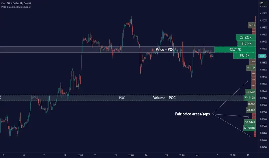
Chart Champions - Part 3 - SessionsThank you for sparing you time to read my indicator.
This indicator has been created as a suite of 3. This was to ensure that those with only the Free Trading View account could benefit (with their restriction to 3 indicators). Please ensure you install each indicator and read each indicator write up to fully understand what has tried to achieved.
Chart Champions – Part 1 –Lvls nPOC VWAPS
This indicator is broken down into:
• Levels
• VWAPS
• Naked Point of Control
Levels
It displays the levels to the right of the price Axis to enable the user to have a cleaner chart.
The below levels will automatically appear:
dOpen – pdHigh – pdLow – pdEQ – pwEQ
Optional Levels include:
mOpen – pmOpen – pdOpen – dbyOpen – wOpen – pwOpen
VWAPs
Optional VWAPs
Daily (including pdVWAP close) – Weekly – Monthly
Naked Points of Control (nPOC)
To view the nPOC move the chart back in time to pick up the nPOCs.
Chart Champions – Part 2 – CCV IBs POC
This indicator is broken down into:
• Chart Champions Value
• Initial Balance
• Points of Control
Chart Champions Value (CCV)
CCV is based on the 80% rule of the dOpen opening outside of the pdVAH/pdVAL. Please do you own research to fully understand how this trading strategy works (readily avaliable online).
Initial Balance (IB)
IB is based on the first 60 minutes of the market opening. It captures the highest and lowest points within that 60 minutes. Please do you own research to fully understand how this trading strategy works (readily avaliable online).
Points of Control (POCs)
POC are the price levels where the most volume was traded.
Developing POC (dPOC) will constantly move with volume/price action through out the day.
Optional POCs
Previous Day POC (pdPOC) – Day Before Yesterday POC (dbyPOC)
Chart Champions – Part 3 – Sessions - Manual Input
This indicator is broken down into:
• Manual Inputs (daily, weekly, monthly)
• IGOR SessionsTtimes
• Pre + Market Openings
Manual Input
Daily x3
Weekly x 3
Monthly x 3
This allows the trader to put in specific levels.
IGOR Session Times
This is a user specific requirement to highlight cetain times during the day, displayed at the bottom of the chart in the colour strip.
Pre + Market Openings
This allows the user to see when pre market trading has started and with the live maket has started, displayed at the top of the chart in colours.
A huge thank you goes out to:
Stackoverflow users AnyDozer and Bjorn.
TV user ahancock for allow me use of this code.
Disclaimer the lower the timeframe the more information it processes.

Chart Champions - Part 1 - nPOC - Levels - VWAPsThank you for sparing you time to read my indicator.
This indicator has been created as a suite of 3. This was to ensure that those with only the Free Trading View account could benefit (with their restriction to 3 indicators). Please ensure you install each indicator and read each indicator write up to fully understand what has tried to achieved.
Chart Champions – Part 1 –Lvls nPOC VWAPS
This indicator is broken down into:
• Levels
• VWAPS
• Naked Point of Control
Levels
It displays the levels to the right of the price Axis to enable the user to have a cleaner chart.
The below levels will automatically appear:
dOpen – pdHigh – pdLow – pdEQ – pwEQ
Optional Levels include:
mOpen – pmOpen – pdOpen – dbyOpen – wOpen – pwOpen
VWAPs
Optional VWAPs
Daily (including pdVWAP close) – Weekly – Monthly
Naked Points of Control (nPOC)
To view the nPOC move the chart back in time to pick up the nPOCs.
Chart Champions – Part 2 – CCV IBs POC
This indicator is broken down into:
• Chart Champions Value
• Initial Balance
• Points of Control
Chart Champions Value (CCV)
CCV is based on the 80% rule of the dOpen opening outside of the pdVAH/pdVAL. Please do you own research to fully understand how this trading strategy works (readily avaliable online).
Initial Balance (IB)
IB is based on the first 60 minutes of the market opening. It captures the highest and lowest points within that 60 minutes. Please do you own research to fully understand how this trading strategy works (readily avaliable online).
Points of Control (POCs)
POC are the price levels where the most volume was traded.
Developing POC (dPOC) will constantly move with volume/price action through out the day.
Optional POCs
Previous Day POC (pdPOC) – Day Before Yesterday POC (dbyPOC)
Chart Champions – Part 3 – Sessions - Manual Input
This indicator is broken down into:
• Manual Inputs (daily, weekly, monthly)
• IGOR SessionsTtimes
• Pre + Market Openings
Manual Input
Daily x3
Weekly x 3
Monthly x 3
This allows the trader to put in specific levels.
IGOR Session Times
This is a user specific requirement to highlight cetain times during the day, displayed at the bottom of the chart in the colour strip.
Pre + Market Openings
This allows the user to see when pre market trading has started and with the live maket has started, displayed at the top of the chart in colours.
A huge thank you goes out to:
Stackoverflow users AnyDozer and Bjorn.
TV user ahancock for allow me use of this code.
Disclaimer the lower the timeframe the more information it processes.
