Gann Box LogicGann Box Logic
Overview
The Gann Box Logic indicator is a precision-based trading tool that combines the principles of Gann analysis with retracement logic to highlight high-probability zones of price action. It plots a structured box on the chart based on the previous day's high and low, overlays Fibonacci-derived retracement levels, and visually marks a critical “neutral zone” between 38.2% and 61.8% retracements.
This zone — shaded for emphasis — is a decision filter for traders:
- It warns against initiating trades in this area (low conviction zone).
- It identifies reversal pull targets when extremes are reached.
Core Principles Behind Gann Box Logic
Logic 1 — The Neutral Zone (38.2% ↔ 61.8%)
- The 38.2% and 61.8% retracement levels are key Fibonacci ratios often associated with consolidation or indecision.
- Price action between these two levels is considered a neutral, low-conviction zone.
- Trading Recommendation:
- Avoid initiating new trades while price remains within this shaded band.
- This zone tends to produce whipsaws and false signals.
- Wait for a decisive break above 61.8% or below 38.2% for clearer momentum.
- Why it matters:
- In Gann’s market structure thinking, the middle range of a swing is often a battleground where neither bulls nor bears are in full control.
- This is the zone where market makers often shake out weak hands before committing to a direction.
Logic 2 — Extremes Seek Balance (0% & 100% Reversal Bias)
- The indicator’s 0% and 100% levels represent the previous day’s low and high respectively.
- First Touch Rule:
- When the price touches 0% (previous low) or 100% (previous high) for the first time in the current session, there is a high probability it will attempt to revert toward the center zone (38.2% ↔ 61.8%).
- Trading Implication:
- If price spikes to an extreme, be alert for reversion trades toward the mid-zone rather than expecting a sustained breakout.
- Momentum traders may still pursue breakout trades, but this bias warns of potential pullbacks.
- Why it works:
- Extreme levels often trigger profit-taking by early entrants and counter-trend entries by mean-reversion traders.
- These forces naturally pull the market back toward equilibrium — often near the 50% level or within the shaded zone.
How the Indicator is Plotted
1. Previous Day High/Low Reference — The script locks onto the prior day’s range to establish the vertical bounds of the box.
2. Retracement Levels — Key Fibonacci levels plotted: 0%, 25%, 38.2%, 50%, 61.8%, 75%, 100%.
3. Box Structure — Outer Border marks the full prior day range, Mid Fill Zone is shaded between 38.2% and 61.8%.
4. VWAP (Optional) — Daily VWAP overlay for intraday bias confirmation.
Practical Usage Guide
- Avoid Trades in Neutral Zone — Stay out of the shaded area unless you’re already in a trade from outside this zone.
- Watch for First Touch Extremes — First touch at 0% or 100% → anticipate a pullback toward the shaded zone.
- Breakout Confirmation — Only commit to breakout trades when price leaves the 38.2–61.8% zone with strong volume and momentum.
- VWAP Confluence — VWAP crossing through the shaded zone often signals a balance day — breakout expectations should be tempered.
Strengths of Gann Box Logic
- Removes noise trades during low-conviction periods.
- Encourages patience and discipline.
- Highlights key market turning points.
- Provides clear visual structure for both new and advanced traders.
Limitations & Warnings
- Not a standalone entry system — best used in conjunction with price action and volume analysis.
- Extreme moves can sometimes trend without reversion, especially during news-driven sessions.
- Works best on intraday timeframes when referencing the previous day’s range.
In Summary
The Gann Box Logic indicator’s philosophy can be boiled down to two golden rules:
1. Do nothing in the middle — Avoid trades between 38.2% and 61.8%.
2. Expect balance from extremes — First touches at 0% or 100% often pull back toward the shaded mid-zone.
This dual approach makes the indicator both a trade filter and a targeting guide, allowing traders to navigate markets with a structured, Gann-inspired framework.
DISCLAIMER
The information provided by this indicator is for educational purposes only and should not be considered financial advice. Trading carries risk, including possible loss of capital. Past performance does not guarantee future results. Always conduct your own research and consult with a qualified financial professional before making trading decisions.
Search in scripts for "pullback"

Peak & Valley Screener RadarThis Pine Script indicator is designed to help traders and investors analyze the percentage distance of stock prices from their recent All-Time High (ATH) and All-Time Low (ALH) over a user-defined number of bars.
It functions as a multi-stock screener, scanning a customizable list of stocks (default: 40 BIST 500 stocks) and displaying results in a dynamic table on the chart.
The script identifies stocks that have pulled back more than a specified percentage from their ATH (potential buying opportunities) or risen less than a specified percentage from their ALH (potential caution zones).
Key Features:
Customizable Stock List: Users can input a comma-separated list of stock tickers (e.g., "AAPL,GOOGL,MSFT") to scan any symbols available on TradingView.
User-Defined Parameters: Adjust the lookback period (bars back, default 250), ATH pullback threshold (default 10%), and ALH rise threshold (default 10%).
Dynamic Table Display: Results are shown in a table with two columns: "Distance to TOP" (ATH pullbacks in red) and "Distance to BOTTOM" (ALH rises in green). The table includes input parameters for quick reference and can be positioned anywhere on the chart (top/bottom left/center/right).
Optional Plots: Toggle plots to visualize the percentage distances for the current chart symbol (red for ATH, green for ALH).
Efficient Data Handling: Uses request.security with tuples for optimized multi-symbol data fetching, supporting up to ~80 stocks without exceeding Pine Script limits (adjust table rows if needed for more).
Real-Time Updates: The table updates only on the last bar for performance efficiency.
How It Works:
The script calculates the highest high and lowest low over the specified bars for each stock.
It computes the percentage difference from the current close: negative for ATH (pullback) and positive for ALH (rise).
Stocks meeting the thresholds are listed in the table with their exact percentages.
Usage Tips:
Apply this indicator to any chart (e.g., a BIST index or stock) to run the screener in the background.
Ideal for swing traders scanning for undervalued stocks near ATH or overbought near ALH.
Note: Performance may vary with large stock lists due to TradingView's security call limits (~40-50 calls per script). Test with smaller lists if needed.
You can bypass the 40-stock limit by adding the indicator twice to the chart, entering 40 different stocks in the second indicator and setting a different table position from the first one, allowing you to scan 80 stocks simultaneously. In fact, this way, you can scan as many stocks as your plan's limits allow.
This script is released under the Mozilla Public License 2.0. Feedback and suggestions are welcome, but please adhere to TradingView's House Rules—no guarantees of profitability, use at your own risk.Disclaimer: This is not financial advice. Past performance does not predict future results. Always conduct your own research.

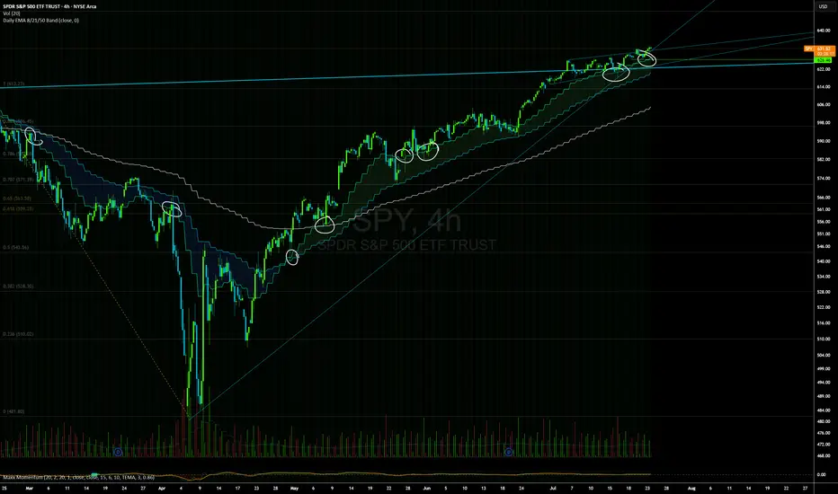
Daily EMAs (8, 21 & 50) with BandDescription:
This script plots the Daily EMAs (8, 21, and 50) on any intraday or higher timeframe chart. It provides a clear, multi-timeframe view of market trends by using daily exponential moving averages (EMAs) and a dynamic visual band. I use this on the major indexes to decide if I should be mostly longing or shorting assets.
-In addition to identifying the trend structure, the 8-Day EMA often serves as a key area where buyers or sellers may become active, depending on the market direction:
-In an uptrend, the 8 EMA can act as a dynamic support zone, where buyers tend to re-enter on pullbacks.
-In a downtrend, the same EMA may act as resistance, where sellers become more aggressive.
-The script also includes a colored band between the 8 and 21 EMAs to highlight the short-term trend bias:
-Green fill = 8 EMA is above the 21 EMA (bullish structure).
Blue fill = 8 EMA is below the 21 EMA (bearish structure).
The 50-Day EMA is included to give additional context for intermediate-term trend direction.
Features:
- Daily EMA levels (8, 21, and 50) calculated regardless of current chart timeframe.
- 8 EMA acts as a potential buyer/seller zone based on trend direction.
- Color-coded band between 8 and 21 EMAs:
- Green = Bullish short-term bias
- Blue = Bearish short-term bias
- Customizable price source and EMA offset.
- Suitable for trend trading, pullback entries, and higher-timeframe confirmation.
Use Cases:
Identify key dynamic support/resistance areas using the 8 EMA.
Assess short-, medium-, and intermediate-term trend structure at a glance.
Enhance confluence for entry/exit signals on lower timeframes.
True Breakout Pattern [TradingFinder] Breakout Signal Indicator🔵 Introduction
In many market conditions, what initially appears to be a decisive breakout often turns out to be nothing more than a false breakout or fake breakout. Price breaks through a key swing level or an important support and resistance zone, only to quickly return to its previous range.
These failed breakouts, which are often the result of liquidity traps or market manipulation, serve more as a warning sign of structural weakness than confirmation of a new trend.
This indicator is designed around the concept of the fake breakout.
The logic is simple but precise : when price breaks a swing level and returns to that level within a maximum of five candles, the move is considered a false breakout. At this point, a Fibonacci retracement is applied to the recent price swing to evaluate the pullback area.
If price, within ten candles after the return to the breakout level, enters the Fibonacci zone between 0.618 and 1.0, the setup becomes valid for a potential entry. This area is identified as a long entry zone, with the stop loss placed just beyond the 1.0 level and the take profit defined based on the desired risk-to-reward ratio.
By combining accurate detection of false breakouts, analysis of price reaction to swing levels, and alignment with Fibonacci retracement logic, this framework allows traders to identify opportunities often missed by others. In a market where failed breakouts are a common and recurring phenomenon, this indicator aims to transform these traps into measurable trading opportunities.
Long Setup :
Short Setup :
🔵 How to Use
This indicator operates based on the recognition of false breakouts from structural levels in the market, specifically swing levels, and combines that with Fibonacci retracement analysis.
In this strategy, trades are only considered when price returns to the broken level within a defined time window and reacts appropriately inside a predefined Fibonacci range. Depending on the direction of the initial breakout, the system outlines two scenarios for long and short setups.
🟣 Long Setup
In the long setup, price initially breaks below a support level or swing low. If the price returns to the broken level within a maximum of five candles, the move is identified as a fake breakout.
At this stage, a Fibonacci retracement is drawn from the recent high to the low. If price, within ten candles of returning to the level, moves into the 0.618 to 1.0 Fibonacci zone, the conditions for a long entry are met.
The stop loss is placed slightly below the 1.0 level, while the take profit is set based on the trader’s preferred risk-reward ratio. This setup aims to capture deeply discounted entries at low risk, aligned with smart money reversals.
🟣 Short Setup
In the short setup, the price breaks above a resistance level or swing high. If the price returns to that level within five candles, the move is again treated as a false breakout. Fibonacci is then drawn from the recent low to the high to observe the retracement area.
Should price enter the 0.618 to 1.0 Fibonacci range within ten candles of returning, a short entry is considered valid. In this case, the stop loss is placed just above the 1.0 level, and the take profit is adjusted based on the intended risk-reward target. This method allows traders to identify high-probability short setups by focusing on failed breakouts and deep pullbacks.
🔵 Settings
🟣 Logical settings
Swing period : You can set the swing detection period.
Valid After Trigger Bars : Limits how many candles after a fake breakout the entry zone remains valid.
Max Swing Back Method : It is in two modes "All" and "Custom". If it is in "All" mode, it will check all swings, and if it is in "Custom" mode, it will check the swings to the extent you determine.
Max Swing Back : You can set the number of swings that will go back for checking.
🟣 Display settings
Displaying or not displaying swings and setting the color of labels and lines.
🟣 Alert Settings
Alert False Breakout : Enables alerts for Breakout.
Message Frequency : Determines the frequency of alerts. Options include 'All' (every function call), 'Once Per Bar' (first call within the bar), and 'Once Per Bar Close' (final script execution of the real-time bar). Default is 'Once per Bar'.
Show Alert Time by Time Zone : Configures the time zone for alert messages. Default is 'UTC'.
🔵 Conclusion
A sound understanding of the false breakout phenomenon and its relationship to structural price behavior is essential for technical traders aiming to improve precision and consistency. Many poor trading decisions stem from misinterpreting failed breakouts and entering too early into weak signals.
A structured approach, grounded in the analysis of swing levels and validated through specific price action and timing rules, can turn these misleading moves into valuable trade opportunities.
This indicator, by combining fake breakout detection with time filters and Fibonacci-based retracement zones, helps traders only engage with the market when multiple confirming factors are in alignment. The result is a strategy that emphasizes probability, risk control, and clarity in decision-making, offering a solid edge in navigating today’s volatile markets.

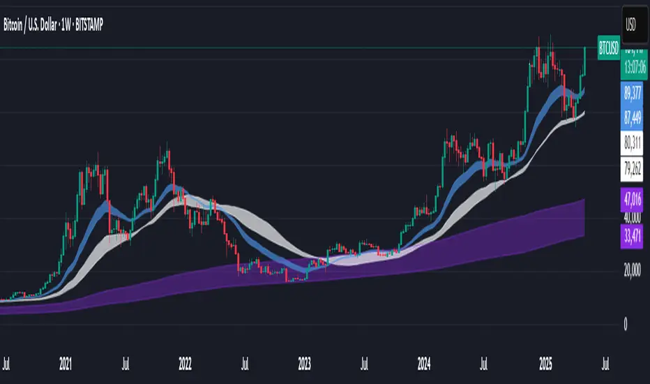
Support BandsSupport Bands – Discount Zones for Bitcoin
⚡Overview:
-The Support Bands indicator identifies one of the most tested and respected support zones for Bitcoin using moving averages from higher timeframes.
-These zones are visualized through colored bands (blue, white, and violet), simplifying the decision making process especially for less experienced traders who seek high-probability areas to accumulate Bitcoin during retracements.
-Band levels are based on manual backtesting and real-world price behavior throughout Bitcoin’s history.
-Each zone reflects a different degree of support strength, from temporary pullback zones to historical bottoms.
⚡️ Key Characteristics:
-Highlights discount zones where Bitcoin has historically shown strong reactions.
-Uses 3 different levels of supports based on EMA/SMA combinations.
-Offers a clean, non-intrusive overlay that reduces chart clutter.
⚡ How to Use:
-Open your chart on the 1W timeframe and select the BTC Bitstamp or BLX symbol, as they provide the most complete historical data, ensuring optimal performance of the indicator.
-Use the bands as reference zones for support and potential pullbacks.
- Level 3 (violet band) historically marks the bottom of Bitcoin bear markets and is ideal for long-term entries during deep corrections.
- Level 2 (white band) often signals macro reaccumulation zones but usually requires 1–3 months of consolidation before a breakout. If the price closes below and then retests this level as resistance for 1–2 weekly candles, it often marks the start of a macro downtrend.
-Level 1 (blue band) acts as short-term support during strong bullish moves, typically after a successful rebound from Level 2.
⚡ What Makes It Unique:
- This script merges moving averages per level into three simplified bands for clearer analysis.
-Reduces chart noise by avoiding multiple overlapping lines, helping you make faster and cleaner decisions.
- Built from manual market study based on recurring Bitcoin behavior, not just random code.
-Historically backtested:
-Level 3 (violet band) until today has always marked the bitcoin bearmarket bottom.
- Level 2 (white band) is the strongest support during bull markets; losing it often signals a macro trend reversal.
- Level 1 is frequently retested during impulsive rallies and can act as short-term support or resistance.
⚡ Disclaimer:
-This script is a visual tool to assist with market analysis.
-It does not generate buy or sell signals, nor does it predict future movements.
-Historical performance is not indicative of future results.
-Always use independent judgment and proper risk management.
⚡ Why Use Support Bands:
-Ideal for traders who want clarity without dozens of lines on their charts.
- Helps identify logical zones for entry or reaccumulation.
- Based on actual market behavior rather than hypothetical setups.
-If the blue band (Level 1) doesn't hold as support, the price often moves to the white band (Level 2), and if that fails too, the violet band (Level 3) is typically the last strong support. By dividing your capital into three planned entries, one at each level,you can manage risk more effectively compared to entering blindly without this structure.
Dual-Phase Trend Regime Oscillator (Zeiierman)█ Overview
Trend Regime: Dual-Phase Oscillator (Zeiierman) is a volatility-sensitive trend classification tool that dynamically switches between two oscillators, one optimized for low volatility, the other for high volatility.
By analyzing standard deviation-based volatility states and applying correlation-derived oscillators, this indicator reveals not only whether the market is trending but also what kind of trend regime it is in —Bullish or Bearish —and how that regime reacts to market volatility.
█ Its Uniqueness
Most trend indicators assume a static market environment; they don't adjust their logic when the underlying volatility shifts. That often leads to false signals in choppy conditions or late entries in trending phases.
Trend Regime: Dual-Phase Oscillator solves this by introducing volatility-aware adaptability. It switches between a slow, stable oscillator in calm markets and a fast, reactive oscillator in volatile ones, ensuring the right sensitivity at the right time.
█ How It Works
⚪ Volatility State Engine
Calculates returns-based volatility using standard deviation of price change
Smooths the current volatility with a moving average
Builds a volatility history window and performs median clustering to determine typical "Low" and "High" volatility zones
Dynamically assigns the chart to one of two internal volatility regimes: Low or High
⚪ Dual Oscillators
In Low Volatility, it uses a Slow Trend Oscillator (longer lookback, smoother)
In High Volatility, it switches to a Fast Trend Oscillator (shorter lookback, responsive)
Both oscillators use price-time correlation as a measure of directional strength
The output is normalized between 0 and 1, allowing for consistent interpretation
⚪ Trend Regime Classification
The active oscillator is compared to a neutral threshold (0.5)
If above: Bullish Regime, if below: Bearish Regime, else: Neutral
The background and markers update to reflect regime changes visually
Triangle markers highlight bullish/bearish regime shifts
█ How to Use
⚪ Identify Current Trend Regime
Use the background color and chart table to immediately recognize whether the market is trending up or down.
⚪ Trade Regime Shifts
Use triangle markers (▲ / ▼) to spot fresh regime entries, which are ideal for confirming breakouts within trends.
⚪ Pullback Trading
Look for pullbacks when the trend is in a stable condition and the slow oscillator remains consistently near the upper or lower threshold. Watch for moments when the fast oscillator retraces back toward the midline, or slightly above/below it — this often signals a potential pullback entry in the direction of the prevailing trend.
█ Settings Explained
Length (Slow Trend Oscillator) – Used in calm conditions. Longer = smoother signals
Length (Fast Trend Oscillator) – Used in volatile conditions. Shorter = more responsive
Volatility Refit Interval – Controls how often the system recalculates Low/High volatility levels
Current Volatility Period – Lookback used for immediate volatility measurement
Volatility Smoothing Length – Applies an SMA to the raw volatility to reduce noise
-----------------
Disclaimer
The content provided in my scripts, indicators, ideas, algorithms, and systems is for educational and informational purposes only. It does not constitute financial advice, investment recommendations, or a solicitation to buy or sell any financial instruments. I will not accept liability for any loss or damage, including without limitation any loss of profit, which may arise directly or indirectly from the use of or reliance on such information.
All investments involve risk, and the past performance of a security, industry, sector, market, financial product, trading strategy, backtest, or individual's trading does not guarantee future results or returns. Investors are fully responsible for any investment decisions they make. Such decisions should be based solely on an evaluation of their financial circumstances, investment objectives, risk tolerance, and liquidity needs.

EMA Trend Pro: Dynamic Clouds & ColorsEMA Trend Pro is your ultimate trend companion, built for traders who want clarity, precision, and confidence in their entries.
This script fuses dynamic EMA cloud zones with breakout and pullback signals — giving you real-time insights into market structure and momentum. Whether you're trading crypto, forex, stocks, or futures, EMA Trend Pro adapts to your style.
🔧 Key Features:
✅ EMA Stack Clouds with Folding Sensitivity (9/21/48/200)
✅ Bullish / Bearish trend labels with real-time dashboard
✅ Volume strength analysis (High, Normal, Low)
✅ Breakout signal alerts (momentum-based)
✅ Pullback signal alerts (trend resumption)
✅ Fully customizable: EMA lengths, signal visibility, cloud opacity
✅ Works across all assets and timeframes
🛠️ Designed for scalping, swing trading, and intraday setups.
🔔 Built-in alerts make automation seamless — no guesswork.
💡 Usage Tips:
Use clouds and trend labels to identify structure and bias
Trade breakouts when EMAs align and volume confirms
Look for pullbacks into the EMA zone and enter on resumption
📅 Market Hours Filter: Keeps signals relevant during core trading hours (9:30 AM–4 PM ET).
👤 Developed by @glapougbaegarmondeh
🧠 Version 1.0 | 📆 Released: April 24, 2025

[MAD] Custom Session VWAP BandsOverview
This indicator helps visualize the Volume Weighted Average Price (VWAP) and its associated standard deviation bands over specified time periods, providing traders with a clear understanding of price trends, volatility, and potential support/resistance levels.
Inputs
Deviation
StDev mult 1: Multiplier for the first standard deviation band (Default: 1.0)
StDev mult 2: Multiplier for the second standard deviation band (Default: 2.0)
StDev mult 3: Multiplier for the third standard deviation band (Default: 3.0)
StDev mult 4: Multiplier for the fourth standard deviation band (Default: 4.0)
Line width: Width of the lines for the bands (Default: 2)
Custom Vwap session reset settings
Many different options are considered when a session is going to be reset.
Plot and Fill Options
Enable Fills: Enable/disable filling between bands.
Plot +4: Enable/disable plotting the +4 standard deviation band.
Plot +3: Enable/disable plotting the +3 standard deviation band.
Plot +2: Enable/disable plotting the +2 standard deviation band.
Plot +1: Enable/disable plotting the +1 standard deviation band.
Plot VWAP: Enable/disable plotting the VWAP line.
Plot -1: Enable/disable plotting the -1 standard deviation band.
Plot -2: Enable/disable plotting the -2 standard deviation band.
Plot -3: Enable/disable plotting the -3 standard deviation band.
Plot -4: Enable/disable plotting the -4 standard deviation band.
How to Use the Indicator
Adding the Indicator
Add the indicator to your chart through your trading platform's indicator menu.
Configuring the VWAP Reset
Specify reset intervals based on time, days of the week, or specific dates.
Adjust the time zone if necessary.
Customizing Standard Deviation Bands
Set the multipliers for the standard deviation bands.
Choose line width for better visualization.
Enabling Plots and Fills
Select which bands to display.
Enable or disable fills between the bands.
Practical Application of VWAP Bands
Understanding VWAP
VWAP is a trading benchmark that calculates the average price a security has traded at throughout the day based on volume and price. It is primarily used for intraday trading but can also offer insights during end-of-day reviews.
Using VWAP for Trading
Intraday Trading
Entry and Exit Points: VWAP can help identify optimal buy and sell points. Buy when the price is above VWAP and sell when it's below.
Support and Resistance: VWAP often acts as a dynamic support/resistance level. Prices tend to revert to VWAP, making it a crucial level for intraday traders.
Trend Confirmation
Uptrends and Downtrends: In an uptrend, the price will generally stay above VWAP. Conversely, in a downtrend, it will stay below. Use this to confirm market direction.
Combining with Other Indicators
Moving Averages and Bollinger Bands: Combining VWAP with these indicators can provide a more robust trading signal, confirming trends and potential reversals.
Setting Stop-Loss and Profit Targets
Conservative Stop Orders: Place stop orders at recent lows for pullback trades.
Profit Targets: Use daily highs or Fibonacci extension levels to set profit targets.
Strategies for Using VWAP
Pullback Strategy
Buy during pullbacks to VWAP in an uptrend, and sell during rallies to VWAP in a downtrend.
Breakout Strategy
Look for breakouts above/below VWAP after the market open to capitalize on new trends.
Momentum Trading
Use VWAP to confirm the strength of a trend. Buy when the price is consistently above VWAP and sell when it's consistently below.
Institutional Strategies
Institutional traders use VWAP to execute large orders without causing significant market impact, ensuring trades are made around the average price.
By incorporating these strategies, traders can better understand market dynamics, make informed trading decisions, and manage their risk effectively.
Some setup possibilities
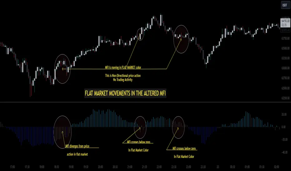
Altered Money Flow Index by CoffeeShopCrypto**Use the comments section below to request access to the script**
Market Trends need to be confirmed each and every time.
Over the years the Money Flow Index has been a tool to find where the money is flowing
either long or short in market movements.
Long confirmation and false short
Confirming a long entry:
1. Wait for price to close above a previous swing high.
2. Look to see if the MFI is in UPCOLOR and above ZERO.
Confriming a short entry:
1. Wait for price to close below a previous swing low.
2. Look to see if the MFI is in DOWNCOLOR and below ZERO.
NON-Confirmed market: (Flat Market)
Anytime you believe you have a confirmation via price action, check the MFI to see if it is in FLAT MARKET color.
If this is true, do not enter until it is out of FLAT MARKET color.
Flat Market ALtered MFI
A Flat Market Altered MFI reading can do a few things for you.
It can help to confirm the following:
1. price action is moving sideways.
2. a pullback or market stall that was deep enough where dis-intrest in the market occured.
3. a sudden loss of momentum in the short term trend of closing prices.
Utilizing the Altered Money Flow Index indicator by CoffeeShopCrypto offers traders a nuanced approach to identifying market trends, including periods of flat market conditions. Alongside its directional bias indicating bullish or bearish activity based on whether values are above or below zero, respectively, the script incorporates a distinctive feature to recognize flat markets. When neither bullish nor bearish momentum dominates, the indicator designates a flat market, denoted by a distinct color. This feature enhances traders' ability to discern not only bullish and bearish phases but also periods of market consolidation or indecision.
In addition to its ability to recognize bullish and bearish trends, the Altered Money Flow Index indicator by CoffeeShopCrypto incorporates a unique feature to signify potential pullbacks or pauses in market momentum. This is particularly evident when the MFI crosses below zero while displaying a flat market color. Such occurrences suggest that although the short-term movement may appear bearish, it's likely a temporary pullback rather than a sustained trend reversal. Similarly, when the MFI crosses above zero amidst a flat market color, it indicates a potential pause in bullish momentum, urging traders to exercise caution and await confirmation of a sustained uptrend. By incorporating these nuanced observations, traders can effectively discern between short-term fluctuations and significant trend changes, enabling them to make more judicious trading decisions and avoid premature entries or exits.
Alongside its directional bias indicating bullish or bearish activity based on whether values are above or below zero, respectively, the script integrates the Relative Strength Index (RSI) to further refine market analysis. When the Altered MFI and RSI are both above zero, it suggests a strong bullish trend, indicating significant buying pressure. Conversely, when both indicators are below zero, it indicates a strong bearish trend, signifying heightened selling pressure. By observing the confluence between the Altered MFI and RSI, traders can gain valuable confirmation of bullish or bearish money flow in the market, enabling them to make more informed trading decisions.
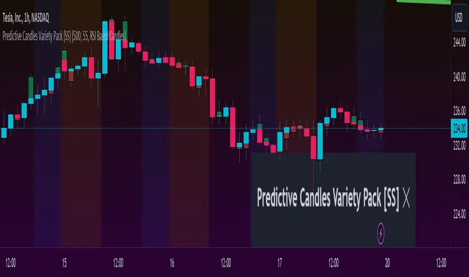
Predictive Candles Variety Pack [SS]This indicator provides you with the ability to select from a variety of candle prediction methods.
It permits for:
👉 Traditional Linear Regression Candle Predictions
👉 Candle Predictions based on the underlying Stochastics
👉 Candle Predictions based on the underlying RSI
👉 Candle Predictions based on the underlying MFI
👉 Candle Predictions based on the EMA 9
👉 Candle Predictions based on ARIMA modelling
Which is best?
Each method serves its unique purpose.
Here are some general tips of which candles are better suited for what:
🎯Trend Following🎯
For Trend following, the EMA 9 would be an appropriate choice of candle as it helps you to identify the current trend and potential early pullbacks/reversals.
🎯Momentum Following🎯
Momentum following is best carried out with the Stochastics Candles.
🎯Pullback Determination🎯
Pullback Determination is best accomplished through the RSI candles, as the ranges compress or expand based on the current state of oversold/overboughtness.
🎯Detrended Range🎯
To see the detrended range of where the ticker should be falling, absent the trendy noise, it's best to use the ARIMA candles.
Other Features
👉 Other features include a Backtest option that can be toggled on or off and will backtest over the length of the assessment. I don't recommend leaving it on as it can be resource-heavy on Pinescript though.
👉 The ability to adjust the transparency of the candles if you want them to be more or less visible.
Troubleshooting Note
The ARIMA modeling version is extremely resource-heavy, as it has to fully develop an ARIMA model. I have tried to optimize it by reducing the lagged assessment to just 2 lags. If you are using a free or non-premium membership, you may need to reduce the length of the assessment.
And that's it! Pretty straightforward indicator.
Hope you enjoy it!
[CP]Pivot Boss Multi Timeframe CPR Inception with MACD and EMAINTRODUCTION:
This indicator combines multi-timeframe CPR bands with MACD Momentum and EMA trend, all projected on the candlestick chart through a novel visualization.
If you have seen my other indicators on TradingView, you would know that I use floor pivots a lot and “Secrets of a Pivot Boss” is my favorite book. While using floor pivots, time and again I have noticed an interesting price behavior,
Trending moves in price typically start from around the Central Pivot Range (CPR). The CPR could be from ANY timeframe. These moves can easily be caught using simple momentum and trend indicators like MACD and EMA crossovers.
Yes, it is that simple. Follow along to understand how to use this indicator.
INDICATOR SETTINGS:
RANGEBOUND MACD AND EMA MARKINGS:
TradingView limits the max number of labels that can be shown on a chart to 500. Therefore, if you go far back enough, you won't see any markings for the MACD or EMA setups. If you are looking to test the efficacy of this indicator in the past, change the start and end dates to your desired timeframe and then select the ‘Mark MACD and EMA Setups in Range?’ option.
MULTI TIMEFRAME CENTRAL PIVOT RANGE:
Here you can select CPRs and their bands from which timeframes are shown on the chart. I will share my favorite settings later in this description.
CPR CONFIGURATION:
Show CPR Labels: CPRs markings can carry labels, so that you don’t confuse between which line is what. Use this setting to toggle them On/Off.
Show Next Time Period Pivots: Check this option if you want to see the CPR of the next time period. This is typically done to figure out the ’Two Day CPR Relationship’ . Read the book, “Secrets of a Pivot Boss”, to understand more.
EMA TREND:
Show EMA on the Chart: EMAs will be plotted on the chart. Standard stuff.
Mark EMA Crossovers on Chart: EMA crossovers will be marked on the chart in diamond shapes. If you are using EMA crossovers, I recommend setting this option to True.
Rest of the EMA settings are fairly obvious.
MACD MOMENTUM:
Projecting MACD parameters directly on the candlesticks is surely going to give you a new perspective about price action and MACD.
Also, in order to better understand the MACD projections on the chart, you can add a standard MACD indicator on the chart with default settings to figure out what my indicator is actually showing you.
Marking MACD Crossovers on Chart: Marks the MACD signal crossovers on the chart. This visualization was a game changer for me.
Show MACD Histogram on Chart: Projects the complete MACD Histogram in a novel fashion (Try it!). You will be able to visually see the ebbs and flow of momentum in the charts.
Mark MACD Histogram Peaks on Chart: Marks only the MACD peaks instead of the complete histogram. Peaks are a great way to enter an ongoing trend and to play an intraday rangebound market.
Rest of the settings are just the standard settings that you will find in a typical MACD indicator.
ALERTS:
Not shown in the settings panel, but I have added alerts for EMA and MACD Crossovers so that you don’t have to sit in front of the charts or constantly check the price all day long.
If you don’t know how to set alerts in TradingView, then please Google it.
INDICATOR USAGE EXAMPLES:
This indicator can be used in intraday as well as in higher timeframes.
There are quite a few variations possible, I personally prefer to use the EMA crossovers in intraday (5m) and MACD on Daily timeframes.
This is just a matter of personal preference, some people might prefer using EMAs only or MACD only in all timeframes.
Here are my personal settings for the intraday 5-minute timeframe:
Turn on all the CPR pivots starting from Yearly all the way to Daily. You can turn on 6 hourly and 4 hourly as well if you want.
Hourly CPR is mostly used when the price is in a strong trend and you missed the entry and don’t know when to enter. Price will typically experience pullbacks towards the Hourly CPR, before resuming in the direction of the trend. That is your chance to hop onto the bandwagon.
For Intraday, I keep the Bands off. Just a personal preference here.
You can turn ON the Show CPR Labels , if you want.
Turn ON both the options in the EMA TREND section. You would want to see the EMA crossovers marked on the chart as well as the EMAs themselves, as the distance between the two EMAs will give you an idea about the strength of the trend.
Keep rest of the settings in the EMA section as default (you can change the colors if you wish). I keep the same EMAs as the ones kept in the MACD indicator. I like to keep things simple.
In the MACD MOMENTUM section, turn ON Mark MACD Histogram Peaks on Chart and all the other options turned OFF. Leave the other settings as default. By the way, these are the default settings of the standard MACD Indicator.
You can set up EMA Bullcross and Bearcross alarms if you like.
Before checking out the examples, remember one super simple rule:
SOME OF THE BEST TRENDING MOVES IN THE MARKET, BE IT INTRADAY OR OTHERWISE, ORIGINATE IN THE VICINITY OF A LARGER TIMEFRAME PIVOT/CPR.
Look for price settling above/below a pivot, and then a move away from the pivot in any direction is typically a trending move.
You can use hourly pivots or MACD Histogram peaks marked on the chart to enter an existing trend, or add to your positions.
Let’s have a look at a few recent intraday examples from the Crypto, Indian, and US equity markets.
I have added my comments in the charts to make you easily understand what is going on.
Understand that both, moving average crossover and MACD, will give out a lot of signals (chop) every day. But almost 70% of them are going to be fake signals. It is the signals that you get when the price is near a Pivot, that tend to convert into gorgeous trending moves that last.
BTC 5m Charts
NIFTY Futures 5m Charts (good intraday trends are hard to find here, as the market is very efficient)
TSLA 5m Charts
Some important points for using this indicator in higher timeframes:
For higher timeframes, my personal preference is to go with the MACD indicator. I personally find MACD to be lethal on daily and weekly timeframes, if you know how to use it well.
The default settings of the indicator are the settings I use for both, Daily and Weekly, timeframes. Additionally, I turn off the CPR labels.
In theory large trending moves still have a big probability to start near an important pivot level, however, in larger timeframes, trending moves can start from anywhere. They need not start in the vicinity of any important pivot (but they often do!).
Weekly pivots can act as great pullback levels when the price is in strong momentum, when trading on the daily timeframe.
Quarterly Pivots act as great pullback levels when the price is in strong momentum, when trading on the weekly timeframe.
BTC Weekly Chart
BTC Daily Chart
Nifty Weekly Chart
Nifty Daily Chart
NASDAQ Weekly Chart
NASDAQ Daily Chart
FINAL WORDS:
Please understand that I have Cherry Picked the examples to showcase the capability of the indicator and its usage.
DO NOT conflate the accuracy of examples with the accuracy of this indicator.
Biggest catch is the fact that this indicator, like every other indicator out there, will have whipsaws. Some I have also marked in the example charts.
You need to come up with your own technique to avoid whipsaws, one technique I have shared here…… big moves typically start near pivots.
Work on avoiding whipsaws and finding you own edge in the markets.
If you really want to learn how to use Pivots, read the book ’Secrets of a Pivot Boss’ . This book can change your life.
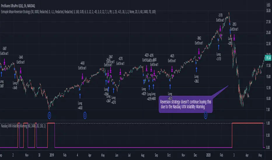
Nasdaq VXN Volatility Warning IndicatorToday I am sharing with the community a volatility indicator that uses the Nasdaq VXN Volatility Index to help you or your algorithms avoid black swan events. This is a similar the indicator I published last week that uses the SP500 VIX, but this indicator uses the Nasdaq VXN and can help inform strategies on the Nasdaq index or Nasdaq derivative instruments.
Variance is most commonly used in statistics to derive standard deviation (with its square root). It does have another practical application, and that is to identify outliers in a sample of data. Variance is defined as the squared difference between a value and its mean. Calculating that squared difference means that the farther away the value is from the mean, the more the variance will grow (exponentially). This exponential difference makes outliers in the variance data more apparent.
Why does this matter?
There are assets or indices that exist in the stock market that might make us adjust our trading strategy if they are behaving in an unusual way. In some instances, we can use variance to identify that behavior and inform our strategy.
Is that really possible?
Let’s look at the relationship between VXN and the Nasdaq100 as an example. If you trade a Nasdaq index with a mean reversion strategy or algorithm, you know that they typically do best in times of volatility . These strategies essentially attempt to “call bottom” on a pullback. Their downside is that sometimes a pullback turns into a regime change, or a black swan event. The other downside is that there is no logical tight stop that actually increases their performance, so when they lose they tend to lose big.
So that begs the question, how might one quantitatively identify if this dip could turn into a regime change or black swan event?
The Nasdaq Volatility Index ( VXN ) uses options data to identify, on a large scale, what investors overall expect the market to do in the near future. The Volatility Index spikes in times of uncertainty and when investors expect the market to go down. However, during a black swan event, historically the VXN has spiked a lot harder. We can use variance here to identify if a spike in the VXN exceeds our threshold for a normal market pullback, and potentially avoid entering trades for a period of time (I.e. maybe we don’t buy that dip).
Does this actually work?
In backtesting, this cut the drawdown of my index reversion strategies in half. It also cuts out some good trades (because high investor fear isn’t always indicative of a regime change or black swan event). But, I’ll happily lose out on some good trades in exchange for half the drawdown. Lets look at some examples of periods of time that trades could have been avoided using this strategy/indicator:
Example 1 – With the Volatility Warning Indicator, the mean reversion strategy could have avoided repeatedly buying this pullback that led to this asset losing over 75% of its value:
Example 2 - June 2018 to June 2019 - With the Volatility Warning Indicator, the drawdown during this period reduces from 22% to 11%, and the overall returns increase from -8% to +3%
How do you use this indicator?
This indicator determines the variance of VXN against a long term mean. If the variance of the VXN spikes over an input threshold, the indicator goes up. The indicator will remain up for a defined period of bars/time after the variance returns below the threshold. I have included default values I’ve found to be significant for a short-term mean-reversion strategy, but your inputs might depend on your risk tolerance and strategy time-horizon. The default values are for 1hr VXN data/charts. It will pull in variance data for the VXN regardless of which chart the indicator is applied to.
Disclaimer: Open-source scripts I publish in the community are largely meant to spark ideas or be used as building blocks for part of a more robust trade management strategy. If you would like to implement a version of any script, I would recommend making significant additions/modifications to the strategy & risk management functions. If you don’t know how to program in Pine, then hire a Pine-coder. We can help!
S&P500 VIX Volatility Warning IndicatorToday I am sharing with the community a volatility indicator that can help you or your algorithms avoid black swan events. Variance is most commonly used in statistics to derive standard deviation (with its square root). It does have another practical application, and that is to identify outliers in a sample of data. Variance in statistics is defined as the squared difference between a value and its mean. Calculating that squared difference means that the farther away the value is from the mean, the more the variance will grow (exponentially). This exponential difference makes outliers in the variance data more apparent.
Why does this matter?
There are assets or indices that exist in the stock market that might make us adjust our trading strategy if they are behaving in an unusual way. In some instances, we can use variance to identify that behavior and inform our strategy.
Is that really possible?
Let’s look at the relationship between VIX and the S&P500 as an example. If you trade an S&P500 index with a mean reversion strategy or algorithm, you know that they typically do best in times of volatility. These strategies essentially attempt to “call bottom” on a pullback. Their downside is that sometimes a pullback turns into a regime change, or a black swan event. The other downside is that there is no logical tight stop that actually increases their performance, so when they lose they tend to lose big.
So that begs the question, how might one quantitatively identify if this dip could turn into a regime change or black swan event?
The CBOE Volatility Index (VIX) uses options data to identify, on a large scale, what investors overall expect the market to do in the near future. The Volatility Index spikes in times of uncertainty and when investors expect the market to go down. However, during a black swan event, the VIX spikes a lot harder. We can use variance here to identify if a spike in the VIX exceeds our threshold for a normal market pullback, and potentially avoid entering trades for a period of time (I.e. maybe we don’t buy that dip).
Does this actually work?
In backtesting, this cut the drawdown of my index reversion strategies in half. It also cuts out some good trades (because high investor fear isn’t always indicative of a regime change or black swan event). But, I’ll happily lose out on some good trades in exchange for half the drawdown. Lets look at some examples of periods of time that trades could have been avoided using this strategy/indicator:
Example 1 – With the Volatility Warning Indicator, the mean reversion strategy could have avoided repeatedly buying this pullback that led to SPXL losing over 75% of its value:
Example 2 - June 2018 to June 2019 - With the Volatility Warning Indicator, the drawdown during this period reduces from 22% to 11%, and the overall returns increase from -8% to +3%
How do you use this indicator?
This indicator determines the variance of the VIX against a long term mean. If the variance of the VIX spikes over an input threshold, the indicator goes up. The indicator will remain up for a defined period of bars/time after the variance returns below the threshold. I have included default values I’ve found to be significant for a short-term mean-reversion strategy, but your inputs might depend on your risk tolerance and strategy time-horizon. The default values are for 1hr VIX data. It will pull in variance data for the VIX regardless of which chart the indicator is applied to.
Disclaimer : Open-source scripts I publish in the community are largely meant to spark ideas or be used as building blocks for part of a more robust trade management strategy. If you would like to implement a version of any script, I would recommend making significant additions/modifications to the strategy & risk management functions. If you don’t know how to program in Pine, then hire a Pine-coder. We can help!

Fast SMAFast SMA is based on the simple moving average and adds to it more flexibility.
It is a composite indicator, as it uses sma and counts factor that gives more weight for a more recent price index.
The difference between sma (thin line) and fast sma (bold line) you can see on the chart.
Fast sma with default parameters with this script is faster then ema with the same length.
It has flexibility almost as HMA with the same length has.
After using it for two months I found this ma very interesting and decided to share its code and the way it can be used.
FSMA and price index interact:
1) FSMA acts as support or resistance giving price line good pullbacks.
2) If price breaks through FSMA the stop of this move form strong support or resistance level.
3) if price cross FSMA without cutting move of make fuss on FSMA it forms range. In this case, FSMA break must be considered only after price leaves the range. In such cases, FSMA usually shows the direction by giving additional price pullback confirmations.
On the chart I added some comments and marked SR lvls, zones and strong moves of BTC since 2018 till now with submitted FSMA strategy.
I wish you good trades.
examples:

David's four emasThe 200 ema gives the overall big trend. You can use it to choose long only or short only setups. The 20 and 50 emas allow you to find an "area of value", so that in a down trend for instance, a pullback to this area could provide an area for a possible short using a chart pattern such as a double top on a lower time frame, a break of support or a bearish engulfing candle. The 5 ema is another possible entry to a trend if there are no pullbacks. After (say) five consecutive closes on one side of the 5 ema then we have a possible short entry at that low (or a fraction of the ATR below it) which gets us into the trend.

[CT] Smart Supertrend Smart Supertrend is an overlay trend and context indicator that combines three different ideas into one visual: a dynamic “cloud” that adapts to market cycle speed, a pivot-point anchored trailing line that behaves like a smarter Supertrend, and an ADX strength filter that helps separate real trends from noisy sideways movement. It is designed to keep you aligned with the dominant direction while giving you a clean framework for entries, pullbacks, and exits.
The “cloud” is the heart of the script’s regime read. Internally, it builds an adaptive smoothing engine that reacts to how efficiently the price is moving. When the price is moving in a clean, directional way, the cloud becomes more responsive. When the price is choppy and overlapping, the cloud becomes slower and steadier. The cloud itself is drawn as two lines, Cloud A and Cloud B, and the filled area between them. When the adaptive KAMA slope is rising, the cloud is treated as bullish and uses your Up color. When it is falling, the cloud is treated as bearish and uses your Down color. This creates a quick visual of whether the market is behaving like an uptrend regime or a downtrend regime without relying on one fixed moving average length that can be too fast in chop or too slow in trend.
The PP line is the trade management spine. It is built from pivot logic that detects meaningful swing highs and swing lows using your PP Period. Those pivots are blended into a centerline, and then an ATR band is applied around that center using your ATR Period and ATR Factor. That band is turned into a trailing line that “ratchets” in the direction of the current trend. When the price is above the trailing logic, the script considers the trend state to be long. When the price is below, it considers the trend state to be short. The reason this feels different from a basic Supertrend is that the anchor comes from pivots and smoothing rather than only a direct ATR band around price, so it tends to track structure more naturally and reduce some of the fast flipping you see in choppy sections.
The ADX filter is the quality control layer. It computes plus DI, minus DI, and ADX over your ADX Length, and then checks whether ADX is above your threshold. When ADX is above the threshold, it suggests the market is trending enough for trend signals to matter. When ADX is below the threshold, the script is telling you the environment is more sideways, which is where most trend systems get chopped up. In the original logic, the “best” conditions occur when the cloud direction agrees with the DI direction, and ADX is strong, because that means direction and strength are aligned.
How you trade it starts with using the cloud as your directional bias. When the cloud is bullish, you prioritize longs and you treat shorts as lower quality or countertrend. When the cloud is bearish, you prioritize shorts and you treat longs as lower quality. Next, you use the PP line as the “line in the sand” for trend state and risk placement. In a bullish environment, price holding above the PP line is your confirmation that the structure-anchored trailing level is supporting the move. In a bearish environment, price holding below the PP line is your confirmation that the trailing level is capping rallies.
A clean, practical entry approach is to wait for agreement between the cloud and the PP line, then take pullbacks into that framework. For long trades, the highest quality setups occur when the cloud is bullish, the PP line is below price, and ADX is above the threshold with plus DI leading minus DI. In that state, you can look for pullbacks that dip toward the PP line or into the cloud region and then reject back upward, because you’re buying a retracement inside a confirmed trend regime rather than chasing extension. For short trades, the mirror applies: the cloud is bearish, the PP line is above price, ADX is above the threshold with minus DI leading, and you sell rallies back into the PP line or cloud that fail and rotate down.
Stops and exits can be built around the PP line because it is already an ATR-based trailing structure level. For a long, a conservative stop is placed just below the PP line with a buffer related to ATR, because if price closes and holds below that line you are likely seeing a trend condition break. For a short, the stop goes just above the PP line with a similar buffer. For profit taking, many traders scale out when price stretches far away from the PP line or when the cloud begins to lose slope and compress, because that often signals trend momentum is slowing. Another simple exit rule is to reduce or close when the PP line flips trend state against your position, or when the ADX falls back under the threshold after a run, because that frequently marks a transition into consolidation where trailing systems can give back gains.
If you enable signals in versions that plot them, the logic is meant to highlight moments when the PP line flips trend and the cloud is not contradicting that flip, then further filters those into “higher quality” conditions when cloud direction and ADX trend strength agree. In practice, you should still treat signals as prompts, not automatic trades. The best results come from using the signal as a timing cue while you still enforce the bigger rule of alignment: cloud direction, PP line trend state, and ADX strength all pointing the same way, with entries taken on pullbacks rather than on late breakout candles.
Finally, be aware that all adaptive smoothing systems will look different across markets and timeframes, so the main tuning knobs are your Cloud Length, PP Period, ATR Factor, and ADX Threshold. If you want fewer flips and more “position trading” behavior, increase the ATR Factor and consider a higher ADX threshold. If you want earlier entries and more sensitivity, lower ATR Factor and lower the threshold, but expect more chop. The indicator is at its best when you treat it as a regime and structure tool: let the cloud tell you the side, let the PP line define where you are wrong, and let ADX decide whether it’s a trend day or a chop day before you commit size.

BTC Flow Dashboard (Spot Premium + OI + Funding)It builds a single flows dashboard that shows whether real spot demand (fiat buyers) or leveraged perps (futures traders) are driving BTC, and then cross-checks that with Open Interest (OI) and funding pressure—all normalized so you can spot regime shifts and squeeze risk fast.
How to read it (practical playbook)
Continuation (healthier trend)
Price ↑, premium > 0 and rising, oiZ ≥ 0 → spot sponsoring the move; perps chase → add on pullbacks.
Leverage-led & vulnerable
Price ↑, premium < 0, fundZ > 0 (expensive longs) → crowding → fade extensions / expect sharp pullbacks.
Buyable dip / absorption
Price ↓, premium ≥ 0 (spot supporting), oiZ flat/down, fundZ ≤ 0 → selling looks weak → scale into reversals.
Exhaustion / mean reversion
premZ ≥ +2 after a run → flows unusually hot → take profits / tighten risk.
premZ ≤ −2 into key support → capitulation risk but also bounce setups if OI/funding aren’t pressuring.

Outside Candle Session Breakout [CHE]Outside Candle Session Breakout
Session - anchored HTF levels for clear market-structure and precise breakout context
Summary
This indicator is a relevant market-structure tool. It anchors the session to the first higher-timeframe bar, then activates only when the second bar forms an outside condition. Price frequently reacts around these anchors, which provides precise breakout context and a clear overview on both lower and higher timeframes. Robustness comes from close-based validation, an adaptive volatility and tick buffer, first-touch enforcement, optional retest, one-signal-per-session, cooldown, and an optional trend filter.
Pine version: v6. Overlay: true.
Motivation: Why this design?
Short-term breakout tools often trigger during noise, duplicate within the same session, or drift when volatility shifts. The core idea is to gate signals behind a meaningful structure event: a first-bar anchor and a subsequent outside bar on the session timeframe. This narrows attention to structurally important breaks while adaptive buffering and debouncing reduce false or mid-run triggers.
What’s different vs. standard approaches?
Baseline: Simple high-low breaks or fixed buffers without session context.
Architecture: Session-anchored first-bar high/low; outside-bar gate; close-based confirmation with an adaptive ATR and tick buffer; first-touch enforcement; optional retest window; one-signal-per-session and cooldown; optional EMA trend and slope filter; higher-timeframe aggregation with lookahead disabled; themeable visuals and a range fill between levels.
Practical effect: Cleaner timing at structurally relevant levels, fewer redundant or late triggers, and better multi-timeframe situational awareness.
How it works (technical)
The chart timeframe is mapped to an analysis timeframe and a session timeframe.
The first session bar defines the anchor high and low. The setup becomes active only after the next bar forms an outside range relative to that first bar.
While active, the script tracks these anchors and checks for a breakout beyond a buffered threshold, using closing prices or wicks by preference.
The buffer scales with volatility and is limited by a minimum tick floor. First-touch enforcement avoids mid-run confirmations.
Optional retest requires a pullback to the raw anchor followed by a new close beyond the buffered level within a user window.
Optional trend gating uses an EMA on the analysis timeframe, including an optional slope requirement and price-location check.
Higher-timeframe data is requested with lookahead disabled. Values can update during a forming higher-timeframe bar; waiting and confirmation mitigate timing shifts.
Parameter Guide
Enable Long / Enable Short — Direction toggles. Default: true / true. Reduces unwanted side.
Wait Candles — Minimum bars after outside confirmation before entries. Default: five. More waiting increases stability.
Close-based Breakout — Confirm on candle close beyond buffer. Default: true. For wick sensitivity, disable.
ATR Buffer — Enables adaptive volatility buffer. Default: true.
ATR Multiplier — Buffer scaling. Default: zero point two. Increase to reduce noise.
Ticks Buffer — Minimum buffer in ticks. Default: two. Protects in quiet markets.
Cooldown Bars — Blocks new signals after a trigger. Default: three.
One Signal per Session — Prevents duplicates within a session. Default: true.
Require Retest — Pullback to raw anchor before confirming. Default: false.
Retest Window — Bars allowed for retest completion. Default: five.
HTF Trend Filter — EMA-based gating. Default: false.
EMA Length — EMA period. Default: two hundred.
Slope — Require EMA slope direction. Default: true.
Price Above/Below EMA — Require price location relative to EMA. Default: true.
Show Levels / Highlight Session / Show Signals — Visual controls. Default: true.
Color Theme — “Blue-Green” (default), “Monochrome”, “Earth Tones”, “Classic”, “Dark”.
Time Period Box — Visibility, size, position, and colors for the info box. (Optional)
Reading & Interpretation
The two level lines represent the session’s first-bar high and low. The filled band illustrates the active session range.
“OUT” marks that the outside condition is confirmed and the setup is live.
“LONG” or “SHORT” appears only when the breakout clears buffer, debounce, and optional gates.
Background tint indicates sessions where the setup is valid.
Alerts fire on confirmed long or short breakout events.
Practical Workflows & Combinations
Trend-following: Keep close-based validation, ATR buffer near the default, one-signal-per-session enabled; add EMA trend and slope for directional bias.
Retest confirmation: Enable retest with a short window to prioritize cleaner continuation after a pullback.
Lower-timeframe scalping: Reduce waiting and cooldown slightly; keep a small tick buffer to filter micro-whips.
Swing and position context: Increase ATR multiplier and waiting; maintain once-per-session to limit duplicates.
Timeframe Tiers and Trader Profiles
The script adapts its internal mapping based on the chart timeframe:
Under fifteen minutes → Analysis: one minute; Session: sixty minutes. Useful for scalpers and high-frequency intraday reads.
Between fifteen and under sixty minutes → Analysis: fifteen minutes; Session: one day. Suits day traders who need intraday alignment to the daily session.
Between sixty minutes and under one day → Analysis: sixty minutes; Session: one week. Serves intraday-to-swing transitions and end-of-day planning.
Between one day and under one week → Analysis: two hundred forty minutes; Session: two weeks. Fits swing traders who monitor multi-day structure.
Between one week and under thirty days → Analysis: one day; Session: three months. Supports position traders seeking quarterly context.
Thirty days and above → Analysis: one day; Session: twelve months. Provides a broad annual anchor for macro context.
These tiers are designed to keep anchors meaningful across regimes while preserving responsiveness appropriate to the trader profile.
Behavior, Constraints & Performance
Signals can be validated on closed bars through close-based logic; enabling this reduces intrabar flicker.
Higher-timeframe values may evolve during a forming bar; waiting parameters and the outside-bar gate reduce, but do not remove, this effect.
Resource footprint is light; the script uses standard indicators and a single higher-timeframe request per stream.
Known limits: rare setups during very quiet periods, sensitivity to gaps, and reduced reliability on illiquid symbols.
Sensible Defaults & Quick Tuning
Start with close-based validation on, ATR buffer on with a multiplier near zero point two, tick buffer two, cooldown three, once-per-session on.
Too many flips: increase the ATR multiplier and cooldown; consider enabling the EMA filter and slope.
Too sluggish: reduce the ATR multiplier and waiting; disable retest.
Choppy conditions: keep close-based validation, increase tick buffer, shorten the retest window.
What this indicator is—and isn’t
This is a visualization and signal layer for session-anchored breakouts with stability gates. It is not a complete trading system, risk framework, or predictive engine. Combine it with structured analysis, position sizing, and disciplined risk controls.
Disclaimer
The content provided, including all code and materials, is strictly for educational and informational purposes only. It is not intended as, and should not be interpreted as, financial advice, a recommendation to buy or sell any financial instrument, or an offer of any financial product or service. All strategies, tools, and examples discussed are provided for illustrative purposes to demonstrate coding techniques and the functionality of Pine Script within a trading context.
Any results from strategies or tools provided are hypothetical, and past performance is not indicative of future results. Trading and investing involve high risk, including the potential loss of principal, and may not be suitable for all individuals. Before making any trading decisions, please consult with a qualified financial professional to understand the risks involved.
By using this script, you acknowledge and agree that any trading decisions are made solely at your discretion and risk.
Do not use this indicator on Heikin-Ashi, Renko, Kagi, Point-and-Figure, or Range charts, as these chart types can produce unrealistic results for signal markers and alerts.
Best regards and happy trading
Chervolino
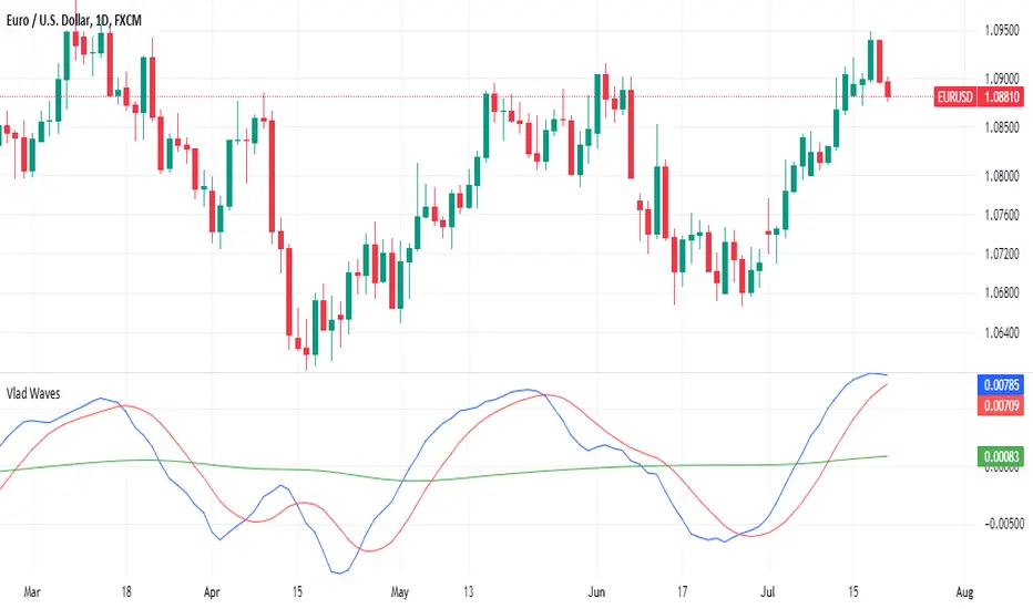
Vlad Waves█ CONCEPT
Acceleration Line (Blue)
The Acceleration Line is calculated as the difference between the 8-period SMA and the 20-period SMA.
This line helps to identify the momentum and potential turning points in the market.
Signal Line (Red)
The Signal Line is an 8-period SMA of the Acceleration Line.
This line smooths out the Acceleration Line to generate clearer signals.
Long-Term Average (Green)
The Long-Term Average is a 200-period SMA of the Acceleration Line.
This line provides a broader context of the market trend, helping to distinguish between long-term and short-term movements.
█ SIGNALS
Buy Mode
A buy signal occurs when the Acceleration Line crosses above the Signal Line while below the Long-Term Average. This indicates a potential bullish reversal in the market.
When the Signal Line crosses the Acceleration Line above the Long-Term Average, consider placing a stop rather than reversing the position to protect gains from potential pullbacks.
Sell Mode
A sell signal occurs when the Acceleration Line crosses below the Signal Line while above the Long-Term Average. This indicates a potential bearish reversal in the market.
When the Signal Line crosses the Acceleration Line below the Long-Term Average, consider placing a stop rather than reversing the position to protect gains from potential pullbacks.
█ UTILITY
This indicator is not recommended for standalone buy or sell signals. Instead, it is designed to identify market cycles and turning points, aiding in the decision-making process.
Entry signals are most effective when they occur away from the Long-Term Average, as this helps to avoid sideways movements.
Use larger timeframes, such as daily or weekly charts, for better accuracy and reliability of the signals.
█ CREDITS
The idea for this indicator came from Fabio Figueiredo (Vlad).
GOLD TERTIUM MGC 1mThis indicator is a visual tool for TradingView designed to help you read trend structure using EMAs and highlight potential long and short entries on the MGC 1‑minute chart, while filtering pullbacks and avoiding trades when the 200 EMA is flat.
It calculates five EMAs (32, 50, 110, 200, 250) and plots them in different colors so you can clearly see the moving‑average stack and overall direction. The main trend is defined by the 200 EMA: bullish when price and the fast EMAs (32 and 50) are above it with a positive slope, and bearish when they are below it with a negative slope; if the 200 EMA is almost flat, signals are blocked to reduce trading in choppy markets.
Entry logic looks for a pullback into the 32–50 EMA zone on the previous candle, then requires a trend‑aligned candle to trigger a signal: long when the trend is up, the previous bar retested the EMA zone, and the current bar closes above EMA 32 with a bullish body; short when the trend is down, there was a valid retest, the current bar closes below EMA 32 with a bearish body and EMA 32 is below EMA 50. On the chart, you will see colored EMAs plus green “L” triangles under bars for potential long entries and red “S” triangles above bars for potential short entries, which are meant as visual cues rather than automatic trade instructions

SEPA Sell Signal IndicatorSEPA Sell Signal Indicator - Documentation
Overview
A comprehensive exit signal indicator designed to work alongside the main SEPA (Stage, EMA, Price Action) indicator. It detects entry points via SEPA base breakouts and provides intelligent sell signals to protect profits and limit losses.
Core Features
Entry Detection
Automatically detects SEPA base breakout patterns
Tracks entry price and calculates swing low reference
Monitors position status (LONG/FLAT)
5 Sell Triggers
Price < EMA50 (Technical weakness)
Protected by EMA10 system (see below)
Trend Broken (Price < EMA150 AND EMA200)
Major trend reversal signal
Not protected - always fires
EMA Cross (EMA50 < EMA150)
Death cross indicating momentum shift
Not protected - always fires
Swing Low Broken (Price < Previous Swing Low)
Hard stop loss trigger
Lookback period: 10 bars (adjustable 5-50)
Not protected - always fires
Relative Strength Negative (RS vs NIFTY500 < 0)
Stock underperforming benchmark index
Based on 21-period EMA comparison
Not protected - always fires
EMA10 Protection System (Refinement Feature)
Purpose
Prevents premature exits during healthy pullbacks in strong uptrends.
Protection Criteria (All must be true)
✅ Stock in uptrend (EMA50 > EMA150 > EMA200)
✅ Price above EMA10
✅ Price above EMA50
✅ Only protects Condition 1 (Price < EMA50)
Two-Stage Warning System
Stage 1: Yellow "CAUTION" Signal
Appears when Condition 1 triggers but protection is active
Grace period begins (default: 5 bars)
Allows time for price to recover
Stage 2: Red "SELL" Signal
Fires when ANY of these occur:
Warning timer expires (5/5 bars)
Price drops below EMA10
Price drops below EMA50
Uptrend ends
Any other sell condition (2-5) triggers
Settings
Enable EMA10 Protection: ON/OFF toggle (default: ON)
Protection Time Limit: 1-20 bars (default: 5)
Visual Elements
Chart Signals
🔴 Red Triangle (SELL): Confirmed sell signal - exit position
🟡 Yellow Circle (CAUTION): Warning - monitor closely
🟢 Green Background Tint: Currently in position
Information Tables
Top Right - Sell Conditions Table
Shows real-time status of all 5 conditions
✓ (Green) = Condition NOT met (safe)
✓ (Red) = Condition met (danger)
⚠ (Yellow) = Warning active (monitoring)
Displays EMA10 protection status (ON/OFF)
Shows warning timer (e.g., "3/5")
Bottom Right - Position Details (when in position)
Entry price
Swing low level
Relative strength value (color-coded)
Current P&L percentage
Bottom Right - Status (when flat)
Shows "NO POSITION"
Indicates waiting for "BASE BREAKOUT"
Alert System
Entry Signal: SEPA base breakout detected
Warning Alert: Caution - price below EMA50 but protected
EMA50 Break: Sell confirmed after protection expires
Trend Break: Major reversal - exit immediately
EMA Cross: Death cross - exit immediately
Swing Low Break: Hard stop - exit immediately
RS Negative: Underperformance - exit immediately
Configuration Parameters
ParameterDefaultRangeDescriptionEMA 10101-50Fast moving average for protectionEMA 50501-200Primary trend indicatorEMA 1501501-300Medium-term trendEMA 2002001-500Long-term trendSwing Low Lookback105-50Bars to find previous swing lowRS EMA215-50Period for relative strength calcBenchmarkCNX500-Index for RS comparisonProtection Time Limit51-20Max bars for warning stateTable Text Size1 (Small)0-40=Tiny, 4=HugeEMA10 ProtectionONON/OFFEnable/disable protection
Trading Workflow
Entry: Indicator detects SEPA base breakout
Monitoring: Track 5 sell conditions in real-time
Warning: Yellow CAUTION if minor weakness (Condition 1 only)
Grace Period: 5 bars to recover or confirm breakdown
Exit: Red SELL signal when conditions confirm weakness
Reset: Returns to flat, waits for next base breakout
Key Advantages
✅ Selective Protection: Only protects shallow pullbacks, not real breakdowns
✅ Time-Limited: Won't delay exits indefinitely (5-bar max)
✅ Multi-Layered: 5 independent sell conditions
✅ Visual Clarity: Color-coded signals and comprehensive tables
✅ Customizable: All parameters adjustable for your style
✅ Alert System: Never miss a critical signal
Philosophy
The indicator balances two competing goals:
Stay in winning trades during healthy pullbacks
Exit quickly when trends genuinely reverse
The refined EMA10 protection system achieves this by giving breathing room for minor dips while ensuring swift exits on confirmed weakness.

EMA Multi-Type StrategyThis is a price-action + EMA trend strategy that:
Uses EMA as trend filter
Looks for pullbacks and structure shifts near the EMA
Trades 3 different entry patterns (TYPE 1 / 2 / 3)
Allows:
Fixed SL–TP (RR based)
OR ATR trailing stop
Optionally blocks opposite trades until the current trade exits
Think of it as:
“Trade continuation after pullback in EMA trend, with multiple confirmation strengths.”

Smart Signals [Vdubus]Smart Signals
Concept & Philosophy
Smart Signals is a "Regime-Filtered" oscillator designed to solve the biggest problem with standard indicators: Counter-trend noise.
Most oscillators (like Stochastic or RSI) are "dumb" to market context—they will signal "Sell" continuously during a strong uptrend simply because the price is high. Smart Signals fixes this by first determining the Market Regime (Bullish or Bearish) and then strictly filtering out any signal that contradicts that trend.
It creates a "Tiered" trading system that separates standard trend-following entries from high-probability "Sniper" entries (Hidden Divergence), all presented in a clean, color-blind-friendly visual interface.
Core Functions
1. The "Sheriff" (Trend Filter)
At the heart of the indicator is a heavy, modified Hull Moving Average (HMA 200) that acts as the trend baseline.
Bullish Regime: When the baseline is sloping UP, the indicator enters "Buy Only" mode. All Sell signals are mathematically deleted.
Bearish Regime: When the baseline is sloping DOWN, the indicator enters "Sell Only" mode. All Buy signals are mathematically deleted.
The Math: It uses a custom difference-weighted formula (wmaHalf = Length / 1) to create a stable, chop-resistant trend anchor.
2. Dual-Signal Engine
The indicator scans for two distinct types of entries simultaneously:
♦ Standard Signals (Blue/Red Diamonds):
Logic: A classic Stochastic pullback (Cross 20/80) aligned with the trend.
Use Case: These are frequent "Bread and Butter" trend entries. They are excellent for scaling into a position or adding to a winner as the trend continues.
Location: Plotted at the top (Sell) and bottom (Buy) edges of the panel.
+ Sniper Signals (Gold Crosses):
Logic: Hidden Divergence. The script detects when Price holds structure (Higher Low) while Momentum resets (Lower Low). This is a "Slingshot" setup.
Use Case: These are rare, high-conviction entries. They often mark the end of a complex correction and the resumption of the main trend.
Location: Plotted on the Zero Line to indicate structural strength.
3. Smart Momentum Histogram
The histogram visualizes the "Energy" of the move (MACD 21, 34, 7), but with a twist. It is color-coded to the signal priority:
Gold Bars: A Sniper (Divergence) setup is active.
Solid Blue/Red Bars: A Standard Signal is active.
Faded Blue/Red Bars: The trend is active, but momentum is resetting (waiting mode).
Gray Bars: Counter-trend noise (Ignore).
How to Trade It
Check the "Road": Look at the general color of the histogram columns.
Blue Columns: Look for Longs.
Red Columns: Look for Shorts.
The "Sniper" Entry: Wait for a Gold Cross (+) on the zero line. This is your primary signal to enter a trade with normal risk.
The "Pyramid" Entry: If the trend continues and you see Blue/Red Diamonds (♦) appear at the edges, these are safe places to add to your position.
The Exit: Since this is a trend-following tool, exit when the histogram color flips (e.g., from Blue to Red/Gray), or use your own support/resistance targets.
Alerts Configuration
The indicator comes with a full suite of alerts for automation:
Gold Buy / Gold Sell: Notifies you only for the high-probability Hidden Divergence setups.
Standard Buy / Standard Sell: Notifies you for every trend pullback.
ANY BUY / ANY SELL: A combo alert that triggers on either signal type (useful for simplifying your alert limits).
Accessibility
Color Blind Friendly: The default palette uses High-Contrast Blue (#2962FF) and Soft Red (#FF5252) instead of standard Green/Red, ensuring visibility for all users.
Zero Clutter: No text labels or confusing lines. Just clear, distinct shapes (Diamonds and Crosses) at fixed locations.
