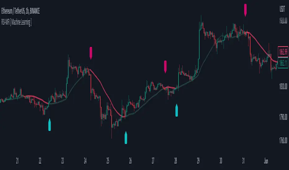
RSI-MFI Machine Learning [ Manhattan distance ]The RSI-MFI Machine Learning Indicator is a technical analysis tool that combines the Relative Strength Index (RSI) and Money Flow Index (MFI) indicators with the Manhattan distance metric.
It aims to provide insights into potential trade setups by leveraging machine learning principles and calculating distances between current and historical data points.
The indicator starts by calculating the RSI and MFI values based on the specified periods for each indicator.
The RSI measures the strength and speed of price movements, while the MFI evaluates the inflow and outflow of money in the market.
By combining these two indicators, the indicator captures both price momentum and money flow dynamics.
To apply machine learning principles , the indicator utilizes the Manhattan distance metric to quantify the similarity or dissimilarity between different data points.
The Manhattan distance is calculated by taking the absolute differences between corresponding RSI and MFI values of the current point and historical points.
Next, the indicator determines the nearest neighbors based on the calculated Manhattan distances.
The number of nearest neighbors is determined by the square root of the specified count of neighbors.
By identifying similar patterns and behaviors in the historical data, the indicator aims to uncover potential trade opportunities.
Trade signals are generated based on the calculated distances. The indicator compares each distance with the maximum distance encountered so far.
If a new maximum distance is found, it updates the value and considers the corresponding direction as a potential trade signal. The trade signals are stored in an array for further analysis.
Furthermore, the indicator considers the price action and a calculated regression line to differentiate between long and short trade signals.
Long trade signals are identified when the closing price is above the regression line, indicating a potentially bullish setup.
Short trade signals are identified when the closing price is below the regression line, indicating a potentially bearish setup.
The RSI-MFI Machine Learning Indicator visualizes the regression line on the price chart and labels the bars accordingly. It highlights the regression line with different colors based on the trade signals, making it easier for traders to identify potential entry or exit points.
Traders can use the RSI-MFI Machine Learning Indicator as a tool to analyze price movements, evaluate market conditions based on RSI and MFI, leverage machine learning concepts to find similar patterns, and make informed trading decisions.
Search in scripts for "rsi"
RSI Moving Average CrossoversThis script is an improved version of the RSI indicator, using a moving average on the RSI itself, as well as two other moving averages used to determine the current trend.
A small screener indicating the current movement is displayed in the bottom-left zone of the chart: trend (Bullish/Bearish/Uncertain) and status (Impulse or Correction)
Trends are simply based on moving averages crossovers, coupled to the fact that the current candle closes above the fast MA in a bull trend, and under the fast MA in a bear trend. In other cases, the trend and the movement are considered as "Uncertain" by the indicator.
Options
Various types of moving averages for the RSI and trend MA
Show/Hide crossovers between the RSI and its MA
Color the RSI normal zone with the current trend/movement colors
Show/Hide the screener indicating the current movement
Defaults Parameters
Fast MA 20
Slow MA 50
MA source: Close
RSI Length 14
RSI MA: SMMA (RMA)
RSI MA Length: 20
Don't hesitate to suggest any idea which could improve this indicator.
RSI MACD Same RatioこのインジケータはRSIとMACDを同比率で表示するものです。
なぜ同比率で表示するのでしょうか。
同比率で表示することでRSIとMACDのダイバージェンスを同時に確認することができます。
私には思いつきませんが、他にも使い道はあるかもしれません。
必要と感じた場合はぜひ使ってみてください。
※同比率で表示するためにRSIとMACDの値を変更しています。
そのため、値はあくまで参考程度にご覧ください。
注目すべきはラインのみです。
使う場合は「adjustment ratio」に適当な値を入れて、RSIの比率とMACDの比率を合わせてください。
それでは良いトレードライフを。
-----
This indicator shows RSI and MACD in equal proportions.
Why are they displayed at the same ratio?
By displaying at the same ratio, you can check the divergence of RSI and MACD at the same time.
I can't think of it, but there may be other uses.
If you feel it is necessary, please use it.
caution!
The RSI and MACD values are changed to display the same ratio.
Therefore, please see the values for reference only.
Only the line should be noted.
When using it, enter an appropriate value in "adjustment ratio" and match the RSI ratio with the MACD ratio.
Let's have a good trade life.

RSI/Momentum derivativesthis indicator plots the derivatives of the RSI to get more leading sense of direction of the price
we know that the rsi shows us the momentum of the price, so the easiest/logical way to interpret this indicator and benefit from it is as follows:
- see the price as 'distance'
- see the rsi as 'speed'
- see the rsi/momentum of the above/'speed' as 'velocity'
- see the rsi/momentum of the above/'velocity' as 'acceleration'
once you understand this you can analyse and interpret this indicator to give you a more leading analysis and more accurate entry and exit points.
- also includes the RMA for each RSI derivative which can help for identifying breakouts, direction of price, pivot points and more.
in the above chart
- black is the standard rsi/speed
- orange is the momentum of the rsi/velocity
- green is the momentum of the velocity

RSI Trend Indicator [paRSI]The Relative Strength Index ( RSI ) is a measurement used by traders to assess the price momentum. It is scaled from 0 to 100. when RSI reads below 30, it is usually interpreted as oversold and when RSI is above 70 it is usually interpreted as overbought. However, it is usually not profitable to trade based on overbought and oversold signal.
RSI Trend Indicator or as I like to call it "paRSI" ("Parsa (my name) + RSI") shows that when RSI is above a specific number (default value = 60) it indicates bullish trend and when RSI is below a specific number (default value = 40 ) it indicates bearish trend. Lastly when RSI is below the 2 specified numbers it indicates a neutral trend.
I don't recommend trading based on this single indicator. If you're a trend trader this might be useful tool in addition to your own strategy
Usage:
If the created pattern has worked previously on the chart, you could enter on the first stages of the green or red section (depending on the market's trend).
It is not recommended to trade in any direction when there is no color
*THIS IS A TREND FOLLOWING STRATEGY AND DOES NOT WORK ON ALL MARKETS*

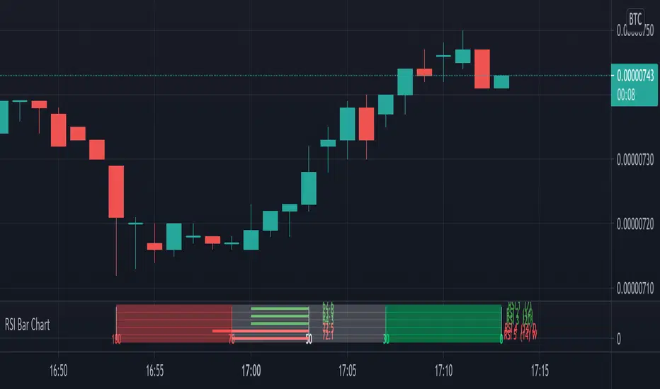
RSI Bar ChartA different way to plot several RSI at once,
5 RSI with different options:
- source, length, timeframe
- size of indicator (width)
- color change
- limit change (30, 70), labels will be changed accordingly
- type of RSI line (line, arrow), linewidth
- offset label (at the right)
There are 4 colors (RSI line)
- when RSI > sell limit
- when RSI > 50 but below sell limit
- when RSI < 50 but above buy limit
- when RSI < buy limit
Arrows:
Different size:
Cheers!
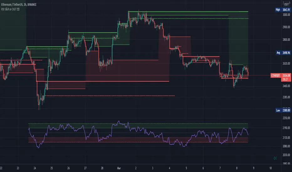
RSI Support & Resistance by DGTRSI Sᴜᴘᴘᴏʀᴛ & Rᴇꜱɪꜱᴛᴀɴᴄᴇ ʙʏ DGT
This experimental study attempts to translate Relative Strength Index (RSI) threshold levels of oversold/overbought and bull/bear zones as probable Price Support and Resistance levels
█ OPTIONS
Support & Resistance Levels , the main aim of the study. Level calculations are based on Relative Strength Index (RSI) threshold levels of oversold/overbought and bull/bear zones, where all threshold values are customizable through the user dialog box. Background of the levels can be colored optionally
RSI Weighted Colored Bars and/or Mark Overbought/Oversold Bars , Bar colors can be painted to better emphasis RSI values. Darker colors when the oscillator is in oversold/overbought zones, light colors when oscillator readings are below/above the bull/bear zone respectively, and remain unchanged otherwise. Besides the colors, with “Display RSI Overbought/Oversold Price Bars” option little triangle shapes can be plotted on top or bottom of the bars when RSI is in oversold/overbought zones
Example usage of the study with explanations
█ OTHERS
More regarding Support & Resistance concept (definition, identifying levels, trading S&R, etc) you are kindly invited to check my previous publication
Price Action - Support & Resistance by DGT
More regarding Relative Strength Index (RSI) and Relative Strength of Volume Indicators , please check Relative Strength of Volume Indicators by DGT
Disclaimer:
Trading success is all about following your trading strategy and the indicators should fit within your trading strategy, and not to be traded upon solely
The script is for informational and educational purposes only. Use of the script does not constitute professional and/or financial advice. You alone have the sole responsibility of evaluating the script output and risks associated with the use of the script. In exchange for using the script, you agree not to hold dgtrd TradingView user liable for any possible claim for damages arising from any decision you make based on use of the script
RSI Multi Time FrameHello Traders,
Recently we got new features in Pine such Arrays of Lines, Labels and Strings. Thanks to the Pine Team! ( here )
So I decided to make new style of Multi Time Frame indicator and I used Array of Lines in this script. here it is, RSI Multi Time Frame script. it shows RSI for current time frame as it is and also it gets RSI for the Higher Time Frame and converts it and shows it as in time frame. as you can see, RSI for HTF moves to the right on each candle until higher time frame was completed.
You have color and line width options for both RSI, also if you want you can limit the number of bars to show higher time frame RSI by the option " Number of Bars for RSI HTF ", following example show RSI HTF for 100 bars.
Most of you know that old style Multi Time Frames indicators was like:
Hope you like this new Multi time frame style ;)
Enjoy!
RSI Step Oscillator [racer8]Purpose of RSO is to identify when RSI has reached key levels. These levels are 80, 70, 60, 40, 30, and 20.
When indicator displays a bar with color...
Purple : RSI > 80
Blue : RSI > 70
Green : RSI > 60
Gray : RSI is inbetween 40 and 60.
Yellow : RSI < 40
Orange : RSI < 30
Red : RSI < 20
Hit the like button and enjoy 😁

RSI Currency Strength Correlation by LukasHello guys.
This is RSI Currency Strength with less noise, combine with my Price CSI to get the best result.
How it works :
This Indicator (on bottom) will tell you RSI information, and my other indicator I mentioned above (on the middle) will tell you price movement.
Sometimes when RSI up doesn't mean Price will go up, that's why divergence happen.
So trading only with RSI will trigger many false signal. Combine both of indicator will help you make better decision.
Buy :
- RSI rising up and price rising up
- If price already strong, wait for the RSI on strong currency pullback and rebound.
Sell :
- RSI going down and price going down
- don't sell when RSI going down but the price is not going down
I use one hour chart, usually can get 3-5 hours trade
Setting :
- Timeframe : you can play around with, your timeframe x 2
- MA length : I use 21,5,8

RSI BammThe standard RSI only has the definition of upper band and lower band, which means overbought and oversold respectively.
But sometimes, we need the middle band to help complete some analysis, such as RSI BAMM (bat action magnet move).
This indicator adds the definition of the mid-track to the standard RSI and automatically identifies the RSI BAMM. Hope it is useful to you.
标准RSI只有上轨和下轨的定义,分别表示超买和超卖。但有时候,我们需要中轨来辅助完成一些分析,比如RSI BAMM (蝙蝠吸磁运动)
此指标在标准RSI的基础上,加入中轨的定义,并自动识别RSI BAMM。 希望对你有用。

Ultimate RSIRSI w/BBands and 12 period moving average.
BBands show the standard deviation of the RSI, and can therefore suggest if a trend is oversold or overbought in conjunction with the 30 and 70 RSI values. A tightening of the BBands also suggests a major move/trend change is immanent.
The RSI moving average can suggest if the RSI is in a bullish or bearish trend . So if RSI>RSIMA then bullish trend , and if RSI
RSI Correlation with future priceThis script measures the correlation of the hourly RSI of 24 hours ago with the difference of price between now and the price 24 hours ago. In other words, this is an indicator which measures the predictive power of the RSI.
Green means that the price is strongly correlated with the past RSI (which is the normal state when the market is flat and there is no news).
Red means that the price is inversely correlated with the past RSI.
The hourly RSI is a leading indicator which enables you to (sort of) see into the future. It shows you how the current price is, compared to the price 24 (or 48) hours into the future.
If the RSI is low, it means the current price is low compared to the future price, and if the RSI is high, it means the current price is high compared to the future price.
So the hourly RSI really correlates (in the way I described) to the price 24 hours in the future.
Except when it doesn't!!!
What happens when the correlation breaks (RED on this indicator)? Usually there are important news - a strong signal external to the chart. There are either economy at large news, or security-specific news.
Following a strong break of this RSI-future price correlation, some cash can be made by understanding what happened and playing the restoration of the RSI-price correlation.

RSI/MFI - MTF - Entry signals/Trend colored bars - JD@version=2
This indicator is designed to give early entry signals as well as to follow trend moves, according to different settings.
The indicator shows a histogram of the RSI ro MFI in relation to an ema of the RSI or MFI.
The histogram is then smoothed to give early reversal/entry signals.
The actual RSI/MFI line with oversold/overbought indication can be displayed or omitted, as preferred.
in addition to the RSI/MFI line or as an alternative to it, the background colour can be set to change folowing the RSI/MFI signals.
The timeframe can be chosen. Higher timeframes (eg. 3h) tend to give less false signals.
version 5.
added support for custom Multiple Time Frame selection.
added option for choice of RSI or MFI as base indicator.
added option for price bar coloring according to the indicator. (deselecting "borders" in the "style" tab is recommended)
price bar coloring can be adjusted for different strategies:
1. following the slope of the histogram (for faster entry/exit signals)
2. according to positive or negative histogram (for longer moves)
3. according to pos. or neg. RSI/MFI (for longer term trend holds)
4. uptrend: biased towards faster buy signals and slower sell signals to stay in the uptrend
5. downtrend: biased towards faster sell signals and slower buy signals to stay in the downtrend
A longer timeframe (eg. 3x) is recommended for following trend moves.
try different strategies to see what works better for RSI or MFI.
JD.

RSI/VIX Reversal Signal (StevenCharts) [BETA]The RSI/VIX Reversal Signal (StevenCharts) is a specialized mean-reversion indicator that combines technical momentum (RSI) with market sentiment data (VIX).
While standard RSI strategies often fail by catching "falling knives" during strong trends, this indicator filters setups by requiring a specific volatility environment. It identifies moments of extreme fear (High VIX + Oversold RSI) or extreme complacency (Low VIX + Overbought RSI) to pinpoint high-probability reversal zones.
How It Works
This script operates on a two-step confirmation logic to prevent premature entries:
The Trigger (Blue Dot): The indicator first identifies an extreme condition.
Potential Buy: Price is Oversold while Volatility is elevated. This indicates panic selling.
Potential Sell: Price is Overbought while Volatility is suppressed. This indicates market complacency.
The Signal (Triangle Label): Once a trigger is detected, the script waits for Price Action Confirmation.
It will not print a Green Buy Label until a green candle actually closes.
It will not print a Red Sell Label until a red candle actually closes.
Key Features
Dual-Factor Analysis: Filters out weak RSI signals by demanding VIX confirmation.
Stateful Logic: Remembers if a trigger condition was met and patiently waits for the reversal candle before signaling.
Timeframe Noise Filter: Includes a built-in setting to automatically hide signals on lower timeframes to focus on macro reversals.
Data Table: An optional dashboard that displays real-time VIX values, RSI values, and Overbought/Oversold status directly on your chart.
How to Use
Buying the Fear: Look for the Green Triangle. This signals that panic selling has likely exhausted itself and buyers are stepping back in.
Selling the Greed: Look for the Red Triangle. This signals that the market is overextended and volatility is too low to sustain the move.
Blue Dots: Treat these as "Warning Shots." They tell you a setup is building, but the reversal hasn't confirmed yet.

RSI Screener TF + HTF (20 symbols, S/R + $Volume + ATR, Toggles)This script builds a table-style screener for up to 20 symbols and shows:
RSI (TF + HTF)
Uses a configurable intraday timeframe (default 1H) and a higher timeframe (default 1D)
RSI is displayed relative to the 50 line:
Above 50 → shown as a positive value (e.g. 56)
Below 50 → shown as a negative value (e.g. -45)
Cells are color-coded for overbought / oversold / neutral
Support / Resistance Proximity (TF + HTF)
Calculates recent support and resistance using a lookback window
Shows a 0–100% “S&R” value:
100% = price sitting on support
0% = price sitting at resistance
Mid values are neutral
Background color shifts for support zone / resistance zone / neutral
ATR % Regime (TF + HTF)
Converts ATR into a percentage of price
Colors the cell to show low / normal / high volatility regimes (quiet vs explosive conditions)
Dollar Volume (TF)
Uses close × volume and displays dollar volume in millions ($M)
Heat-colored based on relative volume vs its own average (hot / neutral / cold)
Sorting & Layout
Table can be sorted by:
RSI TF, RSI HTF
S&R TF, S&R HTF
ATR TF, ATR HTF
Volume TF
Sort direction: Ascending / Descending
Option to show full mode (Symbol + Price + all metrics) or compact mode (metrics only)
All columns (RSI, S&R, ATR, Volume, HTF columns) can be toggled on/off per your needs
Customization
Fully configurable colors, text size, table position (left/center/right)
User can adjust the RSI period, S/R lookback, ATR period, volume lookback and thresholds
Default setup is optimized for 1H + 1D swing/active trading, but timeframes are editable
This tool is meant as a dashboard to quickly see:
Which names have bullish vs bearish RSI regimes (signed vs 50)
Which ones are sitting on support or resistance
Where volatility is contracting or expanding
Where money/volume is flowing right now.

RSI Hybrid + EMA Cloud + Major & Intermediary Swing (2H/1D)# **📌 RSI Hybrid + EMA Cloud (2H Trend + 1D Momentum)**
A multi-timeframe trading model combining fast trend structure with higher-timeframe momentum and volume confirmation.
---
## **🧩 What This Indicator Does**
This tool blends:
### **🔹 2H Trend (EMA Cloud) – 2 Points**
* EMA 7 vs 21 → Short-term trend
* EMA 30 vs 74 → Long-term trend
* Dynamic cloud shading shows bullish/bearish bias
### **🔹 1D Momentum (RSI Hybrid) – 3 Points**
* RSI > 50
* RSI > SMA(4)
* RSI > SMA(12)
Provides short, medium, long momentum structure.
### **🔹 1D Volume Power – 1 Point**
* Volume vs 20-period SMA
* Mild / Moderate / Strong Bull or Bear
* Confirms strength behind the move
---
## **⭐ Score System (0–6)**
| Component | Points |
| --------------- | ------ |
| 2H EMA Trend | 2 |
| 1D RSI Hybrid | 3 |
| 1D Volume Power | 1 |
| **Total** | **6** |
**Score Meaning:**
* **5–6 → Strong trend & momentum alignment**
* **3–4 → Moderate confluence**
* **1–2 → Weak / mixed**
* **0 → No clear direction**
---
## **📊 Structural Levels (2H)**
* Last confirmed swing high & swing low (close-based)
* Running high since last swing low
* Running low since last swing high
* ATR(2H) for volatility context
Excellent for:
* Breakouts
* Breakdown confirmation
* Stop-loss placement
* Measuring momentum extension
---
## **🎛 On-Chart Table**
Displays:
* 2H trend bias
* 1D RSI states
* Volume power
* Bull/Bear score with breakdown
* Swings & ATR readings
---
## **💡 Why Use This Indicator**
* Clear multi-timeframe confluence
* Trend + Momentum + Volume = High-quality signals
* Structure levels improve timing
* Scoring system simplifies decision-making
* Works on indices, stocks, crypto, FX

RSI V-PILOTRSI V-PILOT
Concept
Uses RSI to determine the active trade mode (Buy/Sell):
When RSI crosses down into the Oversold (OS) zone ⇒ a SELL label appears and the system switches to the Sell mode.
When RSI crosses up into the Overbought (OB) zone ⇒ a BUY label appears and the system switches to the Buy mode.
The indicator remembers its current state and will not show duplicate labels as long as it remains in the same mode.
How to Use
Add the indicator to your chart.
Works on any symbol and timeframe.
Set up the inputs:
RSI Length: default = 14
Overbought Level (OB): default = 70
Oversold Level (OS): default = 30
Confirm on bar close: turn ON to confirm signals only at bar close (recommended)
Read the signals:
A BUY label appears when RSI crosses above the Overbought level → switch to Buy mode.
A SELL label appears when RSI crosses below the Oversold level → switch to Sell mode.
While remaining in the same mode, no new labels will be created.

RSI Bars - OnlyFlowThis indicator applies the RSI (Relative Strength Index) to candle coloring so that bar colors reflect momentum conditions instead of a fixed scheme.
RSI Logic: Bars shift color when RSI values move into overbought or oversold regions, with intensity scaled by how far RSI extends beyond the thresholds.
Gradient / Step Mode: Choose between a smooth gradient or a 3-step palette to visualize strength.
Directional Neutral Colors: Neutral zones can follow candle direction for clearer trend context.
Customization: Overbought/oversold levels and color palettes are user-configurable.
Optional RSI Panel: An RSI plot with overbought/oversold lines can be enabled in a separate pane if desired.
This tool is meant to give traders a more intuitive view of RSI conditions directly on price bars, helping to quickly see momentum extremes without needing to glance away from the chart.

RSI(7) + MACD ZoneTitle: RSI(7) + MACD Zone Combo
Description:
This indicator combines RSI (7) and MACD (12,26,9) into a single panel with a unified scale for easier analysis.
RSI (7) is plotted in white and automatically turns red when the market reaches overbought (>70) or oversold (<30) conditions.
MACD is normalized to align with the RSI scale (0–100).
A value of 50 represents MACD = 0.
Above 50 (teal) indicates positive momentum.
Below 50 (red) indicates negative momentum.
This combination allows traders to quickly identify when short-term RSI conditions align with overall momentum shifts from MACD.
How to use:
Look for potential buy opportunities when RSI is oversold (<30) and MACD is above 50 (positive momentum).
Look for potential sell opportunities when RSI is overbought (>70) and MACD is below 50 (negative momentum).
Use in conjunction with price action and risk management — not as a standalone signal.

RSI Plus – Divergence + EMA/WMARSI Plus – Divergence + EMA/WMA
This is an advanced RSI indicator designed for traders who want to maximize the power of RSI.
Beyond the standard RSI plot, this tool adds extra features to help analyze trends and identify better entry signals.
Key Features:
Standard RSI with highlighted zones (20–30, 30–40, 40–60, 60–70, 70–80)
Multiple smoothing options: SMA, EMA, SMMA, WMA, VWMA
Bullish/Bearish divergence detection with labels and alerts
WMA(45) on RSI for mid-term trend confirmation
EMA vs WMA45 color-fill (green for bullish, red for bearish)
Multi-timeframe support (Daily, H4, H1)
How to use:
Spot potential reversals with RSI divergence
Confirm trend direction when RSI EMA > WMA45 (bullish) or EMA < WMA45 (bearish)

RSI with Moving Averages[UO] EnhancedWhat This Indicator Does
Displays the RSI (Relative Strength Index) with two customizable moving averages to help identify trend direction and momentum shifts.
Key Features
RSI Line: Shows momentum (overbought above 70, oversold below 30)
Two Moving Averages: Smooth RSI signals and show trend direction
Color-Coded Fills: Visual areas between lines indicate bullish/bearish conditions
Support/Resistance Lines: Bull market support (40) and bear market resistance (60)
Customization Options
Moving Average Types: Choose SMA or EMA for each line
Periods: Adjust RSI (14), First MA (13), Second MA (33)
Visual Elements: Toggle background shading and fills on/off
Colors & Styles: Customize all line colors and widths in Style tab
How to Read It
Green Fill: Second MA below first MA (bullish momentum)
Red Fill: Second MA above first MA (bearish momentum)
RSI Above 70: Potentially overbought
RSI Below 30: Potentially oversold
Perfect for traders wanting enhanced RSI analysis with flexible moving average confirmation signals.

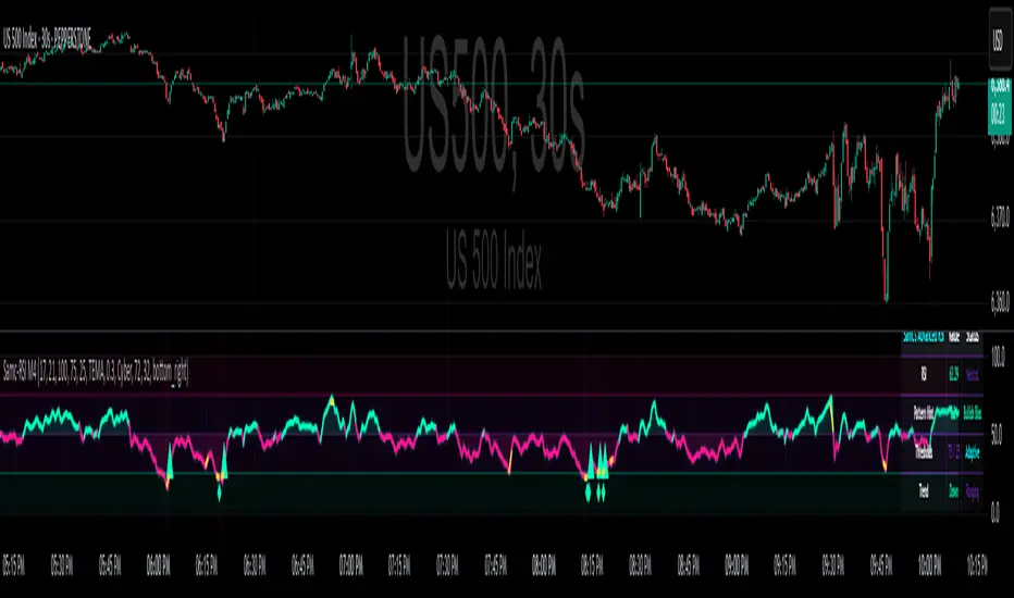
Advanced RSI — Mark 4 RSI was introduced by J. Welles Wilder Jr. in 1978 in New Concepts in Technical Trading Systems. It measures the velocity of gains vs. losses on a bounded 0–100 scale and popularized the 14-period lookback with 70/30 guide rails for overbought/oversold. Over time, traders added variations (different lengths, thresholds, smoothing, adaptive levels), but the core idea stayed the same: momentum turns often precede price turns.
and i initially started to make minor adjustments for personal use like changing the default to 17 , and using Tradingviews official RSI which comes with a MA embedded. but it was not enough. especially the visuals.
so, for this public release Mark 4 i enhanced RSI by incorporating :
1. Dual-Length Fusion
Two RSI periods (default 17 + 21) blended then lightly smoothed (TEMA by default) → steadier
line without dulling turns.
2. Adaptive OB/OS (ATR-aware) for fewer whipsaws.
3. OB/OS alt solution:
Brief yellow segments appear only at local extremes (default: >72 tops, <32 bottoms) to
emphasize exhaustion without repainting the whole line.
4. Signals you can actually see
Triangle markers for:
Bullish: RSI crossing up through adaptive OS (and still <40 at the cross).
Bearish: RSI crossing down through adaptive OB (and still >60 at the cross).
“Strong Bull/Bear” background nudges appear when momentum is pushing beyond the
bands.
Optional Divergence Tags
and
Tiny diamonds to flag potential bullish/bearish divergences (look-back based).
Info Table (can be hidden)
my Fav feature i included 5 colorways with modern themes.(pls check under INPUTS)
and i made all that to make the indicator visualization look awesome on high end displays.
Credits & acknowledgment
Inspired by the original RSI by J. Welles Wilder Jr. (1978).
Built to be modern, focused, and comfortable for long sessions—especially on dark/OLED displays.
THIS INDICATOR IS MORE THAN ENOUGH BUT I DO HAVE PRIVATE INDICATORS WITH DIFFERENT LOGIC FUNCTIONS.
I'm open for feedback/collaboration.
drsamc.