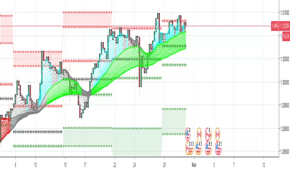
Weekly Range PlotterThe Weekly Range Plotter is a dynamic market structure tool designed to help traders visualize critical high and low levels from specific days of the week and the previous week's range. It provides key visual anchors to support analysis of market behavior, including range compression/expansion and directional bias.
Search in scripts for "weekly"

Weekly COT ReportsThis is a separate pane that displays weekly COT reports reported on the CFTC website.
If the Currency is the base it will display on top of the midline. If the Currency is the quote it will display under the midline with the longs and shorts reversed so that all rising long positions put pressure to the upside and all rising shorts put pressure to the downside.
This version contains 16 weeks of data, updated every weekend.
It is based on midnight U.S. Central time.
It works best on the four-hour time frame.
The USD is found under "Market data & Economic Analysis" / Commitment of Traders / ICE Futures U.S. / Futures Only / Short Format
USD Code-098662.
All other are found under "Market data & Economic Analysis" / Commitment of Traders / Chicago Mercantile Exchange / Futures Only / Short Format
EUR Code-099741
CAD Code-090741
AUD Code-232741
GBP Code-096742
JPY Code-097741
NZD Code-112741
CHF Code-092741
Weekly Opening Range and Previous Data for FuturesThis indicator will not predict future price action.
This indicator is a time based range tool. These types of tools are great to use when there is not any historical data to look back on (as in all time highs/lows). The user can use this indicator to measure distributions, use deviations of the range to identify support/resistance levels, and see how historical price action influences current price action. This indicator is unique because it uses the price range from the open of the futures market on Sunday 18:00 America/New York to the open of the Bond Market 8:00 America/New York as the range for all calculations.
This indicator collects the multiple points of data from each day of the week, and gives the user many options on how to use the data that is collected. The amount of data collected is based on the time frame of the chart (best used on a 15 minute chart), but is limited to 30 minute charts.
Data Collected:
Opening Range for the week
High of Each Day
Low of Each Day
Close of Each Day
Initially the range is plotted on the chart as a box, when the Bond market opens the high/low/mid is plotted, as well as the current week open and previous week close.
How the data is used.
Intraday: Monday does not have a previous day to pull data on, so all data for Monday is intraday data. When a new high is made, the indicator will search all previous data in the lookback period for the current day , find all highs that are within a set variance (determined by the user), and plot the corresponding lows from the matching days. It will do the same for new lows that are made, with corresponding historical highs. All of these levels are plotted on the chart, as well as the Average High, Average Low. If price moves beyond either Average, the Average of all days that distributed higher than the Average is plotted on the chart as Min/Max Average.
Previous Day Data: Tuesday - Friday. After the close of the day, the user has the option to choose either the High, Low, or Close of that day to find previous data that matches within a variance determined by the user; or an option to find the n closest matches (up to 20). That data is then matched to the corresponding next day data and plotted on the chart as a box. Example: Monday closes at +1 Deviation (Dev) of the Weekly Opening Range (WOR). The user sets the variance at 0.5 (0.5 Dev of the WOR), the indicator will search the lookback period for all Mondays that closed between 1.25 Dev and 0.75 Dev of the WOR. The matching Mondays will then be matched to their corresponding Tuesdays and the data for the High and Low from those Tuesdays will be placed on the chart as a box overlaying the current Tuesday. Each match is numbered so that corresponding Highs and Lows of each historical day can be identified. The same can be done for either the High or Low of the Previous Day.
The indicator has a table that can be shown.
Data shown in table:
Current Extension of the WOR
Maximum Extension of the WOR
Average WOR in %
Current WOR in %
Average Range for the day in % based on data set
Current Range for the day in %
Number of days in the data set
Number of Previous Day Matches
Variance for previous day data
Number of Intraday High Matches
Number of Intraday Low Matches
Variance for Intraday Matches
The table as well as all lines and boxes have the option of being shown or not, as well as have their settings customized to fit the users chart layout.
As with any indicator, do not let the data shown change your trading model. Past performance is not indicative to future performance.

Weekly and daily separatorsThis script plots vertical line between each trading week (thick, solid) and smaller lines (dotted) between each trading day. This helps kepping a better overview on the aspect of time on the higher timeframes below 1D. The distance of the lines to the top and bottom of the chart is controlled by your chart settings menu under Appearance -> Margins.
Weekly Volume HeatmapThis tool is designed to visualize how the trading volume of each asset changes during the week.
How to use
This tool can help us better understand the market and answer many questions, such as:
◽ How to avoid getting stop hunted?
Typically, trading volume decreases at certain times of the week, which is the best time for large holders to manipulate the market. Low volume means there is less liquidity in the market. Large transactions in an illiquid market can cause large price changes.
Large holders (whales) have enough capital to push the price in the desired direction to trigger a cascade of stop-loss orders which can move the price further.
After a stop hunt, the market typically reverses, leaving stop hunted traders behind.
It is best to avoid using stop-loss orders and leveraged trading during these hours of the week.
◽ When’s the best time to make decisions
During some hours of the week the trading volume usually decreases; at these times, most traders are inactive and do not participate in transactions.
Therefore, the price changes that occur during these times lack conviction.
It is better to make decisions when there are more active traders in the market. At these periods, a relatively high trading volume is usually observed.
How it works
First, it calculates the average traded volume of each period (for example Monday 9:00 AM) from the first bar to the last bar. It then calculates the ratio of the average traded volume in each period to the average traded volume per week. Finally, the result is displayed as a percentage in each cell.
Different values are distinguished by different background colors. Light colors are used for low values and dark colors are used for high values.
Limits
It only works in the 1 hour time frame.
Samples
Stock => AAPL
Futures => ES1!
Forex => EURUSD

Weekly Fibonacci MatrixThe weekly Fibonacci Matrix builds a matrix based on specific time and price criteria. It is paired with higher and lower timeframe matrices to identify key entry and exit points for day trades and intraweek swing trades.
This is part of a full suite of tools I have developed for matrix analysis and ORB breakouts.

weekly MapThis indicator shows the highest and lowest level of the previous week in the current week. This area is also divided into 4 sections that can be controlled from the settings section.

Weekly MM200 distance ratioThis indicator is used to calculate the ratio from the current price and the weekly 200 moving average.

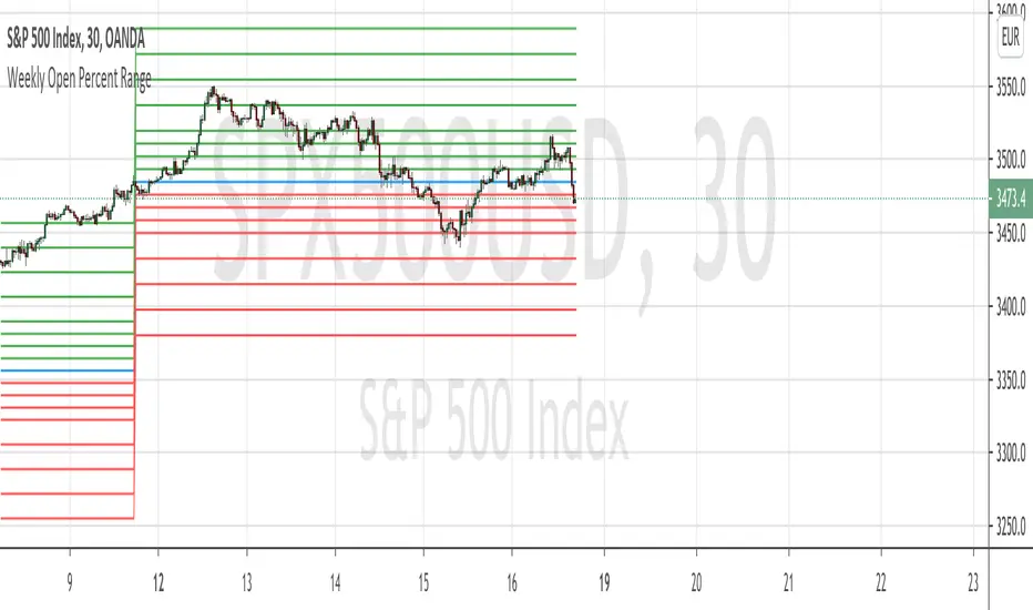
Weekly Open Percent RangeA simple take on finding percentage gain/drop range in a week for ranging or trending market instrument.
This script is hard coded to plot 0 to 3%, -3% range for the week base on instrument weekly open price.
Best to use with measured volatility indicator to gauge the movement of price. Anytime the price goes above the range level then it is likely to be trending. Highly volatile instruments will not find this indicator useful. It is best for heavy instruments like Forex or Indices where range % in a week in a non-volatile move is really quite small that these act as resistances and support.
Range Levels:
3%
2.5%
2%
1.5%
1%
0.75%
0.5%
0.25%
0%
-.25%
-.5%
-.75%
-1%
-1.5%
-2%
-2.5%
-3%
The next step for this indicator is to consider volatility range of instrument and to include this in the percentage zone levels instead of hard coding these.
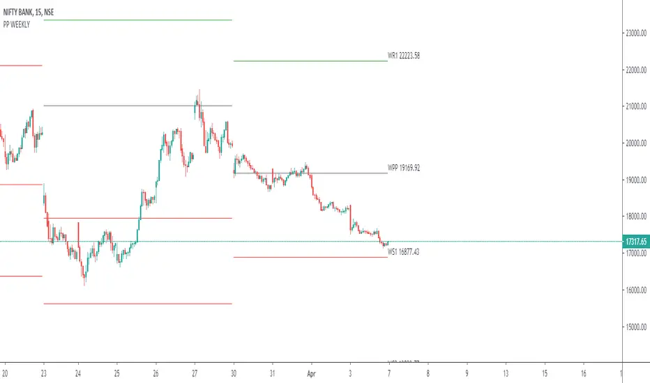
Weekly Pivot Points with Colored Mid Pivots from HalcyonUpdated version of the Weekly Pivots Points that include mid pivot lines.
Target trading zones for the week are shaded green and red respectively. The mid pivot area is shaded aqua.
Use: buy (green) zones are buys, red zones are sells with respective color targets.

Weekly VWAP - Starts Monday 12AMThere are a number of VWAP indicators out there, but it's difficult to find VWAP calculations that take the entire week into account. This helps with analyzing longer-term trends on daily and intraday charts. As with all VWAP indicators, this one is also more sensitive to price starting at the open of trading at the beginning of the week.

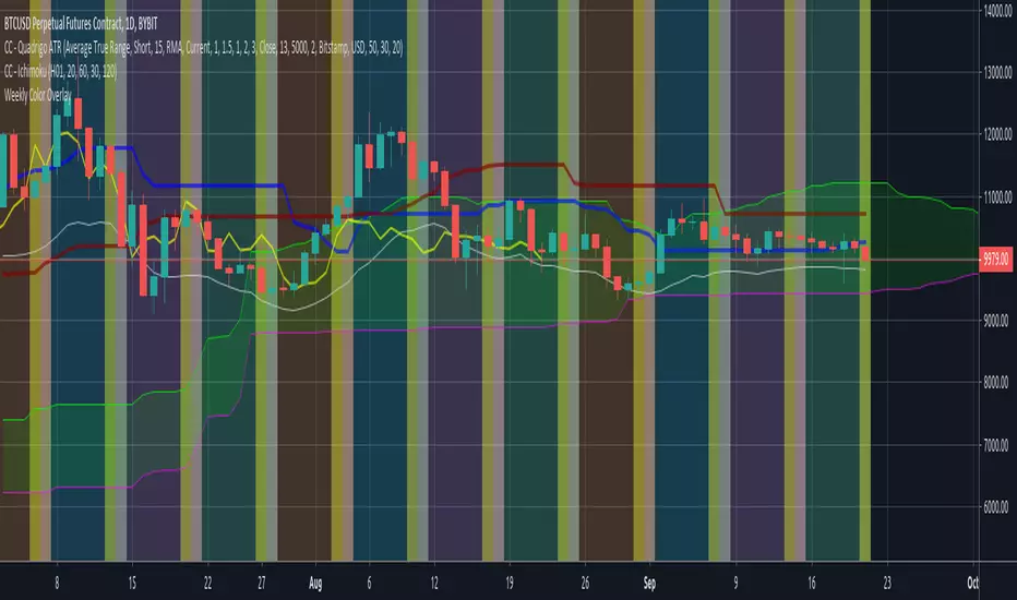
Weekly Color OverlayThis script facilitates visualization of week-of-the-month breaks with Sunday highlighting the beginning of a new week. Code breaks at the monthly time-period and since I don't ever look at that time period i'm not inclined to fix it unless someone sends me a 'push' via message.

Weekly and Daily SMAs on any timeframeThis script just plots the weekly and daily SMAs on any timeframe. I'd imagine most traders already have this or something like this available to them, but I couldn't find a way to cross the timeframe barrier on a single graph, so I did this. It ain't pretty, but it's accurate.
Weekly FibonacciThis indicator displays the Fibonacci ratio using high and low prices of previous week
Bold dotted lines is high and low prices
The other dotted lines is the level values you can set.
You can use Fibonacci strategies with this indicator.
This indicator can be set to any of 19 values.
My youtube Chaneel

weekly-vwapAuthor: Andrew Palladino
Date: 1/12/2016
Description: Volume Weighted Moving Average calculated weekly on the start of a specified week day. Default is set to Sunday.
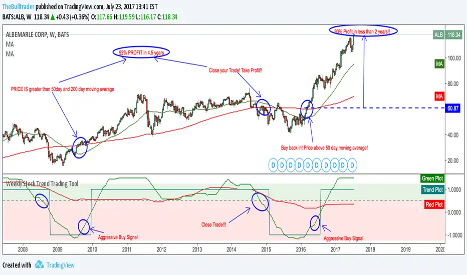
Weekly Stock Trend Trading Tool// Created by TheBullTrader, 2017.
// Hi everyone, welcome to my Weekly Trend Trading Tool with the 50 day and 200 day moving averages
// This indicator scores each stock/ index individually and scores them on a simple scale -1.5 to +1.5
// This indicator has 2 zones: green zone = bullish, and red zone = bearish
// There are 3 plots: green = 50 day sma, red = 200 day sma, and trend signal= teal
// Buying Signal is when the green plot crosses teal plot or AGGRESSIVE Buy = green plot beginning to curve up from bearish zone.
// Sell Signal is when the green plot enters the RED ZONE
// By using this indicator as described, it will help you pick stock bottoms and COULD GET YOU OUT OF A STOCK CRASH!
// Recommendations is to scan this indicator against the top 100 US stocks with a long stock history greater than 10 years.
// I usually find 5-10 really good deals every few months. Slow and Easy way to build wealth. **Thanks for reading**
Weekly closeIt turned out not to be that easy to plot the close of the previous week in hourly or daily charts. In my first experiments things went wrong on Friday or intraday if you simply use the security function. So here is the thing with an algorithm that guaranties the correct value.

TPCharts HighOfWeekShows the days on which highs and lows for a week occurred (Sunday through Saturday).
Yeah, you could download data feeds and write some Python, but not everybody wants to do that.
Usage:
Get probability on your side when entering or taking profits.
If 60% of the weekly lows are on a Tuesday, what day probably works best to buy?
Keep in mind that many altcoins have slightly different weekly patterns.
Options in settings:
1. Show each day's name in a bubble underneath.
2. Display "summary" total stats for highs / lows when over 50 SMA.
Future updates:
Handle bear markets for final stats. Currently only calculates high/lows in summary bubble when over the 50 SMA.

Intraday Quarter Points- Psychological LevelsThis template can be used for Higher Time Frame analysis in forex. Using the Bar Replay, develop a technical bias and mark psychological levels on the H4 timeframe. This can be used with Supply and demand and Quarter Points Theory.
Monthly- Default setting
Weekly- Default setting
Daily- On Sund-Mon
H4- On Sund-Mon, Show Weekly High + Low
H1- Show Quarter Points