Trendtracker by GIchimoku and MA-based indicator that follows trends pretty accurately.
Consider using on Higher Timeframes.
Do not hesitate if you have any question.
How to trade this indicator?
Easy strategy:
- open long/close short on the next candle trading above a white candle's high.
- close long/enter a short on the next candle trading below a black candle's low.
Not financial nor trading advice standard disclaimer applies.
Keep your stop loss triggers tight!
Strategy!

Three Outside Down Strategy This is a three candlestick bearish reversal pattern consisting of a bearish
engulfing pattern formed by the first two candlesticks then followed by a down
candlestick with a lower close than the prior candlestick.
WARNING:
- This script to change bars colors.

RSI-ATR Divine StrategyLive, non-repainting strategy using ATR and RSI mixed together to take long and short positions. Includes:
Live entry direction with trade warnings and alerts
Live trade building buy and sell stops (for buy/sell stop limits)
Entry location icons as well as pyramid entries (to add to existing position)
3 separate targets based on the ATR setting and entry location
2 separate trailing stops, 1 for "absolute stop" and 1 for "take profit stop"
Alert conditions for every update and condition change of the strategy
4 pre-built color themes, including candlestick coloring
This strategy is best used with my RSI Shaded Indicator using the identical RSI settings.

Bitmex Alanovski_SuperStrategyBitmex Alanovski_SuperStrategy
Try it at different timeframes.
Contact me via Telegram @Alanovski for more info.

MACD Enhanced System MTF with optional TSL and Alerts [LTB]This script is developed to analyse MACD, MACD Signal, MACD Histogram movements by using current and higher time frame. Script calculates higher time frame automatically, no manuel entry. there is trailing stop loss line that is optional.
You can change the parameters as you wish.
btw. you should know that MACD is more successful when there is a trend.
I already shared this as a strategy script. Some ppl wanted to see the code.
You might want to see strategy test =>
by LonesomeTheBlue

Three Inside Up Strategy This is a three candlestick bullish reversal pattern consisting of a
bullish harami pattern formed by the first 2 candlesticks then followed
by up candlestick with a higher close than the prior candlestick.
WARNING:
- This script to change bars colors.

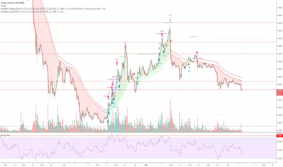
Cryptocurrency trend following EMA Ribbon LONG only studyThis strategy is based on EMA Ribbon and uses multiple indicators to find optimal time to enter/exit the trade and filter out false signals. The script with default setting is developed mainly for trading altcoins/stable coin pair such as ADA(USDT etc on 4h timeframe but it can be applied to any pair/any timeframe with some settings adjustments.
For plot on chart features make sure that you have both study and strategy scripts on chart with same settings.
Strategy settings description:
1. Signal EMA Length - Value for exponencial moving average (slowest from EMA Ribbon)
1a. Buy price toleration (%) - Price deviation for filtering bounces of EMA - price must close defined percents above EMA to open long trade
1b. Sell price toleration (%) - Price deviation for filtering bounces of EMA - price must close defined percents bellow EMA to close long trade
1c. EMA deelay - EMA id delayed by defined bars for smoothening
2. Filter by Fast EMA - Strategy filters signals to prevent buy while coin is dropping
2a. Fast EMA Length - Value for fast exponencial moving average
3. Filter by SMA - Strategy filters signals to confirm trend change
3a. SMA Length - Value for simple moving average
4. Filter by RSI - Strategy filters signals to prevent buing/selling overbought/oversold coins
4a. RSI Length - Length of RSI identificator
4b. RSI Source candle - What price of candle is used for RSI calculation (open, close, high, low)
4c. RSI Long condition - When buy, RSI indicator must be below this value to prevent of buying already overbought coin
4d. RSI Short condition - When sell, RSI indicator must be above this value to prevent of selling already oversold coin
5. RSI Close Trade Condition - Strategy sell coin once RSI reach defined value
5a. RSI close trade condition - Sell once RSI indicator acquires defined value
6. Close trade by Take Profit or Stop Loss Condition (STRATEGY ONLY) - Strategy sell coin once defined take profit / stoploss level is reached
6a. Take Profit (%) - Take profit value in percent
6b. Stop Loss (%) - Stop loss value in percent
6c. Plot targets on chart - defined targets will be plotted as lines on chart
7. Date range from
7a From Year - To run strategy in interval
7b From Month - To run strategy in interval
7c From Day - To run strategy in interval
8. Date range to
8a To Year - To run strategy in interval
8b To Month - To run strategy in interval
8c To Day - To run strategy in interval
9. Wait to confirm the signal
9a Wait candless to buy - strategy will wait defined candless to confirm the signal before buy
9b Wait candless to sell - strategy will wait defined candless to confirm the signal before sell
10. Plotting on chart (STUDY ONLY)
10a Plot signal line channel with bows on chart
10b Plot simple moving average on chart
10c Plot EMA Ribbon on chart
10d Plot recent support and resistance levels on chart
11. Show Every signal (STUDY ONLY) - Unchecked shows only first signal based on strategy. But if you use take profit/stoploss settings within your bot, you might want to rebuy on next signal. Checked shows signal on each candle.
Throw on chart also buld-in RSI indicator and set the same as strategy
Notice that there might be false signals, especially when the coin is not trending or is strongly manipulated. Overall strategy is profitable though. You just take some minor loses and wont miss the big move.
You may also consider to compare buy&hold return vs profit from trading this strategy. In downtrend as we have seen recently, profit may not be as high as you expect but it is still much better than just hold and hope.
You can use the strategy script for fine tunning settings and find best settings for yourself.
Study script helps you to automate trading with use of alerts perharps with 3commas bot or even trade manually based on email/sms notification setted by tradingview
Notice that study script does not handle takeprofit/stoploss order. That is why sell arrows could be plotted by study script later than strategy script. To rebuy after takeprofit/stop-loss use "11. Show Every signal (STUDY ONLY)" setting
Make sure that you keep same settings for strategy and study scripts.
If you need any help with settings do not hesitate to ask. I would also appriciate any feedback and ideas how to improve this script.
Here is backtest result from 1. Nov 2018 using constant 100USD Buy ammount:
Three Inside Down Strategy This is a three candlestick bearish reversal pattern consisting of a bearish
harami pattern formed by the first 2 candlesticks then followed by down
candlestick with a lower close than the prior candlestick.
WARNING:
- This script to change bars colors.

Profitable Vortex Indicator ScannerIntroduction
The Vortex Indicator is a technical indicator invented by Etienne Botes and Douglas Siepman (Technical Analysis of Stocks & Commodities, V.28:1 (January, 2010): "The Vortex Indicator") to identify the start of a new trend or the continuation of an existing trend within financial markets.
It is composed of two lines, +VI and -VI . +VI represents up trending momentum and -VI represents down trending momentum.
The most basic strategy is to use the crossovers as trade signals:
when +VI crosses above -VI , go Long
when -VI crosses above +VI , go Short
Exit when a crossover occurs in the opposite direction
What is this tool?
This tool is a performance scanner that uses a decision tree-based algorithm under the hood to find the most profitable period's setting for the indicator. It analyzes the range of periods between 2 to 100 and backtests the Vortex Indicator for each period using the strategy mentioned above across the entire history of an instrument.
Settings
Net Profit line is optional and can be hidden through settings.
Alerts
It has an alert that notifies when a more profitable period was detected.
NOTE : It does not change what has already been plotted.
Good luck!

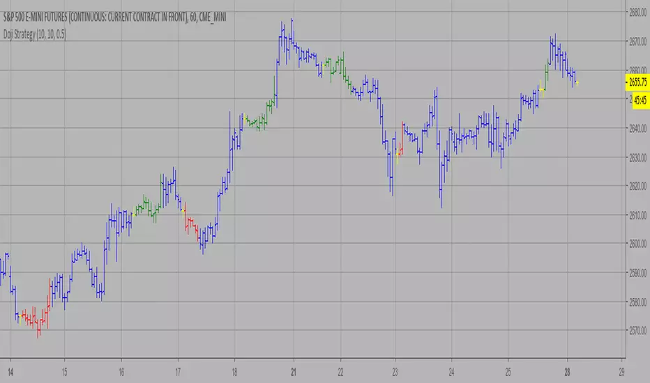
Doji Strategy This is a candlestick where the open and close are the same.
WARNING:
- This script to change bars colors.
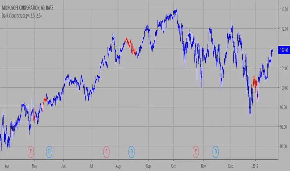
Dark Cloud Strategy This is a bearish reversal pattern formed by two candlesticks within a uptrend.
Consists of an up candlestick followed by a down candlestick which opens lower
than the prior candlestick and closes below the midrange of the prior candlestick.
It is the reverse of the Piercing Line.
WARNING:
- This script to change bars colors.
Cyatophilum Ichimoku Small TimeFrames [ALERT SETUP]A script for daytraders trading small timeframes.
Currently in developpement.
If you want to try it send me a PM, and give a like to receive updates.
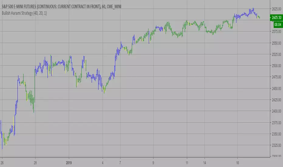
Bullish Harami Strategy This is a bullish reversal pattern formed by two candlesticks in which a small
real body is contained within the prior session's unusually large real body.
Usually the second real body is the opposite color of the first real body.
The Harami pattern is the reverse of the Engulfing pattern.
WARNING:
- This script to change bars colors.
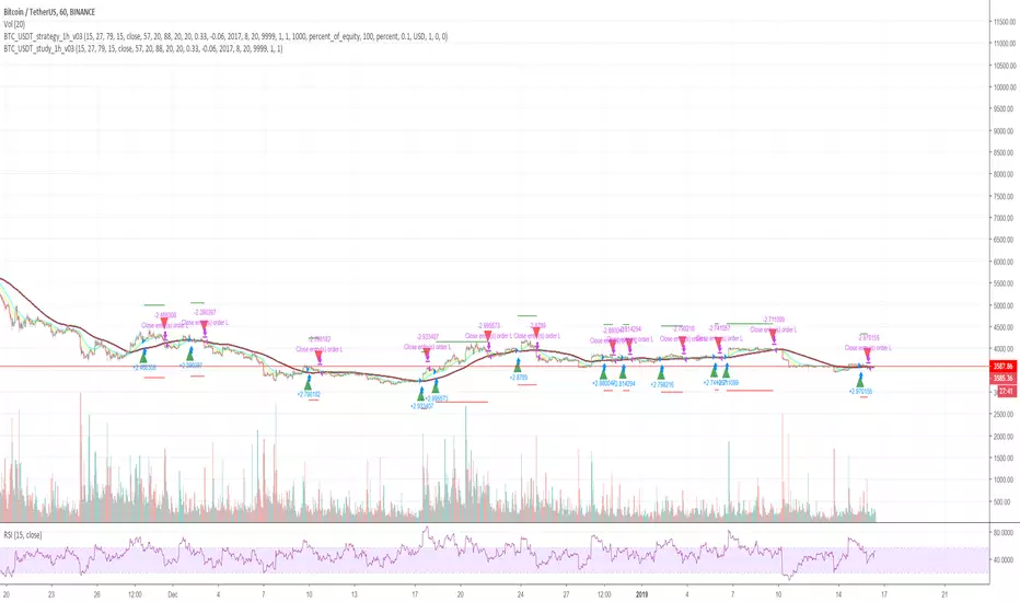
Cryptocurrency trend following LONG only studyThis strategy uses multiple indicators to find optimal time to enter/exit the trade. The default setting is mainly for trading bitcoin/stable coin pair such as USDT etc on 1h timeframe but it can be applied to any pair/any timeframe with some settings adjustments.
Strategy settings description:
ID Name Descrption
1 FastMA - Value for fast exponencial moving average
2 SlowEMA - Value for slow exponencial moving average
3 SMA - Value for simple moving average
4 RSI Length - Length of RSI identificator
5 RSI Source candle - What price of candle is used for RSI calculation (open, close, high, low)
6 RSI Long condition - When buy, RSI indicator must be below this value to prevent of buying already overbought coin
7 RSI Short condition - When sell, RSI indicator must be above this value to prevent of selling already oversold coin
8 RSI close trade condition - Sell once RSI indicator acquires defined value
9 Take Profit (%) - Take profit value in percent
10 Stop Loss (%) - Stop loss value in percent
11 Long price toleration (%) - Price deviation for filtering bounces of simple moving average - price must close defined percents above SMA to open long trade
12 Short price toleration (%) - Price deviation for filtering bounces of simple moving average - price must close defined percents bellow SMA to close long trade
13 From Year - To run strategy in interval
14 From Month - To run strategy in interval
15 From Day - To run strategy in interval
16 To Year - To run strategy in interval
17 To Month - To run strategy in interval
18 To Day - To run strategy in interval
19 Show every signal? - (Study only) Unchecked shows only first signal based on strategy. But if you use take profit/stoploss settings within your bot, you might want to rebuy on next signal. Checked shows signal on each candle.
Notice that there are also false signals, especially when the coin is not trending or is strongly manipulated. Overall strategy is profitable though. You just take some minor loses and wont miss the big move.
You may also consider to compare buy&hold return vs profit from trading this strategy. In downtrend as we have seen recently, profit may not be as high as you expect but it is still much better than just hold and hope.
You can use the strategy script for fine tunning settings and find best settings for yourself
Study script helps you to automate trading with use of alerts perharps with 3commas bot or even trade manually based on email/sms notification setted by tradingview
Make sure that you keep same settings for strategy and study scripts.
If you need any help with settings do not hesitate to ask. I would also appriciate any feedback and ideas how to improve this script.
Here is backtest result from 23.08.2017:
Bearish Harami Copyright by HPotter 15/01/2019
This is a bearish reversal pattern formed by two candlesticks in which a short
real body is contained within the prior session's long real body. Usually the
second real body is the opposite color of the first real body. The Harami pattern
is the reverse of the Engulfing pattern.
WARNING:
- This script to change bars colors.
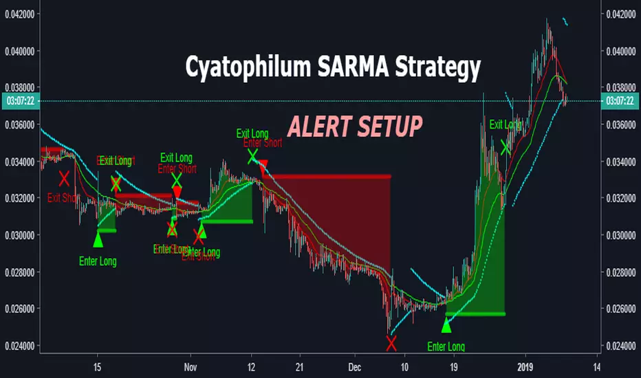
Cyatophilum SAR-MA Strategy [ALERT SETUP]An Automated Strategy based on Parabolic SAR and EMAs, also called the SARMA Strategy. Works on any timeframe and market.
Read More
This indicator will trigger long/short signals entries and exits. Excellent for manual or bot trading!
It has a stop loss system that you can activate to reduce risk.
Note: If a stop loss is reached, an exit alert is triggered.
This is the Alert Setup version. That means it is used to create automatic email or SMS alerts.
It has a Backtest version that you can use to find the best configuration. I will also be there to help you on my Discord channel .
Sample Use cases
Get the indicator today!
𝙇𝙄𝙌𝙐𝙄𝘿 𝙅𝘼𝘿𝙀 🇸🇨🇷🇮🇵🇹𝙇𝙄𝙌𝙐𝙄𝘿 𝙅𝘼𝘿𝙀 🇸🇨🇷🇮🇵🇹 v0.1
-Unique LJS breakout/reversal system
-Multi timeframe trend restricted trading
-Renko, ADX, MAs
-Risk Management, TP, SL
More to come!

ANB AI Alert (my ANN)Hi guy
This is a high level trend predicting study. It is modified from the strategy by sirlof.
Feel free to use it as you like.
::USAGE only on 15 minutes
1. add the study in your chart
2. create an alert on the right
3. select ANB AI Alert (my ANN)(0,1D)
4. select the option you wish
5. select once per bar close alert
6. you can select email alert which i usually like
7. once the trade is alerted, execute your trade
TP: DYNAMIC (read more)
SL: null
Setting TP and SL: this is in consideration with the daily volatility and sessions
USDCAD TP 400 points, no stop loss.
To maximize profit, use trailing stops. most trades are 500 to 1800 points

EMA SMA ALERTS V1 2H// Strategy based on Simple Moving Average (SMA) and Exponential Moving Average (EMA)
// Greatest profit index on 2H time frame
// Created and based on Binance chart
// Working with comission
// No repaint
// Alerts +

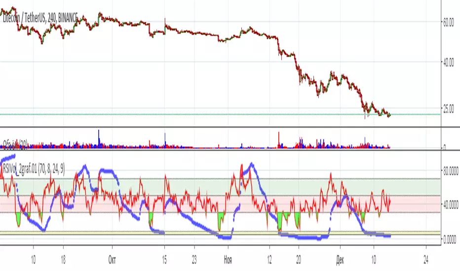
RSIVolume_2graf.01[wozdux] Tactics and strategy Tactics and strategy
The indicator combines 2 variants of the RSI indicator. The first option is calculated relative to the normal close price. The second option is calculated relative to the volume price. The volume price is calculated as the product of the volume price. For normal RSI, the default period is 9, for the volume price .
Settings. Level_close sets the width of the middle region, the oscillations of the indicator chart for the average of the closing price. Level_volume*close sets the critical level for the volume price. Period 24 (len1) specifies the RSI calculation period for the volume price. Period 9 (len3) specifies the RSI calculation period for the regular price.
The combination of two versions of the indicator helps to see more truthful information about the mood of buyers and sellers. When the volume price reaches its critical level of 8 units, it is a signal to a strong fall in the price. In this state, you should monitor the classic RSI. Thus, the classic RSI determines the tactical movement, and the volumetric RSI – strategic.
-------------------------------------
Тактика и стратегия
Индикатор совмещает в себе 2 варианта индикатора RSI. Первый вариант вычисляется относительно обычной цены закрытия. Второй вариант вычисляется относительно объемной цены. Объемную цену вычисляют как произведение цены на объем. Для обычного RSI по умолчанию берется период 9 , для объемной цены .
Настройки. Level_close задает ширину средней области колебания графика индикатора для обычной цены закрытия. Level_volume*close задает критический уровень для объемной цены. Период 24 (len1) задает период вычисления RSI для объемной цены. Период 9(len3) задает период вычисления RSI для обычной цены.
Сочетание двух вариантов индикатора помогает увидеть более правдивую информацию о настроениях покупателей и продавцов. Когда объемная цена достигает своего критического уровня 8 единиц, то это является сигналом к сильному падению цены. В этом состоянии следует следить за классической RSI. Таким образом классическое RSI определяет тактическое движение, а объемное RSI – стратегическое.
BB RSI (Bollinger Bands + RSI strategy) by BAHbOBollinger bands are used mostly for selling (shorting), when the price is above the upper band.
Sometimes it can be used for buying (longing), when the price is below the bottom band - but it can be tricky, because it can go even more lower.
This combined with Oversold/Overbought RSI will give you price entries/exits (arrows).

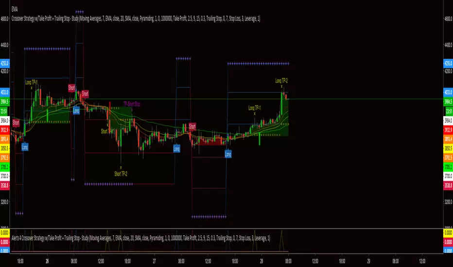
Crossover Strategy w/Take Profit + Trailing Stop - StudyThis script is a result of hours of trail, error and research. If something is not functioning as anticipated, please notify me with a description and possible screen shot of the issue.
The strategy is a basic crossover strategy. When MA1 crosses above MA2, it will trigger a long entry. When MA1 crosses below MA2, it will trigger a short entry.
When using the Take Profit function, the trailing stop will automatically activate at the defined TP3 level.
Also, when TP1 is hit a stop loss is set at 0.3% (this can be adjusted in settings) above/below the current entry. When TP2 is achieved, the stop will move up to the TP1 level.
If the trailing stop locks in LESS profit than the TP2 level, the stop will trigger at the TP2 level. This will continue until the trailing stop has moved to a level more advantageous than TP2.
There is a companion Alerts script for use with AutoView.
***AutoView syntax IS NOT provided***
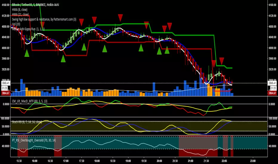
Heiken Ashi Gypsy Run Alerts & triggers based on heiken ashi changes in the colour of the candle, default settings are at 1, 1, 1 meaning it will trigger every time there is a change in the colour of the candle. You can change so it isn't as sensitive. It also has alert settings.