Support and Resistance MTF [Cometreon]The Support and Resistance MTF elevates your technical analysis by automatically identifying and plotting critical support and resistance levels across any symbol and timeframe—even higher ones. Powered by advanced algorithms, this tool continuously analyzes market structure and updates in real time, saving you hours of manual analysis.
If you're looking for a smart, dynamic, and highly customizable S&R solution, this is the tool for you.
🔷 Key Features & Improvements
🟩 Automatic Level Detection
The indicator automatically plots all support and resistance levels, providing a clear map of key points on the chart.
🟩 Historical Level Display
Shows historical support and resistance levels, providing a comprehensive view of the market over time.
🟩 Dynamic Trend Creation
Automatically identifies and updates trends based on levels, simplifying the understanding of market directions.
🟩 Automatic Fibonacci
Generates Fibonacci levels based on the last two support and resistance levels, offering additional reference points for potential price retracements or extensions.
🟩 Customizable Alerts
Offers a series of configurable alerts to keep you informed about breakouts, new confirmed levels, and price bounces on active levels.
🔷 Technical Details and Customizable Inputs
1️⃣ Line Types - Select the type of lines to display: active, broken, both, or none.
2️⃣ Left Length - Determines the number of candles to calculate the previous high or low point.
3️⃣ Right Length - Defines the number of candles needed to confirm a level as Support or Resistance.
4️⃣ Timeframe - You can modify the timeframe of supports and resistances to view levels of a higher timeframe. It's also possible to add additional support and resistance levels using a second timeframe.
5️⃣ Breakout Source - Change the source needed to break support and resistance levels between Close or High/Low.
6️⃣ Delete at Timeframe - Allows removing levels based on the current chart resource instead of using that of the higher timeframe.
7️⃣ Session Range - Choose a period of distance from the last candle to define how far back in the past the indicator should look for Supports or Resistances.
8️⃣ Style Valid Level - Customize the appearance of active levels, including the color of the level itself, Liquidity fill, text color, line style and thickness, extension, as well as the size, position, and values to display in the level text.
9️⃣ Liquidity - This option displays the liquidity associated with each support and resistance level, with three modes: "Wick" which goes from the high/low to the upper/lower body, "Body" instead goes from the level to the lower/upper body of the candle and "Full Range" which extends from the high to the low of the candle.
1️⃣0️⃣ Style Break Level - Allows modifying color, style, and thickness of lines, as well as text width, for two types of breakouts: "MSS" and "BOS".
" MSS " stands for " Market Structure Switch " and indicates a level breakout opposite to the previous breakout, signaling a trend reversal.
" BOS ", on the other hand, means " Break of Structure" and occurs when a level is broken in the same direction as the previous one, confirming trend continuation.
1️⃣1️⃣ Fibonacci Trend Line - Add up to 8 Fibonacci levels based on the last two identified support and resistance levels. Customize the different levels by modifying colors, thickness, style, and extension of lines. You also have the option to add a transparent background between each level.
1️⃣2️⃣ Use Only Confirmed Levels - Activate this option if you want the system to use only the last two confirmed levels, excluding potential levels not yet confirmed.
1️⃣3️⃣ Reverse - Used to reverse the direction of Fibonacci lines.
1️⃣4️⃣ Use Higher / Lower - This option allows using the currently active maximum and minimum levels of Support and Resistance. The indicator will update each Support level until it encounters another active Resistance, and vice versa.
1️⃣5️⃣ Trend Style - Activate/deactivate two types of indicator Trends: "Bar Color" based on level breakouts and "Background Color" based on the last active unconfirmed level.
1️⃣6️⃣ Signal Style - Activate or deactivate the various breakout and bounce signals. Bounces present three options:
Total Rejection(TR) : occurs when the price exceeds the high or low and closes below the liquidity level.
Internal Rejection(IR) : the price closes in the liquidity zone.
Liquidity Rejection(LR) : the price does not exceed the high or low, but only the liquidity level, closing below it.
1️⃣7️⃣ Customized Alerts - Set alerts to be notified in case of breakouts, bounces, or formation of new levels.
These options allow you to optimize the indicator for different trading styles and market conditions, ensuring accurate and tailored technical analysis.
🔍 How to Use Support and Resistance MTF Pro
📌 Using Critical Levels
Consider all levels on the chart as "magnetic points" for the price. These represent critical areas where the market tends to react.
📈 Signal Interpretation
Use the indicator's signals to interpret market movements. A level breakout can indicate a trend reversal or continuation. Bounces can suggest the holding of a level or signal a possible breakout.
🛠 Strategy Integration
Leverage the trend of support and resistance levels, breakouts, and bounces as key elements to develop and refine your trading strategies.
☄️ Support and Resistance simplifies your market analysis, saving you time and improving the accuracy of your decisions. Thanks to clearly visualized and customizable levels, you'll have a clearer and more immediate view of market dynamics.
Don't wait any longer: discover how Support and Resistance can enhance your market analysis, offering you clear indications for faster and more precise trading decisions.
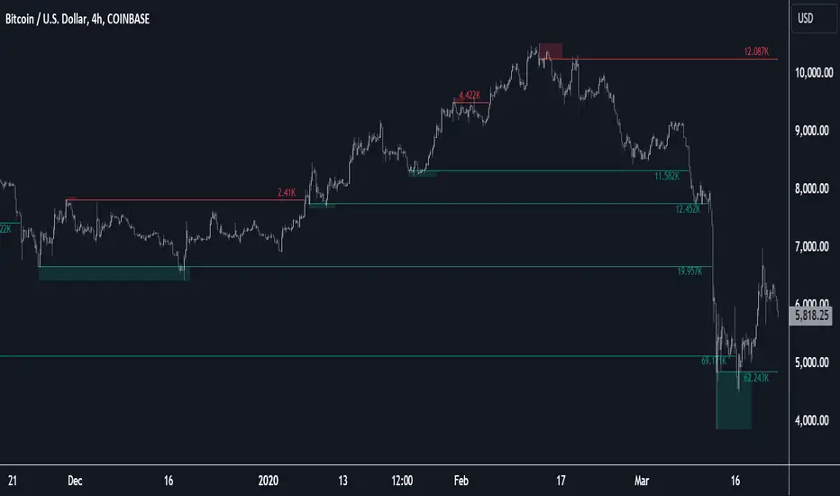
Support and Resistance
3 CANDLE SUPPLY/DEMANDExplanation of the Code:
Demand Zone Logic: The script checks if the second candle closes below the low of the first candle and the third candle closes above both the highs of the first and second candles.
Zone Plotting: Once the pattern is identified, a demand zone is plotted from the low of the first candle to the high of the third candle, using a dashed green line for clarity.
Markers: A small triangle marker is added below the bars where a demand zone is detected for easy visualization.
Efficient Logic: The script checks the conditions for demand zone formation for every three consecutive candles on the chart.
This approach should be both accurate and efficient in plotting demand zones, making it easier to spot potential support levels on the chart.

Institutional Order Finder (IOF) - Hidden Order Block LiteInstitutional Order Finder (IOF) - Hidden Order Blocks
Institutional Order Finder (IOF) Indicator: Detecting Breaker Blocks and Hidden Order Blocks (HOBs)
The Institutional Order Finder (IOF) Lite is designed to assist traders in identifying breaker blocks, also known as hidden order blocks (HOBs). The indicator helps identify untouched bodies within order blocks and offers comprehensive analysis of fair value gaps (FVGs) and order blocks based on engulfing candles. The method for detecting engulfing patterns is customizable (available in the Pro version).
Features of the Institutional Order Finder (IOF) Lite Indicator
The indicator detects breaker blocks and distinguishes between complete HOBs and partial HOBs (PHOBs). An HOB is created when the body of a candle, to the left of an engulfing candle, ideally fits through the fair value gaps without being touched by wicks. The indicator differentiates between:
HOB (Hidden Order Block): The body completely fits through the FVGs and is untouched by wicks, making it a strong and reliable breaker block.
PHOB (Partial Hidden Order Block): The body does not fully fit, but at least the equilibrium (50% level of the body left of the engulfing candle) is covered by the FVGs.
The minimum requirement for a “good” HOB is for the equilibrium to be crossed by the FVGs. This method provides a focused and high-quality view of the market structure.
Visualization and Market Structure Analysis
The Institutional Order Finder (IOF) displays order blocks as lines, with the equilibrium being a critical analysis point. Once the equilibrium is reached, the order block is considered invalid. In addition to HOBs and PHOBs, the indicator also displays fair value gaps, as well as invalidated order blocks (OBs) and breaker blocks (BBs). Understanding these invalidations is essential for interpreting market behavior and potential turning points. The line representation offers a cleaner view, making it easier to combine multiple timeframes and spot clusters.
Multi-Timeframe Analysis (MTF)
The Lite version allows analysis of up to three different timeframes, helping traders observe the relevance and strength of order blocks across different time periods. For each selected timeframe, not only confirmed order blocks are shown, but also “potential order blocks (OBs) and breaker blocks (BBs).” These blocks are currently forming and are not yet confirmed. Potential OBs and BBs can provide crucial insights into the current market structure, especially for traders who seek early signals.
Lite Version and Limitations
The Lite version of the Institutional Order Finder (IOF) indicator has certain limitations. It can display only up to three timeframes, offers fewer customization options, and focuses on basic analysis tools. Nonetheless, the Lite version is a powerful tool for gaining initial insights into the functionality of the MT Breaker Block indicator and improving understanding of market structure.
Why Use the Institutional Order Finder (IOF) Indicator?
The Lite indicator offers a precise way to analyze and visualize order blocks and breaker blocks. By focusing on identifying untouched bodies and the equilibrium, the indicator provides a unique perspective on market structure, often missing from traditional order block indicators. With its ability to conduct multi-timeframe analysis and identify potential order blocks in real time, the IOF Lite indicator offers a detailed understanding of potential price movements.
Special thanks to Moneytaur for inspiring the creation of this indicator.
Settings Overview
GENERAL SETTINGS
Historical order blocks: Enables the display of historical order blocks on the chart.
Order blocks: Activates the detection and display of order blocks (OB).
Show high quality breaker blocks: Displays only high-quality breaker blocks (BB) that meet strict criteria. The lines for high-quality BBs are twice as thick as regular lines.
ENGULFING
Please choose Engulfing engine: Choose the type of engulfing pattern used to detect order blocks (e.g., “Engulfing Strict” for stricter criteria).
MTF SETTINGS
Default timeframe: Sets the default timeframe for order block analysis when the multi-timeframe (MTF) mode is turned off.
Show MTF order blocks: Enables the display of order blocks from multiple timeframes.
Timeframe 1, Timeframe 2, Timeframe 3: Specify the individual timeframes for MTF analysis.
Activate Timeframe 1, Activate Timeframe 2, Activate Timeframe 3: Control which MTF timeframes are actively used in the analysis.
ORDER BLOCK SETTINGS
Order Block Filter Strategy: Choose a filtering strategy to display only the most relevant OBs.
Extend order blocks to the right: Extends order blocks to the right until they are invalidated.
Show timeframe as label: Displays the timeframe of the order block as a label on the chart.
Bearish OB, Bullish OB, Breaker Block, Old Order Blocks, Old BB-Blocks (and possible): Choose colors for different types of order blocks and breaker blocks for easier visual distinction.
Label text color: Sets the color of the text within labels.
Label background color: Defines the background color of the labels.
Line width: Specifies the thickness of the lines that represent order blocks.
Please choose style of lines / current timeframe, Please choose style of lines / alternative timeframe: Choose the style of lines (e.g., solid or dotted) for the current and alternative timeframes.
Timeframe label offset in bars from actual bar: Determines the offset of labels relative to the candles, improving visibility.
FAIR VALUE GAPS
Show Fair Value Gaps: Activates the detection and display of fair value gaps (FVG), highlighting potential liquidity gaps.
FILTER SETTINGS
Number of Previous Candles (Candle Pattern Strength): Specifies the number of previous candles to analyze to determine the strength of the candle pattern.
Candle Size Multiplier (Candle Pattern Strength): Sets a multiplier for the candle size within the pattern to emphasize stronger patterns.
RSI Period (RSI): Defines the period for the RSI indicator, used to analyze overbought/oversold conditions.
Overbought Level (RSI), Oversold Level (RSI): Sets the RSI threshold values to identify potential trend reversal points.
Minimum Volume (Volume): Specifies the minimum volume that must be reached to validate order blocks and breaker blocks.
This guide provides a comprehensive breakdown of the Institutional Order Finder (IOF) Lite Indicator settings, allowing you to customize and maximize the indicator’s functionality for optimal trading insights.

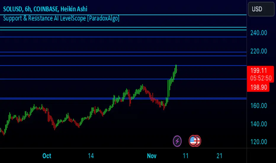
Support & Resistance AI LevelScopeSupport & Resistance AI LevelScope
Support & Resistance AI LevelScope is an advanced, AI-driven tool that automatically detects and highlights key support and resistance levels on your chart. This indicator leverages smart algorithms to pinpoint the most impactful levels, providing traders with a precise, real-time view of critical price boundaries. Save time and enhance your trading edge with effortless, intelligent support and resistance identification.
Key Features:
AI-Powered Level Detection: The LevelScope algorithm continuously analyzes price action, dynamically plotting support and resistance levels based on recent highs and lows across your chosen timeframe.
Sensitivity Control: Customize the sensitivity to display either major levels for a macro view or more frequent levels for detailed intraday analysis. Easily adjust to suit any trading style or market condition.
Level Strength Differentiation: Instantly recognize the strength of each level with visual cues based on how often price has touched each one. Stronger levels are emphasized, highlighting areas with higher significance, while weaker levels are marked subtly.
Customizable Visuals: Tailor the look of your chart with customizable color schemes and line thickness options for strong and weak levels, ensuring clear visibility without clutter.
Proximity Alerts: Receive alerts when price approaches key support or resistance, giving you a heads-up for potential market reactions and trading opportunities.
Who It’s For:
Whether you're a day trader, swing trader, or just want a quick, AI-driven way to identify high-probability levels on your chart, Support & Resistance AI LevelScope is designed to keep you focused and informed. This indicator is the perfect addition to any trader’s toolkit, empowering you to make more confident, data-backed trading decisions with ease.
Upgrade your analysis with AI-powered support and resistance—no more manual lines, only smart levels!
Volumetric Rejection Blocks [UAlgo]The Volumetric Rejection Blocks is designed to help traders identify and visualize key price levels where volumetric rejections occur, which may indicate a shift in market sentiment. These rejections can signal potential trend reversals or areas where price action is likely to face support or resistance. By drawing rejection blocks based on volumetric strength, the indicator allows users to observe where significant buying or selling pressure has been exerted, which can be used as a reference point for future price action.
Also indicator dynamically calculates swing highs and lows, analyzes bullish and bearish strengths based on volume-weighted price movements, and displays rejection blocks on the chart. Each rejection block represents an area where the price attempted to move beyond a certain level but faced rejection, either on a close or wick basis. This can be particularly useful for traders who rely on market structure and order flow to make informed decisions about entering or exiting trades.
🔶 Key Features
Swing Length Customization: Allows users to define the swing length, helping tailor the sensitivity of the swing high and low detection to the specific market conditions.
Rejection Block Visualization: Displays up to the last 10 rejection blocks based on user settings, clearly marking areas of significant bullish or bearish rejections.
Volumetric Strength Analysis: The indicator calculates bullish and bearish strength for each rejection block, based on volume-weighted price movements over the last few bars, giving insight into the intensity of the rejection.
Violation Check Type: Offers two options for violation detection—"Close" and "Wick". This allows traders to specify whether a price level is considered broken only if it closes beyond the level or if any wick breaches it.
Bullish and Bearish Block Coloring: Rejection blocks are colored to represent bullish (green) and bearish (red) rejection areas. The color transparency can be adjusted for clear visibility overlaid on the price chart.
Market Structure Labels: Labels and lines marking "Market Structure Shift" (MSS) and "Break of Structure" (BOS) are displayed, giving traders context about significant market structure changes.
🔶 Interpreting the Indicator
Rejection Blocks: These colored blocks on the chart indicate areas where the price faced significant buying or selling pressure. A green block suggests a bullish rejection (support zone), where buyers absorbed the sell-off, potentially pushing the price upward. Conversely, a red block indicates a bearish rejection (resistance zone), where sellers overpowered buyers, potentially driving the price lower.
Strength Analysis: The width of the green and red sections within a rejection block represents the relative bullish and bearish strengths. A wider green section indicates stronger bullish support, while a wider red section suggests more robust bearish resistance. This helps traders gauge the likelihood of price holding or breaching these levels.
Market Structure Shift (MSS) and Break of Structure (BOS): The indicator automatically detects and labels significant changes in market structure. An "MSS" label indicates the first break, suggesting a potential shift in trend direction. A "BOS" label indicates a subsequent confirmation in trend direction, allowing traders to recognize potential trend continuations.
Violation Check: Traders can choose how to interpret breaks of these rejection blocks. Using the "Close" option provides a more conservative approach, requiring a close beyond the level for confirmation. The "Wick" option is more aggressive, treating any wick beyond the level as a break.
🔶 Disclaimer
Use with Caution: This indicator is provided for educational and informational purposes only and should not be considered as financial advice. Users should exercise caution and perform their own analysis before making trading decisions based on the indicator's signals.
Not Financial Advice: The information provided by this indicator does not constitute financial advice, and the creator (UAlgo) shall not be held responsible for any trading losses incurred as a result of using this indicator.
Backtesting Recommended: Traders are encouraged to backtest the indicator thoroughly on historical data before using it in live trading to assess its performance and suitability for their trading strategies.
Risk Management: Trading involves inherent risks, and users should implement proper risk management strategies, including but not limited to stop-loss orders and position sizing, to mitigate potential losses.
No Guarantees: The accuracy and reliability of the indicator's signals cannot be guaranteed, as they are based on historical price data and past performance may not be indicative of future results.

Formation Defined Moving Support and ResistanceThe script was originally coded in 2018 with Pine Script version 3, and it was in protected code status. It has been updated and optimised for Pine Script v5 and made completely open source.
The Formation Defined Moving Support and Resistance indicator is a sophisticated tool for identifying dynamic support and resistance levels based on specific price formations and level interactions. This indicator goes beyond traditional static support and resistance by updating levels based on predefined formation patterns and market behaviour, providing traders with a more responsive view of potential support and resistance zones.
Features:
The indicator detects essential price levels:
Lower Low (LL)
Higher Low (HL)
Higher High (HH)
Lower High (LH)
Equal Lower Low (ELL)
Equal Higher Low (EHL)
Equal Higher High (EHH)
Equal Lower High (ELH)
By identifying these key points, the script builds a foundation for tracking and responding to changes in price structure.
Pre-defined Formations and Comparisons:
The indicator calculates and recognises nine different pre-defined formations, such as bullish and bearish formations, based on the sequence of price levels.
These formations are compared against previous levels and formations, allowing for a sophisticated understanding of recent market movements and momentum shifts.
This formation-based approach provides insights into whether the price is likely to maintain, break, or reverse key levels.
Dynamic Support and Resistance Levels:
The indicator offers an option to toggle Moving Support and Resistance Levels.
When enabled, the support and resistance levels dynamically adjust:
Upon a change in the detected formation.
When the bar’s closing price breaks the last defined support or resistance level.
This feature ensures that the support and resistance levels adapt quickly to market changes, giving a more accurate and responsive perspective.
Customisable Price Source:
Users can choose the price source for level detection, selecting between close or high/low prices.
This flexibility allows the indicator to adapt to different trading styles, whether the focus is on closing prices for more conservative levels or on highs and lows for more sensitive level tracking.
This indicator can benefit traders relying on dynamic support and resistance rather than fixed, historical levels. It adapts to recent price actions and market formations, making it useful for identifying entry and exit points, trend continuation or reversal, and setting trailing stops based on updated support and resistance levels.

Chessboard Support & ResistanceThe “Chessboard Support & Resistance” indicator is designed to assist traders in visualizing key levels of support and resistance on a chart by employing ATR (Average True Range) to create dynamic horizontal zones. This indicator automatically plots robust support and resistance bands that can help identify potential areas where price may reverse, consolidate, or react. These levels are particularly beneficial for traders who employ concepts like Smart Money analysis, as they illustrate zones where institutional trading activity might occur.
How It Works:
• The indicator uses ATR-based calculations to determine the placement of the support and resistance zones. This approach accounts for market volatility, making the zones adaptive to changing conditions.
• The Zone Thickness parameter allows users to customize the width of the plotted zones, enhancing visibility and fitting them to their specific trading style.
• The support and resistance zones extend horizontally across the chart, providing clear reference points for potential price reactions.
Practical Application:
• Trend Analysis: Identify areas of significant price resistance and support to understand potential turning points or trends in the market.
• Risk Management: Use these zones to better inform stop-loss placements or set profit targets.
• Confirmation Tool: Combine the indicator with other technical analysis tools for confirmation of potential trade entries or exits.
Customization Options:
• Change the colors of the support and resistance zones for better integration with different chart themes.
• Adjust the ATR Length and Multiplier to fine-tune the sensitivity of the zones based on personal preferences and the characteristics of the asset being analyzed.
Disclaimer:
This indicator is for educational and informational purposes only. It is not intended to serve as investment advice or a recommendation to buy or sell any financial instrument. Always perform your own research and consider consulting with a financial professional before making trading decisions. Trading involves significant risk, and past performance does not guarantee future results.
Volume Profile Heatmap 2.0The "Enhanced Volume Profile Heatmap" is a powerful Pine Script indicator designed for advanced volume analysis on TradingView charts. It creates a dynamic heatmap of volume distribution across a defined price range, enabling traders to pinpoint significant trading levels and understand price action more deeply.
Key Features:
Configurable Parameters:
Number of Bins (numBins): Defines the resolution of the heatmap by dividing the price range into multiple levels. More bins provide higher granularity.
Lookback Period (lookback): Sets the historical period over which the volume profile is calculated.
Price Range Calculation:
Calculates the highest and lowest prices over the lookback period, defining the boundaries for volume distribution.
Volume Allocation Across Price Levels:
The price range is divided into "bins" where each bin represents a specific price level.
For each price within the lookback period, the corresponding volume is allocated to its bin, building a comprehensive distribution of volume per price level.
Volume Normalization and Heatmap Visualization:
Volume for each bin is normalized based on the highest volume bin, creating a gradient effect to visually represent high and low-volume areas.
A heatmap color scheme is applied, where low volume appears redder and high volume appears greener, emphasizing critical price levels.
Visual Representation:
Each bin’s volume is depicted as a horizontal line with varying color intensity, creating a heatmap effect directly over the price chart.
Purpose:
The Enhanced Volume Profile Heatmap is ideal for traders looking to identify high-activity trading zones, which often act as strong support or resistance. By visualizing where trading activity concentrates, users can gain insights into potential areas of interest, allowing for more informed entry and exit decisions.
This indicator is a unique tool for volume-based analysis, helping traders understand underlying market sentiment and positioning across different price levels in a clear, intuitive way.

GEX Profile [PRO] Real Auto-Updated Gamma Exposure Levels𝗥𝗲𝗮𝗹 𝗚𝗘𝗫 𝗟𝗲𝘃𝗲𝗹𝘀 𝘄𝗶𝘁𝗵 𝗦𝗲𝗮𝗺𝗹𝗲𝘀𝘀 𝗔𝘂𝘁𝗼-𝗨𝗽𝗱𝗮𝘁𝗲𝘀 𝗳𝗼𝗿 𝗼𝘃𝗲𝗿 𝟭𝟲𝟱+ 𝗼𝗳 𝘁𝗵𝗲 𝗠𝗼𝘀𝘁 𝗟𝗶𝗾𝘂𝗶𝗱 𝗨.𝗦. 𝗠𝗮𝗿𝗸𝗲𝘁 𝗦𝘆𝗺𝗯𝗼𝗹𝘀 (including 𝟬𝗗𝗧𝗘 𝗳𝗼𝗿 𝗦𝗣𝗫, SPY, QQQ, TLT, IWM, etc...)
🔃 Dynamic Updates : Receive precise GEX levels with auto-updating metrics up to 5 times a day throughout the trading session—no manual refresh needed!
🍒 Strategically Developed : Built by experienced options traders to meet the needs of serious options market participants.
🕒 0DTE? No Problem! : Designed with 0DTE traders in mind, our indicator keeps you updated with GEX levels and seamless auto-refresh to capture every crucial market shift.
📈 Optimized for Option Traders : See accurate GEX and NETGEX profiles for multiple expirations to maximize strategic potential.
🔶 Comprehensive GEX Levels
This indicator provides unparalleled insight into market dynamics with levels like Call/Put Support, Resistance, HVL (High Volatility Level), and Call/Put Walls. These levels are auto-updated based on live market movements and reflect gamma shifts and volatility signals essential for options traders.
🔶 Ideal for 0DTE and Multi-Leg Strategies
Track essential GEX levels across expirations with our unique Cumulative (⅀) and Selected Alone (⊙) calculation models. Customize your view to reveal high-impact levels across multiple expirations or focus on a specific expiration for a targeted strategy.
🔶 Coverage of 165+ Highly Liquid U.S. Symbols
Compatible with over 165 U.S. market symbols, including SP:SPX , AMEX:SPY , NASDAQ:QQQ , NASDAQ:TLT , AMEX:GLD , NASDAQ:NVDA , and more. The watchlist is expanding continuously to meet the needs of active traders. List of Compatible Symbols Available Here: www.tradingview.com
🔶How does the indicator work and why is it unique?
This is not just another GEX indicator. It incorporates 15min delayed option chain data from ORATS as data provider, processes and refines the delayed data package using pineseed, and sends it to TradingView, visualizing the key GEX levels using specific formulas (see detailed below). This method of incorporating options data into a visualization framework is unique and entirely innovative on TradingView.
Unlike other providers that only set GEX levels at market open, this indicator adjusts dynamically throughout the day, providing updated insights across the trading day and capturing gamma shifts as the market moves.
_________________________________
-----------------------------------------------
🌑 𝗗 𝗢 𝗖 𝗨 𝗠 𝗘 𝗡 𝗧 𝗔 𝗧 𝗜 𝗢 𝗡 🌑
-----------------------------------------------
_________________________________
🔶 Understanding GEX (Gamma Exposure) and Gamma Profiling
Gamma Exposure (GEX) is a crucial concept in options trading because it reveals how options market positions can influence the dynamics of asset prices. In essence, GEX measures the collective gamma exposure of options market participants, impacting overall market stability and price movements.
🔹 What is GEX?
At its core, GEX captures the aggregate impact of gamma, a key options Greek, which tells us how an option's delta changes in response to price movements in the underlying asset. Positive or negative GEX levels can reflect the collective bullish or bearish stance of the market:
Positive GEX (far above HVL) : Indicates a net bullish positioning by options holders. When GEX is strongly positive, it suggests that as the asset price increases, market participants might need to buy more of the asset to maintain their hedges. This behavior can fuel further upward momentum.
Negative GEX (far below HVL) : Implies a net bearish positioning. In a strongly negative GEX environment, declines in the asset's price might prompt participants to sell, potentially exacerbating the downward movement.
🔹 The Influence of GEX on Strike Prices and Expiration
A unique feature of GEX is its impact near expiration dates. As options approach expiration, GEX levels can “pin” the price to specific strike levels, where options positions are concentrated. This pinning effect arises as market makers adjust their hedging strategies, often causing the asset price to gravitate towards certain strike prices, where a large volume of options contracts sits.
🟨 Overview of our GEX Calculation Models for Options Traders 🟨
Our GEX indicator models were developed with serious options traders in mind, providing flexibility beyond typical GEX providers. We know that using GEX levels for multi-leg strategies, where the underlying doesn't need a strong trend to be profitable , calls for a nuanced approach that aligns with different trading horizons. Here’s a detailed breakdown of our GEX calculation models and how they support strategic trading across varying timeframes.
Thus, the HVL an orher CALL/PUT WALLS depends on the indicator's selected calculation mode and expiration. The NETGEX profile of the chosen expiration appears on the HVL line , which automatically updates five times during trading hours , except for 0DTE, which reflects the value set at market open.
🔶 Cumulative Expiration (⅀) Calculation Method
This method aggregates GEX data for all expirations up to the selected date , giving you a more comprehensive view of market dynamics. We recommend using this method, as it allows you to see how combined expirations impact GEX levels, which can be critical when setting up trades with a longer time horizon.
🔶 Selected Alone (⊙) Calculation Method
This option displays the GEX profile specific to only the chosen expiration , providing a unique, time-bound view. This approach is ideal for those seeking precise insight into how an individual expiration is performing without the broader context of other expirations.
🔶 Example of using calculation methods:
With options trading, especially for multi-leg strategies, choosing the right expiration and calculation model is crucial. Let’s break down an example:
Suppose you’re considering a Friday (4DTE) front-leg diagonal on the SPX at the start of the week. In this case, the focus isn’t strictly on any single expiration (like 0DTE or 4DTE individually), but rather on what might happen cumulatively by Friday across all expirations . Here, the Cumulative Expiration (⅀) model comes into play, as it shows you an aggregated view of the GEX profile, factoring in all strikes and legs for all expirations leading up to the selected date.
For most use cases, we recommend setting your indicator to the Cumulative (⅀) model , which provides a broad and insightful look at GEX levels across multiple expirations. However, you can always switch to Selected Alone (⊙) for targeted analysis of an individual expiration. Remember, 0DTE defaults to “Selected Alone”, and Every Expiry always shows a cumulative value by default.
_________________________________
-----------------------------------------------
🟦 HVL (High Volatility Level) 🟦
Also known as the Gamma FLIP level or Zero Gamma , it represents the price level at which the gamma environment transitions from positive to negative or vice versa. The High Volatility Level (HVL) is a critical point for understanding gamma shifts and anticipating volatility. This shift influences how market makers hedge their positions, potentially increasing or dampening market volatility.
🔷 Understanding the Gamma Flip and HVL
At its core, the gamma flip represents the point where market makers may transition from a net positive to a net negative gamma position, or the reverse. When prices move above HVL, gamma is positive, often leading to lower volatility due to the stabilizing effects of market makers’ hedging. Conversely, when prices drop below HVL, gamma flips negative, and hedging by market makers can amplify volatility as they trade with the direction of price movements.
The HVL (High Volatility Level) is particularly important as it signals a shift in the impact of price movements on the GEX profile. Using the cumulative calculation mode, GEX values are aggregated across all strikes and expirations up to the selected expiration, helping to pinpoint the point where the GEX curve's slope changes from negative to positive.
🔷 Implications for Traders and Market Makers
For market makers, crossing below HVL into a negative gamma zone means that they hedge in the same direction as price movements, potentially amplifying volatility. For traders, understanding HVL's role is essential to choosing strategies that align with the prevailing volatility regime:
Positive GEX 🟢:
Above HVL, where GEX is positive, market makers hedge by buying stocks as prices fall and selling as prices rise. This has a stabilizing effect, creating a lower-volatility environment.
Negative GEX 🔴:
Below HVL, where GEX is negative, market makers' hedging aligns with price movements, increasing volatility. Here, they buy as prices rise and sell as they fall, reinforcing price direction.
🔷 HVL as a Momentum and Volatility Indicator
The HVL offers traders insight into potential shifts in market momentum. For example, above HVL, if the price increases, Net GEX also rises, which stabilizes prices as market makers hedge in opposition to price direction. Below HVL, however, a price rise decreases Net GEX, creating conditions where market makers’ hedging amplifies price movements, resulting in a more volatile environment.
HVL also acts as a significant support level, often preceding put supports. If the price falls below this level, traders may expect heightened volatility and increased bearish sentiment.
Knowing the location of HVL is vital for positioning yourself on the right side of volatility. By monitoring the HVL, traders can better anticipate shifts in sentiment and align strategies with prevailing market dynamics.
_________________________________
-----------------------------------------------
🟩 Call Resistance and Call Wall Levels 🟩
In options trading, understanding GEX levels like Call Resistance and Call Wall levels is crucial for navigating potential price inflection points. Our indicator provides these levels directly on your chart, allowing you to customize and optimize your trading approach. Here’s a detailed guide to help you understand and use Call Resistance and additional Call Wall levels effectively.
🟢 Call Resistance Level
The Call Resistance Level is a key point where our model indicates heightened Call GEX concentration. This level serves as a potential resistance area where price movement may face a barrier, slowing or even reversing before a breakout. Here’s how the Call Resistance Level can influence market behavior:
Resistance and Price Reversal ⬇️ : Similar to the Put Support level, the Call Resistance acts as a "sticky" price level, where upward movement encounters resistance. When the price approaches this level, it’s common for market makers to begin shorting to maintain delta neutrality. This shorting activity, combined with the potential monetization of calls, introduces a technical bearish force in the short term, often causing the price to bounce downward.
Upside Acceleration Point ⬆️ : If investors reposition calls to higher strikes as the price reaches Call Resistance, this level can roll up, allowing the price to push upward and potentially accelerating the rally. This effect can drive the market to higher levels as market makers adjust their positions accordingly.
🟢 Additional Call Wall Levels
Our model identifies the second and third-highest Call GEX levels, known as additional Call Walls. These levels are often secondary resistance points but hold significance as they add layers of possible resistance or breakout points. They offer similar potential as the primary Call Resistance level, acting as either:
Resistance Zones: Slowing the price momentum as it approaches these levels.
Inflection Points for Upside Momentum: Allowing for a possible continuation of upward movement if prices break through.
🟢 How to Trade the Call Resistance Level
To use the Call Resistance level effectively, look for possible price rejections or consolidations as the price approaches this zone. Here are the main scenarios:
Bounce to Downside: As the price nears the Call Resistance level, market makers’ delta-hedging activity (through shorting) can turn this level into a short-term bearish force, leading to price pullbacks.
Rolling the Position: For bulls, a key objective at the Call Resistance level is to see investors roll their call positions higher, effectively moving the resistance up. This repositioning may lead to incremental price gains as the Call Resistance level rises with each roll.
_________________________________
-----------------------------------------------
🟥 Put Support and Put Wall Levels 🟥
In options trading, understanding GEX levels like Put Support and secondary Put Wall levels is essential for managing potential price support points and gauging downside risk. Our indicator places these levels directly on your chart, allowing for customization to enhance your trading strategy. Here’s a detailed guide to help you leverage the Put Support and additional Put Wall levels effectively.
🔴 Put Support Level
The Put Support Level is a key zone where our model shows the highest concentration of negative GEX, representing an area with substantial put option interest. This level functions as a potential support zone, where price may stabilize or bounce upward, or as an inflection point, signaling increased downside momentum. Here’s how the Put Support Level can affect market behavior:
Support and Price Reversal🔺 : Similar to how Call Resistance operates on the upside, the Put Support Level often acts as a "sticky" level on the downside, where price finds support. As the asset price moves closer to this level, market makers begin adjusting their positions, frequently buying to maintain delta neutrality. This activity can create a temporary short squeeze, pushing prices back up.
Downside Acceleration Point 🔻 : If the asset continues moving lower, triggering more hedging activity, this level can become a tipping point for accelerated downside momentum.
🔴 Additional Put Wall Levels
Our model also identifies the second and third-highest negative GEX levels, known as secondary Put Walls. These levels are often seen as secondary support points and hold significance by adding layers of support or potential downside inflection points. Like the primary Put Support Level, they can act in two ways:
Support Zones: Helping slow price declines as they approach these levels.
Downside Inflection Points: Allowing further price decline if the support fails.
🔴 How Investors Hedge with Put Options
Investors commonly use put options to hedge long positions and protect portfolios, especially during times of market stress when implied volatility rises. This demand for puts increases the Put Skew, as market makers short to remain delta hedged.
As prices approach the Put Support Level, the hedging activity often intensifies because more puts become At the Money (ATM) or In the Money (ITM). To realize the value of their hedges, investors typically monetize these puts at this level, triggering the closing of short positions by market makers and resulting in a price bounce.
🔴 The Role of Implied Volatility
Implied Volatility (IV) is also a critical factor since it directly influences market flows. If IV driving put flows decreases, market makers may buy back shorts, which contributes to the bounce at the Put Support Level. Additionally, another Greek, Vanna—representing changes in delta due to IV shifts—plays a vital role here. As IV changes, Vanna affects delta-hedging adjustments, adding a layer of complexity to understanding market makers' actions around these support levels.
🔴 Possible Price Scenarios at the Put Support Level
When the price reaches the Put Support Level, there are generally two scenarios:
Bounce to Upside🔺 : The Put Support Level is where substantial put hedging activity happens. As prices approach, market makers adjust their delta by buying, which can push prices back up.
Roll Positions🔻 : After monetizing puts, investors have two options: roll hedges to higher strikes if they expect a bullish move, or open new out-of-the-money puts at lower strikes. If new hedges are set at lower levels, the Put Support level may also shift lower, creating a new bearish force as market makers begin hedging these new positions.
🟨 Customizing Put Support/Call Resistance and Put/Call Wall Levels on Your Chart
Our indicator settings provide extensive customization options for displaying Put Support, Call Resistance, and Put/Call Wall levels.
You can:
adjust the depth to highlight the highest positive or negative NETGEX levels
choose to display relative data, show only the colored strike line
adjust the offset for enhanced visibility.
This flexibility helps you focus on the critical details that best align with your trading strategy, ensuring a clearer and more tailored view of the GEX levels on your chart.
Currently, we examine the top three levels with the highest positive and negative NETGEX values, allowing you to view seven key GEX levels on your chart (3 Call + 1 HVL + 3 Put). However, in the near future, we plan to expand this to seven levels per side, resulting in a total of up to 15 significant GEX levels on the chart instead of the current 7. This enhancement will cater to all needs, especially benefiting 0DTE traders.
_________________________________
-----------------------------------------------
🔶 ADDITIONAL IMPORTANT COMMENTS
🔹- Why is there a slight difference between the displayed data and other GEX provider's data like MenthorQ, GammaEdge, SpotGamma, GEXBot, etc?
There are two reasons for this, and one is beyond our control:
🔹 (1) Option-data update frequency:
According to TradingView's regulations and guidelines, we can update external data a maximum of 5 times per day. We strive to use these updates in the most optimal way:
(1st update) 15 minutes after U.S. market open
(2nd, 3rd, 4th updates) 1.5–3 hours during U.S. market open hours
(5th update) 10 minutes before U.S. market close.
You don’t need to refresh your window; our latest refreshed data pack is always automatically applied to your indicator. You can see the time elapsed since the last update by hovering over the HVL.
🔹 (2) GEX Levels with Intraday Updates Based on Price Movements
The TanukiTrade Options GEX Indicator for TradingView provides open interest data with a 15-minute delay after the market opens. Using this data, we calculate and update the relevant levels throughout the trading day, reflecting almost real-time price changes and gamma values. Unlike other GEX providers, who set their GEX levels solely at market open without further updates, we dynamically adjust our levels intraday to capture significant price shifts.
🔹 Automatic & Seamless Intraday Updates and Special Cases
For our indicator, the HVL (High Volatility Level) reflects the selected calculation mode and expiration. We update these NETGEX profiles five times throughout the trading day, with one exception: 0DTE data, which is set at market open and does not update intraday due to the rapid narrowing of gamma levels . Note that similar to other GEX providers, our 0DTE remains fixed at open, while cumulative values update during the day based on almost real-time market movements.
🔹Consistent SPX 0DTE GEX Levels with Morning Open Interest Updates Only
For SPX, the 0DTE (Zero Days to Expiration) options and GEX levels are calculated based on openinterest data provided by the clearinghouse at market open. Due to the exponential narrowing of gamma levels throughout the day, we do not update these levels intraday, unlike other expirations. Therefore, if you select the expiring contract on that day, you’ll see the exact morning level, as it was calculated at market open. This status is also published the previous evening, based on the data available then, so you can already view the levels for the following day’s 1DTE (next day’s 0DTE) before market close. After market open, around 15 minutes later, this level is updated with the latest open interest data and remains unchanged for the rest of the day. Other providers take a similar approach. We do not support intraday volume-based GEX calculations, as our benchmarks show this can produce misleading results.
Disclaimer:
Our option indicator uses approximately 15min-3 hour delayed option market snapshot data to calculate the main option metrics. Exact realtime option contract prices are never displayed; only derived GEX metrics are shown to ensure accurate and consistent visualization. Due to the above, this indicator can only be used for decision support; exclusive decisions cannot be made based on this indicator. We reserve the right to make errors.This indicator is designed for options traders who understand what they are doing. It assumes that they are familiar with options and can make well-informed, independent decisions. We work with paid delayed data and we are not a data provider; therefore, we do not bear any financial or other liability.

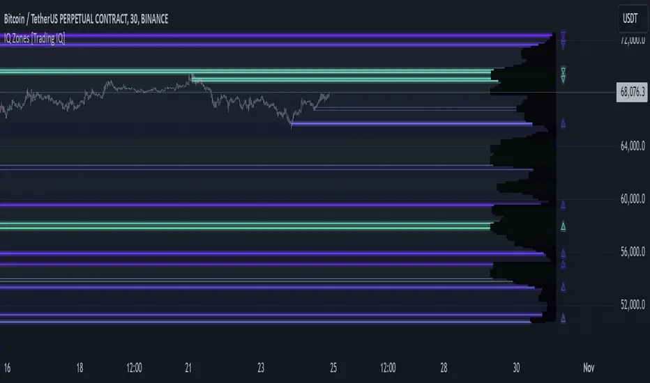
IQ Zones [TradingIQ]Hey Traders!
Introducing "IQ Zones".
"IQ Zones" is an indicator that combines support and resistance identification with volume, the "value area" of a candlestick to be exact. IQ Zones identifies turning points in the market; however, the candlestick high or low that formed the key turning point is not necessarily distinguished as the support/resistance area. Instead, the script looks into the bar at lower timeframes and calculates the value area of the candlestick that formed the support or resistance level. Therefore, any lines protruding from a candlestick reflect the value area of that candlestick. These levels (value area high and value area low) are marked on the candlestick as a support/resistance level. If the level formed on high volume it's marked as an "IQ Zone".
Additionally, IQ Zones presents a heat map to show volume intensity at nearby price areas. The heatmap is a product of the Volume Profile (IQ Profile) located on the right of the chart.
The IQ Profile is a segmented volume profile. Recent price is split into fifths (customizable), and individual volume profiles are calculated for all segmented price areas. Price is split into more than one segment to avoid a situation where volume in a ranging price zone far surpasses all other recent price areas - creating an "unusable" volume profile that doesn't offer helpful insights. If desired, you can set the segmenting option to "1" to calculate one unified volume profile for the entire price range.
The image above shows IQ Zones in action!
Core Features of IQ Zones
Value Area Support and Resistance Levels
Segmented volume profile for the recent trading period
Volume intensity heatmap
Support and resistance levels in high volume intensity may be more significant as price stoppers
The image above explains the labels marked along the y-axis of the IQ Profile.
The "more green" a price area/label is, the higher the volume intensity at the marked support/resistance area.
The image above further explains line lines protruding from the IQ Profile.
For this example, the value area of the candlestick (where most trading action occurred) is quite far from the high price of the candlestick that formed a resistance level! Using the value area of a candlestick that marks a key turning point to draw support/resistance offers insight into where the majority of trading action took place when the support/resistance level was forming!
Additionally, you can hover your mouse over the IQ Zone labels (triangles pointing up or down) to see the prices of the value area for the support/resistance level, including the total buying volume and total selling volume at the price area!
The image above further explains the IQ Profile!
You can segment the recent price area anywhere from 1 - 15 times.
The image above further explains IQ Zones and the IQ Profile!
That will be all for this indicator - a fun project to share with the community.
Thank you!
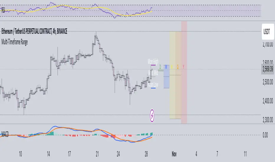
Multi-Timeframe RangeThe Multi-Timeframe Range Indicator is designed for traders looking to monitor key price levels across various timeframes (Daily, Weekly, Monthly, Quarterly, and Yearly) directly on their charts. This indicator draws boxes and mid-lines for each timeframe’s high, low, and midpoint, enabling users to visualize price ranges and assess potential areas of support and resistance more effectively.
Features:
Dynamic Range Boxes: Displays the high, low, and midpoint levels for each specified timeframe, with customizable colors for easy differentiation.
Visual Cues for Monday’s Levels: Highlights Monday’s high, low, and midpoint levels each week to support intraday trading setups and weekly trend analysis.
Multi-Timeframe Flexibility: Easily toggle between timeframes to view ranges from daily to yearly, making this indicator suitable for both short-term and long-term traders.
Ideal Use Cases:
Identify key support and resistance zones based on multiple timeframes.
Assess weekly and monthly trends using the Monday range levels.
Gain insights into market structure across various timeframes.
ARMORE Capital: Support–Resistance Levels v2.0 [Enhanced]Enhanced S/R Levels with Signals
The "Enhanced S R Levels with Signals" indicator is designed to help traders and investors identify key Support and Resistance levels on a price chart. It also includes LONG and SHORT signals to help you see potential buy and sell opportunities. Here's a beginner-friendly breakdown of how it works and how to use it:
How it Works
Support and Resistance Levels:
Support Levels (blue lines) are prices where the stock tends to find a "floor" or buying interest, potentially pushing the price up. These levels are calculated based on the lowest prices over a period, with the sensitivity setting helping adjust the distance between each support level.
Resistance Levels (red lines) are prices where the stock often encounters a "ceiling" or selling interest, which could push the price down. These levels are calculated based on the highest prices over a period, with sensitivity adjusting the distance between each resistance level.
The indicator plots up to five support and five resistance lines, giving you a layered view of price levels where the market may react.
LONG and SHORT Signals:
LONG Signal (green arrow pointing up): When the closing price goes above the closest support level, the indicator shows a LONG signal below the bar, suggesting a potential upward trend.
SHORT Signal (red arrow pointing down): When the closing price goes below the closest resistance level, the indicator shows a SHORT signal above the bar, indicating a potential downward trend.
Background Ribbons:
When a LONG condition is met, a faint green background appears on the chart as a visual cue.
When a SHORT condition is met, a faint red background appears to signal potential bearish pressure.
How to Use It
1. Finding Entry and Exit Points: Use the LONG and SHORT signals as a guide, but remember to consider other factors before making trading decisions. A LONG signal suggests that price may rise, while a SHORT signal indicates potential downside.
2. Support & Resistance Levels: Treat these levels as potential points of interest. Prices often react at support or resistance, so you can look for confirmation (e.g., reversal patterns, volume spikes) around these levels.
3. Experiment with Sensitivity: Adjust the "Sensitivity" setting to see how it changes the spacing of support and resistance levels. Higher sensitivity may show more frequent support/resistance levels, which can be helpful for short-term traders.
DISCLAIMER : This is purely experimental and shouldn't be considered a blatant Buy-Sell Indicator. Please feel free to use it to supplement your research, share it with your friends, iterate and improve upon it, and use it to build better, more powerful tools!
Remember, always combine technical indicators with other analysis methods and manage your risk responsibly. Happy Trading!

CSP Key Level Finder This script is designed for option sellers, particularly those using strategies like cash-secured puts (CSPs), to help automate the process of identifying key levels in the market. The core functionality is to calculate a specific price level where a 5% return can be achieved based on the historical volatility of the underlying asset. This level is visually plotted on a chart to guide traders in making more informed decisions without manually calculating the thresholds themselves.
The script incorporates implied volatility (IV) data to determine the volatility rank of the asset and calculates historical volatility (HV) based on price movements. These volatility measures help assess market conditions. The resulting key level is drawn as a line on the chart, along with a label that includes relevant information about volatility, making it easier for traders to evaluate potential option selling strategies.
Additionally, the script includes user input options, allowing users to control when to display the key level on the chart, offering flexibility based on individual needs. Overall, the script provides a visual aid for option sellers to streamline the process of identifying attractive entry points.

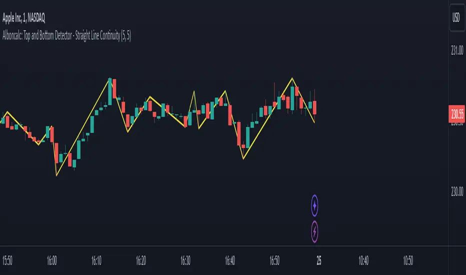
Alboncalc: Top and Bottom Detector - Straight Line ContinuityDescription:
The "Alboncalc: Top and Bottom Detector - Straight Line Continuity" is an innovative indicator for identifying key price reversal points (tops and bottoms) with precision. Unlike traditional indicators that focus on abstract data representations like oscillators or momentum-based lines, this indicator directly overlays the price chart. It draws a continuous line connecting highs and lows (tops and bottoms), providing traders with a clear and immediate visual representation of market swings. The lines automatically adjust in real-time, maintaining a straight path during trend continuations and only shifting when a trend reversal is detected.
Originality and Usefulness:
This indicator stands out from other tools available on TradingView due to its unique ability to maintain a continuous line across price swings, preserving accuracy and visual clarity. Most traditional top-and-bottom detectors merely mark points or provide indicators that are disconnected from price action, making it harder for traders to spot patterns. This script takes a different approach by drawing lines directly on the price chart, offering greater precision and better trend visualization. This innovation is particularly useful for traders who rely on visual cues and price action analysis to make decisions. It simplifies the process of identifying reversal points and trends without needing to rely on lagging indicators.
How It Works:
This indicator detects tops and bottoms based on user-defined periods. When the highest point in a given period is detected, it marks it as a top, and similarly, when the lowest point is detected, it marks it as a bottom. As the price moves, the indicator adjusts the lines to connect consecutive tops and bottoms. If the trend continues in the same direction (e.g., an uptrend), the line remains straight and extends. If a reversal is detected, a new line is drawn to connect the previous bottom (or top) to the new reversal point, providing an accurate visual representation of market trends.
How to Use:
1. Load the Indicator: Add the "Alboncalc: Top and Bottom Detector - Straight Line Continuity" to your chart from the TradingView script library.
2. Customize Settings: Adjust the "Top Period" and "Bottom Period" inputs to fine-tune the sensitivity of top and bottom detection based on your preferred timeframe.
3. Observe Price Action: As the price moves, the indicator will draw lines directly over the price chart, connecting tops and bottoms.
4. Interpret the Lines: Use the continuous lines to identify ongoing trends and potential reversal points. The line remains straight during trend continuation, indicating sustained movement in one direction. A new line signifies a reversal in the trend.
This tool is ideal for traders using trend-following strategies, breakout detection, or those who prefer clean, visual price action analysis (Only Tops and Bottons).
Underlying Concepts:
The core of this indicator is based on the highest high and lowest low concept, which is common in technical analysis. The logic is simple:
- A top is detected when the price reaches a high point compared to a user-defined number of prior candles (i.e., the `top_period`).
- A bottom is detected when the price hits a low point compared to the prior candles (i.e., the `bottom_period`).
When the price continues in the same trend, the line is extended without a break. This behavior ensures that trends are represented in a clear and consistent manner, which helps traders better identify trend continuations and reversals.
Code Breakdown:
```pinescript
//@version=5
indicator("Top and Bottom Detector - Straight Line Continuity", overlay=true)
```
- This initializes the indicator and specifies that it will overlay directly on the price chart.
```pinescript
var int top_period = input.int(5, title="Top Period", minval=1)
var int bottom_period = input.int(5, title="Bottom Period", minval=1)
```
- These inputs allow the user to customize the number of candles used to identify tops and bottoms. A higher period results in fewer but more significant top/bottom detections, while a lower period increases sensitivity.
```pinescript
isTop = ta.highest(top_period) == high
isBottom = ta.lowest(bottom_period) == low
```
- These lines check if the current candle has the highest high or the lowest low in the defined period. If true, the current price is either a top or a bottom.
```pinescript
var line currentLine = na
var float last_price = na
var int last_index = na
var bool isUpTrend = na
```
- These variables store the current line being drawn (`currentLine`), the last detected price (`last_price`), and the direction of the trend (`isUpTrend`). `last_index` tracks where the last top or bottom was detected.
```pinescript
if (isTop or isBottom)
if (not na(last_price))
if ((isTop and isUpTrend) or (isBottom and not isUpTrend))
line.set_xy2(currentLine, bar_index, (isTop ? high : low))
else
currentLine := line.new(x1=last_index, y1=last_price, x2=bar_index, y2=(isTop ? high : low), color=color.yellow, width=2)
last_price := (isTop ? high : low)
last_index := bar_index
isUpTrend := isTop
```
- The `if` block handles the logic of drawing the line. If a top or bottom is detected, and the trend continues (either an uptrend for tops or a downtrend for bottoms), the current line is extended using `line.set_xy2`. If a reversal is detected, a new line is drawn using `line.new`.
- The `last_price` and `last_index` variables are updated after each detection, and the `isUpTrend` flag is set based on whether a top or bottom was found.
Conclusion:
This indicator offers a more precise and visually intuitive way of identifying tops and bottoms directly on the price chart, making it an essential tool for traders focused on price action. Its ability to draw continuous lines through ongoing trends and adjust only upon a reversal makes it superior in terms of visual clarity compared to most conventional indicators.
$TUBR: 7-25-99 Moving Average7, 25, and 99 Period Moving Averages
This indicator plots three moving averages: the 7-period, 25-period, and 99-period Simple Moving Averages (SMA). These moving averages are widely used to smooth out price action and help traders identify trends over different time frames. Let's break down the significance of these specific moving averages from both supply and demand perspectives and a price action perspective.
1. Supply and Demand Perspective:
- 7-period Moving Average (Short-Term) :
The 7-period moving average represents the short-term sentiment in the market. It captures the rapid fluctuations in price and is heavily influenced by recent supply and demand changes. Traders often look to the 7-period SMA for immediate price momentum, with price moving above or below this line signaling short-term strength or weakness.
- Bullish Supply/Demand : When price is above the 7-period SMA, it suggests that buyers are currently in control and demand is higher than supply. Conversely, price falling below this line indicates that supply is overpowering demand, leading to a short-term downtrend.
Is current price > average price in past 7 candles (depending on timeframe)? This will tell you how aggressive buyers are in short term.
- Key Supply/Demand Zones : The 7-period SMA often acts as dynamic support or resistance in a trending market, where traders might use it to enter or exit positions based on how price interacts with this level.
- 25-period Moving Average (Medium-Term) :
The 25-period SMA smooths out more of the noise compared to the 7-period, providing a more stable indication of intermediate trends. This moving average is often used to gauge the market's supply and demand balance over a broader timeframe than the short-term 7-period SMA.
- Supply/Demand Balance : The 25-period SMA reflects the medium-term equilibrium between supply and demand. A crossover between the price and the 25-period SMA may indicate a shift in this balance. When price sustains above the 25-period SMA, it shows that demand is strong enough to maintain an upward trend. Conversely, if the price stays below it, supply is likely exceeding demand.
Is current price > average price in past 25 candles (depending on timeframe)? This will tell you how aggressive buyers are in mid term.
- Momentum Shift : Crossovers between the 7-period and 25-period SMAs can indicate momentum shifts between short-term and medium-term demand. For example, if the 7-period crosses above the 25-period, it often signifies growing short-term demand relative to the medium-term trend, signaling potential buy opportunities. What this crossover means is that if 7MA > 25MA that means in past 7 candles average price is more than past 25 candles.
- 99-period Moving Average (Long-Term):
The 99-period SMA represents the long-term trend and reflects the market's supply and demand over an extended period. This moving average filters out short-term fluctuations and highlights the market's overall trajectory.
- Long-Term Supply/Demand Dynamics : The 99-period SMA is slower to react to changes in supply and demand, providing a more stable view of the market's overall trend. Price staying above this line shows sustained demand dominance, while price consistently staying below reflects ongoing supply pressure.
Is current price > average price in past 99 candles (depending on timeframe)? This will tell you how aggressive buyers are in long term.
- Market Trend Confirmation : When both the 7-period and 25-period SMAs are above the 99-period SMA, it signals a strong bullish trend with demand outweighing supply across all timeframes. If all three SMAs are below the 99-period SMA, it points to a bear market where supply is overpowering demand in both the short and long term.
2. Price Action Perspective :
- 7-period Moving Average (Short-Term Trends):
The 7-period moving average closely tracks price action, making it highly responsive to quick shifts in price. Traders often use it to confirm short-term reversals or continuations in price action. In an uptrend, price typically stays above the 7-period SMA, whereas in a downtrend, price stays below it.
- Short-Term Price Reversals : Crossovers between the price and the 7-period SMA often indicate short-term reversals. When price breaks above the 7-period SMA after staying below it, it suggests a potential bullish reversal. Conversely, a price breakdown below the 7-period SMA could signal a bearish reversal.
- 25-period Moving Average (Medium-Term Trends) :
The 25-period SMA helps identify the medium-term price action trend. It balances short-term volatility and longer-term stability, providing insight into the more persistent trend. Price pullbacks to the 25-period SMA during an uptrend can act as a buying opportunity for trend traders, while pullbacks during a downtrend may offer shorting opportunities.
- Pullback and Continuation: In trending markets, price often retraces to the 25-period SMA before continuing in the direction of the trend. For instance, if the price is in a bullish trend, traders may look for support at the 25-period SMA for potential continuation trades.
- 99-period Moving Average (Long-Term Trend and Market Sentiment ):
The 99-period SMA is the most critical for identifying the overall market trend. Price consistently trading above the 99-period SMA indicates long-term bullish momentum, while price staying below the 99-period SMA suggests bearish sentiment.
- Trend Confirmation : Price action above the 99-period SMA confirms long-term upward momentum, while price action below it confirms a downtrend. The space between the shorter moving averages (7 and 25) and the 99-period SMA gives a sense of the strength or weakness of the trend. Larger gaps between the 7 and 99 SMAs suggest strong bullish momentum, while close proximity indicates consolidation or potential reversals.
- Price Action in Trending Markets : Traders often use the 99-period SMA as a dynamic support/resistance level. In strong trends, price tends to stay on one side of the 99-period SMA for extended periods, with breaks above or below signaling major changes in market sentiment.
Why These Numbers Matter:
7-Period MA : The 7-period moving average is a popular choice among short-term traders who want to capture quick momentum changes. It helps visualize immediate market sentiment and is often used in conjunction with price action to time entries or exits.
- 25-Period MA: The 25-period MA is a key indicator for swing traders. It balances sensitivity and stability, providing a clearer picture of the intermediate trend. It helps traders stay in trades longer by filtering out short-term noise, while still being reactive enough to detect reversals.
- 99-Period MA : The 99-period moving average provides a broad view of the market's direction, filtering out much of the short- and medium-term noise. It is crucial for identifying long-term trends and assessing whether the market is bullish or bearish overall. It acts as a key reference point for longer-term trend followers, helping them stay with the broader market sentiment.
Conclusion:
From a supply and demand perspective, the 7, 25, and 99-period moving averages help traders visualize shifts in the balance between buyers and sellers over different time horizons. The price action interaction with these moving averages provides valuable insight into short-term momentum, intermediate trends, and long-term market sentiment. Using these three MAs together gives a more comprehensive understanding of market conditions, helping traders align their strategies with prevailing trends across various timeframes.
------------- RULE BASED SYSTEM ---------------
Overview of the Rule-Based System:
This system will use the following moving averages:
7-period MA: Represents short-term price action.
25-period MA: Represents medium-term price action.
99-period MA: Represents long-term price action.
1. Trend Identification Rules:
Bullish Trend:
The 7-period MA is above the 25-period MA, and the 25-period MA is above the 99-period MA.
This structure shows that short, medium, and long-term trends are aligned in an upward direction, indicating strong bullish momentum.
Bearish Trend:
The 7-period MA is below the 25-period MA, and the 25-period MA is below the 99-period MA.
This suggests that the market is in a downtrend, with bearish momentum dominating across timeframes.
Neutral/Consolidation:
The 7-period MA and 25-period MA are flat or crossing frequently with the 99-period MA, and they are close to each other.
This indicates a sideways or consolidating market where there’s no strong trend direction.
2. Entry Rules:
Bullish Entry (Buy Signals):
Primary Buy Signal:
The price crosses above the 7-period MA, AND the 7-period MA is above the 25-period MA, AND the 25-period MA is above the 99-period MA.
This indicates the start of a new upward trend, with alignment across the short, medium, and long-term trends.
Pullback Buy Signal (for trend continuation):
The price pulls back to the 25-period MA, and the 7-period MA remains above the 25-period MA.
This indica
tes that the pullback is a temporary correction in an uptrend, and buyers may re-enter the market as price approaches the 25-period MA.
You can further confirm the signal by waiting for price action (e.g., bullish candlestick patterns) at the 25-period MA level.
Breakout Buy Signal:
The price crosses above the 99-period MA, and the 7-period and 25-period MAs are also both above the 99-period MA.
This confirms a strong bullish breakout after consolidation or a long-term downtrend.
Bearish Entry (Sell Signals):
Primary Sell Signal:
The price crosses below the 7-period MA, AND the 7-period MA is below the 25-period MA, AND the 25-period MA is below the 99-period MA.
This indicates the start of a new downtrend with alignment across the short, medium, and long-term trends.
Pullback Sell Signal (for trend continuation):
The price pulls back to the 25-period MA, and the 7-period MA remains below the 25-period MA.
This indicates that the pullback is a temporary retracement in a downtrend, providing an opportunity to sell as price meets resistance at the 25-period MA.
Breakdown Sell Signal:
The price breaks below the 99-period MA, and the 7-period and 25-period MAs are also below the 99-period MA.
This confirms a strong bearish breakdown after consolidation or a long-term uptrend reversal.
3. Exit Rules:
Bullish Exit (for long positions):
Short-Term Exit:
The price closes below the 7-period MA, and the 7-period MA starts crossing below the 25-period MA.
This indicates weakening momentum in the uptrend, suggesting an exit from the long position.
Stop-Loss Trigger:
The price falls below the 99-period MA, signaling the breakdown of the long-term trend.
This can act as a final exit signal to minimize losses if the long-term uptrend is invalidated.
Bearish Exit (for short positions):
Short-Term Exit:
The price closes above the 7-period MA, and the 7-period MA starts crossing above the 25-period MA.
This indicates a potential weakening of the downtrend and signals an exit from the short position.
Stop-Loss Trigger:
The price breaks above the 99-period MA, invalidating the bearish trend.
This signals that the market may be reversing to the upside, and exiting short positions would be prudent.

Supply and demandHi all!
This is my take on supply/demand. The gist is that it creates a zone if there is a big enough reaction. This is configurable in settings as "Minimum range (ATR factor)" (the Average True Length of length 14) that is the distance that the price must travel and "Reaction bars" that is the maximum number of bars that price must travel this distance. The zones that are shown are the ones that have a retest, break and retest or is unmitigated (untouched). If a zone is mitigated (entered) or broken it is temporarily hidden. For a zone to be created it needs to have this reaction and the previous bar does not.
So this script will show you zones that are fresh (unmitigated), retested or broken and retested. This means that the zones that are shown have "proven" that they are good zones through this. Basically it means that the script creates a bunch of zones and then picks the good once. This makes the script have some latency, but will hopefully give you good zones. A zone is completely removed if it's broken twice (it's okay if it's broken once and can still have a retest after it has flipped from previous supply (or resistance) into demand (or support)).
Here is a zone (the one that has the lowest opacity) that is broken and retested that could have resulted in a good long trade (the settings are default but has a stop in the beginning of 2024):
You have a setting to remove zones that are pierced (broken by price wicks). The following zone is pierced by price (in the beginning of May) that will not be shown after the start of May if you have "Pierced" checked (the indicator has default settings but a stop in the middle of April):
You have a trend section. Zones that create a reaction upwards can only be created if the trend is considered to be up, and vice versa. The options here are "SMA50" (the current price needs to be over the Simple Moving Average of length 50) and "SMA50, SMA200" (price needs to be over the Simple Moving Average of length 50 and the Simple Moving Average of length 50 needs to be over the Simple Moving Average of length 200). If these conditions are met the trend is considered to be up, otherwise it's down. You can disable this by choosing "No detection".
The zones that are shown also need to be within a limit (of the current price). This limit is 10 (factor of the Average True Range if length 14) by default. Set this to 0 to deactivate. This is useful for not showing zones that are far away from current price and therefore unlikely to be interacted with.
You can stop the calculation of zones (through the "Stop" value in the settings). This is useful to see if previous zones were any good. I used it in my testing of the script but left it because it can be nice to have.
The zones created by the script have different transparency based upon the zone's interaction. The clearest zones are the ones that are unmitigated, the second clearest ones are the ones having a retest and lastly the zones which are most unclear are the ones having a break and then a retest.
You can see the concept of this script to be a mix of supply/demand and support/resistance, having zones being unmitigated (untouched) as the most important but also show the zones having an interaction (in the form of a retest or a break and retest).
This is from a previous supply (or resistance) zone that has flipped into demand (or support) and has shown to be a good zone through a retest followed by a rally (default settings):
This zone has multiple retest and then rallies that could have given a good long trades (it has the default settings but a "Stop" time at 2022-01-14):
TODO:
- Create zones based on pivots
- Handle overlapping zones
- Incorporate volume in the creation and/or interaction with zones
- Add alerts
- Add ability to set maximum zone width
- Add ability to set the maximum number of retest bars
- ...?
The example for this publication has the default settings bit a "Stop" and a tighter "Limit" of 4.
I hope this explanation makes sense, let me know otherwise. Also let me know if you have any suggestions on improvements.
Best of trading luck!
Advanced Supply and Demand Indicator# Advanced Supply and Demand Indicator
This Pine Script™ indicator helps traders identify potential supply and demand zones in financial markets. It uses price action, volume, and historical data to plot these zones on your chart, providing valuable insights for trading decisions.
## Key Features:
- Automatically detects and plots supply and demand zones
- Customizable lookback period for zone identification
- Adjustable strength multiplier for more precise zone detection
- User-defined opacity for visual clarity
- Combines price action and volume analysis for improved accuracy
## How It Works:
1. Identifies significant price levels using a specified lookback period
2. Analyzes volume data to confirm potential supply and demand zones
3. Plots supply zones in red and demand zones in green
4. Displays the current price for easy reference
## Customization Options:
- Lookback Period: Adjust the historical data range (1-100 bars)
- Zone Strength Multiplier: Fine-tune the sensitivity of zone detection (1.0-3.0)
- Zone Opacity: Set the transparency of plotted zones (10-100%)
This indicator is designed to help traders identify potential areas of support and resistance, allowing for more informed entry and exit decisions in their trading strategies.

CPR by NKDCentral Pivot Range (CPR) Trading Strategy:
The Central Pivot Range (CPR) is a widely-used tool in technical analysis, helping traders pinpoint potential support and resistance levels in the market. By using the CPR effectively, traders can better gauge market trends and determine favorable entry and exit points. This guide explores how the CPR works, outlines its calculation, and describes how traders can enhance their strategies using an extended 10-line version of CPR.
What Really Central Pivot Range (CPR) is?
At its core, the CPR consists of three key lines:
Pivot Point (PP) – The central line, calculated as the average of the previous day’s high, low, and closing prices.
Upper Range (R1) – Positioned above the Pivot Point, acting as a potential ceiling where price may face resistance.
Lower Range (S1) – Found below the Pivot Point, serving as a potential floor where price might find support.
Advanced traders often expand on the traditional three-line CPR by adding extra levels above and below the pivot, creating up to a 10-line system. This extended CPR allows for a more nuanced understanding of the market and helps identify more detailed trading opportunities.
Applying CPR for Trading Success
1. How CPR is Calculation
The CPR relies on the previous day's high (H), low (L), and close (C) prices to create its structure:
Pivot Point (PP) = (H + L + C) / 3
First Resistance (R1) = (2 * PP) - L
First Support (S1) = (2 * PP) - H
Additional resistance levels (R2, R3) and support levels (S2, S3) are calculated by adding or subtracting multiples of the previous day’s price range (H - L) from the Pivot Point.
2. Recognizing the Market Trend
To effectively trade using CPR, it’s essential to first determine whether the market is trending up (bullish) or down (bearish). In an upward-trending market, traders focus on buying at support levels, while in a downward market, they look to sell near resistance.
3. Finding Ideal Entry Points
Traders often look to enter trades when price approaches key levels within the CPR range. Support levels (S1, S2) offer buying opportunities, while resistance levels (R1, R2) provide selling opportunities. These points are considered potential reversal zones, where price may bounce or reverse direction.
4. Managing Risk with Stop-Loss Orders
Proper risk management is crucial in any trading strategy. A stop-loss should be set slightly beyond the support level for buy positions and above the resistance level for sell positions, ensuring that losses are contained if the market moves against the trader’s position.
5. Determining Profit Targets
Profit targets are typically set based on the distance between entry points and the next support or resistance level. Many traders apply a risk-reward ratio, aiming for larger potential profits compared to the potential losses. However, if the next resistance and support level is far then middle levels are used for targets (i.e. 50% of R1 and R2)
6. Confirmation Through Other Indicators
While CPR provides strong support and resistance levels, traders often use additional indicators to confirm potential trade setups. Indicators such as moving averages can
help validate the signals provided by the CPR.
7. Monitoring Price Action At CPR Levels
Constantly monitoring price movement near CPR levels is essential. If the price fails to break through a resistance level (R1) or holds firm at support (S1), it can offer cues on when to exit or adjust a trade. However, a strong price break past these levels often signals a continued trend.
8. Trading Breakouts with CPR
When the price breaks above resistance or below support with strong momentum, it may signal a potential breakout. Traders can capitalize on these movements by entering positions in the direction of the breakout, ideally confirmed by volume or other technical indicators.
9. Adapting to Changing Market Conditions
CPR should be used in the context of broader market influences, such as economic reports, news events, or geopolitical shifts. These factors can dramatically affect market direction and how price reacts to CPR levels, making it important to stay informed about external market conditions.
10. Practice and Backtesting for Improvements
Like any trading tool, the CPR requires practice. Traders are encouraged to backtest their strategies on historical price data to get a better sense of how CPR works in different market environments. Continuous analysis and practice help improve decision-making and strategy refinement.
The Advantages of Using a 10-Line CPR System
An extended 10-line CPR system—comprising up to five resistance and five support levels—provides more granular control and insight into market movements. This expanded view helps traders better gauge trends and identify more opportunities for entry and exit. Key benefits include:
R2, S2 Levels: These act as secondary resistance or support zones, giving traders additional opportunities to refine their trade entries and exits.
R3, S3 Levels: Provide an even wider range for identifying reversals or trend continuations in more volatile markets.
Flexibility: The broader range of levels allows traders to adapt to changing market conditions and make more precise decisions based on market momentum.
So in Essential:
The Central Pivot Range is a valuable tool for traders looking to identify critical price levels in the market. By providing a clear framework for identifying potential support and resistance zones, it helps traders make informed decisions about entering and exiting trades. However, it’s important to combine CPR with sound risk management and additional confirmation through other technical indicators for the best results.
Although no trading tool guarantees success, the CPR, when used effectively and combined with practice, can significantly enhance a trader’s ability to navigate market fluctuations.
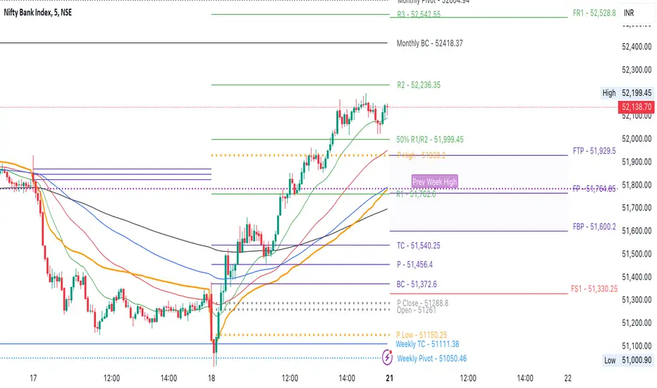
RSI/MFI Divergence Finder [idahodev]Monitoring RSI (Relative Strength Index) and MFI (Money Flow Index) divergences on a stock or index chart offers several benefits to traders and analysts. Let's break down the advantages:
Comprehensive Market View: Combining both indicators provides a more complete picture of market conditions, as they measure different aspects of price movement. RSI focuses on recent gains/losses relative to price change, while MFI incorporates volume data to assess money flow in and out of a security.
Enhanced Signal Accuracy: When divergences occur simultaneously in both RSI and MFI, it may be considered a stronger signal than if only one indicator showed divergence. This can potentially lead to more reliable trading decisions.
Identification of False Breakouts: Divergences between these indicators and price action can help identify false breakouts or misleading price movements that are not supported by underlying market strength or volume.
More Nuanced Market Understanding: By examining divergent behavior between money flow (MFI) and momentum (RSI), traders gain a more detailed comprehension of the interplay between these factors in shaping market trends.
Early Warning Signs: These divergences can act as early warning signs for potential trend reversals or changes in market sentiment, allowing traders to adjust their strategies proactively.
It's important to note that RSI/MFI divergences should be used as part of a broader trading strategy rather than solely relying on them for buy/sell signals. They can serve as valuable tools for confirming trends, identifying potential turning points, or warning against overbought/oversold conditions.
When using these indicators together, traders must be cautious of false signals, especially in choppy markets or during periods of high volatility. It's crucial to combine this analysis with other technical and fundamental factors before making trading decisions.
In summary, monitoring RSI/MFI divergences may offer a way to gain insights into the underlying strengths and weaknesses of market movements.
This utility differs from other in that it allows for a choke/threshold/sensitivity setting to help weed out noisy signals. This needs to be carefully adjusted per chart.
It also allows for tuning of the MFI smoothing length (number of bars on the current chart) as well as how many previous bars it will take into consideration when calculating RSI and MFI divergences. It will signal when it sees alignment forming between RSI and MFI divergences in a direction. You will likely need to tune this script's settings every few days or at least anytime there is a change in overall market behavior or sustained volatility.
Ultimately, the goal with this script is to provide an additional level of confirmation of weakness or strength. It should be combined with other indicators such as exhaustion, pivots, supply/demand, trendline breaks or tests, and structure changes, to name a few complementary tools or strategies. It's not meant to be a standalone buy/sell signal indicator!
Here are some settings for futures that may help you get started:
ES (4m chart)
RSI Length: 26
MFI Length: 8
MFI Smoothing Length: 32
Divergence Sensitivity: 124
Left Bars for Pivot: 10
Right Bars for Pivot: 1
NQ (4m chart)
RSI Length: 14
MFI Length: 14
MFI Smoothing Length: 21
Divergence Sensitivity: 400
Left Bars for Pivot: 21
Right Bars for Pivot: 1
YM (4m chart)
RSI Length: 14
MFI Length: 14
MFI Smoothing Length: 21
Divergence Sensitivity: 810
Left Bars for Pivot: 33
Right Bars for Pivot: 1

Multi-Timeframe SMA Plot**Introducing the Multi-Timeframe SMA Plot**
This script is designed to help traders easily visualize multiple Simple Moving Averages (SMAs) across different timeframes, all on a single chart. The Multi-Timeframe SMA Plot allows you to configure up to three different SMAs with customizable lengths, timeframes, colors, line styles, and line thicknesses, providing a versatile tool to analyze market trends in various granularities.
**Key Features**:
1. **Multiple SMA Timeframes**: You can plot SMAs from different timeframes like 15 minutes, 1 hour, daily, weekly, and more, enabling a comprehensive perspective of market movements.
2. **Fully Customizable**: Each SMA comes with options to adjust the length, timeframe, color, line style (solid, dashed, or dotted), and thickness, giving you control over how you visualize trend data.
3. **User-Friendly Inputs**: The script provides intuitive input fields that make it easy to adjust the settings without diving into the code, making it suitable for both beginner and advanced traders.
**How to Use**:
- Select the desired length and timeframe for each SMA (e.g., 50-period SMA on a 1-hour chart).
- Customize the line style and color to match your chart's theme or make distinctions between each SMA.
- Analyze how different SMAs align or cross over time to identify potential support, resistance, or trend changes.
The Multi-Timeframe SMA Plot is ideal for traders who rely on moving averages to gauge trend strength, direction, and potential entry or exit points. By having multiple SMAs from different timeframes on one chart, you can better understand the overall market sentiment and make more informed decisions.
Give this script a try and streamline your technical analysis with clear, customizable SMA lines!
**Code**: Check out the full script and start customizing it to fit your trading style. Your feedback is always welcome!

Ping Pong Bot StrategyOverview:
The Ping Pong Bot Strategy is designed for traders who focus on scalping and short-term opportunities using support and resistance levels. This strategy identifies potential buy entries when the price reaches a key support area and shows bullish momentum (a green bar). It aims to capitalize on small price movements with predefined risk management and take profit levels, making it suitable for active traders looking to maximize quick trades in trending or ranging markets.
How It Works:
Support & Resistance Calculation:
The strategy dynamically identifies support and resistance levels using the lowest and highest price points over a user-defined period. These levels help pinpoint potential price reversal areas, guiding traders on where to enter or exit trades.
Buy Entry Criteria:
A buy signal is triggered when the closing price is at or below the support level, and the bar is green (i.e., the closing price is higher than the opening price). This ensures that entries are made when prices show signs of upward momentum after hitting support.
Risk Management:
For each trade, a stop loss is calculated based on a user-defined risk percentage, helping to protect against significant drawdowns. Additionally, a take profit level is set at a ratio relative to the risk, ensuring a disciplined approach to exit points.
0.5% Take Profit Target:
The strategy also includes a 0.5% quick take profit target, indicated by an orange arrow when reached. This feature helps traders lock in small gains rapidly, making it ideal for volatile market conditions.
Customizable Inputs:
Length: Adjusts the period for calculating support and resistance levels.
Risk-Reward Ratio: Allows traders to set the desired risk-to-reward ratio for each trade.
Risk Percentage: Defines the risk tolerance for stop loss calculations.
Take Profit Target: Enables the customization of the quick take profit target.
Ideal For:
Traders who prefer an active trading style and want to leverage support and resistance levels for precise entries and exits. This strategy is particularly useful in markets that experience frequent price bounces between support and resistance, allowing traders to "ping pong" between these levels for profitable trades.
Note:
This strategy is developed mainly for the 5-minute chart and has not been tested on longer time frames. Users should perform their own testing and adjustments if using it on different time frames.

Chandelier Exit Pro w/ExtensionsChandelier Exit Pro w/Extensions
The Chandelier Exit Pro w/Extensions indicator is designed to assist traders in managing risk and identifying trend reversals. The strategy is based on the Chandelier Exit concept, originally created by Charles Le Beau. It uses the Average True Range (ATR) to calculate dynamic stop levels that adjust based on market volatility. This script not only implements the standard Chandelier Exit, but also introduces extension levels and alerts to enhance decision-making.
Key Features:
➡️Dynamic Stop Levels: The indicator calculates stop levels for both long and short positions based on an ATR multiple. This allows traders to determine exit points by monitoring when the price crosses above or below these levels. These levels adapt in real-time based on price volatility, making them a versatile tool for trend-following strategies.
➡️Extension Levels: In addition to the primary stop levels, the script includes extension levels for more advanced stop-loss management. Traders can view active and extension levels separately, providing more flexibility in their exit strategies.
➡️Labels and Visual Cues: The indicator provides dynamic labels that automatically update and follow the plotted stop levels. Labels include the ATR multiplier value (e.g., "2.5" or "2.5ext"), clearly showing the significance of each level. When price crosses below or above a level, the corresponding label is highlighted, aiding traders in quickly identifying the most relevant stop level.
➡️Bar Confirmation and Alerts: The script includes an "await bar confirmation" option to ensure that the stop levels and alerts only trigger after the bar has closed. Alerts are customizable and will notify traders when price crosses critical levels, helping to make timely decisions without the need to constantly monitor charts.
➡️Multiple ATR Levels for Enhanced Precision: The indicator supports up to four different ATR levels, each with customizable multipliers. This allows traders to set different thresholds for exits based on varying degrees of volatility. For example, Level 1 (2.5x ATR) might represent a tighter stop, while Level 4 (10x ATR) could serve as a wider stop for long-term positions.
➡️Calc_bars_count: Improves efficiency of the indicator by reducing the on-chart calculations in to the past. This input can be found at the bottom of the INPUTS tab.
How it Helps Traders:
💥Trend Identification: By using the Chandelier Exit levels, traders can identify when the trend is likely to reverse. When the price crosses below the stop level in a long trade or above the stop level in a short trade, it signals a potential exit point.
💥Volatility-based Adjustments: Unlike static stop-loss methods, the ATR-based stop levels dynamically adjust based on the market’s volatility. This means tighter stops during low volatility periods and wider stops during high volatility periods, reducing the chance of being stopped out prematurely.
💥Risk Management: The dynamic stop levels and extension levels provide a structured way to manage risk. Traders can set tighter stops for short-term trades and wider stops for longer-term trades. The script's visual labels make it easy to track these levels in real-time.
💥Automation with Alerts: The built-in alert system ensures that traders are notified when key levels are crossed. This helps to avoid emotional decision-making and allows for better execution of trading strategies.
Confluence and Price Fluidity:
One of the powerful ways to enhance the effectiveness of the Chandelier Exit indicator is by using it in conjunction with other technical analysis tools to create confluence. Confluence occurs when multiple indicators or price action signals align, providing stronger confirmation for a trade decision. For example:
🎯Support and Resistance Levels: Traders can use the Chandelier Exit levels in combination with key support and resistance zones. If the price is nearing a support level and the Chandelier Exit signals a bullish reversal, this alignment strengthens the case for entering a long position.
🎯Moving Averages: When the Chandelier Exit signals a trend reversal and this is confirmed by a crossover in moving averages (such as a 50-day and 200-day moving average), traders gain additional confidence in the trade direction.
🎯Momentum Indicators: Traders can also look for momentum indicators like RSI or MACD to confirm the strength of a trend or potential reversal. For instance, if the Chandelier Exit triggers a short signal and the RSI also shows overbought conditions, this could provide stronger confirmation to exit a long trade or enter a short position.
🎯Candlestick Patterns: Price fluidity can be monitored using candlestick formations. For example, a bearish engulfing pattern near a Chandelier Exit resistance level offers confluence, adding confidence to the signal to close or short the trade.
By combining the Chandelier Exit with other tools, traders ensure that they are not relying on a single indicator. This layered approach can reduce the likelihood of false signals and improve overall trading accuracy.
Practical Use Case:
Imagine a trader enters a long position, and the price moves favorably. Using the Chandelier Exit, the trader sets the initial stop level at 2.5x ATR below the highest close. As the price continues to rise, the stop level follows the price, locking in profits. If the market suddenly turns, the price crossing below the stop level signals an exit, helping the trader preserve gains. With extension levels, the trader can further refine exits, adjusting based on their risk tolerance and market conditions.
Good luck and I hope that you can find a place in your tool bag to use this dynamic indicator 🙏
Liquidity Pools [LuxAlgo]The Liquidity Pools indicator identifies and displays estimated liquidity pools on the chart by analyzing high and low wicked price areas, along with the amount, and frequency of visits to each zone.
🔶 USAGE
Liquidity Pools are areas where smaller participants are likely to place stop-limit orders to manage risks at reasonable swing points. These zones attract institutional traders who use the pending orders as liquidity to enter larger positions, aiming to influence price movements. By monitoring these zones, traders can anticipate market movements and potentially benefit from these dynamics.
Beyond general liquidity theory, identifying zones consistently visited by price aids in using them as support and resistance zones. By analyzing these areas, we can assess how effectively participants enter or exit these zones, helping to gauge their importance.
In the screenshots below, we will explore both sides of the same chart in more detail to display how each zone could be viewed from a bullish and bearish perspective.
Bullish Zones Example:
Bearish Zones Example:
🔶 DETAILS
The method behind this indicator focuses on identifying a swing point and tracking future interactions with it. It adaptively identifies high and low "potential zones". These zones are monitored over time; if a zone meets the user-defined criteria, the script marks and displays these zones on the chart.
🔹 Identification
The method to identify Liquidity Pools in this indicator revolves around 3 main parameters. By utilizing these settings, the indicator can be tailored to produce zones that fit the specific strategic needs of each trader.
Zone Identification Parameters
Zone Contact Amount: This setting determines the number of times each zone must be in contact with the price (and bought or sold out of) before being identified by the indicator as a Liquidity Pool.
For example: When a zone is first displayed, it is considered as having been reached 1 time. When the zone is re-tested for the first time, this is considered the 2nd contact, since the price has seen the zone a total of 2 times.
Bars Required Between Each Contact: This is used to rule out (or in) consecutive candles reaching each zone from the calculation, adding a separation length between zone contact points to refine the zones produced.
For example: When set to "2", the first contact point (first re-test) will be ignored by the script if it is not at least 2 bars away from the initial zone proposal point.
Confirmation Bars: After a zone has reached the desired Contact Amount, this setting will cause the script to wait a specified number of bars before identifying a zone. While this might initially seem counterintuitive, by waiting, we are able to watch the market's reaction to the proposed zone and respond accordingly. If the price were to continue through the potential liquidity zone Immediately, it would not be logical to consider this area as a valid Liquidity Pool.
Displayed in this screenshot, you will see the specific points we are looking for in order to identify these zones.
🔹 Display
After a Liquidity Pool is identified, its boundary line is extended to the current price to keep it in view for reference. This extension will continue until the zone is mitigated (price has closed above or below the zone), after which it will stop extending.
Candles can optionally be colored when returning to the most recent Liquidity Pool if it is still unmitigated, and will only color after the zone is displayed on the chart. Because of this, if a candle is colored within a zone, then its color comes from being inside a previously unmitigated zone.
🔹 Volume
Each time a candle overlaps an Unmitigated Zone, a percentage of its volume will be accumulated to the total for each specific zone. The volume total is displayed on the right end of the extended boundary lines.
This volume data could help to determine the importance of specific zones based on the amount of volume traded within.
Note: This volume is fractional to the percentage of candles that are contained within the zone. If a candle is 50% within a zone, The zone will receive 50% of the candle's volume added to its current total.
🔶 SETTINGS
See above for a more detailed explanation of the "Zone Identification" parameters.
Zone Contact Amount: The number of times the price must bounce from this zone before considering it as a liquidity pool.
Bars Required Between Each Contact: The number of bars to wait before checking for another zone contact.
Confirmation Bars: The number of bars to wait before identifying a zone to confirm validity.
Display Volume Labels: Toggles the display for the volume readout for each Liquidity Pool.
Fill Candles Inside Zones: Toggles the display of colored candles within Liquidity Pools.