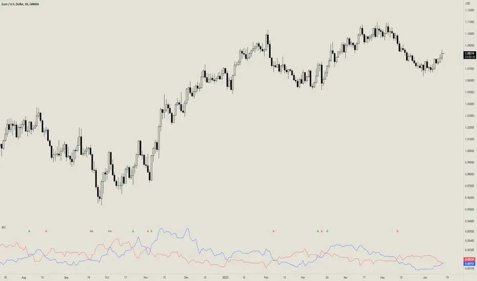
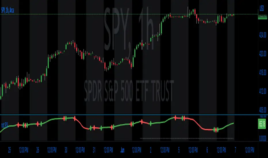
Prevailing Trend IndicatorOVERVIEW
The Prevailing Trend indicator is a technical indicator that gauges whether the price is currently trending up or down. The purpose of this indicator is to call and/or filter with-trend signals.
CONCEPTS
This indicator assists traders in identifying high-probability trend entries. The upper line (blue line on the indicator) is calculated by taking the average range (high-low) of all bullish candles. The lower line (red line on the indicator) is calculated by taking the average range of all bearish candles. When these two lines intersect and cross each other, a buy and sell signal is generated. For example, if the blue line crosses over the red line, this indicates that the average size of all bullish bars are larger than the average size of all bearish bars. This is a good sign that an uptrend might occur. Vice versa for downtrends.
HOW DO I READ THIS INDICATOR
As an entry indicator:
When the blue line crosses over the red line, go long.
When the red line crosses over the blue line, go short.
As a signal filter:
If the blue line is above the red line, only take long trades.
If the red line is above the blue line, only take short trades.
Trendtrading
ChanLun ProChanLun, also known as Entanglement Theory or "缠论", is a highly regarded technical analysis methodology that originated in China. Since its introduction in 2006, ChanLun has rapidly gained significant attention and a strong following within the Chinese trader community due to its exceptional ability to navigate complex market dynamics.
ChanLun places great emphasis on market structure, price action, momentum, and the intricate interplay between market forces. It recognizes that the market operates in cyclical patterns and aims to capture the underlying structure and rhythm of price movements. Through meticulous analysis of the intricate relationships between price and time, it provides traders with a unique perspective on market trends, potential reversals, and critical turning points.
This indicator offers a meticulous and comprehensive implementation of the ChanLun theory. It facilitates in-depth analysis and visual representation of all essential components, encompassing “Candlestick Conversion”, "Candlestick Standardization", "Fractal", "Stroke", "Segment", "Pivot", and "Buying/Selling Point".
🟠 Algorithm
🔵 Step 1: Candlestick Conversion
In ChanLun, candlestick analysis focuses less on the opening/closing prices and wicks, but rather emphasizes the price range at which the stock price has reached. As a result, the initial step in ChanLun involves converting each candlestick to contain solely the high and low prices, disregarding other elements.
🔵 Step 2: Candlestick Standardization
In the second step, the converted candlesticks are standardized to ensure strict directional consistency and eliminate the presence of inner bars or outer bars. For any adjacent two candlesticks A and B where one’s price range completely encompasses another, A and B are merged into a new candlestick C. If A is trending up from its previous candle, then C will be defined such that high(C) = max(high(A), high(B)) and low(C) = max(low(A), low(B)). If A is trending down from its previous candle, then C will be defined such that high(C) = min(high(A), high(B)) and low(C) = min(low(A), low(B)).
After completing these steps, when considering any adjacent candlesticks A and B, we can always observe either of the following conditions:
1. high(A) > high(B) and low(A) > low(B)
2. high(A) < high(B) and low(A) < low(B)
The chart below illustrates how the candlesticks would appear after this step.
🔵 Step 3: Fractals
A "Fractal" refers to the pattern formed by three consecutive "standardized" candlesticks, where the middle candlestick shows a clear higher or lower value compared to the surrounding candlesticks. When considering three adjacent candlesticks, A, B, and C, we have either of the two conditions:
1. high(B) > high(A) and high(B) > high(C) and low(B) > low(A) and low(B) > low(C)
2. high(B) < low(A) and high(B) < low(C) and low(B) < low(A) and low(B) < low(C)
For #1 above, we refer to the combination of A, B, and C as a “Top Fractal”, whereas for #2 we designate it as a “Bottom Fractal”.
The chart below illustrates all the fractals, with the red triangles indicating the Top Fractals and the green triangles indicating the Bottom Fractals.
🔵 Step 4: Strokes
A “Stroke” is a line connecting a top fractal and a bottom fractal, subject to the following rules:
1. There must be at least one "free" candlestick positioned between these fractals, meaning it is not part of either the top or bottom fractal. This guarantees that a stroke encompasses a minimum range of five candlesticks from beginning to end.
2. The top fractal must have a higher price compared to the bottom fractal.
3. The endpoint fractals should represent the highest or lowest point throughout the entire span of the stroke. (There is an option within this indicator to enable or disable this rule.)
Strokes enable traders to identify and visualize significant price swings or trends while effectively filtering out minor fluctuations.
🔵 Step 5: Segments
A "Segment" is a higher-level line that connects the starting and ending points of at least three consecutive strokes, reflecting the current trend of the market structure. It continues to extend as new strokes emerge, until there is a break in the market structure. The break occurs when an uptrend forms a lower high and lower low, or when a downtrend forms a higher high and higher low. It's worth noting that during trading ranges, it is common for strokes to exhibit a higher high and lower low or a higher low and lower high pattern (similar to inner bars and outer bars). In such cases, the strokes will be merged in a similar manner as described earlier for candlesticks, until there is a distinct break in the market structure. Segments provide a relatively stable depiction of the market trend in a higher timeframe, as opposed to strokes.
It is important to note that the algorithm used to calculate segments from strokes can be recursively applied to the generated segments again, forming higher-level segments that represent the market trend on a even larger timeframe.
🔵 Step 6: Pivots
In ChanLun, the term "Pivot" does not indicate a price reversal point. Instead, it represents a trading range where the price of a security tends to fluctuate. Within a given "Segment," the pivot is determined by the overlap of two consecutive strokes moving in the opposite direction of the segment. When two downtrend strokes A and B form a pivot P within an uptrend segment S, the upper and lower bounds of the pivot are defined as follows:
1. upper(P) = min(high(A), high(B)
2. lower(P) = max(low(A), low(B))
The pivot range is typically where consolidation occurs and where there is a high trading volume.
If a future stroke, moving in the opposite direction of the current segment, overlaps with the upper and lower bounds of the pivot, it is merged into the existing pivot and extends the pivot along the x-axis. A new pivot is formed when two consecutive strokes moving in the opposite direction of the current segment, intersect with each other without overlapping the previous pivot.
Likewise, pivots can also be recursively identified within the higher-level segments. The blue boxes below represent the "Segment Pivots" that are identified within the context of higher-level segments.
🔵 Step 7: Buying/Selling Points
There are three types of buying/selling points defined in ChanLun.
1. Type 1 Buying and Selling Points: Also known as trend reversal points. These points are where the old segments terminate and new segments are generated.
2. Type 2 Buying and Selling Points: Also known as trend continuation points. These points occur while the price is in the midst of a trend and signify the continuation of the trend. In an uptrend, the Type 2 buying point is the rebound point after the price retraces to a previous low or support level, indicating that the price may continue to rise. In a downtrend, the Type 2 selling point is the pullback point after the price rallies to a previous high or resistance level, indicating that the price may continue to decline.
3. Type 3 Buying and Selling Points: These points indicate the retests of breakouts from pivot ranges. The presence of these retest points suggests that the price has the potential to continue its upward/downward movement above/below the pivot levels.
A discerning reader may notice that these buying/selling points are lagging indicators. For example, by the time a new segment is confirmed, multiple candlesticks have already occurred since the type 1 buying/selling point of that segment.
Indeed, it is true that the buying/selling points lag behind the actual market movements. However, ChanLun addresses this issue through the utilization of multi-timeframe analysis. By examining the confirmed buying/selling points in a lower timeframe, one can gather additional confidence in determining the overall trend of the higher timeframe.
🔵 Step 8: Divergence
Another core technique in ChanLun is the application of divergence to anticipate the emergence of type 1 buying/selling points. While MACD is the most commonly employed indicator for detecting divergence, other indicators such as RSI can also be utilized for this purpose.
🟠 Summary
In essence, ChanLun is a robust approach to technical analysis that integrates the careful examination and interpretation of price charts, the application of technical indicators and quantitative tools, and a keen attention to multiple timeframes. Its objective is to identify prevailing market trends and uncover potential trading prospects. What sets ChanLun apart is its holistic methodology, which blends both qualitative and quantitative analysis to facilitate informed and successful trading decisions.
🟠 NOTE
The freely available "ChanLun | AlgoTrader" script, published by the same account, incorporates only a limited set of fundamental concepts from ChanLun.
In contrast, this script is a premium invite-only version that represents a comprehensive implementation of the complete ChanLun methodology, specifically tailored for more experienced and professional traders.
________________________________________________________________________________
该指标严格按照缠论原文实现了包括“K线标准化”、“分型”、“笔”、“线段”、“中枢”和“买卖点”在内的所有关键元素。它旨在为缠友们提供一个准确可靠的缠论实现,以便快速而精准地分析市场,从而获得更优秀的交易业绩。
该指标的主要特点如下:
1. 实时标记所有缠论元素:该指标具备实时识别和标记分型、笔、线段、中枢和买卖点的功能,提供清晰的信号和准确的趋势判断。
2. 多种笔段算法选择:提供三种不同的笔算法(“老笔”、“新笔”和“4K”)以及两种线段算法(“特征序列”和“1+1终结”),满足不同交易者个性化需求,可根据偏好和策略选择最适合的算法。
3. 三级别联立:指标同步计算并显示笔、线段和递归高级段,提供更全面的市场动态分析。
4. 自定义颜色:用户可以根据个人喜好和需求自定义指标的颜色方案,与图表风格和视觉需求完美匹配。
5. 完美实现K线回放功能:指标充分利用了K线回放功能,让交易者能够回顾和分析历史市场数据,提高对市场趋势的研究和理解,增强市场洞察力和决策能力。

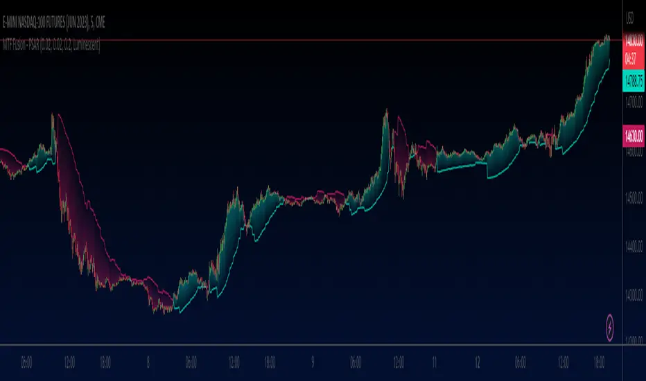
MTF Fusion - PSAR [TradingIndicators]MTF Fusion PSAR intelligently adapts to whatever timeframe you're trading - dynamically calculating Parabolic SAR (Stop and Reverse) levels combined from four appropriate higher timeframes to give you a much broader view of the market and an edge in your trading decisions. It is the third indicator in our MTF Fusion series, and leverages our MTF Fusion algorithm - only this time to visualize J. Welles Wilder Jr.'s famous Parabolic SAR indicator.
What is MTF Fusion?
Multi-Timeframe (MTF) Fusion is the process of combining calculations from multiple timeframes higher than the chart's into one 'fused' value or indicator. It is based on the idea that integrating data from higher timeframes can help us to better identify short-term trading opportunities within the context of long-term market trends.
How does it work?
Let's use the context of this indicator, which calculates PSAR levels, as an example to explain how MTF Fusion works and how you can perform it yourself.
Step 1: Selecting Higher Timeframes
The first step is to determine the appropriate higher timeframes to use for the fusion calculation. These timeframes should typically be chosen based on their ability to provide meaningful price levels and action which actively affect the price action of the smaller timeframe you're focused on. For example, if you are trading the 5 minute chart, you might select the 15 minute, 30 minute, and hourly timeframe as the higher timeframes you want to fuse in order to give you a more holistic view of the trends and action affecting you on the 5 minute. In this indicator, four higher timeframes are automatically selected depending on the timeframe of the chart it is applied to.
Step 2: Gathering Data and Calculations
Once the higher timeframes are identified, the next step is to calculate the data from these higher timeframes that will be used to calculate your fused values. In this indicator, for example, the values of PSAR levels are calculated by determining the value of the PSAR indicator for all four higher timeframes.
Step 3: Fusing the Values From Higher Timeframes
The next step is to actually combine the values from these higher timeframes to obtain your 'fused' indicator values. The simplest approach to this is to simply average them. If you have calculated the value of a PSAR level from three higher timeframes, you can, for example, calculate your 'multi-timeframe fused level' as (HigherTF_PSAR_Level_1 + HigherTF_PSAR_Level_2 + HigherTF_PSAR_Level_3) / 3.0.
Step 4: Visualization and Interpretation
Once the calculations are complete, the resulting fused indicator values are plotted on the chart. These values reflect the fusion of data from the multiple higher timeframes, giving a broader perspective on the market's behavior and potentially valuable insights without the need to manually consider values from each higher timeframe yourself.
What makes this script unique? Why is it closed source?
While the process described above is fairly unique and sounds simple, the truly important key lies in determining which higher timeframes to fuse together, and how to weight their values when calculating the fused end result in such a way that best leverages their relationship for useful TA.
This MTF Fusion indicator employs a smart, adaptive algorithm which automatically selects appropriate higher timeframes to use in fusion calculations depending on the timeframe of the chart it is applied to. It also uses a dynamic algorithm to adjust and weight the PSAR calculations depending on each higher timeframe's relationship to the chart timeframe. These algorithms are based on extensive testing and are the reason behind this script's closed source status.
What is the PSAR indicator?
The Parabolic SAR (Stop and Reverse) indicator is a technical analysis tool that helps identify potential trend reversals in price movements. It was developed by J. Welles Wilder Jr. and is widely used by traders to determine entry and exit points in the market. It consists of levels that are plotted above or below current price. The position of these plots relative to the price provides valuable information about the prevailing trend and potential reversal points.
Here's how the original PSAR indicator works:
Upward Trend: When the Parabolic SAR level is plotted below the price, it indicates an upward trend in the market. The level generally moves closer to the price as the trend progresses. This creates a parabolic curve that rises with time. Traders typically interpret this as a bullish signal, suggesting that it may be a good time to buy or hold positions.
Downward Trend: Conversely, when the Parabolic SAR level is plotted above the price, it indicates a downward trend in the market. The plot generally moves closer to the price as the trend continues, forming a parabolic curve that declines with time. This is considered a bearish signal, suggesting that it may be a suitable time to sell or avoid taking long positions.
Reversal Points: The primary purpose of the Parabolic SAR indicator is to identify potential trend reversals. When the price crosses above or below the Parabolic SAR level, it indicates a possible reversal in the trend.
The Parabolic SAR indicator is versatile and can be used in various market conditions and timeframes. It is particularly useful in trending markets, where it helps traders ride the trend and capture potential profits. However, it's important to note that the Parabolic SAR may generate false signals or provide delayed indications in sideways or choppy markets.
Included Features
Fusion PSAR levels
Filled zones to highlight trends
Full customization of PSAR parameters
Pre-built color stylings
Options
Fusion View: Show/hide the Fusion PSAR levels calculated from multiple higher timeframes
Fill Trending Zones: Show/hide the fill for 'trending zones' between price and the Fusion PSAR levels
Start: Defines the rate at which the PSAR levels move closer to the price during the initial stages of a trend (higher = faster convergence, lower = slower convergence)
Increment: Controls the rate at which the acceleration factor increases or decreases as the trend continues (higher = faster convergence, lower = slower convergence)
Max: Sets a limit on the maximum value that the acceleration factor can reach
Pre-Built Color Styles: Use a pre-built color styling (uncheck to use your own colors)
Manual Color Styles: When pre-built color styles are disabled, use these color inputs to define your own
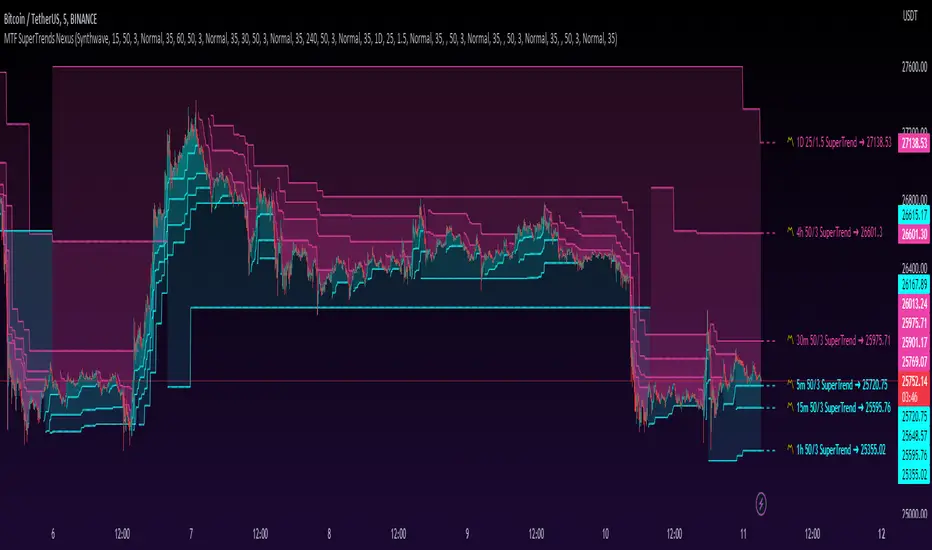
MTF SuperTrends Nexus [DarkWaveAlgo]🧾 Description:
A nexus is a connection, link, or neuronal junction where signals and information are transmitted between different elements.
The MTF SuperTrends Nexus indicator serves as a nexus between MTF SuperTrends by facilitating the visualization of up to eight multi-timeframe SuperTrends, each with its own customizable timeframe, period, factor, and coloring customization. By combining these various SuperTrends, it helps you create a comprehensive view of MTF trend dynamics and cross-timeframe confluence according to the SuperTrend indicator.
It acts as a utility/control center that brings together multiple MTF SuperTrends and allows you to visualize the interactions between them with exceptional ease-of-use and customizability, helping to provide you with valuable insights into potential trend reversals, momentum shifts, and trading opportunities.
💡 Originality and Usefulness:
While there are other multi-timeframe SuperTrend indicators available, MTF SuperTrends Nexus' semi-transparent fills create a compounding opaqueness when SuperTrends from multiple timeframes coalesce - making visual assessment of cross-timeframe confluence extremely easy. We also believe it stands above the rest with its sheer quantity and quality of settings, features, and usability.
✔️ Re-Published to Avoid Misleading Values
This script has been re-published to ensure that it does not use `request.security()` calls using lookahead_on to access future data when referencing SuperTrend calculations from other timeframes. This decreases the likelihood that the indicator will provide deceiving values. This change has been made in accordance with the PineScript documentation: "Using barmerge.lookahead_on at timeframes higher than the chart's without offsetting the `expression` argument like in `close [ ]` will introduce future leak in scripts, as the function will then return the `close` price before it is actually known in the current context" and the Publishing Rule: "Do not use `request.security()` calls using lookahead to access future data". Historical and real-time values may differ when referencing timeframes other than the chart's.
💠 Features:
8 toggleable MTF SuperTrends with customizable timeframes, periods, and factors
Compounding filled areas for easy MTF SuperTrend confluence analysis
Aesthetic and flexible coloring and color theme styling options
End-of chart labels and options for ease-of-use and legibility
⚙️ Settings:
Use a Color Theme: When this setting is enabled, all manual 'Bullish and Bearish Colors' are overridden. All plots will use the colors from your selected Color Theme - excepting those plots set to use the 'Single Color' coloring method.
Color Theme: When 'Use a Color Theme' is enabled, this setting allows you to select the color theme you wish to use.
Fill SuperTrend Areas: When enabled, the area between any MTF SuperTrend and the price bars will be filled with semi-transparent coloring.
Hide SuperTrends on Timeframes Lower Than the Chart: When this setting is enabled, any MTF SuperTrend with a timeframe smaller than that of the chart the indicator is applied to will be hidden from view.
Enable: Show/hide a specific MTF SuperTrend.
Timeframe: Set the timeframe for a specific MTF SuperTrend.
Period: Set the lookback period for a specific MTF SuperTrend.
Factor: Set the multiplier factor used for a specific MTF SuperTrend's calculation.
Bullish Color: When 'Use a Color Theme' is disabled, this will set the 'bullish color' for this specific MTF SuperTrend.
Bearish Color: When 'Use a Color Theme' is disabled, this will set the 'bearish color' for this specific MTF SuperTrend.
Enable Label: When enabled, a label will show at the end of the chart displaying the timeframe, period, factor, and current price value of this specific MTF SuperTrend.
Size: Sets the font size of this specific MTF SuperTrend's label.
Label Offset (in Bars): Sets the distance from the latest bar, in bars, at which this specific MTF SuperTrend's label is displayed.
Show Label Line: When enabled, this specific MTF SuperTrend's label will be accommodated by a dashed line connecting it to its plot.
📈 Chart:
The chart shown in this original publication displays the 5 minute chart on BTCUSDT. Displayed on the chart are 6 MTF SuperTrends: the 5m 50-period/3-factor SuperTrend, 15m 50-period/3-factor SuperTrend, 30m 50-period/3-factor SuperTrend, 1h 50-period/3-factor SuperTrend, 4h 50-period/3-factor SuperTrend, and the 1D 25-period/1.5-factor SuperTrend - offering an exemplary view of how you can easily use these MTF SuperTrends to your advantage in analyzing SuperTrend relationships across multiple timeframes.
Trendline Pivots [QuantVue]Trendline Pivots
The Trend Line Pivot Indicator works by automatically drawing and recognizing downward trendlines originating from and connecting pivot highs or upward trendlines originating from and connecting pivot lows.
These trendlines serve as reference points of potential resistance and support within the market.
Once identified, the trend line will continue to be drawn and progress with price until one of two conditions is met: either the price closes(default setting) above or below the trend line, or the line reaches a user-defined maximum length.
If the price closes(default setting) above a down trend line or below an up trend line, an "x" is displayed, indicating the resistance or support has been broken. At the same time, the trend line transforms into a dashed format, enabling clear differentiation from active non-breached trend lines.
This indicator is fully customizable from line colors, pivot length, the number lines you wish to see on your chart and works on any time frame and any market.
Don't hesitate to reach out with any questions or concerns.
We hope you enjoy!
Cheers.

nNouSignnNouSign
☆
Welcome to a path to trading success in the world of trading, where fortunes are made and dreams come true.
But amidst the excitement and possibilities, there lies the challenge of deciphering the market's complexities.
Fear not, for we present to you the ultimate weapon in your trading arsenal: the nNouSign indicator.
Prepare to embark on a thrilling journey of trading mastery as we guide you through its optimal usage, enlightening you with its potential and empowering you with the ability to navigate the markets with confidence.
Embracing the nNouSign magic as you apply the nNouSign indicator to your TradingView chart, envision a realm where the convergence of art and science births incredible trading opportunities.
• The indicator's smooth moving average line, represented by a vibrant orange hue, acts as your guiding light. It captures the essence of market sentiment and unveils the hidden patterns that govern price movements.
Decoding the colors of success, possess a mystical power to evoke emotions and ignite motivation . The nNouSign indicator harnesses this power, allowing you to personalize your trading experience.
• Choose the color of prosperity for your buy signals, perhaps a vivid shade of green. Let it symbolize the life-giving force of profits flowing into your trading account.
• As for sell signals, embrace the passionate intensity of red, signifying your ability to seize opportunities and protect your gains.
Riding the trend waves is one of the nNouSign indicator's core strengths. It lies in its ability to identify trends.
Whether the market surges upwards like a fearless tide or recedes like a wise old ocean, the indicator whispers the secrets of trend direction.
• When the moving average is conquered by the closing price, rejoice, for it signals a bullish trend.
• Conversely, when the closing price descends beneath the moving average, it reveals a bearish trend.
Harmonizing with the trading signals which are the magical spells that teleport you to the forefront of profitable trades.
Watch as the nNouSign indicator casts its spells in the form of tiny triangles on your chart.
• When a bullish trend is confirmed, a mystical triangle points upwards, signaling a buy opportunity.
• On the contrary, when a bearish trend emerges, a bewitching triangle points downwards, beckoning you to sell.
Embrace these signals and let them guide your path to success.
Unleashing the power of alerts like the modern trader(s) whom thrives on speed and efficiency.
The nNouSign indicator empowers you with its alert system , ensuring you never miss a precious trading moment.
• Customize your alerts to receive notifications when the bullish or bearish trends are confirmed.
Imagine the thrill of being the first to seize an opportunity, swiftly executing trades with confidence, and reaping the rewards.
Dance with the trendline as you journey through the market's ebb and flow, through the nNouSign indicator its visual masterpiece.
Behold the trendline , gracefully drawn on your chart.
• In the presence of a bullish trend, it steps aside, allowing the moving average to shine brightly.
• Yet, in the depths of a bearish trend, it emerges, painted in shades of red, serving as a reminder to exercise caution.
Let this visual spectacle guide your decision-making process.
☆
Intrepid trader! ,may you now have unlocked the secrets of the nNouSign indicator and embark on a journey that will forever transform your trading experience.
Armed with its wisdom and most importantly YOUR OWN WISDOM, may you possess the ability to navigate the markets with confidence and precision.
Embrace its vibrant colors, heed its trading signals and dance with the trendline as you ride the waves of market trends. Let the indicator be your constant companion, guiding you through the ever-changing tides of the financial world.
Remember, trading is not just a science; it is an art. The nNouSign indicator provides you with the tools to create your masterpiece.
Embrace its colors, for they evoke the emotions and motivation necessary for success.
Let the green of buy signals ignite your passion for profit, and the red of sell signals fuel your determination to protect your gains.
But trading is more than just following signals; it requires discipline and adaptability.
Observe the trendlines and understand the market's rhythm.
Be patient when the trend favors the bulls, and exercise cautio n when the bears take control.
The nNouSign indicator, with its magical trendline, will be your compass in navigating these changing conditions.
In the fast-paced world of trading, timing is everything. The alerts generated by the nNouSign indicator will keep you informed, ensuring you never miss an opportunity.
Stay alert, for swift and decisive action can be the key to reaping substantial rewards.
☆
Finally, remember that trading is a journey of growth and learning.
Embrace the educational aspect of using the
nNouSign indicator.
Analyze your trades, study the outcomes, and fine-tune your strategies.
With each trade , you'll gain valuable insights and develop the skills necessary for long-term success .
☆
So, fellow trader, take this guide as your roadmap to trading mastery.
Let the nNouSign indicator be your guide, entertaining you with its vibrant colors, motivating you with its signals, and educating you through each trading experience.
Embrace the power it bestows upon you, and let it unleash your full potential in the exciting world of trading.
Success awaits those who dare to seize it!
-HappyTrading- J

Ichimoku Z-Score Stochastic Oscillator with Kumo Depth Analysis---
Ichimoku Z-Score Stochastic Oscillator with Kumo Depth Analysis
---
Script Overview
Welcome to the Advanced Ichimoku Z-Score Stochastic Oscillator with Kumo Depth Analysis. This unique strategy is designed to provide a comprehensive, multi-timeframe trading view by leveraging the Ichimoku Cloud, Z-Score, Stochastic Oscillator, and an innovative implied volatility measure – the Kumo Depth. By integrating these powerful tools into one script, traders can make more informed decisions by considering trend strength, volatility, and volume in one holistic view.
Rationale & Strategy
The script was created with the rationale that trading decisions should not only be based on price action and volume, but also on market trend strength and implied volatility. The script integrates these various elements:
The Ichimoku Cloud, a versatile indicator that provides support and resistance levels, trend direction, and momentum all at once.
The Z-Score, a statistical measurement of a value's relationship to the mean (average) of a group of values.
The Stochastic Oscillator, a momentum indicator that uses support and resistance levels to determine probable trend reversals.
The Kumo Depth Analysis, an innovative measure of implied volatility and market trend strength derived from the thickness of the Ichimoku Cloud.
How It Works
This script works by providing visual buy and sell signals based on the confluence of the aforementioned tools.
Ichimoku Cloud and Z-Score: The script first calculates the Ichimoku Cloud lines for both a higher and lower timeframe and measures how much current prices deviate from the cloud using Z-Score.
Stochastic Oscillator: This Z-Score is then inputted into a Stochastic Oscillator, thus giving the oscillator a more normalized range.
Kumo Depth Analysis: Simultaneously, the thickness of the Ichimoku Cloud (Kumo) is calculated as an implied volatility indicator. This depth is normalized and used as a filter to ensure we are trading in a market with substantial trend strength.
Signals: Buy and sell signals are triggered based on the crossover and crossunder of the Stochastic Oscillator lines. Signals are then filtered based on their location relative to the Ichimoku Cloud (price should be above the cloud for buy signals and below for sell signals) and the normalized Kumo Depth.
How to Use
Signal Types: The script provides both strong and weak signals. Strong signals are accompanied by high volume, while weak signals are not. Strong buy signals are indicated with a green triangle at the top, strong sell signals with a red triangle at the bottom. Weak signals are shown as blue and yellow circles, respectively.
Trend Strength: The trend strength is shown by the normalized Kumo Depth. The greater the Kumo Depth, the stronger the trend.
Timeframes: You can customize the timeframes used for the calculations in the input settings.
Adjustments: Users can adjust parameters such as the Ichimoku settings, Stochastic Oscillator settings, timeframes, and Kumo Depth settings to suit their trading style and the characteristics of the asset they are trading.
This script is a complete trading strategy tool providing multi-timeframe, trend-following, and volume-based signals. It's best suited for traders who understand the concepts of trend trading, stochastic oscillators, and volatility measures and want to incorporate them all into one powerful, comprehensive trading strategy.

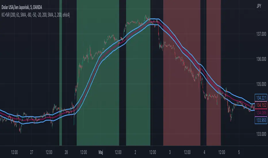
Williams %R + Keltner chanells - indicator (AS)1)INDICATOR ---This indicator is a combination of Keltner channels and Williams %R.
It measures trend using these two indicators.
When Williams %R is overbought(above upper line (default=-20)) and Keltner lower line is below price indicator shows uptrend (green).
When Williams %R is oversold(below lower line (default=-80)) and Keltner upper line is above price indicator shows downtrend (red) .
Can be turned into a strategy quickly.
2) CALCULATIONS:
Keltner basis is a choosen type of moving average and upper line is basis + (ATR*multiplier). Same with lower but minus instead of plus so basiss – (ATR*multiplier)
Second indicator
Williams %R reflects the level of the close relative to the highest high for the lookback period
3)PLS-HELP-----Looking for tips, ideas, sets of parameters, markets and timeframes, rules for strategy -------OVERALL -every advice you can have
4) SIGNALS-----buy signal is when price is above upper KC and Williams %R is above OVB(-20). Short is exactly the other way around
5) CUSTOMIZATION:
-%R-------LENGTH/SMOOTHING/TYPE SMOOTHING MA
-%R-------OVS/MID/OVB -(MID-no use for now)
-KC -------LENGTH/TYPE OF MAIN MA
-KC-------MULTIPLIER,ATR LENGTH
-OTHER--LENGTH/TYPE OF MA - (for signal filters, not used for now)
-OTHER--SOURCE -src of calculations
-OTHER--OVERLAY - plots %R values for debugging etc(ON by default)
6)WARNING - do not use this indicator on its own for trading
7)ENJOY
ChanLun [AlgoTrader]ChanLun, also known as Entanglement Theory or "缠论," is a highly regarded technical analysis methodology that originated in China. Since its introduction in 2006, ChanLun has rapidly gained significant attention and a strong following within the Chinese trader community due to its exceptional ability to navigate complex market dynamics.
ChanLun places great emphasis on market structure, price action, momentum, and the intricate interplay between market forces. It recognizes that the market operates in cyclical patterns and aims to capture the underlying structure and rhythm of price movements. Through meticulous analysis of the intricate relationships between price and time, it provides traders with a unique perspective on market trends, potential reversals, and critical turning points.
This indicator incorporates three fundamental components of the ChanLun methodology, namely "Candle Standardization," "Fractal," and "Stroke."
- "Candle Standardization" is a process in which the candles are standardized to ensure strict directional consistency and eliminate the presence of inner bars or outer bars.
- "Fractal" refers to the formation of three consecutive "standardized" bars, with the middle bar demonstrating a definitive higher or lower value compared to the bars surrounding it.
- "Stroke" is a line connecting a top fractal and a bottom fractal, subject to the strict condition that there is a minimum of one free bar positioned between them. This requirement ensures that a stroke encompasses a minimum span of five bars from end to end. It is crucial to emphasize that the top fractal consistently maintains a higher value than the bottom fractal.
Within the ChanLun algorithm, these components are processed meticulously and sequentially. The initial step involves candle standardization, where the candles are harmonized to adhere to strict criteria. Subsequently, the identification of fractals takes place by examining the standardized candles. Finally, the stroke component is applied, establishing connections between top and bottom fractals while ensuring the defined conditions are met.
The final component, stroke, enables traders to identify and visualize significant price swings or trends while effectively filtering out minor fluctuations. This functionality proves particularly valuable in recognizing major support and resistance levels, trend reversals, and chart patterns, enhancing the overall analysis process.
__________________________________________________________________________________________________________
本指标严格按照缠论原理实现了三个核心要素,分别为“K线标准化”、“分型”和“笔”。它旨在为缠友们提供准确而可靠的市场分析工具,以在交易中获得更好的表现。
该指标的特色如下:
1. 实时标记分型和笔:本指标具备实时识别和标记分型和笔的功能,以提供清晰的信号和准确的趋势判断。
2. 多种笔算法选择:本指标提供三种不同的笔算法,包括“老笔”、“新笔”和“4K”。这样的设计能够满足不同缠友的个性化需求,让大家根据自己的偏好和策略选择最适合的算法。
3. 自定义颜色:缠友们可以根据自己的喜好和需求,自定义指标的颜色方案。这样的灵活性使得指标能够与图表风格和视觉需求完美匹配。
4. 完美实现K线回放功能:本指标充分利用了K线回放功能,使缠友们能够回顾和分析历史市场数据,从而可以更好地研究和理解市场趋势,提高对市场的洞察力和决策能力。

Relative Strength, not RSIThe Smoothed Relative Strength Indicator (not RSI) with Multi-Timeframe Support is a custom indicator that combines the concepts of Relative Strength (not RSI) and Money Flow Index (MFI) to create a smoothed trend-following tool. It works on any timeframe and adapts to different market conditions.
Key Features:
Multi-timeframe support: [ The script uses the request.security function to fetch data from other timeframes, allowing users to analyze the trend on different timeframes simultaneously.
Relative Strength calculation: The script calculates the Relative Strength (not RSI) by averaging the gains and losses over a user-defined period (len).
Money Flow Index calculation: The script calculates the Money Flow Index (MFI) by considering both price and volume data. The MFI is an oscillator that ranges between 0 and 100, and it helps identify overbought or oversold conditions in the market.
Combination of Relative Strength and MFI:The indicator calculates the average of Relative Strength and MFI values to create the Trend Reversal Strength (TRS) line.
Smoothing the TRS line: The TRS line is smoothed using a Simple Moving Average (SMA) with a user-defined smoothing length (smoothLen). This helps to reduce noise and make the trend more readable.
Trend color determination: The script determines the trend color based on the slope of the smoothed TRS line. If the current value of the smoothed TRS line is higher than the previous one, the line is colored green (uptrend). If the current value is lower than the previous one, the line is colored red (downtrend).
Visual representation of trend changes: The indicator plots small circles at points where the trend color changes, making it easier to identify potential trend reversal points.
Zero line: The script draws a horizontal line at the zero level to help users gauge the market's strength or weakness relative to this level.
Usage:
This indicator can be used as a trend-following tool to identify potential entry and exit points in the market. When the smoothed TRS line is green and rising, it suggests a bullish trend, and traders may consider entering long positions. Conversely, when the smoothed TRS line is red and falling, it indicates a bearish trend, and traders may consider short positions or exiting long trades.
Please note that this indicator should be used in conjunction with other technical analysis tools and proper risk management techniques to improve the accuracy of your trading decisions.
Dynamic Trendlines Multi-TimeframeThe Dynamic Trendlines indicator is a useful tool for traders to identify potential support and resistance levels in the market. By analyzing price volatility and drawing trendlines based on high volatility candles, it helps traders visualize key price levels that may influence future price action. This indicator uses the Average True Range (ATR) as a measure of price volatility to determine the threshold for high volatility candles. This indicator can be used on multiple time frames, so just choose which one works best for you!
The underlying concept of this indicator revolves around the calculation of the True Range and Average True Range. The True Range is the maximum value among the difference between the current high and low, the absolute value of the difference between the current high and previous close, and the absolute value of the difference between the current low and previous close. The ATR is then calculated as the simple moving average of the True Range over a user-defined period (default is 14). The threshold for high volatility candles is determined by multiplying the ATR by a user-defined multiplier (default is 1.5).
The indicator identifies high volatility candles when the closing price is greater than the previous closing price plus the threshold. Based on the price action, trendlines are drawn connecting the high or low of high volatility candles. The initial color and style of the trendline are determined by whether the price is moving up or down. Green solid lines represent upward price movement, while red solid lines represent downward price movement.
As the price crosses the trendlines, the indicator tracks the number of crosses and updates the line's style accordingly. If the price crosses a trendline twice, the line style is changed to dashed, indicating the potential weakening of the support or resistance level.
This indicator works best with trading methods that focus on capturing price breakouts or reversals. Traders can use the trendlines to identify potential entry or exit points, stop-loss levels, or take-profit targets. It's important to note that this indicator should be used in conjunction with other technical analysis tools and an understanding of the overall market context to make informed trading decisions.
When using the Dynamic Trendlines indicator on TradingView, users can customize the ATR length, threshold multiplier, and the number of recent trendlines displayed on the chart. Additionally, small triangles are plotted below high volatility candles, with their color based on the trendline it starts, providing a quick visual reference for traders.
In summary, the Dynamic Trendlines indicator is a valuable tool for identifying potential support and resistance levels in the market by analyzing price volatility and drawing trendlines based on high volatility candles. It is best suited for breakout and reversal trading strategies and should be used in conjunction with other technical analysis tools for optimal results.

Moving Average Trend Sniper [ChartPrime]Today we introducing the Moving Average Trend Sniper (MATS), a unique and powerful multi faceted tool. This moving average is designed to adapt to the ever-changing market conditions. MATS provides the ideal solution for traders looking to capitalize on market trends while accurately identifying support and resistance levels.
Why MATS?
MATS was developed with the trader in mind, focusing on the key factors crucial for a successful trading strategy - trend following, support, and resistance. Its unique moving average calculation not only accounts for market volatility and momentum but also provides a stable yet adaptable foundation for your trading decisions.
MATS employs a range of mathematical techniques to provide a precise and adaptive moving average, offering traders a more effective tool for analyzing market trends and identifying support and resistance levels. One of the primary distinctions of MATS is its use of delta, the change in market conditions, to update the moving average based on the trend's strength. This delta-based updating allows the moving average to adapt to market fluctuations and helps traders make more informed decisions when entering or exiting positions. MATS also focuses on the highs in a downtrend and the lows in an uptrend to provide more reliable support and resistance. By taking these crucial market points into consideration, the moving average delivers a comprehensive and accurate insight into the market's behavior and allows traders to make more precise predictions.
MATS leverages trigonometry to determine the trend angle for the moving average. By calculating this angle, MATS can efficiently pick the correct source (either the high or the low) to provide the best support and resistance analysis. This innovative use of trigonometry ensures that the moving average is better suited to the current market conditions and provides traders with a dynamic yet stable tool to support their trading decisions.
Settings:
Length: The length input for MATS plays a crucial role in determining how responsive the moving average will be to changes in market conditions. A shorter length setting results in a more reactive moving average that closely follows price movements, whereas a longer length setting generates a smoother, less volatile average. By adjusting the length setting, traders can fine-tune the sensitivity of MATS to align with their specific trading strategies and needs.
Glow: MATS offers a customizable and visually engaging display that helps traders effectively identify market trends. The "glow" effect surrounding support and resistance levels, available as an optional feature, enables users to assess these crucial areas more easily.
Example use cases:
In the screenshot below you can see the MATS acting as both a classical support and resistance while the glow and coloring is helped to provide a more classical trend following visualization to a trader. This duel functionality can help in re-entering during market retracements.

Risk-Adjusted Return OscillatorThe Risk-Adjusted Return Oscillator (RAR) is designed to aid traders in predicting future price action by analysing the risk-adjusted performance of an asset. This oscillator is displayed directly on the price chart, unlike other oscillators.
By considering the risk-return relationship, the indicator helps identify periods of overvaluation or undervaluation, allowing traders to anticipate potential price reversals or trend accelerations.
HOW TO USE
The Risk-Adjusted Return Oscillator analyses the risk-adjusted performance of an asset to detect price reversals and accelerations. Here's how to interpret its signals:
Ranging Market:
Overbought Signal: When the RAR curve reaches the overbought level (upper red line), it suggests a potential reversal signal. It indicates that the asset may be overvalued, and a price correction or trend reversal could occur.
Oversold Signal: When the RAR curve reaches the oversold level (lower red line), it indicates a potential reversal signal. It suggests that the asset may be undervalued, and a price correction or trend reversal could take place.
Trending Market:
Overbought Signal: In a trending market, an overbought signal (RAR curve reaching upper red line) suggests trend acceleration. It indicates that the existing trend is gaining strength, and buying pressure is increasing.
Oversold Signal: In a trending market, an oversold signal (RAR curve reaching lower red line) also signifies trend acceleration. It suggests that the prevailing trend is intensifying, and selling pressure is increasing.
Thus, it's important to consider the market context when interpreting overbought and oversold signals. In ranging markets, these signals act as potential reversal points. However, in trending markets, they indicate trend acceleration, reinforcing the current price direction.
SETTINGS
Period Length: Adjust the number of bars used to calculate returns and standard deviation.
Smoothing: Define the smoothing period for the RAR curve.
Show Overbought/Oversold Signals: Choose whether to display triangular shapes for overbought and oversold conditions.

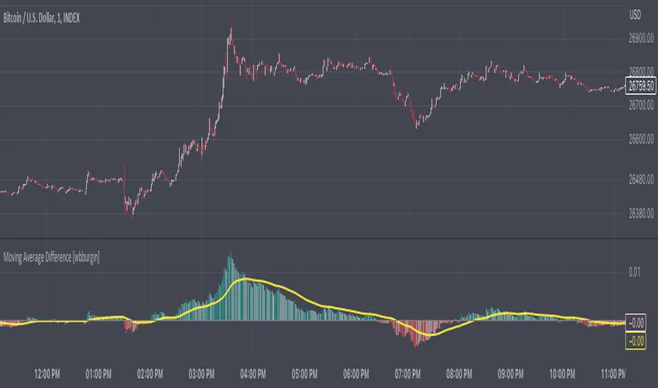
Recursive Moving Average DifferenceThe relative difference between a moving average and the price can be a useful tool for interpreting trend direction and identifying pullbacks or breakdowns. This indicator recursively finds all the relative moving average differences between two simple moving averages of your choosing and weighs them by their lengths. It then returns a value that represents the weighted average of all the moving average differences. This can represent the gradient of motion between moving averages, or the path of least resistance, which the price may revert to in certain situations.
For the settings: minimum MA represents the minimum simple moving average to consider for the total weighted average. Maximum MA represents the maximum simple moving average to consider. "Move By" is the increment that you want to move between these two moving averages.
A positive moving average difference indicates that the price is above the moving average difference (i.e. the weighted average of all moving average differences between your two selected moving averages). A negative moving average difference indicates that the price is below the moving average difference. I have added a signal with a configurable length input as well to smooth out trends.
You can configure colors and lengths, as well as the counting increment. Future updates may include different ways to calculate weights, perhaps on overlay or strategy.
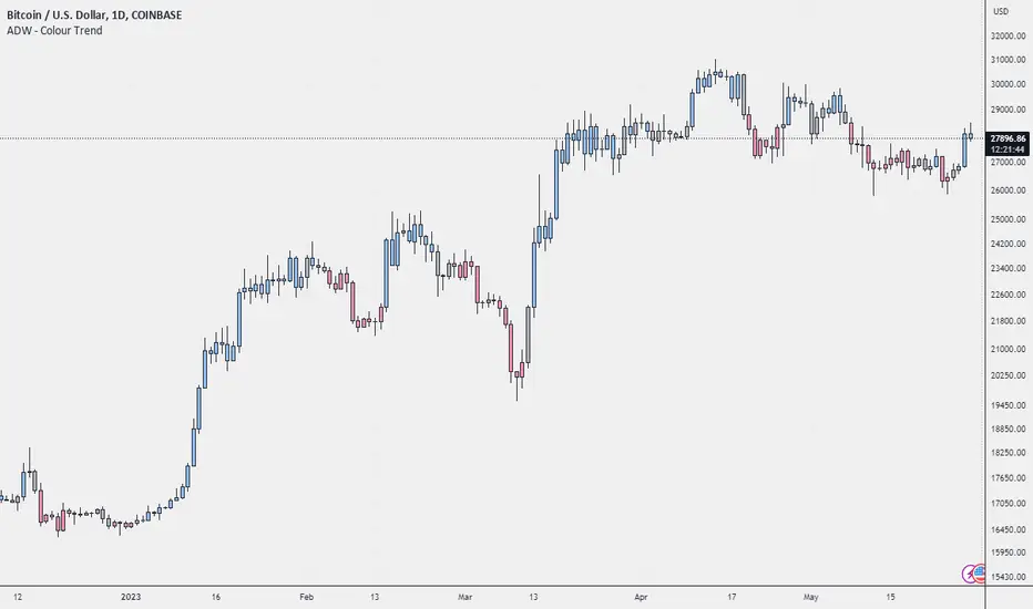
ADW - Colour TrendColour Trend is an indicator that will give you a visual representation of the trend in a selected market, and alert you when the trend changes. The green colour represents a bullish trend (prices are going up), the red colour represents a bearish trend (prices are going down), and silver represents a neutral trend (prices are relatively stable). The script calculates these trends based on the relative price levels and their moving averages.
Below is a breakdown of the script so you can better understand how these trends are defined.
Function f_p(_length, price) : This function calculates the price relative to its highest and lowest point over the given `_length` of time. This calculation is normalized by multiplying it by 100, giving us a percentage-like measure.
User Inputs : The length of the period (default 12), you can choose to show or hide bar colours (default is true).
Variables cycle_avg, cycle_counter, cycle_count, cycle_trend, cycle_col : These variables are used to calculate the trend cycles. The `cycle_avg` is the average trend cycle, `cycle_counter` keeps track of the current trend cycle, `cycle_count` counts the total number of cycles, `cycle_trend` keeps track of the direction of the cycle (1 for up, -1 for down), and `cycle_col` defines the colour of the current cycle.
Variables ph, pl, avg, mean : These variables calculate the price level relative to the highest and lowest prices (`ph` and `pl`), the average of these two levels (`avg`), and the cumulative average of the price level (`mean`).
Conditionals for cycle trend : The if-statements are checking whether the price level has reached a trend extreme and then updating the trend cycle, colour, count, and average accordingly.
Variable col and bar color : The variable `col` is used to define the colour of the bars based on the average price level. If the `show_barcolor` is true, the colour is determined based on the `avg` value.
Alert Conditions : These are conditions that will send alerts to the user when the trend changes. Specifically, the alerts occur when the colour changes from non-green to green (bull trend), from non-red to red (bear trend), or from non-silver to silver (no trend).
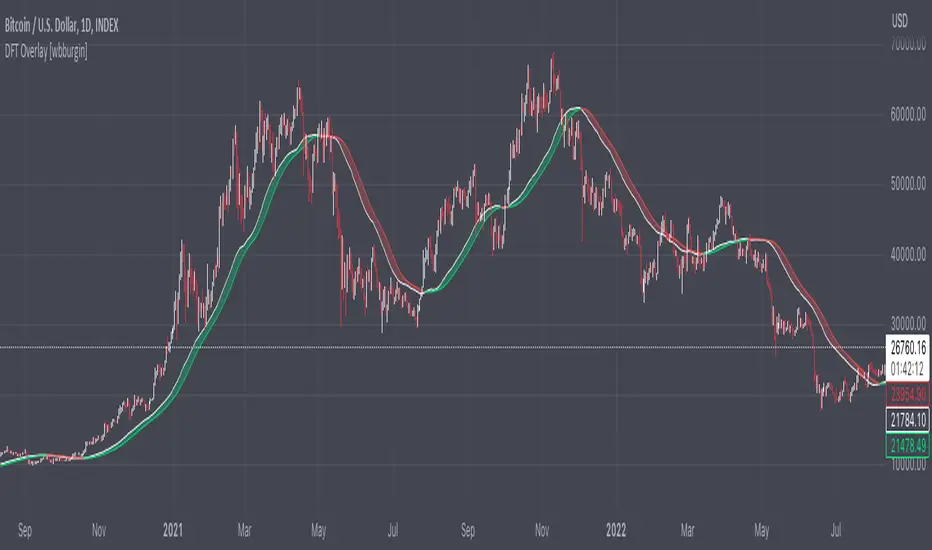
Discrete Fourier Transform Overlay [wbburgin]The discrete Fourier transform (DFT) overlay uses a discrete Fourier transform algorithm to identify trend direction. This is a simpler interpretation that only uses the magnitude of the first frequency component obtained from the DFT algorithm, but can be useful for visualization purposes. I haven't seen many Fourier scripts on TradingView that actually have the magnitude plotted on the chart (some have lines, for instance, but that makes it difficult to look into the past or to see previous lines).
About the Discrete Fourier Transform
The DFT is a mathematical transformation that decomposes a time-domain signal into its constituent frequency components. By applying the DFT to OHLC data, we can interpret the periodicities and trends present in the market. I've designed the overlay so that you can choose your source for the Fourier transform, as well as the length.
Settings and Configuration
The "Fourier Period" is the transform length of the DFT algorithm. This input indicates the number of data points considered for the DFT calculation. For example, if this input is set to 20, the DFT will be performed on the most recent 20 data points of the input series. The transform length affects the resolution and accuracy of the frequency analysis. A shorter transform length may provide a broader frequency range but with less detail, while a longer transform length can provide finer frequency resolution but may be computationally more intensive (I recommend using under 100 - anything above that might take too much time to load on the platform).
The "Fourier X Series" is the source you want the Fourier transform to be applied to. I have it set in default to the close.
"Kernel Smoothing" is the bar-start of the rational quadratic kernel used to smooth the frequency component. Think of it just like a normal moving average if you are unfamiliar with the concept, it functions similarly to the "length" value of a moving average.
AlphaTrend - ScreenerScreener version of AlphaTrend indicator:
BUY / LONG when AlphaTrend line crosses above its 2 bars offsetted line, and there would be a green filling between them
SELL / SHORT when AlphaTrend line crosses below its 2 bars offsetted line, and filling would be red then.
Default values:
Coefficient: 1, which is the factor of the trailing ATR value
Common Period: 14, which is the length of ATR MFI and RSI
AlphaTrend default uses MFI in the calculation, and MFI (Money Flow Index) needs the volume data of the chart.
If your chart doesn't have the volume data, please select the "Change Calculation" option to use RSI instead of MFI.
Screener Panel:
You can explore 20 different and user-defined tickers, which can be changed from the SETTINGS (shares, crypto, commodities...) on this screener version.
The screener panel shows up right after the bars on the right side of the chart.
Tickers seen in green are the ones that are in an uptrend, according to AlphaTrend.
The ones that appear in red are those in the SELL signal, in a downtrend.
The numbers in front of each Ticker indicate how many bars passed after the last BUY or SELL signal of AlphaTrend.
For example, according to the indicator, when BTCUSDT appears in (3) and in GREEN, Bitcoin switched to BUY signal 3 bars ago.

Adaptive Gaussian Moving AverageThe Adaptive Gaussian Moving Average (AGMA) is a versatile technical indicator that combines the concept of a Gaussian Moving Average (GMA) with adaptive parameters based on market volatility. The indicator aims to provide a smoothed trend line that dynamically adjusts to different market conditions, offering a more responsive analysis of price movements.
Calculation:
The AGMA is calculated by applying a weighted moving average based on a Gaussian distribution. The length parameter determines the number of bars considered for the calculation. The adaptive parameter enables or disables the adaptive feature. When adaptive is true, the sigma value, which represents the standard deviation, is dynamically calculated using the standard deviation of the closing prices over the volatilityPeriod. When adaptive is false, a user-defined fixed value for sigma can be input.
Interpretation:
The AGMA generates a smoothed line that follows the trend of the price action. When the AGMA line is rising, it suggests an uptrend, while a declining line indicates a downtrend. The adaptive feature allows the indicator to adjust its sensitivity based on market volatility, making it more responsive during periods of high volatility and less sensitive during low volatility conditions.
Potential Uses in Strategies:
-- Trend Identification : Traders can use the AGMA to identify the direction of the prevailing trend. Buying opportunities may arise when the price is above the AGMA line during an uptrend, while selling opportunities may be considered when the price is below the AGMA line during a downtrend.
-- Trend Confirmation : The AGMA can be used in conjunction with other technical indicators or trend-following strategies to confirm the strength and sustainability of a trend. A strong and steady AGMA line can provide additional confidence in the prevailing trend.
-- Volatility-Based Strategies : Traders can utilize the adaptive feature of the AGMA to build volatility-based strategies. By adjusting the sigma value based on market volatility, the indicator can dynamically adapt to changing market conditions, potentially improving the accuracy of entry and exit signals.
Limitations:
-- Lagging Indicator : Like other moving averages, the AGMA is a lagging indicator that relies on historical price data. It may not provide timely signals during rapidly changing market conditions or sharp price reversals.
-- Whipsaw in Sideways Markets : During periods of low volatility or when the market is moving sideways, the AGMA may generate false signals or exhibit frequent crossovers around the price, leading to whipsaw trades.
-- Subjectivity of Parameters : The choice of length, adaptive parameters, and volatility period requires careful consideration and customization based on individual preferences and trading strategies. Traders need to adjust these parameters to suit the specific market and timeframe they are trading.
Overall, the Adaptive Gaussian Moving Average can be a valuable tool in trend identification and confirmation, especially when combined with other technical analysis techniques. However, traders should exercise caution, conduct thorough analysis, and consider the indicator's limitations when incorporating it into their trading strategies.

Super Momentum Trend IndicatorThis is a trend momentum indicator that uses some of Ichimoku Cloud's core trading concepts and Supertrend, so before using this indicator, you can first understand Ichimoku Cloud, which is very helpful for understanding this indicator.
There are mainly the following ways to identify trends in Ichimoku Cloud.
1. The price is above or below the Tenkan-sen and the Kijun-sen
2. The Tenkan-sen crosses the Kijun-sen
3. The price breaks or falls below Leading Span B
4. Leading Span A crosses Leading Span B
I converted the above signal into the following expression (see chart):
1. Green dot: the price is above the Tenkan-sen and Kijun-sen
2. Red dot: the price is below Tenkan-sen and the Kijun-sen
3. Orange or blue dot: the price is between Tenkan-sen and Kijun-sen
4. Triangular symbol: the Tenkan-sen crosses the Kijun-sen, and the price continues to stand firmly above or below Kijun-sen by 2 candles (prevent fake moves)
5.B1 signal: the price breaks or falls below Leading Span B
6. B2 signal: Leading Span A crosses Leading Span B (this expresses whether the color of the cloud is green or red in Ichimoku cloud)
The default for this indicator is Ichimoku Cloud turned off so that the charts are simpler, but you can turn it on if you want to check Ichimoku Cloud.
When you use this indicator, you can observe the changes of the dots:
1. The upward trend reverses to a downward trend (see chart)
What you will see is: green dots, orange dots, red dots, unless the price suddenly falls below the Tenkan-sen and the Kijun-sen, then you will see red dots directly without orange dots .
2. The downward trend reverses to an upward trend (see chart)
What you will see is: red dots, blue dots, green dots, unless the price suddenly breaks through the Tenkan-sen and Kijun-sen, then you will see the green dots directly without the blue dots.
The dot is usually the signal on the left-hand side, the triangle is between the left-hand side and the right-hand side, and B1/B2 is the signal on the right-hand side.
I recommend entry trades separately , and using Supertrend to judge the trend. This is why this indicator also adds two Supertrends.
Why not just use the Super Trend indicator?
Because SuperTrend only provides a pure uptrend or downtrend, it does not show the upcoming reversal.
And with the momentum dots added, when you see orange or blue dots, the trend may be about to reverse.
Therefore, this indicator can better capture the changing process of the trend.
What if the momentum dots are not trending as indicated by the SuperTrend indicator?
If the Super Trend shows a downward trend, but you frequently see green and blue dots, it means that the trend is likely to reverse upwards.
On the contrary, if the Super Trend shows an upward trend, but you frequently see red or orange dots, it means that it is likely to reverse downward.
Please remember that when you want to open a position, the trend direction of SuperTrend should be consistent with the direction of the dots momentum and signals. If they are inconsistent, you need more patience to judge the trend direction.
Which signal is most important?
When using these signals, you must remember that the dot belongs to the left-hand side signal, the triangle belongs to the half left-hand side and half right-hand side signal, and B1/B2 is the right-hand side signal. So I think the B1/B2 signal is the most important because of the meaning of B1 It means that the price has broken through the support or resistance of the cloud layer, and the meaning of B2 in Ichimoku Cloud is that the cloud (kumo) has reversed.
I backtested COINBASE:BTCUSDT for several signals of this indicator, and the B2 signal has a higher win rate.
Why two SuperTrends are used?
Because I found that there are many fake moves in the market, using two SuperTrends with different ATR multipliers can effectively identify fake moves.
Most Important Reminder:
The dot display, triangle signal, and B1/B2 signals have a sequential relationship with the timing of their appearance. During the process of trend change, you will definitely see the change of the dot first, then the triangle, and finally B1/B2, this is why I suggest that you should add positions separately.
If the signals on the chart are not displayed in sequence, it means that the trend has not reversed. Then adding positions separately at the beginning can just reduce your loss.
In addition, it is strongly recommended that you must understand the formula of Ichimoku Cloud, otherwise you may misuse this indicator.
How do I use this indicator?
1. I will build positions in batches when I see the triangle, B1, and B2 signals.
2. When you see Supertrend changing trend, or reverse triangle, you can consider ending position.
3. Triangle/B1/B2 and other signals should be in the same direction as Supertrend before entering the market.
4. When you see the green dot, you don’t need to rush to get into the market, you can wait for a triangle signal, because the triangle means that the conversion line (Tenkan-sen) crosses the base line (Kijun-sen), and the price stands firm on the base line (Kijun-sen) two candles above or below
5. If you are not sure why there is a triangle/B1/B2 signal in a certain place, you can open Ichimoku Cloud in settings to confirm for yourself.
========== 中文說明 (Chinese Explanation) ==========
這是一隻趨勢動量指標,使用了部分 Ichimoku Cloud 的核心交易理念與Supertrend,所以在使用這支指標之前,您可以先搞懂 Ichimoku Cloud,對於理解這隻指標很有幫助。
在 Ichimoku Cloud 中主要有以下幾種方式來確定趨勢。
1.價格在轉換線(Tenkan-sen)與 基準線(Kijun-sen)上方或下方
2.轉換線(Tenkan-sen)與 基準線(Kijun-sen)交叉
3.價格突破或跌破 Leading Span B
4. Leading Span A 與 Leading Span B 交叉
我將上述訊號轉換成以下表達方式(看圖):
1.綠點:價格在轉換線(Tenkan-sen)與 基準線(Kijun-sen)之上
2.紅點:價格在轉換線(Tenkan-sen)與 基準線(Kijun-sen)之下
3.橘點或藍點:價格在轉換線(Tenkan-sen)與 基準線(Kijun-sen)之間
4.三角形符號:轉換線(Tenkan-sen)與 基準線(Kijun-sen)交叉,並且價格持續站穩 Kijun-sen 兩根K線(防止假突破)
5.B1 訊號:價格突破或跌破 Leading Span B
6.B2 訊號:Leading Span A 與 Leading Span B 交叉(這表達為雲的顏色是綠色還是紅色)
這隻指標的預設 Ichimoku Cloud 是關閉的,這樣圖表會更簡單,但如果你想檢查 Ichimoku Cloud ,可以隨時打開。
在你使用這支指標時,可以觀察圓點的變化:
1、向上趨勢反轉成向下趨勢(看圖)
你會看到的點順序是:綠點、橘點、紅點,除非價格突然跌破轉換線(Tenkan-sen)與 基準線(Kijun-sen),這時會直接看到紅點而沒有橘點。
2、向下趨勢反轉成向上趨勢(看圖)
你會看到的點順序是:紅點、藍點、綠點,除非價格突然突破轉換線(Tenkan-sen)與 基準線(Kijun-sen),這時會直接看到綠點而沒有藍點。
圓點通常是左側訊號,三角形介於左側與右側之間,而B1/B2則是右側訊號,我建議將倉位根據訊號顯示的前後順序分批下單,並且搭配 Supertrend來判斷趨勢,這也是為什麼這隻指標還加上了兩條 Supertrend 的原因。
為什麼不單純使用 Super Trend 指標?
因為 SuperTrend 只提供了單純的向上趨勢或向下趨勢,而不會顯示即將到來的反轉。
而加上動量圓點之後,當你看見橘點或藍點時,代表趨勢可能即將反轉。
因此這隻指標更能捕捉到趨勢的變化過程。
如果動量圓點跟 SuperTrend 指標顯示的趨勢不一樣怎麼辦?
如果 Super Trend 顯示向下趨勢,而你卻頻繁看到綠點跟藍點,代表趨勢很可能會向上反轉。
相反的,如果 Super Trend 顯示向上趨勢,而你卻頻繁看到紅點或橘點,代表很可能要向下反轉。
請記得,當你要建立倉位時,SuperTrend 的趨勢方向應該跟原點動量的方向是一致的,如果這兩個方向不一致,你需要更多的耐心來判別趨勢方向。
哪個訊號最重要?
使用這些訊號時必須記得,圓點屬於左側訊號,三角形屬於半左側半右側訊號,而B1/B2則是右側訊號,真的要我說的話,我認為B1/B2訊號最重要,因為B1的意義代表價格突破了雲層支撐或阻力,而B2在 Ichimoku Cloud 裡面的意義是雲朵(kumo)發生了反轉。
我針對這隻指標的幾個訊號對COINBASE:BTCUSDT進行了回測,B2訊號有較高的勝率。
為什麼使用了兩條 SuperTrend ?
因為我發現在市場經常會產生假突破,使用兩條 SuperTrend 並設置不同的 ATR 乘數,可以有效識別假突破。
最重要的提醒:
圓點的顯示、三角形訊號、B1/B2 這幾種訊號,它們出現的時間點是有順序關係的,趨勢轉變的過程,你一定會先看見圓點的變化,然後是出現三角形,最後出現B1/B2,這也是為什麼我建議你應該分批下單,如果圖表上的訊號沒有按照順序先後顯示,表示趨勢並沒有反轉,那麼一開始的分批下單,剛好可以降低你的虧損。
另外強烈建議,務必搞懂 Ichimoku Cloud 的公式,否則你可能會誤用這個指標。
我是如何使用這隻指標?
1.我會在看見三角形、B1、B2訊號時,分批建倉。
2.當你看到Supertrend改變趨勢,或是反向三角形時,可以考慮賣出。
3.三角形/B1/B2等訊號應該跟Supertrend是同一個方向時才可以進場。
4.當你看見綠點時,可以不用著急做多,可以再等一個三角形的訊號,因為三角形表示轉換線(Tenkan-sen)與 基準線(Kijun-sen)交叉,並且價格站穩在基準線(Kijun-sen)之上或之下兩天
5.如果你不確定某個地方為什麼會有三角形/B1/B2訊號,可以打在設定中打開Ichimoku Cloud自行確認。

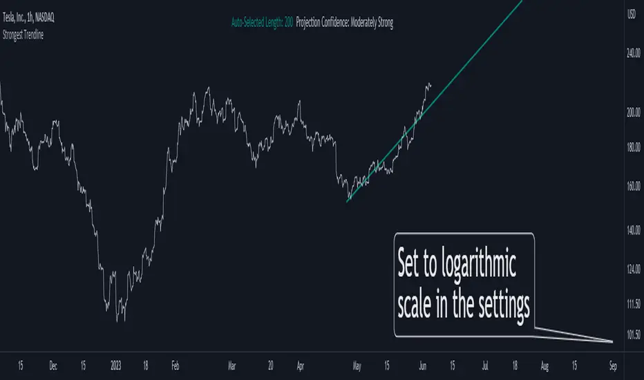
Strongest TrendlineUnleashing the Power of Trendlines with the "Strongest Trendline" Indicator.
Trendlines are an invaluable tool in technical analysis, providing traders with insights into price movements and market trends. The "Strongest Trendline" indicator offers a powerful approach to identifying robust trendlines based on various parameters and technical analysis metrics.
When using the "Strongest Trendline" indicator, it is recommended to utilize a logarithmic scale . This scale accurately represents percentage changes in price, allowing for a more comprehensive visualization of trends. Logarithmic scales highlight the proportional relationship between prices, ensuring that both large and small price movements are given due consideration.
One of the notable advantages of logarithmic scales is their ability to balance price movements on a chart. This prevents larger price changes from dominating the visual representation, providing a more balanced perspective on the overall trend. Logarithmic scales are particularly useful when analyzing assets with significant price fluctuations.
In some cases, traders may need to scroll back on the chart to view the trendlines generated by the "Strongest Trendline" indicator. By scrolling back, traders ensure they have a sufficient historical context to accurately assess the strength and reliability of the trendline. This comprehensive analysis allows for the identification of trendline patterns and correlations between historical price movements and current market conditions.
The "Strongest Trendline" indicator calculates trendlines based on historical data, requiring an adequate number of data points to identify the strongest trend. By scrolling back and considering historical patterns, traders can make more informed trading decisions and identify potential entry or exit points.
When using the "Strongest Trendline" indicator, a higher Pearson's R value signifies a stronger trendline. The closer the Pearson's R value is to 1, the more reliable and robust the trendline is considered to be.
In conclusion, the "Strongest Trendline" indicator offers traders a robust method for identifying trendlines with significant predictive power. By utilizing a logarithmic scale and considering historical data, traders can unleash the full potential of this indicator and gain valuable insights into price trends. Trendlines, when used in conjunction with other technical analysis tools, can help traders make more informed decisions in the dynamic world of financial markets.
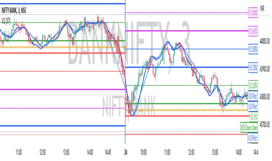
V2 Indicator: A Unique IndicatorV2 Indicator: A Unique Indicator Combining Percentage Level and 5MWAP
V2 Indicator is an innovative trading tool developed by Najoomi Ji. It incorporates a combination of percentage levels and the 5MWAP (5 Moving Weighted Average Price) to provide valuable insights into market trends. The concept of percentage chart trading was inspired by the late Gurbachan Singh, the father of Najoomi Ji.
The primary rule of the V2 Indicator involves plotting lines on the chart based on the daily market open level and the percentage levels. At the start, a line is drawn 5% above and below the market open level on both sides. The indicator identifies the direction in which the market breaks out and prompts traders to enter the market accordingly.
To manage risk effectively, trailing stop-loss levels are employed in the V2 Indicator. These levels are set at significant percentage levels, such as 5%, 35%, 65%, and 95%. The market tends to respect these levels, making them crucial points for adjusting stop-loss orders.
Traders utilizing the V2 Indicator gain an advantage by closely monitoring the interplay between percentage levels and the 5MWAP. This indicator allows them to make informed decisions about market entry points, as well as effectively manage their trades by utilizing trailing stop-loss orders.
By combining the expertise of Najoomi Ji and the inspiration from Gurbachan Singh, the V2 Indicator offers a unique approach to trading, providing traders with a comprehensive tool for identifying market trends and managing risk effectively.
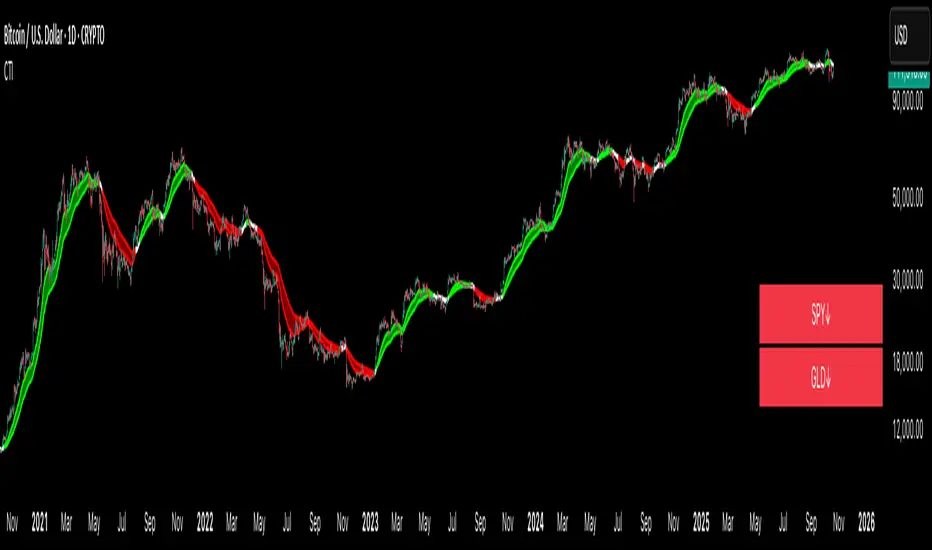
Crypto Trend IndicatorThe Crypto Trend Indicator is a trend-following indicator specifically designed to identify bullish and bearish trends in the price of Bitcoin, and other cryptocurrencies. This indicator doesn't provide explicit instructions on when to buy or sell, but rather offers an understanding of whether the trend is bullish or bearish. It's important to note that this indicator is only useful for trend trading.
The band is a visual representation of the 30-day and 60-day Exponential Moving Average (EMA). When the 30-day EMA is above the 60-day EMA, the trend is bullish and the band is green. When the 30-day EMA is below the 60-day EMA, the trend is bearish and the band is red. When the 30-day EMA starts to converge with the 60-day EMA, the trend is neutral and the band is grey.
The line is a visual representation of the 20-week Simple Moving Average (SMA) in the daily timeframe. "Bull" and "Bear" signals are generated when the 20-day EMA is either above or below the 20-week SMA, in conjunction with a bullish or bearish trend. When the band is green and the 20-day EMA is above the 20-week SMA, a “Bull” signal emerges. When the band is red and the 20-day EMA is below the 20-week SMA, a “Bear” signal emerges. The 20-week SMA can potentially also function as a leading indicator, as substantial price deviations from the SMA typically indicate an overextended market.
While this indicator has traditionally identified bullish and bearish trends in various cryptocurrency assets, past performance does not guarantee future results. Therefore, it is advisable to supplement this indicator with other technical tools. For instance, range-bound indicators can greatly improve the decision-making process when planning for entries and exits points.
True Trend Oscillator [wbburgin]The True Trend oscillator identifies trending or ranging markets with a stochastic ATR and RSI. Here are some examples for how it can be used.
Uptrends
If the candlesticks are lime green, this signals an uptrend. On the oscillator, you can identify an uptrend if the bull strength (the green line) is above the bear strength (the red line). The strength of the uptrend and the downtrend can be found by looking at the slope of these lines.
Downtrends
If the candlesticks are red, this signals a downtrend. On the oscillator, notice how the bear strength line is above the bull strength line.
Ranging Markets and Pullbacks
The True Trend oscillator can also be used to identify ranging markets or pullbacks. Let's look at the previous example again:
If you notice that the bull and bear lines are bouncing above the red weak-trend zone (as in the example above), this signals an extended trend. On the contrary, when the bull and bear lines fall into the weak-trend zone, this may indicate a larger pullback or a range to look to enter a trade again, as in this example, where the ranging candles in gray demonstrate temporary pullbacks in a larger bullish trend:
Ranges can also occur before trend reversals, so a range may also indicate a smart time to secure profits.
You can customize the ranging threshold in the settings. It can be set from 0-100 because the indicator is a stochastic.
Hope you all find this indicator useful!
