SPX500 – PREMIUM OUTLOOK | Resistance Reaction Signals Key SetupSPX500 – Technical Overview
SPX500 has already reached the 6874 resistance zone highlighted in previous analysis.
As long as the price trades below 6874 and 6888, bearish momentum is expected, with downside targets at 6860 and 6845.
A bullish retracement will require a 1H close above 6888, which would confirm renewed upside momentum toward 6918.
Key Levels
Pivot Line: 6874
Support: 6860 · 6845 · 6815
Resistance: 6888 · 6918
Trade ideas

SPX500: Break Above 6815 Could Accelerate GainsOANDA:SPX500USD |Overview
U.S. futures pointed lower on Monday as investors turned cautious following a soft, holiday-thinned trading week.
Despite Wall Street posting its strongest weekly performance since June, the Nasdaq ended November with its first monthly decline since March, as concerns grew over overstretched AI and tech valuations.
Markets are now awaiting remarks from Fed Chair Powell, along with early holiday-spending data, private payrolls, and this week’s key PCE inflation report, which may guide expectations ahead of next week’s policy meeting.
Technical Outlook
SPX500 maintains a bullish momentum while trading above 6771, although a correction from 6815 back toward 6771 is possible before attempting another upward move.
Bullish Scenario:
As long as price holds above 6771, the bullish trend remains intact.
A 4H close above 6815 will confirm continuation toward 6844 and 6888, with potential extension to 6918.
Bearish Scenario:
A 1H close below 6771 will signal the start of a bearish move toward 6713, and possibly 6670.
Pivot Line: 6815
Support: 6771 · 6713 · 6670
Resistance: 6844 · 6888 · 6918

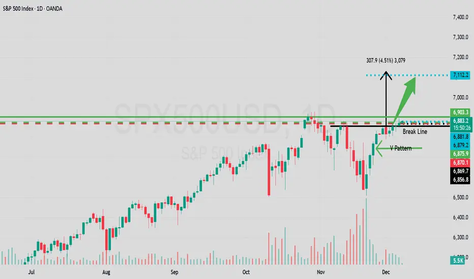
SPX/USD Daily Showing Another V Pattern To The Upside!Traders and fellow following trading friends!
Here it shows again no surprise. A V pattern to make SPX rise .
Price broke out above the break-line 6856.8
Set target price - 7112.2
Happy Santa Rally ! Go long and receive your Christmas gift from Santa Wall street $$$
Enjoy the free money and use it to buy your loved ones in your life some nice gifts :)
More on this later as she unfolds. Best of luck in all your trades.
S&P500, Waiting for breakoutAs is clear from the chart, the chart has reached its All-Time High (ATH), and a powerful fundamental stimulus is needed to break out of this level.
Traders have many strategies for their trades. In my opinion, having a fixed trading methodology and obeying the rules of that strategy are more important than anything else in trading. I do not ask others to copy my ideas; instead, I encourage others to analyze them using their own methods.
Based on my strategy, I should close my positions below resistance levels, especially at the ATH. Then, after a confirmed breakout or a sure pullback, I will enter new positions.
Therefore, I closed all my positions yesterday and am currently waiting for a small correction or a clean breakout to re-enter.
Do not forget: disciplined adherence to a sound strategy is the ultimate guarantee of success.

SPX: Fed will decide on SPX next move The inflation data, as posted through the PCE Price Index on Friday, was in the focus of markets during the previous week. This data came just a week before the FOMC meeting, scheduled for December 10th, increasing odds that Fed might cut interest rates by another 25 basis points. The PCE of 2,8% y/y in September was just a bit lower from anticipated 2,9%. In addition, Friday brought University of Michigan Consumer Sentiment for December, exposing decreased inflator expectations for both near and long term. The CME FedWatch Tool is now posting around 87% odds for a 25bps rate cut in December. On the other hand, analysts are noting that the market has already priced this cut, so the main current question is what is next for the US economy?
The S&P 500 continued its winning streak during the previous week. The index has closed the week at the level of 6.870, after previously reaching the weekly high at 6.893. The biggest weekly surprise came from Netflix, who agreed to buy Warner Bros.’ key studio and streaming assets, including HBO/HBO Max and major film-/TV-studio operations, in a deal valued at around $83 billion (equity value about $72 billion). The deal must clear regulatory review, and sources say the Trump administration views the merger “with heavy scepticism,” signalling a potentially difficult approval process under U.S. antitrust scrutiny.
Tech companies continue to dominate markets, however, Nvidia continues to struggle to gain momentum. The week ahead is promising to be a volatile one, considering the FOMC meeting, scheduled for Wednesday, December 10th. As analysts are noting, the market has already priced the 25bps rate cut. In case of any surprises on this side, a significant market correction might be triggered. In case of a rate cut, the markets might continue to price US equities at higher grounds.

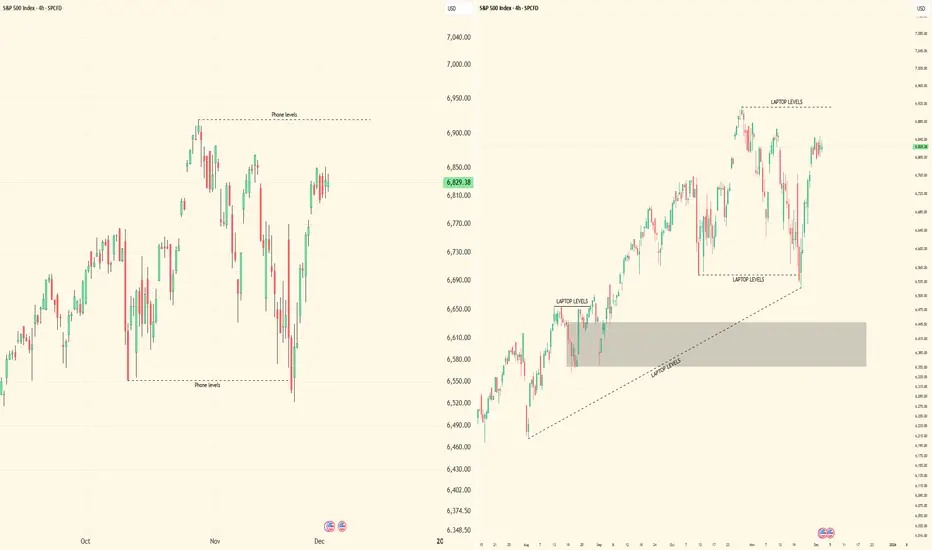
''iPhone vs Laptop Trading: The Truth Nobody Talks About''Alright, let’s get straight to it. I’ve been watching traders debate this forever — phone or laptop. Here’s my breakdown, from someone who actually trades multi-timeframe SMC setups, tracks liquidity, and executes in real-time.
⸻
1️⃣ Execution and Speed
• On a laptop, you’ve got full visibility: multiple monitors, larger charts, higher timeframe context, all indicators and order blocks at a glance.
• On iPhone? Limited view, smaller screen, harder to see context, and micro adjustments take longer.
• The reality: Speed matters. A 1-minute confirmation or lower-high break can happen fast. If you’re on a phone, you risk missing that critical move or entering late.
⸻
2️⃣ Multi-Timeframe Analysis
• Edge comes from analyzing multiple chart intervals to see the bigger picture and confirm setups.
• Laptop: Side-by-side charts, smooth workflow, all intervals visible at once.
• On the phone, switching between timeframes is clunky, slow, and mentally taxing. You’ll start guessing instead of confirming.
• Key takeaway: Serious traders of any style know: a laptop gives you the clarity, control, and precision that’s hard to achieve on a phone.
⸻
3️⃣ Precision of Orders
• Laptop: You can place precise limit entries, manage stop losses, and see where liquidity clusters are.
• Phone: Accidental taps, misclicks, or lag can cost you a trade. Especially when dealing with small spreads, tight stop losses, or micro entries.
• Lesson: Mistakes on micro orders aren’t small. They erode both capital and confidence.
⸻
4️⃣ Situational Use
• Phone trading isn’t useless. It’s fine for monitoring, tracking TPs, or checking alerts when you’re away from your desk.
• But if you’re entering, executing, or actively managing high-leverage trades — laptop wins hands down.
⸻
5️⃣ Psychology and Focus
• Laptop setups create a trading environment: focus, fewer distractions, full screen, proper charts.
• Phone trading often comes with notifications, background apps, and temptation to “glance and guess.”
• Your mindset matters as much as your setups. Treat trading like a full-time process, not a side hobby.
⸻
6️⃣ My Personal Take
• I’ve tested both. I’ll check charts on my phone sometimes — especially during quick monitoring sessions.
• But every serious execution, every multi-timeframe setup, every liquidity play — it happens on my laptop. That’s where precision, patience, and professionalism live.
⸻
🔥 Key Lessons
1. Phone = monitoring & alerts only.
2. Laptop = execution & analysis.
3. Edge isn’t just charts — it’s control, speed, and clarity.
4. You can’t shortcut this without costing yourself trades or your confidence.
⸻
💡 Visual Reference:
I posted screenshots to show the difference between iPhone and laptop trading setups. Laptop view is on the right side, showing full charts and multi-interval visibility. iPhone view is on the left side, compact and limited. This makes it clear why execution and workflow are easier on a laptop.
Bottom line: Don’t kid yourself. Your tools matter, but more importantly, how you use them separates amateurs from pros.
I’m curious — who’s still trying to trade full-time on a phone? Let’s see if they’re really ready to compete.
All is wellSo far the market is acting correctly to reset the indicators one more time and confirm the highs in futures. I still expect a pullback starting sometime today or Monday.

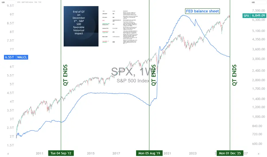
End of the Fed’s QT: What Impact on the S&P 500?The U.S. Federal Reserve (Fed) is expected to end its quantitative tightening (QT) program on December 1, 2025. This step marks the halt of the reduction of its balance sheet, after several years devoted to withdrawing liquidity from the financial system to fight post-COVID inflation. Historically, the end of a QT cycle has often coincided with an improvement in the S&P 500’s trend. However, while this development is generally a positive signal, it deserves a nuanced analysis in a context where the index is already trading at historically high valuation levels.
1) A look at history: a frequently favorable turning point
In previous episodes, notably in 2012 and 2019, the end of QT coincided with a stabilization, then a gradual acceleration of equity markets. The economic logic is intuitive: when the Fed stops reducing liquidity, pressure on financial conditions eases. Investors then anticipate a more predictable monetary environment, sometimes heralding a loosening cycle. This improvement in sentiment has often supported U.S. indices in the following months.
This is not a mechanical link, but an observed trend: the end of QT acts as a relief, removing a monetary tightening factor that weighed on valuation multiples.
2) Why remain cautious despite this signal?
The current context differs in several ways. First, by the end of 2025, the S&P 500 is showing valuation levels close to its records, driven by a handful of large technology stocks. This concentration means that part of the potential future upside is already priced in. Second, even if the Fed ends QT, this does not guarantee a rapid rate cut or a swift return to a highly accommodative monetary policy. The central bank may prefer to maintain a restrictive stance as long as inflation does not durably converge toward its target.
Finally, investors will have to deal with persistent uncertainties: slowing global growth, pressured margins in certain sectors, and geopolitical tensions that may create volatility.
3) Why keep an optimistic bias?
Despite these precautions, several factors justify measured optimism. Ending QT removes a significant headwind for equities. If inflation continues to normalize, the Fed will have greater flexibility, which could improve economic prospects and support corporate profits. In short, the end of QT is not a guarantee, but it represents a positive catalyst in a context where the risk of excessive market valuation is present.
DISCLAIMER:
This content is intended for individuals who are familiar with financial markets and instruments and is for information purposes only. The presented idea (including market commentary, market data and observations) is not a work product of any research department of Swissquote or its affiliates. This material is intended to highlight market action and does not constitute investment, legal or tax advice. If you are a retail investor or lack experience in trading complex financial products, it is advisable to seek professional advice from licensed advisor before making any financial decisions.
This content is not intended to manipulate the market or encourage any specific financial behavior.
Swissquote makes no representation or warranty as to the quality, completeness, accuracy, comprehensiveness or non-infringement of such content. The views expressed are those of the consultant and are provided for educational purposes only. Any information provided relating to a product or market should not be construed as recommending an investment strategy or transaction. Past performance is not a guarantee of future results.
Swissquote and its employees and representatives shall in no event be held liable for any damages or losses arising directly or indirectly from decisions made on the basis of this content.
The use of any third-party brands or trademarks is for information only and does not imply endorsement by Swissquote, or that the trademark owner has authorised Swissquote to promote its products or services.
Swissquote is the marketing brand for the activities of Swissquote Bank Ltd (Switzerland) regulated by FINMA, Swissquote Capital Markets Limited regulated by CySEC (Cyprus), Swissquote Bank Europe SA (Luxembourg) regulated by the CSSF, Swissquote Ltd (UK) regulated by the FCA, Swissquote Financial Services (Malta) Ltd regulated by the Malta Financial Services Authority, Swissquote MEA Ltd. (UAE) regulated by the Dubai Financial Services Authority, Swissquote Pte Ltd (Singapore) regulated by the Monetary Authority of Singapore, Swissquote Asia Limited (Hong Kong) licensed by the Hong Kong Securities and Futures Commission (SFC) and Swissquote South Africa (Pty) Ltd supervised by the FSCA.
Products and services of Swissquote are only intended for those permitted to receive them under local law.
All investments carry a degree of risk. The risk of loss in trading or holding financial instruments can be substantial. The value of financial instruments, including but not limited to stocks, bonds, cryptocurrencies, and other assets, can fluctuate both upwards and downwards. There is a significant risk of financial loss when buying, selling, holding, staking, or investing in these instruments. SQBE makes no recommendations regarding any specific investment, transaction, or the use of any particular investment strategy.
CFDs are complex instruments and come with a high risk of losing money rapidly due to leverage. The vast majority of retail client accounts suffer capital losses when trading in CFDs. You should consider whether you understand how CFDs work and whether you can afford to take the high risk of losing your money.
Digital Assets are unregulated in most countries and consumer protection rules may not apply. As highly volatile speculative investments, Digital Assets are not suitable for investors without a high-risk tolerance. Make sure you understand each Digital Asset before you trade.
Cryptocurrencies are not considered legal tender in some jurisdictions and are subject to regulatory uncertainties.
The use of Internet-based systems can involve high risks, including, but not limited to, fraud, cyber-attacks, network and communication failures, as well as identity theft and phishing attacks related to crypto-assets.
S&P500 Index Goes "Hanging Man" Due To Mixed Monthly ReturnsHanging man pattern is a single-candle bearish reversal signal that appears after an uptrend and warns that selling pressure is starting to emerge, even if the candle closes bullish.
For the S&P 500 November 2025 monthly candle, current data show a shallow pullback within an ongoing uptrend rather than a textbook hanging man, so any bearish implication is weak and unconfirmed.
What a hanging man is
A hanging man is a one-candle pattern that appears after a price advance and has a small real body near the top of the range, a long lower shadow (typically at least twice the body), and little or no upper shadow. It signals that sellers were strong intramonth (long lower wick) but buyers managed to push price back up by the close, creating a warning of potential trend exhaustion that must be confirmed by a subsequent bearish candle or downside break.
Key points for a valid hanging man on a higher timeframe such as a monthly chart are:
Clear prior uptrend into the candle.
Small body near the high, long lower shadow, minimal upper shadow.
Bearish confirmation the next bar (lower close or break of the low).
S&P 500 November 2025 monthly candle
Available November 2025 data show that the S&P 500 spent most of the month near recent highs after breaking above the 6,800 area, with the broader structure still strongly bullish into year-end 2025. While there was some downside volatility, the monthly action is better characterized as a modest pullback or consolidation after a strong advance than a classic hanging man with a pronounced long lower shadow and tiny body at the top of the range.
Several technical commentaries into late November and early December focus on resistance, overbought readings, and risk of correction, but they do not highlight a confirmed monthly hanging man or other completed exhaustion signal for 2025. One analysis even notes that a specific type of monthly exhaustion pattern is not yet in place for 2025, implying that the major trend remains intact despite short‑term risks.
Bearish technical perspectives from here
Even without a textbook monthly hanging man, there are credible bearish technical scenarios because the index is extended and pressing important resistance zones, meaning a confluence of resistance near high Fibonacci retracement levels, overbought momentum (elevated RSI), and key moving average and trendline tests as areas where a failure could trigger a correction.
Market breadth remains weak
In a short, in the year 2025 there're still no any new 52-week highs for major indices that count number of stocks above 200-Day average, like INDEX:MMTH , INDEX:NCTH , INDEX:R1TH , INDEX:S5TH and so on.
Potential bearish follow‑through in coming months generally centers on:
A failure to sustain above current resistance bands, leading to a pullback toward roughly the 5400 – 5000 region that aligns with prior supports and Fibonacci levels.
Rising volatility around macro catalysts such as inflation data and Federal Reserve policy decisions, which could accelerate downside if the index breaks below short‑term support and recent uptrend lines.
Overall, the S&P 500 remains in a longer‑term uptrend into late 2025, and any hanging‑man‑like monthly candle would be treated as an early warning, not a standalone sell signal; bears still need confirmation via a decisive break of support and a sequence of lower highs and lower lows on weekly and daily charts.

S&P 500 Bullish Layers Setup — Demand Zone Reload Opportunity!🟩 Asset:
US500 / S&P 500 — Index Market Trade Opportunity Guide (Swing / Day Trade)
💡 Trade Plan Overview
A bullish continuation plan is confirmed as the index builds strong demand-zone pressure, supported by broad fundamental economic drivers including resilient U.S corporate earnings, easing treasury yields, and steady sector rotation behavior.
This setup favors structured long positioning using disciplined multi-layer entries.
🎯 Trade Execution Plan (Thief Strategy — Layering Entry Method)
🟦 Entry Strategy (Layer Entries)
You can enter at any price, but here is the structured Thief layering approach:
Buy Limit Layer 1: 6,750
Buy Limit Layer 2: 6,800
Buy Limit Layer 3: 6,850
(You may add more layers if you prefer deeper dips — fully customizable to your personal risk appetite.)
🛡️ Stop Loss (SL)
Thief SL: 6,650
👥 Dear Ladies & Gentlemen (Thief OG’s), feel free to adjust SL based on your approach and risk preference. This SL is not mandatory — trade at your own risk tolerance.
🎯 Target Zone (TP)
Main Target: 7,050
The moving average cluster above current price acts as a strong resistance. Market structure signals a potential overbought trap, so locking profits as we approach 7,050 is wise.
👥 Dear Ladies & Gentlemen (Thief OG’s), this TP is not compulsory — take profits whenever your system confirms opportunities.
📊 Key Market Notes
Demand zones are holding strongly
Momentum shifts show bullish continuation
Price action respects MA levels
Fundamentals + rotation fuels upside
Trap zones above — manage exits properly
🔗 Correlation Watchlist (Related Markets You Must Track)
Monitoring correlated markets strengthens decision-making. Here are highly relevant pairs/assets:
💲 1. US Dollar Index (DXY)
Why important:
S&P 500 typically moves inverse to the USD.
When DXY weakens, US500 often gains momentum.
Strong USD → pressure on equities, especially tech.
Watch for:
USD pullback = bullish support for US500
USD breakout = equities face resistance
💲 2. US10Y / US Treasury Yields
Correlation:
Yields rising = stock market weakness
Yields falling = S&P 500 bullish fuel
Watch for:
Yields softening → risk-on flows
Freight in yield spikes → temporary pullbacks
💲 3. VIX (Volatility Index)
Correlation:
Low VIX = stable bullish conditions
Rising VIX = possible correction / trap
Watch for:
VIX drop under key zones → bullish confirmation
Spike above resistance → protect profits
💲 4. NASDAQ 100 (US100)
Correlation:
Strong tech = strong S&P 500
Tech weakness often leads broader index lower
Watch for:
Mega-cap earnings cycles
AI sector momentum
Bond yield reaction on tech stocks
💲 5. Crude Oil (USOIL / WTI)
Correlation:
High oil prices → inflation pressure → Fed concerns
Lower oil → relief → bullish S&P 500
Watch for:
Oil spike = possible S&P 500 pullback
Oil cool down = index strengthens
💲 6. Gold (XAU/USD)
Correlation:
Indirect & risk sentiment-based
Risk-off flows go into gold → equities may pause
Watch for:
Gold breakout = risk-off environment
Gold drop = risk-on supports S&P 500
📘 Final Thoughts
This setup follows the well-tested Thief layering strategy, combining technical demand zones with macroeconomic alignment. Stick to your personal risk comfort, manage layers wisely, and let price action guide exits.

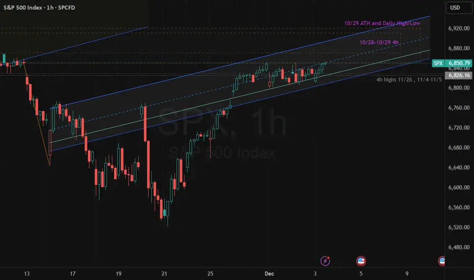
$SPX 1H – Bear Flag at Supply | Bearish- STRICT DAY TRADE IDEASTRICT DAY TRADE IDEA (Applies only for hourly chart for short term day trades within 1 to 2 days)
SP:SPX is sitting inside a rising 1H channel that continues to behave more like a bear flag than a bullish breakout setup. Price tapped only the bottom edge of the 10/29 ATH supply zone—not the core of the zone—showing early seller absorption.
We also tagged the mid-channel, which normally signals momentum weakening rather than expansion.
Check Bear-flag thesis from Nov 17 and Nov 21 and Dec 2
As long as SPX remains inside this structure, the bias stays bearish for day trading.
Break of 6,840 opens the door to a channel breakdown, with intraday targets at 6,810 → 6,780 → 6,740.
Upside invalidation is clean: bulls must break above 6,885–6,900 with strength and reclaim the ATH zone from inside, not just touch it.
Until that happens, rallies into channel mid or top = short opportunities.
Bearish Bias | Watch 6,840 | Bear Flag Until Proven Otherwise
#SPX #S&P500 SP:SPX SP:SPX CBOE:SPX #SP500 #BearFlag
SPX500 Forecast According to my forecast, SPX500 is now in a long channel where the price has almost reached its upper limit, but there is a chance that the price will break out of the channel and there will be a rapid long, although I personally doubt this because on the daily timeframe we already have a divergence, so there is a greater chance that the price will bounce off the upper limit and go short. Also, a short long is indicated by the expanding wedge, the height of which should work out almost to the remaining fibo height. This is a more global forecast and we can see the result of its working out in just a few weeks

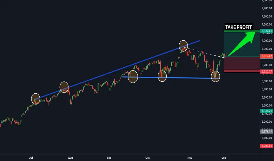
BUY SPX NOW...time to buySPX500 is in a clear upwards channel and has broken the last bit of resistance (white trendline line shown) - this is a clear confirmation that the next target will be the next resistance zone to the upside shown above (this is a great buy trade opportunity) - Time to buy!
US 500 – Signs of Fatigue After a Strong Recovery?It’s been an edgy start to December for the US 500 index, a month which is historically one of the strongest. Part of the reason could be that the last 7 trading days of November saw a 5.3% rally from lows of 6508 (Nov 21st) to 6852 (Nov 28th) as markets reacted positively to more dovish commentary from Federal Reserve policymakers, which revived the possibility of a final Fed rate cut at their last meeting of the year on December 10th.
Now Fed speakers are in the blackout period before that meeting where they are banned from publicly discussing current policy and it suddenly feels like a long time to wait to hear the outcome of their deliberations, especially with the US 500 sitting a mere 2% from its record highs of 6925 set on October 30th.
Traders also must contend with a busy data schedule across this week, and it didn’t get off to the best start with yesterday’s US ISM Manufacturing PMI survey showing activity falling further into contraction territory (below 50), with sagging order books and higher prices being paid.
However, while manufacturing activity is important to the US economy, by far the biggest driver is services and the ISM Services PMI survey is due for release tomorrow at 1500 GMT. Last month’s reading sat comfortably in expansion territory (above 50) and US 500 traders will be looking to judge this new release against the previous month. Any disappointment could weigh on sentiment and vice versa.
The available updates on the US labour market could also be important as they could impact the Fed rate decision next week. The ADP monthly private sector payrolls is released tomorrow at 1315 GMT, with the Challenger job cuts due Thursday at 1230 GMT and weekly jobless claims due at 1330 GMT. The shock weaker Challenger job cuts reading last month initiated some extra US 500 volatility and it will be interesting to see if this happens again.
The technical backdrop is also potentially crucial going into such a critical period and the current assessment can be seen below.
Technical Update: Signs of Fatigue After Strong Recovery?
The US 500 index has staged an impressive recovery of more than 5.3% since the November 21st low, as recent price weakness once again found dip buyers. This pattern has been a consistent feature in US equities for some time. However, as the chart below highlights, the latest upside move in price has yet to achieve a close above the potential resistance defined by the October and November highs.
This may be seen by some as the latest buying failing to breach a previous price peak, thereby disrupting the pattern of higher highs and higher lows. In other words, a possible sign of slowing upside price momentum.
Of course, this does not necessarily signal the end of recent price strength. However, it may remain prudent to monitor both support and resistance levels closely, as doing so may help clarify whether the latest activity reflects a slowing of upside momentum that could lead to renewed weakness, or simply a pause in the advance before fresh price strength emerges.
Potential Resistance Levels:
As strong as the rally from the November 21st low appears, it currently remains capped below 6880, the November 12th session high. As the chart below highlights, this 6880 level represents the last recovery high and failure point, where selling pressure was sufficient to reverse the price advance back to the downside. Traders are therefore possibly viewing 6880 as the first potential resistance level to the current rally.
While not a guarantee of continued upside, closing breaks above 6880 may be interpreted as a sign of price strength resuming. If this proves to be the case, closes above 6880 could pave the way for attempts to challenge 6925, the October 30th session high, with possibilities for further gains should that level also give way on a closing basis.
Potential Support Levels:
If resistance at 6680 continues to hold, traders may begin to suspect that upside price momentum is slowing, which in turn could see renewed selling pressure. At the same time, attention may shift to 6751 as the first support. This level is equal to the Bollinger mid‑average.
While much will depend on future market sentiment and price trends, closing breaks below 6751 could open scope for further declines. Such moves, if seen, may lead to tests of 6722, the 38.2% Fibonacci retracement of the latest advance, and potentially even extend toward 6681, the deeper 50% retracement.
The material provided here has not been prepared accordance with legal requirements designed to promote the independence of investment research and as such is considered to be a marketing communication. Whilst it is not subject to any prohibition on dealing ahead of the dissemination of investment research, we will not seek to take any advantage before providing it to our clients.
Pepperstone doesn’t represent that the material provided here is accurate, current or complete, and therefore shouldn’t be relied upon as such. The information, whether from a third party or not, isn’t to be considered as a recommendation; or an offer to buy or sell; or the solicitation of an offer to buy or sell any security, financial product or instrument; or to participate in any particular trading strategy. It does not take into account readers’ financial situation or investment objectives. We advise any readers of this content to seek their own advice. Without the approval of Pepperstone, reproduction or redistribution of this information isn’t permitted.

BUY SPX NOW...time to buy nowSPX 500 is in a clear upwards channel and has broken the last bit of resistance (white trendline line shown) - this is a clear confirmation that the next target will be the next resistance zone to the upside shown above (this is a great buy trade opportunity) - Time to buy SPX 500

$SPX: Wave 4 consolidation on 1-hr chartSP:SPX : looks like it's in a small degree Wave 4 consolidation. Wave 3 exceeded 161.8% of Wave 1. If Wave 5 = Wave 1, Wave 5 can reach 6950 area. However, Wave 5 = 61.8% Wave 1 is also quite common, which would take us to 6900 area.

Bearish Shark - Retest All time highs? Speculating on another run up to retest all time highs for OANDA:SPX500USD before capitulation or significant retracement event, depending on rate cuts and or QE news of course.

SPX Gann Boxtime and price targets for upcoming sell wave, i matched fib extensions with significant horizontal support levels. I also highlited fib extensions for potential time targets, we would land somewhere between 3.382 and 4, lets see how price develops until then...

SPX Gann BoxUpdated Gann BOX Fibonacchi Levels for upcoming SPX correction/wave down.
Horizontal levels mark possible price targets at fibonacchi numbers with a horizontal support. Vertical levels show time targets at fibonacchi numbers. Current move went up to .618 and .786 levsl, that indicates us a price target at 2.618 or 2.786 would be likely as well.

To chase or not to chase?Deploying risk at or near highs while volatility is getting smacked might not be the "best" risk. I'd much rather see a pullback of some sort before attempting highs. This week was a challenge, price action was sloppy, bears attempted multiple times, quickly giving up, and bulls employed large buy programs, seldom giving anyone "good" entires - creating this chase dynamic in low volatility.
While I believe the lows in November are good to trade off of, is it smart to allocate risk to or above aths from current spot?

S&P500 breakout retest? S&P 500 Trading Summary
Markets started December on weak footing, with risk assets and bonds under pressure. A global rates selloff, triggered by hawkish comments from BoJ Governor Ueda that pushed 10yr JGB yields to post-GFC highs, spilled into the US and Europe. Treasury yields jumped sharply, with the 10yr +7.2bps, its biggest rise in nearly a month.
At the same time, US data disappointed: the ISM manufacturing print took on a stagflationary tone, and higher oil prices amplified inflation concerns. This combination of higher yields + weaker data weighed on equities, leaving the S&P 500 down –0.53%.
Crypto-related volatility added to the risk-off sentiment, with Bitcoin down over 5% and major crypto-linked ETFs suffering steep year-to-date losses, though investor demand for such products remains surprisingly resilient.
On the consumer side, Cyber Monday spending grew more slowly in the US compared to Europe, partly reflecting tariff-driven pressures on US shoppers. While global online spending rose about 5%, the US lagged at 2.6%.
Overall: The session reflected renewed rate fears, stagflation worries, and softening US consumer data, all contributing to a softer tone for the S&P 500.
This communication is for informational purposes only and should not be viewed as any form of recommendation as to a particular course of action or as investment advice. It is not intended as an offer or solicitation for the purchase or sale of any financial instrument or as an official confirmation of any transaction. Opinions, estimates and assumptions expressed herein are made as of the date of this communication and are subject to change without notice. This communication has been prepared based upon information, including market prices, data and other information, believed to be reliable; however, Trade Nation does not warrant its completeness or accuracy. All market prices and market data contained in or attached to this communication are indicative and subject to change without notice.

$SPX — WEEK 49 TREND REPORTSPX — WEEK 49 TREND REPORT
Ticker: SP:SPX — 12/01/2025 @ 6812.63
Timeframe: WEEKLY
This is a reactive structural classification of SPX based on the weekly chart as of this timestamp. Price conditions are evaluated as they stand — nothing here is predictive or forward-assumptive.
⸻
1) Current Trend Condition
• Trend Duration: +2 weeks (bullish)
• Trend Reversal Level ( Origin ): 6,721
• Trend Reversal Level ( Confirmation ): 6,432
⸻
2) Structure Health
Retracement Phase:
• Uptrend (operating above 78.6%)
Position Status:
• Healthy (price above both structural layers)
⸻
3) Temperature: Warming Phase
⸻
4) Momentum: Bullish
⸻
5) Market Sentiment: Bullish
⸻
Author’s Note
This analysis is fully reactive, not predictive. Market conditions, trend structure, and behavior are classified as they appear in real time. The objective is to identify where directional shifts first occurred, where structural integrity remains intact, and where it would begin to weaken if key levels were breached.
Predictive analysis projects outcomes that do not exist yet. Without price confirmation, prediction is built on baseless assumptions. This framework avoids that entirely by responding only to verified structural changes and live conditions.
The levels shown simply identify where the current trend structure first shifted and where it would begin to lose integrity if breached. Recognizing these boundaries allows for clearer interpretation of market behavior without relying on forward guarantees, speculative projections, or unsupported assumptions.
⸻
Methodology Overview
This classification framework evaluates directional conditions using internal trend-interpretation logic that references price behavior relative to its structural layers. These relationships are used to identify when price movement aligns with the framework’s criteria for directional phases, transition points, or regime shifts. Visual elements or structural labels reflect these internal interpretations, rather than explicit trading signals or preset indicator crossovers. This framework is observational only and does not imply future outcomes.

SPX — a new ATH is coming very soon.The market has just formed a clean initial impulse and broke out of the descending Andrews pitchfork , which tells us one thing: the correction is about done. (I previously expected a triangle as a possible correction, but the structure is now clear.)
From here, the next step is simple — a new all-time high.
Targets: I’m focused on the 127.2% and 161.8% Fibonacci extensions of the correction.
Trading plan: I’m waiting for a local 3-wave pullback — and only then I’ll enter on the breakout. Entering “just because it dipped” — ❌ never an option.
