Bollinger Bands in Crypto: See Volatility in ActionHey traders! 😎
Bollinger Bands — they’re everywhere in crypto trading, and for good reason. This powerhouse of an indicator helps you track volatility and forecast price moves like a seasoned trader. Let's explore how you can use them to navigate the market, whether it's a breakout or a pullback, and effectively manage your trades.
Bollinger Bands and Volatility: Where to Look
Bollinger Bands are built around a simple moving average (SMA), with the upper and lower bands reflecting standard deviation bands. When the bands contract, it’s a sign that volatility is low — often referred to as a BB squeeze. This is typically followed by a period of expansion, where the price starts to move more aggressively. If you're watching for price breakouts, this is where to pay attention.
However, Bollinger Band width alone doesn’t always tell the full story. When using BB, combine it with other indicators for a more accurate view of market conditions:
RSI: Confirm if the market is overbought or oversold. Extreme values may signal a less sustainable breakout;
MACD: Identify trend reversals or confirm breakout strength with bullish or bearish crossovers;
Volume: High volume confirms breakout strength; low volume suggests a potential fakeout;
Stochastic Oscillator: Overbought (above 80) or oversold (below 20) conditions can indicate reversal points.
Combining Bollinger Bands with Other Indicators
Bollinger Bands work best when used in combination with momentum indicators like the MACD (Moving Average Convergence Divergence) or Stochastic Oscillator. These can help you confirm whether a trend is strong enough to break out of the BB squeeze or if a potential reversal is on the horizon:
⬆️ Price hits the upper Bollinger Band and MACD shows a bearish crossover, that could indicate a potential reversal, even if the price is technically in an uptrend.
⬇️ Price hits the lower Bollinger Band and MACD shows bullish momentum, it could suggest the price might bounce back.
Avoiding Overreliance on Bollinger Bands
While Bollinger volatility behavior can be useful, don’t rely solely on band contraction and band expansion for your trading decisions. These signals are helpful for understanding the overall market atmosphere, but they don’t provide an exact entry or exit point. It’s essential to look at the BB dynamics alongside other data points, like volume and price action, to get a fuller picture.
⚠️ When volatility is high and BB expansion is happening, be cautious. Price can get erratic, and big swings may not always give you the clearest direction. It’s important to watch for confirmation from other indicators, especially when the market is volatile.
When to Stay Away from Bollinger Bands
Bollinger Bands can sometimes be less reliable in certain market conditions. Here are a few scenarios where you should be cautious:
Strong Trending Market: When the market is trending, Bollinger Bands may give false reversal signals, as prices move consistently in one direction.
Choppy or Range-Bound Market: In sideways markets, frequent band squeezes and expansions can lead to false breakout signals with little price follow-through.
Short-Term Focus: Avoid focusing too much on short-term price movements. Instead, combine Bollinger Bands with trend-following indicators like moving averages to confirm the overall market direction.
Wrapping It Up
Bollinger Bands are like a weather forecast for market volatility, helping you spot potential breakouts. However, just like you wouldn’t rely solely on a weather report to plan your day, you shouldn’t use Bollinger Bands in isolation. You can combine them with other indicators like RSI, MACD, and volume to confirm trends and avoid false signals. Band contraction and expansion provide insight into crypto volatility, but always assess the broader market context.
This isn’t trading advice—always DYOR and make decisions based on your analysis.
This material is for informational purposes only and does not constitute trading or investment advice.
Community ideas

Best Trend Following Strategies for Gold. XAUUSD Day Trading
The recent bull run on Gold is a perfect example of a strong trending market. For traders, such sentiment always provides very profitable trading opportunities.
In this article, I will share 3 best trend-following strategies for day trading Gold that showed extremely high performance the last 3 years.
So what I did, I back tested 4H/1H time frame since the middle of February of 2023 when the bull market started.
I tested various strategies: price action, SMC, multiple indicators, candlestick patterns; and I was looking for the ones that showed the highest accuracy and profitability.
1. Moving Averages Crossover
The first strategy that showed a very high performance was based on a crossover of 2 moving averages.
Exponential MA with 30 length.
Simple MA with 9 length.
For entry signal, Simple MA should cross Exponential MA from the downside and a candle should close above both MAs'.
Stop loss will b e below the closest horizontal support.
The setup is considered to be profitable if, after the entry, the price moved up at least by pips distance from entry to stop loss.
13 setups we spotted.
9 of them were profitable.
Total winning rate is 69%.
2. Trend-Following Patterns
The second strategy that showed a very high performance was based on classic price action patterns.
I was looking for bullish patterns like bullish flag, falling wedge, horizontal range, double bottom, head and shoulders, ascending triangle, cup & handle.
Bullish confirmation was a breakout and a candle close above a neckline of the pattern.
The pattern is considered to be losing if after the breakout of the neckline, the price dropped below its lows.
The pattern is considered to be profitable if, after the entry, the price moved up at least by pips distance from entry to stop loss.
I found and tested 37 bullish patterns.
According to the rules that I described above, 31 pattern turned out to be profitable.
That gives 83% winning rate.
3. Break of Structure (BoS)
The Break of Structure strategy is very old and based on breakouts of current highs.
In a bullish trend, after the price violates the levels of a current Higher High HH, a bullish continuation is expected.
A long trade is opened after the candle closes above HH or on a retest.
With such a strategy, Stop Loss is lying below the last Higher Low HL.
The setup is considered to be profitable if, after the entry, the price moved up at least by pips distance from entry to stop loss
For the same period, I identified 21 Breaks of Structure.
According to the rules, 18 setups were profitable.
Total win rate is 85%.
Remember that you should not overestimate the performance of these strategies. They work perfectly only in times of a strong bullish market. Such periods are extremely rare.
However, once you see a strong bullish season, these strategies will help you to get maximum from it.
❤️Please, support my work with like, thank you!❤️
I am part of Trade Nation's Influencer program and receive a monthly fee for using their TradingView charts in my analysis.

are you ignoring the power of divergence in trading?Let’s talk about divergences - the closest thing we have to seeing the future in technical analysis.
Price is lying to you all the time. Indicators lie too. But when price and indicator start lying in different directions - that’s divergence. And that moment, when the lies don’t match anymore, is where reversals are often born.
Imagine a car climbing a hill. It’s still moving forward, but the engine is clearly dying, speed is dropping. That’s a trend with divergence. Price still pushes in the old direction, but momentum is already bailing out.
Classic bullish divergence:
- Price makes a lower low
- Your indicator (RSI, MACD, whatever you use) makes a higher low
Translation into normal human language: sellers pushed price even lower, but they did it with less strength than before. The punch is weaker. That’s often how downtrends fade and bottoms form.
Classic bearish divergence:
- Price makes a higher high
- Indicator makes a lower high
Market makes a fresh high, everyone gets euphoric, but under the hood momentum is already dropping. That’s how tops are made - not with fireworks, but with quiet exhaustion.
Why divergences are so powerful:
Because most TA tools react to what already happened. Divergence is one of the few things that lets you catch when the current trend is running out of fuel before the actual reversal candle hits you in the face.
A few simple rules I use so divergences don’t kill my account:
1. Higher timeframe - stronger signal
H1 divergence beats M5. H4 and Daily are kings. On low timeframes, the market draws divergences every time it sneezes.
2. I never trade divergence alone
Best combo: divergence + level.
Support/resistance, demand/supply, trendline, key zone - if price shows divergence exactly there, that’s where I pay attention.
3. I don’t try to nail the exact top or bottom
Divergence is a warning, not an entry trigger. I wait for price action: break of structure, impulse in the new direction, retest. Let the market show it really wants to turn.
4. Stops are not optional
Bullish divergence - stop usually goes under the last low.
Bearish divergence - above the last high.
Otherwise you’ll watch a “strong signal” keep diverging while your account converges to zero.
There is also hidden divergence - when price makes a higher low, but the indicator makes a lower low (in an uptrend), or the opposite in a downtrend. That’s more about trend continuation: the market is correcting, but momentum hinting that the main trend is still strong.
Maybe I’m wrong, but divergence is the only TA signal I still respect after watching thousands of indicators lie to people for years.
The market doesn’t reverse out of nowhere. It first slows down, runs out of fuel, and only then turns. Divergence is you watching the fuel gauge, not just the speedometer.
Next time you see a clean trend, don’t just stare at candles. Glance at your RSI or MACD and ask:
“Are you sure you still believe in this move?”
If price says “yes” and momentum says “no” - that’s where things get interesting.

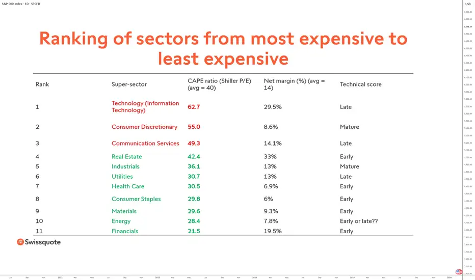
Sectors that could outperform the S&P 500 (methodology)While the S&P 500 is still trading at all-time highs and appears very expensive in valuation terms, is it possible to optimize and diversify by identifying sectors that could outperform the S&P 500 over the coming months? Vincent Ganne presents his methodological answer. The research is conducted within the 11 “super sectors” of the S&P 500 index.
Analysis methodology applied to the 11 super sectors that make up the S&P 500 index: CAPE ratio + net margin + average medium/long-term technical score
1) Shiller P/E (CAPE ratio)
The CAPE ratio (Cyclically Adjusted Price-to-Earnings) measures the valuation level of a market by comparing its price to the average real earnings (inflation-adjusted) over 10 years.
It helps smooth economic and accounting cycles and is mainly used to assess the relative expensiveness of a market over the long term. Historically, a high CAPE is associated with lower future returns over several years.
2) Net margin
The net margin of a sector measures the average final profitability of companies within the sector, i.e. the share of revenue that remains as net profit after all costs. At the sector level, this is a weighted average of the net margins of the companies in the sector (often weighted by market capitalization).
3) Average medium/long-term technical score
A technical score that qualifies the maturity of the trend according to the ratings “early”, “mature”, and “late”. From a technical analysis perspective, potential outperformance is more likely to be found in the “early” and “mature” categories. The rating is based on technical analysis of monthly and weekly charts.
By combining these three criteria, the objective is to identify sectors that offer a reasonable valuation, sufficient structural profitability, and a technical momentum that remains exploitable. This approach aims to avoid sectors that are highly performant in terms of earnings growth but already significantly overvalued and technically in a late-cycle phase.
Sales and earnings growth data show a strong concentration of recent performance in technology and, to a lesser extent, industrials. However, these sectors are also among the most expensive in terms of the CAPE ratio, which limits their potential for relative outperformance over the medium term, despite high margins and solid earnings growth.
The table below presents the results of the research. The best opportunities are found among sectors that are inexpensive (see CAPE ratio), with a net margin above average and a technical score that is not classified as “late”.
Conversely, several sectors display a more balanced profile. Financials stand out with a CAPE ratio significantly below average, robust net margins, and a still favorable technical positioning. Defensive sectors such as consumer staples and healthcare also show more moderate valuations, with technical scores classified as “early”, suggesting potential sector rotation in their favor in the event of an economic slowdown or increased volatility.
Real estate and utilities also deserve particular attention. Although their earnings growth is more modest, their high margins and valuations that have become more attractive again after several quarters of underperformance could make them credible candidates for relative outperformance if monetary conditions ease.
DISCLAIMER:
This content is intended for individuals who are familiar with financial markets and instruments and is for information purposes only. The presented idea (including market commentary, market data and observations) is not a work product of any research department of Swissquote or its affiliates. This material is intended to highlight market action and does not constitute investment, legal or tax advice. If you are a retail investor or lack experience in trading complex financial products, it is advisable to seek professional advice from licensed advisor before making any financial decisions.
This content is not intended to manipulate the market or encourage any specific financial behavior.
Swissquote makes no representation or warranty as to the quality, completeness, accuracy, comprehensiveness or non-infringement of such content. The views expressed are those of the consultant and are provided for educational purposes only. Any information provided relating to a product or market should not be construed as recommending an investment strategy or transaction. Past performance is not a guarantee of future results.
Swissquote and its employees and representatives shall in no event be held liable for any damages or losses arising directly or indirectly from decisions made on the basis of this content.
The use of any third-party brands or trademarks is for information only and does not imply endorsement by Swissquote, or that the trademark owner has authorised Swissquote to promote its products or services.
Swissquote is the marketing brand for the activities of Swissquote Bank Ltd (Switzerland) regulated by FINMA, Swissquote Capital Markets Limited regulated by CySEC (Cyprus), Swissquote Bank Europe SA (Luxembourg) regulated by the CSSF, Swissquote Ltd (UK) regulated by the FCA, Swissquote Financial Services (Malta) Ltd regulated by the Malta Financial Services Authority, Swissquote MEA Ltd. (UAE) regulated by the Dubai Financial Services Authority, Swissquote Pte Ltd (Singapore) regulated by the Monetary Authority of Singapore, Swissquote Asia Limited (Hong Kong) licensed by the Hong Kong Securities and Futures Commission (SFC) and Swissquote South Africa (Pty) Ltd supervised by the FSCA.
Products and services of Swissquote are only intended for those permitted to receive them under local law.
All investments carry a degree of risk. The risk of loss in trading or holding financial instruments can be substantial. The value of financial instruments, including but not limited to stocks, bonds, cryptocurrencies, and other assets, can fluctuate both upwards and downwards. There is a significant risk of financial loss when buying, selling, holding, staking, or investing in these instruments. SQBE makes no recommendations regarding any specific investment, transaction, or the use of any particular investment strategy.
CFDs are complex instruments and come with a high risk of losing money rapidly due to leverage. The vast majority of retail client accounts suffer capital losses when trading in CFDs. You should consider whether you understand how CFDs work and whether you can afford to take the high risk of losing your money.
Digital Assets are unregulated in most countries and consumer protection rules may not apply. As highly volatile speculative investments, Digital Assets are not suitable for investors without a high-risk tolerance. Make sure you understand each Digital Asset before you trade.
Cryptocurrencies are not considered legal tender in some jurisdictions and are subject to regulatory uncertainties.
The use of Internet-based systems can involve high risks, including, but not limited to, fraud, cyber-attacks, network and communication failures, as well as identity theft and phishing attacks related to crypto-assets.
POINT & FIGURE🔸🔸🔸 1 - Back to the Roots: Learn the Theory, Improve Signal 🔸🔸🔸
Many traders believe that history repeats itself. Others think past performance can clearly explain what will happen next. The most common mistake is believing that technical indicators, calculated only from past data, can predict the future.
In reality, price charts do not show the future. They show only what has already happened and what is happening right now. Nothing more.
For this reason, we do not use charts as prediction tools. We use them as decision tools. Their purpose is not to tell us what will happen, but to help us build a roadmap in an uncertain future - a strategy, not a forecast.
To do this properly, we must understand the theory behind price behavior. Without theory, charts become pictures. With theory, they become structure.
That is why learning theory comes first.
🔸🔸🔸 2 - Point & Figure 🔸🔸🔸
Financial markets produce more information than traders can process. Prices move constantly, news never stops, and decisions must often be made under pressure. The real challenge is not accessing data, but turning that data into something useful.
Point & Figure (P&F) charts were created to address this problem. Instead of reacting to every small fluctuation, they record only meaningful price movement. By removing time and minor noise, Point & Figure charts provide a clear and structured view of market behavior.
Point & Figure charts display price movement only. Time is completely ignored. This is the main difference between Point & Figure charts and traditional bar charts.
In bar charts, both price and time are part of the structure. The vertical axis shows price, while the horizontal axis represents time. As time passes, new bars are added to the right side of the chart. Even if price stays the same, a new bar is still printed for each time period.
Point & Figure charts work in a very different way. There is no time axis. The horizontal space does not represent days or hours. The chart grows only when price moves enough to matter.
Price is plotted using fixed price boxes.
When price rises, Xs are added.
When price falls, Os are added.
If price continues moving in the same direction, the chart stays in the same column. For example, if price rises continuously for 5 days without a pullback equal to the reversal amount, this entire move appears as a single column of Xs. In a bar chart, the same move would create 5 separate bars.
If price does not meet the predefined rules, nothing is added to the chart. No X, no O. In contrast, time-based charts will always print a new bar simply because time has passed.
🔸🔸🔸 3 - Point & Figure Graph 🔸🔸🔸
Before drawing a Point & Figure chart, two parameters must be defined:
Box Size
The box size determines how much price movement is required to add a new X or O.
In this example, the box size is set to $20 . This means:
Every $20 rise adds one X upward.
Every $20 drop adds one O downward.
Reversal Amount
The reversal amount defines how many boxes price must move in the opposite direction to start a new column.
In Point & Figure charts, Xs and Os never appear in the same column. Each column contains only Xs or only Os.
In this example:
Box size = $20
Reversal amount = 3 boxes
This means a reversal requires a $60 move in the opposite direction.
Graph A
If the current column is an X column and price continues to rise, new Xs are added to the same column as long as the box size rule is met.
Graph B
When price falls by 3 boxes ($60), a new column begins to the right. Three 0s are placed starting one box below the highest X of the previous column.
Graph C
If price continues to fall, additional Os are added downward in the same column.
Graph D
If price then rises by 3 boxes ($60), another new column starts. Three Xs are placed one box above the lowest O of the previous column.
Graph E
As long as price continues higher without another 3-box reversal, Xs keep extending in the same column.
🔸🔸🔸 4 - The Rules for Plotting Point & Figure Charts 🔸🔸🔸
Before drawing a Point & Figure chart, a few basic rules must be defined. These rules determine which price source will be used and how price movement will be measured. The chart can be built using Close prices or High–Low data , and the box size can be calculated in different ways, such as Fixed value, Percentage, or ATR-based methods.
Each choice affects how sensitive the chart is to price movement and how much noise is filtered out. Understanding these rules is essential, because a Point & Figure chart only reacts when price movement meets the predefined conditions - nothing more, nothing less.
📌 4.1- High-Low Price Source
Preference is always given to price movements that continue the current trend. The price in the opposite direction is considered only if the trend cannot be extended.
The process starts by defining two key parameters: box size and reversal amount. In this example, the box size is set to $20, and the reversal amount is 3 boxes. These values determine when the chart should update.
The algorithm first reads the high and low prices of the current timeframe candle. The next step depends on the current column direction.
4.1.1 - When the Current Column Is Xs (Uptrend)
If the chart is currently in a column of Xs , preference is given to upward price movement.
The algorithm first checks whether the current candle's high is at least one box above the previous high.
If this condition is met and the box is fully filled, new Xs are plotted in the same column.
If the price does not move high enough to extend the X column, only then is the low price checked.
If the candle's low falls at least three boxes below the previous high, a reversal occurs:
A new column begins to the right.
Three Os are plotted, starting one box below the highest X of the previous column.
If neither condition is met, the chart remains unchanged.
4.1.2 - When the Current Column Is Os (Downtrend)
If the chart is in a column of Os , preference is given to downward price movement.
The algorithm first checks whether the current candle's low is at least one box below the previous low.
If the box is fully filled, new Os are added to the same column.
If the price does not extend the O column, the algorithm then checks the high price.
If the candle's high rises at least three boxes above the previous low, a reversal is triggered:
A new column starts to the right.
Three Xs are plotted, starting one box above the lowest O of the previous column.
Again, if neither condition is met, no action is taken.
📌 4.2 - Close Price Source
When the Close Price is used as the price source, the same plotting algorithm applies without any structural changes. The only difference is that high and low values are ignored. All decisions - box extensions and reversals - are made using closing prices only . If the close fills a box in the direction of the current column, new Xs or Os are plotted. If the close reaches the reversal amount in the opposite direction, a new column is started.
📌 4.3 - Box Size Method
Box size defines how much price must move before a new X or O is plotted on a Point & Figure chart. For this reason, box size directly controls the sensitivity of the chart. A small box size produces more signals and more noise, while a larger box size filters noise but reacts more slowly.
Choosing the correct box size is one of the most important decisions in Point & Figure charting. Markets differ in price level and volatility, and these characteristics can also change over time. A single box size cannot work equally well for every instrument or every market condition.
Each method has its strengths and weaknesses. The key is not finding a "perfect" box size, but choosing a method that matches the behavior of the market and the objectives of the trader.
To address this, Point & Figure charts commonly use three different box size methods:
4.3.1 - Fixed Box Size
The box size is defined as a fixed price value (for example, $20 per box). This method is simple and easy to understand, but it does not adapt to changing volatility.
4.3.2 - Percentage Box Size
In the percentage box size method, each box represents a constant percentage of the current price rather than a fixed price value.
Using a percentage-based box size helps normalize charts across markets with different price ranges and makes long-term comparisons more meaningful. However, because the box size is recalculated as price changes, the chart effectively adapts continuously. Rising prices increase the reversal distance, which can delay reversals and extend trends. Falling prices reduce the reversal distance, potentially triggering reversals more quickly.
While this method improves adaptability compared to fixed box sizes, it does not directly measure volatility. In markets where volatility changes sharply without large price changes, fixed percentage-based box sizing may still produce inconsistent signals.
4.3.3 - ATR-Based Box Size
The ATR Box Size method adjusts the box size based on market volatility rather than price alone. Instead of using a fixed value or a percentage of price, each box is calculated as a multiple of the Average True Range (ATR).
ATR measures how much price typically moves over a given period. As volatility increases, ATR rises and box sizes become larger. When volatility decreases, ATR falls and box sizes become smaller. This allows the Point & Figure chart to adapt naturally to changing market conditions.
For example, if the 50-period ATR of an instrument is 8 points and the ATR multiplier is set to 1.0, each box represents 8 points. A 3-box reversal would therefore require a 24-point move. If volatility later doubles, the box size increases automatically, filtering out noise during highly volatile periods.
ATR Box Size does not predict price direction. It simply ensures that the chart reflects meaningful price movement relative to current volatility, keeping the focus on true supply and demand rather than random fluctuations.
🔸🔸🔸 5 - Point & Figure on TradingView 🔸🔸🔸
This section explains how to open Point & Figure charts on TradingView and how to adjust the key parameters properly. Before discussing trading techniques, it is important to understand how to enable Point & Figure charts and configure their settings correctly.
📌 5.1 - Enable Point & Figure from Chart Type Menu
Point & Figure charts can be enabled directly from the Chart Type menu on TradingView. To activate it, open the chart type selector and choose Point & Figure from the list.
Note: Point & Figure charts are available only on TradingView Plus and higher plans.
Good news 🚀 At the end of this article, you can find the link to the indicator I developed based on Point & Figure logic.
📌 5.2 - Chart Settings
To change Point & Figure settings, right-click on the chart and select Settings from the menu. Then, open the Symbol tab to adjust the Point & Figure parameters. These settings allow you to control both the visual appearance of the chart and the logic used to build it.
Up Bars
Customize the color of rising columns (X columns).
Down Bars
Customize the color of falling columns (O columns).
Projected Up Bars
Represents potential rising columns (Xs) based on the current price before the bar is closed.
Projected Down Bars
Represents potential rising columns (Os) based on the current price before the bar is closed.
Source
Selects which price data is used for Point & Figure calculations (such as Close or High/Low). The logic and differences between these source types are explained in Section 4 .
Box Size Assignment Method
Choose how the box size is calculated:
Traditional: A fixed, user-defined box size
Percentage (LTP): Box size is calculated as a percentage of the last closed price
ATR: Box size is based on the Average True Range
The logic and usage of each method are explained in detail under the Box Size Methods section in Section 4.
ATR Length
If the ATR method is selected, this defines the look-back period used to calculate volatility.
Box Size
When using the Traditional method, this value defines the fixed price movement required to add one box.
Reversal Amount
Defines how many boxes price must reverse before a new column is created. The most common setting is a 3-box reversal.
Percentage
When using the Percentage (LTP) method, this value defines the box size as a percentage of the last closest price.
🔸🔸🔸 6 - Point & Figure Trading Technique 🔸🔸🔸
In this section, we will focus on three core trading techniques that are commonly used with Point & Figure charts: Reversal-based entries, Vertical Count, and Horizontal Count. Each method approaches the market from a different perspective - risk control, trend projection, and consolidation analysis - while remaining fully consistent with Point & Figure principles.
📌 6.1 - Reversal Based Entries
Point & Figure trading is based on breakouts to new highs and new lows. The most basic signals are simple and well defined:
Buy when the current column of Xs breaks one box above the previous X column.
Sell when the current column of Os breaks one box below the previous O column.
Using these basic rules, the trader is almost always in the market, reversing positions when an opposite signal appears (except in long-only stock trading).
In the figure above:
A new high is formed by breaking one box above the top of the previous O column, generating a buy signal. The stop-loss is placed one box below the lowest level of the prior column.
Price fails to show sufficient continuation and reverses downward with a 3-box reversal. When price breaks one box below the bottom of the previous X column, a sell signal is triggered, stopping out the previous long position.
After the pullback that follows the breakout, price turns upward again. A new buy signal occurs when price rises one box above the top of the previous O column. The stop-loss is placed one box below the lowest X in the current column.
However, many traders prefer alternative entry techniques to reduce risk and avoid false breakouts. One of the most common approaches is to enter after a pullback, rather than buying immediately at the breakout. This method limits risk while still respecting the Point & Figure structure.
Instead of buying at the first breakout, the trader waits for a reversal and enters at a lower price (or a higher price for short positions) that aligns with an acceptable risk level. This approach aims to reduce risk by waiting for a pullback, allowing entry closer to the stop-loss level. However, this comes with a trade-off: while risk is reduced, some trading opportunities may be missed if price continues in the breakout direction without a meaningful pullback.
📌 6.2 - Horizontal Count
In Point & Figure charting, the time price spends in a consolidation area is considered related to the size of the next price move. The longer the consolidation, the larger the potential breakout.
The horizontal count method is used to estimate price targets based on this idea.
6.2.1 - Upside Horizontal Count
To calculate an upside price objective:
Upside Target = Lowest price of the base + (Width × Reversal Value)
Lowest price of the base is the lowest box in the consolidation area
Width is the number of columns in the base (excluding the breakout column)
Reversal value is the box size multiplied by the reversal amount (for example, 3 (boxes) x 20$ = 60$)
Steps:
Identify the base after the breakout has occurred.
Count the number of columns across the base.
Multiply this number by the reversal value.
Add the result to the lowest price of the base.
This gives a projected upside price target.
6.2.2 - Downside Horizontal Count
The downside objective is calculated in the same way, but in the opposite direction:
Downside Target = Highest price of the top − (Width × Reversal Value)
Highest price of the top is the highest box in the distribution area
Width is the number of columns in the top formation
Reversal value is the box size multiplied by the reversal amount (for example, 3 (boxes) x 20$ = 60$)
Steps:
Identify the top formation after a downside breakout has occurred.
Count the number of columns across the top formation (do not include the breakout column).
Multiply the width by the reversal value.
Subtract the result from the highest price level of the top formation.
Key Notes
Wider bases or tops produce larger price objectives.
Smaller formations usually lead to shorter moves.
Multiple possible widths can be selected; closer targets are easier to reach, while wider counts often align with major support or resistance levels.
Horizontal counts provide price objectives , not guarantees, and should be used together with trend analysis and risk management.
📌 6.3 - Vertical Count
The vertical count is a simpler and more direct method than the horizontal count. It is used to estimate a price objective based on the strength of the first move away from a top or bottom. While the horizontal count measures accumulation or distribution, the vertical count measures volatility and momentum.
Like the horizontal count, the vertical count allows enough time to identify the formation and calculate the target before it is reached.
Purpose of the Vertical Count
Measures the initial price thrust after a confirmed top or bottom
Estimates how far price may travel in the direction of the new move
Often used to project retracements or continuation targets after major reversals
The vertical count relies on the idea that a strong first reversal often leads to a move of proportional size.
6.3.1 - Upside Vertical Count
To calculate an upside vertical count:
Confirm a bottom formation
Identify the first reversal column of Xs after the bottom.
Count the number of boxes in that first reversal.
Multiply this number by the minimum reversal value.
Add the result to the lowest box of the bottom.
Upside Vertical Count = Lowest box + (First reversal boxes × Minimum reversal boxes)
6.3.2 - Downside Vertical Count
The downside vertical count follows the same logic, but in the opposite direction:
Confirm a top formation.
Identify the first reversal column of Os after the top.
Count the number of boxes in that first reversal.
Multiply this number by the minimum reversal value.
Subtract the result from the highest box of the top.
Downside Vertical Count = Highest box − (First reversal boxes × Minimum reversal boxes)
Key Notes
The vertical count is based on volatility , not time.
It often provides conservative targets and may underestimate very strong trends.
Multiple vertical counts from nearby highs or lows can confirm each other.
Vertical counts are price objectives , not predictions, and should be used together with trend analysis and risk management.
🔸🔸🔸 7 - Conclusion 🔸🔸🔸
Finally, it is important to remember a principle that applies to all forms of technical analysis: Point & Figure charts, like any other method, are not a complete buy–sell system on their own.
Point & Figure does not predict the future, and it does not eliminate uncertainty. What it offers is something far more valuable: a structured way to interpret price behavior, free from time-based noise and emotional distraction. It helps us understand where supply and demand are truly in control, where risk is defined, and where decisions can be made logically.
For this reason, trading decisions should never be based on Point & Figure alone - or on any single technique. A robust trading strategy is built by combining multiple tools, perspectives, and confirmations. Trend analysis, support and resistance, market context, volatility, and risk management must all work together.
Even if Point & Figure charts are a core part of your approach, they should be seen as one weapon in a larger arsenal, not the entire strategy. The goal is not to find a perfect indicator, but to build a disciplined process where each tool supports and confirms the others.
Returning to theory gives us that discipline. And with theory in place, Point & Figure becomes not just a chart - but a framework for decision-making in an uncertain market.

Market Regime Analyzer — Understanding Consolidation Regimes
Markets don’t always trend. Much of the time, price oscillates within a range where mean reversion dominates and breakout strategies underperform.
This example illustrates how the Market Regime Analyzer identifies a Consolidation Regime and how price behavior aligns with that classification.
What the chart is showing:
Price rotates within a defined range without sustained directional expansion
Breakouts repeatedly fail or fade back into the range
Volatility remains contained and directional follow-through is limited
This behavior matches the indicator’s Consolidation Regime classification.
Indicator interpretation:
The oscillator fluctuates around a mean-reversion reference level
Oscillations around this level define the regime’s behavior
Volume pressure remains muted, reinforcing range-bound conditions
Transition probabilities strongly favor continued consolidation
Important:
The Market Regime Analyzer is not a trade signal. It is designed for regime awareness and strategy selection.
How this should influence decision-making? When a consolidation regime is active:
Trend-following strategies lose edge
Mean-reversion and range-based approaches perform better
Risk should be reduced on breakout attempts
Patience becomes a position
Understanding when not to force trades is a competitive advantage.
Indicator used:
Market Regime Analyzer
This indicator is designed to help traders align execution with market conditions, not predict direction.

Crypto Is In Extreme Fear — And What Retail Traders Get WrongOver the past few weeks, the crypto market has slipped into what can only be described as extreme fear territory. Prices have pulled back heavily, sentiment has turned negative, and many traders are now questioning whether this is simply a correction or the start of something much deeper.
If you’ve been in crypto for any length of time, you’ll know this emotional cycle is nothing new. In fact, extreme fear is often when the most important market decisions are made — not by retail traders, but by institutions and experienced investors
Fear in crypto markets usually builds when prices drop quickly or when uncertainty hits the wider financial system. This can be caused by regulatory concerns, macroeconomic shifts, or profit taking after large rallies.
Right now, we are seeing a combination of several of these factors. Liquidity has tightened, volatility has increased, and traders are reacting emotionally rather than strategically.
Historically, fear tends to peak when retail traders start to lose confidence in their positions. This often leads to panic selling, which can push prices even lower in the short term.
One of the biggest mistakes retail traders make during fear-driven markets is reacting emotionally rather than following structured plans.
Common behaviours include:
• Selling at heavy losses
• Chasing quick recovery trades
• Overleveraging to recover previous losses
• Losing confidence in long-term crypto adoption
These reactions are completely understandable, but they are also the behaviours that historically lead to poor trading outcomes.
While retail sentiment tends to become fearful, experienced investors often shift into accumulation mode during uncertainty.
This does not mean markets instantly recover. Fear phases can last weeks or even months. However, historically, some of the strongest long-term entry opportunities have formed during periods of extreme negative sentiment.
Markets move in cycles, and sentiment often reaches its lowest point shortly before structural recoveries begins
Instead of focusing purely on price, traders should be watching:
• Market structure
• Liquidity zones
• Volume behaviour
• Macro economic signals
• Institutional activity
Understanding where liquidity sits in the market often gives better insight than emotional sentiment alone.
Extreme fear does not guarantee immediate bullish movement. Markets can always move lower, and risk management remains essential.
However, fear phases are often when long-term positioning strategies are developed. The key difference between successful traders and struggling traders is usually preparation and discipline during uncertain periods
Markets reward patience, structure, and emotional control.
Fear is part of every crypto cycle, but it is also where education, strategy, and community support often become most valuable.
I regularly break down market sentiment, technical structure, and retail psychology across my social platforms and within my trading community, the Crypto Wolf Pack, where traders focus on structured learning and disciplined decision making

Bitcoin Isn’t a Trap for Money — It’s a Trap for EmotionsBody / Analysis:
When traders look at Bitcoin, many think the biggest risk is financial loss. But in reality, Bitcoin isn’t just a trap for your money — it’s a trap for your emotions. The volatile nature of crypto markets triggers fear, greed, and impulsive decisions more than it threatens your actual capital.
1️⃣ Emotional Trading: The Real Trap
Bitcoin’s price can swing 5–10% in a single day. This volatility can make even experienced traders second-guess their strategies. Emotional reactions like panic selling during dips or FOMO buying during rallies often lead to losses, even for traders who understand market fundamentals.
2️⃣ Understanding Market Psychology
Success in Bitcoin trading isn’t just about numbers—it’s about mindset. Traders who control their emotions and stick to clear entry and exit strategies outperform those who react to price spikes. Recognizing the psychological traps of fear and greed is key to staying consistent.
3️⃣ Strategies to Avoid Emotional Traps
Plan your trades: Set clear entry, stop-loss, and take-profit levels.
Stick to your strategy: Avoid impulsive decisions based on market hype.
Journal your trades: Track decisions and emotions to learn patterns.
Use technical indicators wisely: RSI, FVG, and support/resistance levels can guide decisions without emotional bias.
4️⃣ Why Long-Term Mindset Wins
Traders focused solely on short-term profits are more prone to emotional mistakes. A long-term mindset, combined with disciplined risk management, can transform Bitcoin from an emotional trap into a strategic opportunity.
💡 Key Takeaway:
Bitcoin doesn’t steal your money—it exposes your emotional weaknesses. The best traders aren’t those who predict every price move, but those who control fear and greed, sticking to their plan regardless of market chaos.

Why Volatility Breaks Retail Traders?Why Volatility Breaks Retail Traders
“Volatility doesn’t destroy accounts.
It exposes them.”
When markets move fast, many traders feel lost.
Setups fail.
Stops get hit quickly.
Confidence disappears.
It feels like the strategy stopped working.
But volatility didn’t break the strategy.
It revealed the weaknesses around it.
What Volatility Actually Changes
During calm markets:
• Entries feel clean
• Stops feel respected
• Moves feel predictable
During high volatility:
• Price moves faster than decisions
• Pullbacks become violent
• Stops feel too tight or too wide
• Emotions accelerate
The environment changes — and so must behavior.
Why Retail Traders Struggle
High volatility exposes hidden habits:
• Position sizes that are too large
• Stops that are too tight for fast markets
• Emotional reactions to fast losses
• The urge to “recover quickly”
• The need to stay active
In slow markets, these weaknesses stay hidden.
In fast markets, they surface immediately.
Volatility removes the margin for error.
The Speed Problem
Retail traders make decisions emotionally.
Volatility speeds up emotion.
Fear appears faster.
FOMO appears stronger.
Revenge trading happens sooner.
The faster the market moves,
the harder it becomes to stay objective.
The Real Risk of Fast Markets
It isn’t direction.
It isn’t analysis.
It’s behavior.
• Overtrading increases
• Discipline weakens
• Risk expands
• Patience disappears
And small mistakes become expensive quickly.
How Professionals Adapt
Professionals don’t fight volatility.
They adapt to it.
They:
• Reduce position size
• Trade less frequently
• Accept wider stops or stay flat
• Focus on survival first
• Wait for clarity to return
They protect capital before chasing opportunity.
Volatility doesn’t create bad traders.
It reveals unprepared ones.
📘 Shared by @ChartIsMirror
Do you trade more during volatility… or become more selective?
Comment honestly.

How to Trade Using Rapid ORB ProRapid ORB Pro is a structure-first, confirmation-based ORB framework .
It does not execute trades automatically. Instead, it provides context, timing, and high-probability zones , while trade execution is performed using price action confirmation .
Below is the recommended execution process we use.
1. Signal + FVG Appears (Primary Setup)
Context
A valid ORB breakout signal prints
A Fair Value Gap (FVG) forms in alignment with the breakout
Execution
Follow the default entry guidance shown by the indicator
Risk Management
Stop Loss: High / Low of the 2nd FVG candle, plus a small buffer
Take Profit: As advised by indicator
This setup combines range expansion + inefficiency, and is treated as the highest-quality condition.
2. Only FVG Appears (No ORB Signal)
When an FVG forms without a breakout signal, additional confirmation is required.
Three execution models are commonly used:
A. Two-Bar Sweep Setup
Requirements
Two consecutive candles form outside the ORB range after break
Neither candle re-enters or touches the range
Confirmation
A Pin Bar forms at the range boundary (Sitting like a Lolli Pop)
Entry
50% retracement of the Pin Bar
Risk Management
SL: High / Low of the 2nd FVG candle (+ buffer)
TP: 3R
B. Gap Fill → Engulfing Reaction
Requirements
Price retraces into the FVG
A strong engulfing or marubozu candle forms
Entry
50% of the engulfing candle
Risk Management
SL: High / Low of the retest candle (+ buffer)
TP: 3R
C. Gap Cross → Liquidity & CISD
Requirements
Price fully crosses the FVG
Reaches prior swing high/low
Liquidity sweep + Change in State of Delivery (CISD)
Entry
Inside the inverse FVG (iFVG) which created by the CISD
Risk Management
SL: Below protected structure (+ buffer)
TP: Previous market structure
3. Only ORB Signal Appears (No FVG)
Requirements
Signal candle closes beyond EMA
Chart-timeframe trend aligns with signal direction
Execution
Locate a prior FVG
Wait for a valid candle pattern inside that zone
Accepted Patterns
Power engulfing
Harami
Star formations
Three Soldiers
Marubozu
Entry
50% of the confirmation candle
Risk Management
SL: High / Low of the 2nd FVG candle (+ buffer)
TP: 3R
4. Fresh EMA Cross Setup
Requirements
New EMA cross occurs
CISD with displacement is present
FVG forms
Price pulls back to EMA without breaking it
Confirmation
Pin Bar at EMA or
Engulfing candle inside FVG
Entry
50% of the Pin Bar or engulfing candle
Risk Management
SL: High / Low of the 2nd FVG candle (+ buffer)
TP: 2R
Important Notes
The indicator provides structure and timing, not trade execution
All trades require price action confirmation
Risk must be defined before entry
Not every signal must be traded
Rapid ORB Pro is designed to help traders align with:
Session structure
Liquidity behavior
Market momentum
Multi-timeframe bias

12 Laws of RSI: BTC Edition What if everything you’ve been told about “oversold” and “overbought” was statistically backwards? CRYPTO:BTCUSD
Most traders learn RSI as a simple reversal tool: buy when it’s oversold, sell when it’s overbought. But when you actually test RSI behavior across market structure, volatility conditions, volume environments, and forward‑return distributions, a very different picture emerges. The 12 Laws of RSI (BTC Edition) were created to correct the most common misunderstandings traders have about the Relative Strength Index. These laws rely on statistical findings (Due to be released soon) that summarizes the truth about the behavioral characteristics of how this indicator performs on bitcoin daily chart with a 10-day horizon. Instead of treating RSI as a simple “overbought/oversold” reversal tool, these laws reveal how RSI actually behaves in bull markets, bear markets, momentum phases, and periods of weakness. If you want to use RSI intelligently, these 12 laws are the foundation:
Law 1: RSI Is a Continuation Indicator in Bull Markets, not a Reversal Indicator.
• In bullish market structure (price > MA50 > MA200), treat RSI > 70 as a momentum confirmation, not a sell signal.
• When the market is going up, and RSI is high, do not bet against it, it means that the move is strong and its going to keep going for at least 5 days.
• If the market is strongly moving upward, and RSI is in a strong overbought position, that is an indication of double strength, not a warning sign.
Law 2: RSI < 30 is not a buy signal in bear markets.
• Do not aim for long setups with an RSI under 30 in downtrends, treat the oversold condition if the market is bearish as a sign of continuation in the negative direction.
Law 3: RSI > 70 Outperforms RSI < 30 Over 10 day horizons.
• RSI>70 can be used as a trend-strength filter for continuation setups
• This is the first place where RSI behavior produces a real, measurable statistically significant edge.
Law 4: RSI Behavior is Asymmetric, meaning Overbought does NOT equal oversold conditional wise.
• RSI > 70 has stronger, more consistent continuation in bull markets
• RSI < 30 has weaker, inconsistent bounces in bear markets
• This breaks the concept of the “buy when oversold” and “sell when overbought”
Law 5: Oversold means sellers are in control, not that a immediate reversal is incoming.
• Sellers have been beating up price for days
• This is NOT a buy signal
• RSI < 30 means the price is weak, not a discount alert.
Law 6: Oversold moves are very fast and hard, and are not statistically random.
• Bearish moves are very sharp and aggressive, and usually steep negative movements fall with force
• Sharp drops are going to often keep going rather before they stop
• Expect volatility and instability, not a clean bounce
Law 7: Oversold does not prove that positive returns are within a 10 day horizon.
This is because of how violent price can move in an oversold territory.
Law 8: Oversold price reversals are weak, inconsistent and mostly random.
• RSI values below 30 do not indicate a “bottom is in”
Law 9: Buying the “dip” just because the RSI indicator indicates a bottom is statistically a bad idea.
• Never assume that oversold means “Safe to buy”, you should like always, treat values below 30 as a signal to expect more moves to the downside.
Law 10: It’s not smart to pair volatility indicators to see if you can get a statistical edge with even the best oversold setups with the RSI.
• High volatility oversold, and low volatility oversold produce statistically indistinguishable forward returns, and volatility does not make RSI < 30 better or worse in any reliable way.
Law 11: Trend Indicators with low RSI filters do not offer a “fix”.
• Strong downtrends do not make RSI < 30 reversals any stronger
• All the “Oversold works best after a big dump” narratives fail statistically.
• Avoid rules like “buy RSI<30 after a 10 day crash”
Law 12: Prior uptrends do not offer an extra edge
• High RSI + Prior uptrends do not equal major bull runs are about to occur at all, that’s why you should use good risk management and position sizing, and only sacrifice what you can afford to lose
The 12 Laws of RSI make one thing clear: RSI is not a reversal tool, it is a context‑dependent continuation tool.
High RSI in bull markets signals strength, not danger.
Low RSI in bear markets signals weakness, not opportunity.
Oversold reversals are unreliable, inconsistent, and cannot be repaired with volatility indicators, trend indicators, or deep‑decline indicators.
The only meaningful edge comes from understanding RSI’s asymmetry: RSI > 70 has more continuation power than RSI < 30 has reversal power.
If you want to use RSI effectively, you must stop treating it as a bottom‑finder and start treating it as a market structure aware momentum gauge.
Legal Disclaimer
These laws summarize historical behavior and are provided for educational purposes only.
They do not constitute financial advice, trading recommendations, or predictions of future performance. Cryptocurrency markets are volatile and unpredictable; always use proper risk management and consult a qualified financial professional before making investment decisions.

A guide to Optimise your profits using your trading DiaryI could have done 1037% more in 2025
Introduction:
In the following article, I will try to breakdown the following points
1.why is it important to accumulate trading data
2.what data to collect
3.how can it be used to maximise profit and boost confidence
4.Examples and stats from my own trading experience
• Why is it important to collect data?
Collecting your trading data is a great way to keep track on your performance and also compare your trading with past periods whether you are a trader who doesn't change strategy often or you are someone who change strategy every now and then. But also it can help you to answer the "what if" questions which I believe every trader ask himself, mostly beginners but also more seasoned traders.
What if I held the trade longer?
What if my Stop Loss was larger?
What if I had bigger account and so on…
This is where you trading diary comes in to help you simulate or back test the real trades you took under different conditions set up by you and that's what makes trading diary back test personal and tailored to your own trading style.
With a little knowledge of using tools like Excel, Sheets or even Python you can make the data work for you. The results will surprise you.
Now, I want to state here that I have just very basic knowledge of how to use Excel, performing basic task, but is just enough, what I'm saying you don't have to be an Excel Guru.
So if you want to find your trading sweet spot I think this is a good read worth your time, if you are only interested in the results and real data from my 2025 trades scroll to the bottom where I will post some interesting stats.
I could have done 1038% more or 10.38£ more for every 1£ of profit!
• What data to collect?
I will display it in two types of data Raw Data (just raw numbers) and Derivatives (relationship between two or more raw data sets) and Formulas (the mathematical operation used to derive those numbers). For completeness I will add all the data I collect for each trade, and the data sets marked with * are the one needed to perform the optimisation. Note that your broker already collects some of your trading data, but usually is very general information (i.e trade duration, P/L ratios, RRR etc.) in our case we need a bit more detailed information.
• How to perform the Optimisation, and Assumptions .
Now, first I will start with the assumptions one has to take in consideration, specifically when reading the examples of my own trading simulation. I want you to understand more about my trading technic because it is very likely it's different than your and the set up for the computation might differ when you try to replicate it.
- I'm a day trader but I want to move into swing trading, that is why I collect 5DayMax and 5DayMin, I'm interested to see how far a trade go in a full trading week
- I have two accounts my own 5k and funded 50k, and later in the example you will see in my stats I took this into consideration.
- I trade support and resistance (parallel channels) , both breakouts and rejections
- My max risk is 30 pips, my overall average is 21.32, my 2025 average is 17.39 pips
- My targets are next support/resistance not RR ratios (if a set-up is good I'm happy to take 1:1 ratio)
- I had 210 trades last year about 4 per week, and I enter the same entries both in the small and big account, they are practically synchronised the only difference is the size of the entries.
- Random PL, I intend closing trade following signals, for example a counter pattern, divergence, volume or any other tool you are using to close your trades. Random because it doesn't specify where exactly you will exit the trade, but rather "I will exit if".
This is how my optimisation table looks like, I excluded some other sets I add, but they are irrelevant to the subject we are discussing now.
Examples
Example 1 Real PL: In the first example we will just compare real values, i.e keep the actual PL pips constant only manipulate size
Assume 1 lot = 10 pips
Simulation I: Ideal Fixed Size 2 Lots
Simulation II: Optimal Lost per trade 120£ max
Let's break this down.
Real PL -12£
Simulation I (hold size constant) 60£
Simulation II (hold SL£ constant) 120£
Three different outcomes to two absolutely identical trades. We haven't change anything else in the trades except the inputs of the size. The difference comes because the PL it is not a function of your stop loss or target, but rather a function of the size(x) and your actual closing(a). PL(x) = a(X) - s (spread).
** Opt. N is very similar to buying an option where the profit can go up to "infinity" if you have infinite amount of capital (x can be 0.1 to ∞, ) but our loss it's just the premium for that option.
Example 2 Optimising the Target:
Assume Mini Lots 1mini lot = 1Pip
Target Optimisation at 50%
Simulation I: Take profit at 50% from open to target, all other things equal
Simulation II: Ideal Fixed Size 6mini lots, take profit at 50% from open to target
Simulation III and IV: Opt. Lost per trade 100 and 250, take profit at 50% from open to target
Additional notes:
**It is very useful to use conditional formatting to separate winners from losers by target %
** When a trade is lost is multiplied by the risk not by % target
Now, I know at first glance this table can look a little bit confusing and I promise you, but once you summarise the totals only in a separate table it becomes much easier to read.
Real PL: 169.35
Simulation I: 169.50
Simulation II: 289.90
Simulation III and IV: 258.44 and 645.22
Takeaways from the example, having a Fixed Size or a Fixed Stop Loss in dollar value (not in pips) it's an absolute gamechanger, and you can see it by yourself and this are just 3 example trades if you perform this on a quarter or an yearly performance the numbers are mind-blowing as you will see in the next session where I will show my own stats.
To make it clear this doesn't imply you have to change your strategy or your trading decisions, but rather shows how a different set up based on your Size and SL can maximise your profits.
To clarify you still measure your targets the way you always did, but instead of waiting to take profit when the signal comes or when the target get hit, you set an alert at the % which maximises your profits over time, and once has been reached you close your trade. You might ask, why not changing directly your Target at the moment of entry, let's say your next support is at t pips you hold constant n% target why not directly cut to n pips target, well because you want to take advantage of the sudden volatility which may hit your asset.
The Goal is to take profits above n% not below n%.
Little inside of how this was thought
Essentially, when we enter in a trade we have 3 variables SL(x), Size(z) and Target(y) (in pip value), and we have to evaluate/decide their values before enter a trade based on some kind of trading strategy we follow.
By doing what I just shown in the example, we are playing with all possible relations between this variables to understand what is actually the optimal relation between X,Y and Z for that type of trading strategy. In the table below I put down the relations for completeness.
You will see them all at work at the end of this note.
• My own Stats
How to read the table:
Suppose 1 (top left corner of the table) is my profit last year(normalised to 1), then take any value from the table is X times 1.
In other words for every £ I made last year I could have done X times more.
Example: T50% Opt250 is 1x10.37 = 10.37 for every £ I made, if my real profit was 100£ then the optimised profits is 100x10.37 = 1,037£ or 1037%
Also I attached a chart where is visually easier to see the performance of each column.
Takeaways from the table:
1. 5k account best performing by holding size and target (5 mini, %mean) constant, stop loss variable.
2. 50k account best performing by holding stop loss and target (250£, 50%) constant, size variable. Here one can also imagine the more I increase the risk the more will increase the profit, there is no need to of another chart to show that, they are perfectly correlated.
3. Win % is there for a boarder view, but I don't really take it in consideration.
4. RRR not included because completely unrelated to this study, and I don't do much of it.
5. One might note that this technic also gives you a broader view of your trading strategy, and as you probably already notice my strategy (parallel channels) is profitable in nearly all x,y,z configurations even if I increase the target to 125%. The only configuration which failed completely is holding stop loss and size constant (5mini and 20pips) and having a variable target.
6. The follow up of this study will be next year, I have already adjusted my trading style to follow this findings, and can't wait to see how this will work out.
What I gained from this study:
1. I found my trading sweet spots, and therefore I can maximise my profits
2. It boost my confidence that my strategy is solid
3. I think this one is super important, I don't have to ask myself anymore "what if" questions, because I have the answers
4. I can project a better future value and growth%. Trading is a business and has to be treated as so.
5. And the most important for my personal growth, I wrote my first educational Idea.
To you:
1. Keep collecting data, anything you think can be useful.
2. Put some of this in practice a check how it works for you ( I'm sure you will benefit from it)
3. If you don't have any knowledge of how to use Excel (or similar), do a basic course.
4. Trading is not just watching at the charts, it is a continuous learning and development.
5. Set up learning targets and goals, use your screen time wisely.
Trading is a business and has to be treated as so!!!
• Final words
I really hope you enjoyed reading this study and it was worth your time, also I hope you will put some of this work in practice and maximise your 2026 profits.
There are many other possibilities here which we haven't explored yet (one very interesting example is to simulate your stop loss distance) and maybe in future I will write a few words about it.
If there is interest about this study I will be also more than happy to create Excel samples, ready to use, and of course for free, to share and simplify your job a little.
I'm not doing this for fame or money, this is just part of my learning goal.
I'm also happy to answer any questions or criticism, If you spot any mistakes please do get back to me, feedback is really important.
If you think this was a good article, please comment and click on that rocket so we can send it the moon and make it visible to as many people as possible.
Thank you!!!

Reading Price Control Using the Reference CandleCRT – Candle Range Theory
Advanced Professional Guide with Key Levels
Candle Range Theory (CRT) is an advanced price-action framework that analyzes market behavior through price control within a defined candle range, rather than relying on classical candlestick patterns.
Before any meaningful move, the market builds a Decision Range.
CRT is the skill of reading and trading that range.
1️⃣ Reference Candle | What Is It?
A Reference Candle is a candle that:
Has a clear and meaningful range (High–Low)
Forms before or after a liquidity event
Appears at a significant Key Level
Is often accompanied by volume expansion or momentum shift
📌 This candle defines the decision framework for near-future price behavior.
2️⃣ Candle Range Structure | Internal CRT Levels
Each Reference Candle contains three critical levels:
Level Function
High Seller control ceiling
Low Buyer control floor
Midpoint (50%) Balance of power
🎯 The Midpoint (50%) is the most important CRT level
Price acceptance above or below it defines market bias.
3️⃣ Bias Determination | Market Direction
Price above 50% → Bullish Control
Price below 50% → Bearish Control
Price inside the range → Indecision / Liquidity Hunt
❌ Trading inside the range without a break and confirmation is a structural mistake.
4️⃣ Key Levels | The Backbone of CRT
CRT without Key Levels is incomplete.
Major Key Levels include:
Previous High / Low
Liquidity Highs & Lows
Daily / Weekly Open
Session High / Low (London / New York)
Higher-Timeframe Support & Resistance
📌 The highest-quality CRT setups form when the Reference Candle is created directly at a Key Level.
5️⃣ Liquidity & Manipulation | The Hidden Dimension
In many cases:
Initial breaks of the Reference Candle’s High or Low
are liquidity grabs (stop hunts), not real breakouts.
CRT helps you:
Identify false breakouts
Enter after manipulation, not before it
6️⃣ Professional Long Setup (Buy Model)
Conditions:
Price reaches HTF Support or a Liquidity Low
Liquidity sweep occurs
A Reference Candle forms
Price holds above the Midpoint
Break & Close above the candle High
Execution:
Entry: High retest or LTF confirmation
Stop Loss: Below the candle Low
Targets:
TP1: Internal range high
TP2: External liquidity
🎯 Risk–Reward: Minimum 1:3, optimal 1:5
7️⃣ Professional Short Setup (Sell Model)
Exact inverse logic:
HTF Resistance or Liquidity High
Reference Candle formation
Price acceptance below Midpoint
Break & Close below the candle Low
Entry with confirmation
8️⃣ Multi-Timeframe Alignment
A professional CRT trader uses:
Higher Timeframe (H1–H4):
Market bias
Key Levels
Reference Candle
Lower Timeframe (M1–M15):
Entry execution
Risk refinement
Precision confirmation
9️⃣ Risk Management (Institutional Style)
Stop Loss always outside the range
Risk per trade: 0.5%–1%
Partial profits allowed, core position maintained
No trade if:
The range is too small
Market is ranging with no liquidity presence
🔟 Common Advanced Mistakes
❌ Choosing a Reference Candle without context
❌ Ignoring liquidity behavior
❌ Trading mid-range
❌ Entering without break & close
❌ Trading against HTF bias
🎯 Professional Summary
CRT is the art of reading price control, not chasing candles.
When combined with Liquidity, Key Levels, and Multi-Timeframe alignment,
it becomes a repeatable, low-risk, institutional-grade trading framework.

Why Market ChangesMarkets change because participation changes. Price is not driven by patterns. It is driven by order flow, liquidity conditions, and shifting incentives across timeframes. When those inputs change, the behaviour of the chart changes with them. The same strategy can look flawless for weeks and then feel unusable, not because the market became random, but because the environment that supported the edge is no longer present.
One driver is liquidity. Crypto liquidity is not stable. Depth increases during overlap sessions and dries up during dead zones. When liquidity is thick, moves are cleaner, levels respect more often, and retests tend to hold. When liquidity thins, spreads widen, stops get tagged more frequently, and structure becomes less reliable on lower timeframes. Many traders call this manipulation. It is often just a liquidity problem.
Another driver is volatility regime. Volatility expands when uncertainty rises, new information enters, or leverage builds and gets forced out. Volatility compresses when participation slows and the market waits for fuel. Strategies that rely on tight invalidation distance struggle during expansion because candle ranges widen and execution becomes less precise. Strategies that rely on momentum struggle during compression because price rotates without follow-through. A strategy does not stop working. It becomes mismatched with the regime.
Market phase also matters. Trends, ranges, and transitions behave differently because the market is doing different work. Trends move between liquidity pools with momentum. Ranges build inventory and sweep both sides repeatedly. Transitions are messy because control is shifting and both sides are active. Traders lose most money in transitions because they apply trend logic to a market that is no longer trending.
Timeframe alignment is another source of change. A clean intraday trend can exist inside a higher timeframe range. A strong lower timeframe breakout can occur while the higher timeframe is still completing a liquidity objective in the opposite direction. When timeframes are aligned, trades feel easy. When timeframes conflict, trades feel like constant stop hunts.
Finally, participants adapt. When one side becomes crowded, the market seeks the liquidity created by that crowd. Retail tends to chase clean breakouts and obvious levels. Larger participants use those obvious levels to fill positions. As positioning shifts, the market shifts with it. Price changes behaviour because the incentives behind price change.
The practical takeaway is simple: your job is not to predict direction. Your job is to diagnose environment before you execute. Liquidity conditions, volatility regime, market phase, and timeframe alignment should decide whether you trade aggressively, trade selectively, or stay flat. Consistency comes from adapting exposure to conditions, not forcing the same behaviour onto every chart.

Losing Trades deep dive talk. Introduction to GOLD.GBPJPY short: wishful trading, no MS, no fib, calling the top.
USDCHF long: tight SL, fibs with different biases, choppy structure, bigger fib in direction of the opened position.
USDJPY long: pivotal trading, ranging, consolidation, SL to 120% of biggest candle in the range or to a closest swing.
USTEC long: no engulfing confirmation, tight SL, no retracement (pullback), low confidence in the trade.

Clear Portfolio Structure Matters More Than Market PredictionsOne of the most common mistakes investors make is believing that better predictions automatically lead to better results. In reality, markets remain uncertain regardless of how much data we consume. What often separates consistent investors from reactive ones is not forecasting ability, but portfolio structure and decision clarity.
Markets Don’t Reward Certainty - They Test Discipline
No matter how advanced analytics become, uncertainty remains a constant feature of financial markets. Prices move for reasons that are often only clear in hindsight. In this environment, relying too heavily on predictions can lead to overtrading, emotional positioning, and inconsistent risk exposure.
Experienced investors tend to shift their focus away from trying to predict every move and toward building portfolios that can function across different market regimes. Structure becomes the anchor when conviction is tested.
TradingView is full of signals, indicators, and short-term ideas. While these tools can be useful, they rarely replace a coherent framework. Without structure, even accurate signals can lead to poor outcomes if position sizing, timing, or risk alignment are unclear.
A structured portfolio approach helps transform insights into controlled action. It creates boundaries that limit emotional responses and supports consistency over time.
At its core, portfolio management is a decision system rather than a collection of trades. Allocation, diversification, and risk controls work together to reduce dependence on single outcomes.
This philosophy aligns with the approach taken by FinanceStPierre, where portfolio strategy is built around clarity, transparency, and long-term alignment rather than short-term speculation. By focusing on disciplined processes and adaptive strategy, the goal is to help clients move from insight to action without being overwhelmed by market noise.
Emotional risk is often underestimated. When portfolios lack structure, investors tend to react more strongly to volatility, news cycles, and short-term drawdowns. Clear allocation logic and predefined risk parameters reduce the need for constant intervention.
Clarity does not eliminate losses, but it helps investors understand why they occur and how they fit into the broader strategy. This perspective is essential for maintaining confidence during periods of uncertainty.
Modern markets reward speed, but long-term performance is built on patience and preparation. Investors who prioritize structure over prediction are better positioned to adapt without abandoning their strategy at the first sign of stress.
Portfolio clarity supports sustainable growth by keeping decisions grounded in process rather than impulse. It allows investors to evolve while remaining aligned with their objectives.
Predictions come and go, but structure remains. In an environment defined by volatility and constant information flow, the ability to maintain a clear and disciplined portfolio framework is a powerful advantage.
Markets will always be uncertain. The real question is whether your decision-making process is built to handle that uncertainty consistently.

How Much Can You Lose?Every trade carries two risks. One is visible and measured. The other is hidden and cumulative. Most traders focus on the visible number: the percentage or dollar amount they risk on a single position. What actually ends trading careers is the second risk, the one created by behavior, sequencing, and correlation.
The obvious limit is per-trade risk. This is the amount you are willing to lose if the idea is invalidated. It must be small enough to survive randomness and large enough to matter when the market aligns. In crypto, where volatility expands quickly, this number must account for realistic invalidation distance, not arbitrary percentages. A stop placed inside noise does not reduce risk. It increases failure frequency.
The more important limit is daily and weekly loss tolerance. Losses cluster. A single losing trade rarely causes damage. Multiple losses taken during the same session, often driven by frustration or overconfidence, compound far faster than expected. This is why professional risk frameworks cap daily exposure. When conditions are poor, capital preservation matters more than participation.
Correlation is another silent risk. Taking multiple positions that rely on the same narrative effectively multiplies exposure without appearing to do so. Long BTC, long SOL, and long an alt correlated to risk-on behaviour is one idea expressed three times. When that idea fails, the drawdown feels sudden and unfair, but it was mathematically predictable.
There is also execution risk. Slippage, spread expansion, partial fills, and latency increase effective loss beyond what the chart suggests. Backtested risk rarely matches live risk. In fast markets, the distance between intention and execution widens. Your risk model must assume imperfect fills, especially around liquidity events.
Finally, there is psychological drawdown. After losses, decision quality degrades. Traders increase size to recover, hesitate on valid setups, or abandon rules entirely. These reactions create losses larger than any predefined stop. Risk is no longer controlled by numbers but by emotion.
So how much can you lose? You can lose far more than a single trade suggests if you ignore clustering, correlation, execution friction, and behavioral response. Sustainable trading is not about avoiding losses. It is about defining limits that keep losses contained when the market environment is not supportive. Capital survives first. Opportunity returns later.

Is Overtrading Holding You Back? Or Why Less Is MoreMany traders think that activity means productivity. More charts, more clicks, more trades… more monitors?
The day feels productive when something is always happening (ref: the economic calendar ). The sense of participation feels rewarding.
This mindset forms early. And it’s normal — markets stay open across time zones and social feeds reinforce the idea that opportunity lives in constant motion. It becomes easy to believe that frequent action leads to faster learning and better results.
Markets, however, reward decision quality far more than decision quantity.
🤑 The Market Never Sleeps, but Your Edge Does
Markets offer endless movement all across the macro board . Stocks trend, currencies oscillate, crypto trades through weekends, and futures light up overnight. Availability creates temptation. But it also creates a false sense of urgency. And that can lead to overtrading.
Overtrading emerges when availability replaces selectivity. The presence of movement becomes enough reason to participate. Over time, that shift erodes consistency.
📉 How Trade Frequency Dilutes Quality
As trade count increases, standards tend to loosen. Entries happen at random points. Rationales fade and vague ideas begin to qualify. (Why not buy silver OANDA:XAGUSD at $120?)
This process rarely feels reckless. It feels adaptive. The trader remains engaged, yet the edge spreads thinner with each additional position. Performance suffers through gradual dilution rather than sudden failure.
🧮 Why Fewer Trades Improve the Math
Every trade carries friction. Spreads, swaps, slippage, fees, and mental effort accumulate with frequency.
When trades are selective, friction affects fewer outcomes and higher-quality setups offset costs more efficiently.
Many traders improve results by removing their weakest trades rather than adding new tools. Fewer decisions often lead to stronger averages.
🧘 Learning to Sit with Inactivity
Periods without trades feel uncomfortable at first. But with time, perspective shifts and missed trades reveal themselves as avoided losses. Market clarity improves without pressure to act.
After all, you’re not a hedge fund (yet) and you’re not obligated to produce quarterly results for your clients (ok, fine… yet). You don’t need the pressure to act.
Sitting on your hands becomes a skill rather than a weakness. Many traders identify this transition as a turning point in their development.
Here it from the legend himself:
“I began to realize that the big money must necessarily be in the big swing.” - Jesse Livermore.
📊 Cleaner Data, Better Reviews
Fewer trades create clearer feedback because patterns stand out and mistakes become easier to diagnose. What’s more, you can do a much better homework on one or two trades a month than 30-40 trades.
On the flipside, overtrading floods review processes with noise. Selectivity produces cleaner datasets and more actionable insights.
Improvement accelerates when analysis focuses on quality rather than volume.
🎯 Why Less Is More
And here’s why less is more. When you trade less, you do more intentional participation.
It involves waiting for familiar conditions, accepting missed moves, and treating restraint as a form of risk management.
The objective centers on precision rather than presence. The goal here is to last to see another day, because markets will be there tomorrow, offering another chance to pick up a profit.
Again, overtrading often feels productive. Screens stay active and effort remains visible. Markets, however, reward patience, clarity, and selectivity. If the “more is less” concept sounds as distant as “cut losses, let profits run,” worry not — it gets easier.
“It never was my thinking that made the big money for me. It always was my sitting. Got that? My sitting tight!” - Jesse Livermore.
Off to you : How do you approach your trades? Are you the active trader seeking out daily moves in multiple trades or you take a broader view with less time spent in and out of positions?

Who says you can't make money during a collapse?This picture has not been a pretty one. TSSI has fallen 72% since its June 26th high close of 31.10. And to be honest, this is both the best and worst stock to use as an example of what I'm doing. But the pros outweigh the cons, so I'll use it, but with some caveats.
First of all, I didn't make all of these trades. They are here because they were valid signals and illustrate the point of what I am doing and why. I have made many of them, and I'll make many more. So why did I choose TSSI here?
First, it is to show that with the right situation and discipline, it is possible to make money long even when stocks are cratering. I will say, though, that the story would not be the same for all stocks. How a stock falls matters, and whether it will ever come back again or not does too. I would never use this, for example on some meme stock that requires hype to create escape hatches for foolish entries.
Second, it is an illustration of the most important feature of this kind of trading - volatility. Most people fear it when it comes to stocks, but harnessing it can allow for successes that non-volatile stocks cannot and in some way, create safety with that volatility.
This method does not work well on stocks that lack sufficient volatility. The more volatile, the better, in my experience - so long as the company is a legitimate one. Any stock trading 70% below its IPO price is one I would only ever short. Yeah they may have a day where they pop 60 or 70% and hooray for whoever catches one of those. But for the most part, those stocks will give that whole move back, and the rest of the 30% to zero or delisting as well.
The methodology is as follows:
Step 1: find a stock whose median daily open to high move is at least 2%. I try to look at both longer term and more recent data there and go with the lower of the 2 values. Volatility ebbs and flows over time. Recent values higher than the long term averages tend to mean revert and can leave me out to dry waiting for a return that is too fat. I have my own indicator to do this for me, as this is very labor intensive to do manually. It's private, though, and TV has too many hoops to jump through for me to hassle with making it public. Sorry. But a 2% median open-high is a hard floor for me. I won't do this kind of trade for a stock lower than that. I'll explain why later.
Second: the setup here could be really any short term oversold indicator. I use a self made, non-repainting, one day offset SD channel. Sorry, that one's private too, but a regular one like the one on the chart is fine too. Bollinger Bands, RSI, etc. can also be used if you want. They all work for me, more or less. I prefer using short timeframe settings and 2 SD bands.
Longer time frames and/or wider bands will produce fewer signals, which can be both good and bad. During a really rough downturn, for example, it will keep your exposure limited. As you can see on the chart, this method using my preferred setting is bag holding on a couple of trades that are down 60% so far, another down 44%, and a couple more down 18% and 11%.
My settings are not for the faint of heart. Wider bands and longer time frames reduce that, but also reduce the number of winning trades as well. I prefer to deal with the bag holding risk by using smaller lots, since I get so many more trade signals than with most other trading methods I use, but changing the sensitivity of the signal to be less sensitive is certainly a fine way to go as well.
Also, for those who aren't familiar with my trading, I do not use stops. I don't recommend that for everyone. Most people should. I have some lots of other stocks that are down in excess of 90% right now. If you can't handle that, you should be using stops. I just have found them to not be all that protective with the way I trade. I prefer to overwhelm those big losses with a ton of wins until they become irrelevant. One thing I have been looking at, though, is that catching tops is the worst case scenario here, and it may make sense to use a 20% stop if a trade is the first signal after a high, but I haven't put in the time to quantify whether that is a smart move or not. Do as you like with stops, but the less trading experience you have, the more I'd recommend them.
Money management is key if not using stops - lot sizes too large will cause you to run out of capital before you can get losses cancelled by wins. I always would err on the side of smaller lot sizes to prevent that. You make less money, but you never get shut down due to lack of funds. What I'm doing here may seem like a get rich quick scheme, but it is actually the opposite. It is very conservative and I end up being in way more cash than most people most of the time.
I am up about 7% on the year so far in my account and I am holding about 50% cash. That's about average for me. The lowest I've been in a while is maybe 20% cash reserves. This method and the others I use lets a little cash do a lot of work while keeping a safety net in place for tough times. I would ALWAYS recommend that.
So, back to the setup. My entry is whenever the price crosses the lower boundary of the SD channel (only 1 per day, though, unless a previous trade from that day has already closed with a win.
My SD channel does not repaint and is based on the previous day's value, so at the start of the trading day, I know what my entry level will be for a particular stock and can put a buy order in at that level. Either it gets hit or it doesn't and that target isn't a moving one the way it is for a BB or regular SD channel that fluctuates with intraday price moves. I only do this with a handful of stocks, so it isn't a major chore to get those entry targets set up.
Once a buy is triggered, I envy the people who have access to "one triggers the other" orders. If I did, the entry would automatically trigger the placement of the sell order. The level of that sell is where the 2% rule I mentioned earlier comes in. My exit target is 2x the median O/H move, rounded down to the nearest whole %. The rounding just keeps the math simpler for me.
So for TSSI, the median intraday upside move is around 3%, so I set the sell order for a gain of 6%. That level can be tweaked to be more aggressive or conservative, but there are risks to both. A level too high (ESPECIALLY during a downtrend) sets you up to be a bag holder of a bunch of lots - we do NOT like that! However, it might seem safer to say, just target 1%. But here's why that isn't ideal either.
I brought up the 60% losing trades earlier for a reason. Sometimes, even with only a 1% target, you'll get stuck with one of those. It's just part of the deal. Sometimes you catch tops. The way I deal with them is to cancel them out with wins. However, if the wins are only 1% wins, I need 60 of them to cancel out a 60% loss. With a 6% target, I only need 10.
In this example in the chart, I chose this time frame because it is pretty much a worst case scenario. But prior to June, TSSI had been on a metoric rise and every trade rang that 6% register. Literally, every trade I'd have EVER placed on this stock prior to June would have paid 6%. But drops are part of the deal and if you get in at the exact wrong time, which is inevitable if you trade long enough, how the system works needs to be able to withstand that worst case scenario.
So since June, the record here would be 33 6%+ wins vs. those 5 losses I mentioned earlier. But since the wins were all at least 6%, they combined for a +199% return collectively. The 5 losers are at -188%. So WHILE THE STOCK WAS FALLING 70%, the wins more than compensated for the losers. In the event the stock reverses, which I expect happens eventually, I will start stacking wins WHILE shrinking those losses or turning them into wins. At that point, the returns become compelling. But to even be able to say you are making any money long overall while a stock is dropping 70% is no small thing. It makes you much less worried about market crashes, as long as lot sizes and profit targets are well constructed.
And for those who might consider this a one off anomaly, I'll give 2 other examples. First, go to the minds for ECX and look at the mind I just posted there today. ECX is down 46% in the span of those trades.
Another example is ALAB. Since the November high, it is down 40%. The net gains on 47 trades during that span (including 4 open losers - the largest of which is -36%) is +100%. To illustrate what happens when times are good, the backtest on ALAB to its IPO in March of '24 would would have yielded around 200 trades, only 4 of which would still be open losers, and a combined net gain of 887%. Over half of those trades closed either same day or the day following the opening trade.
Now for the risks. The biggest risk here is that you accumulate exposure during long downtrends by taking every trade. If lot sizes are small enough, it's not a big deal. But it's very easy to run out of capital here getting greedy and going for a big score, given the stats I mentioned. But don't forget the cardinal rule of statistics - they only tend to predict reality over large sample sizes. Over the short term (as evidenced by TSSI and ALAB's epic drops of late) it may not. You have to be able to live to fight another day with this method and that first and foremost involves checking that worst of trading emotions (greed) at the door. The market can keep going down longer than you can afford to keep buying unless you really control your lot sizes.
The second risk is that by not using stops, I run the risk of tying up capital in losing trades for extended periods of time. While not specifically using this method, I have more than a few trades I've been holding over a year. After the 2000 or 2008 crashes, those holding periods sometimes stretched a decade or more. A friend of mine had a pile of CSCO he's been holding since the dot com crash that only recently became profitable. That's something it's important to be prepared to deal with. Also another argument for using stops if that's not OK with you.
So anyway, today's long entry here was actually at the close at 8.79. My exit target is 9.31. The aftermarket trading has gotten me halfway there already. Feel free to accuse me of cheating, but my time-stamped prior ideas would show you that's not how I roll. It has just taken forever to write this, as I'm sure you can imagine if you've taken the time to read it all. Congrats and my thanks if you did. My apologies for typos or other grammatical errors - I haven't had time to proofread this. Feel free to point out any errors that need fixing. If anyone would like clarification on anything I've written here, please don't hesitate to leave a comment and I'll address it as soon as I can.
As always - this is intended as "edutainment" and my perspective on what I am or would be doing, not a recommendation for you to buy or sell. Act accordingly and invest at your own risk. DYOR and only make investments that make good financial sense for you in your current situation.

The key is whether the USDT and USDC gap downtrend will stop
Hello, fellow traders!
Follow us to get the latest information quickly.
Have a great day.
-------------------------------------
(USDT 1D chart)
USDT is showing a gap downtrend, leading to a decline in the coin market.
A gap downtrend in USDT or USDC can be interpreted as a sign of capital outflow from the coin market.
The key question is whether this gap-up will lead to another upward trend.
(USDC 1D chart)
USDC is also showing a gap-up trend.
It's worth paying attention to the movements of USDT, which has a significant impact on the coin market.
-
(USDT.D 1M chart)
USDT is showing a gap-down trend, leading to an increase in USDT dominance.
A rising USDT dominance is likely to lead to a downward trend in the coin market.
Therefore, it's beneficial to see a declining USDT dominance.
This means that funds are flowing into the coin market through USDT, and the inflow of USDT is used to purchase coins, causing USDT dominance to decline.
-
(BTC.D 1M chart)
As BTC dominance rises, I believe funds will flock to BTC, creating a BTC-led market.
Therefore, we expect an altcoin bull market to emerge when BTC dominance and USDT dominance coincide.
For this to occur, BTC dominance must fall below 55.01 and either remain stable or exhibit a downward trend.
-
Currently, USDT dominance is rising, while BTC dominance is falling.
I believe this movement is best interpreted as altcoins focusing on price defense.
The decline in BTC dominance indicates that funds are flocking to altcoins, while the rise in USDT dominance indicates a downward trend in the coin market.
-
Therefore,
we need to determine whether the upward trend of USDT and USDC can be sustained,
starting with the recent gap-up,
see whether the upward trend of USDT dominance has stalled,
and whether BTC dominance can support the price of BTC.
While the USDT, USDC, BTC.D, and USDT.D charts only provide a rough idea of the fund flow in the coin market, I believe this information alone is a valuable resource for individual investors who trade with limited information.
Therefore, I believe this is one of the reasons why the coin market is more transparent than any other investment market.
-
Thank you for reading to the end.
I wish you successful trading.
--------------------------------------------------

Mastering Gold Valuation Models: Unlock XAUUSD's True Worth!Title: 📚 Mastering Gold Valuation Models: Unlock XAUUSD's True Worth for 2026 Traders! 🚀
Hello TradingView community! 👋
Today, let's dive into XAUUSD with a detailed educational post focusing on gold valuation models, fundamentals, and insights. 📊 This isn't financial advice just an in-depth look based on public data to help you understand how to value this timeless asset.
Current Snapshot:
Price: $4,940.73 💵
52-Week High/Low: $5,595.46 / $2,832.63 📈📉
Market Cap: N/A (spot commodity)
Fundamental Analysis (e.g., Valuation Models Explained):
Gold is a unique asset without cash flows, dividends, or earnings, so traditional DCF isn't directly applicable. Instead, models treat it as a store of value, inflation hedge, or financial asset influenced by macros. Here's a structured breakdown of key gold valuation models to empower your analysis:
- Interest Rate and Yield-Based Models 📉 : These view gold as a "zero-yield bond" where price inversely correlates with real interest rates (nominal minus inflation). For example, gold has an effective "real duration" of about 18 years a 1% rise in real yields (e.g., 10-year TIPS) historically drops inflation-adjusted gold prices by 18%. Simple formula: Fair Value ≈ Initial Value / (1 + Real Rate)^Time Horizon, adjusted for inflation expectations. In low/negative rate environments, this signals undervaluation (e.g., below $5,000 amid uncertainty).
- Supply and Demand Equilibrium Models ⚖️ : Frameworks like the World Gold Council's Qaurum balance supply (mining ~3,000 tons/year, recycling) with demand (jewelry ~45%, investment ~25%, central banks ~20%). Recent central bank purchases (>1,000 tons annually) can project fair value ranges like $5,400 to $6,300 under 10% growth assumptions. Production cost models provide floors (~$1,200 to $1,500/oz), but ignore speculative flows great for macro scenario testing.
- Relative Valuation Models 🔄: Compare gold to benchmarks for over/undervaluation. Ratios include S&P 500/Gold (e.g., ~1.36 ounces per S&P unit vs. historical averages signaling cheap gold) or gold's above-ground stock as ~50% of U.S. market cap (deviations from 20 to 50% norms indicate mispricing). Real yield correlation (~-0.7) highlights undervaluation in low-rate, high-uncertainty periods.
- Long-Term Expected Return Models 📈: Estimate 2 to 4% real returns based on gold's dual role as a good and asset, tied to global GDP growth minus portfolio expansion. Over decades (e.g., 1992 to 2025), gold averaged ~7 to 8% annually vs. S&P's ~11%. Formula: Expected Return ≈ β1 × GDP Growth - β2 × Global Portfolio Growth. Useful for portfolio allocation.
Key insights: Combine models for robustness e.g., yield-based for timing, supply-demand for fundamentals. Banks like Goldman forecast $5,400+ by year-end amid geopolitics. 📈
SWOT Analysis (Strengths, Weaknesses, Opportunities, Threats):
Strengths: 💪 Proven safe-haven with central bank demand (>1,000 tons/2025), low equity correlation (~0.4 beta to S&P).
Weaknesses: ⚠️ No yield, high volatility (e.g., recent 10% drops), USD/rate sensitivity.
Opportunities: 🌟 Geopolitical tensions (U.S.-Iran), potential Fed cuts, green tech industrial demand.
Threats: 🛑 Hawkish policy shifts, conflict de-escalation, "digital gold" competition like Bitcoin.
Technical and Risk Insights:
Use non-repainting indicators like 200-day SMA (~$4,200 to $5,000 range for support/resistance). Current RSI (~35 to 40) often signals oversold 🚨. Risks: Interest rate exposure, macro attribution (~60% returns from trends vs. supply). Consider time-series like ARIMA for forecasts. 📉
Historical Context and Examples:
Gold has delivered 7 to 8% annualized over 10+ years, with examples like 2022's recovery from $1,600 low to $2,000+ on inflation fears. Yield models predicted 2025 surges to $5,000+ amid low rates, showing how these frameworks inform real-market decisions. 📜
What do you think: Which gold valuation model resonates most with your XAUUSD view for 2026? Share your analyses or charts below! ❓
#XAUUSD #GoldValuation #ValuationModels #CommodityAnalysis #TradingEducation #FundamentalAnalysis #TechnicalAnalysis #GoldTrading #InvestingInsights

Max Pain: The Market's Magnetic Pull or Just a Trader's Tale?Hey there!
Ever get the feeling the market is playing games with you? That right when you place a trade, price seems to be drawn to a specific level like a magnet, only to reverse exactly there? Traders often whisper about "Max Pain" – a level that supposedly causes maximum financial "pain" to option buyers at expiration. It sounds almost mythical, right? A secret force guiding the market.
I've been diving deep into this rabbit hole myself, and today, I want to share the basics with you. Not as a guru with all the answers, but as a curious trader on the same journey of discovery. I won't tell you whether to believe in its power. Instead, I'll give you the map so you can explore this territory yourself.
What is Max Pain? The Simple Math Behind the Mystery
Let's strip away the mystique. Max Pain is a specific stock or asset price at which the total value of all open options (puts and calls) would suffer the maximum collective loss for option buyers/holders at the moment of expiration.
How is it calculated? It's not magic, it's arithmetic:
- For each available strike price, you calculate the total dollar loss for option buyers if the underlying asset settles at that strike at expiration.
- You sum the losses for all open puts and calls at that strike.
- The strike price with the highest total loss for option buyers is the Max Pain level.
Simple example for illustration: Imagine most traders bought calls at $100 and puts at $95. If the price is exactly at $98 at expiration, both the call and put buyers lose. The writers (sellers) keep the premiums. $98 could well be the Max Pain point.
The hypothesis is that market makers and large players, who are typically net sellers of options, may have an incentive to influence the price toward this level to minimize their own potential payouts (by maximizing losses for the buyers). This is where the theory of "price attraction" comes from.
The Great Debate: Magnet or Mirage?
This is where it gets interesting. The community is sharply divided.
The Believers: They see Max Pain as a powerful "magnet," especially in the days leading up to expiration (OpEx). They point to countless charts where price seems to gravitate and even pin exactly at that level on Friday.
The Skeptics: They argue it's a self-fulfilling prophecy or mere coincidence. If enough people watch a level, their collective action (take-profit, stop-loss orders) can create support/resistance, not some hidden force.
So, who's right? This is exactly the question that should drive our research, not blind faith in market hypnosis.
A Nudge from Academia: "No Max Pain, No Max Gain"
This isn't just trader lore. Serious academics are studying it. A recent and very compelling paper titled "No Max Pain, No Max Gain: A Case of Predictable Reversal" by Ilias Filippou and Pedro A. Garcia-Ares (September 30, 2024) investigated this phenomenon on the stock market.
Their key finding? Stocks whose prices were above the Max Pain level ahead of expiration showed a statistically significant tendency to move down toward it, and vice-versa for stocks below it. They documented a predictable "reversal" effect. This is a powerful piece of evidence that the effect might be real and measurable, at least in equities but not for all stocks.
But here's the critical thought: does this apply to metals, indices, or Forex, where the option market structure is different? That's a wide-open question.
Your Journey, Your Edge: Become a Data Detective
This is the core of my message to you. Don't just take my word for it, or anyone else's. The greatest edge in trading comes from your own conviction, built on your own analysis.
Here’s how you can start your own investigation:
1. Identify the Levels: First, you need reliable Max Pain data for your traded asset. These levels are recalculated daily as open interest changes.
2. Gather Evidence: Start a trading journal. Note the Max Pain level at the start of the OpEx week. Observe where price closes on expiration day. Don't just look for confirmations; actively note the exceptions.
3. Ask Specific Questions: Is the "attraction" stronger for NASDAQ stocks than for gold? Does it work better in trending or ranging markets? Is the effect stronger on quarterly "triple witching" expirations?
4. Collect Your Own Statistics: Track 20, 50, 100 expiration events. What percentage of the time did price close within 0.5% of Max Pain? Was there a mean-reversion effect as the academic paper suggests?
Conclusion:
I started this journey recently, focusing on metals and major currency pairs. I'm systematically collecting data, drawing my charts, and keeping my own journal. I don't have a definitive answer yet. Maybe the "magnet" is strong in some assets and weak in others. Maybe it's a self-fulfilling prophecy we can still trade.
But one thing I'm sure of: passively believing or dismissing market narratives is a dead end . The active path of observation, data collection, and critical thinking is what separates a spectator from a strategist.
So, I invite you to become a market researcher. Test the Max Pain hypothesis yourself. See if these levels whisper secrets to you, or if they remain silent. Your own collected data will be your most trusted advisor.
Happy charting, and may your curiosity be your most profitable indicator!
P.S. If you're interested in seeing how these levels shift daily but you don't have time and skills to collect data, you can still track them I plot them daily (take a look TradingView bio).

My Kind of Trades.My work is focused exclusively on the long-term structure of financial markets.
When markets are viewed through this lens, a key truth becomes clear: markets are not chaotic — they follow structure and repeatable patterns. This approach significantly reduces the noise that dominates most financial commentary: short-term price fluctuations, emotionally driven moves, and surface-level buy/sell signals that lack broader context.
This is deep, contextual analysis — understanding market structure before execution, not reacting to price after the fact.
Structural moves of this nature occur across all markets. One of the clearest examples of why market structure matters is during stock market crashes. We reference extended work analyzing both the Dot-com Bubble and the Global Financial Crisis using long-term S&P 500 charts. Those full deep dives are published elsewhere and go beyond simply mapping crashes — they demonstrate how the two events were structurally linked and, most importantly, why they should have been expected.
Another referenced example includes the analysis of UK Oil prices from 1861 to 2026, again explored in detail elsewhere, showing how the same structural principles persist across centuries, asset classes, and market regimes.
The purpose here is not to reproduce those deep dives, but to underline a core principle: markets have structure — they are not driven by chaos, manipulation, or randomness.
This framework is applied across stocks, commodities, forex and cryptocurrencies.
For extended case studies and full structural breakdowns, this is done elsewhere, where the real analysis happens.
Check the bio for more.
