Mastering MACD: A Complete Guide to Momentum🔵 Mastering MACD: A Complete Guide to Momentum, Trend Phases, Reversals & Professional Signals
Difficulty: 🐳🐳🐳🐳🐋 (Advanced)
This article goes far beyond simple MACD crossovers. You will learn where MACD comes from, why it was created, and how professionals use it to read momentum, trend phases, acceleration, deceleration, and early reversals.
🔵 THE ORIGINS OF MACD (A SHORT HISTORY)
The MACD (Moving Average Convergence Divergence) indicator was developed in the late 1970s by Gerald Appel , a technical analyst and investor.
At that time, traders relied heavily on moving averages to identify trends. While useful, moving averages alone could not explain one critical question:
Is momentum strengthening or weakening inside the trend?
Gerald Appel solved this by measuring the distance between two moving averages and tracking how that distance expands and contracts.
This simple idea allowed traders to:
Detect trend acceleration and deceleration
Spot momentum exhaustion before reversals
Combine trend direction and momentum in one tool
Later, in the 1980s, Thomas Aspray introduced the MACD histogram , making momentum pressure visible instead of hidden inside lines.
This transformed MACD from a crossover tool into a true momentum phase indicator .
MACD still works today because institutions, funds, and algorithms continue to rely on moving averages.
🔵 WHY MOST TRADERS MISUSE MACD
Most traders reduce MACD to one idea:
Buy when MACD crosses above the signal line
Sell when MACD crosses below the signal line
While MACD crossovers are frequently used to signal potential trend reversals, their effectiveness improves when they occur at extreme MACD levels, far above or below the zero line, where momentum exhaustion is more likely.
MACD is not a buy or sell button.
MACD is a momentum and trend phase analyzer .
To master MACD, you must understand:
Zero-line regimes
Histogram pressure
Momentum expansion and contraction
Divergences
Continuation behavior
Structure confirmation
Multi-timeframe alignment
MACD shows how momentum changes around trend, not where price will go next.
🔵 MACD STRUCTURE (WHAT IT IS REALLY MEASURING)
MACD consists of three components:
MACD line = difference between fast EMA and slow EMA
Signal line = smoothed average of MACD
Histogram = distance between MACD and signal line
Because of this construction, MACD measures the rate of change between trends .
Expanding MACD means momentum is accelerating.
Contracting MACD means momentum is fading.
🔵 ZERO-LINE REGIMES (TREND PHASE IDENTIFICATION)
The zero line is the most important level in MACD.
Bullish MACD Regime
MACD stays above zero
Pullbacks stall near zero
Histogram remains mostly positive
Bearish MACD Regime
MACD stays below zero
Rallies fail near zero
Histogram remains mostly negative
Professional rule: Trade in the direction of the zero-line regime. Ignore signals against it.
🔵 HISTOGRAM PRESSURE (THE REAL EDGE)
The histogram reveals momentum pressure before crossovers appear.
Expanding histogram = momentum acceleration
Contracting histogram = momentum deceleration
Below the zero line, higher histogram lows indicate weakening bearish momentum and a potential bullish shift
Above the zero line, lower histogram highs indicate fading bullish momentum and a potential bearish shift
Histogram turning points often precede:
Trend pauses
Pullbacks
Reversals
The histogram is the heartbeat of MACD.
🔵 MOMENTUM DIVERGENCES (EARLY WARNING SYSTEM)
Bearish Divergence
Price makes higher high
MACD or histogram makes lower high
Momentum weakens before price
Bullish Divergence
Price makes lower low
MACD or histogram makes higher low
Selling pressure fades
Divergences work best:
After extended trends
Near major structure levels
When histogram contracts sharply
🔵 MACD AS A TREND CONTINUATION TOOL
MACD excels at trading pullbacks in strong trends.
Bullish Continuation
MACD above zero
Histogram pulls back toward zero
Histogram turns positive again
Bearish Continuation
MACD below zero
Histogram retraces upward
Histogram turns negative again
This is the professional way to use MACD inside trends.
🔵 MACD + PRICE STRUCTURE CONFLUENCE
MACD becomes powerful when aligned with structure.
Higher highs + rising MACD = healthy trend
Higher highs + flat MACD = weakening momentum
Break of structure + MACD zero-line flip = regime change
Structure retest + histogram expansion = high-probability entry
MACD filters false breakouts by revealing momentum behind price.
🔵 MULTI-TIMEFRAME MACD ALIGNMENT
Professional rule:
Lower timeframe setups must align with higher timeframe MACD regime.
HTF MACD above zero = long-only bias
HTF MACD below zero = short-only bias
HTF histogram expanding = trend acceleration
This alignment significantly improves consistency.
🔵 EXAMPLE TRADING FRAMEWORK
Bullish Setup Checklist
MACD above zero
Histogram contracts then expands
Price forms higher low
Bearish Setup Checklist
MACD below zero
Histogram retraces then expands negatively
Price forms lower high
🔵 COMMON MACD MISTAKES
Trading every crossover blindly
Ignoring zero-line regime
Using MACD without structure context
Overreacting to small histogram changes
Treating MACD as a prediction tool
🔵 CONCLUSION
MACD is not a simple crossover indicator. When mastered, it becomes a complete framework for:
Reading momentum strength
Identifying trend phases
Detecting exhaustion early
Trading continuation setups
Confirming structure shifts
Aligning multi-timeframe bias
MACD does not predict price.
It reveals how momentum evolves around trend.
How do you use MACD? Histogram pressure, zero-line regimes, or divergences? Share your approach below.
Macdivergence

How to Trade with MACD in TradingViewMaster the MACD indicator using TradingView’s charting tools in this comprehensive tutorial from Optimus Futures.
The Moving Average Convergence Divergence (MACD) is a momentum and trend-following indicator that helps traders identify shifts in market direction and momentum strength. It measures the relationship between two exponential moving averages (EMAs) to reveal when momentum may be building or fading.
What You’ll Learn:
Understanding MACD as a tool that tracks the convergence and divergence of moving averages
How the MACD line is calculated as the difference between the 12-period and 26-period EMAs
How the Signal line acts as a 9-period EMA of the MACD line and serves as a trigger for potential buy or sell signals
How the Histogram visualizes the distance between the MACD line and Signal line to show momentum strength
Recognizing bullish and bearish crossovers between the MACD and Signal lines
How to interpret the Zero Line as a momentum baseline — above zero suggests an uptrend, below zero suggests a downtrend
Identifying bullish and bearish divergences between MACD and price to anticipate potential reversals
Why crossovers and divergences should be confirmed with price action and trend structure, not used in isolation
How to add MACD to a TradingView chart via the Indicators menu
Understanding the default settings (12, 26, 9) and how adjusting them changes responsiveness
Practical examples on the E-mini S&P 500 futures chart to illustrate MACD signals in real market conditions
Applying MACD across multiple timeframes — daily, weekly, or intraday — for higher-confidence confirmations
This tutorial will benefit futures traders, swing traders, and technical analysts who want to incorporate MACD into their trading process.
The concepts covered may help you identify trend changes, momentum shifts, and potential entry or exit points across different markets and timeframes.
Learn more about futures trading with TradingView:
optimusfutures.com
Disclaimer
There is a substantial risk of loss in futures trading. Past performance is not indicative of future results. Please trade only with risk capital. We are not responsible for any third-party links, comments, or content shared on TradingView. Any opinions, links, or messages posted by users on TradingView do not represent our views or recommendations. Please exercise your own judgment and due diligence when engaging with any external content or user commentary.
This video represents the opinion of Optimus Futures and is intended for educational purposes only.
Chart interpretations are presented solely to illustrate objective technical concepts and should not be viewed as predictive of future market behavior. In our opinion, charts are analytical tools — not forecasting instruments.

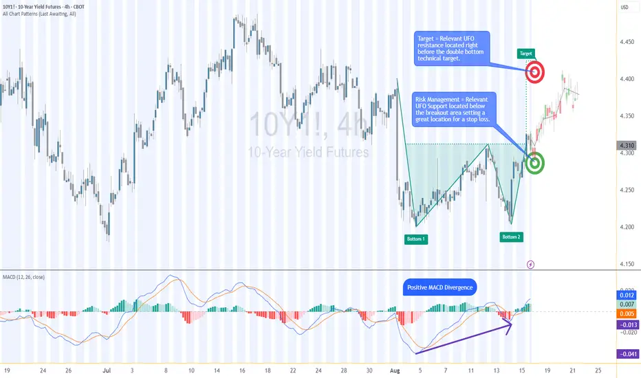
10Y Futures Case Study: Trading the Breakout with Defined Risk1. Introduction
The 10-Year Yield Futures market has recently drawn attention as it builds a constructive base and attempts to shift momentum higher. After weeks of choppy movement, price action on the 4-hour chart has resolved into a breakout scenario that could define the next leg for yields. At the heart of this case study is a double bottom formation, a classical reversal structure, confirmed at 4.321. What makes this setup more compelling is the presence of nearby support and resistance zones, providing a precise technical framework to define entries, targets, and stop placement with discipline.
2. Double Bottom Pattern
The double bottom is one of the most reliable chart patterns signaling the potential exhaustion of selling pressure. It typically forms after a downtrend, with two consecutive troughs creating a strong support base before buyers regain control. In the current 10-Year Yield Futures chart, the first bottom occurred near 4.20, followed by a retest close to the same level. The neckline breakout emerged at 4.312, marking the confirmation point. Applying classical pattern analysis, the measured move points toward a target near 4.396. This alignment of structure and projection provides traders with a clear and objective technical roadmap.
3. MACD Confirmation
Momentum indicators often add depth to price action analysis, and the MACD (Moving Average Convergence Divergence) is one of the most widely followed. Built from the relationship of short- and long-term moving averages, it helps reveal underlying shifts in strength. In the current 10-Year Yield Futures chart, the MACD displayed a positive divergence: while price carved lower lows during the second bottom, the MACD lines began to slope higher. This divergence often signals weakening bearish momentum and the early stages of accumulation. In this case, it reinforces the validity of the double bottom breakout and its bullish potential.
4. UFO Support & Resistance
UnFilled Orders, or UFOs, represent areas where pending buy or sell orders may remain active, providing powerful zones of support or resistance. On the 10-Year Yield Futures chart, a key UFO support sits just below the breakout at 4.278, making it a logical stop-loss placement to protect the trade. Meanwhile, the upside target of the double bottom at 4.396 coincides with a UFO resistance zone. This overlap creates a clear exit area where supply may re-emerge. By combining classical charting techniques with order-flow–based zones, traders gain a structured plan that balances opportunity with risk control.
5. Trade Idea (Illustrative Case Study)
In this case study, the trade idea develops around the breakout point of 4.312 with the current price at the time of writing this article of 4.321. A trader could consider going long if the market sustains above this neckline level. The projected target is the resistance zone at 4.396, while the protective stop loss can be placed just below the UFO support at 4.278. This creates a defined risk profile with a reward-to-risk ratio of roughly 2:1. Alternatively, more conservative traders might consider a wider stop beneath the second bottom, offering more tolerance against volatility but at the expense of risk-reward efficiency. Both options maintain risk clarity and structure.
6. Contract Specifications & Margin Overview
The 10-Year Yield Futures (ticker: 10Y or 10Y1! on TradingView) is a cash-settled futures contract that tracks the 10-year U.S. Treasury yield directly. The gain or loss per tick per contract is as follows: 1 tick = 0.001 Index points (1/10th basis point per annum) = $1.00.
According to CME’s margin schedule (which changes as market conditions change through time), the current margin requirement is approximately $300 per contract. These relatively modest requirements make the product accessible while still providing meaningful exposure to U.S. interest rate markets.
7. Importance of Risk Management
Even with technically strong setups, the defining factor between consistent traders and inconsistent ones is risk management. Futures are leveraged products, meaning a small price move can translate into significant profit or loss. Using stop-loss orders helps enforce discipline, ensuring that one trade does not spiral into uncontrolled exposure. In this case, the support at 4.278 provides a logical technical area for a stop. Regardless of market outlook, avoiding undefined risk is key to long-term survival and consistency.
8. Closing Remarks
The alignment of a double bottom breakout, positive MACD divergence, and key support and resistance zones creates a textbook technical case study in the 10-Year Yield Futures market. With a clearly defined entry, target, and stop-loss, this setup demonstrates how combining price patterns with momentum and order-flow levels can help build structured trade plans. Yet, no analysis guarantees outcomes, and discipline remains at the core of every approach.
When charting futures, the data provided could be delayed. Traders working with the ticker symbols discussed in this idea may prefer to use CME Group real-time data plan on TradingView: www.tradingview.com - This consideration is particularly important for shorter-term traders, whereas it may be less critical for those focused on longer-term trading strategies.
General Disclaimer:
The trade ideas presented herein are solely for illustrative purposes forming a part of a case study intended to demonstrate key principles in risk management within the context of the specific market scenarios discussed. These ideas are not to be interpreted as investment recommendations or financial advice. They do not endorse or promote any specific trading strategies, financial products, or services. The information provided is based on data believed to be reliable; however, its accuracy or completeness cannot be guaranteed. Trading in financial markets involves risks, including the potential loss of principal. Each individual should conduct their own research and consult with professional financial advisors before making any investment decisions. The author or publisher of this content bears no responsibility for any actions taken based on the information provided or for any resultant financial or other losses.
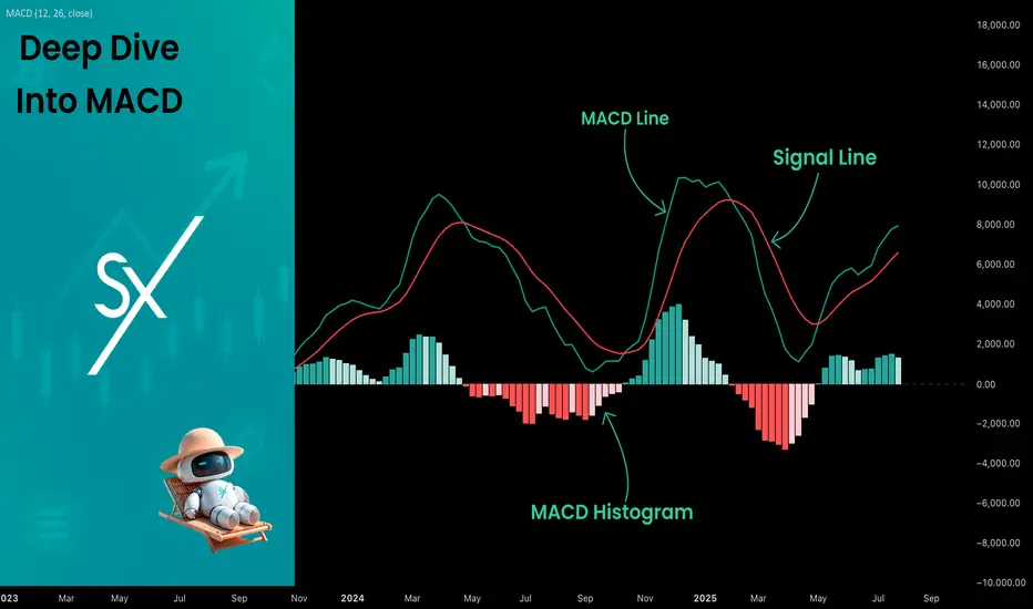
Deep Dive Into Moving Average Convergence Divergence (MACD)🗓 The Moving Average Convergence Divergence (MACD) is one of the most popular momentum indicators in technical analysis. Whether you're a beginner or an experienced trader, understanding how the MACD works can significantly enhance your trading decisions.
📚 Introduction: What Is MACD and Why It Matters
The MACD (Moving Average Convergence Divergence) is one of the most powerful and widely used momentum indicators in technical analysis. It was developed by Gerald Appel in the late 1970s and has since become a staple in the toolkit of traders and investors across markets — from stocks and forex to cryptocurrencies.
At its core, MACD helps traders understand the relationship between two moving averages of an asset’s price, providing insight into both trend direction and momentum strength. By analyzing how these averages converge and diverge, the indicator offers valuable signals for entries, exits, and trend reversals.
What makes MACD especially popular is its versatility — it works well in trending markets, can be used across all timeframes, and combines both leading and lagging components. Whether you're a day trader or a long-term investor, understanding how MACD works gives you an edge in making timely and informed trading decisions.
📚 How the MACD Is Calculated: The Components Explained
The MACD is built from three core components: MACD line, Signal line and MACD histogram.
🔹 Calculating the MACD Line:
The MACD line is the difference between two Exponential Moving Averages (EMAs), typically 12-period EMA (fast) and 26-period EMA (slow). The formula is:
MACD Line = EMA(12) − EMA(26)
This line captures momentum by tracking how the shorter-term average diverges from the longer-term average. When the MACD line rises, the short-term momentum is increasing faster than the longer-term trend — a sign of bullish acceleration. The reverse implies bearish momentum.
🔹 Calculating the Signal Line:
To reduce noise and provide clearer signals, a 9-period EMA of the MACD line is plotted on top. This is the Signal Line, and it acts as a trigger:
When the MACD line crosses above the signal line → bullish signal (buy)
When the MACD line crosses below the signal line → bearish signal (sell)
Signal Line = EMA(9)(MACD Line)
🔹 Calculating the MACD Histogram:
The Histogram shows the difference between the MACD Line and the Signal Line:
Histogram = MACD Line − Signal Line
It provides a visual representation of momentum strength. The histogram bars expand when momentum strengthens and contract as it fades. It helps you spot shifts in momentum earlier than a basic crossover.
📚 How to Use MACD in Trading Strategies
⚡️MACD Signal Line Crossover
Buy Signal:
MACD Line crosses above the Signal Line from below (bullish crossover)
Preferably when both lines are below the zero line (early in the trend)
Price closes above the long-term trend approximation, in our case we use 200-period EMA
Sell Signal:
MACD Line crosses below the Signal Line from above (bearish crossover)
Preferably when both lines are above the zero line (early in the trend)
Price closes below the long-term trend approximation, in our case we use 200-period EMA
📈Long Trading Strategy Example
1. Wait until MACD line crosses over the Signal line from down to up. In our example we use 1D time frame for BITMART:BTCUSDT.P . Open long trade if point 2 will be completed.
2. Price candle shall be closed above the 200-period EMA. This is long-term trend filter to increase the probability that trades will be open only in the direction of the main trend.
3. Close the long trade when the MACD line crosses under the Signal line. This is an approximation that short-term impulse is over and correction is about to start.
In our case we have +20% return on this long trade, but, please, notice that we have not used initial stop-loss in this strategy. Trade was closed according to the technical condition, this approach can violate the risk management rules, but also can be applicable if you trade the amount ready to lose using this strategy. We will talk about stop-loss later.
📉Short trading strategy example
1. Wait until MACD line crosses under the Signal line from up to down. In our example we use 1D time frame for BITMART:ETHUSDT . Open short trade if point 2 will be completed.
2. Price candle shall be closed below the 200-period EMA. This is long-term trend filter to increase the probability that trades will be open only in the direction of the main trend.
3. Close the short trade when the MACD line crosses over the Signal line. This is an approximation that short-term impulse is over and correction is about to start.
In this case we have +15% return on the short trade. Again, strategy used the technical condition to close the trade and now let's cover how to place the stop-loss. There is no right answer how to use stop-losses. The first and the most obvious way to place stop-loss is using recent swing low/high, but the problem is that all traders are seeing them and do the same. Price tends to reach such levels to collect liquidity.
Another one way to place stop-loss is using the signal candle's high/low. This is so-called 1 candle stop-loss. Usually it's very tight and can allow to have the fantastic risk to reward ratio, but we are now recommend to use it if you are not a professional trader because win rate of such strategy decreases.
Third approach in placing stop-loss which we often use in our algorithmic strategies is the Average True Range (ATR). ATR is the volatility measurement, it allows to take into account the current volatility. Sometimes it helps to avoid the stop-loss hit when trade finally goes in your direction. You can just simply subtract (in case of long trade) or add (in case of short trade) ATR value to the entry price and obtain the dynamic stop loss based on current market condition. Also multiplier can be used for ATR. You shall choose the approach which is more comfortable for you, backtest all these approached to make your choice.
🧪Important: we used the long signals only below the zero-line and short signals above it in the attempt to catch the beginning of a trend and have large potential move. On the picture below you can see the same BITMART:BTCUSDT.P , but what will happen if we open long on the lines crossover above zero line? This trade will not be profitable because of restricted potential.
⚡️MACD Zero Line Crossover
Buy Signal:
MACD Histogram crosses above the zero line (momentum shifts from bearish to bullish)
Price closes above the long-term trend approximation, in our case we use 200-period EMA
Sell Signal:
MACD Histogram crosses below the zero line (momentum shifts from bullish to bearish)
Price closes below the long-term trend approximation, in our case we use 200-period EMA
📈Long Trading Strategy Example
1. Wait until MACD Histogram crosses over zero line. Open long trade if point 2 will be completed.
2. Price candle shall be closed above 200-period EMA. This is long-term trend filter to increase the probability that trades will be open only in the direction of the main trend.
3. Take profit when price reaches 3:1 risk to reward ratio according to the stop-loss from point 4.
4. Stop-loss shall be placed below recent swing low. This point can be discussed, you can use any stop-loss technique described earlier in this article. We demonstrate the simplest one, the key here is using at least 3:1 RR.
📉Short trading strategy example
1. Wait until MACD Histogram crosses under zero line. Open short trade if point 2 will be completed.
2. Price candle shall be closed below 200-period EMA. This is long-term trend filter to increase the probability that trades will be open only in the direction of the main trend.
3. Take profit when price reaches 3:1 risk to reward ratio according to the stop-loss from point 4.
4. Stop-loss shall be placed above recent swing high. This point can be discussed, you can use any stop-loss technique described earlier in this article. We demonstrate the simplest one, the key here is using at least 3:1 RR.
⚡️MACD Divergence Strategy
MACD Divergence is a strategy that helps traders identify potential reversals in market direction before they become obvious on the price chart. This makes it a favorite tool among swing traders and crypto enthusiasts looking to catch major moves early.
But what exactly is a divergence? In simple terms, divergence occurs when price and momentum (MACD) are moving in opposite directions — signaling that the current trend may be losing strength and preparing for a reversal. There are two main types of divergence.
🐂 Bullish Divergence
Price makes a lower low
MACD Histogram makes a higher low
This suggests that while price is still falling, downward momentum is weakening. The bears are losing control, and a bullish reversal may be near. Trading signal is very simple, when bullish divergence happens wait for the first increasing column on MACD histogram and open long trade. Place stop-loss under recent swing low and take profit at 3:1 RR.
🐻Bearish Divergence
Price makes a higher high
MACD makes a lower high
This suggests that while price is still falling, downward momentum is weakening. The bears are losing control, and a bullish reversal may be near. Trading signal is very simple, when bearish divergence happens wait for the first decreasing column on MACD histogram and open short trade. Place stop-loss above recent swing high and take profit at 3:1 RR.
🧪 Important hint: MACD histogram shall cross the zero line between two lows/high to create the most reliable divergence signals. We are not recommend to use it without zero-line crossover to decrease number of false signals.
📈Long Trading Strategy Example
1. MACD Histogram shall create higher low.
2. Price shall create lower low.
3. MACD Histogram shall cross the zero line between lows.
4. MACD Histogram shall show the first increasing column.
5. Put stop-loss under the recent swing low.
6. Put take profit at 3:1.
🧪 You can enhance the long signal with the MACD Line divergence. In our case we have both divergences: with MACD Histogram and MACD Line.
📉Short trading strategy example
1. MACD Histogram shall create lower high.
2. Price shall create higher high.
3. MACD Histogram shall cross the zero line between lows.
4. MACD Histogram shall show the first decreasing column.
5. Put stop-loss above the recent swing high.
6. Put take profit at 3:1.
🧪Divergence is extremely strong signal, but when price continue it's move in the direction of a trend and it's not reversing it can also be the signal for the trend continuation. This situation is called "Baskerville Hound" signal, this name was given by famous trader Alexander Elder. We don't recommend to use it for novice traders, but it's useful to know about it.
📚 Conclusion
The Moving Average Convergence Divergence (MACD) is more than just a crossover tool — it's a powerful momentum indicator that offers deep insight into the strength, direction, and timing of market trends. By understanding how the MACD line, Signal line, and Histogram interact, traders can uncover early trend shifts, spot momentum divergences, and time entries and exits with greater confidence.
Whether you're a short-term trader using fast crossovers for scalping or a long-term investor watching for weekly divergences, MACD can adapt to your style when used thoughtfully. Like all indicators, it works best when combined with price action, support/resistance levels, and other indicators — not in isolation.
Ultimately, mastering MACD is not about memorizing patterns, but about learning to read the story of momentum that unfolds beneath the surface of price. With disciplined application and practice, MACD can become a reliable compass in your trading strategy.
Color Your Trades: MACD 4C vs the Classic📊 Coloring Momentum: Comparing Standard MACD vs MACD 4C
Momentum indicators are a trader’s compass—but not all compasses are created equal. In this post, we compare the classic MACD with the visually enhanced MACD 4C , a four-color histogram tool that adds clarity and nuance to trend and momentum analysis.
Let’s break down how both tools work, how we use them at Xuantify, and how you can decide which one fits your strategy best.
🔍 What Are These Indicators?
Standard MACD (Moving Average Convergence Divergence) is a time-tested momentum indicator that plots the difference between two EMAs (typically 12 and 26) and a signal line (usually a 9 EMA of the MACD line). It’s simple, effective, and widely used.
MACD 4C , developed by vkno422 , builds on the classic MACD by introducing a four-color histogram and divergence detection , making it easier to interpret momentum shifts and trend strength visually.
Key Differences:
Standard MACD: Two lines + histogram (single color)
MACD 4C: Histogram only, but with four colors to show trend strength and direction
MACD 4C includes bullish/bearish divergence detection
🧠 How We Use Them at Xuantify
We use both indicators—but for different purposes.
1. Standard MACD – Clean Confirmation
We use it for classic trend confirmation and crossover signals . It’s great for traders who prefer minimalism and are comfortable interpreting line-based momentum.
2. MACD 4C – Visual Momentum Clarity
We use MACD 4C when we want a more intuitive, color-coded view of momentum. The four-color histogram helps us quickly spot trend strength, exhaustion, and divergence.
🧭 Color Coding in MACD 4C
MACD 4C uses four histogram colors (default settings):
Lime/Green : Bullish momentum building or continuing
Red/Maroon : Bearish momentum building or continuing
This makes it easier to:
Spot momentum shifts
Identify trend continuation
Detect divergence at a glance
⚙️ Settings That Matter
Both indicators allow customization, but MACD 4C offers more visual tuning:
MACD 4C:
Adjustable fast/slow MA and signal smoothing
Toggle divergence detection
Color-coded histogram for quick reads
Standard MACD:
Clean, minimal, and widely supported
Best for traders who prefer traditional setups
🔗 Best Combinations with These Indicators
We combine MACD tools with:
Structure Tools – BOS/CHOCH for context
Liquidity Zones – To spot where momentum may reverse
Volume Profile – To confirm strength behind moves
Fair Value Gaps (FVGs) – For precision entries
⚠️ What to Watch Out For
Both indicators are lagging by nature—they rely on moving averages. MACD 4C’s divergence detection can help anticipate reversals, but it’s still best used as a confirmation tool , not a standalone signal.
🔁 Repainting Behavior
Both the standard MACD and MACD 4C are non-repainting . Once a histogram bar or crossover is printed, it remains fixed. This makes them reliable for real-time trading and backtesting .
⏳ Lagging or Leading?
These are lagging indicators , designed to confirm trends—not predict them. MACD 4C’s divergence feature adds a leading element , but it should always be used with structure and price action for confirmation.
🚀 Final Thoughts
If you’re a visual trader who wants more clarity from your momentum tools, MACD 4C is a powerful upgrade. If you prefer simplicity and tradition, the standard MACD still holds its ground.
Try both, test them in your strategy, and see which one sharpens your edge.

MACD: More Than Just a Crossover ToolHello, traders! 🔥
The MACD (Moving Average Convergence Divergence) indicator is one of the most trusted tools in technical analysis — but often one of the most oversimplified. While many traders focus on signal line crossovers, the real power of MACD lies in its ability to visualize market momentum, subtle shifts in trend strength, and early signs of potential reversals.
Let’s unpack how MACD behaves using the weekly BTC/USDT chart ✍🏻.
🔧 Understanding the Mechanics
At its core, MACD is the difference between two exponential moving averages — typically the 12-period EMA and the 26-period EMA. The result is the MACD line (blue). The orange line represents a 9-period Exponential Moving Average (EMA) of the MACD line, commonly referred to as the signal line. The histogram reflects the distance between them, helping to visualize when momentum is building or fading.
📊 MACD in Action — Weekly BTC Chart Breakdown
Looking at the BTC/USDT weekly chart, several notable MACD behaviors stand out:
1. The Bullish Acceleration in Early 2023
In early 2023, MACD crossed above the signal line, accompanied by a sharp rise in the histogram. This indicated strong positive momentum, as the price began recovering from the 2022 lows. The histogram’s expansion confirmed increasing divergence between the short- and long-term EMAs — a classic sign of trend acceleration.
2. Peak Momentum in Late 2023
Around late 2023, the MACD line peaked while the histogram also reached maximum height. This wasn’t just a confirmation of strength — it also hinted that momentum may have reached a climax. Despite price continuing to rise slightly, the MACD curve started to flatten — an early warning of potential exhaustion in trend strength.
3. Bearish Convergence into Q1 2025
In early 2025, the MACD line turned downward and eventually crossed below the signal line, while the histogram flipped to red. This reflected a cooldown in bullish momentum rather than an immediate reversal. What’s notable is how price didn’t collapse sharply, but moved into a pullback phase — illustrating how MACD can show momentum softening before price visibly reacts.
📌 What This Can Tells Us
The MACD indicator on this weekly BTC chart shows how momentum often shifts before the trend itself breaks. Each crossover, divergence, or histogram change is not a guarantee, but a cue to pay closer attention.
Key takeaways:
Strong Histogram Expansion = Confidence in the Current Move.
Peaks in MACD Without Price Making New Highs = Potential Divergence.
Shrinking Histogram + Converging Lines = Momentum Stalling.
🧠 Final Thought
MACD isn’t just about “buy when it crosses” or “sell on red bars.” It’s a narrative tool, showing how the story of the price develops beneath the surface. On higher timeframes, such as the weekly chart, it can potentially highlight macro momentum shifts long before they become apparent in price action alone.

Let's talk about the MACD components, signals and strategies The Moving Average Convergence Divergence (MACD) is a powerful technical indicator widely used in crypto trading to identify trends, momentum shifts, and potential entry or exit points.
Here's how to effectively use MACD in your crypto trading strategy:
Understanding MACD Components
The MACD consists of three main elements:
MACD Line: Calculated by subtracting the 5-period Exponential Moving Average (EMA) from the 20-period EMA
Signal Line: A 9-period EMA of the MACD line
Histogram: Represents the difference between the MACD line and the signal line
Key MACD Trading Signals
Signal Line Crossovers
Buy Signal: When the MACD line crosses above the signal line
Sell Signal: When the MACD line crosses below the signal line.
Zero Line Crossovers
Bullish Signal: MACD crosses above the zero line
Bearish Signal: MACD crosses below the zero line
Divergences
Bullish Divergence: Price makes lower lows while MACD makes higher lows
Bearish Divergence: Price makes higher highs while MACD makes lower highs
MACD Trading Strategies
Trend Following
Use MACD to identify and follow strong trends. When the MACD line is above the signal line, it indicates an uptrend, while the opposite suggests a downtrend
Momentum Trading
The MACD histogram can help identify building momentum. Increasing histogram bars suggest strengthening momentum in the current direction
Divergence Trading
Look for divergences between price action and MACD to spot potential trend reversals
Multiple Timeframe Analysis
Combine MACD readings from different timeframes to get a more comprehensive view of the market
Best Practices
Confirm Signals: Use MACD in conjunction with other indicators like RSI or Bollinger Bands for stronger confirmation
Avoid Choppy Markets: MACD is less effective in ranging or sideways markets, potentially generating false signals
Risk Management: Always use stop-loss orders and proper position sizing to manage risk
Timeframe Selection: Choose an appropriate timeframe based on your trading style (e.g., intraday, swing, or long-term)
Default Settings: Stick to the default MACD settings (12, 20, 5) as most traders use these, potentially creating self-fulfilling prophecies in the market

What Indicators Do Traders Use for Scalping? What Indicators Do Traders Use for Scalping?
Scalping is a fast-paced trading style where traders aim to take advantage of small price movements within short timeframes. Such traders often rely on technical indicators to make quick decisions. This article explores some of the most popular scalping indicators, providing insights into how they can help traders spot opportunities in fast-moving markets.
Understanding Scalping Indicators
As you know, scalping is a trading strategy where traders aim to take advantage of small price movements by executing numerous trades within short timeframes, often closing trades within a few minutes. This approach requires swift decision-making and precise timing.
Technical indicators are essential tools in this context, as they provide real-time data and insights into market trends, momentum, and volatility. Using these indicators, traders can identify optimal entry and exit points, potentially enhancing their ability to navigate the rapid pace of the market.
Below, we’ll break down five indicators for scalping. You’ll find these scalping indicators in MT4 and MT5, TradingView. Also, you can get started in seconds with FXOpen’s free TickTrader trading platform.
Moving Averages
Moving averages (MAs) are considered by some to be the best indicator for scalping, smoothing out price data to help identify trends by calculating the average price over a specific period. In scalping, where quick decisions are crucial, certain types of moving averages can be useful.
Exponential Moving Average (EMA)
Unlike the Simple Moving Average (SMA), which assigns equal weight to all data points, the EMA gives more significance to recent prices, making it more responsive to current market movements. This responsiveness is advantageous for scalpers. For instance, a 9-period EMA reacts swiftly to recent price changes, potentially providing timely signals for entry and exit points.
Hull Moving Average (HMA)
Developed by Alan Hull, the HMA further reduces lag and enhances smoothness compared to traditional moving averages. It achieves this by weighting recent prices more heavily and using a unique calculation method. The HMA's ability to closely follow price action while minimising lag makes it a valuable indicator for scalpers.
Applying Moving Averages in Scalping
- Crossover Strategy: Scalpers often use two EMAs of different lengths to identify potential trading opportunities. A common approach involves a fast EMA (e.g., 5-period) and a slow EMA (e.g., 15-period). When the fast EMA crosses above the slow EMA, it may indicate a bullish trend, suggesting a potential buying opportunity or a chance to close a short trade. Conversely, when the fast EMA crosses below the slow EMA, it may signal a bearish trend, indicating a potential selling opportunity or moment to close a long trade.
- Trend Confirmation: The EMA and HMA can be used to confirm trends identified by other indicators. For example, if the moving average is sloping upwards, it may confirm an uptrend, supporting decisions to enter long positions. If it's sloping downwards, it may confirm a downtrend, supporting decisions to enter short positions.
You can find these scalping indicators in TradingView and FXOpen’s TickTrader platform.
Relative Strength Index (RSI)
The Relative Strength Index (RSI) is a well-known scalping indicator that measures the speed and change of price movements, oscillating between 0 and 100. Traditionally, an RSI above 70 indicates overbought conditions, while below 30 suggests oversold conditions.
In scalping, traders often adjust the RSI from its typical length of 14 to shorter periods, such as 7 or 9, to capture rapid price swings occurring over minutes. This adjustment makes the RSI more sensitive to recent price changes, providing timely signals for quick trades.
Applying RSI in Scalping
- Overbought/Oversold Levels: When the RSI moves beyond 70 or drops below 30, traders watch for potential reversal points. However, scalpers may focus on the RSI’s movement back into the 30-70 range as an early sign of momentum shifting.
- Divergences: Scalpers also look for divergence between price movement and the RSI. For example, if the price reaches a new high but the RSI does not, it may signal a weakening trend and possible reversal. This divergence can be an effective tool for anticipating quick market shifts.
- Midpoint (50 Level): The 50 level serves as a midpoint, indicating the balance between gains and losses. An RSI crossing above 50 may suggest bullish momentum, while dropping below 50 can indicate bearish momentum. Scalpers use this midpoint to assess the prevailing market trend.
Bollinger Bands
Bollinger Bands are a technical analysis tool comprising three lines: a simple moving average (SMA) in the middle, with upper and lower bands set at a specified number of standard deviations from the SMA. These bands expand and contract based on market volatility, providing a visual representation of price fluctuations.
In scalping, traders often adjust Bollinger Bands to shorter timeframes, such as 1-minute or 5-minute charts, to capture quick price movements. A common approach involves setting the SMA period to 7-10 and the standard deviation to 1.5-2, potentially enhancing sensitivity to short-term market changes.
Applying Bollinger Bands in Scalping:
- Bollinger Squeeze: When the bands contract, indicating low volatility, it often precedes significant price movements. Scalpers watch for a breakout above or below the SMA to identify potential trading opportunities.
- Reversal: Price breaching the upper band may suggest overbought conditions, while below the lower band may indicate oversold conditions. Scalpers use these signals to anticipate potential price reversals.
Stochastic Oscillator
The Stochastic Oscillator is a momentum indicator that compares an asset’s closing price to its price range over a specific period, typically 14. It includes the %K line, the current closing price relative to the range, and the %D line, a moving average of %K. The scale runs from 0 to 100, where readings over 80 suggest overbought levels, and those under 20 point to oversold levels.
In scalping, traders may adjust the Stochastic Oscillator to shorter settings, such as 5,3,3, to increase sensitivity to rapid price movements. This adjustment can help in capturing short-term market fluctuations.
Applying the Stochastic Oscillator in Scalping:
- Overbought and Oversold Conditions: When the %K line crosses the %D line in the overbought (above 80) or oversold (below 20) zones, it can signal a potential reversal. Scalpers use these crossovers as quick alerts for shifts in momentum, helping them to act swiftly in volatile markets.
- Crossovers: Besides extreme conditions, traders also monitor crossovers between %K and %D. A %K line crossing above %D from a lower level can suggest an upward move, while a downward crossover may hint at a short-term price decline.
- Divergence: If the price makes a new high/low but the Stochastic Oscillator does not, it may signal a weakening trend, indicating a potential reversal.
Moving Average Convergence Divergence (MACD)
The Moving Average Convergence Divergence (MACD) is considered one of the top forex indicators for scalping. It’s a momentum indicator that reflects the relationship between two moving averages. It comprises the MACD line (the difference between the 12-period and 26-period exponential moving averages), the signal line (a 9-period EMA of the MACD line), and a histogram, which illustrates the gap between the two lines.
Scalpers prefer to adjust these settings to 3, 10, and 16, respectively, to make the MACD more responsive to rapid price movements.
Applying MACD in Scalping:
- Crossovers: When the MACD line crosses above the signal line, it may indicate bullish momentum; a crossover below suggests bearish momentum. Scalpers monitor these crossovers to identify potential entry and exit points.
- Histogram Analysis: The histogram represents the difference between the MACD and signal lines. An expanding histogram indicates strengthening momentum, while a contracting histogram reflects weakening momentum. Scalpers use these changes to gauge the intensity of price movements.
- Divergences: A divergence occurs when the price moves in one direction while the MACD line moves in the opposite. For example, if the price reaches a new low but the MACD does not, it may reflect a potential upward reversal. Scalpers watch for such divergences to anticipate shifts in market direction.
Combining Indicators for Scalping Strategies
Combining multiple indicators can enhance scalping strategies by providing a more comprehensive view of market conditions. Each indicator offers unique insights, and their combined use can help filter out false signals and confirm trading opportunities. Here are some pairings:
- EMA and RSI: Utilising the Exponential Moving Average to identify trend direction alongside the Relative Strength Index to gauge momentum can help traders confirm the strength of a trend before making decisions. For instance, if the EMA indicates an uptrend and the RSI is above 50, it may suggest strong bullish momentum.
- Bollinger Bands and Stochastic Oscillator: Bollinger Bands measure volatility, while the Stochastic Oscillator identifies overbought or oversold conditions. When prices touch the upper or lower bands and the Stochastic Oscillator reflects overbought or oversold conditions, it may indicate potential reversal points.
- MACD and RSI: The Moving Average Convergence Divergence (MACD) highlights momentum changes, and the RSI indicates overbought and oversold conditions. Using them together can help confirm potential entry or exit points. For example, if the MACD shows bullish momentum and the RSI is rising but not yet overbought, it may signal a buying opportunity.
Common Challenges When Using Indicators in Scalping
Scalping with indicators offers valuable insights, but there are some challenges traders should be aware of:
- False Signals: Rapid market movements can trigger misleading signals, causing traders to act prematurely.
- Overtrading: Relying too heavily on short-term indicators can lead to excessive trades, increasing transaction costs.
- Market Noise: High volatility and frequent price fluctuations can make it difficult to distinguish genuine trends from random market "noise."
- Lagging Indicators: Some indicators may react too slowly, causing traders to miss opportunities.
The Bottom Line
Scalping requires quick decisions and the right tools, and indicators like the EMA, RSI, and MACD can help traders navigate fast-moving markets. Found the best scalping indicator that suits your style? Open an FXOpen account to access four advanced trading platforms and start building your scalping strategy today with low-cost, high-speed trading conditions.
FAQ
What Is the 1-Minute Scalp Strategy?
The 1-minute scalp strategy involves making rapid trades on a 1-minute chart. Traders look for small price movements and enter multiple trades within a short period, often using scalp trading indicators like the EMA or RSI for quick signals.
What Is the 5-Minute Scalping Strategy?
The 5-minute scalping strategy focuses on capturing short-term price movements on a 5-minute chart. Traders typically combine trend and momentum indicators, like the MACD and Bollinger Bands, to make fast, informed decisions.
Which Stocks Are Good for Scalping?
The choice depends on the trader’s risk tolerance, trading approach, experience, and toolkit. However, according to theory, stocks with high liquidity, tight spreads, and significant daily volume are good for scalping. Popular choices include tech giants like Apple (AAPL) and Tesla (TSLA), as they offer frequent price fluctuations. But at the same time, they bear higher risks.
What Is the Best EMA for Scalping?
There is no best exponential moving average for scalping. However, traders often use a pair of EMAs, such as a 9- or 5-period and 21- or 15-period, to quickly respond to price changes in scalping. These EMAs help identify trend direction and momentum.
How Can You Use RSI for Scalping?
In scalping, the RSI is often set to shorter periods, like 7 or 9, to catch signals quickly. Traders watch for the RSI to cross key levels (30 or 70) and form a divergence with a price chart to spot potential reversals.
This article represents the opinion of the Companies operating under the FXOpen brand only. It is not to be construed as an offer, solicitation, or recommendation with respect to products and services provided by the Companies operating under the FXOpen brand, nor is it to be considered financial advice

How to Read the MACD Indicator and Use It in Your TradingTechnical analysis is a vast field with thousands of indicators, which may be confusing to those among us who are just starting out. In this Idea, we look at one of the most popular indicators and also one of the easiest ones to fire up and start using from Day 1.
MACD (Moving Average Convergence Divergence)
MACD is arguably the most widely used indicator that can get slapped on virtually every chart out there. The indicator’s full name is Moving Average Convergence Divergence, but you don’t need to remember that.
If you need to take away one thing, it’s this: MACD is easy to read. Here’s how to do it.
Technical Side of Things
Add the MACD in your chart of choice — any chart, any time frame.
You’ll see three default numbers used to set it up — 12, 26, 9.
The 12 is the moving average of the previous 12 bars (also called faster moving average).
The 26 is the moving average of the previous 26 bars (also called slower moving average).
The 9 is the moving average of the difference between the two averages in play.
Next, you see that there are two lines that move up and down and cross each other occasionally. The two lines are:
The MACD line: the difference between the two moving averages and the “faster line”.
The Signal line: the moving average of the MACD line and the “slower line”.
Because the two lines measure price changes at different speeds, the faster one (MACD) will always run ahead and react before the slower one (Signal) catches up.
How to Trade with MACD
If all that sounds a bit complex, here’s the gist of it:
Faster line leads, slower line follows.
Faster line crosses slower line to the downside — a downward trend may be forming.
Faster line crosses slower line to the upside — an upward trend may be forming.
Technically, whenever a new trend is shaping up, the slower line should confirm it by following the faster line. And that happens when the two cross over. The way to potentially spot new trading opportunities is to look for the crossover.
This, in a nutshell, is how to read the MACD indicator and use it to help you become a more profitable trader. There's a whole plethora of MACD examples in action — dive right in !
Let us know your thoughts and experience with the MACD in the comments below!

Navigating the Markets with Fibonacci ChannelsToday we delve into the fascinating world of Fibonacci Channels, a powerful tool for traders looking to identify potential non-horizontal support and resistance levels in the market.
Throughout the video, we provide a step-by-step guide on how to place Fibonacci Channels on price charts, allowing you to visualize and understand their significance in identifying key price levels. We also showcase real-world examples to demonstrate how Fibonacci Channels can be used to find points of interest, such as trend reversals and price targets.
Furthermore, we discuss the integration of Fibonacci Channels with other technical indicators, providing insights into how this combination can enhance your trading strategy. By the end of this video, you will have a comprehensive understanding of Fibonacci Channels and the ability to confidently incorporate them into your trading approach. Get ready to unlock the potential of Fibonacci Channels and take your trading skills to the next level!

Educational: Grid Trading, What is it? How it works?Grid trading is often marketed as a way to win every trade. People usually get away with this type of marketing of the trading style due to the fact that grid trading does not care for market execution in the sense of market direction because you will close profitable trades if the market goes up or down. But it's not as simple as that.
What is Grid trading?
Grid trading is a type of trading strategy that makes use of market price variations by placing buy and sell orders at regular intervals around a base price. The foreign exchange market is where grid trading is most frequently employed, but it can also be used on other markets, like those for futures contracts.
How to execute trades on a grid
The image above explains exactly how positions that run in the upper direction are executed. Let's break down the process:
(1) At the start of your grid trading system, you execute a buy and a sell position with the same lot size.
(2) You will only set a take profit and a buy limit/sell limit, but no stop loss.
(3) Assuming the price runs in the direction of the buy and you have a 10-pip stop loss, once the price hits your 10-pip stop loss, you will also execute a sell position via the sell limit. This sell position will have a 10-pip take profit in the opposite direction.
See demonstration below:
There is no restriction on the size of the grid. It does not have to be 10 pips apart. The distance of the grid is explained further in the publication.
Here is a video using a trading simulator to show you how these positions would be executed
:
So, as you can see, with this style of trading, you can potentially make money whether the price goes up or down. However, it can be quite challenging to execute and maintain a large number of trades. Therefore, individuals typically employ automated systems or use trading software to manage and monitor these trades.
Trending Market
Grid trading can be used to profit from both trending and ranging markets. In a trending market, grid trading involves placing buy orders above the base price and sell orders below the base price. This way, the trader can capitalize on the price movement in a sustained direction. For example, if the base price of Bitcoin futures is $60,000, the trader can place buy orders every $1,000 above the base price. This is also sometimes wrong referred to as dollar cost averaging or compounding your trade which are very different investment strategies.
Grid trading's key benefit is that it can be readily automated using trading bots and does not require a lot of forecasting of market direction. Grid trading's main disadvantage is that, if the market goes against the grid and the trader does not apply appropriate risk management strategies like stop-loss limits or position sizing, it may result in significant losses.
Grid Size
Choosing a grid spacing is one of the most important aspects of grid trading. This depends on a number of elements, including:
- The volatility of the market: The more volatile the market is, the wider the grids should be to avoid frequent executions and commissions.
- The personal preference of the trader: The trader should choose a grid size that suits their trading style and risk tolerance.
Technical indicators like moving averages or Bollinger bands are sometimes used to calculate the spacing between the grids. These indicators can be used to determine the market's volatility and average price over a specific time frame. You can also use basic price action to determine what range the market is likely to tstay within and then calculate the grid in-between
Ranging or Trending:
Identifying whether the market is trending or range is another important aspect of grid trading. This can be used to determine whether to employ grids that move with the trend or against it. There are a number of approaches to determine if the market is trending or fluctuating, including:
- Using trend lines or channels: A trend line or channel is a line that connects higher highs or lower lows in a trending market. A break of a trend line or channel can indicate a change in trend or a range-bound market.
- Using trend indicators such as ADX or MACD: The average directional index (ADX) measures the strength of a trend on a scale from 0 to 100. A high ADX value (above 25) indicates a strong trend while a low ADX value (below 20) indicates a weak trend or a range-bound market. The moving average convergence divergence (MACD) measures the difference between two moving averages of different lengths. A positive MACD value indicates an uptrend while a negative MACD value indicates a downtrend. A crossover of MACD lines or zero line can indicate a change in trend or a range-bound market.
Link to a publication on MACD :
- Using range indicators such as RSI or Stochastic: The relative strength index (RSI) measures how overbought or oversold a market is on a scale from 0 to 100. A high RSI value (above 70) indicates an overbought market while a low RSI value (below 30) indicates an oversold market. A reversal of RSI from extreme levels can indicate a change in trend or a range-bound market. Link to related publication:

Educational: MACD, What is it and how to use it 📊 Introduction
You might want to read more about the MACD indicator if you're seeking for a technical indicator that can assist you in spotting market trends and momentum. Moving average convergence/divergence, or MACD, is one of the most well-known and often applied technical analysis indicators. We will define the MACD indicator, describe its operation, and provide trading tips in this publication.
📊 What is the MACD?
The MACD indicator displays the relationship between two exponential moving averages (EMAs) of a security's price and is a trend-following momentum indicator. The 26-period EMA is subtracted from the 12-period EMA to calculate the MACD line. The MACD line is the output of the calculation.
The signal line, which is then drawn on top of the MACD line and can be used as a trigger for buy or sell signals, is a nine-day EMA of the MACD line. When the MACD line crosses above the signal line, traders may buy the asset; when it crosses below, they may sell—or short—the security.
The difference between the MACD line and the signal line is represented as a bar graph on the MACD indicator called the histogram. The histogram can inform traders of the strength of a directional move and forewarn them of a probable price reversal. It can also determine whether an asset is overbought or oversold.
The MACD indicator thus depends on three time parameters, namely the time constants of the three EMAs. The notation "MACD (a,b,c)" usually denotes the indicator where the MACD series is the difference of EMAs with characteristic times a and b, and the average series is an EMA of the MACD series with characteristic time c. These parameters are usually measured in days. The most commonly used values are 12, 26, and 9 days, that is, MACD (12,26,9).
📊 How does the MACD work?
The MACD indicator gauges how much two moving averages of various periods are convergent or divergent from one another. The price trend is revealed by the moving averages, a form of smoothing technique that eliminates noise and oscillations in the price data.
The majority of MACD changes are driven by the shorter (12-day) moving average due to its speed. The 26-day moving average is slower and less responsive to changes in the price of the underlying securities.
There is a strong momentum in that direction when the shorter moving average pulls away from the longer moving average (i.e., when there is a significant difference between the two). According on whether the movement is upward or downward, this indicates that there is an increase in either purchasing pressure or selling pressure.
There is a weak momentum in that direction when the shorter moving average drifts in the direction of the longer moving average (i.e., when there is a minor difference between them). This signals a lessening of buying or selling pressure, as well as a price consolidation or sideways movement.
📊 How to use the MACD
The MACD (Moving Average Convergence Divergence) indicator is designed to be used for several purposes in technical analysis. Its primary function is to identify potential trend reversals, confirm entry and exit points, and assess the strength of a trend. Here are the key applications of the MACD indicator:
🔹Trend Identification: The MACD indicator helps traders identify the direction of the underlying trend in a market. By comparing the MACD line (the difference between two moving averages) and the signal line (a smoothed moving average of the MACD line), traders can determine whether the trend is bullish or bearish. A positive MACD indicates a bullish trend, while a negative MACD suggests a bearish trend.
🔹Momentum Analysis: The MACD indicator provides insights into market momentum. When the MACD line and the signal line move farther apart, it indicates increasing momentum in the prevailing trend. Conversely, when the MACD lines converge or move closer together, it suggests a potential slowdown or loss of momentum. Traders can use this information to assess the strength of a trend and make informed decisions.
🔹Crossover Signals: The MACD indicator generates crossover signals when the MACD line crosses above or below the signal line. A bullish crossover occurs when the MACD line crosses above the signal line, indicating a potential buying opportunity. Conversely, a bearish crossover takes place when the MACD line crosses below the signal line, suggesting a potential selling opportunity. These crossover signals are commonly used to identify entry and exit points for trades.
🔹Divergence Detection: Divergences occur when the price of an asset moves in the opposite direction of the MACD indicator. Bullish divergences can be observed when the price makes lower lows while the MACD forms higher lows. Conversely, bearish divergences occur when the price achieves higher highs while the MACD forms lower highs. Divergences can be early indications of potential trend reversals and can help traders anticipate changes in market direction.
🔹Histogram Analysis: The MACD histogram represents the difference between the MACD line and the signal line, displayed as bars above or below a zero line. The histogram provides visual cues about the strength of a trend. When the histogram bars are above the zero line, it indicates bullish momentum, and when they are below the zero line, it suggests bearish momentum. Additionally, the shape and direction of the histogram bars can provide insights into potential trend reversals or market consolidations.
📊 How to access the MACD.
The MACD can be accessed for free by simply clicking on your indicators tab and seraching MACD where you will find Moving average convergence/divergence.
The MACD indicator is a useful tool, but to make well-rounded trading decisions, it should be utilized in conjunction with other technical indicators, price patterns, and fundamental analysis. To make the best use of the MACD indicator, traders need also take into account the individual market circumstances and periods they are trading in.

How to Use the MACD Indicator?How to Use the MACD Indicator?
🔶 What’s MACD?
That is an abbreviation for Moving Average Convergence Divergence.
This technical indicator is a tool for identifying moving averages that indicate a new trend, whether bullish or bearish.
After all, finding a trend is a key priority in trading because that’s where the greatest money is produced.
A MACD chart typically displays three figures that serve as its settings.
▪️ The first parameter is the number of periods utilized to construct the faster-moving average.
▪️ The second factor is the amount of periods used in the slower moving average.
▪️ The third parameter is the number of bars utilized to construct the moving average of the difference between the faster and slower moving averages.
For example, if you saw "12, 26, 9" as the MACD parameters (which is typically the default value for most charting software), you would read it as follows:
🔹 The number 12 signifies a 12-bar moving average.
🔹 The number 26 denotes the moving average of the preceding 26 bars.
🔹 The 9 is a moving average of the difference between the two moving averages mentioned above.
When it comes to the MACD lines, there is a widespread misperception.
There are two lines:
🔺"MACD Line"
🔻"Signal Line"
The two lines that have been drawn are NOT price moving averages.
The MACD Line is the difference (or separation) of two moving averages. Typically, these two moving averages are exponential moving averages (EMAs).
The MACD Line is the "faster" moving average when looking at the indicator.
The MACD Line in our previous example is the difference between the 12- and 26-period moving averages.
The MACD Line's moving average is the Signal Line.
When viewing the indication, the Signal Line is the "slower" moving average.
The slower moving average plots the previous MACD Line's average. Again, in our previous example, this would be a 9-period moving average.
By default, most charts employ a 9-period exponential moving average (EMA).
This indicates that we are plotting the average of the last 9 periods of the "faster" MACD Line as our "slower" moving average.
The Signal Line's aim is to mellow down the sensitivity of the MACD Line.
The difference between the MACD Line and the Signal Line is represented in the Histogram.
It depicts the distance between the two lines graphically.
It may occasionally offer you an early warning that a crossover is going to occur.
When we look at our original chart, we can see that the histogram grows as the two moving averages (MACD Line and Signal Line) separate.
The faster moving average (MACD Line) is "diverging" or moving away from the slower moving average (Signal Line), resulting in a MACD divergence.
The histogram shrinks as the moving averages move closer together. Because the faster moving average (MACD Line) is "converging" or approaching the slower moving average (Signal Line), this is referred to as convergence .
That is how you get the name Moving Average Convergence Divergence.
So now you are aware of what MACD performs. Let us now demonstrate what MACD can achieve for YOU.
🔸 MACD Trading Guide
Given that there are two moving averages with differing "speeds," it stands to reason that the faster one will respond to changes in price more quickly than the slower one.
The faster line (MACD Line), which reacts first to a new trend, finally crosses the slower line (Signal Line).
It frequently signifies the emergence of a new trend when this "crossover" takes place and the fast line begins to "diverge" or move away from the slower line.
The fast line passed UNDER the slow line in the previous chart, correctly identifying a new downtrend.
You'll see that the Histogram briefly vanished when the lines intersected.
This is due to the fact that there is no difference between the lines at the moment of the cross.
The histogram increases as the downtrend takes hold and the fast line begins to diverge from the slow line, which is a sign of a strong trend.
Let's look at an illustration.
The fast line passed over the slow line in the above 1-d chart of BTC/USD, and the histogram vanished. This implied that the brief downward trend might eventually turn around.
After that, the BTC/USD launched a new upswing and immediately shot up.
🔴 BUT The MACD has one disadvantage.
Moving averages naturally lag behind price. It's only an average of past prices, after all.
Keep in mind that the MACD indicator has three parts:
🔹The MACD Line which represents the difference between two moving averages.
🔹The Signal Line which is a moving average of the MACD Line.
🔹The Histogram which is a graphical representation of the distance between the MACD Line and Signal Line.
However, MACD is still one of the favorite tools of many traders and mine, of course )
If you liked the post and it was useful to you - click <>, let newcomers see! Leave your comments, I'll be so pleased!
Sincerely yours Kateryna

“HOW TO” Video Overview “Jerry J8 Scalping Indicators"Hello Investors!!!
This is a detailed video overview of the “Jerry J8 Scalping Indicators” which can be used to scalp when the markets are up, down, or sideways.
I will post the link to the strategies after this video goes live on TradingView in either the Related Ideas, or as a comment below with the link.
Thank you.

MACD 1D: X, XD, XDD, and P=M(XD)Andrew M. Kempi
7 January 2023
MACD 1D Methodology:
X, XD (X•), XDD (X••), and P=M(XD)
Determine Volume psychology and volume mass.
P=Mass(Velocity), p=volume(XD), including pascal averaging.
The Volume, and price value, is dependent on Velocity (XD).
Velocity is dependent on Acceleration.
Confirm undeviated direction and trend.
Establish location: above or below directional price average.
Trend symmetrically around price average.
Confirm XDD (X••) acceleration.
Identify the Vector utilizing XD (X•).

HOW TO SWING TRADE USING BB - MACD!Today im going to show you how to use Bolinger Bands and MACD together to understand where the price is going.
So you can swing trade easily.
By the way swing trade is holding assets for profit for more than a day.
So this strategy is suitable for novice investors. But you will need practice before applying this to your trading strategy!
First of all i do not recommend betting against the market.
Do follow the trend when using this strategy. If the trend is upwards do not short the asset.
But there can be breakout from the existing trend.
Therefore we can also use trendlines to have better understanding of the market.
Lets identify indicators that we are going to use then i will explain how to use them to swing trade.
MACD measure specific EMAs and their relations. EMAs are mainly 12 period EMA and 26 period EMA.
There are 2 lines and 1 histogram on MACD. They are called, MACD line, Signal line, Histogram.
MACD line = 12 EMA - 26 EMA
Signal line = 9 EMA of MACD line
Histogram = Difference between MACD line and Signal line
We use MACD to identify trends so we can trade accordingly.
If the MACD line is above 0, we are in a uptrend.
If the MACD line is below 0, we are in a downtrend.
If the MACD line is above or crosses above signal line it is a buy signal.
If the MACD line is below or crosses below signal line it is a sell signal.
Longer histograms and being too far away from zero line means momentum of the trend is high.
These are the basic of MACD.
Bolinger Band is easier to grasp than MACD.
There is an upper channel and lower channel calculated with volatility and 2 Standard Deviations from 20 Simple of MA line.
Generally if the price is closer to the upper band, market is considered overbought and vice versa.
If the market is highly volatile bands widen and if volatility is low bands contract.
The most important thing about BB is 20MA. Generally price will test 20MA line after it hits the upper or lower band.
If price breakout or rejceted from it, trend is established.
So how can we combine both of them to swing trade successfully?
1- We have to identify the market trend. We can simply draw a trendline on the chart to identify it.
2- Use 20 MA as entry-exit
3- Look MACD histogram for momentum
4- Use lower - higher band as SL-TP
Example;
Look at the chart on the left!
Feb 04 19, uptrend started and MACD signal buy.
But there is no momentum.
MACD far away from zero line and price far away from 20MA.
Wait until price breakout from 20MA.
1- is the confirmation of trend with momentum rising and price breakout above 20MA line. BB start to widen meaning high volatility.
You can enter long trade here since price and momentum rising with volatility.
2- is the upper band of BB. This is take profit levels.
If you are seasoned enough you can open short position here with 20MA area TP.
3- Test of 20MA. You can enter short or long here with lower BB being SL - TP.
But with MACD signaling sell and losing positive momentum in histogram, short seems to be the RIGHT CHOICE .
4-Price cant hold 20MA. Drop to the lower band. SL-TP zone.
If you are seasoned enough, potential entry zone for long trade. TP being with 20 MA zone.
Lets take a look at the chart on the right.
Same chart, after a couple of weeks from chart 1.
There is a clear uptrend that started 09 March 20.
1- At 20 April MACD signal buy but there is no momentum and price was still below MA20.
It is logical to wait for confirmation which is the breakout of MA20.
2-Price breakout MA20 after a week.
Between 27 April - 05 Oct, there are more than couple times that market offers good entry zones.
Between this time, MACD momentum and lines are rising to the positive-buy zone.
3- Price is around upper band for a long time. Could be a TP zone.
Price also lost %25 value 2 in weeks. Some people use here as TP zone.
But MACD lines and histogram were positive.
Price didnt test the 20MA.
Also BB is still widening. Meaning high volatility in a bull market.
Opening short is not logical here.
4- Last time price touched the upper band.
Histogram started to lose momentum.
Potential TP zone and short entry.
To be honest this seems to be a good point for short trade but didnt work out.
Price went up (2. ATH) couple of weeks later with MACD momentum nearly finished.
Therefore always put SL-TP with your orders.
5- MACD signaling sell.
Low negative momentum.
If open short here, it could be like NO.3 on the chart.
Wait for confirmation.
6- Price test MA20.
After couple of weeks we broke down MA20. Bear confirmed.
Momentum rapidly increase to the negative zone.
Potential short entry.
7-Price cant hold MA20.
Lower BB reached.
Possible SL-TP area.
So sign from MACD to enter a long trade just yet.
8- Possible long entry with MA20 breakout above.
MACD signal buy with low momentum. Therefore wait for confirmation is logical.
After a week momentum rises.
Long entry seems logical.
New ATH for BTC.
So in short,
Identify a trend!
Check MACD for momentum and trend strength.
Enter when price breakout MA20.
Confirm the breakout before enter!
TP-SL at the MA20 and Band limits.

An introduction to the MACD indicatorHere is my quick and dirty introduction/explanation of what the Moving Average Convergence Divergence (MACD) indicator………… indicates.
The Moving Average Convergence Divergence (MACD) is a trend following momentum indicator that follows the intimate relationship between a 12-Period EMA and a 26-Period EMA on a price chart in whatever timeframe you are in.
The MACD indicator is made up of 6 parts, the MACD Line, the Signal Line, the Histogram, the 0.00 Base Line, the Positive Zone and the Negative Zone.
As default, the MACD Line is calculated by subtracting the value of a 26-Period EMA from the value of a 12-Period EMA on your chart to give you your MACD Line value. The MACD indicator will give a MACD Line value in whatever timeframe you are in.
The Signal Line is a 9-Period EMA of the MACD Line and is used with the MACD Line to generate/trigger Buy and Sell Signals. If the MACD Line crosses ABOVE the Signal Line, that is considered a Buy Signal. If the MACD Line crosses BELOW the Signal Line, that is considered a Sell Signal. Note that Buy and Sell Signals can be generated in both the Positive and Negative Zones
The Histogram is a graphical representation of the distance between the MACD Line and the Signal Line (9-Period EMA).
Green Histograms will appear above the 0.00 Base Line when the MACD Line crosses ABOVE the Signal Line. The Green Histograms will Increase in size the further the MACD Line moves upwards & away from its Signal Line. The Green Histogram will also lighten in colour if the MACD Line fails to move higher to create a higher Green Histogram Bar.
Red Histograms will appear below the 0.00 Base Line when the MACD Line crosses below the Signal Line. The Red Histograms will increase in size the further the MACD Line moves downwards & away from its Signal Line. The Red Histogram will also lighten in colour if the MACD Line fails to move lower to create a lower Red Histogram Bar.
The Positive Zone is the area ABOVE the 0.00 Base Line. If the MACD Line crosses above the 0.00 Base Line, this means that a 12-Period EMA is ABOVE a 26-Period EMA on your price chart in whatever timeframe you are in. So to reiterate, the MACD Line will be ABOVE the 0.00 Base Line when a 12-Period EMA is ABOVE a 26-Period EMA on your price chart.
The Negative Zone is the area BELOW the 0.00 Base Line. If the MACD Line crosses below the 0.00 Base Line, this means that a 12-Period EMA is BELOW a 26-Period EMA on your price chart in whatever timeframe you are in. So to reiterate, the MACD Line will be BELOW the 0.00 Base Line when a 12-Period EMA is BELOW a 26-Period EMA on your price chart.
Note that the MACD indicator has no upper limit in the Positive Zone and no lower limit in the Negative Zone.
The MACD indicator can also be used to show Divergence between the Price and the MACD Line. In a Bullish scenario, if the Price is making Lower Lows and the MACD Line is making Higher Lows then this is potentially Bullish.
For a Bearish scenario, if the Price is making Higher Highs and the MACD Line is making Lower Highs then this is potentially Bearish.
The MACD indicator can also be used to show Hidden Divergence between the Price and the Histogram. In a Bullish scenario, if the Price is making Higher Lows but the Histogram is making Lower Lows then this is potentially Bullish. For a Bearish scenario, if the Price is making Lower Highs but the Histogram is making Higher Highs then this is potentially Bearish.
The MACD can sometimes produce false positive as can be seen here where we have Bullish Divergence with the Price Converging with the MACD Line but no real breakout happened.
Note that the MACD Line and Signal Line will be in line with the current Candle Wick in whatever timeframe you are in.
The MACD indicator is a lagging indicator but it also has the power to be predictive especially with potential upcoming Buy and Sell signals, divergence and when used with other indicators like Volume, the Ichimoku Cloud, Bollinger Bands, MAs or EMAs, RSI, ADX DI to name but a few as these can help complement the MACD signals to help get a much clearer picture as to what is going on and what may happen on your chart in whatever timeframe you are in, because there is a lot of BS, FUD, FOMO and utter crap out there so a little clarity is always helpful ;-)
For me the MACD is a very useful indicator with my trading, so I hope you have found this quick and dirty MACD educational post helpful. Happy trading.
Notes:
MACD Line = 26-Period EMA Value - 12-Period EMA Value = MACD Line Value
Signal Line = 9-Period EMA of the MACD Line. Used with the MACD Line to trigger Buy and Sell Signals
Histogram = Distance between the MACD Line and the Signal Line
0.00 Base Line = Crossover point to the Positive Zone and/or Negative Zone
Positive Zone = a 12-Period EMA is ABOVE a 26-Period EMA on your price chart
Negative Zone = a 12-Period EMA is BELOW a 26-Period EMA on your price chart
EMA = Exponential Moving Average.

How to spot and use MACD DivergencesOscillators
Oscillators are any bits of information or data moving back and forth between two points. It is usually used as a signal for a buy or a sell on either side of the range it is moving in. The Relative Strength index which you might hear of is an example of an oscillator, however I will not be going into detail about it as we do not personally do not use it for my trading. When there is a change in momentum, this often signals weakness in a trend. The indicators are designed to signal a possible trend reversal.
The only oscillator we use in our trading is the MACD. Moving Average Convergence Divergence. Feel free to look into other indicators, however, we believe that the MACD has been our favourite to use.
DIVERGENCE
Divergence is simply when we will be looking at the difference in price action against an indicator such as MACD, RSI, Stochastic.
The simplest way to put it, when the price is making higher highs the indicator should also be making higher highs, and lower lows then vice versa. If the price is making higher highs but the indicator is not, then the two are diverting from each other and we have divergence. This is a great sign for a weakening trend and a potential shift in momentum.
The two types include regular and hidden.
Regular divergence
When the price is making lower lows (LL), and the oscillator is making higher lows (HL), then we have what we call regular bullish divergence which usually appears at the end of a downtrend.
If the price makes a higher high (HH) but the oscillator makes a lower high (LH), then we have regular bearish divergence. This usually occurs at the end of an uptrend.
Hidden Divergence
Divergence does not necessarily have to show when the trend will reverse, it can show trend continuation, and since we try to avoid trading against the trend this can be of great help.
When the price makes a higher high, but the oscillator makes a lower low, we have what we call hidden bullish divergence.
When the price goes to make a lower high but the oscillator makes a higher high, this is what we call hidden bearish divergence.
Always remember that in conjunction with these signals, we need other signs in order for us to enter the trade. We cannot solely base our analysis on oscillator divergence, otherwise we can find ourselves on the wrong side of the trade.
Wait for the crossovers of the indicators to be sure, this can happen after the price has begun to move, however it can be an assurance that the divergence observed is correct.
Always remember if the market is moving sideways, there are no clear indications of divergence so do not force it. Always connect the latest in the price action, meaning if the price is bullish and is retracing, you are looking at higher highs. Focus on the highs and lows of the indicators and ignore any small minor movements in between. Wherever lines are drawn on the price, they have to line up with the oscillator and that is where the line will also have to be drawn, everything has to line up.

The MACD explained ! All you need to know about it Hello everyone, as we all know the market action discounts everything :)
_________________________________Make sure to Like and Follow if you like the idea_________________________________
In this video, I am gonna explain what is the MACD and how to use it and how to identify buy and sell signals using this indicator.
So what is the MACD, The MACD is a trend-following momentum indicator (so a momentum indicator is a technical analysis tool that allows us to determine the strength or weakness of a stock's price movement )
There are a lot of people that use the MACD when they analyze charts because it's very simple and it's very good but I always say never just use 1 indicator to analyze a chart, always try to use at least 3 this way u can make sure that the result is more accurate and the market most likely to move as u analyzed.
let's look at the theory behind the MACD before looking at a real-life example and how to identify buy and sell signals using this indicator :
The typical settings for the MACD are 12 26 and 9.
The MACD consist of 4 parts :
1) Zero line
2) MACD line
3) Signal line
4) Histogram
We start off with our zero line and this is where the MACD line and the signal line move around and basically so if the MACD is trading above the 0 line then it's bullish and if it's under then it's bearish.
Then we have the MACD line and it comes from the 12 26 section, and it gets calculated by subtracting the 26 EMA of the price out of the 12 day EMA of the price.
And after that we have a second line that gets plotted from the 9 section so basically, it’s a moving average for the MACD line so it tries to smooth the MACD line and give us some signals and it's called the signal line.(it's called a signal line because that's where we get our buy and sell signals from)
So on top of that, we have another part in this indicator which is called the histogram. So this histogram job is to show how close these lines will crossover, so when the distance between the MACD line and the signal line is far the histogram gets bigger and bigger.
So how do we use this indicator :
1) Crossovers between the MACD line and the Signal line.
* When the MACD line crosses above the Signal line then its a buy signal (Bullish Crossover)
* When the MACD line crosses below the Signal line then its a sell signal (Bearish Crossover)
2) The Histogram .
A lot of people use histograms as a way to predict when a reversal will occur.
We know that the MACD is a momentum indicator so it can show us when sell pressure is low. And that means it might be a good time to buy. And It can tell you when your long position is about to run out of steam and when you should exit.
3) Divergences between the MACD and the Market Price .
A Divergence means that the indicator is not moving in sync with the Market Price and a Reversal could happen (Note that Reversal trading is risky so please calculate your risks before using this Strategy)
always remember that :
Bullish divergence is when the Market price is going down but the MACD is going up.
Bearish divergence is when the Market Price is going up but the MACD is going down.
I hope I’ve made the MACD easy for you to understand and please ask if you have any questions .
Hit that like if you found this helpful and check out my other video about the Moving Average, Stochastic oscillator, The Dow Jones Theory, How To Trade Breakouts and The RSI. links will be bellow

Using the Moving Average Convergence Divergence (MACD)MACD – What it is
The Moving Average Convergence Divergence (MACD) is the momentum indicator that shows the relationship between two different moving averages:
1. The 12 period exponential moving average – On Tradingview it is the Fast Length.
2. The 26 periods exponential moving average –On Tradingview it is the Slow Length.
The MACD line is calculated by subtracting the 26 period EMA from the 12 period EMA.
The Signal line is the 9 period exponential moving average.
These two lines are then plotted on top of each other. These are the two lines you see when you turn on the MACD indicator.
Additionally, there is a histogram that shows the distance between the two lines. Larger bars tell us that the MACD and Signal are further apart.
When it comes to candles, size matters. The larger the candle the more momentum the trend has.
The histogram will turn green when the MACD line is above 0 (bullish) and it will turn red when the MACD line is below 0 (bearish).
Very bearish momentum is shown above. Photo was taken May 23, 2021.
How to use the MACD
The most important thing to know about the MACD is how to read the relationship between the two lines.
I’ve found that the best timeframe to use the MACD with is daily. This is because the MACD is a lagging indicator and using daily data prevents a lot (not all) of false buy and sell signals.
These signals are:
• When the MACD line crosses above the signal line it is a buy signal
• When the MACD line crosses below the signal line it is a sell signal
Additionally, it is best to use the MACD in a trending market; a market with a clearly defined up or down trend.
Using the MACD with trend lines is a very powerful combination.
The reason for this is that if the market is moving sideways, you can see small fluctuations where the MACD and Signal Line cross but the price does not really go anywhere. These are false breakouts.
Therefore, these signals are not automatic buys and sells.
There are ways of confirming the indications from the MACD chart.
One way is a strategy that uses the RSI and MACD together (which is beyond the scope of this text, but I will discuss in my next article).
Another way is to use the MACD with the current trend. So, if you are in an uptrend and then you see a bullish cross, then this is confirmation that you are likely to go higher.
The same is true in reverse.
Also, please note that the cross over happens well after the price either stabilizes or rises. Again, this is because the MACD is a lagging indicator.
Leading Indicator?
Since the MACD and Signal lines are lagging indicators is there something that can be used in a predictive way?
Some traders use the histogram as a way to predict when a reversal will occur.
Since the MACD is a momentum indicator it can show us when sell pressure is alleviating. Meaning it might be a good time to buy.
This doesn’t always work of course, but with good risk management (stop losses) you can often get into a position well before its breakout.
Conversely, it can show you when your long position is running out of steam and can warn you when to get out.
MACD Divergence
Another useful way to use the MACD is to spot divergences.
A bullish divergence, very similar to the RSI, is when the short-term price trend is going down but, the MACD is going up.
Bearish divergence, also very similar to the RSI, is when the price trend is going up but, the MACD is going down.
Trading this way is sometimes not a good idea because you are trading against the trend. Please practice good risk management if you are trading reversals.
Also, notice the buy signal right before the sell signal that is circled. I really want to hammer home the point that the signals are not automatic buys and sells.
Price action is a great way to confirm the reversal (to the up or down side) of a trend. Because simply spotting a divergence does not guarantee the price will follow.
Final thoughts
As you can see there are different ways of successfully using the MACD. I hope I’ve made a few of these ways clear in this beginner guide.
Please let me know if you have any questions and if you like it, please hit the thumbs up and be sure to follow for more.
Links to my Fibonacci Retracement and RSI guides are below.
Thanks for reading!

What is a bearish divergence?What is the Moving Average Convergence Divergence (MACD) Indicator?
The Moving Average Convergence Divergence (MACD) is a trend-following momentum indicator. The indicator tells us the relationship between two moving averages of the security price. To determine MACD subtract the 26-period exponential moving average from the 12-period exponential moving average. There is a nine-day exponential moving average of the MACD that is used as the "signal line." Whenever MACD crosses the signal line that is an indication to sell or buy.
The histogram indicates strength. Dark green means the bulls are stronger. Light green means the bulls are weak. Dark red means the bears are strong. Light red means the bears are weak. The centerline for MACD is 0.
What is a bearish divergence?
A bearish divergence occurs when the price rise to a new high but the indicator new peak is lower than the previous high peak.
Forecastability of the bearish divergence
The bearish divergence indicator predicts a bearish future for the stock. However, do not assume a bearish divergence will be bearish all the time. There is an exception: in a strong bull market, the bearish divergence will transform itself and the uptrend may continue.
Thank you for reading!
Greenfield
Remember to click "Like" and "Follow" to see more articles.
Disclosure: Article written by Greenfield. A market idea by Greenfield Analysis LLC for educational material only.

How To Understand And Trade With The MACDWelcome Traders!
In today's trading episode, you will learn what the MACD is and how to use it to find trade setups. No indicator can predict market moves perfectly, but this is a good indicator to have in your arsenal when you trade.
Take time to practice what you learned in today's video.
Until next time, have fun, and trade confident :)

Renko MACD and Renko MACD Trend IntroductionI introduce the Renko MACD and Renko MACD Trend indicators.
Other indicators powered by the Renko Engine:
Renko RSI
Renko Trend Momentum
Renko Weis/Ord Wave Volume
Strategies:
RSI-RENKO DIVINE Strategy
