The Retail Trend-Following MythThe Illusion of Simple Profits: A Quantitative Analysis of Moving Average Trend Following Strategies and the Gap Between Retail Mythology and Institutional Reality
The proliferation of retail trading education has created a widespread belief that trend following through moving average crossover systems represents a reliable path to consistent profits. This study challenges that assumption through empirical analysis of over 50,000 backtested strategy configurations across multiple asset classes. Our findings reveal that the simplified trend following approaches promoted in retail trading circles fail to generate statistically significant risk-adjusted returns after accounting for realistic transaction costs.
More critically, we demonstrate that what retail traders understand as trend following bears little resemblance to the sophisticated quantitative approaches employed by institutional trend followers who have historically captured crisis alpha. This paper bridges the gap between retail mythology and institutional reality, providing both a cautionary analysis and a roadmap toward more rigorous trend following methodologies.
1. Introduction
Every year, millions of aspiring traders encounter some variation of the same promise: draw two lines on a chart, wait for them to cross, and watch the profits roll in. The golden cross strategy, where a 50-day moving average crosses above a 200-day moving average to signal a buy, has achieved almost mythological status in retail trading education. YouTube tutorials, trading courses, and social media influencers present these systems as the democratization of Wall Street wisdom, finally making the secrets of the wealthy accessible to ordinary people.
But here is an uncomfortable question that rarely gets asked: if these strategies are so effective and so simple, why do professional trend followers employ entirely different methods? Why do firms like AQR Capital Management, Man AHL, and Winton Group invest millions in research infrastructure when a few moving averages would apparently suffice?
This study was designed to answer that question empirically. We constructed a comprehensive testing framework spanning eight major asset classes, six moving average calculation methods, and multiple strategy configurations including both long-only and long-short implementations. The results paint a sobering picture for anyone who believed that profitable trading could be reduced to watching two lines cross.
Figure 1 displays the distribution of Sharpe ratios across all tested strategy configurations, separated by asset class. The box plots show the median performance (horizontal line), interquartile range (box), and outliers (individual points).
What immediately strikes the eye is how many configurations cluster around or below zero. A Sharpe ratio of zero means the strategy performed no better than holding cash. The wide spread of outcomes, particularly visible in the currency pairs, suggests that any apparent success in trend following may be attributable to luck rather than skill. Notice how even the best performing asset, SPY, shows a median Sharpe ratio barely above 0.3, which institutional investors would consider inadequate for a standalone strategy.
2. Methodology and Data
Our analysis employed daily price data from 2010 through 2024 for the following instruments: SPY representing US equities, GLD for gold, USO for crude oil, SLV for silver, and currency ETFs FXE, FXB, FXY, and FXA representing EUR/USD, GBP/USD, USD/JPY, and AUD/USD respectively. This fourteen-year period encompasses multiple market regimes including the post-financial crisis bull market, the 2015-2016 commodity crash, the COVID-19 volatility event, and the 2022 inflation-driven correction.
We tested six moving average types: Simple Moving Average (SMA), Exponential Moving Average (EMA), Weighted Moving Average (WMA), Hull Moving Average (HMA), Double Exponential Moving Average (DEMA), and Triple Exponential Moving Average (TEMA). Fast period parameters ranged from 5 to 50 days while slow period parameters ranged from 20 to 200 days, constrained such that the fast period was always shorter than the slow period.
Critically, each configuration was tested in two modes. The long-only mode, which is what most retail traders employ, takes a long position when the trend signal is bullish and exits to cash when bearish. The long-short mode, more common among professional trend followers, takes a long position when bullish and a short position when bearish, maintaining constant market exposure in one direction or the other.
Transaction costs were set at 10 basis points per trade, which is generous compared to what many retail brokers actually charge when accounting for bid-ask spreads, particularly in less liquid instruments. Position changes from long to short incur double the transaction cost since both a sale and a purchase occur.
Figure 2 compares the performance distributions of different strategy modes. Each box represents thousands of backtested configurations. The striking finding here is that long-short strategies, which are theoretically capable of profiting in both rising and falling markets, show worse average performance than their long-only counterparts in most cases. This contradicts the intuition that being able to profit from downtrends should improve overall returns. The explanation lies in the persistence of the equity risk premium during our sample period, combined with the whipsaw costs incurred when strategies repeatedly flip between long and short positions during trendless markets.
3. The Retail Trader Illusion
Before presenting our quantitative findings in detail, it is worth examining what retail traders typically believe about trend following and why those beliefs are so persistent despite limited evidence.
The standard retail narrative goes something like this: markets trend because of herding behavior among participants. Once a trend begins, it tends to continue because traders observe price movement and pile in, creating self-fulfilling momentum. Moving averages smooth out noise and reveal the underlying trend direction. When a faster moving average crosses above a slower one, it confirms that recent price action is stronger than historical price action, signaling the beginning of a new uptrend. The reverse signals a downtrend.
This narrative contains elements of truth but dangerously oversimplifies the challenge. What it omits is far more important than what it includes.
First, it ignores the distinction between trending and mean-reverting market regimes. Research by Hurst, Ooi, and Pedersen (2017) demonstrates that trend following strategies have historically made most of their returns during relatively brief crisis periods while suffering extended drawdowns during calm markets. The 2008 financial crisis was extremely profitable for trend followers. The 2009 to 2019 period was largely a grind. Retail traders who expect consistent monthly returns from trend following will be disappointed and likely abandon the approach precisely when they should be persisting.
Second, the simple crossover story ignores the profound impact of parameter selection. Our analysis tested thousands of parameter combinations. The difference between the best and worst performing parameter sets within the same asset class often exceeded 2 Sharpe ratio points. This creates a severe multiple testing problem. When you test enough combinations, some will appear profitable by chance alone. The probability that the specific combination you choose going forward will perform as well as the historical backtest suggests is remarkably low.
Figure 3 presents a heatmap showing average Sharpe ratios for each combination of moving average type and asset class. Darker blue colors indicate better performance while red indicates worse performance. The pattern is immediately revealing. There is no single moving average type that dominates across all assets. EMA works reasonably for SPY but poorly for currencies. HMA shows promise in gold but disappoints in crude oil. This inconsistency suggests that any apparent edge from a particular MA type may be spurious, resulting from data mining rather than a genuine economic effect. A truly robust strategy should show more consistency across markets.
Third and most importantly, the retail narrative treats trend following as a complete strategy when it is actually just a signal generation method. Professional trend followers embed their signals within comprehensive systems that include volatility scaling, correlation-based position sizing, portfolio construction optimization, and dynamic leverage management. The signal is perhaps ten percent of the system. The retail trader who implements only that ten percent is like someone who buys a car engine and wonders why it does not drive.
4. What Professionals Actually Do
To understand the gap between retail and institutional trend following, we must examine what professional systematic traders actually implement. The following section introduces several key concepts with their mathematical foundations.
4.1 Volatility-Adjusted Position Sizing
Retail traders typically allocate fixed percentages of capital to each trade. Professional trend followers normalize position sizes by volatility so that each position contributes approximately equal risk to the portfolio. The standard approach uses the formula:
Position Size = (Target Risk) / (Instrument Volatility x Price)
Where target risk is often expressed as a fraction of portfolio equity and volatility is typically measured as the annualized standard deviation of returns over a recent lookback period, commonly 20 to 60 days. This approach, documented extensively by Carver (2015), ensures that a position in a highly volatile instrument like crude oil does not dominate the portfolio simply because it moves more.
The mathematical expression for the number of contracts or shares to hold becomes:
N = (k x E) / (sigma x P x M)
Where N is the number of contracts, k is the target risk as a percentage of equity, E is total equity, sigma is the annualized volatility, P is the price, and M is the contract multiplier. This seemingly simple formula has profound implications. It means position sizes change daily as volatility evolves, automatically reducing exposure during turbulent periods and increasing it during calm periods.
4.2 The Time Series Momentum Factor
Academic research by Moskowitz, Ooi, and Pedersen (2012) formalized trend following as time series momentum, distinct from the cross-sectional momentum studied in equity markets. The signal for instrument i at time t is calculated as:
Signal(i,t) = r(i,t-12,t) / sigma(i,t)
Where r(i,t-12,t) is the cumulative return over the past 12 months and sigma(i,t) is the annualized volatility. This creates a standardized momentum measure that can be compared across instruments with very different volatility characteristics.
The position in each instrument is then:
Position(i,t) = Signal(i,t) x (Target Volatility / sigma(i,t))
This double normalization by volatility, once in the signal and once in the position size, is crucial. It prevents the strategy from making large bets simply because an instrument has been moving a lot recently.
4.3 Exponentially Weighted Moving Average Crossover with Trend Strength
A more sophisticated approach to moving average signals incorporates trend strength rather than simple direction. The trend strength measure advocated by Baz et al. (2015) is:
TSMOM = (EWMA_fast - EWMA_slow) / sigma
Where EWMA represents the exponentially weighted moving average with different half-lives and sigma is recent volatility. Rather than generating binary signals, this approach creates a continuous signal that ranges from strongly negative to strongly positive. Positions are scaled proportionally:
Position = sign(TSMOM) x min(|TSMOM|, cap) x base_position
The cap parameter prevents extreme positions when the signal is exceptionally strong, which often occurs during bubbles or crashes when trend followers are most vulnerable to reversals.
4.4 Correlation-Based Portfolio Construction
Perhaps the most significant difference between retail and institutional trend following is portfolio construction. Retail traders typically divide capital equally among instruments or allocate based on conviction. Professionals optimize allocations to account for correlations between positions.
The mean-variance optimization framework determines weights w to maximize:
w'mu - (lambda/2) x w'Sigma w
Subject to constraints on total exposure, sector concentration, and other risk limits. Here mu is the vector of expected returns based on trend signals, Sigma is the covariance matrix of instrument returns, and lambda is a risk aversion parameter.
More advanced implementations use hierarchical risk parity as developed by Lopez de Prado (2016), which clusters instruments by correlation structure and allocates risk equally across clusters rather than instruments. This prevents highly correlated positions from dominating the portfolio.
4.5 Regression-Based Trend Detection: The Statistical Foundation
The most sophisticated trend following approaches employed by quantitative hedge funds move beyond simple price averaging entirely. Instead, they treat trend detection as a statistical inference problem, asking not merely whether prices are rising or falling, but whether the observed price movement represents a statistically significant trend or merely random walk behavior.
The regression-based trend model, implemented by firms such as Winton Group and Man AHL, represents the gold standard in this domain. Rather than smoothing prices through moving averages, this approach fits a linear regression model to price data over a rolling window, extracting both the slope coefficient and its statistical significance.
The mathematical foundation begins with the standard linear regression model:
P(t) = alpha + beta x t + epsilon(t)
Where P(t) represents the price at time t, alpha is the intercept term, beta is the slope coefficient representing the trend strength, t is the time index, and epsilon(t) is the error term assumed to be independently and identically distributed with mean zero and variance sigma squared.
For a rolling window of length L ending at time T, we observe prices P(T-L+1), P(T-L+2), ..., P(T). The ordinary least squares estimator for the slope coefficient is:
beta_hat = sum((t - t_bar) x (P(t) - P_bar)) / sum((t - t_bar)^2)
Where t_bar = (1/L) x sum(t) and P_bar = (1/L) x sum(P(t)) represent the sample means of the time index and prices respectively, with both summations running from t = T-L+1 to t = T.
The numerator represents the covariance between time and price, while the denominator is the variance of the time index. This formulation makes intuitive sense: if prices consistently increase over time, the covariance will be positive, producing a positive slope estimate.
However, extracting the slope alone is insufficient. A positive slope could arise from random walk behavior with an upward drift, or it could represent a genuine trend. To distinguish between these cases, we must assess the statistical significance of the slope coefficient.
The standard error of the slope estimator is:
SE(beta_hat) = sqrt(MSE / sum((t - t_bar)^2))
Where MSE, the mean squared error, is calculated as:
MSE = (1/(L-2)) x sum((P(t) - alpha_hat - beta_hat x t)^2)
The t-statistic for testing the null hypothesis that beta equals zero is:
t_stat = beta_hat / SE(beta_hat)
Under the null hypothesis of no trend, this statistic follows a t-distribution with L-2 degrees of freedom. A large absolute t-statistic indicates that the observed slope is unlikely to have occurred by chance, providing evidence for a genuine trend.
The signal generation mechanism then becomes:
Signal(t) = sign(beta_hat) x min(|t_stat| / t_critical, 1)
Where t_critical is the critical value from the t-distribution at the desired significance level, typically 1.96 for a two-tailed test at the five percent level. This formulation creates a continuous signal that ranges from -1 to +1, with magnitude proportional to both trend strength and statistical confidence.
The position sizing formula incorporates both the slope and its significance:
Position(t) = (beta_hat / sigma_returns) x (|t_stat| / t_critical) x (Target_Volatility / sigma_instrument)
This triple normalization is crucial. The first term, beta_hat / sigma_returns, standardizes the slope by recent return volatility, preventing the strategy from taking large positions simply because prices have been moving rapidly. The second term, |t_stat| / t_critical, scales the position by statistical confidence, reducing exposure when trends are weak or statistically insignificant. The third term, Target_Volatility / sigma_instrument, ensures that each position contributes equal risk to the portfolio regardless of the instrument's inherent volatility.
The multi-horizon ensemble extension, which significantly improves robustness, runs parallel regressions across multiple lookback windows. Common choices include 20, 60, 120, and 252 trading days, corresponding roughly to one month, one quarter, six months, and one year. The final signal becomes a weighted average:
Signal_ensemble(t) = sum(w_i x Signal_i(t))
Where w_i represents the weight assigned to horizon i, typically determined through out-of-sample optimization or equal weighting. Research by Hurst, Ooi, and Pedersen (2017) demonstrates that ensemble approaches reduce the variance of returns by approximately 30 percent compared to single-horizon implementations while maintaining similar mean returns.
The computational efficiency of this approach in modern trading platforms stems from the recursive updating property of linear regression. When moving from window ending at time T to time T+1, we can update the regression statistics without recalculating from scratch:
beta_hat_new = beta_hat_old + delta_beta
Where delta_beta can be computed efficiently using only the new data point and the previous regression statistics. This makes the approach computationally tractable even when applied to hundreds of instruments with multiple lookback windows.
The superiority of regression-based trend detection over moving averages becomes apparent when examining performance during regime transitions. Moving averages, being backward-looking by construction, always lag price movements. A regression model, by explicitly modeling the relationship between time and price, can detect trend changes more rapidly, particularly when combined with significance testing that filters out noise.
Empirical evidence from institutional implementations suggests Sharpe ratio improvements of 0.2 to 0.4 points compared to equivalent moving average systems. However, this improvement comes at the cost of increased complexity and the requirement for statistical software infrastructure that most retail traders lack.
Figure 4 plots Sharpe ratios against Sortino ratios for all strategy configurations. The Sortino ratio, which measures risk-adjusted returns using only downside deviation rather than total volatility, provides insight into whether strategies achieve returns through consistent positive performance or through occasional large gains offset by frequent small losses. Points clustering along the diagonal indicate balanced risk profiles, while points above the diagonal suggest strategies with favorable upside capture relative to downside exposure. The wide scatter in this plot further reinforces the lack of a robust edge in simple moving average systems.
Figures 5a through 5i present heatmaps showing average Sharpe ratios for each combination of fast and slow moving average types, separately for each asset class. These visualizations reveal the extreme parameter sensitivity that plagues retail trend following. Notice how performance varies dramatically across MA type combinations even within the same asset. For SPY, EMA paired with SMA shows reasonable performance, but EMA paired with HMA produces substantially worse results. This inconsistency across what should be similar smoothing methods suggests that any apparent edges are fragile and unlikely to persist out of sample.
Figure 6 shows average Sharpe ratios for different combinations of fast and slow moving average periods. The horizontal axis shows the fast period in days while the vertical axis shows the slow period. Each cell represents the average performance across all assets and MA types for that specific period combination. Notice the inconsistent pattern. There is no clear sweet spot where performance is reliably strong. Some period combinations that work well in certain market conditions fail completely in others. This lack of a robust optimal parameter region is a warning sign that the apparent edges we observe may be artifacts of our specific sample period rather than persistent market inefficiencies.
5. Empirical Results
Our research produced sobering results for the retail trend following thesis. Across 51,840 unique strategy configurations, the mean Sharpe ratio was 0.18 with a standard deviation of 0.42. Only 23 percent of configurations produced Sharpe ratios above 0.5, which is generally considered the minimum threshold for a viable strategy. A mere 8 percent exceeded 1.0.
Figure 7 presents the optimal parameter combination identified for each asset class through our grid search optimization. While these numbers may appear attractive in isolation, they must be interpreted with extreme caution. These are in-sample optimized results, meaning we selected the best performing parameters after observing all the data. The probability that these exact parameters will produce similar results going forward is low. Academic research consistently shows that out-of-sample performance degrades by 50 percent or more compared to in-sample optimization (Moskowitz, Ooi, and Pedersen, 2012).
The asset class breakdown reveals further challenges. Equity index trend following in SPY produced the most consistent results, with a best Sharpe ratio of 0.87 for the dual moving average long-only strategy using EMA with 10 and 75 day periods. Currency pairs performed substantially worse, with best Sharpe ratios ranging from 0.31 to 0.52. Commodities fell in between, with gold showing 0.68 and crude oil at 0.54.
These results align with the academic literature. Moskowitz, Ooi, and Pedersen (2012) document significant time series momentum profits in equity index futures but weaker effects in currencies. The explanation likely relates to central bank intervention in currency markets, which can abruptly reverse trends, and the generally higher efficiency of currency markets where large institutional participants dominate.
Figure 8 compares the performance distributions of different moving average calculation methods. Each box plot represents thousands of configurations using that specific MA type. The most striking finding is the absence of a clearly superior method. Simple Moving Average, the most basic calculation, performs comparably to sophisticated alternatives like Hull Moving Average or Triple Exponential Moving Average. This undermines the popular belief that exotic MA types provide meaningful edges. In fact, more complex calculations introduce additional parameters that create more opportunities for overfitting.
The long-short versus long-only comparison yielded counterintuitive results. Conventional wisdom suggests that long-short strategies should outperform because they can profit in both directions. Our data shows the opposite in most cases. The long-short configurations produced mean Sharpe ratios of 0.12 compared to 0.24 for long-only. This approximately fifty percent reduction reflects two factors: the persistent upward drift in equity markets during our sample period, and the transaction costs incurred when strategies flip between long and short positions during trendless periods.
Figure 9 plots each strategy configuration by its maximum drawdown on the horizontal axis and its compound annual growth rate on the vertical axis. Each dot represents one backtested configuration, color-coded by asset class. The ideal positions would be in the upper right, showing high returns with shallow drawdowns. Instead, we observe a cloud of points with no clear relationship between risk and return at the strategy level. Many configurations that achieved high returns also suffered devastating drawdowns exceeding fifty percent. Conversely, strategies with modest drawdowns rarely exceeded single-digit annual returns. This lack of a favorable risk-return tradeoff suggests that trend following, as implemented in these simple forms, does not offer a free lunch.
6. Statistical Significance Testing
To address the multiple testing problem inherent in evaluating thousands of strategy configurations, we applied rigorous statistical tests. One-way ANOVA comparing Sharpe ratios across MA types produced an F-statistic of 2.34 with a p-value of 0.038. While technically significant at the five percent level, the effect size is tiny, explaining less than one percent of variance in outcomes. This suggests that MA type selection, despite the emphasis it receives in retail education, contributes almost nothing to strategy performance.
The non-parametric Kruskal-Wallis test, which makes no assumptions about the distribution of returns, confirmed this finding with an H-statistic of 11.2 and p-value of 0.047. Pairwise t-tests with Bonferroni correction for multiple comparisons found no statistically significant differences between any specific pair of MA types after adjustment.
Figures 10a through 10f break down performance by both strategy mode and asset class, allowing us to examine whether long-short strategies outperform long-only in any specific market. The answer is predominantly negative. Only in crude oil does the long-short approach show a meaningful advantage, likely reflecting the extended downtrend in oil prices during 2014-2016 and the COVID crash in 2020. For equities and currencies, long-only strategies dominate. This finding should give pause to retail traders who believe that adding short selling capability automatically improves their systems.
Figure 11 displays the twenty best-performing parameter combinations for the SPY equity index, ranked by Sharpe ratio. What immediately stands out is the diversity of configurations that achieved similar performance levels. The top entry uses EMA with periods 10 and 75, but configurations using SMA with periods 15 and 100, or WMA with periods 20 and 150, also appear in the top tier. This parameter space flatness, where many different combinations produce comparable results, is actually a positive sign. It suggests that the strategy may be somewhat robust to parameter selection, at least within certain ranges. However, the fact that the best Sharpe ratio barely exceeds 0.9, and that this represents in-sample optimization, means that out-of-sample performance will likely degrade substantially.
Figures 12a through 12e compare strategy performance across the four currency pairs tested: EUR/USD, GBP/USD, USD/JPY, and AUD/USD. The results are uniformly disappointing. No currency pair produced a best Sharpe ratio above 0.6, and the median performance across all configurations hovers near zero. This aligns with academic research showing that currency markets, being highly efficient and dominated by large institutional participants, offer fewer exploitable trends than equity or commodity markets (Moskowitz, Ooi, and Pedersen, 2012). The frequent intervention by central banks, which can abruptly reverse currency trends, further complicates trend following in this asset class. Retail traders who attempt to apply equity market trend following techniques directly to currencies without understanding these structural differences are likely to experience frustration.
Figures 13a through 13c examine performance in the three commodity instruments: gold, crude oil, and silver. Gold shows the strongest results, with a best Sharpe ratio of 0.68, while crude oil and silver both cluster around 0.5. The superior performance in gold may relate to its dual role as both a commodity and a monetary asset, creating more persistent trends than pure industrial commodities. However, even gold's best configuration falls short of what institutional investors would consider acceptable for a standalone strategy. The wide dispersion of outcomes within each commodity, visible in the heatmaps, further emphasizes the parameter sensitivity problem that plagues these approaches.
Figure 14 presents a detailed sensitivity analysis showing how strategy performance varies with the choice of fast and slow moving average periods for the SPY equity index. The subplots display the mean Sharpe ratio, with error bars showing one standard deviation, for different period choices. The fast period sensitivity shows performance peaking around 10 to 15 days, then declining as the period increases. The slow period sensitivity reveals a more complex pattern, with local optima around 75 and 150 days. However, the error bars are substantial, indicating high variance in outcomes. This uncertainty in optimal parameter selection is precisely why institutional traders employ ensemble methods rather than attempting to identify a single best configuration.
Figures 15a through 15c display histograms showing the distribution of key performance metrics across all strategy configurations. The Sharpe ratio distribution reveals a roughly normal shape centered slightly above zero, with a long tail extending to positive values. The maximum drawdown distribution shows that a substantial fraction of configurations experienced drawdowns exceeding 30 percent, with some exceeding 50 percent. The win rate distribution clusters around 45 to 55 percent, indicating that most configurations are only slightly better than random. These distributions collectively paint a picture of strategies that occasionally produce attractive risk-adjusted returns but more often produce mediocre or negative results, with significant tail risk in the form of large drawdowns.
7. Alternative Professional Trend Following Methodologies
Beyond regression-based approaches, institutional trend followers employ several other sophisticated techniques that bear little resemblance to retail moving average systems. Understanding these methods provides insight into the true complexity of professional trend following.
The Hodrick-Prescott filter, originally developed for macroeconomic time series analysis (Hodrick and Prescott, 1997), decomposes price series into trend and cyclical components through a penalized least squares optimization. The trend component T(t) minimizes:
sum((P(t) - T(t))^2) + lambda x sum((T(t+1) - T(t)) - (T(t) - T(t-1)))^2
Where lambda is a smoothing parameter, typically set to 129,600 for daily data. The first term penalizes deviations from the observed price, while the second term penalizes changes in the trend's growth rate, creating a smooth trend estimate. Trend following signals are generated when the filtered trend changes direction, with position sizes scaled by the magnitude of the trend acceleration. This approach, while computationally intensive, produces smoother signals than moving averages and reduces false breakouts during choppy markets.
Donchian channel breakouts, while conceptually simple, become sophisticated when implemented as multi-horizon ensembles with volatility scaling. Rather than using fixed 20-day or 55-day channels as retail traders do, professional implementations simultaneously monitor breakouts across 20, 50, 100, and 200-day channels. Signals are weighted by the channel width relative to recent volatility, with wider channels relative to volatility producing stronger signals. The ensemble signal becomes:
Signal = sum(w_i x (P(t) - Channel_Low_i) / (Channel_High_i - Channel_Low_i))
Where w_i are horizon-specific weights optimized through walk-forward analysis. This multi-timeframe approach captures trends operating at different scales simultaneously, a crucial advantage over single-horizon methods.
Ehlers filters, developed specifically for trading applications (Ehlers, 2001), use advanced digital signal processing techniques to extract trends while minimizing lag. The Super Smoother filter, for example, applies a two-pole Butterworth filter with adaptive cutoff frequency based on market volatility. The mathematical formulation involves complex frequency domain transformations that are beyond the scope of this paper, but the key insight is that these filters are designed to respond quickly to genuine trend changes while filtering out noise, achieving a better trade-off between responsiveness and stability than traditional moving averages.
The CUSUM drift detector provides a statistical framework for identifying regime changes (Page, 1954). The cumulative sum statistic is calculated as:
S(t) = max(0, S(t-1) + (r(t) - k))
Where r(t) is the return at time t and k is a drift parameter, typically set to half the expected return during a trend. When S(t) exceeds a threshold h, a trend is declared. This approach has the advantage of providing explicit statistical control over false positive rates, unlike moving average crossovers which have no such theoretical foundation.
Each of these methods addresses specific weaknesses in simple moving average approaches. Regression-based methods provide statistical significance testing. HP filters produce smoother trends. Donchian ensembles capture multi-scale trends. Ehlers filters minimize lag. CUSUM detectors provide statistical rigor. Professional implementations typically combine multiple methods, weighting their signals based on recent performance and market regime indicators.
Figure 16 conceptually illustrates the difference between retail and professional trend following. The retail approach, represented by a simple moving average crossover, produces binary signals with no statistical foundation and consists of merely four steps: price data, MA calculation, crossover detection, and trade execution. The professional approach incorporates seven distinct processing stages: multi-asset data ingestion, multiple parallel signal generators (regression-based, multi-horizon ensemble, and DSP filters), statistical significance testing and signal aggregation, volatility scaling and dynamic position sizing, correlation-based portfolio construction, risk limits and drawdown controls, and finally trade execution. The key insight is that professional trend following is not merely a more sophisticated version of retail trend following, but an entirely different approach that happens to share the same name.
8. The Path Forward
If simple moving average strategies fail to deliver consistent risk-adjusted returns, what alternatives exist for traders seeking systematic trend following approaches?
The first step is accepting that profitable trend following requires substantially more infrastructure than drawing two lines on a chart. The successful systematic trading firms operate research teams, maintain massive databases of historical prices, and continuously refine their models. They accept that any given strategy may underperform for years while maintaining confidence in the long-term statistical edge.
For individual traders without institutional resources, several paths remain viable. The first is specialization. Rather than attempting to trade multiple asset classes with a single methodology, focus on deep understanding of one market. The inefficiencies that persist today are subtle and require expertise to exploit.
The second is ensemble approaches. Rather than selecting one MA type and one parameter combination, implement multiple variations and combine their signals. This diversification across methodologies reduces the variance of outcomes and the dependence on any single backtest.
The third is incorporation of additional factors. Pure price trend is just one source of potential edge. Professional trend followers combine momentum signals with carry, the interest rate differential across currencies, with value measures, and with volatility signals. Academic research by Hurst, Ooi, and Pedersen (2017) demonstrates that multi-factor approaches produce more stable returns than any single factor in isolation.
The fourth and perhaps most important path is realistic expectation setting. Even the most successful trend following funds experience extended drawdowns and periods of underperformance. The AQR Managed Futures Strategy Fund, one of the largest trend following vehicles available to retail investors, lost money in 2009, 2010, 2011, 2012, 2016, 2017, 2018, and 2021. Seven losing years out of thirteen. Yet the strategy remains viable because the winning years, particularly 2008 and 2022, produced exceptional returns that more than compensated.
9. Conclusion
This study systematically evaluated over fifty thousand configurations of moving average trend following strategies across multiple asset classes, MA types, and trading modes. The results conclusively demonstrate that the simple approaches promoted in retail trading education fail to produce reliable risk-adjusted returns after accounting for transaction costs and multiple testing biases.
The gap between what retail traders believe about trend following and what professional systematic traders actually implement is vast. Retail approaches treat the entry signal as the complete system. Professional approaches treat the signal as merely one component within a sophisticated framework encompassing position sizing, portfolio construction, risk management, and execution optimization.
This does not mean that trend following is without merit. Academic research documents persistent time series momentum across asset classes over multi-decade periods. Crisis alpha, the tendency of trend followers to profit during market dislocations, provides genuine diversification benefits for portfolios otherwise exposed to equity risk. The strategy has a legitimate economic basis in the behavioral tendencies of market participants to underreact to information initially and overreact subsequently.
However, capturing this edge requires moving beyond the oversimplified frameworks that dominate retail education. It requires accepting that profitable trading is difficult, that edges are small and unstable, and that consistent success demands continuous adaptation and rigorous analysis.
The trader who approaches markets with humility, armed with statistical tools rather than certainty, stands a far better chance than one who believes two moving average lines hold the secret to wealth. No evidence, no trade. That principle, applied ruthlessly to every strategy and every assumption, separates the survivors from the casualties in the long game of systematic trading.
References
Baz, J., Granger, N., Harvey, C.R., Le Roux, N. and Rattray, S. (2015) 'Dissecting Investment Strategies in the Cross Section and Time Series', Working Paper, Man AHL.
Carver, R. (2015) Systematic Trading: A Unique New Method for Designing Trading and Investing Systems. Petersfield: Harriman House.
Ehlers, J.F. (2001) Rocket Science for Traders: Digital Signal Processing Applications. New York: John Wiley and Sons.
Hodrick, R.J. and Prescott, E.C. (1997) 'Postwar U.S. Business Cycles: An Empirical Investigation', Journal of Money, Credit and Banking, 29(1), pp. 1-16.
Hurst, B., Ooi, Y.H. and Pedersen, L.H. (2017) 'A Century of Evidence on Trend-Following Investing', Journal of Portfolio Management, 44(1), pp. 15-29.
Lopez de Prado, M. (2016) 'Building Diversified Portfolios that Outperform Out of Sample', Journal of Portfolio Management, 42(4), pp. 59-69.
Moskowitz, T.J., Ooi, Y.H. and Pedersen, L.H. (2012) 'Time Series Momentum', Journal of Financial Economics, 104(2), pp. 228-250.
Page, E.S. (1954) 'Continuous Inspection Schemes', Biometrika, 41(1/2), pp. 100-115.
Community ideas

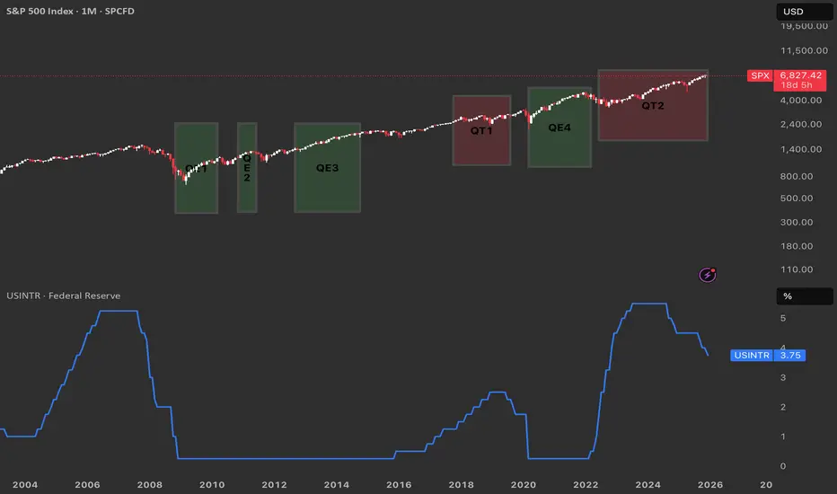
From QE to QT. Reading the Fed’s Cycle from the ChartQuantitative Easing (QE) is when the Federal Reserve buys large amounts of Treasuries and mortgage‑backed securities to expand its balance sheet, inject liquidity, and push interest rates lower across the curve.
Quantitative Tightening (QT) is the opposite: the Fed allows its bond holdings to roll off or sells securities, shrinking the balance sheet and tightening financial conditions.
QE near zero rates
Historically the Fed has only launched QE when the policy rate was pinned near zero and conventional rate cuts were basically exhausted, as in 2008–2014 and again in 2020–2022.
QT at elevated rates
By contrast, QT has been used only once the Fed had already hiked rates to clearly positive, “elevated” levels and wanted to normalize the balance sheet from those earlier QE waves.
What ending QT in December could imply
QT effectively ended around 1 December, it suggests the Fed may feel comfortable pausing balance‑sheet tightening while rates are still high, opening the door later to cuts if growth or markets weaken.
In that setting, the market could start to price a shift from outright restriction toward neutrality, which often coincides with more two‑sided volatility in risk assets.
Echoes of the QT1 → QE3 window
The period after QT1 and before QE3 saw rates come off their highs and then a major shock (COVID-18 crysis) that helped justify easier policy again.
A similar path is plausible here: a “black swan” type event in the coming year could hit growth or credit, force a rapid drop in rates, and trigger a new QE‑style response that would rhyme with the QT1‑to‑QE3 sequence your chart visually captures.
Why the Reaction Matters More Than the Level!!!Most traders spend their time hunting for the perfect level.✖️
Support. Resistance. Demand. Supply.
They draw the zone… and assume price must react.
But professionals know something crucial:
The level itself is not the edge.
The reaction is.
Here’s why.
1️⃣ Levels Are Common Knowledge
Everyone sees the same support.
Everyone sees the same resistance.
If levels alone were enough, everyone would be profitable.
A level is just a location.📍
It doesn’t tell you who is in control.
2️⃣The Reaction Reveals Intent
What matters is how price behaves at the level.
Ask yourself:
- Does price reject immediately or hesitate?
- Are candles impulsive or overlapping?
- Does price leave the level with strength or drift away slowly?
A strong reaction tells you:
➡️ One side stepped in aggressively.
A weak reaction tells you:
➡️ The level exists… but conviction doesn’t.
3️⃣ Clean Rejections Beat Perfect Levels
A slightly imperfect level with a violent reaction
is far more valuable than a textbook level with no follow-through.
Professionals wait for:
- sharp rejections
- momentum expansion
- structure confirmation
They don’t assume... they observe.
4️⃣ Failed Reactions Are Warnings
When price reaches a level and does nothing…
that silence is information.
Failed reactions often lead to:
- level breaks
- deeper moves
- trend continuation
The market is telling you:
➡️ “This level no longer matters.”
📚The Big Lesson
Levels tell you where to look.
Reactions tell you what to do.
If you shift your focus from drawing levels to reading behavior at levels,
your trading instantly becomes clearer and more objective.
⚠️ Disclaimer: This is not financial advice. Always do your own research and manage risk properly.
📚 Stick to your trading plan regarding entries, risk, and management.
Good luck! 🍀
All Strategies Are Good; If Managed Properly!
~Richard Nasr

Overtrading Gold – Biggest Account KillerOvertrading Gold – Biggest Account Killer
🧠 What Overtrading REALLY Means in Gold
Overtrading is not just trading too often — it’s trading without edge, patience, or contextual alignment.
In XAUUSD, overtrading usually looks like:
Multiple entries in the same range
Chasing price after impulsive candles
Trading every wick, every breakout, every news spike
📌 Gold gives the illusion of opportunity every minute — but institutions trade very selectively.
🧨 Why Gold Is the Perfect Trap for Overtraders
Gold is engineered (by behavior, not conspiracy) to punish impatience 👇
🔥 Extreme volatility
🔥 Fast candles & long wicks
🔥 Sudden reversals
🔥 News-driven manipulation
🔥 Liquidity sweeps above & below range
💣 Result?
Retail traders feel forced to trade — and end up trading against structure and liquidity.
🧩 The Overtrading Cycle (Account Destruction Loop)
Most gold traders repeat this cycle unknowingly ⛓️
1️⃣ Enter early (no confirmation)
2️⃣ Stop-loss hit by wick
3️⃣ Re-enter immediately (revenge)
4️⃣ Increase lot size
5️⃣ Ignore bias & HTF context
6️⃣ Emotional exhaustion
7️⃣ Big loss → account damage
📉 This cycle has nothing to do with strategy — it’s pure psychology.
🧠 Why Strategy Stops Working When You Overtrade
Even a 60–70% win-rate strategy will fail if:
❌ Trades are taken outside optimal time
❌ Entries ignore higher-timeframe direction
❌ Risk increases after losses
❌ Rules are bent “just this once”
📌 Gold exposes discipline weakness faster than any other market.
⏰ Time Is the Hidden Edge in Gold
Gold does NOT move efficiently all day ⏱️
🟡 Asian Session → Range & traps
🟡 London Open → Liquidity grab
🟢 New York Session → Real direction
Overtraders:
❌ Trade Asian noise
❌ Enter mid-range
❌ Chase NY expansion late
Smart traders:
✅ Wait for liquidity first
✅ Trade after manipulation
✅ Enter once direction is clear
📉 Statistical Damage of Overtrading
Let’s talk numbers 📊
🔻 More trades = more spread & commission
🔻 Lower average R:R
🔻 Lower win probability
🔻 Higher emotional stress
🔻 Faster drawdowns
💡 One A-grade setup can outperform 10 random gold trades.
🧠 Psychology: The Real Root Cause
Overtrading is driven by internal pressure 👇
😨 Fear of missing out
😡 Anger after stop-loss
😄 Overconfidence after win
😴 Boredom during ranges
Gold feeds emotions — and then punishes them.
📌 Institutions wait. Retail reacts.
🛑 How Professionals Control Overtrading
Real solutions — not motivational quotes 👇
✅ Maximum 1–2 trades per session
✅ Trade only at predefined time windows
✅ Fixed risk per trade (no exceptions)
✅ Daily stop after 2 losses max
✅ Journal every impulsive entry
📘 If it’s not planned before price moves, it’s emotional.
🏆 Golden Rule of XAUUSD
💎 Gold is not hard because it’s random
💀 Gold is hard because it exposes impatience
You don’t need more trades.
You need more discipline.
📌 Final Truth
Most XAUUSD accounts don’t blow because of:
❌ Bad indicators
❌ Bad analysis
❌ Bad strategy
They blow because of overtrading driven by emotion.
📉 Overtrading is the biggest account killer in gold trading.

Clean vs Trap Pullbacks — Don’t Get FooledIn trading, a pullback can be an opportunity…
but it is also one of the most common traps that causes traders to lose money.
Some pullbacks allow you to enter with low risk, clean RR, and follow the trend smoothly.
Others look perfectly reasonable… until the market reverses and wipes out your stop loss.
So how do you tell a clean pullback from a trap pullback?
1. Clean Pullback – A Pause Before Continuation
A clean pullback is a healthy correction within a strong, intact trend.
Think of it as the market catching its breath before the next push.
Key characteristics of a clean pullback:
◆ The main trend remains clear
Higher highs – higher lows (uptrend)
Lower lows – lower highs (downtrend)
◆ The retracement is weaker than the impulse move
Smaller candles, shorter bodies, long wicks
No structural break
◆ Volume decreases during the pullback
Selling (or buying) pressure is not aggressive
The market is simply “resting”
◆ Price pulls back into a logical area
Previous support/resistance
Structural zones
Common Fibonacci levels (38.2 – 50 – 61.8)
👉 A clean pullback does not damage the trend’s integrity — it only tests it.
2. “Trap” Pullback – Looks Like a Retracement, Acts Like a Reversal
Trap pullbacks usually appear after a trend has extended too far or when momentum starts to fade.
They make traders think:
“It’s just a normal pullback…”
But in reality, smart money is already distributing.
Signs of a trap pullback:
◆ Trend strength is clearly weakening
New highs fail to exceed previous highs
Previous lows start getting broken
◆ The retracement is strong and aggressive
Large-bodied candles closing deep
Price moves confidently against the trend
◆ Volume increases during the pullback
This is no longer a technical retracement
Real money is changing direction
◆ Market structure breaks
Key highs/lows are violated
Break → retest → continuation in the opposite direction
👉 Trap pullbacks exploit a trend trader’s overconfidence.
3. A Common Mistake: “Price Pulls Back = Enter Trade”
Many traders don’t lose because of bad analysis,
but because they enter too early.
Familiar thoughts:
“It pulled back to support — buy.”
“The trend is still bullish.”
“That candle is just a retracement.”
But the market doesn’t care what you think.
It only cares about where the money is flowing.
4. How to Avoid Trap Pullbacks – Survival Rules
If you remember these three rules, you’ll avoid most pullback traps:
◆ Never enter just because price pulls back
Wait for confirmation:
rejection candles
small break & retest
clear reaction at structure
◆ Always check market structure first
Is the structure intact or broken
Are key highs/lows still respected?
◆ Compare impulse vs retracement
Strong impulse – weak pullback → trend is alive
Strong pullback – weak impulse → reversal risk
Why Central Banks Buy Gold — The Ultimate Asset of PowerWhen a central bank decides to buy gold, it is not simply adding another metal to its reserves. It is reinforcing the foundation of national financial power — a form of strength that does not rely on promises, carries no debt obligation, and cannot be manipulated by any superpower. In a modern financial system where nearly every asset represents someone else’s liability — from U.S. Treasuries to fiat currencies like USD or EUR — gold stands apart. It is not anyone’s debt, is immune to political influence, and cannot be printed. This absolute independence makes gold the ultimate anchor of national trust.
Gold carries a dual nature: it is both a durable financial asset and a geopolitical instrument. It protects national wealth in ways fiat currencies cannot. A country with substantial gold reserves possesses a shield for its currency, reducing vulnerability to exchange-rate shocks and enhancing stability during global cycles of volatility. History has repeatedly confirmed this pattern: during major inflationary periods — from 2008–2011, through the 2020 pandemic peak, to the inflation surge of 2022 — gold followed the same rule. When money lost value, gold rose. When central banks expanded money supply, gold became the final line of defense.
On the geopolitical level, gold’s role is even more pronounced. It does not depend on the U.S. dollar system, does not require SWIFT for settlement, and—most importantly—cannot be frozen like foreign exchange reserves. In an increasingly polarized world, gold has become the safest asset a nation can hold: silent power, yet profoundly real.
Central banks do not buy gold like retail investors. They accumulate it gradually and strategically over long periods, quietly, without disturbing prices or signaling intentions. Within reserve structures, gold sits alongside USD and U.S. Treasuries as a three-pillar framework: gold for systemic risk protection, USD for liquidity, and bonds for yield. In times of crisis, gold becomes an “activation asset” — sold to obtain USD, defend the exchange rate, stabilize confidence, and prevent currency collapse. This logic also explains the accelerating trend of de-dollarization across Asia, the Middle East, and especially the BRICS bloc.
Real-world examples reinforce gold’s role. China has consistently increased gold reserves from 2019 to 2025, according to PBoC disclosures, aiming to reduce USD dependence and strengthen the renminbi amid rising trade tensions. Russia provides the clearest case: after sanctions in 2022 froze most USD and EUR assets, gold remained untouched — serving as Russia’s financial immune system. In Turkey, when inflation surged to 60–80% between 2021 and 2023, the central bank expanded gold reserves to stabilize confidence in the lira — a strategy acknowledged in IMF surveillance reports.
The 2023–2025 period has revealed an undeniable truth: in a world marked by high inflation, a strong dollar, geopolitical conflict, and global recession risks, countries with large gold reserves — such as China, Russia, and India — maintained relative stability, while nations with weaker reserves struggled with currency crises, external debt, and inflation. When everything else depends on trust, gold depends on nature — and that is why it remains a pillar of national power even in the 21st century.

How to Use Candlesticks in a High-Probability Way | Tutorial #1In this tutorial, we break down candlestick analysis in a clear, structured, and practical way—focused on probability, context, and confirmation , not guessing.
You’ll learn what candlesticks really represent , how to read market intent behind them, and how to use them correctly within a high-probability trading framework.
🔍 What are candlesticks?
Candlesticks visually represent price behavior, showing the battle between buyers and sellers within a specific time period. Each candle tells a story—but only when read in context.
📘 Candlestick Types Covered in This Tutorial
📌 1) Shrinking Candlesticks
➡️ What is a shrinking candle?
Shows loss of momentum and potential market pause or reversal.
📌 2) Inside Bar Candlestick
➡️ What is an inside bar candle?
Indicates consolidation and compression before expansion.
📌 3) Takuri Line Candlestick
➡️ What is a Takuri Line candle?
A strong bullish rejection candle with a long lower wick.
📌 4) Hanging Man Candle
➡️ What is a hanging man candle?
Warns of potential bearish reversal after an uptrend.
📌 5) Inverted Hammer
➡️ What is an inverted hammer candle?
Shows buyer reaction after downside pressure.
📌 6) Shooting Star
➡️ What is a shooting star candle?
Signals seller dominance near highs.
📌 7) Spinning Top Candle
➡️ What is a spinning top candle?
Represents indecision between buyers and sellers.
📌 8) Spinning Bottom Candle
➡️ What is a spinning bottom candle?
Indicates uncertainty after downside movement.
📌 9) Doji Candle
➡️ What is a doji candle?
Shows balance—often a warning sign before a shift.
📌 10) Engulfing Candle
➡️ What is an engulfing candle?
Strong momentum candle that fully absorbs the previous one.
📌 11) Momentum Candlestick
➡️ What is a momentum candle?
Large-bodied candle showing aggressive participation.
📌 12) Change Color Candle
➡️ What is a change color candle?
Occurs after minimum 5 candles of one color , followed by a candle of the opposite color—often signaling momentum shift.
🧠 Best Practice
Candlesticks work best when multiple candles stack together, forming a story—not when traded individually.
This tutorial shows real chart examples of candle clustering and how to interpret them properly.
⚠️ Important Note
Candlesticks alone are NOT enough.
They should be combined with:
--> Support & Resistance
--> Areas of Confluence
--> Chart Patterns
--> Trendlines
--> Indicators
--> Other high quality traits
This is how high-probability setups are built.
👍 Want PART 2?
Leave a like and a comment below.
Follow for high-quality trading education and clean technical logic.
⚠️ DISCLAIMER
This content is for educational purposes only and does not constitute financial advice.
Trading involves risk—always conduct your own analysis.
I am not responsible for any decisions or losses based on this material.

The Crypto Money Flow CycleThe capital rotation cycle in the crypto market is not a theoretical concept, but a phenomenon that has repeated itself across multiple growth cycles. It reflects the natural behavior of capital flows: starting from the safest assets, then gradually spreading to higher-volatility instruments as confidence and risk appetite increase. Typically, capital first flows into Bitcoin — the foundational asset and “anchor” of the entire market — before rotating into Ethereum, a core ecosystem that consistently attracts strong inflows once market conditions stabilize.
When these two pillars begin to slow down, capital expands into large-cap altcoins, then accelerates into meme coins, and ultimately ends in the riskiest assets such as shitcoins. This is the point at which the market reaches peak heat: potential returns are enormous, but risk is also at its highest level.
If Bitcoin is the main river, Ethereum represents the major tributaries, altcoins are the canal system, and meme coins and shitcoins are the stagnant waters at the very end of the flow — the murkiest area, but also the place where many investors are most likely to “drown.” The imagery may sound harsh, but it accurately captures the market’s nature: the higher the potential return, the greater the downside, and near the end of the cycle, even a small variable can push the entire structure into chaos.
Understanding this cycle not only helps investors identify where the market currently stands, but also supports more rational capital allocation decisions. When capital is still concentrated in BTC and ETH, rushing into shitcoins offers little advantage and only increases the risk of capital loss. Conversely, when the market enters its euphoric phase, FOMO often overrides logic: newcomers rush in just as smart money is preparing to exit. Recognizing the cycle helps avoid these traps. It also explains the common frustration of “the coin I hold goes nowhere while others keep pumping,” because you understand where capital is flowing instead of investing based on emotion.
To accurately identify the market’s position within the cycle, it is essential to observe behavior at each stage. When BTC rallies strongly and BTC Dominance rises, capital is in the early phase. This is the time to focus on Bitcoin and avoid smaller altcoins, as they usually underperform when dominance expands. When Bitcoin starts to slow down, moving sideways or correcting slightly while the ETH/BTC pair trends steadily higher, capital is rotating into Ethereum. This phase often favors increasing exposure to ETH.
When both BTC and ETH stall, the market enters Altcoin Season. Altcoins with solid fundamentals, mid-to-large market capitalizations, and clear narratives become the primary destinations for capital. This is when Layer-1, Layer-2, DeFi, AI, and RWA sectors tend to perform strongly. However, this is still not the right time to dive into meme coins and shitcoins, as the market remains in the “mid-cycle” phase, where performance belongs to fundamentally backed assets rather than purely speculative tokens.
The final — and most dangerous — stage is when meme coins and shitcoins explode. The clearest signs are social media being flooded with x20, x50, or x100 stories and near-vertical price charts detached from any real product or utility. This is when smart money gradually exits, leaving the stage to new participants driven by euphoria. If participation is unavoidable, only a very small portion of capital should be allocated, with a mindset of “fast in, fast out,” because risk in this environment can materialize within hours.
To navigate the full cycle effectively, several indicators should be monitored consistently. BTC Dominance reveals whether the market is prioritizing safety or expanding toward risk. Market capitalization and liquidity determine both upside potential and downside resilience. Finally, the risk-on/risk-off environment clearly reflects investors’ willingness to take risk. When the market shifts to risk-on, altcoins and meme coins tend to surge; when it turns risk-off, capital typically flows back into BTC or stablecoins for defense.

How to Use Chart Patterns in a High-Probability Way Tutorial #1In this tutorial, I explain how to use chart patterns in a structured and high-probability way, focusing on confirmation, market logic, and clean execution.
WHAT IS A CHART PATTERN?
A chart pattern is a visual representation of price behavior that forms due to market psychology, supply and demand, and repeated trader reactions.
Chart patterns help identify potential continuations or reversals when confirmed correctly.
CHART PATTERNS COVERED IN THIS TUTORIAL
1.) Double Top
2.) Ascending Triangle Pattern
3.) Symmetrical Triangle Pattern
WHAT IS A DOUBLE TOP?
A Double Top is a bearish reversal pattern formed after an uptrend.
Price fails to break a resistance level twice, signaling buyer exhaustion and a potential shift in control from buyers to sellers.
WHAT IS AN ASCENDING TRIANGLE PATTERN?
An Ascending Triangle is a bullish continuation pattern characterized by higher lows pressing against a flat resistance level.
It reflects increasing buyer strength and often leads to a breakout once resistance is broken with confirmation.
WHAT IS A SYMMETRICAL TRIANGLE PATTERN?
A Symmetrical Triangle represents consolidation, where higher lows and lower highs compress price action.
The breakout direction defines the next impulsive move once volatility expands.
GENERAL STEP-BY-STEP PROCESS
1.) Identify the chart pattern on the chart
(Unconfirmed structure forming)
2.) Draw the key trendlines and neckline
(Support and resistance define structure validity)
3.) Wait for a break of BOTH the trendline and the neckline
(This confirms the chart pattern)
4.) Move to a lower timeframe and look for an entry
(Trade in the direction of the confirmed breakout using clean price action)
If you want PART 2 , leave a like and a comment.
Follow for high-quality trading education and clean technical logic.
DISCLAIMER
This content is for educational purposes only and does not constitute financial advice.
Trading involves risk. Always conduct your own analysis.
I am not responsible for any decisions or losses based on this material.
5 Must-Know Tips for Trading Gold. XAUUSD Must Know Secrets
After more than 9 years of Gold trading, I decided to reveal 5 essential trading tips , that will save you a lot of money, time and effort.
Of course, these trading recommendations won't make you rich, but they will certainly help you to avoid a lot of losing trades.
Whether you are new to Gold trading or an experienced trader, these insights will dramatically improve your trading.
Don't trade gold with a small account
I always repeat to my students that in gold trading, the risk per trade should not exceed 1% of a trading account.
It means that if your trades close with stop loss, you should lose maximum 1% of your deposit.
For the majority of the day trading and swing strategies, you will require at least 2000$ deposit to risk 1% per trade. Trading with a smaller account size, it will be challenging to follow this risk management principle of not exceeding 1%
Here is a day trade on Gold.
With a stop loss of 619 pips and a trading account of 10000$,
a lot size for this trade will be 0.02.
If the trade closes on stop loss, total risk will be 100$ or 1% of a trading account.
With a 100$ account, trading with a minimal lot 0.01, your potential risk will be 50$ or half of your trading account.
Check spreads
Spread may dramatically fluctuate on Gold.
High spreads can make it difficult for day traders to catch small price movements, reducing the profit potential of their trades.
Wide spreads can lead to slippage , where day traders may end up buying at a higher price and selling at a lower price than expected, increasing the risk of losses.
Gold has the lowest spreads during London and New York sessions,
while trading the Asian session is not recommended.
Personally, I don't trade Gold if the spread exceeds 100 pips.
In the picture above, you can see a current spread on Gold.
It is 30 pips. It is a relatively low spread, so we can trade.
Don't trade on US holidays
When US banks are closed, liquidity drops substantially on Gold.
It leads to increased spreads and higher probabilities of manipulations,
reduced volatility and very slow market.
For that reason, it is better not to trade Gold during US holidays.
You can easily find the calendar of US banking holidays on Google.
Simply take a break during these trading days.
Don't trade ahead of important US news
US news may dramatically affect Gold prices.
Such events as FOMC or FED Interest rate decision may trigger a high volatility and very impulsive movements.
My recommendations to you is to stay away from trading Gold one hour ahead of the important news releases.
You can find important US news in the economic calendar .
Just sort out the calendar in a way that it would display only significant news and pay attention to them.
Above, you can see the important US news for the coming days in the economic calendar.
Do not open multiple orders
Here is what many Gold traders do wrong:
once they place an order, instead of patiently waiting for a stop loss or take profit being reached, they start opening more orders.
Please, open one single trade per your prediction.
Open a new trade if only you see a new trading setup or your initial trade is already risk-free with a stop loss move to entry level.
Here is the example, a newbie trader decides to buy Gold and opens a long positions.
The market moves in the projected direction, and a trader opens one more trade.
The one can open even dozens of positions like that.
However, the problem is that the market can always suddenly reverse and all these trades will be closed in a loss.
It can lead to a substantial account drawdown.
Open a one single trading position instead.
I truly believe that these trading tips will help you improve your gold trading. Carefully embed these rules in your trading plan and watch how your trading performance improves.
❤️Please, support my work with like, thank you!❤️
I am part of Trade Nation's Influencer program and receive a monthly fee for using their TradingView charts in my analysis.

Mistakes I am Making In Implementing My Own Forex Trading PlanI know that we all want to see material of Forex Trading plans that actually work and bring in profit. We don't want to waste our time with what doesn't work.
Still, in this video I am talking about my lack of discipline in applying my own Forex trading plan which made me lose focus and get into a losing streak.
My Win/Loss ratio is still better, my balance is still above its initial amount, but to me all that is not important. Many people are result oriented, I am not. I am process oriented.
I need to trust my process. If I think that I have a solid Forex trading plan then I should follow it. If I am making changing to it then the plan needs changing.
My next steps are as follows:
1) Stop trading the Demo account and use the Replay Feature of TradingView to get more experience in implementing my own plan. With this action point, I will also discover if the current plan is profitable or if it needs changes.
2) Back to Education: I found a new Forex Educational Resource that I want to check out, and see if there is anything of that value there. This resource seems to be going deeper into SMC and teaches advanced areas to better understand liquidity.
I hope this video is helpful and a good reminder of the importance of discipline in Forex trading.

The system that turned ordinary traders into millionaires!!🐢 Turtle Trading Strategy
A classic, rule-based, and repeatable trend trading system
Introduction
The Turtle Trading strategy is one of the most documented and successful trading systems in financial market history. It was designed in the 1980s to prove that trading is a skill that can be taught, not an innate talent.
This strategy is built on three key principles:
• Trend Following
• Strict Risk Management
• Eliminating Emotional Decision-Making
1. Suitable Markets and Timeframes
Turtles only traded markets with the potential for large, sustained trends.
Suitable markets:
• Commodities (oil, gold, metals)
• Forex
• Indices
• Cryptocurrencies
Recommended timeframes:
• Daily (as the main timeframe)
• Weekly for long-term trend filtering
📌 Higher timeframes provide more reliable signals.
2. Entry Logic
Entries in this system are based on price breakouts, not predicting reversals.
System 1 – Short-Term Breakouts
• Buy: Break above the high of the last 20 candles
• Sell: Break below the low of the last 20 candles
System 2 – Long-Term Breakouts
• Buy: Break above the high of the last 55 candles
• Sell: Break below the low of the last 55 candles
📌 Enter only after a candle closes beyond the valid range.
ICT Turtle Soup Indicator:
To optimize entries, especially in short-term breakouts, the ICT Turtle Soup indicator can be used. It focuses on false breakouts, helping reduce invalid signals:
Identifies short-term high/low breakouts and checks volume/strength
Trades in the opposite direction of false breakouts (e.g., high breakout → short)
Quick exits with stop-loss near the breakout level
This tool allows the classic Turtle system to improve entry accuracy and reduce risk.
3. Filtering Invalid Trades
To avoid trading in ranging markets:
• If the last trade in the 20-day system was profitable → ignore the next signal
• If the last trade was a loss → the next trade is allowed
This rule ensures the system is only active under favorable conditions.
4. Stop-Loss and Exit Rules
Initial Stop-Loss:
• Distance: 2 × N (market volatility)
• Placed where the trend scenario is invalidated
Exit:
• Long trades: Break below the low of the last 10 candles
• Short trades: Break above the high of the last 10 candles
📌 Exits are entirely mechanical; no reevaluation is needed.
5. Risk Management
The core of the Turtle Trading system is risk management, not entry timing:
• Risk per trade: maximum 1% of capital
• Trade size adjusted according to market volatility
• All trades evaluated independently
🎯 Goal: Survive the market until large trends develop
6. Pyramiding
Turtles built big profits by adding positions logically:
• Add positions only on profitable trades
• Every 0.5 × N, add a new position
• Maximum 4–5 positions per trend
• Manage stop-loss across all positions
7. Psychological Structure
This strategy is psychologically challenging:
• Many small losses
• Few very profitable trades
• Low win rate but positive expected value
📌 Traders must endure losing streaks without breaking the rules.
8. Strengths and Weaknesses
Strengths:
• Fully rule-based and testable
• Removes emotions from decision-making
• Applicable across all markets
• Compatible with automation
Weaknesses:
• Weak performance in ranging markets
• Requires patience and discipline
• Occasional drawdowns
Final Summary
The Turtle Trading strategy teaches you to:
• React, don’t predict
• Accept losses quickly
• Let profits run
• Stick to the rules
• Use modern tools like ICT Turtle Soup to improve entry accuracy and turn false breakouts into opportunities
In this system, “being right” doesn’t matter; adherence to rules determines success.

BITCOIN'S ALL TIME HISTORY CHART(KEY INSIGHTS)This is a breakdown of all major waves that have occurred in Bitcoin's History. This chart might explain why CRYPTOCAP:BTC has been the most successful coin while also answering if the growth will be sustained. This is a pretty standard 5 wave move- Waves 1 to 4 having been completed(shown in Red). We are on our last Major wave before it becomes a complete 5 wave impulse.
Wave 1(Red) was followed by a Zigzag correction for Wave 2, hence we expected a Flat correction For Wave 4. Keep in mind, this Flat correction had been predicted almost 2 and a half years before, when Wave 2 was completed! Wave 4 had 3 internal waves namely A,B and C- shown in Blue.
With Wave 4 complete, it was time to launch our 5th Wave of the Major impulse. This 5th Wave has 5 internal waves as is typical for impulses and are shown in Green. Once again, when Wave 1(Green) completes we see a Flat correction for Wave 2 meaning our Wave 4 would most likely be a Zigzag correction. Note that these two corrections are best seen on the Weekly and Daily Charts.
With Wave 4(Green) complete, what we are left with is Wave 5(Green) in its final developments. Once this Wave 5 is complete, this will be the Wave 5(Red) of Bitcoin. When this happens, it will be the end of the first impulse that started in 0ct. 2009 and the beginning of Wave 2, which will be a massive correction!

MASTERING RISK MANAGEMENT: THE SURVIVAL SYSTEM FOR TRADERSRisk management is not just a safety net; it is the specific system used to control losses and protect your trading capital. Without a strict risk plan, even a highly profitable strategy will eventually fail. A few bad trades should never have the power to wipe out your account.
WHY IT IS CRUCIAL
Markets are inherently unpredictable. No matter how good the analysis is, probabilities dictate that losses will occur. Risk management:
1. Protects against emotional trading (fear and greed).
2. Ensures long-term survival so you can stay in the game long enough to be profitable.
3. Stabilizes your equity curve, avoiding massive drawdowns.
OUR CORE RISK RULES
1. PER TRADE RISK LIMIT
Never risk more than 0.7% to 2% of your total account balance on a single trade. This ensures that a losing streak does not destroy your capital.
Example:
If you have a $10,000 account, your maximum risk per trade should be between $70 and $200.
2. DAILY LOSS LIMIT
Do not open too many positions simultaneously. You must have a hard stop for the day. Your total daily loss limit should be a maximum of 15% of your portfolio. If you hit this limit, stop trading immediately for the day to prevent emotional revenge trading.
KEY TOOLS FOR RISK CONTROL
Use a Risk Calculator to automate your position sizing. Do not guess your lot size.
Stop Loss (SL): An order that automatically exits a losing trade at a specific price. This is your insurance policy. Never trade without it.
Take Profit (TP): An order that locks in gains at predefined levels.
Risk-to-Reward Ratio (RRR):
Always aim for 1:2 or better. This means if you are risking 50 pips/5%, your target should be at least 100 pips/10%. With a 1:2 ratio, you can be wrong 50% of the time and still be profitable.
ADVANCED TACTIC: MOVING STOP-LOSS TO ENTRY (BREAK-EVEN)
Moving the Stop-Loss to the Entry price is a technique used to eliminate risk exposure in an active trade. It involves adjusting your stop loss level to the exact price where you entered the market.
Why do this?
If the trade reverses against you after moving to entry, you lose $0. You have eliminated the risk while keeping the potential for profit open.
ADVANCED TACTIC: CLOSING PART OF A TRADE (PARTIALS)
You do not have to close 100% of a trade at once. Closing a portion (partial closing) is vital for managing psychology and banking revenue.
By taking profits on 50% or 75% of a position, you lock in gains immediately. You can then leave the remaining portion of the trade running to catch a larger trend with zero stress, as you have already banked profit.
COMING UP NEXT
In the next article, we will be diving into Types of Traders & Their Risk Management Styles
Disclaimer: This content is for educational purposes only and does not constitute financial advice. Trading involves significant risk.
- Tuffy (Team Mubite)
#RiskManagement #CapitalProtection #TradingSurvival #RiskReward

Surviving this market for 10 years taught me thisI’ve been trading this market for over 10 years.
In the beginning, all I cared about was how much I could make.
That’s what most people focus on.
What I learned the hard way is this:
If the account doesn’t survive, nothing else matters.
No funds means no next trade.
No next trade means no edge, no learning, no comeback.
There were long periods where I wasn’t making money.
But I was protecting my ability to stay in the game.
That mattered more than being right.
This chart isn’t about profits.
It’s about still being here.

How to Use S & R in a High-Probability Way | Tutorial #1❓ What is Support & Resistance?
Support and Resistance are key price levels where the market has previously shown strong reactions, often leading to reversals, pauses, or continuations.
🧩 Key Traits of High-Quality Support & Resistance
✔ Multiple rejections ( minimum 2 , more is better)
✔ Level has acted as both support and resistance
✔ Recently respected by price (close to the left structure)
✔ Recently formed level (fresh in market memory)
✔ Strong and impulsive move away from the level
✔ Very obvious level (can be spotted within seconds)
📌 Note:
Not all traits are required.
The more traits align, the higher the probability.
⚠️ Important
Support & Resistance alone is not enough .
High-probability setups come from combining S&R with:
🕯 Candlestick confirmation
🧠 Area of confluence
📐 Chart patterns
⏱ Multi-timeframe alignment
📊 Other high-quality technical factors
👍 Want PART 2?
Leave a like and a comment below.
📈 Follow for high-quality trading education and clean technical logic.
⚠️ DISCLAIMER
This content is for educational purposes only and does not constitute financial advice.
Trading involves risk—always conduct your own analysis.
I am not responsible for any decisions or losses based on this material.

What The Cumulative Volume Index Can Say About Smart Money
The cumulative volume index is an indicator of great importance when trying to suffice the difference between a strong market and a weak one.
One thing that has interested me as related to this indicator is related to the divergences between the CVI and price movement.
Overall, you surely would like the underlying stock to have an overall upwards trending CVI, as this indicates that there is a strong demand for that market and money is consistently flowing into it.
A downwards CVI would indicate that sellers are exiting their positions and have lost faith in the market.
However, with that being said there is something to say about the divergences and convergences of the CVI and price movement.
Key points of rising CVI and falling price:
Accumulation / absorption: Buyers may be quietly absorbing supply on the way down, so the breadth/volume backdrop is improving before price reflects it.
Selling pressure is weakening: The down-move may be running out of fuel (fewer stocks participating on volume), even if the index/price is still drifting lower.
Higher odds of a reversal or bounce: Not guaranteed, but divergences like this often precede a short-term bottom, especially if you later see price break structure (higher high / reclaim key levels).
Key points of falling CVI and rising price:
Rally on narrowing participation: Fewer stocks (or less advancing volume) are powering the move, so the uptrend is more fragile.
Distribution / fading demand: Buyers are still lifting price, but the net volume backdrop is deteriorating—often seen near exhaustion tops or late-stage pushes.
Higher odds of a pullback or reversal: Especially if price is making new highs while CVI makes lower highs.
I believe that this is a macro-level indicator that can provide valuable insights into the overall health of a given market, but in order to trade based off of this indicator at favorable entries it would require other filters and catalysts to time the market more efficiently.
Disclaimer: The information provided is for educational and informational purposes only and does not constitute financial, investment, legal, or tax advice. I am not a licensed financial advisor, and nothing here should be considered a recommendation to buy, sell, or hold any security, cryptocurrency, or other financial instrument. Trading and investing involve risk, including the possible loss of principal. You are solely responsible for your decisions—do your own research and consider consulting a qualified professional before making any financial decisions. Past performance is not indicative of future results.

Confirming Chart Patterns With VolumeIn the chart above, one can clearly recognize the Wyckoff Market Cycle pattern. The pattern's legitimacy can be confirmed by volume. The volume is represented in the lower portion of the chart.
Low to average volume candles are blue. Average volume is indicated by light blue candles. Yellow candles represent higher than average volume. Orange is high volume. And red represents extremely high volume.
You will see each phase of the Wyckoff Market Cycle pattern confirmed by this volume on our current Bitcoin chart.
First, the market enters the accumulation phase. Market volume is fairly high, as seen in the accumulation quadrant in the lower left on the chart. However, it is important to note that there is an equal distribution of high-volume selling days as there are high-volume buying days. Thus, price tends to trend sideways within the channel until the true buying power comes into action.
Next, the buyers step in and take the price higher. This is generally indicated by a high-volume day when the price breaks above the accumulation channel. When buyers step in, most of the yellow and orange volume candles are, in fact, buyers in the markup phase. You can verify this is true by lining these higher-than-average volume candles up with the green price candles on the Bitcoin chart. This indicates the markup phase has begun and is underway.
Then, we come to the distribution phase on our chart. Notice the volume in that 3rd quadrant, the distribution quadrant. It is mostly average volume. Institutional sellers are attempting to carefully exit quietly. But you can also see that near the end of the distribution phase, sellers are starting to step in, tipping their hats and indicating that the distribution phase is about to end.
Finally, sellers take back full control, dropping us from the distribution channel altogether. High volume selling confirms this move and the pattern. The final quadrant in the bottom right proves that mostly sellers have control, as the majority of higher volume candles (yellow, orange, and red) are credited to the sellers.
Our Wyckoff Market Cycle pattern is now confirmed, and further selling can be expected until volume is once again taken back by the buyers. One will need to see clearly that high-volume candles are in line with green price candles. In this chart, that is not yet the case. Thus, more selling should be expected until it is clearly evident that buyer command control once again.
Hope you found this brief educational write-up informative and helpful, as volume can often be utilized in many uncertain pattern formations to find pattern legitimacy and confirmation.
✌️Stew
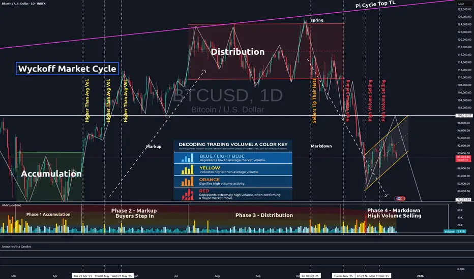
Side-by-Side Proof Retail Wealth Was Structurally Extracted!This is not an opinion.
This is comparative math.
--------------------------------------------------
OLD CYCLES VS THIS CYCLE
THEN (2017–2021)
Typical altcoin launch:
- Launch market cap: $20M – $200M
- Circulating supply: 60–90%
- FDV approximately equal to market cap
- Unlocks: minimal or short
Result:
- Public markets performed price discovery
- Clear risk → reward asymmetry
- CRYPTOCAP:TOTAL3ES expanded 10×–20×
--------------------------------------------------
NOW (POST-2021)
Typical altcoin launch:
- Launch FDV: $2B – $10B
- Circulating supply: 10–20%
- FDV far above market cap
- Unlocks: 3–5 years, linear
Result:
- Valuation discovery happens before retail access
- Public markets absorb scheduled exits
- CRYPTOCAP:TOTAL3ES remains structurally capped
This is not market weakness.
This is valuation engineering.
--------------------------------------------------
EXAMPLES:
CRYPTOCAP:SUI
- Max supply: 10B
- Circulating supply: ~35%
- Market cap: ~6B
- FDV: ~16B
Sol-normalized fair value: ~3B
Retail entry conditions:
- ~2× normalized value
- ~65% supply still pending unlocks
--------------------------------------------------
CRYPTOCAP:APTO
- Launch FDV: ~10B
- Circulating supply: <15%
- Unlock schedule extends to 2030
Public markets were not designed to reprice APT upward.
They were designed to distribute supply over time.
--------------------------------------------------
CRYPTOCAP:ARBI
- Launch FDV: ~12B
- Circulating supply: ~12%
- Persistent unlock pressure
Network usage increased.
Token price did not compound.
This is design working as intended.
--------------------------------------------------
WHY RETAIL HAD NO WINNING STRATEGY
Retail could not:
- Buy early
- Influence supply
- Avoid unlock schedules
- Participate in valuation setting
All paths led to:
- Time exposure
- Dilution
- Opportunity cost
This was not misexecution by retail.
It was structural exclusion.
--------------------------------------------------
CONCLUSION
There will be no traditional alt season because this cycle was designed so that:
- Upside was realized privately
- Risk was transferred publicly
- Protocol success did not require token appreciation
HOW TO USE IMPORT & EXPORT LIST IN WATCHLISH IN TRADINGVIEWThis video explains how to use the import and export list feature in the Trading-View watchlist. It covers how watchlists can be imported, exported, and managed using the available tools within the platform. The focus is on understanding the interface and the correct usage of these features to organize and transfer watchlists efficiently.
This content is purely instructional and is intended to help users learn how to work with the import and export watchlist tools inside Trading-View, without any market analysis or trading recommendations.

Investing in Gold: A Comprehensive Analysis1. Why Invest in Gold?
Gold offers several compelling reasons for investment. Primarily, it acts as a hedge against inflation. During periods when the purchasing power of fiat currencies declines, gold prices generally rise, preserving wealth. For example, during the 1970s, the US experienced high inflation, and gold prices surged dramatically.
Additionally, gold provides protection during economic and geopolitical uncertainty. In times of financial crises, such as the 2008 global recession, investors flocked to gold as a safe-haven asset. Gold is not tied to any single country’s economy, making it a globally recognized store of value.
Diversification is another key reason. Financial advisors often suggest including gold in an investment portfolio to reduce overall risk. Unlike stocks or bonds, gold has a low or negative correlation with other asset classes, which means its value can remain stable or even rise when other investments falter.
2. Forms of Gold Investment
Investors can access gold through various channels, each with unique advantages and considerations:
Physical Gold: This includes gold bars, coins, and jewelry. Physical gold provides tangible ownership and a psychological sense of security. However, it requires safe storage and insurance, and liquidity can sometimes be a concern.
Gold ETFs (Exchange-Traded Funds): These funds track gold prices and are traded on stock exchanges. They offer a convenient and liquid way to invest without dealing with physical gold. They typically have lower transaction costs compared to buying physical gold.
Gold Mutual Funds: These invest in gold mining companies or gold-related assets. They offer exposure to gold without owning it directly and can generate returns through dividends and capital appreciation.
Gold Futures and Options: These are derivatives that allow investors to speculate on future gold prices. They can provide significant leverage but carry high risk, making them suitable only for experienced investors.
Digital Gold: This is a modern form of investment where investors can buy gold online in small quantities. It offers convenience and security without the need for physical storage.
3. Factors Influencing Gold Prices
Gold prices are influenced by a combination of macroeconomic, geopolitical, and market-specific factors. Understanding these drivers can help investors make informed decisions:
Inflation and Interest Rates: Gold is often inversely related to interest rates. When real interest rates (adjusted for inflation) are low or negative, gold becomes more attractive, driving up prices.
Currency Movements: Gold is priced in US dollars globally. A weaker dollar makes gold cheaper for other currency holders, often increasing demand. Conversely, a stronger dollar can suppress gold prices.
Geopolitical Risks: Wars, conflicts, and political instability can increase demand for gold as a safe-haven asset.
Central Bank Policies: Central banks around the world hold significant gold reserves. Changes in their buying or selling behavior can impact global prices.
Supply and Demand: Gold mining production, recycling, and industrial demand (especially in jewelry and technology) influence supply and demand dynamics.
4. Benefits of Investing in Gold
Investing in gold provides multiple advantages:
Wealth Preservation: Gold has historically maintained its value over centuries, protecting investors from currency depreciation and economic downturns.
Portfolio Diversification: It reduces overall portfolio risk due to its low correlation with stocks and bonds.
Liquidity: Gold is globally recognized and can be quickly sold or exchanged for cash in most markets.
Inflation Hedge: Gold tends to retain purchasing power during periods of rising prices.
Safe Haven During Crises: It is considered a stable investment during financial and geopolitical turmoil.
5. Risks of Investing in Gold
Despite its advantages, gold investment carries certain risks:
Price Volatility: Although gold is less volatile than stocks, it can still experience short-term price fluctuations due to market sentiment or speculative activity.
No Income Generation: Unlike stocks or bonds, gold does not provide dividends or interest. Returns depend solely on price appreciation.
Storage and Security Concerns: Physical gold requires secure storage and insurance, which can incur additional costs.
Market Timing Risk: Buying gold at a peak can result in temporary losses if prices decline before an investor exits.
6. Strategies for Investing in Gold
Successful gold investment requires careful planning and strategy:
Long-Term Investment: Investors seeking stability can buy and hold gold for the long term to hedge against inflation and economic uncertainty.
Diversification: Allocate a portion of the portfolio to gold alongside equities, bonds, and real estate to balance risk. Many advisors recommend 5–15% of a portfolio in gold.
Dollar-Cost Averaging: Buying gold in regular intervals, regardless of price, can mitigate the impact of short-term volatility.
Monitoring Macroeconomic Trends: Keeping track of inflation rates, interest rates, currency movements, and geopolitical events can help in timing investments.
Combining Physical and Paper Gold: A combination of physical gold for security and ETFs or mutual funds for liquidity can optimize returns while managing risks.
7. Conclusion
Gold remains a timeless investment vehicle with unique advantages. It offers protection against inflation, acts as a hedge during economic and geopolitical instability, and provides diversification to investment portfolios. While gold does not generate income, its long-term value preservation and liquidity make it a preferred choice for conservative investors. Understanding the forms of gold investment, factors influencing its price, and implementing strategic approaches can help investors leverage gold effectively for wealth protection and growth.
Whether through physical ownership, digital platforms, or financial instruments, gold remains an essential component of a balanced investment strategy. By carefully assessing individual financial goals, risk tolerance, and market conditions, investors can harness the enduring appeal of gold to safeguard and grow their wealth.
World Finance Rating Agencies: An OverviewHistorical Background
The concept of credit ratings originated in the early 20th century. The first formal credit rating agencies were Moody’s (founded in 1909) and Standard & Poor’s (S&P) (with origins in 1860, evolving into S&P in 1941). Fitch Ratings, founded in 1913, also became a major player in the credit rating industry.
Initially, these agencies focused on rating bonds and fixed-income instruments in the United States. Over time, their operations expanded globally, covering sovereign nations, multinational corporations, structured finance products, and emerging markets. Today, the "Big Three"—Moody’s, S&P, and Fitch—dominate global credit ratings, collectively controlling roughly 95% of the market.
Purpose and Function
Financial rating agencies serve several critical functions in global finance:
Credit Risk Assessment: Agencies evaluate the likelihood that a borrower will default on obligations. Ratings range from high-grade (low risk) to junk (high risk), providing a snapshot of credit quality.
Investor Guidance: Investors, particularly institutional ones, use ratings to make informed investment decisions. Many funds and pension plans have policies restricting investments to certain rating thresholds.
Market Efficiency: Ratings reduce information asymmetry between borrowers and lenders. Investors can quickly gauge risk without conducting extensive internal research.
Regulatory Role: Financial regulators often incorporate ratings into capital adequacy rules. Banks, insurance companies, and investment funds may need higher capital reserves when investing in lower-rated securities.
Benchmarking and Pricing: Ratings influence borrowing costs. Higher-rated entities enjoy lower interest rates, while lower-rated issuers pay a premium for risk.
Types of Ratings
Financial rating agencies provide different types of ratings, depending on the instrument or entity being assessed:
Sovereign Ratings: Assess a country's ability and willingness to repay debt. These ratings impact government bond yields and influence foreign investment flows. Examples: U.S. AAA rating by S&P or India’s BBB- rating by Fitch.
Corporate Ratings: Evaluate corporations’ creditworthiness, often for bonds or long-term loans. These ratings reflect financial health, debt structure, profitability, and operational stability.
Structured Finance Ratings: Include mortgage-backed securities (MBS), collateralized debt obligations (CDOs), and asset-backed securities (ABS). These complex instruments require detailed risk modeling.
Municipal Ratings: Cover local government entities or projects, particularly in the U.S., affecting municipal bond markets.
Short-Term Ratings: Assess liquidity and ability to meet short-term obligations, often for commercial paper and money market instruments.
Rating Methodologies
Agencies use a mix of quantitative and qualitative methods to assign ratings. Key factors include:
Financial Ratios: Debt-to-equity ratio, interest coverage ratio, profitability, and liquidity.
Economic Environment: Macro conditions, inflation rates, currency stability, and economic growth.
Political Stability: For sovereign ratings, political risk, governance, and regulatory frameworks are crucial.
Industry Analysis: Sectoral trends, competition, and market dynamics.
Management Quality: Corporate governance, strategy, and operational competence.
The resulting rating is expressed as a letter grade. For example, S&P uses AAA (highest quality) to D (default), with intermediate grades like AA+, BBB-, etc. Moody’s uses a numeric system combined with letters (e.g., A1, Baa3).
Global Influence of Rating Agencies
Credit rating agencies have a profound impact on global finance:
Capital Flow Direction: Sovereign ratings influence foreign investment, with higher-rated countries attracting more capital.
Interest Rates and Borrowing Costs: Ratings directly affect yields on bonds and the cost of capital.
Financial Market Stability: Ratings changes can trigger large-scale portfolio reallocations, influencing stock and bond markets worldwide.
Emerging Markets: Agencies heavily affect emerging economies, where a downgrade can sharply increase debt servicing costs and reduce investor confidence.
Criticism and Controversies
Despite their significance, rating agencies have faced substantial criticism:
Conflict of Interest: Agencies are paid by the issuers they rate, creating potential bias. For example, during the 2008 financial crisis, they rated many subprime mortgage-backed securities as AAA, later revealed to be extremely risky.
Procyclicality: Ratings can amplify financial cycles. Downgrades during crises may force asset sales, worsening liquidity problems.
Opaque Methodologies: The complexity and lack of transparency in rating models, especially for structured finance products, make it difficult for external stakeholders to assess validity.
Regulatory Overreliance: Banks and investors often rely heavily on ratings for compliance, sometimes ignoring independent analysis, which can exacerbate financial instability.
Market Concentration: The dominance of the Big Three limits competition, potentially reducing innovation and accuracy in risk assessment.
Reforms and Modern Trends
In response to criticism, rating agencies have evolved:
Increased Transparency: Agencies now publish methodologies, criteria, and assumptions used in ratings.
Regulatory Oversight: Post-2008 reforms, such as the Dodd-Frank Act in the U.S. and EU regulation, increased oversight to reduce conflicts of interest.
Emergence of Alternatives: New players like DBRS Morningstar, Scope Ratings, and China Chengxin provide alternatives to the Big Three.
Integration of ESG Factors: Many agencies now incorporate environmental, social, and governance (ESG) metrics, reflecting long-term sustainability risks.
Technology and Big Data: Advanced analytics, machine learning, and real-time data improve predictive accuracy for ratings.
Regional and Global Perspectives
United States: The U.S. remains the center of rating agency operations, with S&P, Moody’s, and Fitch headquartered there. U.S. ratings influence global capital markets due to the dollar’s reserve currency status.
Europe: European regulators have attempted to encourage competition, with agencies like Scope Ratings (Germany) and Creditreform Rating gaining traction.
Asia: Emerging economies like China, India, and Japan have local agencies (e.g., China Chengxin, CRISIL, Japan Credit Rating Agency) to supplement international ratings.
Global Coordination: International bodies like the International Organization of Securities Commissions (IOSCO) set principles for credit rating agencies to enhance reliability and transparency globally.
Conclusion
World finance rating agencies play a critical role in shaping global financial markets. Their ratings guide investor behavior, influence borrowing costs, and contribute to market efficiency. However, their dominance and occasional lapses in judgment highlight the need for careful oversight, transparency, and the integration of alternative perspectives. The evolution toward ESG considerations, technological adoption, and regional diversification suggests that rating agencies will continue to adapt to the complex demands of modern global finance.
While their influence is undeniable, investors and policymakers must balance reliance on ratings with independent analysis and prudent risk management. The interplay between these agencies, global capital markets, and regulatory frameworks ensures that they will remain central players in international finance for decades to come.

Oil Market Volatility: An In-Depth Analysis1. Nature of Oil Market Volatility
Oil is a commodity with characteristics that make it inherently volatile. Unlike many other goods, its supply and demand are sensitive to a wide array of factors including geopolitical events, macroeconomic conditions, technological changes, and environmental policies. Volatility in the oil market is typically measured using statistical methods, such as standard deviation of price returns, implied volatility from futures options, or historical price ranges. High volatility reflects uncertainty in market fundamentals and can manifest as sudden and large price swings over short periods.
Historically, oil prices have experienced extreme fluctuations. For instance, the 1973 oil embargo led to a fourfold increase in crude oil prices, while the 2020 COVID-19 pandemic triggered a historic collapse in oil demand, causing oil futures to briefly turn negative in April 2020. These examples demonstrate the susceptibility of the market to both supply shocks and demand shocks.
2. Key Drivers of Oil Market Volatility
a. Geopolitical Events
Oil is highly concentrated in politically sensitive regions such as the Middle East, North Africa, and parts of South America. Conflicts, wars, sanctions, and political instability in these regions can significantly disrupt supply, creating volatility. For instance, tensions between Iran and the United States or conflicts in Libya have historically led to sudden spikes in crude oil prices due to fears of supply shortages.
b. Supply and Production Shocks
The oil market is influenced heavily by the production decisions of major oil producers, particularly the Organization of the Petroleum Exporting Countries (OPEC) and its allies (OPEC+). Decisions to cut or increase production can create short-term price fluctuations. Unexpected supply disruptions, such as hurricanes affecting Gulf of Mexico oil production or sabotage of pipelines, also contribute to volatility.
c. Demand Fluctuations
Global demand for oil is sensitive to macroeconomic conditions. Economic recessions, changes in industrial activity, or shifts in transportation patterns can drastically alter demand. For instance, the 2008 global financial crisis led to a sharp decline in oil consumption, causing prices to drop from over $140 per barrel to below $40 per barrel within months.
d. Financial Market Speculation
Oil markets are not only physical commodity markets but also financial markets. Speculators and institutional investors trading oil futures and options amplify price swings. Large inflows of capital into oil derivatives can exacerbate volatility, particularly when market participants react to news or market sentiment rather than fundamentals.
e. Technological and Structural Factors
Technological developments, such as fracking and deepwater drilling, have changed the supply dynamics of oil markets, particularly in the United States. These innovations can increase supply flexibility but also create periods of oversupply, contributing to price volatility. Additionally, structural factors like the capacity of strategic petroleum reserves and pipeline infrastructure influence the market’s ability to absorb shocks.
f. Currency Fluctuations
Since oil is priced in U.S. dollars, changes in the dollar’s exchange rate affect global oil prices. A stronger dollar tends to make oil more expensive in other currencies, potentially reducing demand, while a weaker dollar can boost demand and price. These currency dynamics often contribute to short-term volatility.
3. Impacts of Oil Market Volatility
a. Economic Implications
Volatility in oil prices directly affects inflation, production costs, and economic growth. Rising oil prices increase costs for transportation, manufacturing, and energy-intensive industries, leading to inflationary pressures. Conversely, falling oil prices can depress revenues for oil-exporting countries and oil-related industries, potentially slowing economic growth.
b. Corporate and Financial Implications
Companies operating in oil-intensive sectors, such as airlines, shipping, and petrochemicals, are highly exposed to price swings. Volatile oil prices complicate budgeting, hedging strategies, and investment planning. For financial markets, oil price swings influence equities, bonds, and currency markets, creating ripple effects across the global financial system.
c. Geopolitical and Strategic Implications
Oil market volatility can influence international relations and policy decisions. Countries heavily dependent on oil revenues, such as Saudi Arabia, Russia, and Venezuela, are vulnerable to price swings, which can affect domestic stability and foreign policy. For energy-importing nations, volatile oil prices can impact trade balances and energy security strategies.
d. Social and Environmental Implications
High oil price volatility can impact living costs, particularly for households dependent on fuel and transportation. This can lead to social unrest, as seen in historical “fuel riots.” On the environmental front, volatility may either encourage energy conservation and renewables adoption during high prices or increase fossil fuel consumption during low-price periods.
4. Strategies to Manage Oil Market Volatility
a. Hedging and Risk Management
Companies and investors often use financial instruments like futures, options, and swaps to hedge against price fluctuations. For example, airlines may lock in fuel costs through hedging contracts to stabilize expenses.
b. Diversification of Energy Sources
Countries and companies aim to diversify energy sources to reduce dependency on volatile oil prices. This includes investing in renewable energy, nuclear power, and natural gas.
c. Strategic Petroleum Reserves
Governments maintain strategic reserves to buffer against supply disruptions. Releasing oil from reserves can stabilize prices temporarily during crises.
d. Policy Measures
Monetary and fiscal policies can influence oil demand and indirectly stabilize prices. Additionally, international cooperation through organizations like OPEC can moderate production to reduce extreme volatility.
5. Recent Trends in Oil Market Volatility
In recent years, the oil market has experienced heightened volatility due to a combination of factors:
COVID-19 Pandemic: The unprecedented collapse in global demand led to negative oil prices for the first time in history, reflecting extreme volatility.
Energy Transition: The shift towards renewable energy and decarbonization policies introduces uncertainty about long-term demand for oil, influencing speculative behavior.
Geopolitical Tensions: Conflicts in the Middle East, sanctions on Russia, and geopolitical rivalries continue to create price swings.
Technological Disruption: The U.S. shale boom has added a flexible supply source, making the market more reactive to short-term demand changes.
Macroeconomic Volatility: Inflation, interest rate changes, and currency fluctuations add layers of uncertainty to oil pricing.
6. Conclusion
Oil market volatility is a multifaceted phenomenon driven by geopolitical, economic, financial, technological, and environmental factors. Its implications extend far beyond energy markets, influencing global economic stability, corporate strategy, geopolitical relations, and social welfare. Managing this volatility requires a combination of financial hedging, strategic reserves, diversified energy sources, and international cooperation.
As the world transitions toward renewable energy and as geopolitical uncertainties persist, oil market volatility is unlikely to disappear. Instead, it will evolve, with market participants needing to adapt to a more complex and interconnected energy landscape. Understanding the dynamics of oil price swings remains crucial for investors, policymakers, and businesses navigating the global economy.
