Examples of How to Determine When to Trade
Hello, fellow traders!
Follow us to get the latest information quickly.
Have a great day!
-------------------------------------
How can you profit from trading with charts that show the above movements?
To trade, you need a basic trading strategy.
This basic trading strategy varies from person to person, so it's important to create a basic trading strategy that suits you.
The basic trading strategy I'm suggesting is to buy in the DOM(-60) ~ HA-Low range and sell in the HA-High ~ DOM(60) range.
However, if the HA-High ~ DOM(60) range rises, a step-up trend is likely, while if the DOM(-60) ~ HA-Low range falls, a step-down trend is likely.
Therefore, you should trade using a segmented trading method.
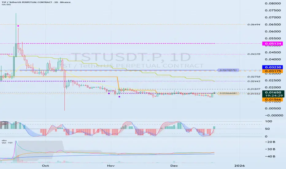
Looking at the chart, you can see that a step-down trend is occurring, and the HA-High indicator has been created for the first time.
Therefore, if the current HA-Low indicator level of 0.01566 is supported and the price rises, the wave will end around 0.03230.
If you zoom in on the chart, you can see that the M-Signal indicator on the 1D chart has risen above the HA-Low indicator and has broken above it.
Therefore, we can see that short-term trading is possible.
The following evidence supports this:
1. The TC indicator has risen above the 0 level.
2. The StochRSI indicator is showing an upward trend.
3. The OBV indicator is showing signs of rising above the High Line.
Therefore, we can initiate a trade around the HA-Low indicator level of 0.01566, depending on whether there is support.
However, since the price is in a stepwise downtrend, if it falls below 0.01566, we should cut our losses or sell in installments to secure funds for future purchases.
A full-scale uptrend is likely to begin when the M-Signal indicator on the 1W chart rises above it.
-
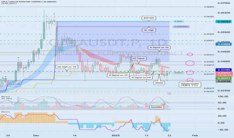
Unlike the TST chart, the CHZ chart has the M-Signal indicator from the 1M chart.
Therefore, to sustain a long-term uptrend, the price must rise above the M-Signal indicator on the 1M chart.
Currently, the price is in a stepwise downtrend, but it has risen above the M-Signal indicator on the 1W chart.
Therefore, if the price remains above the M-Signal indicator on the 1W chart, an uptrend is expected.
As mentioned earlier, the basic trading strategy considers the HA-High ~ DOM (60) range as a sell zone.
Therefore, we should respond based on the presence of support around the 0.04363-0.04631 range.
If the HA-High ~ DOM (60) range supports the price and rises, a stepwise uptrend is likely.
At this point, the key is whether the price can sustain itself by breaking above the M-Siganl indicator on the 1M chart.
-
To continue the uptrend by breaking above a key point or range, the following conditions must be met:
1. The TC indicator must be trending upward. If possible, it should remain above the zero level.
2. The StochRSI indicator must be trending upward. If possible, it should not enter the overbought zone.
3. The OBV indicator must be trending upward. If possible, it should remain above the High Line.
Based on the above conditions, the current price movement appears highly likely to continue upward.
However, if the price breaks above the next important level, the 0.04363-0.04631 range, we must reassess whether the above conditions are met.
------------------------------------------------------------
To trade, we strive to gather as much information as possible.
This information includes issues beyond the chart itself.
However, if you identify issues outside of the chart before the chart analysis is complete, you may end up analyzing the chart subjectively. Therefore, it's best to explore other issues after the chart analysis is complete.
The most important thing when looking at a chart is the flow of funds.
However, it can be difficult for individual investors to understand this flow.
Analyzing trading volume can also be difficult, so to simplify this process, we created the TC indicator, which utilizes the OBV and PVT indicators.
Furthermore, the DOM indicator, which comprehensively evaluates the DMI, OBV, and MONENTUM indicators, also includes trading volume and displays support and resistance points.
Additionally, you can activate the StochRSI 20, 50, and 80 indicators, as well as the OBV High and Low indicators.
You can utilize these indicators to further refine your trading strategy.
However, you should first check the movement and alignment of the M-Signal indicator on the 1M, 1W, and 1D charts.
Next, you should check the location of the DOM(-60) ~ HA-Low or HA-High ~ DOM(-60) range and determine whether there is support near those areas.
Using other people's indicators or chart analysis requires significant time and observation.
Otherwise, you are more likely to misinterpret the data and fail to trade.
To utilize my charts, it's recommended to activate the indicators as follows:
1. Activate only the M-Signal and HA-Low/HA-High indicators on the 1M, 1W, and 1D charts to check and observe the basic chart movements.
You can trade with these indicators alone.
However, if volatility occurs, the high and low points are not clearly defined, which can delay response times.
2. To prevent this, activate the DOM(60) and DOM(-60) indicators. The DOM(60) indicator represents a high, while the DOM(-60) indicator represents a low.
Therefore, you can buy around the DOM(-60) ~ HA-Low range depending on whether there's support, and sell around the HA-High ~ DOM(60) range depending on whether there's support.
3. If you're comfortable interpreting steps 1 and 2, you can use the movements of the auxiliary indicators TC, StochRSI, and OBV.
Steps 1 and 2 can be thought of as indicating support and resistance points. When determining support near these points, refer to the movements of the auxiliary indicators TC, StochRSI, and OBV to help you determine whether there's support.
Becoming proficient at interpreting steps 1 through 3 will greatly aid you in identifying trading opportunities.
-
Thank you for reading to the end.
I wish you successful trading.
--------------------------------------------------
Stochastic RSI (STOCH RSI)
Examples of Using the StochRSI Indicator
Hello, fellow traders!
Follow us to get the latest information quickly.
Have a great day!
-------------------------------------
The StochRSI indicator combines the Stochastic indicator with the RSI indicator.
You can find more detailed explanations of this indicator online.
I'd like to explain how to utilize the StochRSI indicator to aid trading.
The standard way to interpret the StochRSI indicator is to interpret chart movements by touching and breaking out of overbought or oversold zones.
The method I use, utilizing this principle, is to draw a trend line.
That is, when the K value of the StochRSI indicator forms a peak in the overbought or oversold zone, I connect those points to create a trend line.
This creates a trend line like the one drawn in the example chart above.
However, when drawing a trend line, the candlestick that forms the peak in the overbought zone must be the open value of a bearish candlestick.
If not, the open value of the first bearish candlestick encountered to the right is used.
In the oversold zone, the peak is the low value.
-
I've also included a second method for interpreting the StochRSI indicator.
When the indicator is activated, the chart above will appear.
This can be intuitively seen by the StochRSI indicator appearing on the price candlestick.
To sustain an uptrend, the price must remain above the StochRSI 80 level.
Therefore, the StochRSI 80 level acts as resistance.
A decline below the StochRSI 20 level likely indicates a downtrend.
Therefore, the StochRSI 20 level acts as support.
This interpretation can be helpful when entering a trade.
However, the most important points are the support and resistance levels drawn on the 1M, 1W, and 1D charts.
Therefore, observing the movement of the StochRSI indicator near the support and resistance levels drawn on the 1M, 1W, and 1D charts can help you determine the trend.
-------------------------------
The StochRSI and RSI indicators are also indicators that utilize averages.
When interpreting indicators that utilize averages, it's important to consider the location of the average and how to interpret it accordingly.
Therefore, the StochRSI 50 indicator point can be used as an average.
Therefore, you can initiate a trade based on whether there is support at the StochRSI 50 indicator point.
As mentioned earlier, the most important points are the support and resistance levels drawn on the 1M, 1W, and 1D charts. Therefore, you should check the movement of the StochRSI indicator around these support and resistance points.
-
Thank you for reading to the end.
I wish you successful trading.
--------------------------------------------------

Example of how to draw a trend line using the StochRSI indicator
Hello, traders.
If you "Follow", you can always get new information quickly.
Have a nice day today.
-------------------------------------
We use the StochRSI indicator to draw a trend line.
We draw a trend line by connecting the peaks of the StochRSI indicator, i.e. the K line, when they are created in the overbought area or when they are created in the overbought area.
That is, when the K line of the StochRSI indicator forms a peak in the overbought area, the trend line is drawn by connecting the Open values of the falling candles.
If the candle corresponding to the peak of the StochRSI indicator is a rising candle, move to the right and use the Open value of the first falling candle.
When drawing the first trend line, draw it from the latest candle.
Since the third trend line indicates a new trend, do not draw anything after the third trend line.
The currently drawn trend line corresponds to the high-point trend line.
-
Therefore, you should also draw the low-point trend line.
The low-point trend line is drawn by connecting the K line of the StochRSI indicator when the top is formed in the oversold zone.
The low-point trend line uses the low value of the candle when the K line of the StochRSI indicator forms the top in the oversold zone.
That is, it doesn't matter whether the candle is a bearish candle or a bullish candle.
The drawing method is the same as when drawing the high-point trend line, drawing from the latest candle.
The top of the best K line of the StochRSI indicator was not formed within the oversold zone.
(The top is indicated by the section marked with a circle.)
Since the trend line was not formed, the principle is not to draw it.
If you want to draw it and see it, it is better to display it differently from the existing trend line so that it is intuitively different from the existing trend line.
-
The chart below is a chart that displays the trend line drawn separately above as a whole.
It is also good to distinguish which trend line it is by changing the color of the high-point trend line and the low-point trend line.
The chart below is a chart that distinguishes the high-point trend line in blue (#5b9cf6) and the low-point trend line in light green (#00ff00).
The low-point trend line is a line drawn when the trend has changed, so it does not have much meaning, but it still provides good information for calculating the volatility period.
-
To calculate the volatility period, support and resistance points drawn on the 1M, 1W, and 1D charts are required.
However, since I am currently explaining how to draw a trend line, it is only drawn on the 1M chart.
-
I use the indicators used in my chart to indicate support and resistance points.
That is, I use the DOM(60), DOM(-60), HA-Low, HA-High, and OBV indicators to indicate support and resistance points.
Since the DOM(-60) and HA-Low indicators are not displayed on the 1M chart, I have shown the 1W chart as an example.
The indicators displayed up to the current candle correspond to the main support and resistance points.
Although it is not displayed up to the current candle, the point where the horizontal line is long is drawn as the sub-support and resistance point.
It is recommended to mark them separately to distinguish the main support and resistance point and the sub-support and resistance point.
The trend line drawn in this way and the support and resistance points are correlated on the 1D chart and the volatility period is calculated.
(For example, it was drawn on the 1M chart.)
The sections marked as circles are the points that serve as the basis for calculating the volatility period.
That is,
- The point where multiple trend lines intersect
- The point where the trend line and the support and resistance points intersect
Select the point that satisfies the above cases at the same time to display the volatility period.
When the point of calculating the volatility period is ambiguous, move to the left and select the first candle.
This is because it is meaningless to display it after the volatility period has passed.
If possible, the more points that are satisfied at the same time, the stronger the volatility period.
If the K-line peak of the StochRSI indicator is formed outside the overbought or oversold zone, it is better to exclude it when calculating the volatility period.
-
The chart below is a chart drawn on a 1D chart by summarizing the above contents.
The reason why there are so many lines is because of this reason.
For those who are not familiar with my charts, I have been simplifying the charts as much as possible these days.
However, when explaining, I have shown all the indicators to help you understand the explanation.
-
Thank you for reading to the end.
I hope you have a successful trade.
--------------------------------------------------

StochRSI indicator and support and resistance levels
Hello, traders.
If you "follow" me, you can always get the latest information quickly.
Have a nice day today.
-------------------------------------
The StochRSI indicator on the left chart is slightly different from the StochRSI indicator on the right.
The StochRSI indicator on the left chart is the StochRSI indicator provided by default in TradingView, and the StochRSI indicator on the right chart is an indicator with a modified formula.
The StochRSI indicator is a leading indicator that is reflected almost in real time.
Therefore, it reacts sensitively to price changes.
Although it is advantageous because it reacts sensitively, it also increases the possibility of being caught in a fake, so I thought that a slight delay(?) was necessary, and so I created the StochRSI indicator on the left chart.
If you look at the relationship between the K and D of the StochRSI indicators on the two charts, you can see that there is a big difference.
In the end, you can predict the movement by checking whether the movement of the K line has escaped the overbought or oversold section.
However, I think that you will receive information that can determine the sustainability of the trend depending on the positional relationship between K and D.
Therefore, it is important to distinguish the inflection points that occur in the StochRSI indicator.
This is because these inflection points provide important information for drawing trend lines.
Therefore, the StochRSI indicator on the left chart, which better expresses the inflection point, is being used to draw the trend line.
(Unfortunately, this indicator was not registered on TradingView because I did not explain it well.)
-
As a new candle was created, the StochRSI indicator on the left chart is showing an inflection point on the K line.
The StochRSI indicator on the right chart is showing a transition to a state where K < D.
We will have to check whether the inflection point was created only when today's candle closes, but I think that the fact that it is showing this pattern means that there is a high possibility of a change in the future trend.
Since the next volatility period is expected to start around July 2nd (July 1st-3rd), I think it has started to show meaningful movements.
-
It is true that you want to buy at the lowest price possible and sell at the highest price.
However, because of this greed, one mistake can lead to a loss that can overturn nine victories, so you should always be careful.
Therefore, if possible, it is better to check for support and respond.
In that sense, I think it is worth referring to the relationship between K and D of the StochRSI indicator on the left chart.
This is because the actual downtrend is likely to start when K < D.
-
In order to check for support, you definitely need support and resistance points drawn on the 1M, 1W, and 1D charts.
Ignoring this and checking for support at the drawn support and resistance points can result in not being able to apply the chart you drew to actual trading.
Therefore, you should draw support and resistance points first before starting a trade.
Otherwise, if you draw support and resistance points after starting a trade, you are more likely to set support and resistance points that reflect your subjective thoughts, so as I mentioned earlier, you are more likely to lose faith in the chart you drew.
If this phenomenon continues, it will eventually lead to leaving the investment market.
-
It is important to determine whether there is support by checking the correlation between the StochRSI indicator and other indicators at the support and resistance points drawn on the 1M, 1W, and 1D charts.
Even if the inflection point of the StochRSI indicator or other indicators occurs at a point other than the support and resistance points you drew, you should consider it as something that occurred beyond your ability to handle.
In other words, you should observe the price movement but not actually trade.
As I mentioned earlier, if you start to violate this, you will become less and less able to trust the chart you drew.
-
Accordingly, the basic trading strategy I suggest is to buy near the HA-Low indicator and sell near the HA-High indicator.
However, since the HA-Low and HA-High indicators are expressed as average values, they may move in the opposite direction to the basic trading strategy.
In other words, if the HA-Low indicator is resisted and falls, there is a possibility of a stepwise downward trend, and if the HA-High indicator is supported and rises, there is a possibility of a stepwise upward trend.
Therefore, the basic trading strategy mentioned above can be considered a trading strategy in the box section.
In the case of deviating from this box section, it is highly likely to occur before and after the volatility period indicated by the relationship between the trend line using the StochRSI indicator mentioned above and the support and resistance points drawn on the 1M, 1W, and 1D charts.
Therefore, special care is required when conducting new transactions during the volatility period.
This is because there is a high possibility of being caught in a fake when trading during the volatility period.
-
The DOM(60) and DOM(-60) indicators are good indicators to look at together with the HA-Low and HA-High indicators.
The DOM indicator is an indicator that comprehensively evaluates the DMI, OBV, and MOMENTUM indicators.
Therefore, the DOM(60) indicator is likely to be at the end of the high point range, and the DOM(060) indicator is likely to be at the end of the low point range.
In the explanation of the HA-Low and HA-High indicators,
- I said that if the HA-Low indicator receives resistance and falls, there is a possibility that a stepwise downtrend will begin,
- and if the HA-High indicator receives support and rises, there is a possibility that a stepwise uptrend will begin.
In order for an actual stepwise downtrend to begin, the price must fall below DOM(-60), and in order for a stepwise uptrend to begin, it must rise above DOM(60).
In other words, the DOM(-60) ~ HA-Low section and the HA-High ~ DOM(60) section can be seen as support and resistance sections.
-
If these correlations start to appear, I think you will be able to create a trading strategy that fits your investment style without being swayed by price volatility and proceed with trading.
The reason for analyzing charts is to trade.
Therefore, the shorter the time for chart analysis, the better, and you should increase the start of creating a trading strategy.
-
Thank you for reading to the end.
I hope you have a successful trade.
--------------------------------------------------

Mastering the Stochastic RSI - Guide to Spotting Momentum ShiftsIntroduction
In the world of technical analysis, momentum indicators are essential tools for understanding market sentiment and potential price movements. One such tool is the Stochastic RSI (Stoch RSI), a unique and highly sensitive variation of the traditional Relative Strength Index (RSI). While the standard RSI focuses on price, the Stoch RSI takes it a step further by measuring the momentum of the RSI itself. This makes it a faster-reacting and more dynamic indicator that many traders use to anticipate trend shifts and spot overbought or oversold conditions earlier.
What is the Stochastic RSI?
The Stochastic RSI (Stoch RSI) is a momentum oscillator that operates similarly to the RSI but with a twist — instead of measuring the price of an asset, it measures the movement of the RSI. Because of this, the Stoch RSI is typically more sensitive and quicker to respond to changes in market momentum.
It consists of two lines:
* The blue line: The primary line that reacts quickly and shows when the RSI is gaining or losing momentum.
* The orange line: A moving average of the blue line, which acts as a smoother version to help filter out noise and highlight potential turning points.
How to Read the Stoch RSI
The Stoch RSI moves between 0 and 100, and traders often focus on the 20 and 80 levels as key thresholds:
Above 80 (Overbought): Indicates that the RSI has been running hot compared to recent values. This suggests strong upward momentum that could be due for a slowdown or minor correction. However, it doesn’t necessarily mean the price will drop immediately, just that conditions are extended.
Below 20 (Oversold): Suggests the RSI has been suppressed, signaling weakening bearish momentum and a possible reversal upward. Again, this isn’t a guaranteed bounce but rather a situation where a shift may be more likely.
How to Trade with the Stoch RSI
While entering overbought or oversold zones can offer insight, trading solely based on those levels is risky. Instead, look for crossovers between the blue and orange lines:
Bearish signal: When the Stoch RSI is above 80 and the blue line crosses below the orange line, it can indicate that bullish momentum is fading — a potential short entry.
Bullish signal: When the Stoch RSI is below 20 and the blue line crosses above the orange line, it may suggest that bearish momentum is weakening — a potential long entry.
These crossover points provide more reliable signals than the levels alone, especially when confirmed by price action or other indicators.
What Timeframes to Use
The Stoch RSI can be applied to any timeframe, but its effectiveness varies. On lower timeframes (like 1-minute or 5-minute charts), it generates many signals, including plenty of false or weak ones. For stronger and more reliable signals, it’s best used on higher timeframes such as the 4-hour, daily, weekly, or monthly charts. Generally, the higher the timeframe, the more significant the signal becomes.
Conclusion
The Stochastic RSI is a powerful indicator that combines the strengths of the RSI and Stochastic Oscillator to deliver sharper, more responsive momentum signals. While it’s tempting to act on overbought or oversold readings alone, true effectiveness comes from understanding the behavior of the two lines and using it in conjunction with other analysis tools. Whether you're a short-term trader or a long-term investor, mastering the Stoch RSI can add depth to your strategy and help you make more informed decisions.

Example of how to draw a trend line using the StochRSI indicator
Hello, traders.
If you "Follow", you can always get new information quickly.
Please click "Boost" as well.
Have a nice day today.
-------------------------------------
I have explained how to draw a trend line before, but I will take the time to explain it again so that it is easier to understand.
-
When drawing a trend line, it must be drawn on the 1M, 1W, and 1D charts.
However, since I focused on understanding the concept of drawing a trend line and the volatility period that can be seen with a trend line, I will explain it only with a trend line drawn on the 1D chart.
Please note that in order to calculate a somewhat accurate volatility period, support and resistance points drawn on the 1M, 1W, and 1D charts are required.
I hope this was helpful for understanding my thoughts on the concept of drawing trend lines and how to interpret them.
The main reason for drawing trend lines like this is so that anyone who sees it can immediately understand why such a trend line was drawn.
Then, there will be no unnecessary disagreements about the drawing, and each person will be able to share their opinions on the interpretation.
--------------------------
When drawing trend lines, the StochRSI indicator is used.
The reason is to secure objectivity.
When the StochRSI indicator touches the oversold zone and rises, the low corresponding to the peak is connected to draw a trend line between low points.
And, when the StochRSI indicator touches the overbought zone and falls, the Open of the downward candle corresponding to the peak is connected to draw a trend line between high points.
If the peak is not a downward candle, it moves to the right and is drawn with the Open of the first downward candle.
If you refer to the candlesticks of the arrows in the chart above, you will understand.
The trend line drawn as a dot is a high-point trend line, but it is a proper trend line because it does not touch the overbought zone between highs.
Therefore, you can draw a trend line corresponding to trend line 1.
Accordingly, around March 25-29, around April 8, and around April 14 correspond to the volatility period.
-
You can see how important the low-point trend line (2) is.
If the high-point trend line is properly created this time and the low-point trend line and the high-point trend line are displayed in the same direction, the trend is likely to continue along that channel.
If the StochRSI indicator rises and a peak is created in the overbought zone, you will draw a high-point trend line that connects to point A.
-
Thank you for reading to the end. I hope your transaction will be successful.
--------------------------------------------------

Example of explanation of chart analysis and trading strategy
Hello, traders.
If you "Follow", you can always get new information quickly.
Please click "Boost" as well.
Have a nice day today.
-------------------------------------
There was an inquiry asking for detailed information on how to analyze charts and create trading strategies accordingly, so I will take the time to explain it.
Before reading this article, you need a basic understanding of charts.
That is, you need to understand candles and price moving averages.
If you study this first and then read this content, I think you will have some understanding of trading.
---------------------------------------
Whether you are trading spot or futures, marking support and resistance points according to the arrangement of candles on the 1M, 1W, and 1D charts is the first task you need to do before trading.
To do this, you need to understand the arrangement of candles.
Therefore, before using my indicator, it is better to study candles first and understand the arrangement of candles.
When studying candles, it is better not to try to memorize the names or shapes of various patterns.
This is because the overall understanding of candles is important, not the various patterns of candles.
If you study with a book or video, you will be able to understand candles after reading or watching them at least 3 times.
We study charts to trade, not to analyze charts and teach them to others, so we need to study efficiently and save time.
-
If you study candles, you will naturally understand the price moving average.
The indicator corresponding to the price moving average is the MS-Signal indicator.
This MS-Signal indicator consists of the M-Signal indicator and the S-Signal indicator, and the main indicator is the M-Signal indicator.
Therefore, we added the M-Signal indicator of the 1W chart and the M-Signal indicator of the 1M chart to the 1D chart so that we can see the overall trend.
-
You can see the arrangement of the MS-Signal (M-Signal of 1M, 1W, 1D charts) indicators in the example chart.
Currently, since the M-Signal of the 1M chart > the M-Signal of the 1W chart, we can see that it is a reverse array.
If you understand the price moving average, you will understand that we should not trade when it is a reverse array, but when it is a regular array.
Therefore, since the current state of the example chart is a reverse array, it is not suitable for trading.
However, the reason we brought this chart in this state is because the M-Signal indicators of the 1M and 1W charts are converging.
As convergence progresses, it will eventually diverge.
Therefore, since the possibility of price volatility increases, the possibility of capturing the timing for trading increases depending on whether there is support at the support and resistance points.
-
The indicators included in the example chart are drawn as horizontal lines to indicate support and resistance points.
This work performs the same role as the support and resistance points drawn on the 1M, 1W, and 1D charts according to the arrangement of the candles mentioned above.
Therefore, on the 1M, 1W, and 1D charts, horizontal lines are drawn on the indicators to indicate support and resistance points.
You can draw horizontal lines on indicators that are horizontal for at least 3 candles, and if possible, 5 candles.
-
Among the HA-MS indicators, the important indicators are the HA-Low and HA-High indicators.
The HA-Low and HA-High indicators are indicators created for trading on the Heikin-Ashi chart.
Therefore, it is the next most important indicator after the MS-Signal (M-Signal on 1M, 1W, 1D charts) indicator that can tell the trend.
You can create a trading strategy depending on whether there is support near the HA-Low, HA-High indicators.
-
The next most important indicator is the BW(0), BW(100) indicator.
When this indicator is created or touched, it is time to respond in detail.
That is, when you are trading with a trading strategy created from the HA-Low, HA-High indicators, when the BW(0), BW(100) indicators are created or touched, you can choose whether to proceed with a split transaction.
In addition, you can understand the OBV, +100, -100 indicators as response points for split transactions.
Therefore, you do not need to indicate support and resistance points for the OBV, +100, -100 indicators.
However, it is recommended to mark support and resistance points for the HA-Low, HA-High, BW(0), BW(100) indicators.
-
If you look at the price position in the example chart, you can see that it is located in the 0.03347-0.03485 range.
And, the M-Signal indicator of the 1W chart is passing through this range, and the HA-High indicator of the 1W chart is acting as support and resistance.
Therefore, whether there is support near 0.03485 is an important key point.
If support is confirmed near 0.03485, it is a time to buy.
However, since the MS-Signal (M-Signal on the 1D chart) indicator is passing between 0.03485-0.03814, the point to watch is whether the MS-Signal (M-Signal on the 1D chart) indicator can break through upward.
As I mentioned earlier, if the MS-Signal indicator passes, a trend change will occur, so it is significant.
Therefore, in order to turn into a short-term uptrend, it is likely to be supported around 0.03814-0.03982.
Therefore, the first split selling section will be around 0.03814-0.03982.
At this time, whether to sell or hold depends on your investment style and investment period.
-
Since the M-Signal indicator on the 1M chart is passing around 0.04341, it is likely to start when the price is maintained above the M-Signal indicator on the 1M chart in order to turn into a long-term uptrend.
Therefore, the second split selling period will be around the M-Signal indicator on the 1M chart.
This is also something you can choose.
-
An important volume profile section is formed around 0.03038.
Therefore, the 0.03038 point corresponds to a strong support section.
-
(30m chart)
When the time frame chart you are trading is below the 1D chart, it is recommended to activate the 5EMA indicator on the 1D chart.
(I just used the 30m chart as an example. The same principle applies to any time frame chart you usually use.)
This is because there is a high possibility of volatility when the 5EMA of the 1D chart and the M-Signal indicator of the 1M, 1W, and 1D charts are touched.
In other words, you can understand that it plays a certain role of support and resistance.
If it touches the HA-High, BW(100) indicator and falls and falls below the MS-Signal indicator, it will basically touch the HA-Low or BW(0) indicator.
On the other hand, if it touches the HA-Low, BW(0) indicator and rises and rises above the MS-Signal indicator, it will basically touch the HA-High or BW(100) indicator.
However, since it may not do so and may rise or fall in the middle, it is necessary for the support and resistance points drawn on the 1M, 1W, and 1D charts as mentioned earlier.
The support and resistance points drawn on the 1D chart are currently indicated at the 0.03347 point.
Therefore, even if it falls below the MS-Signal indicator, you can understand that there is a possibility of rising again around 0.03347.
Since the 5EMA of the 1D chart and the M-Signal indicator of the 1W chart are passing around 0.03485, we can see that the area around 0.03485 is an important support and resistance zone.
-
Since the StochRSI indicator is currently above 50, we should focus on finding a time to sell.
Since it has fallen below the BW(100) and HA-High indicators, it has fallen too much to start trading with a sell (SHORT) position.
However, if you can respond quickly, you can enter a sell (SHORT) position when it falls from the 0.03411 point where the MS-Signal indicator is passing.
When the StochRSI indicator falls below 50, we should focus on finding a time to buy.
At this time, you can trade based on whether there is support or resistance at the support and resistance points drawn on the 1M, 1W, and 1D charts or around the MS-Signal (M-Signal on the 1M, 1W, and 1D charts), 5EMA, HA-Low, HA-High, BW(0), and BW(100) indicators on the 1D chart.
As mentioned earlier, you should not forget that trading strategies can be created based on whether there is support at the HA-Low and HA-High indicators.
Therefore, if possible, it is recommended to trade based on whether there is support near the HA-High indicator point of 0.03443.
-
Thank you for reading to the end.
I hope you have a successful trade.
--------------------------------------------------
I need objective information to help me interpret the chart
Hello, traders.
If you "Follow", you can always get new information quickly.
Please click "Boost" as well.
Have a nice day today.
-------------------------------------
With this decline, the BW(100) indicator was created at 104556.23.
Accordingly, the high boundary section is the 101947.24-104556.23 section.
Unfortunately, since it fell below 101947.24, the key is whether it can receive support near the MS-Signal (M-Signal on the 1D chart) indicator, i.e., around 98892.0, and rise.
If it falls below the MS-Signal (M-Signal on the 1D chart) indicator and shows resistance, it is highly likely to turn into a short-term downtrend.
-
The settings for the StochRSI indicator I use are 14, 7, 3, 3 (RSI, Stoch, K, D).
The source value is ohlc4.
If you set it as above, it will show a movement similar to the StochRSI indicator on my chart.
When the StochRSI indicator
- falls in the overbought zone,
- is located near the 50 point,
- rises in the oversold zone,
volatility is likely to occur.
However, you should check whether there is support near the support and resistance points drawn on the 1M, 1W, and 1D charts and think of a corresponding response plan.
Therefore, by checking the relationship between the movement of the StochRSI indicator and the support and resistance points drawn on the 1M, 1W, and 1D charts, you can choose the point where you can make a trade.
If you can calculate these selection points, I think it is highly likely that you will be able to create a trading strategy that suits your investment style.
It is good to predict future movements with trends or waves, but if you can calculate the point where you can actually make a trade, I think you can create a better trading strategy.
-
I wrote a long article, but
1. Will the StochRSI indicator fall in the overbought zone?
2. Will it receive support near the MS-Signal (M-Signal on the 1D chart) indicator?
3. Will it rise to the high boundary section?
You should focus on the three things above.
---------------------------------
The method of drawing support and resistance points is drawn according to the arrangement of candles.
This method can actually include subjective thoughts, so it requires skill.
Therefore, if possible, I recommend that you sign up as a paid member of TradingView and share my charts with me, and use the HA-High, HA-Low, BW(100), BW(0), OBV, +100, -100 indicators that appear on 1M, 1W, and 1D charts by the HA-MS_BW+v2 indicator as horizontal lines and use them as support and resistance points.
Then, even if others look at the charts, they will be easier to understand, and it will be easier to share opinions on trading strategies according to each other's investment styles.
By utilizing indicators that anyone can use in this way, you will be able to view the charts objectively.
If you trade based on what others tell you, you will likely not be able to respond quickly when sudden volatility occurs.
Therefore, when creating a trading strategy, you should roughly think about how to respond to all cases, both when it goes up and when it goes down.
That's why it's best to draw support and resistance points or other reference materials on your chart if possible and prepare countermeasures accordingly.
-
Thank you for reading to the end.
I hope you have a successful trade.
--------------------------------------------------

Example of Interpretation of USDT, USDC, BTC.D, USDT.D
Hello, traders.
If you "Follow", you can always get new information quickly.
Please also click "Boost".
Have a nice day today.
Trading Strategy
-------------------------------------
(USDT 1D chart)
USDT is a stable coin that has a great influence on the coin market.
Therefore, the gap decline of USDT is likely to have a negative impact on the coin market.
Since the gap decline means that funds have flowed out of the coin market, it can be interpreted that funds have currently flowed out through USDT.
(USDC 1D chart)
USDC cannot help but have a lower influence on the coin market than USDT.
The reason is that USDC markets are not operated in all exchanges around the world.
In other words, USDC can be seen as having limitations compared to USDT as an American investment capital.
Therefore, the gap increase of USDT is likely to have a short-term impact on the coin market.
----------------------------------
(BTC.D 1D chart)
You can refer to BTC dominance to choose which side (BTC, Alts) to trade in the coin market.
Since the rise in BTC dominance means that funds are concentrated on BTC, it can be interpreted that Alts are likely to gradually move sideways or show a downward trend.
For this interpretation to be meaningful, USDT dominance must show a downward trend.
(USDT.D 1D chart)
Because the decline in USDT dominance is likely to result in a rise in the coin market.
Therefore, if USDT dominance rises, it may be a good idea to pause all trading and take a look at the situation.
-
You can roughly figure out whether funds are flowing into or out of the coin market with USDT and USDC.
You can roughly figure out which direction the funds in the actual coin market are moving with BTC dominance and USDT dominance.
As I am writing this, BTC dominance is rising and USDT dominance is falling, so it is better to trade BTC rather than Alts.
-
Thank you for reading to the end.
I hope you have a successful trade.
--------------------------------------------------

Example of how to trade without chart analysis
Hello, traders.
If you "Follow", you can always get new information quickly.
Please also click "Boost".
Have a nice day today.
-------------------------------------
Since the coin market can be traded 24 hours a day, 365 days a year, gaps do not occur as often as in the stock market.
(However, gaps may occur frequently in exchanges with low trading volume.)
In any case, I think that these movements provide considerable usefulness in conducting transactions.
Sometimes I told you to buy when the price drops by -10% or more.
Today, I will tell you why.
--------------------------------------
In order to trade, you must have basic knowledge of charts.
Otherwise, you are likely to conduct transactions incorrectly due to volatility.
However, such cases are less common in the coin market than in the stock market.
One of the reasons is that the current coins (tokens) are not being used for actual business purposes.
So, I think there are quite a few issues that cause volatility other than charts like stocks.
-
If the price falls one day and falls by about -10% from the high before a new candle is created, I buy.
The next day, if it falls by about -10% from the high again, I buy again.
When it falls by about -10% like this, I continue to buy in installments.
That's why I need to adjust my investment ratio.
-
If I buy like that, there will come a point where my price rises more than the average unit price.
In that case, when I'm making a profit, I sell the amount corresponding to the purchase principal in installments and leave the number of coins (tokens) corresponding to the profit.
If you want cash profit, you can sell a certain portion in installments.
Also, on the contrary, when it rises by about +10%, we proceed with a split sale.
-
As shown in the example chart, you can see that there are not many cases where it rises by -10% or +10%.
However, since it occurs more often in the case of altcoins than in BTC or ETH, you should pay special attention to adjusting your investment ratio when trading altcoins.
That is why you must check the price fluctuation range 1-3 hours before a new candle is created on the 1D chart.
This method is a method that can be traded even if you lack knowledge about charts.
If you let go of your greed a little and have the ability to split sell when you are making a profit, you will be able to meet the moment when a crisis becomes an opportunity.
-
Thank you for reading to the end.
I hope you have a successful trade.
--------------------------------------------------

Example of how to select a volatility period
Hello, traders.
If you "Follow", you can always get new information quickly.
Please also click "Boost".
Have a nice day today.
-------------------------------------
The date that I am talking about as a volatility period refers to a period in which there may be a movement that may change the trend.
In other words, it means that there is a high possibility of creating a new wave as the volatility period passes.
Basically, the volatility period is expressed as an issue regarding the coin (token) or a global issue, but the volatility period that I am talking about is expressed by the support and resistance points and trend lines drawn on the chart.
-
The support and resistance points refer to the points drawn on the 1M, 1W, and 1D charts.
In other words, they refer to the points of the HA-Low, HA-High, BW(0), BW(100), and OBV indicators displayed on each chart.
When indicating support and resistance points, indicators connected to the current price candle are unconditionally drawn.
Also, indicators that are not expressed up to the current price candle are drawn starting from the one with the longest horizontal line.
Among indicators that are not expressed up to the current candle, horizontal lines expressed less than 5 candles are not drawn if possible.
If there are support and resistance lines that are expressed too closely, the support and resistance lines that are closest to the current candle are used.
-
The StochRSI indicator is used to draw a trend line.
When the StochRSI indicator enters the oversold or overbought zone and reverses, that is, when a peak is created, those points are connected and expressed.
Therefore, the peak created in the 20~80 range of the StochRSI indicator is ignored.
Therefore, the trend line is created by connecting the high and low points of the StochRSI indicator.
However, the high point connection line connects the opening price of the falling candle.
If there is no bearish candle at the peak of the StochRSI indicator, move to the right and use the first bearish candle.
When drawing the trendline for the first time, it is better to draw it from the vicinity where the current wave started.
If the StochRSI indicator has two peaks in the overbought or oversold area, use both when it leaves the overbought or oversold area and then re-enters it.
Otherwise, use only one peak at a time.
-
Draw support and resistance points and trendlines on each chart.
-
Find and mark points where trend lines or support and resistance points intersect at least two times.
The importance is determined in the order of trend lines drawn on the 1M chart > trend lines drawn on the 1W chart > trend lines drawn on the 1D chart.
Therefore, in order to express a period of volatility with a trend line drawn on the 1D chart, there must be at least two intersecting points.
In other words, there must be at least two intersecting points when indicating a period of volatility, such as when trend lines intersect each other or when trend lines intersect support and resistance points.
In addition, support and resistance points are also important in the order of 1M > 1W > 1D charts, so when they intersect with support and resistance points, they are selected according to this importance.
-
Then, if you hide the trend line, you will complete the chart showing the period of volatility.
-
When drawing for the first time,
1. When indicating support and resistance points, if you do not understand the arrangement of candles, it may be difficult to select.
2. It may be difficult to select the peak and candle of the StochRSI indicator.
3. It may be difficult to select which intersection point to select when indicating the volatility period.
Since you cannot get used to everything at once, it is recommended to draw and observe one by one and try to solve the difficulty of the next step once you get used to it.
-
The StochRSI indicator on this chart is an indicator whose formula has been changed from the basic StochRSI indicator.
Therefore, if possible, it is recommended to use the StochRSI indicator on my chart.
If you use your own StochRSI indicator,
Settings: 14, 7, 3, 3 (RSI, Stoch, K, D)
Source value: ohlc4
If you change the values above, it will be expressed similarly.
-
Thank you for reading to the end.
I wish you successful trading.
--------------------------------------------------

Example of creating a trading strategy chart
Hello, traders.
If you "Follow", you can always get new information quickly.
Please click "Boost" as well.
Have a nice day today.
-------------------------------------
To interpret the chart from a trend perspective, you can use the MS-Signal indicator.
The MS-Signal indicator consists of the M-Signal indicator and the S-Signal indicator.
Therefore, you can analyze the chart by checking the arrangement of the M-Signal indicator and the movement around it.
The most important thing in chart analysis is support and resistance points.
Therefore, if you do not indicate support and resistance points, it can be said that the chart analysis cannot be used for trading.
-
So, Fibonacci retracement and trend-based Fibonacci extension are widely used in chart analysis.
I used the Trend-Based Fib Extension tool.
I selected and displayed the low and high points pointed by the fingers.
The selection of the candles pointed by the fingers corresponds to the inflection points of the StochRSI indicator.
-
If you connect these, you get a trend line.
The important thing when drawing a trend line is to connect the high points of the StochRSI indicator by connecting the opening prices of the falling candles.
When connecting the low points, you can connect the low points regardless of whether it is a falling candle or an rising candle.
This is because I think it best expresses the trend and volatility period based on my experience using it.
When drawing the Fibonacci ratio and when drawing the trend line, the selection points are different, so you should draw it with this in mind.
-
If it is drawn as above, you can see that the chart is ready to be analyzed.
Since the channeling most commonly used in chart analysis has been formed, I think chart analysis will not be difficult.
However, the above method is a drawing for chart analysis, so it is not suitable for trading.
This is an important point.
If you are good at chart analysis, but wonder why you lose money when trading, you should change the drawing of support and resistance points.
Do not trade with Fibonacci ratios, but mark support and resistance points according to the candle arrangement on the 1M, 1W, and 1D charts and create a trading strategy according to their importance.
-
The chart above shows the support and resistance points drawn on the 1M, 1W, and 1D charts.
To display this, we used the HA-High, HA-Low, OBV 0, OBV Up, OBV Down, BW (100), Mid (50), BW (0) indicators.
To display the exact volatility period, we also need to draw a trend line on the 1M, 1W chart.
The indicators that are important for support and resistance points are HA-Low, HA-High, BW (100), BW (0).
Therefore, the point where the trend line intersects this point is likely to correspond to the volatility period.
It is not accurate because it is displayed only with the trend line that was created right away, but I think it explains well how to display the volatility period.
-
If you display the volatility period like this and hide all indicators, you will have a complete chart that can be used for trading.
-
Have a good time.
Thank you.
--------------------------------------------------

The Coin Market is Different from the Stock Market
Hello, traders.
If you "Follow", you can always get new information quickly.
Please also click "Boost".
Have a nice day today.
-------------------------------------
The coin market discloses a lot of information compared to the stock market.
Among them, it discloses the flow of funds.
Most of the funds in the coin market are flowing in through USDT, and it can be said that it currently manages the largest amount of funds.
Therefore, unlike the stock market, individual investors can also roughly know the flow of funds.
Therefore, you can see that it is more transparent than other investment markets.
-
USDT continues to update its ATH.
You can see that funds are continuously flowing into the coin market through USDT.
USDC has been falling since July 22 and has not yet recovered.
The important support and resistance level of USDC is 26.525B.
Therefore, if it is maintained above 26.525B, I think there is a high possibility that funds will flow in.
If you look at the fund size of USDT and USDC, you can see that USDT is more than twice as high.
Therefore, it can be said that USDT is the fund that has a big influence on the coin market.
USDC is likely to be composed of US funds.
Therefore, if more funds flow in through USDC, I think the coin market is likely to develop into a clearer investment market.
But it is not all good.
This is because the more the coin market develops into a clearer investment market, the more likely it is to be affected by the existing investment market, that is, the watch market.
This is because large investment companies are working to link the coin market with the coin market in order to make the coin market an investment product that they can operate.
In order for the coin market to be swayed by the coin-related investment product launched in the stock market, more funds must flow into the coin market through USDC.
Otherwise, it is highly likely that it will eventually be swayed by the flow of USDT funds.
Therefore, USDC is likely to have a short-term influence on the coin market at present.
-
As mentioned above, the most important thing in the investment market is the flow of funds.
The flow of funds in the coin market can be seen as maintaining an upward trend.
Therefore, there are more and more people who say that there are signs of a major bear market these days, but their position seems to be judging the situation from a global perspective and political perspective.
As mentioned above, the funds that still dominate the coin market are USDT funds, which are an unspecified number of funds.
Therefore, I think that the coin market should not be predicted based on global perspectives and political situations.
The start of the major bear market in the coin market is when USDT starts to show a gap downtrend.
Until then, I dare say that the coin market is likely to maintain its current uptrend.
------------------------------------
(BTCUSDT 1D chart)
The StochRSI indicator is approaching its highest point (100), and the uptrend is reaching its peak.
Accordingly, the pressure to decline will increase over time.
-
(1W chart)
The StochRSI indicator is also in the overbought zone on the 1W chart.
-
(1M chart)
On the 1M chart, the StochRSI indicator is showing signs of entering the overbought zone, but it is not expected to enter the oversold zone due to the current rise.
The movement of the 1M chart should be checked again when a new candle is created.
-
You can see that the StochRSI indicator on the 1M chart is the most unusual among the three charts above.
In the finger area on the 1M chart, the StochRSI indicator was in the overbought zone, but it is currently showing signs of entering the oversold zone.
Therefore, you can see that the current movement is different from the past movement.
Therefore, I think it is not right to predict the current flow by substituting past dates.
------------------------------------------
I wrote down my thoughts on the recent comments from famous people who say that the coin market will enter a major bear market along with the stock market.
-
Have a good time. Thank you.
--------------------------------------------------
- Big picture
It is expected that the real uptrend will start after rising above 29K.
The section expected to be touched in the next bull market is 81K-95K.
#BTCUSD 12M
1st: 44234.54
2nd: 61383.23
3rd: 89126.41
101875.70-106275.10 (overshooting)
4th: 134018.28
151166.97-157451.83 (overshooting)
5th: 178910.15
These are points where resistance is likely to be encountered in the future. We need to see if we can break through these points.
We need to see the movement when we touch this section because I think we can create a new trend in the overshooting section.
#BTCUSD 1M
If the major uptrend continues until 2025, it is expected to start by creating a pull back pattern after rising to around 57014.33.
1st: 43833.05
2nd: 32992.55
-----------------

Chart with trend(MACD), momentum(DMI), and market strength(OBV)
Hello, traders.
If you "Follow", you can always get new information quickly.
Please click "Boost" as well.
Have a nice day today.
-------------------------------------
BW+ indicator is an indicator that comprehensively evaluates MACD, DMI, and OBV indicators.
Therefore, knowledge of MACD, DMI, and OBV indicators is required.
I added the existing HA-Low and HA-High indicators to express the section to start trading more clearly.
-
The indicators have changed and been supplemented a lot over the past 6 years of using TradingView.
It was not easy to express my trading method as an indicator.
Because of this, I think there are people who unintentionally interpret my writing differently from what I think.
So, to narrow this gap, I am explaining the indicators used in my article.
Since these indicators are automatically generated by a formula, no one can change them.
Therefore, I think anyone can look at the chart and interpret it from the same perspective.
However, there may be differences in interpretation depending on one's investment style or average purchase price.
However, since everyone talks about the same point, there will be no confusion.
-
When talking to each other in the community, if you talk with the chart tool you drew, you may talk differently and there may be room for misunderstanding.
So, I think the conversation often goes in a strange direction because the conversation ends up talking about whether it is LONG or SHORT right now.
I think that charts drawn with chart tools are not very meaningful because they only show a part of the person's thoughts through chart analysis.
This is because they do not tell you the selection point using the chart tool, so interpretation or understanding is lacking.
Therefore, you cannot apply such content to your own chart.
So, since it can't be used as a trading strategy, I can't help but just say, "Oh, that could be possible."
However, if there is a chart that everyone can see and no one can change, I think it would be easier to talk and reflect each other's thoughts on my trading strategy.
I think that because of that, I can find out what I lacked and supplement it.
Not everyone sees the same thing and thinks the same, but if the basic point of the thought is the same, I think it can help me make other people's thoughts my own.
-
Anyway, I hope that this chart change will help you create a clearer analysis or trading strategy.
-
The MACD indicator added to the chart is an indicator with a modified formula from the existing MACD indicator, but the interpretation method is the same.
That is,
- If MACD > Signal, it is interpreted as an upward trend,
- If MACD < Signal, it is interpreted as a downward trend.
-
The DMI indicator added to the chart simplifies the interpretation of the existing D+, D- indicators by expressing them as lines on the ADX line.
That is,
- The section expressed in Aqua color means a downward section,
- The section expressed in Orange means an upward section.
- When ADX is above 25, it means that the strength of the upward or downward movement is strong,
- When it is below 25, it means that there is a high possibility of forming a box section or sideways section.
-
The OBV indicator added to the chart means an upward trend when each line is broken upward, and a downward trend when it is broken downward.
-
The indicator that expresses the contents explained above is the BW v1.0 indicator.
In order to see this more intuitively, the BW (100), BW (0), and Mid (50) indicators were added so that they can be expressed in the price candle section.
In addition, there are also High (80 Down), Low (20 Up) indicators.
-
It is never easy to interpret each indicator and evaluate it comprehensively.
It is especially difficult when trading in real time.
-
When interpreting the BW v1.0 indicator, it is basically divided into rising and falling based on the 50 point.
Therefore, passing the 50 point increases the possibility of a significant change in the trend.
Therefore, it seems that trading can be done based on whether there is support near the Mid (50) line generated when the BW indicator passes the 50 point, but this is not the case.
The reason is that volatility is likely to occur when a change in trend occurs.
When volatility occurs, your trading point will go up and down, so psychological pressure will increase and you may proceed with an inappropriate trade.
Therefore, a good point to start trading is the BW (0), BW (100) or HA-Low, HA-High point.
Since these indicators are generated at the boundary of the low or high point range, if you start trading based on whether there is support, you are more likely to get good results.
-
In any case, you should think in line with your average purchase price.
Otherwise, if you trade incorrectly due to psychological pressure when you get close to the average purchase price, you may end up with little profit or even a loss.
This means that when you start a new trade, it is better to start near the BW (0), BW (100), HA-Low, and HA-High indicators as mentioned above.
-
Have a good time.
Thank you.
--------------------------------------------------

New chart tool released: Parallel Channel
Hello, traders.
If you "Follow", you can always get new information quickly.
Please also click "Boost".
Have a nice day today.
-------------------------------------
You can check the detailed explanation of the newly added chart tool by clicking the link address below.
www.tradingview.com
---------------------------------------
The most important thing when drawing a trend line is where you designate the selection point.
Therefore, it is recommended to draw the trend line before starting a trade.
If you draw a trend line while a trade is in progress, you should be careful because your psychological state may be reflected when designating the selection point.
-
You need to select 3 points to draw a parallel channel.
The first and second are the points corresponding to the trend line, and the third selection point is the point where the channel will be drawn.
Accordingly, I recommend drawing on the largest time frame chart possible.
I think that is the most objective way to draw parallel channels.
-
The chart above is the 12M chart, which is the largest time frame chart.
If the 12M chart does not have the current candle arrangement, you should use the 1M chart.
-
As in the example chart above, create a trend line by specifying the low point of the rising candle after the falling candle. (Specify 1st and 2nd points)
Then, complete the channel by specifying the high point of the candlestick to the left of the previous downtrend candlestick of the 2nd point. (Specify 3rd point)
If you draw it like above and look at it on a 1D chart, it will feel like it is drawn well.
-----------------
If you want to draw a 1D chart on a lower time frame chart, the 3rd point is the hardest to choose.
However, since you can designate it in the same way as you drew it on the largest time frame chart, you have to find out which point corresponds to the 3rd point.
-
If you look at the current trend, you can see that it is forming a downtrend channel.
Therefore, you have to choose a point to create a downtrend channel.
-
You can select and designate as shown in the chart above.
When drawing on the 12M chart above (when in an uptrend)
1st point designation: Select the low point of the rising candle after the falling candle
2nd point designation: Select the point of the rising candle after the falling candle after the 1st point designation
3rd point designation: Select the high point of the candle on the left of the falling candle to the left of the 2nd point designation
(When in a downtrend)
1st point designation: Select the opening price of the falling candle (wave) after the rising candle (wave)
2nd point designation: Select the opening price of the falling candle (wave) after the rising candle (wave) after the 1st point designation
3rd point designation: Select the low point of the rising candle (wave) to the left of the 2nd point designation
If you select in the above way, you can get a feeling that something is well drawn.
If you have your own drawing style, you can draw it that way.
I am just giving you an example of how to draw, so you don't have to follow it.
However, the important point is that you have to draw it according to the method of designating the selection point and creating a pattern.
-
If you look at the 1D chart above, you can see that there is a vertical line drawn.
This vertical line indicates the high point of the StochRSI indicator.
Since the current trend is a downtrend, the high point of the StochRSI indicator is indicated, but when it is an uptrend, the low point of the StochRSI indicator is indicated.
And, based on that point, you can select the point according to the format of designating the selection point mentioned above.
-
The trend line is a tool for chart analysis.
Therefore, in order to trade, the support and resistance points drawn on the 1M, 1W, and 1D charts must be indicated.
So, if you have confirmed the trend using the parallel channel released this time, you must draw the support and resistance points to create a basis for trading.
The reason is that since the trend line is diagonal, it is difficult to determine the timing to start trading.
-----------------------------------
The method I am talking about is a method that anyone can understand.
The trend line you draw should be a point that everyone who sees various support and resistance points can understand.
Then there is no need to explain why you chose that point, and I think everyone can easily understand it.
If you have a good method that you are using, please publish it as an idea and make it public.
-
Have a good time.
Thank you.
--------------------------------------------------

Example of Conditions for Starting Trading
Hello, traders.
If you "Follow", you can always get new information quickly.
Please also click "Boost".
Have a nice day today.
-------------------------------------
I will publish in advance due to an external schedule tomorrow.
Accordingly, I will take time to provide additional explanations on the ideas published today.
----------------------------------------
I will talk about the basis for indicating the direction of progress shown in the chart above.
In order to differentiate from other people's analyses, I am trying to explain the basis for indicating the support and resistance points or sections on the chart.
I think that if you understand why those points and sections were set, you will eventually be able to understand them without having to read the explanation all the way through.
For this, more support and resistance points are needed.
This is because we can select the volatility period by additionally drawing the trend line.
However, since all of these processes are displayed on the chart, there are many complaints that the chart is messy and confusing, so we are trying to reduce them as much as possible.
Therefore, there are cases where the chart is displayed in two versions.
The chart below is a chart that shows many support and resistance points and draws a trend line to select the volatility period.
Therefore, since the support and resistance points may be displayed differently, it is recommended that you refer to the points or sections that I have written.
-
The conditions for starting a transaction are simpler than they look.
However, when these conditions are met, the support and resistance points drawn on the 1M, 1W, and 1D charts must be displayed.
Therefore, even if the conditions for starting a transaction are met, if the support and resistance points are not displayed at the corresponding price, you cannot start a transaction.
Please read this carefully and thank you.
-
(It would be good to see this as an example of how to find the conditions that fit you and how to utilize them.)
Conditions for starting a transaction are
1. Buying time conditions
- When the StochRSI indicator rises in the oversold range and maintains the state of StochRSI > StochRSI EMA
- When the BW indicator forms a horizontal line at the lowest point (0)
- When the OBV indicator rises below the 0 point
- When the DMI indicator rises below the 0 point
2. Selling time conditions
- When the StochRSI indicator falls in the overbought range and maintains the state of StochRSI < StochRSI EMA
- When the BW indicator forms a horizontal line at the highest point (100)
- When the OBV indicator falls above the 0 point
- When the DMI indicator falls above the 0 point
When the above conditions are met, check whether there is support at the support and resistance points drawn near the price. Confirmation is used to proceed with the transaction.
The current price position is 60672.0-61099.25.
Therefore, you can proceed with the transaction depending on whether there is support in this section.
Since it is currently falling below 60672.0, there is nothing you can do in spot trading other than cutting losses.
In futures trading, you can enter with a sell (SHORT) position.
-
It is rare for all the conditions for starting a transaction mentioned above to be met.
Therefore, it is recommended to basically check whether the BW indicator forms a horizontal line at the lowest point (0) or highest point (100), and then proceed with the transaction by checking the movement of the StochRSI indicator.
Also, it is recommended to select a split sell section to make a profit by calculating the fluctuation range while checking the strength of the rise or fall with OBV and DMI.
-
In summary of the above,
Since the StochRSI indicator has not yet risen from the oversold zone and StochRSI < StochRSI EMA, it is recommended to check whether a reversal is occurring.
Also, you should check whether the BW indicator has fallen to the lowest point (0) and formed a horizontal line.
If the OBV and DMI indicators rise below the 0 point without meeting these conditions, you should proceed with an aggressive purchase (a transaction that requires a quick response similar to scalping or day trading).
If you do not proceed with an aggressive purchase, you should wait.
-
It is not a good idea to enter a current sell (SHORT) position in futures trading.
However, if you proceed with an aggressive transaction (scalping or day trading), you can start trading.
The reason why it is not a good condition for trading is because the price is located in the 1. purchase timing condition section among the conditions for starting a transaction mentioned above.
Therefore, the profit is small or you may even suffer a loss.
-
If you are not currently trading, I think the section where you should trade is when it rises around 61K.
Before that, it is highly likely that you will not be able to purchase because it seems like it will fall further.
I think this point, or the section where you actually trade, is the psychological volume profile section.
This psychological volume profile section is the section where psychology applies that you must trade even now.
Since this point is ultimately a low or high point, it is a section where you are likely to incur losses if you purchase.
The 61K section that I mentioned earlier is a section where it is highly likely to be a low point, so it is a section where you are likely to incur losses if you cut your loss or enter a sell (SHORT) position.
-
If it shows resistance near 60672.0, there is a possibility that a sharp decline will occur momentarily and touch 59K and then rise.
This phenomenon can be a fake or a sweep movement, so you need to be careful.
In order to avoid losses from this phenomenon, auxiliary indicators are necessary.
Since auxiliary indicators are lagging, they are unlikely to show large movements in sudden price fluctuations.
-
What I am talking about is not a method of chart analysis, but an example of how to set a standard for trading.
Therefore, I hope you do not misunderstand the above as about chart analysis.
Since chart analysis and trading are different, what you see on the chart is also different.
In order to complement this difference, what is needed is the support and resistance points drawn on the 1M, 1W, and 1D charts.
Since charts without support and resistance points are likely to be for chart analysis, there is no need to try to find a trading point on these charts.
-
Have a good time.
Thank you.
--------------------------------------------------
- Big picture
It is expected that the real uptrend will start after rising above 29K.
The section expected to be touched in the next bull market is 81K-95K.
#BTCUSD 12M
1st: 44234.54
2nd: 61383.23
3rd: 89126.41
101875.70-106275.10 (overshooting)
4th: 134018.28
151166.97-157451.83 (overshooting)
5th: 178910.15
These are points where resistance is likely to be encountered in the future. We need to see if we can break through these points.
We need to see the movement when we touch this section because I think we can create a new trend in the overshooting section.
#BTCUSD 1M
If the major uptrend continues until 2025, it is expected to start by creating a pull back pattern after rising to around 57014.33.
1st: 43833.05
2nd: 32992.55
-----------------

Chart Analysis: Establishing Trading Strategies
---------------------------------
Hello, traders.
If you "Follow", you can always get new information quickly.
Please click "Boost" as well.
Have a good day today.
-------------------------------------
When you start studying charts, the first thing you learn is about candles.
However, you start studying about the Open, Close, High, and Low of candles.
When you start studying about the Moving Average, you start to think that you understand the charts.
However, when you actually start trading with the Moving Average, you realize that nothing works properly.
So, you start studying other indicators.
-
The above is based on my experience. When you study various charts, you may think you know them, but when you actually start trading, you realize that they don't apply at all.
Where on earth did I go wrong?... What I learned after a long time is that I was wrong from the very beginning.
-
In other words, I realized that my subsequent chart studies were not done properly because I lacked understanding of candles.
When you start studying candles, you study candles of various shapes and patterns.
At this time, you should not be too obsessed with the names of candle shapes or patterns or the conditions that occur and try to memorize them.
It is important to read it repeatedly several times until you can grasp the concept of the arrangements formed by the combination of candle shapes or patterns, that is, the support and resistance points.
Eventually, when the candle shapes or patterns are combined, you can find the volume profile section formed around it, that is, the section where trading volume occurs.
By drawing and marking the support and resistance points you find in this way on 1M, 1W, and 1D charts, you can create a trading strategy on the charts you mainly trade.
That's all the experts in chart analysis say.
In the end, everything is about looking at the combination of candles that make up the chart, finding the corresponding support and resistance points, and trading according to your trading strategy.
A trading strategy is to create a response strategy at the corresponding support and resistance points based on the three things above:
1. Investment period
2. Investment size
3. Trading method and profit realization method
However, since most books do not include trading strategies, you will only learn about the timing of trading and closing of trading using various indicators.
Because of this, there are many cases where you cannot respond to the volatility that occurs after starting trading and end up losing money.
Even so, it is difficult to specifically define the contents of trading strategies.
This is because the investment period, investment size, and trading method are different depending on the individual's investment style.
Therefore, what I can tell you is that you need to set the buy, sell, and stop loss points according to the support and resistance points obtained through chart analysis and wait for a while.
Due to price volatility, you may not touch the buy, sell, and stop loss points or may move past them.
You should learn how to create a trading strategy by modifying the way you respond to these things according to your investment style.
-
One important thing here is that you should mark the support and resistance points in advance through chart analysis before starting trading.
Otherwise, if you start trading and then mark support and resistance points, psychological factors will come into play, which will likely lead to an unexpected transaction.
Don't forget this, and you should practice marking support and resistance points in advance before starting a transaction.
Also, you should avoid analyzing charts after listening to various articles, news, or community content.
The reason is that psychological factors can come into play.
-
I think trading is a response to the movement of prices that fluctuate in real time.
Therefore, waiting and determination are necessary.
If you wait too long or do not make a decision and pass it by, there is a high possibility that you will suffer losses or make little profit, so you need something to refer to when waiting or making a decision.
That is the support and resistance points I mentioned above.
-
However, support and resistance points alone do not solve everything.
Therefore, you should add trend lines and various indicators to ask for a method of responding to price fluctuations.
However, since the trend line is formed by a diagonal line, there is a lack of countermeasure strategies using the trend line.
Therefore, the trend line is used to literally find out what the current trend is.
-
Therefore, when it deviates from the trend line, the movement at the support and resistance points is checked and the corresponding response is made.
When trading with a chart consisting of the above two support and resistance points or only the trend line, there are often cases where the transaction cannot be properly conducted due to fakes or sweeps.
Therefore, in order to counter these fakes or sweeps, various indicators are added to the chart.
The most commonly used of these is the price moving average.
Even if you add the price moving average, you realize that it is a curve, just like the trend line, and is therefore not suitable for countermeasure strategies.
So, the price moving average is also used to check the trend, just like the trend line.
-
In that regard, the indicator I recommend is the StochRSI indicator.
The default settings for the StochRSI indicator are 14, 7, 3, 3 (RSI, Stoch, K, D).
The value of the Signal line (EMA) of the StochRSI indicator is 7.
If the StochRSI indicator rises in the oversold zone and maintains the state of StochRSI > StochRSI EMA, it is a buying period.
On the other hand, if the StochRSI indicator falls in the overbought zone and maintains the state of StochRSI < StochRSI EMA, it is a selling period.
However, you should trade depending on whether there is support or resistance at the support and resistance points formed at that location.
Even if there is movement in the StochRSI indicator, it is recommended not to trade if you do not have support and resistance points drawn on the 1M, 1W, and 1D charts.
The reason is that you may feel psychologically anxious, so there is a possibility that the trade will proceed incorrectly.
-
If you can trade with only what I mentioned above and make an average profit, it is because you have established a trading strategy according to your investment style.
-
We need objective information to establish a trading strategy according to your investment style.
We think that this is the only way to minimize the psychological factors that arise when starting a trade.
If you can add various indicators to the chart to obtain objective information and receive support and resistance point information according to them, you can create a trading strategy according to them at any time.
To do this, we used the StochRSI, OBV, CCI, and RSI indicators to display support and resistance points on the price candle part.
And, we added the StochRSI and BW indicators as auxiliary indicators.
The StochRSI indicator added as an auxiliary indicator is not the StochRSI indicator provided by default, but an indicator with a modified formula, so you can share the chart and use it or copy and paste the TS-BW UP indicator to your own chart and use it.
There is no problem using the basic StochRSI indicator.
However, there is a slight difference from what I said, so there may be a slight problem in understanding.
-
As above, since the support and resistance points of the 1M, 1W, and 1D charts are drawn on the chart to create a trading strategy, my chart is very confusing and not easy to understand when you first look at it.
And, since there are many indicators that I have not explained, it may be even more difficult to see the chart.
Therefore, to resolve the difficult parts, share the chart, hide the indicators added to the chart, and activate them one by one while looking at them, and you will be able to understand the chart.
If you share the chart, you can use it normally, so you can check the chart from various angles.
-
Have a good time.
Thank you.
--------------------------------------------------

Finding a section to start tradingHello, traders.
If you "Follow", you can always get new information quickly.
Please also click "Boost".
Have a nice day today.
-------------------------------------
The BW indicator included in the TS - BW indicator is an indicator expressed by synthesizing the MACD, StochRSI, CCI, PVT, and superTrend indicators.
When the BW indicator
- records a high point, it is time to sell, and
- When it records a low point, it is time to buy.
The BW indicator in the price candle section is the same as the BW indicator included in the TS - BW indicator, but it is an indicator that is expressed in the price candle when a horizontal line is formed at the highest or lowest point.
If you look at the position of the BW indicator expressed in the price candle section, you can know when to proceed with a trade.
I think you can be confident about starting a trade by referring to the status of the MS-Signal (M-Signal on 1D, 1W, 1M charts) indicator that can confirm the trend.
If you add the HA-Low, HA-High indicators here, you can create a more detailed trading strategy.
Have a good time.
Thank you.
--------------------------------------------------
- Big picture
It is expected that a full-scale uptrend will start when it rises above 29K.
The section that is expected to be touched in the next bull market is 81K-95K.
#BTCUSD 12M
1st: 44234.54
2nd: 61383.23
3rd: 89126.41
101875.70-106275.10 (overshooting)
4th: 13401.28
151166.97-157451.83 (overshooting)
5th: 178910.15
These are points where resistance is likely to occur in the future.
We need to check if these points can be broken upward.
We need to check the movement when this section is touched because I think a new trend can be created in the overshooting section.
#BTCUSD 1M
If the major uptrend continues until 2025, it is expected to start forming a pull back pattern after rising to around 57014.33.
1st: 43833.05
2nd: 32992.55
-----------------

Examples of how to draw and use trend linesHello traders!
If you "Follow" us, you can always get new information quickly.
Please also click “Boost”.
Have a good day.
-------------------------------------
(1W chart)
Usually, the way to draw a trend line is to connect the high point and the high point where the trend changes, or to connect the low point and the low point to display the trend line.
Then, a channel is formed to express movement within that channel.
It is a relatively simple analysis tool that anyone with a good understanding of charts can draw trend lines.
However, I think whether you can use it in actual trading depends on how much you trust the trend line.
However, due to the nature of the trend line, it is expressed as a diagonal line, so it has a fundamental problem that it is not easy to respond even if it deviates from the trend line.
So, in order to trade with information obtained from chart analysis, you must draw support and resistance points close to the horizontal line.
Therefore, in chart analysis, you must have a basic understanding of the candle arrangement.
In my chart, the StochRSI indicator is
1. Use the waves of the StochRSI indicator to check support and resistance at support and resistance points.
2. Used to draw trend lines.
When drawing a trend line with the StochRSI indicator, the oversold section is below 20, the overbought section is above 80, and the trend line is drawn by connecting the points where the vertices are created.
However, the trend line drawn between high points is drawn based on the opening price of the falling candle.
Therefore, draw a trend line by selecting the peak of the StochRSI indicator or the opening price of the nearest bearish candle.
You can draw a trend line by connecting the low points of candles corresponding to the vertices of the trend line, which is drawn by connecting the low points.
For detailed instructions, please refer to the trend line displayed on the chart.
Among the trend lines drawn on the chart, I think that the trend line drawn almost horizontally is actually important.
Otherwise, I think it is a trend line drawn for chart analysis because it is difficult to use diagonal trend lines for trading.
In order to utilize a trend line expressed as a diagonal line, support and resistance points must be displayed together to be considered a trend line that can be used for trading.
When using various chart tools that are used by specifying a selection point, how the selection point is specified is very important.
Therefore, if the criteria are not clear when specifying the selection point, what is drawn using various chart tools cannot be trusted.
To solve this problem to some extent, we used the StochRSI indicator to draw a trend line.
(1D chart)
If you look at the trend lines drawn on the 1D chart, you can see that the two trend lines at the current price position are drawn close to the horizon.
Therefore, the key is whether the price can be maintained by breaking above the trend line of 1.
If this is not the case and it falls below trend line 2, it can be seen that there is a high possibility that it will lead to a further decline.
In that sense, the key is whether it can rise above the HA-High indicator, that is, above 43K.
If it falls, it is likely to touch the HA-Low indicator, so it is important to check for support near the HA-Low indicator when it is generated.
When drawing a trend line using the StochRSI indicator, vertices formed outside of oversold or overbought areas are excluded.
The reason is that the upward or downward intensity is weak.
This is to prevent confusion because if the rising or falling strength is weak, it is likely to be a fake or whipsaw.
It is important to draw in a way that has a solid basis so that you can trust the tools you draw on the chart.
StochRSI settings : 14, 7, 3, 3 (RSI, Stoch, K, D)
Have a good time.
thank you
--------------------------------------------------
- The big picture
The full-fledged upward trend is expected to begin when the price rises above 29K.
This is the section expected to be touched in the next bull market, 81K-95K.
#BTCUSD 12M
1st: 44234.54
2nd: 61383.23
3rd: 89126.41
101875.70-106275.10 (when overshooting)
4th: 13401.28
151166.97-157451.83 (when overshooting)
5th: 178910.15
These are points that are likely to encounter resistance in the future.
We need to see if we can break through these points upward.
Since it is thought that a new trend can be created in the overshooting zone, you should check the movement when this zone is touched.
If the general upward trend continues until 2025, it is expected to rise to around 57014.33 and then create a pull back pattern.
1st: 43833.05
2nd: 32992.55
-------------------------------------------------- -------------------------------------------
** All explanations are for reference only and do not guarantee profit or loss in investment.
** Trading volume is displayed as a candle body based on 10EMA.
How to display (in order from darkest to darkest)
More than 3 times the trading volume of 10EMA > 2.5 times > 2.0 times > 1.25 times > Trading volume below 10EMA
** Even if you know other people’s know-how, it takes a considerable amount of time to make it your own.
** This chart was created using my know-how.
---------------------------------

Using Heikin Ashi and MS-Signal Indicatorshello?
Traders, welcome.
If you "Follow", you can always get new information quickly.
Please also click "Boost".
Have a good day.
-------------------------------------
(1h chart)
The biggest disadvantage of trading using moving averages is that it is not easy to identify support and resistance points.
To compensate for this to some extent, we looked at how to add and utilize Bollinger bands and StochRSI indicators.
The 150 moving average is an important moving average in utilizing the moving average.
This 150 Moving Average can be applied and utilized on any time frame chart.
The next possible moving average combinations are 5 and 26, 26 and 50.
Time frame charts suitable for utilizing the 26 and 50 moving averages can be utilized on charts under the 15m chart.
The reason is that it is a time frame chart with too fast volatility.
For other time frame charts, i.e. 15m charts and above, you can use a combination of 5 and 26 moving averages.
I have written down the names of the indicators displayed on this chart.
5 The indicator corresponding to the moving average corresponds to the Heikin Ashi indicator.
26 The indicator corresponding to the moving average corresponds to the MS-Signal indicator.
Therefore, when the 5 moving average crosses upward from the 26 moving average, that is, when a regular arrangement is made, it is time to buy.
As such, when the Heikin Ashi indicator breaks above the MS-Signal indicator, it is time to buy.
The good thing about using the MS-Signal indicator and the Heikin Ashi indicator is that you can see the breadth along the trend.
The thicker the width, the stronger the role of support and resistance.
Thus, it provides more confidence in direction than a single line, such as the 5EMA indicator on a 1D chart.
And, you can also tell if a trend reversal is taking place or not.
This change is indicated by the color change of the MS-Signal indicator and the width of the Heikin Ashi indicator.
The transition of the MS-Signal indicator from downtrend to uptrend is indicated by the transition from red to blue.
Conversely, a transition from an uptrend to a downtrend is indicated by the transition from blue to red.
The Heikin Ashi indicator transitions from blue to orange for a downtrend to uptrend and orange to blue for an uptrend to bearish transition.
This change in appearance can be useful when conducting transactions.
The M-Signal indicator on the 1D, 1W, and 1M charts and the 5EMA indicator on the 1D chart are very useful when conducting day trading.
Therefore, it is recommended to activate it and check the movement during day trading.
The M-Signal indicator on the 1D chart works similarly to the 26 Moving Average.
Therefore, the short-term trend of the 1D chart can be intuitively identified by the 5EMA indicator on the 1D chart and the M-Signal indicator on the 1D chart.
Therefore, it can be very useful if you trade using tradingview brokers.
(1D chart)
Also, if you mark the M-Signal indicators of the 1W and 1M charts on the chart, you can intuitively know the mid- to long-term trend, so you can complete the chart analysis faster.
-------------------------------------------------- --------
With this, we learned how to trade using moving averages and indicators that are more valuable than this.
Chart analysis is only one part of the process to trade after all.
No matter how good your chart analysis is, if you don't come up with a good trading strategy, you will end up with losses or small profits.
---------------------------------------------------------------------------------------------
** All descriptions are for reference only and do not guarantee profit or loss in investment.
** Even if you know other people's know-how, it takes a considerable period of time to make it your own.
** This is a chart created with my know-how.
---------------------------------

Day trading using moving averagesHello?
Traders, welcome.
If you "Follow", you can always get new information quickly.
Please also click "Boost".
Have a good day.
-------------------------------------
The first time you studied moving averages, you must have had a new and surprising experience.
However, if you trade using the moving average, you will also have experienced that it does not work properly.
This is the limit of moving averages.
This is a problem because it is not easy to quickly determine whether the moving average line is supported or resisted because it is made up of curved lines.
Moving averages, which are explained in many textbooks, usually have a lot of descriptions of 20 and 60 setting values.
This can be said to be the result of the utilization value in the stock market, which has been utilized for a long time.
However, charts in the coin market use a default value of 150, which is greater than the 20 and 60 settings.
Therefore, if the price is above the 150 moving average based on the 150 moving average, it is an uptrend, that is, a buying season.
Conversely, if the price is below the 150 moving average, it is in a downtrend, i.e. selling period.
Therefore, the time to buy corresponds to LONG and the time to sell corresponds to SHORT.
The setting value of 150 for this moving average is a value that can be applied to all time frame charts.
Therefore, even in day trading, you can trade based on the 150 moving average.
However, as mentioned above, it is not easy to trade only with the moving average, so to overcome this, Bollinger bands and StochRSI indicators are added and utilized.
Because the moving average line is made up of curves, you proceed with trading by your own sensory decision.
Therefore, market transactions are mainly conducted rather than limit transactions.
Therefore, it is necessary to be careful when trading because it is often bought at a higher price than expected and sold at a lower price than expected.
Depending on the size of the trading volume, it is necessary to decide whether to proceed with the transaction based on the limit or market price.
Coins (tokens) with a high trading volume can be traded at market prices, but caution is required when trading coins (tokens) with a low trading volume.
Therefore, when conducting day trading, you should check the size of the trading volume rather than the increase in the price.
Although the above explanation may seem difficult, you should make good use of the search function supported by the exchange as it is a must-have for day trading. (Search by trading volume)
Once you have decided which coin (token) to trade, you now need to decide which time frame chart and which moving average line to use.
Time frame charts that fall under scalping usually refer to trades under the 3m chart.
Therefore, you should set 5 moving averages on the chart and practice trading from the 1m chart.
Buy when the price crosses above the 5 Moving Average, and sell when it crosses below the 5 Moving Average.
After several trades like this, you can find a time frame chart that suits you.
Finding a time frame chart that suits you depends on whether you traded near the price you thought when you traded when the 5 moving average line was broken up or down.
If the trades are continuously made near the price you thought, the time frame chart you traded now becomes a day trading chart that suits you.
If the time frame chart found is a chart below the 5m chart, set a 26, 50 moving average line on the chart.
Otherwise, if it exceeds the 5m chart, set 5, 26 moving averages on the chart.
(1m chart)
(15m chart)
Note that,
Settings for the bowlinger bands are 60, 1.8.
The StochRSI indicator is 3, 3, 14, 7.
Here 7 is the Stochastic Length value.
You have also found a coin (token) to trade, and have completed setting up a time frame chart and indicator to use.
If you are trading spot, buy when the 150 moving average, the most basic moving average, is crossed upward, and when the price is above the 150 moving average, 5 and 26, and also when the 26 and 50 moving averages are in regular alignment.
At this time, what you need to check is whether it is located near the top of the Bollinger Band and whether the StochRSI indicator is in the overbought zone.
If it is near the top of the Bollinger Bands or if the StochRSI indicator is in the overbought zone, do not buy.
Therefore, in order to buy, the price must be located in the middle or below the Bollinger Band, and the StochRSI indicator must also be located near or below 50.
To recap,
In spot trading,
1. When the 150 moving average crosses upward, it is a buying time.
2. When the price is located above the 150 moving average, when the 5 and 26 and 26 and 50 moving averages form a regular array, when the Bollinger Band is below the middle and the StochRSI indicator is below 50, it is a buying time.
when to sell
1. When it falls below the 150 Moving Average
2. When the 5 and 26 and 26 and 50 moving averages create an inverted array
3. When the StochRSI indicator breaks out of the overbought zone
SHORT trading in futures trading is the opposite of the spot trading above.
This concludes the study of moving averages.
Moving averages are an important part of chart study.
In order to perform lower chart analysis or trading, you must learn the concept and movement of moving averages.
Therefore, you should awaken your senses by using various indicators using moving averages.
---------------------------------------------------------------------------------------------
** All descriptions are for reference only and do not guarantee profit or loss in investment.
** Even if you know other people's know-how, it takes a considerable period of time to make it your own.
** This is a chart created with my know-how.
---------------------------------

Why you should only think about charts when looking at chartsHello?
Traders, welcome.
If you "Follow", you can always get new information quickly.
Please also click "Boost".
Have a nice day.
-------------------------------------
When looking at the investment market, the first thing to do is to analyze the chart, and I wanted to say that the most important thing is how to create a trading strategy that suits your investment style with that chart.
-------------------------------------------------
Most people try to predict the movement of the investment market by looking at the announcement of various economic indicators and the contents of global issues (war, corona, etc.).
A big issue must be something that can cause great volatility in the investment market, but it is also clear that when such an issue accumulates, it can no longer create volatility.
So, you should be careful that trying to predict the movement of the investment market with such issues can make a wrong prediction.
Sudden big issues For example, in the case of a global shock due to an issue such as the 9/11 terrorist attack, it may cause great volatility without time to respond.
Other than these issues, most of the chart's price movement will react first.
In order to see this pre-reflection in advance, you need to look at the chart without reflecting factors that can change your psychological state, such as the announcement of various economic indicators or global issues.
I don't think this kind of work is a big deal, but it is a very important factor that occupies a fairly important part of investing.
We need to think a lot about how to figure out the trend only with the movement of the chart, away from the announcement of various economic indicators and thoughts about global issues.
As it rises above the indicator called Low, which was created on June 19, 2022, we can see that it is splitting the flow of the chart in half.
A change in the -100 indicator has always completed a low.
Although it is currently showing a different look than before, it will form a low as long as the -100 indicator is created.
The +100 indicator is an indicator that starts generating when a high is formed.
Therefore, a rise above the +100 indicator means that the uptrend to break the high is likely.
Therefore, in order to show a full-fledged uptrend from the current price position, it must rise above 38K.
The high point has been holding for a long time now.
However, the low point has not yet formed a clear point due to the change of the -100 indicator.
However, as the -100 point is moved near the current price range, the possibility of forming a low is very high.
This shows that we are facing a new trend.
Keeping the price above 17941.69 is most important from a short-term perspective to create this new trend.
The next most important thing is to keep the price above 20552.75.
Then, it completes the appearance of a trough (a phenomenon in which the price drops more before making a bigger rise) before showing an uptrend.
The StochRSI indicator is showing a fairly rapid decline.
We will verify what we said above by looking at where the Stoch RSI indicator finds support and resistance when it turns upside down.
This change in support and resistance points can tell you which direction the movement of the current chart is about to head.
You may think my explanation is inconclusive, but the conclusion has already been drawn.
We live in a flood of information.
It is quite difficult to infer an objective conclusion by synthesizing such a large amount of information.
Therefore, it is necessary to objectify all information using objectified tools and indicators.
Many celebrities' chart analysis methods and trading methods are introduced on the Internet or in books.
In order to make the contents of these people my own, it can only be acquired through numerous transactions and numerous experiences.
Over time, trends change and all patterns change and evolve.
In order to read the chart in line with these changes, I think it is better to use a simpler and faster way to analyze.
This is because you can keep up with the ever-changing trends.
It is more important to make your own mental state stable due to volatility by investing more time in the trading strategy than the time used for analysis.
What do you guys think?
-------------------------------------------------- -------------------------------------------
** All descriptions are for reference only and do not guarantee profit or loss in investment.
** If you share this chart, you can use the indicators normally.
** The MRHAB-T indicator includes indicators that indicate points of support and resistance.
** Check the formulas for the MS-Signal, HA-Low, and HA-High indicators at ().
** SR_R_C indicators are displayed as StochRSI (line), RSI (columns), and CCI (bgcolor).
** The CCI indicator is displayed in the overbought section (CCI > +100) and oversold section (CCI < -100).
(Short-term Stop Loss can be said to be a point where profit or loss can be preserved or additional entry can be made by split trading. This is a short-term investment perspective.)
---------------------------------

Regarding the SR_R_C (Stoch RSI + RSI + CCI) indicator...Hello?
Welcome, traders.
By "following", you can always get new information quickly.
Please also click "Like".
Have a good day.
-------------------------------------
We use several methods to analyze charts.
When you start studying charts, you study a lot of things.
However, you should forget everything you have studied, trends, patterns, and indicators when conducting real trading.
Otherwise, it is because you are stuck in the studied frame and try to fit the chart into the studied frame without interpreting the chart movement as it is.
I think that this behavior makes you analyze charts with subjective thoughts, which increases the chances of creating a wrong trading strategy.
To prevent this, we will explain a new indicator.
The SR_R_C indicator is a combined indicator of the Stoch RSI, RSI, and CCI indicators.
- The set values of the Stoch RSI indicator are 14, 7, 3, 3.
It is displayed as one line by treating it as the middle value of the K and D lines.
- The setting value of the RSI indicator is 14.
Instead of the existing Close value, we tried to maintain the continuity between the oversold section and the overbought section by calculating the Heikin Ashi Close value.
RSI indicators are displayed in columns.
- The set value of the CCI indicator is 9.
When the CCI value rises above the +100 point, it is marked as overbought, and when it falls below the -100 point, it is marked as oversold.
CCI indicators are displayed in bgcolor.
There are a lot of information on how to interpret each indicator if you search.
However, you can read the searched content and forget it.
The detailed interpretation method can add subjective interpretation to the objective information that can be obtained through the index, so you can forget about the method of interpretation of the index itself.
The core interpretation method of the SR_R_C indicator can be interpreted that if two or more of the three indicators are defective, a reversal of the trend is highly likely.
For example, if two or more of the Stoch RSI, RSI, and CCI indicators are in the oversold zone, it can be interpreted that there is a high possibility of turning into an uptrend.
Conversely, if it enters the overbought zone, it can be interpreted that it is highly likely to turn into a downtrend.
Trend patterns such as Fibonacci, Harmonic, and Elliott waves will show the result of the discussion depending on the selected point.
Therefore, in order to use these patterns, indicators, and tools, the selection of a selection point is the most important.
However, I think that auxiliary indicators, such as MACD, RSI, Stoch RSI, CCI, etc., can help to obtain objective information because there is no point of choice.
In conclusion, the reason for analyzing the chart is to make a trading strategy based on the analyzed content to make a successful trade, so it is important to analyze the chart in the most objective and essential way.
Even with any of these indicators, patterns, and tools, critically choosing the wrong support and resistance points will lead to trouble crafting a trading strategy.
Therefore, solid learning of support and resistance points is required before studying or utilizing all indicators, patterns, and tools.
Thank you for reading this long article to the end.
For reference, all indicators included in this chart can be used normally if the chart is shared.
Also, you can copy and paste the indicators to other layouts to use them neatly.
