'Two Charts, Same Pattern, Totally Different Market - Here's Why🔥 THE DEEPEST TRUTH MOST TRADERS NEVER LEARN: CONTEXT IS THE MARKET’S REAL LANGUAGE
If you stare at enough charts, you’ll start to see a pattern problem — and it’s destroying traders every single day. Everyone wants to react to what price looks like, instead of learning how price behaves.
Two charts can look exactly the same — same pattern, same shape, same pullback, same consolidation, same breakout — and still produce completely opposite outcomes.
Why?
Because context isn’t visual.
Context is structural.
Context is narrative.
Context is market psychology expressed through order flow.
A lot of traders are studying candles… but the candles aren’t the truth.
The phase is the truth.
The position inside the leg is the truth.
The liquidity story is the truth.
And if you don’t know the truth, the market punishes you.
⸻
🔥 THE DIFFERENCE BETWEEN WINNING AND LOSING IS NOT THE PATTERN — IT’S THE ENVIRONMENT
Let’s break it down clean:
A pullback inside a strengthened, impulsive uptrend is opportunity.
Smart money is reloading.
Volume supports the continuation.
Liquidity is building below swing lows.
The correction is healthy — supported by momentum, structure, and expansion.
But here’s the flip:
A pullback inside a weakened, distributive market is a death trap.
The leg is tired.
Momentum is fading.
Liquidity is drying out.
Smart money is offloading inventory — not accumulating.
To the naked eye, both pullbacks look the same.
To the trained eye, they couldn’t be more different.
This is why top-down analysis matters.
⸻
🔥 BREAKOUTS PROVE IT EVEN CLEARER
A breakout during a momentum phase is fuel.
It tells you price is expanding with force, not faking direction.
But a breakout inside distribution?
That’s manipulation.
That’s inducement.
That’s the market selling strength to buyers who don’t understand phase transitions.
From the outside, both breakouts look clean.
Both breakouts feel bullish.
Both breakouts trigger emotion.
But one breakout is confirming continuation —
The other breakout is preparing reversal.
And traders who don’t understand context end up buying the exact candle professional money is using to exit.
⸻
🔥 THIS IS WHY MOST TRADERS LOSE: THEY TRADE SHAPES, NOT STORIES
Most people can read candles.
Very few can read intention.
Most people see structure.
Very few understand order flow.
Most people memorize patterns.
Very few study phases, accumulation, distribution, inducements, and macro positioning.
And when you’re blind to context, price movement starts looking random — not because it is random, but because your process is incomplete.
⸻
🔥 TOP-DOWN ANALYSIS IS THE ANTIDOTE
When you move from 4H → 30M → 5M, the entire game changes.
You start seeing:
• What leg price is responding to
• Whether the move is correction or expansion
• Whether the premium/discount environment supports continuation or reversal
• Whether volume aligns with market direction
• Whether structural shifts have real intention
• Whether the pullback is healthy or distributive
• Whether you’re trading strength or exhaustion
This is not about finding entries.
This is about understanding story.
And when you understand the story, the market stops attacking you — it starts communicating with you.
That’s why I always say:
📌 Structure without context is noise.
📌 Patterns without narrative are traps.
📌 Entries without phase analysis are gambling.
⸻
🔥 SMART MONEY DOESN’T TRADE CANDLES — IT TRADES PHASES
Accumulation → Manipulation → Expansion → Distribution.
That cycle has existed forever — way before candlesticks, way before indicators, way before retail charts.
Jesse Livermore was teaching it 100 years ago without even using modern language:
Price doesn’t move because of patterns — price moves because of positioning.
And that’s the same message today, just spoken through volume, OBs, HTF narrative, inducements, liquidity sweeps, and structural transitions.
Context IS Smart Money Concepts.
Context IS the real edge.
Context IS the only reason price behaves the way it does.
⸻
🔥 FINAL MESSAGE FOR TRADERS: IF YOU CAN’T SEE CONTEXT, YOU’RE NOT SEEING THE MARKET
If trading feels confusing, unpredictable, inconsistent, emotional — it’s not because you’re bad at trading.
It’s because you’re trading charts instead of trading environments.
Two charts can be identical.
Only context tells you whether the pullback deserves your money —
or your patience.
Only context tells you whether the breakout deserves conviction —
or caution.
Only context tells you whether the structure deserves participation —
or avoidance.
Context tells the truth.
Everything else is noise.
Structure

How to Use VWAP in Confluence with StructureVWAP is one of the few indicators that consistently adds value when used correctly. It does not predict direction and it does not replace market structure, but it provides a powerful reference point for where fair value sits within the current session or trend.
When combined with structural analysis, VWAP helps you filter trades, improve timing, and avoid impulsive entries that fight the underlying flow.
The first step is understanding what VWAP represents. It shows the average price weighted by volume, reflecting where most transactions have occurred. When price trades above VWAP, it signals that buyers are in control of the session.
When price trades below it, sellers dominate. This context becomes meaningful only when it aligns with the higher timeframe structure.
Start by establishing your bias through market structure.
If the higher timeframe is in an uptrend and price trades within a discount zone, VWAP becomes a dynamic confirmation tool. A reclaim of VWAP after a liquidity sweep or after a break of structure is one of the cleanest signals that buyers are stepping back in.
The same applies in reverse for downtrends: a VWAP rejection after a pullback into premium strengthens the short bias.
VWAP also adds clarity during intraday consolidation. Ranges often form around VWAP because it reflects the session’s equilibrium. Breakouts that occur away from VWAP without pullbacks frequently lack durability.
However, a breakout followed by a retest of VWAP shows acceptance and builds confidence in continuation. This combination turns a common indicator into a reliable filter rather than a standalone signal.
Another effective use of VWAP is identifying exhaustion. When price aggressively pushes far above or below VWAP, it often signals that the move is extended. This does not mean you fade the trend, but it does mean you tighten expectations and wait for structure to align before entering. Once price reconnects with VWAP and shows intent, the next move becomes more sustainable.
VWAP becomes particularly powerful when paired with session logic. Trading above VWAP in a bullish higher timeframe environment during London or New York sessions often leads to cleaner impulses.
Trading against VWAP during low-volume hours produces far more false signals. Timing, structure, and VWAP together create a cohesive framework.
Used in confluence, not in isolation, VWAP supports disciplined decision-making.
It aligns entries with momentum, filters low-quality setups, and clarifies whether the market accepts or rejects a level. When you combine VWAP with structure, liquidity, and session context, your trades become more intentional, less emotional, and significantly more consistent.
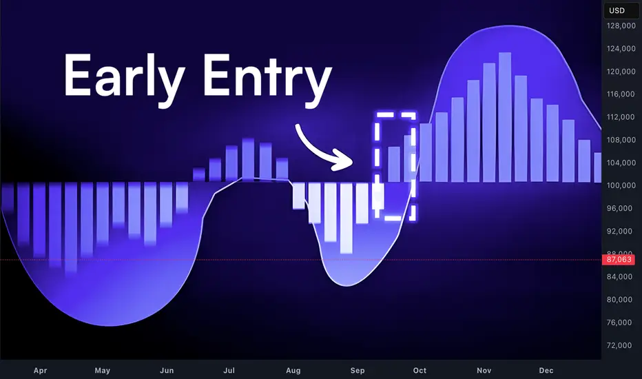
You're Early, Not Wrong*Trading Isn’t Hard Because of Entries.
It’s Hard Because Most Traders Don’t Wait for Alignment.
Most traders think trading is hard because:
• They can’t find the right entry
• They struggle to focus
• They’re distracted
• They don’t have enough time
• They think their strategy doesn’t work
Those are symptoms.
The real reason trading feels hard is because most traders don’t understand alignment.
⸻
📍 What Alignment Actually Means
Trading is not about being early.
It’s about being in sync.
Price moves cleanly only when:
• Higher-timeframe objectives are active
• Liquidity has been engineered and taken
• Price is delivered to fair value (premium/discount)
• Lower timeframes execute the higher timeframe plan
If even one piece is missing, the market feels random.
It’s not random — it’s misaligned.
⸻
📉 Why “Good Setups” Fail
Most losses don’t come from bad strategies.
They come from forcing execution before alignment.
Example:
• Liquidity gets swept
• Traders enter immediately
• Nearest order block fails
• Price goes deeper
Nothing broke.
Price was simply seeking better alignment on a higher controlling timeframe.
⸻
⏳ Patience Is Not Waiting for Price
Patience Is Waiting for Timeframes to Agree
This is the part no one wants to hear:
The market doesn’t pay you for being active.
It pays you for being in position at the right moment.
Alignment is rare.
That’s why consistency is rare.
⸻
🧩 Once You See Alignment, Trading Gets Quiet
When timeframes are aligned:
• You stop chasing
• You stop panicking when OBs fail
• You stop needing constant entries
• You stop overtrading
You start waiting with intent.
⸻
Final Thought
If trading feels hard right now, ask yourself:
Am I actually wrong… or am I just early?
There’s a difference.
🧠 The market is never confusing — it’s just ahead of you.
Let alignment catch up before you act.

"The Liquidity Trap 90% of Traders Completely Miss"🔥 EVERY TRADER GETS TRAPPED HERE… EXCEPT THE ELITE
You watch the highs and lows, the support and resistance, the obvious levels…
And you think you’re safe.
You’re not.
The real move comes from liquidity inside the swing — the part most traders never notice.
1️⃣ External Liquidity is What Retail Chases… Not the Real Move
• Traders see obvious highs, obvious lows, support, resistance.
• They think: “Price will reverse here.”
• This is the illusion the market creates.
Here’s the truth:
External liquidity is bait, not the target.
It’s where most traders get trapped.
⸻
2️⃣ Internal Liquidity is Where the Smart Money Lives
Inside every swing — every leg up or down — exists hidden liquidity:
• Micro Order Blocks
• Lower highs / higher lows inside the leg
• Stop clusters designed to trigger retail exits
Most traders don’t look inside the leg. They only see the edges.
That’s the trap. That’s where your edge comes in.
Nugget: The move you want usually comes after the internal liquidity is cleared, not at the obvious high/low.
⸻
3️⃣ The Sequence Traders Must See (Stop Losing to the Trap)
Here’s the real SMC sequence, step by step:
A. External Sweep → The Bait
• Everyone watches it
• Everyone reacts
B. Internal Liquidity Run → The Real Target
• Hidden inside the leg
• Where stops, inducements, and OBs cluster
• The market clears this before the real move
C. Displacement → The Delivery
• After internal liquidity clears, price finally moves in the “true” direction
• This is when smart traders enter with confidence
Nugget: If you chase the sweep and ignore internal liquidity, you’re giving your edge to the market.
⸻
4️⃣ How to Spot Internal Liquidity Like a Pro
Look for these patterns inside the leg:
• Lower highs / higher lows forming in micro OBs
• Price clustering around imbalance areas
• Fake breaks that lure retail orders
• Zones where price pauses before real expansion
Golden Nugget: Price gives clues every time. The problem is, 90% of traders don’t see them.
⸻
5️⃣ Why Traders Lose Even When They’re “Right”
• You can have the right bias
• You can see the sweep
• You can even pick the “obvious OB”
But if you enter too early or in the wrong micro-structure, your stop gets taken, and the move happens without you.
This is why SMC isn’t about guessing.
It’s about understanding sequence, intention, and liquidity footprint.
⸻
6️⃣ Mindset Shift: Read Market Intention, Not Candles
Stop asking:
• “Did it break the high?”
• “Did it hit my level?”
Start asking:
• “Where is the internal liquidity being cleared?”
• “What is the smart money engineering?”
• “Where will the market take the stops before the real move?”
Nugget: Reading price action without seeing internal liquidity is like driving blind.
⸻
7️⃣ The SMC Edge You Must Internalize
• External liquidity = bait → observe
• Internal liquidity = real objective → anticipate
• Displacement = delivery → execute
When you see it unfold:
• Your entries become surgical
• Your stops make sense
• Your bias is confirmed before most traders even blink
You’re not reacting to the market.
You’re predicting its intentional sequence.
⸻
🔥 Final Takeaway (Save This)
The market isn’t random.
It’s designed to trap traders.
External liquidity tricks 90% of traders into early stops.
Internal liquidity reveals where the real move will come.
Learn to see it.
Respect it.
Trade it.
This is the real sauce of SMC trading.
Not flashy indicators. Not random setups.
Sequence, liquidity, inducement.
Pro Nugget: Once internal liquidity is in your sights, price becomes predictable.
The rest? Just execution.

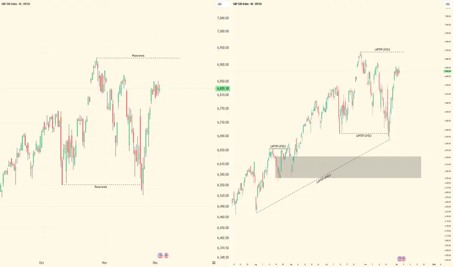
''iPhone vs Laptop Trading: The Truth Nobody Talks About''Alright, let’s get straight to it. I’ve been watching traders debate this forever — phone or laptop. Here’s my breakdown, from someone who actually trades multi-timeframe SMC setups, tracks liquidity, and executes in real-time.
⸻
1️⃣ Execution and Speed
• On a laptop, you’ve got full visibility: multiple monitors, larger charts, higher timeframe context, all indicators and order blocks at a glance.
• On iPhone? Limited view, smaller screen, harder to see context, and micro adjustments take longer.
• The reality: Speed matters. A 1-minute confirmation or lower-high break can happen fast. If you’re on a phone, you risk missing that critical move or entering late.
⸻
2️⃣ Multi-Timeframe Analysis
• Edge comes from analyzing multiple chart intervals to see the bigger picture and confirm setups.
• Laptop: Side-by-side charts, smooth workflow, all intervals visible at once.
• On the phone, switching between timeframes is clunky, slow, and mentally taxing. You’ll start guessing instead of confirming.
• Key takeaway: Serious traders of any style know: a laptop gives you the clarity, control, and precision that’s hard to achieve on a phone.
⸻
3️⃣ Precision of Orders
• Laptop: You can place precise limit entries, manage stop losses, and see where liquidity clusters are.
• Phone: Accidental taps, misclicks, or lag can cost you a trade. Especially when dealing with small spreads, tight stop losses, or micro entries.
• Lesson: Mistakes on micro orders aren’t small. They erode both capital and confidence.
⸻
4️⃣ Situational Use
• Phone trading isn’t useless. It’s fine for monitoring, tracking TPs, or checking alerts when you’re away from your desk.
• But if you’re entering, executing, or actively managing high-leverage trades — laptop wins hands down.
⸻
5️⃣ Psychology and Focus
• Laptop setups create a trading environment: focus, fewer distractions, full screen, proper charts.
• Phone trading often comes with notifications, background apps, and temptation to “glance and guess.”
• Your mindset matters as much as your setups. Treat trading like a full-time process, not a side hobby.
⸻
6️⃣ My Personal Take
• I’ve tested both. I’ll check charts on my phone sometimes — especially during quick monitoring sessions.
• But every serious execution, every multi-timeframe setup, every liquidity play — it happens on my laptop. That’s where precision, patience, and professionalism live.
⸻
🔥 Key Lessons
1. Phone = monitoring & alerts only.
2. Laptop = execution & analysis.
3. Edge isn’t just charts — it’s control, speed, and clarity.
4. You can’t shortcut this without costing yourself trades or your confidence.
⸻
💡 Visual Reference:
I posted screenshots to show the difference between iPhone and laptop trading setups. Laptop view is on the right side, showing full charts and multi-interval visibility. iPhone view is on the left side, compact and limited. This makes it clear why execution and workflow are easier on a laptop.
Bottom line: Don’t kid yourself. Your tools matter, but more importantly, how you use them separates amateurs from pros.
I’m curious — who’s still trying to trade full-time on a phone? Let’s see if they’re really ready to compete.
The Most Underrated Skill: Reading the Market Without Bias!Most traders focus on indicators, patterns, and strategies…
But very few focus on the skill that actually moves the needle:
Learning to read the market without forcing your bias onto the chart.
Here’s the truth 👇
When you zoom out and remove the noise, the market is always telling one of only three stories:
📘 1. Impulse → Market is moving with strength
An impulse leg is a clear, strong movement in one direction.
Candles are decisive. Pullbacks are shallow. Speed is visible.
When you identify an impulse, the message is simple:
“Don’t fight me, follow me.”
This is where continuation trades thrive.
📔 2. Correction → Market is taking a breath
A correction is messy, slow, overlapping price action.
The market is not reversing; it’s reloading.
Most beginners confuse corrections with trend reversals… Professionals don’t.
The key question becomes: “Where will this correction end?”
Because that’s where the next impulse usually begins.
📕 3. Reversal → Structure shifts, and momentum dies
A reversal is structural.
You see new lower lows in an uptrend, or new higher highs in a downtrend.
Momentum slows. Failed impulses appear. Trendlines break.
A true reversal is never a single candle; It’s a story told over multiple chapters.
🔑 The Skill: Listening Instead of Predicting
Most traders lose because they try to predict what comes next.
Professionals focus on reading what’s happening now.
Ask these questions every time you open a chart:
- Is momentum increasing or decreasing?
- Are corrections getting deeper or shallower?
- Is structure still intact?
- Which key level holds all the power?
Master these, and you’ll start seeing the market in HD.
💡 Why This Matters
Your entries, exits, and risk management improve automatically when you can answer one simple question:
“Is the market impulsive, corrective, or reversing?”
This removes emotional trading, kills hesitation, and builds confidence, because you’re no longer guessing... You're listening.
🤔 Final Thought
Strategies don’t fail because they’re bad.
Strategies fail because traders apply them at the wrong time.
Read the market first. Trade second.
⚠️ Disclaimer: This is not financial advice. Always do your own research and manage risk properly.
📚 Stick to your trading plan regarding entries, risk, and management.
Good luck! 🍀
All Strategies Are Good; If Managed Properly!
~Richard Nasr

Internal vs External Liquidity: The Skill Nobody Actually MasterMost traders think they understand liquidity…
They mark equal highs, equal lows, and call it a day.
But let me tell you something real:
Knowing liquidity exists is NOT the skill.
Knowing WHICH liquidity matters right now is the real edge.
That’s the difference between:
✔ catching continuations
✔ catching reversals
✔ avoiding trap entries
✔ timing precision entries
✔ and actually staying in profitable moves
Most traders lose because they don’t understand the hierarchy of liquidity.
Let me break this down the way nobody online does:
⸻
🔥 1. Internal Liquidity = Fuel for Continuation
This is the liquidity inside the active range.
It sits between swing points, inside consolidation, above minor highs, below short-term lows.
Internal liquidity gets taken when:
• Market is in trend
• Price is compressing
• Price is building inducement
• Algorithms are collecting “fuel” before delivery
When internal gets swept, DO NOT expect a reversal.
Expect a continuation into the next external pool.
This is why most traders get faked out:
They see a sweep and scream “reversal!”
But they’re reacting to internal liquidity — not the real turning point.
⸻
🔥🔥 2. External Liquidity = The Real Reversal Zones
External liquidity sits at the RANGE BOUNDARIES:
• The major swing high
• The major swing low
• The extreme points of the structure
These are the levels that actually SHIFT trend, cause deep pullbacks, or start major legs.
This is where smart money:
✔ Clears the crowd
✔ Triggers stops
✔ Closes positions
✔ Repositions
✔ Begins delivery in the opposite direction
External liquidity is the turning point.
Internal liquidity is just the build-up.
If you can’t distinguish the two, every reversal will feel random to you.
⸻
🔥🔥🔥 3. Here’s the Rule Nobody Teaches:
If price sweeps internal → expect continuation.
If price sweeps external → expect correction or reversal.
But here’s where MOST traders fail:
They don’t know which one they’re looking at.
If you think a reversal is starting but you’re still inside the range…
You’re not trading a reversal.
You’re trading hopium.
⸻
🔥🔥🔥🔥 4. How Smart Money Chooses Which Liquidity to Target First
This is where your real edge comes in.
Smart money asks ONE question:
“Which pool unlocks the next delivery path?”
If the next objective is above → they’ll sweep internal lows to build power.
If the next objective is below → they’ll sweep internal highs to induce buyers.
Smart money is always targeting what unlocks:
✨ the cleanest path
✨ the imbalanced leg
✨ the untouched zone
✨ the unmitigated order block
✨ the next HTF objective
You think the sweep is the entry.
They see the sweep as the setup.
⸻
🔥🔥🔥🔥🔥 5. Here’s the TRUTH:
Internal liquidity fuels the move.
External liquidity flips the move.
If you master this one skill, your whole trading shifts.
Your confidence shifts.
Your timing shifts.
Your strike rate shifts.
You stop chasing noise.
You stop guessing bottoms.
You stop guessing tops.
You start reading intention — not reacting to candles.
Most of the trading world knows liquidity.
Almost nobody knows when liquidity actually matters.
That’s the part the textbooks don’t teach.
That’s the part the YouTubers don’t show.
That’s why most traders stay confused for years.
Internal liquidity gets you in —
External liquidity gets you paid.
Master the difference and you’ll trade with precision most people only dream of.

The Hard Truth About Trading: Too Much Knowledge is Hurting you A real breakdown for traders who actually want clarity, not confusion.
Most traders don’t fail because they’re “missing a secret concept.”
They fail because they’re drowning in information that doesn’t matter.
The truth is simple:
The more clutter you add, the less you can see.
The less you can see, the slower you think.
The slower you think, the more you hesitate.
Hesitation kills traders.
Let’s strip the ego out and get direct:
⸻
📍 1. The Market Only Runs on a Few Core Realities
Everything you see on the chart — every candle, every sweep, every displacement — connects back to a small handful of factors:
• External structure (macro swing flow)
• Internal structure (micro order flow)
• Premium/discount pricing
• Inducements / engineered liquidity
• Order flow shifts at key levels
• Narrative alignment across HTFs
That’s it.
No magic indicator.
No super-obscure model.
No 99-step “advanced SMC” blueprint.
If it’s not tied to structure or liquidity within structure,
it’s irrelevant noise.
⸻
📍 2. More Knowledge ≠ More Skill
Trading isn’t school.
You don’t get rewarded for memorizing more concepts.
Most of the “extra knowledge” traders chase only creates:
• Paralysis
• Over-marked charts
• Conflicting signals
• Emotional swings
• Analysis loops
• Missed moves
Pros don’t hunt for more concepts — they refine fewer ones.
The people who win long-term master what’s essential, not what’s trendy.
⸻
📍 3. Liquidity Without Structure Is Useless
A massive mistake in the community is labeling every high/low as “liq.”
Not true.
Not all sweeps are equal.
Not all liquidity is engineered.
Not every takeout is meaningful.
The only liquidity that matters is:
• IDM / engineered liquidity (purpose-driven)
• Inducements that fuel the real move
• Liquidity aligned with the HTF order block and narrative
Everything else?
Just market noise dressed up with fancy terminology.
⸻
📍 4. A Clean Blueprint Beats a Complicated One
The more experienced I became, the more I realized:
Trading mastery is deletion, not addition.
When you cut away unnecessary concepts, what’s left is:
• Cleaner charts
• Faster decisions
• Simpler narratives
• Higher confidence
• Fewer emotional flips
• More consistency
A trader with a refined system will always outperform a trader with a “complicated system.”
⸻
📍 5. Here’s the Real Pipeline of a Professional SMC Trader
If you want to win consistently, your process should be this clear:
HTF trend →
Premium/discount →
Identify the inducement →
Locate the OB →
Wait for the internal structure shift →
Execute with precision
That’s the Smart Money engine.
That’s the whole formula.
Everything else is just reworded versions of the same thing.
⸻
📍 Final Thought for Anyone Reading This
If you feel overwhelmed, confused, or inconsistent…
it’s not because you don’t know enough.
It’s because you know too much of the wrong things.
Trading becomes consistent when your blueprint becomes simple.
Less noise.
More clarity.
More precision.
More profits.
Strip the chart back to what matters —
and the market finally starts to make sense.

"The Myth of Confirmation - What Retail Gets Wrong Every Day"🔥 THE TRUTH ABOUT MARKET “CONFIRMATION” (What Retail Never Realizes)
Most traders think confirmation comes from indicators, patterns, candle shapes, or repeating formations on lower timeframes.
This is the greatest misunderstanding in trading.
Confirmation does NOT come from the LTF.
Confirmation comes from alignment of the delivery cycle — and the LTF only expresses what the HTF already decided.
Retail thinks the 5M “creates” trend.
Institutions know the 5M merely reflects it.
Here’s the real breakdown institutions use:
⸻
1. Confirmation = Completion of a Phase, Not a Pattern
A market only confirms when a structural phase fully completes, meaning:
• Liquidity objective hit
• Internal structure reset
• Order flow aligned
• Efficient price or imbalance corrected
• Pullback cycle finished
• New impulsive leg prepared
This is confirmation.
Not a candle.
Not an indicator.
Not a shape on your chart.
⸻
2. LTF Structure Means NOTHING Without HTF Context
Retail loves reacting to:
• 5M BOS
• 1M pullback
• 15M FVG
• Candle patterns
• Trend lines
None of these matter if the HTF hasn’t finished its development cycle.
This is why traders lose:
They see “confirmation” while the HTF is still in a build-up, not a release phase.
⸻
3. The Market Confirms Twice — Retail Only Sees One
Institutional traders track two confirmations:
Macro Confirmation (HTF)
This tells the market what it wants to do next
— continuation or pullback.
Micro Confirmation (LTF)
This tells the market when it’s safe to execute
— trend shift + pullback + OB tap + displacement.
Retail only waits for micro confirmation.
They skip macro confirmation.
So they trade inside noise.
⸻
4. Candles Don’t Confirm — the Cycle Confirms
People over-read 5M candles, ignoring the fact that candles are only expressions of liquidity movement.
You can’t read intent from shape.
You read intent from position in the cycle.
The same candle means:
• continuation in one phase
• reversal in another
• manipulation in another
Only the cycle gives it meaning.
⸻
5. The Market Doesn’t Confirm For You — It Confirms ITSELF
This is the coldest truth most will never learn:
Price never confirms your bias.
Price only confirms where it is in the timeline.
If you don’t know the timeline,
you don’t know the confirmation.
TL;DR
(Beginner/Simple)
Confirmation = Cycle Completion + Alignment
NOT a candle pattern or indicator.
You don’t follow confirmation.
You follow timing.
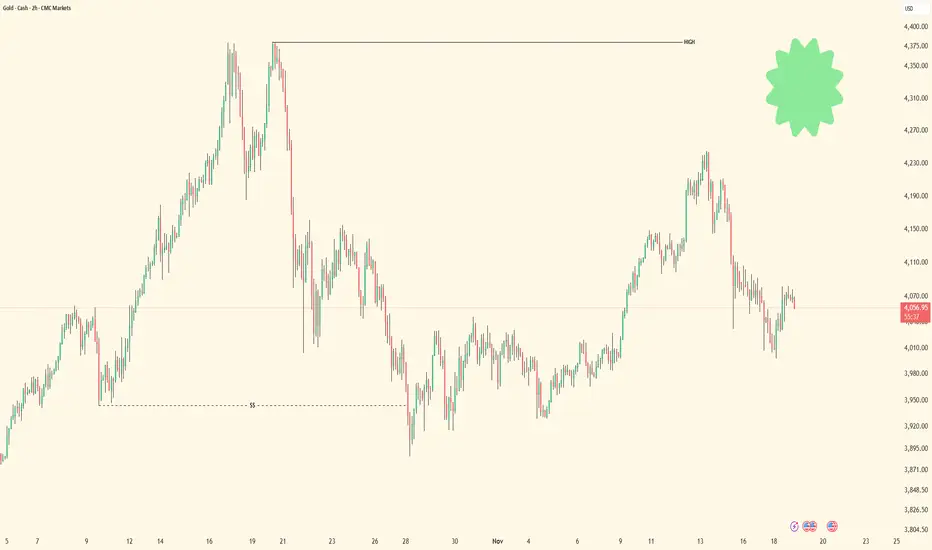
A High-Impact Support Zone Meets a Breakout StructureIntroduction
Markets occasionally compress into areas where structure, momentum, and historical buying pressure align with surprising precision. When that compression occurs at a major higher-timeframe floor, traders often pay closer attention—not because the future is predictable, but because the chart reveals a location where price behavior typically becomes informative.
The current case study centers on a market pressing into a high-impact support zone visible on the monthly chart, while the daily chart displays a falling wedge pattern that has gradually narrowed the range of movement. This combination often highlights moments where the auction process is nearing a decision point. The purpose here is to dissect that confluence using multi-timeframe structure, pattern logic, and broad order-flow principles—strictly for educational exploration.
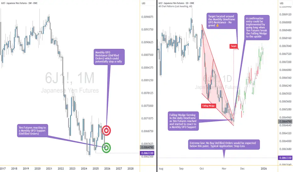
Higher-Timeframe Structure (Monthly)
The monthly chart shows price approaching a well-defined support area between 0.0065425 and 0.0063330, a region that has acted in the past as a base for significant reactions. These areas often develop because markets rarely absorb all buy interest in a single pass; pockets of unfilled orders may remain, leading to renewed reactions when price returns.
This type of zone does not guarantee a reversal. However, historically, when price reaches such levels, traders tend to monitor whether selling pressure slows or becomes less efficient. In this case, the structure suggests a recurring willingness from buyers to engage at these prices, forming a foundation that has held multiple swings.
The presence of a clear, higher-frame resistance at 0.0067530 anchors the broader range. When price rotates between such boundaries, the monthly context often acts as a roadmap: major support below, major resistance above, and room in between for tactical case-study exploration.
Lower-Timeframe Structure (Daily)
Shifting to the daily chart, price action has carved a falling wedge, a pattern often associated with decelerating downside movement. In wedges, sellers continue to push price lower, but with diminishing strength, as each successive low becomes less effective.
This type of compression structure can provide early evidence that the auction is maturing. Traders studying such patterns often watch for:
tightening of the range,
shorter waves into new lows,
initial signs that buyers are defending intraday attempts to drive price lower.
The daily wedge in this case sits directly on top of the monthly support zone—an alignment that strengthens its analytical relevance. The upper boundary of the wedge sits near 0.0065030, and a break above that line is often interpreted as price escaping the compression phase.
Multi-Timeframe Confluence
Multi-timeframe confluence arises when higher-frame structure provides the background bias and lower-frame patterns offer the tactical trigger. In this case:
The monthly chart signals a historically responsive support zone.
The daily chart shows structural compression and slowing downside momentum.
The interaction between them creates a scenario where educational case studies tend to focus on breakout behavior, as the daily timeframe may provide the first evidence that higher-frame buyers are engaging.
This confluence does not imply certainty. It simply highlights a location where structure tends to become more informative, and where traders often study the transition from absorption to response.
Order-Flow Logic (Non-Tool-Specific)
From an order-flow perspective, strong support zones typically develop where prior buying activity left behind unfilled interest. When price returns to that region, two things often happen:
Sellers begin to encounter difficulty driving price lower, as remaining buy orders absorb their activity.
Compression patterns form, as the market oscillates in a tightening range while participants test whether enough liquidity remains to cause a directional shift.
A breakout of the daily wedge represents a potential change in the auction dynamic. While sellers are still active inside the wedge, a breakout suggests their pressure may have become insufficient to continue the sequence of lower highs and lower lows. Traders studying market transitions often use such moments as part of hypothetical scenarios to understand how imbalances evolve.
Forward-Looking Trade Idea (Illustrative Only)
For educational purposes, here is how a structured case study could frame a potential opportunity using the discussed charts:
Entry: A hypothetical entry could be placed above the falling wedge, around 0.0065030, once buyers demonstrate the ability to break outside the compression structure.
Stop-Loss: A logical invalidation area in this case study would be at or below the monthly support, around 0.0063330, where failure would indicate the higher-timeframe zone did not hold.
Target: A purely structural wedge projection would suggest a target near 0.0067695, aligning closely with the broader resistance region on the monthly chart.
These price points yield a reward-to-risk profile that is measurable and logically linked to structure, though not guaranteed. This case study exists solely to illustrate how support-resistance relationships and pattern logic can be combined into a coherent, rules-based plan, not as an actionable idea for trading.
Yen Futures Contract Context
The larger (6J) and micro-sized (MJY) versions of this futures market follow the same underlying price but differ in exposure and margin scale. The standard contract generally carries a greater notional value and therefore translates each price movement into a larger monetary change. The micro contract mirrors the same structure at a reduced size, allowing traders to adjust position scaling more precisely when navigating major zones or breakout structures such as the one discussed in this case study:
6J equals 12,500,000 Japanese Yen per contract, making it suitable for larger, institutional players. (1 Tick = 0.0000005 per JPY increment = $6.25. Required Margin = $2,800)
MJY equals 1,250,000 Japanese Yen per contract, making it suitable for larger, institutional players. (1 Tick = 0.000001 per JPY increment = $1.25. Required Margin = $280)
Understanding margin requirements is essential—these products are leveraged instruments, and small price changes can result in large percentage gains or losses.
Risk Management Considerations
Strong support zones can attract interest, but risk management remains the foundation of any structured approach. Traders studying these transitions typically:
size positions relative to the distance between entry and invalidation,
maintain clear exit criteria when structure fails,
avoid adjusting stops unless the market has invalidated the original reasons for the plan,
adapt to new information without anchoring to prior expectations.
These principles emphasize the importance of accepting uncertainty. Even at major support zones, markets can remain volatile, and scenarios may unfold differently than anticipated.
When charting futures, the data provided could be delayed. Traders working with the ticker symbols discussed in this idea may prefer to use CME Group real-time data plan on TradingView: www.tradingview.com - This consideration is particularly important for shorter-term traders, whereas it may be less critical for those focused on longer-term trading strategies.
General Disclaimer:
The trade ideas presented herein are solely for illustrative purposes forming a part of a case study intended to demonstrate key principles in risk management within the context of the specific market scenarios discussed. These ideas are not to be interpreted as investment recommendations or financial advice. They do not endorse or promote any specific trading strategies, financial products, or services. The information provided is based on data believed to be reliable; however, its accuracy or completeness cannot be guaranteed. Trading in financial markets involves risks, including the potential loss of principal. Each individual should conduct their own research and consult with professional financial advisors before making any investment decisions. The author or publisher of this content bears no responsibility for any actions taken based on the information provided or for any resultant financial or other losses.
The Deeper Logic Behind Price Delivery (Nobody Talks About This)Most traders think some pairs are slow and others are fast.
But that belief is the reason they stay confused, lose trades, and can’t read delivery.
The truth is deeper, and once you see it, you can’t unsee it.
This is the real explanation behind timing, alignment, and phase delivery — the part nobody teaches.
Most traders think some markets “move fast” and other markets “move slow.”
That’s a surface-level observation. It sounds true, but it completely misses the deeper mechanics behind why price behaves the way it does.
The truth is this:
Markets don’t move fast or slow — markets move according to timing.
Every pair follows the same structural blueprint.
The only difference is where each pair is within its delivery cycle.
Price is always doing one of two things:
1. Delivering a continuation leg (impulsive, clean, fast movement)
2. Building the pullback leg (corrective, choppy, slower movement)
When a pair is fully aligned on the higher timeframe — when the trend, liquidity objectives, and structural breaks are all synchronized — the continuation phase will always look fast. It’s clean, directional, and decisive because the cycle is ready to deliver.
When a pair is still developing inducements, collecting liquidity, or forming the structure it needs for the next leg, it will naturally look slow or indecisive. Not because the pair is slow, but because the cycle is incomplete.
This is why one pair may be exploding while another is barely moving:
they’re simply in different phases of the same universal process.
Price is never random.
Price is never “lazy” or “weak.”
Price is simply obeying its timing.
Higher timeframes reveal that timing.
They show you:
• Whether continuation is ready
• Whether the pullback is still developing
• Whether liquidity has been engineered
• Whether the dominant leg is prepared to deliver
• Whether the cycle is aligned or still maturing
Lower timeframes only express what the higher timeframe already decided.
So the idea that “some pairs move fast and some move slow” is a misunderstanding. No pair is naturally fast or slow — every pair delivers exactly the same way, just not at the same time.
Fast movement = HTF alignment + continuation phase
Slow movement = HTF development + liquidity engineering phase
Once you understand timing, you stop comparing pairs by their speed and start reading them by their position in the cycle.
That’s when trading stops being guesswork and starts becoming recognition.
Because the deeper truth is simple:
Price isn’t unpredictable — traders are just unaware of what time it is.
-Do you view the market by timing or by “speed”?
Let me know — I read every comment.
#NAS100 #Education #SMC #MarketTiming #PriceAction #SmartMoney #Forex #Indices
Personal Account vs Prop firm TradingHere’s where a lot of traders miss the point.
Prop firms sound good on paper — funded accounts, big leverage, short-term payout structure. That’s attractive to retail and newer traders. But let’s be honest — true SMC traders see deeper.
A prop firm is a classroom. A personal account is freedom.
⚖️ Prop Firms:
• Beginner-friendly, structured, and can help build discipline early.
• But they come with strict rules — max drawdown, time limits, no weekend holds, no high-impact news trading.
• These rules can kill genuine SMC plays, because Smart Money often holds setups that develop midweek and deliver through Friday.
• Some prop firms even close trades automatically during volatile pullbacks — meaning your well-timed institutional entry could be cut off early.
Prop firms test you on rule-following, not market mastery.
💼 Personal Accounts:
• You control risk, timing, trade management, and exposure — full freedom.
• You can hold trades through the weekend, manage partials your way, and let multi-day structures complete.
• You can size positions sustainably — not recklessly, but with intent — and manage equity growth over time.
• It demands mastery, discipline, and emotional control — but that’s the essence of becoming a true trader, not a funded participant.
“Prop firms build discipline. Personal accounts build legacy.”
🧭 My Take:
I respect prop firms — they have their place. But I’m a personal account believer.
Why? Because Smart Money Concepts require freedom to express trade ideas dynamically, without artificial restrictions.
A true SMC trader isn’t trying to pass a challenge — he’s trying to understand and move with the market.
Prop firms serve the student. Personal accounts serve the master.
✍️ Closing Statement
“The real education starts when you stop testing history and start studying live footprints.
Prop firms can train your discipline, but personal mastery is built when your decisions shape your own equity.
Trading is not about probabilities — it’s about reading precision, cause, and intent. That’s the Smart Money way.”

What Are These Messy Lines in my Chart? - Explaining the AlgosIf you’ve checked out my trading chart, you might’ve noticed it looks a bit complex — full of colorful lines and structures. But have you ever wondered what those lines are really for?
Each one is drawn to graphically identify the presence of invisible algorithms — the hidden forces that move the market. At any given time, multiple algorithms are battling for control of price direction. By visualizing their interaction on the chart, we can begin to see the true structure behind market movement.
Understanding this gives you a deeper insight into how markets actually function — and that insight can completely change the way you trade.
If you find this perspective useful, consider subscribing and diving deeper into this style of market analysis.

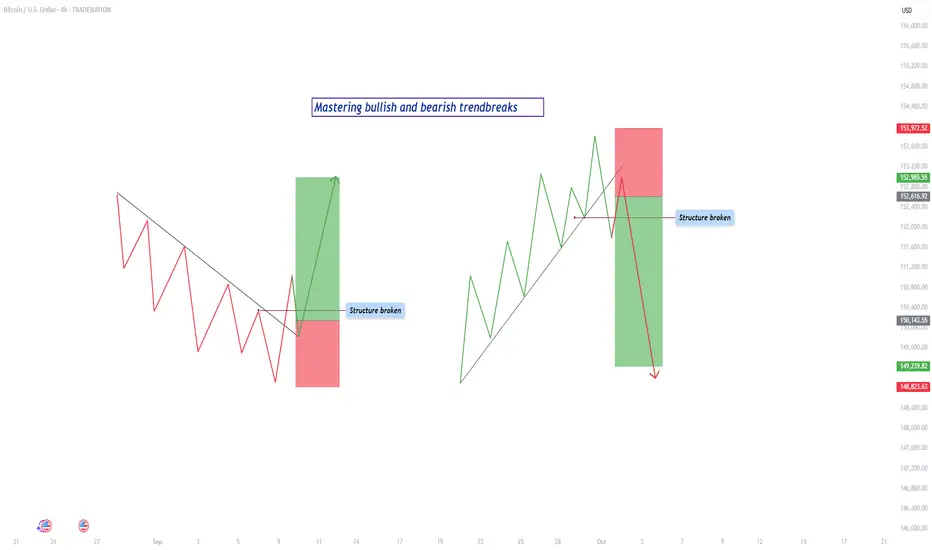
Mastering trendbreaks - How to trade it?In this guide will the trendbreaks be discussed. The following subjects will be explained:
- What is a trend?
- What is a bearish trendline break?
- What is a bullish trendline break?
- How to trade a trendbreak?
- Example
What is a trend?
A trend is the backbone of price action in any market. It represents the general direction in which price is moving over a sustained period of time. When price is consistently creating higher highs and higher lows, the market is considered to be in an uptrend. This behavior shows that buyers are in control and are willing to keep paying higher prices with each wave. On the other hand, when price continues to make lower highs and lower lows, the market is in a downtrend. This shows that sellers dominate the market and buyers are unable to push price above previous levels. Understanding trends is essential because it gives traders a framework for anticipating what is most likely to happen next, rather than guessing in random price action.
What is a bearish trendline break?
A bearish trendline break takes place when an established uptrend begins to lose momentum. In an uptrend, price usually respects a rising trendline, bouncing off it multiple times as buyers defend the bullish structure. Eventually, there comes a point when the market can no longer sustain this strength. Price breaks down through the rising trendline, signaling potential weakness. However, the true confirmation of a bearish shift only happens once the market also breaks below the most recent higher low. This is the key moment where structure changes. What was once a sequence of higher highs and higher lows now transforms into lower highs and lower lows, showing that sellers are gaining control. Without this structural shift, the break of the trendline alone might just be a temporary pullback or a false signal.
What is a bullish trendline break?
A bullish trendline break is the mirror image. In a downtrend, price respects a falling trendline as it consistently makes lower highs and lower lows. Each rally upward fails to break past previous highs, confirming sellers’ control. Eventually, price surges and breaks above the falling trendline. Just like with a bearish break, this initial move is not enough on its own. The true sign of reversal comes when price also breaks above the most recent lower high. This action destroys the existing bearish structure, which relied on lower highs to remain valid. Once that lower high is broken, the market shows that buyers have taken back control and a potential uptrend may begin.
How to trade a trendbreak?
For a valid trendbreak, three conditions must come together. First, the price must break the trendline itself, either rising or falling depending on the direction of the trend. Secondly, the breakout needs to be with strong volume. lastly, the price must also break the most recent higher low in an uptrend or lower high in a downtrend. Without this structural break, what looks like a reversal may only be a correction before the market resumes in its original direction. This distinction is crucial because many traders enter too early on a simple trendline break, only to get caught when the market snaps back into the trend. The combination of both the trendline break and the structural break provides much stronger confirmation.
Trading the trendbreak is where discipline and patience make the difference between success and failure. When the structure has been broken, it is tempting to enter immediately in the direction of the new move. But the higher-probability entry usually comes from waiting. Price often pulls back after a break, returning to retest the broken level. This retest can take different forms. Sometimes price simply returns to the broken higher low or lower high and uses it as support or resistance. Other times, price fills what traders call a fair value gap (fvg), which is an imbalance left on the chart when price moves too quickly in one direction without much trading in between. By waiting for this retest, a trader enters at a better price, with a tighter stop loss and greater profit potential.
Example
For example, imagine the market in an uptrend. Price respects a rising trendline until it finally breaks through it. Shortly after, the market breaks below the most recent higher low, confirming the bearish trendbreak. Instead of selling right at the break, the disciplined trader waits. Price pulls back upward to retest the broken higher low, which now acts as resistance. At that moment, the trader sells with a stop loss just above the retest level and targets the next support or previous swing low. This provides a controlled risk and larger potential reward.
The same logic applies to a bullish trendbreak. Price in a downtrend breaks above the falling trendline, then pushes higher to break a lower high, flipping the structure bullish. Price later dips back down to retest the broken lower high or fills a fair value gap. When it holds and begins to rise again, the trader enters long, with a stop below the retest and a target at the next resistance level.
By combining awareness of trendlines, structural shifts, and retest opportunities, traders can filter out false signals and position themselves to catch the early stages of new trends. The trendbreak is not just about spotting the first sign of weakness or strength, but about confirming that the underlying structure has truly changed. This approach gives a trader clarity, consistency, and confidence in execution, making trendbreaks one of the most powerful tools for price action trading.
-------------------------
Disclosure: I am part of Trade Nation's Influencer program and receive a monthly fee for using their TradingView charts in my analysis.
Thanks for your support. If you enjoyed this analysis, make sure to follow me so you don't miss the next one. And if you found it helpful, feel free to drop a like 👍 and leave a comment 💬, I’d love to hear your thoughts!
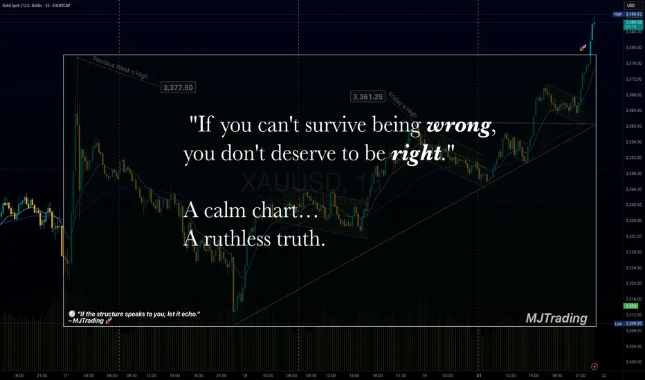
Survive first. Thrive later.🧠 Trading Psychology x Risk Management
"If you can't survive being wrong, you don't deserve to be right."
💬 A calm chart…
A ruthless truth.
Most traders obsess over being right.
But the market only rewards those who manage being wrong.
Risk control isn’t just technical — it’s emotional.
Survive first. Thrive later.
— MJTrading
Psychology Always Matters:
Click on them for notes in the caption...
#MJTrading #ChartDesigner #TradingPsychology #RiskManagement #MindfulTrading #CapitalPreservation #SmartMoney #XAUUSD #ForexDiscipline #15minChart #GoldAnalysis #MentalEdge #Gold
How To Do Multi-TimeFrame Analysis With TradingViewHey,
In this video I provide the two key laws that helped me with trading;
1. An imbalance on the higher time-frames is a range on the lower time-frames.
2. A run on the higher time-frames is a trend on the lower time-frames.
From this point of view, I share with you how I analyze the charts from Monthly to Weekly to Daily chart, and how I like to time the next few days of price-action.
The chart I use in this tutorial is GBP/USD.
Kind regards,
Max Nieveld

Institutional Supply: CAD/JPY shortsHey,
Little bit of a tutorial here to give you a better understanding about my zones.
Of course on my profile you find multiple videos of my trading style.
But if you see something like this shape up, all I do is wait...
I wait for price to reach my supply zone, and show me 4hour confirmation.
This confirmation is explained in other video's and posts.
Study these charts, the zones play out a lot of times.
A true edge.
Kind regards,
Max Nieveld

41-Day Sentiment mastery missionGM WARRIORS
I'm on a mission to master the SuperTrend indicator by testing all 42 combinations of its key settings: Factor, ATR (Average True Range), and Time Periods.
Each day, I’ll backtest 50 trades on a new combination to refine a 15-minute day trading system, focusing on trend precision and market sentiment. The combinations include:
21 Factors (2.0 to 4.0 in 0.1 increments).
2 Timeframes (15M and 30M).
Goal: Identify the optimal SuperTrend configuration, master early trend reversals, and sharpen market insights within a month.
Results will be shared daily via a public sheet and incorporated into my ongoing SuperTrend study. If you’d like updates, let me know, and I’ll tag you in this journey!
📊 Progress Sheet: docs.google.com
📘 SuperTrend Study: docs.google.com

How TradingView Helps Me Not Miss TradesHey,
In this video I provide several examples that help me to not miss any trading opportunities and provide me more clarity and confidence in my trading. I share my trading style, the usage of tradingview alerts and multi-timeframe analysis to time it right.
Often traders struggle with missing trades, this is why you might miss them:
- Lack of confidence
- Lack of chart time
- Lack of knowledge
If you solve them one by one, your trading performance can improve fast.
Kind regards,
Max Nieveld

How To Setup Your TradingView RightHey,
In this video I show you how my charting setup looks like.
I use the monthly, weekly, daily time-frames in one layout.
I use the 4hour and 1hour time-frame in my other layout.
Then I show you everything I trade for FX in my watch list.
Then I show you my crypto and stock market watch list.
Kind regards,
Max

MY APPROACH TO MAKING MONEYMy main trading principle is that the price always moves from swept liquidity levels to untouched liquidity levels by forming structure on the way.
Liquidity and Structure is a key for my trading system.

How NC Zones WorkHey,
Why not share some knowledge while we at it.
I've been trading these zones for many years now..
If you want to understand them, it starts like this;
Look for imbalances (new capital indicator find it for free)
Make sure the imbalance is engulfed.
Draw in a zone.. (Called the imbalance zone)
Now see if this imbalance zone achieved something...
Like taking out a trendline zone.. or taking out a trend.
Happy studying :)
Happy wknd,
Max

What is liquidityLiquidity is the market's fuel to run the market further market drives from internal liquidity to external liquidity which is also called ERLIRL in short form it's the place where most of the stop loss get hunts and market shift to opposite direction
