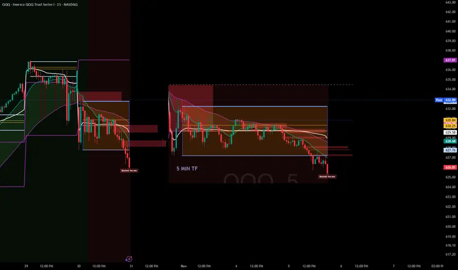
A Lesson in Patience and structure - ORB waited till 2pm todayFellow traders,
Today tested patience more than precision.
The morning was a maze — choppy price action, overlapping candles, and zero conviction. The ORB range between 9:30–9:45 never gave clean confirmation. Buyers held the low, sellers pressed the top, but neither could gain control. Every candle said, “not yet.”
Then came midday compression. From 11 AM to 1:30 PM, QQQ coiled tightly under the EMAs and VWAP. That silence wasn’t random — it was the market loading energy. The moment VWAP was lost for good, the floodgates opened.
Finally, around 2 PM, the breakdown came: a clean retest rejection of the ORB box and an accelerated drop through 629. The move I had been watching all day finally unfolded — only this time, discipline said don’t chase.
And that’s the point of today’s session.
Not every move is yours to catch. Sometimes your biggest win is not forcing a trade that forms too late or breaks your system’s timing window.
Patience is part of the strategy.
The setup played out exactly as it should — I just didn’t have to be in it to learn from it.
Stay disciplined. Stay sharp.
— Trades with B ⚡
Techincalanalysis
TradeCityPro Academy | Support & Resistance Part 2👋 Welcome to TradeCityPro Channel
🎓 Educational Section Technical Analysis Training Series
Welcome to the Educational Content Section of our channel!
Here, we aim to teach you technical analysis from A to Z through structured playlists.
We’ll cover everything from risk and capital management, Dow Theory, support and resistance, trends, and market cycles, to more advanced concepts.
Our lessons are based on both real market experience and The Handbook of Technical Analysis.
🎨 What is Technical Analysis?
Technical Analysis (TA) is a method used to forecast price movements in financial markets by analyzing historical data, especially price and volume.
It’s based on the idea that history tends to repeat itself, and that recurring patterns can reveal profitable trading opportunities.
📚 Complete Guide to Support and Resistance in Technical Analysis
🧩 Introduction
In technical analysis, two key concepts form the foundation of nearly every trading strategy: Support and Resistance.
These levels represent areas on the chart where the price is likely to change direction, as buyers or sellers regain control.
But to truly understand them, you must go beyond the chart — because their origin lies in human psychology and collective behavior.
🟢 What Is Support?
A support level is an area where buying pressure increases and prevents the price from falling further.
It acts like a floor where buyers believe the asset has become cheap enough to buy.
As a result, the market tends to bounce upward from that area.
For example, if Bitcoin has repeatedly reversed near $55,000, that zone is considered a support level.
🔴 What Is Resistance?
A resistance level is an area where selling pressure increases and stops the price from rising higher.
When the price approaches this level, traders often feel the asset is “too expensive” and start selling.
For example, if Ethereum has failed multiple times to break above $3,800, that area is considered resistance.
💭 Why Do Support and Resistance Form?
Markets are not just numbers — they’re the reflection of human emotion and crowd behavior.
When large groups of traders make similar decisions (to buy or sell) around the same price zone, it creates a psychological memory in the market.
If price has reacted there before, traders remember it — and react the same way next time.
This repetition forms the backbone of how support and resistance levels develop and strengthen over time.
🧠 The Role of Emotion and Crowd Psychology
Emotions drive markets.
When prices rise quickly, people experience FOMO (Fear of Missing Out) and rush to buy — until demand runs out and price reverses (resistance).
When prices fall, fear of losing money triggers panic selling — until sellers dry up and price rebounds (support).
This constant emotional cycle repeats endlessly, creating recurring support and resistance zones on every chart.
⚙️ The Structure Behind the Levels
From a technical perspective, these levels form because large clusters of orders are placed around them.
Traders typically set buy orders below the current price (near support) and sell orders above it (near resistance).
So when the market reaches those areas, there’s a strong battle between buyers and sellers.
That’s why these zones are not just psychological — they’re also built into the order flow and liquidity structure of the market.
📈 Reactions and Breakouts
When price approaches a key level, two outcomes are possible: Reaction or Breakout.
In a reaction, price touches the level and reverses — meaning buyers or sellers defend it successfully.
In a breakout, price pushes through with strong momentum and high volume, breaking the market’s previous belief.
After a breakout, the level often changes its role:
A broken resistance becomes new support.
A broken support becomes new resistance.
This behavior is known as Role Reversal, one of the most powerful principles in chart analysis.
⚖️ The Professional Mindset
Support and resistance are zones, not exact numbers.
The market may slightly move above or below them before reacting — this is known as a fake breakout.
Professional traders look for confirmation such as reversal candles, volume spikes, or RSI divergences before acting.
The key is not to memorize lines but to read crowd behavior.
Once you understand why people buy or sell at certain points, you gain a true edge over the average trader.
🧩 Conclusion
Support and resistance are not just lines on a chart; they are the visible footprints of fear, greed, and collective memory in the market.
By understanding their psychological and structural roots, you can identify better entry and exit zones,
predict reactions more accurately, and avoid emotional mistakes.
Learn to read the emotions behind the candles — because at its core, the market is simply a crowd of human minds trying to win.

Wedge Pattern: A Key to Trend Reversals and Continuations📈 Wedge Pattern: A Key to Trend Reversals and Continuations
A wedge pattern is a technical chart formation that signals a potential reversal or continuation in the market. It’s formed when price moves between two converging trendlines — either sloping upward or downward — creating a narrowing range over time.
There are two main types of wedge patterns:
🔻 Falling Wedge (Bullish)
Formed during a downtrend or as a correction in an uptrend.
Characterized by lower highs and lower lows, with the slope of the support line steeper than the resistance line.
Typically signals a bullish reversal as momentum builds for a breakout to the upside.
✅ Confirmation: Break above the resistance line with volume surge.
🔺 Rising Wedge (Bearish)
Appears during an uptrend or as a correction in a downtrend.
Shows higher highs and higher lows, but the support line is steeper than the resistance line.
Often leads to a bearish reversal, especially when volume declines into the pattern.
⚠️ Confirmation: Break below the support line with increasing volume.
🧠 Key Characteristics
Volume tends to decrease as the pattern forms, indicating a pause in momentum.
The breakout direction (up or down) determines whether it’s a continuation or reversal signal.
Wedges can appear on any time frame and are useful for both day traders and long-term investors.
📊 Trading Tip
Always wait for confirmation of the breakout before entering a trade. False breakouts can be common, especially in low-volume environments

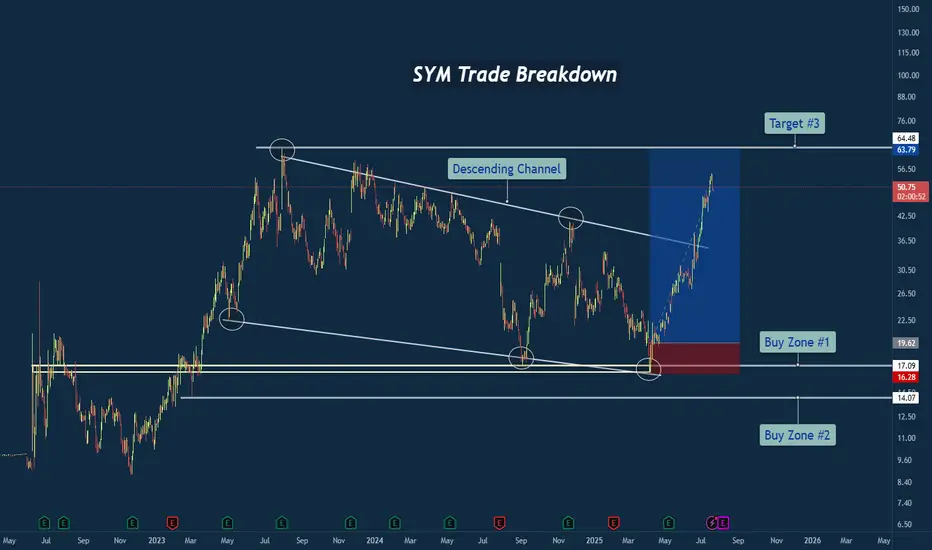
SYM Trade Breakdown – Robotics Meets Smart Technical's🧪 Company: Symbotic Inc. ( NASDAQ:SYM )
🗓️ Entry: April–May 2025
🧠 Trade Type: Swing / Breakout Reversal
🎯 Entry Zone: $16.28–$17.09
⛔ Stop Loss: Below $14.00
🎯 Target Zone: $50–$64+
📈 Status: Strong Rally in Motion
📊 Why This Trade Setup Stood Out
✅ Macro Falling Wedge Reversal
After nearly two years of compression inside a falling wedge, price finally tapped multi-year structural support and fired off with strength. This wasn’t just a bottom — it was a structural inflection point.
✅ Triple Tap at Demand Zone
Symbotic tapped the ~$17 area multiple times, signaling strong accumulation. Volume and momentum picked up with each successive test, showing institutional interest.
✅ Clean Break of Trendline
Price broke through the falling resistance trendline decisively, confirming the bullish reversal and unleashing stored energy from months of sideways structure.
🔍 Company Narrative Backdrop
Symbotic Inc. isn't just any tech stock. It’s at the forefront of automation and AI-powered supply chain solutions, with real-world robotics deployed in major retail warehouses. That kind of secular growth narrative adds rocket fuel to technical setups like this — especially during AI adoption surges.
Founded in 2020, Symbotic has quickly become a rising name in logistics and warehouse automation, serving the U.S. and Canadian markets. With robotics in demand and investors chasing future-ready tech, the price action aligned perfectly with the macro theme.
🧠 Lessons from the Trade
⚡ Compression = Expansion: Wedges like this build pressure. When they break, the moves are violent.
🧱 Structure Never Lies: The $17 zone was no accident — it was respected over and over.
🤖 Tech Narrative Boosts Confidence: Trading is easier when the fundamentals align with the technicals.
💬 What’s Next for SYM?
If price holds above the wedge and clears the $64 resistance, we could be looking at new all-time highs in the next cycle. Watching for consolidation and retests as opportunity zones.
#SYM #Symbotic #Robotics #Automation #AIStocks #BreakoutTrade #FallingWedge #SwingTrade #TechnicalAnalysis #TradingView #TradeRecap #SupplyChainTech
Bollinger Bands: How to Stop Being a Slave to the Markets.Bollinger Bands are a technical analysis indicator widely used in trading to assess the volatility of a financial asset and anticipate price movements. Created in the 1980s by John Bollinger, they consist of three lines superimposed on the price chart:
The middle band: a simple moving average, generally calculated over 20 periods.
The upper band: the moving average to which two standard deviations are added.
The lower band: the moving average to which two standard deviations are subtracted.
These bands form a dynamic channel around the price, which widens during periods of high volatility and narrows when the market is calm. When a price touches or exceeds a band, it can signal an overbought or oversold situation, or a potential trend reversal or continuation, depending on the market context.
What are Bollinger Bands used for?
Measuring volatility: The wider the bands, the higher the volatility.
Identify dynamic support and resistance zones.
Detect market excesses: A price touching the upper or lower band may indicate a temporary excess.
Anticipate reversals or consolidations: A tightening of the bands often heralds an upcoming burst of volatility.
Why is the 2-hour time frame so widely used and relevant?
The 2-hour (H2) time frame (TU) is particularly popular with many traders for several reasons:
Perfect balance between noise and relevance: The H2 offers a compromise between very short time frames (often too noisy, generating many false signals) and long time frames (slower to react). This allows you to capture significant movements without being overwhelmed by minor fluctuations.
Suitable for swing trading and intraday trading: This TU allows you to hold a position for several hours or days, while maintaining good responsiveness to take advantage of intermediate trends.
Clearer reading of chart patterns: Technical patterns (triangles, double tops, Wolfe waves, etc.) are often clearer and more reliable on H2 than on shorter time frames, making decision-making easier.
Less stress, better time management: On H2, there's no need to constantly monitor screens. Monitoring every two hours is sufficient, which is ideal for active traders who don't want to be slaves to the market.
Statistical relevance: Numerous backtests show that technical signals (such as those from Bollinger Bands) are more robust and less prone to false signals on this intermediate time frame.
In summary, the 2-hour time frame is often considered "amazing" because it combines the precision of intraday trading with the reliability of swing trading, thus providing superior signals for most technical strategies, particularly those using Bollinger Bands.
To summarize
Bollinger Bands measure volatility and help identify overbought/oversold areas or potential reversals.
The 2-hour timeframe is highly valued because it filters out market noise while remaining sufficiently responsive, making it particularly useful for technical analysis and trading decision-making.

Understanding Market StructureIn this video, I break down market structure in a simple and easy-to-digest way, helping you understand how to identify whether the market is in an uptrend or downtrend.
Recognizing market direction is a key skill for any trader, it allows you to trade in alignment with price action and make more confident, higher-probability decisions.
✅ If you're new to trading or want to sharpen your edge, this video will give you the insights needed to read market trends more clearly.
📈 Hope you find value in this breakdown!
👉 Don’t forget to like, comment, and subscribe to support the channel and stay tuned for more educational content.

How Can You Use a Spinning Top Candlestick Pattern in Trading?How Can You Use a Spinning Top Candlestick Pattern in Trading?
The spinning top candle is a key tool in technical analysis, highlighting moments of market indecision. This article explores what spinning tops represent, how they differ from similar patterns, and how traders can interpret them to refine their strategies across various market conditions.
What Does a Spinning Top Candlestick Mean?
A spinning top is a candlestick pattern frequently used in technical analysis. It consists of one candle with a small body and long upper and lower shadows of approximately equal length. The candle’s body symbolises the discrepancy between the opening and closing prices during a specified time period, while the shadows indicate that volatility was high and neither bulls nor bears could take control of the market.
This pattern signifies market indecision, where neither buyers nor sellers have gained dominance. It suggests a state of equilibrium between supply and demand, with the price oscillating within a narrow range. The spinning top may indicate continued sideways movement, particularly if it appears within an established range. However, if it forms after a bullish or bearish trend, it could signal a potential price reversal. Traders always look for additional signals from confirming patterns or indicators to determine the possible market direction.
It’s important to note that the spinning top candle is neutral and can be either bullish or bearish depending on its context within the price chart. The colour of the candle is not important.
Spinning Top vs Doji
Doji and spinning top candlesticks can be confused as they have similar characteristics. However, the latter has a small body and upper and lower shadows of approximately equal lengths. It indicates market indecision, suggesting a balance between buyers and sellers without a clear dominant force. Traders interpret it as a potential reversal signal, reflecting a possible change in the prevailing trend.
The doji candlestick, on the other hand, has a small body, where the opening and closing prices are very close or equal, resulting in a cross-like shape. If it’s a long-legged doji, it may also have long upper and lower shadows. A doji candle also represents market indecision but with a focus on the relationship between the opening and closing prices. Doji patterns indicate that buyers and sellers are in equilibrium, and a potential trend reversal or continuation may occur.
How Do Traders Use the Spinning Top Pattern?
Traders often incorporate the spinning top candle pattern into their analysis as a way to interpret moments of market indecision. Whether the pattern appears during a trend or at key turning points, its context plays a significant role in shaping trading decisions.
In the Middle of a Trend
When a spinning top forms in the middle of an ongoing trend, traders often view it as a signal of potential market hesitation. This indecision can indicate a pause in momentum, suggesting either a continuation of the trend or the possibility of a reversal.
Entry
In such cases, traders typically wait for confirmation of the next price move. A break above the high of the spinning top may signal the trend will continue upward, while a break below the low could suggest the trend may move down. Observing how subsequent candles interact with the spinning top can help a trader gauge the market’s intentions.
Take Profit
Profit targets might be aligned with key price levels visible on the chart, such as recent highs or lows. For traders expecting trend continuation, these targets might extend further, while those anticipating a reversal might aim for closer levels.
Stop Loss
Stop-loss orders might be set in accordance with the risk-reward ratio. This placement helps account for the pattern's characteristic volatility while potentially protecting against unexpected movements.
At the Top or Bottom of a Trend
When a spinning top forms at a significant peak or trough, it often draws attention as a potential reversal signal. This appearance may reflect market uncertainty after a prolonged uptrend or downtrend.
Entry
Confirmation from subsequent price action is critical. Traders typically observe if the price breaks above the candle (bullish spinning top) or below the candle (bearish spinning top) to determine the likelihood of a reversal.
Take Profit
Targets could be set at major support or resistance zones. A trader expecting a reversal may look for levels reached during the previous trend.
Stop Loss
Stops could be placed in accordance with the risk-reward ratio, allowing for the volatility often present at trend-turning points while potentially mitigating losses.
Remember, trading decisions should not solely rely on this formation. It's crucial to consider additional technical indicators, market trends, and risk management principles when executing trades.
Live Example
In the EURUSD chart above, the red spinning top candle appears at the bottom of a downtrend. A trader went long on the closing of the bullish candle that followed the spinning top. A take-profit target was placed at the closest resistance level, and a stop-loss was placed below the low of the spinning top candlestick.
There is another bearish spinning top candlestick pattern on the right. It formed in a solid downtrend; therefore, a trader could use it as a signal of a trend continuation and open a sell position after the next candle closed below the lower shadow of the spinning top candle.
A Spinning Top Candle: Benefits and Drawbacks
The spinning top candlestick pattern offers valuable insights into market indecision, but like any tool in technical analysis, it has its strengths and limitations. Understanding these might help traders use it more effectively.
Benefits
- Identifies Market Indecision: Highlights moments where neither buyers nor sellers dominate, providing a clue about potential price reversals or continuations.
- Versatile Across Trends and Markets: Can signal price consolidation, continuation, or reversal depending on its context. It’s also possible to use the spinning top across stocks, currencies, and commodities.
- Quick Visual Insight: The distinctive shape makes it easy to spot on charts without extensive analysis.
Drawbacks
- Requires Confirmation: On its own, the pattern lacks particular signals, needing additional indicators or price action for confirmation.
- Context-Dependent: Its reliability depends heavily on where it forms in the trend, making it less useful in isolation.
- Prone to False Signals: Market noise can produce spinning tops that do not lead to meaningful movements, increasing the risk of misinterpretation.
Takeaway
The spinning top candlestick reflects market indecision and suggests a potential reversal or consolidation. Traders use this pattern as a tool to identify areas of uncertainty in the market. Therefore, it's important to consider the spinning top pattern within the broader context and get confirmation from other analysis tools.
If you want to test your spinning top candlestick trading strategy or apply it to a live chart, open an FXOpen account and start trading with tight spreads from 0.0 pips and low commissions from $1.50. Good luck!
FAQ
What Is a Black Spinning Top?
A black (red) spinning top is a variation of the spinning top candlestick pattern with a small body and equal-length shadows. This is different from the white (green) spinning top, as its body indicates a lower closing price. Traders analyse its context, technical factors, and confirmation from other indicators to interpret its significance.
What Is a Spinning Top Candlestick?
A spinning top candle meaning refers to a pattern characterised by a small body and long upper and lower shadows of roughly equal length. It reflects market indecision, where neither buyers nor sellers hold a clear advantage, and is often used in technical analysis to assess potential trend reversals or consolidations.
Is the Spinning Top Bullish or Bearish?
The spinning top candlestick pattern is neutral by nature. Its significance depends on the context within the price chart. When it appears at the end of an uptrend, it may signal a bearish sentiment, while at the end of a downtrend, it can indicate a potential bullish reversal.
What Does a Spinning Top Candle Indicate?
This pattern indicates a period of indecision and balance between buying and selling pressure. Depending on its position within a trend, it can signal consolidation, continuation, or a reversal in price direction.
What Is the Spinning Top Rule?
There is no fixed "rule" for spinning top trading. Traders typically look for confirmation from subsequent price movements or other technical indicators to decide on a course of action.
Is Spinning Top a Doji?
Although similar, spinning tops and doji candles differ. A spinning top has a small body with visible discrepancies between opening and closing prices, whereas a doji’s body is almost non-existent.
Trade on TradingView with FXOpen. Consider opening an account and access over 700 markets with tight spreads from 0.0 pips and low commissions from $1.50 per lot.
This article represents the opinion of the Companies operating under the FXOpen brand only. It is not to be construed as an offer, solicitation, or recommendation with respect to products and services provided by the Companies operating under the FXOpen brand, nor is it to be considered financial advice.

EDUCATION: Using RENKO Charts to Trade Crypto Like a ProRenko charts strip away the noise of traditional candlestick charts, making them a powerful tool for trading crypto. Instead of plotting price movements based on time, Renko charts focus purely on price changes, filtering out the wicks and erratic movements that make crypto trading so volatile.
Why Use Renko for Crypto?
Crypto markets never sleep, and their constant fluctuations can overwhelm traders. Renko simplifies this by helping you:
Spot Trends Clearly – No distractions from minor price fluctuations.
Reduce Market Noise – Filters out insignificant moves and focuses on real momentum.
Identify Support & Resistance – Renko blocks highlight strong price levels better than traditional charts.
How to Set Up Renko for Crypto Trading
Choose an ATR-Based Brick Size – A 14 or 13-period ATR setting adapts to market volatility.
Identify Key Levels – Look for trend reversals, double tops/bottoms, and support/resistance zones.
Use Confirmation Indicators – Pair Renko with moving averages or RSI to confirm trades.
Renko is a game-changer for crypto traders who want cleaner, more actionable charts. Have you tried trading crypto with Renko? Drop a comment and share your experience! 🚀 #CryptoTrading #RenkoCharts #Bitcoin

How to Master Technical AnalysisHow to Master Technical Analysis
Price action traders are avid chart enthusiasts, constantly scouring price charts for valuable insights. Their trading approach is deeply rooted in technical analysis, a method that has been in the books of market participants for centuries. This article will cover technical analysis strategies and go into advanced technical analysis techniques.
Definition and Purpose of Technical Analysis
Technical analysis is a method used to evaluate and forecast the future movements of financial assets, such as stocks, currencies, commodities, or cryptocurrencies*, based on historical market data and statistics. The primary purpose of technical analysis is to help traders and investors make informed decisions by studying patterns and trends in charts and identifying potential entry and exit points.
Key Principles of Technical Analysis
Technical analysis in trading is based on several principles:
- Supply and demand. This principle reflects that the asset price is influenced by supply and demand. When demand outpaces supply, instruments tend to move up, and vice versa.
- "Trend Is Your Friend". This principle emphasises identifying and following prevailing trends and not going against them. Traders can spot trends by using tools like trendlines, moving averages, and indicators like the Average Directional Index (ADX).
- Volumes. Volume, the traded amount of an asset, is crucial; high volume during price changes indicates strong interest and validates movements, while low volume suggests uncertainty.
You may employ several indicators for a better technical analysis on FXOpen’s TickTrader platform.
Chart Types and Timeframes
The most common chart types used in technical analysis include:
- Line Chart: It connects closing prices with a line, providing a simple overview of chart movements over time.
- Bar Chart: Each bar represents the high, low, open, and close prices for a specific period, offering more detailed information than a line chart.
- Candlestick Chart: Similar to a bar chart, but each candlestick's body represents the difference between the open and close prices, and the wicks (shadows) show the high and low prices.
Timeframes in technical analysis refer to specific durations for representing price data on charts. Common timeframes include intraday (1-minute, 5-minute, 15-minute, 30-minute, and 1-hour) for short-term trading, daily for swing trading, weekly for identifying longer-term trends, and monthly for long-term investors.
Essential Technical Analysis Tools and Indicators
Traders utilise a wide array of indicators to inform their trading decisions, which can be categorised into five main groups:
- Momentum Indicators: These indicators gauge the velocity and strength of price movements, aiding in the identification of whether a trend is gaining or losing momentum.
- Volume Indicators: These indicators analyse trading volume to assess the potency of price movements. They offer insights into the level of market participation and can confirm or question the validity of price trends.
- Trend Indicators: These indicators assist in recognising the direction and strength of trading trends.
- Oscillators: Oscillators signal overbought or oversold conditions and can help identify potential trend reversals.
- Volatility Indicators: Volatility indicators quantify the rate at which the prices of an asset fluctuate.
Chart and Candlestick Patterns
Traders also use chart and candlestick patterns. Chart Patterns, such as Head and Shoulders and Double Tops/Bottoms, serve as indicators of potential trend changes, while Flags and Pennants point towards trend continuations. Candlestick Patterns, such as Doji, Hammer, and Engulfing, reveal market sentiment and potential reversals.
Support and Resistance Levels
Support and resistance points are essential in technical analysis.
Support levels are where an asset tends to find buying interest and reverse its downward movement. Resistance levels are where selling interest tends to emerge, causing the instrument to reverse its upward movement. Support and resistance levels are crucial as they indicate potential turning points in the market. A break below support or above resistance can signal a trend change.
You can practise adding different tools in various markets right now.
Limitations of Technical Analysis
Technical analysis has the following limitations:
- Subjectivity: Technical analysis relies on interpreting historical price patterns and indicators, which can be subjective and open to different interpretations.
- Lack of Fundamental Analysis: Technical analysis does not consider fundamental factors like company financials or economic indicators, which can have a significant impact on an instrument.
- Market Sentiment Shifts: Unexpected news or events can quickly invalidate technical analysis predictions, leading to potential losses.
Conclusion
Technical analysis may be a valuable tool for traders and investors to analyse price movements and make informed decisions; however, it's essential to acknowledge its limitations and consider it as one of many techniques when trading. Combining technical and fundamental analyses may lead to a more comprehensive approach to trading and investing. As you get a better understanding of the subject, you may consider opening an FXOpen account and applying the concepts to live trading.
*At FXOpen UK, Cryptocurrency CFDs are only available for trading by those clients categorised as Professional clients under FCA Rules. They are not available for trading by Retail clients.
This article represents the opinion of the Companies operating under the FXOpen brand only. It is not to be construed as an offer, solicitation, or recommendation with respect to products and services provided by the Companies operating under the FXOpen brand, nor is it to be considered financial advice.

Camarilla Pivots: A Guide to Mastering Reversals and BreakoutsIntroduction to Camarilla Pivot Points
Before delving into the personal challenges I've encountered with Camarilla Pivots, and the often stark contrast between theoretical strategies and real-world trading outcomes, it's crucial to lay a foundational understanding of the Camarilla Pivot Points. This will set the stage for discussing the adjustments and solutions I implemented to navigate these challenges effectively.
Understanding the Core Layers of Camarilla Pivots: S3 and R3
Camarilla Pivots are structured around multiple layers of support (S) and resistance (R), with the third layer (S3 and R3) playing a pivotal role. Unlike the first two layers, which often see less action, S3 and R3 are key zones where momentum frequently stalls. These levels are battlegrounds for "Responsive Traders" who aim to reverse the price direction based on perceived fair values.
Trading at R3: Recognized as a prime selling opportunity, traders should aim for S3 as a profit target with a stop loss set just above at R4.
Trading at S3: This level is seen as a buying zone, with objectives set towards R3 and a stop loss placed below at S4.
Advanced Layers: S4 and R4 (Reversal/Breakout Points)
Reversal Scenario: S4 and R4 act as the last line of defense for pivot support or resistance. If the price fails to reverse at S3 or R3, it may continue to these outer layers, which then serve as optimal entry points for reversals due to their potentially lower risk and high strategic value.
Breakout Scenario: In instances where the price fails to reverse at R4 and instead pushes above, R4 transforms from a resistance to a support level. This shift marks a critical entry point for traders anticipating further upward momentum, positioning R4 as a new buying zone.
The Role of S5 and R5 (Profit-Taking Layers)
Although not traditionally part of the Camarilla framework, S5 and R5 are frequently used by traders to exit positions, particularly after successful breakouts from S4 or R4. These levels act as final targets for taking profits, capturing gains from momentum-driven market moves.
Practical Trading Tips:
It's often wise to avoid trading within the narrow bands between S3 and S4 or R3 and R4, as these zones typically represent accumulation or distribution phases. Decisions in these areas are fraught with uncertainty, as the market has yet to indicate a clear dominance by either buyers or sellers.
Conclusion and Upcoming Insights
As we progress, I will explore deeper into the nuances of applying Camarilla Pivots in trading, focusing on how to adapt and thrive amidst the unpredictability of the markets. Stay tuned for more insights that will help refine your trading strategies and enhance market performance using Camarilla Pivots.

Understanding Technical Indicators - Avoid FaultsI received a question from a member today related to Divergence on RSI or Stochastics.
I've been lucky to actually sit down with the creator of Stochastics, George C. Lane, to discuss his indicator and how he used it to trade.
I've also been luck to be able to attend multiple industry conferences over the past 20+ years where I've been able to watch and listen to dozens of the best technicians and analysts explain their techniques.
Boy, those were the days - right?
This video is going to help you understand most technical indicators are designed based on a RANGE of bars (usually 14 or so). This means they are measuring price trend/direction/strength/other over the past 14 bars - not longer.
And because of that you need to understand any trend lasting more than 14+ bars could result in FAILURE of the technical indicator.
Watch this video. I hope it helps.
Get some.

3 Best Fibonacci Tools For Forex Trading
Hey traders,
In this article, we will discuss 3 classic Fibonacci tools you must know for trading different financial markets.
1️⃣ Fibonacci Retracement
Fib.Retracement is my favorite fib.tool. It is aimed to identify strong horizontal support and resistance levels within the impulse leg .
We draw this tool based on the high and low of the impulse (from wick to wick) and it shows us POTENTIALLY strong structure levels determined by Fibonacci numbers .
Common Fib.Retracement levels are: 0.382, 0.5, 0.618, 0.786 .
Once one of the levels is reached, wait for a confirmation before you open a trading positions.
Above is the example of an application of a fibonacci retracement tool based on a bearish impulse leg on EURUSD.
2️⃣ Fibonacci Extension
Fib.Extension indicates strong horizontal support and resistance levels beyond the impulse . Similar to Fib.Retracement tool, Fib.Extension is drawn relying on impulse's high and low (from wick to wick) and it shows POTENTIALLY strong structure levels where the consequent impulses may complete based on Fibonacci number.
Common Fib.Extension levels are: 1.272, 1.414, 1.618 .
Once one of the levels is reached, wait for a confirmation before you open a trading positions.
Above is the example of fibonacci extension tool based on USDJPY based on a bullish impulse leg.
3️⃣ Fibonacci Channel
Fib.Channel shows strong vertical supports and resistances (trend lines) within the channel . The tool is drawn based on the trend line of a valid parallel channel (based on wicks) and it shows POTENTIALLY strong trend lines from where the market may retrace .
The trend lines within Fib.Channel rest on 0.382, 0.5, 0.618, 0.786 Fib.Levels .
Once one of the levels is reached, wait for a confirmation before you open a trading positions.
Above is the example of a fibonacci channel on USDCHF.
Remember that Fibonacci's are simply tools in a toolbox. In order to use them properly, you need to build a trading system around them, test it and confirm its efficiency.

Why am i going long when we dumping >.<Simple i like to trade volume profiles. It show the value of a asset in real time. I like to buy when its cheap and sell when its expensive. Value Area highs, POC or Value area low with deviations to give a better confluence.

Mastering Stop-Loss with ATR IndicatorMastering Stop-Loss and Take-Profit with ATR Indicator
What is the ATR Indicator?
The Average True Range (ATR) indicator is a nifty tool that helps traders gauge the market's volatility. Simply, it tells you how much an asset typically moves in a given timeframe.
Placing Stop Loss to Avoid Getting Stopped Out
Step 1: Identify ATR Value
Look at the ATR indicator on your chart; it's usually at the bottom or top of your screen.
Note the ATR value; the higher it is, the more volatile the market.
Step 2: Setting Stop Loss
Set your stop loss beyond the ATR value to avoid getting prematurely stopped due to regular market fluctuations.
For instance, if the ATR is 50, consider placing your stop loss at least 60 points away to give your trade room to breathe.
Understand ATR's Role
ATR not only helps with stopping losses but also guides in setting realistic take-profit levels.
It gives you an idea of how much the asset can move in a given time, assisting you in capturing profits before a potential reversal.
Final Tips for Beginners
Adapt to Market Changes: ATR values change as market conditions shift. Stay adaptable and reassess your stop-loss and take-profit levels accordingly.
Practice on Demo Accounts: Before diving into live trading, practice using the ATR indicator on demo accounts. Gain confidence and refine your strategy without risking real money.
In essence, the ATR indicator is your ally in navigating market volatility. By using it wisely, you can enhance your risk management, safeguarding your trades from unnecessary stop-outs while optimizing your profit potential. Happy trading! 📈✨

100 AND 200 EMA PLUS BREAK OF S AND R (hENRY GOAT STRATEGY)Hello guys, check out this new trading strategy I develop.
Backtest it and let me see what you gat.
Love y'all

The 150 and 200 EMA Trading Strategy Hi guys kindly watch the video and back test this strategy let me know what you got.
Drop your comments and feedback.

TRADING IS THE MOST REWARDING BUSINESS WORLDWIDETRADING IS THE MOST REWARDING BUSINESS IN THE WORLD.
But 99% of traders don't know how to win.
6 STEPS TO BECOME A TRADING SNIPER:
1. Develop A+ setups
- Focus on low risk, high reward
- Don't worry if you need time to execute
- You don't need to catch every market's movement to be successful
One setup is enough to kill in the trading arena.
2. Focus on A+ setups
- Execute like a machine when you spot an A+ setup
- Forget anything else. Don't take stupid trades just because you don't have opportunities
Trust your setups. Trust your plans. Trust your execution.
3. Control your emotions
Waiting is the hardest trading skill:
- You need patience to wait for your setups
- You need discipline to execute your setups
- You need confidence to win with your setups
Traders, like snipers, wait 99% of the time.
4. Know your system like a brother
- Know the details. RR, WR, strengths and weaknesses.
- Know what to expect: "If x happens, I'll do this. If y happens, I'll do this."
Always have a plan.
5. Aim for 1%
If average traders practice 1 hour per day, start practicing 2 hours per day.
If average traders review trades once a week, start reviewing trades every day.
If average traders never shapes minds, start meditating every day.
To be the 1%, do what the 99% don't do.
6. Become a trading sniper
- Focus on A+ setups
- Control your emotions
- Always have a plan
Shape your weapons. Shape your trading.
If you enjoyed this insightful post, please share with your friends and invite them to join us. Thanks

Market Update - Risk Management A discussion about today's market and how swing trades played out and how risk mamangement plays a huge part in this and needs to be respected.

Top 10 Trading IndicatorsWelcome to the dynamic world of trading indicators! These meticulously crafted metrics, born from the intersection of mathematics and market psychology, offer traders a distinct advantage by transforming raw market data into actionable intelligence. Join us as we embark on a journey through the top 10 trading indicators, exploring their intricacies, strengths, and applications in deciphering the ever-shifting landscape of global markets. Whether you're a seasoned trader seeking to refine your strategies or a novice investor eager to grasp the essentials, this exploration promises to illuminate the fascinating realm of trading indicators and their pivotal role in the pursuit of financial success.
1. Moving Averages (MA)
The Moving Average often referred to as the SMA (Simple Moving Average), serves as a valuable tool for discerning the prevailing direction of a current price trend, while filtering out short-term price fluctuations. Through a calculated amalgamation of price points over a defined time span, divided by the total data points, the MA indicator presents a singular trend line that encapsulates the overall trajectory.
The timeframe utilized for the MA computation dictates the dataset employed. For instance, a 200-day MA necessitates 200 days' worth of data. By harnessing the insights offered by the MA indicator, one can delve into the realm of support and resistance levels, gaining insights from past price movements and the market's historical evolution. This, in turn, facilitates the anticipation of potential future patterns with enhanced precision.
2. Average True Range (ATR)
The Average True Range (ATR) is a widely used technical indicator designed to measure market volatility and assess potential price movement within a given trading period. Developed by J. Welles Wilder, ATR offers traders insights into the range of price fluctuations, accounting for both intraday price spikes and overnight gaps. Unlike many other indicators, ATR does not provide directional signals but instead focuses on quantifying volatility levels.
ATR is computed by considering the true range for each trading period, which involves calculating the greatest value among three key metrics: the difference between the high and low prices of the current period, the absolute value of the difference between the previous period's high and the current period's close, and the absolute value of the difference between the previous period's low and the current period's close. These true range values are then smoothed over a specified number of periods, often 14, to create the ATR line.
Traders employ the ATR indicator for multiple purposes. It aids in setting stop-loss levels, as larger ATR values suggest increased volatility and the potential for wider price swings. Additionally, ATR can assist in determining position sizing, with lower volatility suggesting smaller trade sizes and vice versa. Overall, ATR provides a valuable quantification of market volatility, enabling traders to adapt their strategies to prevailing market conditions and manage risk more effectively.
3. Stochastic oscillator
The Stochastic Oscillator is a momentum-based technical indicator that offers traders insights into potential trend reversals and overbought or oversold conditions in a market. Developed by George C. Lane, this oscillator compares the most recent closing price of an asset to its price range over a specified period, typically 14 periods. The resulting value, often expressed as a percentage, indicates the relative position of the closing price within that range. The Stochastic Oscillator comprises two lines: %K, the faster line that represents the current price's relationship to the recent range, and %D, a smoothed moving average of %K, providing a more stable signal.
Traders commonly use the Stochastic Oscillator to identify potential turning points in price trends. When the oscillator ventures into the overbought zone (typically above 80), it suggests that the asset might be overvalued, potentially signaling an impending price reversal or correction. Conversely, readings in the oversold zone (typically below 20) indicate potential undervaluation and may signal an upcoming price bounce. By analyzing the crossovers, divergences, and relationships between %K and %D, traders can derive valuable insights into the market's underlying momentum, facilitating more informed trading decisions and strategic entries or exits.
4. Moving average convergence divergence (MACD)
The Moving Average Convergence Divergence (MACD) is a versatile and widely used technical indicator that provides traders with insights into trend direction, momentum shifts, and potential buy or sell signals. Created by Gerald Appel, the MACD consists of two main components: the MACD line and the signal line. The MACD line is derived from the difference between two exponential moving averages (usually 12-period and 26-period EMAs), reflecting the convergence or divergence of short-term and long-term price trends. The signal line, often a 9-period EMA of the MACD line, acts as a trigger for potential trade entries or exits.
Traders leverage the MACD for various purposes. When the MACD line crosses above the signal line, it generates a bullish signal, indicating a potential upward price momentum and suggesting a favorable buying opportunity. Conversely, when the MACD line crosses below the signal line, a bearish signal is generated, suggesting a potential downward trend and a possible selling opportunity. Additionally, traders analyze the MACD histogram, which represents the difference between the MACD line and the signal line, providing insights into the strength and intensity of price momentum. With its ability to capture both short-term and long-term trends, the MACD remains a valuable tool for traders seeking to navigate complex market dynamics and make well-informed trading decisions.
5. Bollinger bands (BB)
Bollinger Bands, a cornerstone of technical analysis, provide traders with a unique perspective on price volatility and potential trend reversals. Created by John Bollinger, this indicator comprises three distinct lines that encapsulate price action: the middle band, typically a simple moving average (SMA), and an upper and lower band, which flank the middle band at a specified standard deviation distance. The width between the upper and lower bands dynamically adjusts according to market volatility, expanding during periods of heightened price swings and contracting during calmer phases.
These bands offer traders invaluable insights into market dynamics. When prices gravitate towards the upper band, it suggests potential overbought conditions, signifying that prices might have risen too far, too fast, potentially foreshadowing a reversal or corrective move. Conversely, when prices approach the lower band, it indicates potential oversold conditions, implying that prices might have fallen excessively and could be due for a rebound. Additionally, traders scrutinize Bollinger Band squeezes, characterized by a contraction of the bands, as they often precede significant price breakouts. By incorporating Bollinger Bands into their analytical toolkit, traders gain a nuanced understanding of price movements and volatility patterns, enabling them to make more informed decisions and better navigate the intricacies of financial markets.
6. Relative Strength Index (RSI)
The Relative Strength Index (RSI) stands as a pivotal momentum oscillator in the realm of technical analysis, offering traders a comprehensive measure of an asset's strength and potential overbought or oversold conditions. Conceived by J. Welles Wilder, the RSI compares the magnitude of recent price gains to losses over a specific time frame, typically 14 periods. This computation yields a value between 0 and 100, with readings above 70 often indicating overbought conditions, implying that the asset may have experienced excessive buying and could be due for a price correction. Conversely, readings below 30 signify potential oversold conditions, suggesting that selling pressure might have driven the asset's price too low and could lead to a rebound.
Traders wield the RSI as a versatile tool to uncover potential trend reversals and assess the underlying strength of an asset. By identifying divergence between the RSI and price movements, traders can pinpoint situations where momentum might be shifting before it becomes evident through price action alone. Moreover, the RSI's ability to generate signals when crossing key thresholds adds an element of decisiveness to trading strategies, guiding traders on when to buy or sell based on the prevailing market sentiment. With its capacity to unveil underlying market dynamics, the RSI empowers traders with a deeper comprehension of asset behavior, enabling them to make more informed decisions and navigate market fluctuations with greater confidence.
7. Fibonacci retracement
Fibonacci analysis, rooted in the pioneering work of Leonardo Fibonacci, has become an essential tool in technical analysis, guiding traders and analysts in deciphering potential price levels, retracements, and extensions within financial markets. The Fibonacci sequence, a mathematical progression where each number is the sum of the two preceding ones (1, 1, 2, 3, 5, 8, 13, and so on), forms the foundation of this technique. In trading, Fibonacci ratios such as 0.618 (Golden Ratio), 0.382, and 0.236 are applied to various price movements to identify significant levels of support and resistance. These ratios, when combined with key price points, create Fibonacci retracement and extension levels that aid in predicting potential price reactions and trend continuations.
Traders utilize Fibonacci analysis to comprehend price patterns, predict reversals, and identify areas of interest for market entry or exit. The technique's widespread application spans across different timeframes and asset classes, making it a versatile tool for both short-term traders seeking precise entries and long-term investors analyzing broader trends. By integrating Fibonacci ratios with chart patterns, trendlines, and other technical indicators, traders can enhance their decision-making processes, improve risk management, and gain a deeper understanding of market psychology as reflected in price movements.
8. Ichimoku Cloud
The Ichimoku Cloud, a distinctive and comprehensive technical indicator developed by Goichi Hosoda, stands as a multifaceted analytical tool that provides traders with a holistic view of an asset's price action and potential trend direction. Comprising five lines and a shaded area, the Ichimoku Cloud offers a layered perspective that transcends traditional technical analysis. At its core, the indicator features the Senkou Span A and Senkou Span B lines, which, when combined, form the cloud-like area on the chart. The cloud serves as a dynamic support and resistance zone, with its thickness reflecting market volatility and potential trend shifts. The Tenkan-sen and Kijun-sen lines, akin to fast- and slow-moving averages, contribute to the indicator's depth by indicating current momentum and trend direction. Finally, the Chikou Span, plotted backward, provides insights into the relationship between current and past prices.
Traders and analysts employ the Ichimoku Cloud for its comprehensive insights into market conditions. The cloud's shifting nature offers early indications of potential trend changes, while crossovers between the Tenkan-sen and Kijun-sen lines provide buy or sell signals. Furthermore, the Ichimoku Cloud accommodates various timeframes, catering to both short-term and long-term trading strategies. Its intricate combination of lines and the cloud presents traders with a holistic picture of price dynamics, enhancing decision-making through a blend of trend analysis, momentum assessment, and support/resistance identification.
9. Standard deviation
The Standard Deviation indicator, a fundamental component of technical analysis, offers traders a quantitative tool for assessing the volatility and dispersion of price data within a given trading period. By quantifying the degree of variability in prices around their average or mean, this indicator aids in comprehending market dynamics and potential price fluctuations. Computed by analyzing the differences between each data point and the mean, squaring these differences, averaging the squared values, and finally taking the square root of the result, the Standard Deviation indicator produces a numerical value that represents the degree of price dispersion. A higher value suggests greater market volatility and potential risk, while a lower value indicates more stable and predictable price movements.
Traders harness the Standard Deviation indicator to achieve a variety of objectives. Firstly, it helps identify periods of heightened market volatility, guiding traders to exercise caution or implement risk management strategies during times of potential turbulence. Secondly, it contributes to the assessment of potential price targets and support/resistance levels. By recognizing how price data typically deviates from the mean, traders can anticipate potential price levels at which reversals or trend changes might occur. Furthermore, the Standard Deviation indicator can be employed in conjunction with other technical tools to fine-tune trading decisions and develop strategies that align with prevailing market conditions. Its quantitative approach to measuring volatility enhances traders' ability to make informed choices and navigate market uncertainty with a greater degree of confidence.
10. Average Directional Index (ADX)
The Average Directional Index (ADX), a pivotal technical indicator, empowers traders with insights into the strength of a prevailing trend and the potential for trend reversals. Developed by J. Welles Wilder, the ADX operates in conjunction with two companion lines, the Positive Directional Index (+DI) and the Negative Directional Index (-DI). The +DI line gauges upward movement's strength, while the -DI line measures downward movement's strength. The ADX itself is a non-directional indicator, designed to quantify the intensity of the trend rather than its direction.
The ADX is particularly valuable for traders seeking to gauge the robustness of trends and assess their suitability for trading strategies. When the ADX value is ascending, it suggests an intensifying trend, while a descending ADX indicates a weakening trend or a market in consolidation. A low ADX reading may signify a lack of trend, while a high ADX reading implies a strong, sustainable trend. Traders often use the ADX alongside other technical indicators, such as moving averages or trendlines, to validate the strength of a trend before executing trades. This versatile indicator plays a vital role in enhancing traders' ability to navigate markets by offering a quantifiable measure of trend strength and aiding in the identification of opportune entry and exit points.

HOW TO CHOOSE STOCKS STEP-BY-STEP APPROACHHOW TO CHOOSE STOCKS STEP-BY-STEP APPROACH
1. Systematic approach:
It's crucial to have a good strategy to identify stocks that align with your investment goals and risk tolerance.
Let's learn the full process.
2. Identify Companies with Strong Fundamentals:
Evaluate the following metrics while selecting stocks.
• Price-to-Earnings (P/E) Ratio • Return on Equity (ROE)
• Debt-to-Equity Ratio
• Dividend Yield
• Free Cash Flow (FCF)
Here's an evaluation of each of the mentioned metrics
a. Price-to-Earnings (P/E) Ratio:
The Price-to-Earnings ratio (P/E ratio) is one of the most commonly used valuation metrics. It compares a company's stock price to its earnings per share (EPS). The formula is:
P/E Ratio = Stock Price / Earnings Per Share (EPS)
A high P/E ratio may indicate that investors have high expectations for the company's future growth potential, while a low P/E ratio may suggest that the stock is undervalued. However, a high P/E ratio could also mean the stock is overvalued or that the company is experiencing temporary issues.
b. Return on Equity (ROE):
Return on Equity measures a company's profitability relative to shareholders' equity. It is calculated as:
ROE = (Net Income / Shareholders' Equity) * 100
ROE represents how efficiently a company is using shareholders' capital to generate profits. A higher ROE generally indicates better financial performance and management effectiveness. However, it's essential to compare ROE within the same industry, as different industries may have varying capital structures and profitability expectations.
c. Debt-to-Equity Ratio:
The Debt-to-Equity ratio (D/E ratio) assesses a company's financial leverage by comparing its total liabilities to shareholders' equity. The formula is:
D/E Ratio = Total Debt / Shareholders' Equity
A high D/E ratio may suggest that the company relies heavily on debt to finance its operations, which can increase financial risk. On the other hand, a low D/E ratio may indicate a more conservative capital structure. A balance between debt and equity is generally preferred, depending on the industry and the company's overall financial health.
d. Dividend Yield:
The Dividend Yield is a financial ratio that shows the annual dividend income as a percentage of the current stock price. The formula is:
Dividend Yield = (Annual Dividend Per Share / Stock Price) * 100
Dividend-paying stocks with a higher yield can be attractive to income-focused investors. However, it's essential to consider the sustainability of the dividend and the company's ability to maintain or increase it over time.
e. Free Cash Flow (FCF):
Free Cash Flow represents the cash a company generates from its operating activities after accounting for capital expenditures. It provides insight into a company's financial flexibility and ability to invest in growth opportunities or return cash to shareholders. The formula is:
FCF = Operating Cash Flow - Capital Expenditures
A positive and growing FCF is generally a positive sign, as it suggests the company can fund its operations and invest in future growth without relying on excessive debt or equity issuance.
Strong fundamentals indicate a company's ability to generate consistent earnings and withstand market fluctuations.
3. Analyze Competitive Position:
Assess a company to see if they have a competitive edge in the market.
Factors like brand strength, patents, unique technology, or dominant market share can contribute to a company's competitive edge.
4. Study Historical Performance and Future Growth Potential:
Look for consistent revenue and earnings growth over time.
Additionally, assess the company's growth for future by considering factors like new product launches, expansion plans, and market opportunities.
5. Monitor and Review:
After selecting stocks, it's crucial to monitor and review your investments regularly.
Evaluate your portfolio's performance and make adjustments as necessary to ensure it remains aligned with your investment goals.
Here are some additional tips for choosing stocks:
6. Diversification:
Diversification is a key principle in stock investing. It involves spreading your investment across different companies, industries, or asset classes. By diversifying, you reduce the risk associated with any single stock or sector performing poorly, as losses in some areas may be offset by gains in others. Diversification can be achieved through mutual funds, exchange-traded funds (ETFs), or by individually selecting stocks from various sectors.
7. Risk Assessment:
Understanding and assessing the risks associated with a particular stock or investment is essential. Each stock carries its own set of risks, including market risk, sector-specific risks, company-specific risks, and broader economic risks. Consider your risk tolerance and the amount of risk you are willing to take on before investing in any stock.
8. Technical Analysis vs. Fundamental Analysis:
Investors use two main approaches to analyze stocks: technical analysis and fundamental analysis. Technical analysis involves studying historical price and volume patterns to make predictions about future price movements. On the other hand, fundamental analysis, which was partially covered in step 2, involves evaluating a company's financial health, performance, and potential for growth. Understanding the differences between these approaches can help you decide which one aligns better with your investment strategy.
9. Long-term vs. Short-term Investing:
Decide whether you want to be a long-term investor or a short-term trader. Long-term investing involves holding onto stocks for extended periods, often years, to benefit from potential long-term growth. Short-term trading involves buying and selling stocks over shorter periods, typically to take advantage of short-term price movements. Your choice will depend on your investment goals and risk tolerance.
10. Consider Dividends:
Dividends are payments made by some companies to their shareholders from their profits. If you are seeking a regular income stream or want to reinvest in more stocks, consider choosing companies that offer dividends. Dividend-paying stocks can be an essential component of an income-focused investment strategy.
11. Stay Informed:
Stay updated on market trends, economic indicators, and company news. Being informed about the latest developments can help you make more informed investment decisions. Read financial news, follow reputable analysts, and keep track of relevant events that could impact the stock market.
12. Avoid Emotional Investing:
Avoid making investment decisions based on emotions, such as fear or excitement. Emotional investing can lead to impulsive decisions that may not align with your overall strategy. Instead, stick to your systematic approach and investment plan, considering the long-term objectives you set.
13. Understand Tax Implications:
Consider the tax implications of your investments. Different countries have different tax rules for stocks, and holding periods can also affect taxation. Understanding the tax implications can help you optimize your investment returns and minimize tax liabilities.
14. Seek Professional Advice:
If you are new to investing or find it challenging to select stocks, consider seeking advice from a financial advisor or investment professional. They can provide personalized guidance based on your financial situation, risk tolerance, and investment goals.
15. Stay Patient and Disciplined:
Stock market investing requires patience and discipline. The market may experience ups and downs, but it's essential to stay focused on your long-term goals and avoid making impulsive decisions based on short-term market fluctuations.
Advice before making any investment decisions:
Do your research. Before you invest in any stock, make sure you do your research and understand the company. This includes reading the company's financial statements, following the news about the company, and talking to other investors.
Diversify your portfolio. Don't put all your eggs in one basket. By diversifying your portfolio, you can reduce your risk.
Don't panic sell. When the market takes a downturn, it is important to stay calm and not panic sell. Remember, the market will eventually recover.

What’s CHOCH ?Whene price making LL (lower low) and lower High (LH) it’s down trend, whene price break last lower high (LH) and make new higher high (HH) and higher low (HL) trend changed and called change of character (CHOCH) and up trend

What is the EMA? How to use EMA most effectively!What is EMA?
EMA or Exponential Moving Average (EMA) – An exponential moving average (EMA) is a type of moving average (MA) that is based on a weighted exponential formula that is more responsive to changes recent prices, compared to a simple moving average (SMA) that only applies equal weight to all periods, helping the EMA to smooth the price line more than the SMA.
What signals does the EMA provide to traders?
Moving averages offer a significant benefit by offering clear insight into price trends. In other words, the Exponential Moving Average (EMA) cannot exceed or remain above the price line unless the price is increasing. Similarly, it cannot be below the price line if the price is not actually decreasing. This is crucial for traders as it provides a distinct and reliable indication of the price trend, avoiding any ambiguity. The trend is essential in helping traders identify entry points.
The EMA will become a dynamic resistance, because it moves in the direction of the price, which means where the price goes, the EMA will follow.
Become dynamic support and resistance levels (these resistance levels can be used to compare the trendline, support and static resistance lines). From here will look for entry points, stop loss and take profit points.
Identify price trends.
Which EMA should be used most appropriately?
EMA 9 or EMA 10: This number represents a two-week period of trading, making EMA9/EMA10 commonly used for short-term transactions.
EMA 34/EMA 89 are used to align with the primary waves as per the Elliott wave theory.
EMA 20, EMA 50, EMA 200 are closely associated with trading sessions. Over the course of a year, we can typically trade for around 200 days, accounting for holidays and breaks. EMA50 represents the medium term, corresponding to the four seasons in a year, with each season having approximately 50 trading sessions. Similarly, EMA 20 represents the month.
Some traders also utilize the 250 EMA in addition to the 200 EMA, believing that 250 represents the number of trading days in a year.
EMA100 is a commonly chosen EMA due to its round number value. Round numbers are often seen as psychological barriers in trading.
Compare trendline with EMA:
As mentioned earlier, EMA is another way to identify trends, just like the trendline.
To better understand this concept, the trendline can be seen as a fixed resistance. Once you draw a trendline, it will act as a reference point for the price.
On the other hand, EMA is a dynamic resistance. It moves along with the price line. Unlike the trendline, EMA closely follows the price line because it is calculated based on the price itself. This makes EMA more accurate in showing the trend. It can clearly indicate whether the price is above or below the EMA.
Some notes with EMA:
- When the price surpasses or falls below the EMA, but then retreats below it again, it indicates a strong downtrend or uptrend.
- If the price strays too far from the EMA, it is advisable to wait for it to correct itself and return to the EMA before considering any trading actions.
- Fast EMAs or short period EMAs are more sensitive to price movements compared to slow EMAs, but they are also more prone to breakdowns. This can be advantageous as it allows for early trend identification compared to the SMA. However, the EMA is likely to experience more frequent short-term fluctuations compared to the corresponding SMA.
- EMAs act as dynamic resistance levels that consistently track the price line.
- The EMA is not primarily used for pinpointing exact tops or bottoms. Instead, it assists traders in aligning their trades with the prevailing trend.
- The EMA always has a delay, making the SMA more useful in sideways markets, while the EMA is more effective in clearly trending markets.
Thank you @TradingView !

Price BreakoutsHello traders 📊
On this picture here you can see 3 types of breakouts. On the left side you can see breakout examples in an downtrend and on the right side, you can see examples in an uptrend.
Breakouts occur when price breaks a certain zone (support or resistance) and in many cases breakouts represent very important moment. This is usually good time to look for opportunity to trade.
First type of breakout is "strong breakout". They occur once the price breaks certain zone with a strong candle and continue to move without pullback.
Second type of breakout is "retest". Retests are very common and extremely useful. Some of the best trading opportunities are when retest occurs. This means that price went back to test previously broken zone and this is usually good place to buy or sell.
Third type of breakout is "fake-out". This is the worst scenario as price quickly goes back after a breakout. Traders usually enter after a breakout, but once fake-out occurs, traders lose as price goes back quickly to hit stop loss.
We can not know exactly when fake-out will occur, but the best way to protect your account from this is to wait for the candle to close and to avoid to trade when big news are about to release.
Have a great day!
