Sector Divergence: Technology vs Industrials1. Nature of the Two Sectors
The Technology sector is primarily growth-oriented, driven by innovation, intellectual property, software scalability, and network effects. Revenue growth, margin expansion, and long-term disruption potential are central to valuation. Many technology companies operate with relatively low marginal costs and high operating leverage once scale is achieved.
The Industrials sector, in contrast, is cyclical and asset-heavy, encompassing manufacturing, infrastructure, engineering, capital goods, logistics, and defense. Performance depends heavily on economic growth, government spending, private capital expenditure (capex), and global trade volumes.
This structural difference lays the foundation for divergence.
2. Macro-Economic Sensitivity
Technology tends to outperform during:
Low interest rate environments
High liquidity conditions
Periods of moderate but stable economic growth
Times when productivity-enhancing investments are favored
Lower rates increase the present value of future cash flows, which disproportionately benefits tech stocks due to their long-duration earnings profile.
Industrials outperform during:
Economic expansions or recoveries
Rising capex cycles
Infrastructure booms
Manufacturing upcycles
Industrial earnings are more sensitive to GDP growth, PMI data, and order books. When economies accelerate, industrial revenues and operating leverage rise sharply.
3. Interest Rates and Inflation Impact
Interest rates are a key driver of divergence.
Technology suffers when interest rates rise sharply, as higher discount rates compress valuations. Even strong earnings growth may not offset multiple contraction.
Industrials often perform better in moderate inflation and rising-rate environments, especially when pricing power and order visibility improve.
High inflation with aggressive tightening:
Negative for tech (valuation compression)
Mixed for industrials (input cost pressure vs demand strength)
Controlled inflation with fiscal spending:
Strongly positive for industrials
Neutral to mildly positive for tech
4. Earnings Cycles and Visibility
Technology earnings:
More scalable and margin-rich
Often recurring (subscriptions, SaaS, licensing)
Sensitive to enterprise spending cycles
Vulnerable to sudden demand slowdowns (IT budget cuts)
Industrial earnings:
Order-book driven
Higher revenue visibility over medium term
Sensitive to raw material costs, labor, and logistics
Strong operating leverage during upcycles
This difference means tech can re-rate quickly on expectations, while industrials move more steadily with economic data.
5. Valuation Dynamics
Technology stocks typically trade at:
Higher P/E and EV/EBITDA multiples
Premiums based on growth and innovation
Valuation sensitive to guidance and long-term TAM (Total Addressable Market)
Industrials usually trade at:
Lower multiples
Closer alignment with earnings cycles
Valuation support from tangible assets and cash flows
Divergence often appears when:
Tech valuations expand faster than earnings
Industrials lag despite improving fundamentals
or vice versa during late-cycle slowdowns.
6. Market Cycle Positioning
Early Cycle
Tech outperforms as liquidity returns
Industrials lag until capex recovers
Mid Cycle
Industrials gain leadership
Tech continues performing but with selective stock picking
Late Cycle
Industrials peak as cost pressures rise
Tech leadership becomes narrow and volatile
Recession / Risk-Off
Both decline, but defensiveness within tech (large-cap, cash-rich firms) may outperform cyclical industrials
Understanding the cycle helps explain why divergence can persist for quarters, not just weeks.
7. Policy and Government Spending Influence
Industrials benefit disproportionately from:
Infrastructure spending
Defense budgets
Energy transition projects
Manufacturing incentives
Technology benefits from:
Digitalization policies
AI, cloud, semiconductor incentives
Education and skill development initiatives
When fiscal policy dominates monetary policy, industrials tend to outperform. When liquidity and innovation dominate, technology leads.
8. Global Trade and Supply Chains
Industrials are more exposed to:
Global trade volumes
Supply chain disruptions
Commodity price fluctuations
Geopolitical risks
Technology, while global, is increasingly:
Asset-light
Service-oriented
Less exposed to shipping and logistics disruptions
This difference can cause divergence during geopolitical or supply-chain stress periods.
9. Investor Behavior and Sentiment
Technology attracts:
Momentum investors
Growth funds
Retail participation
Venture and innovation capital
Industrials attract:
Value investors
Income-oriented funds
Long-term institutional capital
During risk-on phases, tech sentiment can turn euphoric quickly. Industrials, however, tend to see more measured inflows based on fundamentals.
10. Trading and Investment Implications
For Traders
Sector rotation strategies can exploit divergence
Relative strength (Tech / Industrials ratio) is a key indicator
Divergence often precedes index-level trend changes
For Long-Term Investors
Balance growth (tech) with cyclicality (industrials)
Adjust weights based on macro signals (rates, PMI, policy)
Avoid over-concentration during extreme divergence
For Risk Management
Tech-heavy portfolios are more duration-sensitive
Industrial-heavy portfolios are more growth-sensitive
11. India-Specific Context (Optional Insight)
In markets like India:
Technology (IT services) is linked to global demand and currency trends
Industrials are closely tied to domestic growth, infrastructure, and government spending
Periods of strong domestic capex often see industrials outperform IT, even when global tech struggles.
Conclusion
Sector divergence between Technology and Industrials is not random—it reflects deeper forces such as interest rates, economic cycles, policy direction, earnings visibility, and investor psychology. Technology thrives on liquidity, innovation, and long-term growth expectations, while Industrials benefit from economic expansion, capex cycles, and fiscal stimulus.
Successful investors and traders monitor this divergence closely, using it as a leading indicator for market regime shifts. Rather than choosing one sector permanently, the key lies in dynamic allocation, recognizing when leadership is changing, and positioning accordingly.
Trend Lines

Role of International Trade1. Promotes Economic Growth
One of the most significant roles of international trade is its contribution to economic growth. By opening access to larger global markets, countries can sell more than they could within their domestic boundaries. This increased demand encourages higher production, leading to better utilization of resources and economies of scale. Export-oriented industries often grow faster, contributing positively to a nation’s Gross Domestic Product (GDP). For developing countries, international trade provides opportunities to accelerate growth by integrating with global value chains.
2. Efficient Allocation of Resources
International trade is based on the principle of comparative advantage, which states that countries should specialize in producing goods and services they can produce most efficiently and at lower opportunity cost. For example, a country rich in natural resources may focus on mining or agriculture, while a technologically advanced country may specialize in manufacturing or services. This specialization leads to efficient allocation of global resources, minimizing waste and maximizing productivity worldwide.
3. Enhances Consumer Choice and Living Standards
Trade allows consumers access to a wide variety of goods and services that may not be available domestically. Products such as electronics, automobiles, medicines, clothing, and food items can be sourced from different parts of the world at competitive prices. Increased competition among producers also leads to better quality and innovation. As a result, consumers enjoy lower prices, improved quality, and greater choices, which significantly enhances living standards.
4. Encourages Industrial Development
International trade supports industrialization, especially in developing and emerging economies. Exposure to global markets encourages industries to improve efficiency, adopt new technologies, and meet international quality standards. Export-led growth strategies have helped many countries transform from agrarian economies into industrial powerhouses. Trade also attracts foreign direct investment (FDI), which brings capital, managerial expertise, and advanced technology.
5. Generates Employment Opportunities
Trade expansion leads to job creation in export-oriented industries such as manufacturing, agriculture, logistics, shipping, finance, and information technology. As companies expand production to meet global demand, they require more labor. Although trade can sometimes lead to job displacement in less competitive sectors, overall it creates better employment opportunities and encourages skill development. Governments can support workforce transition through training and education programs.
6. Facilitates Technology Transfer and Innovation
International trade plays a crucial role in spreading technology and innovation across borders. Imports of advanced machinery, equipment, and software help domestic industries modernize production processes. Multinational companies often share best practices, research methods, and technical knowledge with local firms. This exchange accelerates innovation, increases productivity, and strengthens a country’s technological capabilities.
7. Strengthens International Relations
Trade fosters cooperation and interdependence among nations. Countries engaged in trade are more likely to maintain peaceful relations, as economic ties create mutual benefits. Trade agreements and economic partnerships promote dialogue, trust, and collaboration on broader global issues such as climate change, security, and sustainable development. Thus, international trade also plays a diplomatic role by strengthening global stability.
8. Supports Economic Diversification
For many countries, especially those dependent on a single commodity or sector, international trade encourages diversification. By exploring new export markets and products, economies reduce dependence on limited resources and minimize vulnerability to price fluctuations. Diversification improves economic resilience and helps countries better withstand global economic shocks.
9. Increases Government Revenue
Trade generates significant revenue for governments through customs duties, tariffs, and taxes on imports and exports. These revenues can be used to fund public services such as infrastructure, healthcare, education, and social welfare programs. While many countries are reducing tariffs under free trade agreements, trade-related economic growth still expands the tax base.
10. Promotes Global Economic Integration
International trade is a foundation of globalization. It connects countries into a single economic system where goods, services, and capital flow more freely. This integration helps align production standards, financial systems, and business practices. While globalization presents challenges such as inequality and environmental concerns, its benefits—driven largely by trade—have lifted millions out of poverty worldwide.
11. Challenges and Responsible Trade
Despite its advantages, international trade also presents challenges. Trade imbalances, protectionism, unfair trade practices, environmental degradation, and social inequality are important concerns. Therefore, the role of international trade must be supported by fair trade policies, strong regulations, environmental protection, and inclusive growth strategies. Sustainable and ethical trade ensures that the benefits are widely shared.
Conclusion
The role of international trade in the modern world is multifaceted and indispensable. It drives economic growth, promotes efficiency, enhances consumer welfare, supports industrial and technological advancement, and strengthens global cooperation. While challenges exist, well-managed international trade remains a powerful engine for development and prosperity. In an increasingly interconnected global economy, countries that actively and responsibly engage in international trade are better positioned to achieve long-term economic stability and improved quality of life for their citizens.

Navigating an Era of Uncertainty and TransformationRisks and Opportunities in the Global Market:
The global market today stands at a critical crossroads, shaped by rapid technological progress, shifting geopolitical alliances, economic realignments, and evolving consumer behavior. For governments, businesses, investors, and individuals, understanding the risks and opportunities embedded in this complex environment is essential for long-term sustainability and growth. While globalization has expanded access to markets, capital, and innovation, it has also amplified vulnerabilities. This dynamic interplay between risk and opportunity defines the modern global market and demands strategic foresight and adaptability.
Key Risks in the Global Market
One of the most significant risks facing the global market is geopolitical instability. Conflicts between nations, trade wars, sanctions, and regional tensions can disrupt supply chains, increase commodity price volatility, and weaken investor confidence. Events such as wars, territorial disputes, or diplomatic breakdowns often have ripple effects that extend far beyond national borders, impacting currencies, energy markets, and global trade flows. Businesses operating across multiple regions must continuously reassess political risk and regulatory uncertainty.
Another major risk is macroeconomic volatility. Inflationary pressures, interest rate fluctuations, debt crises, and uneven economic recovery among countries create instability in global financial markets. Central banks’ monetary policy decisions—especially by major economies like the United States, the European Union, and China—can trigger capital flows that destabilize emerging markets. Currency depreciation, rising borrowing costs, and shrinking liquidity pose serious challenges for governments and corporations alike.
Supply chain disruptions have emerged as a critical vulnerability in the global market. The pandemic exposed how dependent global production systems are on a limited number of suppliers and geographies. Natural disasters, labor shortages, trade restrictions, and logistical bottlenecks can halt production and inflate costs. Overreliance on single-source suppliers increases exposure to shocks, making resilience a key concern for global enterprises.
Technological risk is another growing challenge. While digitalization enhances efficiency, it also increases exposure to cyberattacks, data breaches, and system failures. Cybersecurity threats can cripple financial institutions, disrupt trade platforms, and erode consumer trust. Additionally, rapid technological change can render existing business models obsolete, creating competitive pressure for firms unable to adapt quickly.
Environmental and climate-related risks are increasingly central to global market dynamics. Climate change has led to extreme weather events, resource scarcity, and regulatory shifts toward sustainability. Industries such as agriculture, energy, insurance, and manufacturing face rising costs and operational uncertainty. Failure to align with environmental standards and climate goals can result in regulatory penalties, reputational damage, and loss of market access.
Major Opportunities in the Global Market
Despite these risks, the global market also presents vast and evolving opportunities. One of the most powerful drivers of opportunity is technological innovation. Advances in artificial intelligence, automation, blockchain, biotechnology, and renewable energy are transforming industries and creating entirely new markets. Companies that invest in innovation can achieve higher productivity, reduced costs, and stronger competitive advantages.
Emerging markets represent another significant opportunity. Countries in Asia, Africa, and Latin America are experiencing rising incomes, urbanization, and digital adoption. These regions offer large consumer bases, growing demand for infrastructure, healthcare, education, and financial services. For global investors and corporations, emerging markets provide higher growth potential compared to mature economies, albeit with higher risk.
The transition toward a green and sustainable economy is opening new avenues for growth. Renewable energy, electric vehicles, sustainable agriculture, and green finance are gaining momentum as governments and corporations commit to net-zero targets. Companies that align their strategies with environmental, social, and governance (ESG) principles can attract long-term investment, reduce regulatory risk, and build stronger brand trust.
Digital globalization has also expanded opportunities beyond traditional trade. E-commerce, digital services, remote work, and cross-border data flows allow even small firms to access international markets. Technology-enabled platforms reduce entry barriers and enable businesses to scale globally with relatively low capital investment. This democratization of global trade fosters entrepreneurship and innovation.
Another important opportunity lies in financial market integration and diversification. Global capital markets allow investors to diversify portfolios across geographies and asset classes, reducing dependence on domestic economic cycles. Access to international funding enables companies to raise capital more efficiently and pursue global expansion strategies.
Balancing Risk and Opportunity
Successfully navigating the global market requires a balanced and strategic approach. Risk management is no longer about avoidance but about anticipation, diversification, and resilience. Businesses must diversify supply chains, hedge financial exposures, invest in cybersecurity, and remain agile in response to policy and market changes. Governments play a crucial role by promoting stable regulatory frameworks, fostering innovation, and strengthening international cooperation.
At the same time, capturing opportunities demands long-term vision and adaptability. Organizations that understand global trends, invest in human capital, embrace sustainability, and leverage technology are better positioned to thrive. Strategic partnerships, localization strategies, and data-driven decision-making can help firms mitigate risks while unlocking new growth avenues.
Conclusion
The global market is characterized by uncertainty, complexity, and constant change. Risks such as geopolitical tensions, economic volatility, climate challenges, and technological disruption pose serious threats, but they also coexist with unprecedented opportunities driven by innovation, emerging markets, sustainability, and digital transformation. Those who can accurately assess these forces and respond with agility and foresight will not only survive but prosper. In this evolving landscape, the ability to turn risk into opportunity is the defining factor of success in the global market.

How and Where AI is being used by Professionals of the Market.There is a plethora of misinformation on the retail internet about how AI is used by professionals, Buy Side Institutions, Sell Side Institutions, etc.
This tutorial explains how Buy Side Institutions, aka Mutual Fund companies,
ETF developers, etc, and how Sell Side Institutions are using AI.
These two giant Market Participant Groups dominate the professional side
of the market.
Buy Side Institutions are also called Dark Pools of Liquidity as they hold trillions of assets worldwide and manage the colossal pension monies of the middle class of America.
The Buy Side and the Sell Side have entirely different internal market structures, goals, trading systems, but both have floor traders who do not use AI for their work except to route the orders on the millisecond scale.

The trend is your friendHello everyone. I’m a financier and this is educational post that might help you get closer to consistent profitability (if you actually get the point).
Today I want to talk about trend trading. Yes - that very “best friend of a trader” that every book and every course keeps repeating. And after years in the market I can say: it’s not just a cliché - it really works.
I’ve been through plenty of strategies: classic TA, Elliott Waves, Smart Money Concepts, Williams’ trading chaos - you name it. I’ve traded with the trend, against it, and inside ranges.
Honestly, the results were average. My monthly win rate was about 30–40%. Not terrible, but I wanted fewer mistakes and more stability.
Eventually I set one hard rule for myself:
👉 I only trade in the direction of the trend.
And statistically, that mostly means trading the uptrend.
Here’s the logic. Any asset can drop around 99.99% - the downside is capped. But to the upside there is no limit. An asset can grow 2x, 5x, 10x and more. So statistically, longs are more favorable. I still take shorts when the market structure is bearish, but lately most assets are trending up.
So what’s the real advantage of trading with the trend?
The market has its own momentum. It’s simply easier to move with that flow than to fight it. I stopped trying to outsmart the market or predict every reversal. I don’t obsess over overbought/oversold signals. I just wait for my setup - the same repeatable scenario - and I trade it in the direction of the trend.
I’m a boring trader - and that’s exactly why I’m a profitable trader.
On social platforms my job is to share analysis and possible scenarios. But trading itself is different: the goal is not to predict, the goal is to execute. If the setup plays out - great. If not -no problem, I wait for the next one. I’m no longer a hostage to my own forecasts, which only kill objectivity.
Trend filters out a huge number of bad trades. It instantly removes about half of all random entries. After I really internalized that, my win rate improved, my psychology inside trades got much cleaner, less FOMO, less second-guessing. I stopped guessing - and started systematically executing.
So my takeaway for today:
👉 Trend really is your friend.
Try focusing only on trend trading and then tell me in the comments how it changed your results and mindset.

Advanced Algorithmic Trendline Breakout Strategies● Advanced Algorithmic Trendline Breakout Strategies: A Comprehensive Analysis of Dynamic Support/Resistance and Geometric Target Projection
● Part I: The Theoretical Architecture of Market Geometry
• 1. Introduction to Algorithmic Price Action
The intersection of classical technical analysis and modern algorithmic trading has birthed a new class of indicators that bridge the gap between subjective chart interpretation and objective mathematical execution. At the core of this evolution is the automation of the trendline—a tool as old as the Dow Theory yet as relevant as high-frequency trading algorithms. This report provides an exhaustive, expert-level analysis of a specific methodology: the automated construction of trendlines based on user-defined pivot points, the identification of breakouts via closing price confirmation, and the projection of price targets using a vertical distance metric derived from the structure's final swing point.
This methodology is not an invention of the digital age but rather a quantification of principles established by the titans of technical analysis: Robert D. Edwards, John Magee, John Murphy, and Thomas Bulkowski. By synthesizing Edwards and Magee’s geometric rigidity, Murphy’s trend-following philosophy, and Bulkowski’s statistical rigor, we establish a robust framework for identifying high-probability structural shifts in financial markets.
• 2. The Lineage of The Path of Least Resistance
To understand the efficacy of an automated trendline strategy, one must first dissect the theoretical lineage that validates the trendline as a predictive tool. The concept of the trendline is rooted in the physical laws of inertia and momentum, applied to market psychology.
• 2.1 The Dow Theory Foundation
John Murphy, in Technical Analysis of the Financial Markets, posits that the trend is the foundational concept of all technical analysis. Murphy explains that market action discounts everything, meaning that the price chart is the ultimate arbiter of truth. The trendline serves as the visual representation of the primary trend defined by Charles Dow. In an uptrend, demand consistently exceeds supply at progressively higher price levels. The trendline connects the troughs of these demand waves. As long as the price remains above this line, the physical law of inertia suggests the trend will continue.
The automated methodology described utilizes this principle by identifying Pivot Lows (in an uptrend) or Pivot Highs (in a downtrend) to anchor the trendline. This mirrors Murphy’s instruction to draw lines under significant reaction lows. However, where Murphy relied on visual inspection, the algorithm relies on specific lookback parameters to define what constitutes a significant reaction, thereby standardizing the identification of the trend across all assets and timeframes.
• 2.2 Edwards and Magee: The Geometry of Conflict
While Dow and Murphy focused on the trend's direction, Edwards and Magee formalized the geometry of the trendline. In Technical Analysis of Stock Trends, they describe the trendline as a dynamic boundary of conflict between buyers and sellers. They introduced the crucial concept that a trendline is a line of dynamic support or resistance. Unlike a horizontal support level (e.g., $100), which represents a static price memory, a trendline represents a time-dependent price memory.
In a rising market, the value buyers place on an asset increases with time. A trendline sloping upward at a 45-degree angle indicates that the market demands a specific rate of price appreciation to maintain bullish sentiment. The automated indicator’s logic—extending a line infinitely to the right based on two points—is a direct application of this geometric theory. It creates a line in the sand that moves. If price fails to keep up with the slope of the line (i.e., breaks below it), it signals a deceleration of momentum that Edwards and Magee classify as a potential reversal signal.
• 2.3 Bulkowski’s Statistical Empiricism
Thomas Bulkowski revolutionized the field by testing these classical theories against vast datasets. His Encyclopedia of Chart Patterns moves beyond the anecdotal evidence of Edwards and Magee to provide statistical probabilities. Bulkowski’s work is essential to the Target Projection component of this methodology. He established that patterns like wedges, triangles, and flags have predictable failure rates and measure rules.
The methodology’s reliance on the vertical distance for target calculation is a generalized application of Bulkowski’s findings on Measured Moves. Bulkowski observed that the volatility inherent in the pattern (represented by its height) is often replicated in the breakout move. By automating this measurement, the indicator moves from a discretionary guesstimate to a statistically grounded projection.
• 3. The Geometry of Trendline Construction
The automated generation of trendlines requires precise definitions of points and lines that can be executed by code. This section explores the mathematical mechanics used by the indicator and their theoretical implications.
• 3.1 Pivot Point Identification Logic
The script constructs the trendline by connecting two distinct points in time. These are not arbitrary points but Pivots or Swing Points.
Definition: A Pivot High is a candle that has a higher high than the N candles preceding it and the N candles following it. A Pivot Low is the inverse.
User Input: The snippet references Start Date and End Date inputs. This implies a semi-automated approach where the trader identifies the region of interest, and the algorithm snaps the trendline to the exact mathematical extremes (High or Low) within those timestamps.
This Hybrid approach solves a major issue in algorithmic trading: context. A fully automated script might draw trendlines across every minor fluctuation. By allowing user input for the anchor points, the tool leverages human pattern recognition (identifying the Forest) while using algorithmic precision for the execution (identifying the Trees and calculating the exact slope).
• 3.2 The Slope and Infinite Extension
Once the two pivots (P1 at t1, P2 at t2) are locked, the algorithm calculates the linear equation of the trendline:
y = mx + c
Where:
m (slope) = (Price2 - Price1) / (Time2 - Time1)
x is the current time index.
c is the y-intercept.
The crucial feature described in the research is the infinite extension to the right. This extension transforms the historical line into a future-predictive tool. It allows the trader to see where the price must be at a future time tn to maintain the trend.
Wedge Construction: In a wedge pattern, two trendlines converge. The automated extension allows the user to define the upper resistance line independently of the lower support line. As time progresses, the gap between price and this extended line narrows, decreasing volatility and increasing the probability of a violent breakout—a phenomenon described by Bulkowski as coiling.
• 3.3 Logarithmic vs. Arithmetic Scaling
A nuance often overlooked but critical in Edwards and Magee’s work is the scale of the chart. They heavily favored semi-logarithmic charts for long-term trend analysis because a straight line on a log chart represents a constant percentage rate of change.
Algorithmic Implication: While most simple scripts use arithmetic calculations (Price2 - Price1), advanced implementations of this methodology (as hinted at in market geometry references) may need to account for log-scale slopes, especially for long-term targets. However, for the vertical distance calculation method described (measuring price difference at a specific bar), the arithmetic difference is the standard convention in modern coding (Pine Script/Python).
• 4. Dynamic Support and Resistance Mechanics
The trendline created is not just a visual aid; it is a functional barrier.
Bullish Trendline: Connects Pivot Lows. Acts as dynamic Support.
Bearish Trendline: Connects Pivot Highs. Acts as dynamic Resistance.
The dynamic nature implies that the support level rises with every new candle (in an uptrend). This puts constant pressure on the bears. If they cannot push price down fast enough, the rising support line will eventually intersect with the current price, forcing a decision. This interaction is the Trigger Event for the strategy.
● Part II: The Mechanics of the Breakout
• 5. Defining the Breakout Event
In classical analysis, a breakout is subjective. Edwards and Magee speak of decisive penetrations. The automated methodology rigorously defines this using boolean logic.
• 5.1 The Close vs. Wick Debate
The research material explicitly states that a breakout is identified based on closing prices.
The Trap of Wicks: Intraday price action often pierces trendlines due to temporary liquidity sweeps or stop-hunting algorithms. These are false breakouts. A wick above a resistance line shows that buyers pushed price there, but sellers were strong enough to push it back down before the close.
The Commitment of the Close: A closing price beyond the trendline indicates that the market sentiment has fundamentally shifted. Buyers (in a bullish breakout) were willing to hold the asset at a higher valuation through the end of the session.
Murphy’s Rule: John Murphy emphasizes that a closing price filter (e.g., requiring a 3% penetration or a two-day close) significantly reduces whipsaws. The automated script simplifies this to a single bar close logic:
Signal = Close > TrendlineValue
This binary condition (True/False) allows the script to print a BC (Breakout Candle) label instantly, providing the trader with an actionable signal that removes hesitation.
• 5.2 Volume Confirmation
Snippet 16 and 17 highlight the necessity of volume. A breakout on low volume is suspect. The Edwards and Magee standard requires an increase in volume on upside breakouts.
Algorithmic Integration: While the primary trigger is price, the most robust versions of this indicator likely include a volume condition (e.g., Volume > SMA(Volume, 20)). This aligns with Bulkowski’s finding that breakouts with above-average volume are less likely to experience a failure or a deep throwback.
• 5.3 The Throwback and Pullback Phenomenon
Bulkowski’s statistics are vital here. He notes that after a breakout, price returns to the trendline (Throwback) in approximately 40-60% of cases, depending on the pattern.
Methodology Handling: The automated target logic (discussed in Part III) is static once the breakout occurs. This is crucial because if a throwback occurs, the trendline value has changed (it has moved higher/lower). By locking in the targets at the moment of the breakout candle, the algorithm provides a fixed reference point for the trader to manage risk during the chaotic throwback phase.
• 6. Breakout Filters and False Signals
To further refine the signal, the methodology references concepts like Change of Character (CHOCH) and Liquidity Sweeps.
• 6.1 Change of Character (CHOCH)
Snippet 19 and 11 mention an optional CHOCH module. This concept, popular in Smart Money Concepts (SMC), looks for the breach of a prior swing high/low in addition to the trendline break.
Confluence: If a bearish trendline is broken (price goes up), AND the price also breaks above the most recent significant Pivot High (CHOCH), the probability of a sustained reversal increases. This aligns with Dow Theory’s requirement for a pattern of higher highs to confirm a new uptrend.
• 6.2 The Busted Pattern Strategy
Bulkowski identifies a specific scenario called a Busted Pattern: when a breakout occurs, moves less than 10%, and then reverses to break the other side of the pattern. These often result in powerful moves in the reverse direction. While the core indicator focuses on the initial breakout, understanding this failure mode is essential for risk management (Stop Loss placement).
● Part III: The Vertical Distance Target Projection Model
• 7. Theoretical Derivation of the Target
The most distinctive feature of this methodology is its target calculation: Projecting the vertical distance between the breakout line and the last pivot. This differs from the standard Pattern Height rule in subtle but significant ways.
• 7.1 The Measure Rule vs. Last Pivot Logic
Classic Measure Rule (Triangles/Wedges): Edwards and Magee typically measure the widest part of the triangle (the base) and project that from the breakout.
Automated Method: Measures the distance at the Last Pivot before the breakout.
Why the distinction?
In a converging pattern like a wedge or triangle, volatility is compressing. The widest part represents volatility from weeks or months ago. The Last Pivot represents the current volatility state immediately preceding the breakout.
Volatility Compression: As the price coils into the apex, the energy available for the initial thrust is often proportional to the most recent swing. Using the Last Pivot provides a more conservative and highly probable target (Target 1) compared to the widest part, which might be an overestimation in a low-volatility environment.
• 7.2 Mathematical Formula for Target Calculation
Let t_break be the time of the breakout candle.
Let P_break be the closing price of the breakout candle (or the trendline value).
Let P_pivot be the price of the most recent significant swing point (High or Low) at time t_pivot.
Let L(t) be the value of the trendline at time t.
Step 1: Calculate Vertical Distance (D)
The distance is measured strictly vertically at the time index of the pivot.
D = | P_pivot - L(t_pivot) |
Crucially, this uses the trendline value at the historical pivot time, not the current time.
Step 2: Project Targets (T)
The distance D is projected from the Trendline value at the breakout point (or the breakout price itself, depending on specific script implementation).
Target 1 (1.0x): T1 = P_break +/- (D x 1.0)
Target 2 (1.618x): T2 = P_break +/- (D x 1.618)
Target 3 (2.618x): T3 = P_break +/- (D x 2.618)
• 7.3 Fibonacci Harmonics
The use of 1.618 (Golden Ratio) and 2.618 multipliers aligns the strategy with harmonic trading theory. Bulkowski often references Fibonacci extensions as secondary targets when the primary measure rule is exceeded.
Target 1 represents the Measured Move (Symmetry).
Target 2 represents the Extension (Momentum run).
Target 3 represents the Exhaustion (Statistical outlier).
• 8. Comparative Analysis of Target Methods
The following table contrasts the Vertical Distance at Last Pivot method with other classical targeting methods referenced in the literature.
Method: Widest Base
Source: Edwards & Magee
Measurement Basis: Widest part of pattern (start of trendlines).
Projection Point: Breakout Point
Pros: Captures full potential of the structure.
Cons: Can be overly ambitious for late breakouts; ignores volatility compression.
Method: Flagpole
Source: Murphy
Measurement Basis: Entire preceding trend leg (Flagpole).
Projection Point: Breakout Point
Pros: Best for Bull Flags/Pennants.
Cons: Often overestimates targets for Reversal patterns (like wedges).
Method: Last Pivot (Vertical)
Source: Automated Method
Measurement Basis: Distance from Trendline to Last Swing.
Projection Point: Breakout Point
Pros: Adjusts for recent volatility; higher probability T1.
Cons: May underestimate the move in explosive breakouts (requires T2/T3).
Method: Percent Decline
Source: Bulkowski
Measurement Basis: Percentage drop/rise of prior trend.
Projection Point: Breakout Price
Pros: Statistically robust across large datasets.
Cons: Harder to automate visually on a chart compared to geometric lines.
• 9. Intraday vs. Swing Targets
The methodology applies to both intraday and swing trading.
Intraday: The Last Pivot method is superior because intraday volatility changes rapidly (e.g., opening range vs. lunch hour). Measuring the most recent swing captures the immediate liquidity conditions better than a pivot from 4 hours ago.
Swing/Daily: On daily charts, the Widest Base method of Edwards and Magee often aligns with the Last Pivot method if the pattern is a Rectangle or Channel (where width is constant). It only diverges significantly in Triangles.
● Part IV: Pattern-Specific Applications and Analysis
The automated trendline tool is pattern-agnostic—it simply sees a line and a pivot. However, the trader applies it to specific structures. This section analyzes how the tool performs on the specific patterns mentioned in the research.
• 10. The Wedge (Rising and Falling)
Wedges are defined by converging trendlines with a distinct slope against the prevailing trend.
Falling Wedge (Bullish): Resistance line slopes down; Support line slopes down (steeper).
Automated Setup: User draws the Resistance Trendline connecting lower highs.
Target Logic: The Last Pivot is the most recent Lower Low.
Bulkowski Stat: Falling wedges break upward 69% of the time.
Nuance: Because wedges converge, the Last Pivot distance is naturally smaller than the Base. This makes the automated Target 1 very achievable. Snippet 16 shows a specific example of a Wedge in Tata Motors where the target was exactly hit using the High minus Low difference, validating the math.
• 11. The Bump and Run Reversal (BARR)
This is a proprietary pattern identified by Thomas Bulkowski. It consists of three phases:
Lead-in: A steady trend (30-45 degrees).
Bump: A rapid acceleration (speculative excess) moving price far away from the trendline.
Run: The reversal after the trendline break.
Applying the Automated Tool to BARR:
Construction: The user draws the trendline along the Lead-in phase pivots.
The Vertical Distance Check: Bulkowski validates the pattern by measuring the vertical distance of the Bump height. It must be at least 2x the height of the Lead-in height.
Target: The automated tool is perfect for this. The Last Pivot corresponds to the Bump High.
D = Height of Bump.
Target = Breakout Price - D.
This implies a full retracement of the speculative bump, which is exactly Bulkowski’s target for this pattern.
• 12. Triangles (Symmetrical, Ascending, Descending)
Symmetrical Triangle: Indecision. Breakout can be either way.
The 50-75% Rule: Snippet 17 emphasizes that breakouts are most reliable when they occur 50-75% of the way to the apex.
Automated Filter: If the user sets the trendline, the visual proximity of the Last Pivot to the breakout point tells the story.
If D is tiny, the breakout is near the apex (late). Targets will be small.
If D is large, the breakout is early (potentially premature).
The Sweet Spot generates a moderate D and a high-probability Target 1.
• 13. Flags and Pennants
These are continuation patterns.
Edwards & Magee: The Flag flies at half-mast. The move after the flag equals the move before (Flagpole).
Automated Adaptation: The tool measures the flag's width.
Target 1 (1x Width): A scalper's target inside the trend.
Target 3 (2.618x Width): Often approximates the full Flagpole height.
Insight: This highlights the utility of the multi-target system. T1 ensures money is banked if the trend fails; T3 captures the classical Measured Move of the Flagpole.
● Part V: Statistical Validation, Risk Management, and Coding
• 14. Statistical Reliability (The Bulkowski Data)
No technical analysis report is complete without addressing failure rates. Bulkowski’s data provides the reality check for the geometric projections.
• 14.1 Pattern Success Rates (2025 Data)
The research snippets provide updated statistics for 2025:
Head and Shoulders: 89% accuracy (when confirmed).
Double Bottoms: 88% success in bull markets.
Symmetrical Triangles: 76% success in direction of trend.
Bull Flags: 91.5% success rate (highest reliability).
These high success rates validate the Breakout signal. However, success is often defined as a 5% move, not necessarily hitting the full target. This is why the Target 1 (1:1) rule of the automated indicator is so effective—it aims for a statistically probable move rather than a home run.
• 14.2 The Busted Opportunity
If a pattern fails (e.g., a Bull Flag breaks up, hits T1, then collapses), it becomes a Busted Pattern. Bulkowski found that busted patterns have higher average gains than standard patterns because the trapped traders provide fuel for the reversal.
Strategy: If price reverses and closes back below the trendline after triggering a breakout, the automated system’s signal is invalidated. Advanced traders reverse their position immediately, targeting the opposite side pivot.
• 15. Risk Management: Stop Loss Placement
Where does the stop loss go?
Method A (Conservative): Below the Last Pivot used for the calculation.
Logic: If price breaks the trendline but then takes out the pivot that created the setup, the structure is broken (Dow Theory violation).
Risk/Reward: Since Target 1 is calculated using distance D (Trendline to Pivot), placing the stop at the Pivot means the Risk is D.
Result: A perfect 1:1 Risk/Reward Ratio for Target 1.
Method B (Aggressive): Just below the trendline or the breakout candle.
Logic: Minimizes risk.
Danger: High susceptibility to Throwbacks (40-60% probability).
The report recommends Method A for swing trading (to survive the throwback) and Method B only for high-momentum scalping.
• 16. Algorithmic Implementation Challenges
Translating this theory into code (e.g., Pine Script) involves specific challenges.
• 16.1 Repainting
The script must leverage confirmed pivots. If the script uses a pivothigh function with rightbars=5, the pivot is only confirmed 5 bars after it happens.
Solution: The trendline is drawn retrospectively, but the breakout is real-time. The script must ensure that the Last Pivot index is stable before the breakout candle closes.
• 16.2 Parameter Sensitivity
The lookback period for pivot detection determines the scale of the trendline.
Short Lookback (e.g., 5 bars): Catches micro-trends. Targets are small. High noise.
Long Lookback (e.g., 20 bars): Catches major structural trends. Targets are large. Fewer signals.
Recommendation: Users should align the lookback with the timeframe (e.g., 5 on Daily chart, 20 on 1-minute chart) to capture relevant liquidity sweeps.
• 17. Conclusion: The Synthesis of Old and New
The automated trendline breakout strategy is a testament to the enduring validity of classical technical analysis. By automating the insights of Edwards and Magee (dynamic support/resistance), adhering to the filters of John Murphy (closing price confirmation, volume), and applying the statistical rigor of Thomas Bulkowski (measured move targets, failure rates), the methodology transforms subjective art into objective science.
The Vertical Distance to Last Pivot calculation stands out as a robust, volatility-adaptive metric that provides realistic profit objectives. Whether applied to a Bulkowski Bump and Run or a classic Murphy Flag, the logic holds: Energy accumulated during the compression (Pivot Distance) is released during the expansion (Target).
For the modern trader, this tool does not replace analysis; it standardizes it. It ensures that every breakout traded adheres to the same geometric rules, allowing for consistent risk management and performance tracking—the ultimate goal of any professional trading system.
● Appendix: Data Tables and Reference Summaries
• Table 1: Comparative Breakout Statistics (Source: Bulkowski & 2025 Data)
Pattern Type: Head & Shoulders | Breakout Direction: Down | Success Rate: 89% | Avg. Throwback Rate: ~45-50% | Target Reliability (T1): High
Pattern Type: Bull Flag | Breakout Direction: Up | Success Rate: 91.5% | Avg. Throwback Rate: Low | Target Reliability (T1): Very High
Pattern Type: Sym. Triangle | Breakout Direction: Trend Continuation | Success Rate: 76% | Avg. Throwback Rate: Moderate | Target Reliability (T1): Moderate (depends on apex proximity)
Pattern Type: Falling Wedge | Breakout Direction: Up | Success Rate: 69% | Avg. Throwback Rate: Low | Target Reliability (T1): High
Pattern Type: Bump & Run | Breakout Direction: Reversal | Success Rate: Variable | Avg. Throwback Rate: Low (Violent Move) | Target Reliability (T1): Very High (for T1)
• Table 2: Target Projection Multipliers
Target Level: T1 | Multiplier of Distance (D): 1.0 | Theoretical Basis: Geometric Symmetry / Measured Move | Usage Case: Primary Take Profit (Conservative)
Target Level: T2 | Multiplier of Distance (D): 1.618 | Theoretical Basis: Golden Ratio Extension | Usage Case: Strong Trends / Runners
Target Level: T3 | Multiplier of Distance (D): 2.618 | Theoretical Basis: Deep Harmonic Extension | Usage Case: Climactic / Blow-off Tops
• Table 3: Filter Logic Summary
Filter Name: Close Filter | Condition: Close > Trendline | Source Justification: Edwards & Magee / Murphy (Avoid wicks/noise)
Filter Name: Volume Filter | Condition: Vol > AvgVol | Source Justification: Murphy / Bulkowski (Confirm institutional participation)
Filter Name: Pivot Filter | Condition: Pivot > Previous Pivot | Source Justification: Dow Theory (Trend definition)
Filter Name: Time Filter | Condition: 50-75% to Apex | Source Justification: Bulkowski (Avoid dead zones in triangles)

Global Currency Reset: Concept, Drivers, and ImplicationsThe idea of a Global Currency Reset (GCR) refers to a broad restructuring or realignment of the world’s monetary and currency systems. It is not a single event with a universally agreed definition, but rather a conceptual framework used to describe major changes in exchange rates, reserve currencies, monetary policies, and global financial architecture. Throughout history, global currency systems have undergone resets—sometimes gradually and sometimes abruptly—driven by economic crises, geopolitical shifts, technological change, and evolving trade relationships. In the modern context, discussions around a global currency reset have intensified due to rising debt levels, inflationary pressures, digital currencies, and the changing balance of global economic power.
Historical Background of Currency Resets
Historically, currency resets have often followed periods of severe economic imbalance. One of the most prominent examples was the Bretton Woods system established after World War II, which pegged major currencies to the US dollar, and the dollar itself to gold. This system effectively reset the global monetary order, stabilizing exchange rates and facilitating post-war reconstruction. However, when the United States suspended gold convertibility in 1971, the world transitioned to a fiat currency system, marking another significant reset.
Other examples include hyperinflation-driven currency reforms in countries like Germany (1923), Zimbabwe (2009), and Venezuela (multiple times), as well as the formation of the Eurozone, where multiple national currencies were replaced by a single shared currency. These episodes illustrate that currency resets are not theoretical—they are recurring responses to systemic stress.
Key Drivers Behind a Global Currency Reset
Several structural forces are often cited as drivers that could lead to a global currency reset in the modern era:
Excessive Global Debt
Governments, corporations, and households worldwide are carrying historically high levels of debt. When debt becomes unsustainable, currencies may be devalued, restructured, or replaced as a way to reduce real debt burdens.
Inflation and Monetary Expansion
Large-scale money printing, especially after financial crises and pandemics, has increased concerns about currency debasement. Persistent inflation can erode trust in fiat currencies, increasing calls for monetary reform.
Shift in Global Economic Power
The dominance of the US dollar has been a cornerstone of the global financial system. However, the rise of emerging economies, particularly China and India, has fueled discussions about a more multipolar currency system.
Geopolitical Tensions and Sanctions
Economic sanctions and trade conflicts have encouraged some nations to reduce dependence on the dollar and develop alternative payment systems, accelerating fragmentation in the global currency framework.
Technological Innovation
The emergence of blockchain technology, cryptocurrencies, and central bank digital currencies (CBDCs) is reshaping how money is issued, transferred, and stored, potentially laying the groundwork for a reset.
Role of the US Dollar and Reserve Currencies
At the heart of global currency reset discussions lies the role of the US dollar as the world’s primary reserve currency. The dollar dominates international trade, foreign exchange reserves, and global debt markets. While this dominance provides stability and liquidity, it also creates vulnerabilities. US monetary policy decisions have global consequences, sometimes leading to capital flows, currency volatility, and financial instability in emerging markets.
A global currency reset does not necessarily imply the collapse of the dollar, but it could involve a rebalancing—with greater roles for other currencies such as the euro, Chinese yuan, or even a basket-based system similar to the IMF’s Special Drawing Rights (SDRs).
Digital Currencies and the Reset Narrative
One of the most transformative elements in modern currency discussions is the rise of digital currencies. Central banks around the world are exploring or piloting CBDCs to improve payment efficiency, enhance financial inclusion, and maintain monetary sovereignty in the face of private cryptocurrencies.
CBDCs could act as a soft reset by changing how money circulates without abandoning existing currencies. On the other hand, decentralized cryptocurrencies like Bitcoin are often viewed by proponents as alternatives to fiat systems, especially in countries facing currency instability. While unlikely to replace national currencies entirely, they influence how people perceive and trust traditional money systems.
Potential Forms of a Global Currency Reset
A global currency reset does not have to be a dramatic overnight event. It can take multiple forms:
Gradual Devaluation and Realignment: Exchange rates adjust over time to reflect economic realities.
Introduction of New Monetary Frameworks: Greater reliance on currency baskets or regional monetary arrangements.
Digital Transformation: Widespread adoption of CBDCs and reduced reliance on physical cash.
Debt Restructuring and Inflation Management: Using controlled inflation or policy reforms to manage excessive debt.
In extreme scenarios, resets can involve currency redenomination or replacement, but such outcomes are typically localized rather than truly global.
Implications for Global Trade and Markets
A currency reset would have profound effects on international trade, capital markets, and investment strategies. Exporters and importers would face changing competitiveness due to currency realignments. Financial markets could experience volatility as investors reprice assets and reassess risk.
For emerging markets, a reset could provide relief from dollar-denominated debt pressures, but it could also introduce uncertainty if capital flows become unstable. Developed economies may face challenges in maintaining financial dominance and policy independence.
Impact on Individuals and Businesses
For individuals, the effects of a currency reset are often felt through inflation, changes in purchasing power, interest rates, and asset prices. Savings held in cash may lose value during inflationary resets, while real assets such as equities, real estate, and commodities may act as hedges.
Businesses must adapt to changing exchange rates, supply chain adjustments, and new regulatory frameworks. Companies engaged in international trade or finance are particularly sensitive to currency realignments.
Myths and Misconceptions
The term “global currency reset” is sometimes associated with conspiracy theories promising sudden wealth redistribution or instant revaluation of certain currencies. In reality, monetary resets are complex, policy-driven processes aimed at restoring stability, not creating overnight riches. Understanding the economic fundamentals behind currency changes is essential to separating credible analysis from speculation.
Conclusion
A Global Currency Reset is best understood as an evolving process rather than a single dramatic event. It reflects the continuous adaptation of the global monetary system to economic imbalances, technological change, and geopolitical realities. While the current system faces significant challenges—ranging from debt and inflation to digital disruption—a reset, whether gradual or structural, aims to restore confidence, stability, and efficiency in global finance.
For policymakers, investors, and individuals alike, the key lies in awareness and adaptability. History shows that currencies change, systems evolve, and financial resilience comes not from predicting exact outcomes, but from understanding the forces that drive transformation in the global monetary order.
Unlocking Currency DerivativesStrategies, Instruments, and Risk Management in the Global FX Market
Currency derivatives are powerful financial instruments that allow traders, investors, and corporations to manage foreign exchange (FX) risk, speculate on currency movements, and enhance portfolio efficiency. As global trade, capital flows, and cross-border investments continue to expand, understanding and effectively using currency derivatives has become essential. Unlocking currency derivatives means not only knowing what these instruments are, but also mastering how, why, and when to use them.
Below is a detailed, structured explanation of currency derivatives, their types, uses, strategies, risks, and relevance in modern financial markets.
1. Understanding Currency Derivatives
Currency derivatives are financial contracts whose value is derived from an underlying currency pair (e.g., USD/INR, EUR/USD).
They allow participants to lock in future exchange rates or profit from changes in currency prices.
These instruments are widely used in international trade, investment hedging, and speculative trading.
Currency derivatives trade both on exchanges (standardized contracts) and over-the-counter (OTC) markets (customized contracts).
2. Why Currency Derivatives Matter
Exchange rates are influenced by interest rates, inflation, geopolitics, trade balances, and central bank policies.
Sudden currency fluctuations can significantly impact profits, costs, and asset values.
Currency derivatives help manage uncertainty by transferring risk from those who want to avoid it to those willing to take it.
They provide transparency, liquidity, and price discovery in global FX markets.
3. Major Types of Currency Derivatives
Currency Forwards
Customized OTC contracts to buy or sell a currency at a predetermined rate on a future date.
Widely used by corporates to hedge import/export exposure.
Currency Futures
Exchange-traded, standardized versions of forwards.
Offer transparency, daily mark-to-market settlement, and lower counterparty risk.
Currency Options
Give the buyer the right, but not the obligation, to buy or sell a currency at a specific rate before or on expiry.
Useful for asymmetric risk protection.
Currency Swaps
Agreements to exchange principal and interest payments in different currencies.
Commonly used by banks, governments, and large institutions.
4. Participants in the Currency Derivatives Market
Hedgers
Corporations, exporters, importers, and investors protecting against adverse currency movements.
Speculators
Traders seeking to profit from anticipated currency fluctuations.
Arbitrageurs
Participants exploiting price inefficiencies across markets.
Institutional Players
Banks, hedge funds, asset managers, and central banks providing liquidity and depth.
5. Hedging with Currency Derivatives
Currency derivatives allow businesses to stabilize cash flows and protect profit margins.
Importers hedge against currency appreciation, while exporters hedge against depreciation.
Options provide flexible hedging by allowing participation in favorable moves while limiting downside risk.
Effective hedging improves financial planning, budgeting, and investor confidence.
6. Speculative Trading Strategies
Directional Trading
Taking long or short positions based on macroeconomic or technical analysis.
Carry Trade
Borrowing in a low-interest currency and investing in a high-interest currency.
Volatility Trading
Using options strategies such as straddles and strangles to profit from large price movements.
Range Trading
Benefiting from stable currency movements using option selling strategies.
7. Role of Interest Rates and Central Banks
Interest rate differentials are a major driver of currency prices.
Central bank actions, such as rate hikes, quantitative easing, and forward guidance, directly impact FX markets.
Currency derivatives allow traders to position themselves ahead of policy announcements.
Understanding monetary policy cycles is critical to unlocking consistent returns.
8. Risk Management in Currency Derivatives
Currency derivatives involve leverage, which can magnify gains and losses.
Key risks include market risk, liquidity risk, counterparty risk, and regulatory risk.
Stop-loss strategies, position sizing, and diversification are essential risk controls.
Margin requirements and mark-to-market settlements demand disciplined capital management.
9. Regulatory Framework and Market Integrity
Exchange-traded currency derivatives are regulated to ensure transparency and reduce systemic risk.
OTC markets have evolved with central clearing and reporting requirements.
In countries like India, regulators such as SEBI and RBI oversee currency derivative markets.
Compliance enhances investor protection and market stability.
10. Currency Derivatives in Portfolio Diversification
Currency exposure can be both a risk and an opportunity.
Currency derivatives help investors diversify beyond equities and commodities.
They provide low correlation benefits during global market stress.
Professional portfolios often use currency overlays to optimize returns.
11. Technology and the Evolution of FX Derivatives
Electronic trading platforms have increased accessibility and execution speed.
Algorithmic and high-frequency trading play a growing role in FX derivatives.
Advanced analytics, AI models, and real-time data improve decision-making.
Retail participation has increased due to lower entry barriers.
12. Challenges and Common Mistakes
Overleveraging due to low margin requirements.
Trading without understanding macroeconomic drivers.
Ignoring implied volatility and time decay in options.
Lack of a clear risk management framework.
13. Strategic Mindset for Mastery
Successful currency derivative trading requires patience, discipline, and continuous learning.
Combining macroeconomic insights with technical analysis enhances accuracy.
Keeping a trading journal helps refine strategies.
Long-term consistency matters more than short-term profits.
14. Future Outlook of Currency Derivatives
Globalization and cross-border investments will continue to drive demand.
Emerging market currencies will see increased derivative participation.
Regulatory clarity and technological innovation will expand market depth.
Currency derivatives will remain a cornerstone of global financial risk management.
Conclusion
Unlocking currency derivatives is about transforming complexity into opportunity. These instruments empower market participants to hedge risk, speculate intelligently, and navigate global financial uncertainty with confidence. When used with proper knowledge, discipline, and risk control, currency derivatives become not just tools of protection, but engines of strategic growth in the modern financial ecosystem.

Most Traders Draw Trendlines WrongTRENDLINE MASTERCLASS — How Smart Money Uses Trendlines
1. What a Trendline REALLY Represents
A trendline is not just a drawing tool.
It represents market structure, where supply and demand repeatedly react.
✔ In an uptrend → trendline acts as dynamic support
✔ In a downtrend → trendline acts as dynamic resistance
Smart money doesn’t trade the line they trade the reaction around it.
2. Conditions for a Valid Trendline
A trendline is only valid when:
✔ Minimum 3 clean touches
✔ Price respects it as a zone, not a single price
✔ The slope is realistic (too steep = weak structure)
✔ Anchored from real swing points, not noise
A trendline without structure is just decoration.
3. Three High-Probability Trading Scenarios
Scenario 1 — Trendline Bounce (Trend Continuation)
✔ Price taps trendline
✔ Shows rejection (wick / strong candle)
✔ Continues in trend direction
➡ Best setup when aligned with HTF trend.
Scenario 2 — Trendline Break (Momentum Shift)
✔ Strong candle closes beyond trendline
✔ Indicates weakening structure
✔ Often followed by volatility expansion
⚠ Break alone is NOT enough — confirmation is required.
Scenario 3 — Break + Retest (Highest Accuracy)
✔ Trendline breaks
✔ Price retests from the other side
✔ Trendline flips role (support ↔ resistance)
➡ This is where professional entries happen.
4. Professional Trade Execution Rules
Bounce Setup
Entry: rejection at trendline zone
SL: below/above last swing
TP: next liquidity zone
RR ≥ 1:2
Break + Retest Setup
Entry: retest confirmation
SL: behind trendline
TP: range high/low or imbalance
Always trade reaction, not prediction.
5. Common Mistakes Most Traders Make
❌ Drawing trendlines in sideways markets
❌ Forcing trendlines to fit bias
❌ Treating trendlines as exact prices
❌ Ignoring higher timeframe structure
✔ Trendline is a tool, not a signal by itself
✔ Confluence creates probability
Final Insight
Trendlines don’t predict the market.
They reveal where liquidity reacts.
If you learn to read structure + reaction,
you stop guessing and start trading like institutions.

Tsogoo note: TS CISD MSS2025.12.19 homework
Tsogoo brother shared his homework. I simulate his lines to my chart.
Even so we're analyzing chart on 1h timeframe, we have to take consideration on the higher timeframe trends (W, D).

How to Trade Breakouts in TradingViewBreakout trading is a strategy that aims to capture strong price movements when markets break through key support or resistance levels, often signaling the start of a new trend or continuation move.
What You'll Learn:
Understanding breakouts as price movements beyond established support or resistance levels
How breakouts can occur at horizontal levels, trendlines, or chart patterns like triangles, rectangles, and flags
Why consolidation patterns often precede strong breakout moves
Recognizing the difference between false breakouts and confirmed breakouts
How to use candle closes beyond key levels as confirmation rather than relying on quick spikes
The critical role of volume in validating breakouts and separating real moves from fakeouts
Why expanding ATR during a breakout confirms increasing volatility and momentum
Understanding the break and close entry method for conservative breakout trades
How to scale into positions by entering partially on the break and adding on continuation
Using the pullback entry strategy to trade retests of broken levels as new support or resistance
Setting stop losses using ATR-based methods or placing them beyond consolidation patterns
Calculating profit targets with measured move techniques by projecting pattern heights
How to mark key levels in TradingView using the horizontal line tool from the left toolbar
Drawing trendlines and connecting swing points for pattern recognition
Accessing built-in pattern recognition tools through the Indicators menu
Practical examples using futures charts across multiple timeframes
This tutorial is designed for futures traders, day traders, and swing traders who want to capitalize on momentum moves and volatility expansion using technical breakout strategies.
The methods discussed may help you identify high-probability breakout setups, manage entries with proper confirmation, and set risk-appropriate stops and targets across multiple markets and timeframes.
Learn more about futures trading with TradingView: optimusfutures.com
Disclaimer
There is a substantial risk of loss in futures trading. Past performance is not indicative of future results. Please trade only with risk capital. We are not responsible for any third-party links, comments, or content shared on TradingView. Any opinions, links, or messages posted by users on TradingView do not represent our views or recommendations. Please exercise your own judgment and due diligence when engaging with any external content or user commentary.
This video represents the opinion of Optimus Futures and is intended for educational purposes only. Chart interpretations are presented solely to illustrate objective technical concepts and should not be viewed as predictive of future market behavior. In our opinion, charts are analytical tools, not forecasting instruments.

Top 4 Price Action Signals For Beginners. Forex, Gold Trading
I will reveal 4 accurate price action signals that even a newbie trader will manage to easily recognize.
Watch carefully because these signals alone will help you to make a lot of money trading Forex, Gold or any other financial market.
Change of Character
Change of character is a strong signal that indicates a trend violation and a highly probable market reversal.
In a bearish trend, the change of character will be a bullish violation of the level of the last lower high.
Check how the change of character accurately indicated a bullish reversal on EURJPY pair.
In a bullish trend, a bearish violation of the level of the last higher low will signify a change of character and a highly probable bearish reversal.
Bearish violation of the last higher low level and a change of character on USDJPY gave a perfect bearish signal.
Breakout of Consolidation
No matter what time frame you trader, you probably noticed that quite often the markets become weak and start consolidating .
Most of the time, the prices tend to consolidate within horizontal ranges.
Breakout of one of the boundaries of the range can give you a strong trading signal.
Check how the price acted on GBPCHF.
The breakout of the support/resistance of the range always gave an accurate signal, no matter what was the preceding direction of the market.
Trend Line Breakout of a Pattern
There are a lot of trend line based bullish and bearish price action patterns: the ranges, the wedges, the triangles, the channels.
What unites these patterns is that the violation of the trend line of the pattern gives a strong trading signal.
A bullish breakout of a resistance line of a falling wedge, a bullish flag and a symmetrical triangle will give us a strong bullish signal.
Just look how EURUSD bounced after a bullish breakout of a resistance line of a falling wedge pattern.
While a bearish breakout of a support line of a rising wedge, a bearish flag or a symmetrical triangle will indicate a highly probable bearish continuation
Here is how a bearish breakout of the support of a symmetrical triangle formation helped me to predict a bearish movement on Gold.
Neckline breakout of a horizontal pattern
There are a lot of different price action patterns.
One element that unites many of them is the so-called horizontal neckline.
In bearish price action patterns like double top, head and shoulders, descending triangle, triple top, etc. a horizontal neckline represents a support from where buyers are placing their orders.
Bearish violation of such a neckline will be considered to be an important sign of strength of the sellers and a strong bearish signal.
In bullish price action patterns like double bottom, inverted head and shoulders pattern, ascending triangle, cup & handle, etc. a horizontal neckline represents a resistance where sellers a placing their orders.
Its bullish violation will a strong bullish signal.
Below is a perfect example how a bullish breakout of a neckline of an inverted head and shoulders pattern on Bitcoin triggered a strong bullish rally.
Here is how a breakout of a neckline of a double top on USDCAD confirmed an initiation of a bearish correctional movement.
The most important thing about these price action signals is that it is very simple to recognize them. You should learn the basic price action rules and a couple of classic price action patterns, it will be more than enough for you to identify confirmed bullish and bearish reversals on any time frame and any trading instrument.
❤️Please, support my work with like, thank you!❤️
I am part of Trade Nation's Influencer program and receive a monthly fee for using their TradingView charts in my analysis.

Why 90% of Traders Blow Their Account?-And How to NEVER Be One!What is Risk Management? ⚠️
In trading, it means evaluating, measuring, and reducing potential losses , while capital management focuses on preserving and growing your capital. The main goal is to ensure that even if several trades turn out to be losers, your entire account doesn't get wiped out. For example, always ask yourself before entering a trade: "How much am I willing to lose?" ❓ This helps maintain your trading psychology 🧠 and prevents emotional decisions 🚫.
Practical Risk Management Techniques:
Using Stop-Loss and Take-Profit : Always set a stop-loss 🛑 so the trade closes automatically if the market moves against you. Also, use trailing stops to adjust the stop as the market moves in your favor and lock in more profits 💹.
Position Sizing : Never risk more than 1-2% of your total capital on a single trade. For example, if your account is $10,000, risk a maximum of $100-200 💸. This is called the "2% rule" and helps keep your capital safe even after several consecutive losses 🔄.
Risk-Reward Ratio : Always aim for at least 1:2 – meaning for every 1 unit of risk, target 2 units of potential reward. For example, if you risk $100, aim for at least $200 in profit. This way, even if only 50% of your trades win 🏆, you'll still come out profitable overall.
Diversification : Spread your capital across different markets (like forex, crypto, and stocks) to ensure that risk in one market doesn't impact everything else. For example, allocate 30% to stocks 📊, 40% to forex 💱, and 30% to crypto 🪙.
⚠️This post is for educational purposes only.⚠️
What’s YOUR biggest risk management rule? Drop it in the comments!👇

Don't Trade These Trend Lines. Forex Gold Trading Basics
A lot of traders apply trend lines for trading and making predictions on different financial markets.
Trend line can also be an important element of price action patterns.
However, only few knows that some trend lines are better to be avoided .
In this article, I will share with you the types of trend lines that you should avoid and not rely on for making trading decisions.
Invalidated Trend Line
Even the strongest trend lines may lose their significance with time.
Before you take a trade from a trend line, make sure that it still remains valid.
If the trend line is not respected by the buyers and then by the sellers,
or by the sellers and then by the buyers, we say that such a trend line lost its significance, and it is better to not trade it.
Have a look at that rising trend line on USDCAD.
We see strong bullish reactions to that, and we may expect a bullish movement from that, once it is tested.
However, it was violated and after a breakout it should turn into a vertical resistance.
Retesting that, the price easily went through the broken trend line.
The trend line lost its significance, and it is better to not trade that in the future.
2 Touches Based Trend Line
When you are looking for a strong trend line to trade, remember that the trend line should be confirmed by at least 3 touches and 3 consequent bullish / bearish reactions to that.
Above is the example of a valid and reliable trend line.
However, quite often, newbie trade 2 touches based trend lines.
Most of the time, such trend lines are neglected by the market.
Moreover, relying on 2-touches-based trend lines, your chart will look like a complete mess .
Simply because there are too many trend line meeting that criteria.
Receding trend line
There are the trend lines that go against your trade with time while remaining valid.
Have a look at a major falling trend line on NZDCHF on a daily time frame.
You may open a swing long position from that on a daily or a day trade on intraday time frames like an hourly.
You can see that the market may easily go against your predictions for a long time, while perfectly respecting a trend line.
The price was sliding on that trend line for 6 consequent days before it finally started to grow.
Such trend lines are better to be avoided .
Make sure that a trend line and your trade have the same direction.
Trend lines can provide very safe points for trading entries. However, the trend lines are not equal and while some of them can be very profitable, some of them can lead to substantial losses.
❤️Please, support my work with like, thank you!❤️
I am part of Trade Nation's Influencer program and receive a monthly fee for using their TradingView charts in my analysis.

Forex Major Pairs Trading (EUR/USD, USD/JPY, GBP/USD)1. EUR/USD – The Euro vs. the US Dollar
The EUR/USD is the most traded currency pair globally, representing the economies of the Eurozone and the United States. Its daily trading volume is massive, providing excellent liquidity and tight spreads.
Key Characteristics
High liquidity and low transaction cost
Moderate volatility, making it suitable for beginners and professionals
Strongly influenced by monetary policy divergence between the European Central Bank (ECB) and the Federal Reserve (Fed)
Factors Influencing EUR/USD
Interest Rate Decisions
When the Federal Reserve increases interest rates, USD strengthens, causing EUR/USD to fall, and vice versa. The same logic applies to ECB policy moves.
Economic Data Releases
Important indicators include:
US Non-Farm Payrolls (NFP)
Eurozone CPI (Inflation)
US GDP, PMIs, and Retail Sales
These reports can cause sharp intraday movements.
Risk Sentiment
In risk-off scenarios (fear in markets), USD strengthens as a safe-haven asset.
In risk-on environments (market optimism), EUR may strengthen.
Geopolitical events
Political instability in Europe, US policy changes, or global crises can greatly influence the pair.
Trading Strategies for EUR/USD
Trend following using moving averages
Breakout trading during major economic announcements
Range trading during low-volatility sessions (especially Asian session)
EUR/USD typically reacts cleanly to technical levels due to its high liquidity.
2. USD/JPY – The US Dollar vs. the Japanese Yen
The USD/JPY pair is the second most traded major pair. It is known for its sensitivity to interest rates, risk sentiment, and carry trade strategies.
Key Characteristics
Yen is considered a safe-haven currency
USD/JPY reacts strongly to bond market movements, especially US Treasury yields
Volatile during risk events (war, market crash, recession fears)
Factors Influencing USD/JPY
US Treasury Yield Movements
The Japanese Yen is highly sensitive to bond yields.
Rising US yields → USD strengthens → USD/JPY rises
Falling yields → JPY strengthens → USD/JPY falls
Bank of Japan (BOJ) Policies
Historically, the BOJ has maintained ultra-loose monetary policy, causing long-term yen weakness. When BOJ hints at tightening, the pair may fall sharply.
Global Risk Sentiment
In risk-off situations, investors shift to JPY, leading to USD/JPY decline.
In risk-on environments, JPY weakens, and the pair rises.
Government Intervention
Japan sometimes intervenes directly in forex markets when the yen becomes extremely weak or volatile. Such interventions cause sudden, sharp movements.
Trading Strategies for USD/JPY
Yield-driven trading: following bond yield trends
Safe-haven trading: buying JPY during risk-off events
Breakout strategies during Tokyo and London overlap
Carry trade strategy (borrowing yen at low rates to invest in higher-yield currencies)
USD/JPY often moves in clear directional waves, making trend trading effective.
3. GBP/USD – The British Pound vs. the US Dollar (‘Cable’)
Known as Cable, the GBP/USD pair is one of the most volatile major pairs. It represents the economies of the United Kingdom and the United States.
Key Characteristics
Higher volatility compared to EUR/USD
Influenced heavily by UK political events, BOE policy, and economic data
Provides good opportunities for short-term traders due to fast movements
Factors Influencing GBP/USD
Bank of England (BOE) Monetary Policy
Changes in interest rates, forward guidance, and inflation control measures significantly affect GBP.
UK Economic Data
High-impact indicators include:
CPI inflation
Wage growth
GDP data
Manufacturing & Services PMIs
Political Events
GBP/USD is sensitive to political developments such as:
Brexit negotiations
UK general elections
Government budget announcements
Risk Sentiment and Global Flows
During global uncertainty, USD strengthens, causing GBP/USD to fall.
Trading Strategies for GBP/USD
Volatility-based strategies (like Bollinger Bands)
News trading, especially during UK economic releases
Breakout strategies due to frequent sharp movements
Swing trading because the pair forms strong medium-term trends
GBP/USD is ideal for traders who can handle higher volatility and sharp reversals.
General Tips for Trading Major Currency Pairs
Follow Central Banks Closely
Policies from Fed, ECB, BOE, and BOJ shape the market direction.
Use Proper Risk Management
Volatility varies by pair; set stop-loss levels accordingly.
Watch Global Risk Sentiment
Safe-haven currencies like JPY behave differently from risk-on currencies like GBP.
Monitor Economic Calendars
High-impact events such as NFP, CPI, interest rate decisions, and geopolitical news greatly influence major pairs.
Combine Technical and Fundamental Analysis
Major pairs respond strongly to both analysis methods.
Conclusion
Trading major currency pairs like EUR/USD, USD/JPY, and GBP/USD provides opportunities for traders of all levels due to their high liquidity, consistent volatility, and predictable responses to economic data and central bank policies. Each pair has unique characteristics: EUR/USD is stable and technically clean, USD/JPY reacts strongly to yields and risk sentiment, and GBP/USD offers high volatility with rich trading opportunities for experienced traders. Understanding the factors driving these pairs and applying disciplined risk management is essential for long-term success in the forex market.

Continuing Triangle PatternHello friends
we are here with a simple strategy tutorial that is a model, but it also requires practice.
Well, whenever we have a structure, whether it is bullish or bearish, it doesn't matter. Now in this example, our structure is bearish and you can see how sharp the spikes that the sellers make are and at one point the price compresses and forms a triangle. Here, considering the bearish structure we have and the strength of the sellers that you see, we expect a decline if the triangle breaks.
Which is the continuation of our downward trend or structure, which we call a continuation triangle, meaning the price continues its previous structure.
The way to trade it is also simple. Just wait for a strong break of the triangle, and when the break is valid and the bottom of the triangle closes, we can enter with a stop loss above the ceiling and a target equal to the previous drop of the triangle, which is the trend move.
Be sure to follow risk and capital management.
*Trade safely with us*
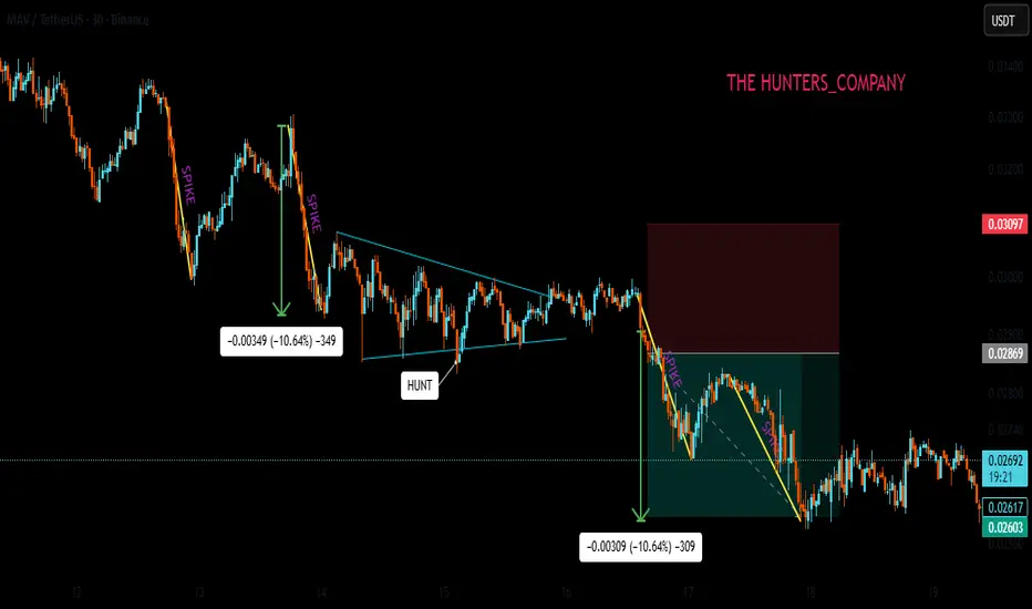
ESG Investing and Sustainable Finance1. Understanding ESG Investing
ESG stands for Environmental, Social, and Governance — the three key pillars used to evaluate the sustainability and ethical impact of an investment.
Environmental (E):
This pillar examines how a company manages its environmental responsibilities. Factors include carbon emissions, energy efficiency, waste management, pollution control, renewable energy use, and climate change mitigation strategies.
Example: Companies that reduce greenhouse gas emissions or invest in renewable energy are seen as environmentally responsible.
Importance: Investors assess environmental performance to gauge how well a company can manage climate-related risks and comply with emerging environmental regulations.
Social (S):
This component focuses on how a company interacts with people — employees, customers, suppliers, and communities. It includes labor practices, employee welfare, diversity and inclusion, human rights, product safety, and community engagement.
Example: Firms that promote gender equality, maintain fair wages, or engage in ethical supply chains demonstrate strong social values.
Importance: Socially responsible companies tend to attract loyal customers, maintain a motivated workforce, and avoid reputational risks.
Governance (G):
Governance deals with corporate leadership, internal controls, and shareholder rights. It assesses board diversity, executive pay, ethical business conduct, transparency, and anti-corruption policies.
Example: Companies with independent boards, fair executive compensation, and transparent reporting systems score high in governance.
Importance: Good governance reduces the likelihood of fraud, mismanagement, and unethical behavior — ensuring long-term stability.
In ESG investing, these three dimensions help investors identify organizations that are not only financially sound but also sustainable and ethical in their operations.
2. The Rise of ESG Investing
ESG investing has evolved from a niche concept to a global mainstream movement. Several factors have contributed to this shift:
Investor Awareness:
Modern investors, particularly millennials and Gen Z, are increasingly motivated by values. They prefer to invest in companies that align with their ethical and environmental beliefs.
Regulatory Push:
Governments and international bodies are promoting ESG standards. For example, the European Union introduced the Sustainable Finance Disclosure Regulation (SFDR), and India’s Business Responsibility and Sustainability Report (BRSR) mandates ESG disclosures for top-listed companies.
Corporate Accountability:
Global corporations are under growing pressure to adopt ESG frameworks, not only to attract investors but also to secure long-term sustainability and brand credibility.
Risk Management:
ESG factors are now recognized as essential to identifying long-term risks such as environmental disasters, regulatory changes, or social unrest that could affect business performance.
According to data from the Global Sustainable Investment Alliance (GSIA), ESG-related investments surpassed $35 trillion globally by 2023, representing about one-third of all professionally managed assets.
3. The Concept of Sustainable Finance
While ESG investing focuses on evaluating company performance using sustainability metrics, sustainable finance refers to the broader financial system that supports sustainable development.
Sustainable finance integrates environmental, social, and governance considerations into all aspects of financial decision-making — including banking, insurance, and capital markets. It aims to channel capital toward projects and companies that contribute positively to society and the planet.
Key components of sustainable finance include:
Green Finance:
This focuses on funding environmentally friendly projects — such as renewable energy, energy-efficient infrastructure, sustainable agriculture, or water conservation.
Example: Green bonds are debt instruments used to finance environmental projects.
Social Finance:
This supports initiatives that improve social well-being — such as affordable housing, education, healthcare, or employment generation.
Climate Finance:
A subcategory of sustainable finance, it targets investments that mitigate or adapt to climate change. This includes funding clean technologies and climate-resilient infrastructure.
Impact Investing:
This approach seeks measurable positive social and environmental outcomes alongside financial returns. Investors directly fund projects or enterprises that deliver tangible societal benefits.
4. Interconnection Between ESG Investing and Sustainable Finance
ESG investing is a subset of sustainable finance. While ESG focuses on assessing companies through sustainability metrics, sustainable finance provides the financial infrastructure — such as green bonds, sustainability-linked loans, and climate funds — to support those ESG-driven companies and initiatives.
In other words:
ESG provides the criteria for evaluation.
Sustainable finance provides the capital for transformation.
Together, they form a comprehensive ecosystem where financial decisions contribute to a greener, fairer, and more transparent global economy.
5. Benefits of ESG Investing and Sustainable Finance
Long-Term Value Creation:
ESG-aligned companies tend to perform better in the long run due to better risk management, innovation, and adaptability.
Lower Risk Exposure:
Firms adhering to ESG standards are less likely to face regulatory fines, lawsuits, or reputational damage.
Improved Access to Capital:
Sustainable companies attract more investors, as many institutional funds now mandate ESG compliance.
Enhanced Reputation and Brand Loyalty:
Consumers increasingly support ethical and eco-conscious brands, boosting market share.
Positive Societal Impact:
Capital is directed toward solving global issues like climate change, poverty, and inequality, leading to inclusive growth.
6. Challenges in ESG and Sustainable Finance
Despite its growth, ESG investing faces several obstacles:
Lack of Standardization:
Different rating agencies use varying ESG criteria, leading to inconsistent evaluations of the same company.
Greenwashing:
Some companies falsely claim to be sustainable to attract investors — a practice known as “greenwashing.”
Data Limitations:
Reliable and comparable ESG data is scarce, especially in emerging markets.
Short-Term Market Pressures:
Investors often prioritize quarterly profits over long-term sustainability goals.
High Implementation Costs:
Transitioning to sustainable practices can be expensive, particularly for small and medium enterprises (SMEs).
7. Global and Indian Perspective
Globally, regions like Europe and North America lead in ESG adoption, with institutional investors such as BlackRock and Vanguard emphasizing sustainability mandates. The United Nations Principles for Responsible Investment (UN PRI) and the Paris Agreement have further driven ESG integration into the financial system.
In India, ESG and sustainable finance are gaining momentum:
SEBI (Securities and Exchange Board of India) has made ESG reporting mandatory for the top 1,000 listed companies under the BRSR framework.
The Reserve Bank of India (RBI) has initiated policies supporting green and social financing.
Indian banks like SBI and HDFC are issuing green bonds to finance renewable energy and social projects.
This marks a clear shift in India’s investment culture — aligning financial growth with sustainability.
8. The Future of ESG and Sustainable Finance
The future of finance lies in sustainability-driven innovation. Artificial intelligence, big data, and blockchain are being used to enhance ESG data transparency and traceability. Governments are introducing carbon pricing, taxonomy regulations, and sustainability-linked incentives to encourage responsible investing.
As climate risks and social inequalities intensify, ESG and sustainable finance will continue to evolve — not as alternatives but as the new standard of global financial practice.
Conclusion
ESG investing and sustainable finance represent more than just financial trends — they are part of a paradigm shift in how societies view growth and prosperity. They align economic success with social well-being and environmental preservation. By integrating sustainability into financial systems, investors and institutions are not only securing returns but also shaping a resilient, equitable, and sustainable future for generations to come.
In essence, profit and purpose are no longer opposites — they are partners in the global mission toward sustainable development.

Sector-Wise Performance: Winners and Losers in a Recession1. Consumer Staples – The Recession-Resilient Winner
One of the most consistent winners during a recession is the consumer staples sector. This includes companies that produce essential goods such as food, beverages, cleaning products, and personal care items. No matter how bad the economy gets, people still need to eat, brush their teeth, and maintain basic hygiene.
Examples: Procter & Gamble, Nestlé, and Hindustan Unilever often maintain stable revenues even when luxury sectors collapse.
Why it survives:
Demand for basic necessities remains constant.
Consumers may switch from premium to affordable brands, but overall spending on essentials doesn’t fall drastically.
Predictable cash flows make these companies attractive to defensive investors.
Investor takeaway: During economic downturns, defensive sectors like consumer staples tend to outperform broader markets and serve as safe havens for portfolio stability.
2. Healthcare – A Pillar of Stability
The healthcare sector also tends to weather recessions well. People do not stop buying medicines or seeking medical attention due to economic hardship. Hospitals, pharmaceutical companies, and medical equipment manufacturers often continue to generate revenue even when consumer sentiment is weak.
Examples: Johnson & Johnson, Pfizer, and major hospital chains maintain steady performance during recessions.
Why it survives:
Healthcare demand is largely inelastic (not sensitive to economic changes).
Aging populations and chronic diseases ensure consistent demand.
In some cases, recessions can increase stress-related health issues, indirectly boosting demand for certain treatments.
Investor takeaway: Healthcare stocks often act as defensive assets. They provide consistent dividends and stable earnings, making them ideal for investors seeking protection from volatility.
3. Utilities – The Safe but Slow Sector
Utilities such as electricity, water, and gas providers are among the most stable industries during recessions. These services are essential for daily living, and their demand rarely fluctuates with economic cycles.
Why it survives:
Energy and water are indispensable, regardless of income levels.
Many utility companies have regulated pricing structures, ensuring steady revenue.
High dividend yields attract investors seeking safety.
Investor takeaway: Utilities offer reliability and income stability, though they may not deliver high growth. In a recession, they serve as a “safe harbor” for conservative investors.
4. Information Technology – Mixed Performance
The IT sector shows a mixed response during recessions. On one hand, technology is deeply embedded in modern life and business operations. On the other hand, corporations may delay software upgrades or IT spending to cut costs.
Winners within IT:
Cloud computing, cybersecurity, and digital communication firms often continue to grow as businesses seek efficiency and remote solutions.
Subscription-based services (like Microsoft 365, AWS, or Zoom) maintain steady cash flow.
Losers within IT:
Hardware manufacturers and consumer electronics companies may suffer due to reduced discretionary spending.
Startups dependent on venture capital may struggle as funding tightens.
Investor takeaway: Look for tech firms with recurring revenue models and strong balance sheets. They can outperform during recessions and rebound faster afterward.
5. Financial Services – Major Losers
The financial sector is often one of the hardest hit during recessions. Banks, insurance companies, and investment firms experience declines due to loan defaults, reduced credit demand, and falling asset prices.
Why it suffers:
Rising unemployment increases loan delinquencies.
Stock market volatility reduces investment income.
Central banks may lower interest rates, squeezing lending margins.
Examples: During the 2008 global financial crisis, banking giants like Lehman Brothers collapsed, and others like Citigroup required government bailouts.
Investor takeaway: Avoid heavily leveraged or high-risk financial institutions during recessions. Focus on well-capitalized banks with strong liquidity and diversified operations.
6. Real Estate & Construction – A Cyclical Victim
Real estate and construction are highly cyclical sectors that depend on credit availability and consumer confidence. During recessions, both commercial and residential property demand usually declines.
Why it suffers:
High-interest rates (if inflation-driven) make mortgages expensive.
Companies delay expansion plans, lowering commercial property demand.
Property prices may fall due to oversupply and weak investor sentiment.
Exceptions: Affordable housing and rental properties sometimes see steady demand as people downsize from luxury housing.
Investor takeaway: Real estate investment trusts (REITs) with strong cash flow from essential infrastructure (like warehouses or data centers) may perform better than those dependent on office or retail spaces.
7. Consumer Discretionary – The First to Fall
The consumer discretionary sector includes automobiles, luxury goods, entertainment, and travel — all of which are non-essential expenditures. When incomes fall and job insecurity rises, consumers cut back on these first.
Why it suffers:
Reduced household spending on luxury or leisure items.
High inventory levels can lead to heavy discounting and profit erosion.
Companies like automakers, apparel brands, and restaurants often report sharp sales drops.
Examples: The auto and tourism industries saw major declines during the 2020 COVID-19 recession.
Investor takeaway: Avoid heavily cyclical discretionary stocks during downturns. Focus instead on affordable or value-oriented brands that appeal to cost-conscious consumers.
8. Energy Sector – Highly Volatile
The energy sector is deeply tied to global economic activity. Recessions typically reduce industrial output, transportation, and consumption, leading to falling oil and gas demand.
Why it suffers:
Lower demand leads to falling commodity prices.
High fixed costs hurt profitability.
Energy companies may cut capital expenditures, slowing exploration and innovation.
Exceptions: Renewable energy firms and utilities linked to clean energy sometimes remain resilient as governments push green investment even in tough times.
Investor takeaway: Energy stocks can be risky in a recession but may offer opportunities when prices bottom out. Long-term investors can benefit from cyclical rebounds.
9. Industrials – Dependent on Economic Cycles
Industrial companies, including manufacturing, logistics, and heavy equipment firms, are directly affected by economic slowdowns. Orders decline, supply chains contract, and capital investment pauses.
Why it suffers:
Reduced demand for machinery and construction materials.
Dependence on global trade makes them vulnerable to international slowdowns.
Cost-cutting leads to layoffs and reduced capacity utilization.
Investor takeaway: Avoid capital-intensive industrials during recessions. Focus on companies with strong government contracts or exposure to defense and essential infrastructure projects.
10. Communication Services – The Modern Necessity
This sector includes telecom providers, digital media, and online entertainment platforms. In modern recessions, communication services have shown resilience because people still need connectivity for work, study, and entertainment.
Why it survives:
Internet and mobile connectivity are essential utilities today.
Streaming and online gaming often see usage spikes when people stay home.
Advertising revenue may dip, but subscription models offer balance.
Investor takeaway: Companies with recurring revenue, like telecoms or streaming platforms, often perform relatively well compared to traditional media firms reliant on ad income.
Conclusion
Recessions expose the real strength and adaptability of each sector. While consumer staples, healthcare, utilities, and telecom typically emerge as winners, sectors such as financials, real estate, energy, and discretionary goods often become losers due to their sensitivity to income and credit conditions.
For investors, the key lesson is sector rotation — shifting portfolio weight toward defensive and essential industries during downturns, and gradually moving back to cyclical and growth sectors as recovery begins. Understanding these dynamics not only helps preserve capital but also positions investors to capture gains when the economy eventually rebounds.
Global Market Time Zone ArbitrageIntroduction
In the increasingly interconnected world of finance, the concept of time zone arbitrage has become a significant factor shaping global market dynamics. As financial markets across continents operate in different time zones, differences in market closing times, liquidity conditions, and price discovery processes create unique opportunities for investors and traders. This temporal gap between global exchanges allows for price discrepancies, which can be exploited through a strategy known as global market time zone arbitrage.
Time zone arbitrage leverages the fact that while one market closes, another opens. For instance, Asian markets like Tokyo or Hong Kong open long before Europe and the United States. This allows traders to act on price movements in one region before another market reacts to the same information, creating both profit opportunities and risks.
This essay explores the concept of global market time zone arbitrage, how it works, its types, real-world examples, associated risks, and the overall impact it has on global financial markets.
Understanding Time Zone Arbitrage
At its core, arbitrage means profiting from price differences of the same asset in different markets or forms. Time zone arbitrage, specifically, involves exploiting these differences that arise because of the time separation between trading sessions across global financial centers such as New York, London, Tokyo, and Sydney.
For example, suppose the Japanese stock market reacts positively to an earnings report of a multinational corporation that is also listed in the U.S. When the Japanese market closes, the U.S. market may not have yet opened. In this time gap, traders can anticipate that U.S. investors will react similarly and buy the stock or related derivatives before the U.S. market adjusts, earning a profit once prices align.
Thus, time zone arbitrage is not just about price differences between markets but also about timing, information flow, and investor reaction across geographies.
Global Financial Market Time Zones
To understand how time zone arbitrage operates, it’s essential to look at the sequence of global market hours:
Asia-Pacific Session: Tokyo, Hong Kong, Singapore, Sydney
European Session: London, Frankfurt, Paris
American Session: New York, Chicago, Toronto
These trading sessions overlap partially—such as the London-New York overlap—where most global liquidity is concentrated. However, outside these overlaps, market isolation creates pricing inefficiencies that form the basis for arbitrage opportunities.
For instance, when the U.S. markets close, Asian traders analyze U.S. closing data overnight and adjust their own markets the following morning. Conversely, European and U.S. traders later react to Asian developments, perpetuating a continuous cycle of price discovery across time zones.
Mechanisms of Time Zone Arbitrage
Time zone arbitrage typically occurs through the following mechanisms:
Information Lag Arbitrage
When significant news or data is released after a market closes, traders in another time zone can act on that information before the first market reopens. For example, if the Federal Reserve announces an unexpected interest rate cut after U.S. markets close, Asian traders can buy Asian equities or currencies that will benefit from a weaker dollar before U.S. investors can respond.
ETF and NAV Timing Mismatches
One of the most well-known forms of time zone arbitrage occurs in mutual funds and exchange-traded funds (ETFs) that hold international assets. These funds’ net asset value (NAV) is calculated based on closing prices of foreign securities, which may be stale by the time U.S. investors trade them. Arbitrageurs exploit this stale pricing by buying or selling fund shares based on information that emerged after the underlying markets closed.
Cross-listing Arbitrage
Many global corporations are listed on multiple stock exchanges (e.g., HSBC in London and Hong Kong). If the stock moves in one market while the other is closed, arbitrageurs can anticipate the direction of the price adjustment once the second market opens.
Currency and Futures Arbitrage
Currencies trade 24 hours, but equity and bond markets do not. Traders may use currency or futures positions to exploit expected movements in markets that have yet to open. For instance, a trader may short yen futures if they expect Japanese equities to fall following negative news in the U.S.
Example: U.S.-Japan Time Zone Arbitrage
A practical example involves the relationship between U.S. and Japanese markets. Suppose Apple Inc. reports outstanding quarterly results after the U.S. markets close. While U.S. investors cannot immediately trade Apple shares, Japanese traders can anticipate a positive impact on Apple’s Japanese suppliers (e.g., Sony, Murata Manufacturing). They buy those stocks during Tokyo’s trading hours, leading to a rise in prices before U.S. investors react the next day.
When the U.S. market opens, Apple’s stock jumps, confirming the arbitrageur’s expectation. The trader profits from the time lag between markets by leveraging cross-market relationships and predictive linkages.
Mutual Fund Timing Arbitrage
A historically significant form of time zone arbitrage occurred in U.S. mutual funds investing in international markets. Because international markets close before U.S. markets, mutual fund NAVs often reflected outdated prices. For example, if Asian markets closed before a rally in U.S. stocks, the NAV of an Asia-focused U.S. mutual fund might remain artificially low. Traders could buy fund shares before the NAV updated and sell them the next day after the price adjustment.
This practice became controversial in the early 2000s, leading to regulatory scrutiny. The 2003 mutual fund scandal in the U.S. revealed that some hedge funds exploited these stale prices systematically, prompting the SEC to enforce stricter pricing mechanisms known as “fair value pricing”, which adjusts foreign security prices to account for time-zone effects.
Types of Time Zone Arbitrage Strategies
Equity Market Arbitrage
Traders use historical correlations between markets (e.g., S&P 500 and Nikkei 225) to predict movements and position themselves accordingly.
Currency and Index Futures Arbitrage
Currency markets react instantly to news. Traders use FX movements as a proxy to predict equity market openings in other regions.
Commodity Market Arbitrage
Commodities such as oil and gold trade globally, but not every derivative market is open simultaneously. Traders may exploit time gaps between futures contracts traded in London, New York, and Shanghai.
ETF and Mutual Fund Arbitrage
Investors trade global ETFs based on anticipated movements in underlying assets, taking advantage of time lags in NAV updates.
Technological Advancements and Algorithmic Arbitrage
With the rise of algorithmic trading and artificial intelligence, time zone arbitrage has evolved beyond manual exploitation of price lags. Advanced trading algorithms now continuously monitor global markets, news feeds, and cross-asset correlations to identify arbitrage opportunities within milliseconds.
These systems use machine learning models to predict how markets will react to global events and execute trades automatically. The speed advantage of these algorithms minimizes human error and maximizes profit capture before prices adjust across time zones.
High-frequency trading (HFT) firms and global hedge funds have particularly benefited from this technological evolution, making time zone arbitrage more efficient and less accessible to retail traders.
Risks Involved in Time Zone Arbitrage
While the concept of arbitrage implies risk-free profit, time zone arbitrage involves several risks due to global uncertainty and information dynamics:
Information Risk
News may be interpreted differently by investors in different regions, leading to unexpected market reactions.
Liquidity Risk
During off-peak hours or illiquid sessions (like pre-market or after-hours trading), executing large trades can cause slippage.
Currency Risk
Exchange rate fluctuations can erode arbitrage profits, especially for cross-border trades involving multiple currencies.
Regulatory Risk
Many regulators, especially in the U.S. and EU, have tightened rules around cross-time-zone and stale-price trading to prevent unfair practices.
Execution and Timing Risk
Delays in order execution or incorrect assumptions about market reactions can quickly turn profits into losses.
Correlation Breakdown
Historical market correlations may not hold during crises or volatility spikes, reducing the predictability of price movements.
Regulatory and Ethical Considerations
Time zone arbitrage often lies in a gray area of financial ethics. While arbitrage itself is legal and contributes to market efficiency, exploiting time-zone pricing inefficiencies in mutual funds was considered unfair to long-term investors. Regulatory bodies like the U.S. Securities and Exchange Commission (SEC) and the Financial Conduct Authority (FCA) have implemented measures such as:
Fair Value Pricing: Adjusting NAVs to reflect real-time global developments.
Time-Stamps on Orders: Preventing late trading after market close.
Enhanced Disclosure: Requiring funds to reveal their valuation methodologies.
These reforms have significantly reduced illicit arbitrage opportunities but have not eliminated legitimate global time zone trading strategies.
Economic Implications of Time Zone Arbitrage
Improved Market Efficiency
Arbitrage helps align prices across global markets, ensuring that information is reflected more quickly and accurately.
Enhanced Liquidity
Continuous trading activity across time zones contributes to global liquidity and reduces bid-ask spreads.
Integration of Global Markets
Time zone arbitrage contributes to tighter linkages between financial centers, reinforcing the idea of a truly “24-hour global market.”
Volatility Transmission
On the downside, arbitrage accelerates the spread of shocks from one region to another, increasing global market interdependence.
Technological Advancement
The pursuit of arbitrage efficiency has driven innovation in trading infrastructure, from algorithmic execution systems to cross-border clearing networks.
Real-World Examples
Asian Market Reaction to U.S. Earnings
Japanese and Hong Kong markets often react first to overnight U.S. corporate earnings, providing early signals for European investors.
Oil Price Arbitrage between London and New York
Crude oil futures listed on ICE (London) and NYMEX (New York) often show short-term discrepancies due to non-overlapping hours, which traders exploit.
ETF Mispricing in Global Funds
U.S.-listed ETFs tracking Asian or European markets often trade at premiums or discounts relative to their NAVs during U.S. hours, offering arbitrage opportunities to institutional traders.
The Future of Time Zone Arbitrage
As globalization deepens and trading technology advances, time zone arbitrage will continue to evolve. The advent of 24-hour trading for certain instruments, such as major stock index futures and cryptocurrencies, is gradually reducing traditional arbitrage windows. However, human behavior, regulatory boundaries, and data asymmetry ensure that time-based inefficiencies will persist to some degree.
The next phase of time zone arbitrage will likely involve AI-driven predictive analytics, capable of modeling how markets in one region will react to developments elsewhere before the markets even open. Quantum computing and blockchain-based global exchanges could further compress time differences, bringing markets closer to real-time synchronization.
Conclusion
Global market time zone arbitrage is a sophisticated strategy that thrives on the natural time differences between global trading hubs. By exploiting price inefficiencies and information lags, traders contribute to global price discovery and market integration. However, this strategy also carries significant risks and ethical considerations, requiring a balance between innovation and regulation.
As global markets continue to move toward seamless 24-hour trading, the opportunities for traditional time zone arbitrage may narrow, but the underlying principle—profiting from the misalignment of time, price, and information—will remain central to the mechanics of global finance.
Global Equity TrendsIntroduction
Global equity markets serve as the heartbeat of the world economy. They represent ownership in publicly traded companies, providing investors with opportunities for wealth creation, diversification, and long-term growth. Over the decades, global equity trends have evolved through technological innovation, globalization, regulatory reforms, and changing investor behavior. The past few years—especially post-COVID-19—have seen dramatic shifts in market dynamics, valuations, and sectoral leadership. Understanding global equity trends is essential for investors, policymakers, and economists to navigate the ever-changing financial landscape.
1. The Evolution of Global Equity Markets
Historically, equity markets were dominated by a few developed economies like the United States, United Kingdom, Germany, and Japan. However, over the last three decades, globalization and liberalization of capital markets have expanded participation to emerging economies such as China, India, Brazil, and South Korea.
In the 1980s and 1990s, major structural reforms and the integration of technology revolutionized stock trading, making global equities more accessible and transparent. The rise of electronic trading, online brokerages, and exchange-traded funds (ETFs) further democratized participation. Today, investors can access global equities at the click of a button, enabling cross-border diversification and global asset allocation strategies.
2. Post-Pandemic Recovery and Market Resilience
The COVID-19 pandemic marked one of the most volatile periods in financial history. Equity markets crashed in early 2020 but rebounded swiftly, driven by unprecedented fiscal stimulus and ultra-loose monetary policies by central banks. The recovery was uneven—technology and healthcare sectors surged, while travel, energy, and traditional manufacturing lagged behind.
By 2021, global markets reached record highs, fueled by optimism over digital transformation, renewable energy, and e-commerce growth. However, 2022 brought renewed challenges as inflation surged, interest rates rose sharply, and geopolitical tensions—particularly the Russia-Ukraine war—disrupted supply chains and energy markets. Despite these shocks, equity markets have shown remarkable adaptability, demonstrating the long-term resilience of the global economy.
3. Regional Market Performance
a. United States
The U.S. remains the anchor of the global equity landscape, accounting for over 60% of global market capitalization. The S&P 500, NASDAQ, and Dow Jones indices have led global performance, driven by technology giants like Apple, Microsoft, Nvidia, and Alphabet. The U.S. equity trend has been characterized by strong innovation, corporate profitability, and deep capital markets. However, valuation concerns and interest rate sensitivity remain key challenges going forward.
b. Europe
European equities have underperformed relative to the U.S., primarily due to slower economic growth, demographic challenges, and political fragmentation. Nonetheless, markets like Germany, France, and the Netherlands remain strong in industrials, luxury goods, and renewable energy. The United Kingdom, post-Brexit, has experienced both volatility and opportunity, particularly in financial services and energy sectors.
c. Asia-Pacific
Asia has emerged as the growth engine of global equities. China, Japan, India, and South Korea have become crucial drivers of market performance. China’s rise was spectacular through the 2010s, led by technology and manufacturing. However, recent regulatory crackdowns and real estate sector weakness have slowed momentum. India, in contrast, has become a standout performer, attracting foreign investment through policy reforms, a booming startup ecosystem, and a rapidly growing consumer base. Japan’s renewed corporate reforms and governance improvements have also revitalized investor confidence.
d. Emerging Markets
Emerging market equities offer diversification and high growth potential but are prone to volatility. Latin America, Africa, and Southeast Asia have benefited from commodity booms and favorable demographics, though they remain exposed to currency risk, political instability, and inflation. The long-term outlook remains promising, especially for economies focusing on industrialization and digital innovation.
4. Sectoral Shifts in Global Equities
Equity trends are increasingly defined by sectoral transformations:
a. Technology Dominance
The technology sector continues to lead global equity growth. Artificial intelligence, cloud computing, semiconductors, and digital platforms have driven exponential gains. Companies like Apple, Microsoft, Amazon, and Nvidia dominate global valuations. The “tech megatrend” is supported by ongoing digitalization across industries, making technology not just a sector, but the foundation of modern economic growth.
b. Renewable Energy and ESG Investing
Environmental, Social, and Governance (ESG) principles have reshaped global equity allocations. Investors now prioritize sustainability, clean energy, and ethical governance. Renewable energy companies—solar, wind, and electric vehicle producers—are gaining prominence. ESG-themed ETFs and funds are attracting trillions in inflows, transforming how corporations are valued and managed.
c. Healthcare and Biotechnology
The pandemic accelerated investment in healthcare innovation. Biotechnology, telemedicine, and pharmaceutical research have become vital equity themes. Aging populations in developed nations and rising healthcare demand in emerging markets continue to drive this sector’s growth trajectory.
d. Financial Services Transformation
The financial sector is evolving with the rise of fintech, digital banking, and blockchain technology. Traditional banks face disruption from agile startups offering digital wallets, online lending, and decentralized finance (DeFi). Nonetheless, rising interest rates have revived profitability for major banks, especially in the U.S. and Europe.
e. Commodities and Industrials
With global infrastructure spending increasing, industrial and commodity-related equities are regaining attention. Energy transition metals like lithium, copper, and nickel are vital to the EV revolution, attracting investors seeking exposure to the “green economy.”
5. The Role of Institutional and Retail Investors
The composition of equity investors has transformed dramatically. Institutional investors—pension funds, sovereign wealth funds, and mutual funds—continue to dominate in size, but retail participation has surged. The rise of zero-commission trading platforms and social investing communities has empowered individuals globally.
The “meme stock” phenomenon of 2021, driven by platforms like Reddit, demonstrated the influence of retail investors. Meanwhile, institutional investors are increasingly adopting quantitative and algorithmic strategies, relying on big data and AI for trading decisions. This blend of technology and democratization has increased liquidity but also amplified short-term volatility.
6. Globalization, Integration, and Interdependence
Equity markets today are more interconnected than ever. A policy shift by the U.S. Federal Reserve can ripple through Asia and Europe within hours. Cross-border listings, dual-traded stocks, and global ETFs have deepened financial integration. However, this interconnectedness also increases systemic risk. Global crises—whether economic, geopolitical, or environmental—can trigger synchronized market reactions.
At the same time, globalization has led to the rise of multinational corporations whose revenues are not confined to domestic borders. For example, companies like Apple, Nestlé, and Samsung derive the majority of their income from international markets, blurring the line between “local” and “global” equities.
7. Impact of Geopolitical and Economic Factors
Geopolitical tensions significantly influence equity trends. The U.S.–China trade war, the Russia-Ukraine conflict, and Middle East instability all shape investor sentiment. Sanctions, supply chain disruptions, and shifts in energy policy affect specific sectors and regional equities.
Macroeconomic policies also play a central role. Inflation trends, interest rate decisions, and fiscal spending directly impact equity valuations. Central banks, particularly the U.S. Federal Reserve and the European Central Bank, are the key arbiters of global liquidity. The transition from an era of cheap money (2010–2021) to a higher-rate environment post-2022 has reshaped risk appetite and capital flows.
8. Technological Innovation and Market Structure
Technology has transformed not only which companies succeed but also how markets function. High-frequency trading, blockchain-based settlement systems, and artificial intelligence-driven analysis are redefining efficiency and transparency. Global stock exchanges are embracing digital transformation to attract international listings and facilitate faster execution.
Decentralized trading platforms and tokenized assets may represent the next frontier. Although still in early stages, blockchain technology could one day enable direct trading of fractional equity shares globally without intermediaries, further expanding market accessibility.
9. ESG and Sustainable Investing as a Core Trend
ESG has moved from the periphery to the mainstream of equity investing. Investors are increasingly aware that sustainability reduces long-term risk and enhances resilience. Governments and regulators are enforcing stricter disclosure requirements on carbon emissions, labor practices, and governance standards. As a result, companies with strong ESG performance often enjoy lower capital costs and better investor confidence. The global shift toward green finance will continue to shape equity trends for decades.
10. Valuation Trends and Market Cycles
Valuation trends vary across regions and sectors. U.S. equities trade at relatively higher price-to-earnings ratios due to strong earnings growth expectations. European markets are generally undervalued, reflecting lower growth prospects but offering potential for value investors. Emerging markets often trade at discounts due to perceived risks but can deliver outsized returns during expansion cycles.
Market cycles—bull and bear phases—are natural in equities. After years of stimulus-driven bull markets, recent corrections have reintroduced discipline and selectivity. Investors are now focusing on fundamentals, earnings quality, and balance sheet strength rather than speculative momentum.
11. The Future of Global Equities
The next decade will likely bring both opportunities and disruptions. Key future trends include:
Artificial Intelligence and Automation: AI will revolutionize productivity, profit margins, and equity valuations across multiple sectors.
Decarbonization and Energy Transition: Companies aligned with net-zero goals will attract greater capital inflows.
Demographic Shifts: Aging populations in developed economies and youthful demographics in emerging nations will reshape consumption and investment patterns.
Financial Inclusion and Tokenization: Blockchain-based equity systems could make investing more accessible worldwide.
Reshoring and Supply Chain Realignment: As nations seek resilience over efficiency, industrial and logistics equities will see renewed focus.
The long-term outlook remains optimistic. Despite cyclical volatility, equities continue to outperform most asset classes over extended horizons due to innovation, productivity gains, and corporate adaptability.
12. Conclusion
Global equity trends mirror the evolution of the world economy itself—dynamic, interconnected, and resilient. From the dominance of U.S. technology firms to the rapid growth of Asian markets and the rise of ESG investing, equities reflect both opportunity and transformation.
Investors navigating this complex landscape must adapt to structural changes, remain diversified across regions and sectors, and embrace innovation while managing risk. As globalization, technology, and sustainability redefine economic priorities, global equity markets will continue to be the central pillar of wealth creation, capital formation, and economic progress in the 21st century.

Developed Market and Emerging MarketIntroduction
The global economy is an interconnected network of nations at different stages of economic development. These stages are generally categorized into developed markets, emerging markets, and frontier markets. Among them, developed and emerging markets play the most significant roles in shaping international trade, investment flows, and financial stability. Understanding these two categories is essential for investors, policymakers, and economists who analyze global financial dynamics, risk profiles, and growth opportunities.
Developed markets represent mature, advanced economies with strong industrial bases, high income per capita, and stable political systems. Emerging markets, on the other hand, are countries in the process of industrialization and modernization, showing rapid growth but also facing economic volatility and structural challenges. This distinction helps investors gauge risk, return potential, and diversification strategies in global portfolios.
1. Definition and Concept
Developed Market
A developed market (also known as an advanced or mature market) refers to a country with a highly industrialized economy, well-established financial systems, and high living standards. These nations have robust infrastructure, sophisticated regulatory frameworks, and stable political environments that promote predictable business operations. Their economic activities are primarily driven by services and advanced manufacturing rather than agriculture or basic industries.
International organizations such as the International Monetary Fund (IMF), World Bank, and United Nations classify developed markets based on indicators like:
Gross Domestic Product (GDP) per capita
Human Development Index (HDI)
Financial market sophistication
Industrial diversification
Institutional strength and governance quality
Examples of developed markets include:
United States
Canada
United Kingdom
Germany
France
Japan
Australia
South Korea
Switzerland
These economies form the backbone of global financial systems and often host major stock exchanges such as the NYSE, NASDAQ, London Stock Exchange, and Tokyo Stock Exchange.
Emerging Market
An emerging market is a nation transitioning from a developing to a developed economy. These countries experience rapid industrialization, urbanization, and integration into the global economy, leading to substantial growth potential. However, they also face higher risks, including political instability, inflation volatility, and weaker institutional frameworks.
The term "emerging market" was popularized by economist Antoine van Agtmael in the 1980s to describe countries with growing capital markets that were becoming attractive to foreign investors.
Criteria defining emerging markets include:
Moderate to high GDP growth rates
Expanding middle class
Increasing foreign investment
Developing infrastructure and technology
Improving governance and market reforms
Prominent emerging markets include:
China
India
Brazil
Russia
Mexico
Indonesia
South Africa
Turkey
Thailand
These countries often form part of groupings such as BRICS (Brazil, Russia, India, China, South Africa) or MINT (Mexico, Indonesia, Nigeria, Turkey).
2. Key Characteristics
Developed Markets
High Income Levels:
Developed economies have high GDP per capita, reflecting widespread wealth and purchasing power. For example, countries like the U.S. and Switzerland boast per capita incomes exceeding $60,000 annually.
Mature Financial Systems:
Their banking systems, capital markets, and insurance sectors are well-established and transparent, governed by strong regulatory frameworks.
Low Political and Economic Risk:
Stable governments, rule of law, and consistent economic policies create confidence among investors.
Advanced Infrastructure:
Efficient transportation, communication, and energy networks support productivity and competitiveness.
Technological Leadership:
Developed nations are at the forefront of innovation in industries such as IT, biotechnology, and renewable energy.
Stable Currency and Inflation:
Their central banks, such as the U.S. Federal Reserve or the European Central Bank, maintain price stability and sound monetary policy.
Emerging Markets
High Growth Potential:
Emerging economies often record faster GDP growth, sometimes exceeding 5–8% annually, driven by industrialization and rising domestic consumption.
Expanding Middle Class:
Economic development leads to a growing middle-income population, which boosts demand for goods, housing, and financial services.
Reform-Driven Economies:
Structural reforms, such as privatization and liberalization, make these markets more attractive to foreign investors.
Developing Financial Systems:
Their capital markets are growing but may still lack depth, transparency, and liquidity compared to developed markets.
Currency and Political Volatility:
Exchange rates and government policies can fluctuate significantly, affecting investor confidence.
Urbanization and Industrialization:
Rapid city expansion and manufacturing growth drive job creation and export competitiveness.
3. Economic Indicators Comparison
Indicator Developed Markets Emerging Markets
GDP per capita High (> $40,000) Moderate ($5,000–$20,000)
Growth rate Moderate (1–3%) High (4–8%)
Inflation Low and stable Moderate to high
Infrastructure Advanced Developing
Political stability Strong Varies widely
Currency stability High Often volatile
Industrial base Services and high-tech Manufacturing and agriculture
Income inequality Relatively low Often high
Financial markets Deep and liquid Expanding but less liquid
4. Role in Global Economy
Developed Markets’ Role
Developed economies act as the anchors of global finance and trade. They host the largest multinational corporations, reserve currencies, and financial hubs. The U.S. dollar, euro, and yen serve as international mediums of exchange, influencing global monetary policy. Their advanced financial systems provide capital to the rest of the world through foreign direct investments (FDI) and institutional funds.
They also drive technological innovation and research & development, setting global standards in production and governance. Developed markets’ consumer demand fuels global exports from emerging and developing nations, linking their prosperity to world trade flows.
Emerging Markets’ Role
Emerging economies represent the engine of global growth in the 21st century. They contribute a significant share of global GDP expansion due to large populations, rapid industrialization, and consumption growth. For instance, China and India alone account for over one-third of global economic growth.
They are crucial suppliers of raw materials, manufactured goods, and increasingly digital services. Moreover, they offer investment diversification opportunities, as their growth cycles may differ from developed economies. Emerging markets also play an essential role in addressing global challenges such as energy demand, environmental sustainability, and digital transformation.
5. Investment Perspective
From an investment standpoint, both developed and emerging markets present distinct risk-reward profiles.
Developed Market Investments
Investing in developed economies offers stability, transparency, and lower risk. Their stock markets are highly liquid and regulated, making them ideal for long-term investors seeking steady returns. However, growth opportunities may be limited because of market maturity and slower GDP expansion.
Common investment vehicles include:
Blue-chip equities (e.g., Apple, Microsoft, Nestlé)
Government bonds (e.g., U.S. Treasuries)
Index funds tracking major benchmarks (e.g., S&P 500, FTSE 100)
Emerging Market Investments
Emerging markets provide higher growth potential but also higher volatility. Investors are attracted to the potential for strong returns from sectors like infrastructure, consumer goods, and technology. However, risks include political instability, currency depreciation, and weaker governance.
Investment opportunities include:
Local equities and bonds
Exchange-traded funds (ETFs) tracking emerging indices (e.g., MSCI Emerging Markets Index)
Direct investment in infrastructure or start-ups
Diversifying portfolios across both markets helps balance stability and growth potential.
6. Challenges Faced by Each Market Type
Challenges in Developed Markets
Slow Growth:
Mature economies experience limited GDP expansion due to market saturation and aging populations.
High Debt Levels:
Many developed nations carry large public debts, creating fiscal pressures.
Technological Disruption:
Automation and AI may lead to job displacement and inequality.
Geopolitical Risks:
Trade disputes and policy shifts (e.g., Brexit, U.S.–China tensions) can affect global stability.
Challenges in Emerging Markets
Political Instability:
Government changes and weak institutions can disrupt economic policy.
Inflation and Currency Risk:
Volatile exchange rates can deter foreign investment.
Dependence on Commodities:
Many emerging economies rely heavily on exports like oil or minerals, making them vulnerable to price swings.
Infrastructure Deficits:
Inadequate roads, power supply, and communication networks limit industrial efficiency.
Capital Flight:
When global interest rates rise, investors often withdraw funds from riskier emerging markets.
7. Interdependence Between Developed and Emerging Markets
Globalization has woven developed and emerging markets into a mutually dependent economic fabric. Developed nations invest heavily in emerging markets for higher returns and resource access, while emerging markets rely on developed economies for technology, capital, and demand.
For example:
U.S. and European companies outsource manufacturing to Asia to reduce costs.
China and India import advanced machinery and software from developed countries.
Financial crises or interest rate changes in the U.S. can ripple across emerging economies.
Thus, while they differ in structure and stability, both market types are interlinked in global trade, investment, and policy networks.
8. The Future Outlook
The future of global growth is expected to be driven increasingly by emerging markets. By 2050, countries like China, India, and Indonesia are projected to become the world’s largest economies in purchasing power parity (PPP) terms. Their rising consumer bases, technological adoption, and urbanization will reshape global demand patterns.
However, developed markets will continue to dominate in innovation, finance, and governance standards. They will serve as models of economic stability and sustainability, influencing the global economic architecture through institutions such as the IMF, World Bank, and G7.
The key to a balanced global economy lies in cooperation between developed and emerging markets, focusing on trade fairness, technology transfer, and sustainable development.
Conclusion
Developed and emerging markets represent two distinct yet complementary pillars of the global economic system. Developed markets embody stability, efficiency, and innovation, while emerging markets offer dynamism, growth, and transformation. Together, they shape the rhythm of global finance, trade, and investment.
For investors and policymakers alike, understanding the interplay between these markets is crucial. Developed economies provide safe, predictable environments for steady returns, whereas emerging markets offer the promise of high growth with commensurate risks. As globalization deepens and digital technologies blur traditional boundaries, the collaboration and balance between these two market categories will define the future of global prosperity.
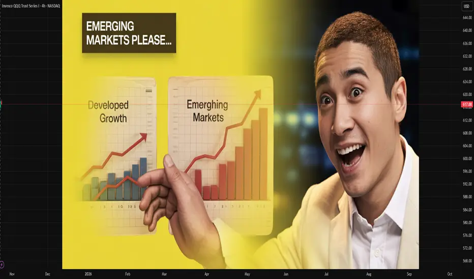
CBDCs as Digital AssetsIntroduction
In the rapidly evolving landscape of global finance, digitalization is redefining how value is created, stored, and exchanged. Among the most transformative innovations in this domain is the Central Bank Digital Currency (CBDC) — a digital form of sovereign money issued by a nation’s central bank. Unlike cryptocurrencies such as Bitcoin or Ethereum, CBDCs are centralized, fully regulated, and backed by the monetary authority of a country. As financial systems shift toward more digital and decentralized infrastructures, CBDCs are emerging not only as new payment tools but also as significant digital assets that may redefine global trade, investment, and monetary policy.
This essay explores the concept of CBDCs as digital assets, their structure, design models, global adoption trends, potential benefits, risks, and their future implications for economies and financial systems worldwide.
Understanding CBDCs: Concept and Structure
A Central Bank Digital Currency (CBDC) is a digital version of a country’s fiat currency, representing a direct liability of the central bank. It can be used by individuals, businesses, and financial institutions as a means of payment, store of value, and unit of account — the three fundamental functions of money. Unlike commercial bank deposits or cryptocurrencies, CBDCs are risk-free because they are backed by the full faith and credit of the issuing government.
CBDCs typically exist in two primary forms:
Retail CBDCs: Designed for public use, enabling citizens and businesses to conduct transactions directly with the central bank through digital wallets.
Example: The Bahamian Sand Dollar, Nigeria’s eNaira, and China’s e-CNY.
Wholesale CBDCs: Used primarily by financial institutions for interbank settlements, cross-border transfers, and clearing operations.
Example: Project Helvetia by the Swiss National Bank and Project Jura by the Banque de France.
As digital assets, CBDCs are tokenized representations of sovereign money that exist in digital form on a secure ledger — either centralized or distributed. They can integrate with blockchain technology or function on traditional centralized databases, depending on the design choice of the issuing central bank.
CBDCs vs. Cryptocurrencies and Stablecoins
To understand CBDCs as digital assets, it is essential to distinguish them from other digital currencies:
Cryptocurrencies (e.g., Bitcoin, Ethereum) are decentralized, not backed by any authority, and rely on market demand for valuation.
Stablecoins (e.g., USDT, USDC) are privately issued tokens pegged to fiat currencies but not directly guaranteed by central banks.
CBDCs, on the other hand, combine the trust and stability of fiat currencies with the efficiency and speed of digital technology.
This hybrid nature positions CBDCs as state-backed digital assets that can bridge the gap between traditional financial systems and the emerging digital economy.
The Economic Rationale Behind CBDCs
Central banks worldwide are exploring CBDCs for several economic and strategic reasons:
Enhancing Payment Efficiency:
Traditional payment systems, especially cross-border transactions, are slow and costly. CBDCs can streamline these processes by enabling real-time settlements and reducing dependency on intermediaries.
Financial Inclusion:
CBDCs can extend financial services to unbanked populations by allowing anyone with a mobile phone to access digital payment systems, especially in developing nations.
Maintaining Monetary Sovereignty:
The rapid rise of private digital currencies and foreign stablecoins poses a challenge to national monetary control. CBDCs enable central banks to retain authority over the money supply and ensure economic stability.
Reducing Transaction Costs:
With blockchain or distributed ledger technology (DLT), CBDCs can minimize clearing and settlement costs, promoting more transparent and efficient financial ecosystems.
Combating Illicit Activities:
Digital traceability enables better monitoring of transactions, helping authorities curb money laundering, tax evasion, and terrorism financing.
CBDCs as Digital Assets in Financial Markets
As digital assets, CBDCs possess unique attributes that can transform both domestic and international finance. Their programmable nature and compatibility with other tokenized assets open the door to new financial models and asset ecosystems.
1. Tokenization and Programmability
CBDCs can be programmed with smart contracts, enabling automated execution of financial transactions — such as interest payments, tax collection, or subsidy distribution — without intermediaries. This programmable feature turns CBDCs into intelligent digital assets capable of interacting with decentralized finance (DeFi) systems, digital bonds, and other tokenized securities.
2. Integration with Digital Asset Markets
CBDCs can serve as the foundation layer for broader digital asset ecosystems. They can facilitate instant settlement of tokenized assets, streamline securities trading, and enhance liquidity management. For example, central banks could use wholesale CBDCs to settle government bond trades in real time, reducing counterparty risks.
3. Cross-Border Payments
In global trade, CBDCs could eliminate the inefficiencies of correspondent banking. Multi-CBDC arrangements, such as the mBridge project (involving Hong Kong, China, Thailand, and the UAE), are testing platforms where multiple CBDCs interact seamlessly. This could create a new class of digital reserve assets, enabling faster, cheaper, and more transparent cross-border settlements.
Global Adoption and Case Studies
Central banks across more than 130 countries — representing over 98% of global GDP — are exploring or piloting CBDC initiatives. Some notable examples include:
China (Digital Yuan / e-CNY):
The People’s Bank of China has been a pioneer in retail CBDCs, using the e-CNY for domestic transactions, public salaries, and pilot programs in major cities.
European Union (Digital Euro):
The European Central Bank aims to launch a digital euro to complement physical cash, ensuring privacy, security, and monetary stability in the Eurozone.
India (Digital Rupee / e₹):
The Reserve Bank of India launched pilot programs for wholesale and retail CBDCs in 2022, exploring use cases in interbank settlements, government payments, and retail transactions.
United States (Digital Dollar):
The Federal Reserve is researching potential frameworks for a digital dollar, emphasizing privacy, interoperability, and financial stability.
Bahamas (Sand Dollar):
The world’s first fully deployed retail CBDC, launched in 2020, aimed at improving financial inclusion across remote islands.
These global experiments highlight CBDCs’ potential as national digital assets that could reshape the structure of global payments and reserves.
Benefits of CBDCs as Digital Assets
Trust and Stability:
Being issued by central banks, CBDCs are backed by government guarantees, making them a more stable form of digital money compared to volatile cryptocurrencies.
Interoperability:
CBDCs can act as a universal settlement asset across various financial systems, improving coordination between banks, fintechs, and digital platforms.
Transparency and Traceability:
Digital ledgers enable authorities to monitor money flows in real time, enhancing fiscal transparency and reducing corruption.
Resilience and Innovation:
By introducing programmable features, CBDCs foster innovation in payment systems, encouraging new fintech products and digital services.
Cost Reduction:
The elimination of intermediaries lowers transaction fees and settlement times, particularly in international trade and remittances.
Support for Digital Transformation:
CBDCs align with broader trends toward digital economies, e-governance, and data-driven policy-making.
Risks and Challenges
While CBDCs offer vast potential, they also introduce new complexities and risks that central banks must manage carefully.
1. Privacy Concerns
CBDCs could enable governments to track every transaction, raising concerns about surveillance and data privacy. Designing systems that balance transparency with anonymity is critical.
2. Cybersecurity Risks
As digital assets, CBDCs are vulnerable to cyberattacks, data breaches, and technological failures. Ensuring secure, resilient, and tamper-proof systems is essential.
3. Financial Disintermediation
If individuals hold CBDCs directly with central banks, it may reduce the role of commercial banks in deposit-taking, potentially destabilizing credit markets.
4. Technological Inequality
Not all citizens have equal access to digital infrastructure. Poor connectivity and lack of digital literacy could limit CBDC adoption.
5. Global Fragmentation
Different technological standards and regulatory frameworks across nations could create fragmented CBDC ecosystems, hindering cross-border interoperability.
6. Monetary Policy Complexity
Introducing programmable money could complicate the transmission of monetary policy and raise new questions about interest rates on digital assets.
CBDCs and the Future of Monetary Policy
CBDCs provide central banks with new tools for implementing and monitoring monetary policy. For instance:
Direct Stimulus Distribution: Governments could issue programmable CBDCs for targeted economic aid, ensuring efficient and transparent delivery.
Interest-bearing CBDCs: Central banks could adjust interest rates directly on CBDC holdings, influencing spending and saving behavior more precisely.
Real-time Economic Data: Digital transaction data could provide policymakers with real-time insights into economic activity, enabling faster responses to inflation or recession.
However, this also raises concerns about excessive control and the need for robust governance frameworks to prevent misuse of power.
CBDCs and the Digital Asset Ecosystem
The emergence of CBDCs is not occurring in isolation. They are expected to interact with other components of the digital asset ecosystem, including:
Tokenized securities and commodities
Decentralized finance (DeFi) protocols
Blockchain-based identity systems
Digital wallets and payment gateways
By enabling secure settlement and universal interoperability, CBDCs could become the anchor of the global digital asset infrastructure — ensuring stability in a marketplace otherwise characterized by volatility and fragmentation.
The Future Outlook
The evolution of CBDCs represents more than a technological upgrade — it signifies a shift in the philosophy of money. As digital assets, CBDCs have the potential to transform the global financial order by:
Redefining the role of central banks in the digital economy
Enhancing global financial inclusion and efficiency
Introducing programmable, transparent, and instantaneous financial systems
In the coming decade, the success of CBDCs will depend on how well central banks address privacy, security, interoperability, and governance challenges while ensuring public trust and economic stability.
Conclusion
CBDCs, as digital assets, stand at the intersection of technology, economics, and policy. They combine the reliability of state-backed money with the innovation of blockchain and digital finance. By doing so, they promise to modernize financial systems, expand inclusion, and strengthen monetary sovereignty. Yet, their implementation requires careful balancing between innovation and regulation, privacy and oversight, and efficiency and stability.
Ultimately, CBDCs are more than just a new form of currency — they are the next evolution of money in the digital era. As nations continue experimenting and refining their models, CBDCs will likely play a pivotal role in shaping the future of the global financial system — transforming how we perceive, use, and store value in an increasingly digital world.
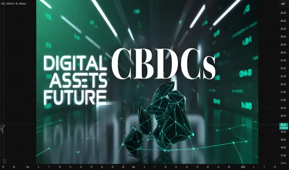
Derivatives Are Powerful in the Global MarketIntroduction
In the vast and intricate world of finance, derivatives stand out as some of the most powerful and influential instruments driving global markets. These complex financial contracts derive their value from the performance of underlying assets such as stocks, bonds, commodities, interest rates, currencies, or market indices. Over the past few decades, derivatives have transformed the global financial landscape, enabling investors, corporations, and governments to manage risk, enhance returns, and access new opportunities. However, their complexity and leverage potential have also made them subjects of controversy, as they can amplify both gains and losses. This essay explores the nature of derivatives, their types, their importance in the global market, and how they influence international trade, investment, and financial stability.
Understanding Derivatives
The term derivative originates from the word “derive,” meaning that the instrument’s value is dependent on something else. In essence, a derivative is a financial contract whose value is based on the price of an underlying asset. Derivatives are typically used for three main purposes: hedging, speculation, and arbitrage.
Hedging:
Hedgers use derivatives to reduce or eliminate the risk of price fluctuations in the underlying asset. For example, a wheat farmer might use futures contracts to lock in the selling price of wheat months before the harvest, ensuring income stability despite potential market volatility.
Speculation:
Speculators, on the other hand, use derivatives to profit from expected changes in the market value of the underlying asset. They do not necessarily own the asset but anticipate price movements to gain from them.
Arbitrage:
Arbitrageurs use derivatives to profit from price discrepancies between markets or instruments. They buy in one market and sell in another to take advantage of temporary inefficiencies.
Types of Derivatives
Derivatives can be traded either on exchanges (standardized and regulated) or over-the-counter (OTC) (customized and privately negotiated). The four main types of derivatives are:
Futures Contracts:
Futures are standardized agreements to buy or sell an asset at a predetermined price on a specific date in the future. They are widely used for commodities like oil, gold, and agricultural products, as well as for financial assets.
Forward Contracts:
Forwards are similar to futures but are privately negotiated between two parties and not traded on an exchange. They are customizable in terms of quantity, price, and settlement date.
Options Contracts:
Options give the holder the right, but not the obligation, to buy (call option) or sell (put option) an underlying asset at a predetermined price before or on a certain date. They are powerful tools for both hedging and speculative strategies.
Swaps:
Swaps involve the exchange of cash flows between two parties, often based on different financial instruments. The most common types are interest rate swaps, currency swaps, and credit default swaps (CDS).
Growth of the Global Derivatives Market
The global derivatives market has grown exponentially since the 1980s. Today, it represents a notional value of hundreds of trillions of dollars, making it one of the largest components of the financial system. The expansion has been driven by globalization, technological innovation, financial liberalization, and the growing need for risk management tools among corporations and investors.
According to data from the Bank for International Settlements (BIS), the notional amount of OTC derivatives alone exceeds $600 trillion. Exchange-traded derivatives (ETDs) are also massive, with daily volumes in futures and options numbering in the millions. This growth reflects the increasing reliance of global market participants on derivatives to manage exposure to interest rates, currencies, commodities, and equity prices.
Derivatives as Tools for Risk Management
One of the most significant contributions of derivatives to the global market is risk management. Businesses and investors face various forms of risk—price, interest rate, credit, and currency risk—that can affect profitability and stability. Derivatives provide mechanisms to transfer or mitigate these risks.
Currency Risk:
Multinational corporations use currency forwards and swaps to hedge against fluctuations in foreign exchange rates. For example, an Indian exporter earning in U.S. dollars can use derivatives to lock in exchange rates and protect revenue from depreciation of the dollar.
Interest Rate Risk:
Banks and companies use interest rate swaps to manage exposure to changing interest rates. By exchanging fixed-rate and floating-rate payments, they can stabilize financing costs or returns.
Commodity Price Risk:
Producers and consumers of commodities use futures contracts to secure prices. Airlines, for example, use oil futures to hedge against rising fuel prices, ensuring predictable operating costs.
Through these mechanisms, derivatives contribute to financial stability by providing certainty and predictability in cash flows, even in volatile environments.
Enhancing Liquidity and Market Efficiency
Derivatives play a vital role in improving market liquidity and efficiency. By enabling investors to take positions without directly trading the underlying asset, derivatives increase the depth of the market. For instance, stock index futures and options allow investors to gain or hedge exposure to entire markets without trading individual stocks. This efficiency attracts institutional investors and promotes active participation across global exchanges.
Moreover, derivatives markets facilitate price discovery—the process of determining the fair value of an asset. The continuous trading of futures and options reflects the collective expectations of market participants about future price movements. This helps align prices across markets and reduces information asymmetry.
Speculation and Profit Opportunities
While derivatives are often used for hedging, they are equally attractive to speculators seeking to profit from market volatility. The leverage embedded in derivatives allows traders to control large positions with relatively small capital. For instance, buying an option requires only a fraction of the cost of the underlying asset, but potential profits (and losses) can be substantial.
Speculative trading, when done responsibly, enhances market liquidity and efficiency. Speculators absorb risk from hedgers, providing them with the counterparties necessary for risk transfer. However, excessive speculation can lead to bubbles or destabilizing volatility, as witnessed during the 2008 global financial crisis.
Derivatives in Global Financial Integration
Derivatives are at the heart of global financial integration. They connect markets across continents and allow capital to flow more freely. Through currency and interest rate swaps, international investors can manage cross-border risks and invest in foreign markets with confidence.
Global corporations rely on derivatives to operate efficiently in multiple countries. For example, a U.S.-based company investing in European projects might use currency forwards to hedge euro exposure, while using interest rate swaps to adjust financing costs in line with U.S. benchmarks. This interconnected web of derivative transactions supports global trade and investment, making derivatives indispensable to modern globalization.
Derivatives and the 2008 Financial Crisis
Despite their benefits, derivatives have also been associated with systemic risks. The 2008 financial crisis exposed the darker side of derivative misuse, particularly in the credit derivatives market. Instruments like credit default swaps (CDS) were used to insure against default risk on mortgage-backed securities. However, the complexity and opacity of these products led to massive losses when underlying assets (subprime mortgages) collapsed.
Institutions like Lehman Brothers and AIG faced devastating losses due to excessive exposure and inadequate risk management. The crisis revealed the dangers of leverage, interconnectedness, and lack of transparency in OTC derivatives markets.
In response, regulators introduced reforms such as central clearinghouses, higher capital requirements, and reporting obligations to enhance oversight and reduce systemic risk. These measures have made today’s derivatives markets more transparent and resilient.
Technological Advancements and Derivatives Trading
Technology has revolutionized the way derivatives are traded globally. The rise of electronic trading platforms, algorithmic trading, and blockchain technology has enhanced speed, transparency, and efficiency in derivatives markets. Exchange-traded derivatives are now accessible to a broader range of participants, from institutional investors to retail traders.
Moreover, the introduction of financial derivatives based on new asset classes—such as cryptocurrencies, carbon credits, and volatility indices—has expanded the frontier of derivative innovation. For instance, Bitcoin futures and options have allowed institutional investors to manage crypto exposure while maintaining compliance with regulatory standards.
Derivatives and Emerging Markets
In emerging economies like India, China, and Brazil, derivatives markets have become critical components of financial development. They offer mechanisms for managing currency volatility, commodity prices, and interest rate fluctuations—issues that are often more pronounced in developing nations.
India’s National Stock Exchange (NSE) and Bombay Stock Exchange (BSE) have developed vibrant derivatives markets, particularly in index futures and options. These instruments attract global investors and contribute to capital market growth, making emerging markets more integrated into the global financial ecosystem.
Challenges and Risks in the Derivatives Market
Despite their power, derivatives come with inherent risks that must be carefully managed:
Leverage Risk:
Small changes in the price of the underlying asset can result in large gains or losses due to leverage.
Counterparty Risk:
In OTC markets, the risk that one party defaults on the contract can lead to cascading failures.
Liquidity Risk:
In times of market stress, derivative positions may become difficult to unwind, leading to forced losses.
Complexity:
Some derivatives are highly complex and difficult to value, making them prone to misuse.
Systemic Risk:
The interconnected nature of derivatives markets can transmit shocks across institutions and borders, threatening global financial stability.
Regulation, transparency, and proper risk management are therefore essential to harnessing the benefits of derivatives without endangering the system.
The Future of Derivatives in the Global Market
Looking ahead, derivatives are likely to play an even greater role in shaping the future of finance. The rise of environmental, social, and governance (ESG) investing has led to new forms of derivatives such as carbon emission futures and climate swaps, designed to manage sustainability-related risks. Likewise, AI-driven analytics and machine learning models are being used to optimize derivative pricing, risk management, and trading strategies.
As the global economy becomes increasingly interconnected and digitized, derivatives will continue to serve as vital tools for managing uncertainty, improving liquidity, and enhancing market efficiency.
Conclusion
Derivatives are undeniably powerful instruments in the global market. They enable participants to manage risk, speculate efficiently, and facilitate cross-border capital flows. By enhancing liquidity, supporting price discovery, and integrating global markets, derivatives have become indispensable to modern finance. Yet, their power demands responsibility; misuse can have catastrophic consequences, as history has shown.
With sound regulation, technological innovation, and prudent risk management, derivatives can continue to drive global financial progress—empowering businesses, investors, and economies to navigate the complex landscape of the 21st-century marketplace with greater stability and precision.
