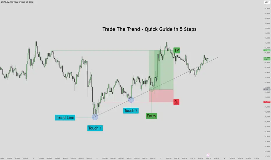
Trade The Trend – Quick Guide In 5 StepsWhat is Trading the Trend?
Trading the trend means buying when the market is going up, and selling when it’s going down.
You're following the direction of the market, not fighting it.
If the trend is up:
Price makes higher highs and higher lows
You look for chances to buy (go long)
If the trend is down:
Price makes lower highs and lower lows
You look for chances to sell (go short)
Why it works:
You’re going with momentum
Simple rule:
Buy in an uptrend, sell in a downtrend — never trade against the flow
1. Assess the chart. Where is it headed? It's headed up.
2. Place your trend line by connecting the first two points.
3. Let the chart play out for a bit. Afterwards prepare your entry on previous failed trend line retest. Set your stop loss below the previous trend line retest, and your TP just before the previous sweep above.
4. Proceed to let the chart play out, then set your pending order.
5. Watch the Trade enter and play out with patience.
This method works for bearish trends as well, just reversed.
If you would like to see more 5 step guides, comment down below.
Thank you!
Trend Lines
Pennant — Trend Is Your Best Friend 🚩 Pennant — Trend Is Your Best Friend 📈
drive.google.com
🔍 Introduction
The Pennant is a trend continuation pattern, resembling a small triangle that forms after a strong initial move (known as the “flagpole”). It is similar to the Flag pattern, but with one key difference: the body of the Pennant is formed by two converging trendlines, rather than parallel ones.
📐 Pattern Description
The Pennant forms after a strong, impulsive price move, indicating that the trend is likely to continue after a short pause.
Like the Flag, the Pennant consists of two main components:
The flagpole — a sharp, directional move (either bullish or bearish)
The Pennant body — a brief consolidation shaped like a symmetrical triangle 🔺
🟢 A bullish pennant forms after a strong upward move
🔴 A bearish pennant follows a strong downward move
🧠 Market psychology behind the pattern:
After a big move, many traders expect a reversal and begin taking counter-trend positions. But when the breakout occurs in the direction of the original trend, it triggers a wave of new orders, pushing price even further. That’s why the Pennant is often used to enter trades in the direction of the dominant trend.
📉 Volume behavior is also key:
High volume during the initial move
Low volume during the Pennant’s consolidation
Rising volume on the breakout
This volume pattern reflects renewed trader interest and often leads to a more explosive breakout compared to a Flag, due to the tightening nature of the consolidation.
⚠️ A weak or sloppy move before the Pennant weakens the signal and increases the risk of false breakouts.
🎯 Entry & Stop-Loss Strategy
📥 Entry: After a confirmed breakout above the Pennant’s resistance (or below it for bearish setups)
🛑 Stop-loss: Placed just below the last local low before breakout
💰 Profit Target:
Partial take profit at the top of the flagpole
Full target = the height of the flagpole projected from the breakout point (aka the Measured Move)
Always account for key support/resistance levels to define the potential range
💡 The Pennant often offers great risk/reward due to its tight structure and explosive potential.
💡 My Pro Tips for Trading Pennants
✅ Pennant Pattern Criteria
Trend continuation pattern
A strong, nearly vertical move preceding the Pennant
Triangle-shaped consolidation (two converging lines)
The Pennant body must be shorter than the flagpole
The lowest point of the Pennant should not exceed half the length of the flagpole
Breakouts should happen in the direction of the initial trend
Tight range before breakout increases accuracy
📈 What Strengthens the Signal
Sharp, clean, directional initial move (strong flagpole) ⚡
High volume on the initial move, and volume surge on breakout 💥
⚠️ What Weakens the Signal
Choppy or weak price action before the Pennant 🫤
Lack of volume during the flagpole or breakout 💤
✅ Examples of My Winning Pennant Setups
🔗 EURUSD Bearish Pennant — Ready to Drop
❌ Examples of My Losing Setups
🔗 XAUUSD Bullish Pennant — Failed Follow-through
💬 Do You Trade Pennants?
They’re one of the most powerful continuation patterns when paired with clean price action and volume confirmation. What’s your experience with Pennants? Share your wins — and fails — below 👇👇

Accurate Price Model for Trading Smart Money Concepts SMC (=
If you trade Smart Money Concepts SMC, there is one single pattern that you should learn to identify.
In this article, you will learn an accurate price model that you can use to predict a strong bullish or bearish movement way before it happens.
Read carefully and discover how to track the silent actions of smart money on any market.
The only thing that you need to learn to easily find this pattern is basic Structure Mapping . After you map significant highs and lows, you will quickly recognize it.
This SMC pattern has 2 models: bullish and bearish ones.
Let's start with a bearish setup first.
Examine a structure of this pattern
it should be based on 2 important elements.
The price should set a sequence of equal lows.
These equal lows will compose a demand zone.
The area where a buying interest will concentrate.
The minimum number of equal lows and lowers highs should be 2 to make a model valid.
Exhausting of bullish moves will signify a loss of confidence in a demand zone . Less and less market participants will open buy positions from that.
At some moment, a demand zone will stop holding. Its bearish breakout will provide a strong bearish signal , and a bearish continuation will most likely follow.
This price model will signify a market manipulation by Smart Money.
They will not intentionally let the price fall, not letting it break a demand zone. A buying interest that will arise consequently will be used as a source of liquidity.
Smart money will grab liquidity of the buyers, silently accumulating huge volumes of selling orders.
Once they get enough of that, a bearish rally will start, with a demand zone breakout as a trigger.
Though, the chart model that I shared above has a strong bullish impulse, preceding its formation, remember that it is not mandatory.
The price may also form a bearish impulse first and for a pattern then.
Each bullish movement that initiates after a formation of an equal low should be weaker than a previous one.
So that the price should set a lower high every time after a formation of an equal low.
Look at a price action on USDCHF forex pair. Way before the price dropped, you could easily identify a market manipulation of Smart Money and selling orders accumulation.
A breakout of a horizontal demand zone was a final bearish confirmation signal.
Let's study its bullish model.
It has a similar structure.
The price should set a sequence of equal highs, respecting a horizontal supply zone.
Each bearish move that follows after its test should have a shorter length, forming a higher low with its completion.
This model will be also valid if it forms after a completion of a bearish impulse.
Weakening bearish movements will signify a loss of confidence in a supply zone, with fewer and fewer market participants selling that.
Its bullish breakout will be an important even that will confirm a highly probable strong bullish continuation.
Smart Money will use this price model to manipulate the market and accumulate buying orders, not letting the price go through a supply zone. They will grab a liquidity of the sellers each time a bearish move follows from a supply zone.
When they finally get enough of a liquidity, a bullish rally will initiate and a supply zone will be broken , providing a strong confirmation signal.
That price model was spotted on GBPJPY forex pair.
Smart Money were manipulating the market, not letting it continue rallying by creating a significant horizontal supply zone.
Selling orders that were executed after its tests provided a liquidity for them.
A bullish breakout of the underlined zone provides a strong bullish confirmation signal.
A breakout and a future rise could be easily predicted once this price model appeared.
Why they do it?
But why do Smart Money manipulate the markets that way?
The answer is simple: in comparison to retail traders, they trade with huge trading orders . To hide their presence and to not impact market prices much, they split their positions into a set of tiny orders that they execute, grabbing the liquidity.
The price model that we discussed today is the example how they do it.
The important thing to note about this pattern is that it efficiently works on any market and any time frame. You can use that for scalping, day trading, swing trading. And it can help you find great investing opportunities.
❤️Please, support my work with like, thank you!❤️
I am part of Trade Nation's Influencer program and receive a monthly fee for using their TradingView charts in my analysis.
Wedge Pattern: A Key to Trend Reversals and Continuations📈 Wedge Pattern: A Key to Trend Reversals and Continuations
A wedge pattern is a technical chart formation that signals a potential reversal or continuation in the market. It’s formed when price moves between two converging trendlines — either sloping upward or downward — creating a narrowing range over time.
There are two main types of wedge patterns:
🔻 Falling Wedge (Bullish)
Formed during a downtrend or as a correction in an uptrend.
Characterized by lower highs and lower lows, with the slope of the support line steeper than the resistance line.
Typically signals a bullish reversal as momentum builds for a breakout to the upside.
✅ Confirmation: Break above the resistance line with volume surge.
🔺 Rising Wedge (Bearish)
Appears during an uptrend or as a correction in a downtrend.
Shows higher highs and higher lows, but the support line is steeper than the resistance line.
Often leads to a bearish reversal, especially when volume declines into the pattern.
⚠️ Confirmation: Break below the support line with increasing volume.
🧠 Key Characteristics
Volume tends to decrease as the pattern forms, indicating a pause in momentum.
The breakout direction (up or down) determines whether it’s a continuation or reversal signal.
Wedges can appear on any time frame and are useful for both day traders and long-term investors.
📊 Trading Tip
Always wait for confirmation of the breakout before entering a trade. False breakouts can be common, especially in low-volume environments

Welcome Back! Gold Trading Strategy & Key Zones to WatchIn this week’s welcome back video, I’m breaking down my updated approach to XAU/USD and how I plan to tackle the Gold markets in the coming days. After taking a short break, I’m back with fresh eyes and refined focus.
We’ll review current market structure, identify key liquidity zones, and outline the scenarios I’m watching for potential entries. Whether you’re day trading or swing trading gold, this breakdown will help you frame your week with clarity and confidence.
📌 Covered in this video:
My refreshed trading mindset after a break
Key support/resistance and liquidity zones
Market structure insights and setup conditions
What I’ll personally avoid this week
The “trap zones” that might catch retail traders off guard
🧠 Let’s focus on process over profits — welcome back, and let’s get to work.

What is Dynamic Support and Resistance Levels & Zones in Forex
Dynamic supports and resistances play a crucial role in technical analysis.
Unlike classic supports and resistances, these zones change and adapt to a market price action in real time.
Learn what is dynamic support and resistance in Forex, Gold trading and how to find it easily.
Discover its main types and real market examples.
Let's start with the basics.
There are 2 major types of supports and resistances in technical analysis.
The first type is called static .
Such supports and resistances are fixed and don't change with time.
It should be strictly horizontal key levels or the zones.
Market price action and momentum beyond them do not affect these supports and resistances.
In the example above, you can find static supports and resistances on Gold. The market may return to one of those levels or the zones today, tomorrow or in a month, but it will not move.
In comparison to static supports and resistances, the dynamic ones shift with time. They constantly change and adjust as the time flies.
One of the obvious types of dynamic supports and resistances is a trend line.
Above is the example of a dynamic rising support based on trend line.
As the time goes, a support shifts and becomes higher and higher.
I found a great example of a dynamic resistance on Dollar Index.
Depending on the moment when the price tests that, the resistance will be on different levels.
The later the price tests the trend line, the lower is the resistance.
When newbie traders learn dynamic supports and resistances, they usually stop on trend lines.
But it is just a beginning.
Really significant dynamic supports are resistances will be the zones .
The areas based on static horizontal supports and resistances and trend lines.
Examine a price action on GBPCHF forex pair.
We have a static horizontal support area and a dynamic rising trend line.
Two supports intersect, composing a contracting dynamic support zone.
With time, it will become narrower, accumulating buy orders within.
On NZDCAD forex pair, I underlined a contracting dynamic resistance zone that is based on an intersection of a static horizontal resistance area and a falling trend line.
Selling orders will be distributed within.
The 2 dynamic support and resistance zones that we discussed are narrowing , but that is not always the case.
A dynamic support zone that I found on GBPNZD is expanding and broaden with time.
It is based on a dynamic falling trend line and a static horizontal support.
With time its boundaries will be wider and a bullish reaction may initiate from any level within that.
A dynamic resistance area that I spotted on EURCAD forex pair is a great example of an expanding resistance.
It is based on a static horizontal resistance and a rising trend line.
We can easily recognize how it grows with time.
Of course, another types of dynamic supports and resistances exist. But they are more nuanced and rare.
As soon as you learn to recognize the clusters that we discussed in this article, you will be able to recognize the less obvious ones as well.
Next time, when you execute a support and resistance analysis, try to find a dynamic zone. You can find it on any time frame, and forex pair and gold, and it will completely change your perspective on the market.
❤️Please, support my work with like, thank you!❤️
I am part of Trade Nation's Influencer program and receive a monthly fee for using their TradingView charts in my analysis.

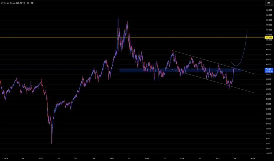
U-oyela Ongahluziwe Nenkunzi.Considering the current countries in conflict - FX:USOIL is in the middle of it. This will lead in a high demand but low supply of the commodity resulting in a soaring bullish move, fundamentally. Technically, the commodity has created a LL in the current year, tapping lows last touched since 2021 and has further recovered from last years close of 71.899.
FX:USOIL reaching highs of $110.00 is therefore likely.
***The best way to take advantage of this commodity or any other is to cherry pick stocks that are sensitive to it e.g. JSE:SOL is sensitive to FX:USOIL .***
How Bitcoin can impact alt coins like sol and sui This video is a very quick update on the potential for bitcoin to drop into the 96/97k region and the effect it will have on alt coins .
If you hold altcoins and you see them bleed in price then its important to know and understand whats ahead for Bitcoin .
Understanding this will help you with your entry's and your exits on all altcoins .

Trendline Break Retests: The Setup Nobody Talks AboutHello, Traders! 😎
It’s one of crypto's most overlooked yet commonly recurring structures: the trendline break and retest.
You’ve probably seen it without even realizing it. A clean trendline gets broken, price pulls away, and then, quietly, almost politely, comes back to “kiss” the line before taking off again. Or dropping.
That’s the retest. And in the chaotic crypto world, where hype often drowns out structure, this simple behavior deserves more attention.
🔍 First, What Is a Trendline Really?
A crypto trendline connects key highs or lows on a chart, not to predict the future, but to help visualize the mean price trendline: the market's directional bias. In rising markets, we draw support lines connecting higher lows. In falling markets, resistance lines link lower highs.
Learning how to draw trendlines in crypto properly is a skill in itself. Use wicks or closes? Log scale or linear? Everyone has a method, but consistency is key. If you’re unsure, zoom out and let the chart speak first. But once that line is broken, something changes.
🧠 Why Breaks (Alone) Are Not Enough
In theory, a break of the trendline means momentum has shifted. But in practice? Breaks happen all the time in crypto; many are fakeouts or short-lived. That’s where the trendline break and retest come in. It’s the market asking: “Are we done with this trend?”
Retests often create the cleanest entries for trend continuation, not because they guarantee success, but because they offer structure. They provide a technical “moment of truth” when buyers or sellers show their true strength. And if the retest holds? The move that follows tends to be more confident and less noisy.
📐 Trendline Break & Retest: Mapping the Larger Structure
Looking across the full BTC/USDT weekly chart, several major shifts can be framed through the lens of trendline crypto behavior, particularly the classic sequence of break → retest → continuation.
🔻 2021–2022: Macro Breakdown
After the bull run to ~$69K in 2021, Bitcoin started forming a descending series of lower highs, which gave rise to a macro-level downward trendline — a key reference point for many traders at the time.
🔴 Upper Zone: Failed Retest Cluster
The upper horizontal band (~$47K–$52K) highlights a zone where BTC repeatedly attempted to reclaim the broken structure. Each time the price rallied into this region, sellers stepped in, forming local highs and multiple failed retests (marked with red circles). This wasn’t just resistance — it was a battleground where buyers tried to flip the trend… and couldn’t. This behavior often signals a trendline break rejection, where the market tests the underside of prior structure, then resumes the existing trend.
🔴 Lower Zone: Breakdown and Retest That Held
The lower zone (~$28K–$32K) was formerly a strong support area during mid-2021. Once it was broken in early 2022, the price returned to retest from below, failing to reclaim it, confirming it had turned into resistance. This is a textbook example of trendline retest turned supply, and after the failed reclaim, BTC slid further into the ~$16K range.
✂️ Late 2023: The Breakout
In late 2023, BTC finally broke above the descending trendline, confirming a long-term shift in momentum. Importantly, this wasn’t just a clean breakout. The market returned shortly after to retest the broken trendline, around the $42K–46K range, forming a consolidation zone.
🟩 And Then Came the Retest from Above
Let’s fast-forward to early 2024. After months of chop, Bitcoin finally breaks through that upper red zone (the same one that previously acted as resistance and rejection city). But here’s the part many miss:
It didn’t just moon.
It came back.
Look closely at the green zone around ~$46K–$48K, the same area where BTC got rejected multiple times in 2021–2022. And now? Price pulls back, taps that level from above, and holds.
That makes this zone so interesting: 👉 It’s a classic “retest from the other side”, where former resistance becomes support. The market is saying: “This level matters. Let’s make sure it holds before we go further.” It’s a quiet confirmation and a great example of how crypto trendlines and price memory shape behavior, even months or years later.
🪞 It’s Not Just About Lines — It’s About Psychology
Why does this pattern repeat?
Because breakouts are emotional.
They create FOMO. Traders rush in. Then the market pauses, tests your conviction, and shakes out the impatient.
Retests act like a filter.
They flush out the noise — and confirm who’s really in control.
That’s why drawing trendlines in crypto isn’t just about geometry. It’s about crowd behavior. When enough traders see the same line, and price respects it after the break, it becomes a self-fulfilling zone of interest.
🧭 A Word of Caution
This isn’t a secret formula. Not every trendline crypto setup will play out cleanly.
SOME BREAKS NEVER RETEST.
SOME RETESTS FAKE YOU OUT.
AND SOMETIMES, THE LINE YOU DREW ISN’T THE ONE THE MARKET IS ACTUALLY WATCHING.
But if you learn to draw trendlines in crypto clearly, stay patient, and observe the trendline break retest behavior, you’ll begin to see this pattern appear again and again. Quietly. Consistently.
It won’t make the headlines like “BTC Hits 100K,” but it might just tell the story behind that move. This is just one example. In reality, charts are full of these zones. Each one tells a part of the story. And honestly, why not listen?

How to Draw Support & Resistance In TradingViewLearn how to effectively identify, draw, and utilize support and resistance levels in TradingView with this comprehensive step-by-step tutorial. Whether you're a beginner trader or looking to refine your technical analysis skills, this video covers everything you need to know about one of the most fundamental concepts in trading.
What You'll Learn:
Understanding support and resistance: the foundation of technical analysis and price action trading
Step-by-step instructions for drawing horizontal support and resistance lines in TradingView
Creating support and resistance zones for more flexible trading approaches
Practical tips for using TradingView's drawing tools effectively
This tutorial may be helpful for day traders, swing traders, and investors using TradingView who want to improve their chart analysis skills. The techniques covered could help you make more informed entry and exit decisions by understanding where price might find support or encounter resistance.
Visit Optimus Futures to learn more about trading futures with TradingView: optimusfutures.com
Disclaimer:
There is a substantial risk of loss in futures trading. Past performance is not indicative of future results. Please trade only with risk capital. We are not responsible for any third-party links, comments, or content shared on TradingView. Any opinions, links, or messages posted by users on TradingView do not represent our views or recommendations. Please exercise your own judgment and due diligence when engaging with any external content or user commentary.
This video represents the opinion of Optimus Futures and is intended for educational purposes only. Chart interpretations are presented solely to illustrate objective technical concepts and should not be viewed as predictive of future market behavior. In our opinion, charts are analytical tools—not forecasting instruments. Market conditions are constantly evolving, and all trading decisions should be made independently, with careful consideration of individual risk tolerance and financial objectives.

Learn TOP 3 Elements of a Perfect SWING TRADE (GOLD, FOREX)
In the today's post, I will share with you a formula of ideal swing trading setup.
✔️Element 1 - Market Trend
When you are planning a swing trade, it is highly recommendable that the direction of your trade would match with the direction of the market trend.
If the market is trading in a bullish trend, you should look for buying the market while if the market is bearish, you should look for shorting.
Take a look at CHFJPY pair on a daily. Obviously, the market is trading in a bullish trend and your should look for swing BUYING opportunity.
✔️Element 2 - Key Level
You should look for a trading opportunity from a key structure.
IF the market is bullish, you should look for buying from a key horizontal or vertical SUPPORT, WHILE if the market is bearish, you should look for shorting from a key horizontal or vertical RESISTANCE.
CHFJPY is currently approaching a rising trend line - a key vertical support.
Please, note that if the price is NOT on a key structure, you should patiently wait for the test of the closest one.
✔️Element 3 - Confirmation
Once the market is on a key level, do not open a trading position blindly. Look for a confirmation - for the sign of strength of the buyers, if you want to buy or for the sign of strength of the sellers, if you are planning to short.
There are dozens of confirmation strategies, one of the most accurate is the price action confirmation.
Analyzing a 4H time frame on CHFJPY, we can spot a falling wedge pattern. While the price is stuck within that, the minor trend remains bearish. Bullish breakout of the resistance of the wedge will be the important sign of strength of the buyers and can be your strong bullish confirmation.
Following these 3 conditions, you will achieve high win rate in swing trading. Try these techniques yourself and good luck in your trading journey.
❤️Please, support my work with like, thank you!❤️
I am part of Trade Nation's Influencer program and receive a monthly fee for using their TradingView charts in my analysis.

USDJPY Case StudyHey guys!
Trendline traders would be profited from this UJ trade last week or today.
The market structure before the supply zone that I draw was a messy, don't you agree?
I would not consider this supply zone to enter the trade. But, if you draw a trendline and the supply zone automatically aligns with the break of the trendline, it became the place where trendline traders put their sell limit to join the bearish moves. It was a beauty. As of now, my target is only 2RR for my small funded account, so yeah it is easy to achieve.
The supply zone met my requirement as below:
1. Supply was left with imbalance followed by break of structure to the downside.
2. After supply zone, there was SBR level present. SBR traders would benefited from this zone.
3. Price approaching in clean structure or candles.
Btw, I am not taking this trade since I draw my supply zone without try to place a trendline on the market structure before it.
What is your goal this week?
Mine still the same. Trade the same setup, if setup no present, I will continue watching "traders motivation videos".

Trendlines and broken trendlines resultsTrendlines are one of the major supports or resistances and on this Bitcoin chart we can see few examples which price react well to them and start to pump from green trendlines and sometimes dump from red trendlines and it is easy to draw one trendline ----> simple like drawing support line this time try to find support line which is Diagonal and one or two touch with this trendline you can find next support which is third touch and you can set your buy there like below example:
also sometimes trendline broke and their support turn to resistance and after retest of breakout you can enter sell like example:
there are so many rules about trendline like when it can break or after how many touches trendline lose it's power and ... we can discuss in comments more about them so ask any questions there and lets discuss.
Also currently if we have a valid breakout of red trendline to the upside for Bitcoin price can easily pump to 90K$ at least.
DISCLAIMER: ((trade based on your own decision))
<

Why Support and Resistance are Made to Be Broken ?Hello fellow traders! Hope you're navigating the markets smoothly. As we go through the daily dance of price action, one thing becomes clear support and resistance are just moments, not walls. They're temporary. Momentum and trend strength? Now that’s where the real story lies.
This publication dives into how these so-called key levels break and more importantly, how to position yourself smartly when they do. Stay flexible, trade with confidence, and let the market lead. Let’s get into it.
Why Support and Resistance Levels Break
Support and resistance are some of the most talked-about tools in technical analysis. But here's the truth they’re not meant to last forever.
No matter how strong a level may appear on your chart, it eventually gets tested, challenged, and often broken. Why? Because the market is dynamic. The real edge for a trader lies not in hoping a level holds, but in reading when it’s about to fail and being ready for it.
No Resistance in a Bull, No Support in a Bear
Ever seen a strong bull market pause just because of a resistance line? It doesn’t. Price keeps pushing higher as buyers keep stepping in. Same goes for a strong bear market support levels collapse as fear takes over and selling snowballs.
Instead of clinging to lines on a chart, think bigger: Where is the momentum? What’s the trend saying? That’s where your trading decisions should come from.
Support and Resistance: Not Fixed, Always Shifting
Yes, these levels matter but only as zones, not exact prices. They’re areas where price has reacted in the past, where traders might expect something to happen again. But they’re not magic numbers.
When traders treat these levels as absolute, they fall into traps false confidence, poor entries, tighter than-needed stop losses. Always remember: market sentiment, liquidity, and institutional activity are constantly changing. So should your interpretation of the chart.
The Temporary Nature of These Levels
Markets move on supply and demand. A level that acted as resistance last week could easily become support next week. Or break completely.
Take the classic example support turning into resistance. When support breaks, former buyers might now be sellers, trying to get out on a bounce. That flip happens because behavior and sentiment have shifted. And as traders, that’s the real pattern we need to track not just price levels, but the psychology behind them.
“Strong” Support? It’s Mostly an Illusion
We all love the idea of a strong level something we can lean on. But large players? They don’t think like that.
Institutions don’t place massive orders at a single price point. They spread across a zone building positions slowly without moving the market too much. What looks like a strong level to us might just be an accumulation or distribution range for them. Always think beyond what’s visible on the surface.
How to Spot Breakouts Before They Hit
Here’s what separates seasoned traders from the rest the ability to spot potential breakouts before they explode.
🔹 Volume Confirmation: If a resistance level is tested repeatedly on rising volume, that’s a big clue buyers are serious.
🔹 Structure Shifts: Higher highs in an uptrend or lower lows in a downtrend signal that the old levels are being challenged.
🔹 Liquidity Traps: Watch out for fakeouts. These are designed to trap impatient traders just before the real move.
🔹 News & Events: Never ignore macro triggers. Earnings, economic data, or geopolitical surprises can fuel breakouts that crush technical levels.
🔹 Break & Retest: A solid strategy — wait for the level to break, then get in on the retest.
🔹 Momentum Tools: Indicators like RSI, MACD, or even EMAs can offer extra confidence that a move has legs.
3 Practical Trading Setups
1. Breakout Trading
Mark key levels on daily or weekly charts.
Watch for volume and momentum confirmation.
Enter after a clear breakout or retest.
Stop-loss: Just below resistance (for longs) or above support (for shorts).
2. Range Trading
If price is stuck between support and resistance, trade the range.
Look for price rejection (wicks, pin bars, etc.).
Use RSI or Stochastics to time entries.
3. Trend Following
Identify the dominant trend using moving averages or price structure.
Avoid going against the trend unless reversal signs are very clear.
Let profits run use trailing stops instead of fixed targets.
Mind Over Market: Psychology of S&R
One of the biggest traps in trading? Overtrusting support and resistance.
We get emotionally attached. We want the support to hold or the resistance to reject. And that bias clouds our judgment. How many times have you seen price break a level — and you freeze because it “wasn’t supposed to”?
To break free of that:
✅ Trade with a plan.
✅ Set your risk before the trade, not after.
✅ Don’t treat any level as sacred.
✅ Stay open to what the market is telling you not what you want it to say.
Final Thoughts
Support and resistance are great tools but they’re just one part of the puzzle. The real power lies in reading price action, watching volume, and understanding market sentiment. Don’t ask, “Will this level hold?” Ask instead, “What happens if it breaks?”
That shift in thinking? It can make all the difference.
Stay sharp, stay adaptive, and keep evolving with the market.
Wishing you green trades and growing accounts!
Best Regards- Amit Rajan.

3 Best Trading Opportunities to Maximize Profit Potential
Hey traders,
In the today's article, we will discuss 3 types of incredibly accurate setups that you can apply for trading financial markets.
1. Trend Line Breakout and Retest
The first setup is a classic trend line breakout.
Please, note that such a setup will be accurate if the trend line is based on at least 3 consequent bullish or bearish moves.
If the market bounces from a trend line, it is a vertical support.
If the market drops from a trend line, it is a vertical resistance.
The breakout of the trend line - vertical support is a candle close below that. After a breakout, it turns into a safe point to sell the market from.
The breakout of the trend line - vertical resistance is a candle close above that. After a breakout, it turns into a safe point to buy the market from.
Take a look at the example. On GBPJPY, the market was growing steadily, respecting a rising trend line that was a vertical support.
A candle close below that confirmed its bearish violation.
It turned into a vertical resistance .
Its retest was a perfect point to sell the market from.
2. Horizontal Structure Breakout and Retest
The second setup is a breakout of a horizontal key level.
The breakout of a horizontal support and a candle close below that is a strong bearish signal. After a breakout, a support turns into a resistance.
Its retest is a safe point to sell the market from.
The breakout of a horizontal resistance and a candle close above that is a strong bullish signal. After a breakout, a resistance turns into a support.
Its retest if a safe point to buy the market from.
Here is the example. WTI Crude Oil broke a key daily structure resistance. A candle close above confirmed the violation.
After a breakout, the broken resistance turned into a support.
Its test was a perfect point to buy the market from.
3. Buying / Selling the Market After Pullbacks
The third option is to trade the market after pullbacks.
However, remember that the market should be strictly in a trend .
In a bullish trend, the market corrects itself after it sets new higher highs. The higher lows usually respect the rising trend lines.
Buying the market from such a trend line, you open a safe trend-following trade.
In a bearish trend, after the price sets lower lows, the correctional movements initiate. The lower highs quite often respect the falling trend lines.
Selling the market from such a trend line, you open a safe trend-following trade.
On the chart above, we can see EURAUD pair trading in a bullish trend.
After the price sets new highs, it retraces to a rising trend line.
Once the trend line is reached, trend-following movements initiate.
What I like about these 3 setups is the fact that they work on every market and on every time frame. So no matter what you trade and what is your trading style, you can apply them for making nice profits.
❤️Please, support my work with like, thank you!❤️
I am part of Trade Nation's Influencer program and receive a monthly fee for using their TradingView charts in my analysis.

Power of trendline + support/resistanceI would like to show the power of combining trendlines and support & resistance on your chart work. As we all know in order for a trendline to be effective it must be used with key major points and the trend must be clear whether it's an uptrend or downtrend, cause if the trend is neither then that would lead to false signals that would cause people to get stopped out.
If used with S&R it can give us way better entries and more accurate with high probability of winning, We all know if for example an Uptrend trendline is broken then that would mean we have sellers active and that means the trend will go down, however that is not entirely true if it was then we would all be millionaires lol. So in order to fix this and know for sure the trend is changing for real we need to combine both our Trendlines and S&R, as you can see from the chart our uptrend trendline was broken and those who entered immediately after the breakout would have been trapped by professional traders when the price pulled back to their entry points, but to avoid this and get a much better entry that has high accuracy like mine you would also need to use your "visible" support and resistance.
As the uptrend line was broken that gave us a sign sellers are active and might push the price down but that is not enough confirmation to sell, unless you want to make a loss obviously💀,If you noticed I also marked my Visible Support(CHANGE OF TREND), since this is the lowest point in the uptrend then we know if price breaks below it then it's a clear confirmation that sellers will overpower buyers and push the price down, our first confirmation was Price breaking the uptrend(not enough to sell), our second powerful confirmation was price breaking below the CHANGE OF TREND, now this shows that bears overpowered bulls causing a CHANGE OF TREND and a much higher winning probability and a much better R:R.
I know most people would see this as a late entry, but it's not trust me there's no better entry you can get better than this that has higher chance of winning and a better R:R also less risky. Most people chase the trend instead of waiting for the trend to come to them, that's also why they make many losses because they enter with few confirmations that have low probability

How to Draw Trendlines Like a Pro – Rulers Out, Rules In!Hi everyone!
If you don’t have any rules for drawing a trendline, then this is by far the most subjective technical analysis criterion of all. So, grab your ruler, and let’s dive in! ;)
Without clear guidelines, you can draw it however you want, shaping the narrative to fit your bias. This makes it the perfect tool to talk yourself into a trade or justify staying in a bad one—there’s always a new “support” coming…
If you don't have rules, you can always find some dots to connect, making it look "perfect" for you.
In this post, I'll discuss buying opportunities using trendlines, share key rules for drawing them correctly, and highlight common mistakes to avoid - all with a focus on mid- and long-term investment opportunities.
-------------------------
The Basics: How to Draw a Trendline
The trendline is a highly effective tool for mid- and long-term investors to find an optimal buying zone for their chosen asset. I always take a full view of the chart, analyzing its entire history to find the longest trendline available. The longer the trendline, the stronger it is!
To draw a trendline, we simply connect two points and wait for the third touch to confirm it. Easy, right?
The strongest trendline comes from points that are easily recognizable—you should spot them in a split second.
Maximum view, if possible Monthly chart, connect the dots and wait for a third one.
For me, the third and fourth touches are the most reliable.
If you have to look deeply to find where to draw a trendline, then it's already a first sign that it’s not strong! The best ones appear instantly.
---------------------------
Two Myths About Trendlines
Myth #1: "You cannot draw a trendline without three touching points."
Don’t even remember from where I heard that kind of bs but as you see in the images above, yeah I can. If I have a correct lineup, the third touch is the strongest.
Myth #2: "The more touches, the stronger the trendline."
Yes, a trend appears stronger with more touches, but each additional touch increases the odds of a break or trend change. To buy from, let’s say, the sixth touch, there must be strong confluence factors, and fundamentals should support the investment.
“The trend is your friend, until the end when it bends.” — Ed Seykota
Sure, I’ve had great trades from the fifth or seventh touch, but as said, the area has to be strong, combining multiple criteria. Think of a trendline like 3-5 cm thick ice on a lake. You can’t break it with one hit, or the second, or the third. But after the fourth or fifth, it starts to crack, and by the sixth—boom!
From my psychological perspective, the more touches, the weaker the trendline becomes.
-----------------------
Rule #1: Wick to Wick or Body to Body
If there aren't any anomalies, the trendline should always be drawn from wick to wick (image below) or body to body.
Here was the trendline draw from wick to wick
I mostly use body-to-body when there is a lot of noise on the chart and many large wicks that don’t show the real price behavior—whether from a panic sell-off or other unexpected market moves.
Candlestick chart, the trendline drawn from body-to-body
Tip! Body-to-body means drawing trendlines from closing prices to remove unnecessary noise from the chart. To make the chart even clearer, I often use a line chart (it tracks closing prices), which filters out the noise and gives a cleaner view of the price action.
The same chart as above using line chart.
Mistake to avoid: If you start from the wick but the second point is from the body, it's wrong. This can lead to misleading breakout trades or confusing rejection trades.
If there are no significant large wicks, go from wicks.
If a chart offers a lot of huge panic-sell wicks, use bodies instead to get a cleaner setup.
Quite often, I use a hybrid version as well. We are investors, not traders. We need a price zone, not an exact price!
In these cases, I combine wicks and closing prices to find the optimal trendline, which stays somewhere between them.
Light-blue is the zone
-----------------------
Rule #2: Higher Highs Strengthen the Trendline
A trendline is more reliable if the price makes a new higher high (HH) after the previous rejection, and before it approaches a trendline.
The third and fourth touch came from higher high (HH) levels
This confirms that the recent trend is strong. If it all lines up, we can step in!
-----------------------
Rule #3: Even Timing Between Touches
A trendline rejection works best when the timing between touches is symmetrical. They don’t have to be perfectly equal but they also shouldn’t be wildly different - one touch being very small and another very large can weaken the trendline’s reliability.
A good combinations is when the price comes from higher high levels, the next touch has an equal or fairly similar distance between previous ones.
Yeah, there are quite a lot of touches, but you get the point; market symmetry plays an important role in making decisions.
Warning: If the next touch comes too soon, especially from a lower high (LH) levels, which signals that momentum may be fading, and the touch happens at an uneven distance, it weakens the trendline’s reliability. So, watch out for that.
Two alerts: uneven length between touches & comes from lower highs.
Next red alert: When there are huge uneven gaps between touches, as shown in the picture below.
The first and second touch compared to the second and third touch are out of balance, weakening the trendline's reliability.
------------------------
Trendline Summary: Key Criteria for Mid- to Long-Term Analysis
Open the maximum chart view – analyze all available data for the asset.
The higher the timeframe, the stronger the trendline.
A trendline needs two clean and clear points to be drawn.
The highest probability rejection happens at the third and fourth touch.
If there are large wicks or panic sell-offs, use closing prices (body-to-body).
Remove noise and wicks by using a line chart for a clearer view.
A trendline touch is strongest when the price approaches from a higher high (HH).
A trendline touch is strongest when the distance between touches is symmetrical.
A slight flex in the trendline is ideal; it should be between 20 to 35 degrees, not too steep in its climb. ;)
These are the main criteria for a trendline that I use when analyzing stocks or any asset from a mid-to long-term perspective.
----------------------
Trendlines Alone Are Not Enough
Now, here’s the interesting part. Even if a trendline looks perfect and meets all criteria, I still won’t rush to share an analysis. Why? Because a trendline alone isn’t enough.
A trendline is just one piece of the puzzle. We need multiple confluence factors in a single price zone to make the setup truly strong and reliable. Usually, I need at least 3-7 criteria to align before making a move or recommendation.
So, that's it! A brief overview and hopefully, you found this informative. Feel free to leave a comment with your thoughts!
Before you leave - Like & Boost if you find this useful! 🚀
Trade smart,
Vaido

How to Find Best Supply and Demand Zones/Areas in Forex & Gold
In this article, I will show you the strongest supply and demand zones.
These zones are called confluence zones.
I will teach you to identify these areas properly and explain how to apply it in Forex and Gold trading.
Let's start with a short but important theory.
In technical analysis, there are 2 types of supports and resistances.
Horizontal structures are supports and resistance that are based on horizontal key levels.
Vertical structures are supports and resistance that are based on trend lines.
A confluence supply or demand zone, will be the area of the intersection between a horizontal and vertical structures.
Look at GBPJPY pair. I underlined a significant horizontal support and a rising trend line - a vertical support.
We see a clear crossing of both structures.
The trend line and a horizontal support will compose a narrow, contracting area. It will be a confluence demand zone.
Within, with a high probability, a high volume of buying orders will concentrate, and a strong bullish movement will initiate after its test.
Above is one more example of a powerful demand zone.
It was spotted on a Gold chart.
Now let's discuss the supply zone.
There are 2 strong structures on GBPNZD: a vertical resistance - a falling trend line and a horizontal resistance.
These 2 resistances will constitute a confluence supply zone.
That is a powerful resistance cluster that will concentrate the selling orders. Chances will be high to see a strong bearish movement from that.
There is a strong supply zone on CHFJPY that is based on the intersection of a wide horizontal resistance and a falling trend line.
Supply and demand zones that we discussed are very significant. Very often, strong bullish and bearish waves will initiate from these clusters.
Your ability to recognize these zones will help you to make accurate predictions and identify a safe point to open a trading position from
❤️Please, support my work with like, thank you!❤️

How to determine trend line in trading?Determining a trend line in trading is a fundamental skill used to identify the direction and strength of a price trend. Here's a step-by-step guide to drawing and interpreting trend lines:
1. Understand the Basics of a Trend Line
A trend line is a straight line that connects two or more price points on a chart, extending into the future to act as a line of support or resistance.
Uptrend Line: Connects higher lows in an upward trend (acts as support).
Downtrend Line: Connects lower highs in a downward trend (acts as resistance).
Sideways/Ranging Market: Price moves horizontally, and trend lines may not be as effective.
2. Identify Key Price Points
For an uptrend, identify at least two higher lows (swing lows) and draw a line connecting them.
For a downtrend, identify at least two lower highs (swing highs) and draw a line connecting them.
The more times the price touches the trend line without breaking it, the stronger and more valid the trend line is.
3. Draw the Trend Line
Use a charting platform to draw the line manually.
Connect the swing lows for an uptrend or swing highs for a downtrend.
Ensure the line is not too steep or too flat; it should reflect the natural slope of the price movement.
4. Validate the Trend Line
A valid trend line should be touched by price at least three times. The more touches, the more reliable the trend line.
If the price breaks the trend line significantly, it may indicate a potential trend reversal or weakening of the current trend.
5. Use Trend Lines for Analysis
Support/Resistance: In an uptrend, the trend line acts as support. In a downtrend, it acts as resistance.
Breakouts: A break below an uptrend line or above a downtrend line may signal a trend reversal or continuation, depending on the context.
Trend Strength: A steep trend line may indicate a strong trend, while a shallow one may suggest a weaker trend.
6. Combine with Other Tools
Use trend lines in conjunction with other technical indicators (e.g., moving averages, RSI, MACD) to confirm trends and potential entry/exit points.
Look for volume confirmation: Increased volume during a breakout or bounce off the trend line adds validity to the signal.
7. Adjust as Needed
Trend lines are not static. As new price data comes in, you may need to redraw or adjust the trend line to reflect the current market conditions.
Example:
BTC has touched the line that I've drawn multiple time so It is a reliable Bullish Trend line. The next Possible connection can be around 93.5k! the line also acts as a support.
By mastering trend lines, you can better identify potential trading opportunities and manage risk effectively. Always practice on historical data and use proper risk management techniques.

Making money in a downtrend - J is WILDI chose J as my public idea for the day for a lot of reasons
-it’s my best idea of the day (it’s #11 on my composite score list)
-covering a span of over 1800 trades (real and backtested), it has an AVERAGE gain of 2.9%.
-the 1 “losing” trade in all 1800+ was a signal from yesterday which I will boldly predict will become profitable too.
-it has a per day held average gain of over 3x that of the S&P500 over those 1800+ trades
-it’s right at support and has some more support further down both from previous highs and an unbroken uptrend line going back over 18 months
-it has a track record of rebounding nicely after earnings “disappointments”
-it’s trading in the middle of its 6 month range
But I also chose it to illustrate a point about the way I trade, and it’s one that is very relevant and about to become more relevant, I think. When the market starts to show weakness, people get scared of trading long. And I get that - it’s a valid concern. It’s easier to make money in an uptrend - that’s why so many people who have traded NVDA over the last 2 years think they are amazing traders. Rising tides lift ALL boats, even leaky ones. But making money in ANY environment is the difference maker.
J is down a little over 11% in the last 3 months or so. It is in the middle of a legitimate Wall Street definition of a correction. I am not picking the bottom here, or even trying to. That’s the point. I don’t care if this is the bottom. It’d be great if it was, but it doesn’t matter. Now I’m not saying my algo is the greatest thing ever (though it might be for me), but the WAY I use it is significant and it illustrates something ANYONE can do when a stock or markets are trending lower.
During this correction, my algo has signaled 14 LONG trades, including today. 12 have been closed profitably and one was the long signal yesterday (#14 was today). Full disclosure: I didn’t actually trade that signal yesterday, but I am today. The average gain on the 13 prior to today (including yesterday's "loser"), DURING A CORRECTION, is +0.9%.
Not only does it win, but it wins consistently even when stocks are trading lower. The key is as much how/when I exit as it is the algo and its entry signals. As soon as a lot is end of day profitable, it is gone. I don’t care how much I’ve made, it’s gone. And that is a secret to making money long during a downtrend. It helps a lot that my entry signals are good ones, but the key is GET OUT WITH A PROFIT.
Don’t let the market take its money back. It’s the same thing casinos try to do when you win and they have the edge - keep you playing so they can get their money back. I trade the same way in uptrends too. That leaves some money on the table then, but I take it back on the way down when I’m making money instead of losing it - and you can too. The method I use works in almost every situation, on almost any stock. But its shining moment is when things are going downhill. Not just because it makes money, but because I don’t worry about timing and downtrends much any more.
Some slides can get annoying under the right circumstances, but I don’t worry. This technique has worked in every major market downtrend in the last 50 years. Except for stocks that go to zero, it works on stocks in corrections or bear markets, though at a certain point even it will lose money (I’ll be posting an idea involving NVDA in that regard sometime relatively soon).
But relatively small losses are easily regained, especially if the win rate is high (which it obviously is here). The key is avoiding the BIG losses and this technique does that very well.
So I went long at the close at 132.19. Per my usual strategy, I'll add to my position at the close on any day it still rates as a “buy” and I will use FPC (first profitable close) to exit any lot on the day it closes at any profit.
As always - this is intended as "edutainment" and my perspective on what I am or would be doing, not a recommendation for you to buy or sell. Act accordingly and invest at your own risk. DYOR and only make investments that make good financial sense for you in your current situation.

BTCUSDT soon below 100K$ and heavy fall will leadThis post is also educational and now as we can see the pump and breakout was fake and the fall started:https://www.tradingview.com/chart/BTCUSDT/sbV6gZGS-Bitcoin-major-sign-of-Stop-loss-hunting-and-dump-seen/
so the question is this that why we are looking for below 100K$ or 90K$?
1. first reason: stop loss hunting which is mentioned as i said before makes a good volume and liquidation for them to enter the position and make a good profit and if you take look at chart we have two Fakeouts at same time and with one high volume candle it is all done, yes the first one is those sellers which enter with resistance of red trendline and the other sellers also joined with resistance of ATH and both of them which used high volume now are out because they had the Felling that if Bitcoin break ATH it will pump and they put stop loss close and both get loss and gets out of trade + we have two major buyers which get in the trade to open long and first are those who enter after breakout of trendline and add more volume after ATH broke and others are those who open long after ATH breakout and were looking for more rise and gain so soon their stop loss will also hit or already done and that is another good volume for them.
2. second reason: usually like previous time which we can see fake breakout we have good move to the upside or downside and i think the dump just started and it will continue more at least to 90K$.
Always do your own research and also remember more reasons and ... will cause this fall and here i mentioned two of them you can add more in comments and mention why we are looking for more fall?
DISCLAIMER: ((trade based on your own decision))
<<press like👍 if you enjoy💚

Bitcoin major sign of Stop loss hunting and dump seen!!!This is educational post and i am making it short this time with one example which happened at 13/Jan/2025 as you can see previous time we had same scenario but they did hit stop loss of sellers + buyers and how is that ?
price was breaking 90K$ support zone which is strong and major support for BTC in lower time frames as you can see at that time and it breaks that immediately after hitting so many stop loss of buyers below 90K$ and get them out of their buy positions it pumped and start to rise also it hit so many stop loss of sellers with high leverage which sell the Bitcoin below that support zone and they were looking for the upcoming dump after breakout but it didn't happen and both sides get loss and someone's loss is some others profit and this high volume there is reason of that and after price pump above we can see more gain also appear due to that good stop loss hunting and it seems that we have the same scenario now happening but this time it seems that Resistance and ATH resistance zone is breaking so take care.
How to find out if the breakout is valid or is it fake breakout ?
1. let it breaks the resistance or support with at least +-3% as confirmation.
2. after breakout wait for retest of breakout and let it retest previous support for example and see if it turns to resistance zone this time.
3. high volume is needed after 2-3 next candles after breakout + breakout candle.
I think we may have another fake breakout and soon price will fall and dump hard and this is my thoughts.
So always do your own research and DISCLAIMER: ((trade based on your own decision))
<>

Crude OIL SHORT Today Ran For +4R BreakdownNYMEX:CL1!
"Successful trading has always been about understand the convictions, the strength and the weakness of buyers and sellers. Once you understand what the other traders are doing in the market, you can successfully trade with them." -Michael Valtos
Confluence Profile 500K (Expectational Order-Flow + PA) 10pt Stop / +4R Run... Well Done!!
Remember; "Our Profession is to Manage the downside costs of printing HIGHSIDE returns of $$$ consistently. Done correctly, well Abundance awaits us." -500KTrey
