Volume EPO – One bar, seven volume stories Volume EPO – One bar, seven volume stories (VAKFN, Borsa Istanbul)
This idea illustrates how different volume-classification methods can produce very different interpretations of the same bar. The Volume EPO overlay is used as a research tool to display seven methods side by side in a compact HUD.
The example is taken from VAKFN on Borsa Istanbul. On this market, TradingView provides extended intrabar volume data (BIST volume data plan), which allows the Intrabar row of the table to be built from lower-timeframe up/down volume and used as a high-precision benchmark.
Price is shown on the daily chart inside an ascending channel. The last daily bar in that structure is analyzed with the Volume EPO table on the right. Total volume on that bar is the same for every row (66.49M), but each method splits it into buy / sell / delta differently:
- Intrabar (Ref) – lower-timeframe up/down volume
≈ 36.66M buy vs 29.83M sell → delta +6.83M (moderate net buying; benchmark “truth layer”).
- BVC (Smart) – probabilistic split via normal CDF on normalized price change
Delta ≈ +7.61M, very close to Intrabar (Diff ≈ 1.1%), confirming a mild buy imbalance.
- Tick Rule – classic uptick/downtick classifier
Because the close is above the previous close, the whole 66.49M is classified as buy volume
→ delta +66.49M (Diff ≈ 90%), an extremely bullish reading.
- Lee-Ready Style – delayed midpoint quote test with Tick fallback
On this bar the close falls on the sell side of the delayed midpoint, so the entire volume is classified as selling
→ delta −66.49M (Diff ≈ 110%), the exact opposite of Tick Rule.
- Wick Imbalance – geometric supply/demand from upper vs lower wicks
A strong upper wick and weak close again lead to a full sell reading
→ delta −66.49M (Diff ≈ 110%).
- ML-Logit – logistic model of normalized return and volume deviation
Shows only a small negative imbalance
→ delta ≈ −1.38M (Diff ≈ 12.1%), close to neutral flow.
- Geometry – legacy CLV-style candle approximation
With the close near the low of the range, more volume is assigned to sellers
→ delta ≈ −33.25M (Diff ≈ 60.1%), strong selling.
On this single daily bar of VAKFN, the conclusions range from “mild net buying” (Intrabar, BVC) to “massive buying” (Tick Rule), “massive selling” (Lee-Ready Style, Wick Imbalance), “almost neutral” (ML-Logit), and “strong selling” (Geometry).
Only the Intrabar row uses actual lower-timeframe up/down volume from TradingView; all other rows are models built on top of OHLCV. Access to deeper intrabar history on small timeframes (such as 1s/5s, depending on data plan and subscription level for BIST) strengthens this benchmark layer and makes it easier to see which methods stay close to the underlying flow and which ones drift away.
This idea is presented as a research and educational example on VAKFN, not as a trade signal or financial advice.
Volume

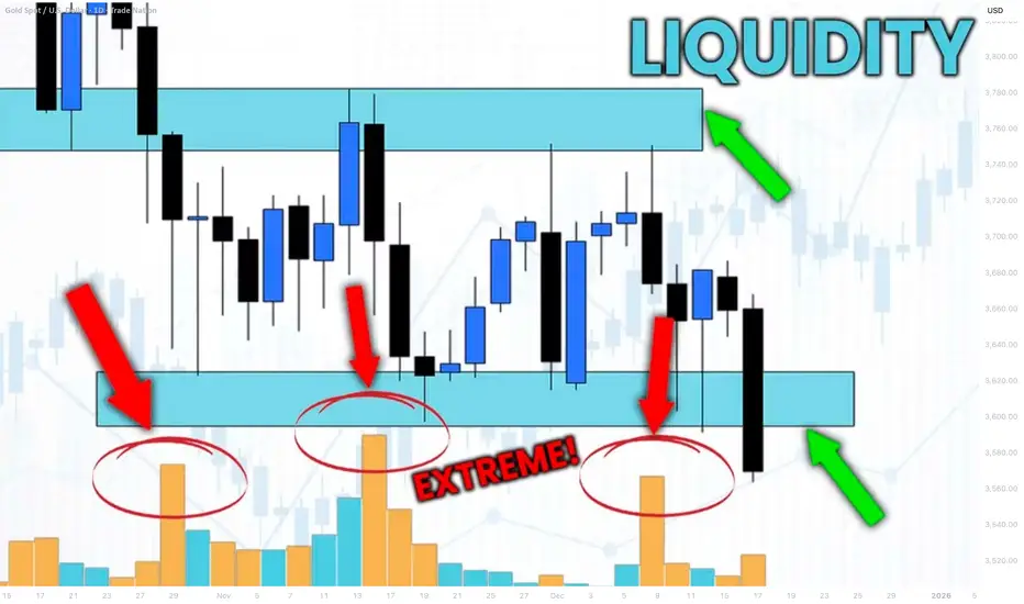
How to Identify Liquidity in Chart with VOLUME Indicator
Smart Money Concept is all about finding the liquidity .
Liquidity analysis is the essential element of profitable trading SMC.
In this article, I will teach you how to use volume indicator to identify liquidity - supply/demand clusters and hidden zones that move the market.
First, let's discuss what exactly we mean by liquidity.
Analysing any forex pair, you should know that orders of the market participants are not equally distributed among all the price levels.
While some levels and the zones will lack the interest of the market players, some will attract huge trading volumes.
We will call such zones - liquidity zones.
To find these zones, you can execute volume analysis.
By using volume indicator, we will look for volume spikes - it will indicate strong buying and selling activity.
Examine NZDUSD chart on a daily time frame with default volume indicator being added.
I highlighted a recent volume spike.
The elevated volume level confirms that there was strong institutional participation in the formation of this candle.
But you can see that this particular candle has quite a wide rage.
So how do we know where exactly and on what levels liquidity concentrates?
We will need to use another indicator to find liquidity zones - a volume profile.
Here is what this indicator does.
Think of the chart as a battlefield. The Volume Profile shows you exactly where the major fighting between buyers and sellers is taking place. It reveals the price levels where the most orders have been executed.
While a classic volume indicator shows when volume occurred, it lights up the specific price levels where the most trading activity is concentrated.
Analyzing Volume Profile on NZDUSD, we can easily find the exact zone where liquidity was concentrated.
We simply take the entire range of a high volume candle and look for a volume profile spike within.
To identify other liquidity zones, continue searching for volume spikes in Volume indicator.
By the way, adding a Simple Moving Average on your Volume indicator will help you find these spikes easier.
Here are 4 significant liquidity zones that I found using this method.
Please, note that there are 3 high volume candles that were formed within the same liquidity zone.
A combination of a classic Volume indicator and Volume Profile will help you to accurately identify the exact moments of volume increase and the price levels where this rise occurred.
That will be a reliable strategy to find important liquidity zones.
❤️Please, support my work with like, thank you!❤️
I am part of Trade Nation's Influencer program and receive a monthly fee for using their TradingView charts in my analysis.
Rapid ORB ProLive trade using our advanced indicator. This is free for everyone to use in trading view. We are working with guidelines and different ways to enter trade with out indicator. This will make everyone profitable.

Ross Cameron ScreenerThe 12-Minute Morning Flow (7:00–7:12 ET)
Open “Gap & % Gainers” list (pre-market).
Sort by % change; scan the top 5–10 only.
Hard filters (pass/fail):
Price $1–$20 (sweet spot $5–$10).
%chg ≥ 10% (≥4% absolute minimum).
RVOL ≥ 5× (today vs 30-/60-day avg).
Float ≤ 20M (prefer ≤10M; sub-5M = rocket fuel).
Catalyst check (white-/blacklist below).
Float rotation quick glance: Volume / Float ≥ 1× already? Bump priority if so.
Liquidity guardrails:
Pre-mkt volume ≥ 300k (tighten to ≥ 1M for safer fills).
Bid/ask spread ≤ 1% (or ≤ $0.05 under $10).
Tag 1–3 tickers as A-setups (everything else = B/C or ignore).
Mark headline times to anticipate bursts: 7:00, 7:30, 8:00, 8:30, 9:00, 9:30.
What to Trade (and What to Skip)
A. Green-list catalysts (prefer)
Earnings beats/upside outlook
Clinical results / FDA approvals
Material contracts/partnerships (not fluff)
Sector tailwinds (theme rotation—AI, GLP-1, China ADRs, etc.)
Technical/short-squeeze breakouts (OK even with no news if tape is clean)
B. Red-list catalysts (avoid)
Buyouts / M&A at fixed price (turns into a barcode around deal level)
Obvious promo/pump (OTC, newsletter spam)
Bankruptcy/provisional delisting (too binary; hard to manage risk)
The Scanner Recipe (copy these ideas to your platform)
Universe: All US stocks, price $1–$20, not OTC, primary listing.
% Change: ≥ +10% (pre-market) → sort DESC.
Relative Volume (day): ≥ 5× (or “Volume ≥ 5 × avg 30D”).
Float: ≤ 20M (display float column; you’ll eyeball ≤10M first).
Pre-mkt Volume: ≥ 300k (raise to 1M on choppy days).
Optional momentum toggles: Price > VWAP, Price > 20/50-DMA.
Columns shown: %chg, Price, Volume, RVOL, Float, Sector, News flag, Rotation = Volume/Float.
Fast Prioritization Heuristics
A-tier: Price $5–$10, Float ≤10M, RVOL ≥10×, %chg ≥25%, clean catalyst, tight L2, rotation ≥1×.
B-tier: Price $1–$5 or $10–$20, Float 10–20M, RVOL 5–10×, %chg 10–25%.
Pass: No catalyst and messy tape, float > 50M, RVOL < 3×, thin/illiquid prints.
Timing & Session Edges
Prime window: 7:00–10:30 ET (most of your trades happen here).
Midday: Usually stand down unless a true anomaly trends.
Power hour (15:00–16:00): Only re-engage if the morning leader holds trend/flags above VWAP with volume.
Sizing, Risk & Do-Nots (keeps you alive)
Starter size only until it proves it can hold above VWAP/prev high.
Max risk per trade: 0.25–0.50R of daily stop; daily hard stop set in stone.
Liquidity check: Your order ≪ 2–5% of 1-minute volume.
Respect halts/SSR mechanics; never chase into first spike after a resumption.
No shorting early for beginners—unbounded risk; squeeze risk is real.
Walk away if the tape turns illiquid or spreads blow out.
Quick Read of the Tape (pre-entry sanity)
Level 2: stacked bids, refreshing buyer at VWAP/flag lows, speed of prints increasing on pushes, light volume on dips.
Structure: Clean pre-mkt flag, higher lows, holds pre-mkt high on the open, respects VWAP on pullbacks.
Bad tells: Stuffed breakouts with heavy offers, repeated reclaim-failures of VWAP, volume dying on pushes.
Minimal Watchlist Template (fill it in each morning)
A1: Ticker / Price / %chg / Float / RVOL / Rotation / Catalyst / Pre-mkt high / Levels to watch
A2: …
A3: …
Contingency: 2 B-tier names if the A’s die.
When Nothing Qualifies
Trade nothing. Or relax rules one notch (e.g., RVOL ≥ 3×, Float ≤ 30M) but demand cleaner technicals (above VWAP, tight flags, no overhang).
“Why this works” (mental model)
You’re engineering an extreme supply–demand imbalance:
Demand = big % gap + RVOL + attention (top of list) + credible catalyst
Supply = small float → fast float rotation → squeezes/continuation
Then you ride clean technicals and cut losers fast.
Screener:
www.tradingview.com

HOW-TO: Ranger in TradingViewChart patterns and ranges are essential in technical analysis, helping traders identify potential support/resistance zones, volatility expansions, and reversal points. However, manually detecting daily or weekly ranges can be time-consuming and subjective. In this post, we describe how to effectively use the Automatic Range Detection feature inside the ZenAlgo - Ranger indicator, which calculates VWAP-based ranges and standard deviation lines automatically to save time and improve accuracy.
Using the Range Detection Feature
Add the Indicator : Access the ZenAlgo - Ranger and add it to your chart. It works on any timeframe up to 4H for optimal performance.
Key Settings :
Show Today's VWAP Range : Enabled by default. This displays the current day's range based on VWAP ±2.0 standard deviations (core range).
Show Previous Day's Range : Toggle to view historical daily ranges (up to 70 days back).
Show Monday Range : Activates weekly-like ranges derived from Monday's data (shiftable forward for projection).
Standard Deviation Lines : Customize visibility for ±3.0 to ±10.0 (and halves like ±0.5, ±1.5). Highlighted lines (e.g., ±5.0, ±10.0) use solid styles for emphasis.
Monday Range StdDev Lines : Extended up to ±40.0 for advanced volatility analysis.
Box Transparency : Adjust for visual clarity (0-100%).
Tip : Start with defaults – today's range in teal, previous in gray, Monday in yellow/blue – and tweak based on your asset's volatility.
The indicator uses a locked 1-min VWAP calculation for precision, incorporating buy/sell volume delta from 4H data to color ranges dynamically.
Range Detection Overview
ZenAlgo - Ranger detects and plots:
Daily Ranges : VWAP-centered core (±2.0 std) with extensions via std dev lines. Supports up to 50 previous days.
Monday (Weekly Projection) Ranges : Special ranges from Tuesday's data (representing Monday's VWAP), extendable up to 30 weeks. Includes core levels (25%, 50%, 75%) and extreme std devs (±40.0).
Half StdDev Lines : For finer granularity (e.g., ±2.5, ±3.5).
Volume Delta : Integrated buy/sell volume calculation for each range, helping identify bullish/bearish bias.
Return Labels : Automatically labels entries back into the range (e.g., "dS" for daily short return above RH).
Detection relies on VWAP and std dev thresholds – higher std lines indicate potential overextensions.
Examples
Here are some practical examples on BTCUSD (see chart snapshots below):
Daily Range in Action : The red box shows today's VWAP range (±2.0 std). Notice how price bounces off the midrange (MID) acting as resistance.
Previous Ranges for Context : Gray boxes overlay past days. In a trending market, price often respects these as dynamic S/R – e.g., breaking below a previous RL signals strength.
Monday Range Projection : Yellow core with blue borders. Shift forward to project weekly volatility. The 50% midline often acts as equilibrium.
StdDev Extensions : ±5.0 (solid) and ±10.0 lines for extreme targets. Useful in high-vol assets like crypto.
Tips
Validate ranges with volume delta for bias confirmation.
Use on intraday charts; combine with other indicators for entries.
For volatile markets, enable higher STDs on Monday ranges.
Is the Bitcoin market bearish?📊 Bitcoin Market Psychology Analysis
Market psychology analysis is one of the most fascinating and practical approaches to understanding Bitcoin's current position! 🎯
🎭 Market Psychology Cycle Phases:
1. Hope Phase 🟦
Likely the current point for many assets
· 📈 Description: After a panic-driven crash, the market stabilizes and consolidates within a relatively stable range
· 💰 Price hasn't returned to previous lows and shows occasional small positive breakouts
· 😌 Sentiment: Fatigue from the downturn, but quiet hope for gradual improvement
· 👴 Experienced investors accumulate while newcomers remain cautious
· 📊 Indicator: Moderate trading volume typically
2. Optimism & Belief Phase 🟩
· 🚀 Description: Price begins breaking key resistance levels
· 📰 Media gradually starts paying attention again
· 😨 Sentiment: FOMO (Fear Of Missing Out) among experienced investors
· 😞 Regret over selling at the bottom
· 📈 Indicator: Beginning of increasing trading volume
3. Greed & Euphoria Phase 🟨
· 📈 Description: Full-blown bullish phase - price rises consistently and rapidly
· 🗞️ Positive news dominates everywhere
· 👥 Friends and acquaintances talk about massive profits
· 💭 Sentiment: Belief that "this time it's different" and "price only goes up"
· 💸 Greed for more profits and borrowing to buy
· 📊 Indicator: Very high trading volume and positive media coverage
4. Denial Phase 🟧 - Danger Point!
· 📉 Description: Price falls from the peak
· 🤦 Many investors consider this just a "temporary correction"
· 🔮 Expect a return to the peak
· ❌ Sentiment: Strong denial
· 🛒 Buying during the decline hoping for recovery
· 📊 Indicator: Trading volume remains high
5. Fear, Panic & Capitulation Phase 🟥
· 🚨 Description: Sharp and rapid decline
· 📉 Price experiences consecutive breakdowns
· 😱 Sentiment: Intense fear, panic selling
· 💔 Acceptance of heavy losses - absolute despair
· 📊 Indicator: Very high selling volume
6. Apathy & Depression Phase ⬜
· 😴 Description: Market remains stagnant with low volatility for extended periods
· 💤 Prices are low and boring
· 🚫 Sentiment: Complete disinterest in the market
· 👋 Most people have accepted defeat and exited the market
· ☠️ Talk of "Bitcoin's death" resurfaces
· 📊 Indicator: Very low trading volume and minimal media attention
---
💡 Golden Insight:
Understanding these phases can help you make the best trading decisions! ✨
---
📌 Market Psychology + Technical Analysis = Trading Success 🚀
---
💬 Let's Interact!
I'd love to hear your thoughts! 👇
· 🤔 Which phase do you think we're currently in?
· 📊 What's your market outlook for the coming months?
· 💭 Share your technical analysis perspective
· 🎯 Have you used market psychology in your trading strategy?
· 📉 What indicators do you find most reliable?
· 💡 Any successful trades based on market sentiment?
· 🔮 Where do you see Bitcoin in the next 6 months?
Let's learn from each other! Share your comments and analysis below 👇
Your experience and insights are valuable - let's build our trading knowledge together! 🌟
Feel free to ask any questions or share your trading experiences! 💪

GameStop and Fibonacci: It's About TimeThis is my first attempt at publishing a video on TradingView, so hopefully it works.
I wanted to put together something educational about fib channels and why I like to use them. They're not a silver bullet, but they do tell you a lot about where to expect support and resistance because the chart has a very good memory, and you can see this play out on pretty much any instrument, including cryptocurrencies.
I follow NYSE:GME closer than any other ticker, so this video is about my philosophy on the fib channels that I have been using on the GME chart and talking about on the Echo Chamber Podcast. Hopefully this adds a little more context to that discussion, how the flat price levels are not always the only thing that matters, but taking time-based trends into account can make a big difference in your analysis and understanding of price movement.
Happy to hear people's thoughts on my crayons 🖍️ which color should I eat next?
Since this is a bit of a longer video, here's an AI summary of the content with timestamps:
Introduction 00:00-01:05
I introduce the topic of explaining my TradingView chart, which has many colorful lines. I clarify that I didn't manually draw all the lines, but used Fibonacci channels that only require selecting 3 points.
Explaining Current Chart 01:05-04:33
I show my current GameStop chart, explaining various trend lines and Fibonacci channels. I demonstrate how to adjust the Fibonacci channel points to analyze different price movements.
Fresh Chart Walkthrough 04:33-11:57
Moving to a clean chart, I explain global chart items, including trend lines from major tops and bottoms. I discuss dividend-adjusted vs non-adjusted charts and explain the "Gandalf line" of support.
Fibonacci Channels Explanation 11:57-24:54
I provide a detailed explanation of how Fibonacci channels work, demonstrating how to draw them and interpret the resulting lines. I show how these channels can describe price action across long time periods.
Additional Examples 24:54-33:44
I show more examples of Fibonacci channels applied to GameStop's entire price history. I discuss how these channels can provide insight into potential future price movements and support/resistance levels.
Conclusion 33:44-34:40
I summarize my thoughts on GameStop's current price action in relation to the Fibonacci channels and support levels identified.
Some Quotes
"I find them mathematically interesting." 11:54 - Referring to trend-based Fibonacci tools.
"Math is your friend here. But you don't have to do the math, you just can use tools that will help you." 17:19
"Price is fractal in nature in that patterns are repeating and Fibonacci is everywhere." 17:19
"Things like history repeats itself. It's just a question of when, not if." 24:30
"The point I want to drive home here is that when we start to get a little bit more granular here, and this is why I have lots of crayons on my chart." 28:34
Key Tips/Concepts
Fibonacci channels can be powerful tools for technical analysis, providing insight into potential support and resistance levels.
These channels can sometimes describe price action across very long time periods, even when drawn based on recent price movements with thoughtfully selected endpoints.
The importance of considering price, time, and volume in technical analysis, as demonstrated by the "Gandalf line".
The value of using multiple timeframes and chart types (dividend-adjusted vs non-adjusted, trading hours only vs extended hours included) to gain a more complete picture of a stock's price history. (Editorial note: something I didn't cover in the video, but the difference between log scale and linear scale sometimes will make for an interesting story on trendlines and fib channels too. I prefer to keep my chart in log scale, but will toggle between log and linear occasionally to see if there's something interesting there in the lines already drawn.)
The concept of fractal nature in price movements and how patterns tend to repeat over time.

Volume profile indicator Volume Profile is an advanced charting tool that displays trading activity (volume) over a specified period at specified price levels
Volume Profile plots a histogram on the chart to show significant price levels based on volume (typically daily or weekly sessions)

Liquidity Voids: Where Price Runs Through Empty Space█ Liquidity Voids: Where Price Runs Through Empty Space
Big moves don’t just “happen”, they happen because either buyers or sellers step aside and let price run.
A liquidity void is what’s left behind when that happens: an area on the chart where price traded with very little volume, leaving a ‘hole’ in market participation.
This is not just another fair value gap. A typical FVG can form on normal volume during strong momentum. A liquidity void specifically signals a displacement under thin conditions, meaning the move was too easy, and price often comes back to check that area later.
█ What Exactly Is a Liquidity Void?
Think of the order book as a ladder of bids and asks. Normally, price moves step by step as orders fill at each level. But when there aren’t enough orders (low liquidity), price jumps levels and that jump is your void.
On a chart, it shows up as:
A large, one-directional candle with very small or no wicks overlapping neighbors.
Little or no volume relative to the move’s size (thin participation).
Price displacement that looks almost “too clean” — no hesitation, just a straight run.
These clues tell you price didn’t just move on heavy buying/selling, it moved through empty space.
⚪ Liquidity Void Detector
Use this free Liquidity Void Detector indicator to spot liquidity voids. It signals when the market makes a relatively sharp move on comparatively low volume, helping you spot these voids in real time.
█ Why Low Volume Matters
⚪ Not All Gaps Are Voids
A fair value gap can form on high participation, think of a breakout candle with heavy volume and institutional backing. That’s an accepted price move.
⚪ Voids Are Different
A liquidity void happens when the market skips prices because there was no one there to trade. It’s an inefficient move that the market often wants to revisit and “fill in” once participation returns.
⚪ Volume as the Filter
When volume is below its own average (or below a trend baseline), it tells you this wasn’t a “healthy” move, it was a thin-book displacement.
█ How Traders Use This
⚪ Mark the Zone
Draw the high and low of the candle(s) that created the void. This is your “inefficiency zone.”
⚪ Wait for the Return
Voids often act like magnets. Price often reverses and retests or fills the void, but it can just as easily slice through the zone once revisited, as thin liquidity offers little resistance.
█ What Research Show
Academic studies on price gaps find that immediate fills are rare, but the probability of fill rises over time. Downward voids (panic selling) fill faster on average than upward voids.
Crypto traders track CME Bitcoin gaps and report over 80–90% eventually get filled, but timing is unpredictable.
Volume-adjusted strategies outperform simple gap-filling because they focus on inefficient moves, not every gap. The key is filtering for thin participation.
█ Bottom Line
Liquidity voids are not just gaps, they are evidence of skipped prices under low participation.
They tell you where price moved “too easily,” leaving behind unfinished business.
Learn to filter for low-volume displacements, mark those zones, and watch how often price comes back to rebalance them. This turns a random candle into a predictive level, one that can guide your mean reversion trades or act as a support/resistance flip in trending markets.
-----------------
Disclaimer
The content provided in my scripts, indicators, ideas, algorithms, and systems is for educational and informational purposes only. It does not constitute financial advice, investment recommendations, or a solicitation to buy or sell any financial instruments. I will not accept liability for any loss or damage, including without limitation any loss of profit, which may arise directly or indirectly from the use of or reliance on such information.
All investments involve risk, and the past performance of a security, industry, sector, market, financial product, trading strategy, backtest, or individual's trading does not guarantee future results or returns. Investors are fully responsible for any investment decisions they make. Such decisions should be based solely on an evaluation of their financial circumstances, investment objectives, risk tolerance, and liquidity needs.

What no one will reveal to you about volume. Theory and PracticeFor Richard W. Schabacker, whom I consider the father of Technical Analysis in the West, rigorous technical analysis must combine the study of price and volume. Paradoxically, volume was the last piece of data I effectively integrated into my trading, due to the scarcity of practical information.
In this article, I will explore the classical view of using volume and then my personal approach, based on logic and accumulated experience.
Whether you are a novice or an expert in the markets, and whether or not you use volume to clarify your analyses, reading this article will enrich your perspective on this topic.
The Ichimoku indicator values displayed on the screen are personal variations, resulting from my research. I hope they are useful to you.
What is Volume?
In the context of financial markets, volume represents the number of shares, contracts, or lots traded in an asset over a specific period of time.
Volume reflects the intensity of market activity and is represented as a histogram just below the price chart.
"Volume is a relative matter; that is, when we speak of high volume, we refer to a transaction volume greater than what has prevailed for some time before."
— Richard W. Schabacker, Technical Analysis and Stock Market Profits
Classical View of Volume:
Generally, the main proponents inShannon proponents in this discipline see volume as useful for the following purposes:
1. Confirming the Strength of a Trend:
Volume should accompany the strength of a trend, and if volume is weak, it is likely that we can anticipate a reversal, as low volumes in a trend indicate a loss of interest among participants.
2. Analyzing Support and Resistance:
Most major proponents tend to view weak volume as a signal for potential reversals, while recommending validating breakouts of support and resistance with increased volume.
3. Analyzing Continuation or Exhaustion Patterns:
The classical approach suggests that before entering continuation or exhaustion patterns (such as accumulations, distributions, head and shoulders, double tops and bottoms, triangles, etc.), there should be a depletion of volume, followed by a breakout of the pattern with a significant increase in volume to confirm the presence of participant interest.
This approach is solid in theory, but in practice, it can lead to subjective interpretations and errors if not properly contextualized.
Personal View: May the Force Be with You
In my experience, volume should not be primarily interpreted by observing weakness, as this can lead to misreadings and premature market entries. Instead, I recommend focusing on detecting strength as the decisive factor. High volume reveals the massive entry of participants or large orders—whether from large investors or institutions—leaving a clear footprint in the market. These large orders, whether buy or sell, indicate real commitment and potential for sustained movements.
On Volume and Trend Analysis:
Why base a reversal on the weakness of a trend when the key is to identify the context and strength driving the change? A clearly weakened price action backed by low volumes can extend in the direction of the trend, draining our accounts if we base our entries on volume weakness. Whether trading with or against the trend, the turning point must be supported by robust volume. This spike in activity confirms the presence of large investors or institutions in action, translating into greater interest and liquidity.
As technical analysts, our goal is to capture fluctuations or trends, not to diagnose whether a trend is "healthy." Weakness is relevant information for detecting exhaustion, but it is strength, in the right context and with proper confirmation (through patterns), that will increase our success rate and improve our risk-reward ratio.
In Figure 1.1, we can see how volume spikes generally predict pauses or reversals in trends.
Figure 1.1
Tesla. Daily Chart
In Figure 1.2, we can observe how weak volume could indicate a loss of interest from participants (1 and 2), but it is an increase in volume combined with a Japanese candlestick pattern (3) that can confirm a likely effective entry.
Figure 1.2
BTC/USDT Daily Chart
On Volume in Support and Resistance Analysis:
As mentioned earlier, weakness is relevant information, but strength is essential to validate a trend reversal or continuation.
According to the classical approach, a breakout of support or resistance should be backed by a significant increase in volume. However, experience has taught me that the high volume detected during a breakout often represents common bull or bear traps, where buyers or sellers get trapped.
There are several reasons for this: supports and resistances are psychological zones that are constantly evolving, making it easy to confuse breakout volume with rejection volume. Additionally, during breakouts of significant supports or resistances, large institutions often manipulate or protect their positions by executing large buy or sell orders.
How can we avoid falling into bull or bear traps, or even use them to our advantage?
Personally, I recommend not seeking breakouts of supports and resistances based on volume. Price compressions around supports and resistances are more useful for this purpose, as they reveal the intent and dominance of buyers or sellers while offering a superior risk-reward ratio. High volumes generally indicate rejection, even if the zone appears to have been broken. Without prior compression—or accumulation or distribution—it is never advisable to chase breakouts.
In Figure 1.3, we can observe two phenomena in one: the breakout of a consolidation pattern and the breakout of a resistance ($110,000) following a price compression (3). Notice how buying forces intensely defended the $100,000 zone, as evidenced by volume spikes and large engulfing patterns that preceded them (1 and 2). The price compression at the $110,000 zone reveals the bullish intent to break the resistance in a context where buying strength is dominant.
On the other hand, in Figure 1.4, I show you what a bear trap looks like. Observe how what appears to be a confirmed breakout with volume at a defended support level ended up being a significant rejection by large investors or institutions (1).
At this point, I will make two clarifications:
The volume histogram is represented with colors on some investment platforms to facilitate the visual detection of patterns, but volumes themselves do not have color. Whether a volume is bullish or bearish does not depend on whether the accompanying candlestick is bullish or bearish, but rather on the real-time interpretation of the technical analyst and, above all, on the subsequent development of events. In the example of the false breakout in Figure 1.4, we observe a bullish rejection volume.
Another vital aspect is that supports in strong and healthy uptrends will generate more false breakouts than reliable ones, so I recommend taking more long entries. Additionally, during the euphoria and hope characteristic of a bullish market, short entries will be extremely risky.
In the articles “Bear and Bull Traps” and “Double Pressure: The Key to Successful Breakout Trading,” I describe these phenomena in detail.
Figure 1.3
BTC/USDT Daily Chart
Figure 1.4
BTC/USDT 4-Hour Chart
On Volume in Continuation or Exhaustion Patterns:
While it is often recommended to ensure a decrease in volume prior to the breakout of an exhaustion pattern, I recommend ensuring the detection of large volumes within the exhaustion pattern itself and confirming entries based on price compressions at the boundaries of the accumulation or distribution range.
Large volumes in continuation or exhaustion patterns indicate that many participants or strong institutions are partially or fully closing their buy or sell positions, which can lead to a correction. Even investors like Thomas Bulkowski have noted that the success rate increases in patterns where large volumes are present.
On the other hand, contrary to the classical approach, I recommend avoiding confirming entries based on pattern breakouts with large volume, as exhaustion and trend continuation patterns often generate strong bursts of volatility. In the best case, this may cause you to miss the trend, but in the worst case, it will expose you to entries with poor risk-reward ratios. Price compressions are a safer option for making entries and capitalizing on volatility bursts.
In Figure 1.5, you can observe the effectiveness of price compressions in the right context and how volume is a key factor in determining the presence of large investors.
Figure 1.5
BTC/USDT Daily Chart
Some Additional Examples:
An ABCD pattern offers excellent opportunities to take entries based on volume, always with confirmation from price action. In Figure 1.6, you will observe how I would effectively use bear traps (D), which are very common in strong uptrends.
Figure 1.6
BTC/USDT Daily Chart
Relevant Data on Volume:
Volume in Forex and CFDs
Both the Forex market (currencies) and CFDs (contracts for difference) operate in a decentralized, over-the-counter (OTC) manner, meaning there is no centralized exchange where all trading volume is recorded.
In Forex, the volume displayed on platforms does not represent the "true" total volume of the global market, but rather the flow of trades within the liquidity pool of the broker or its liquidity providers.
CFDs, being OTC derivatives offered by brokers, follow the same pattern: the visible volume is specific to the broker and its liquidity network, not the total volume of the underlying market. Brokers aggregate liquidity from multiple providers (such as banks or dark pools), but traders only see a fraction of this, which may not reflect the actual volume of the underlying asset (e.g., a CFD on stocks does not show the total volume of the stock exchange).
Volume in Centralized Stock Exchanges
Stock markets like the NYSE are centralized, meaning all transactions are executed and recorded on a single regulated exchange. This allows for consolidated, real-time reporting of the total volume of shares traded on that exchange. The volume reflects all executed trades, including the total number of shares bought and sold. Under strict regulation, the data is standardized, audited, and publicly accessible.
Volume in the Cryptocurrency Market
The cryptocurrency market is decentralized and fragmented, similar to Forex: transactions occur across multiple global exchanges (such as Binance or Coinbase) without a unified central record. This makes the total volume an aggregation of data reported by each platform, introducing inconsistencies and potential manipulations.
Personally, I recommend prioritizing data from Binance, as it consistently leads in spot and derivatives trading volume globally, representing a significant portion of the market (approximately 30-40% in recent aggregated metrics).
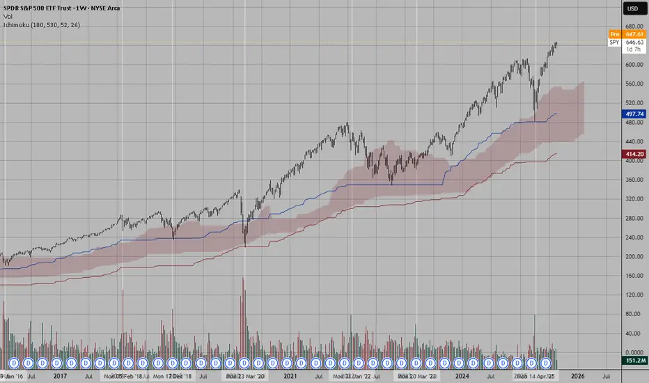
Volume and the S&P 500
Although the S&P 500 index, being a composite indicator and not a tradable asset itself, does not record transaction volume, a smart strategy for analyzing volume related to this index involves monitoring the trading volume of the SPY ETF (SPDR S&P 500 ETF Trust). This exchange-traded fund closely tracks the performance of the S&P 500 and attracts a high level of trading activity, providing a valuable metric for assessing market interest, liquidity, and potential volume patterns during bullish or bearish trends.
In Figures 1.7 and 1.8, you can see how S&P 500 readings can be cleverly combined with SPY volume data.
Figure 1.7
S&P 500 Daily Chart
Figure 1.8
SPY Daily Chart
Final Note:
If you’d like to take a look at my analysis record, you can check out my profile in Spanish, where I transparently share well-defined market entries. Send your good vibes if you enjoyed this article, and may God bless you all.
The Compression Break: Identifying the Spring Before ExpansionDifficulty: 🐳🐳🐳🐋 (Intermediate)
This article is for traders who want to recognize and trade explosive moves that form after periods of tight price compression. Perfect for those familiar with structure, volume, and volatility concepts.
🔵 INTRODUCTION
Price doesn’t move in a straight line — it breathes. It expands when there’s imbalance, and it compresses when the market is building energy. The most powerful moves often start with a compression phase — a tight, controlled price range — before a sudden breakout.
Learning to spot these “springs” before they snap can give you trades with excellent risk/reward ratios and clear invalidation points.
🔵 WHAT IS COMPRESSION?
Compression occurs when price volatility shrinks, and each swing becomes smaller than the last. It looks like price is being “squeezed” between converging support and resistance levels.
Common causes of compression:
Liquidity build-up before a major session open
Market waiting for a news release or key event
Institutional positioning before a drive
The tighter the range, the bigger the potential release.
🔵 WHY IT MATTERS
Compression is important because:
It reveals where the market is balanced and undecided
It creates a high-energy environment — a small push can trigger big moves
It offers tight stop-loss placement and clear breakout targets
Think of it like a coiled spring: the more it’s compressed, the more explosive the release.
🔵 HOW TO IDENTIFY COMPRESSION
1️⃣ Price Action Clues
Consecutive smaller candles with overlapping ranges
Lower highs + higher lows (triangle formation)
Reduced wick size in the final stages before breakout
2️⃣ Volume Clues
Declining volume during the squeeze
Sudden volume spike as breakout begins
3️⃣ Volatility Clues
ATR (Average True Range) dropping to local lows
Bollinger Bands narrowing (optional)
🔵 TRADING THE COMPRESSION BREAK
Step 1: Define the Box
Mark the high and low of the compression range. This will be your breakout reference.
Step 2: Wait for Volume Confirmation
Avoid jumping in on the first tick outside the box. Wait for a volume surge or strong close beyond the boundary.
Step 3: Trade in the Breakout Direction
Entry: After confirmed breakout close
Stop Loss: Inside the compression range
Target: Equal to the height of the compression box or previous swing high/low
🔵 EXAMPLE SCENARIO
Price compresses for more then 10 bars into a tight range
Volume steadily declines → ATR hits a local low
A big body bullish candle breaks above range high with 2× average volume
Entry at breakout close, stop inside range, target = box height projected upward or 1:2 RR
🔵 ADVANCED TIPS
Align with higher timeframe trend for higher probability
Watch for false breakouts (liquidity sweeps) before real move
Combine with order blocks or VWAP to refine entries
Use session timing — many compression breaks happen at market opens
🔵 CONCLUSION
Compression is the market’s way of loading a trade with potential energy. When you spot it, you’re seeing the buildup before the burst. Trade it with patience, volume confirmation, and proper structure, and it can become one of your highest-probability setups.
Have you traded compression breaks before? Share your best example in the comments!
How to Read COT Data: Understanding Big Players’ Order FlowHey whats up traders, today Im going to reveal my COT approach. If you’re serious about finding higher timeframe bias based on what the big players are doing, then COT data is a tool you need to know. It offers unique insights into the positioning of institutional traders—and if read correctly, it can help you align with real market momentum rather than noise.
Before we break it down step-by- step. I want to mention that this is my personal approach. Larry Williams is doing it differently and I have seen some other approaches. This is what works for me, might you find it also usefull.
What Is COT Data?
The Commitment of Traders (COT) report is published every Friday by the CFTC (U.S. Commodity Futures Trading Commission). It shows the open positions of various market participants in the futures markets as of the previous Tuesday.
This data is based on the requirement that large traders must report their positions once they pass a certain threshold. In short, we’re peeking into the order flow of institutions—excluding high-frequency trading and market making noise.
Hope you already recognized small disadvantage to us as retail traders.
Big players report data on Tuesday and it's published on Friday. So we basically have it late and we dont know what has happen in last 3 days. But no worry I will show you my trick how to read between the lines.
COT helps us:
• Understand HTF (Higher Timeframe) bias
• Spot shifts in institutional positioning
• Identify trend continuations or potential reversals
• Avoid getting trapped in retail sentiment traps
It’s not a standalone entry tool, but rather a macro confirmation layer for swing or position trades. Huge advantage by following large players is that they are trading on fundamentals and you dont need to worry about that - you just follow them. But you must follow the right participants, because there is few.
Who Are the Market Participants?
The COT report breaks down traders into several categories. Each one has a different motive and behavior in the market:
1. Commercials
• Think of them as hedgers.
• These are producers, manufacturers, and institutions trying to lock in prices for raw materials or currencies.
• They are usually contrarian at extremes.
When they reach record net long or net short positions, reversals often follow.
2. Non-Commercials (Speculators)
• These are institutional funds, hedge funds, and large speculators.
• Their goal? Profit.
• Often, they follow trends and their positioning reflects the broader market sentiment of the big money.
3. Dealers
• Mostly big banks and institutions facilitating trades.
• They manage risk rather than speculate heavily, so they typically take the opposite side of speculative flows.
4. Leveraged Money
• Hedge funds using high leverage.
• Their positions often reflect short-term speculative behavior.
• Watching their net positioning and changes week-to-week can give clues on momentum exhaustion.
Now you might think which one to follow and Yes you can build your strategy on following any of them fore example
Larry Williams - been trading base on Commercials
Anton Kreil - suggest following Leveraged money
I tried both but for me works best - Non commercials ( Speculators)
Again here you cant say definitely which one is right or wrong. What works for you is right. Thats it.
There are multiple versions of the report, but here are the most commonly used, Im using - ✅ Traders in Financial Futures (TFF)
• Focused on financial markets like forex, bonds, and indexes.
Where to find COT data?
It's free and you can find it on the SEC website there is simple week to week format. As you can see below. Many traders are watching this.
I dont say this is wrong but you dont have complete data - missing big picture.
As you can see here these data below are clearly giving you a picture about an order flow and positioning changedsvn the positions which can confirm trend or help you spot potential reversal you need to watch bigger data sample. Institutions doesnt reverse market in a week, they need to of load positions and I it takes them some time. Which will explain later.
Im collecting the data to the collums. I want see longs, shorts of commercials and from that I calculate. Following
Longs % exposure
Shorts % exposure
Net positions
13 weeks average
Historical Highest positions
Historical Lowest Positions
Relationship between these numbers helps me justify whats going behind the price action, but also spot strong levels. I will show you how to put it together with the context of the charts and then I will show you few order flow patterns examples, it's not difficult but it requires a bit of practice.
Bullish Pattern - Longs growing / Shorts being closed
This is the strongest COT patter and clean sign of buying
This is classing pattern what we have just seen on the EURUSD
Notice how longs has been growing constantly and net positions confirms that.
In may been able to see rapid shorts closing, which and confirmed bullish trend and we can look just for the bullish setups.
Now lets look to the USDJPY chart it will be tricky because it's all red and looks tricky but focus to the numbers and price action, how longs are growing while shorts being closed. Very weak JPY.
Bearish consolidation Shorts being build
Massive shorts being added int he consolidation phase longs doenst move at all. Further big drop coming. This is now happening on the AUDUSD. Look at this tight price consolidation and let's read what is happening. just look at the COT its clean longs around 23K constantly while they are building massive shorts. Whats gonna happens next is clear.
Profit taking move
This ofter occurs when we can see sharp move above the highs but without real longs being added, rather they being closed. As on our example below on the gold. We can see massive profit taking on longs while price was moving up. But they were not been adding shorts. What doest it tell us. They do not want to trade full reversal - not building short position, but market is overheated and they taking profits to buy later for lower or price can go to the consolidation where they will be building short, but definitely its late for us to go long.
Here is another example on USDCHF
Notice longs positions in the moment where there was 46K long and then next week change -12K net. It's a huge change which has started Sell off. But look in to Shorts , there is no heavy shorting, price simply go down based on huge longs profit taking. This is why its important to look in to bigger picture because if you look only in to week to week data. You will still see bigger longs than shorts and it will give you bullish opinion. Hope it's clear. And by the way now we can see 2 weeks with more then +3.4K longs. Its getting bullish IMO.
Now lets look to the another example on the USDCAD
Now we will use one of my past analysis where based on the data I predicted further move. And here I want to mention one thing. Even though we can see COT being bearish. It doesnt mean that price cant go up in short term (can be be 2- 3 weeks) There for you still need to use price action and dont just blindly short, but short run above the highs, because this is where big players add shorts. Not on the lows.
P rice moving up shorts being added - Reversal coming
This is showing positions building for the sell. In this case you can see both growing longs and shorts remember. Big players are hedgers, they are taking longs to move price up so they build shorts. Once they got their positions they close longs and sell of starts.
Lets look to my TV analysis where I have seen shorts grown recently while GBP was moving up close the Monthly Order block , but notice the shorts colum how the shorts were growing recently and also longs dropped from 110K to 100K.
Clena signs of the reversal but again I waited for a pullback above the weekly highs. Click to open a chart bellow
This was a prediction from few week ago. Now let's look how the data looks right now. On the GBPUSD chart below we can see reveal in the data. Long significantly dropped by 50% and shorts increased by 50%. This is a clean reversal pattern in the COT. Look at net positions it clearly flipped to the bearish and big drop is coming.
Few more tips
Remember they know we are watching this data and what we see is what they want us to see, so they are often trying to hide their positions as long as possible. Thats why intra-week reversal are happening on Wednesday after they report their positions.
They cannot hide the data forever, follow the data week by week to keep in track whats happening. It will increase your winning ratio.
Every 3 months there is a new futures contract. The must close the positions and reopen them in to the new contract, They are using it for reversals.
Also some if there is some US holidays on the day when report should be released to the public its delayed to the next week. And thats when they do biggest positions changes secretly.
COT data isn’t a magic crystal ball—but it’s a powerful tool if you know how to combine it with technical analysis. You need to use your mechanical system. It perfectly fits with my CLS strategy and It's suitable for swing traders.
Think outside the box. Even when you see bearish COT - dont be stupid to sell low. It's not NOD order flow for intraday scalping, you have time. But if you something is clearly bearish every run above weekly and daily highs is high probability Sell in the smart money trend.
Dont hesitate to ask any questions and follow. I share COT weekly updates.
“Adapt what is useful. Reject whats useless and add whats is specifically yours.”
David Perk aka Dave FX Hunter

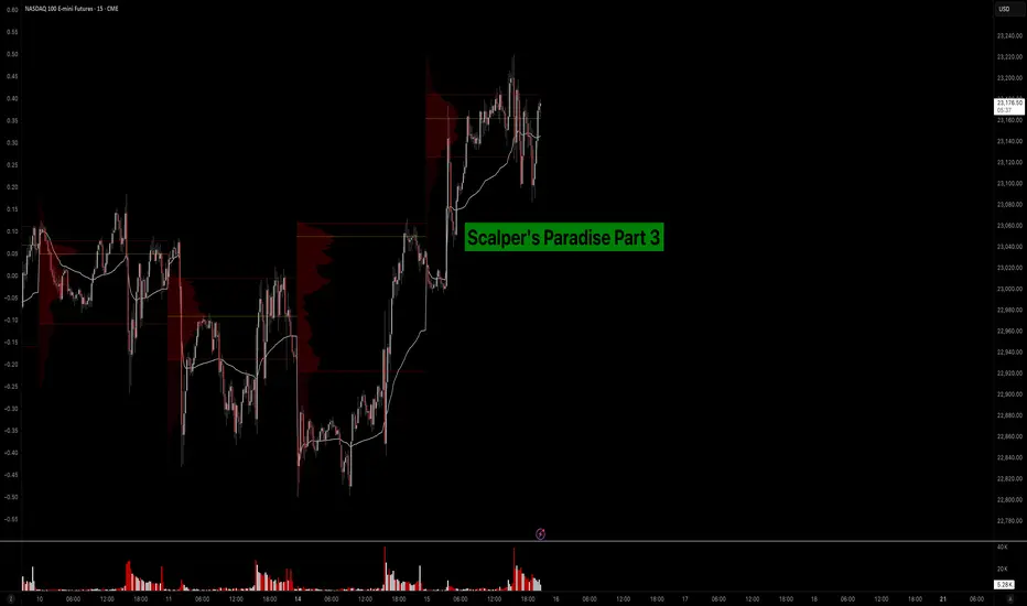
Scalper’s Paradise Part 3 – The Power of Order Flow and DOMWelcome back to Scalper’s Paradise! In this third part of the series, I want to take you into one of the most powerful tools in professional trading: Order Flow and the Depth of Market (DOM).
I chose this topic because during my time as an institutional trader, this was our entire world. We didn’t use indicators. We didn’t guess. We traded exclusively based on what we could see happening live in the DOM and Time & Sales. Every decision was made tick by tick, based on real market activity.
That experience shaped the way I view markets forever—and today, I want to share that perspective with you.
What Is Order Flow, Really?
To me, Order Flow is the most honest information the market can give you. It doesn’t predict, it reveals. It shows who is actually making moves right now. When I was sitting at my institutional desk, I didn’t look at moving averages or oscillators. I looked at who was being aggressive: were market buyers lifting offers, or were sellers smashing the bid?
Watching the tape (Time & Sales) and the footprint chart was like watching a fight unfold in real time. No filters, no guesses. Just raw interaction between buyers and sellers. That’s where real decisions are made.
The DOM: My Daily Reality as a Trader
The DOM (Depth of Market) was the first thing I looked at every morning, and the last thing I closed at night. It shows all visible limit orders resting at each price level. But there’s a catch: not everything you see is real.
In the institution, we were trained to spot real interest versus manipulation. Stacked bids might look strong, but if they disappear the moment price drops tells you that there was never a true intent. Iceberg orders were more interesting, when price gets hit again and again and doesn’t move, that usually meant someone was absorbing quietly.
Reading the DOM is like reading an X-ray of the market’s intentions. And yes, there’s a lot of noise, a lot of deception. But once you learn to read through it, it’s the most powerful tool you’ll ever have.
How We Used Order Flow on the Institutional Side
At the institution, we never chased price. That was rule number one. We let the market come to us (meaning: we used Limit Orders as often as possible) and we used Order Flow to guide every decision.
One of the most important concepts was absorption . If we needed to build a large long position, we didn’t just slam the ask. We would let sellers come in and hit our bids again and again and again. If price didn’t break lower, that told us we were in control.
On the flip side, when we needed to move the market , we switched gears. We used market orders aggressively to push through key levels, forcing reactions, triggering stops, and creating follow-through.
And yes, there were times when we intentionally created traps . We’d push price into obvious zones, make it look like a breakout, then fade it, because we knew how the market reacts afterwards. Order Flow was the only way to read those games in real time.
How You Can Use This as a Retail Trader
I know what you might be thinking: “I’m just a retail trader, how can I possibly use tools like Order Flow or DOM the way institutions do?”
The good news is: you don’t have to compete with institutions, you just need to read their intentions.
Here’s how I would approach it today:
1) Open a footprint chart and look for imbalances, areas where one side is clearly more aggressive. Watch for absorption or sudden volume spikes.
2) Watch the Time & Sales feed. Is there a flurry of trades hitting the ask, but price isn’t moving? That’s someone selling into strength.
3) Use the DOM around key areas like VWAP, previous day high/low, or liquidity clusters. Are orders getting pulled? Is size appearing suddenly? These are all signals.
You don’t need to be early. Let the big player act first, then confirm what you’re seeing across Order Flow and DOM. When everything aligns, that’s your edge.
Bringing It All Together
In Part 1, I shared how we used VWAP and Volume Profile as benchmarks to evaluate execution quality. In Part 2, I showed you how I identify institutional activity using raw volume and 10-second charts. And now, in Part 3, you’ve seen the real-time decision-making tools: Order Flow and DOM.
These aren’t indicators. They’re not theories. They’re the actual battlefield where institutions operate and where I learned to trade.
My goal with this series has always been simple: to give you access to the same mindset I used at the institutional level, but through a lens that makes sense for your reality as a retail trader.
Don’t try to outsmart the market. Observe it. Align with the big players. Let their behavior guide your decisions.
That’s how I learned to trade professionally—and it’s exactly how you can start thinking and acting like a pro, even without the size.
Part 1:
Part 2:
Mastering Delta–Volume Divergence
🎓 Mastering Delta–Volume Divergence: How to Read Institutional Absorption and Trap Setups
⸻
1️⃣ What Is Delta?
Delta measures the net aggression between buyers and sellers:
• Market Buys: traders lifting the ask
• minus
• Market Sells: traders hitting the bid
✅ Positive Delta indicates stronger buying pressure.
✅ Negative Delta indicates stronger selling pressure.
Delta shows who is initiating trades, not just that trading is occurring.
⸻
2️⃣ What Is Volume?
Volume measures the total number of contracts traded, regardless of who initiated them.
Every matched buy and sell contributes equally to volume.
Volume reveals activity, but not who controls the move.
⸻
3️⃣ What Is Delta–Volume Divergence?
Delta–Volume Divergence occurs when:
✅ Volume is high (lots of trades happening),
✅ But Delta is near zero (neither side dominates).
This signals:
• Intense two-sided activity between buyers and sellers,
• Strong participation on both sides,
• Passive absorption—institutions quietly filling large orders without moving price significantly.
⸻
4️⃣ Chart Breakdown – Bar by Bar
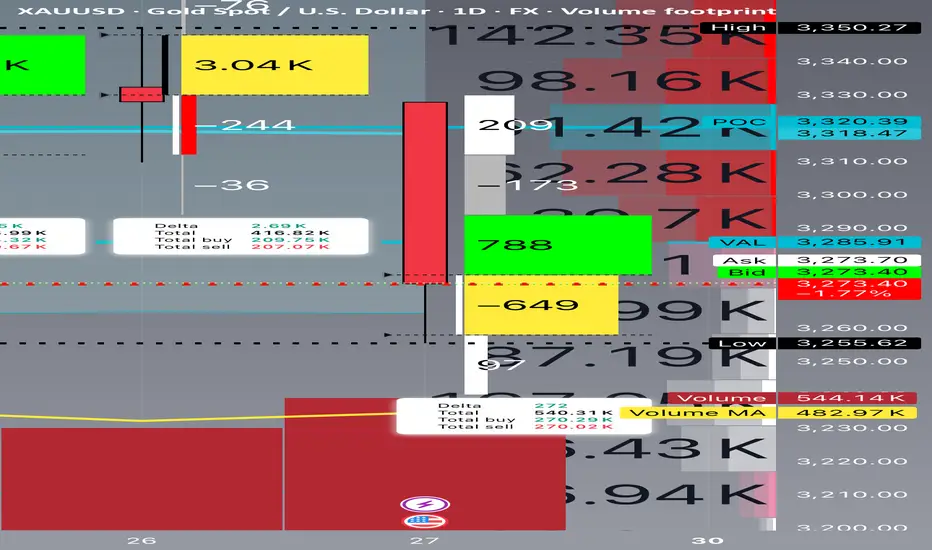
Below is a clear example of this concept in practice, reviewing each daily bar from your footprint chart:
⸻
🔴 June 24
• Delta: -8,240 (strong net selling)
• Volume: 575,720 (very high)
• Interpretation:
• Heavy, aggressive selling.
• Clear trend-confirming action.
• No divergence.
⸻
🟢 June 25
• Delta: +4,650 (net buying)
• Volume: 343,990 (moderate)
• Interpretation:
• Counter-trend buying or short covering.
• Less volume and less conviction.
⸻
🟢 June 26
• Delta: +2,690 (mild net buying)
• Volume: 416,820 (higher)
• Interpretation:
• Rising volume but weaker delta.
• Early sign of balance developing.
• Possible absorption beginning.
⸻
🟨 June 27 (Critical Bar)
• Delta: +272 (near zero)
• Volume: 540,310 (very high)
• Interpretation:
• Huge volume churn.
• Neither buyers nor sellers in control.
• Likely institutional absorption of aggressive orders.
✅ This is a textbook example of Delta–Volume Divergence.
⸻
5️⃣ Why This Matters
Professional Insight:
• Sellers had been aggressive for several sessions.
• Suddenly, volume remained elevated, but delta flatlined.
• This suggests:
• Exhaustion of selling aggression, or
• Institutional accumulation and passive positioning.
This often sets the stage for:
• A trap reversal (short squeeze), or
• A continuation flush if sellers regroup and push lower.
⸻
6️⃣ Confirmation Scenarios
Scenario A: Bearish Continuation
• Watch for renewed strong negative delta (e.g., -5,000 or worse).
• Price remains below the last support (~3,250).
• Confirms absorption failed and sellers remain dominant.
Scenario B: Short Squeeze Reversal
• Price reclaims the VAL (~3,285–3,300).
• Delta flips strongly positive (+5,000 or more).
• Trapped shorts begin covering, driving price back toward supply.
⸻
7️⃣ Common Misinterpretation
⚠️ High volume alone does NOT mean momentum.
Key Point:
If delta is flat, high volume simply means churn, not directional energy.
This is why inexperienced traders often get caught:
• They see heavy volume and assume a breakout is underway.
• In reality, the market is absorbing liquidity to trap both sides.
⸻
8️⃣ Professional Tips for Trading Divergence
✅ Wait for confirmation before entering:
• Clear delta shifts, and
• Price reclaiming or rejecting key levels.
✅ Be aware of stop zones:
• Under recent lows if buyers fail,
• Above recent range if sellers get exhausted.
✅ Avoid trading during pure churn without clear follow-through.
⸻
9️⃣ Quick Recap
✅ Delta–Volume Divergence: High volume, flat delta, no clear directional control.
✅ Typically signals absorption and position buildup.
✅ Requires confirmation before committing to trades.
✅ Recognizing it helps you avoid traps and false breakouts.
⸻
🔟 Final Thought
Learning to read divergence is what separates professional traders from retail:
“Volume tells you how hard the market is working. Delta tells you who’s winning.”
Combine both to see the hidden game behind every price bar.
⸻
⚠️ Disclaimer: This lesson is for educational purposes only. Nothing here constitutes financial advice.
How to Find Day Trading Momentum Plays...In this video I show the screener I use in order to find my momentum day trading setup. If you have any questions feel free to ask. Hope you enjoy!!

How to use VWAP the right-way on TradingView
1️⃣ What Is VWAP (Volume Weighted Average Price)?
VWAP stands for Volume Weighted Average Price. It's a tool that shows the average price an asset has traded at throughout the day, adjusted for volume. That means it gives more weight to prices with high trading volume.
✅ It helps traders and investors see if the current price is above or below the average price paid.
✅ It’s often used by institutional traders, such as mutual funds and pension funds, to enter and exit positions without causing major price moves.
VWAP = (Sum of Price * Volume) / Total Volume
2️⃣ Why VWAP Matters
I (Traders) often use VWAP as a dynamic support or resistance zone.
- Price below VWAP: considered undervalued by some 👉 may act as support
- Price above VWAP: considered overvalued 👉 may act as resistance
It acts like a magnet for price, especially in trending markets.
VWAP is also used as a benchmark for large players want to buy below VWAP or sell above it.
3️⃣ Anchored VWAP (AVWAP)
Anchored VWAP is a more advanced version of VWAP. Instead of starting at the market open, you anchor it to a specific candle (pivot high or low).
🔍 Why use it:
- Lets you analyze the average price from key market turning points
- Helps spot institutional interest near pivots
- More accurate for swing trading
When you anchor VWAP to a major high or low, it gives you clean zones where smart money might enter or exit.
4️⃣ How I Use Anchored VWAP
I personally anchor VWAP from:
- Major pivot highs/lows
- Breakout points
- Strong reversal candles
Then I watch how price interacts with it.
✅ Works well on 30m and 4H charts for intraday or swing setups
✅ Can be combined with fixed range volume profile for extra confluence
If you haven’t read my guide on fixed range volume profile, scroll below — it’s linked there.
5️⃣ Common Uses
✔️ Support and resistance zone in trending markets
✔️ Institutional entry/exit level benchmark
✔️ Reversion-to-mean setups
VWAP is used across timeframes. I use higher timeframes like 4H to spot trend zones, then zoom into 30m or 15m for entries.
Setting and more information
VWAP Explained by TradingView: www.tradingview.com
Anchored VWAP Explained by TradingView: www.tradingview.com
6️⃣ VWAP Limitations
⚠️ VWAP doesn’t work well in all cases:
- In sideways/choppy markets, it can lose value
- It is not an exact entry/exit signal, but rather a dynamic zone
- In FX markets, it’s unreliable due to lack of centralized volume data
Also, treat VWAP as a zone, not a line. Large players fill big orders in that area, expect false moves or liquidity grabs.
7️⃣ Mistakes to Avoid
❌ Entering blindly on VWAP touches
❌ Using VWAP without confirmation from price action or volume
❌ Assuming it always gives perfect levels
It works best when combined with other tools, such as market structure, support/resistance, and volume profile.
8️⃣ Final Thoughts
VWAP is a powerful tool to see where price is relative to volume-based value. Anchoring VWAP to key levels adds precision and insight.
Used properly, it helps:
- Spot where institutions might be active
- Confirm high-probability zones
- Improve entries/exits when paired with other tools
Examples are provided below to show how VWAP works in real-time setups. This guide is educational and for learning purposes only.
VWAP Zone and a Example trade CRYPTOCAP:BTC
Example Stock Market NASDAQ:AAPL
Example Resistance NASDAQ:MSTR
VWAP (Volume Weighted Average Price) helps traders see the average price weighted by volume. It's commonly used by institutions to identify good entry/exit zones. Anchored VWAP takes this further by starting from key points like pivot highs/lows for more accuracy. It's most useful in trending markets and works best when combined with tools like fixed range volume profile or support/resistance. While powerful, VWAP isn’t perfect it should be used as a dynamic zone, not a fixed level, and always with other confirmations.
Disclaimer: This is not financial advice. Always do your own research. This content may include enhancements made using AI.

Volume Speaks Louder: My Custom Volume Indicator for Futures
My Indicator Philosophy: Think Complex, Model Simple
In my first “Modeling 101” class as an undergrad, I learned a mantra that’s stuck with me ever since: “Think complex, but model simple.” In other words, you can imagine all the complexities of a system, but your actual model doesn’t have to be a giant non-convex, nonlinear neural network or LLM—sometimes a straightforward, rule-based approach is all you need.
With that principle in mind, and given my passion for trading, I set out to invent an indicator that was both unique and useful. I knew countless indicators already existed, each reflecting its creator’s priorities—but none captured my goal: seeing what traders themselves are thinking in real time . After all, news is one driver of the market, but you can’t control or predict news. What you can observe is how traders react—especially intraday—so I wanted a simple way to gauge that reaction.
Why intraday volume ? Most retail traders (myself included) focus on shorter timeframes. When they decide to jump into a trade, they’re thinking within the boundaries of a single trading day. They rarely carry yesterday’s logic into today—everything “resets” overnight. If I wanted to see what intraday traders were thinking, I needed something that also resets daily. Price alone didn’t do it, because price continuously moves and never truly “starts over” each morning. Volume, however, does reset at the close. And volume behaves like buying/selling pressure—except that raw volume numbers are always positive, so they don’t tell you who is winning: buyers or sellers?
To turn volume into a “signed” metric, I simply use the candle’s color as a sign function. In Pine Script, that looks like:
isGreenBar = close >= open
isRedBar = close < open
if (not na(priceAtStartHour))
summedVolume += isGreenBar ? volume : -volume
This way, green candles add volume and red candles subtract volume, giving me positive values when buying pressure dominates and negative values when selling pressure dominates. By summing those signed volumes throughout the day, I get a single metric—let’s call it SummedVolume—that truly reflects intraday sentiment.
Because I focus on futures markets (which have a session close at 18:00 ET), SummedVolume needs to reset exactly at session close. In Pine, that reset is as simple as:
if (isStartOfSession())
priceAtStartHour := close
summedVolume := 0.0
Once that bar (6 PM ET) appears, everything zeroes out and a fresh count begins.
SummedVolume isn’t just descriptive—it generates actionable signals. When SummedVolume rises above a user-defined Long Threshold, that suggests intraday buying pressure is strong enough to consider a long entry. Conversely, when SummedVolume falls below a Short Threshold, that points to below-the-surface selling pressure, flagging a potential short. You can fine-tune those thresholds however you like, but the core idea remains:
• Positive SummedVolume ⇒ net buying pressure (bullish)
• Negative SummedVolume ⇒ net selling pressure (bearish)
Why do I think it works: Retail/intraday traders think in discrete days. They reset their mindset at the close. Volume naturally resets at session close, so by signing volume with candle color, I capture whether intraday participants are predominantly buying or selling—right now.
Once again: “Think complex, model simple.” My Daily Volume Delta (DVD) indicator may look deceptively simple, but five years of backtesting have proven its edge. It’s a standalone gauge of intraday sentiment, and it can easily be combined with other signals—moving averages, volatility bands, whatever you like—to amplify your strategy. So if you want a fresh lens on intraday momentum, give SummedVolume a try.

What is a Bearish Breakaway and How To Spot One!This Educational Idea consists of:
- What a Bearish Breakaway Candlestick Pattern is
- How its Formed
- Added Confirmations
The example comes to us from EURGBP over the evening hours!
Since I was late to turn it into a Trade Idea, perfect opportunity for a Learning Curve!
Hope you enjoy and find value!

Understanding VWAP In TradingWhat is VWAP?
VWAP is a price benchmark that gives more importance to prices where higher trading volume occurs. Unlike simple moving averages, which treat each price point equally, VWAP provides a volume-weighted perspective, making it more representative of market activity.
Traders use VWAP to gauge market trends, confirm trade entries and exits, and measure the quality of executions relative to the market's liquidity.
How Institutional Traders Use VWAP
Large financial institutions and mutual funds execute large orders over time to minimize their market impact.
VWAP helps them:
Achieve better execution by ensuring their orders are filled at a price close to the session's average.
Reduce market impact by avoiding aggressive buying or selling at extreme price points.
Gauge liquidity and time their orders efficiently.
Role of VWAP in Algorithmic Trading
VWAP is integral to algorithmic trading strategies that automate order execution.
Algorithms use VWAP in:
VWAP Trading Strategies: Algorithms execute orders in line with VWAP to avoid moving the market.
Mean Reversion Trading: Traders look for deviations from VWAP, buying when the price is below and selling when it is above.
Liquidity-Based Order Execution: Algorithms track VWAP to execute trades more efficiently, particularly in high-frequency trading (HFT).
Why VWAP is a Critical Benchmark for Intraday Traders
For short-term traders, VWAP provides key insights into market behavior:
Trend Confirmation: If the price is above VWAP, it indicates bullish sentiment; below VWAP suggests bearish conditions.
Entry and Exit Points: Traders use VWAP as support/resistance for trade decisions.
Institutional Footprint: Retail traders track VWAP to understand where large orders might be executing.
Since VWAP resets daily, it remains a highly relevant indicator for gauging intraday momentum and trend strength.
Calculation
Where:
Price = (High + Low + Close) / 3 (Typical Price for each period)
Volume = The total number of shares/contracts traded in the period
Understanding How VWAP is Calculated:
Calculate the Typical Price (TP): TP=High+Low+Close/3
Multiply TP by Volume for each time period to get the Cumulative Price-Volume product.
Sum the Price-Volume values cumulatively throughout the day.
Divide by the cumulative volume up to that time.
Since VWAP is cumulative from the market open, it resets at the start of each trading day.
Difference Between VWAP and Moving Averages
VWAP
Volume-weighted
Resets daily
Determines fair value in a session
Reacts to volume spikes
Moving Averages (SMA/EMA)
Equal-weighted (SMA) or Exponentially weighted (EMA)
Continuous across multiple sessions
Identifies overall trend direction
Reacts to price changes
How to Interpret VWAP
When the price is above VWAP: It suggests that the market is in an uptrend, and VWAP may act as support if the price retraces.
When the price is below VWAP: It signals a downtrend, and VWAP may act as resistance if the price attempts to rise.
Reclaiming VWAP: If the price moves below VWAP but then breaks back above it, this could signal a bullish reversal. The opposite is true for a bearish scenario.
VWAP and Market Trend Identification
Uptrend: If the price remains consistently above VWAP and VWAP itself is sloping upward, the market is in an uptrend.
Downtrend: If the price stays below VWAP and VWAP is sloping downward, the market is in a downtrend.
Sideways Market: If the price oscillates around VWAP and VWAP remains flat, the market is range-bound.
VWAP Standard Deviations (Bands) and Their Significance
First Standard Deviation (VWAP ±1σ)
Represents a normal fluctuation around VWAP.
Prices bouncing within this range indicate balanced market activity.
Second Standard Deviation (VWAP ±2σ)
Suggests stronger price movement.
A move beyond this level may indicate an overbought (above VWAP) or oversold (below VWAP) condition.
Third Standard Deviation (VWAP ±3σ)
Extreme price movement; rarely sustained.
A reversion back toward VWAP is highly likely.
Misinterpreting VWAP Signals
Many traders assume that VWAP alone dictates market direction. However, simply being above or below VWAP does not automatically mean the market is bullish or bearish. Market structure, momentum, and external factors such as news events or institutional order flows must also be considered.
How to Avoid It?
Look for Confirmation: Use VWAP in combination with price action and other indicators, such as volume, market structure, and momentum oscillators (e.g., RSI or MACD).
Check the Trend of VWAP: If VWAP is sloping upward and price is above it, this signals strength. Conversely, a downward-sloping VWAP with price below it indicates weakness.
Observe Price Interaction with VWAP: If the price consistently bounces off VWAP and continues in the trend direction, it confirms its role as dynamic support or resistance. If the price frequently crosses VWAP back and forth without clear direction, it signals a choppy, range-bound market.
Strategies
VWAP Bounce
If the price pulls back to VWAP and holds, traders may look for a long entry (in an uptrend) or a short entry (in a downtrend).
Stop-loss orders are often placed slightly beyond VWAP in case of a trend reversal.
VWAP Breakout
If the price consolidates near VWAP and then breaks out strongly, traders may enter in the direction of the breakout.
A sustained break above VWAP signals strength, while a break below VWAP signals weakness.
VWAP as a Reversion Point
Traders monitor price deviations from VWAP. If the price moves too far from VWAP, a reversion trade back toward VWAP may be expected.
Key Takeaways
VWAP Represents Fair Value – It calculates the average price of a security, weighted by volume, giving traders insight into where most of the trading activity has occurred.
Intraday Benchmark – VWAP resets daily and is primarily used by intraday traders and institutions to assess whether prices are trading at a premium or discount.
Support and Resistance Tool – VWAP often acts as dynamic support in uptrends and resistance in downtrends, helping traders make entry and exit decisions.
Institutional Trading Guide – Large institutions use VWAP to execute orders efficiently, minimizing market impact and ensuring better fills.
VWAP vs. Moving Averages – Unlike moving averages, which continue across multiple sessions, VWAP is cumulative from the market open and resets each day.
Trend Confirmation – Price above a rising VWAP signals a strong uptrend, while price below a declining VWAP suggests a downtrend.
Avoid Over-Reliance – While useful, VWAP should be combined with volume analysis, price action, and other indicators to avoid false signals.
VWAP Bands for Overbought/Oversold Levels – Standard deviation bands around VWAP can help identify price extremes and potential mean reversion setups.
VWAP is more than just an average—it's the heartbeat of market sentiment, revealing where true liquidity and fair value align.
Stay sharp, stay ahead, and let’s make those moves. Until next time, happy trading!

How to Use Fixed Range Volume Profile on TradingView
1️⃣ Why Fixed Range Volume Profile Matters
✅ It helps you spot real price structure where traders were active, not just where price passed through.
Useful for:
Identifying Supply & Demand zones
Understanding nstitutional activity (volume concentration = likely smart money involvement)
Analyzing range-bound markets
Confirming pullbacks or entries in trending setups
There are two different tools: one is called Volume Profile, and the other is Fixed Range Volume Profile. To learn more about them, check out the link below.
Volume Profile Indicators: basic concepts: www.tradingview.com
Fixed Range Volume Profile: www.tradingview.com
2️⃣ What is Volume in Trading?
Volume refers to the total number of units (e.g., shares, contracts, coins) traded during a specific time period. It measures the market's participation.
✔️ High Volume = strong interest and confirmation of price moves.
❌ Low Volume = weak conviction, indecision, or potential false moves.
Volume is calculated by counting all completed trades in a candle both buying and selling.
Learn more about volume here: www.tradingview.com
3️⃣ What is Fixed Range Volume Profile?
Fixed Range Volume Profile is a tool you can draw on your chart to check how much trading happened at different price levels, but only within the range you select. You pick the start and end point, and the tool shows volume activity just in that area.
It shows three main levels:
🔴 Point of Control (POC): the price where the most trading happened
🟢 Value Area High (VAH): the highest price in the area where most trades occurred (about 70% of total volume)
🔵 Value Area Low (VAL): the lowest price in that same area
These three levels show the price range where most trading took place also called the value area.
4️⃣ Why Fixed Range Volume Profile Matters
It helps you spot real price structure where traders were active, not just where price passed through.
Useful for:
Identifying Supply & Demand zones
Understanding institutional activity (volume concentration = likely smart money involvement)
Analyzing **range-bound markets
Confirming pullbacks or entries in trending setups
5️⃣ How to Use Fixed Range Volume Profile on TradingView
Steps:
1. First, look for a clear range on your chart. A range is a sideways movement where price is mostly moving back and forth instead of trending.
2. I like to use the 4-hour chart for this, but you can use any timeframe. Using candles with clearer shapes can help you see the range more easily.
3. Once you see a range, go to the left-hand toolbar and select the Fixed Range Volume Profile tool.
4. Click at the beginning of the range, then drag your mouse to the end of the range.
5. Let go of the mouse, and the volume profile will appear on that section of the chart.
Analyze:
POC: Price may often return to this level because it's where most trading happened
VAH: Price could have a harder time moving higher if it reaches this level may act like resistance
VAL: Price may find support around here — traders bought more in this area
1. Find the Range
2. Draw your Profile
3. You should treat your volume range like a basic support and resistance level. What you want to see is a flip between support and resistance.
4. If the price breaks above the volume profile and keeps going higher, you want it to come back and retest that same range this time acting as support.
5. Your entry should be near the support. Your stop-loss should be placed above the high of the breakout or a logical structure. Of course, setting a stop-loss always depends on more context, like the overall market structure and your risk management plan.
6️⃣ Practical Scenarios
✔️ Use it during sideways or quiet market phases (called consolidation) to see where most of the trading happened before the market moved
✔️ Try it on pullbacks in trending markets to check if price is returning to an area of high volume
✔️ Draw profiles on different price swings to spot areas where volume keeps showing up again and again
Example:
⚠️ Limitations
Fixed Range Volume Profile might not work well when:
The asset has very little trading volume (like new coins or very small stocks)
There’s a big news event causing unexpected volume spikes
The market is moving fast in one direction, and the volume zones don’t hold
⚠️ A couple of common mistakes traders make when using Fixed Range Volume Profile:
They apply it in trending markets. This tool works best in sideways or ranging markets, not when price is trending strongly up or down.
They include breakout volume. Breakouts often include forced liquidations or trapped traders this can create misleading spikes in volume.
7️⃣ Summary
Fixed Range Volume Profile helps you see where most trades happened in a specific part of the chart. It highlights price zones where traders were most active, which can help you understand possible support, resistance, or value areas.
✅ Good for:
Markets that are going sideways
Double-checking volume around key levels
Spotting price zones where support or resistance might appear
Disclaimer: This is not financial advice. Always do your own research. This content may include enhancements made using AI.

Follow the Flow: Trading with Liquidity ZonesLiquidity is where the market breathes. The Liquidity Zones indicator by BigBeluga helps traders visualize where large players may be hiding orders—revealing the zones where price is most likely to react, reverse, or accelerate.
Let’s break down how this tool works, how we use it at Xuantify, and how you can integrate it into your own strategy.
🔍 What Is the Liquidity Zones Indicator?
This open-source tool identifies pivot highs and lows filtered by volume strength and plots them as liquidity zones —highlighting areas where buy/sell orders are likely to accumulate.
Key Features:
Volume-filtered pivot detection (Low, Mid, High)
Dynamic or static liquidity zone boxes
Color intensity based on volume strength
Liquidity grab detection with visual cues
These zones act as magnets for price , helping traders anticipate where reactions, reversals, or stop hunts may occur.
🧠 How We Use It at Xuantify
We use Liquidity Zones as a contextual map for structure and execution.
1. Entry & Exit Planning
We align entries near untested liquidity zones and use them as targets for exits—especially when confirmed by structure or momentum.
2. Liquidity Grab Detection
When price pierces a zone and reverses, it often signals a liquidity sweep . We use this as a trigger for reversal setups.
3. Volume Context
Zones with higher volume intensity are prioritized. These are more likely to attract institutional activity and generate stronger reactions.
🧭 Dynamic vs. Static Zones
The indicator offers both dynamic and static zone modes:
Dynamic : Box height adjusts based on normalized volume, showing how much liquidity is likely present.
Static : Consistent box size for cleaner visuals and easier backtesting.
Why this matters:
Dynamic zones reflect real-time volume strength
Static zones offer simplicity and clarity
Both modes help visualize where price is likely to “grab” liquidity
⚙️ Settings That Matter
To get the most out of this tool, we recommend:
Volume Strength = Mid or High for cleaner zones
Enable Dynamic Mode when trading volatile assets
Use Color Intensity to quickly spot high-liquidity areas
🔗 Best Combinations with This Indicator
We pair Liquidity Zones with:
Market Structure Tools – BOS/CHOCH for context
Momentum Indicators – Like RSI or MACD for confirmation
Fair Value Gaps (FVGs) – For precision entries near liquidity
This layered approach helps us trade into liquidity , not against it.
⚠️ What to Watch Out For
Liquidity zones are not signals —they’re context . In fast-moving or low-volume markets, price may ignore zones or overshoot them. Always combine with structure and confirmation.
🔁 Repainting Behavior
The Liquidity Zones indicator is designed to be non-repainting . However, due to waiting for pivot confirmation, the zones are plotted in hindsight. This makes it suitable for real-time execution .
⏳ Lagging or Leading?
This tool is partially lagging —it waits for pivot confirmation and volume validation before plotting a zone. However, once plotted, these zones often act as leading levels , helping traders anticipate where price may react next.
🚀 Final Thoughts
The Liquidity Zones indicator by BigBeluga is a powerful visual tool for traders who want to understand where the market is likely to move—not just where it’s been. Whether you’re trading reversals, breakouts, or mean reversion, this tool helps you stay aligned with the market’s hidden intent.
Add it to your chart, test it, and see how it sharpens your edge.

Why Volume Bar Colors Can Mislead You█ The Truth Behind Volume Bars — What Do Green and Red Actually Mean?
Most traders learn early on that green volume bars mean bullish activity, and red bars mean bearish pressure. But is it really that simple? What does volume truly reflect, and are we making assumptions that can mislead us?
█ What Volume Actually Is
Volume represents the number of shares/contracts traded during a specific time interval. Every transaction includes both a buyer and a seller. So, volume itself doesn’t distinguish whether a trade was bullish or bearish. Instead, platforms color volume bars based on price movement:
Green: If price closed higher than it opened.
Red: If price closed lower than it opened.
Some platforms, like TradingView, allow you to color volume based on whether the price closed higher or lower than the previous candle’s close.
So YOU, as a trader, have the chance to decide whether to assign volume bars either bullish or bearish! It’s a setting parameter anyone can change. Traders around the globe might look at the same volume bar, but some interpret it as bearish, while others interpret it as bullish. What is the most correct way?
█ The Assumption Behind the Color
This coloring assumes that:
A rising price means buyers were more aggressive (lifting the ask).
A falling price means sellers were more aggressive (hitting the bid).
This is a proxy — an approximation. It simplifies market pressure into a binary outcome: if price goes up, it's bullish volume; if it goes down, it's bearish. But the market isn't always so binary.
However, the assumption is only an approximation of buying vs. selling. In reality, every single trade involves both a buyer and a seller, so volume itself isn’t inherently “buy” or “sell” – what matters is who initiated the trades. As one trading expert explains, talking about “buying volume” vs “selling volume” can be misleading: for every buyer there is a seller, so volume cannot be literally split into purchases and sales. Instead, what traders really mean by “bullish volume” is that buyers were more aggressive (lifting offers) and drove the price up, whereas “bearish volume” means sellers were more aggressive (hitting bids) and drove the price down. The colored volume bar is essentially a proxy for which side won the battle during that bar.
█ Why This Can Mislead You
Price might close higher, not because there were more buyers than sellers (there never are — every trade has both), but because buyers were more urgent. And sometimes price moves due to other forces, like:
Short covering.
Stop-loss runs.
Liquidity vacuums.
This means a green bar might not reflect strong demand, just urgency from the other side closing their positions.
⚪ Example:
Take the well-known GameStop short squeeze as an example. If you looked only at the volume bars during that rally, you’d see a wall of strong green candles and high volume, which might suggest aggressive bullish buying.
However, that interpretation would be misleading.
Under the surface, the surge wasn't driven by fresh bullish conviction — it was massive short covering. Traders who were short were forced to buy back shares to cover their positions, which drove prices even higher. The volume was categorized as bullish, but the true intent behind the move had nothing to do with new buying pressure.
This demonstrates why relying solely on volume color or candle direction can lead to false conclusions about market sentiment.
Does this simple up/down volume labeling truly reflect buying vs. selling pressure? To a degree, yes – it captures the net price outcome, which often corresponds to who was more aggressive. For example, if many buyers are willing to pay higher prices (demand), a bar will likely close up and be colored green, reflecting that buying interest. Conversely, if eager sellers are dumping shares and undercutting each other, price will drop, yielding a red bar that flags selling pressure. Traders often use rising volume on up-moves as confirmation of a bullish trend’s strength, and high volume on down-moves as a warning of distribution, which indeed aligns with traditional analysis
That said, the method has important limitations and nuances, documented both anecdotally and in research:
⚪ Volume is not one-dimensional: Since every trade has both a buyer and seller, one cannot literally count “buy volume” vs “sell volume” without more information. The green/red coloring is a blunt classification based on price direction, not an actual count of buys or sells. It assumes the price change direction is an adequate proxy for the imbalance of buying vs. selling. This is often true in a broad sense, but it’s not a precise measure of order flow.
⚪ Intrabar Dynamics Are Lost: A single bar’s color only tells the end result of that interval, not the story of what happened during the bar. For instance, a 4-hour candle might be red (down) overall, but it could have contained three hours of rally (buying) followed by a steep selloff in the final hour that erased the gains. The volume bar will be colored red due to the net price drop, even though significant buying occurred earlier in the bar. In other words, a large red bar can mask that there were pockets of bullish activity within – the selling just happened to win out by the close of that period. Without looking at smaller time frames or detailed data, one can’t tell from a single color how the buying/selling tug-of-war progressed within the bar.
⚪ Gap Effects and Criteria Choices: The choice of using open vs. close or previous close can alter the interpretation of volume. As discussed, a day with a big gap can be labeled differently under the two methods. Neither is “right” or “wrong” – they just highlight different perspectives (intraday momentum vs. day-over-day change). Traders should be aware that colored volume bars are an approximation. A green volume bar under one method might turn red under the other method for the same bar. This doesn’t mean volume changed – it means the classification scheme changed. For example, a stock that closes below its open but still higher than yesterday will show a red volume bar by the intraday method but would be considered an “up-volume day” in OBV terms (previous close method).
⚪ No Indication of Magnitude or Commitment: A single color also doesn’t convey how much buying or selling pressure there was, only which side won. Two green volume bars might both be green, but one could represent a modest uptick with tepid buying, whereas another could represent an aggressive buying spree – the color alone doesn’t distinguish this (other than one bar likely being taller if volume was higher). Traders often need to consider volume relative to average (e.g. using volume moving averages or looking for volume spikes) to judge the significance of a move, not just the color.
█ Summary
The coloring of volume bars is a visual shortcut, not an exact science. It’s a guess based on price direction — useful, but imperfect. Understanding this helps traders avoid reading too much into what a green or red volume bar actually means.
-----------------
Disclaimer
The content provided in my scripts, indicators, ideas, algorithms, and systems is for educational and informational purposes only. It does not constitute financial advice, investment recommendations, or a solicitation to buy or sell any financial instruments. I will not accept liability for any loss or damage, including without limitation any loss of profit, which may arise directly or indirectly from the use of or reliance on such information.
All investments involve risk, and the past performance of a security, industry, sector, market, financial product, trading strategy, backtest, or individual's trading does not guarantee future results or returns. Investors are fully responsible for any investment decisions they make. Such decisions should be based solely on an evaluation of their financial circumstances, investment objectives, risk tolerance, and liquidity needs.

A much easier way to use Anchored VWAPs: a BandI created this indicator to make life easier when using anchored VWAPs and ended up finding out that it's a no brainer.
