2025 BITCOIN TARGETS: Reality Check
Forecasting is easy. Being right is hard.
1. When Targets Turn Into Illusions
Look at this chart.
Bitcoin at $90,000. Sixteen days left in 2025.
And every “expert” target — JPMorgan, VanEck, Standard Chartered, Tom Lee, Kiyosaki, BlackRock, Cathie Wood —
all of them missed. Every single one.
Why?
Because it’s almost impossible to stay objective when you own the asset you’re predicting.
When you hold a position, your mind paints infinity.
You stop seeing the market — you start seeing your hopes.
You stop analyzing — you start believing.
These price targets were never forecasts.
They were wishful thinking, dressed up as analysis.
2. My Position — Stay Sane
In my posts, I always try to remain objective and grounded.
I don’t trade emotions.
I observe, analyze, and share what I actually see — not what I want to see.
And here’s what I see now:
Those bullish targets might still be achieved one day —
but not by the end of 2025.
Not even by the end of 2026.
According to my cycle analysis, the next real bull market peak will come around 2029.
And even then, it’s hard to name a precise number.
But if history repeats — and each new cycle doubles the previous one —
then levels like $250k, $275k, or even $300k are possible.
Still, even those words must be questioned.
Because the market has one constant lesson — humility.
And those who sound most confident are usually the first to be wrong.
3. Why Bitcoin Will Keep Growing Anyway
Despite all the chaos and uncertainty, one thing remains clear:
Bitcoin will keep growing in the long run.
The reasons are structural, not emotional:
mining difficulty keeps rising,
competition among miners is increasing,
the industry is expanding,
institutional interest is growing,
the circulating supply is shrinking,
the market is becoming more concentrated, leveraged, and volatile.
We’re witnessing moves that a few years ago were unimaginable.
A $20,000 daily swing is no longer shocking — it’s the new normal.
Just look back at October 11th — Bitcoin dropped $20,000 in a single day.
That’s a record.
And it will be broken again.
Because the game keeps escalating.
Bitcoin won’t die.
Unlike thousands of altcoins that fade into oblivion,
Bitcoin has too many players, too much capital, too much gravity to disappear.
4. Where We Are Now
Let’s be honest —
we’re not even halfway through this bear market.
Not even close.
Maybe 20% of the way.
The real pain is still ahead — disappointment, capitulation, and exhaustion.
And not only among retail traders.
Funds, miners, corporations — all of them will face it.
Every cycle demands maximum rejection.
It needs the crowd to give up.
That’s how markets reset.
Bear markets are not crashes — they’re slow, grinding declines that strip away hope.
They don’t destroy capital first — they destroy conviction.
5. The Bicycle Metaphor
If you plan to stay in this market the whole way down,
I’ll compare you to a man riding a bicycle downhill.
He tells himself:
“Yes, I’m going down, but I’ll keep pedaling.
When others quit, I’ll be ahead.”
But the truth is —
when he reaches the bottom,
and the next uphill begins,
he’ll have no strength left to climb.
He’ll be burned out — mentally, financially, emotionally.
He won’t make it up the next mountain.
6. What’s Happening Now
Right now, we’re in a correction phase.
The impulse move is over.
The small bounces you see — they’re not a reversal,
just temporary relief before the next leg down.
This is not the start of a new bull market — it’s a pause between declines.
The macro setup doesn’t support growth yet.
The structure isn’t there.
The market simply isn’t ready.
Every cycle gets heavier.
Each one demands more pain, more time, more cleansing.
7. The Bottom Line
I have no illusions.
No fantasies about instant rallies to $300k.
Only realism and patience.
The market will sort itself out.
But by the time the next real bull run begins,
most of those who are still “pedaling downhill” now
won’t have the energy — or the faith — to climb again.
Best regards, EXCAVO
Community ideas

GOLD 1H CHART ROUTE MAP UPDATE & TRADING PLAN FOR THE WEEKHey Everyone,
Please see our 1h chart levels and targets for the coming week.
We are seeing price play between two weighted levels with a gap above at 4306 and a gap below at 4270, as support. We will need to see ema5 cross and lock on either weighted level to determine the next range.
We will see levels tested side by side until one of the weighted levels break and lock to confirm direction for the next range.
We will keep the above in mind when taking buys from dips. Our updated levels and weighted levels will allow us to track the movement down and then catch bounces up.
We will continue to buy dips using our support levels taking 20 to 40 pips. As stated before each of our level structures give 20 to 40 pip bounces, which is enough for a nice entry and exit. If you back test the levels we shared every week for the past 24 months, you can see how effectively they were used to trade with or against short/mid term swings and trends.
The swing range give bigger bounces then our weighted levels that's the difference between weighted levels and swing ranges.
BULLISH TARGET
4306
EMA5 CROSS AND LOCK ABOVE 4306 WILL OPEN THE FOLLOWING BULLISH TARGETS
4334
EMA5 CROSS AND LOCK ABOVE 4334 WILL OPEN THE FOLLOWING BULLISH TARGETS
4362
EMA5 CROSS AND LOCK ABOVE 4362 WILL OPEN THE FOLLOWING BULLISH TARGETS
4395
EMA5 CROSS AND LOCK ABOVE 4395 WILL OPEN THE FOLLOWING BULLISH TARGETS
4430
BEARISH TARGETS
4270
EMA5 CROSS AND LOCK BELOW 4270 WILL OPEN THE FOLLOWING BEARISH TARGET
4231
EMA5 CROSS AND LOCK BELOW 4231 WILL OPEN THE FOLLOWING BEARISH TARGET
4184
EMA5 CROSS AND LOCK BELOW 4184 WILL OPEN THE SWING RANGE
4150
4102
As always, we will keep you all updated with regular updates throughout the week and how we manage the active ideas and setups. Thank you all for your likes, comments and follows, we really appreciate it!
Mr Gold
GoldViewFX

BTCUSDTHello Traders! 👋
What are your thoughts on BITCOIN?
Bitcoin is currently consolidating within a well-defined range between $88,000 and $95,000, while continuing to trade inside an ascending channel.
The lower boundary of this ascending channel aligns closely with the $88,000 support zone, adding confluence and strengthening this area as a key demand region. At the moment, price action is hovering near the channel support, suggesting that selling pressure is weakening.
As long as the price holds above the $88,000 support, we expect some short-term consolidation followed by a bullish push toward the upper range at $95,000.
A clean breakout above $95,000 could open the door for a continuation move toward the upper boundary of the ascending channel, which would act as the next upside target.
A sustained break below the channel support would invalidate this scenario.
Don’t forget to like and share your thoughts in the comments! ❤️

BTC Corrections Don’t Kill Bull Market. They Power Them1. Primary Trend Structure
Macro trend: Clearly bullish. Price has respected a rising diagonal trendline since the 2022–2023 cycle low. Market structure shows higher highs and higher lows, confirming an intact uptrend.
This is a classic bull market staircase: impulsive advances (green boxes) followed by corrective consolidations (red boxes).
2. Cycle & Time Symmetry Observation
Advancing phases lasting roughly 120–225 days
Corrective phases averaging 80–120 days
Volume tends to expand during upswings and contract during consolidations
This suggests:
Healthy demand-driven rallies
Corrections are time-based rather than price-destructive
Importantly, the current corrective phase (~118 bars) is statistically aligned with prior pullbacks.
3. Current Price Action (Key Focus)
Price is pulling back toward the rising trendline. This is the first meaningful retest after a strong impulsive leg.
Historically, BTC has often reacted positively at this trendline
This zone acts as:
Dynamic support
A decision point between trend continuation vs. deeper correction
4. RSI & Momentum Context
RSI is around 45
This is neutral-to-bullish, not oversold. Momentum has cooled without breaking down
Interpretation:
No bearish divergence visible
RSI reset is consistent with bull market consolidations, not trend reversals
5. Volume Behavior
Declining volume during the pullback
Higher volume during prior upswings
This supports:
Profit-taking, not aggressive distribution
Sellers lack conviction so far
6. Key Levels to Watch
Support
Rising trendline (critical)
Prior consolidation midpoint (green box support area)
Psychological zone near previous cycle high region
Resistance
Recent local highs
Upper range of the last distribution box
Break-and-hold above prior ATH zone would signal continuation
7. Probable Scenarios
Scenario 1: Bullish Continuation (Higher Probability)
Trendline holds
Price forms a base
Next impulsive leg begins → new highs
Scenario 2: Deeper Correction (Lower Probability but Possible)
Daily close below trendline
Retest of prior green box support
On-Chain Confirmation
a) Long-Term Holder (LTH) Behavior
LTH supply remains stable to rising. No evidence of aggressive LTH distribution yet
Interpretation:
Smart money is holding, not exiting.
Exchange Balances
BTC on exchanges continues a structural decline
Indicates:
Reduced sell-side pressure
More cold storage / institutional custody
This supports the idea that pullbacks are liquidity-driven, not supply-driven.
Macro Liquidity Context (Primary Driver)
Global Liquidity (M2 & Financial Conditions)
Bitcoin’s major uptrends historically align with expanding global liquidity, not strictly rate cuts.
Even with policy rates elevated, financial conditions have eased via:
Treasury issuance absorption
Stable banking reserves
Risk-on capital rotation
Implication:
BTC can continue trending higher before rate cuts, as long as liquidity is not contracting aggressively.
ETF & Institutional Flow Impact:
Spot BTC ETFs introduced:
Persistent baseline demand
Structural bid during dips
Even during corrections:
Flows slow, but do not reverse violently
This changes historical cycle dynamics (less violent bear legs)
Risk Signals to Monitor (Invalidation Checklist)
This bullish macro/on-chain thesis weakens if:
Global liquidity contracts sharply
LTH supply begins sustained decline
Exchange inflows spike aggressively
Daily & weekly close below the rising trendline + failure to reclaim
Absent these, pullbacks remain buy-the-dip corrections.

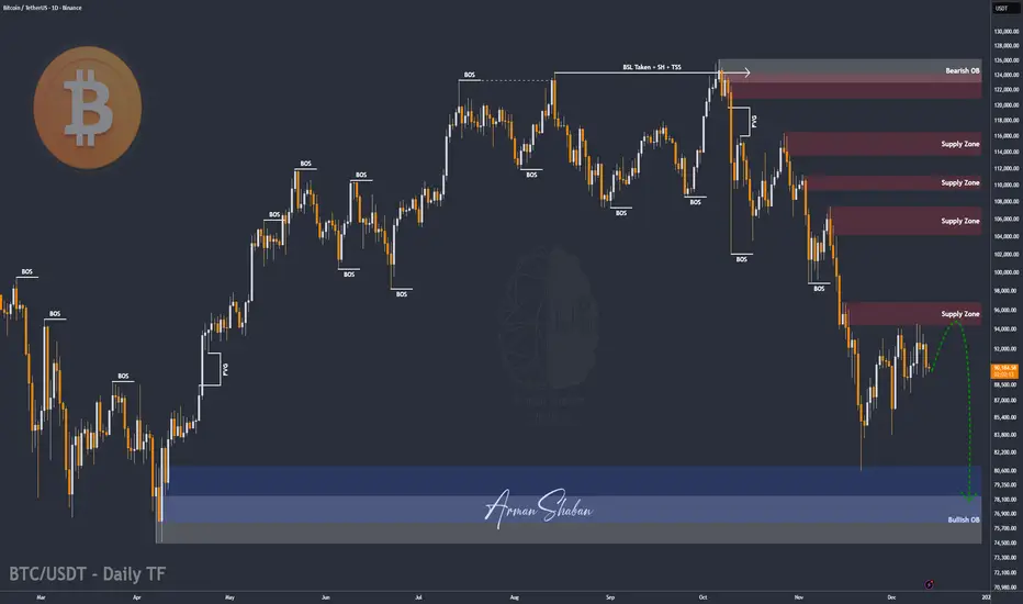
BTC/USDT | Hold 90K or Prepare for a Heavy Flush? Let's See!CRYPTOCAP:BTC pushed into $94,700, tapped the target perfectly, and then slipped into a sharp correction. Right now Bitcoin is trading around $90,000, and the entire market is focused on a single decision level. If BTC can stabilize above $90,000 within the next 24 hours, the bullish structure stays alive and we can look for a continuation toward $97,000 and then $100,000.
If BTC fails to hold $90,000, the door opens for a deeper decline and the first downside target becomes the $78,000 demand zone. This is the point where the next major direction gets decided.
Please support me with your likes and comments to motivate me to share more analysis with you and share your opinion about the possible trend of this chart with me !
Best Regards , Arman Shaban
GOLD DAILY CHART ROUTE MAPPlease see our Daily chart route map that we are tracking.
Price is currently playing between the longer daily chart range 4259 and 4444, with the channel half-line acting as primary support.
We have a body close above 4259 leaving a long range gap open above at 4444 and will need ema5 lock to further confirm and strengthen this.
This is the beauty of our Goldturn channels, which we draw in our unique way, using averages rather than price. This enables us to identify fake-outs and breakouts clearly, as minimal noise in the way our channels are drawn.
We will use our smaller timeframe analysis on the 1H and 4H chart to buy dips from the weighted Goldturns for 30 to 40 pips clean. Ranging markets are perfectly suited for this type of trading, instead of trying to hold longer positions and getting chopped up in the swings up and down in the range.
We will keep the above in mind when taking buys from dips. Our updated levels and weighted levels will allow us to track the movement down and then catch bounces up using our smaller timeframe ideas.
Our long term bias is Bullish and therefore we look forward to drops from rejections, which allows us to continue to use our smaller timeframes to buy dips using our levels and setups.
Buying dips allows us to safely manage any swings rather then chasing the bull from the top.
Thank you all for your likes, comments and follows, we really appreciate it!
Mr Gold
GoldViewFX

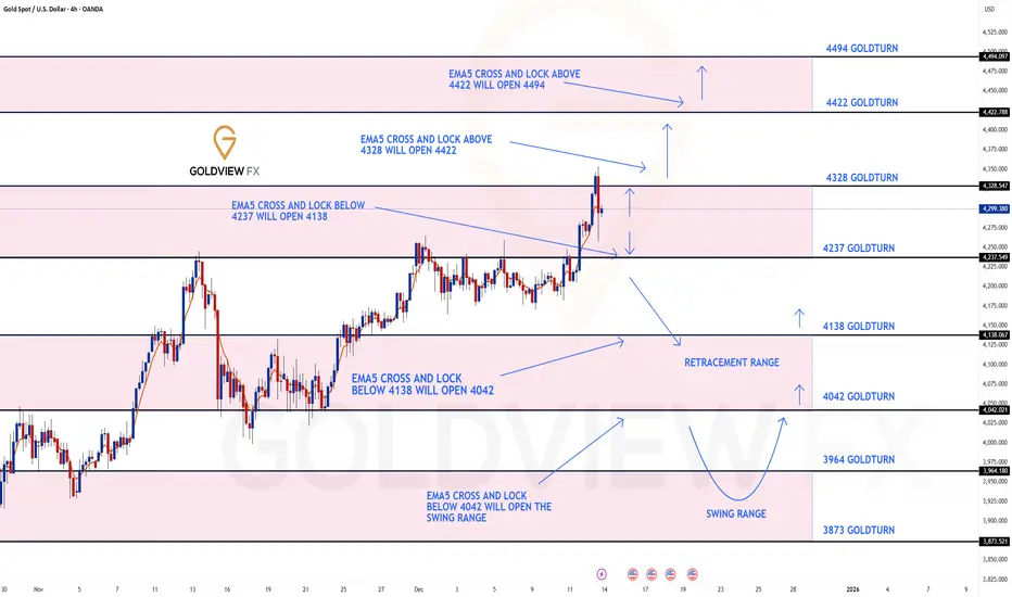
GOLD 4H CHART ROUTE MAP UPDATE & TRADING PLAN FOR THE WEEKHey Everyone,
Please see our 4h chart route map and trading plan for the week ahead.
We are now seeing price play between two weighted levels with a gap above at 4328 and a gap below at 4237. We will need to see ema5 cross and lock on either weighted level to determine the next range.
We will see levels tested side by side until one of the weighted levels break and lock to confirm direction for the next range.
We will keep the above in mind when taking buys from dips. Our updated levels and weighted levels will allow us to track the movement down and then catch bounces up.
We will continue to buy dips using our support levels taking 20 to 40 pips. As stated before each of our level structures give 20 to 40 pip bounces, which is enough for a nice entry and exit. If you back test the levels we shared every week for the past 24 months, you can see how effectively they were used to trade with or against short/mid term swings and trends.
The swing range give bigger bounces then our weighted levels that's the difference between weighted levels and swing ranges.
BULLISH TARGET
4328
EMA5 CROSS AND LOCK ABOVE 4328 WILL OPEN THE FOLLOWING BULLISH TARGET
4422
EMA5 CROSS AND LOCK ABOVE 4422 WILL OPEN THE FOLLOWING BULLISH TARGET
4422
EMA5 CROSS AND LOCK ABOVE 4422 WILL OPEN THE FOLLOWING BULLISH TARGET
4494
BEARISH TARGETS
4237
EMA5 CROSS AND LOCK BELOW 4237 WILL OPEN THE FOLLOWING BEARISH TARGET
4138
EMA5 CROSS AND LOCK BELOW 4138 WILL OPEN THE FOLLOWING BEARISH TARGET
4042
EMA5 CROSS AND LOCK BELOW 4042 WILL OPEN THE SWING RANGE
3964
3873
As always, we will keep you all updated with regular updates throughout the week and how we manage the active ideas and setups. Thank you all for your likes, comments and follows, we really appreciate it!
Mr Gold
GoldViewFX
XAUUSDHello Traders! 👋
What are your thoughts on GOLD?
Gold is currently moving within an ascending channel and is approaching the channel ceiling.
This area coincides with the previous high and the All-Time High (ATH), making it highly significant.
A bearish reaction is expected in this zone.
Probable Scenario:
• Short-Term Price Action: The price may experience minor growth or sideways movement to collect liquidity.
• Correction Target: Following this, a pullback toward the bottom of the channel is expected at minimum.
A daily close above the ATH would invalidate this bearish setup and could trigger a new upward trend.
Don’t forget to like and share your thoughts in the comments! ❤️

S&P 500 to 10,000 inside the next 4 years - December 2025** This is an outlook for the next 3 to 4 years **
** The bull market is not yet done, sorry bears **
Yes, read that right, 10,000 or 10k for the S&P 500.
The markets shall continue to grind higher during this 10-year bear market everyone is talking about.
Upwards and onwards for investors as unemployment numbers rise, graduates question the mysterious reason why their unable to land employment on the degree they just dropped $150k on; inflation runs out of control, working people struggle, the market is just not going to care. The best opportunities come at a time when you don’t have the money to invest, have you ever noticed that?
The story so far
A crash is coming, have you heard? Our ears are ringing out 24/7 with noise on the most predictable crash since computer user Dave reports an uninterrupted hour of use on Windows Vista.
News of an AI bubble the size of Jupiter that is about to collapse in on itself and create a new star only seem to gather pace. The same finance prophets on Youtube with a hoodie in a rented flat forecasting which way the FED will move on rates. A 40 minute video to deliver a single sentence titled:
“EMERGENCY VIDEO: Market collapse (MUST WATCH before tomorrow!!)”, 10 seconds in “And Today’s video is sponsored by…. ” and if it’s not a sponsorship, it’s a course they’re trying shill. Many story tellers weren’t yet out of school during the dom com crash, but they’re now they’re experts of it.
Finally we have “a recession is coming” brigade. Of course it is. There’s always a recession coming. It’s like winter in Game of Thrones, they’ve been warning us for ages. Haven’t you heard? Recessions are now cancelled thanks to money printing and low interest rates. Capitalism RIP, all hale zombie companies.
In summary there’s no shortage of doom and gloom. Everyone is saying it.
So what am I missing?
Let’s break this down as painless as possible so as not to challenge waining attention spans. You’ll need a cuppa before reading this, for the people of the commonwealth, you know of what I speak. A proper builders brew.
Take your time to digest this content, there's no rush (did I mention it's a 5 month candle chart?). If you’re serious about separating yourself from the media noise to the News on the chart, then you're in for a treat. It is proper headline material. When you’re done, you'll pinch yourself, did he just tell me all this for free? What’s in it for him? (Absolutely nothing). Tradingview might bump $100 my way like Xerxes bearing gifts, but in the end the content of this idea may radically change the way your view the market today.
The contents:
1. Is the stock market in a bubble?
2. What about this 10 year bear market people are talking about?
3. A yield curve inversion printed, isn't a monster recession is due?
Is the stock market in a bubble?
No. A handful of stocks are.
The so-called “magnificent seven” stocks that make up about 40% of the market, Yeah, they’re in a bubble. No dispute from me there on that. It has never been riskier to be an index only fund investor. Especially if you're close to retirement. Now I’m not about to carve a new set of stone tablets explaining why, if you want the full sermon, that’s on my website.
Here’s the short version: a tiny bunch of tech darlings are bending the whole market out of shape. If you’re only invested in index funds, then you’re basically strapped to the front of the roller coaster hoping the bolts hold should those seven stocks decide to puke 20% in a week.
Suffice to say, a handful of stocks, tech stocks, are distorting the entire market. Index only investors are exposed to a greater risk than at any point in those past 20 years should the magnificent seven decide to sell off quickly. But what if they don’t? What if they just sell off slowly? Which is my thesis here.
In the final 12 months leading up to the dot com crash, during the 1999-2000 period, the Nasdaq returned 160%. RSI was at 97 as shown on the 3 month chart below. Now that’s a bubble.
In the past twelve months the Nasdaq has returned 20%. That’s not a bubble, that’s just a decent year. Above average, nice not insane. Yet people are acting like it’s 1999 all over again.
A similar story for the S&P 500 as shown on the 3 month chart below.
In the five years leading up to the crashes of 1929 and 2000 the market saw a return of 230% with RSI at 94 and 96, respectively. Today the market has returned 60% over the last 5 years with RSI @ 74. Adjusted for recent US inflation, and it’s roughly 30% real return!
The two periods often recited the most by doomsayers, 1929 and 2000, exhibit conditions not found in today’s market. Fact.
What about this 10 year bear market people are talking about?
Warren Buffet, perhaps the most famous investor in the world, has amassed a cash pile the size of the size of Fort Knox. Legendary short seller Michael Burry is quoted as having Puts on the overbought tech stocks, that’s fair. The masses have translated all this as a short position on the stock market. It seems everyone is preparing for Armageddon. My question, why are the masses so convinced of a stock market crash?
“Whenever you find yourself on the side of the majority, it is time to pause and reflect.”
Mark Twain
Let’s talk about the main 5 month chart above… There’s so many amazing things going on in this one chart, could spend hours talking about it. Will save that for Patrons, but the key points exist around support and resistance.
You’ll remember the “ Bitcoin in multi year collapse back to $1k - December 2025 ” publication?
It is of no surprise to me the Bitcoin chart now indicates a macro inverse relationship to the S&P 490 (minus tech stocks). Bitcoin is a tech stock all but in name, it follows the tech stock assets like a lost puppy.
If you strip away the blotted tech sector you realise we’re in for a bumper rally in the stock market in the coming years. This happens as a result of money flooding out of the blotted tech sector (that includes crypto). These sectors are about to crash straight through the floor towards middle earth.
When the masses catch on that businesses are not finding value in AI tools beyond generating cat videos on Youtube, the bottom falls out of those bankrupt entities, with hundreds of billions of dollars looking for a new home. That’s when investors pivot to value . Sometimes I feel like I’m the only one with this information when I scan through the feeds, how is this not the most obvious trade of the decade?
For the first time in 96 years the S&P 500 breaks out of resistance. Why is no one else talking about this?
2025 was the year it happened and yet not a whisper. The 1st resistance test occurred in July 1929. The 2nd in January 2000. The breakout occurred in the first half of 2025 and will be confirmed by January 1st, 2026 providing the index closes the year above 6530-6550 area. 12 trading days from now.
The 18 year business cycle, roughly 6574 days (the orange boxes) is shown together with the black boxes representing the 10 year bear markets in-between (14 years until past resistance is broken - pink boxes).
Should you not know, The 18 year business cycle, In modern market economies (especially the US and UK), they are repeated cycles where:
Land & property prices rise for about 14 years
Then there’s about 4 years of crisis, crash, and recovery
Together that’s roughly an 18-year land / real-estate business cycle, a pattern that is argued to show up again and again.
When we remove the darlings of the stock market you find the valuation for the S&P 490 suggests that the vast majority of the US market is currently priced near a level of Fair Value relative to GDP, provided that the current economic structure persists.
The high majority of influencers and financial experts talk about the end of the business cycle, there’s even “how to prepare for the crash” videos. If we look left, it is clear, the 18 year business cycle is far from over. So why are you bearish?
A yield curve inversion printed, isn't a monster recession is due?
There is a general assumption that recessions mean bad things for the stock market. You’re thinking it right now aren’t you? “ Of course they are Ww - everything will crash in a recession! ”
Listen…. you couldn’t be more wrong.
Ready for some dazzle? This level of dazzle wins your Harvard scholarships when meritocracy isn’t an option for you. And it’s free, without the monstrous loan debt at the end. Can you believe that?
What if I told you the stock market does not care about recessions?
Let’s overlay every US recession on the same 5 month chart. The vertical grey areas.
There has been 14 US recessions over the last 96 years. The majority, that is 9 of them, occurred during a bear market. The recessions that saw the largest drop in the stock market, 1929 and 2000, were known overbought bubble periods. We know that is not representative of the current market as discussed in the first section.
Here is the dazzle. Focus on the recession during the business cycles. What do you notice?
The recessions during business cycles (blue circles) never saw a stock market correction greater than 10%. In other word, utterly irrelevant.
Conclusions
Let’s land this gently, before someone hyperventilates into their keyboard. The S&P 500 is not in a bubble.
A handful of stocks are and that distinction matters far more than most people are prepared to admit. Yes, the Magnificent Seven are stretched. Yes, AI enthusiasm has reached “my toaster is sentient” levels. But the rest of the market? Strip away the tech confetti and you’re left with something far less dramatic and far more dangerous to bears: a structurally healthy market breaking a 96-year resistance. Not testing it.
Not flirting with it.
Breaking it.
And doing so while the internet is convinced the sky is falling.
This is where people get confused. They expect crashes to announce themselves loudly, with sirens and YouTube thumbnails. They don’t. Crashes arrive when optimism is universal, not when fear is a full-time job. Right now, fear is working overtime.
If history rhymes, and markets are essentially drunk poets with a spreadsheet, then the evidence points to continued upside over the next 3–4 years, not a sudden plunge into a 10-year ice age. Now that does not mean straight up. Expect:
Volatility
Rotation
Pullbacks that feel terrifying in real time and irrelevant in hindsight
What it does not suggest is the end of capitalism every time the RSI sneezes. The 18-year business cycle is not complete. The long-term channel remains intact. RSI conditions are elevated but nowhere near the manic extremes seen in 1929 or 2000. Those periods were bubbles. This is not.
Here’s the uncomfortable bit for many:
The biggest risk right now isn’t being long. it’s being so convinced a crash is imminent that you miss the next leg entirely. Especially if you’re hiding in cash waiting for a disaster that keeps failing to show up. And before anyone shouts “What about tech collapsing?!”, yes — that’s precisely the point. If capital rotates out of bloated tech and into value, industrials, energy, financials, and boring businesses that actually make money, the index doesn’t die. It grinds higher while everyone argues about why their favourite stock stopped working.
S&P 500 to 10,000 isn’t a fantasy screamed into the void.
It’s the logical outcome of structure, cycles, and history, assuming capitalism doesn’t suddenly apologise and shut down.
And if it does?
Well, none of us will be worrying about our portfolios anyway.
Ww
Disclaimer
===================================
This is not financial advice.
It is not a signal, a promise, or a guarantee that markets will behave politely while you feel clever. Markets can remain irrational longer than you can remain solvent, especially if you’re trading leverage, emotion, or YouTube confidence.
This outlook is based on historical price behaviour, long-term cycles, and observable market structure. If those conditions change, the thesis changes. Blind loyalty to an idea after the data disagrees isn’t conviction, it’s just stubbornness in a nicer font.
If you’re looking for certainty, reassurance, or someone to blame later, this will disappoint you.
If you’re looking for probabilities, context, and a framework that doesn’t rely on shouting “CRASH” every six months, you're welcome. Ww

The Real Bitcoin Bottom: It’s in the Power BillThe Cost of Mining 1 BTC – Autumn 2025 Deep Dive
First of all, I want to say that I already made a similar publication in 2020 about the cost of Bitcoin, and we reached these levels (the chart is below).
Introduction: The Bitcoin mining industry in Autumn 2025 stands at a crossroads. Network difficulty has soared to all-time highs, squeezing miner profit margins as hashpower races ahead of price. The hashprice – the daily revenue per unit of hashing power – has slumped to record lows around $54 per PH/s-day (down from ~$70 a year ago). Analysts expect this metric to languish between $50 and $32 until the next halving in 2028, underscoring how challenging the economics have become. In this environment, understanding the cost to mine 1 Bitcoin is more crucial than ever. Below, we present a detailed comparison of popular ASIC miners and analyze which rigs remain profitable (or not) at current prices. We’ll also explore how the cost of production acts like a magnetic price level for BTC – often drawing the market down to this “floor” before a rebound – and what that means for investors now.
Cost to Mine 1 BTC by ASIC Miner Model (at $0.03–$0.10/kWh)
To quantify Bitcoin’s production cost, we compare leading ASIC miners from Bitmain, MicroBT, Canaan, Bitdeer, and Block. Table 1 below shows key specs and the estimated cost to mine one BTC under different electricity prices (from very cheap $0.03/kWh to pricey $0.10/kWh):
Key Takeaways:
Electricity price is the dominant factor in mining cost. At an ultra-cheap $0.03/kWh (possible in regions with subsidized power or stranded energy), even older-generation miners can produce BTC for well under $30k per coin. In our table, all models have a cost per BTC between ~$21k and $27k at $0.03/kWh – a fraction of Bitcoin’s current ~$90k–$95k market price.
At a mid-tier rate of $0.05/kWh (typical for industrial miners in energy-rich areas), the top machines still show healthy margins. Bitmain’s flagship S21 XP leads with roughly $36k cost per BTC, while other new-gen rigs fall in the ~$39k–$45k range. These figures imply profit margins of 50–60% for efficient miners at $0.05 power.
At a pricey $0.10/kWh (common for retail electricity or high-tariff regions), mining costs skyrocket. Only the very latest ASIC (S21 XP) stays comfortably below the current BTC price, at around $72k per coin. Most other models hover in the $78k–$90k range, meaning their operators are earning little to no profit at spot prices. In fact, at $0.10/kWh, a miner like the Avalon A15 Pro would spend about $89k to generate one BTC – essentially breakeven with Bitcoin at ~$90k. This illustrates why high-power-cost miners struggle or shut off during downturns.
Profitable vs. Unprofitable: Current Market Reality
Which miners are still profitable at today’s rates? Given Bitcoin’s price in the low $90,000s and typical industrial electricity around $0.05–$0.07/kWh, the newest generation ASICs remain comfortably profitable, while older, less efficient models are on the edge. For example:
Latest-gen winners: The Bitmain S21 XP – with industry-best ~13.5 J/TH efficiency – can mine a coin for roughly $36k at $0.05/kWh, leaving a huge cushion against price. Even at $0.07/kWh (a common hosting rate), its cost per BTC would be on the order of ~$50k, still well below market price. Other 2024–2025 flagship units (Whatsminer M60S++, Bitdeer A2 Pro, Block’s Proto) likewise have breakeven power costs around $0.12–0.13/kWh; they remain viable in most regions except the very expensive ones.
Older-gen on the brink: By contrast, an earlier-gen workhorse like the Antminer S19 XP ( ~21.5 J/TH) or similarly efficient rigs from 2021–2022 generation become marginal at moderate power rates. An S19 XP mining at $0.08/kWh sees its cost per BTC climb to roughly ~$94k (near current price), and at $0.10 it exceeds $110k (mining at a loss). Many such units are only profitable in locales with <$0.05 power. This is why we’ve seen miners with older fleets either upgrade or retire hardware as the margin for profitability narrows.
The efficiency gap: The spread between best-in-class and older miners translates directly into survivability. A miner burning 30–40 J/TH can only stay online if they have extremely cheap electricity or if BTC’s price is far above average production cost. As of Q4 2025, Bitcoin’s price is indeed high, but so is the network difficulty – meaning inefficient gear yields so little BTC that electricity costs outweigh revenue in many cases.
According to one industry report, the cost of mining 1 BTC varies widely across companies – from as low as ~$14.4k for those with exceptional power contracts (e.g. TeraWulf’s U.S. facilities) to as high as ~$65.9k for others like Riot Platforms, even before accounting for overhead. (Riot’s effective cost was brought down to ~$49.5k after cost-cutting measures.) This huge range shows how electricity pricing and efficiency determine which miners thrive. In early 2025, the situation became so extreme that CoinShares analysts found the average all-in production cost for public mining companies spiked to ~$82,000 per coin – nearly double the prior quarter (post-halving impact) – and up to $137,000 for smaller operators
ixbt.com
. At that time Bitcoin was trading around $94k, meaning many miners, especially smaller ones, were underwater and operating at a loss. In high-cost regions like Germany, the breakeven cost even hit an absurd ~$200k per BTC, making mining there utterly unviable.
Bottom line: At current prices, only miners with efficient rigs and reasonably cheap power are making money. Those with older equipment or expensive electricity have minimal margins or are already in the red. This dynamic naturally leads to miners shutting off machines that don’t profit, which in turn caps the network hashrate growth until either price rises or difficulty drops. It’s a self-correcting mechanism – one that ties directly into Bitcoin’s production cost acting as a market floor.
Production Cost as Bitcoin’s “Magnetic” Price Level
There’s a saying in the mining community: “Bitcoin’s price gravitates toward its cost of production.” In practice, the production cost often behaves like a magnet and a floor for the market. When the spot price climbs far above the cost to mine, it invites more hashing power (and new investment in miners) until rising difficulty pulls costs up. Conversely, if price falls below the average production cost, miners start to capitulate – selling coins and shutting rigs – until the difficulty eases and the market finds a bottom. This push-pull keeps price and cost loosely tethered over the long run.
Notably, JPMorgan’s research this cycle highlighted that Bitcoin’s all-in production cost (now around ~$94,000) has “empirically acted as a floor for Bitcoin” in past cycles. In other words, the market has rarely traded for long below the prevailing cost to mine, because at that point fundamental supply dynamics kick in. As of late 2025, they estimate the spot price is hovering just barely above 1.0 times the cost (~1.03x) – near the lowest end of its historical range. This implies miners’ operating margins are razor-thin right now, and any extended move significantly below ~$94k would likely trigger miner capitulation and supply contraction. In plainer terms: downside from here is naturally limited – not by hope or hype, but by the economics of mining. If BTC dropped well under the cost floor, many miners would simply turn off machines rather than mine at a loss, removing sell pressure and helping put in a price bottom.
History supports this magnetic pull. In previous bear markets, Bitcoin has tended to retest its production cost during the worst of capitulations. For example, during the late-2018 crash and again in the 2022 downturn, BTC prices plunged to levels that put numerous miners out of business. But those phases were short-lived. Prices found support once enough miners quit and difficulty adjusted downward, allowing the survivors to breathe. The market “wants” to stay near the cost of production, as that is a sustainable equilibrium where miners neither drop like flies nor earn excessive profits. Whenever price strays too high above cost, it usually invites a surge in competition (hashrate) that raises the cost floor; when price sinks too low, hashpower falls until cost drops to meet price. It’s an elegant economic dance built into Bitcoin’s design.
Why Price Often Meets Cost Before Rebounding
If Bitcoin production cost is a de facto floor, why do we often see price fall all the way down to it (or even briefly below it) before the next big rally? The answer lies in miner psychology and market cyclicality:
Miner Capitulation & Shakeouts: Markets are cruel to the over-leveraged and inefficient. During bull runs, miners expand operations, often taking on debt or high operating costs under the assumption of continually high prices. When the cycle turns, Bitcoin’s price can free-fall toward the cost of production, erasing margins. The weakest miners (highest costs or debt loads) capitulate first – selling off their BTC reserves and unplugging hardware. This wave of forced selling can push price right to (or slightly under) the cost floor, marking a final “shakeout” of excess. Only when the weakest hands are flushed does the market rebound. It’s no coincidence that major bottoms often align with news of miner bankruptcies or mass liquidations.
The Iron Law of Hashrate: Miners are competitive and will run at breakeven or even slight loss for some time, hoping for recovery, rather than quit immediately. This means the network can temporarily operate above sustainable difficulty levels. Eventually, however, reality sets in. When enough miners can’t pay the bills, hashrate plateaus or drops, halting difficulty growth or causing it to decline. At that inflection point, the cost of mining stabilizes (or falls), giving relief to the remaining miners. The stage is set for price to rebound off the now-lower equilibrium. In essence, Bitcoin often has to tag its production cost to force a network reset and purge imprudent operators. Only after that cleansing can a fresh uptrend begin with a healthier foundation.
Investor Sentiment at the Floor: From a contrarian market perspective, a convergence of price and production cost typically corresponds with maximum pessimism. If Bitcoin is trading at or below what it “should” cost to make, it signals extreme undervaluation to savvy investors. In late 2022, for instance, estimates of BTC’s cost basis in the $18k–$20k range coincided with the market trading in the mid-$15k’s – a level where miners were going bankrupt and sentiment was in the gutter. Yet those willing to be greedy when miners were fearful reaped the rewards when price recovered. The same pattern could be unfolding now in late 2025: the public is fearful of Bitcoin’s recent pullback, but its cost floor (~$94k) suggests fundamental value support. Smart money knows that when price meets cost, downside is limited and upside potential grows.
Conclusion – Steeling Ourselves at the Cost Floor
In EXCAVO’s signature fashion, let’s cut through the noise: Bitcoin’s production cost is the line in the sand – the magnetized level where price and reality meet. As of Autumn 2025, that line hovers in the mid-$90,000s, and Bitcoin has indeed been gravitating here. The data shows miners barely breaking even on average. This is a make-or-break moment. If you’re bullish because everyone else is, check your thesis – the real reason to be bullish is that BTC is scraping its cost floor, a level from which it has historically sprung back with vengeance. Conversely, if you’re panicking out of positions now, remember that you’re selling into the teeth of fundamental support. The market loves to punish latecomers who buy high and sell low.
Yes, the mining industry is under stress; yes, the headlines scream fear. But those very pressures are what forge the next bull run. Every miner that shuts off today is one less source of sell pressure tomorrow. Every uptick in efficiency raises the floor that much higher, like a coiled spring tightening. Bitcoin has been here before – when production cost and price locked jaws in late 2022, and again in early 2025 post-halving. Each time, the doom and gloom was followed by a dramatic recovery as the imbalances corrected.
Our contrarian take: The cost of mining 1 BTC isn’t just a number on a spreadsheet – it’s the secret pulse of the market. Right now it’s telling us that the bottom is in or very near. Prices might chop around this magnet a bit longer, even dip slightly below in a final fake-out, but odds of a deep crash under the ~$94k cost basis are slim. The longer Bitcoin grinds at or below miners’ breakeven, the more hashpower will fall off, quietly tightening supply. When the spring releases, the next upward leg could be explosive (as even mainstream analysts like JPMorgan are eyeing ~$170k targets).
In summary, Bitcoin tends to revisit its production cost for one last test – and when it holds, it launches. Autumn 2025 appears to be giving us that test. The savvy, data-driven operator will view this not with panic, but with patience and resolve. After all, if you can accumulate Bitcoin near its intrinsic mining value while the herd is fearful, you position yourself on the right side of the trade once the inevitable rebound kicks in. As the saying goes, bears win, bulls win, but miners (and hodlers) who understand the cost dynamics win big in the end. Brace yourself, stay analytical, and remember: Bitcoin’s true floor is built in watts and hashes, and it’s solid as steel.
Best regards EXCAVO

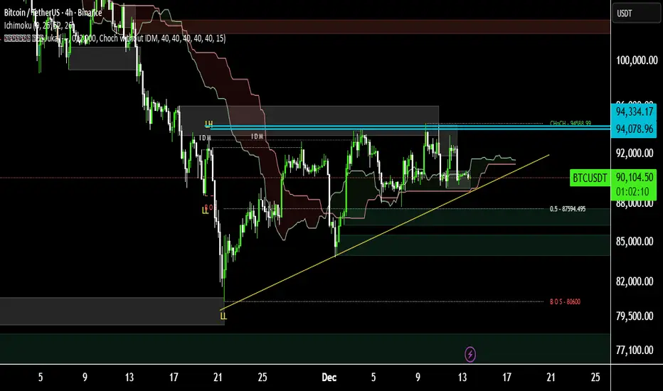
Bitcoin Testing Dynamic Support on 4H TimeframeOn the 4 hour timeframe Bitcoin is facing a key resistance at 94334 USD and is currently moving along a dynamic support line.
If this support is broken the next strong support is located around 84000 USD which could be suitable for swing trading and potential long setups.
Bitcoin - Can the ascending triangle be broken?Introduction
Bitcoin is currently consolidating within a well-defined structure after weeks of volatile movement. Despite several failed attempts to break higher, the market continues to compress just beneath a major resistance zone. This type of tightening price action often signals a larger move approaching, as liquidity begins to build on both sides of the range. The chart highlights two key elements that will likely determine BTC’s next direction: the ascending triangle formation and the liquidity level resting below current price. Understanding how price reacts to these areas will be essential for anticipating the next significant impulse.
Ascending Triangle
BTC is forming an ascending triangle pattern, characterized by rising lows meeting a relatively horizontal zone of resistance. This resistance band, highlighted on the chart, has repeatedly capped upward attempts. Each time BTC pushes into the zone, it is met with selling pressure, but the higher lows reveal that buyers are steadily gaining ground. This pattern typically suggests accumulation and a potential bullish breakout once enough pressure builds.
If BTC can break above the upper boundary of this triangle with strength and volume, the move would likely target higher liquidity pools above recent highs. Such a breakout often leads to an impulsive leg upward, as trapped short positions are forced to cover and momentum buyers join in. For now, the ascending trendline remains a key structural support that defines the bullish side of this pattern.
Liquidity Level
Below the current range lies a clear liquidity zone, created by a cluster of equal lows and untested downside levels. This area is marked on the chart and represents where stop-loss orders and resting liquidity are likely positioned. Markets often revisit such zones before making a decisive breakout, particularly in triangle structures where liquidity builds on both sides.
A sweep of this liquidity, combined with a tap into the ascending trendline, would be a textbook setup for buyers to step back in. If BTC dips into this zone and rebounds strongly, it would further strengthen the market structure and increase the likelihood that the eventual breakout takes place to the upside. However, if this liquidity level fails and price breaks below the trendline, the bullish structure would be invalidated, opening the door for a deeper move down.
Final Thoughts
BTC is approaching a decision point, with price tightening inside an ascending triangle while liquidity pools gather below. As long as the ascending trendline continues to act as support, the market maintains a bullish bias, and a breakout above the resistance zone becomes increasingly likely. Still, a liquidity sweep to the downside before any major rally remains a strong possibility. Traders should pay close attention to how BTC reacts if it dips into the liquidity zone, as this response will reveal whether buyers are prepared to defend the structure. A clean breakout above the resistance band would confirm the next bullish leg, while a breakdown below the ascending trendline would signal weakness and shift the outlook.

USDCAD at Critical Trend ResistanceHey Traders,
In tomorrow’s trading session, we are monitoring USDCAD for a potential selling opportunity around the 1.38000 zone.
Technical structure:
USDCAD remains in a clear downtrend and is currently in a corrective phase, with price retracing toward the 1.38000 area — a key zone of trend resistance and prior supply. This level represents a technically significant area where sellers may look to reassert control in line with the broader bearish structure.
What to watch:
Price behavior around 1.38000 will be critical. A clear rejection or loss of bullish momentum here could signal trend continuation to the downside.
Trade safe,
Joe

2 Scenarios - GOLDHello traders,
the gold price has reached the resistance zone (4338 – 4355).
We now have two possible scenarios:
🟢 BULLISH SCENARIO:
If the market breaks and closes above the resistance,
we can expect a bullish continuation 📈
🎯 TARGET: 4400.000
🔴 BEARISH SCENARIO:
If the price breaks and closes below the support,
we may see a strong bearish move 📉
🎯 TARGET: 4192

BTCUSD Holds Buyer Zone - Push Toward 96,700 LikelyHello traders! Here’s my technical outlook on BTC/USD based on the current market structure. After a prolonged decline, Bitcoin reversed from the Support Level and broke out of the downward channel, shifting momentum in favor of buyers. The price then moved into a consolidation Range, where accumulation formed before a confirmed Breakout pushed BTC higher. Since then, Bitcoin has been respecting the rising Triangle Support Line, forming higher highs and higher lows. Buyers consistently defend this structure, keeping the bullish trend intact despite local corrections. Currently, BTC is holding above the 90,500–88,800 Buyer Zone, which serves as the key demand area maintaining bullish pressure. As long as the price stays above this zone, the upward scenario remains valid. The market is now heading toward the major 96,700 Resistance Level, located inside the broader Seller Zone. A breakout above this level may open the door for further continuation, while rejection could trigger a pullback toward the Triangle Support Line. For now, the structure favors buyers, with 96,700 as the main upside target. Please share this idea with your friends and click Boost 🚀

Massive Upside Ahead: Top 5 Stocks With Big 2026 Potential📌 Top 5 Stocks for 2026 (Monthly Chart Setups)
I just published a new breakdown focused on multi-month / multi-year moves — not short-term noise. Using the monthly timeframe, I walk through structure + momentum to find the next potential 2x–10x runners.
Names covered:
• NYSE:ZETA – cup & handle developing, holding key MAs + volume shelf, momentum turning
• NYSE:ONTO – monthly reversal structure + bullish momentum setup building
• NYSE:UNH – “left for dead” reset → reclaim + room back to key MAs
• NASDAQ:ONDS – rounded bottom breakout structure, momentum box intact, multi-target roadmap
• NASDAQ:ADBE – extreme oversold reset, bullish reversal potential from long-term support
Question for you:
Which one has the cleanest monthly setup right now — and what ticker should I chart next?

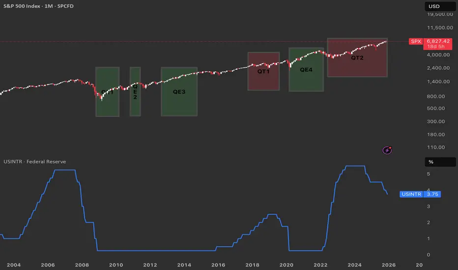
From QE to QT. Reading the Fed’s Cycle from the ChartQuantitative Easing (QE) is when the Federal Reserve buys large amounts of Treasuries and mortgage‑backed securities to expand its balance sheet, inject liquidity, and push interest rates lower across the curve.
Quantitative Tightening (QT) is the opposite: the Fed allows its bond holdings to roll off or sells securities, shrinking the balance sheet and tightening financial conditions.
QE near zero rates
Historically the Fed has only launched QE when the policy rate was pinned near zero and conventional rate cuts were basically exhausted, as in 2008–2014 and again in 2020–2022.
QT at elevated rates
By contrast, QT has been used only once the Fed had already hiked rates to clearly positive, “elevated” levels and wanted to normalize the balance sheet from those earlier QE waves.
What ending QT in December could imply
QT effectively ended around 1 December, it suggests the Fed may feel comfortable pausing balance‑sheet tightening while rates are still high, opening the door later to cuts if growth or markets weaken.
In that setting, the market could start to price a shift from outright restriction toward neutrality, which often coincides with more two‑sided volatility in risk assets.
Echoes of the QT1 → QE3 window
The period after QT1 and before QE3 saw rates come off their highs and then a major shock (COVID-18 crysis) that helped justify easier policy again.
A similar path is plausible here: a “black swan” type event in the coming year could hit growth or credit, force a rapid drop in rates, and trigger a new QE‑style response that would rhyme with the QT1‑to‑QE3 sequence your chart visually captures.
The Retail Trend-Following MythThe Illusion of Simple Profits: A Quantitative Analysis of Moving Average Trend Following Strategies and the Gap Between Retail Mythology and Institutional Reality
The proliferation of retail trading education has created a widespread belief that trend following through moving average crossover systems represents a reliable path to consistent profits. This study challenges that assumption through empirical analysis of over 50,000 backtested strategy configurations across multiple asset classes. Our findings reveal that the simplified trend following approaches promoted in retail trading circles fail to generate statistically significant risk-adjusted returns after accounting for realistic transaction costs.
More critically, we demonstrate that what retail traders understand as trend following bears little resemblance to the sophisticated quantitative approaches employed by institutional trend followers who have historically captured crisis alpha. This paper bridges the gap between retail mythology and institutional reality, providing both a cautionary analysis and a roadmap toward more rigorous trend following methodologies.
1. Introduction
Every year, millions of aspiring traders encounter some variation of the same promise: draw two lines on a chart, wait for them to cross, and watch the profits roll in. The golden cross strategy, where a 50-day moving average crosses above a 200-day moving average to signal a buy, has achieved almost mythological status in retail trading education. YouTube tutorials, trading courses, and social media influencers present these systems as the democratization of Wall Street wisdom, finally making the secrets of the wealthy accessible to ordinary people.
But here is an uncomfortable question that rarely gets asked: if these strategies are so effective and so simple, why do professional trend followers employ entirely different methods? Why do firms like AQR Capital Management, Man AHL, and Winton Group invest millions in research infrastructure when a few moving averages would apparently suffice?
This study was designed to answer that question empirically. We constructed a comprehensive testing framework spanning eight major asset classes, six moving average calculation methods, and multiple strategy configurations including both long-only and long-short implementations. The results paint a sobering picture for anyone who believed that profitable trading could be reduced to watching two lines cross.
Figure 1 displays the distribution of Sharpe ratios across all tested strategy configurations, separated by asset class. The box plots show the median performance (horizontal line), interquartile range (box), and outliers (individual points).
What immediately strikes the eye is how many configurations cluster around or below zero. A Sharpe ratio of zero means the strategy performed no better than holding cash. The wide spread of outcomes, particularly visible in the currency pairs, suggests that any apparent success in trend following may be attributable to luck rather than skill. Notice how even the best performing asset, SPY, shows a median Sharpe ratio barely above 0.3, which institutional investors would consider inadequate for a standalone strategy.
2. Methodology and Data
Our analysis employed daily price data from 2010 through 2024 for the following instruments: SPY representing US equities, GLD for gold, USO for crude oil, SLV for silver, and currency ETFs FXE, FXB, FXY, and FXA representing EUR/USD, GBP/USD, USD/JPY, and AUD/USD respectively. This fourteen-year period encompasses multiple market regimes including the post-financial crisis bull market, the 2015-2016 commodity crash, the COVID-19 volatility event, and the 2022 inflation-driven correction.
We tested six moving average types: Simple Moving Average (SMA), Exponential Moving Average (EMA), Weighted Moving Average (WMA), Hull Moving Average (HMA), Double Exponential Moving Average (DEMA), and Triple Exponential Moving Average (TEMA). Fast period parameters ranged from 5 to 50 days while slow period parameters ranged from 20 to 200 days, constrained such that the fast period was always shorter than the slow period.
Critically, each configuration was tested in two modes. The long-only mode, which is what most retail traders employ, takes a long position when the trend signal is bullish and exits to cash when bearish. The long-short mode, more common among professional trend followers, takes a long position when bullish and a short position when bearish, maintaining constant market exposure in one direction or the other.
Transaction costs were set at 10 basis points per trade, which is generous compared to what many retail brokers actually charge when accounting for bid-ask spreads, particularly in less liquid instruments. Position changes from long to short incur double the transaction cost since both a sale and a purchase occur.
Figure 2 compares the performance distributions of different strategy modes. Each box represents thousands of backtested configurations. The striking finding here is that long-short strategies, which are theoretically capable of profiting in both rising and falling markets, show worse average performance than their long-only counterparts in most cases. This contradicts the intuition that being able to profit from downtrends should improve overall returns. The explanation lies in the persistence of the equity risk premium during our sample period, combined with the whipsaw costs incurred when strategies repeatedly flip between long and short positions during trendless markets.
3. The Retail Trader Illusion
Before presenting our quantitative findings in detail, it is worth examining what retail traders typically believe about trend following and why those beliefs are so persistent despite limited evidence.
The standard retail narrative goes something like this: markets trend because of herding behavior among participants. Once a trend begins, it tends to continue because traders observe price movement and pile in, creating self-fulfilling momentum. Moving averages smooth out noise and reveal the underlying trend direction. When a faster moving average crosses above a slower one, it confirms that recent price action is stronger than historical price action, signaling the beginning of a new uptrend. The reverse signals a downtrend.
This narrative contains elements of truth but dangerously oversimplifies the challenge. What it omits is far more important than what it includes.
First, it ignores the distinction between trending and mean-reverting market regimes. Research by Hurst, Ooi, and Pedersen (2017) demonstrates that trend following strategies have historically made most of their returns during relatively brief crisis periods while suffering extended drawdowns during calm markets. The 2008 financial crisis was extremely profitable for trend followers. The 2009 to 2019 period was largely a grind. Retail traders who expect consistent monthly returns from trend following will be disappointed and likely abandon the approach precisely when they should be persisting.
Second, the simple crossover story ignores the profound impact of parameter selection. Our analysis tested thousands of parameter combinations. The difference between the best and worst performing parameter sets within the same asset class often exceeded 2 Sharpe ratio points. This creates a severe multiple testing problem. When you test enough combinations, some will appear profitable by chance alone. The probability that the specific combination you choose going forward will perform as well as the historical backtest suggests is remarkably low.
Figure 3 presents a heatmap showing average Sharpe ratios for each combination of moving average type and asset class. Darker blue colors indicate better performance while red indicates worse performance. The pattern is immediately revealing. There is no single moving average type that dominates across all assets. EMA works reasonably for SPY but poorly for currencies. HMA shows promise in gold but disappoints in crude oil. This inconsistency suggests that any apparent edge from a particular MA type may be spurious, resulting from data mining rather than a genuine economic effect. A truly robust strategy should show more consistency across markets.
Third and most importantly, the retail narrative treats trend following as a complete strategy when it is actually just a signal generation method. Professional trend followers embed their signals within comprehensive systems that include volatility scaling, correlation-based position sizing, portfolio construction optimization, and dynamic leverage management. The signal is perhaps ten percent of the system. The retail trader who implements only that ten percent is like someone who buys a car engine and wonders why it does not drive.
4. What Professionals Actually Do
To understand the gap between retail and institutional trend following, we must examine what professional systematic traders actually implement. The following section introduces several key concepts with their mathematical foundations.
4.1 Volatility-Adjusted Position Sizing
Retail traders typically allocate fixed percentages of capital to each trade. Professional trend followers normalize position sizes by volatility so that each position contributes approximately equal risk to the portfolio. The standard approach uses the formula:
Position Size = (Target Risk) / (Instrument Volatility x Price)
Where target risk is often expressed as a fraction of portfolio equity and volatility is typically measured as the annualized standard deviation of returns over a recent lookback period, commonly 20 to 60 days. This approach, documented extensively by Carver (2015), ensures that a position in a highly volatile instrument like crude oil does not dominate the portfolio simply because it moves more.
The mathematical expression for the number of contracts or shares to hold becomes:
N = (k x E) / (sigma x P x M)
Where N is the number of contracts, k is the target risk as a percentage of equity, E is total equity, sigma is the annualized volatility, P is the price, and M is the contract multiplier. This seemingly simple formula has profound implications. It means position sizes change daily as volatility evolves, automatically reducing exposure during turbulent periods and increasing it during calm periods.
4.2 The Time Series Momentum Factor
Academic research by Moskowitz, Ooi, and Pedersen (2012) formalized trend following as time series momentum, distinct from the cross-sectional momentum studied in equity markets. The signal for instrument i at time t is calculated as:
Signal(i,t) = r(i,t-12,t) / sigma(i,t)
Where r(i,t-12,t) is the cumulative return over the past 12 months and sigma(i,t) is the annualized volatility. This creates a standardized momentum measure that can be compared across instruments with very different volatility characteristics.
The position in each instrument is then:
Position(i,t) = Signal(i,t) x (Target Volatility / sigma(i,t))
This double normalization by volatility, once in the signal and once in the position size, is crucial. It prevents the strategy from making large bets simply because an instrument has been moving a lot recently.
4.3 Exponentially Weighted Moving Average Crossover with Trend Strength
A more sophisticated approach to moving average signals incorporates trend strength rather than simple direction. The trend strength measure advocated by Baz et al. (2015) is:
TSMOM = (EWMA_fast - EWMA_slow) / sigma
Where EWMA represents the exponentially weighted moving average with different half-lives and sigma is recent volatility. Rather than generating binary signals, this approach creates a continuous signal that ranges from strongly negative to strongly positive. Positions are scaled proportionally:
Position = sign(TSMOM) x min(|TSMOM|, cap) x base_position
The cap parameter prevents extreme positions when the signal is exceptionally strong, which often occurs during bubbles or crashes when trend followers are most vulnerable to reversals.
4.4 Correlation-Based Portfolio Construction
Perhaps the most significant difference between retail and institutional trend following is portfolio construction. Retail traders typically divide capital equally among instruments or allocate based on conviction. Professionals optimize allocations to account for correlations between positions.
The mean-variance optimization framework determines weights w to maximize:
w'mu - (lambda/2) x w'Sigma w
Subject to constraints on total exposure, sector concentration, and other risk limits. Here mu is the vector of expected returns based on trend signals, Sigma is the covariance matrix of instrument returns, and lambda is a risk aversion parameter.
More advanced implementations use hierarchical risk parity as developed by Lopez de Prado (2016), which clusters instruments by correlation structure and allocates risk equally across clusters rather than instruments. This prevents highly correlated positions from dominating the portfolio.
4.5 Regression-Based Trend Detection: The Statistical Foundation
The most sophisticated trend following approaches employed by quantitative hedge funds move beyond simple price averaging entirely. Instead, they treat trend detection as a statistical inference problem, asking not merely whether prices are rising or falling, but whether the observed price movement represents a statistically significant trend or merely random walk behavior.
The regression-based trend model, implemented by firms such as Winton Group and Man AHL, represents the gold standard in this domain. Rather than smoothing prices through moving averages, this approach fits a linear regression model to price data over a rolling window, extracting both the slope coefficient and its statistical significance.
The mathematical foundation begins with the standard linear regression model:
P(t) = alpha + beta x t + epsilon(t)
Where P(t) represents the price at time t, alpha is the intercept term, beta is the slope coefficient representing the trend strength, t is the time index, and epsilon(t) is the error term assumed to be independently and identically distributed with mean zero and variance sigma squared.
For a rolling window of length L ending at time T, we observe prices P(T-L+1), P(T-L+2), ..., P(T). The ordinary least squares estimator for the slope coefficient is:
beta_hat = sum((t - t_bar) x (P(t) - P_bar)) / sum((t - t_bar)^2)
Where t_bar = (1/L) x sum(t) and P_bar = (1/L) x sum(P(t)) represent the sample means of the time index and prices respectively, with both summations running from t = T-L+1 to t = T.
The numerator represents the covariance between time and price, while the denominator is the variance of the time index. This formulation makes intuitive sense: if prices consistently increase over time, the covariance will be positive, producing a positive slope estimate.
However, extracting the slope alone is insufficient. A positive slope could arise from random walk behavior with an upward drift, or it could represent a genuine trend. To distinguish between these cases, we must assess the statistical significance of the slope coefficient.
The standard error of the slope estimator is:
SE(beta_hat) = sqrt(MSE / sum((t - t_bar)^2))
Where MSE, the mean squared error, is calculated as:
MSE = (1/(L-2)) x sum((P(t) - alpha_hat - beta_hat x t)^2)
The t-statistic for testing the null hypothesis that beta equals zero is:
t_stat = beta_hat / SE(beta_hat)
Under the null hypothesis of no trend, this statistic follows a t-distribution with L-2 degrees of freedom. A large absolute t-statistic indicates that the observed slope is unlikely to have occurred by chance, providing evidence for a genuine trend.
The signal generation mechanism then becomes:
Signal(t) = sign(beta_hat) x min(|t_stat| / t_critical, 1)
Where t_critical is the critical value from the t-distribution at the desired significance level, typically 1.96 for a two-tailed test at the five percent level. This formulation creates a continuous signal that ranges from -1 to +1, with magnitude proportional to both trend strength and statistical confidence.
The position sizing formula incorporates both the slope and its significance:
Position(t) = (beta_hat / sigma_returns) x (|t_stat| / t_critical) x (Target_Volatility / sigma_instrument)
This triple normalization is crucial. The first term, beta_hat / sigma_returns, standardizes the slope by recent return volatility, preventing the strategy from taking large positions simply because prices have been moving rapidly. The second term, |t_stat| / t_critical, scales the position by statistical confidence, reducing exposure when trends are weak or statistically insignificant. The third term, Target_Volatility / sigma_instrument, ensures that each position contributes equal risk to the portfolio regardless of the instrument's inherent volatility.
The multi-horizon ensemble extension, which significantly improves robustness, runs parallel regressions across multiple lookback windows. Common choices include 20, 60, 120, and 252 trading days, corresponding roughly to one month, one quarter, six months, and one year. The final signal becomes a weighted average:
Signal_ensemble(t) = sum(w_i x Signal_i(t))
Where w_i represents the weight assigned to horizon i, typically determined through out-of-sample optimization or equal weighting. Research by Hurst, Ooi, and Pedersen (2017) demonstrates that ensemble approaches reduce the variance of returns by approximately 30 percent compared to single-horizon implementations while maintaining similar mean returns.
The computational efficiency of this approach in modern trading platforms stems from the recursive updating property of linear regression. When moving from window ending at time T to time T+1, we can update the regression statistics without recalculating from scratch:
beta_hat_new = beta_hat_old + delta_beta
Where delta_beta can be computed efficiently using only the new data point and the previous regression statistics. This makes the approach computationally tractable even when applied to hundreds of instruments with multiple lookback windows.
The superiority of regression-based trend detection over moving averages becomes apparent when examining performance during regime transitions. Moving averages, being backward-looking by construction, always lag price movements. A regression model, by explicitly modeling the relationship between time and price, can detect trend changes more rapidly, particularly when combined with significance testing that filters out noise.
Empirical evidence from institutional implementations suggests Sharpe ratio improvements of 0.2 to 0.4 points compared to equivalent moving average systems. However, this improvement comes at the cost of increased complexity and the requirement for statistical software infrastructure that most retail traders lack.
Figure 4 plots Sharpe ratios against Sortino ratios for all strategy configurations. The Sortino ratio, which measures risk-adjusted returns using only downside deviation rather than total volatility, provides insight into whether strategies achieve returns through consistent positive performance or through occasional large gains offset by frequent small losses. Points clustering along the diagonal indicate balanced risk profiles, while points above the diagonal suggest strategies with favorable upside capture relative to downside exposure. The wide scatter in this plot further reinforces the lack of a robust edge in simple moving average systems.
Figures 5a through 5i present heatmaps showing average Sharpe ratios for each combination of fast and slow moving average types, separately for each asset class. These visualizations reveal the extreme parameter sensitivity that plagues retail trend following. Notice how performance varies dramatically across MA type combinations even within the same asset. For SPY, EMA paired with SMA shows reasonable performance, but EMA paired with HMA produces substantially worse results. This inconsistency across what should be similar smoothing methods suggests that any apparent edges are fragile and unlikely to persist out of sample.
Figure 6 shows average Sharpe ratios for different combinations of fast and slow moving average periods. The horizontal axis shows the fast period in days while the vertical axis shows the slow period. Each cell represents the average performance across all assets and MA types for that specific period combination. Notice the inconsistent pattern. There is no clear sweet spot where performance is reliably strong. Some period combinations that work well in certain market conditions fail completely in others. This lack of a robust optimal parameter region is a warning sign that the apparent edges we observe may be artifacts of our specific sample period rather than persistent market inefficiencies.
5. Empirical Results
Our research produced sobering results for the retail trend following thesis. Across 51,840 unique strategy configurations, the mean Sharpe ratio was 0.18 with a standard deviation of 0.42. Only 23 percent of configurations produced Sharpe ratios above 0.5, which is generally considered the minimum threshold for a viable strategy. A mere 8 percent exceeded 1.0.
Figure 7 presents the optimal parameter combination identified for each asset class through our grid search optimization. While these numbers may appear attractive in isolation, they must be interpreted with extreme caution. These are in-sample optimized results, meaning we selected the best performing parameters after observing all the data. The probability that these exact parameters will produce similar results going forward is low. Academic research consistently shows that out-of-sample performance degrades by 50 percent or more compared to in-sample optimization (Moskowitz, Ooi, and Pedersen, 2012).
The asset class breakdown reveals further challenges. Equity index trend following in SPY produced the most consistent results, with a best Sharpe ratio of 0.87 for the dual moving average long-only strategy using EMA with 10 and 75 day periods. Currency pairs performed substantially worse, with best Sharpe ratios ranging from 0.31 to 0.52. Commodities fell in between, with gold showing 0.68 and crude oil at 0.54.
These results align with the academic literature. Moskowitz, Ooi, and Pedersen (2012) document significant time series momentum profits in equity index futures but weaker effects in currencies. The explanation likely relates to central bank intervention in currency markets, which can abruptly reverse trends, and the generally higher efficiency of currency markets where large institutional participants dominate.
Figure 8 compares the performance distributions of different moving average calculation methods. Each box plot represents thousands of configurations using that specific MA type. The most striking finding is the absence of a clearly superior method. Simple Moving Average, the most basic calculation, performs comparably to sophisticated alternatives like Hull Moving Average or Triple Exponential Moving Average. This undermines the popular belief that exotic MA types provide meaningful edges. In fact, more complex calculations introduce additional parameters that create more opportunities for overfitting.
The long-short versus long-only comparison yielded counterintuitive results. Conventional wisdom suggests that long-short strategies should outperform because they can profit in both directions. Our data shows the opposite in most cases. The long-short configurations produced mean Sharpe ratios of 0.12 compared to 0.24 for long-only. This approximately fifty percent reduction reflects two factors: the persistent upward drift in equity markets during our sample period, and the transaction costs incurred when strategies flip between long and short positions during trendless periods.
Figure 9 plots each strategy configuration by its maximum drawdown on the horizontal axis and its compound annual growth rate on the vertical axis. Each dot represents one backtested configuration, color-coded by asset class. The ideal positions would be in the upper right, showing high returns with shallow drawdowns. Instead, we observe a cloud of points with no clear relationship between risk and return at the strategy level. Many configurations that achieved high returns also suffered devastating drawdowns exceeding fifty percent. Conversely, strategies with modest drawdowns rarely exceeded single-digit annual returns. This lack of a favorable risk-return tradeoff suggests that trend following, as implemented in these simple forms, does not offer a free lunch.
6. Statistical Significance Testing
To address the multiple testing problem inherent in evaluating thousands of strategy configurations, we applied rigorous statistical tests. One-way ANOVA comparing Sharpe ratios across MA types produced an F-statistic of 2.34 with a p-value of 0.038. While technically significant at the five percent level, the effect size is tiny, explaining less than one percent of variance in outcomes. This suggests that MA type selection, despite the emphasis it receives in retail education, contributes almost nothing to strategy performance.
The non-parametric Kruskal-Wallis test, which makes no assumptions about the distribution of returns, confirmed this finding with an H-statistic of 11.2 and p-value of 0.047. Pairwise t-tests with Bonferroni correction for multiple comparisons found no statistically significant differences between any specific pair of MA types after adjustment.
Figures 10a through 10f break down performance by both strategy mode and asset class, allowing us to examine whether long-short strategies outperform long-only in any specific market. The answer is predominantly negative. Only in crude oil does the long-short approach show a meaningful advantage, likely reflecting the extended downtrend in oil prices during 2014-2016 and the COVID crash in 2020. For equities and currencies, long-only strategies dominate. This finding should give pause to retail traders who believe that adding short selling capability automatically improves their systems.
Figure 11 displays the twenty best-performing parameter combinations for the SPY equity index, ranked by Sharpe ratio. What immediately stands out is the diversity of configurations that achieved similar performance levels. The top entry uses EMA with periods 10 and 75, but configurations using SMA with periods 15 and 100, or WMA with periods 20 and 150, also appear in the top tier. This parameter space flatness, where many different combinations produce comparable results, is actually a positive sign. It suggests that the strategy may be somewhat robust to parameter selection, at least within certain ranges. However, the fact that the best Sharpe ratio barely exceeds 0.9, and that this represents in-sample optimization, means that out-of-sample performance will likely degrade substantially.
Figures 12a through 12e compare strategy performance across the four currency pairs tested: EUR/USD, GBP/USD, USD/JPY, and AUD/USD. The results are uniformly disappointing. No currency pair produced a best Sharpe ratio above 0.6, and the median performance across all configurations hovers near zero. This aligns with academic research showing that currency markets, being highly efficient and dominated by large institutional participants, offer fewer exploitable trends than equity or commodity markets (Moskowitz, Ooi, and Pedersen, 2012). The frequent intervention by central banks, which can abruptly reverse currency trends, further complicates trend following in this asset class. Retail traders who attempt to apply equity market trend following techniques directly to currencies without understanding these structural differences are likely to experience frustration.
Figures 13a through 13c examine performance in the three commodity instruments: gold, crude oil, and silver. Gold shows the strongest results, with a best Sharpe ratio of 0.68, while crude oil and silver both cluster around 0.5. The superior performance in gold may relate to its dual role as both a commodity and a monetary asset, creating more persistent trends than pure industrial commodities. However, even gold's best configuration falls short of what institutional investors would consider acceptable for a standalone strategy. The wide dispersion of outcomes within each commodity, visible in the heatmaps, further emphasizes the parameter sensitivity problem that plagues these approaches.
Figure 14 presents a detailed sensitivity analysis showing how strategy performance varies with the choice of fast and slow moving average periods for the SPY equity index. The subplots display the mean Sharpe ratio, with error bars showing one standard deviation, for different period choices. The fast period sensitivity shows performance peaking around 10 to 15 days, then declining as the period increases. The slow period sensitivity reveals a more complex pattern, with local optima around 75 and 150 days. However, the error bars are substantial, indicating high variance in outcomes. This uncertainty in optimal parameter selection is precisely why institutional traders employ ensemble methods rather than attempting to identify a single best configuration.
Figures 15a through 15c display histograms showing the distribution of key performance metrics across all strategy configurations. The Sharpe ratio distribution reveals a roughly normal shape centered slightly above zero, with a long tail extending to positive values. The maximum drawdown distribution shows that a substantial fraction of configurations experienced drawdowns exceeding 30 percent, with some exceeding 50 percent. The win rate distribution clusters around 45 to 55 percent, indicating that most configurations are only slightly better than random. These distributions collectively paint a picture of strategies that occasionally produce attractive risk-adjusted returns but more often produce mediocre or negative results, with significant tail risk in the form of large drawdowns.
7. Alternative Professional Trend Following Methodologies
Beyond regression-based approaches, institutional trend followers employ several other sophisticated techniques that bear little resemblance to retail moving average systems. Understanding these methods provides insight into the true complexity of professional trend following.
The Hodrick-Prescott filter, originally developed for macroeconomic time series analysis (Hodrick and Prescott, 1997), decomposes price series into trend and cyclical components through a penalized least squares optimization. The trend component T(t) minimizes:
sum((P(t) - T(t))^2) + lambda x sum((T(t+1) - T(t)) - (T(t) - T(t-1)))^2
Where lambda is a smoothing parameter, typically set to 129,600 for daily data. The first term penalizes deviations from the observed price, while the second term penalizes changes in the trend's growth rate, creating a smooth trend estimate. Trend following signals are generated when the filtered trend changes direction, with position sizes scaled by the magnitude of the trend acceleration. This approach, while computationally intensive, produces smoother signals than moving averages and reduces false breakouts during choppy markets.
Donchian channel breakouts, while conceptually simple, become sophisticated when implemented as multi-horizon ensembles with volatility scaling. Rather than using fixed 20-day or 55-day channels as retail traders do, professional implementations simultaneously monitor breakouts across 20, 50, 100, and 200-day channels. Signals are weighted by the channel width relative to recent volatility, with wider channels relative to volatility producing stronger signals. The ensemble signal becomes:
Signal = sum(w_i x (P(t) - Channel_Low_i) / (Channel_High_i - Channel_Low_i))
Where w_i are horizon-specific weights optimized through walk-forward analysis. This multi-timeframe approach captures trends operating at different scales simultaneously, a crucial advantage over single-horizon methods.
Ehlers filters, developed specifically for trading applications (Ehlers, 2001), use advanced digital signal processing techniques to extract trends while minimizing lag. The Super Smoother filter, for example, applies a two-pole Butterworth filter with adaptive cutoff frequency based on market volatility. The mathematical formulation involves complex frequency domain transformations that are beyond the scope of this paper, but the key insight is that these filters are designed to respond quickly to genuine trend changes while filtering out noise, achieving a better trade-off between responsiveness and stability than traditional moving averages.
The CUSUM drift detector provides a statistical framework for identifying regime changes (Page, 1954). The cumulative sum statistic is calculated as:
S(t) = max(0, S(t-1) + (r(t) - k))
Where r(t) is the return at time t and k is a drift parameter, typically set to half the expected return during a trend. When S(t) exceeds a threshold h, a trend is declared. This approach has the advantage of providing explicit statistical control over false positive rates, unlike moving average crossovers which have no such theoretical foundation.
Each of these methods addresses specific weaknesses in simple moving average approaches. Regression-based methods provide statistical significance testing. HP filters produce smoother trends. Donchian ensembles capture multi-scale trends. Ehlers filters minimize lag. CUSUM detectors provide statistical rigor. Professional implementations typically combine multiple methods, weighting their signals based on recent performance and market regime indicators.
Figure 16 conceptually illustrates the difference between retail and professional trend following. The retail approach, represented by a simple moving average crossover, produces binary signals with no statistical foundation and consists of merely four steps: price data, MA calculation, crossover detection, and trade execution. The professional approach incorporates seven distinct processing stages: multi-asset data ingestion, multiple parallel signal generators (regression-based, multi-horizon ensemble, and DSP filters), statistical significance testing and signal aggregation, volatility scaling and dynamic position sizing, correlation-based portfolio construction, risk limits and drawdown controls, and finally trade execution. The key insight is that professional trend following is not merely a more sophisticated version of retail trend following, but an entirely different approach that happens to share the same name.
8. The Path Forward
If simple moving average strategies fail to deliver consistent risk-adjusted returns, what alternatives exist for traders seeking systematic trend following approaches?
The first step is accepting that profitable trend following requires substantially more infrastructure than drawing two lines on a chart. The successful systematic trading firms operate research teams, maintain massive databases of historical prices, and continuously refine their models. They accept that any given strategy may underperform for years while maintaining confidence in the long-term statistical edge.
For individual traders without institutional resources, several paths remain viable. The first is specialization. Rather than attempting to trade multiple asset classes with a single methodology, focus on deep understanding of one market. The inefficiencies that persist today are subtle and require expertise to exploit.
The second is ensemble approaches. Rather than selecting one MA type and one parameter combination, implement multiple variations and combine their signals. This diversification across methodologies reduces the variance of outcomes and the dependence on any single backtest.
The third is incorporation of additional factors. Pure price trend is just one source of potential edge. Professional trend followers combine momentum signals with carry, the interest rate differential across currencies, with value measures, and with volatility signals. Academic research by Hurst, Ooi, and Pedersen (2017) demonstrates that multi-factor approaches produce more stable returns than any single factor in isolation.
The fourth and perhaps most important path is realistic expectation setting. Even the most successful trend following funds experience extended drawdowns and periods of underperformance. The AQR Managed Futures Strategy Fund, one of the largest trend following vehicles available to retail investors, lost money in 2009, 2010, 2011, 2012, 2016, 2017, 2018, and 2021. Seven losing years out of thirteen. Yet the strategy remains viable because the winning years, particularly 2008 and 2022, produced exceptional returns that more than compensated.
9. Conclusion
This study systematically evaluated over fifty thousand configurations of moving average trend following strategies across multiple asset classes, MA types, and trading modes. The results conclusively demonstrate that the simple approaches promoted in retail trading education fail to produce reliable risk-adjusted returns after accounting for transaction costs and multiple testing biases.
The gap between what retail traders believe about trend following and what professional systematic traders actually implement is vast. Retail approaches treat the entry signal as the complete system. Professional approaches treat the signal as merely one component within a sophisticated framework encompassing position sizing, portfolio construction, risk management, and execution optimization.
This does not mean that trend following is without merit. Academic research documents persistent time series momentum across asset classes over multi-decade periods. Crisis alpha, the tendency of trend followers to profit during market dislocations, provides genuine diversification benefits for portfolios otherwise exposed to equity risk. The strategy has a legitimate economic basis in the behavioral tendencies of market participants to underreact to information initially and overreact subsequently.
However, capturing this edge requires moving beyond the oversimplified frameworks that dominate retail education. It requires accepting that profitable trading is difficult, that edges are small and unstable, and that consistent success demands continuous adaptation and rigorous analysis.
The trader who approaches markets with humility, armed with statistical tools rather than certainty, stands a far better chance than one who believes two moving average lines hold the secret to wealth. No evidence, no trade. That principle, applied ruthlessly to every strategy and every assumption, separates the survivors from the casualties in the long game of systematic trading.
References
Baz, J., Granger, N., Harvey, C.R., Le Roux, N. and Rattray, S. (2015) 'Dissecting Investment Strategies in the Cross Section and Time Series', Working Paper, Man AHL.
Carver, R. (2015) Systematic Trading: A Unique New Method for Designing Trading and Investing Systems. Petersfield: Harriman House.
Ehlers, J.F. (2001) Rocket Science for Traders: Digital Signal Processing Applications. New York: John Wiley and Sons.
Hodrick, R.J. and Prescott, E.C. (1997) 'Postwar U.S. Business Cycles: An Empirical Investigation', Journal of Money, Credit and Banking, 29(1), pp. 1-16.
Hurst, B., Ooi, Y.H. and Pedersen, L.H. (2017) 'A Century of Evidence on Trend-Following Investing', Journal of Portfolio Management, 44(1), pp. 15-29.
Lopez de Prado, M. (2016) 'Building Diversified Portfolios that Outperform Out of Sample', Journal of Portfolio Management, 42(4), pp. 59-69.
Moskowitz, T.J., Ooi, Y.H. and Pedersen, L.H. (2012) 'Time Series Momentum', Journal of Financial Economics, 104(2), pp. 228-250.
Page, E.S. (1954) 'Continuous Inspection Schemes', Biometrika, 41(1/2), pp. 100-115.

GOLD - Distribution phase. Target - ATH (4380), 4400...FX:XAUUSD is rallying after breaking through consolidation resistance. The fundamental background is positive, with the train heading for an all-time high.
Expectations of a soft Fed policy remain, with the market pricing in two rate cuts in 2026. India's pension fund regulator has allowed investments in gold and silver ETFs. An increase in US unemployment claims (+44,000) has heightened fears of a slowdown in the labor market.
A reversal in the Bank of Japan's policy (rate hike) and a pause by the ECB are boosting the appeal of gold.
Any correction is likely to be short-term and will be met with support from buyers. The baseline scenario remains bullish amid soft monetary policy and a weakening dollar.
Technically, it is dangerous to sell in the current market; it is worth looking for buying opportunities after corrections or pullbacks...
Resistance levels: 4325, 4335, 4380
Support levels: 4300, 4285, 4265
The rally phase is quite aggressive due to the long period of consolidation that the market has been in. All possible factors are supporting growth. In such a market, one can only buy on pullbacks. I expect a pullback from the indicated zone, within which growth to ATH can be considered.
Sincerely, R. Linda!

12.15-19 Gold Trading Analysis for Next Week BFORE Xmas 1. Year-End Liquidity Profile
As we head into the pre-Christmas week, market liquidity will thin: fewer participants will amplify short-term volatility, though long-term allocating capital (central banks/ETFs) will limit deep pullbacks.
2. Key Weekly Chart Levels (Aligned with the Chart)
1. Support Zones:
- Near-term support: 4257.49 (0.886 Fib retracement level on the chart);
- Core support: 5-week EMA (4188.80), the anchor for the weekly uptrend.
2. Resistance:
- Next week’s key resistance: 4353.59 (current weekly high).
3. Trading Strategy
1. Bias: The weekly uptrend remains intact (noted as "EMAs support for weekly ABC wave up" on the chart);
2. Execution:
- Go long on dips: Enter lightly during pullbacks to 4257–4299 (0.886 support → current close), leveraging year-end liquidity-driven swings;
- Risk Management: Stop-loss should be adjusted dynamically based on intraday/4-hour price action (core rule: avoid breaking the 0.886 support zone). Reduce position size to 70% of your usual allocation (to mitigate volatility risks from thin liquidity);
- Target: Focus on breaking 4353 (current weekly high) next week; hold for further upside if this level is firmly breached.
4. Conclusion
Next week will see amplified volatility due to year-end liquidity, but the weekly bullish structure holds. Dips to support are buying opportunities, with the core goal of breaking the current weekly high at 4353.
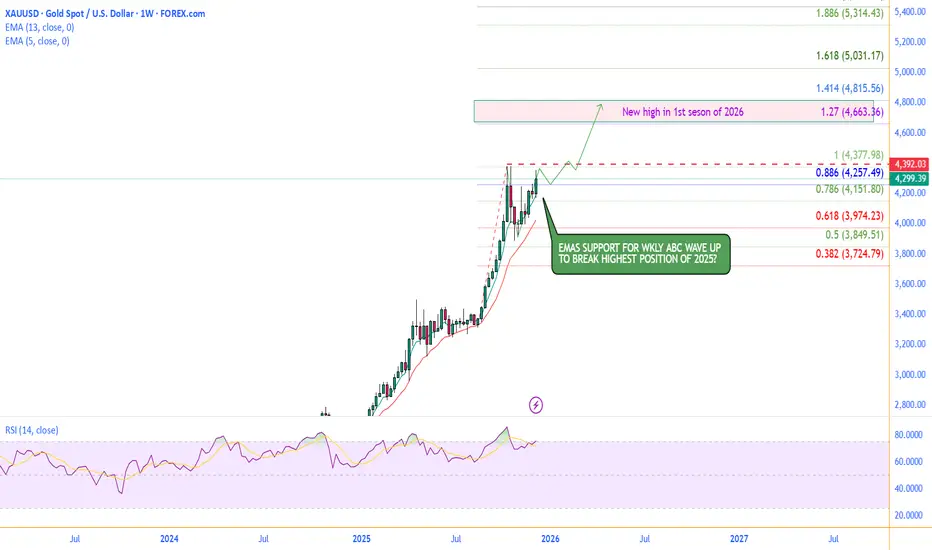
GOLD WEEKLY CHART MID/LONG TERM ROUTE MAPHey everyone,
Please see our weekly chart timeframe Route map and Trading plans for the week ahead.
We are seeing a repeat of the same ranging action again. We still have a long range candle body close gap above at 4294, with 4059 acting as support. We can expect price action to play between these two levels. We now also have EMA5 cross and lock above to strengthen the gap toward 4294. Conversely, a ema5 lock back below 4059 would reopen the broader retracement range.
We’ll keep these long timeframe structures in mind as we continue with our plan to buy dips.
We will keep you all updated as this chart idea unfolds.
Mr Gold

SOLUSD Long-Term Market Cycle Analysis |Bear Market Phase ActiveSolana (SOL) was listed on 10 April 2020 at around $0.21 .
During the 2020–2021 bull market (Altseason Phase-4) , SOL showed an exceptionally strong rally after listing and formed its all-time high near $260 on 6 November 2021 .
From that point, a major bear market started.
Between 7 April 2021 and 29 December 2022 , Solana remained in a clear downtrend , printing continuous lower highs and lower lows.
Price dropped from $260 to nearly $8 , resulting in a −96.9% correction , which is typical for high-beta altcoins during bear cycles.
A new bull market phase began on 30 December 2022 , but according to current market structure and cycle analysis , this bull phase has now ended around 13 September 2025 .
The overall structure has shifted bearish , and Solana is currently trading in a confirmed bear market phase starting from 14 September 2025 .
Key Resistance Zones (Strong Reversal Areas):
$148
$174
$210
These levels are expected to act as major supply zones , where strong selling pressure and reversals are likely.
Bear Market Outlook & Risk Projection
Bear market may extend until October 2026
A further downside move of up to −88% is possible within this cycle
If such a correction occurs, there is an 80% probability that SOL could trade in the $45 – $30 range during September–October 2026
Key Support Zones (Accumulation Areas):
$80
$45
$30
Trading Bias
* Avoid long positions during this phase
* Focus on short setups near resistance zones
* Trade with strict risk management and confirmation
Disclaimer:
This analysis is based on historical market cycles, structure, and technical behavior .
Not financial advice. Always manage risk.
SOL/USDT | Solana Is Testing Buyers Right Now, Pump or Dump?CRYPTOCAP:SOL rallied all the way to $146 before pulling back again and right now price is trading near $132. The correction is completely normal and the main demand zone sits between $122 to $132 which is exactly where Solana is reacting at the moment. This is the zone that needs to hold because losing it would open the door for a deeper drop.
If buyers fail to defend the current range there is still a clean lower demand area around $105 where I expect stronger accumulation and a possible start of the next bullish leg. For now I am watching to see if SOL stabilizes inside the $122 to $132 zone because a proper hold there usually leads to another upward push.
Please support me with your likes and comments to motivate me to share more analysis with you and share your opinion about the possible trend of this chart with me !
Best Regards , Arman Shaban
