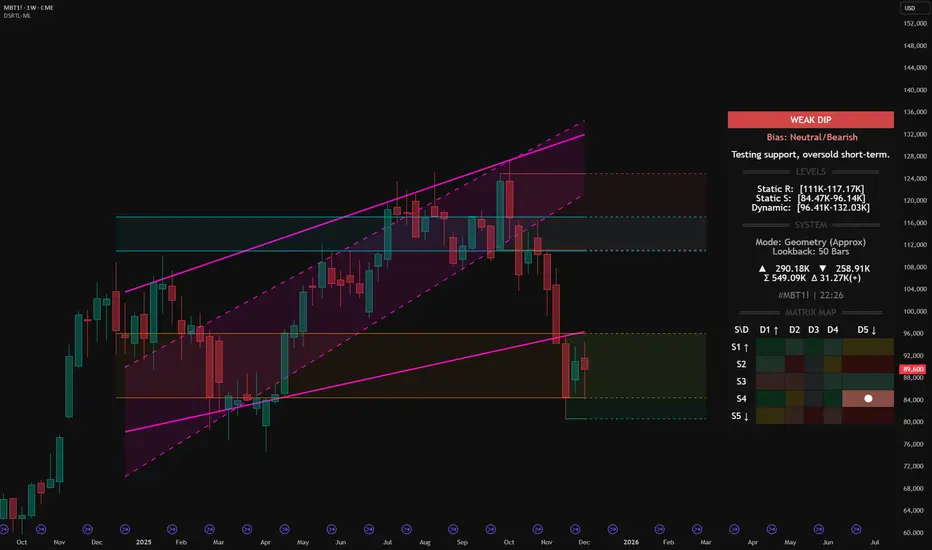
Micro Bitcoin Futures (MBT1!) – DSRTL‑ML Weak Dip at supportMicro Bitcoin Futures (MBT1!) – DSRTL‑ML Weak Dip at S4–D5 Support
We are analyzing the weekly structure of Micro Bitcoin Futures (MBT1!) using the institutional DSRTL‑ML support/resistance engine. On this bar the indicator classifies the state as WEAK DIP with a Neutral/Bearish bias and the system message:
Testing support, oversold short-term.
This reading comes from the current matrix position S4–D5 on the Matrix Map and defines the context for the price action inside this support zone.
1. DSRTL Matrix Diagnosis – State S4–D5
S4 – Static Support in Control
Price is trading inside the DSRTL Static Support band:
Static S: 84.47K – 96.14K
In the logic of DSRTL‑ML, this green support zone marks a historical high‑volume demand node where passive buy liquidity has previously absorbed aggressive selling. It behaves as a structural floor rather than a neutral price area.
D5 – Overshoot Below the Dynamic Channel
At the same time, price is positioned below the 5‑Point Dynamic Channel:
Dynamic Band: 96.41K – 132.03K
State D5 describes a downside extension beneath the lower boundary of the dynamic channel. Within this framework, that move is read as an oversold displacement away from the equilibrium path of the trend geometry, not as a fully confirmed new downtrend on its own.
Combined Reading – WEAK DIP with Neutral/Bearish Bias
The overlap of:
price sitting inside Static Support S4, and
price being oversold relative to the Dynamic Channel (D5)
produces the WEAK DIP classification. The Neutral/Bearish bias tells us that the dominant leg into this area is still downward, but the current candle represents a weaker phase of that dip occurring directly into a pre‑defined demand floor.
2. Key DSRTL Levels on This Chart
From the Levels and System panels on the chart:
Static Resistance (Supply Block): 111K – 117.17K
Upper structural ceiling derived from the DSRTL matrix of historical volume and price interaction.
Static Support (Demand Block): 84.47K – 96.14K
The active S4 floor where the current weekly bar is developing.
Dynamic Channel (Trend Geometry): 96.41K – 132.03K
The 5‑Point trend channel that defines the dynamic path of price; its lower edge around 96.41K is the first mean‑reversion checkpoint above the market.
Volume Metrics on This Bar:
Buying volume (▲): 290.18K
Selling volume (▼): 258.91K
Total volume (Σ): 549.09K
Delta volume (Δ): +31.27K
The positive delta together with the WEAK DIP label supports the idea that, inside S4, aggressive selling is meeting responsive buying rather than progressing as a fresh impulsive breakdown.
3. My Structural View Based on DSRTL‑ML
From a structural perspective, I read this configuration as follows:
Context of the Trend
The Neutral/Bearish bias confirms that the larger move into this zone is still a downward leg. The market is not flagged by DSRTL‑ML as a confirmed bullish reversal; instead, we are in a weak phase of the decline, pressing into defined support while the geometry is stretched.
Support Floor and Invalidation
As long as weekly closes remain above roughly 84.5K – the lower boundary of the S4 block – I consider this area a working demand floor for the current sequence. A decisive weekly close below that level would invalidate the weak‑dip narrative and shift the focus to a more developed breakdown of support.
Primary Path While S4 Holds
If S4 continues to hold, my expectation is that the oversold S4–D5 state will tend to resolve through mean reversion back toward the lower edge of the Dynamic Channel around 96.41K. In DSRTL terms, that is the first structural magnet above price once an overshoot has occurred.
Next Reference Above the Channel
Should price manage to re‑enter and hold inside the Dynamic Channel, the next major reference becomes the Static Resistance block at 111K – 117.17K. In my view, that zone represents the upper boundary of the current weekly structure and the area where I would expect supply and volatility to increase again.
In short, DSRTL‑ML currently maps MBT1! as a weak dip into S4 support with a still‑bearish background trend. My directional view is that, while this support holds, the structure favors a corrective mean‑reversion phase toward the dynamic band rather than an immediate continuation breakdown, with any weekly close below the S4 floor acting as a clear structural invalidation.
Indicator used for this analysis: DSRTL‑ML (Dynamic Support & Resistance Trend Logic).
Disclaimer: This publication expresses my personal opinion on the MBT1! chart based solely on the DSRTL‑ML indicator and standard price/volume analysis. It is not financial or investment advice and does not constitute a recommendation to buy or sell any instrument.
Beststrategy
BTC LONG TERM BULLISH Bitcoin will provide us with a simple and easy to understand pattern as when I check it for the last few years months and weeks , it has to fix itself and correct it’s structural highs and price , bitcoin will not fail or drop it will raise instead and carry on with its long term trajectory

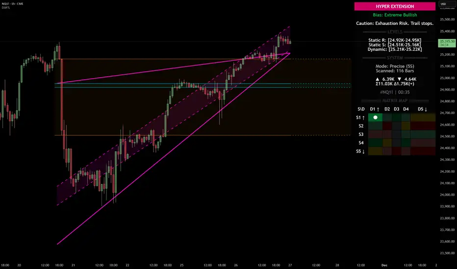
Nasdaq 100 (NQ): Hyper-Extended Momentum – Breakout or Exhaust
Category: Trend Analysis / Support & Resistance
Ticker: NQ1! (CME)
Analysis:
We are looking at the Nasdaq 100 Futures (NQ1!) on the 1H timeframe using the Dynamic Support & Resistance (DSRTL) system. The market is currently displaying a textbook example of a high-momentum breakout that has pushed into statistical extremes.
Here is the breakdown of the current technical landscape based on the indicator's Matrix Logic:
1. The "Hyper Extension" State (S1 / D1)
The indicator’s dashboard has triggered a "HYPER EXTENSION" alert. This specific state occurs when two conditions are met simultaneously:
• Static Breakout (S1): Price has cleared the horizontal resistance structures (indicated by the volume clusters).
• Dynamic Overextension (D1): Price has pierced above the upper limit of the dynamic trend channel (the purple trendlines).
2. Bias: Extreme Bullish
The current bias is rated as "Extreme Bullish". The trend is undeniably strong, confirmed by the positive Volume Delta (+965) shown on the dashboard. The price action is aggressive, creating a steep angle of ascent that has moved away from the mean.
3. The Warning Signal: Exhaustion Risk
While the trend is up, the system issues a cautionary note: "Exhaustion Risk. Trail stops."
In technical terms, when price action moves into "D1" (Dynamic Overextension), it indicates that the asset is trading significantly above its standard deviation or channel geometry. Historically, markets often seek mean reversion or consolidation after such rapid expansions to sustain the trend.
Key Levels to Watch:
• Dynamic Support (Immediate): The top of the purple channel (approx. 25,220) acts as the first layer of defense. A retest of this level is common after a breakout.
• Static Support (Structural): The breakdown level of the previous resistance, now turning into support around the 24.95K region.
Scenario Conclusion:
This is a pure momentum play. Traders should be aware that while the path of least resistance is up, the probability of a "snap-back" or consolidation increases the further price stretches above the dynamic channel. This is not a signal to short the trend immediately, but rather a signal to manage risk tightly on existing long positions.
Disclaimer: This analysis is for educational purposes only and explains the logic of the DSRTL technical indicator. It does not constitute financial advice.
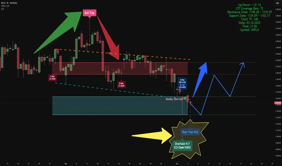
Volume-Based Market AnalysisUsing Indicators:
Smart Money Support/Resistance and ATAI Volume Analysis with Price Action V1.03
Analytical Configuration
This analysis combines two advanced indicators. The calculation period for both has been set to 52 bars, based on a lower timeframe of 1 second (1S), which provides 72 valid LTF candles. This configuration ensures that volume-based calculations remain within the valid data window for maximum accuracy.
Current Market Context
On the latest candle, a Bear Trap Risk signal appeared right after detecting an OverSold condition. This combination usually suggests weakening selling pressure near the end of a bearish leg and indicates the potential for buyer reaction. At that candle, both buy and sell volumes reached their highest values within the 52-bar window, but sellers maintained a slight advantage — approximately 260K sell volume versus 210K buy volume. This dominance by sellers in the OverSold zone reinforces the concept of volume exhaustion
Key Zones
• Support Zone: 1134 – 1163 USD
• Resistance Zone: 1198 – 1217 USD
Price is currently oscillating between these two zones. Based on the data, a short-term move toward the lower edge of the support zone is possible. If strong support holds, a rebound toward the upper boundary of resistance can be expected to retest or potentially break above it.
Structural Observation
In previous data, ATAI identified a Bull Trap at the resistance zone, which initiated the current bearish leg. Now, the emergence of a Bear Trap Risk near the support boundary is an intriguing reversal signal. If this trap functions similarly to the previous Bull Trap but in the opposite direction, we could expect a movement from the support base toward the resistance ceiling in the upcoming phase.
Summary
According to both indicators’ volume-based calculations, this is the most probable short-term scenario. However, this analysis is purely technical and volume-driven, and does not constitute any form of financial or investment advice.
Smart Money Composite View — BYD Company Limited Class ASmart Money Composite View — #002594 (1D), BYD Company Limited Class A
Indicators used:
• Smart Money Support/Resistance
• Smart Money Dynamics Blocks (Pearson Matrix)
• ATAI •Volume Pressure Analyzer v1.2 — Pure Up/Down (Editorial Pick)
We fuse these three into a single composite read. With offset = 48, the setup highlights where price sits relative to smart-money demand/supply, how liquidity is being absorbed, and where momentum can re-emerge.
Market read (composite)
• Price is trading below the 112–118 supply block, which currently acts as the dominant resistance. The failed attempts into this band and the overhead “OverBought” tag mark it as the active sell wall.
• The current swing printed a large negative cumulative delta trough (~-247.8M) right at the lower reaction zone (bear-trap baseline + descending structure). That’s classic absorption of aggressive selling rather than fresh distribution.
• Wing geometry is near-flat (α≈180° / β≈179.8°), signalling compression: momentum has bled off while liquidity rotates. This is typically the pause before a directional decision.
• The grey path on the chart sketches the logical reaction sequence: a relief leg first into the mid-band (~108), where supply should be re-tested, and—only if absorption continues—an extension toward 112–118. Until price reclaims and holds above ~108, the structure remains a redistribution risk under that supply.
Invalidation: A decisive close below the recent trough low (the bear-trap baseline on the chart) would negate the recovery sequence and opens lower prices.
This analysis is a personal market view and is not investment advice.

Smart Money Support/Resistance + ATAI Volume Analysis —PracticalApplication
When these two indicators work together — Smart Money Support/Resistance (Lite) and ATAI Volume Analysis with Price Action — the chart begins to speak a clearer language: one defines where the reaction zones form, and the other explains what happens inside them. The purpose is not prediction but understanding the balance between smart money pressure and retail momentum.
1. Parameter Alignment
On the right side of the chart, the green info panel confirms that both indicators share identical configurations. In this example, the lookback period is set to 52, chosen deliberately because it must be smaller than the total number of LTF coverage bars (65). For the Smart Money Support/Resistance indicator, the projection is set to 26 — extending the detected zones forward without adding excessive visual noise. This alignment is crucial; mismatched parameters can desynchronize volume readings and structural boundaries.
2. Reading the Chart
In this sample chart, the upper red area represents a Smart Money resistance zone — a region of concentrated selling pressure detected from lower timeframe volume. Simultaneously, ATAI Volume Analysis signals an Overbought (6/7) condition, meaning multiple oscillators confirm exhaustion while seller volume (S.Max) begins to outweigh buyer volume (B.Min). This overlap suggests that liquidity has shifted and the prior bullish impulse is weakening. From here, price may consolidate within the zone or initiate a structured retracement toward the blue support area, previously defined by accumulation volume. The red projected path simply visualizes one potential structural scenario; it is not a prediction or trade signal.
3. Broader Context
This example serves only as a demonstration of how these two tools interact when properly tuned. Different assets and timeframes naturally yield unique structures and behaviors, yet the principle remains consistent: define the territory first with Smart Money Support/Resistance, then interpret market behavior within it using ATAI Volume Analysis.
This content is for educational purposes only — not financial advice. User feedback and practical observations play a key role in refining future versions of both indicators.
ALERT: ALT SEASON INCOMING? 🚨 ALERT: ALT SEASON INCOMING? 🚨
Take a close look at the BTC/ETH chart — we’re seeing early signs of a major rotation out of Bitcoin and into Ethereum and altcoins. Historically, when the BTC/ETH ratio starts to fall, it's a clear signal that capital is flowing into altcoins, marking the beginning of alt season.
🔍 The ratio is showing bearish divergence and approaching a key support zone. If this level breaks, ETH is likely to outperform BTC significantly — and we all know what follows: altcoins explode.
📉 BTC dominance is stalling, ETH gaining strength, and altcoins are waking up. The market is shifting. Don't get caught late.
🚀 Get ready. The alt season might just be starting now.
#AltSeason #Crypto #BTC #ETH #TradingView #CryptoTrends

NFP LIQUIDITY GRAB COMING Key Price Levels:
Level Price Importance
PWH (Previous Weekly High) 2,960.000 Strong resistance
PDH (Previous Day High) 2,930.000 Key liquidity level
Equilibrium 2,910.000 Fair value region
PDL (Previous Day Low) 2,890.000 Possible buy-side liquidity
PWL (Previous Weekly Low) 2,840.000 Strong demand zone
Discount Zone 2,850 - 2,830 High-probability buy area
3. Trading Plan:
🔵 Long (Buy) Plan:
Entry Criteria: Wait for a reaction at PDL (2,890.000) or discount zone (2,850 - 2,830). If a bullish BOS or ChOCH forms, enter long.
Confirmations: Bullish engulfing, strong rejection wick, demand zone reaction.
Target (TP1): Equilibrium at 2,910.000
Target (TP2): PDH at 2,930.000
Stop Loss: Below PWL (2,840.000)
Risk-to-Reward: Minimum 1:3
🔴 Short (Sell) Plan:
Entry Criteria: If price reaches PDH (2,930.000) or PWH (2,960.000) and forms a bearish rejection (e.g., double top, BOS).
Confirmations: Bearish engulfing, BOS, liquidity grab.
Target (TP1): Equilibrium at 2,910.000
Target (TP2): PDL at 2,890.000
Stop Loss: Above PWH (2,960.000)
Risk-to-Reward: Minimum 1:3
4. Neutral Zone (No Trade)
If price remains between 2,910.000 - 2,930.000 without a clear BOS or liquidity grab, it’s a consolidation zone. Avoid trading in chop.

IF YOU ARE A NEW TRADER YOU HAVE TO SEE THIS VIDEO!!!In this video we explain you everything about the crypto market and how it operates!
We explain you why you are liquidated multiple times and much more!
Very important informations have been finally revealed!
This video will help you to adapt new mentality and strategy which will help you to take right decisions in the future!
This video will help you to finally become profitable!
Trade safe

Profitable Support and Resistance Strategy for Trading Forex
This support and resistance strategy works on any forex pair and gold.
It is simple and profitable and it is the best trading strategy for beginners.
In this article, I will share with you a step-by-step guide for trading this strategy. You will learn entry rules and important theory.
First and foremost, in order to profitably trade support and resistance levels, you need to know how to identify them. You should know how to distinguish a significant structure level.
I believe that you should look for a strong support or resistance strictly on a daily time frame.
That structure should be historically significant.
It means that it should be respected by the market at least 2 times, with a strong and clear reaction to that.
Here is the example of a key support on EURUSD.
The underlined key level was respected as the resistance, first,
then, after a breakout, it turned into support and a strong bullish reaction followed.
Above, you can see a perfect horizontal resistance level that was respected 2 time in a row in the recent past.
Support and resistance levels that I showed you are truly significant.
But, trading more than 9 years, I realized that the historic reaction of the market to a key level is not enough to make it reliable.
I found one more important condition that strengthen a key level - a market trend.
We will trade only supports that align with the market trend, meaning that we buy from such a support, if only the market is trading in a bullish trend.
In the example above, NZDUSD is trading in a clear bullish trend on a daily. If we buy the market from the underlined support level, we will take a trend-following trade.
That will be the best support level for buying the market from.
We will trade only the resistances that align with the market trend.
It means that we will sell from the resistance, only if the market is trading in a bearish trend.
Look at AUDUSD on a daily. The pair is trading in a bearish trend.
The resistance that I underlined will be valid for selling from, because shoring from that, we will trade with the trend.
Please, realize that if you sell the market that is in an uptrend from a resistance level, you will go AGAINST the trend. The probabilities of winning such a trade will always be lower.
You can see the EURNZD went through a resistance level, completely neglecting that, because the market trend was bullish.
Buying a key support in a bearish trend, we will take a trade against the trend. Such trades always have lower accuracy.
A key support on EURCAD was easily broken because the market was trading in a bearish trend.
Now, let's discuss th e entry point, stop loss placement and target selection.
Once you identified a key resistance in a bearish trend, set a sell limit order on that.
On EURGBP, the market is trading in a bearish trend on a daily.
We see a significant resistance that meets our criteria.
We should set a sell limit order on that.
Stop loss for the trade will be 0.5 ATR.
I simply take the default ATR settings with 14 Length.
In our example, ATR is 27 pips.
Our stop loss for the trade will be 14 pips above the entry level.
Take profit for the trade will be the closest support.
Here is the closest support that I spotted on EURGBP. It will be our TP level.
You can see that the market perfectly reached the target.
Once you identified a key support in a bullish trend, set a buy limit order on that.
I see a perfect daily key support on EURJPY pair.
The market is trading in a strong uptrend.
A buy limit order should be set on that level.
Stop loss for the trade will be 0.5 ATR.
ATR is 139 pips.
Our stop loss will be 70 pips.
Take Profit will be the closest daily resistance.
311 pips of profit were made.
Market trend is always your friend .
The rule to trade support and resistance levels only in the side of the trend is very simple, but many newbie trades neglect that, and lose a lot of money.
Try this support and resistance strategy, back test it on different forex pairs and let me know your results.
Thanks for reading!
❤️Please, support my work with like, thank you!❤️

Exploring Renko Charts: Simple Trading Strategies for Success Today, I'm excited to introduce you to two effective trading strategies designed for Renko charts. Renko charts, unlike traditional Japanese candlestick charts, focus solely on price movements, offering traders a unique perspective on market trends and opportunities. Before diving into the strategies, let's first understand the basics of Renko charts and how they differ from Japanese candlestick charts.
Renko charts are renowned for their:
Absence of time: Renko charts disregard time intervals, concentrating solely on price movements. This feature helps filter out market noise, allowing traders to identify clear trends.
Uniformity: Each brick on a Renko chart represents a fixed price movement, ensuring uniformity across the chart. This consistency aids in trend identification and reversal spotting.
Trend identification: Renko charts excel at identifying trends due to their focus on price movements. Traders can swiftly discern trend reversals or continuations by analyzing brick patterns.
Reduced noise: By filtering out minor price fluctuations, Renko charts offer cleaner data, making it easier for traders to identify significant price movements and trends.
In contrast, Japanese candlestick charts focus on time intervals and include all price movements within the selected period. Both chart types have their advantages, but for our strategies, we'll be using Renko charts.
Now, let's delve into the strategies:
1. Buy Green, Sell Red (with and without 13 EMA):
This straightforward strategy involves buying when a green candle appears and selling when a red candle emerges.
Option 1: Implement this strategy with a 13 EMA (Exponential Moving Average). Buy when a green candle closes above the 13 EMA line and sell when a red candle touches the 13 EMA line.
Option 2: Execute the strategy without the 13 EMA. Simply buy on green and sell on red.
While Option 1 may yield slightly delayed entries and exits, it provides additional confirmation, especially during volatile market conditions.
Consider automating this strategy with an algorithmic trading bot for seamless execution.
2. Strategy that forecasts the market?: This strategy tells you if the market will go up or down after a important for example economic meeting!
So, if you are interested in this strategy than write down in the comment and like (boost) this educational idea, if we get 100 likes (boosts) than I will make Part 2.
Please note: When you have a basic plan, than you can just open Renko chart above 1 day time frame, you can also work good on 1 day, but if you want to see Renko chart on Intraday time frame than you need to have Premium plan. Upgrade now for intraday best experience using RENKO chart: Upgrade now

10 EMA strategy ^BEST TREND-FOLLOWING STRATEGY^Welcome! Today, I'm excited to share with you one of the most effective trend-following strategies that is adaptable to any timeframe and asset class ( OANDA:XAUUSD , NSE:NIFTY , FX:USDCHF ), boasting a remarkable risk/reward ratio of up to 1:10. Let's dive right in.
As mentioned, this strategy revolves around the Exponential Moving Average (EMA), specifically the 10-period EMA. For those unfamiliar, the EMA places greater emphasis on recent price data compared to a Simple Moving Average (SMA), providing a dynamic view of market trends.
When the price on your chart is above the 10 EMA, it signifies a bullish trend; conversely, when the 10 EMA is above the price, it indicates a bearish trend. Let's illustrate with an example:
Imagine a bullish trend with four consecutive green candles followed by a red candle. Our entry point occurs when this red candle, the trigger candle, fails to touch the 10 EMA. Subsequently, when a green candle crosses above the high of the trigger candle, we enter the trade. Setting our stop loss (SL) just below the EMA line beneath the trigger candle, we establish our take profit (TP) based on a risk/reward ratio, starting at 1:2 and potentially reaching an impressive 1:10.
Trailing the 10 EMA line allows us to stay in the trade longer, albeit experiencing initial stop-loss hits. However, perseverance reveals the strategy's efficacy over time.
Now, for short positions, such as during a downtrend characterized by three red candles followed by a green candle, our entry occurs when the low of the green candle is breached by the subsequent red candle. Setting the SL just above the EMA line above the trigger candle and TP based on the risk/reward ratio, we execute the trade.
For those interested in trailing stops, there are two options: firstly, trailing along the 10 EMA line; secondly, utilizing the Average True Range (ATR) for algorithmic trading enthusiasts.
With this strategy's flexibility and potential for significant returns, it offers traders a robust approach to navigating diverse market conditions.
***Here are 2 examples of Long & Short: Long position in BINANCE:SOLUSDT
www.tradingview.com
Short in FOREXCOM:EURCAD
It's crucial not only to grasp the concept of this strategy but also to put it into practice. 💼 Start by implementing it with small capital or utilize paper trading, which platforms like TradingView offer. 📝 Additionally, don't hesitate to experiment. For instance, try using an 11-period EMA and assess its effectiveness. You might find that it better suits your trading style and objectives. 🧪💡 Remember, trading is a journey of discovery! 🚀 Don't be afraid to explore new strategies and techniques along the way.
🌟 Like (boost), follow, comment, and share this strategy to spread the knowledge and empower fellow traders! 📈🚀👍
For the optimal TradingView experience, upgrade now to unlock the platform's full potential:
www.tradingview.com

what is the right timeframelearn the truth about timeframe. the hidden truth that is hiding in plain sight

Best buying #BTC strategy at the exact bottom in a bear market.If you want to buy at the exact bottom of the bear market you need to meet these 2 criteria.
At weekly timeframe
1. Prices goes bellow KC lower band.
2. 5D RSI bellow 30 level


Gold Near Term Resistance 21-EMAGold traded in a narrow range between $1836 and $1807 for the past two days.
Technical:
The near–term support is around $1785, a breach below targets $1750.
The yellow metal faces strong resistance of $1836 (23.6% fib)

Finding That Perfect Strategy When it comes to choosing the best strategies, most traders are often hoaxed into believing that there's a perfect strategy that works irregardless. The stream of loosing trades that comes after they've purchased or spent alot in implementing the strategy contradicts this. Well that's true for the most part. Indicators on the other hand, considered to be lagging, depending on the way they're used can be of great help but also misleading to some point. I once read an article that said to learn, we must unlearn what we've learnt. The way we're used to using indicators may or may not be the correct way they're to be used. Now most people have indicators in their strategies for confluence. I can't for sure say that that's right or wrong because trading isn't about what you see, it's about how you see the markets, and how you interpret that info. It's also about how you handle yourself before and after trades. Your reactions to the outcome of any trade, be it a winner or a loser. So whatever the things that make up your stategy, its all up to you to decide. Because what works for you might not work for me for obvious reasons. Intensively testing a strategy to find out if it works or not before trading in the live markets is the best way to ensure that you understand what you're doing. Its also one way train yourself to take responsibility of whatever outcome the trade you've taken brings. So when you place a trade you always know why you're doing it.
Let me know what you think in the comments section.

USDCHF Trade Journal (1:13 RR Win Trade 😪)Like and Follow. I will reveal my secret trade setup from my guru. 😏
Pure price and naked chart trading.

BTCUSD ENTRIES. BTC WILL MOON SOONAs the mini bearish trend (correction) for btc seems to come to an end, btc will look to hit support at the all time highs. I am very confident that BTC will surpass 60k and will not look back into the 40k and 50k ranges. But as we all know, nothing is guarantee, With my simple price action strategy you will be ready to go for any situation that hits you for max profits.
Message me if you want to know how and why my strategy works. Love helping yall achieve what we all want to achieve.
When resistance breaks (red) enter for a buy
When support breaks (green) enter for a sell.
Bonus: Sell right before resistance breaks with a clear mfi indication (15-20 pip loss if it goes south)
Buy right before support breaks with a clear mfi indication (15-20 pip loss if it goes south)
COMMENT OR MESSAGE ME IF YOU WANT ME TO EXPLAIN HOW MY SCALPING STRATEGY WORKS FOR THE 15M-1HR TIMEFRAME

ETHUSD ENTRIESETH is about to touch all time high resistance back in the middle of February. I believe that ETH not only kiss the resistance but bypass it and continue to moon. Correction seems to be over. But as always, nothing is guarantee. My Simple price action strategy will assure you with big gains with little losses.
Message me if you want to know how to utilize my strategy. Love helping yall achieve what we all want to achieve.
When resistance breaks (red) enter for a buy
When support breaks (green) enter for a sell.
Bonus: Sell right before resistance breaks with a clear mfi indication (15-20 pip loss if it goes south)
Buy right before support breaks with a clear mfi indication (15-20 pip loss if it goes south)
COMMENT OR MESSAGE ME IF YOU WANT ME TO EXPLAIN HOW MY SCALPING STRATEGY WORKS FOR THE 15M-1HR TIMEFRAME

EURUSD ENTRIES. Simple and the best strategymy strategy will work with you to maximize your pip gains if it goes either direction. Simple price action strategy
Message me if you want to know how to utilize my strategy
When resistance breaks (red) enter for a buy
When support breaks (green) enter for a sell.
Bonus: Sell right before resistance breaks with a clear mfi indication (15-20 pip loss if it goes south)
Buy right before support breaks with a clear mfi indication (15-20 pip loss if it goes south)
COMMENT OR MESSAGE ME IF YOU WANT ME TO EXPLAIN HOW MY SCALPING STRATEGY WORKS FOR THE 15M-1HR TIMEFRAME

NATCOPHARM Can Be Good For Holding From HereNSE:NATCOPHARM We can add this script in our portfolio for long run lets discuss about chart view first and then target and sl.
As you can see on chart it was correcting from long time ago and as per price action rules, Stock will start doing consolidation after a huge fall or huge bull run.. The same scenario visible with this scrpt. After looking at current consolidation we can say there can be huge bull run possible in comming days. You can keep in Watch-List If you don't want to participate this you can keep your view on this.
Let's look at level :
Entry : 835
Target : 900++
SL : 775
Thnaks,
-UD Trend
Disclaimer : All Suggestions And Calls Will Be Pure Educational & Self Examination Purpose Only You Can Take Advise Of Your Financial Advisor As Secuirity Market Linked With High Risk.

