Are U.S. Dollar Bears getting exhausted?Still holding on to my EUR/USD short positions since late June/early July and it’s been quite a game of patience at this point but as I have been analyzing the U.S. Dollar for the past few months, from a purely technical analysis perspective, I’m currently still seeing the U.S. Dollar potentially carving out a bottom here and make a run to re-visit the 100 - 102 price zone.
I know markets are highly anticipating a Federal Reserve rate cute in September but with inflation still sticking around, it may not be such a sure thing just yet.
All eyeballs and ears will be on tap for Powell’s speech on Friday.
Technical analysis signals:
• Descending Broadening/Expanding Wedge (Bullish Pattern)
• MACD Histogram showing a sign of potential bearish exhaustion
Chartpatternanalysis

GOLD ANALYSIS What’s Moving the Market Today? December 03, 2025OANDA:XAUUSD GOLD ANALYSIS What’s Moving the Market Today? (December 03, 2025)
Welcome back to Trade with DECRYPTERS, where we decode smart-money footprints into clean, actionable buy & sell zones.
Keep it simple. Trust the levels. Follow the plan.
📰 Market Overview
Gold continues its steady climb after reacting perfectly from Smart Money Buy Orders earlier this week. Price is now rotating upward toward major liquidity pockets and premium sell zones, keeping bulls in command despite light USD stabilization.
The U.S. Dollar Index has cooled after post-election volatility, hovering near structural lows. Combined with ongoing geopolitical tensions and heavy central-bank accumulation, gold remains firmly inside a macro-bullish environment.
With key U.S. data releases (ADP, ISM Services, PCE) lined up this week and the December 9–10 FOMC meeting approaching, markets are moving cautiously. Gold remains well-positioned inside a premium–discount rotation, respecting structure cleanly.
🔍 Key Fundamentals Driving Today’s Move
📈 88% probability of a December rate cut → lower yield competition boosts gold
💵 USD stabilizing but not strengthening → limited downside pressure
🌍 Geopolitical tensions elevated → increased safe-haven premium
🏦 Central banks remain net buyers (634t YTD) → strong long-term demand
📊 Core PCE at 2.9% → keeps Fed leaning dovish
Gold’s strength is driven by a reliable cocktail of macro uncertainty + structural demand + institutional order flow.
📆 Key Events to Watch
🔸 Unemployment Data Today at 01:15 UK Time
Weak unemployment figures signal labor softness, boosting expectations of a December rate cut.
This typically drives gold into a bullish continuation toward upper sell zones.
Stronger data, however, reduces dovish pressure and strengthens the USD temporarily.
Expect a downward liquidity sweep into discount buy areas before any recovery.
First move is often manipulation the real direction comes after liquidity is taken.
🔸 Geopolitical Landscape
Geopolitical tensions remain a major volatility driver for gold’s intraday movement.
Any escalation triggers an immediate safe-haven spike, sending price rapidly toward premium zones.
Calm conditions allow mild USD recovery, creating controlled pullbacks into discount levels.
Structure stays bullish, but momentum slows as markets wait for the next catalyst.
Overall, geopolitics amplifies whichever trend smart money is already building
🟩 GOLD TECHNICAL LEVELS
Gold continues to respect rising structure, reacting precisely from discount zones and rotating toward your institutional premium blocks. Price now sits directly beneath major supply.
🟩 📌 SMART MONEY BUY ORDERS: 4147 – 4167
This is the primary institutional demand block, loaded with nearly $19 million in buy-side liquidity.
Expect:
✔️ Strong first-tap reactions
✔️ Accumulation + mitigation behavior
✔️ Discount long setups inside broader bullish channel
A clean breakdown below 4147 opens liquidity toward 4108 → 4075.
🟧 📌 SCALP SELL AREA: 4240 – 4252
Short-term liquidity zone used for:
✔️ Quick reaction scalps
✔️ Intraday reversals before the major premium zone
✔️ Stop hunts before the bigger move
Rejection here typically sends price back to 4200–4210 liquidity.
🔺 📌 SMART MONEY SELL AREA: 4264 – 4284
Your high-probability institutional distribution zone holding $29 million in sell-side orders.
Expect:
✔️ Manipulation wicks into premium
✔️ Stop-run behavior
✔️ Swing-reversal setups near the top of the range
A break & hold above 4284 = continuation toward 4310 → 4325.
📌 Conclusion
Gold remains firmly bullish as long as the 4147–4167 Smart Money Buy Zone holds, with price continuing to rotate cleanly between institutional premium and discount areas. With unemployment data set to trigger volatility, expect liquidity sweeps rather than major trend shifts. Stay patient, react only at key zones, and let smart-money footprints guide your next move.
🙌 Support the Analysis
If this breakdown brought clarity to your trading:
👍 Drop a like
💬 Comment your levels
📈 Share your charts with the community
Let’s grow together.
Best Regards,
M. MOIZ KHATTAK | Founder — TRADE WITH DECRYPTERS

GOLD ANALYSIS What’s Moving the Market Today? November 26, 2025OANDA:XAUUSD GOLD ANALYSIS What’s Moving the Market Today? (November 26, 2025)
Welcome back to Trade with DECRYPTERS, where we break complex smart-money charts into clean buy & sell zones.
Keep it simple let the levels guide your decisions.
*📰 Market Overview*
Gold continues to push higher inside the rising channel after reacting cleanly from the Smart Money Buy Orders (4088–4109).
A stronger USD earlier in the week capped upside, but buyers have stepped back in aggressively as volatility tightens.
The Dollar Index remains steady near the key 100.20 zone, limiting impulsive bullish continuation—but geopolitical uncertainty and central bank demand continue to provide a strong foundation underneath gold.
As we head deeper into the week, markets are bracing for delayed high-impact macro releases while positioning ahead of December’s FOMC event.
*🔍 Key Fundamentals Driving Today’s Move*
📈 DXY stable near 100.20 → caps aggressive upside moves
🏦 Fed officials remain split → December rate-cut expectations soften
🌍 Geopolitical risks remain elevated → Middle East & Ukraine tensions
🏛 Central banks continue buying → strong long-term support
📊 ETF inflows slow → partial profit-taking into month-end
The tug-of-war between a cautious Fed and strong global risk demand keeps gold in a premium–discount rotation cycle.
*📆 What’s Ahead Key Events to Watch*
🔸 Flash PMIs — This Week
Manufacturing expected ~49
Services expected ~51
Weak PMI → boosts rate-cut probability → gold bullish
Strong PMI → DXY bounce → gold dips toward demand zones
🔸 US Q3 GDP & Jobless Claims
First major release following the data delays.
Strong GDP = postpones rate cuts → gold bearish
Weak data = safe-haven rotation → gold bullish
🔸 FOMC Meeting — December 16
Markets lean toward a pause, but soft labor data could increase odds of a 25bps cut.
Hawkish tone → tests 4109 → 4088
Dovish tone → pushes gold toward 4184 → 4219 → 4244
🔸 Geopolitical Premium
Any escalation = instant safe-haven spike
Calm + strong USD = controlled pullbacks
*🟩 GOLD TECHNICAL LEVELS*
Gold continues respecting the rising channel, tapping premium zones for sells and discount zones for fresh accumulation.
The recent impulsive move from 4088–4109 has driven price into the next liquidity pocket around 4165+, aligning with your chart’s breakout structure.
*🎯 EQUILIBRIUM (EQ): 4135 – 4140*
This is today’s intraday pivot.
✔️ Hold Above EQ
Momentum strengthens toward:
➡️ 4165 → 4184 → 4196
✔️ Stay Below EQ
Price weakens toward:
➡️ 4109 → 4088
Potential deeper sweep if macro data disappoints.
*🟩 📌 SCALP BUY AREA: 4088 – 4109*
Your primary smart-money demand zone.
Ideal for:
✔️ Intraday dip buys
✔️ First-reaction entries
✔️ Premium → discount rebalance setups
Break below this zone = fast drop toward 4040–4020 liquidity.
*🟥 📌 SCALP SELL AREA: 4184 – 4196*
Clean intraday rejection zone.
Sellers consistently defend this level.
✔️ Best for low-risk scalping shorts
✔️ High-probability liquidity grab
✔️ Wick-heavy reactions expected
A clean close above 4196 opens the door to bigger institutional zones.
*🔺 📌 SMART MONEY SELL AREA: 4219 – 4244*
This is your primary large-volume distribution zone.
Expect:
✔️ Manipulation wicks
✔️ Strong algo-driven sells
✔️ Swing-level reversal setups
Break and hold above 4244 = continuation into 4280+.
*🚨 📌 EXTREME POI (Institutional Orders): 4184 – 4200*
Your mid-range liquidity pocket.
If tapped:
Expect reaction → pullback → re-test unless news breaks strongly in favor of risk-off flows.
*🔻 📌* DEEP SMART MONEY BUY ORDERS (Macro Flush): 3965 – 3985
High liquidity pool—activated only during major macro-driven corrections.
Expect:
✔️ Long wicks
✔️ Violent V-shaped reactions
✔️ High-RR swing long setups
Reclaiming 4,000 from this zone confirms strong bullish intention.
*🕑 ASTROLOGY BUY-THE-DIP TIME: 10:50 – 13:50*
Your key energy window based on astro-timing.
Dips during this window especially near 4109–4088 often align with algorithmic reversal periods.
*📌 Conclusion*
Gold continues to trade level-to-level, with 4135–4140 acting as the key intraday pivot for direction. Holding above this area keeps momentum pointed toward 4184–4196 and potentially 4219, while a break below exposes 4109–4088 for fresh accumulation. With delayed macro data and a divided Fed shaping sentiment, expect controlled swings between premium and discount zones. Stay patient and execute only where smart money is active.
Stay disciplined.
Let the levels do the work.
*🙌 Support the Analysis*
If you find this helpful, please support with your likes & comments it motivates deeper daily analysis.
Share your charts, thoughts & predictions. Let’s grow together.
*Best Regards,*
*M. MOIZ KHATTAK | Founder — TRADE WITH DECRYPTERS*

Cup Complete, Breakout Brewing — Handle Still Lost in Tokyo!Greetings, traders! Market Prophecy is telling a story again… Don’t run — it’s not a horror movie, just a Cup & Handle trying to find its happy ending. Grab your popcorn, because this chart has more drama than a Netflix series!
The difference between EUR/JPY and USD/JPY? Simple: USD/JPY has already finished sipping its cup on the monthly chart, while EUR/JPY is still brewing like a slow barista. (Don’t worry, I’ll spill the details on the daily or weekly EUR/JPY chart later.)
For USD/JPY, the handle is still in progress — think of it as the market adding the latte art before serving the breakout. Best dip-buy zone? Around 120, but even at 140, this pair might bounce like a trader after a margin call.
Once the handle completes and resistance breaks, say goodbye to boring consolidation and hello to trending mode. That’s exactly what happened with XAU/USD — it rocketed sky-high! 🚀 So don’t miss out, unless you enjoy watching profits fly past like shooting stars.
Enjoyed this? Show some love with a LIKE and share your thoughts in the COMMENTS! 💬
Disclaimer
My trading strategy isn’t a signal — it’s more like therapy for my brain. I’m just here crying over candlesticks while pretending it’s ‘learning market structure.’ Sharpening my skills? Sure. Building my trade journal? Absolutely. But deep down, it’s just me whispering to the charts: ‘Please love me back

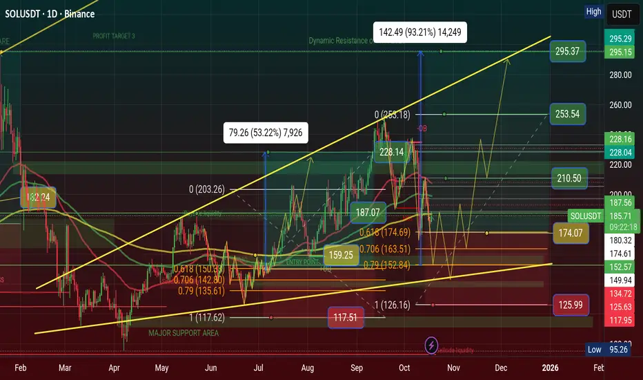
$SOL Showing Inverse Descending Triangle Pattern, $333 in 2026 CRYPTOCAP:SOL Showing Inverse Descending Triangle Pattern, $333 in 2026
💹 Inverse Descending Triangle Pattern
When This pattern will showing a chart than Price is waveing Descending Triangle Range of areas. Price will showing inverse and price moved too. we can make a trade plan to High area and low area. I'm using my Golden Fibonacci Tool, there are 3 point area of Buy position.
💲Position Setup: Open Long Position have 3 point areas, $152, $163, $174 and stoploss below area is $117. The Major Support Area is $101—$111 and Dynamic Resistance of ATH area is $293. My Long Position Target areas $210, $253, $293 and Incredible Price Target $333 areas in 2026
My Previous Long Setup will Hit $228 and complete my Trades. you can see my Previous analysis on this chart and now Waiting for confirmation of golden zone of Golden Fibonacci tool areas.
#Write2Earn #BinanceSquareFamily #Binance #SOL #SUBROOFFICIAL
Disclaimer: This article is for informational purposes only and does not constitute financial advice. Always conduct your own research before making any investment decisions. Digital asset prices are subject to high market risk and price volatility. The value of your investment may go down or up, and you may not get back the amount invested. You are solely responsible for your investment decisions and Binance is not available for any losses you may incur. Past performance is not a reliable predictor of future performance. You should only invest in products you are familiar with and where you understand the risks. You should carefully consider your investment experience, financial situation, investment objectives and risk tolerance and consult an independent financial adviser prior to making any investment.
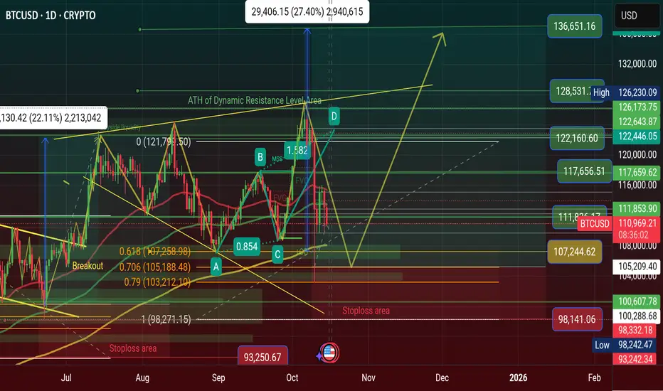
$BTC is showing a Unique Bullish Megaphone Pattern in ATH area, CRYPTOCAP:BTC is showing a Unique Bullish Megaphone Pattern in ATH area, Price will Hit $136K soon 2026
🚀 Dear, Binancians, My BTC Price Prediction will hit $136K in 2026 see on chart.
📈 Chart Analysis: Price is showing a Unique Bullish Megaphone Pattern and this is a Continuation Bull run Pattern. This Pattern is Very Rarely and it's made with on ATH areas. There is a False Breakout after the price will drop to support areas $105K - $108K and than pumping price very sharply. The price goes ATH area than falls breakout to Retested after Price will Break ATH areas. ATH area is a Dynamic Resistance area. When Fill this pattern it will be happened for $136K price areas 2026.
📊 Trading Setup: BTC Long Position setup guidelines: Major Support Areas is $98K and Dynamic Resistance area is ATH areas $126K, I'm using my Golden Fibonacci level for entry. There is 3 point of entry area is $103K, $105K, $108K and it's a Spot Position Entry point areas. Stoploss area is $98K and it's a support area. Profit the Target area is $111K $117K $122K $128K $136K.
#Write2Earn #TrumpTariffs #BTC #MarketPullback #SUBROOFFICIAL
Disclaimer: This article is for informational purposes only and does not constitute financial advice. Always conduct your own research before making any investment decisions. Digital asset prices are subject to high market risk and price volatility. The value of your investment may go down or up, and you may not get back the amount invested. You are solely responsible for your investment decisions and Binance is not available for any losses you may incur. Past performance is not a reliable predictor of future performance. You should only invest in products you are familiar with and where you understand the risks. You should carefully consider your investment experience, financial situation.
$ETH Price Prediction will hit $6K in 2026 see on chart...📈 Chart Analysis: Price is showing a Unique Bullish Megaphone Pattern and this is a Continuation Bull run Pattern. This Pattern is Very Rarely and it's made with on ATH areas. There is a False Breakout after the price will drop to support areas $3K - $3.5K and than pumping price very sharply. The price goes ATH area than falls breakout to Retested after Price will Break ATH areas. ATH area is a Dynamic Resistance area. When Fill this pattern it will be happened for $6K price areas 2026.
📊 Trading Setup: ETH Long Position setup guidelines: Major Support Areas is $3K and Dynamic Resistance area is ATH areas $4.9K, I'm using my Golden Fibonacci level for entry. There is 3 point of entry area is $3.4K, $3.6K, $3.8K and it's a Spot Position Entry point areas. Stoploss area is $3K and it's a support area. Profit the Target area is $4.2K $4.6K $5K $5.5K $6K.
🌍 Dominance Analysis: ETH Dominance is dumping ETH price will Pumping. The Dominance ATH is 22.38% of Resistance area in December 2021 and Support area is 6.95% in April 2025.
#Write2Earn #BinanceSquareFamily #Binance #BTC☀ #SUBROOFFICIAL
Disclaimer: This article is for informational purposes only and does not constitute financial advice. Always conduct your own research before making any investment decisions. Digital asset prices are subject to high market risk and price volatility. The value of your investment may go down or up, and you may not get back the amount invested. You are solely responsible for your investment decisions and Binance is not available for any losses you may incur. Past performance is not a reliable predictor of future performance. You should only invest in products you are familiar with and where you understand the risks. You should carefully consider your investment experience, financial situation, investment objectives and risk tolerance and consult an independent financial adviser prior to making any investment.

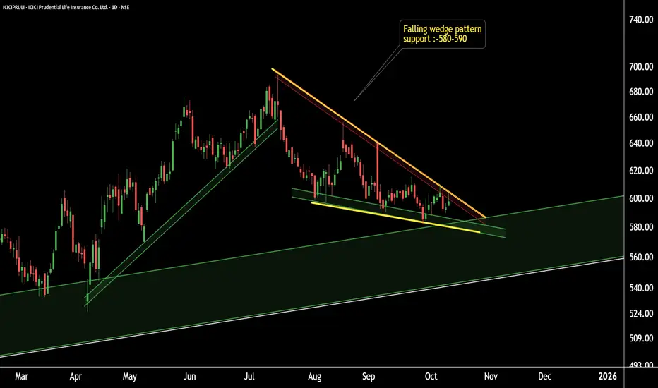
ICICIPRULI – Hidden Pattern Unlocked! Reversal or Continuation?ICICIPRULI Pattern Reveal
This is the daily timeframe chart of ICICIPRULI.
The stock is forming a falling wedge pattern, which is a bullish reversal setup.
Currently, ICICIPRULI is holding strong support near the 580–590 zone based on pattern structure.
If this level sustains, we may see higher prices in the coming sessions.
Thank You !!
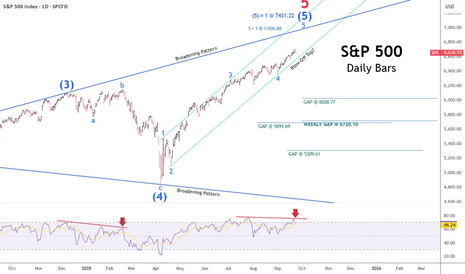
Will the Stock Market Ever Top?When it does, how long will that top last?
The question on the minds of many is just how high this blow-off top in the stock market will go. The cyclical bull market is running a bit long in the tooth and, by every conceivable measure, should be due for a healthy correction at the very least.
No, we’re not talking about the bull market run from the Tariff Tantrum lows in April; we’re talking about a 16-year run-up from the 2009 lows of the Great Financial Crisis—a low, in my view, that was never allowed to clear adequately.
The chart below illustrates the short-term, quintessential V-shaped recovery rebound from the April lows this past spring. These instant recoveries to fresh all-time highs have been a hallmark since the COVID bottom in 2020.
The daily chart above shows five clear waves of advance within a larger broadening pattern. Though a top can form at a moment’s notice from this point forward, the daily chart indicates two outstanding upside price targets at 7,006.88 and 7,431.22, respectively—each a Fibonacci extension of previous wave relationships.
Near-term downside targets ripe for the taking amid any meaningful pullback are represented by the four open gaps listed in the daily chart.
Next, we’ll zoom in a bit closer, looking at a 3-hour chart just before today’s close, with the S&P down slightly, just over half of one percent.
The shaded box above the price action illustrates an upside target window ranging from 6,704.45 on the low end to 7,006.88 on the high side, with an additional target of 6,710.67—also near the lower end of the range. The session’s high earlier was 6,699.52, less than 5 points from the threshold of our standing target window.
I’ll close out this stock market update with our long-term trading chart, which tracks the S&P’s weekly bars from the COVID low.
Above, you can see the broadening pattern mentioned earlier, along with another upside Fibonacci extension target noted at 7,431.22 and an important weekly gap at the 5,720.10 level.
The long-term buy-and-sell indicators at the top and bottom of the chart are not designed to capture or pick tops and bottoms; rather, they aim to capture the lion’s share of a given long-term trend and help you avoid devastating crashes and extended bear markets.
The lower-panel histogram issues buy signals a bit earlier and sell signals a bit later, while the upper-panel crossover study tends to be more active, issuing sell signals earlier and buy signals later.
Regardless of where and when the market tops—if it ever does—at the rate we’re going, be mindful of the risks inherent in making assumptions and extrapolating past performance into future expectations. Why? Because amid the Fourth Turning, old rules may no longer apply, and market tops may last much longer than we have become accustomed to.
Opportunity Knocks! Fresh buying interest visible in CAMS.This is the daily timeframe chart of CAMS.
The stock is currently trading within a well-defined parallel channel, with a strong support zone near ₹3600–₹3700.
If this level holds, we may witness higher prices in CAMS.
Thank you !!

Still keeping a close eye on a potential USD pop...Although the EUR/USD and GBP/USD popped higher late last week, I'm still keeping a close eye to stay short on the EUR/USD considering the bearish rising broadening pattern coupled with a yearly pivot point inter-median level and negative divergence on the MACD. This is all based on the daily chart.
Many factors are in play right now with what's going on between Israel and Iran along with FOMC this week and Tariffs still in play.
On a purely technical analysis point of view, I potentially expect a bullish retracement in the USD while remaining long term bearish across the board.
we'll see how this one develops.
Good Luck & Trade Safe.

Will the U.S. Dollar Bear go out to lunch and take a break?In this video I go over the case for the U.S. Dollar bear taking a break and price action getting a pullback across the EUR/USD, GBP/USD and USD/JPY.
I took a 42% profit on EUR/USD longs and currently keeping an eye on a short opportunity if weakness starts to creep in on the price action.
Long term, I remain U.S. Dollar bearish across the board however pullbacks are always expected during a macro price move.
If we trade higher, so be it and I will evaluate what the next position will be.
As always, Good Luck & Trade Safe.

AUD/USD Price Action Analysis – Range Trading Opportunity📉 AUD/USD Price Action Analysis – Range Trading Opportunity 🔁
⚙️ Market Structure Overview:
The AUD/USD pair is currently exhibiting a well-defined range-bound market structure between the Support Zone (0.63800 – 0.64000) and the Resistance Zone (0.65200 – 0.65400).
🟩 Support Zone
📍 Identified by multiple price rejections and bullish reversals (marked with ⬆️ arrows).
💡 This area represents strong buying interest, making it a potential long-entry zone on bullish confirmation.
🟥 Resistance Zone
📍 Marked by two sharp rejections (⬇️ arrows) and upper wicks.
💡 This zone has served as a supply area, where sellers overpower buyers, signaling potential short opportunities.
🔄 Current Scenario:
Price is approaching the support zone again after rejecting the resistance area. Based on historical behavior:
📉 Short-term Bearish Momentum is in play until support is tested.
📈 Potential Bullish Reversal is likely if support holds — aligning with previous bounce behavior.
🔮 Trade Ideas:
📈 Bullish Setup:
📍Entry: Near support zone (~0.63850)
🎯Target: Resistance zone (~0.65250)
🛑Stop-loss: Below support (~0.63650)
📉 Bearish Setup (Breakdown Scenario):
📍Entry: On confirmed break below support (~0.63800)
🎯Target: Lower structure zones (TBD based on breakout leg)
🛑Stop-loss: Above broken support
📅 Key Risk Events:
🔔 Multiple high-impact USD and AUD economic events approaching.
🧭 Traders should monitor fundamentals closely for increased volatility and breakout potential.
🧠 Summary:
📌 The AUD/USD pair is currently respecting a range-bound structure.
🧱 Buying from support and selling from resistance remains the most probable high-probability strategy.
📊 Range trading suits this setup until a confirmed breakout or breakdown occurs.
🔔 Like & Follow for more clean, structured trade setups and zone-based price action ideas!

Professional Analysis: XAU/USD – GOLD Price Forecast :
📈 Professional Analysis: XAU/USD – GOLD Price Forecast 🟡
🗓️ Date: May 28–29, 2025 | ⏱ Timeframe: Intraday (Hourly)
🔍 Instrument: Gold vs. USD (XAU/USD)
📊 Technical Chart Summary
🟥 Resistance Zone:
📌 Level: $3,350 – $3,365
🛑 Price has rejected this zone multiple times, marking it as a strong supply area.
📉 Each test of resistance led to a pullback — showing seller strength 💪.
🟩 Support Zone:
📌 Level: $3,280 – $3,295
🛡 Multiple higher low bounces suggest this zone is being defended by buyers.
🔁 Price has formed 3 reaction lows, indicating accumulation 📥.
🔄 Structure & Pattern Recognition
🔺 Descending followed by Ascending Swings
⛳ Market shows a reversal attempt after forming a potential double bottom / triple test at support.
📈 Bullish structure forming with the latest swing creating a higher low.
📉 Past wave = Bearish Correction
📈 Current projection = Potential bullish impulse if the support holds.
📐 Projection & Price Action Forecast
📍 Current Price: $3,297.175
📈 Expected Move: Bounce off support → climb toward $3,330–$3,350 🔼
🧠 Rationale:
Price testing support again
Market respecting horizontal range
No clean breakdown yet
📊 Bullish Scenario (Primary)
🔁 Rebound off support
🎯 Target: Resistance zone ($3,350)
✅ Entry: Above $3,300 with bullish candle close
🛑 SL: Below $3,280
📉 Bearish Breakdown (Alternate)
❌ Break below $3,280
🎯 Target: $3,260 or lower
⚠️ Wait for confirmation candle
🔚 Conclusion
🟡 Gold (XAU/USD) is trading within a well-defined range with buyers stepping in near $3,290 and sellers near $3,355.
📌 Based on current technicals, there’s a higher probability of an upward move, unless support breaks decisively.
🛠️ Pro Tip:
💡 Use RSI + Volume to confirm momentum on breakout. Look for bullish divergence or volume surge near the bounce.

JPYUSD Technical Analysis | (MMC) in Play + Target🟦 1. Structure & Price Action Overview
The chart is of JPY/USD on the 2-hour timeframe, showing a clear picture of price movement over several weeks.
We see three major market phases:
Range/Resistance Phase (Left side of chart)
Uptrend Phase (Middle – rising channel)
Reversal Setup (Right side – potential bearish move forming)
📈 2. Uptrend Channel (Accumulation to Expansion Phase)
From around May 13th, price started forming higher highs and higher lows, respecting a bullish channel (light blue shaded area).
This is a classic ascending channel, often seen during a controlled uptrend where buyers are still in control but momentum is slowing.
The channel took price directly into the resistance zone (marked in purple at the top).
🚫 3. Resistance Zone Rejection (Key Supply Zone)
Once price hit the resistance zone (~0.00705), it failed to break higher.
This level had previously caused sharp drops, so it's a well-established supply zone.
Price was rejected and dropped sharply, breaking out of the ascending channel – a strong bearish signal.
🔄 4. Mirror Market Concept (MMC) – Curve Bending Pattern
After the initial drop, price attempted a bounce, but couldn't even reach previous highs.
The curved arrow labeled "Curve Bending" shows how the market is “bending” its momentum – not pushing upward anymore but turning into a reversal.
This forms the mirror of the previous rise – indicating the market is ready to “mirror” that previous bullish leg, but to the downside.
🔄 5. SR Interchange (Support Flipped Resistance)
The previous demand zone (around 0.006950–0.007000), where buyers pushed price higher during the uptrend, is now acting as resistance.
This is called an SR Flip (Support becomes Resistance) – a very reliable technical sign of trend reversal.
🎯 6. Bearish Target Projection
Based on MMC and symmetry of past movements, the chart is projecting a strong drop toward the 0.006800 support zone.
This zone is also historically significant and acted as a demand area earlier.
The black arrow and target box show this expected move, which aligns with the mirror structure.
🧩 Conclusion & Trade Plan
Bias: Strong Bearish
Confirmation : Channel break + rejection at resistance + curve bending
Trigger: Price fails to reclaim 0.00700 and breaks below 0.006930
Target: 0.006800
Invalidation : Clean break & hold above 0.007050
🛡️ Pro Tips:
Don’t just jump in — wait for bearish confirmation (like a bearish engulfing candle, or a failed retest).
Always set your SL (Stop Loss) above the resistance zone (~0.007050).
Let the setup come to you — don’t force trades.

Bitcoin MMC Analysis – Mirror Market Concepts in Action + Target📌 Overview:
In this idea, I’m using Mirror Market Concepts (MMC) to break down Bitcoin’s current price behavior. MMC is a powerful way to spot repetitive price patterns, psychological zones, and mirrored moves that help us predict where the market might go next.
Let’s break down what this chart is really telling us. 👇
🔁 1. Mirror Market Concept in Play
MMC is all about symmetry. Think of it like looking into a mirror—what price did on the left side, it might repeat (or mirror) on the right side.
Look at the two rounded zones (highlighted in light blue ellipses). Price dipped into the support zone, formed a rounded bottom, and then shot up. A similar pattern is forming again on the right-hand side. This mirroring behavior gives us a clue that price could follow the same path upward again.
📉 2. Trendline Resistance – A Key Level
The chart shows a clear descending trendline that has been respected multiple times. Every time price tries to break above this line, it gets rejected. This tells us that sellers are still in control at that level.
Until this trendline is broken cleanly, bullish momentum remains capped. However, multiple tests of the trendline also indicate it's getting weaker, so a breakout might be coming.
🟪 3. Support Zone – Buyer’s Stronghold
See the purple shaded area near $108,400? That’s the support zone. Price bounced off this area several times, showing that buyers are defending this level.
This zone is important because:
If it holds, we can expect another upward push.
If it breaks, price could drop to the next support level (not shown here, but could be around $107,000–$107,500 based on structure).
🎯 4. Previous Target Hit – New Target Identified
Using MMC, we previously predicted a move up to around $110,800, and that target has been successfully hit (labeled as "Previous Target" in the chart).
Now, a new target zone is forming around $109,600–$109,800, marked on the right side of the chart. If price breaks above the trendline and central zone, this is the next likely destination.
🔵 5. Central Ellipse Zone – Compression Area
The blue ellipse on the right side represents a central zone—an area of price compression and indecision. In MMC, this is where price builds up energy before a move. It acts like a spring: the longer price consolidates here, the bigger the breakout move will be.
Right now, BTC is compressing in this central zone. This is a critical moment. The breakout direction from here could decide the short-term trend.
📊 Trade Plan Ideas:
🔹 Bullish Scenario:
Wait for a clean breakout above the trendline and central zone.
Look for a retest of the breakout area (confirmation).
Target the $109,600–$109,800 zone.
🔹 Bearish Scenario:
If price fails to break the trendline and drops below the support zone at $108,400…
We could expect a deeper pullback toward $107,000–$107,500.
🔹 Key Levels:
Resistance: $109,200 (trendline area), $109,800 (target zone)
Support: $108,400 (zone), $107,500 (next major support if broken)
📘 Final Thoughts:
This chart is a perfect example of how MMC (Mirror Market Concepts) can give us a visual roadmap of what price might do next. It’s not about guessing—it’s about recognizing the psychological patterns that repeat over and over in the markets.
Right now, Bitcoin is sitting at a decision point:
Break above the trendline = possible bullish continuation
Break below support = likely bearish shift
Watch the central zone closely—because the next big move could start from right there. 🔍

XAGUSD Technical Analysis : MMC Breakdown from Resistance ZoneChart Concept: By Using MMC – Mirror Market Concepts
🔎 1. Major Resistance Zone – The Brick Wall
At the top of the chart, around $33.85–$34.00, we see a strong major resistance zone. This area has acted as a ceiling for price multiple times in the past. Think of it like a brick wall where the bulls keep trying to break through but get pushed back. When price touches this level and fails to break above it, that’s a clear rejection.
This rejection gives the first sign that buyers are losing steam and sellers are stepping in.
🧠 2. Mirror Market Concept (MMC) in Action
Using the MMC (Mirror Market Concept), we’re treating the chart like a reflection — what happened on one side of the move is likely to mirror or repeat on the other.
So when price aggressively moved up into resistance, you look for a symmetrical move back down once it's rejected — just like looking in a mirror. This concept helps predict where price might land based on previous movements, levels, and psychological patterns.
🧱 3. SR Interchange Zone (Support ↔ Resistance Flip)
Look around the $33.10–$33.25 area — this is a critical SR interchange zone. Price used this zone as resistance in the past, broke above it, and then used it as support.
Now that price has rejected from the top, it’s coming back down to retest this SR zone. If it breaks below this area, it confirms a shift in market structure—from bullish to bearish.
🌀 4. Black Mind Curve Support – Dynamic Support
That curved black line? That’s not just a drawing — it's called Mind Curve Support in MMC. This curve helps map out dynamic support based on price memory and human psychology.
As long as the price respects that curve, the structure is bullish. But once it breaks below it — like it’s threatening to do now — it often means momentum has shifted and a correction is underway.
⛓️ 5. Bearish Breakdown Structure
Once price touched the major resistance, it formed two swing highs labeled TP1 and TP2. That’s very similar to a double top pattern, which is a strong bearish reversal signal. After the second peak, price dropped sharply — that’s your early confirmation of a potential move lower.
And now, price is forming lower highs and lower lows, another classic sign of bearish momentum taking over.
🎯 6. Target Zone – Why $32.72?
Here’s where MMC really helps:
The projected target zone is $32.72, which is marked in the chart.
Why this exact level?
It’s previous market structure (support zone from earlier)
It aligns with the 50% Fibonacci retracement
It’s the mirror reflection of the bullish move, completing the MMC concept
This is a high-probability area where buyers may step in again.
💼 Trade Setup Summary (Educational Only)
Parameter Level
Entry Below $33.20 after confirmation candle
Stop Loss Above $33.85 (recent high)
Take Profit $32.72 (MMC Mirror Target)
🧠 Final Thoughts – The MMC Edge
This chart isn’t just about lines and levels. It’s about understanding how traders think — where they get excited, scared, greedy, or exhausted. That’s what Mirror Market Concepts (MMC) are built on.
By recognizing structure, psychological curves, and SR flips, you're not just guessing—you’re reading the market’s mind.
⚠️ Risk Disclaimer
This is not financial advice. Always use proper risk management and confirm setups with your own trading plan before entering any trade.

BTCUSD MMC Breakdown – Curve Collapse & H&S Sell-Off Loading🔍 Chart Overview – BTC/USD (1H Timeframe)
This setup uses Mirror Market Concepts (MMC) to forecast Bitcoin’s next potential major move, blending institutional-level curve analysis, pattern recognition, and structure shifts.
We are currently seeing a Head & Shoulders (H&S) pattern develop under a Black Mind Curve Resistance, supported by a sloping neckline and a clear zone of structure breaks and retests. Price is positioned for a significant bearish continuation if confirmation hits.
📐 Breakdown of Key Components:
🧠 1. Mirror Market Concepts (MMC)
MMC focuses on the symmetry and memory of market behavior. When certain price structures mirror past reactions (support, resistance, or rejection points), we gain an edge in anticipating where big moves will happen.
Here, the curve structure and neckline level align to mirror prior bearish reactions.
👤 2. Head & Shoulders Pattern
Left Shoulder: Formed with rising volume and strong bullish momentum.
Head: A sharp move upward forming a new high, but eventually fails to sustain above the curve.
Right Shoulder: A weaker bullish attempt, indicating exhaustion and imbalance.
The neckline is clearly marked — a break below it validates the reversal pattern.
🟠 3. Black Mind Curve Resistance
This is an institutional resistance arc — an MMC dynamic level that mirrors prior selling patterns. Price reacted strongly under this curve, confirming its relevance.
It acted as a ceiling for the head formation, capping bullish continuation and turning price downward.
🔵 4. Black Mind Curve Support
Drawn beneath the price action, this dynamic support is about to be tested again. A clean break below the curve and neckline would likely result in a strong drop.
⚠️ 5. Major CHoCH & BOS Zones
CHoCH (Change of Character): Price failed to form new highs and showed early bearish shift.
BOS (Break of Structure): Confirmed when neckline is broken.
These are vital MMC confirmation points that strengthen the short idea.
🔁 6. Retest & Boom (Bearish Version)
Price could retest the neckline or the broken trendline (shown by the blue arrows), offering a perfect "sell on retest" opportunity before dropping to the target.
This is a classic MMC play — breakdown ➝ retest ➝ continuation.
🎯 7. Target Zone
Projected based on:
Height of the H&S pattern.
Previous key structure zone.
MMC symmetry principles.
Expected target: near $101,700 – $102,000.
🧨 Trade Idea:
✅ Bearish Setup (Preferred Bias)
Wait for a clean neckline break and candle close.
Look for retest of neckline or curve (lower timeframes).
Sell with target near $101,700, SL above right shoulder.
🚫 Invalidation:
Price closes back above right shoulder and curve.
Invalidates the bearish structure.

Silver Double Top at Major Resistance – Bearish Breakdown📌 Overview:
This chart shows a classic Double Top Pattern forming on the weekly timeframe for Silver (XAG/USD). Price has reached a multi-year resistance zone and failed to break above it twice, signaling potential exhaustion of bullish momentum and the possibility of a larger trend reversal.
🧩 Detailed Pattern Breakdown:
🔹 1. Double Top Pattern
The double top is one of the most reliable bearish reversal patterns, formed when the market tests a resistance level twice and fails to break it, creating two rounded or sharp peaks. In this case:
Top 1 and Top 2 occurred near the $35–36 zone, clearly marked as a major resistance level.
This indicates strong selling pressure from that zone.
🔹 2. Major Resistance Zone
The $35–36 price range has historically acted as a ceiling for Silver prices. It rejected price several times between 2021 and 2025. When this kind of level holds, it often precedes sharp corrections, especially when volume begins to drop and momentum weakens.
🔹 3. Rising Trendline Break
After forming the double top, price broke down through a key ascending trendline, a sign that the bulls are losing control. The breakdown is further confirmed by a strong bearish candle, closing below both the trendline and a critical SR (Support-Resistance) Interchange zone.
🔹 4. Retesting in Progress
Post-breakdown, the price action is now retesting the broken trendline and horizontal zone (~$28). This is a crucial moment:
If Silver gets rejected here, it confirms the bearish breakout and signals entry for sellers.
If it reclaims this level, the bearish setup could fail, and price might consolidate or resume uptrend.
🔹 5. SR - Interchange Zone
This zone is marked because it acted as resistance during the 2022-2023 period, and then flipped into support in 2024. Currently, it’s being tested from below, making it an SR flip retest. These zones often become inflection points.
🔹 6. Black Mind Curve Support
An important and unique addition is the “Black Mind Curve Support” – a curved dynamic trendline that has historically aligned with price retracements. The projected path shows that the curve and horizontal support (~$22.68) intersect, strengthening the significance of that level.
🔹 7. Measured Move & Target
Based on the height of the Double Top pattern (approx. $10 range from top to neckline), the measured move places the target near $22.68, which matches both:
Historical demand zone
Curve support
This alignment makes $22.68 a realistic and strong downside target.
🧭 Strategic Summary:
Pattern Type: Double Top (Bearish Reversal)
Key Resistance: $35–36 (Multi-year rejection level)
Trendline: Broken (Bearish confirmation)
Retesting Area: $28–29 zone (Watch for rejection)
Downside Target: $22.68 (Confluence of support zones)
Invalidation: Clean weekly close above $35
🔍 What Traders Should Watch:
✅ Bearish Candlestick Confirmation at the retest zone (e.g. bearish engulfing, shooting star).
✅ Increased volume on drop, confirming participation by larger players.
🚫 Invalidation signal would be a sustained move and close back above the resistance zone.
⚖️ Risk Management Tip:
This pattern offers a high risk-to-reward ratio trade setup. Short entries on the retest with stop loss above $36 can provide substantial downside potential toward $22–23, especially in a commodity market prone to sharp retracements.
📌 Final Thoughts:
Silver appears to be forming a clean double top reversal at a long-term resistance. If the current retest fails, a significant correction may follow, targeting the $22.68 level. This pattern, combined with key support-resistance dynamics and psychological zones, makes this setup worth monitoring for medium- to long-term traders.

JPY/USD Rising Wedge Pattern Formed | Retest & Move To Target🧠 Overview:
The JPY/USD pair has recently exhibited a Rising Wedge Pattern, a classic technical formation known for its bearish implications. This pattern has developed over several days of bullish price action, showing diminishing bullish momentum as price action narrows.
The wedge is forming right beneath a minor resistance zone, increasing the likelihood of a potential rejection and breakdown. This setup is particularly noteworthy due to the multiple layers of confluence supporting the bearish bias.
🔍 Technical Breakdown:
📌 1. Rising Wedge Formation
A rising wedge is often considered a bearish reversal pattern, especially after a strong uptrend.
As seen on the chart, price is respecting both the upper and lower bounds of the wedge, but with a loss of bullish momentum, indicated by shallower highs.
This tightening price action hints at indecision and likely exhaustion from buyers.
📌 2. Minor Resistance Zone
Price has approached a previous structure high where strong selling interest was seen before.
This zone has already rejected price once, acting as a supply area.
The repeated failure to break above reinforces the strength of this resistance.
📌 3. SR Interchange (Support Turned Resistance)
Below the current price action, there's a well-defined Support-Resistance Flip Zone (SR Interchange).
Previously a strong demand area, this zone may now act as a new resistance if price breaks below and retests it.
This is a key area where sellers are likely to step in again.
📌 4. Break & Retest Structure
As price begins to break the lower wedge boundary, the next move we anticipate is a retest of the broken wedge trendline.
This retest, if confirmed by rejection candles (such as bearish engulfing or pin bars), would present an ideal entry opportunity for short positions.
🎯 Trade Plan & Price Levels:
💼 Bearish Scenario
Entry Point: Wait for a successful retest of the broken wedge line (confirmation via price action: bearish engulfing or pin bar).
Stop Loss: Above the recent swing high or above the wedge resistance (~0.006920).
Take Profit 1 (TP1): 0.006845 – First key support zone.
Take Profit 2 (TP2): 0.006807 – Next major support / liquidity zone.
🧩 Why This Setup Makes Sense:
✅ Multiple Confluences:
Bearish wedge structure = reversal pattern.
Resistance zone = psychological and technical rejection.
SR Interchange = confirms institutional selling interest.
Retest confirmation = high-probability entry.
Target zones = based on recent support levels and market structure.
🛑 Risk Management:
Risk-to-reward ratio favors short positions if executed after retest.
Avoid jumping in early — wait for confirmation.
Proper stop loss is key to avoiding false breakouts or premature entries.
📊 Summary:
This is a textbook bearish setup with strong technical backing. The rising wedge pattern, when combined with resistance and retest zones, offers a great shorting opportunity — assuming price respects the pattern. Patience will be crucial here; wait for the break, the retest, and the confirmation before entering.
🔔 What to Watch:
Price behavior near the lower wedge boundary.
Reaction on retest — do bulls defend or do bears take over?
Confirmation from volume or price action (engulfing candles, rejection wicks).
Any fundamental catalysts or USD-related news.
✍️ Final Thoughts:
This is a well-structured short setup on the JPY/USD 1H chart. Wedges often deceive with temporary breakouts before reversing hard — so discipline, timing, and confirmation will be key. If the market respects this technical structure, we could see a clean drop toward our projected targets.

XAGUSD Triangle Pattern Forming – Breakdown on the Horizon?🧠 Technical Analysis – XAG/USD
Silver (XAG/USD) has entered a compression phase, forming a classic Symmetrical Triangle Pattern within a broader Black Mind Curve structure, which adds additional psychological and visual significance. These patterns, when paired together, often signal a build-up of volatility ahead of a powerful breakout.
🔍 Pattern Explanation: Triangle + Black Mind Curve
Symmetrical Triangle Pattern: This pattern is marked by converging trendlines of higher lows and lower highs. It reflects indecision between bulls and bears — a tug-of-war where volatility decreases as price coils into the apex.
Black Mind Curve Structure: The curved support and resistance arcs highlight a rounded structure often seen before large breakout moves. These curves create an intuitive framework for understanding how the market is behaving on a broader scale — the "mind of the market" if you will.
🔺 Curve Resistance: Acting as a ceiling suppressing bullish attempts.
🔻 Curve Support: The dynamic floor that has held price within bounds until now.
📉 Breakout & Retest Phase in Play
The triangle has now been breached to the downside, and price is currently in the retest phase — a textbook behavior before continuation. The market is now revisiting the lower boundary of the triangle (~$32.30–$32.40), which is potentially flipping into resistance.
This retest is critical: if price fails to reclaim the triangle and gets rejected, it strengthens the case for further downside.
We’ve also seen a slight uptick in bearish momentum and volume on the initial breakdown.
🎯 Projected Price Targets
We apply the measured move technique, which calculates the triangle’s height and projects it downward from the breakout point:
TP1: $31.68 – A short-term support level and the first technical target.
TP2: $31.12 – Measured move target and key demand zone from the past week.
These levels are not arbitrary — they align with both psychological round numbers and historical structure zones, which often act as magnets for price.
📌 Why This Setup Matters
This isn’t just a triangle breakout. The confluence of the triangle pattern and the Black Mind Curve framework suggests a psychologically significant shift is underway.
Price has respected the curved structure for nearly two weeks.
The triangle represents compression — the final phase before directional expansion.
The false breakout risk is real, but the context (bearish trend leading in, lower highs, failed rallies) favors a downward continuation.
💡 Trade Setup Idea (Example Only)
Parameter Value
🧩 Pattern Symmetrical Triangle
⏳ Phase Retesting after breakdown
🎯 Entry On bearish confirmation at ~$32.30
❌ Stop Loss Above triangle upper bound (~$32.65)
✅ TP1 $31.68
✅ TP2 $31.12
⚖️ Risk/Reward 1:2 or better
Note: Wait for clear rejection candlesticks (e.g., bearish engulfing, shooting star) to confirm bearish intent.
⚠️ Risk Management & Considerations
Avoid premature entries — wait for candle confirmation on the retest zone.
Adjust lot size and leverage according to personal risk tolerance.
Remember: triangle patterns can break either way — monitor invalidation levels carefully (e.g., a breakout back into triangle with strong volume).
💬 Mindset & Market Psychology
This triangle and curve setup mirrors a battle between consolidation and trend continuation. The curves represent the market’s subconscious behavior — as price rounds out and tests boundaries, the final breakout reveals collective trader sentiment.
“Patterns are footprints of psychology. Trade the behavior, not the prediction.”
Be the trader who waits for the story to unfold. Let structure speak before you act.
✅ In Summary
📌 Pattern: Triangle inside Black Mind Curve
🔍 Key Levels: $32.30 (retest), $31.68 (TP1), $31.12 (TP2)
📉 Bias: Bearish, with potential continuation after retest rejection
⏱️ Timeframe: 1H – Suitable for intraday to short-term swing trades
💬 What do you think – is Silver ready to break down, or will bulls reclaim control? Drop your analysis below! Like & follow for more smart technical setups every week.

BTC/USD Bearish Setup – Trendline Retest Before the Fall?🔍 Technical Breakdown – BTC/USD 3H Timeframe
Bitcoin is displaying a textbook Double Top pattern formation on the 3-hour chart, signaling a potential bearish reversal after a strong bullish run. This classic pattern suggests buyer exhaustion and sets the stage for a downward move. Let's break down the analysis:
🧠 Pattern Insight: Double Top Reversal
A Double Top is one of the most reliable trend reversal patterns, especially when it forms after a sustained uptrend — just like we're seeing here.
Top 1 and Top 2 both formed inside a strong Resistance Zone between $106,500 and $107,000, showing repeated rejection from buyers to push price higher.
The formation of lower highs and long wicks near Top 2 further reinforce the weakening bullish momentum.
💥 Neckline Breakdown & Bearish Trigger
The Neckline, aligned with a horizontal Support Zone (~$103,300–$103,800), was decisively broken, confirming the pattern.
This breakdown acts as the trigger for bearish entries, and we are now in the "Retest Phase", where price often pulls back to the neckline or a nearby trendline before continuing lower.
📐 Trendline Confluence – Retest Opportunity
A short-term descending trendline drawn from Top 2 intersects near the neckline zone.
Price is now approaching this confluence area, offering a potential high-probability short entry if bearish price action confirms (e.g., a rejection candle like a bearish engulfing or pin bar).
🎯 Price Targets & Trade Setup
Parameter Value
📍 Entry On bearish confirmation near neckline/trendline retest (~$105,300)
❌ Stop Loss (SL) Above recent swing high / Top 2 (~$107,100)
🎯 Target ~$97,126 (based on measured move from top to neckline projection)
⚖️ Risk:Reward Approx. 1:3 or better (depending on entry timing)
Measured Target Calculation:
Height from neckline to peak (~$107,000 - $103,500 = $3,500)
Target = Neckline break - height = ~$103,500 - $3,500 = $97,000–$97,100
🔥 Market Context & Psychological Edge
This chart structure reflects a shift in market sentiment. What was once strong bullish momentum is now hesitating — with buyers failing to make higher highs and sellers stepping in aggressively. The double top is not just a pattern, it's a narrative of exhaustion and reversal.
“Let price confirm your bias. Don't just predict; react to structure and behavior.”
Being patient and letting the retest play out is crucial. Don’t rush in early — let the market give you a clean signal. This is where technical discipline pays off.
⚠️ Risk Management Notes
Crypto markets are highly volatile — avoid oversized positions.
A failed double top can lead to a bullish continuation, so SL discipline is key.
Wait for confirmation — candlestick patterns, momentum shifts, or bearish volume spikes can add confidence.
📌 Summary
✅ Pattern: Double Top
✅ Confirmation: Neckline Break
🔄 Current Phase: Retesting Neckline/Trendline
📉 Bias: Bearish
🎯 Target: ~$97,100
❗ SL: Above Top 2
💬 What do you think? Are we headed to GETTEX:97K or is this just a fakeout? Drop your thoughts below and don’t forget to like and follow for more trade setups!

XAUUSD Double Top Breakdown & Target – Bearish Reversal in Play?In today’s analysis, we focus on Silver (XAG/USD) on the daily timeframe, which is currently presenting a high-probability bearish reversal setup. The price action has completed a Double Top pattern — a classic reversal formation — and has broken down below its neckline support, signaling a potential shift in momentum from bullish to bearish.
This chart setup is particularly valuable for swing traders, pattern traders, and anyone seeking to anticipate mid-term directional moves in the commodities market.
📐 Technical Breakdown:
🔷 1. Double Top Formation:
The Double Top pattern forms after a sustained uptrend and is identified by two peaks at nearly the same level.
In this case:
Top 1 formed near $35.5.
Top 2 retested the same zone but failed to break above.
The neckline support — drawn across the $28 zone — was eventually broken.
This price action confirms the classic M-shaped structure, signaling distribution and potential bearish continuation.
🔷 2. Neckline and Breakdown:
After failing at Top 2, price dropped below the neckline, breaking critical horizontal support.
This move completed the pattern, triggering many technical sell signals.
Price is now retesting the neckline zone, a common phenomenon where broken support becomes resistance (known as a "retest").
This retest offers a textbook short opportunity if bearish confirmation follows.
🔷 3. Curve Resistance:
The upper curved blue line represents dynamic resistance.
It has successfully capped price action across multiple attempts and aligns with the pattern's second top — enhancing the strength of this rejection area.
🧱 Support & Resistance Zones:
Resistance Zone: $34.50–$35.50
Strong resistance from both peaks (Top 1 & Top 2) and historical sellers.
Neckline / Retest Zone: ~$28.00
Now acting as resistance — this is the critical level to watch for rejection or breakout.
Support Zones / Take-Profit Levels:
TP1: ~$26.40 — aligns with recent horizontal structure and minor support.
TP2: ~$22.58 — matches major historical support and measured move projection from the Double Top pattern.
📉 Measured Move Target (Pattern Projection):
To calculate the target from a Double Top:
Measure the height from top to neckline.
Project that downward from the neckline’s breakout point.
In this case:
Height: ~$35.5 – $28 = $7.5
Breakdown point: $28 – $7.5 = Target near $20.5–22.5
The TP2 at $22.58 matches this logic — further validating the downside potential.
🔄 Market Psychology & Sentiment:
This pattern reflects a shift in sentiment:
Bulls tried and failed twice to push through resistance.
The eventual breakdown shows bearish conviction, and the ongoing retest represents a decision point.
If sellers hold this level, we could see a cascade of downside pressure as stops are triggered and momentum builds.
🛠️ Trade Setup & Scenarios:
📌 Scenario 1 – Bearish Continuation (High Probability):
If price fails to reclaim the neckline (now resistance) and forms bearish confirmation (e.g., engulfing candle, rejection wick, breakdown below $31), this confirms a likely move toward TP1 and TP2.
Entry Idea: Short on rejection from the $28–$29 zone
Stop-Loss: Above $30
TP1: $26.40
TP2: $22.58
📌 Scenario 2 – Invalidated Pattern:
If bulls push price back above the neckline ($29–$30 zone) with strong volume and daily close, this invalidates the setup and may lead to:
Bullish continuation toward $32–$34
Possible trend resumption if curve resistance breaks
🧠 Educational Notes:
Double Tops are most reliable when:
Formed at the top of strong uptrends.
Followed by a neckline break with volume.
Retested with rejection.
The retest phase is often the best risk/reward entry because:
It confirms resistance.
Offers clear invalidation levels.
Keeps your stop tight while targeting deeper moves.
📢 Final Thoughts:
Silver is currently at a critical technical juncture. The Double Top breakdown has played out, and now all eyes are on the retest. If bears defend the neckline, this setup provides a strong case for continued downside, offering a clean structure with well-defined targets.
⚠️ Risk Management is crucial — always manage your position size and respect invalidation zones.
