POINT & FIGURE🔸🔸🔸 1 - Back to the Roots: Learn the Theory, Improve Signal 🔸🔸🔸
Many traders believe that history repeats itself. Others think past performance can clearly explain what will happen next. The most common mistake is believing that technical indicators, calculated only from past data, can predict the future.
In reality, price charts do not show the future. They show only what has already happened and what is happening right now. Nothing more.
For this reason, we do not use charts as prediction tools. We use them as decision tools. Their purpose is not to tell us what will happen, but to help us build a roadmap in an uncertain future - a strategy, not a forecast.
To do this properly, we must understand the theory behind price behavior. Without theory, charts become pictures. With theory, they become structure.
That is why learning theory comes first.
🔸🔸🔸 2 - Point & Figure 🔸🔸🔸
Financial markets produce more information than traders can process. Prices move constantly, news never stops, and decisions must often be made under pressure. The real challenge is not accessing data, but turning that data into something useful.
Point & Figure (P&F) charts were created to address this problem. Instead of reacting to every small fluctuation, they record only meaningful price movement. By removing time and minor noise, Point & Figure charts provide a clear and structured view of market behavior.
Point & Figure charts display price movement only. Time is completely ignored. This is the main difference between Point & Figure charts and traditional bar charts.
In bar charts, both price and time are part of the structure. The vertical axis shows price, while the horizontal axis represents time. As time passes, new bars are added to the right side of the chart. Even if price stays the same, a new bar is still printed for each time period.
Point & Figure charts work in a very different way. There is no time axis. The horizontal space does not represent days or hours. The chart grows only when price moves enough to matter.
Price is plotted using fixed price boxes.
When price rises, Xs are added.
When price falls, Os are added.
If price continues moving in the same direction, the chart stays in the same column. For example, if price rises continuously for 5 days without a pullback equal to the reversal amount, this entire move appears as a single column of Xs. In a bar chart, the same move would create 5 separate bars.
If price does not meet the predefined rules, nothing is added to the chart. No X, no O. In contrast, time-based charts will always print a new bar simply because time has passed.
🔸🔸🔸 3 - Point & Figure Graph 🔸🔸🔸
Before drawing a Point & Figure chart, two parameters must be defined:
Box Size
The box size determines how much price movement is required to add a new X or O.
In this example, the box size is set to $20 . This means:
Every $20 rise adds one X upward.
Every $20 drop adds one O downward.
Reversal Amount
The reversal amount defines how many boxes price must move in the opposite direction to start a new column.
In Point & Figure charts, Xs and Os never appear in the same column. Each column contains only Xs or only Os.
In this example:
Box size = $20
Reversal amount = 3 boxes
This means a reversal requires a $60 move in the opposite direction.
Graph A
If the current column is an X column and price continues to rise, new Xs are added to the same column as long as the box size rule is met.
Graph B
When price falls by 3 boxes ($60), a new column begins to the right. Three 0s are placed starting one box below the highest X of the previous column.
Graph C
If price continues to fall, additional Os are added downward in the same column.
Graph D
If price then rises by 3 boxes ($60), another new column starts. Three Xs are placed one box above the lowest O of the previous column.
Graph E
As long as price continues higher without another 3-box reversal, Xs keep extending in the same column.
🔸🔸🔸 4 - The Rules for Plotting Point & Figure Charts 🔸🔸🔸
Before drawing a Point & Figure chart, a few basic rules must be defined. These rules determine which price source will be used and how price movement will be measured. The chart can be built using Close prices or High–Low data , and the box size can be calculated in different ways, such as Fixed value, Percentage, or ATR-based methods.
Each choice affects how sensitive the chart is to price movement and how much noise is filtered out. Understanding these rules is essential, because a Point & Figure chart only reacts when price movement meets the predefined conditions - nothing more, nothing less.
📌 4.1- High-Low Price Source
Preference is always given to price movements that continue the current trend. The price in the opposite direction is considered only if the trend cannot be extended.
The process starts by defining two key parameters: box size and reversal amount. In this example, the box size is set to $20, and the reversal amount is 3 boxes. These values determine when the chart should update.
The algorithm first reads the high and low prices of the current timeframe candle. The next step depends on the current column direction.
4.1.1 - When the Current Column Is Xs (Uptrend)
If the chart is currently in a column of Xs , preference is given to upward price movement.
The algorithm first checks whether the current candle's high is at least one box above the previous high.
If this condition is met and the box is fully filled, new Xs are plotted in the same column.
If the price does not move high enough to extend the X column, only then is the low price checked.
If the candle's low falls at least three boxes below the previous high, a reversal occurs:
A new column begins to the right.
Three Os are plotted, starting one box below the highest X of the previous column.
If neither condition is met, the chart remains unchanged.
4.1.2 - When the Current Column Is Os (Downtrend)
If the chart is in a column of Os , preference is given to downward price movement.
The algorithm first checks whether the current candle's low is at least one box below the previous low.
If the box is fully filled, new Os are added to the same column.
If the price does not extend the O column, the algorithm then checks the high price.
If the candle's high rises at least three boxes above the previous low, a reversal is triggered:
A new column starts to the right.
Three Xs are plotted, starting one box above the lowest O of the previous column.
Again, if neither condition is met, no action is taken.
📌 4.2 - Close Price Source
When the Close Price is used as the price source, the same plotting algorithm applies without any structural changes. The only difference is that high and low values are ignored. All decisions - box extensions and reversals - are made using closing prices only . If the close fills a box in the direction of the current column, new Xs or Os are plotted. If the close reaches the reversal amount in the opposite direction, a new column is started.
📌 4.3 - Box Size Method
Box size defines how much price must move before a new X or O is plotted on a Point & Figure chart. For this reason, box size directly controls the sensitivity of the chart. A small box size produces more signals and more noise, while a larger box size filters noise but reacts more slowly.
Choosing the correct box size is one of the most important decisions in Point & Figure charting. Markets differ in price level and volatility, and these characteristics can also change over time. A single box size cannot work equally well for every instrument or every market condition.
Each method has its strengths and weaknesses. The key is not finding a "perfect" box size, but choosing a method that matches the behavior of the market and the objectives of the trader.
To address this, Point & Figure charts commonly use three different box size methods:
4.3.1 - Fixed Box Size
The box size is defined as a fixed price value (for example, $20 per box). This method is simple and easy to understand, but it does not adapt to changing volatility.
4.3.2 - Percentage Box Size
In the percentage box size method, each box represents a constant percentage of the current price rather than a fixed price value.
Using a percentage-based box size helps normalize charts across markets with different price ranges and makes long-term comparisons more meaningful. However, because the box size is recalculated as price changes, the chart effectively adapts continuously. Rising prices increase the reversal distance, which can delay reversals and extend trends. Falling prices reduce the reversal distance, potentially triggering reversals more quickly.
While this method improves adaptability compared to fixed box sizes, it does not directly measure volatility. In markets where volatility changes sharply without large price changes, fixed percentage-based box sizing may still produce inconsistent signals.
4.3.3 - ATR-Based Box Size
The ATR Box Size method adjusts the box size based on market volatility rather than price alone. Instead of using a fixed value or a percentage of price, each box is calculated as a multiple of the Average True Range (ATR).
ATR measures how much price typically moves over a given period. As volatility increases, ATR rises and box sizes become larger. When volatility decreases, ATR falls and box sizes become smaller. This allows the Point & Figure chart to adapt naturally to changing market conditions.
For example, if the 50-period ATR of an instrument is 8 points and the ATR multiplier is set to 1.0, each box represents 8 points. A 3-box reversal would therefore require a 24-point move. If volatility later doubles, the box size increases automatically, filtering out noise during highly volatile periods.
ATR Box Size does not predict price direction. It simply ensures that the chart reflects meaningful price movement relative to current volatility, keeping the focus on true supply and demand rather than random fluctuations.
🔸🔸🔸 5 - Point & Figure on TradingView 🔸🔸🔸
This section explains how to open Point & Figure charts on TradingView and how to adjust the key parameters properly. Before discussing trading techniques, it is important to understand how to enable Point & Figure charts and configure their settings correctly.
📌 5.1 - Enable Point & Figure from Chart Type Menu
Point & Figure charts can be enabled directly from the Chart Type menu on TradingView. To activate it, open the chart type selector and choose Point & Figure from the list.
Note: Point & Figure charts are available only on TradingView Plus and higher plans.
Good news 🚀 At the end of this article, you can find the link to the indicator I developed based on Point & Figure logic.
📌 5.2 - Chart Settings
To change Point & Figure settings, right-click on the chart and select Settings from the menu. Then, open the Symbol tab to adjust the Point & Figure parameters. These settings allow you to control both the visual appearance of the chart and the logic used to build it.
Up Bars
Customize the color of rising columns (X columns).
Down Bars
Customize the color of falling columns (O columns).
Projected Up Bars
Represents potential rising columns (Xs) based on the current price before the bar is closed.
Projected Down Bars
Represents potential rising columns (Os) based on the current price before the bar is closed.
Source
Selects which price data is used for Point & Figure calculations (such as Close or High/Low). The logic and differences between these source types are explained in Section 4 .
Box Size Assignment Method
Choose how the box size is calculated:
Traditional: A fixed, user-defined box size
Percentage (LTP): Box size is calculated as a percentage of the last closed price
ATR: Box size is based on the Average True Range
The logic and usage of each method are explained in detail under the Box Size Methods section in Section 4.
ATR Length
If the ATR method is selected, this defines the look-back period used to calculate volatility.
Box Size
When using the Traditional method, this value defines the fixed price movement required to add one box.
Reversal Amount
Defines how many boxes price must reverse before a new column is created. The most common setting is a 3-box reversal.
Percentage
When using the Percentage (LTP) method, this value defines the box size as a percentage of the last closest price.
🔸🔸🔸 6 - Point & Figure Trading Technique 🔸🔸🔸
In this section, we will focus on three core trading techniques that are commonly used with Point & Figure charts: Reversal-based entries, Vertical Count, and Horizontal Count. Each method approaches the market from a different perspective - risk control, trend projection, and consolidation analysis - while remaining fully consistent with Point & Figure principles.
📌 6.1 - Reversal Based Entries
Point & Figure trading is based on breakouts to new highs and new lows. The most basic signals are simple and well defined:
Buy when the current column of Xs breaks one box above the previous X column.
Sell when the current column of Os breaks one box below the previous O column.
Using these basic rules, the trader is almost always in the market, reversing positions when an opposite signal appears (except in long-only stock trading).
In the figure above:
A new high is formed by breaking one box above the top of the previous O column, generating a buy signal. The stop-loss is placed one box below the lowest level of the prior column.
Price fails to show sufficient continuation and reverses downward with a 3-box reversal. When price breaks one box below the bottom of the previous X column, a sell signal is triggered, stopping out the previous long position.
After the pullback that follows the breakout, price turns upward again. A new buy signal occurs when price rises one box above the top of the previous O column. The stop-loss is placed one box below the lowest X in the current column.
However, many traders prefer alternative entry techniques to reduce risk and avoid false breakouts. One of the most common approaches is to enter after a pullback, rather than buying immediately at the breakout. This method limits risk while still respecting the Point & Figure structure.
Instead of buying at the first breakout, the trader waits for a reversal and enters at a lower price (or a higher price for short positions) that aligns with an acceptable risk level. This approach aims to reduce risk by waiting for a pullback, allowing entry closer to the stop-loss level. However, this comes with a trade-off: while risk is reduced, some trading opportunities may be missed if price continues in the breakout direction without a meaningful pullback.
📌 6.2 - Horizontal Count
In Point & Figure charting, the time price spends in a consolidation area is considered related to the size of the next price move. The longer the consolidation, the larger the potential breakout.
The horizontal count method is used to estimate price targets based on this idea.
6.2.1 - Upside Horizontal Count
To calculate an upside price objective:
Upside Target = Lowest price of the base + (Width × Reversal Value)
Lowest price of the base is the lowest box in the consolidation area
Width is the number of columns in the base (excluding the breakout column)
Reversal value is the box size multiplied by the reversal amount (for example, 3 (boxes) x 20$ = 60$)
Steps:
Identify the base after the breakout has occurred.
Count the number of columns across the base.
Multiply this number by the reversal value.
Add the result to the lowest price of the base.
This gives a projected upside price target.
6.2.2 - Downside Horizontal Count
The downside objective is calculated in the same way, but in the opposite direction:
Downside Target = Highest price of the top − (Width × Reversal Value)
Highest price of the top is the highest box in the distribution area
Width is the number of columns in the top formation
Reversal value is the box size multiplied by the reversal amount (for example, 3 (boxes) x 20$ = 60$)
Steps:
Identify the top formation after a downside breakout has occurred.
Count the number of columns across the top formation (do not include the breakout column).
Multiply the width by the reversal value.
Subtract the result from the highest price level of the top formation.
Key Notes
Wider bases or tops produce larger price objectives.
Smaller formations usually lead to shorter moves.
Multiple possible widths can be selected; closer targets are easier to reach, while wider counts often align with major support or resistance levels.
Horizontal counts provide price objectives , not guarantees, and should be used together with trend analysis and risk management.
📌 6.3 - Vertical Count
The vertical count is a simpler and more direct method than the horizontal count. It is used to estimate a price objective based on the strength of the first move away from a top or bottom. While the horizontal count measures accumulation or distribution, the vertical count measures volatility and momentum.
Like the horizontal count, the vertical count allows enough time to identify the formation and calculate the target before it is reached.
Purpose of the Vertical Count
Measures the initial price thrust after a confirmed top or bottom
Estimates how far price may travel in the direction of the new move
Often used to project retracements or continuation targets after major reversals
The vertical count relies on the idea that a strong first reversal often leads to a move of proportional size.
6.3.1 - Upside Vertical Count
To calculate an upside vertical count:
Confirm a bottom formation
Identify the first reversal column of Xs after the bottom.
Count the number of boxes in that first reversal.
Multiply this number by the minimum reversal value.
Add the result to the lowest box of the bottom.
Upside Vertical Count = Lowest box + (First reversal boxes × Minimum reversal boxes)
6.3.2 - Downside Vertical Count
The downside vertical count follows the same logic, but in the opposite direction:
Confirm a top formation.
Identify the first reversal column of Os after the top.
Count the number of boxes in that first reversal.
Multiply this number by the minimum reversal value.
Subtract the result from the highest box of the top.
Downside Vertical Count = Highest box − (First reversal boxes × Minimum reversal boxes)
Key Notes
The vertical count is based on volatility , not time.
It often provides conservative targets and may underestimate very strong trends.
Multiple vertical counts from nearby highs or lows can confirm each other.
Vertical counts are price objectives , not predictions, and should be used together with trend analysis and risk management.
🔸🔸🔸 7 - Conclusion 🔸🔸🔸
Finally, it is important to remember a principle that applies to all forms of technical analysis: Point & Figure charts, like any other method, are not a complete buy–sell system on their own.
Point & Figure does not predict the future, and it does not eliminate uncertainty. What it offers is something far more valuable: a structured way to interpret price behavior, free from time-based noise and emotional distraction. It helps us understand where supply and demand are truly in control, where risk is defined, and where decisions can be made logically.
For this reason, trading decisions should never be based on Point & Figure alone - or on any single technique. A robust trading strategy is built by combining multiple tools, perspectives, and confirmations. Trend analysis, support and resistance, market context, volatility, and risk management must all work together.
Even if Point & Figure charts are a core part of your approach, they should be seen as one weapon in a larger arsenal, not the entire strategy. The goal is not to find a perfect indicator, but to build a disciplined process where each tool supports and confirms the others.
Returning to theory gives us that discipline. And with theory in place, Point & Figure becomes not just a chart - but a framework for decision-making in an uncertain market.
Educationalposts

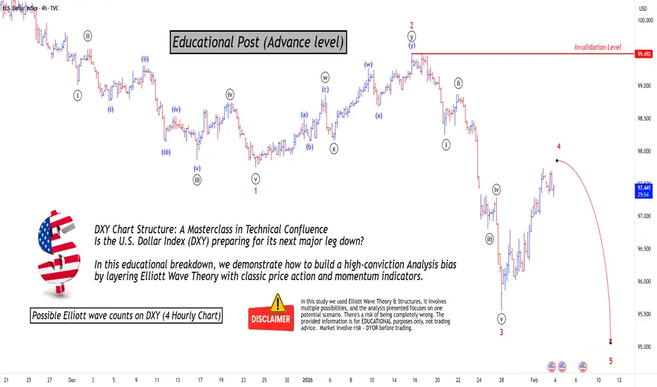
Mastering Technical:DXY Elliott Wave & Multi-Indicators AnalysisTechnical Analysis: DXY Bearish Confluence
This post serves as an educational guide on how various technical analysis tools converge to suggest a strong potential for a continued downtrend in the U.S. Dollar Index (DXY) on the 4-hour timeframe.
Elliott Wave Structure & Bearish Bias
The prevailing Elliott Wave count suggests the DXY is currently completing a corrective minor wave 4 rally within a larger five-wave impulse sequence to the downside. The market bias remains bearish, anticipating the onset of a significant minor wave 5 decline once the current wave 4 correction finishes.
Dow Theory & Price Action Confirmation
Dow Theory principles support the bearish outlook. The price action is clearly establishing a pattern of lower lows and lower highs, a classic signature of an active downtrend. The current rally (wave 4) is simply a higher low correction within this established structure, confirming the overall market direction is down.
Key Confluence Points for Resistance
Multiple technical indicators are clustering at a specific price zone, suggesting a high-probability area where the rally might reverse:
200 EMA Resistance: The price is trading below the 200-period Exponential Moving Average (EMA) on the 4-hour chart. This indicator is positioned just above the current price and is expected to provide significant dynamic resistance (a "hurdle") to the upside.
Fibonacci Retracement Alignment: The crucial 61.8% Fibonacci retracement level of the last major swing low is located very near the 200 EMA. This strong overlap of resistance levels increases the likelihood of a price reversal.
Divergence Analysis
Divergences between price and oscillators further reinforce the bearish sentiment:
Hidden Bearish Divergence: There is existing hidden bearish divergence present. This is a powerful trend-continuation signal that reinforces the expectation that sellers will soon regain control.
Absence of Bullish Signals: A key factor increasing conviction in the bearish bias is the lack of any bullish divergence seen yet on chart. The absence of this potential reversal signal suggests that a strong bullish bounce is not imminent.
Invalidation Level & Potential Targets
Defining risk and reward is essential in trading:
Invalidation Level: The bearish count is only valid as long as the price remains below the critical invalidation level marked at approximately 99.492
Potential Targets: Upon confirmation of the wave 4 top and the start of wave 5, the target for the decline is expected to be lower than the last swing lows (below the wave 3 termination point around 95.100).
I am not Sebi registered analyst. My studies are for educational purpose only.
Please Consult your financial advisor before trading or investing.
I am not responsible for any kinds of your profits and your losses.
Most investors treat trading as a hobby because they have a full-time job doing something else.
However, If you treat trading like a business, it will pay you like a business.
If you treat like a hobby, hobbies don't pay, they cost you...!
Hope this post is helpful to community
Thanks
RK💕
Disclaimer and Risk Warning.
The analysis and discussion provided on in.tradingview.com is intended for educational purposes only and should not be relied upon for trading decisions. RK_Chaarts is not an investment adviser and the information provided here should not be taken as professional investment advice. Before buying or selling any investments, securities, or precious metals, it is recommended that you conduct your own due diligence. RK_Chaarts does not share in your profits and will not take responsibility for any losses you may incur. So Please Consult your financial advisor before trading or investing.
S&P 500: Institutional Demand Zones vs. Macro HeadwindsS&P 500 (SPCFD) Strategic Market Analysis – 4H Timeframe
1. Market Structure & Price Action Overview
The S&P 500 is currently exhibiting a high-level consolidation within a dominant bullish trend. The price action at these peaks suggests a strategic liquidity engineering phase, where the market is balancing before its next directional expansion.
2. Key Liquidity Pools & Demand Zones
The technical map identifies two primary zones of institutional interest:
Sell-Side Liquidity (SSL) Target (6,789.05): This level represents the immediate swing low where retail stop-losses are likely clustered. An institutional "sweep" below this level would likely serve as the catalyst for the next leg up, providing the necessary liquidity to fill large buy orders.
Primary Interest Zone ($6,700 - $6,740): This marked demand block aligns with a "Discount" pricing array. This is the first high-probability area where institutional accumulation is expected to resume.
Extreme Discount/HTF Support ($6,520 - $6,550): This lower boundary serves as the "line in the sand" for the current bullish structure. Maintaining this level is vital for the long-term integrity of the uptrend.
3. Momentum & Volume Distribution Analysis
Williams %R: Currently hovering in the neutral territory (−48.11), confirming the lack of immediate directional conviction. A dip into the oversold region (below −80) followed by a sharp recovery would be a classic trigger for a long entry.
Accumulation/Distribution (A/D): The curve remains resilient at 195.75B. The lack of a sharp divergence suggests that while the price is stalling, major players are not aggressively offloading positions, supporting a "buy-the-dip" thesis.
4. Institutional Executive Summary
Market Bias: Neutral-Bullish. While the macro trend is intact, the micro-structure favors a corrective move to tap into liquidity before further upside.
Strategic Execution Note:
"Patience is advised until the 6,789 liquidity pool is neutralized. A successful sweep of this level, coupled with a bullish rejection in the 6,740 demand zone, would offer a High-Probability Long Setup. Risk parity should be maintained, eyeing a move back toward the previous highs and beyond."
⚠️ STRATEGIC WARNING: High-Volatility Window
The market is currently entering a high-impact zone. While the technical structure remains bullish on a Higher Timeframe (HTF), the price is stalling at premium levels. We are expecting a liquidity-driven correction before the next sustainable expansion. Do not chase the current highs; wait for the "smart money" footprint.

#EDU/USDT Forming Bullish Momentum#EDU
The price is moving within a descending channel on the hourly timeframe. It has reached the lower boundary and is heading towards a breakout, with a retest of the upper boundary expected.
The Relative Strength Index (RSI) is showing a downward trend, approaching the lower boundary, and an upward bounce is anticipated.
There is a key support zone in green at 0.1286, and the price has bounced from this level several times. Another bounce is expected.
The RSI is showing a trend towards consolidation above the 100-period moving average, which we are approaching, supporting the upward move.
Entry Price: 0.1607
Target 1: 0.1391
Target 2: 0.1486
Target 3: 0.1607
Stop Loss: Below the green support zone.
Remember this simple thing: Money management.
For any questions, please leave a comment.
Thank you.

Most Crypto Losses Are Self-Inflicted — Here’s How to Avoid ThemMost traders blame their crypto losses on volatility, market makers, or unexpected news.
That explanation feels safe — because it removes personal responsibility.
But after years of observing real trading behavior across different market cycles, one pattern stands out with brutal consistency:
Most losses in crypto are self-inflicted — not market-inflicted.
And that’s actually good news.
Because what you cause, you can also control.
The Market Is Neutral — Your Behavior Is Not
Crypto doesn’t hunt accounts.
It doesn’t care where you entered.
It doesn’t punish you personally.
Losses usually come from how traders react to price:
- Chasing momentum after late entries
- Panic-selling during healthy pullbacks
- Acting on fear instead of structure
- Forcing trades when the market offers no edge
Price only moves.
Your decisions determine the outcome.
Professionals don’t try to outsmart volatility — they learn to operate calmly within it.
Overtrading: The Most Expensive Habit Nobody Talks About
Many traders aren’t losing because their ideas are bad.
They’re losing because they trade too often.
Overtrading usually shows up as:
- Trading out of boredom
- Trading to recover a previous loss
- Trading every small fluctuation
- Trading without a fully defined setup
Every position carries risk.
More trades do not increase opportunity — they increase emotional exposure.
In professional trading, restraint is a skill, not a weakness.
If You Don’t Control Risk, the Market Will Do It for You
You can be directionally right and still lose money.
Self-inflicted losses often come from:
- Oversized positions
- Moving stop-losses under pressure
- Risking too much on a single idea
- Treating one trade as “the big one”
Professionals don’t think in individual trades.
They think in probability over time.
Their priority is simple:
- Capital preservation first
- Consistent execution second
- Profits as a byproduct
Survival always comes before growth.
Complex Charts Create Emotional Decisions
More indicators do not create better trades.
They often create conflicting signals.
Common mistakes:
- Indicator overload
- Strategy hopping
- Constant re-interpretation of the same chart
- Looking for certainty where none exists
Clear charts produce clear thinking.
Clear thinking reduces emotional damage.
Simplicity isn’t basic — it’s advanced.
Revenge Trading Turns Small Losses Into Big Ones
After a loss, the mind seeks relief — not logic.
That’s when traders:
- Increase position size
- Break their own rules
- Enter without confirmation
- Trade to “feel right” again
The market does not respond to frustration.
And it does not reward urgency.
Losses are part of the business.
Trying to erase them emotionally often compounds them financially.
The Hardest Skill in Trading: Doing Nothing
Some of the best trades are the ones you don’t take.
Not trading when:
- Structure is unclear
- Volatility is erratic
- You’re emotionally involved
- Your plan says “wait”
Doing nothing protects capital.
And capital protection is what allows long-term consistency.
How to Avoid Self-Inflicted Losses (A Practical Framework)
- Trade less, but with intention
- Risk small and consistently
- Follow one system until proven otherwise
- Accept losses quickly and emotionally neutral
- Never trade to fix a feeling
- Measure success by discipline, not outcome
Your job is not to win every trade.
Your job is to stay in the game long enough for probability to work.
Final Thought
Crypto is not dangerous because it’s unfair.
It’s dangerous because it exposes:
- impatience
- ego
- fear
- lack of structure
Once you stop fighting the market and start managing yourself, trading becomes clearer, calmer, and far more sustainable.
Most crypto losses are self-inflicted.
Recognize that — and you’ve already taken the first step to avoiding them.
💬 Do you believe psychology causes more losses than analysis in crypto trading?
Share your perspective below — let’s discuss.

5 IMPOTANT TYPES OF ELLIOTT WAVE PATTERNS !!Hello traders, today we will talk about 5 TYPES OF ELLIOTT WAVE PATTERNS
( FIRST SOME BASIC INFO )
What is Elliott Wave Theory?
The Elliott Wave Theory suggests that stock prices move continuously up and down in the same pattern known as waves that are formed by the traders’ psychology.
The theory holds as these are recurring patterns, the movements of the stock prices can be easily predicted.
Investors can get an insight into ongoing trend dynamics when observing these waves and also helps in deeply analyzing the price movements.
But traders should take note that the interpretation of the Elliot wave is subjective as investors interpret it in different ways.
(KEY TAKEAWAYS)
The Elliott Wave theory is a form of technical analysis that looks for recurrent long-term price patterns related to persistent changes in investor sentiment and psychology.
The theory identifies impulse waves that set up a pattern and corrective waves that oppose the larger trend.
Each set of waves is nested within a larger set of waves that adhere to the same impulse or corrective pattern, which is described as a fractal approach to investing.
Before discussing the patterns, let us discuss Motives and Corrective Waves:
What are Motives and Corrective Waves?
The Elliott Wave can be categorized into Motives and Corrective Waves:
1. Motive Waves:
Motive waves move in the direction of the main trend and consist of 5 waves that are labelled as Wave 1, Wave 2, Wave 3, Wave 4 and Wave 5.
Wave 1, 2 and 3 move in the direction of the main direction whereas Wave 2 and 4 move in the opposite direction.
There are usually two types of Motive Waves- Impulse and Diagonal Waves.
2. Corrective Waves:
Waves that counter the main trend are known as the corrective waves.
Corrective waves are more complex and time-consuming than motive waves. Correction patterns are made up of three waves and are labelled as A, B and C.
The three main types of corrective waves are Zig-Zag, Diagonal and Triangle Waves.
Now let us come to Elliott Wave Patterns:
In the chart I have mentioned 5 main types of Elliott Wave Patterns:
1. Impulse:
2. Diagonal:
3. Zig-Zag:
4. Flat:
5. Triangle:
1. Impulse:
Impulse is the most common motive wave and also easiest to spot in a market.
Like all motive waves, the impulse wave has five sub-waves: three motive waves and two corrective waves which are labelled as a 5-3-5-3-5 structure.
However, the formation of the wave is based on a set of rules.
If any of these rules are violated, then the impulse wave is not formed and we have to re-label the suspected impulse wave.
The three rules for impulse wave formation are:
Wave 2 cannot retrace more than 100% of Wave 1.
Wave 3 can never be the shortest of waves 1, 3, and 5.
Wave 4 can never overlap Wave 1.
The main goal of a motive wave is to move the market and impulse waves are the best at accomplishing this.
2. Diagonal:
Another type of motive wave is the diagonal wave which, like all motive waves, consists of five sub-waves and moves in the direction of the trend.
The diagonal looks like a wedge that may be either expanding or contracting. Also, the sub-waves of the diagonal may not have a count of five, depending on what type of diagonal is being observed.
Like other motive waves, each sub-wave of the diagonal wave does not fully retrace the previous sub-wave. Also, sub-wave 3 of the diagonal is not the shortest wave.
Diagonals can be further divided into the ending and leading diagonals.
The ending diagonal usually occurs in Wave 5 of an impulse wave or the last wave of corrective waves whereas the leading diagonal is found in either the Wave 1 of an impulse wave or the Wave A position of a zigzag correction.
3. Zig-Zag:
The Zig-Zag is a corrective wave that is made up of 3 waves labelled as A, B and C that move strongly up or down.
The A and C waves are motive waves whereas the B wave is corrective (often with 3 sub-waves).
Zigzag patterns are sharp declines in a bull rally or advances in a bear rally that substantially correct the price level of the previous Impulse patterns.
Zigzags may also be formed in a combination which is known as the double or triple zigzag, where two or three zigzags are connected by another corrective wave between them.‘
4. Flat:
The flat is another three-wave correction in which the sub-waves are formed in a 3-3-5 structure which is labelled as an A-B-C structure.
In the flat structure, both Waves A and B are corrective and Wave C is motive having 5 sub-waves.
This pattern is known as the flat as it moves sideways. Generally, within an impulse wave, the fourth wave has a flat whereas the second wave rarely does.
On the technical charts, most flats usually don’t look clear as there are variations on this structure.
A flat may have wave B terminate beyond the beginning of the A wave and the C wave may terminate beyond the start of the B wave. This type of flat is known as the expanded flat.
The expanded flat is more common in markets as compared to the normal flats as discussed above.
5. Triangle:
The triangle is a pattern consisting of five sub-waves in the form of a 3-3-3-3-3 structure, that is labelled as A-B-C-D-E.
This corrective pattern shows a balance of forces and it travels sideways.
The triangle can either be expanding, in which each of the following sub-waves gets bigger or contracting, that is in the form of a wedge.
The triangles can also be categorized as symmetrical, descending or ascending, based on whether they are pointing sideways, up with a flat top or down with a flat bottom.
The sub-waves can be formed in complex combinations. It may theoretically look easy for spotting a triangle, it may take a little practice for identifying them in the market.
Bottomline:
As we have discussed above Elliott wave theory is open to interpretations in different ways by different traders, so are their patterns. Thus, traders should ensure that when they identify the patterns.
This chart is just for information
Never stop learning
I would also love to know your charts and views in the comment section.
Thank you

Most Crypto Losses Are Self-Inflicted — Here’s How to Avoid ThemMost traders blame their crypto losses on volatility, market makers, or unexpected news.
That explanation feels safe — because it removes personal responsibility.
But after years of observing real trading behavior across different market cycles, one pattern stands out with brutal consistency:
Most losses in crypto are self-inflicted — not market-inflicted.
And that’s actually good news.
Because what you cause, you can also control.
The Market Is Neutral — Your Behavior Is Not
Crypto doesn’t hunt accounts.
It doesn’t care where you entered.
It doesn’t punish you personally.
Losses usually come from how traders react to price:
- Chasing momentum after late entries
- Panic-selling during healthy pullbacks
- Acting on fear instead of structure
- Forcing trades when the market offers no edge
Price only moves.
Your decisions determine the outcome.
Professionals don’t try to outsmart volatility — they learn to operate calmly within it.
Overtrading: The Most Expensive Habit Nobody Talks About
Many traders aren’t losing because their ideas are bad.
They’re losing because they trade too often.
Overtrading usually shows up as:
- Trading out of boredom
- Trading to recover a previous loss
- Trading every small fluctuation
- Trading without a fully defined setup
Every position carries risk.
More trades do not increase opportunity — they increase emotional exposure.
In professional trading, restraint is a skill, not a weakness.
If You Don’t Control Risk, the Market Will Do It for You
You can be directionally right and still lose money.
Self-inflicted losses often come from:
- Oversized positions
- Moving stop-losses under pressure
- Risking too much on a single idea
- Treating one trade as “the big one”
Professionals don’t think in individual trades.
They think in probability over time.
Their priority is simple:
- Capital preservation first
- Consistent execution second
- Profits as a byproduct
Survival always comes before growth.
Complex Charts Create Emotional Decisions
More indicators do not create better trades.
They often create conflicting signals.
Common mistakes:
- Indicator overload
- Strategy hopping
- Constant re-interpretation of the same chart
- Looking for certainty where none exists
Clear charts produce clear thinking.
Clear thinking reduces emotional damage.
Simplicity isn’t basic — it’s advanced.
Revenge Trading Turns Small Losses Into Big Ones
After a loss, the mind seeks relief — not logic.
That’s when traders:
- Increase position size
- Break their own rules
- Enter without confirmation
- Trade to “feel right” again
The market does not respond to frustration.
And it does not reward urgency.
Losses are part of the business.
Trying to erase them emotionally often compounds them financially.
The Hardest Skill in Trading: Doing Nothing
Some of the best trades are the ones you don’t take.
Not trading when:
- Structure is unclear
- Volatility is erratic
- You’re emotionally involved
- Your plan says “wait”
Doing nothing protects capital.
And capital protection is what allows long-term consistency.
How to Avoid Self-Inflicted Losses (A Practical Framework)
- Trade less, but with intention
- Risk small and consistently
- Follow one system until proven otherwise
- Accept losses quickly and emotionally neutral
- Never trade to fix a feeling
- Measure success by discipline, not outcome
Your job is not to win every trade.
Your job is to stay in the game long enough for probability to work.
Final Thought
Crypto is not dangerous because it’s unfair.
It’s dangerous because it exposes:
- impatience
- ego
- fear
- lack of structure
Once you stop fighting the market and start managing yourself, trading becomes clearer, calmer, and far more sustainable.
Most crypto losses are self-inflicted.
Recognize that — and you’ve already taken the first step to avoiding them.
💬 Do you believe psychology causes more losses than analysis in crypto trading?
Share your perspective below — let’s discuss.

GOLD SellAs gold is concerned i am seeing a bearish move in the commodity because it has reached its physiological level and forming a M pattern which is too early to be predicted as it has formed its first leg and 2nd is going to be formed in nearing time also another confluence being bearish is we have a 78.6% fibb level residing under 1H 4H and daily respectively from up to down 👇 so i have made a sell position from current price if it breaks down

Why Default Strategy Settings Break Down Across MarketsThe Assumption: Defaults Are Good Enough
Most traders start with default indicator settings . RSI at 14. MACD at 12, 26, 9. Moving averages set to familiar values.
Defaults feel safe because they are familiar. They feel reasonable because they are widely used.
The problem: defaults are not designed to work across all symbols, timeframes, or market conditions.
The solution: instead of assuming defaults are acceptable, test how those settings behave when parameters are varied. Small changes often reveal whether a strategy is stable or dependent on coincidence.
The Assumption: If It Works on One Chart, It Should Work Elsewhere
A strategy looks clean on a single chart. Entries make sense. Losses feel explainable. Confidence builds.
The problem: one chart is not a market. Performance on a single symbol or timeframe says very little about robustness.
The solution: test the same logic across multiple symbols and timeframes. When behavior changes dramatically, it’s not failure, it’s information. Consistency across variation is what signals durability.
The Assumption: Indicator Logic Is the Edge
Traders often focus heavily on the logic behind indicators. Momentum, trend, mean reversion. The reasoning feels solid.
The problem: good logic does not guarantee good behavior. Two parameter sets can follow the same logic and produce completely different risk profiles.
The solution: explore how performance shifts as parameters move. Testing ranges, not single values, shows whether logic holds up under pressure or collapses when assumptions change.
The Assumption: Profit Tells the Full Story
Many traders judge strategies by net profit alone.
The problem: profit without context hides risk. Large drawdowns, unstable equity curves, or long stagnation periods often go unnoticed until they’re experienced live.
The solution: test for drawdown, consistency, and trade distribution alongside profit. Seeing how risk expands or contracts across parameter combinations changes how strategies are evaluated.
The Assumption: Defaults Fail Because Markets Changed
When defaults stop performing, traders often blame the market.
The problem: markets always change. A strategy that only works under narrow conditions was fragile from the start.
The solution: testing across broader conditions reveals whether a strategy is regime-dependent or structurally resilient. This allows expectations to adjust before capital is exposed.
What Testing Actually Replaces
Testing doesn’t replace strategy logic.
It replaces assumptions.
It replaces:
“This should work”
“This looks reasonable”
“Everyone uses this”
With:
“This is how it behaves”
“This is where it struggles”
“This is how sensitive it is”
Final Thought
Default settings are not wrong.
They are incomplete.
They are a starting point, not a conclusion.
The moment defaults are tested across parameters, symbols, and timeframes, they stop being assumptions and start becoming data. That shift is where real understanding begins.

"Macro Maps" - Most Underrated TradingView ToolThis Tool is called "Macro Maps", and have never seen anyone cover this gem on yt or anywhere else. So thanks to Macro Maps, you can view multiple macroeconomic indicators such as interest rates, inflation, or unemployment on the world map without spending any time researching for each individual country. You just have to hover through each country and it will pop up the current, for example, interest rate of that specific country. In addition, it can even show third world countries which are really hard to find on Google through your own research. As such, as day traders, as investors, or as any participant in the financial markets, this map is very important as in seconds, you can find out the interest rate, the inflation rate, or the GDP, or even the unemployment rate of any country on the world map. Of course, there are some exceptions like maybe North Korea, as some countries are secluded. Lastly, what you can also do is compare the change in inflation and other metrics through time. So the map allows you to go from 2025 and compare those metrics, for example, to 1980s for all the countries on the world map. And that's very useful as it helps us not waste time searching for all these macroeconomic metrics.
Disclaimer:
This analysis is for informational and educational purposes only and does not constitute financial advice, investment recommendation, or an offer to buy or sell any securities. Asset prices, valuations, and performance metrics are subject to change and may be outdated. Always conduct your own due diligence and consult with a licensed financial advisor before making investment decisions. The information presented may contain inaccuracies and should not be solely relied upon for financial decisions. I am not a licensed financial advisor or professional trader. I am not personally liable for your own losses; this is not financial advice.

Altcoin season is coming, now doubt about this!Yesterday, I wrote something that might sound harsh — but I stand by it:
In my opinion, 99% of altcoins are junk (and I’m putting it nicely).
Not necessarily scams… just assets with weak long-term survival chances.
And what makes smaller alts dangerous isn’t only the volatility.
It’s the bullish bias they create.
Because if you want to be bullish badly enough, you can take almost any chart, build a bullish narrative around it, and sound smart, logical, and “technical”.
In fact, I can prove it.
I can write two bullish analyses on the exact same chart.
The only difference?
In the second one…
I simply flip the chart upside down.
Let’s go.
✅ Analysis #1 (Bullish… on the normal chart)
"As we can see on the chart, after the major market high in December 2024, altcoins went through a sharp and aggressive drop, which finally found support around the $175B zone in April 2025.
From that point, the market managed to recover nicely, pushing higher — but once price reached the $335B resistance area, momentum faded and sellers stepped back in.
That rejection sent the market lower again, and the decline ended with the mid-October flash crash, where price once again reacted strongly from support.
Now, the start of 2026 is showing something important:
✅ a higher low is in place
If this structure continues to hold, the next logical upside is:
🎯 a return toward the $335B resistance zone.
The market still needs confirmation — but the setup is getting cleaner 🚀"
✅ Analysis #2 (Bullish… on the inverted chart)
Now we flip the same chart upside down.
Same data. Same price action. Same bullish bias.
"After the major low formed back in December 2024 around -450, smaller altcoins printed a very strong impulsive leg up, pushing the price all the way to the -175 zone.
The correction that followed was something normal and found solid support around -335, perfectly aligned with the previous lows from March 2024 — a strong technical floor.
Since September 2025, altcoins have been recovering in a controlled way, gradually building higher lows.
Right now, we’re consolidating just below -175 resistance, which also acts as the neckline of a massive inverted Head & Shoulders pattern.
If buyers break and hold above -175, then:
🎯 -80 becomes the obvious target 🚀"
The point? Bias can turn anything bullish.
But here’s the funny part:
It doesn’t matter, because, regardless
Altcoin season is coming:)) 🚀
Have a nice weekend!
Mihai Iacob

Every Candle Has Psychology — Let’s Decode 3 of ThemHave you ever thought that every single candle carries its own psychology behind it?
If not, don’t worry — that’s exactly what this educational idea is about.
In this lesson, we’re going to break down the psychology behind three of the most popular candles, using a skeptical and practical approach.
In this post, I’ll focus only on single-candle structures.
If you’d like me to cover 2-candle or 3-candle patterns next, drop a comment and let me know.
Let’s start with one of the most famous candles of all time:
🔨 1) Bullish/Bearish Hammer — What’s Really Happening?
Assume we’re looking at a bullish hammer.
Sellers tried everything they had to push price lower.
But buyers stepped in aggressively, forced price back up, and closed the candle near the top.
Psychologically, this tells us two things:
Sellers didn’t just fail — they got liquidated
Buyers gained confidence, and new long positions may fuel upside momentum
The small upper wick represents the last desperate attempt by sellers.
Best execution idea:
Placing a stop-buy above the upper wick.
Why?
Shorts above the wick get liquidated
The sellers’ final defense is removed
Price can accelerate upward with momentum
Win rate improves significantly when:
The hammer forms after an uptrend
Price is aligned with moving averages (e.g. SMA)
🔥 2) Bullish/Bearish Engulfing — Momentum Shift Confirmed
This is one of my personal favorites.
Sellers print a solid bearish candle.
The next candle fully engulfs the previous body to the upside.
What does this mean?
Sellers gave up.
Not gradually — instantly.
Buyers completely dominate the zone, reclaiming all previous losses and closing strong.
This candle is especially powerful when it forms:
After a pullback into a box range
Near a trendline
After a support/resistance break
Psychologically, it often signals:
The start of the second impulse wave
A strong continuation opportunity
A very clean and reliable trigger when context supports it.
🧱 3) Marubozu — Beginning or End?
Marubozu candles usually appear in two very different places:
At the end of a trend
At the start of a new trend
Understanding which one you’re dealing with is critical.
Signs of a trend-ending Marubozu:
Price reaches major levels (e.g. above 4H Pivot Points)
A long, aggressive trend precedes it
RSI is overextended
Price is near strong support or resistance
Result?
➡️ Expect range or correction, not continuation.
Psychology:
Participants exhausted themselves just to reach the level —
not to break it.
Signs of a trend-starting Marubozu:
Price was previously ranging or boxed
Volume was compressed before the move
RSI is far from extreme levels
Orders accumulated inside the range
The longer price stays inside a range,
the more orders build up — and once released, the move becomes sharp and fast.
🧠 How to Trade Them Properly
End-of-trend Marubozu:
Take profits or close positions.
Start-of-trend Marubozu:
You can enter, but it’s smarter to:
Wait for confirmation
Enter on later triggers with smaller stop loss
Improve R/R ratios
By the way, I’m Skeptic , founder of Skeptic Lab.
I focus on long-term performance through psychology, data-driven thinking, and tested processes.
That’s it.
Now get outta here.

Why 99% of Altcoins Are “Aerotyne”… With a Fan ClubIf you’ve seen The Wolf of Wall Street, you remember that legendary early scene where Jordan Belfort is being told what the stock market really is.
And he gets the most accurate financial definition ever created:
“Fugazi… fugezi… it’s a wazi, it’s a woozy… who gives a f.”*
Now translate that into crypto language and you get:
- Doesn’t matter what the token is called.
- Doesn’t matter what the whitepaper says.
- Doesn’t matter how many buzzwords they stack on top of it like a cursed lasagna.
Because the truth is simple:
It’s not real. It’s smoke. It’s vibes. It’s marketing dressed as math.
And that, my friend, is exactly how 99% of altcoins work.
They’re not investments.
They’re emotions with candlesticks.
The funniest part is that the whole thing has already happened in the movie.
Remember that “Aerotyne” moment?
That random company name no one can pronounce properly?
Aerotyne… Arotine… Aerotine…
It didn’t matter what it was called because he wasn’t selling the stock.
- He was selling the story.
- He was selling the feeling.
- That little dopamine fantasy that whispers: “You’ll pay your morgage.”
That’s basically the entire altcoin market in one sentence.
Now, let me be clear: this isn’t one of those posts where I tell you to “read the whitepaper”, “DYOR”, “be careful guys”, and other sterile advice that sounds smart but doesn’t stop anyone from clicking Buy.
And no, this isn’t coming from bitterness either.
Yes, I’ve lost some money on altcoins last year.
But at least I knew what game I was playing.
- I didn’t marry them.
- I didn’t become their lawyer on Twitter.
- I didn’t start defending my coin like it was my childhood dog.
I took the loss like a man and moved on with one thought:
Alright… enough with small coins.
Because at some point you stop asking “what if it moons?” …and you start asking the adult question: What if it just dies quietly?
And in the altcoin world, that’s not FUD.
That’s not negativity.
That’s just… normal.
Here’s what most people don’t want to admit:
You didn’t buy a coin.
You bought a conversation topic for beer night.
A reason to sit with your friends and pretend you’re not gambling — you’re “investing”.
You bought hours of:
“Bro, have you seen the tokenomics?”
“No, no, you don’t understand… this is Layer 0.”
“Wait, they’re building a new ecosystem!”
“This will change the planet!”
“They’re solving a real-world problem!”
And suddenly you’re not gamblers anymore.
You’re analysts.
Economists.
Visionaries.
You and your friends start comparing coins the way others compare football teams.
Your friend picks one altcoin. You pick another.
And now it’s war.
You defend your token like it’s your club.
He says his coin is better, and you take it personally like he insulted your family name.
“No bro, mine is stronger.”
“Mine has better community.”
“Mine has bigger partnerships.”
“Yours is VC-backed.”
“Mine is organic.”
“Mine is still early.”
Two grown men. Arguing like football fans. Over who chose the better Aerotyne with a modern logo.
That’s what you bought.
Not a coin.
Not an investment.
You bought a social identity.
- A team.
- A badge.
- A belief.
- A conversational piece.
But you also bought something else — something deeper: you bought hope, hope in a dark world.
So when a coin shows up with a clean website, a shiny roadmap, and a promise that sounds like:
“We’re building the future…”
…it doesn’t just hit your wallet.
It hits your psychology.
It hits the part of you that still wants to believe there’s a shortcut to freedom, out the stress, out the routine.
That maybe this is the one thing that finally makes life feel fair.
And there’s nothing wrong with that.
There’s nothing wrong with wanting to believe.
There’s nothing wrong with dreaming.
The problem starts when that hope gets monetized.
Because in crypto, hope isn’t just an emotion.
Hope is a business model.
And yes, some developers are real builders.
But most of them?
- They’re not selling tech.
- They’re selling meaning.
- They’re selling purpose.
- They’re selling belonging.
And trust me — they don’t do it randomly.
They have marketing teams trained in mass psychology.
They understand human behavior better than most traders understand their own charts.
They know:
- people copy influencers,
- people chase excitement,
- people fear missing out,
- people want a tribe,
- people defend what they paid for,
- people confuse “community” with “safety”.
That’s why even dead projects always sound alive.
“Big announcement coming.”
“Major update soon.”
“Partnership incoming.”
“New exchange listing.”
“Something huge is cooking.”
Because the goal isn’t to create value. The goal is to keep hope alive…
And once you see that, you can’t unsee it.
You realize that many altcoins don’t behave like businesses.
They behave like campaigns.
Hype campaigns.
They don’t need revenue.
They don’t need customers.
They don’t even need product-market fit.
They need narrative.
They need a pump.
They need attention.
They need your hope.
And that’s why the new altcoin cycle always looks the same:
The teaser.
The hype.
The “community”.
The influencer wave.
The green candles.
... And then silence.
A slow bleed that turns every proud investor into a long-term philosopher: “I’m holding because I believe in the project.”
No bro.
You’re holding because selling would force you to admit you bought Aerotyne.
So if I had to give one useful piece of advice, it wouldn’t be “DYOR”.
It would be boring.
It would be simple.
It would be this: Trade only big coins .
BTC.
ETH.
SOL.
Use technical analysis.
And most importantly…
Drop the “moon” fantasy.
Because moon trading is not strategy.
Moon trading is religion.
And since I started with a quote, I’ll end with one too.
From the immortals SNAP:
“Don’t believe the hype, it’s a sequel.”
And that’s exactly what most altcoins are.
- Not innovation.
- Not a revolution.
- Not “the next big thing”.
Just a sequel.
An Aerotyne sequel.
An Aerotyne with a community.
An Aerotyne with an X account posting daily optimism.
An Aerotyne with a Telegram group full of people chanting “LFG” while the chart bleeds.
An Aerotyne with a swarm of paid influencers…
…who get copied by thousands of smaller influencers…
…because human psychology never changes:
If you see enough people cheering, you start cheering too.
Even if you don’t know what you’re cheering for.
Even if the coin name sounds like a typo.
Even if deep down you already know…
It’s Fugazi!

BANK OF MAHARASHTRA - DAILY CHART MY VIEW The Structure looks good to us, waiting for this instrument to correct and then give us these opportunities as shown on this instrument (Price Chart).
Note: Its my view only and its for educational purpose only. Only who has got knowledge about this strategy, will understand what to be done on this setup. its purely based on my technical analysis only (strategies). we don't focus on the short term moves, we look for only for Bullish or Bearish Impulsive moves on the setups after a good price action is formed as per the strategy. we never get into corrective moves. because it will test our patience and also it will be a bullish or a bearish trap. and try trade the big moves.
We do not get into bullish or bearish traps. We anticipate and get into only big bullish or bearish moves (Impulsive Moves). Just ride the Bullish or Bearish Impulsive Move. Learn & Know the Complete Market Cycle.
Buy Low and Sell High Concept. Buy at Cheaper Price and Sell at Expensive Price.
Please keep your comments useful & respectful.
Keep it simple, keep it Unique.
Thanks for your support
Tradelikemee Academy
Saanjayy K G

Star Cement — The Quiet Phase Before the Next Big Move?📉 Star Cement — Primary Wave-4 & Wave-5 Context (Elliott Wave Study)
This post is an educational Elliott Wave structure study 📚 based on the current weekly and daily chart of Star Cement.
Star Cement completed a strong multi-year advance 🚀 from the 2022 lows, peaking near the ₹308–310 region . This advance shows classic characteristics of a Primary Wave-3 , including strong momentum, broad participation, and a terminal phase near the highs.
After the peak, price behaviour shifted from trending to overlapping and corrective , suggesting the market has transitioned into a Primary Wave-4 phase . Among the common corrective patterns, a Flat (A-B-C) structure currently best explains the price action.
Within this interpretation, Wave A declined from ~₹308 to ~₹245 and showed overlapping characteristics rather than a clean impulse. Wave B retraced weakly toward ~₹270 and lacked impulsive strength, which is typical behaviour within flat corrections. Wave C is currently unfolding with overlapping internal swings and reduced momentum, supporting the view that this is a corrective decline rather than the start of a new impulsive downtrend.
From a structural and Fibonacci perspective 📐, the chart highlights a broader confluence area between ₹195 and ₹205 , corresponding to the 0.618 retracement of the entire Primary Wave-3 and the 1.272 extension of Wave A. An extended confluence area is also visible around ₹185–190 , near the 0.786 retracement of Primary Wave-3. These zones are presented purely as areas of analytical interest where flat corrections often mature, not as signals.
In educational terms 🎓, a Flat-C phase typically ends quietly rather than dramatically . Behaviour consistent with a maturing correction would include price stabilising within the ₹185–205 zone , smaller and overlapping candles, failed breakdown attempts with quick recoveries, and the emergence of a clean directional move away from the zone. In contrast, continuation of the correction would be suggested by impulsive downside expansion below ~₹185 , increasing range and volume on declines, and weak rebounds that remain capped below prior resistance zones.
The projected Primary Wave-5 🔵 (shown in blue on the chart) is included strictly for higher-degree context. Wave-5 scenarios are only studied after Wave-4 has fully resolved and the structure transitions from corrective to impulsive. Historically, Primary Wave-5 advances tend to be more selective, often shorter than Wave-3, and occur only after prolonged consolidation or correction. The Fibonacci extension zones associated with Wave-5 are theoretical reference levels that illustrate how analysts frame potential future paths, not expectations.
At this stage, Star Cement remains in a Primary Wave-4 corrective environment . The focus is on observing structure, momentum, and confirmation rather than anticipating outcomes 🧠. Higher-degree trend continuation can only be discussed after the correction completes and the market clearly proves a change in behaviour.
📉 Star Cement — Blue Wave-4 on Daily Timeframe (Elliott Study)
After the advance into the ₹308–310 zone 🚀, price behaviour shifted from trending to overlapping and corrective , marking the development of blue Wave-4 on the daily chart. This phase is characterised by segmented declines , frequent counter-trend bounces, and fading momentum , rather than impulsive selling.
Blue Wave-4 is interacting with a key ₹195–205 confluence zone 📐, with a deeper reference near ₹185–190 , areas where corrective waves often stabilise. Wave-4 corrections typically resolve quietly through time and overlap ⏳, not sharp reversals.
This study is shared strictly for educational and analytical discussion and does not constitute investment advice ⚠️.

Trading Center: The Dashboard That Changes EverythingStop Drowning in Data. Start Seeing What Matters.
Most traders have 47 browser tabs open, three charting platforms running, and still miss important information.
The problem isn't lack of data. It's lack of organization.
A well-designed trading dashboard transforms chaos into clarity — showing you exactly what you need, when you need it.
Why You Need a Dashboard
The Problem:
Information scattered across platforms
Important data buried in noise
Constant tab-switching and distraction
Missing signals while looking elsewhere
Decision fatigue from information overload
The Solution:
A centralized dashboard that:
Shows key metrics at a glance
Alerts you to important changes
Reduces cognitive load
Keeps you focused on what matters
Dashboard Components
1. Market Overview Panel
What to Include:
Major indices (SPY, QQQ, IWM)
Key sectors
VIX/volatility
Market breadth
Futures if relevant
Purpose:
Understand overall market context before any trade.
2. Watchlist Panel
What to Include:
Your active watchlist
Current price and change
Key levels (support/resistance)
Volume vs average
Alerts status
Purpose:
Track potential opportunities without switching screens.
3. Open Positions Panel
What to Include:
All current positions
Entry price and current price
P&L ($ and %)
Stop loss and target levels
Time in trade
Purpose:
Monitor all positions at a glance.
4. Risk Dashboard
What to Include:
Total portfolio exposure
Open risk ($ at risk)
Daily P&L
Drawdown from peak
Correlation warnings
Purpose:
Never lose track of your risk.
5. Economic Calendar
What to Include:
Upcoming economic events
Earnings dates for watchlist
Fed meetings
Major news events
Purpose:
Avoid being surprised by scheduled events.
6. Performance Metrics
What to Include:
Win rate (recent and overall)
Average R-multiple
Profit factor
Current streak
Monthly P&L
Purpose:
Track performance without opening spreadsheets.
7. Alerts and Notifications
What to Include:
Price alerts
Indicator alerts
News alerts
Risk threshold warnings
Purpose:
Get notified of important events without constant monitoring.
Dashboard Design Principles
Principle 1: Hierarchy of Information
Most important information should be most visible.
Critical data: Large, prominent
Supporting data: Smaller, secondary
Reference data: Available but not distracting
Principle 2: Reduce Noise
Only include what you actually use.
If you haven't looked at it in a week, remove it
Every element should serve a purpose
White space is valuable
Principle 3: Consistent Layout
Same information in same place every time.
Build muscle memory
Reduce search time
Faster decision making
Principle 4: Color Coding
Use color meaningfully.
Green: Positive/bullish
Red: Negative/bearish
Yellow: Warning/attention
Neutral: Normal state
Principle 5: Real-Time Where Needed
Not everything needs to update every second.
Price data: Real-time
Performance metrics: Daily update fine
Economic calendar: Daily update fine
AI-Enhanced Dashboards
1. Smart Alerts
AI filters alerts to show only significant ones:
Unusual volume
Pattern completions
Correlation changes
Risk threshold approaches
2. Anomaly Detection
AI highlights unusual conditions:
Abnormal price movements
Unusual options activity
Sentiment shifts
Correlation breakdowns
3. Predictive Insights
AI provides forward-looking information:
Expected volatility
Probability of hitting targets
Risk scenario analysis
4. Personalized Recommendations
AI suggests based on your patterns:
Best times to trade
Setups matching your edge
Risk adjustments needed
Building Your Dashboard
Option 1: TradingView Layout
Multiple chart layout
Watchlists
Alerts
Limited customization but integrated
Option 2: Spreadsheet Dashboard
Google Sheets or Excel
Pull data via APIs or manual
Highly customizable
Requires maintenance
Option 3: Dedicated Dashboard Tools
Notion, Airtable
Trading-specific tools
More features, learning curve
Option 4: Custom Build
Python + visualization libraries
Maximum flexibility
Requires coding skills
Dashboard Checklist
Before Market Open:
Check market overview (futures, indices)
Review economic calendar
Check open positions
Review watchlist for setups
Verify alerts are set
During Trading:
Monitor open positions
Track risk exposure
Watch for alerts
Note market context changes
After Market Close:
Review daily P&L
Update performance metrics
Adjust watchlist
Set alerts for tomorrow
Dashboard Mistakes
Too Much Information — Cramming everything onto one screen. Only include what you actually use daily.
No Hierarchy — Everything same size and prominence. Make critical information stand out.
Inconsistent Layout — Moving things around constantly. Set a layout and stick with it.
Ignoring Mobile — No way to check when away from desk. Have a simplified mobile version.
Not Updating — Dashboard becomes stale and ignored. Regular review and refinement.
Sample Dashboard Layout
Top Row: MARKET OVERVIEW — SPY, QQQ, IWM, VIX at a glance
Left Column: WATCHLIST — Your opportunities with price, change, key levels
Center: OPEN POSITIONS — All positions with P&L, stops, targets
Right Column: RISK DASHBOARD — Exposure, open risk, drawdown
Bottom Left: ALERTS — Price alerts, indicator alerts, warnings
Bottom Right: CALENDAR — Today's events, upcoming earnings
Key Takeaways
A dashboard transforms scattered information into organized clarity
Include only what you actually use — less is more
Design with hierarchy — critical information most prominent
Consistency builds speed — same layout every day
Regular refinement keeps the dashboard useful
Your Turn
What does your current trading setup look like?
What information do you wish you could see at a glance?
Share your dashboard ideas below 👇

Finding Edge Where Others Aren't Looking
The Best Traders Aren't Just Looking at Charts Anymore
While most traders stare at the same charts, indicators, and news feeds...
A new breed of traders is counting cars in parking lots from space, tracking shipping containers across oceans, and analyzing millions of social media posts.
This is alternative data - and it's changing who has the edge.
What Is Alternative Data?
Definition:
Alternative data is any data used for investment decisions that isn't traditional financial data (price, volume, earnings, etc.).
Traditional Data:
Price and volume
Financial statements
Earnings reports
Economic indicators
Analyst ratings
Alternative Data:
Satellite imagery
Social media sentiment
Web traffic and app usage
Credit card transactions
Geolocation data
Weather patterns
Job postings
Patent filings
And much more...
Types of Alternative Data
1. Satellite and Geospatial Data
What It Tracks:
Retail parking lot traffic
Oil storage tank levels
Crop health and yields
Shipping and logistics
Construction activity
Example:
Count cars in Walmart parking lots before earnings.
More cars = more sales = potential earnings beat.
Edge: Information before it appears in financial reports.
2. Social Media and Sentiment Data
What It Tracks:
Brand mentions and sentiment
Product buzz
Consumer complaints
Viral trends
Influencer activity
Example:
Track sentiment around a new product launch.
Negative sentiment spike = potential sales disappointment.
Edge: Real-time consumer reaction before sales data.
3. Web Traffic and App Data
What It Tracks:
Website visits
App downloads and usage
Search trends
E-commerce activity
User engagement
Example:
Track app downloads for a gaming company.
Declining downloads = potential revenue miss.
Edge: Usage data before quarterly reports.
4. Transaction Data
What It Tracks:
Credit card spending
Point-of-sale data
E-commerce transactions
Consumer behavior patterns
Example:
Aggregate credit card data shows spending at restaurants declining.
Restaurant stocks may underperform.
Edge: Spending patterns before earnings.
5. Employment and Job Data
What It Tracks:
Job postings
Hiring trends
Layoff announcements
Glassdoor reviews
LinkedIn activity
Example:
Company suddenly posts many engineering jobs.
Could indicate new product development.
Edge: Corporate strategy signals before announcements.
6. Supply Chain Data
What It Tracks:
Shipping container movements
Port activity
Supplier relationships
Inventory levels
Logistics patterns
Example:
Track shipping from key suppliers to Apple.
Increased shipments before product launch = strong demand.
Edge: Supply chain signals before sales data.
How AI Processes Alternative Data
Challenge:
Alternative data is:
Massive in volume
Unstructured (images, text, etc.)
Noisy
Requires specialized processing
AI Solutions:
1. Computer Vision
Analyzes satellite imagery
Counts objects (cars, ships, tanks)
Detects changes over time
2. Natural Language Processing
Processes social media text
Extracts sentiment
Identifies trends and topics
3. Machine Learning
Finds patterns in transaction data
Predicts outcomes from alternative signals
Combines multiple data sources
4. Time Series Analysis
Tracks changes over time
Identifies anomalies
Forecasts future values
Alternative Data in Practice
Case Study 1: Retail Earnings
Satellite data shows parking lot traffic up 15% vs last year
Social sentiment for brand is positive
Web traffic to e-commerce site increasing
Prediction: Earnings beat
Result: Stock rises on earnings
Case Study 2: Oil Prices
Satellite shows oil storage tanks filling up
Shipping data shows tankers waiting to unload
Prediction: Supply glut, prices may fall
Result: Oil prices decline
Case Study 3: Tech Company
App download data shows declining engagement
Job postings show layoffs in key division
Social sentiment turning negative
Prediction: Guidance cut coming
Result: Stock falls on earnings
Alternative Data Challenges
Cost - Quality alternative data is expensive. Satellite data: $10,000-$100,000+/year. Transaction data: $50,000-$500,000+/year. Not accessible to most retail traders.
Signal vs Noise - Most alternative data is noise. Requires sophisticated processing. Easy to find false patterns. Overfitting risk is high.
Alpha Decay - As more traders use the same data, edge disappears. Popular datasets become crowded. Unique data sources are key.
Legal and Ethical Issues - Some data collection is questionable. Privacy concerns. Data sourcing legality. Regulatory scrutiny increasing.
Integration Complexity - Combining alternative data with trading is hard. Different formats and frequencies. Requires specialized infrastructure.
Alternative Data for Retail Traders
Accessible Options:
1. Social Sentiment Tools
Free or low-cost sentiment indicators
Twitter/X trending analysis
Reddit sentiment trackers
2. Google Trends
Free search trend data
Track interest in products/companies
Identify emerging trends
3. Web Traffic Estimators
SimilarWeb, Alexa (limited free tiers)
Estimate website traffic
Compare competitors
4. App Store Data
App Annie, Sensor Tower (limited free)
Track app rankings and downloads
Monitor mobile trends
5. Job Posting Aggregators
Indeed, LinkedIn trends
Track hiring patterns
Identify company direction
Building an Alternative Data Framework
Step 1: Identify Your Edge
What information would give you an advantage?
What do you trade?
What drives those assets?
What data could predict those drivers?
Step 2: Find Data Sources
Free sources first (Google Trends, social media)
Low-cost aggregators
Premium sources if justified
Step 3: Process and Analyze
Clean and structure the data
Look for correlations with price
Backtest any signals
Step 4: Integrate with Trading
How will you use the signal?
What's the trading rule?
How do you size positions?
Step 5: Monitor and Adapt
Track signal performance
Watch for alpha decay
Continuously improve
Key Takeaways
Alternative data provides information before it appears in traditional sources
Types include satellite imagery, social sentiment, web traffic, transactions, and more
AI is essential for processing unstructured alternative data at scale
Challenges include cost, noise, alpha decay, and integration complexity
Retail traders can access some alternative data through free or low-cost tools
Your Turn
Have you used any alternative data sources in your trading?
What unconventional information do you think could provide edge?
Share your thoughts below 👇

XAUUSD Crash – Everything You Need To KnowDuring periods of extreme market volatility, there is no word that shocks traders more than CRASH. With gold (XAUUSD), every time rumors of a crash appear, the community splits into two camps: panic sellers and aggressive bottom-catchers. But the truth is this: most traders lose money not because gold crashes, but because they don’t understand the nature of a crash .
This article will help you understand XAUUSD crashes clearly, fully, and realistically—so you don’t become a victim of emotions.
1️⃣ What Is an XAUUSD Crash? (Understanding It Correctly)
An XAUUSD crash is not simply a strong price drop .
A true crash usually has three characteristics:
- Price drops very fast in a short period of time
- Large volatility, breaking multiple key support levels
- Liquidity explodes → many orders are wiped out simultaneously
Most importantly:
👉 A crash usually happens when the market is already imbalanced beforehand , not randomly.
2️⃣ Why Can Gold Crash? (Core Reasons)
No crash happens “out of nowhere.” With XAUUSD, crashes typically come from a combination of three factors :
🔹 1. Strong and Unexpected News
- The FED suddenly turns hawkish
- U.S. economic data comes in far better than expected
- Bond yields and the USD surge rapidly
➡️ Safe-haven capital flows out of gold in a very short time .
🔹 2. The Market Was Overheated Beforehand
- Price keeps printing new highs
- Retail traders FOMO into buy trades
- BUY stop losses are densely stacked below
➡️ One trigger is enough → a domino sell-off.
🔹 3. Liquidity Hunt
- Price breaks support without a pullback
- BUY stop losses are triggered in bulk
- Market makers “collect liquidity” within minutes
3️⃣ Does a Crash Mean a Long-Term Trend Reversal?
👉 In most cases, NO .
Many XAUUSD crashes are actually:
- Deep corrections within an uptrend
- Emotional flushes to clean the market
- A position reset before the next move
Common mistake:
Seeing a sharp drop → concluding “the trend is broken”
Reality:
A trend only breaks when major structure is destroyed and fails to be defended
4️⃣ Where Do Traders Usually Go Wrong During an XAUUSD Crash?
Here are four mistakes I see repeatedly:
❌ Chasing SELLs after price has already moved far
❌ Blindly catching bottoms without clear price zones
❌ Holding BUYs because “gold is a safe-haven asset”
❌ Failing to reduce position size when volatility spikes
A crash doesn’t kill unskilled traders,
👉 it kills undisciplined traders .
5️⃣ What Should You Do When XAUUSD Starts to Crash? (The Right Mindset)
Instead of asking: “Should I SELL now?”
Ask yourself:
- Is price breaking structure or just hunting liquidity?
- Where is the next major support zone?
- Is selling pressure still strong, or has distribution ended?
In many situations:
👉 Not trading is the best trading decision .
Long-term survivors are not those who catch perfect tops or bottoms,
but those who know when to stay out of the market .

Understanding How Your Orders Actually Get Filled
You Click "Buy." What Actually Happens Next?
Most traders see a chart and think that's the market.
But the chart is just the surface. Beneath it lies a complex ecosystem of orders, matching engines, market makers, and execution venues.
Understanding market microstructure won't make you a better chart reader. But it will make you a better trader.
What Is Market Microstructure?
Definition:
Market microstructure is the study of how markets operate at the mechanical level how orders are placed, matched, and executed.
Why It Matters:
Explains why prices move the way they do
Reveals hidden costs of trading
Helps optimize execution
Exposes market manipulation tactics
The Order Book
What It Is:
A real-time list of all pending buy and sell orders at different price levels.
Structure:
ASKS (Sellers)
$50.05 | 500 shares
$50.04 | 1,200 shares
$50.03 | 800 shares
$50.02 | 2,000 shares ← Best Ask (Lowest sell price)
$50.00 | 1,500 shares ← Best Bid (Highest buy price)
$49.99 | 3,000 shares
$49.98 | 1,000 shares
$49.97 | 2,500 shares
BIDS (Buyers)
Key Terms:
Bid: Highest price buyers are willing to pay
Ask: Lowest price sellers are willing to accept
Spread: Difference between bid and ask
Depth: Total orders at each price level
How Orders Get Matched
The Matching Engine:
When you place an order, it goes to a matching engine that pairs buyers with sellers.
Priority Rules:
Price Priority: Better prices get filled first
Time Priority: At same price, earlier orders fill first
Example:
You place market buy for 100 shares.
Best ask is $50.02 with 2,000 shares.
You get filled at $50.02 (takes liquidity from the ask).
Types of Market Participants
1. Retail Traders
Individual traders like you
Typically small order sizes
Often use market orders
Price takers (accept current prices)
2. Institutional Traders
Hedge funds, mutual funds, pension funds
Large order sizes
Use algorithms to minimize impact
Can be price makers or takers
3. Market Makers
Provide liquidity by quoting both bid and ask
Profit from the spread
Required to maintain orderly markets
Use sophisticated algorithms
4. High-Frequency Traders (HFT)
Trade in milliseconds
Exploit tiny price discrepancies
Provide liquidity (sometimes)
Can front-run slower orders
The Spread and Its Implications
What the Spread Represents:
Cost of immediate execution
Market maker's compensation
Liquidity indicator
Spread Dynamics:
Tight spread: High liquidity, low cost to trade
Wide spread: Low liquidity, high cost to trade
Example:
Bid: $50.00, Ask: $50.02
Spread: $0.02 (0.04%)
If you buy at ask and immediately sell at bid, you lose $0.02/share
Implication:
Every round-trip trade costs you at least the spread. This is why overtrading is expensive.
Price Discovery
How Prices Move:
Prices move when there's an imbalance between buying and selling pressure.
Scenario 1: More Buyers
Buyers consume ask liquidity
Price moves up to find more sellers
New equilibrium at higher price
Scenario 2: More Sellers
Sellers consume bid liquidity
Price moves down to find more buyers
New equilibrium at lower price
Key Insight:
Price doesn't move because of "sentiment." It moves because orders hit the book and consume liquidity.
How AI Uses Microstructure
1. Order Flow Analysis
AI tracks:
Aggressive buying vs selling
Large orders hitting the book
Imbalances in bid/ask depth
2. Spread Prediction
AI predicts:
When spreads will widen (reduce size)
When spreads will tighten (better execution)
3. Optimal Execution
AI determines:
Best time to execute
Optimal order size
Which venue to use
4. Market Making
AI market makers:
Quote bid and ask continuously
Adjust quotes based on inventory
Manage risk in real-time
Microstructure Concepts Every Trader Should Know
1. Slippage
The difference between expected price and actual fill price.
Causes:
Market orders in fast markets
Large orders relative to liquidity
Wide spreads
Mitigation:
Use limit orders
Trade liquid assets
Avoid trading during low liquidity periods
2. Market Impact
How your order affects the price.
Reality:
Large orders move prices against you.
Buying pushes price up
Selling pushes price down
Mitigation:
Break large orders into smaller pieces
Use algorithms (TWAP, VWAP)
Trade over time, not all at once
3. Hidden Liquidity
Orders that don't appear in the visible order book.
Types:
Iceberg orders (only show portion)
Dark pools (private exchanges)
Hidden orders
Implication:
The visible order book doesn't show all available liquidity.
4. Queue Position
Your place in line at a price level.
Why It Matters:
If you're 1,000th in queue at $50.00, you won't get filled until 999 orders ahead of you fill.
Implication:
Limit orders at popular prices may not fill even if price touches your level.
Practical Microstructure Applications
Application 1: Reading Order Flow
Watch for:
Large orders hitting bid/ask
Absorption (price holds despite volume)
Exhaustion (volume without price movement)
Application 2: Timing Entries
Enter when:
Spread is tight
Liquidity is high
Order flow supports your direction
Application 3: Avoiding Bad Fills
Avoid:
Market orders in illiquid assets
Trading during news (spreads widen)
Large orders relative to average volume
Application 4: Understanding Wicks
Wicks often represent:
Liquidity being taken
Stop hunts
Temporary imbalances
Microstructure Red Flags
Widening Spreads Indicates decreasing liquidity, higher trading costs.
Thinning Order Book Less depth = more volatile price moves.
Unusual Order Patterns Spoofing, layering, or manipulation attempts.
Delayed Fills Your orders taking longer to fill than usual.
Key Takeaways
The order book is where price discovery actually happens
Spread represents the cost of immediate execution
Your orders have market impact larger orders move prices against you
AI can analyze order flow and optimize execution
Understanding microstructure helps you get better fills and avoid hidden costs
Your Turn
Do you pay attention to the order book or just the chart?
Have you noticed how your order size affects your fills?
Share your microstructure observations below 👇

Drawdown Psychology: How to Survive When Everything Goes WrongEvery Trader Will Face Drawdowns. Most Won't Survive Them Psychologically.
You've been trading well. Account is growing. Confidence is high.
Then it starts. One loss. Then another. Then a streak.
Suddenly you're down 15%. Then 20%. The strategy that was working isn't anymore.
This is the moment that defines your trading career. Not the wins - the drawdowns.
What Is a Drawdown?
Definition:
A drawdown is the decline from a peak in your account equity to a subsequent low.
Calculation:
Drawdown % = (Peak - Trough) / Peak × 100
Example:
Account peaks at $100,000
Falls to $80,000
Drawdown = ($100,000 - $80,000) / $100,000 = 20%
Key Insight:
Drawdowns are inevitable. Every strategy, every trader, every fund experiences them.
The Psychology of Drawdowns
Stage 1: Denial
"This is just a normal losing streak. It'll turn around."
Behavior: Continue trading normally, maybe even increase size to "make it back."
Stage 2: Frustration
"Why isn't this working? What's wrong with the market?"
Behavior: Start questioning strategy, looking for external blame.
Stage 3: Desperation
"I need to make this back. I'll try something different."
Behavior: Abandon strategy, chase trades, increase risk.
Stage 4: Capitulation
"I can't do this anymore. Trading doesn't work."
Behavior: Stop trading entirely, often at the worst possible time.
Stage 5: Recovery (If You Survive)
"I understand what happened. I can rebuild."
Behavior: Return to process, reduced size, systematic approach.
The Math of Recovery
The Brutal Truth:
10% drawdown → Need 11% to recover
20% drawdown → Need 25% to recover
30% drawdown → Need 43% to recover
40% drawdown → Need 67% to recover
50% drawdown → Need 100% to recover
60% drawdown → Need 150% to recover
70% drawdown → Need 233% to recover
80% drawdown → Need 400% to recover
90% drawdown → Need 900% to recover
The Implication:
Large drawdowns are nearly impossible to recover from.
A 50% drawdown requires 100% gain just to break even.
This is why drawdown management is more important than profit maximization.
Drawdown Survival Framework
Rule 1: Expect Drawdowns
Before you start trading, know:
What is the maximum historical drawdown of your strategy?
What drawdown can you psychologically handle?
What drawdown would make you stop trading?
If your strategy's expected max drawdown exceeds what you can handle, reduce size until it doesn't.
Rule 2: Pre-Define Your Response
Write down BEFORE drawdowns happen:
At 10% drawdown, I will: ___________
At 20% drawdown, I will: ___________
At 30% drawdown, I will: ___________
Example responses:
Reduce position size by 25%
Take a 1-week break
Review all trades for pattern
Consult accountability partner
Rule 3: Separate Process from Outcome
During drawdowns, ask:
Am I following my rules?
Is my execution correct?
Is this normal variance or something broken?
If process is correct, the drawdown is just variance. Stay the course.
If process is broken, fix the process - not by chasing.
Rule 4: Reduce Size, Don't Increase
The instinct during drawdowns: "I need to make it back, so I'll size up."
This is the path to ruin.
The correct response: Reduce size during drawdowns.
Smaller losses = slower bleeding
Less emotional pressure
More time to assess and adjust
Rule 5: Take Breaks
Continuous trading during drawdowns leads to:
Emotional exhaustion
Revenge trading
Poor decision making
Scheduled breaks allow:
Emotional reset
Objective review
Fresh perspective
AI-Assisted Drawdown Management
1. Automatic Size Reduction
AI reduces position sizes when drawdown thresholds are hit.
10% drawdown → 75% normal size
20% drawdown → 50% normal size
30% drawdown → 25% normal size or pause
2. Strategy Performance Monitoring
AI tracks whether drawdown is:
Within historical norms
Exceeding expected parameters
Showing signs of strategy breakdown
3. Emotional State Detection
AI monitors trading behavior for signs of tilt:
Increased trade frequency
Larger position sizes
Deviation from rules
4. Automated Circuit Breakers
AI enforces:
Daily loss limits
Weekly loss limits
Mandatory cooling-off periods
Drawdown Mistakes
Increasing Size to Recover - "I need to make it back faster." Result: Larger losses, deeper drawdown, potential ruin. Reduce size during drawdowns, not increase.
Abandoning Strategy Mid-Drawdown - "This strategy doesn't work anymore." Result: Switch to new strategy at worst time, miss recovery. Evaluate strategy on full cycle, not during drawdown.
Revenge Trading - "I'll show the market." Result: Emotional trades, poor decisions, deeper losses. Take breaks, follow rules, reduce size.
Hiding from the Numbers - "I don't want to look at my account." Result: No awareness, no adjustment, continued bleeding. Face the numbers, but with a plan.
Comparing to Others - "Everyone else is making money." Result: FOMO, strategy hopping, emotional decisions. Focus on your process, not others' results.
Drawdown Recovery Protocol
Phase 1: Stabilize (Immediate)
Reduce position sizes by 50%
Take 2-3 day break from trading
Review recent trades objectively
Phase 2: Assess (Week 1)
Is drawdown within historical norms?
Are you following your rules?
Is the strategy still valid?
Phase 3: Adjust (Week 2)
If process issue: Fix the process
If market issue: Adapt or wait
If strategy issue: Consider modifications
Phase 4: Rebuild (Ongoing)
Gradually increase size as performance improves
Don't rush back to full size
Celebrate process adherence, not just profits
Drawdown Checklist
During any drawdown:
Is this drawdown within expected parameters?
Am I following my trading rules?
Have I reduced position sizes?
Have I taken a break to reset emotionally?
Do I have a written plan for this drawdown level?
Am I avoiding revenge trading?
Have I talked to an accountability partner?
Key Takeaways
Drawdowns are inevitable - every trader experiences them
The math of recovery makes large drawdowns nearly impossible to overcome
Pre-define your response to drawdowns BEFORE they happen
Reduce size during drawdowns, never increase
Separate process from outcome - if process is correct, stay the course
Your Turn
What's the largest drawdown you've experienced?
How did you handle it psychologically?
Share your drawdown survival strategies below 👇

XAUUSD Seasonality — What Most Traders MissIt Is A Contextual Framework, Not a Trading Signal
This breakdown explains gold seasonality as a recurring market behavior observed consistently across long-term price data.
Seasonality is not an indicator, not a prediction tool, and not a trading system.
It is an observable tendency driven by institutional flows, physical demand cycles, and portfolio rebalancing behavior.
Seasonality explains why specific market conditions repeat, not where price will move next..
Most traders react emotionally to news headlines. Institutions don’t.
Gold is heavily influenced by repeating seasonal flows that occur every year, regardless of news.
These flows come from:
•Physical demand cycles
•Institutional portfolio rebalancing
•Central bank accumulation
•Cultural & fiscal timing
📉 News creates volatility
📈 Seasonality creates directional bias
1. What Gold Seasonality Really Represents
Seasonality refers to the tendency for gold to perform differently across specific months of the year due to recurring demand and capital flow cycles.
Gold is not just a speculative instrument. It functions as:
•A physical commodity
•A reserve asset
•A portfolio hedge
•A store of value
Because of this, large participants operate on annual and quarterly frameworks, not short-term narratives.
►What usually happens
Across decades of data:
•Certain months repeatedly show stronger upside performance
•Other months show weaker follow-through, consolidation, or deeper pullbacks
•These tendencies repeat across different market regimes
•This behavior reflects how capital is allocated, not random price movement.
►Educational takeaway
Seasonality does not provide entries.
It provides context.
2. Historically Strong Months (Positive Flow Environment)
Over long-term historical data, some months consistently show more favorable conditions for bullish continuation.
Commonly observed strong months include:
•January
•September
•November
•December
These months consistently show:
-Positive average returns
-Sustained upside pressure
-Higher probability of trend continuation
-This doesn’t mean price only goes up — it means bullish setups perform better.
►What usually happens during these months
Markets tend to show:
•Shallower pullbacks
•More reliable breakout continuation
•Cleaner trend development
•Faster dip-buying behavior
►Why this happens
These periods often align with:
•Fresh capital allocation
•Physical demand cycles
•Central bank accumulation
•Portfolio hedging toward year-end
This creates persistent demand, not emotional speculation.
Example: September (Historically Strong)
►Educational takeaway
During strong seasonal months, trend-following strategies face less resistance, assuming structure aligns.
3. Historically Weaker Months (Rebalance & Mean Reversion Environment)
Other months tend to show weaker directional performance or more complex price behavior.
Commonly observed weaker months include:
•March
•April
•June
►What usually happens during these months
Markets often display:
•Choppy price action
•Failed breakouts
•Deeper retracements
•Prolonged consolidation ranges
►Why this happens
During these periods:
•Physical demand softens
•Institutions rebalance exposure
•Profit-taking increases
•Directional conviction declines
This shifts the market toward mean reversion and liquidity-driven behavior rather than expansion.
During these periods, gold often experiences:
•Deeper pullbacks
•Extended consolidation
•Failed breakouts
•Choppy, corrective price action
❗ Many traders blame their strategy here
✅ In reality, it’s a seasonal headwind
Example: June (Historically Weak)
►Educational takeaway
Weak months do not imply bearish markets.
They imply higher selectivity is required for continuation trades.
4. Why Seasonality Exists
Seasonality is driven by real participation, not chart patterns.
►Physical demand cycles
•Major gold-consuming regions (notably Asia) operate on:
•Cultural cycles
•Festival and gifting periods
•Long-term wealth preservation behavior
This demand is:
•Predictable
•Large-scale
•Relatively price-insensitive
►Central bank behavior
🏦 Central banks:
•Accumulate gold as strategic reserves
•Hedge currency and geopolitical risk
•Buy during weakness, not momentum spikes
►Institutional portfolio behavior
Large funds rebalance:
•Monthly
•Quarterly
•Annually
🛡 Safe-Haven Allocation
•Inflation hedging
•Geopolitical risk
•Year-end portfolio protection
📌 Seasonality = footprint of institutional behavior
This creates repeatable flow windows that leave a footprint on price.
►Educational takeaway
Seasonality is the result of institutional memory and recurring demand, not coincidence.
5. How Seasonality Should Be Used
Seasonality should never be used as a standalone trading signal.
It functions as a context filter.
►Correct use
Seasonality helps answer:
•Is continuation or correction more likely?
•Should I be aggressive or conservative?
•Should profits be held longer or taken earlier?
►Incorrect use
•Buying because a month is “bullish”
•Selling because a month is “weak”
•Ignoring structure or liquidity
📌 Real edge comes from:
Structure + Liquidity + Fundamentals + Seasonal Bias
►Educational takeaway
Seasonality adjusts expectations, not execution.
6. Strong vs Weak Month Behavior
►Strong seasonal environment
•Trend continuation performs better
•Pullbacks hold more frequently
•Runners are more likely to extend
►Weak seasonal environment
•Pullbacks are deeper
•Breakouts fail more often
•Ranges and liquidity sweeps dominate
►Educational takeaway
In strong months, patience is rewarded.
In weak months, selectivity is essential.
7. How Seasonality Fits With Structure & Liquidity
Seasonality works best when combined with structure.
Very often:
•Strong months support existing higher-timeframe trends
•Weak months exaggerate pullbacks within those trends
•Liquidity events increase during weaker environments
•The highest-quality trades occur when:
•Seasonal context aligns with higher-timeframe structure
•Liquidity provides precise execution
►Educational takeaway
Seasonality answers “what type of market am I in?”
Structure answers “which direction?”
Liquidity answers “when?”
Note
Seasonality is:
•Descriptive, not predictive
•Contextual, not mechanical
•Supportive, not standalone
The goal is not to trade more.
The goal is to trade when the market environment favors your model.
Gold does not move randomly.
It moves when demand appears — and demand is cyclical.
I have made a script which might help identify XAUUSD Seasonality and month Strength.
Disclaimer
The analysis and script is provided for educational and informational purposes only.
It does not constitute financial advice, investment advice, or a recommendation to buy or sell any instrument.
The script does not execute trades, manage risk, or replace the need for trader discretion. Market behavior can change quickly, and past behavior detected by the script does not ensure similar future outcomes.
Trading involves risk, and losses can exceed deposits. By using the script, you acknowledge that you understand and accept all associated risks.

Why Every Profitable Trader Keeps a JournalThe Difference Between Traders Who Improve and Those Who Don't? A Journal.
Every professional trader I've met keeps a journal.
Every struggling trader I've met doesn't.
This isn't coincidence. It's causation.
A trading journal transforms random experiences into systematic improvement. Without it, you're just gambling with extra steps.
Why Journaling Works
The Problem Without a Journal:
Same mistakes repeated
No idea what actually works
Feelings override facts
No feedback loop for improvement
The Solution With a Journal:
Patterns become visible
What works is documented
Data replaces feelings
Continuous improvement becomes possible
The Science:
Writing forces clarity. Reviewing creates awareness. Data enables optimization.
What to Track
Essential Data (Every Trade):
1. Trade Details
Date and time
Symbol
Direction (long/short)
Entry price
Exit price
Position size
2. Risk Parameters
Stop loss level
Take profit target
Risk amount ($)
Risk percentage (%)
3. Results
Profit/Loss ($)
Profit/Loss (%)
R-multiple (profit ÷ initial risk)
Win/Loss
4. Setup Information
Strategy/setup name
Timeframe
Market conditions
Reason for entry
Advanced Data (Recommended):
5. Execution Quality
Did you follow your rules?
Entry timing (early/on-time/late)
Exit timing
Slippage
6. Psychological State
Confidence level (1-10)
Emotional state before trade
Emotional state during trade
Any urges to deviate from plan
7. Market Context
Overall market direction
Volatility level
News/events
Sector performance
8. Screenshots
Chart at entry
Chart at exit
Annotated analysis
Journal Metrics to Calculate
Performance Metrics:
Win Rate = Winning Trades / Total Trades
Average Win = Total Profits / Winning Trades
Average Loss = Total Losses / Losing Trades
Profit Factor = Gross Profits / Gross Losses
Expectancy = (Win Rate × Avg Win) - (Loss Rate × Avg Loss)
Average R-Multiple = Total R / Total Trades
Process Metrics:
Rule Adherence = Trades Following Rules / Total Trades
Execution Score = Trades with Good Execution / Total Trades
Emotional Deviation Rate = Emotional Trades / Total Trades
Journal Analysis Framework
Weekly Review:
Total trades taken
Win rate for the week
Total P&L
Best and worst trades
Rule adherence score
Lessons learned
Monthly Review:
Performance vs expectations
Strategy breakdown (which strategies worked?)
Time analysis (best/worst times to trade)
Psychological patterns
Areas for improvement
Goals for next month
Quarterly Review:
Overall performance assessment
Strategy evaluation (keep/modify/discard)
Risk management review
Goal progress
Major lessons
Plan adjustments
AI-Enhanced Journaling
1. Automatic Data Capture
AI can automatically log:
Trade executions from broker
Entry/exit prices
Position sizes
Timestamps
2. Pattern Recognition
AI analyzes your journal to find:
Which setups perform best
What times you trade best
Which market conditions suit you
Emotional patterns affecting performance
3. Performance Attribution
AI breaks down returns by:
Strategy
Time of day
Market condition
Position size
Holding period
4. Predictive Insights
AI identifies:
When you're likely to make mistakes
Which trades to avoid
Optimal position sizing based on conditions
Performance degradation signals
5. Automated Reporting
AI generates:
Daily summaries
Weekly performance reports
Monthly analytics
Custom dashboards
What Your Journal Reveals
Pattern 1: Time-Based Performance
"I lose money in the first hour of trading."
→ Solution: Don't trade the first hour.
Pattern 2: Setup Performance
"Breakout trades have 30% win rate, pullback trades have 60%."
→ Solution: Focus on pullback trades.
Pattern 3: Emotional Patterns
"After a big win, my next trade is usually a loss."
→ Solution: Take a break after big wins.
Pattern 4: Size Impact
"Larger positions have worse performance."
→ Solution: Reduce position sizes.
Pattern 5: Market Conditions
"I perform well in trending markets, poorly in ranging."
→ Solution: Reduce trading in ranging markets.
Journaling Mistakes
Only Logging Winners — Selective memory makes you feel good but teaches nothing. Log every trade, especially losers.
Not Reviewing — A journal you never read is just a diary. Schedule weekly and monthly reviews.
Too Much Detail — Overwhelming detail leads to abandonment. Start simple, add complexity gradually.
Only Tracking Results — P&L alone doesn't tell you why. Track process metrics, not just outcomes.
Inconsistent Logging — Gaps in data make analysis impossible. Log immediately after every trade.
Getting Started
Week 1: Basic Logging
Log every trade with essential data
Don't worry about analysis yet
Build the habit
Week 2-4: Add Context
Include screenshots
Note emotional state
Record market conditions
Month 2: Begin Analysis
Calculate basic metrics
Do first weekly review
Identify one pattern
Month 3+: Optimize
Refine based on findings
Add advanced metrics
Implement AI tools if available
Key Takeaways
A trading journal transforms random experience into systematic improvement
Track both results (P&L) and process (rule adherence, emotions)
Review regularly — weekly, monthly, quarterly
AI can automate data capture and reveal hidden patterns
The journal is only valuable if you actually use it to change behavior
Your Turn
Do you currently keep a trading journal?
What's the most valuable insight you've discovered from reviewing your trades?
Share your journaling approach below 👇

Exit Strategies: Entries Get Attention, Exits Make the MoneyEveryone Obsesses Over Entries. Professionals Obsess Over Exits.
Here's a trading truth that took me years to learn:
You can have a mediocre entry and still make money with a great exit.
You can have a perfect entry and lose money with a poor exit.
Exits determine your actual profit or loss. Entries just get you in the game.
Why Exits Matter More
The Entry Illusion:
Traders spend 90% of their time on entries:
Finding the perfect setup
Waiting for confirmation
Timing the exact moment
The Exit Reality:
But exits determine:
Whether a winning trade stays winning
How much you actually capture
Whether a losing trade stays small
Your overall expectancy
The Math:
A 60% win rate with poor exits can lose money.
A 40% win rate with excellent exits can make money.
It's not about being right. It's about how much you make when right and how little you lose when wrong.
Types of Exits
1. Stop Loss Exit
Predetermined price where you exit to limit loss.
Purpose: Capital preservation
Placement: Where your trade thesis is invalidated
2. Take Profit Exit
Predetermined price where you exit to capture profit.
Purpose: Lock in gains
Placement: At logical targets (resistance, measured moves)
3. Trailing Stop Exit
Stop that moves with price to lock in profits.
Purpose: Let winners run while protecting gains
Types: Fixed distance, ATR-based, percentage-based
4. Time-Based Exit
Exit after a certain time regardless of price.
Purpose: Avoid dead money, force decisions
Example: Exit if trade hasn't moved in 5 days
5. Indicator-Based Exit
Exit when indicator gives signal.
Purpose: Systematic exit based on market conditions
Example: Exit when RSI crosses below 70
6. Discretionary Exit
Exit based on judgment and market conditions.
Purpose: Adapt to changing conditions
Risk: Emotional interference
Stop Loss Strategies
Strategy 1: Technical Stop
Place stop where the trade idea is invalidated.
Examples:
Below support level
Below swing low
Below trendline
Advantage: Logical placement based on market structure
Disadvantage: Can be obvious to other traders
Strategy 2: ATR-Based Stop
Place stop at multiple of Average True Range.
Formula:
Stop = Entry - (ATR × Multiplier)
Example:
Entry: $100
ATR: $2
Multiplier: 2
Stop: $100 - ($2 × 2) = $96
Advantage: Adapts to volatility
Disadvantage: May not align with structure
Strategy 3: Percentage Stop
Place stop at fixed percentage from entry.
Example:
Entry: $100
Stop: 5% below = $95
Advantage: Simple, consistent
Disadvantage: Ignores market structure and volatility
Strategy 4: Time Stop
Exit if trade doesn't move within timeframe.
Example:
"If not profitable within 3 days, exit at market."
Advantage: Avoids dead money
Disadvantage: May exit before move happens
Take Profit Strategies
Strategy 1: Fixed Target
Predetermined price target.
Methods:
Risk multiple (2R, 3R)
Resistance level
Round number
Advantage: Clear, removes emotion
Disadvantage: May leave money on table
Strategy 2: Scaled Exit
Exit in portions at different levels.
Example:
1/3 at 1R
1/3 at 2R
1/3 trailing
Advantage: Locks in some profit, lets rest run
Disadvantage: More complex management
Strategy 3: Trailing Stop
Let profits run with moving stop.
Types:
Fixed distance trailing
ATR trailing
Moving average trailing
Swing point trailing
Advantage: Captures extended moves
Disadvantage: Gives back some profit on reversals
Strategy 4: Indicator Exit
Exit when indicator signals.
Examples:
RSI overbought
MACD crossover
Moving average cross
Advantage: Systematic, removes emotion
Disadvantage: May lag price action
AI-Enhanced Exit Strategies
1. Dynamic Stop Optimization
AI adjusts stops based on:
Current volatility
Time in trade
Profit accumulated
Market regime
2. Optimal Target Calculation
AI analyzes:
Historical move distributions
Current momentum
Resistance levels
Probability of reaching targets
3. Exit Signal Ensemble
AI combines multiple exit signals:
Technical indicators
Price action
Volume patterns
Time factors
4. Regime-Adaptive Exits
AI adjusts exit strategy based on market regime:
Trending: Wider trailing stops
Ranging: Tighter fixed targets
Volatile: Faster exits
Exit Mistakes
Moving Stop Loss Away — "I'll give it more room" = hoping, not trading. Set stop before entry, never move it further away.
Taking Profits Too Early — Fear of giving back gains leads to cutting winners short. Use trailing stops to let winners run.
No Exit Plan — Entering without knowing where you'll exit. Define all exits BEFORE entering.
Emotional Exits — Exiting based on fear or greed, not plan. Automate exits or use strict rules.
Same Exit for All Trades — Using identical exit regardless of setup or conditions. Match exit strategy to trade type and market conditions.
Exit Planning Framework
Before Every Trade, Define:
1. Initial Stop Loss
Where is the trade idea wrong?
What's the maximum acceptable loss?
2. Primary Target
Where is the logical profit target?
What's the risk:reward ratio?
3. Trailing Strategy
How will you protect profits?
When does trailing begin?
4. Time Limit
How long will you hold?
When do you exit regardless of price?
5. Invalidation Conditions
What would change your thesis?
When do you exit early?
Exit Scenarios
Scenario 1: Trade Goes Your Way
Move stop to breakeven after 1R
Trail stop as price advances
Take partial profits at targets
Let remainder run with trail
Scenario 2: Trade Goes Against You
Stop loss hits = exit immediately
No hoping, no averaging down
Accept the loss, move on
Scenario 3: Trade Goes Nowhere
Time stop triggers
Exit to free up capital
Reassess if setup is still valid
Scenario 4: Conditions Change
Original thesis no longer valid
Exit regardless of profit/loss
Don't hold for wrong reasons
Key Takeaways
Exits determine actual profit/loss — entries just get you in the game
Define all exits BEFORE entering any trade
Never move stop loss further away — only closer
Use trailing stops to let winners run while protecting gains
Match exit strategy to trade type and market conditions
Your Turn
What's your biggest challenge with exits?
Do you tend to exit too early or hold too long?
Share your exit strategies below 👇
