Falling towards pullback support?EUR/GBP is falling towards the pivot which has been identified as a pullback support and could bounce to the 1st resistance which acts as a swing high resistance.
Pivot: 0.8667
1st Support: 0.86204
1st Resistance: 0.8738
Risk Warning:
Trading Forex and CFDs carries a high level of risk to your capital and you should only trade with money you can afford to lose. Trading Forex and CFDs may not be suitable for all investors, so please ensure that you fully understand the risks involved and seek independent advice if necessary.
Disclaimer:
The above opinions given constitute general market commentary, and do not constitute the opinion or advice of IC Markets or any form of personal or investment advice.
Any opinions, news, research, analyses, prices, other information, or links to third-party sites contained on this website are provided on an "as-is" basis, are intended only to be informative, is not an advice nor a recommendation, nor research, or a record of our trading prices, or an offer of, or solicitation for a transaction in any financial instrument and thus should not be treated as such. The information provided does not involve any specific investment objectives, financial situation and needs of any specific person who may receive it. Please be aware, that past performance is not a reliable indicator of future performance and/or results. Past Performance or Forward-looking scenarios based upon the reasonable beliefs of the third-party provider are not a guarantee of future performance. Actual results may differ materially from those anticipated in forward-looking or past performance statements. IC Markets makes no representation or warranty and assumes no liability as to the accuracy or completeness of the information provided, nor any loss arising from any investment based on a recommendation, forecast or any information supplied by any third-party.
Forextrading

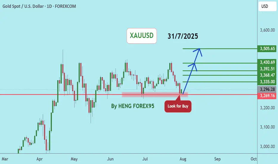
XAUUSDGold is in a correction phase, with prices likely to retest the support zones of 3321 and 3269.
However, if gold prices can hold above 3249, we expect the gold trend to be in an uptrend, consider buying the red zone.
(Very Risky Trade)
🔥Trading futures, forex, CFDs and stocks carries a risk of loss.
Please consider carefully whether such trading is suitable for you.
>>GooD Luck 😊
❤️ Like and subscribe to never miss a new idea!

Market Analysis: USD/CAD Faces Fresh DeclineMarket Analysis: USD/CAD Faces Fresh Decline
USD/CAD declined and is now consolidating losses below 1.3800.
Important Takeaways for USD/CAD Analysis Today
- USD/CAD started a fresh decline after it failed to stay above 1.3900.
- There is a connecting bearish trend line with resistance at 1.3755 on the hourly chart.
USD/CAD Technical Analysis
On the hourly chart of USD/CAD, the pair climbed toward 1.3900 before the bears appeared. It formed a swing high near 1.3867 and recently declined below 1.3800.
There was also a close below the 50-hour simple moving average and 1.3785. The bulls are now active near 1.3720. If there is an upside correction, the pair could face resistance near 1.3755 and a connecting bearish trend line.
The trend line is near the 23.6% Fib retracement level of the downward move from the 1.3867 swing high to the 1.3718 low. If there is an upside break above the trend line, the pair could rise toward the 1.3785 pivot level.
The next key hurdle on the USD/CAD chart is near the 61.8% Fib retracement at 1.3810. If there is an upside break above 1.3810, the pair could rise toward 1.3865. The next major sell zone is 1.3930, above which it could rise steadily toward the 1.4000 handle.
Immediate support is near the 1.3720 level. The first major support could be 1.3700. A close below the 1.3700 level might trigger a strong decline. In the stated case, USD/CAD might test 1.3600. Any more losses may possibly open the doors for a drop toward 1.3500.
This article represents the opinion of the Companies operating under the FXOpen brand only. It is not to be construed as an offer, solicitation, or recommendation with respect to products and services provided by the Companies operating under the FXOpen brand, nor is it to be considered financial advice.

Market Analysis: GBP/USD Bulls in ControlMarket Analysis: GBP/USD Bulls in Control
GBP/USD started a fresh increase above 1.3500.
Important Takeaways for GBP/USD Analysis Today
- The British Pound is eyeing more gains above 1.3500.
- There is a key bearish trend line forming with resistance at 1.3530 on the hourly chart of GBP/USD.
GBP/USD Technical Analysis
On the hourly chart of GBP/USD, the pair formed a base above the 1.3390 level. The British Pound started a steady increase above 1.3440 against the US Dollar, as discussed in the previous analysis.
The pair gained strength above 1.3465 and the 50-hour simple moving average. It even cleared the 1.3500 handle and tested 1.3530. It is now consolidating gains below 1.3530.
The pair is stable above the 23.6% Fib retracement level of the upward move from the 1.3446 swing low to the 1.3529 high. It seems like the bulls might aim for more gains. The RSI moved above the 50 level on the GBP/USD chart and the pair could soon aim for an upside break above a key bearish trend line at 1.3530.
An upside break above 1.3530 could send the pair toward 1.3545. Any more gains might open the doors for a test of 1.3620. If there is a downside correction, immediate support is near the 1.3500 level and the 50-hour simple moving average.
The first major support could be near the 50% Fib retracement at 1.3485. The next pivot level sits near 1.3445. If there is a break below 1.3445, the pair could extend the decline. In the stated case, it could drop and test 1.3420. Any more losses might call for a move toward 1.3390.
This article represents the opinion of the Companies operating under the FXOpen brand only. It is not to be construed as an offer, solicitation, or recommendation with respect to products and services provided by the Companies operating under the FXOpen brand, nor is it to be considered financial advice.

NZDUSD H4 | Bearish Reversal at 61.8% Fib ResistanceThe Kiwi (NZD/USD) is rising towards the sell entry, which is an overlap resistance that aligns with the 61.8% Fibonacci retracement and could reverse from this level to the take profit.
Entry is at 0.5920, which is an overlap resistance that aligns with the 61.8% Fibonacci retracement.
Stop loss is at 0.5983, which acts as a swing high resistance.
Take profit is at 0.5866, which is a pullback support that lines up with the 61.8% Fibonacci retracement.
High Risk Investment Warning
Trading Forex/CFDs on margin carries a high level of risk and may not be suitable for all investors. Leverage can work against you.
Stratos Markets Limited (tradu.com ):
CFDs are complex instruments and come with a high risk of losing money rapidly due to leverage. 65% of retail investor accounts lose money when trading CFDs with this provider. You should consider whether you understand how CFDs work and whether you can afford to take the high risk of losing your money.
Stratos Europe Ltd (tradu.com ):
CFDs are complex instruments and come with a high risk of losing money rapidly due to leverage. 66% of retail investor accounts lose money when trading CFDs with this provider. You should consider whether you understand how CFDs work and whether you can afford to take the high risk of losing your money.
Stratos Global LLC (tradu.com ):
Losses can exceed deposits.
Please be advised that the information presented on TradingView is provided to Tradu (‘Company’, ‘we’) by a third-party provider (‘TFA Global Pte Ltd’). Please be reminded that you are solely responsible for the trading decisions on your account. There is a very high degree of risk involved in trading. Any information and/or content is intended entirely for research, educational and informational purposes only and does not constitute investment or consultation advice or investment strategy. The information is not tailored to the investment needs of any specific person and therefore does not involve a consideration of any of the investment objectives, financial situation or needs of any viewer that may receive it. Kindly also note that past performance is not a reliable indicator of future results. Actual results may differ materially from those anticipated in forward-looking or past performance statements. We assume no liability as to the accuracy or completeness of any of the information and/or content provided herein and the Company cannot be held responsible for any omission, mistake nor for any loss or damage including without limitation to any loss of profit which may arise from reliance on any information supplied by TFA Global Pte Ltd.
The speaker(s) is neither an employee, agent nor representative of Tradu and is therefore acting independently. The opinions given are their own, constitute general market commentary, and do not constitute the opinion or advice of Tradu or any form of personal or investment advice. Tradu neither endorses nor guarantees offerings of third-party speakers, nor is Tradu responsible for the content, veracity or opinions of third-party speakers, presenters or participants.

AUDNZD: Bearish Reversal Confirmed 🇦🇺🇳🇿
There is a high chance that AUDNZD will drop lower
following a confirmed CHoCH on a 4h time frame
with a bearish imbalance candle.
Next support - 1.108
❤️Please, support my work with like, thank you!❤️
I am part of Trade Nation's Influencer program and receive a monthly fee for using their TradingView charts in my analysis.

XAUUSDUpdate:
Gold Price Trend: As per our previous analysis on July 28, 2025, the price has now tested the support at 3,269. We expect that if the gold price can hold above 3,249, the gold price trend will remain bullish. We recommend considering buying in the red zone.
🔥Trading futures, forex, CFDs and stocks carries a risk of loss.
Please consider carefully whether such trading is suitable for you.
>>GooD Luck 😊
❤️ Like and subscribe to never miss a new idea!
EURUSDHello Traders! 👋
What are your thoughts on EURUSD?
EUR/USD has been consolidating within a tight range between the key support at 1.1550–1.1580 and resistance at 1.1740 – 1.1800 in recent weeks.
So far, the pair has failed to break out decisively, showing a lack of strong momentum.
Possible Scenarios
Bullish Scenario:
A confirmed breakout above the 1.1740 – 1.1800 resistance zone could trigger upside momentum, targeting 1.1850 – 1.1950.
Bearish Scenario:
If the 1.1580 –1.1550 support fails and price sustains below it, a deeper decline toward 1.1400 – 1.1450 becomes likely.
As long as price remains inside this range, the optimal strategy is to buy near support and sell near resistance.
However, for higher conviction entries, traders should wait for a clear breakout in either direction and trade accordingly.
Don’t forget to like and share your thoughts in the comments! ❤️

What Is Symmetrical Distribution, and How Do Traders Use It?What Is Symmetrical Distribution, and How Do Traders Use It?
Symmetrical distribution is a key concept in market analysis, helping traders assess price behaviour and volatility. When price movements are evenly distributed around a central point, it can provide insights into potential market trends. This article explores what symmetrical distribution is, how it compares to other price patterns, and how traders use it in strategies like mean reversion to refine their market approach.
What Is a Symmetric Distribution?
The symmetric distribution definition states that data points are evenly spread around a mean, meaning price movements exhibit balance over time. In simple terms, if price movements form a symmetrical shape when plotted on a chart, it suggests that past price behaviour has been balanced, with roughly equal deviations on either side of the average. This balance is supposed to help traders analyse price trends and volatility.
One of the most well-known symmetrical distribution examples is the normal distribution, often visualised as a bell curve. In markets, this means prices are more likely to cluster around the average and become less frequent as you move further away. For example, if a stock has a mean daily return of 0.5%, most days are believed to see returns close to that figure, while extreme price moves—both positive and negative—will be much rarer.
Symmetrical distribution plays a key role in statistical analysis and quantitative trading. It helps traders assess the probability of certain price movements occurring, particularly when using models that rely on historical data.
How Traders Use Symmetrical Distribution in Market Analysis
Traders use symmetrical distribution to analyse price behaviour, identify potential trading opportunities, and refine their strategies. When price movements are evenly distributed around a central point, it provides a structured way to assess market conditions. This concept is particularly useful in mean reversion strategies.
Mean Reversion Strategies
Symmetrical distribution suggests that prices tend to fluctuate around an average, making mean reversion a widely used approach. Traders applying this strategy assume that when an asset moves significantly away from its mean, it is likely to return over time. Bollinger Bands and moving averages are commonly used to measure price deviations and identify potential turning points. This is particularly relevant in markets with balanced volatility, where extreme price moves are less frequent.
Identifying Market Conditions
Analysing whether a market follows a symmetrical distribution can help traders determine which strategies might be effective. In markets where price movements are balanced, traders may focus on range-bound approaches. In contrast, when distributions become skewed, momentum and trend-following strategies might be more suitable. Recognising these shifts allows traders to adapt their methods to changing market conditions.
How to Identify a Symmetrical Distribution
Identifying a symmetrical distribution in market data involves analysing price behaviour to determine whether movements are evenly spread around a central value. While markets don’t always follow perfect symmetry, traders use statistical tools and visual techniques to assess whether a price distribution aligns with this pattern.
Histogram Analysis
A histogram is one of the simplest ways to check for symmetry in price movements. By plotting historical returns or price changes on a frequency chart, traders can see whether data points cluster evenly around the mean. If the left and right sides of the distribution mirror each other, the market may be exhibiting a symmetrical pattern.
Histograms can also reveal uniform distributions, where all values occur with equal probability, forming a flat graph rather than a bell curve. A symmetric and uniform graph can help distinguish between these two patterns—while a uniform distribution shows no central clustering, a symmetric distribution forms a peak around the mean. Recognising whether a market follows a symmetric or uniform structure helps traders determine which statistical tools are most relevant for analysis.
Statistical Measures: Mean and Standard Deviation
Symmetrical distributions tend to have a mean (average) return that sits at the centre of price movements, with standard deviations determining how far prices typically move from that mean. If price fluctuations are evenly distributed around the mean, it suggests a balanced market where extreme moves are less common.
Skewness and Kurtosis
Two key statistical measures help traders confirm symmetry:
- Skewness quantifies how unevenly data points are distributed around the mean. A value close to zero suggests a symmetrical distribution, while a positive or negative skew indicates an imbalance.
- Kurtosis measures how frequently extreme price movements occur. A symmetrical, normally distributed market typically has a kurtosis value near three.
Visualising with Moving Averages
When plotted on a chart, symmetrical price behaviour often aligns with a stable moving average, where price deviations are relatively even on both sides. In contrast, a market with consistent upward or downward bias may show clear asymmetry.
Symmetrical Distribution vs. Other Market Distributions
However, markets don’t always move in a balanced way. While symmetrical distribution means price movements are evenly spread around a central point, real-world trading often shows skewed distributions, where prices are more likely to move in one direction than the other. Understanding the difference is key to assessing market behaviour.
A positively skewed distribution means there are more small downward price moves, but the occasional sharp rally pushes the average return higher. This often happens in growth stocks or high-volatility assets, where losses are frequent but gains can be explosive. On the other hand, a negatively skewed distribution occurs when prices drift upwards gradually but occasionally experience sudden drops. This is common in carry trades, where traders potentially earn small returns over time but risk significant losses during market shocks.
Skewed distributions challenge the assumption that markets follow normal distribution patterns. For example, many risk models assume a symmetrical spread of price moves, but in reality, market crashes and parabolic rallies occur far more often than a normal distribution would assume. This is why relying solely on symmetrical models can lead to underestimating risk in extreme conditions.
Traders who recognise whether a market is symmetrical or skewed can adjust their strategies accordingly. In a symmetrical market, mean reversion strategies could be more effective, while in a skewed market, trend-following approaches could perform better.
Symmetrical Distribution in Risk Management
Risk management relies heavily on statistical analysis, and symmetrical distribution plays a key role in estimating potential market movements. When price changes are symmetrically distributed, traders can use probability models to assess how far an asset is likely to move within a given timeframe.
Value at Risk (VaR) and Probability Modelling
One common application is Value at Risk (VaR), which estimates the maximum expected loss over a period based on historical price data. If potential returns follow a symmetrical distribution, traders can calculate the probability of losses exceeding a certain threshold. For example, in a normal distribution, around 95% of price movements fall within two standard deviations of the mean, allowing traders to set potential risk limits accordingly.
Risk-Reward Calculations
A symmetrical distribution also helps traders refine their risk-reward ratios. If price movements are evenly distributed, traders can estimate potential returns relative to potential losses with greater confidence. In markets where symmetry holds, a trader aiming for a 3:1 risk-reward ratio can assume that price fluctuations are balanced enough for this structure to be viable.
Position Sizing and Stop Placement
By understanding the distribution of price movements, traders can potentially improve position sizing. If historical data suggests symmetrical price behaviour, traders may adjust their position sizes based on expected volatility. Similarly, stop-loss levels might be set relative to the standard deviation of past price movements, ensuring that exits are placed within a statistically reasonable range.
Limitations and Challenges
While symmetrical distribution provides a structured way to analyse price movements, real-world markets rarely follow a perfect balance. External factors, market psychology, and liquidity shifts often distort price behaviour, making it important for traders to recognise the limitations of relying solely on symmetrical models.
Market Skew and Imbalances
Many assets, especially stocks and commodities, exhibit skewed distributions due to long-term trends, supply-demand imbalances, or macroeconomic factors. Price movements often lean in one direction rather than forming a perfect bell curve.
Impact of News and Events
Unexpected events—such as central bank decisions, earnings reports, or geopolitical developments—can cause sudden price moves that disrupt symmetrical patterns. These events create fat tails, where extreme moves occur more frequently than a normal distribution would suggest.
Volatility Clustering
Markets tend to experience periods of high and low volatility in clusters, rather than maintaining a steady distribution. Symmetrical models often underestimate the likelihood of extreme price swings, leading to miscalculations in risk assessment.
Liquidity and Order Flow Distortions
Large institutional orders and algorithmic trading can cause short-term price imbalances, breaking the assumption of symmetrical price behaviour. These distortions can lead to misleading statistical signals.
The Bottom Line
Symmetrical distribution provides traders with a structured way to analyse price movements, assess volatility, and refine strategies. While markets don’t always follow perfect symmetry, understanding when and how these patterns appear may support your trading analysis.
FAQ
What Is Symmetrical Distribution?
Symmetrical distribution refers to a data distribution where values are evenly spread around the mean. In financial markets, this means price movements are balanced, with equal-sized fluctuations on both sides of an average value.
What Is an Example of Symmetric Data?
A common symmetrical data example is the normal distribution, where most data points cluster around the mean, and extreme values occur less frequently. In trading, an asset with daily potential returns that are equally distributed above and below the mean exhibits symmetry.
What Is the Difference Between Uniform and Symmetric Distribution?
When comparing uniform vs symmetric distribution, the key difference is that a uniform distribution gives each value an equal probability with no central clustering. A symmetrical distribution can have values clustered around the mean.
What Is the Difference Between Symmetrical Distribution and Normal Distribution?
A normal distribution is a common symmetric distribution example, creating a bell-shaped curve. While all normal distributions are symmetrical, not all symmetrical distributions follow the strict characteristics of a normal distribution.
This article represents the opinion of the Companies operating under the FXOpen brand only. It is not to be construed as an offer, solicitation, or recommendation with respect to products and services provided by the Companies operating under the FXOpen brand, nor is it to be considered financial advice.
USDJPYHello Traders! 👋
What are your thoughts on USDJPY?
The pair has broken its ascending trendline and is now trading below a key resistance zone.
We expect the price to consolidate and complete a pullback toward the broken zone before resuming its decline toward lower support levels.
A strong breakout and daily close above the resistance zone would invalidate the bearish outlook.
Don’t forget to like and share your thoughts in the comments! ❤️

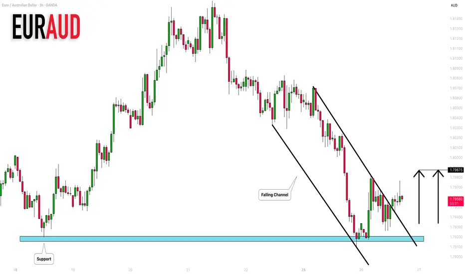
EURAUD: Up Move From Support 🇪🇺 🇦🇺
EURAUD is going to continue rising after a test of a key
horizontal support.
A breakout of a resistance line of a falling parallel channel on an hourly
time frame provides a strong confirmation.
Goal - 1.7987
❤️Please, support my work with like, thank you!❤️
What Is a Pyramiding Strategy, and How Does It Work in Trading?What Is a Pyramiding Strategy, and How Does It Work in Trading?
Pyramiding is a trading strategy where traders gradually increase their position size as the market moves in their favour. Instead of committing full capital upfront, they add to winning positions at key levels. This article explains how pyramiding works, common strategies, potential risks, and key considerations for traders looking to add it to their trading approach.
What Is Pyramiding?
Pyramiding is a strategy where traders gradually add to an effective position instead of going all in from the start. It’s used in trending markets, where traders look to take advantage of sustained price movements by expanding their exposure as the trend develops. The key difference between pyramiding and simply increasing position size at the outset is that pyramiding limits initial risk. Instead of committing full capital upfront, traders build up their position only when the market moves in their favour.
Applying a pyramid to a position is particularly common in markets with strong momentum. A trader, for example, might start with one unit of an asset and, if the price moves favourably, add another half-unit at a predefined level. If the trend continues, they might add another quarter-unit. This gradual scaling means more capital is committed only when conditions confirm the trend.
The logic behind pyramiding in trading is straightforward: when the market is moving in the right direction, the strategy compounds potential returns without significantly increasing initial risk. It also allows traders to adjust their exposure based on market conditions rather than relying on a single entry.
However, pyramiding only works well when executed with clear rules on when to add positions, how much to increase by, and where to adjust risk parameters. Without a structured approach, adding to positions can lead to overexposure, especially if the market reverses. Understanding how to manage this risk is essential, which is why different pyramiding methods exist—each with its own risk-reward profile.
Is Pyramiding the Same as a Forex Pyramid Scheme?
No, pyramiding is a legitimate trading strategy, while a forex trading pyramid scheme is a fraudulent investment model. Pyramiding involves adding to winning trades in a structured manner, whereas pyramid schemes rely on recruiting new investors, often with unrealistic return promises and no genuine market activity.
Common Types of the Pyramiding Strategy
Traders use different types of pyramiding strategies depending on their risk tolerance, market conditions, and trading style. The core idea remains the same—adding to a position as the market moves favourably—but the way additional positions are sized can significantly impact potential risk and returns.
Fixed-Percentage Pyramiding
With this approach, traders add a set percentage of their initial position each time they scale in. For example, if the first position is 1 lot, the next might be 50% of it (0.5 lots), and the next 50% of it (0.25 lots). This method reduces sequential risk exposure with each additional entry, preventing the position from growing too aggressively. It is popular in markets where trends can extend for long periods but aren’t always smooth.
Fixed-Size Pyramiding
Here, traders add the same amount to their position at each entry point. If they start with 1 lot, they continue adding 1 lot at each predetermined level. This method increases exposure more quickly than fixed-percentage pyramiding and is commonly used by traders confident in strong, sustained trends. However, it also carries more risk—if the trend reverses, a larger position is at stake.
Scaled Pyramiding
In this strategy, the size of each additional position decreases as the trade progresses. A trader might start with 1 lot, then add 0.75 lots, then 0.5 lots, and so on. The idea is to lock in potential returns while still participating in the trend, limiting risk as the position grows. This approach is useful when traders want to take advantage of strong momentum but remain cautious about overexposure.
Aggressive Pyramiding
Aggressive traders may add increasingly larger positions as the trade moves in their favour. For example, starting with 1 lot, then adding 1.5 lots, then 2 lots. This approach amplifies potential returns quickly but also significantly increases risk. If the market reverses, the largest position is the most vulnerable.
How Pyramiding Works in Practice
Pyramiding isn’t just about adding to a trade—it requires a structured approach. Traders who use this strategy typically follow a clear set of conditions to determine when and how to scale into a position. These conditions revolve around trend identification, entry levels, risk control, and adjustments based on price action.
1. Identifying a Strong Trend
Pyramiding is used in clear trends, where the price moves consistently in one direction without frequent reversals. Traders often use moving averages, trendlines, or higher highs and higher lows to confirm momentum before considering additional positions. A market that chops sideways or lacks volume makes pyramiding riskier, as price movements can be inconsistent.
2. Setting Initial Risk and Position Size
Before adding to a position, traders determine how much of their total risk they’re willing to allocate. Many use a percentage of their account size to calculate exposure, so they don’t take on too much risk too soon. For example, a trader might start with 1% of their capital at risk and adjust as the trade progresses.
3. Choosing Levels to Add Positions
Entries are usually added at logical technical levels, such as:
- Breakouts of key resistance levels (for long positions) or support levels (for short positions).
- Fibonacci retracements, where price temporarily pulls back before continuing in the trend direction.
- Pullbacks to moving averages, such as the 50-day or 200-day moving average.
4. Adjusting Stop Losses and Managing Risk
As new positions are added, traders adjust stop-loss levels to protect against reversals. Some move stops to breakeven once the trade gains momentum, while others trail stops behind higher lows (in an uptrend) or lower highs (in a downtrend).
Example of a Pyramid in Action
A trader enters a forex trade with 1 lot after a breakout. As the price moves 2% higher, they add 0.5 lots at the next resistance break. After another upward movement, they add 0.25 lots. Their stop loss is adjusted upwards each time, reducing risk. If the price reverses, they lock in potential returns rather than losing their initial position.
Challenges of Pyramiding and How to Deal With Them
Using pyramiding as a trading strategy can be an effective way to scale into trades, but it introduces unique risks that require careful management. While adding to a strong trend can potentially boost returns, it also increases exposure, magnifies losses in reversals, and requires disciplined execution.
1. Increased Exposure in Volatile Markets
One of the biggest risks of pyramid trading is overexposure. As a position grows, so does the potential downside. A sharp market reversal can wipe out potential accumulated gains or lead to a larger-than-expected drawdown. This is particularly challenging in high-volatility conditions, where price swings can occur more often.
Traders who use pyramiding are mindful of position sizing. Instead of doubling exposure with each entry, some reduce position sizes incrementally, so that later additions carry less weight. This prevents a single-price move from turning a strong trade into a major loss.
2. Liquidity and Slippage Issues
Adding to a position in low-liquidity conditions can result in slippage, where orders get filled at worse prices than expected. This often happens in after-hours stock trading, near the end of trading sessions, or during high-impact news events when order book depth is thin.
In fast-moving markets, slippage can cause later pyramid entries to execute at increasingly unfavourable levels. This not only raises the average entry price but also increases the risk if the trend fails. Traders focused on managing execution risk often monitor liquidity before scaling in to check if market conditions allow them to place trades efficiently.
3. Overleveraging and Margin Pressure
Leverage amplifies both potential returns and losses. In pyramid trading, each new entry raises margin requirements. If a leveraged position expands too aggressively, a sudden price move against it can trigger margin calls or forced liquidations before the trade has a chance to recover.
Managing leverage effectively means maintaining a controlled risk-per-trade allocation rather than committing too much capital to additional entries. Many traders assess account exposure relative to market conditions and adjust position growth accordingly.
4. False Trends and Market Reversals
Not all breakouts sustain momentum. An asset might briefly break through resistance, triggering pyramiding entries, only to reverse sharply. If a trader misreads the strength of a trend, they could end up adding to a losing position rather than a winning one.
A structured approach to trend confirmation can help avoid premature entries. Instead of reacting to every breakout, traders often rely on higher timeframe trends, price structure, and volume confirmation to assess whether momentum is sustainable.
5. Poor Stop-Loss Placement
One of the most common mistakes is failing to adjust stop losses properly. If stop losses are too tight, the trader might exit too early. If they’re too loose, losses can escalate quickly.
A common adjustment is trailing stop-losses that move in line with price swings, locking in potential returns while allowing for continued trend movement. Some traders move stops to breakeven after the second entry, while others adjust based on key technical levels.
6. Psychological Pressure
Scaling into a position changes the psychological dynamics of trading. A growing trade size can lead to emotional decision-making, such as exiting too soon out of fear of losing accumulated potential returns or overtrading in an attempt to maximise potential gains.
Having a structured plan before entering a pyramiding trade can help mitigate these pressures. Clear predefined entry, stop, and exit strategies ensure that decisions are made based on analysis rather than emotion.
The Bottom Line
Pyramiding allows traders to take advantage of strong trends by gradually increasing position size while managing risk. When used with a structured approach, it can potentially enhance returns. However, overleveraging is very common, and discipline and risk control are essential when using this approach.
FAQ
What Is the Pyramiding Method?
Pyramiding is a trading strategy where traders gradually increase their position size as the market moves in their favour. Instead of entering a full position at once, they add to it at predetermined levels, typically in a trending market. The goal is to take advantage of momentum while helping to manage initial risk exposure.
What Is the Pyramid Scheme Strategy?
A pyramid scheme is a fraudulent business model that relies on recruiting new participants rather than generating actual revenue. It has nothing to do with pyramiding in trading. In pyramid schemes, early participants take advantage of the investments of later recruits, making the model unsustainable. These schemes often collapse when recruitment slows, leaving most participants at a loss.
What Is an Example of Pyramid Trading?
A trader buys 100 shares of a stock at £50. As the price rises to £55, they add 50 more shares. At £60, they add 25 more. Their position grows only when the trend confirms itself, potentially limiting early risk.
How to Do a Pyramid in Stocks?
Traders typically add positions at breakout levels, retracements, or trendline bounces, adjusting stop losses to lock in potential returns while potentially mitigating risk.
This article represents the opinion of the Companies operating under the FXOpen brand only. It is not to be construed as an offer, solicitation, or recommendation with respect to products and services provided by the Companies operating under the FXOpen brand, nor is it to be considered financial advice.
MarketBreakdown | EURUSD, USDCAD, USDJPY, SILVER
Here are the updates & outlook for multiple instruments in my watch list.
1️⃣ #EURUSD daily time frame 🇪🇺🇺🇸
The pair is now consolidating within a wide horizontal range.
We see a test of its support now.
Probabilities will be high, that a bullish movement will follow from that.
2️⃣ #USDCAD daily time frame 🇺🇸🇨🇦
The pair is positioned strongly bullish,
respecting a solid rising trend line after a pullback.
With a high probability, growth will continue.
3️⃣ #USDJPY daily time frame 🇯🇵🇺🇸
Similarly to EURUSD, the pair is consolidating.
The price is trading in the middle of the horizontal
parallel channel.
With a high probability, it will start growing soon
and reach the resistance of the range.
4️⃣ #SILVER #XAGUSD daily time frame 🪙
The price has recently updated a local high, breaking
a significant horizontal resistance cluster.
We see its retest now. There is a great chance that
the market will cotinue rising soon.
Do you agree with my market breakdown?
❤️Please, support my work with like, thank you!❤️
I am part of Trade Nation's Influencer program and receive a monthly fee for using their TradingView charts in my analysis.

Australian Dollar Surges SharplyAustralian Dollar Surges Sharply
As illustrated by the AUD/USD chart, while the pair was trading near a two-month low at the start of Friday, today it has jumped by more than 1.1%.
The primary driver behind this rally is the weakening US dollar, which reflects the market’s reaction to Jerome Powell’s comments at the Jackson Hole Symposium. He stated that the risks of declining employment are rising. And if these risks materialise, it could happen very quickly. According to Reuters, this strengthens the likelihood of a Federal Reserve rate cut at its meeting next month.
At the same time, market participants are preparing for the release of Australia’s CPI data, scheduled for this Wednesday.
Technical Analysis of AUD/USD
On 14 August, we reviewed the dynamics of the Australian dollar and highlighted the following:
→ a descending channel was identified, with the AUD/USD chart signalling prevailing bearish sentiment;
→ the psychological level of 0.6500 was marked as critical.
Since then:
→ the pair broke through the support line S around 0.6500;
→ on Friday it dropped to a two-month low;
→ but today it is showing signs of strength.
What Could Happen Next?
Bearish outlook:
→ the pair remains within the descending channel;
→ low 5 continues the sequence of lower highs and lower lows;
→ the sharp rally in AUD/USD might prove to be an overly emotional reaction to the Fed Chair’s remarks.
Bullish outlook:
→ when forming low 5, the price fell only slightly below low 3. In SMC terminology, this can be interpreted as a bullish Liquidity Grab;
→ the black arrow indicates a long lower shadow – a sign that demand persisted over the weekend.
Price action suggests an attempt to test the resistance area formed by:
→ the 0.6500 level,
→ the QH line dividing the upper half of the channel into two quarters,
→ the bearish candle (marked with a red arrow), where selling pressure was previously aggressive, breaking support at S – meaning supply dominance may still remain to some extent.
If bulls manage to secure a foothold above 0.6500, this mght be interpreted as a significant shift in market sentiment in favour of demand. In the longer term, this could drive AUD/USD towards the upper boundary of the channel (with a possible breakout scenario).
This article represents the opinion of the Companies operating under the FXOpen brand only. It is not to be construed as an offer, solicitation, or recommendation with respect to products and services provided by the Companies operating under the FXOpen brand, nor is it to be considered financial advice.

Market Analysis: NZD/USD Starts Recovery, Key Hurdles AheadMarket Analysis: NZD/USD Starts Recovery, Key Hurdles Ahead
NZD/USD is also rising and could aim for a move above 0.5900 in the short term.
Important Takeaways for NZD/USD Analysis Today
- NZD/USD is slowly moving higher above 0.5830.
- There is a major bearish trend line forming with resistance at 0.5870 on the hourly chart of NZD/USD.
NZD/USD Technical Analysis
On the hourly chart of NZD/USD, the pair followed AUD/USD. The New Zealand Dollar formed a base above the 0.5800 level and started a recovery wave against the US Dollar.
The pair climbed above the 50-hour simple moving average and 0.5830. There was a close above the 23.6% Fib retracement level of the downward move from the 0.5990 swing high to the 0.5830 low.
However, the bears are now active near the 0.5870 zone and a major bearish trend line. The NZD/USD chart suggests that the RSI is back above 60, signaling a positive bias. On the upside, the pair is facing resistance near 0.5870.
The next major hurdle for buyers could be near the 50% Fib retracement at 0.5895. A clear move above 0.5895 might even push the pair toward 0.5910. Any more gains might clear the path for a move toward the 0.5945 pivot zone in the coming sessions.
On the downside, there is support forming near the 0.5830 zone. If there is a downside break below 0.5830, the pair might slide toward 0.5800. Any more losses could lead NZD/USD into a bearish zone to 0.5740.
This article represents the opinion of the Companies operating under the FXOpen brand only. It is not to be construed as an offer, solicitation, or recommendation with respect to products and services provided by the Companies operating under the FXOpen brand, nor is it to be considered financial advice.

Market Analysis: AUD/USD Starts Recovery, Key Hurdles AheadMarket Analysis: AUD/USD Starts Recovery, Key Hurdles Ahead
AUD/USD is attempting a fresh increase from 0.6415.
Important Takeaways for AUD/USD Analysis Today
- The Aussie Dollar found support at 0.6415 and moved higher against the US Dollar.
- There was a break above a key bearish trend line with resistance at 0.6440 on the hourly chart of AUD/USD.
AUD/USD Technical Analysis
On the hourly chart of AUD/USD, the pair formed a base above 0.6415. The Aussie Dollar started a significant increase above 0.6425 against the US Dollar to enter a short-term positive zone.
There was a break above a key bearish trend line with resistance at 0.6440 and the 23.6% Fib retracement level of the downward move from the 0.6568 swing high to the 0.6415 low. The pair even surpassed 0.6470 and settled above the 50-hour simple moving average.
On the upside, the AUD/USD chart indicates that the pair is now facing resistance near the 50% Fib retracement level at 0.6490. The first major hurdle for the bulls could be 0.6520.
An upside break above 0.6520 resistance might send the pair further higher. The next major target is near the 0.6540 level. Any more gains could clear the path for a move toward 0.6565. If there is no close above 0.6490, the pair might start a fresh decline.
Immediate support sits near the 0.6470 level. The next area of interest could be 0.6440. If there is a downside break below 0.6440 support, the pair could extend its decline toward 0.6410. Any more losses might signal a move toward 0.6350.
This article represents the opinion of the Companies operating under the FXOpen brand only. It is not to be construed as an offer, solicitation, or recommendation with respect to products and services provided by the Companies operating under the FXOpen brand, nor is it to be considered financial advice.

EURUSD: Support & Resistance Analysis For Next Week 🇪🇺🇺🇸
Here is my latest support and resistance analysis
for EURUSD for next week.
Consider these structures for pullback/breakout trading.
❤️Please, support my work with like, thank you!❤️
I am part of Trade Nation's Influencer program and receive a monthly fee for using their TradingView charts in my analysis.

XAU/USD Price Action Zones & Trade Setup (Aug 20, 2025)Analysis:
The market recently made a CHoCH (Change of Character), signaling a possible bearish structure.
First Selling Zone (3340 – 3350): Strong resistance area where sellers may push price down.
Second Selling Zone (3350 – 3360): A deeper liquidity grab area for confirmation shorts.
First Buying Area (3308 – 3320): Demand zone where buyers might step in for a short-term bounce.
Second Buying Area (3270 – 3280): Stronger demand, ideal for swing buy opportunities if price dips further.
Price is currently around 3323, hovering near equilibrium, likely to retest selling zones before dropping to buying areas.
📈 Trade Plan:
Sell Entries
🔹 First Short: Around 3340 – 3350 (First Selling Zone).
🔹 Second Short (confirmation): Around 3350 – 3360 (Second Selling Zone).
🎯 Targets:
TP1: 3320 (First Buying Area)
TP2: 3280 (Second Buying Area)
🛑 Stop Loss: Above 3365
Buy Entries
🔹 First Buy: Around 3310 – 3320 (First Buying Area) for a small bounce.
🔹 Second Buy (stronger): Around 3270 – 3280 (Second Buying Area).
🎯 Targets:
TP1: 3340 (back to resistance)
TP2: 3355 (liquidity above first selling zone)
🛑 Stop Loss: Below 3260

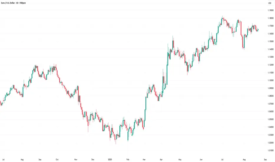
EURUSD strong daily supply is playing out in August 2025EURUSD strong daily supply is playing out in August 2025
Daily downtrend. Imbalance #1, mentioned in the last updates, is still in control and is playing out well. Short positions should be managed.

EURUSDHello Traders! 👋
What are your thoughts on EURUSD?
The EUR/USD pair has been ranging between key support and resistance zones since last week. At present, price is sitting right on a critical support level, as the market appears to be waiting for Fed Chair Jerome Powell's speech at Jackson Hole tomorrow.
Our broader outlook remains bearish, but a clear break below support is needed to confirm downside continuation.
If support breaks, the pair could head toward lower targets in the coming sessions.
Avoid early short positions while price is still holding above support.
Wait for a confirmed breakdown of the support level to validate the bearish scenario.
Don’t forget to like and share your thoughts in the comments! ❤️

What Are Autoregressive Models in Trading?What Are Autoregressive Models in Trading?
Autoregressive (AR) models help traders analyse market movements by identifying statistical relationships in historical price data. These models assume that past values influence current prices, making them useful for spotting trends and price behaviour. This article explores “What is autoregression?”, how AR models function, their role in trading, and how traders apply them to market analysis.
What Is an Autoregressive Model?
Autoregressive (AR) models are statistical tools that can be used in numerous spheres, including market prices, weather, and traffic conditions. They analyse market movements by using past price data to understand current trends. The autoregressive definition refers to a model where each value in a time series depends on previous values plus an error term.
The number of previous values considered is called the “lag order,” denoted as AR(p), where ‘p’ represents the number of lags. In an autoregressive model example, an AR(1) model looks at just the previous value to estimate the current one, while an AR(3) model considers the last three. In trading, the key idea is that if historical prices show a consistent pattern—whether trending or reverting to a mean—an AR model can help identify that structure.
This approach differs from other time series models. Moving averages (MA) smooth out fluctuations by averaging past prices, while autoregressive integrated moving averages (ARIMA) combine both approaches and adjust for trends. AR models, however, focus purely on the statistical relationship between past and present values, making them particularly useful in markets where past behaviour has a clear influence on future movements.
Traders use an autoregressive process to explore trends, momentum, and potential reversals in markets that exhibit persistent patterns. However, their effectiveness depends on market conditions and the assumption that past relationships remain relevant—something that isn’t always guaranteed, especially in volatile or news-driven environments.
How Autoregressive Models Work in Trading
Traders use AR models to examine how past prices influence current movements. An autoregressive model trading strategy often involves assessing whether an asset’s price exhibits momentum or mean reversion tendencies. For example, if an AR(1) model shows that today’s price is strongly influenced by yesterday’s price, it may suggest a continuation bias—meaning traders could expect trends to persist in the short term.
In contrast, if an AR(2) or AR(3) model highlights a tendency for prices to move back toward an average after a few periods, it could indicate mean reversion. This is particularly relevant in range-bound markets where prices frequently return to support and resistance levels.
The number of past values included in an AR model is a key decision. Too few lags might miss relevant patterns, while too many can add unnecessary complexity. Traders typically determine the appropriate lag length by evaluating past data and statistical criteria like the Akaike Information Criterion (AIC).
AR models are more popular in markets where historical relationships hold for extended periods. It’s common to use autoregressive models for trading forex, equities, and commodities, especially in detecting short-term trends or cycles. While they aren’t predictive tools, they provide a structured way to analyse price behaviour, offering traders a statistical foundation for evaluating market movements.
Stationarity and Its Role in AR Models
For an autoregressive time series model to work, the data must be stationary. This means the statistical properties of the time series—such as its mean, variance, and autocorrelation—remain constant over time. If a dataset is non-stationary, meaning its trends, volatility, or relationships shift unpredictably, the AR model's analysis can become unreliable.
Why Stationarity Matters
The autoregressive model, meaning it assumes a consistent statistical structure, can struggle with shifting market conditions if stationarity is not ensured. If a time series is non-stationary, it might show an upward or downward drift, meaning price relationships aren’t consistent over time. This makes it difficult to analyse patterns. For example, a stock experiencing long-term growth won’t have a stable mean, which can distort AR-based analysis.
Testing for Stationarity
Traders often check for stationarity using statistical tests like the Augmented Dickey-Fuller (ADF) test. This test helps determine whether a time series has a unit root—a key characteristic of non-stationary data. If the test suggests a unit root is present, traders may need to adjust the data before using an AR model.
Transforming Data to Stationarity
When data is non-stationary, traders often apply transformations to stabilise it and convert it to an autoregressive model time series. Differencing is a common method, where they subtract the previous value from the current value to remove trends. Log transformations can also reduce the impact of volatility. Once stationarity is achieved, an AR model is believed to be more effective to analyse price movements.
Using an Autoregressive Model in Practice
Understanding how autoregressive models work is one thing—actually applying them in trading is another. These models are primarily used in quantitative strategies, where traders rely on statistical methods rather than gut feelings or news events. While AR models aren’t a complete trading strategy on their own, they can provide valuable insights when used correctly.
Building an AR Model
The first step in using an AR model is preparing the data. Traders typically start with a time series dataset—such as daily closing prices—and ensure it is stationary. If the data shows trends or changing volatility, they may apply differencing or log transformations to stabilise it.
Once the data is ready, the next step is determining the lag order—how many past values should be included in an AR(p) model. This is done through statistical tests like the Akaike Information Criterion (AIC) or Partial Autocorrelation Function (PACF), which help identify how far back price movements remain relevant. For instance, an AR1 model considers only the previous price point, while an AR3 model incorporates the last three observations. Choosing too few lags might miss important relationships, while too many can overcomplicate the model.
After selecting the lag order, traders fit the AR model using statistical software such as Python’s statsmodels or R’s forecast package. The model estimates how past prices influence current ones, producing a set of coefficients that define these relationships. The trader then analyses these results to determine if the model aligns with market behaviour.
Applying AR Models to Trading
Once built, an AR model provides insights into how past price behaviour influences future movement. For example:
- If an AR(1) model shows a strong positive coefficient, it suggests that today’s price is closely linked to yesterday’s, reinforcing a short-term trend.
- If an AR(2) or AR(3) model suggests a return toward a long-term mean, it may indicate a market where price cycles are present.
Traders use these insights in different ways. Some apply AR models to analyse short-term market momentum, while others use them to examine mean-reverting assets like certain forex pairs or commodities. They can also compare AR-based analysis with other indicators like moving averages or Bollinger Bands to refine their decision-making process.
Autoregressive models are also used in machine learning for time series forecasting, helping algorithms detect patterns in sequential data. In trading, autoregressive model machine learning techniques can refine models by dynamically adjusting lag parameters, improving adaptability to changing market conditions and reducing reliance on fixed assumptions.
ARIMA: Extending AR Models
While AR models work well on stationary data, many financial time series contain trends or seasonality that a basic AR model can’t handle. This is a scenario where Autoregressive Integrated Moving Average (ARIMA) models become useful. ARIMA combines AR components with moving averages (MA) and differencing (I for “integrated”) to account for non-stationary behaviour.
For example, if a stock price has an upward drift, an AR model alone won’t be sufficient. An ARIMA model can first remove the trend through differencing, and then apply AR and MA components to analyse underlying patterns. This makes ARIMA more flexible for complex market environments.
Challenges and Considerations When Using AR Models
Autoregressive models can be useful for analysing price movements, but they come with limitations that traders should consider. Financial markets are complex, and historical price patterns don’t always repeat in the same way. Understanding where AR models fall short might help traders apply them more effectively.
Overfitting and Choosing the Right Lag Order
One of the biggest challenges in using AR models is selecting the right lag order. Including too many past values can lead to overfitting, where the model becomes overly sensitive to historical fluctuations that may not be relevant going forward. Overfitting can create misleading analysis, making the model seem accurate in hindsight but ineffective in real-time market conditions. Traders typically balance complexity with statistical tests like the Akaike Information Criterion (AIC) to determine an optimal lag length.
Market Noise and Unexpected Events
AR forecasting assumes that past price relationships remain relatively consistent. However, financial markets are influenced by a wide range of external factors—economic reports, central bank decisions, and geopolitical events—that models based purely on past prices cannot account for. A market that has historically followed a trend can abruptly reverse due to news or institutional flows, reducing the usefulness of AR-based analysis.
Data Quality and Stationarity
The reliability of an AR model depends on the quality of the data used. Non-stationary data, sudden regime changes, or structural shifts in the market can distort results. Traders often need to check for stationarity and adjust their approach when market conditions change, ensuring that their models remain relevant rather than assuming past relationships always hold.
The Bottom Line
Autoregressive models offer traders a statistical approach to analysing price movements, helping them identify trends and market behaviour based on historical data. While they are not standalone trading signals, they can be valuable when combined with other analytical tools.
FAQ
What Is an Autoregressive Model?
An autoregressive (AR) model is a type of statistical model that analyses time series data by expressing a variable as a function of its past values. It assumes that past observations influence current values, making it useful for identifying patterns in sequential data.
What Is an Autoregressive Model in Finance?
In finance, AR models are used to analyse price movements by examining historical data. Traders apply them to identify trends, momentum, or mean-reverting behaviour in assets like stocks, forex, and commodities. AR models help quantify how past price changes relate to current movements.
What Is an Autoregressive Model for Stock Analysis?
AR models in stock analysis assess price patterns by using historical data to determine potential relationships between past and present values. They can highlight statistical trends but do not account for external market drivers like news or economic events.
This article represents the opinion of the Companies operating under the FXOpen brand only. It is not to be construed as an offer, solicitation, or recommendation with respect to products and services provided by the Companies operating under the FXOpen brand, nor is it to be considered financial advice.
GBPAUD: Another Trap?! 🇬🇧🇦🇺
GBPAUD may finally start retracing after a test of a historic daily resistance.
I see a local intraday bearish reversal and anticipate a down movement
to 2.0914
❤️Please, support my work with like, thank you!❤️
I am part of Trade Nation's Influencer program and receive a monthly fee for using their TradingView charts in my analysis.

Market Analysis: USD/JPY Aims Fresh SurgeMarket Analysis: USD/JPY Aims Fresh Surge
USD/JPY is rising and might gain pace above 148.20.
Important Takeaways for USD/JPY Analysis Today
- USD/JPY climbed higher above the 147.00 and 147.40 levels.
- There is a major bearish trend line forming with resistance at 147.70 on the hourly chart.
USD/JPY Technical Analysis
On the hourly chart of USD/JPY at FXOpen, the pair started a fresh upward move from 146.20. The US Dollar gained bullish momentum above 146.50 against the Japanese Yen.
It even cleared the 50-hour simple moving average and 147.50. The pair climbed above 148.00 and traded as high as 148.10. It’s now consolidating gains above the 50% Fib retracement level of the upward move from the 146.73 swing low to the 148.10 high.
The current price action above 147.40 is positive. Immediate resistance on the USD/JPY chart is near a bearish trend line at 147.70 and the 50-hour simple moving average.
The first key hurdle is near 147.95. If there is a close above 147.95 and the RSI moves above 50, the pair could rise toward 148.10. The next major stop for the bulls could be 148.50, above which the pair could test 150.00 in the coming days.
On the downside, the first major support is 147.40. The next area of interest for buyers could be near the 76.4% Fib retracement at 147.05.
If there is a close below 147.05, the pair could decline steadily. In the stated case, the pair might drop toward 146.20. Any more losses might open the doors for a drop to 145.00.
This article represents the opinion of the Companies operating under the FXOpen brand only. It is not to be construed as an offer, solicitation, or recommendation with respect to products and services provided by the Companies operating under the FXOpen brand, nor is it to be considered financial advice.
