5 IMPOTANT TYPES OF ELLIOTT WAVE PATTERNS !!Hello traders, today we will talk about 5 TYPES OF ELLIOTT WAVE PATTERNS
( FIRST SOME BASIC INFO )
What is Elliott Wave Theory?
The Elliott Wave Theory suggests that stock prices move continuously up and down in the same pattern known as waves that are formed by the traders’ psychology.
The theory holds as these are recurring patterns, the movements of the stock prices can be easily predicted.
Investors can get an insight into ongoing trend dynamics when observing these waves and also helps in deeply analyzing the price movements.
But traders should take note that the interpretation of the Elliot wave is subjective as investors interpret it in different ways.
(KEY TAKEAWAYS)
The Elliott Wave theory is a form of technical analysis that looks for recurrent long-term price patterns related to persistent changes in investor sentiment and psychology.
The theory identifies impulse waves that set up a pattern and corrective waves that oppose the larger trend.
Each set of waves is nested within a larger set of waves that adhere to the same impulse or corrective pattern, which is described as a fractal approach to investing.
Before discussing the patterns, let us discuss Motives and Corrective Waves:
What are Motives and Corrective Waves?
The Elliott Wave can be categorized into Motives and Corrective Waves:
1. Motive Waves:
Motive waves move in the direction of the main trend and consist of 5 waves that are labelled as Wave 1, Wave 2, Wave 3, Wave 4 and Wave 5.
Wave 1, 2 and 3 move in the direction of the main direction whereas Wave 2 and 4 move in the opposite direction.
There are usually two types of Motive Waves- Impulse and Diagonal Waves.
2. Corrective Waves:
Waves that counter the main trend are known as the corrective waves.
Corrective waves are more complex and time-consuming than motive waves. Correction patterns are made up of three waves and are labelled as A, B and C.
The three main types of corrective waves are Zig-Zag, Diagonal and Triangle Waves.
Now let us come to Elliott Wave Patterns:
In the chart I have mentioned 5 main types of Elliott Wave Patterns:
1. Impulse:
2. Diagonal:
3. Zig-Zag:
4. Flat:
5. Triangle:
1. Impulse:
Impulse is the most common motive wave and also easiest to spot in a market.
Like all motive waves, the impulse wave has five sub-waves: three motive waves and two corrective waves which are labelled as a 5-3-5-3-5 structure.
However, the formation of the wave is based on a set of rules.
If any of these rules are violated, then the impulse wave is not formed and we have to re-label the suspected impulse wave.
The three rules for impulse wave formation are:
Wave 2 cannot retrace more than 100% of Wave 1.
Wave 3 can never be the shortest of waves 1, 3, and 5.
Wave 4 can never overlap Wave 1.
The main goal of a motive wave is to move the market and impulse waves are the best at accomplishing this.
2. Diagonal:
Another type of motive wave is the diagonal wave which, like all motive waves, consists of five sub-waves and moves in the direction of the trend.
The diagonal looks like a wedge that may be either expanding or contracting. Also, the sub-waves of the diagonal may not have a count of five, depending on what type of diagonal is being observed.
Like other motive waves, each sub-wave of the diagonal wave does not fully retrace the previous sub-wave. Also, sub-wave 3 of the diagonal is not the shortest wave.
Diagonals can be further divided into the ending and leading diagonals.
The ending diagonal usually occurs in Wave 5 of an impulse wave or the last wave of corrective waves whereas the leading diagonal is found in either the Wave 1 of an impulse wave or the Wave A position of a zigzag correction.
3. Zig-Zag:
The Zig-Zag is a corrective wave that is made up of 3 waves labelled as A, B and C that move strongly up or down.
The A and C waves are motive waves whereas the B wave is corrective (often with 3 sub-waves).
Zigzag patterns are sharp declines in a bull rally or advances in a bear rally that substantially correct the price level of the previous Impulse patterns.
Zigzags may also be formed in a combination which is known as the double or triple zigzag, where two or three zigzags are connected by another corrective wave between them.‘
4. Flat:
The flat is another three-wave correction in which the sub-waves are formed in a 3-3-5 structure which is labelled as an A-B-C structure.
In the flat structure, both Waves A and B are corrective and Wave C is motive having 5 sub-waves.
This pattern is known as the flat as it moves sideways. Generally, within an impulse wave, the fourth wave has a flat whereas the second wave rarely does.
On the technical charts, most flats usually don’t look clear as there are variations on this structure.
A flat may have wave B terminate beyond the beginning of the A wave and the C wave may terminate beyond the start of the B wave. This type of flat is known as the expanded flat.
The expanded flat is more common in markets as compared to the normal flats as discussed above.
5. Triangle:
The triangle is a pattern consisting of five sub-waves in the form of a 3-3-3-3-3 structure, that is labelled as A-B-C-D-E.
This corrective pattern shows a balance of forces and it travels sideways.
The triangle can either be expanding, in which each of the following sub-waves gets bigger or contracting, that is in the form of a wedge.
The triangles can also be categorized as symmetrical, descending or ascending, based on whether they are pointing sideways, up with a flat top or down with a flat bottom.
The sub-waves can be formed in complex combinations. It may theoretically look easy for spotting a triangle, it may take a little practice for identifying them in the market.
Bottomline:
As we have discussed above Elliott wave theory is open to interpretations in different ways by different traders, so are their patterns. Thus, traders should ensure that when they identify the patterns.
This chart is just for information
Never stop learning
I would also love to know your charts and views in the comment section.
Thank you
Learning

FinEco For Dummies | The Economic Eco-System Simplified🟢 Intro For Financial Economics & The Financial Eco-Sytem For Dummies
This little book is not about predictions or strategies.
It’s about understanding how financial markets connect, interact, and move together.
If you can read capital flows, risk appetite, and macro relationships,
markets stop feeling random and start making sense.
Financial markets are a system.
Money flows between assets based on risk, growth, inflation, and policy.
This book explains those relationships in simple terms,
so you can understand the environment before making decisions.
Most traders focus on charts.
Few understand the environment those charts live in.
This little book lays out a simple framework for reading market conditions,
capital rotation, and risk behavior, without strategies or hype.
This is a foundation, not a strategy.
A simple guide to how stocks, bonds, currencies, commodities, and crypto
fit together inside the global financial system.
Markets are not random.
They react to incentives, risk, and expectations.
This book helps you see those forces clearly.
🟢 1 - The Big Picture: Markets as a Flow System
Before charts, indicators, or trades, financial markets should be understood as a system of flows, not isolated instruments. Every market, stocks, bonds, currencies, commodities, crypto, etc is simply capital moving between buckets. Nothing trades in a vacuum. When money flows into one place, it must flow out of another.
-
➡️ The Core Idea
Markets are a constant process of:
- Allocation
- Re-allocation
- Risk assessment
Investors are always asking, consciously or not:
“Where do I want my money to park right now?”
The answer changes with:
- Economic expectations
- Central bank policy
- Inflation / deflation fears
- Financial stability
- Geopolitical stress
- Liquidity conditions
Price is just the result of those decisions.
Risk Is the Organizing Principle
At the highest level, all markets organize around risk.
Capital rotates between:
- Risk-on assets → growth, leverage, expansion
- Risk-off assets → safety, preservation, defense
This is not emotional.
It is structural.
Institutions manage:
- Mandates
- Drawdowns
- Volatility targets
- Capital requirements
They must rotate.
-
➡️ The Two Master Regimes
Most market behavior can be simplified into two regimes:
➡️ 1. Risk-On Environment
Characteristics:
- Optimism about growth
- Liquidity is abundant
- Credit flows easily
- Volatility is tolerated
Money prefers:
- Equities (especially growth)
- High beta sectors
- Small & mid caps
- Emerging markets
- Cyclical commodities
➡️ 2. Risk-Off Environment
Characteristics:
- Uncertainty or stress
- Liquidity tightens
- Credit risk rises
- Volatility is avoided
Money prefers:
- Government bonds
- Strong reserve currencies
- Defensive equities
- Gold
- Cash equivalents
Most of the time, markets live between these two, rotating, not flipping instantly.
➡️ Why This Matters for Trading
If you don’t know which regime you’re in, technical setups lose meaning.
A perfect long breakout:
- Works beautifully in risk-on
- Fails constantly in risk-off
A short breakdown:
- Accelerates in risk-off
- Gets absorbed in risk-on
Your job is not to predict the future.
Your job is to identify the current state.
-
🟢 2 - Capital Rotation: How Money Actually Moves
Markets do not rise or fall as one unified object.
They rotate.
Capital is constantly shifting between:
- Sectors
- Asset classes
- Regions
- Risk profiles
This rotation is not random. It follows incentives.
-
➡️ Rotation vs Direction
A common beginner mistake is thinking:
“The market is bullish or bearish.”
In reality, markets are often:
- Bullish somewhere
- Bearish somewhere else
While headlines say “stocks are flat,” money may be:
- Leaving defensives
- Entering growth
- Rotating from large caps into small caps
- Moving from bonds into equities
- Or the opposite
Understanding where money is going matters more than knowing the index direction.
-
➡️ Why Rotation Exists
Large institutions:
- Cannot move all at once
- Cannot hold everything
- Must rebalance constantly
They rotate because of:
- Changing growth expectations
- Interest rate shifts
- Inflation outlook
- Volatility targets
- Risk management rules
This creates waves, not straight lines.
-
➡️ The Economic Cycle (Simplified)
While real life is messy, capital often behaves as if it follows a loose cycle:
Early Expansion
- Rates low or falling
- Liquidity improving
- Confidence returning
Capital prefers:
- Small caps
- Cyclicals
- Growth sectors
- High beta assets
Mid-Cycle
- Growth strong
- Earnings expanding
- Rates stable or slowly rising
Capital prefers:
- Large caps
- Technology
- Industrials
- Consumer discretionary
Late Cycle
- Inflation concerns
- Rates restrictive
- Margins pressured
Capital rotates into:
- Energy
- Materials
- Value
- Financials (if yield curve allows)
Stress / Contraction
- Growth uncertainty
- Credit risk rising
- Liquidity tightening
Capital hides in:
- Defensives
- Bonds
- Gold
- Cash (Liquidity tightening)
This is not a checklist, it’s a lens.
-
➡️ Why Broad Sector ETFs Matter
Broad ETFs allow you to:
- Observe rotation in real time
- See what is being rewarded
- Identify what is being abandoned
They act as market thermometers.
A single stock can lie.
A sector rarely does.
-
➡️ Relative Strength Is the Tell
The most important question is not:
“Is this going up?”
But:
“Is this outperforming other places capital could go?”
Outperformance = demand
Underperformance = avoidance
This relative behavior often appears before major market pivots.
-
➡️ Setting the Stage
From here, we’ll start breaking the market into functional blocks:
- Broad indices
- Sector ETFs
- Bonds
- Currencies
- Hard assets
- Others
Each block tells a different part of the story.
-
🟢 3 - Broad Market Structure: Who Leads, Who Follows
Before zooming into sectors, it’s critical to understand the hierarchy of the equity market itself.
Not all stocks matter equally.
Not all indices send the same signal.
Markets have leaders and followers.
-
➡️ The US Equity Market as a Pyramid
At the top of the pyramid sit the largest, most liquid companies.
At the bottom sit smaller, more fragile, higher-risk firms.
Large Caps
- Highly liquid
- Globally owned
- Institutional core holdings
They represent:
- Stability
- Capital preservation with growth
- Confidence in the system
Mid Caps
- More domestic exposure
- More growth-sensitive
- Less balance-sheet protection
They represent:
- Expansion
- Risk tolerance
- Economic optimism
Small Caps
- Least liquid
- Most rate-sensitive
- Highly dependent on credit conditions
They represent:
- Risk appetite
- Liquidity abundance
- Speculation tolerance
-
➡️ Why Size Matters
When confidence rises:
- Capital flows down the pyramid
- Large → Mid → Small
When stress appears:
- Capital flows up the pyramid
- Small → Mid → Large → Cash
This movement often happens before headlines change.
➡️ Reading the Market Through Indices
Broad indices act as regime filters:
SPY (S&P 500)
Represents large-cap US equity exposure
- Dominated by mega-cap tech and financials
Strength here means:
- Core capital is comfortable staying invested
- The system is stable enough to hold risk
RSP (Equal-Weight S&P 500)
Removes mega-cap dominance
- Shows participation breadth
If SPY rises but RSP lags:
- Leadership is narrow
- Risk is concentrated
- The rally is fragile
If RSP leads:
- Participation is broad
- Confidence is healthy
- Moves are more sustainable
-
➡️ Breadth Is Not a Detail - It’s a Warning System
Strong markets:
- Many stocks participating
- Many sectors contributing
- Leadership rotates smoothly
Weak markets:
- Few leaders
- Defensive hiding
- Sudden rotation spikes
Breadth deterioration often appears long before price collapses.
-
➡️ Why This Matters for Everything Else
Equity leadership sets the tone for:
- Sector performance
- Currency flows
- Bond behavior
- Commodity demand
If equities are unhealthy internally, risk assets elsewhere struggle to hold gains.
-
➡️ Key Takeaway
Markets don’t break all at once.
They weaken from the inside out.
If you learn to read:
- Size
- Breadth
- Leadership
You stop reacting and start anticipating.
-
🟢 4 - Sector ETFs: Reading the Economy Through Capital
KRE — Regional Banks
US regional banks, credit-sensitive, domestic lending.
Best in: Early recovery, rate cuts, steepening yield curve.
Struggles in: Tight liquidity, stress, rising defaults.
ITB — Homebuilders
US residential construction and housing demand.
Best in: Falling rates, easing financial conditions.
Struggles in: Rising yields, affordability stress.
SMH — Semiconductors
Global chipmakers, cyclical growth, capex-driven.
Best in: Expansion, liquidity growth, tech-led cycles.
Struggles in: Hard slowdowns, demand shocks.
XME — Metals & Mining
Steel, miners, raw materials.
Best in: Reflation, infrastructure cycles, USD weakness.
Struggles in: Deflation, global slowdown.
XLRE — Real Estate
REITs, income and rate-sensitive assets.
Best in: Falling yields, stable growth.
Struggles in: Rising rates, credit stress.
XLY — Consumer Discretionary
Non-essential spending (retail, autos, leisure).
Best in: Strong consumer, expansion phases.
Struggles in: Recessions, confidence drops.
EBIZ — E-Commerce / Digital Consumption
Online retail and digital consumer platforms.
Best in: Growth + digital shift, USD weakness.
Struggles in: Consumer pullbacks, tightening liquidity.
XLK — Technology
Large-cap US tech, growth and duration exposure.
Best in: Liquidity expansion, falling rates.
Struggles in: Tight policy, rising real yields.
XLE — Energy
Oil & gas producers and services.
Best in: Reflation, supply constraints, USD weakness.
Struggles in: Demand destruction, growth shocks.
XLB — Materials
Chemicals, construction materials, inputs.
Best in: Early-cycle recovery, reflation.
Struggles in: Late-cycle slowdowns.
RSP — Equal-Weight S&P 500
Broad market without mega-cap dominance.
Best in: Healthy, broad-based expansions.
Struggles in: Narrow leadership, defensive markets.
SPY — S&P 500
US large-cap benchmark.
Best in: Most regimes, reflects overall risk appetite.
Struggles in: Systemic shocks.
XLI — Industrials
Manufacturing, transport, capital goods.
Best in: Expansion, infrastructure, global growth.
Struggles in: Recessions, trade slowdowns.
XLF — Financials
Banks, insurers, financial services.
Best in: Steep yield curve, economic growth.
Struggles in: Credit stress, inverted curves.
XLC — Communication Services
Media, telecom, platforms.
Best in: Growth environments, ad spending cycles.
Struggles in: Economic slowdowns.
IGV — Software
Enterprise software and digital services.
Best in: Liquidity expansion, productivity cycles.
Struggles in: Rate shocks, valuation compression.
XLV — Healthcare
Pharma, biotech, medical services.
Best in: Defensive regimes, late cycle.
Struggles in: High-risk-on rotations.
XLU — Utilities
Regulated utilities, income-focused.
Best in: Risk-off, falling yields.
Struggles in: Rising rates, strong growth cycles.
XLP — Consumer Staples
Essentials (food, household goods).
Best in: Defensive, late-cycle, risk-off.
Struggles in: Strong risk-on rotations.
Once you understand broad market structure, the next layer is sectors.
Sector ETFs are not just industries.
They are expressions of economic belief.
Each sector answers a different question:
- Growth or safety?
- Inflation or deflation?
- Rates up or rates down?
- Confidence or caution?
By watching sector behavior, you can see what investors are preparing for, not what they are reacting to.
-
➡️ Sectors as Economic Sensors
Sectors move differently because:
- They respond differently to rates
- They depend differently on credit
- They react differently to inflation and demand
This makes them ideal tools for:
- Identifying rotation
- Confirming or rejecting index moves
- Spotting regime changes early
➡️ 1. Risk-Oriented Sectors (Risk-On)
These sectors perform best when:
- Liquidity is abundant
- Growth expectations are rising
- Investors are willing to take risk
Technology - XLK / IGV / EBIZ
- Growth-driven
- Highly rate-sensitive
- Dependent on future earnings
Strength implies:
- Falling or stable rates
- Confidence in innovation and growth
- Risk-on environment
Weakness implies:
- Rising real yields
- Liquidity stress
- De-risking behavior
Consumer Discretionary - XLY
- Depends on consumer confidence
- Sensitive to employment and credit
Strength implies:
- Healthy consumers
- Economic expansion
- Optimism about income growth
Weakness implies:
- Caution
- Demand slowdown
- Household stress
➡️ Cyclical / Expansion Sectors
These sectors benefit from economic activity itself.
Industrials - XLI
- Linked to manufacturing and infrastructure
- Sensitive to growth and capex cycles
Strength implies:
- Expansion
- Business investment
- Trade and logistics activity
Materials - XLB / Metals & Mining - XME
- Sensitive to inflation and construction
- Linked to global demand
Strength implies:
- Rising inflation expectations
- Commodity demand
- Late-cycle or reflation themes
Energy - XLE
- Tied to inflation and geopolitics
- Sensitive to supply constraints
Strength implies:
- Inflation pressure
- Tight energy markets
- Often late-cycle behavior
-
➡️ 2. Defensive Sectors (Risk-Off)
These sectors attract capital when:
- Growth is uncertain
- Volatility rises
- Preservation matters more than return
Healthcare - XLV
- Inelastic demand
- Stable cash flows
Strength implies:
- Defensive rotation
- Risk reduction
- Uncertainty ahead
Consumer Staples - XLP
- Everyday necessities
- Low growth but high stability
Strength implies:
- Capital hiding
- Caution
- Late-cycle or stress environment
Utilities - XLU
- Yield-oriented
- Rate-sensitive
Strength implies:
- Demand for safety and income
- Falling rates or risk-off mood
-
➡️ Interest-Rate Sensitive Sectors
Some sectors are less about growth and more about rates.
Real Estate - XLRE
- Highly sensitive to interest rates
- Dependent on financing costs
Strength implies:
- Falling or stabilizing rates
- Yield-seeking behavior
Weakness implies:
- Rising rates
- Credit stress
Financials - XLF / KRE
- Banks reflect system health
- Credit creation and yield curve dependent
Strength implies:
- Healthy lending environment
- Confidence in the financial system
Weakness implies:
- Credit stress
- Yield curve pressure
- Systemic caution
-
➡️ Breadth and Rotation Inside Sectors
A healthy market:
- Multiple sectors leading
- Smooth rotation
- No single sector carrying the index
An unhealthy market:
- Narrow leadership
- Defensive outperformance
- Violent sector rotations
-
➡️ Key Takeaway
Sectors tell you why the market is moving.
Index price tells you that it moved.
Sector behavior tells you what investors believe.
-
➡️ Market Regime Cheat-Sheet
How to Read Sector ETFs in Context
🟢 Risk-On / Expansion
Liquidity flowing, growth rewarded
SMH — Semiconductors (cyclical tech leadership)
XLK — Technology (liquidity + duration)
IGV — Software (productivity, growth)
XLY — Consumer Discretionary (strong consumer)
EBIZ — E-Commerce (digital spending)
XLC — Communication Services (ads, platforms)
Macro backdrop:
- Falling or stable rates
- Easy financial conditions
- Weak or stable USD
- Strong equity breadth
-
🟡 Reflation / Early Cycle
Growth + inflation expectations rising
XLE — Energy (oil, supply constraints)
XME — Metals & Mining (raw materials)
XLB — Materials (inputs, construction)
XLI — Industrials (capex, infrastructure)
ITB — Homebuilders (rate relief + demand)
Macro backdrop:
- Inflation stabilizing or rising
- USD weakness
- Yield curve steepening
- Commodity strength
-
🔵 Broad & Healthy Market
Participation matters more than leaders
RSP — Equal-Weight S&P 500
SPY — Market benchmark
Macro backdrop:
- Balanced growth
- No extreme policy pressure
- Internal market strength
- Rotation instead of liquidation
-
🟠 Financial Sensitivity
Rates, credit, curve shape matter
XLF — Financials (steep curve, growth)
KRE — Regional Banks (credit health)
XLRE — Real Estate (rate sensitivity)
Macro backdrop:
Rate cuts help
Credit stability required
Stress shows early here
-
🔴 Defensive / Risk-Off
Capital preservation, not growth
XLV — Healthcare
XLP — Consumer Staples
XLU — Utilities
Macro backdrop:
- Tight liquidity
- Economic uncertainty
- Rising volatility
- Capital rotates, doesn’t disappear
How to Use This Cheat-Sheet:
- Leadership = regime signal
- Rotation ≠ crash
- Defensives leading = caution
- Cyclicals + tech leading = expansion
- Banks & housing weaken first in stress
-
🟢 5 - Bonds and Central Banks: The Gravity of Markets
If equities are the expression of confidence,
bonds are the constraint.
No market ignores bonds for long.
Interest rates determine:
- The cost of money
- The price of leverage
- The value of future cash flows
- The tolerance for risk
This makes bonds the gravitational force of financial markets.
-
➡️ Why Bonds Matter More Than Headlines
Stocks can stay irrational for a while.
Bonds can not.
Bond markets are dominated by:
- Institutions
- Governments
- Pension funds
- Central banks
They reflect:
- Inflation expectations
- Growth expectations
- Trust in policymakers
When bonds move, everything else eventually follows.
-
➡️ US Treasuries - The Global Benchmark
US Treasuries are the foundation of:
- Global pricing
- Risk-free rates
- Collateral systems
Rising yields mean:
- Tighter financial conditions
- Higher discount rates
- Pressure on growth assets
Falling yields mean:
- Easier conditions
- Support for risk-taking
- Relief for leveraged assets
-
➡️ Short-Term vs Long-Term Yields
The shape of the yield curve matters.
Rising short-term yields:
- Reflect central bank tightening
- Increase funding stress
- Pressure equities and credit
Rising long-term yields:
- Reflect inflation or growth expectations
- Hurt duration-sensitive assets
- Strengthen the currency
Falling long-term yields:
- Signal slowing growth or stress
- Support defensives and gold
-
➡️ The Federal Reserve - Liquidity Manager
The Fed does not control markets directly.
It controls liquidity conditions.
Through:
- Policy rates
- Balance sheet operations
- Forward guidance
The Fed influences:
- Risk appetite
- Credit creation
- Volatility tolerance
Markets often move in anticipation of Fed actions, not after them.
-
➡️ Japan: The Silent Anchor (BoJ & JGBs)
Japan plays a unique role in global markets.
- Ultra-low rates
- Yield curve control history
- Massive domestic savings
Japanese bonds (JGBs) act as:
- A funding benchmark
- A pressure valve for global yields
When Japanese yields rise:
- Global yields tend to follow
- Yen strengthens
- Risk assets feel pressure
This is why Japan matters even if you don’t trade it directly.
-
➡️ Fed vs BoJ - A Critical Relationship
When:
- US rates rise
- Japanese rates stay suppressed
Capital flows:
- Into USD
- Out of JPY
- Into risk assets funded by cheap yen
When that gap narrows:
- Carry trades unwind
- Volatility increases
- Risk assets struggle
-
➡️ Key Takeaway
Bonds tell you:
- How tight or loose the system is
- Whether risk-taking is rewarded or punished
- When markets are approaching stress
Ignore bonds, and everything else becomes noise.
-
🟢 6 - Currencies and FX Indexes: The Language of Capital Flows
Currencies are often misunderstood as “forex trades.”
In reality, currencies are statements of preference.
They show:
- Where capital feels safest
- Where returns are most attractive
- Which economies are trusted
- Which risks are being avoided
Currencies don’t move because of opinions.
They move because of flows.
-
➡️ Why Currencies Matter Even If You Don’t Trade FX
Every asset is priced in a currency.
That means:
- Stocks
- Bonds
- Commodities
- Crypto (later)
Are all influenced by currency strength and weakness.
If you ignore currencies, you miss:
- Hidden tailwinds
- Silent headwinds
- False breakouts caused by FX pressure
-
➡️ The US Dollar (DXY) - Global Liquidity Thermometer
The US dollar is:
- The world’s reserve currency
- The primary funding currency
- The denominator for global trade
A rising USD usually means:
- Tighter global liquidity
- Pressure on risk assets
- Stress for emerging markets
- Headwinds for commodities
A falling USD usually means:
- Easier financial conditions
- Support for equities
- Tailwinds for commodities and risk assets
The dollar is not “bullish” or “bearish.”
It is restrictive or permissive.
-
➡️ Safe-Haven Currencies - JPY and CHF
Some currencies strengthen not because of growth, but because of fear.
Japanese Yen (JPY)
- Historically used for funding
- Ultra-low rate environment
JPY strength implies:
- Risk-off behavior
- Carry trade unwinds
- Stress in global markets
JPY weakness implies:
- Risk-on
- Leverage expansion
- Yield chasing
Swiss Franc (CHF)
- Capital preservation currency
- Financial system trust play
CHF strength implies:
- Capital hiding
- Defensive positioning
- Systemic caution
Risk-Sensitive Currencies
Other currencies strengthen when:
- Growth is strong
- Commodities are in demand
- Risk appetite is healthy
These act as confirmation tools, not drivers.
Weakness here alongside strong equities is often a warning sign.
-
➡️ Currency Indexes as Regime Filters
Watching individual FX pairs can be noisy.
Indexes simplify the message.
Currency indexes help you:
- Identify broad strength or weakness
- Avoid pair-specific distortions
- See regime shifts early
If:
- USD strengthens
- JPY strengthens
- CHF strengthens
That combination rarely supports sustained risk-on behavior.
➡️ Currencies and Equity Behavior
Healthy risk environments usually show:
- Weak or stable USD
- Weak JPY
- Broad equity participation
Stress environments often show:
- Strong USD
- Strong JPY or CHF
- Narrow or defensive equity leadership
Currencies often lead equities, not the other way around.
➡️ Key Takeaway
Currencies are the nervous system of global markets.
They transmit:
- Stress
- Confidence
- Liquidity shifts
If you listen to them, markets stop surprising you.
-
➡️ Currency Regime Cheat-Sheet
*How to Read XY Indices in a Macro Context
-
USDX / DXY — US Dollar Index
Global reserve, liquidity gauge
Strong DXY → global liquidity tightens
Weak DXY → risk assets breathe
Strength signals:
- Risk-off
- Higher real yields
- Global stress
Weakness signals:
- Risk-on
- Commodity support
- EM + crypto tailwind
-
JXY — Japanese Yen Index
Carry trade & volatility trigger
Weak JPY → leverage, risk-taking
Strong JPY → carry unwind, stress
Watch for:
- USDJPY turning points
- BoJ policy shifts
- Global volatility spikes
Yen strength often precedes:
- Equity pullbacks
- Tech weakness
- Crypto drawdowns
-
CXY — Canadian Dollar Index
Commodity & energy proxy
Tracks oil, metals, global growth
Pro-cyclical currency
Strength signals:
- Risk-on
- Commodity demand
- Inflation expectations
Weakness signals:
- Growth slowdown
- Commodity pressure
-
EXY — Euro Index
Growth vs stability balance
Sensitive to global trade
Often moves opposite DXY
Strength signals:
- Global growth optimism
- Risk-on rotation
Weakness signals:
Fragmentation risk
- Banking stress
- Energy shocks
-
BXY — British Pound Index
High beta developed-market currency
Volatile, sentiment-driven
Sensitive to rates & growth
Strength signals:
- Risk-on
- Hawkish BoE expectations
Weakness signals:
- Risk-off
- Political or fiscal stress
-
AXY — Australian Dollar Index
China & global growth barometer
Closely tied to commodities & China
One of the best early growth signals
Strength signals:
- Expansion
- Commodity demand
- Risk-on
Weakness signals:
- China slowdown
- Risk aversion
-
NXY — New Zealand Dollar Index
Pure risk appetite signal
Thin liquidity, high beta
Amplifies global sentiment
Strength signals:
- Risk-on extremes
- Yield-seeking behavior
Weakness signals:
- Flight to safety
- Liquidity stress
-
➡️ How to Read *XYs Together
DXY + JXY rising → risk-off, deleveraging
DXY down + CXY / AXY up → reflation, commodities
JPY leading strength → early warning
AUD / CAD leading → growth confidence
Currencies move first.
Assets react later.
-
➡️ Key Takeaway
XY indices are not trades.
They are context engines.
If you know which currencies are gaining strength,
you know where capital is moving — and why.
Context first.
Positioning second.
-
🟢 7 - Gold and Hard Assets: Trust, Fear, and Real Value
Gold is not a growth asset.
It is not a risk asset.
It is not a productive asset.
Gold is a belief asset.
It reflects:
- Trust in money
- Confidence in institutions
- Fear of debasement
- Desire for permanence
➡️ Why Gold Exists in Modern Markets
Gold does not compete with stocks.
It competes with currencies and bonds.
Gold becomes attractive when:
- Real yields fall
- Currency purchasing power is questioned
- Financial stability is doubted
It is an alternative to:
- Paper promises
- Credit systems
- Central bank credibility
-
➡️ Gold vs Nominal Yields (Coupon rate on a bond)
A common mistake is watching gold against nominal rates.
Gold responds primarily to:
- Real yields (rates minus inflation)
- Currency strength, especially USD
Rising real yields:
- Pressure gold
- Favor cash and bonds
Falling real yields:
- Support gold
- Signal hidden stress or easing
Gold often rises before inflation becomes obvious.
- Gold and the US Dollar
- Gold and USD often move inversely.
Strong USD:
- Makes gold expensive globally
- Reduces gold demand
Weak USD:
- Supports gold
- Signals easier financial conditions
When gold rises despite a strong USD:
- That is a warning signal
- Stress or distrust is increasing
-
➡️ Gold as a Stress Barometer
Gold strength often appears when:
- Financials weaken
- Credit risk rises
- Volatility increases
- Central banks lose control narratives
Gold does not panic.
It prepares.
-
➡️ Hard Assets Beyond Gold
Other hard assets (commodities, metals) behave differently:
- They depend on demand
- They are growth-sensitive
- They can fall in deflationary stress
Gold is unique because:
- It does not depend on growth
- It does not default
- It does not dilute
-
➡️ Gold in a Healthy Market
In strong risk-on environments:
- Gold often lags
- Capital prefers productive assets
In unstable or late-cycle environments:
- Gold begins to lead
- Quietly at first
Gold strength during equity rallies is often a yellow flag.
-
➡️ Key Takeaway
Gold measures confidence in the system itself.
It does not chase returns.
It waits for doubt.
If gold starts outperforming while risk assets struggle, the market is telling you something important.
-
🟢 8 - Silver, Copper, and Oil: The Economy’s Lie Detectors
If gold measures trust,
Industrial commodities measure reality.
Silver, copper, and oil don’t care about narratives.
They respond to:
- Demand
- Production
- Energy use
- Industrial activity
They tell you whether the economy is actually functioning, not whether markets hope it is.
-
➡️ Silver - The Hybrid Asset
Silver sits between two worlds:
- Monetary metal
- Industrial commodity
Because of this, silver often behaves as:
- A leveraged version of gold when confidence is high
- An industrial proxy when growth is strong
Silver strength implies:
- Inflation expectations
- Manufacturing demand
- Liquidity abundance
Silver weakness implies:
- Industrial slowdown
- Deflationary pressure
- Liquidity stress
Silver usually:
- Lags gold in early stress
- Leads gold in reflation
Gold moves on fear.
Silver moves when fear meets demand.
-
➡️ Dr. Copper - The Doctor of the Economy
Copper is often called:
“The metal with a PhD in economics”
That’s because copper demand is tied directly to:
- Construction
- Infrastructure
- Manufacturing
- Electrification
Copper strength implies:
- Real economic activity
- Capital investment
- Expansionary conditions
Copper weakness implies:
- Demand destruction
- Growth slowdown
- Recession risk
Copper rarely lies.
If equities rally while copper falls, something is off.
-
➡️ Copper vs Equities
Healthy expansions usually show:
- Rising equities
- Rising copper
- Rising industrial demand
Danger zones appear when:
- Equities rise
- Copper falls
- Liquidity-driven rallies dominate
That divergence often precedes:
- Growth disappointments
- Equity corrections
- Risk repricing
-
➡️ Oil - The Lifeblood of the System
Oil is not just a commodity.
It is energy, and energy underpins everything.
Oil prices reflect:
- Global demand
- Transportation activity
- Industrial throughput
- Geopolitical stress
Rising oil can mean:
- Strong demand
- Inflation pressure
- Supply constraints
Falling oil can mean:
- Demand destruction
- Economic slowdown
- Deflationary forces
Context matters more than direction.
-
➡️ Oil and Inflation
Oil spikes often:
- Pressure consumers
- Hurt margins
- Force central bank responses
Sustained high oil prices:
- Act like a tax on growth
- Accelerate late-cycle dynamics
Oil collapses often:
- Signal recession
- Precede central bank easing
Putting Them Together
- Gold asks: Do you trust the system?
- Silver asks: Is inflation and demand building?
- Copper asks: Is the economy actually growing?
- Oil asks: Can the system afford this energy cost?
When all agree, markets trend smoothly.
When they diverge, volatility follows.
-
➡️ Key Takeaway
Commodities expose the difference between financial optimism and economic reality.
Equities can float on liquidity.
Commodities need demand.
If hard assets stop confirming financial markets, risk is being mispriced.
-
🟢 9 - Volatility and Options: Stress Beneath the Surface
Price tells you where markets go.
Volatility tells you how they feel about it.
The VIX and the options market are not predictors.
They are emotion and insurance markets.
They show:
- Fear
- Complacency
- Protection demand
- Risk tolerance
-
➡️ What the VIX Actually Is
The VIX measures:
- Expected volatility in the S&P 500
- Derived from option prices
- Forward-looking, not historical
Think of the VIX as:
- The price of fear
- The cost of insurance
High fear = expensive protection
Low fear = cheap protection
-
➡️ What High and Low VIX Mean
Low VIX
- Complacency
- Confidence
- Cheap leverage
- Risk-taking encouraged
This usually aligns with:
- Risk-on environments
- Strong equity trends
- Narrow pullbacks
But extremely low VIX can mean:
- Fragility
- Overconfidence
- Vulnerability to shocks
High VIX
- Fear
- Demand for protection
- Forced hedging
This usually aligns with:
- Risk-off environments
- Equity stress
- Violent price moves
But high VIX can also mean:
- Capitulation
- Opportunity
- Panic already priced in
-
➡️ Context matters.
Why VIX Is a Confirmation Tool, Not a Signal
The VIX should not be traded as a direction indicator.
Instead, it helps answer questions like:
- Is fear rising or falling?
- Is this move relaxed or stressed?
- Are investors hedging or chasing?
Examples:
- Rising equities + rising VIX = unhealthy
- Falling equities + falling VIX = complacent risk
- Falling equities + spiking VIX = stress or panic
-
➡️ Broad Options Market: Insurance Demand
Options markets reflect:
- Where traders fear losses
- Where institutions hedge exposure
- Where risk is concentrated
Heavy put demand implies:
- Protection seeking
- Defensive positioning
Heavy call demand implies:
- Speculation
- Momentum chasing
You don’t need details.
You just need to know which side is desperate.
-
➡️ Volatility and Market Regimes
Healthy markets usually show:
- Moderate or declining volatility
- Predictable rotations
- Orderly pullbacks
Unhealthy markets show:
- Volatility spikes
- Sudden regime shifts
- Failed breakouts
Volatility often changes first, price follows later.
-
➡️ Why This Belongs in the Foundation
VIX and options help you:
- Avoid false confidence
- Recognize fragile rallies
- Respect stressed markets
- Adjust expectations
They don’t tell you what to trade.
They tell you how careful to be.
-
➡️ Key Takeaway
Volatility measures psychology under pressure.
When price and volatility agree, trends persist.
When they diverge, caution is warranted.
Used simply, volatility adds clarity, not noise.
-
🟢 10 - Crypto: Liquidity, Speculation, and Confidence
Crypto is not a replacement for money.
It is not a hedge like gold.
It is not a stock.
Crypto is a reflection of liquidity, trust, and speculative appetite.
To understand crypto, you must stop asking:
“Is it valuable?”
And start asking:
“Why does capital flow here now?”
-
➡️ What Crypto Represents in the Financial Ecosystem
Crypto sits at the edge of the system.
It attracts capital when:
- Liquidity is abundant
- Trust in traditional systems weakens
- Speculation is rewarded
- Regulation feels distant
It loses capital when:
- Liquidity tightens
- Risk appetite falls
- Funding costs rise
- Fear replaces optimism
Crypto does not create liquidity.
It absorbs excess liquidity.
-
➡️ Crypto Is a Risk-On Asset
Despite its narratives, crypto behaves mostly as:
- High beta (volatile)
- Leverage-sensitive
- Confidence-dependent
Strong crypto markets usually align with:
- Weak or falling USD
- Easy financial conditions
- Tech leadership
- High risk tolerance
Weak crypto markets usually align with:
- Strong USD
- Rising yields
- Liquidity stress
- Risk aversion
Crypto exaggerates what markets already feel.
-
➡️ Bitcoin vs the Rest
Bitcoin often behaves differently from smaller crypto assets.
Bitcoin represents:
- The most liquid crypto asset
- A proxy for crypto confidence
- A store of belief, not value
Smaller crypto assets represent:
- Speculation
- Excess risk appetite
- Leverage
In stress:
- Bitcoin holds better
- Smaller assets collapse
This mirrors:
- Large caps vs small caps in equities
-
➡️ Crypto and Trust
Crypto rallies often coincide with:
- Distrust in institutions
- Banking stress
- Monetary uncertainty
- Policy confusion
But unlike gold:
- Crypto requires liquidity
- Crypto requires participation
- Crypto collapses without buyers
Gold survives fear.
Crypto needs belief and liquidity.
-
➡️ Crypto as a Timing Tool
Crypto often:
- Moves early in risk-on phases
- Peaks before broader markets
- Collapses faster in risk-off events
This makes crypto useful as:
- A sentiment amplifier
- A liquidity stress detector
Crypto rarely causes market turns.
It reveals them.
-
➡️ Why Crypto Should Be Side-eyed as Traditional Investor
Crypto helps answer:
- Are people willing to speculate?
- Is liquidity leaking out of the system?
- Is confidence rising or cracking?
Crypto is not the center of the system.
It is the canary at the edge.
-
➡️ Key Takeaway
Crypto measures belief under abundance.
When money is cheap and confidence is high, crypto thrives.
When money tightens or fear rises, crypto breaks first.
It is not a leader.
It is a mirror.
-
🟢 11 - High Impact News & The Weekly Economic Calendar
Financial markets don’t move randomly.
They move around expectations and those expectations are challenged by scheduled news.
High impact news is not about surprise headlines.
It’s about known events that can change how markets price the future.
-
➡️ What Is “High Impact” News?
High impact news is data or events that can:
- Shift central bank policy expectations
- Reprice interest rates
- Change currency flows
- Alter risk-on / risk-off behavior
Traders don’t trade the number itself.
They trade the difference between expectations and reality.
-
➡️ Why the Weekly Calendar Matters
The economic calendar tells you:
- When volatility risk is highest
- When trends can accelerate or break
- When fakeouts are more likely
Markets are often quiet before big releases
and violent after them.
Knowing the calendar helps you:
- Avoid bad timing
- Size risk correctly
- Understand sudden moves
-
➡️ Tier 1 - The Market Movers
These events can move everything at once.
Central Bank Rate Decisions (Fed, ECB, BoJ, etc.)
What they control:
- Interest rates
- Liquidity conditions
- Financial stability
Why they matter:
- Rates affect currencies
- Rates affect bonds
- Rates affect equity valuations
Markets react more to:
- Forward guidance
- Tone of communication
- Changes in wording
Rates don’t need to change for markets to move.
-
➡️ Non-Farm Payrolls (NFP)
What it measures:
- US job creation
- Labor market strength
Why it matters:
- Direct input for Fed policy
- Strong labor supports higher rates
Key components:
- Wage growth
- Participation rate
- Unemployment rate
Typical reactions:
- Strong NFP → USD up, yields up
- Weak NFP → USD down, yields down
Equities react based on what it means for rates, not jobs.
-
➡️ CPI / Inflation Data
What it measures:
- Price pressure in the economy
Why it matters:
- Determines rate direction
- Affects real yields
- Impacts purchasing power
Typical reactions:
- Hot CPI → bonds down, USD up, equities pressured
- Cool CPI → bonds up, USD down, equities supported
Inflation surprises ripple across all markets.
-
➡️ Tier 2 - Growth & Activity Signals
These shape the broader macro narrative.
➡️ PMI / ISM Data
What it measures:
- Business activity
- Economic momentum
Key level:
- Above 50 = expansion
- Below 50 = contraction
Implications:
- Strong PMI → cyclicals, commodities, equities benefit
- Weak PMI → defensives, bonds, safe havens benefit
-
➡️ Retail Sales
What it measures:
- Consumer demand
Why it matters:
- Consumption drives growth
- Confirms economic strength or slowdown
Strong sales support growth narratives
Weak sales raise recession risk.
-
➡️ GDP
What it measures:
- Overall economic output
Why it matters:
- Confirms trends already in motion
GDP rarely shocks markets.
Markets usually price it before it’s released.
➡️ Tier 3 - Context & Confirmation
These rarely move markets alone but add depth.
Includes:
- Housing data
- Consumer sentiment
- Trade balance
- Regional surveys
Useful for:
- Macro confirmation
- Long-term assessment
- Narrative validation
-
➡️ How Traders Actually Use High Impact News
Professionals focus on:
- Expectations vs outcomes
- Market reaction, not logic
- Yield and currency response first
They often:
- Reduce risk before events
- Wait for post-news structure
- Trade continuation, not the spike
-
➡️ Key Takeaways
High impact news:
- Sets volatility windows
- Tests market narratives
- Exposes weak positioning
The calendar doesn’t tell you what to trade.
It tells you when risk is highest.
If you know:
- What’s coming
- Why it matters
- Who it affects
You’re already ahead of most participants.
-
🟢 12 - Politics & Policy (For Dummies)
Politics matters to markets only when it affects:
- Growth
- Inflation
- Liquidity
- Confidence
Markets do not care about ideology.
They care about impact.
-
➡️ The Three Policy Buckets That Move Markets
1. Monetary Policy (Central Banks)
Handled by:
- Federal Reserve (US)
- ECB (Europe)
- BOJ (Japan)
- Others
Main tools:
- Interest rates
- Balance sheet size (QE / QT)
- Forward guidance
Typical market reactions:
- Rate cuts → risk-on, weaker currency, bonds up
- Rate hikes → risk-off, stronger currency, bonds down
- Dovish tone → equities up
- Hawkish tone → equities down
-
➡️ This is the most powerful policy lever.
2. Fiscal Policy (Governments)
Handled by:
- Governments
- Parliaments
- Treasuries
Includes:
- Government spending
- Tax cuts or hikes
- Stimulus packages
- Infrastructure plans
- Defense budgets
Typical market reactions:
- Stimulus → growth assets up, inflation expectations up
- Austerity → growth slows, defensive assets favored
- Large deficits → bond supply pressure, currency sensitivity
Fiscal policy works slower than monetary policy but lasts longer.
-
➡️ 3. Regulatory & Geopolitical Policy
Includes:
- Trade policy
- Sanctions
- Industrial policy
- Energy policy
- Tech regulation
Typical reactions:
- Protectionism → inflation risk, supply chain stress
- Deregulation → sector-specific rallies
- Geopolitical tension → commodities, defense, USD strength
- Stability → risk assets favored
Markets price uncertainty, not morality.
-
➡️ Key Takeaway
Politics matters only through:
- Rates
- Spending
- Rules
- Stability
Ignore the noise.
Track the economic consequences.
-
🟢 13 - Transmission Channels (Final)
Now you understand the engine.
This section explains where the effects show up.
-
➡️ Housing Markets
Sensitive to:
- Interest rates
- Credit availability
- Employment
Why it matters:
- Major household asset
- Wealth effect on consumption
- Banking system exposure
Typical signals:
- Falling housing → economic slowdown
- Rising housing → consumer confidence
-
➡️ Pensions & Long-Term Capital
Sensitive to:
- Bond yields
- Equity performance
- Demographics
Why it matters:
- Forces long-term asset allocation
- Drives demand for bonds and equities
- Creates slow, structural flows
Pensions don’t trade headlines.
They rebalance trends.
-
➡️ Government Debt
Sensitive to:
- Rates
- Inflation
- Confidence in institutions
Why it matters:
- Competes with private capital
- Influences currency credibility
- Affects future policy flexibility
Debt becomes a problem when:
- Growth < interest costs
- Confidence weakens
-
➡️ Trade & Global Capital Flows
Sensitive to:
- Currency strength
- Relative growth
- Yield differentials
Why it matters:
- Explains currency trends
- Explains sector winners
- Explains regional outperformance
Money flows where:
- Returns are higher
- Risk is perceived lower
-
➡️ Putting It All Together
Markets are not random.
They are a feedback system between:
- Policy
- Growth
- Inflation
- Risk appetite
- Capital flows
If you understand:
- Who controls liquidity
- Where growth is accelerating
- Which assets signal stress
You don’t need predictions.
You read the system!
The end.

XAUUSD Seasonality — What Most Traders MissIt Is A Contextual Framework, Not a Trading Signal
This breakdown explains gold seasonality as a recurring market behavior observed consistently across long-term price data.
Seasonality is not an indicator, not a prediction tool, and not a trading system.
It is an observable tendency driven by institutional flows, physical demand cycles, and portfolio rebalancing behavior.
Seasonality explains why specific market conditions repeat, not where price will move next..
Most traders react emotionally to news headlines. Institutions don’t.
Gold is heavily influenced by repeating seasonal flows that occur every year, regardless of news.
These flows come from:
•Physical demand cycles
•Institutional portfolio rebalancing
•Central bank accumulation
•Cultural & fiscal timing
📉 News creates volatility
📈 Seasonality creates directional bias
1. What Gold Seasonality Really Represents
Seasonality refers to the tendency for gold to perform differently across specific months of the year due to recurring demand and capital flow cycles.
Gold is not just a speculative instrument. It functions as:
•A physical commodity
•A reserve asset
•A portfolio hedge
•A store of value
Because of this, large participants operate on annual and quarterly frameworks, not short-term narratives.
►What usually happens
Across decades of data:
•Certain months repeatedly show stronger upside performance
•Other months show weaker follow-through, consolidation, or deeper pullbacks
•These tendencies repeat across different market regimes
•This behavior reflects how capital is allocated, not random price movement.
►Educational takeaway
Seasonality does not provide entries.
It provides context.
2. Historically Strong Months (Positive Flow Environment)
Over long-term historical data, some months consistently show more favorable conditions for bullish continuation.
Commonly observed strong months include:
•January
•September
•November
•December
These months consistently show:
-Positive average returns
-Sustained upside pressure
-Higher probability of trend continuation
-This doesn’t mean price only goes up — it means bullish setups perform better.
►What usually happens during these months
Markets tend to show:
•Shallower pullbacks
•More reliable breakout continuation
•Cleaner trend development
•Faster dip-buying behavior
►Why this happens
These periods often align with:
•Fresh capital allocation
•Physical demand cycles
•Central bank accumulation
•Portfolio hedging toward year-end
This creates persistent demand, not emotional speculation.
Example: September (Historically Strong)
►Educational takeaway
During strong seasonal months, trend-following strategies face less resistance, assuming structure aligns.
3. Historically Weaker Months (Rebalance & Mean Reversion Environment)
Other months tend to show weaker directional performance or more complex price behavior.
Commonly observed weaker months include:
•March
•April
•June
►What usually happens during these months
Markets often display:
•Choppy price action
•Failed breakouts
•Deeper retracements
•Prolonged consolidation ranges
►Why this happens
During these periods:
•Physical demand softens
•Institutions rebalance exposure
•Profit-taking increases
•Directional conviction declines
This shifts the market toward mean reversion and liquidity-driven behavior rather than expansion.
During these periods, gold often experiences:
•Deeper pullbacks
•Extended consolidation
•Failed breakouts
•Choppy, corrective price action
❗ Many traders blame their strategy here
✅ In reality, it’s a seasonal headwind
Example: June (Historically Weak)
►Educational takeaway
Weak months do not imply bearish markets.
They imply higher selectivity is required for continuation trades.
4. Why Seasonality Exists
Seasonality is driven by real participation, not chart patterns.
►Physical demand cycles
•Major gold-consuming regions (notably Asia) operate on:
•Cultural cycles
•Festival and gifting periods
•Long-term wealth preservation behavior
This demand is:
•Predictable
•Large-scale
•Relatively price-insensitive
►Central bank behavior
🏦 Central banks:
•Accumulate gold as strategic reserves
•Hedge currency and geopolitical risk
•Buy during weakness, not momentum spikes
►Institutional portfolio behavior
Large funds rebalance:
•Monthly
•Quarterly
•Annually
🛡 Safe-Haven Allocation
•Inflation hedging
•Geopolitical risk
•Year-end portfolio protection
📌 Seasonality = footprint of institutional behavior
This creates repeatable flow windows that leave a footprint on price.
►Educational takeaway
Seasonality is the result of institutional memory and recurring demand, not coincidence.
5. How Seasonality Should Be Used
Seasonality should never be used as a standalone trading signal.
It functions as a context filter.
►Correct use
Seasonality helps answer:
•Is continuation or correction more likely?
•Should I be aggressive or conservative?
•Should profits be held longer or taken earlier?
►Incorrect use
•Buying because a month is “bullish”
•Selling because a month is “weak”
•Ignoring structure or liquidity
📌 Real edge comes from:
Structure + Liquidity + Fundamentals + Seasonal Bias
►Educational takeaway
Seasonality adjusts expectations, not execution.
6. Strong vs Weak Month Behavior
►Strong seasonal environment
•Trend continuation performs better
•Pullbacks hold more frequently
•Runners are more likely to extend
►Weak seasonal environment
•Pullbacks are deeper
•Breakouts fail more often
•Ranges and liquidity sweeps dominate
►Educational takeaway
In strong months, patience is rewarded.
In weak months, selectivity is essential.
7. How Seasonality Fits With Structure & Liquidity
Seasonality works best when combined with structure.
Very often:
•Strong months support existing higher-timeframe trends
•Weak months exaggerate pullbacks within those trends
•Liquidity events increase during weaker environments
•The highest-quality trades occur when:
•Seasonal context aligns with higher-timeframe structure
•Liquidity provides precise execution
►Educational takeaway
Seasonality answers “what type of market am I in?”
Structure answers “which direction?”
Liquidity answers “when?”
Note
Seasonality is:
•Descriptive, not predictive
•Contextual, not mechanical
•Supportive, not standalone
The goal is not to trade more.
The goal is to trade when the market environment favors your model.
Gold does not move randomly.
It moves when demand appears — and demand is cyclical.
I have made a script which might help identify XAUUSD Seasonality and month Strength.
Disclaimer
The analysis and script is provided for educational and informational purposes only.
It does not constitute financial advice, investment advice, or a recommendation to buy or sell any instrument.
The script does not execute trades, manage risk, or replace the need for trader discretion. Market behavior can change quickly, and past behavior detected by the script does not ensure similar future outcomes.
Trading involves risk, and losses can exceed deposits. By using the script, you acknowledge that you understand and accept all associated risks.

How Overconfidence Destroys Profitable TradersHow Overconfidence Destroys Profitable Traders
Understanding Overconfidence in Trading
Welcome everyone to another article.
One of the most dangerous stages a trader can walk into is not fear… but overconfidence. (EGO)
Overconfidence in trading is essentially ego.
However, there is still an important difference:
- Confidence is a real belief built on proof, statistics, and discipline.
- Overconfidence is an inflated belief in your ability beyond the proof. This is driven by ego.
Many traders do not fail because they do not know enough.
They fail because at some point, they believe they know enough or know “everything.”
What Overconfidence appears as in Trading:
A trader builds a system. ( yay! )
They go on a clean winning streak maybe 10, 12, even 15 profitable trades in a row.
At this point, the trader begins to think and assume:
“ I’ve cracked the code. ”
- Risk gets increased .
- Position sizes get bigger .
- Rules start to bend .
Confidence continues grow until it crosses a dangerous path where belief is no longer supported by data, statistics and proof.
Reality eventually steps in.
You will never again feel as confident as you did during your first major winning streak when it looked like the market finally made sense and success was “ figured out. ”
That feeling is exactly what traps traders.
Overconfidence WILL break Risk Management
Overconfidence destroys a trader by slowly dismantling their risk management, their system, their discipline, their psychology and their consistency.
It rarely happens all at once.
First:
- “ I’ll just risk a little more this time. ”
- “ This setup looks perfect. ”
- “ I’m on a winning streak. ”
Over time, the trader begins to:
• Ignore position sizing rules ( Too many LOTS or contracts )
• Move stop losses (Increases risk)
• Add to losing trades ( Does not accept the original loss )
• Trade larger to “maximize opportunity” (Stick to what you can afford to lose )
The trader thinks and believes the system will continue to work, because it worked before.
But markets do not reward belief, they reward discipline. (I have mentioned this many times in my previous posts.)
Once risk management breaks, even a profitable system becomes dangerous and can lead to zero profits, or even down to negatives.
Overconfidence Blocks Positive criticism and continuous Learning
There is no such thing and there will never be a 100% perfecto trading system/strategy.
Losses are part of the game.
Overconfident traders struggle when reality does not meet their expectations.
Instead of adapting to the market by adjusting their strategy they:
- Resist feedback (Or consider any feedback as hate/negative criticism)
- Ignore changing market conditions (Consolidation, flat lining, barcoding etc)
- Refuse to admit the system is underperforming (Bad performance & results)
- Believe the problem can’t be them (“It’s not the system, it’s the computer!”)
But Why…?
Well because… their mind keeps rewinding the dopamine high from when everything worked perfectly and the win rate was 99%
They only remember the wins, and “ GREEN ” $$$ %%% not the probability.
The exact moment a trader believes they “can’t be wrong,” learning comes to a halt.
And in trading, when learning stops, losses accelerate, revenge trading increase, risk management collapses, and consistency becomes scrambled.
Overconfidence changes Traders into > Gamblers
Overconfidence does not just cause losses it can also change behavior.
Frustration from unexpected losses turns into:
- Anger
- Impatience
- Forced trades
- Revenge trading
Rules get ignored.
Emotions take control.
The trader may still look like a trader, but they are acting like a gambler.
The most dangerous part?
They still believe they are right…
Example: How Overconfidence Destroyed a Profitable Trader
Let’s look at Bobby.
Bobby was a profitable trader. A very successful one in his 4th year of trading.
He discovered what he believed was a 99% win-rate system.
The first month was incredible.
The second month was just as good. Cash flowing in, heaps of green.
By the third month, losses started to appear.
Instead of falling back, taking a breather and reassessing , Bobby doubled down.
Continuing to trade the same system despite clear signs of underperformance.
He was no longer focusing on perfect executions and setups, he was chasing the high.
Losses turned into frustration .
Frustration turned into anger .
Anger turned into impatience .
Soon Bobby was:
• Forcing trades
• Revenge trading
• Ignoring risk management
Bobby refused to take responsibility.
“It was my internet.”
“My computer lagged.”
“My family distraccted me.”
The excuses piled up, but the account kept shrinking.
Bobby did not fail because of the system.
Bobby failed because ego stopped him from adapting to the market and adjusting his system.
Markets Will Always Humble Ego
Markets will humble traders in ways they never expect.
No matter how experienced you are, there is always something else to learn.
Trading is not a destination, it is a constant process of adaptation towards the market. Traders who believe they “know everything” will always be reminded by the market that They. Do. Not.
Overconfidence doesn’t end trading careers immediately.
But it slowly erodes them trade by trade turning it into mental torture.
Final Thoughts
Confidence is necessary to trade.. But Ego is fatal!
The very moment a trader believes they have cracked the code is often the moment their decline begins.
Stay humble.
Respect risk.
Let statistics, not emotion, guide your decisions.
Because in trading, the market doesn’t punish ignorance it punishes ego.

Why Consistency Beats Talent in TradingWelcome all to another post! In today's post we will review the difference between Talented trading and consistent trading.
Why Consistency Beats Talent in Trading
Many new traders usually enter trading believing that success belongs to the most intelligent individuals, the most analytical, or the most “naturally gifted.” In any field.
When in reality, the market only rewards something that is far less glamorous, and that is.. consistency.
Talent can help you understand charts faster and/or grasp concepts a lot quicker, but it is consistency that determines and shows whether you survive long enough to become profitable and make a positive return.
Talent Creates Potential | Consistency Creates Results
Talent shows up early, like in the first week or two.
You might spot patterns instantly, win a few trades, or feel like trading “just makes sense” to you.
Consistency shows up later and it’s far rarer.
The market does not care how smart you are.
It only responds to:
- How often you follow your rules and system.
- How well you manage risk ( or gamble it. )
- How disciplined you are under pressure and stress
- A talented trader who trades emotionally will eventually lose, ( always lose. )
- A consistent trader with average skills can compound them steadily over time.
Why Talented Traders Often Struggle
Ironically, talent can be a disadvantage ( keep on reading )
Talented traders often:
- Rely on intuition instead of their own rules or the games rules ( or common sense. )
- Take trades outside their plan ( like above, not following their rules. )
- Increase risk after a few wins ( again, not following RM rules. )
- Ignore data because “ they feel confident ”
This leads to inconsistency big wins followed by bigger losses. ( Gambling )
The market eventually punishes anyone who treats probability like certainty.
Consistency Turns Probability into an Edge
Trading is not about being right it’s about commencing the same process over and over.
Consistency means:
- Taking only the setups you’ve defined. (Defined what A+ is)
- Risking the same amount per trade. (Risk Management)
- Accepting losses without deviation. (Moving on after a loss)
- Following your plan even after losing streaks. (Maintaining consistency)
One trade means nothing.
A hundred trades executed the same way reveal your edge.
Consistency allows probability to work for you, not against you.
The Market Rewards Discipline, Not Brilliance
The best traders in the world are not constantly trying to outsmart the market.
They:
- Trade fewer setups
- Keep their approach simple
- Protect capital first
- Let time and repetition do the work
- They understand that survival is the first goal.
- You can’t compound an account you’ve blown.
Consistency Is Boring and That’s the Point
Consistencty lacks excitement.
There are no adrenaline rushes, no heroic trades, no all-in moments.
Just repetition, patience, and restraint. This is why most people fail.
The market filters out those who chase excitement and rewards those who treat trading like a business, not entertainment.
Talent Without Consistency Is Temporary
Many traders experience early success.
Very few maintain it.
Short-term success often comes from:
- Favorable market conditions
- Random luck
- Overconfidence
Long-term success comes from:
- Process
- Risk control
- Emotional discipline
Consistency is what turns a good month into a sustainable career.
How to Build Consistency as a Trader
Consistency is a skill not a personality trait.
You build it by:
- Defining clear trading rules
- Using fixed risk per trade
- Journaling every trade honestly
- Reviewing performance regularly
- Trading less, not more
Your goal isn’t to be impressive.
Your goal is to be repeatable.
Final Thoughts
Talent may get you interested in trading.
Consistency keeps you in the game.
In a profession driven by uncertainty, the trader who shows up the same way every day will always outperform the one chasing brilliance.
In trading, consistency doesn’t just beat talent > it replaces it.
Thank you all so much for reading, I hope everyone enjoys it and that it benefits you all!
Let me know in the comments below if you have any questions or requests.
Reading institutional intentions through Volume ProfileReading institutional intentions through Volume Profile
Price moves where money flows. Simple truth that most traders overlook the most obvious source of money information: volume.
Volume Profile shows where trading happened. Not when, but where. The histogram on the side reveals which levels attracted buyers and sellers. While beginners draw support lines by candle wicks, money flows elsewhere.
Value zones versus noise zones
Point of Control (POC) marks the price level with maximum trading volume for the period. Price spent most time here. Buyers and sellers agreed on this price. Fair value at this moment.
Value Area covers 70% of traded volume. Boundaries of this zone show where the market considers the asset undervalued or overvalued. Price gravitates back to Value Area like a magnet.
Look at the practice. Price broke the high, everyone expects growth. Check Volume Profile—volume on the breakout is tiny. Big players didn't participate. Fake breakout. Price will return.
High Volume Node and Low Volume Node
HVN appears as thick sections on the profile. Many transactions, lots of liquidity. Price slows down at HVN, reverses, consolidates. These are market anchors.
LVN shows as thin sections. Few transactions, little liquidity. Price flies through LVN like a hot knife through butter. Nothing to grab onto there.
Traders often place stops behind HVN. Big players know this. Sometimes price deliberately hits those stops to accumulate positions. Called stop hunt .
Profile types and their meaning
P-shaped profile: one wide POC in the middle, volume distributed evenly. Market in balance. Breaking boundaries of such profile produces strong moves.
b-shaped profile: volume shifted to the bottom. Buyers active at low levels. Accumulation before growth.
D-profile: volume at the top. Distribution before decline. Big players exit positions.
Using profile in trading
Find areas with low volume between zones of high volume. LVN between two HVNs creates a corridor for fast price movement. Enter at HVN boundary, target the next HVN.
When price moves outside Value Area boundaries and volume appears there—trend gains strength. New value zone forms. Old levels stop working.
If price returns to old Value Area after strong movement—look for reversal. Market rejects new prices.
Session profiles versus weekly ones
Daily profile shows where trading happened today. Weekly shows where positions accumulated all week. Monthly gives the picture of big money distribution.
Profiles of different periods overlay each other. Daily profile POC can match weekly Value Area boundary. Strong zone. Price will react here.
On futures, account for session times:
Asian session forms its profile
European forms its own
American forms its own, with heavier volume weight
Profile rotation
Price migrates between value zones. Old Value Area becomes support or resistance for the new one. Last week's POC works as a magnet on current week.
When profiles connect—market consolidates. When they separate—trend begins.
Volume and volatility
Low volume at some level means price didn't linger there. Passed quickly. On return to this level, reaction will be weak.
Volume grows at range boundaries. Battle of buyers and sellers happens there. Winner determines breakout direction.
Composite profile
Built from several trading days. Shows where main battle happened over the period. Removes noise of individual days. Picture becomes clearer.
Composite profile helps find long-term support and resistance zones. Monthly composite shows levels institutional traders will work from all next month.
Many traders build Volume Profile directly on Trading View charts. Adjust the period, watch volume distribution, plan trades.

Trading Seasonality: When the Calendar Matters More Than NewsTrading Seasonality: When the Calendar Matters More Than News
Markets move not just on news and macroeconomics. There are patterns that repeat year after year at the same time. Traders call this seasonality, and ignoring it is like trading blindfolded.
Seasonality works across all markets. Stocks, commodities, currencies, and even cryptocurrencies. The reasons vary: tax cycles, weather conditions, financial reporting, mass psychology. But the result is the same — predictable price movements in specific months.
January Effect: New Year, New Money
January often brings growth to stock markets. Especially for small-cap stocks.
The mechanics are simple. In December, investors lock in losses for tax optimization. They sell losing positions to write off losses. Selling pressure pushes prices down. In January, these same stocks get bought back. Money returns to the market, prices rise.
Statistics confirm the pattern. Since the 1950s, January shows positive returns more often than other months. The Russell 2000 index outperforms the S&P 500 by an average of 0.8% in January. Not a huge difference, but consistent.
There's a catch. The January effect is weakening. Too many people know about it. The market prices in the pattern early, spreading the movement across December and January. But it doesn't disappear completely.
Sell in May and Go Away
An old market saying. Sell in May, come back in September. Or October, depending on the version.
Summer months are traditionally weaker for stocks. From May to October, the average return of the US market is around 2%. From November to April — over 7%. Nearly four times higher.
There are several reasons. Trading volumes drop in summer. Traders take vacations, institutional investors reduce activity. Low liquidity amplifies volatility. The market gets nervous.
Plus psychology. Summer brings a relaxed mood. Less attention to portfolios, fewer purchases. Autumn brings business activity. Companies publish reports, investors return, money flows back.
The pattern doesn't work every year. There are exceptions. But over the past 70 years, the statistics are stubborn — winter months are more profitable than summer.
Santa Claus Rally
The last week of December often pleases the bulls. Prices rise without obvious reasons.
The effect is called the Santa Claus Rally. The US market shows growth during these days in 79% of cases since 1950. The average gain is small, about 1.3%, but stable.
There are many explanations. Pre-holiday optimism, low trading volumes, purchases from year-end bonuses. Institutional investors go on vacation, retail traders take the initiative. The mood is festive, no one wants to sell.
There's interesting statistics. If there's no Santa Claus rally, the next year often starts poorly. Traders perceive the absence of growth as a warning signal.
Commodities and Weather
Here seasonality works harder. Nature dictates the rules.
Grain crops depend on planting and harvest. Corn prices usually rise in spring, before planting. Uncertainty is high — what will the weather be like, how much will be planted. In summer, volatility peaks, any drought or flood moves prices. In autumn, after harvest, supply increases, prices fall.
Natural gas follows the temperature cycle. In winter, heating demand drives prices up. In summer, demand falls, gas storage fills, prices decline. August-September often give a local minimum. October-November — growth before the heating season.
Oil is more complex. But patterns exist here too. In summer, gasoline demand rises during vacation season and road trips. Oil prices usually strengthen in the second quarter. In autumn, after the summer peak, correction often follows.
Currency Market and Quarter-End
Forex is less seasonal than commodities or stocks. But patterns exist.
Quarter-end brings volatility. Companies repatriate profits, hedge funds close positions for reporting. Currency conversion volumes surge. The dollar often strengthens in the last days of March, June, September, and December.
January is interesting for the yen. Japanese companies start their new fiscal year, repatriate profits. Demand for yen grows, USD/JPY often declines.
Australian and New Zealand dollars are tied to commodities. Their seasonality mirrors commodity market patterns.
Cryptocurrencies: New Market, Old Patterns
The crypto market is young, but seasonality is already emerging.
November and December are often bullish for Bitcoin. Since 2013, these months show growth in 73% of cases. Average return is about 40% over two months.
September is traditionally weak. Over the past 10 years, Bitcoin fell in September 8 times. Average loss is about 6%.
Explanations vary. Tax cycles, quarterly closings of institutional funds, psychological anchors. The market is young, patterns may change. But statistics work for now.
Why Seasonality Works
Three main reasons.
First — institutional cycles. Reporting, taxes, bonuses, portfolio rebalancing. Everything is tied to the calendar. When billions move on schedule, prices follow the money.
Second — psychology. People think in cycles. New year, new goals. Summer, time to rest. Winter, time to take stock. These patterns influence trading decisions.
Third — self-fulfilling prophecy. When enough traders believe in seasonality, it starts working on its own. Everyone buys in December expecting a rally — the rally happens.
How to Use Seasonality
Seasonality is not a strategy, it's a filter.
You don't need to buy stocks just because January arrives. But if you have a long position, seasonal tailwind adds confidence. If you plan to open a short in December, seasonal statistics are against you — worth waiting or looking for another idea.
Seasonality works better on broad indices. ETFs on the S&P 500 or Russell 2000 follow patterns more reliably than individual stocks. A single company can shoot up or crash in any month. An index is more predictable.
Combine with technical analysis. If January is historically bullish but the chart shows a breakdown — trust the chart. Seasonality gives probability, not guarantee.
Account for changes. Patterns weaken when everyone knows about them. The January effect today isn't as bright as 30 years ago. Markets adapt, arbitrage narrows.
Seasonality Traps
The main mistake is relying only on the calendar.
2020 broke all seasonal patterns. The pandemic turned markets upside down, past statistics didn't work. Extreme events are stronger than seasonality.
Don't average. "On average, January grows by 2%" sounds good. But if 6 out of 10 years saw 8% growth and 4 years saw 10% decline, the average is useless. Look at median and frequency, not just average.
Commissions eat up the advantage. If a seasonal effect gives 1-2% profit and you pay 0.5% for entry and exit, little remains. Seasonal strategies work better for long-term investors.
Tools for Work
Historical data is the foundation. Without it, seasonality is just rumors.
Backtests show whether a pattern worked in the past. But past doesn't guarantee future. Markets change, structure changes.
Economic event calendars help understand the causes of seasonality. When quarterly reports are published, when dividends are paid, when tax periods close.
Many traders use indicators to track seasonal patterns or simply find it convenient to have historical data visualization right on the chart.

How to Find Support and Resistance Levels That Actually WorkHow to Find Support and Resistance Levels That Actually Work
Price never moves in a straight line. It bounces off invisible barriers, pauses, reverses. These barriers are called support and resistance levels.
Sounds simple. But traders often draw lines where they don't exist. Or miss truly strong zones. Let's figure out how to find levels where price reacts again and again.
What Support and Resistance Are
Imagine a ball thrown in a room. It hits the floor and ceiling. The floor is support, the ceiling is resistance.
Support works from below. When price falls to this zone, buyers activate. They consider the asset cheap and start buying. The decline slows or stops.
Resistance works from above. Price rises, reaches a certain height, and sellers wake up. Some lock in profits, others think the asset is overvalued. Growth slows down.
Why Levels Work at All
Thousands of traders look at the same chart. Many see the same reversal points in the past.
When price approaches this zone again, traders remember. Some place pending buy orders at support. Others prepare to sell at resistance. It becomes a self-fulfilling prophecy.
The more people noticed the level, the stronger it is.
Where to Look for Support and Resistance
Start with weekly or daily charts. Zoom out to see history for several months or years.
Look for places where price reversed multiple times. Not one bounce, but two-three-four. The more often price reacted to a level, the more reliable it is.
Look at round numbers. Trader psychology works so that levels like 100, 1000, 50 attract attention. Orders cluster around these marks.
Look for old highs and lows. A 2020 peak can become resistance in 2025. A crisis bottom turns into support a year later.
Drawing Levels Correctly
A level is not a thin line. It's a zone several points or percent wide.
Price rarely bounces from an exact mark. It can break through a level by a couple of points, collect stop-losses and return. Or stop a bit earlier.
Draw a horizontal line through candle bodies, not through wicks. Wicks show short-term emotional spikes. The candle body is where price closed. Where traders agreed on a compromise.
Don't clutter your chart with a hundred lines. Keep 3-5 most obvious levels. If you drew 20 lines, half of them don't work.
How to Check Level Strength
Count touches. Three bounces are more reliable than one. Five bounces - that's a powerful zone.
Look at volume. If there's lots of trading at a level, it confirms its significance. Large volume shows major players are active here.
Pay attention to time. A level that worked five years ago may lose strength. Fresh levels are usually stronger than old ones.
When a Level Breaks
A breakout happens when price closes beyond the level. Not just touched with a wick, but closed.
After a breakout, support becomes resistance. And vice versa. This is called polarity shift. Traders who bought at old support now sit in losses and wait for return to entry point to exit without losses.
A breakout must be confirmed. One candle beyond the level is not a breakout yet. Wait for the day to close, check volume, verify price didn't return.
False breakouts happen all the time. Major players deliberately knock out stops to collect liquidity.
Common Mistakes
Traders draw levels on small timeframes. A five-minute chart is full of noise. Levels from hourly or daily charts work better.
Traders ignore context. Support in an uptrend is stronger than in a downtrend. Resistance in a falling market breaks easier.
Traders enter exactly at the level. Better to wait for a bounce and confirmation. Price can break through a level by several points, knock out your stop, then reverse.
Diagonal Levels
Support and resistance aren't only horizontal. Trendlines work as dynamic levels.
In an uptrend, draw a line through lows. Price will bounce from this line upward.
In a downtrend, connect highs. The line becomes dynamic resistance.
Trendlines break just like horizontal levels. A trendline break often signals a trend reversal.
Combining with Other Tools
Levels don't work in isolation. Their strength grows when they coincide with other signals.
A level at a round number + cluster of past bounces + overbought zone on an oscillator - this is a powerful combination for finding reversals.
Traders often add technical indicators to their charts to help confirm price reaction at levels. This makes analysis more reliable and reduces false signals.
How to survive a losing streak without blowing up your accountHow to survive a losing streak without blowing up your account
Drawdown hits the account, but the real damage lands in your head.
A real trading career always includes stretches of pure red. Five, seven, even ten losses in a row can appear without anything "being wrong" with the setup. At that point the market stops looking like candles and levels, and starts looking like a personal enemy. Without a plan written in advance, the usual reaction is to increase size and "win it back."
The drawdown itself is not the main threat. The danger sits in what happens inside the drawdown: revenge trades, oversized positions, random entries just to feel in control again.
Turn the losing streak into numbers
The feeling "everything goes wrong" is vague and dangerous. Numbers are less emotional.
Simple tracking is enough:
Current drawdown in percent from the equity peak
Number of losing trades in a row
Total hit of the streak in R (risk units per trade)
Example: risk per trade is 1%, and you take five consecutive stops. That is -5%. With a personal limit of 10% drawdown, the account is still alive, but the mind is already tense. At that point the numbers matter more than mood. They show whether there is still room to act or time to stop and regroup.
Why losing streaks bend your thinking
The market does not change during a streak. The trader does.
Typical thoughts:
"The strategy is dead" after only a few stops
Desire to prove to the market that you were right
Sudden shift from clear setups to anything that "might move"
In reality it is normal distribution at work. Losses cluster. Most traders know that in theory, but very few accept it in advance and prepare a plan for that specific phase.
Build a risk frame for bad runs
Risk rules for streaks should live in writing, not in memory.
For example:
Define 1R as 0.5–1% of account size
Daily loss limit in R
Weekly loss limit in R
Conditions for a mandatory trading pause
A simple version:
1R = 1%
Stop trading for the day once -3R is reached
Stop trading for the week once -6R is reached
After a weekly stop, take at least two market sessions off from active trading
This does not make performance look pretty. It simply keeps one emotional spike from turning into a full account blow-up.
A protocol for losing streaks
Rules are easier to follow when they read like a checklist, not a philosophy.
Sample protocol:
After 3 consecutive losses: cut position size in half for the rest of the day
After 4 consecutive losses: stop trading for that day
After 5 or more consecutive losses: take at least one full day off and do only review and backtesting
Return to normal size only after a small series of well-executed trades where rules were respected
Printed rules next to the monitor work better than "mental promises." In stress the brain does not recall theory, it reads whatever sits in front of the eyes.
A drawdown journal
A regular trade log tracks entries and exits. During drawdowns you need an extra layer dedicated to the streak.
For each drawdown period, you can record:
Start date and equity at the beginning
Maximum drawdown in percent and in R
Main source of damage: risk, discipline, setup quality, or flat market conditions
Any mid-streak changes to the original plan
Outside factors such as sleep, stress, or heavy workload
After some months, the journal starts to show patterns. Many discover that the deepest drawdowns came not from the market, but from trading while tired, distracted, or under pressure outside the screen.
Coming back from a drawdown
The drawdown will end. The key part is the exit from it. Jumping straight back to full size is an easy way to start a new streak of losses.
You can describe the return process in stages:
Stage 1. One or two days off from live trading. Only review, markups, statistics.
Stage 2. Half-size positions, only the cleanest setups, strict cap on trade count.
Stage 3. Back to normal risk after a short series of trades where rules were followed, even if the profit is modest.
The drawdown is over not when the equity line prints a new high, but when decisions are again based on the plan instead of the urge to "get it all back."
Where tools and indicators help
A big part of the pressure in a streak comes from the mental load: levels, trend filters, volatility, news, open positions. That is why many traders rely on indicator sets that highlight key zones, measure risk to reward, send alerts when conditions line up, and reduce the need to stare at the screen all day. These tools do not replace discipline, but they take some of the routine off your plate and give more energy for the hard part: staying calm while the equity curve is under water.
A daily trading plan: stop trading your moodA daily trading plan: stop trading your mood and start trading your system
Most traders think they need a new strategy. In many cases they need a clear plan for the day.
Trading without a plan looks very similar across accounts. The platform opens, eyes lock onto a bright candle, the button gets pressed. Then another one. The mind explains everything with words like “intuition” or “feel for the market”, while the journal in the evening shows a pile of unrelated trades.
A daily plan does not turn trades into perfection. It removes chaos. The plan covers charts, risk, loss limits, number of trades and even the trader’s state. With that in place, the history starts to look like a series of experiments instead of casino slips.
Skeleton of a daily plan
A practical way is to split the day into five blocks:
market overview from higher timeframes
watchlist for the session
risk and limits
scenarios and entry checklist
post-session review
The exact form is flexible. The important part is to write it down instead of keeping it in memory.
Market overview: higher timeframe sets the background
The day starts on the higher chart, not on the one-minute screen. H4, D1 or even W1. That is where major swings, large reaction zones and clear impulses live.
A small template helps:
main asset of the day, for example BTC or an index
current phase: directional move or range
nearest areas where a larger player has strong reasons to act
Descriptions work best when they are concrete. Not “bullish market”, but “three higher lows in a row, shallow pullbacks, buyers defend local demand zones”. A month later these notes show how thinking about trend and risk evolved.
Watchlist: stop chasing every ticker
Next layer is a focused list of instruments. With less experience, a shorter list often works better. Two or three names are enough for the day.
Selection can rely on simple filters:
recent activity instead of a dead flat chart
structure that is readable rather than random noise
enough liquidity for clean entries and exits
Once the list is fixed, outside movement loses some emotional grip. Another coin can fly without you, yet the plan keeps attention on the few markets chosen for that day.
Risk and limits: protection from yourself
This block usually appears only after a painful streak. Until then the brain likes the story about “just this one time”.
Minimal set:
fixed percentage risk per trade
daily loss limit in R or percent
cap on number of trades
For example, 1% per trade, daily stop at minus 3R, maximum of 5 trades. When one of these lines is crossed, trading stops even if the chart shows a beautiful setup. That stop is not punishment. It is a guardrail.
Breaking such rules still happens. With written limits, each violation becomes visible in the journal instead of dissolving in memory.
Scenarios and entry checklist
After the bigger picture and limits are set, the plan moves to concrete scenarios. Clarity beats variety here.
For every instrument on the list, write one or two scenarios:
area where a decision on price is expected
direction of the planned trade
SEED_ALEXDRAYM_SHORTINTEREST2:TYPE of move: breakout, retest, bounce
[*stop and targets in R terms
Example: “ETHUSDT. H4 in an uptrend, H1 builds a range under resistance. Plan: long on breakout of the range, stop behind the opposite side, target 2–3R with partial exit on fresh high.”
An entry checklist keeps emotions in check.
$ trade goes with the higher-timeframe narrative
$ stop stands where the scenario breaks, not “somewhere safer”
$ position size matches the risk rules
$ trade is not revenge for a previous loss
If at least one line fails, entry is postponed. That small pause often saves the account from “just testing an idea”.
Post-session review: where real learning sits
The plan lives until the terminal closes. Then comes the review. Not a long essay, more like a short debrief.
Screenshots help a lot: entry, stop, exit marked on the chart, with a short note nearby.
was there a scenario beforehand
did the market behave close to the plan
which decisions looked strong
where emotions took over
Over several weeks, this archive turns into a mirror. Profitable setups repeat and form a core. Weak habits step into the light: size jumps after a loss, early exits on good trades, stop removal in the name of “room to breathe”.
Where indicators fit into this routine
None of this strictly requires complex tools. A clean chart and discipline already move the needle. Many traders still prefer to add indicators that highlight trend, zones, volatility and risk-to-reward, and ping them when price enters interesting regions. That kind of automation cuts down on routine work and makes it easier to follow the same checklist every day. The decision to trade still stays with the human, while indicators quietly handle part of the heavy lifting in the background.

Anchor Candle MethodAnchor Candle Method: How To Read A Whole Move From One Bar
Many traders drown in lines, zones, patterns. One simple technique helps simplify the picture: working around a single “anchor candle", the reference candle of the pulse.
The idea is simple: the market often builds further movement around one dominant candle. If you mark up its levels correctly, a ready-made framework appears for reading the trend, pullbacks and false breakouts.
What is an anchor candle
Anchor candle is a wide range candle that starts or refreshes an impulse. It does at least one of these:
Breaks an important high or low
Starts a strong move after a tight range
Flips local structure from “choppy” to “trending”
Typical traits:
Range clearly larger than nearby candles
Close near one edge of the range (top in an up impulse, bottom in a down impulse)
Comes after compression, range or slow grind
You do not need a perfect definition in points or percent. Anchor candle is mostly a visual tool. The goal is to find the candle around which the rest of the move “organizes” itself.
How to find it on the chart
Step-by-step routine for one instrument and timeframe:
Mark the current short-term trend on higher timeframe (for example 1H if you trade 5–15M).
Drop to the working timeframe.
Find the last strong impulse in the direction of that trend.
Inside this impulse look for the widest candle that clearly stands out.
Check that it did something “important”: broke a range, cleared a local high/low, or started the leg.
If nothing stands out, skip. The method works best on clean impulses, not on flat, overlapping price.
Key levels inside one anchor candle
Once the candle is chosen, mark four levels:
High of the candle
Low of the candle
50% of the range (midline)
Close of the candle
Each level has a function.
High
For a bullish anchor, the high acts like a “ceiling” where late buyers often get trapped. When price trades above and then falls back inside, it often marks a failed breakout or liquidity grab.
Low
For a bullish anchor, the low works as structural invalidation. Deep close under the low tells that the original impulse was absorbed.
Midline (50%)
Midline splits “control”. For a bullish anchor:
Holding above 50% keeps control with buyers
Consistent closes below 50% shows that sellers start to dominate inside the same candle
Close
Close shows which side won the battle inside that bar. If later price keeps reacting near that close, it confirms that the market “remembers” this candle.
Basic trading scenarios around a bullish anchor
Assume an uptrend and a bullish anchor candle.
1. Trend continuation from the upper half
Pattern:
After the anchor candle, price pulls back into its upper half
Pullback holds above the midline
Volume or volatility dries up on the pullback, then fresh buying appears
Idea: buyers defend control above 50%. Entries often come:
On rejection from the midline
On break of a small local high inside the upper half
Stops usually go under the low of the anchor or under the last local swing inside it, depending on risk tolerance.
2. Failed breakout and reversal from the high
Pattern:
Price trades above the high of the anchor
Quickly falls back inside the range
Subsequent candles close inside or below the midline
This often reveals exhausted buyers. For counter-trend or early reversal trades, traders:
Wait for a clear close back inside the candle
Use the high of the anchor as invalidation for short setups
3. Full loss of control below the low
When price not only enters the lower half, but closes below the low and stays there, the market sends a clear message: the impulse is broken.
Traders use this in two ways:
Exit remaining longs that depended on this impulse
Start to plan shorts on retests of the low from below, now as resistance
Bearish anchor: same logic upside-down
For a bearish anchor candle in a downtrend:
Low becomes “trap” level for late sellers
High becomes invalidation
Upper half of the candle is “shorting zone”
Close and midline still help to judge who controls the bar
The structure is mirrored, the reading logic stays the same.
Practical routine you can repeat every day
A compact checklist many traders follow:
Define higher-timeframe bias
On working timeframe, find the latest clear impulse in that direction
Pick the anchor candle that represents this impulse
Mark high, low, midline, close
Note where price trades relative to these levels
Decide: trend continuation, failed breakout, or broken structure
This method does not remove uncertainty. It just compresses market noise into a small set of reference points.
Common mistakes with anchor candles
Choosing every bigger-than-average candle as anchor, even inside messy ranges
Ignoring higher timeframe bias and trading every signal both ways
Forcing trades on each touch of an anchor level without context
Keeping the same anchor for days when the market already formed a new impulse
Anchor candles age. Fresh impulses usually provide better structure than old ones.
A note about indicators
Many traders prefer to mark such candles and levels by hand, others rely on indicators that highlight wide range bars and draw levels automatically. Manual reading trains the eye, while automated tools often save time when many charts and timeframes are under review at once.
New Year rally: a seasonal move without the fairy taleNew Year rally: a seasonal move without the fairy tale
The “New Year rally” sounds like free money on holidays. In reality it is just a seasonal pattern that sometimes helps and sometimes only pushes traders into random entries.
The point is to understand what qualifies as a rally, when it usually appears, and how to plug it into an existing system instead of trading by calendar alone.
What traders call a New Year rally
A New Year rally is usually described as a sequence of trading sessions with a clear bullish bias in late December and in the first days of January.
Typical features:
several days in a row with closes near daily highs
local highs on indexes and leading names get taken out
stronger appetite for risk assets
sellers try to push back but fail to create real follow-through
On crypto the picture is less clean, but the logic is similar: toward year end, demand for risk often increases.
Why markets tend to rise into year end
The drivers are very down to earth.
Funds and year-end reports
Portfolio managers want their performance to look better on the final statement. They add strong names and trim clear losers.
Tax and position cleanup
In markets where taxes are tied to the calendar year, some players close losing trades earlier, then come back closer to the holidays with fresh positioning.
Holiday mood
With neutral or mildly positive news flow, participants are more willing to buy. Any positive surprise on rates, inflation, or earnings gets amplified by sentiment.
Lower liquidity
Many traders and funds are away. Order books are thinner and big buyers can move price more easily.
When it makes sense to look for it
On traditional stock markets, traders usually watch for the New Year rally:
during the last 5 trading days of December
during the first 2–5 trading days of January
On crypto there is no strict calendar rule. It helps to track:
behavior of major coins
dominance shifts
whether the trend is exhausted or still fresh
A practical trick: mark the transition from December to January for several past years on the chart and see what your market actually did in those windows.
How to avoid turning it into a lottery
A simple checklist before trading a “seasonal” move:
higher timeframes show an uptrend or at least a clear pause in the prior selloff
main indexes or key coins move in the same direction instead of diverging
no fresh, heavy supply zone sitting just above current price
risk per trade is fixed in advance: stop, position size, % of equity
exit plan exists: partial take-profit levels and a clear invalidation point
If one of these items fails, it is better to treat the move as market context, not an entry signal.
Common mistakes in New Year rallies
entering just because the calendar says “late December”
doubling position size “to catch the move before holidays”
buying right at the end of the impulse when distribution has already started
skipping the stop because “they will not dump the market into New Year”
Seasonal patterns never replace risk management. A setup that does not survive March will not magically improve in December.
A note on indicators and saving time
Many traders prefer not to redraw the whole market every December. It is convenient when an indicator highlights trend, key zones and momentum, and the trader only has to read the setup. In that case New Year rallies become just one more pattern inside a consistent framework, not a separate holiday legend.

Nifty Analysis Gap fill + Rejection at previous day’s closePrice opened with a gap down and when started pulling back toward the previous day’s close.
Once the gap was filled, the market gave rejection candle exactly at the previous day’s close, confirming that sellers were active at that level.
Entry Logic :
Wait for pullback toward previous day close
Confirmation after gap fill + rejection candle
Short taken after rejection

Crypto diversification checklist for your portfolioCrypto diversification checklist for your portfolio
When the market runs hot, it feels tempting to dump all capital into one coin that moves right now. The story usually ends the same way. Momentum fades, the chart cools down, and the whole account depends on one or two tickers. Diversification does not make every decision perfect. It simply keeps one mistake from breaking the account.
What a diversified crypto portfolio really means
Many traders call a mix of three alts and one stablecoin a diversified basket. For crypto it helps to think in a few clear dimensions:
asset type: BTC, large caps, mid and small caps, stablecoins
role in the portfolio: capital protection, growth, high risk
sector: L1, L2, DeFi, infrastructure, memecoins and niche themes
source of yield: spot only, staking, DeFi, derivatives
The more weight sits in one corner, the more the whole portfolio depends on a single story.
Checklist before adding a new coin
1. Position size
One coin takes no more than 5–15% of total capital
The total share of high risk positions stays at a level where a drawdown does not knock the trader out emotionally
2. Sector risk
The new coin does not fully copy risk you already have: same sector, same ecosystem, same news driver
If the portfolio already holds many DeFi names, another similar token rarely changes the picture
3. Liquidity
Average daily volume is high enough to exit without massive slippage
The coin trades on at least two or three major exchanges, not on a single illiquid venue
The spread stays reasonable during calm market hours
4. Price history
The coin has lived through at least one strong market correction
The chart shows clear phases of accumulation, pullbacks and reactions to news, not only one vertical candle
Price does not sit in a zone where any small dump is enough to hurt the whole account
5. Counterparty risk
Storage is clear: centralized exchange, self-custody wallet, DeFi protocol
Capital is not concentrated on one exchange, one jurisdiction or one stablecoin
There is a simple plan for delisting, withdrawal issues or technical outages
6. Holding horizon
The time frame is defined in advance: scalp, swing, mid term, long term build
Exit rules are written: by price, by time or by broken thesis, not only “I will hold until it goes back up”
Keeping the structure stable
Diversification helps only when the rules stay in place during noise and sharp moves. A simple base mix already gives a frame:
core: BTC and large caps, 50–70%
growth: mid caps and clear themes, 20–40%
experiments: small caps and new stories, 5–10%
cash and stablecoins for fresh entries
Then the main routine is to rebalance back to these ranges every month or quarter instead of rebuilding the whole portfolio after each spike.
A short note on tools
Some traders keep this checklist on paper or in a spreadsheet. Others rely on chart tools that group coins by liquidity, volatility or correlation and highlight weak spots in the structure. The exact format does not matter. The key is that the tool makes it easy to run through the same checks before each trade and saves time on charts instead of adding more noise. Many traders simply lean on indicators for this routine work because it feels faster and more convenient.
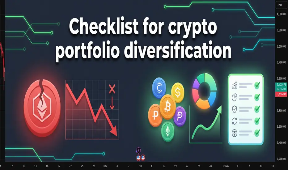
Chasing the last train: how late entries ruin good trendsChasing the last train: how late entries ruin good trends
The picture is familiar.
The asset has already made a strong move, candles line up in one direction, chats are full of profit screenshots.
Inside there is only one thought: "I am late".
The buy or sell button is pressed not from a plan, but from fear of missing out.
This is how a classic "last train" entry is born.
This text breaks down how to spot that moment and how to stop turning each impulse into an expensive ticket without a seat.
How the last train looks on a chart
This situation has clear signs.
Long sequence of candles in one direction with no healthy pullback.
Acceleration of price and volatility compared to previous swings.
Entry happens closer to a local high or low than to any level.
Stop is placed "somewhere below" or moved again and again.
The mind focuses on other people’s profit, not on the original plan.
In that state the trader reacts to what already happened instead of trading a prepared setup.
Why chasing the move hurts the account
The problem is not just "bad luck".
Poor risk-reward .
Entry sits near an extreme. Upside or downside left in the move is small, while a normal stop needs wide distance. In response there is a temptation to push the stop further just to stay in.
Large players often exit there .
For them the trend started earlier. Where retail opens first positions, they scale out or close a part of the move.
Strategy statistics get distorted .
A system can work well when entries come from levels and follow a plan. Once late emotional trades appear in the mix, the math changes even if the historical chart still looks nice.
How to notice that the hand reaches for the last train
Knowing your own triggers helps.
This symbol was not in the morning watchlist, attention appeared only after a sharp spike.
The decision comes from news or chat messages, not from calm chart work.
There is no clear invalidation level, the stop sits "somewhere here".
Many timeframes blink at once, the view jumps from 1 minute to 15 minutes and back.
Inner talk sounds like "everyone is already in, I am the only one outside".
If at least two of these points match, the trade is most likely not part of the core system.
Simple rules against FOMO
Work goes not with the emotion itself, but with the frame around trades.
No plan, no trade .
A position opens only if the scenario existed before the spike. Fresh "brilliant" ideas during the impulse are placed into the journal, not into the order book.
Move distance limit .
Decide in advance after what percentage move from a key zone the setup becomes invalid.
For example: "if price travels more than 3–4 percent away from the level without a retest, the scenario is cancelled, next entry only after a pause and new base".
Trade from zones, not from the middle of the impulse .
Plans are built around areas where a decision makes sense, not around the fastest part of a candle.
Time filter .
After a sharp move, add a small pause.
Five to fifteen minutes with no new orders, only observation and notes.
What to do when the move has already gone
The smart choice is not "grab at least something".
Better to:
save a screenshot of the move;
mark where the trend started to speed up;
write down whether this symbol was in the plan and why;
prepare a setup for a pullback or the next phase, where entry comes from a level, not from the middle of noise.
Then the missed move turns into material for the system instead of three revenge trades in a row.
A short checklist before pressing the button
Was this symbol in the plan before the run started.
Do I see the exact point where the idea breaks and is the stop parked there.
Is the loss size acceptable if this trade repeats many times.
Can I repeat the same entry one hundred times with the same rules.
If any line sounds weak, skipping this "train" often saves both money and nerves.
The market will send new ones. The task is not to jump into every car, but to board the ones that match the timetable of the trading plan.

How to choose what to invest inHow to choose what to invest in: a practical checklist for traders and investors
Many beginners start with the question “What should I buy today?” and skip a more important one: “What role does this money play in my life in the next years?”
That is how portfolios turn into random collections of trades and screenshots.
This text gives you a compact filter for picking assets. Not a magic list of tickers, just a way to check whether a coin, stock or ETF really fits your time horizon, risk and skill level.
Start from your life, not from the chart
Asset selection starts before you open a chart. First, you need to see how this money fits into your real life.
Three simple points help:
When you might need this money: in a month, in a year, in five years.
How painful a 10, 30 or 50 % drawdown feels for you.
How many hours per week you truly give to the market.
Example. Money is needed in six months for a mortgage down payment. A 15 % drawdown already feels terrible. Screen time is 2 hours per week. In this case, aggressive altcoins or heavy leverage look more like a stress machine than an investment tool.
Another case. Ten-year horizon, regular contributions, stable income from a job, 30 % drawdown feels acceptable. This profile can hold more volatile assets, still with clear limits on risk.
Filter 1: you must understand the asset
First filter is simple and strict: you should be able to explain the asset to a non-trader in two sentences.
The label is less important: stock, ETF, coin or future. One thing matters: you understand where the return comes from. Growth of company profit. Coupon on a bond. Risk premium on a volatile market. Fees and staking rewards in a network.
If your explanation sounds like “price goes up, everyone buys”, this is closer to magic than to a plan. Better to drop this asset from the list and move on to something more clear.
Filter 2: risk and volatility
The market does not care about your comfort. You can care about it by choosing assets that match your stress level.
Key checks:
Average daily range relative to price. For many crypto names, a 5–10 % daily range is normal. Large caps in stock markets often move less.
Historical drawdowns during market crashes.
Sensitivity to events: earnings, regulator news, large players.
The sharper the asset, the smaller its weight in the portfolio and the more careful the position size. The same asset can be fine for an aggressive profile and a disaster for a conservative one.
Filter 3: liquidity
Liquidity stays invisible until you try to exit.
Look at three things:
Daily traded volume. For active trading, it is safer to work with assets where daily volume is many times larger than your typical position.
Spread. Wide spread eats money on both entry and exit.
Order book depth. A thin book turns a big order into a mini crash.
Filter 4: basic numbers and story
Even if you are chart-first, raw numbers still help to avoid extremes.
For stocks and ETFs, it helps to check:
Sector and business model. The company earns money on something clear, not only on a buzzword in slides.
Debt and margins. Over-leveraged businesses with thin margins suffer in stress periods.
Dividends or buybacks, if your style relies on cash coming back to shareholders.
For crypto and tokens:
Role of the token. Pure “casino chip” tokens rarely live long.
Emission and unlocks. Large unlocks often push price down.
Real network use: transactions, fees, projects building on top.
Build your personal checklist
At some point it makes sense to turn filters into a short checklist you run through before each position.
Example:
Time. I know the horizon for this asset and how it fits my overall money plan.
Risk. Risk per position is no more than X % of my capital, portfolio drawdown stays inside a level I can live with.
Understanding. I know where the return comes from and what can break the scenario.
Liquidity. Volume and spread allow me to enter and exit without huge slippage.
Exit plan. I have a level where the scenario is invalid and levels where I lock in profit, partly or fully.
Connect it with the chart
On TradingView you have both charts and basic info in one place, which makes this checklist easier to apply.
A typical flow:
Use a screener to find assets that match your profile by country, sector, market cap, volatility.
Open a higher-timeframe chart and see how the asset behaved in past crashes.
Check liquidity by volume and spread.
Only then search for an entry setup according to your system: trend, level, pullback, breakout and so on.
Before clicking the button, run through your checklist again.
Common traps when choosing assets
A few classic traps that ruin even a good money management system:
Blindly following a tip from a chat without knowing what the asset is and why you are in it.
All-in on one sector or one coin.
Heavy leverage on short horizons with low experience.
Averaging down without a written plan and clear risk limits.
Ignoring currency risk and taxes.
This text is for educational purposes only and is not investment advice. You are responsible for your own money decisions.

Reading market regime: trend, range or chaos on a single chartReading market regime: trend, range or chaos on a single chart
Many traders treat every chart the same. Same setup, same stop, same expectations. Then one week the pattern works, the next week it bleeds the account.
In practice, the pattern rarely is the real problem. The problem is that the same pattern behaves differently in different market regimes.
First read the regime. Then trust the pattern.
This article focuses on a simple way to classify any chart into three regimes and adjust entries, stops and targets to match the environment.
What “market regime” really means
Forget academic definitions. For a discretionary trader, market regime is simply how price usually behaves on this chart in the recent swings.
A practical split into three buckets:
Trend: price prints higher highs and higher lows, or lower highs and lower lows. Pullbacks respect moving averages or previous structure. Breakouts tend to continue.
Range: price bounces between clear support and resistance. False breaks are frequent. Mean reversion works better than breakouts.
Chaos: candles with long wicks, overlapping bodies, fake breaks in both directions, no clear structure. Liquidity is patchy, stop hunts are common.
The goal is not perfect classification. The goal is to avoid trading a “trend playbook” in a chaotic zone and a “range playbook” in a strong trend.
Three quick checks for any chart
Before opening a trade, run three very simple checks on the last 50–100 candles.
1. Direction of swings
Mark the last 3–5 swing highs and lows with your eyes.
If highs and lows step clearly in one direction, you have a trend.
If highs and lows repeat in the same zones, you have a range.
If swings are messy and overlap, you are closer to chaos.
2. How price reacts to levels
Pick obvious zones that price touched several times.
Clean tests with clear rejection and follow through support the range idea.
Small pauses and then continuation support the trend idea.
Spikes through levels with no follow through point to chaos.
3. Noise inside candles
Look at wicks and bodies.
Moderate wicks and healthy bodies often belong to a stable trend.
Many doji-like candles and long wicks on both sides are classic noisy conditions.
After these three checks, label the chart in your journal: trend, range or chaos. Do not overthink it. One clear label is enough for each trade.
How to adapt the trade to the regime
Same signal, different execution.
Trend regime
Direction: trade only with the main direction of recent swings.
Entry: focus on pullbacks into previous structure or into dynamic zones like moving averages, not on chasing the breakout spike.
Stop: behind the last swing or behind the structure that invalidates the trend.
Target: allow more distance, at least 2R and more while the trend structure holds.
Range regime
Direction: buy near support, sell near resistance. Ignore mid-range.
Entry: wait for rejection from the edge of the range. Wick rejection or failed breakout is often better than a blind limit order.
Stop: behind the range boundary, where the range idea clearly dies.
Target: either the opposite side of the range or a “safe middle” if volatility is low.
Chaos regime
Size: cut risk per trade or stay flat.
Timeframe: either move to higher timeframe to filter noise or skip the instrument.
Goal: defense, not growth. The main job here is to avoid feeding the spread and slippage.
Use a journal to find your best regime
Add one extra column to your trading journal: “regime”. For each trade, assign one of three labels before entry.
After 30–50 trades, group the results by regime. Many traders discover that:
Trends give the main profit.
Ranges give small but stable gains.
Chaos slowly eats everything.
Once this pattern becomes visible in numbers, discipline around regimes stops being an abstract rule. It turns into a very practical filter.
Conclusion
A setup without a regime filter is half a system.
Start every analysis with a simple question to the chart: trend, range or chaos. Then apply the playbook that fits this environment, instead of forcing the same behaviour from the market every day.

5 Key Trading Tips for BeginnersWelcome back everyone to another post! In this article we will be explaining 5 key pointers (tips) for new individuals entering the trading space.
When it comes to trading first there is “ understanding ” before we begin the 5 keys steps. Let me assist you in understanding what will happen when you take on trading.
Trading is a challenge. Not a video game challenge, not a math test challenge – a * Challenge * One that will break you. Trading will break you mentally, physically, spiritually and financially. It is an eye-opening journey.
Trading will teach you a lot about yourself, and it will teach you a lot about discipline, patience and how you can analyze markets.
I saw a quote somewhere, it said trading: “ Trading is the hardest way, to make easy money ” and they are right.
You will be learning how to manage risk, control your emotions, understand your own decision-making patterns. These are all invaluable lessons for life, as well as trading.
Sounds great! But then there are the losses, what you lose to gain all this. Trading isn’t something that you can learn overnight – all those posts you see about a young 17-year-old “ cracking the code ” is rubbish. Why? Because they haven’t learnt life lessons.
You can make money fast, but you will lose it faster if you don’t know how to manage it.
Trading will drain every bit of energy out of you. You will feel like you’re falling behind, you will eventually collapse at every loss and become frustrated. The market will test you; the market doesn’t give a damn about you – you accept the risk when you take on trading and since you’re the one making the trades, it’s you VS you.
You’re testing yourself. You agree to test your patience, your confidence, your mindset. Doing so will make progress feel nonexistent or slow.
Every day, and every trade you will question yourself, wondering if “trading” is even for you. Sometimes it will feel like you’re going in circles. You will continue to make mistakes repeatedly. It will become exhausting but remember – only experience and your own strengths will allow you to succeed. Only those who can endure the grind without giving up will make it.
So, let’s start off the 5 key pointers that will prepare you.
1) Prioritize Risk Management Over Profits:
Most newbies focus first on “ making money ” rather than safeguarding capital. The reality is that surviving in the market is way more important than winning every trade you see or come across.
Key Points:
Determine risk per trade: A common rule is risking no more than 1-2% of your trading account on a single trade. This way even a string of losses will not wipe you out.
Always use stoploss: A defined maximum loss per trade enforces discipline and emotions to stay in check.
Position sizing: Your sizing should be proportional to what you’re willing to lose on each trade. Bigger trades amplify the losses, but they also amplify the profits.
Why it matters:
Without strong risk management, even a high win-rate strategy can fail. Protecting capital ensures you’re still in the game when opportunities arise.
2) Develop a trading plan and stick to it .
Random reactive trading is the best way to lose money. Build your plan overtime.
Key points:
Define your strategy: Building your strategy is the longest part, constant back testing and forward testing, refining and rebuilding. You’re not “switching” your strategy if you’re adding something small to it, you’re changing it if you eliminate the whole thing.
Identify your form of trades, short, mid, long term or swing trades.
Set clear rules: Don’t leave anything to chance, for example “I only enter trades if price closes above the 50ema and RSI is above 50”
Journalling trades: Ensure to journal all your trades, “How do I journal” Easy. Record the time, date, symbol, pair, what model/system you used, images, your entry, tp and exit, why and for how long you’ll have it open.
Why it matters:
Consistency is a key, it pairs with discipline, psychology and lingers with risk management. Traders who follow a disciplined system perform better than those to trade off an impulsive feeling. Other words “Gamble”
3) Master one market and one system first:
Beginners usually spread themselves too thin, trying forex, crypto, stocks and commodities all at once – Unfortunately for me I made this mistake at the start which made it very difficult! – Don’t do this. Stick to one market.
Key points:
Pick one market: Each market has its own rhythm, volatility, and liquidity. Teaching one thoroughly allows you to understand everything about it.
Focus on one system: Instead of trying every new system from you tubes or forums, master one approach and refine it onwards e.g. – you trade FVGs, Win rate is 50% once you add Fibonacci it might be e.g. 65%
Avoid information overload: Social media and trading forums are filled with conflicting advice, stick to your chosen approach and refine it. People say you need to have 12-hour trading days. If you do this, you will FAIL. You will grind yourself into the ground and face burnout making it very difficult to get back up again. Limit yourself to how much trading and trading study you do a day. Eg 10 back test trades, 3 real trades, 3 journaled trades, 1 hour of studying and researching the market.
Without strong risk management, even a high win-rate strategy can fail. Protecting capital ensures you’re still in the game when opportunities arise.
Why it matters
Depth beats breadth early on. Mastering a single market and system will allow you to build confidence and improve your edge.
4) Understand the Psychology of trading.
Trading isn’t just numbers: as mentioned in “understanding” it’s a test of emotional control, fear, greed and impatience.
Key points:
Emotions vs logic: ensure you recognize emotional reactions like FOMO (Fear of missing out) or revenge trading. Pause before reacting to a trade that will go against you.
Set realistic expectations : Markets move slowly. Sometimes for months, don’t expect huge gains overnight. Just like DCA focus on compounding. Compound your knowledge and skill set.
Mindset training: Techniques like medication and journaling as well as visualization can help reduce stress and maintain discipline.
Why it matters:
Even a diamond system can still fail if emotions drive your actions. Psychology often determines long term success, more than technical skill.
5) Prioritize learning. Then earning.
Beginners fall into the trap of trading being a “get rich quick” scheme. But the real investment is learning how the market works.
Key points:
Paper and demo trade first: Practice on demo accounts before you use real money – you will be surprised how many times you will fail. It’s better to fail with simulation money than your McDonalds weekly wage.
Review every trade: Analyze your losing trades, but also your winning trades. Find patterns and areas to improve.
Continuously educate yourself: Read books about the mind, about habits, watch market analysis but critically, apply what you learn and don’t just collect information and not use it.
Why it matters:
Earnings are just the byproduct trading. The faster you learn and adapt, the sooner your profits will appear. Treat early losses as tuition. Not failure.
Thank you all so much for reading.
I hope this benefits all those who are starting off their trading journey. If you have any questions, let me know in the comments below!

AI in Trading: Hype, Hope, and Hard Truths# TradingView Post: AI in Trading (TradingView Formatting)
"I just made a ChatGPT trading bot that's up 300% in backtests!"
I see this exact post at least 5 times a week. And every time, I know exactly how it ends—blown account, confused trader, and another person convinced that "AI doesn't work in trading."
Here's the uncomfortable truth: AI absolutely works in trading. Just not the way most people think.
The problem isn't the technology—it's that everyone's obsessed with the sexiest part (predicting the next candle) while ignoring the parts that actually make money.
After building dozens of systematic strategies for clients across crypto, forex, and equities, I've learned this: the hard part of trading isn't generating signals. It's managing risk, optimizing execution, and knowing when your edge has disappeared.
Let me show you where AI actually creates alpha—and why your "predictive model" probably won't.
━━━━━━━━━━━━━━━━━━━━━━
The Real Problem With AI Signal Generation
Before we get to what works, let's talk about why most AI trading bots fail:
The Data Problem:
Markets are non-stationary (the game changes constantly)
You need 10,000+ samples for reliable ML models
But market regimes shift every 200-500 bars
You're essentially training on data from a different game
The Overfitting Trap:
Your LSTM "learned" patterns that existed once and may never repeat
95% backtest accuracy? That's usually a red flag, not a green light
Walk-forward testing reveals most models have zero predictive power out-of-sample
The Competition Reality:
Renaissance Technologies has PhDs, decades of data, and billions in infrastructure
Your GPU and 2 years of OHLCV data isn't competing with that
By the time a pattern is obvious enough for simple ML to find, it's arbitraged away
Can pure signal generation work? Yes—but it's the hardest application of AI in trading, not the easiest.
━━━━━━━━━━━━━━━━━━━━━━
Where AI Actually Adds Value (The Unsexy Truth)
Here's what nobody tells you: institutional quant funds use AI heavily, just not for predicting price direction. They use it for the operational advantages that compound over thousands of trades.
1. Position Sizing & Risk Management
Traditional fixed-percentage position sizing (risk 2% per trade) ignores market reality. Sometimes 2% is too aggressive, sometimes it's leaving money on the table.
I've tested reinforcement learning models that dynamically adjust position sizes based on:
Current market volatility regime (VIX, ATR percentiles)
Correlation breakdown between portfolio assets
Recent strategy performance and drawdown depth
Portfolio heat distribution across sectors
Real result from a client system: 23% reduction in maximum drawdown vs. fixed sizing, with nearly identical total returns. The AI wasn't predicting price—it was predicting when the edge was strongest and sizing accordingly.
2. Execution Optimization
This is where prop shops and hedge funds actually deploy ML. Not for signals—for getting better fills.
What ML handles:
Predicting optimal order slicing (VWAP vs. TWAP vs. aggressive IOC)
Detecting liquidity windows in crypto markets (when to place limit orders vs. market orders)
Minimizing slippage on larger positions
Predicting short-term volatility spikes that would hurt execution
Practical example: A simple gradient boosting model analyzing order book depth, bid-ask spread, and recent volume patterns can save 5-15 basis points per trade. On a $100K position, that's $50-150 saved per execution. Over 1,000 trades per year? That's $50K-150K in improved performance.
3. Regime Detection & Strategy Allocation
Stop trying to predict the next candle. Instead, predict the type of market environment you're in.
Use unsupervised learning (K-means clustering, Hidden Markov Models, Gaussian Mixture Models) to identify:
High volatility vs. low volatility regimes
Trending vs. mean-reverting environments
Risk-on vs. risk-off sentiment periods
Correlation expansion/contraction across assets
Why this matters: A moving average crossover that prints money in trending markets will destroy your account in choppy, range-bound conditions. A mean reversion strategy that works beautifully in low volatility will get steamrolled during breakouts.
Implementation: Train an ensemble model on market features (volatility, correlation, volume patterns, momentum indicators). When it detects Regime A, allocate to Strategy Set 1. When it detects Regime B, switch to Strategy Set 2. When confidence is low, reduce exposure across the board.
4. Feature Engineering & Dynamic Signal Weighting
You have 50 technical indicators on your chart. Which ones actually matter right now ?
This changes constantly:
RSI works until the market trends hard, then it's a disaster
Volume patterns matter way more in crypto than traditional equities
Correlation indicators are useless until suddenly they're everything (crisis periods)
Different lookback periods perform differently across volatility regimes
ML solution: Use ensemble methods (Random Forests, XGBoost) to dynamically weight and combine signals based on recent regime and performance.
Instead of: "Buy when RSI < 30"
You get: "Buy when the ensemble model says momentum + volume + volatility features align, weighted by recent regime performance"
Client example: Combined 12 traditional strategies (each with proven edge) with an ML meta-strategy that allocated capital between them. The ML didn't find new edges—it figured out which existing edges to use when. Result: Sharpe ratio improved from 1.1 to 1.7 over 3 years live.
━━━━━━━━━━━━━━━━━━━━━━
The Hybrid Approach That Actually Works
After building systems that survive real markets (not just backtests), here's the architecture that works:
Layer 1 - Core Signals (Traditional Quant):
Mean reversion strategies based on statistical patterns
Momentum breakout systems with volume confirmation
Arbitrage opportunities and structural edges
These are your "alpha generators" with proven statistical edge
Layer 2 - AI Risk Management:
Reinforcement learning for dynamic position sizing
ML models for stop-loss placement and profit-taking
Volatility prediction for exposure adjustment
Layer 3 - AI Strategy Allocation:
Regime detection to switch between strategy sets
Performance-based weighting of different approaches
Correlation analysis for portfolio construction
Layer 4 - AI Execution:
Order optimization based on current liquidity
Slippage prediction and mitigation
Timing of trade execution within the day
Real system I deployed for a crypto client:
Core: 8 different mean reversion + momentum strategies (all traditionally backtested)
AI Layer: Reinforcement learning for position sizing based on volatility regime
ML Layer: Random forest classifier for regime detection (trending vs. ranging vs. high volatility)
Execution: Gradient boosting model for order placement timing
Result: Sharpe ratio improved from 1.2 to 1.8 over 3 years of live trading, max drawdown reduced by 31%
The AI didn't find magic price prediction patterns. It made better decisions about when to trade , how much to risk , and how to execute .
━━━━━━━━━━━━━━━━━━━━━━
What You Should Actually Build
If you're serious about AI in trading, here's my recommendation:
Start here (High ROI, Lower Difficulty):
Build a regime detection system first
Create position sizing rules that adapt to volatility
Optimize your execution (especially in crypto)
Test strategy allocation across different market conditions
Only then consider (High Difficulty, Questionable ROI):
Pure price prediction models
Red flags to avoid:
Any model with >90% backtest accuracy (probably overfit)
Systems that don't account for transaction costs and slippage
Strategies that haven't been walk-forward tested
Anything that can't explain why it should work
━━━━━━━━━━━━━━━━━━━━━━
The Bottom Line
If someone's selling you an AI system that "predicts market direction with 95% accuracy," run away. That's either overfitted garbage or a scam.
If someone's using AI to dynamically manage risk, optimize execution, detect regime changes, and intelligently allocate between proven strategies? That's actually how professionals use it.
The unsexy truth: The best use of AI in trading isn't prediction—it's decision-making around the edges that already exist.
Stop chasing the signal generation hype. Start thinking about the full trading pipeline. That's where the real alpha is hiding.
━━━━━━━━━━━━━━━━━━━━━━
💬 Question for the community: Are you using AI for signal generation or operational optimization? What's been your experience?
🔔 Follow for more quant reality checks—no hype, just data and systems that work in production
📩 Building systematic strategies that need to survive real markets? I specialize in risk-aware ML systems, hybrid quant approaches, and turning backtests into production-ready code. DM me to discuss your project.
━━━━━━━━━━━━━━━━━━━━━━

Fish Hook Pattern: the setup that catches liquidity, not tradersThere’s one pattern that never gets enough attention in textbooks, yet it’s one of the purest reflections of smart money logic - the Fish Hook.
It looks simple: price breaks out, triggers stops, traps breakout traders, and snaps back just as fast. But the psychology behind it is what makes it truly powerful.
When the market consolidates under a level, stop orders start to pile up. Big money knows that liquidity sits there - waiting to be taken. They push the price beyond the level, trigger the stops, and absorb liquidity. The breakout traders think they’ve caught momentum, but in reality, they’ve just become the exit liquidity.
Then comes the reversal - fast, decisive, emotional. That sharp return to the range is the “hook.”
If price breaks a key high or low and immediately rejects it - without structure, without a clean retest - you’re watching a Fish Hook in action.
The entry comes on the retest of that level from the opposite side. The stop goes right beyond the “hook’s tip.” Targets? The opposite edge of the range or the next liquidity pool.
The beauty of the Fish Hook lies in its simplicity. It’s not an indicator or a signal. It’s the behavior of money - watching how capital manipulates emotion.
When you start to see it often, you realize the market isn’t random. It’s intentional.
Trading becomes less about chasing candles and more about reading footprints. Fish Hook setups happen daily across pairs, stocks, and crypto and once you train your eye, you’ll never unsee them.
If your stops keep getting hit before the move - congratulations, you just met the Fish Hook from the wrong side.
Comex Gold.Here is pattern in short time frame that is 15 min. This is a triangle pattern and if you look carefully you will also spot Flag and Pole which I leave you guys to spot for. A breakout from this will trigger an entry.
Tagret for Day high with sl of 3994.
Disclaimer - This is just for educational purpose.
Jai Shree Ram
Follow for more such analysis and learnings!

Understanding Psychological LevelsDefinition:
In Trading, Psychological levels are often called round numbers or psy levels.
This is because the price ends in zeros and fives naturally attracting a trader’s attention.
Examples:
• Forex: 1.0000, 1.0500, 1.1000
• Stocks: $50, $100, $150, $200, $250
• Cryptocurrency: $10,000, $15,000, $20,000, $25,000
These levels are crucial as traders instinctively see targets in round numbers. (Or Incremental levels such as 5, 10, 15, 20, 25, 30 and so on...
This causes many buy, sell, and stop orders to cluster around the same price zones, creating self-reinforcing areas of interest in the market. Again, price sits at 113.2k – Psychological level is 115k.
___________________________________________________________________________________
Why Psychological Levels Matter in Trading
1) Human Bias:
Traders and investors often place orders at simple, rounded numbers. This makes their charts and order list “Clean.”
2) Institutional Targeting:
Large groups, whales or organizations use these levels to find liquidity or trigger stops. (Eg, BTC swept 125k before dumping)
3) Market Memory:
When a Psychological level reacts, traders remember it, and it often becomes relevant again in the future. (Turns into a prev liquidity sweep.)
5) Order Clustering:
Stop losses, take profits, and pending orders frequently build up around these areas. (As above, it builds liquidity.)
__________________________________________________________________________________
How to Identify Psychological Levels
Begin with marking clean, round (or quarterly) numbers on your chart. These are often major levels such as 4.0000, 5.0000, or 6.0000.
See the example below:
Then identify the midpoints/quarter points between them, like 4.5, 5.5, 6.5, 7.5, 8.5
See the example below:
For stronger assessments, look for psychological levels that align with other forms & tools of technical confluence—such as previous S & R, Supply/Demand, Highs & Lows, Fibonacci retracements, trendlines, or volume clusters.
See the example below:
When multiple forms of technical evidence converge near a round number, the level tends to have greater impact.
__________________________________________________________________________________
Trading Around Psychological Levels
When price approaches a psychological level, three common behaviors can occur:
1) Rejection:
Price touches the level and reverses quickly, suggesting strong defense by buyers or sellers. (Liquidity Sweep)
2) Break and Retest:
Price breaks through the level, then revisits it to confirm it as new support or resistance.
3) Compression or Grind:
Price consolidates near the level before a breakout as liquidity builds up.
Practical Application:
Enable alerts slightly before major psychological levels to observe reactions in real time (for example, 4.45 instead of 4.5 ). Wait for confirmation using price action such as a clear rejection wick, an engulfing candle, or a BOS (Break of Structure). Combine this analysis with liquidity or other forms of technical tools for a stronger assessment.
__________________________________________________________________________________
Trader Behavior at These Levels
Market reactions at psychological levels are largely directed by emotion and herd (Group) behavior. Fear of missing out can push price through a round number with momentum & speed while profit-taking can trigger short-term reversals & rejections. Stop hunts are also common, where smart money briefly pushes prices beyond a round level to collect liquidity before reversing. (From 4.0 up to 4.25 then down again)
Because many traders watch these same levels, reactions often repeat, reinforcing their significance.
__________________________________________________________________________________
Example: BTC/USD for $125k
When Bitcoin approaches $125k, many retail traders view it as a significant threshold. They might place short orders just below it or stop just above. Institutions recognize this and may intentionally push prices above $125k (sweeping $126k) to trigger those stops and fill large positions.
Once that liquidity is collected, price can reverse, and the $125k area may later serve as a new resistance zone.
This type of liquidity hunt and reversal pattern occurs frequently across all markets.
__________________________________________________________________________________
Practical Tips
1) Never trade purely based on a round number. Always wait for confirmation through structure or price action. (Retests, MSS, BOS, candle patterns etc)
2) Use alerts & alarms rather than fixed lines; prices often wick slightly above or below the exact level.
3) On higher timeframes, psychological levels often act as major turning zones. On lower timeframes, they tend to attract short-term reactions. (Lower the time frame, the more reactions = constant noise)
4) Combine psychological levels with liquidity, order flow, or volume analysis for a more complete view.
__________________________________________________________________________________
Summary
Psychological levels are where human reactions and liquidity meet. They represent areas of emotional and institutional/organizational interest rather than fixed points of reversal.
By understanding how traders behave around these zones and observing how price reacts to them, you can determine key movements with greater confidence.

Can a Wristband Read Your Mind Before You Move?Wearable Devices Ltd. (NASDAQ: WLDS) is pioneering a radical shift in human-computer interaction through its proprietary neural input interface technology. Unlike invasive brain-computer interfaces or basic gesture-recognition systems, the company's Mudra Band and Mudra Link decode subtle neuromuscular signals at the wrist, enabling users to control digital devices through intent rather than physical touch. What distinguishes WLDS from competitors like Meta's surface electromyography (sEMG) solutions is its patented capability to measure not just gestures, but quantifiable physical forces, including weight, torque, and applied pressure, opening applications far beyond consumer electronics into industrial quality control, extended reality (XR) environments, and mission-critical defense systems.
The company's strategic value lies not in hardware sales but in its planned evolution into a neural data intelligence platform. WLDS is executing a four-phase roadmap that transitions from consumer adoption (Phases 1-2) to data monetization through its Large Motor-Unit Action Potential Model (LMM), a continuously learning biosignal platform expected to launch by 2026. This proprietary dataset, generated from millions of user interactions, positions WLDS to offer high-margin licensing services to OEMs and enterprise clients, particularly in predictive health monitoring and cognitive analytics. With partnerships including Qualcomm and TCL-RayNeo, the company is building the infrastructure for what it envisions as the industry-standard neural interaction platform.
However, WLDS operates in a market defined by extraordinary potential and substantial execution risk. The global brain-computer interface market is projected to reach $6.2 billion by 2030, yet current wireless neural interface revenues remain modest at an estimated $1.5 billion by 2035, suggesting either a massive untapped opportunity or significant adoption barriers. The company's lean 26-34 person operation, $522,000 in 2024 revenue, and extreme stock volatility (Beta: 3.58, 52-week range: $1.00-$14.67) underscore its early-stage profile. Success hinges entirely on converting consumer adoption into the proprietary biosignal data required to train the LMM platform, which in turn must prove sufficiently valuable to command enterprise licensing agreements at scale.
WLDS represents a calculated bet on the convergence of AI, wearable computing, and neurotechnology, a company that could either establish the foundational infrastructure for touchless interaction across XR, healthcare, and defense sectors or struggle to bridge the gap between technological capability and market validation. Its military contracts and robust IP portfolio covering force-measurement capabilities provide technical credibility, but the path to ubiquitous platform adoption (Phase 4) requires flawless execution across consumer seeding, data accumulation, and B2B conversion, a multiyear journey with no guarantee of arrival.
