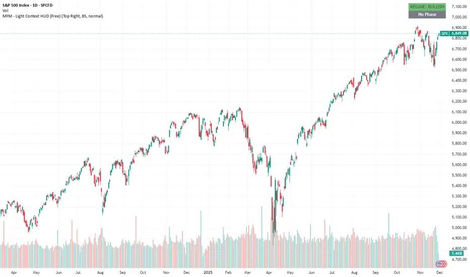
SPX – MFM Light HUD (Free) shows a clean bullish regimeThis post is an educational example of how to interpret the free MFM Light Context HUD. It does not provide trading signals or directional predictions.
The MFM – Light Context HUD (Minimal) gives a simple view of the structural state of the market. On SPX the model shows a clear bullish regime on the weekly momentum ratio. This does not predict direction. It only shows whether the underlying environment is supportive or restrictive.
The phase is currently neutral. That means SPX is not in a volatile phase, not in a compression field, and not in a drift phase. When no phase is active, price tends to behave without strong internal pressure. It is simply the absence of structural imbalance.
What the phases mean
These phases describe structure, not trade signals.
Volatile (Phase 1): fast movement and unstable conditions.
Compression (Phase 2): contracting conditions with slowing momentum.
Drift (Phase 3): more controlled and persistent movement.
Neutral: no clear structural condition.
This is why the HUD is useful. It removes noise and gives a clean top level reading.
You can still use your own strategy or analysis. The HUD just tells you what kind of environment you are operating in.
What you see in this chart
Weekly regime is bullish
No active phase
No signals or forecasts
Only structural context
Why this matters
In strong bullish regimes markets often react differently to pullbacks, volatility spikes or news events. Context does not replace analysis. It frames it.
Disclaimer
The Market Framework Model (MFM) and this indicator are for educational and informational purposes only. Nothing in this script, its visuals, or any documentation should be interpreted as financial advice or as a recommendation to buy or sell any asset.
All examples and historical references are illustrative only and do not imply future results. Trading and investing involve risk, including the potential loss of capital. Users remain fully responsible for their own decisions.
No guarantees are made regarding accuracy, completeness, or reliability. MFM describes structural market context only and should not be used as the sole basis for trading actions.
© 2025 Inratios. Market Framework Model (MFM) is protected via i-Depot (BOIP) – Ref. 155670.
Momentumanalysis
Mastering RSI: A Complete Guide to Momentum🔵 Mastering RSI: A Complete Guide to Momentum, Regimes, Reversals & Professional Signals
Difficulty: 🐳🐳🐳🐳🐋 (Advanced)
This article goes far beyond the basic idea of “RSI = overbought/oversold.” If you want to truly master RSI as a momentum gauge, trend filter, reversal tool, and structure confirmation model, this guide is for you.
🔵 WHY MOST TRADERS MISUSE RSI
Most traders use RSI in the simplest way:
RSI above 70 = sell
RSI below 30 = buy
This leads to shorting strong trends and catching falling knives.
RSI is not a reversal button. RSI is a momentum translator.
To master RSI, you must understand:
Trend regimes
Momentum pressure
Acceleration and deceleration
Failure swings
Divergences
Trend vs range behavior
Multi-timeframe alignment
Structure confirmation
RSI shows the strength behind price, not just extremes.
🔵 1. RSI TREND REGIMES (CORE FOUNDATION)
RSI moves in predictable zones depending on the type of market environment.
Bullish RSI Regime
RSI holds between 40 and 80
Pullbacks bottom around 40–50
Breaks above 60 show trend acceleration
Bearish RSI Regime
RSI holds between 20 and 60
Pullback tops form around 50–60
Breaks below 40 confirm bearish dominance
These regimes tell you who controls the market before you even look at candles.
🔵 2. MOMENTUM PRESSURE (RSI AS A SPEEDOMETER)
RSI measures the speed and pressure of price movement.
Rising RSI with rising price = trend acceleration
Falling RSI with rising price = momentum weakening
Rising RSI with falling price = early strength
Falling RSI with falling price = continuation pressure
This is not divergence. It is momentum pressure, the earliest sign of trend shift.
🔵 3. FAILURE SWINGS (THE MOST RELIABLE RSI REVERSAL SIGNAL)
Failure swings are powerful because they show internal momentum breaking before price reacts.
Bullish Failure Swing
RSI makes a low
RSI rallies
RSI dips again but stays above previous low
RSI breaks the previous high
Bearish Failure Swing
RSI makes a high
RSI pulls back
RSI rallies but fails to break the previous high
RSI breaks the previous low
Failure swings often appear at trend tops and bottoms before candles reveal anything.
🔵 4. DIVERGENCES (REGULAR AND HIDDEN)
Regular Divergence: Reversal Clue
Bullish: price lower low, RSI higher low
Bearish: price higher high, RSI lower high
Hidden Divergence: Trend Continuation
Bullish hidden: price higher low, RSI lower low
Bearish hidden: price lower high, RSI higher high
Hidden divergence is more powerful than regular because it confirms trend continuation.
🔵 5. RANGE RSI VS TREND RSI
RSI behaves very differently in ranges versus trends.
Range Environment
RSI oscillates between 30 and 70
Reversals at extremes have high accuracy
RSI 50 is the equilibrium
Trend Environment
RSI stays above 50 in bullish trends
RSI stays below 50 in bearish trends
30 and 70 extremes lose meaning
Always identify environment first. RSI signals change depending on regime.
🔵 6. RSI AS A STRUCTURE FILTER
RSI combined with structure improves trade selection dramatically.
Price makes higher highs + RSI rising = healthy trend
Price makes higher highs + RSI flat = weak breakout
Price makes higher highs + RSI dropping = exhaustion
Support retest + RSI 40–50 = strong continuation potential
Most false breakouts are avoided simply by checking RSI pressure.
🔵 7. MULTI-TIMEFRAME RSI ALIGNMENT
Use higher timeframe RSI to validate lower timeframe setups.
HTF RSI bullish + LTF RSI pullback = high-quality entry
HTF RSI bearish + LTF RSI bounce = premium short area
HTF RSI crossing 50 = long-term regime shift
This is one of the most powerful RSI confluences.
🔵 EXAMPLE TRADING FRAMEWORK
Bullish Setup Checklist
RSI in bullish regime (above 50)
Pullback into 40–50 zone
Hidden bullish divergence or failure swing
Structure forms a higher low
Bearish Setup Checklist
RSI in bearish regime
Rejection from 50–60 zone
Hidden bearish divergence or failure swing
Structure forms a lower high
🔵 COMMON RSI MISTAKES
Trading RSI extremes without trend context
Ignoring RSI regimes
Entering on regular divergences in strong trends
Not using RSI midline (50) as a regime filter
Relying only on overbought/oversold signals
🔵 CONCLUSION
RSI is one of the most powerful indicators when used correctly. It provides a complete framework for:
Reading trend strength
Tracking momentum pressure
Identifying early reversals
Trading continuation setups
Filtering breakout strength
Aligning multi-timeframe bias
Master RSI, and you gain a clearer view of momentum than most traders ever experience.
How do you use RSI? Do you prefer divergences, trend zones, or failure swings? Share your approach below!

Gold 4H – Big vs Little: The Conflict That Created ClarityJust price, structure, and volume — tracked in real time.
🧠 Chart Breakdown:
✅ Trend Reclaim (Early March) — Entered just after price bounced from the 200 EMA. Both systems aligned: Big Brother reversal and Little Brother trend crossover. I trusted the signal and it ran clean.
⛔ False Top (Late March) — Big Brother printed a red arrow under resistance. Little Brother still looked bullish, but I paused. That caution kept me out of the trap.
✅ Re-entry Confirmation (Early April) — Green triangle fired again after a textbook pullback. Bullish volume returned, and Little Brother confirmed. I re-entered long.
⛔ True Top (Mid-April) — Volume faded. Big Brother gave a second red warning. I exited longs here — structure rolled over fast after that.
🚨 Breakdown Confirmed (May 1–2) — The flush sealed it. Both systems aligned bearish. Structure broke. No more guessing — this trend has shifted.
This is how I trade with conviction. Tools don’t replace decisions — they sharpen them.

Candle Momentum Exhaustion🚀 Candle Momentum Exhaustion Indicator – Spotting Market Reversals Like a Pro!
🔥 Live in Action! Our Candle Momentum Exhaustion Indicator is pr oving its strength in identifying key exhaustion points in the market. Using a black candle fill to highlight exhaustion areas, the indicator successfully detects when momentum weakens, signaling potential reversals with high accuracy.
📊 Key Features & Observations:
✅ Precision Exhaustion Signals – Captures exhaustion points before reversals, helping traders make informed entries & exits.
✅ Works Across Market Conditions – Whether in a strong trend or sideways movement, it adapts dynamically.
✅ Volume Confirmation – Signals align well with increasing/decreasing volume, adding credibility.
✅ Enhanced Visuals – The black-filled exhaustion candles make it easier to spot momentum weakness at a glance!
🔍 How It’s Performing in Nifty 50:
📌 Recent market structure shows consistent accuracy, with exhaustion points appearing at peaks & dips before trend shifts.
📌 Strong signal clusters near resistance zones indicate potential profit booking areas for traders.
📌 Support areas see exhaustion candles aligning with buying interest, helping catch potential reversals early.
🚀 Conclusion:
This indicator is proving to be an essential tool for traders looking to catch momentum exhaustion before price reverses. With strong visual cues and volume correlation, it’s a game-changer for intraday and swing trading!
💬 How are you using the Candle Momentum Exhaustion Indicator? Drop your feedback below! 👇

NVDA | Pivot Points | $100Price action still pulling back around $127 - $120 for a continued sell-off towards $100
I'm using pivot points to help read the direction of trend and then measuring the waves in sellers to get an idea of how well momentum is doing which can also be used to generate targets like shown on chart
Entering at current price would make a 1:1 trade vs looking for a higher entry @ ~126 would allow for less risk.

When Platform Position Style Trades Go Momentum: FTAIThis platform position-style trade is starting to shift to a momentum or swing-style trade, which happens frequently with platforming trends. Above is a daily chart so you can see the shifting daily patterns from platforming to momentum.
The angle of ascent is getting steeper, which is best seen on a weekly chart, below. If you are holding this stock or others similar to this trend, it is time to shift gears to watch for speculative trading and other risk factors.
At some point the angle of ascent will be too steep to sustain the uptrend and you will need to plan how to manage the trade: take profits or hold? Is there potential for longer-term growth? If so, a profit stop must leave ample room for the stock to adjust out the big gains.

Chambal Fertilizers - Tringle BreakoutTriangle Breakout with Strong Volume & Momentum
SL - 287
Nearest resistance- 350 to 365

GBPUSD - bullish momentum Hello traders! We can finally see a shift in the momentum of GBPUSD, after a bearish year. The pair seems to create a nice impulse upwards on daily timeframe, and we can be looking for an entry after the price breaks the resistance on 4H. All the indicators that I use indicate a bullish move, the price is above EMAs, retesting them, the moving averages also indicate a buy, and the MACD line is above 0. Moreover, COT data shows an increase in the strength of GBP compared to USD.
It looks like a potential good setup, but first let's wait in order to see if the price manages to break above the resistance! OANDA:GBPUSD

LTC/BTC - 1D Support + Trend LineSince mid June 2022 LTC has been steadingly increasing in sats value and from the start of November it has been increasing at a much greater pace. Big caps have started to move and are generally a precursor for more volaitlity incoming into other mid to small caps. BTC can still fall so this could take the momentum out of its rise however it would descend slower and will take a while longer to reach its lows like it did in June

GBPJPY Daily TF analysisAs analysed last week. GJ painted a massive double bottom and broke the high structures to the left. I thought that price would pull all the way down for a retest before pushing back up to continue the double bottom pattern. As we know price doesnt move in 1 direction indefinitely, so we always get a pullback. But if momentum is strong enough price doesnt always pull back as hard as we expect, before moving in momentum again.
So as it stands, GJ is in a bullish pattern, with possible intraday sells, if the conditions are right, however, everything points towards a long term buy. When we go to the weekly chart, we are also in a very strong bullish momentum, so trade with caution

Bitcoin price leveling outUsing Bollinger bands with momentum on the 1 hour and 4 hour time frames for dollar cost averaging, it seems that Bitcoin is beginning to level out and stabilize in price action.
This could be the bottom of this downward trend we have seen since the middle of November of 2021, however, I believe caution needs to be used and careful planning. Based upon the market's recent events of unpredictability and unstable volatility, I believe dollar cost averaging is the best approach over the long term in dealing with this unusual market while protecting your investment.
Whether or not this trend continues, it really doesn't matter as this is a good middle range point to pick up a few more positions in it for either a nice little profit if the market does rise, or a stable accumulation point for a continued downtrend.
The only thing that is really clear at the moment, is that the market is at a pivotal point. Risk mitigation and budget management skills are a requirement as this really could go either way.

SPAQ selling climax I'm using the ROC indicator w/ BB to measure statistically unique price changes. Impulses and retracements can end with climatic moves, quick large moves signaling exhaustion. A swing high or swing low may form after this kind of price movement. Using SPAQ for a couple of examples. Example 1 shows a climatic top produced by the large gap up far away from the swing lows. After that, the buyers were exhausted and price has since pulled back. Example 2 shows a possible climatic bottom, though we won't know until it is. Todays daily candle is the largest red candle, far from the swing high put in Sept.15th. This large red candle may represent panic selling within what looks to be a retracement and could be signaling the end is near.
Have you ever bought something, held and held and held as it moves against you and then one day when it really starts to move against you your impulses become so strong you exit only to see that in a few days you had sold the bottom? I have, and maybe those who have as well can start to learn how to see that happening to others using the charts :). Sometimes we must live THEN learn haha. Watching for a swing low to form.

BTC vs. USD confirmed support above long-term trendline.BTC retested the white long-term trendline and confirmed support, which is a very bullish sign.
Note that the daily TD-seq is approaching a 9 though. Expecting a short term (probably minor) reversal to retest the 10429 USD VPVR line.
Green Ichicloud supporting "cushion" ascending higher and appears to be in the process of broadening.
PRISM had registered a bullish reveral as well, and the acceleration/jerk (AJ) ribbon is now curving upwards.
Looking at the 3 hourly:
Price will need to break up above the thick orange 200 SMA to confirm bullishness.
Green Ichicloud have recently formed.
AJ-Ribbon looks like it is in the process of curving upwards (awaiting confirmation -- i.e. when the thick-lime snap-oscillator crosses above the thin-red acceleration-oscillator)
Previous long-term measured move target:

BTC Long T.7k5Normally I never try predict such short term movements to this accuracy.. This was more for fun and trying something new in regards to momentum analysis.
