BTC’s OCD means EMA by NYEWe all know the market has a little OCD. Certain levels it just has to touch before it’ll allow the next move.
On the monthly BTC chart, that level looks like the 9 EMA — and it’s lining up as a likely “must-tag” into month’s end.
Here’s the key observation:
• The monthly 9 EMA has been sliding down ~$2k–$3k per month.
• It’s already dropped from just over $100k last month to a little over ~$98k this month.
• Meanwhile, this month’s high / top wick area is ~94,500.
So right now there’s a gap: 9 EMA above, price wick below.
For the 9 EMA to “touch” the top of this month’s candle (~94,500), one of two things has to happen:
1. EMA drops to price (hard), or
2. Price rises to EMA (much easier).
To get the EMA to drop several thousand more this month, BTC would need a major dump (think the kind of move that drags the average down hard — i.e., ugly). That’s possible, but it’s the less probable path compared to a tag from price.
I built a simple little calculator/tool on my chart that estimates what price would need to do for an EMA tag — and based on that, the cleaner path is BTC pushing higher into month-end to meet the 9 EMA, then potentially setting up the next move (including a possible January fade).
We’re already in the final week of the month, and the tape is starting to look like that “EMA magnet” move could be underway.
Bias: Looking for a long into the 9 EMA tag into year-end — with eyes open for a potential January reversal setup after the touch.
Merry Christmas — consider it my gift to the chart watchers 🎁
Moving_average

NZDUSD testing high resistance moving averagesNZDUSD has rallied to a series of moving averages that have the potential to create a great short opportunity. Similar to the usual BorrowedClothes plays, the pair has already rejected the Monthly 10EMA, and is now testing the weekly 20SMA and 50SMA below. With the 4H RSI overbought and a generally hawkish tone from Powell after Wednesday's fed rate decision, there's a chance this rally will correct which could lead to good profit. Of course I could be wrong. The markets do what they want to do.

How to Use Simple Moving Averages (SMA) to Predict Price TargetsIn this video, you’ll learn exactly how to use the Simple Moving Average (SMA) to find both short-term and long-term price targets.
I explain which SMA settings work best, how to spot trend direction, and most importantly:
When you should take a trade and when you should stay OUT of the market to avoid losses.
What You’ll Learn:
How the Simple Moving Average works (SMA 9, 21, 50)
How to use SMA for short-term and long-term price targets
Best SMA crossover strategies
When to enter a trade using SMA
When to stop trading / avoid traps
How institutions use SMA to set levels
Tips to improve your accuracy and timing

AUDNZD at a critical support levelRisky play here but the potential upside is immense. With AUD CPI just dropping hotter at 3.8% vs 3.6% forecast and NZD lowering interest rate, again, this time by 25bps, the liquidity sweep that followed on the pair could be a gift for longs. The RSI is overbought on the daily, and has been due for a correction however fundamentals are screaming for a continuation of the upward move. Currently sitting sitting at a key uptrend support of a large pennant and the daily 50SMA simultaneously. If one were to play this pair, tight SL should be a priority. Anything can happen, nothing is certain.

XRPUSD testing monthly 20EMA supportCritical area for XRP bulls. If the Monthly 20EMA holds (overlayed on this 4H chart) we could see price retrace to the high 2.20s/low 2.30s to test the resistance at the Monthly 10EMA. Needless to say that the RSI is oversold on multiple time frames but with the algorithm set to "sell off" the RSI has become useless for now. As always, on a play like this, tight SL and sniper entries.

EURCAD testing weekly SMA on 1H oversold RSIAs per subject, standard simple setup, EURCAD testing the weekly 20SMA on an oversold RSI on hourly. Also hitting the top of FVG created on Sept 5th. Nothing is certain. Tight SL.

BXY approaching weekly 50SMA & monthly 20EMAThe pound is due for a rally as it is nearing critical SMA and EMA. The algorithm presumably has to test these moving averages before higher highs. If support holds, all pound pairs should see some bullish momentum.

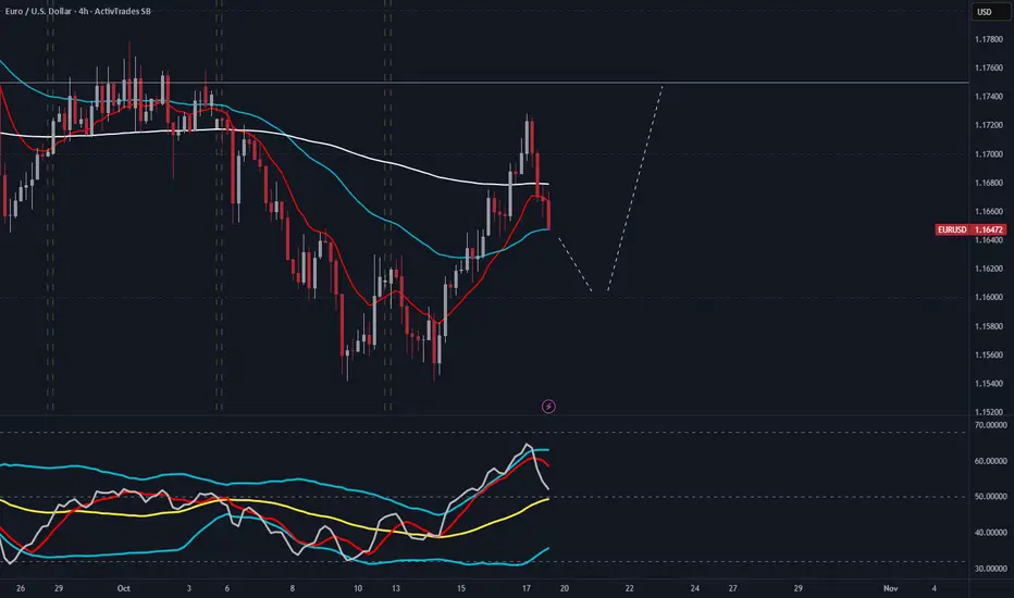
EUR/USD 4H Analysis EURUSD provided a double bottom and rallied it's away towards 1.17 then pulling back shortly after. I'd like to see the market reverse and continue the bullish rally after it's done with the pullback.
EUR/USD on a path to Retest 20 day MA - But what comes next?In yesterday´s video I mentioned that price was firmly in the blue algo for buying and at the same time, at the time of recording the price was building liquidity potentially for some continuation.
In today´s video we review how you could´ve traded that, however given the buying continuation, and the price neighbouring your 20 day MA, there could be some limit in regards to more buying.
I´m not saying this will reverse but we have to be cautious as risk/reward get skewed and take this one algorithm or indicator at a time.
Hope this video helps
As always, let me know if there are any questions

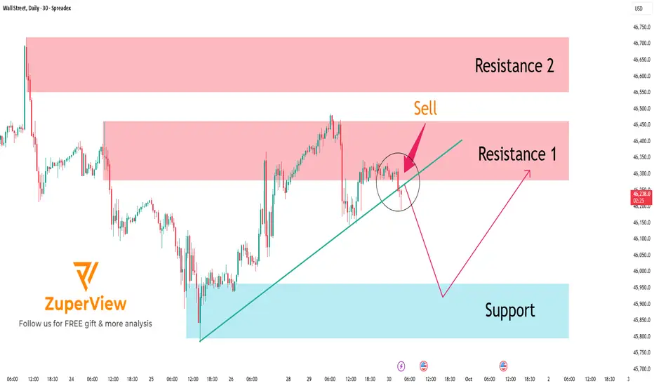
US30: Consecutive breakouts signal an emerging downtrend
SPREADEX:DJI – When price rejects the high, the market begins to shift
On the 30-minute chart, price action is clearly signaling a loss of bullish momentum and a transition toward a bearish structure.
________________________________________
🧠 Price Action Analysis
1. First Failed Breakout
Price initially broke above the ascending trendline that had held since early October — but failed to hold the breakout.
➤ A classic early warning of buyer exhaustion, often seen during distribution phases.
2. Multi-Layered Resistance Zone
The 46,725 – 46,779 region has become a clustered resistance zone, rejecting price repeatedly.
➤ Multiple rejections here suggest dominant selling pressure, with strong supply overhead.
3. Second False Breakout
A more subtle second breakout attempt followed — but again, price was swiftly rejected.
➤ Consecutive failed breakouts typically indicate a lack of conviction and precede sharp reversals.
________________________________________
📉 Trend Structure Has Shifted Bearish
• Lower highs and lower lows now visible
• Price broke below the previous trendline
• Pullback attempts failed to reclaim broken support
• Market is respecting resistance instead of support
➡ These are clear signs of a short-term downtrend emerging.
________________________________________
🔻 Trading Strategy: Favoring Sell Setups in the New Bearish Context
✴️ Scenario 1: Sell at Retest of Proven Resistance Zone
• Optimal Sell Zone: 46,700 – 46,750
• This area has already triggered two failed breakouts — a third touch could be the ideal trap for late buyers
• Watch for bearish rejection candles (pin bars, bearish engulfing, etc.)
Suggested Sell Limit Order:
→ Entry: 46,730
→ Stop Loss: 46,830 (above prior swing high)
→ TP1: 46,500
→ TP2: 46,300
→ Risk-Reward: At least 1:2
_______________________________________
✴️ Scenario 2: Momentum Sell on Breakdown of Local Support
• Trigger Level: 46,580 — if price breaks below with strong momentum (long red candle, increased volume)
• Confirms trend continuation after consolidation
Suggested Sell Breakout Order:
→ Entry: 46,580
→ Stop Loss: 46,680
→ Target: 46,350 – 46,200
→ Tip: Use smaller position size if breakout appears weak to avoid getting trapped in a fakeout
________________________________________
🎯 Trade Management
• Only enter trades with clear price rejection or momentum confirmation
• Move SL to breakeven after TP1 is hit to lock in safety
• Exit the trade if price closes above 46,830 — that would invalidate the bearish thesis
________________________________________
False breakouts leave a trail — for those who know how to read it. It's not a failure. It’s the market whispering that direction has changed.
Please like and comment below to support our traders. Your reactions will motivate us to do more analysis in the future 🙏✨
Harry Andrew @ ZuperView

US30: Rejects Resistance – Bearish Move in Progress
The SPREADEX:DJI index is currently forming a bearish short-term structure, especially after price entered the Resistance Zone 1 (46,279 – 46,445) — a key area where sellers have clearly stepped in with strong rejection.
🚨 CLEAR REVERSAL SIGNALS
At Resistance 1, we saw multiple rejection candles with strong bearish bodies.
Additionally, the MA Plot has turned downward, signaling a possible shift in trend.
Price also touched the 4-level structure zone of support/resistance, adding confluence to the area.
Immediately after, the market reversed and dropped sharply with strong bearish candles, confirming the presence of selling pressure and strengthening the short bias.
📉 PREFERRED SCENARIO – SHORT WITH THE TREND
With the current momentum, the preferred scenario is:
🔻 Price is likely to continue dropping toward the Support Zone: 45,459 – 45,798
This zone serves as a logical short-term target for any short positions taken at Resistance 1. Once price reaches this area, traders can consider partial or full take-profits, depending on market reaction.
🧠 TRADE IDEA
Action: 🔻 Short
Entry Zone: 46,279 – 46,445
Stop Loss: Above 46,550
Take Profit: 45,800 – 45,500
✅ CONCLUSION
US30 is under visible selling pressure after rejecting Resistance 1 and reacting strongly at multiple confluence levels. The technical setup favors a trend-following short strategy, with proper risk management and patience around key levels to confirm next moves.
Please like and comment to support our traders. Your feedback motivates us to produce more analysis in the future 🙏✨
EURUSD Short Trade on the 1 Minute Charta Quick short trade for the EURUSD, it is a little risky as the volume is decreasing gradulally on Friday.
Goodl luck for you all, and thank you
Markets Titan

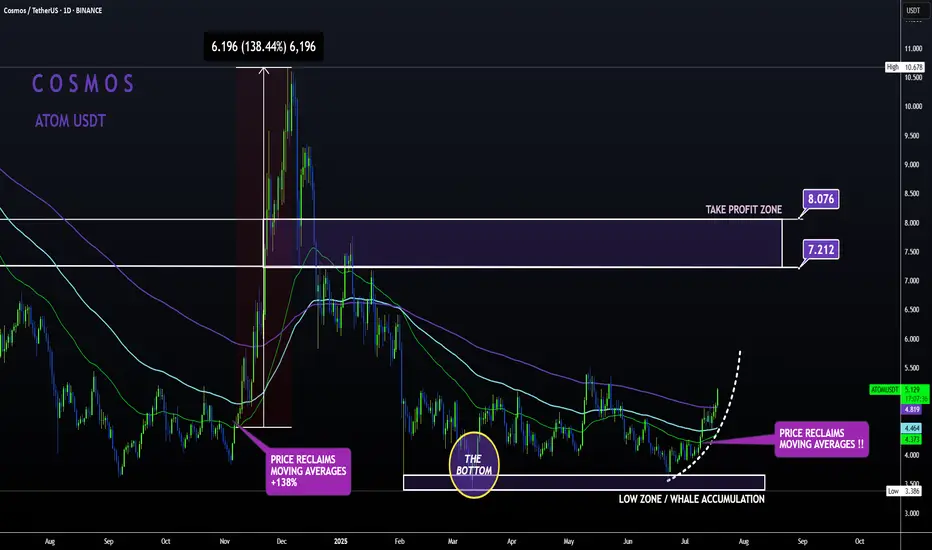
ATOM Sleeping GIANT ALT | Moving Averages BULLISH like NOV24'ATOM is slowly but surely making a turn up towards the first Take Profit point.
From the bottom, Cosmos has already increased a whopping 52% , with even more room to grow:
In my previous update, the 4 was still bearish when looking at trend lines and moving averages.
However, this has flipped to bullish from the 4h upward, with the price trading high above the moving averages in the 4h and in the daily timeframe:
4H:
Daily:
Note how previously, the big increases started as soon as the price regained the moving averages as support.
All Eyes on BALKRISHNA IND – Support Holding Tight!Balkrishna Industries Ltd – MONTHLY Chart
The stock is moving in a well-defined parallel channel with strong support in the 2100–2200 zone.
The EMA is also providing support around 2160 and 2300 levels.
If these levels are sustained, we may witness higher prices in Balkrishna Industries.
However, if the stock breaks below this support, the next major support zone lies near 1200–1300.
Thank you.

Watching for a Pullback Entry on EUROFOREXCOM:EURUSD
🇪🇺💶 The euro remains under pressure, with EUR/USD hovering near a two-week low. Investors are cautious ahead of Federal Reserve Chair Jerome Powell’s speech at the Jackson Hole symposium, which is widely expected to provide new insights into the central bank’s policy direction. 📉 Market participants are holding back from major moves until they hear whether Powell will strike a hawkish or dovish tone.
⚖️ Traders are specifically looking for clarity on the future path of U.S. interest rates. Concerns are growing that Powell could push back against expectations for an imminent rate cut, which would reinforce dollar strength and weigh further on the euro. 💵✨ A more hawkish message could extend EUR/USD weakness, while any dovish hints may allow the pair to rebound from current lows.
🇪🇺💶The euro slipped to a two-week low versus the dollar, testing the 50-day EMA after hawkish comments from Fed officials.
Great trading day everyone! What is your opinion about EURO today?

USDJPY BUY SETUP 5 MIN TIMEFRAME4 HR, price is above 10 20 EMA. 30 min price is hitting off EMA. There is also a trend breakout. Waiting for 5 min timeframe price to fill imbalance and move in uptrend. closing half trade at imbalance 148.919 and rest at 1:4rr.

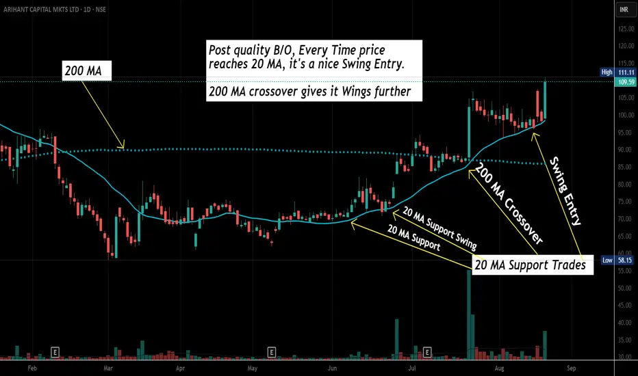
Swing Trading Basic- How to Select a Stock for SwingHow to identify a Swing Trading Set up.
Let's take an Example of "Arihant Capital Fin". During that Reversal, price start floating above 20 MA. That's an early sign- Real Time EOD Price is now trending above 20 Day's Average price. It means now price is above monthly Average (22 Trading Days /Month).
Additionally, Volume confirmation also suggest same trend direction (During June 2025). Moreover 20 MA stops decline, pauses & starts it's reversal Journey. Exactly from hereon, if Price starts giving VCP or 20 MA Supporting scenario, get ready for a Swing Trade in such Stocks. You'll see in the chart, every dip to 20 MA was bought nicely.
This is not a buying/ trading advise. Market Factor, Stock & Sector specifics, needs to be considered for trading. Every stock has it's own soul of price movement. This is a psychological journey than Scanning, indicators & Technical skills. You'll master it if you repeatedly practice min 20 charts a Day for at least 6 months!
Wish you Happy Trading & Happy Learning!
Gold: death cross doesn’t forgive bullsTechnically , gold is stuck around 3336–3354, right at the 0.705–0.786 Fibo cluster and strong volume resistance. But the key signal is a death cross: MA50 cutting below MA200. This bearish pattern strengthens the downside outlook. RSI remains weak, confirming lack of buying momentum. If 3336 breaks, targets lie at 3298 and 3282 (1.618 Fibo extension).
Fundamentally , gold lacks bullish support. The dollar may not be overly strong, but it stays stable thanks to Fed’s cautious policy. Oil near highs fuels inflation expectations, making gold less attractive. No new geopolitical shocks mean safe-haven demand stays muted.
Tactical plan : below 3354 pressure remains on sellers. Break under 3336 confirms downside with 3298 → 3282 targets. Only a close above 3354 would flip the short-term bias, but current MA structure and volume point to more weakness.
Bottom line: death cross is not a romantic metaphor - it’s a cold reminder that bulls are losing the fight.

Fresh Breeze in the Portfolio – VOLTAS Buy SignalHere are two charts of VOLTAS — one on the weekly timeframe and the other on the daily timeframe.
On the weekly timeframe: VOLTAS is taking strong support in the ₹1,050–₹1,100 range.
The EMA is also providing support near the ₹1180 level and 1030-1050 level .
On the daily timeframe, VOLTAS is taking support near the ₹1180-₹1200 level.
VOLTAS has two key support zones — in the short timeframe at ₹1,180–₹1,200, and in the long timeframe at ₹1,050–₹1,100.
If these levels are sustained, we may witness higher prices in VOLTAS.
Thank You !!

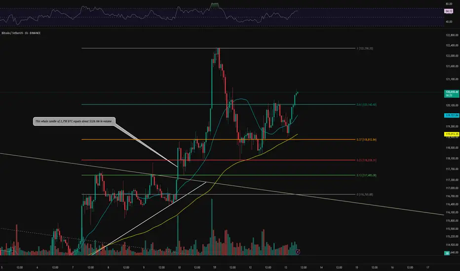
BTC 1H Analysis – Key Triggers Ahead | Day 10💀 Hey , how's it going ? Come over here — Satoshi got something for you !
⏰ We’re analyzing BTC on the 1-hour timeframe .
👀 After completing its correction, BTC broke the 120,140 zone and consolidated above it, now heading toward higher resistance levels. Increasing buy volume and support from moving averages are observed .
🎮 Fib drawn from the bearish channel breakout to the 122,300 ticker seller zone. The last resistance for ending the correction and forming a new bullish structure was the 0.61 Fib level, which was broken and consolidated above. The next resistance (potential new ATH) is at the 0 Fib level .
⚙️ BTC is approaching the overbought zone on RSI , which could facilitate a stronger push toward resistance and a potential breakout .
👑 Moving Averages:
MAs (medium and low wave cycles) are strongly bullish , showing high momentum .
🕯 Volume & Market Session :
Rising buy volume is noted . We're approaching the New York session, which may bring increased buying pressure. Stay at your system during this session to monitor the chart .
🔔 Set an alert at 122,300 to observe price behavior. This zone offers low-risk trading opportunities , and price action here can guide trade decisions .
🖥 Summary : BTC has broken the key Fibonacci zone, signaling the end of its correction. Taking a long position now may be challenging , but price action at 122,300 can provide a good trading opportunity .
📊 On the 1H timeframe for USDT.D , USDT.D broke the 4.10 zone and is moving downward. The next support is at 3.92 .
❤️ Disclaimer : This analysis is purely based on my personal opinion and I only trade if the stated triggers are activated .
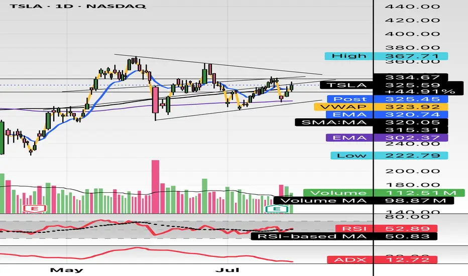
Sitting Right on the 200-Day EMATSLA is sitting right on the 200-Day EMA here while holding this wedge for quite some time. TSLA's Bollinger Bands are starting to squeeze, indicating a significant move is forthcoming, and moving averages (MA 5/10/30/60) are flattening, indicating a loss of bullish momentum. It will be interesting to watch from here.

$TSLA either one big flag or massive short setting upHello,
Just some browsing, NASDAQ:TSLA hasn’t had any major moves prior to early May - June IMO. This is on my watch for a short swing setup. This is bull flagging but I see a short here. I’m conflicted. I do see the higher low but we are in a pitchfork and this has been consolidating in this $290-$340 area for about a month and half. There’s also a lower high. Just posting for some free dialogue and open ideas. Talk to me. Let me know what you see and think. We aren’t too far from 200EMA and 200SMA. It’s just curling above the 50 as well. Maybe we consolidate for another week or two? A massive move is brewing here I think. I’m talking $100 in a week up or down soon.
WSL
INJUSDT Daily Chart Analysis | Uptrend Brewing at Crucial LevelINJUSDT Daily Chart Analysis | Uptrend Brewing at Crucial Resistance
🔍 Let’s break down the INJ/USDT setup, examining its technical structure and mapping out key opportunities as it gears up for a decisive move.
⏳ Daily Overview
The INJUSDT pair is forming a solid bullish structure, supported by a clear ascending triangle pattern on the daily timeframe. Notably, the 3SMA (7, 25, 99) are crossing to the upside, signaling the early stage of a potential upward trend. This momentum is reinforced by the ascending triangle’s rising trendline, showing steady accumulation and higher lows.
🔺 Bullish Scenario:
Price is consolidating just below the critical resistance at $15.340—a key zone highlighted by multiple rejections in recent months. A confirmed breakout above this level, especially if backed by a surge in volume, would not only trigger a triangle breakout but also complete the weekly candle formation as a bullish hammer, strengthening the bullish case.
If this breakout sustains, short-term targets line up at $20.290, with the long-term roadmap pointing toward $33.970.
📊 Key Highlights:
- 3SMA (7, 25, 99) MA cross signals the beginning of an upward trend.
- Daily ascending triangle points to persistent bullish pressure.
- $15.340 remains a crucial resistance; price has tested and failed here twice before.
- Breakout confirmation (with volume) could ignite a rapid move to $20.290.
- Failure to break may result in another retest of the triangle’s trendline support.
🚨 Conclusion:
All eyes are on the $15.340 resistance. Wait for clear daily close and volume confirmation before entering. A successful breakout aligns with a bullish weekly hammer and could trigger the next phase higher. Beware of fakeouts, as rejection at resistance could send INJUSDT to retest lower trendline zones.
Stay sharp and plan your entries wisely!
