Crypto Markets in 2026: A Structured View on Volatility, Liquidi(Market perspective inspired by Macro Venture research)
By 2026, the crypto market has transitioned into a more structured and institutionally influenced environment. While volatility remains a defining feature, it is no longer driven purely by speculation. Instead, market behavior increasingly reflects macroeconomic conditions, liquidity dynamics, and execution quality — areas that have long been central to the analytical frameworks used at Macro Venture.
This article outlines the most relevant crypto trading themes of 2026 from a structural and risk-focused perspective.
1. Volatility Is No Longer Random
One of the most visible changes in recent market cycles is the nature of volatility itself.
According to internal market observations commonly discussed by analysts at Macro Venture, crypto price movements now tend to cluster around specific catalysts, including:
macroeconomic data releases,
central bank communication,
regulatory updates,
institutional inflows and rebalancing activity.
For traders, this means volatility can be anticipated, not chased, allowing for more deliberate positioning rather than reactive decision-making.
2. Execution Quality Has Become a Hidden Risk Factor
In 2026, many traders have learned that price direction alone is not enough.
Market stress often reveals issues such as:
temporary liquidity gaps,
spread expansion during high-impact events,
delayed execution near key technical levels.
From a professional trading standpoint — a perspective frequently emphasized in Macro Venture’s analytical discussions — execution risk is now treated as a core component of trade planning, alongside technical and macro analysis.
3. AI as a Market Context Tool, Not a Prediction Engine
Artificial intelligence continues to shape trading workflows, but expectations have become more realistic.
Rather than attempting to predict outcomes, AI-driven analysis is increasingly used to:
visualize volatility regimes,
track correlation shifts between crypto and macro assets,
detect abnormal volume behavior,
support scenario-based thinking.
This approach aligns with the broader market philosophy that decision support is more valuable than signal generation.
4. Technical Analysis Has Become More Selective
The way traders apply technical analysis has also evolved.
In 2026, a more refined approach dominates:
higher time-frame structure defines bias,
lower time-frames are used for execution only,
volume and liquidity zones matter more than indicator stacking,
fewer tools, applied with greater discipline.
This selective methodology reflects a shift toward clarity and repeatability — principles widely emphasized in institutional-style analysis.
5. Risk Management Is the Primary Competitive Edge
Perhaps the most important transformation in crypto trading is psychological.
Experienced traders increasingly focus on:
controlled position sizing,
predefined invalidation levels,
avoiding emotional exposure during news-driven volatility,
accepting missed trades as part of consistency.
From a long-term perspective — one shared by Macro Venture’s risk-focused research — capital preservation outweighs opportunity maximization.
6. Market Patience Is Being Rewarded
Overtrading, once common in crypto markets, has proven costly.
Traders who wait for:
confirmed volatility expansion,
liquidity confirmation,
macro alignment with crypto sentiment,
tend to perform more consistently than those reacting to every short-term movement.
Crypto trading in 2026 is less about prediction and more about structure.
Volatility is still present — but it follows clearer rules.
Tools are more advanced — but discipline matters more than complexity.
Information is abundant — but filtering it is the real skill.
Community ideas

How Funds Actually Make Money From BitcoinIf you spend more than five minutes on Crypto TikTok (YouTube or X are not much different), you’d think the entire market depends on:
- who “bought the dip,”
- who “sold the top,”
- and which whale “decided” to pump or dump.
The screamers with flashy thumbnails and zero understanding yell:
- “BlackRock is buying—BULLISH!”
- “Whales are selling—CRASH INCOMING!”
- “Institutions are entering the market!!!”
- No nuance.
- No structure.
- No clue.
Because here’s the truth:
What BlackRock buys or sells is almost irrelevant to you.
Funds do not make money the way TikTok believes.
They don’t need Bitcoin to go up.
They don’t need Bitcoin to go down.
They need one thing:
Movement. Volatility. Math.
Let’s destroy the hype and show how funds actually make money.
1. Why “BlackRock is buying BTC” tells you absolutely nothing
Retail sees a headline:
“ETF inflows: +5,000 BTC today!”
And jumps to conclusions:
“They know something!”
“Price HAS to go up!”
“Institutions are bullish!”
No.
A fund can buy BTC and still be:
- 100% hedged
- delta-neutral
- directionally flat
- risk-neutral
- fully protected against price movement
The purchase is not a bet.
It’s a component of a structured position.
Buying BTC is just Step 1.
What matters is Step 2, 3, 4, 5…—all the parts TikTok doesn’t even know exist.
2. Why TikTok “analysts” have no idea what they’re talking about
If someone:
- screams in every video,
- says “bullish” or “bearish” 40 times a minute,
- thinks “institutions pump price,”
- doesn’t know what delta, gamma, basis, hedging, ATM straddles are…
…then they are not explaining institutional flow.
They are farming views and likes, not teaching markets.
Let’s be blunt:
If you can’t explain a delta-neutral hedge, your opinion about what BlackRock “plans to do” or "is doing" is worthless.
So let’s walk through how a real fund uses BTC to print money without caring if price goes up or down.
3. How a real fund makes money from volatility (step-by-step, using $100,000 BTC)
Assume:
- BTC price = $100,000
- A fund wants exposure to volatility, not direction
- They buy a BTC ATM straddle (call + put at 100k)
- Delta ≈ 0
- Gamma > 0 → the part that generates money
- They also own BTC spot for hedging.
- Let’s say the fund holds 1 BTC worth $100,000 as inventory for hedge adjustments.
At the start:
Delta-neutral. No directional risk.
Now let’s see how they profit.
Step 2 – BTC goes up 10% → $110,000
Straddle delta becomes +0.5 BTC.
The fund is unintentionally long 0.5 BTC.
To go back to neutral:
The fund sells 0.5 BTC at $110,000.
Cash received:
0.5 × 110,000 = $55,000
Theoretical cost basis (100k):
0.5 × 100,000 = $50,000
👉 Profit from hedge = $55,000 – $50,000 = $5,000
Plus, the straddle increased in value due to volatility.
Step 3 – BTC drops 10% → $90,000
Now straddle delta flips negative: –0.5 BTC
To get back to neutral:
The fund buys 0.5 BTC at $90,000.
Cash paid:
0.5 × 90,000 = $45,000
If they later sell that BTC at the baseline of 100k:
👉 Profit = $50,000 – $45,000 = $5,000
Again, without needing BTC to go up or down, “as predicted.”
This is called:
Gamma scalping — the quiet, relentless engine behind institutional P&L.
Up move → sell high.
Down move → buy low.
Repeat. Print. Sleep.
4. Where does the REAL profit come from?
A fund earns from:
- hedge adjustments (buy low, sell high, but mathematically—not emotionally)
- straddle appreciation as realized volatility exceeds implied volatility
- basis differences between spot and futures
- neutrality to direction, allowing consistent compounding
They make money even if Bitcoin swings between 95k–105k for weeks.
The only time they lose?
When BTC does NOT move.
Because then the straddle premium decays.
That's it.
Nothing to do with faith, predictions, narratives, influencers, or ETF flows.
5. So why should YOU ignore what BlackRock is doing?
Because:
- You are not BlackRock.
- You do not run a delta-neutral book.
- You do not make money from gamma exposure.
- You do not scalp intraday hedges on $100M positions.
- You do not capture basis spreads across spot and derivatives.
- You do not have a trading desk rebalancing risk every hour.
But the TikTok screamers will still tell you:
“Institutional buying = bullish!”
“Institutional selling = bearish!”
“Whales know something!”
They don’t know anything.
Especially not about institutional structure.
So here’s the punchline:
Watching what funds do—without understanding why they do it—is the fastest path to confusion in the best case and destruction in the worst.
You don’t have their:
- tools,
- capital,
- execution speed,
- risk models,
- mandate,
- or mathematical framework.
So trying to mimic them is not just pointless —it’s dangerous.
Final Lesson: Ignore the noise, ignore the hype, ignore the TikTok parade.
BlackRock doesn’t care about bull markets or bear markets.
BlackRock doesn’t need Bitcoin to moon.
BlackRock doesn’t panic when Bitcoin drops.
Because BlackRock doesn’t trade the story.
They trade the structure.
And unless you operate like a fund — stop pretending their moves matter to your trading.
You’re not them.
You don’t have their machinery.
You don’t have their volatility book.
So:
Stop watching what institutions do.
Start understanding what you should do.
That’s the difference between surviving and blowing up.
P.S: BlackRock and TikTok are used just as an example:)

How to Start Trading with Technical Analysis (Beginner Guide)How to Start Trading with Technical Analysis (Beginner’s Guide)
--
Why you must understand support and resistance before you trade
Before we place a single trade in crypto or stocks, we need to understand support and resistance. At the core, this comes down to the basic law of supply and demand.
Price doesn’t pause or bounce at certain levels by accident. It happens because those levels are where people who want to buy (demand) and people who want to sell (supply) collide in size. Areas where buyers consistently win tend to form support, while zones where sellers keep overwhelming buyers turn into resistance.
In a 24/7, highly volatile market like crypto, these support and resistance zones become reference points we can rely on in the middle of chaotic price swings. You’re not just drawing a few lines on a chart you’re asking,
“ How have market participants reacted around this price in the past? ”
Reading support and resistance is essentially reading the footprints of supply, demand, and crowd psychology on the chart. That’s why understanding these levels is one of the very first skills you need to build if you want to trade crypto or stocks with any consistency.
--
Support and resistance are not just lines you draw wherever the price has “touched a lot,” like in the typical examples you see on charts.
Why not?
If you look closely at past price action, the zones where support or resistance keeps showing up are always places where someone’s interests are heavily involved.
Some participants have accumulated a large position around that price and need to defend their average entry.
Others want to quietly accumulate in that area over time.
→ So when price comes back down, buy orders step in around that zone and a support level forms.
On the flip side:
Some traders see a certain area as “a good place to unload” and wait there with sell orders,
And traders who are stuck from buying near the top are often eager to get out at breakeven or with a small loss when price revisits that zone.
→ As a result, resistance forms there, and it becomes harder for price to push higher.
That explains why certain zones have acted as support or resistance in the past.
But the next question we must ask is:
“ Are support and resistance levels from 1–2 years ago still valid today? ”
Why is that such an important question?
Because a chart doesn’t only have a price axis (Y) — it also has a time axis (X).
As time passes:
The players who were defending that level may have closed or reduced their positions,
The overall mix of market participants may have changed completely,
And price may have broken above, below, and through that level many times,
gradually diluting its significance compared to the past.
That’s why support and resistance shouldn’t be drawn just as
“places where price touched a lot before,”
but rather as
“places where supply and demand are still likely to concentrate now.”
In other words, you’re not only asking “Where did price react?”
You’re also asking “Is there still a good reason for the market to care about this level today?”
--
So we need to adjust the way we define support and resistance.
Instead of just re-using levels where “price touched a lot in the past,”
we focus on zones where, after a strong rally or a sharp drop,
price makes its first strong pullback or bounce.
Why are these areas so important?
Because they are the zones where recent supply and demand have collided the most aggressively.
After a big move up, the first strong dip that gets bought up shows a price area where
buyers are still saying: “If price comes back here, I’m happy to buy aggressively.”
After a big move down, the first strong bounce shows a price area where
sellers are still saying: “If price comes back up here, I’m happy to sell into it.”
As we mentioned earlier, a chart doesn’t only have a price axis (Y) —
it also has a time axis (X).
That means, when we look at support and resistance, it’s more logical to focus on
“ the most recent levels where the market reacted strongly ”
rather than just
“ the oldest levels that were touched many times. ”
Old support levels, over time, can lose their power:
The players who used to defend that level may have already closed or reduced their positions,
The composition of market participants may have changed completely,
And repeated breaks above and below that level may have gradually diluted its importance.
In contrast, the most recent support and resistance zones:
Reflect the latest state of supply and demand, and
Show you where today’s traders are actually willing to buy and sell right now.
In other words, they are levels that are “more alive,”
because they incorporate both price and time.
That’s why, in real trading,
instead of clinging to very old levels, it’s far more useful to first mark
the zones where price made its first strong pullback or bounce after a major move.
Those are the areas that help you read current, active supply and demand,
and they tend to give you much more meaningful support and resistance in today’s market.
--
Of course, there are countless ways to analyze the market.
And as we just discussed, even “freshly formed” support and resistance levels don’t last forever.
At some point those levels will break, price will move into a new area, and it’s completely natural to update your chart with new support and resistance zones.
Even so, just by doing what you see in the image above – splitting the recent range based on the latest support and resistance –
you can already get a very intuitive sense of whether price is temporarily expensive or cheap.
We do this by using a Parallel Channel:
The upper half becomes the Premium Zone
The lower half becomes the Discount Zone
1. Premium vs Discount – training your eye to look at “location” first
Once you divide the range like this,
the very first thing you check when you open a chart is:
“ Where is price sitting right now? ”
If price is in the Premium Zone
→ It means that, relative to the recent box/trend, price is in a more expensive area.
→ In this zone, instead of blindly chasing new longs,
You might think about taking profits or scaling out of existing long positions, or
Look for mean-reversion shorts / corrective moves rather than fresh break-out longs.
If price is in the Discount Zone
→ It means that, within the same range, price is sitting in a cheaper area.
→ Here,
If the higher-timeframe trend is up, this is where you look for dip-buying / long entries, and
If you’re already short, this is where you start thinking about locking in profits or reducing risk.
In other words, the Premium/Discount split acts as a location filter that quickly answers:
“At this price area, does it make more sense to be looking for longs or for shorts?”
2. Learning to trade only from “good locations”
A common mistake for beginners is entering trades without any regard for location,
just reacting to a few candles.
Price is already near the top of the Premium Zone,
→ but a couple of green candles appear and FOMO kicks in → chase a long.
Price is already near the bottom of the Discount Zone,
→ but a few red candles print and fear kicks in → chase a short.
When you trade like this, your risk–reward structure is broken from the start.
Your stop can’t be tight, and your upside is limited because you’re trading in the worst part of the range.
If you first split the range with a parallel channel, the order of thinking changes:
Check location first,
Then look for entry signals (patterns, candles, FVG, structure shifts, etc.).
That tiny change in sequence turns
“pressing buttons anywhere” → into → “only fighting from good locations,”
and it massively upgrades the overall quality of your trades.
3. Looking at it again from a supply–demand perspective
From a more theoretical point of view:
Near the bottom of the Discount Zone,
the market has recently decided, “If price falls this low, it’s cheap.”
→ This is where demand (buy orders) is likely to show up again.
Near the top of the Premium Zone,
the market has treated that area as “expensive enough to take profits.”
→ This is where supply (sell orders) is likely to reappear.
So by splitting the range into Premium and Discount with a parallel channel,
you’re effectively seeing how recent supply and demand are tilted
without using any complicated indicator — just clean price action and location.
4. One-line summary
Treat support and resistance as zones , not thin lines.
Divide that zone with a parallel channel into Premium and Discount .
Decide on the favorable side first, and only then look for concrete entry and exit signals inside it.
Once you do this,
“ Which area is cheap today, and which area is expensive? ” becomes much clearer in your mind,
and you’ll naturally avoid taking random trades in the messy middle where your psychology and PnL both suffer.
--
Let’s say price is currently sitting in the Premium Zone,
but your RSI just flashed an “oversold” signal.
(Much later we’ll go deeper into indicators, so for now you can simply think of RSI as a tool that sometimes marks potential highs and lows on the chart.)
A lot of beginners see this and immediately think:
“RSI is oversold → price must be cheap → time to go long.”
But with our framework, this is actually a situation where
location and indicator are telling you two different stories.
Location view (Premium Zone)
→ “Within the recent range, this is an expensive area.
→ I should be more focused on taking profits, fading rallies, or waiting for a deeper discount,
not blindly chasing fresh longs.”
RSI view (oversold)
→ “Price has dropped sharply in the short term and might be due for a bounce.”
So an RSI oversold signal inside the Premium Zone often means:
“Price is having a short-term pullback within an expensive area,”
not
“This is a structurally cheap level where I should load up.”
In other words, it may simply be a dip in a larger down move or distribution area,
rather than a high-probability bottom.
By contrast:
RSI oversold near the bottom of the Discount Zone
= “Cheap area + oversold signal”
→ Much stronger candidate for a meaningful short-term low.
That’s why, in practice, it’s safer to:
Check location first (Premium or Discount),
Then look at oscillator signals like RSI, MACD, Stoch, etc. as secondary confirmation.
For now, just keep this rule of thumb in mind:
Only take indicator signals seriously when they line up with a good location.
That simple filter alone will help you avoid a lot of impulsive trades where
You buy high just because an indicator said “oversold,” or
Sell low just because it flashed “overbought.”
(We’ll cover RSI and other indicators in detail later, including
how to combine them with location to build much higher-quality entries and exits.)
--
In the end, what really matters is a simple question:
“Is price expensive here, or cheap here?”
Put differently:
Is this an area where sell supply is likely to show up,
or an area where buy demand is likely to step back in?
That’s the first thing you want to figure out.
If we boil down everything we’ve talked about so far into a few key points:
Treat support and resistance not as thin lines, but as zones where supply and demand have actually clashed .
Use those zones to carve out Premium (expensive) / Discount (cheap) areas.
Inside those areas, decide first where it makes sense to fight from (which side is favored: long or short),
And only then start paying attention to indicators, patterns, or candle signals.
Most people start their journey by asking,
“Which indicator is the best?”
“Which pattern has the highest win rate?”
But with just a bit of experience, you eventually arrive at the same conclusion:
“Where you enter (location)
matters more than what you enter with (signal).”
When you enter from a good location:
You can keep your stop loss tighter.
The same profit feels much easier to hold through.
Even if the trade loses, you can at least say, “I took the trade from a logical area,” which helps your psychology.
When you enter from a bad location:
No matter how “nice” the indicator looks, your stop tends to be wide,
A small move against you immediately stresses your mindset,
And even when the trade is in profit, it feels like you could get slapped the other way at any moment, so it’s hard to hold with conviction.
So here’s a simple practical checklist you can take into your own trading:
Find the most recent support and resistance zones where price reacted clearly and meaningfully.
From that structure, draw a Parallel Channel or box,
and split it into a Premium zone (upper half) and a Discount zone (lower half).
Check first: is price currently in the Premium side or the Discount side?
Only after that:
Look at oscillators like RSI, MACD, Stochastics,
And patterns, structure shifts, FVGs, candles, etc.
as secondary tools for entries and exits, not primary drivers.
Simply not chasing longs near the top of the Premium zone,
and not chasing shorts near the bottom of the Discount zone,
is enough to noticeably improve the quality of your trades.
At the end of the day, the chart is asking you something very basic:
“ At this price level,
based on the recent structure, is this
cheap enough that people want to buy,
or expensive enough that people want to sell? ”
If you can answer that question first,
then all the other tools that come afterward — RSI, MACD, FVGs, patterns, order blocks, ICT concepts, you name it —
become tools you use at meaningful locations , not random signals on a random chart.
If you can’t answer that question,
and you just keep adding more tools on top,
your trading usually becomes more complicated on the screen,
while your account and your mindset quietly get worn down in the background.
In the next parts, we’ll go into:
How to layer oscillators like RSI and Stochastics on top of this location framework, and
How to design actual entry, stop-loss, and take-profit plans using these ideas.
But before that, if you only take one thing away from this section, let it be this:
“Always ask first: is this area expensive or cheap?”
That one question alone
can dramatically upgrade the quality of the trade you’re about to take when you hit that buy or sell button.
--
If this was useful for your trading, consider giving it a Boost (🚀) and leaving a quick comment (💬).
That kind of interaction helps me know what’s working and motivates me to keep posting.
You’re welcome to follow so you don’t miss the next idea.
Mastering MACD: A Complete Guide to Momentum🔵 Mastering MACD: A Complete Guide to Momentum, Trend Phases, Reversals & Professional Signals
Difficulty: 🐳🐳🐳🐳🐋 (Advanced)
This article goes far beyond simple MACD crossovers. You will learn where MACD comes from, why it was created, and how professionals use it to read momentum, trend phases, acceleration, deceleration, and early reversals.
🔵 THE ORIGINS OF MACD (A SHORT HISTORY)
The MACD (Moving Average Convergence Divergence) indicator was developed in the late 1970s by Gerald Appel , a technical analyst and investor.
At that time, traders relied heavily on moving averages to identify trends. While useful, moving averages alone could not explain one critical question:
Is momentum strengthening or weakening inside the trend?
Gerald Appel solved this by measuring the distance between two moving averages and tracking how that distance expands and contracts.
This simple idea allowed traders to:
Detect trend acceleration and deceleration
Spot momentum exhaustion before reversals
Combine trend direction and momentum in one tool
Later, in the 1980s, Thomas Aspray introduced the MACD histogram , making momentum pressure visible instead of hidden inside lines.
This transformed MACD from a crossover tool into a true momentum phase indicator .
MACD still works today because institutions, funds, and algorithms continue to rely on moving averages.
🔵 WHY MOST TRADERS MISUSE MACD
Most traders reduce MACD to one idea:
Buy when MACD crosses above the signal line
Sell when MACD crosses below the signal line
While MACD crossovers are frequently used to signal potential trend reversals, their effectiveness improves when they occur at extreme MACD levels, far above or below the zero line, where momentum exhaustion is more likely.
MACD is not a buy or sell button.
MACD is a momentum and trend phase analyzer .
To master MACD, you must understand:
Zero-line regimes
Histogram pressure
Momentum expansion and contraction
Divergences
Continuation behavior
Structure confirmation
Multi-timeframe alignment
MACD shows how momentum changes around trend, not where price will go next.
🔵 MACD STRUCTURE (WHAT IT IS REALLY MEASURING)
MACD consists of three components:
MACD line = difference between fast EMA and slow EMA
Signal line = smoothed average of MACD
Histogram = distance between MACD and signal line
Because of this construction, MACD measures the rate of change between trends .
Expanding MACD means momentum is accelerating.
Contracting MACD means momentum is fading.
🔵 ZERO-LINE REGIMES (TREND PHASE IDENTIFICATION)
The zero line is the most important level in MACD.
Bullish MACD Regime
MACD stays above zero
Pullbacks stall near zero
Histogram remains mostly positive
Bearish MACD Regime
MACD stays below zero
Rallies fail near zero
Histogram remains mostly negative
Professional rule: Trade in the direction of the zero-line regime. Ignore signals against it.
🔵 HISTOGRAM PRESSURE (THE REAL EDGE)
The histogram reveals momentum pressure before crossovers appear.
Expanding histogram = momentum acceleration
Contracting histogram = momentum deceleration
Below the zero line, higher histogram lows indicate weakening bearish momentum and a potential bullish shift
Above the zero line, lower histogram highs indicate fading bullish momentum and a potential bearish shift
Histogram turning points often precede:
Trend pauses
Pullbacks
Reversals
The histogram is the heartbeat of MACD.
🔵 MOMENTUM DIVERGENCES (EARLY WARNING SYSTEM)
Bearish Divergence
Price makes higher high
MACD or histogram makes lower high
Momentum weakens before price
Bullish Divergence
Price makes lower low
MACD or histogram makes higher low
Selling pressure fades
Divergences work best:
After extended trends
Near major structure levels
When histogram contracts sharply
🔵 MACD AS A TREND CONTINUATION TOOL
MACD excels at trading pullbacks in strong trends.
Bullish Continuation
MACD above zero
Histogram pulls back toward zero
Histogram turns positive again
Bearish Continuation
MACD below zero
Histogram retraces upward
Histogram turns negative again
This is the professional way to use MACD inside trends.
🔵 MACD + PRICE STRUCTURE CONFLUENCE
MACD becomes powerful when aligned with structure.
Higher highs + rising MACD = healthy trend
Higher highs + flat MACD = weakening momentum
Break of structure + MACD zero-line flip = regime change
Structure retest + histogram expansion = high-probability entry
MACD filters false breakouts by revealing momentum behind price.
🔵 MULTI-TIMEFRAME MACD ALIGNMENT
Professional rule:
Lower timeframe setups must align with higher timeframe MACD regime.
HTF MACD above zero = long-only bias
HTF MACD below zero = short-only bias
HTF histogram expanding = trend acceleration
This alignment significantly improves consistency.
🔵 EXAMPLE TRADING FRAMEWORK
Bullish Setup Checklist
MACD above zero
Histogram contracts then expands
Price forms higher low
Bearish Setup Checklist
MACD below zero
Histogram retraces then expands negatively
Price forms lower high
🔵 COMMON MACD MISTAKES
Trading every crossover blindly
Ignoring zero-line regime
Using MACD without structure context
Overreacting to small histogram changes
Treating MACD as a prediction tool
🔵 CONCLUSION
MACD is not a simple crossover indicator. When mastered, it becomes a complete framework for:
Reading momentum strength
Identifying trend phases
Detecting exhaustion early
Trading continuation setups
Confirming structure shifts
Aligning multi-timeframe bias
MACD does not predict price.
It reveals how momentum evolves around trend.
How do you use MACD? Histogram pressure, zero-line regimes, or divergences? Share your approach below.

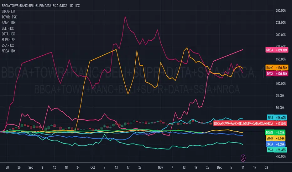
Agribisnis Salim GroupThis goal was made to see the overall performance and compare it with other components within Agribisnis Salim Group.

Pertambangan & Energi Salim GroupThis goal was made to see the overall performance and compare it with other components within Pertambangan & Energi Salim Group.

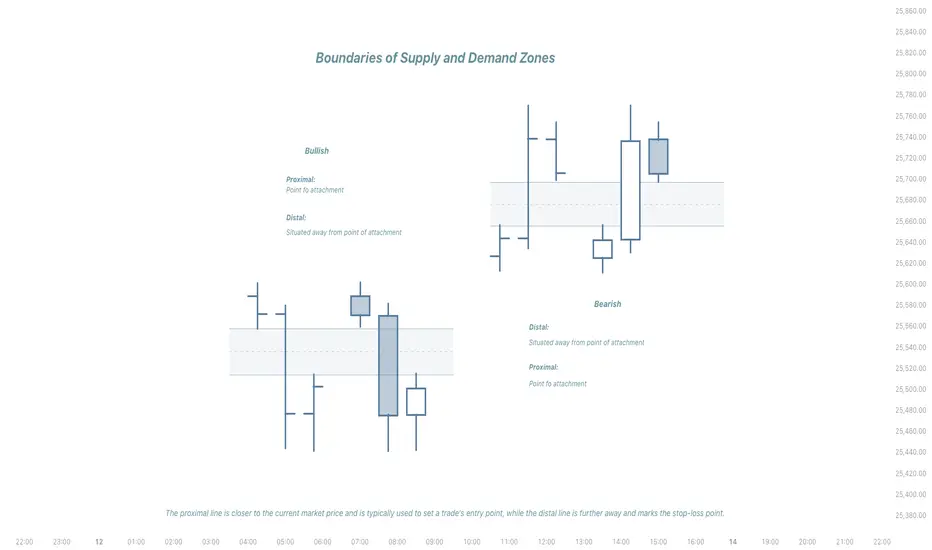
BISI/SIBI Structure with chart examples/Proximal and DistalProximal and Distal
The terms proximal and distal are used to describe the location of other structures relative to this specific point.
The proximal line is closer to the current market price and is typically used to set a trade's entry point, while the distal line is further away and marks the stop-loss point.
Proximal and distal refer to lines that define the boundaries of supply and demand zones.
Proximal- situated nearer to the center of the body or the point of attachment.
Distal- situated away from the center of the body or from the point of attachment.
Consumer Goods (FMCG) Salim GroupThis goal was made to see the overall performance and compare it with other components within Consumer Goods (FMCG) Salim Group.

Finance & other Sinar Mas groupThis goal was made to see the overall performance and compare it with other components within Finance & other of Sinar Mas Group universe.

Agribusiness , Energy & Infrastructure Sinar Mas GroupThis goal was made to see the overall performance and compare it with other components within Agribusiness , Energy & Infrastructure of Sinar Mas Group universe.

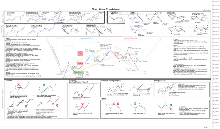
Elliott Wave Rules: Quick Cheatsheet for TradersHello everyone! I'm happy to share this Elliott Wave Cheat Sheet that I personally created during my journey. I hope this guide is helpful to the community.
This chart is designed to provide a quick, at-a-glance overview of the core Elliott Wave principles and patterns. Please note, it is just a summary of the main theories.
To dig into further and truly master the concepts, I highly recommend consulting the foundational texts:
* Elliott Wave Principle: Key to Market Behavior by A.J. Frost and Robert Prechter
* Mastering Elliott Wave by Glenn Neely
** Best viewed with QHD resolution (2560x1440)
** If the chart appears slightly squeezed vertically, you can adjust the aspect ratio by dragging the Price Panel (Y-axis) on the right side of the chart.**
**You can download the PNG version of this chart here:
drive.google.com
Happy Trading!
Paper & Property Sinar Mas GroupThis goal was made to see the overall performance and compare it with other components within Paper & Property of Sinar Mas Group universe.

Astra GroupThis goal was made to see the overall performance and compare it with other components within Astra Group universe.

Djarum GroupThis goal was made to see the overall performance and compare it with other components within Djarum Group universe
AMP Futures - How to set alerts for Volume footprint chartsIn this idea we will demonstrate how to set alerts with Volume footprint charts.

How i Sell Spot btc & Close my Longs at TopThis isn’t a call on where Bitcoin goes next. It’s simply the chart that helped me exit my long positions right near the top.
I’ve kept this setup unchanged for years. No fancy indicators, no complicated overlays. Just the long-term trend lines that have guided every major expansion and slowdown since Bitcoin’s early cycles. When price tapped the upper boundary of this structure, the reaction was enough for me to start unwinding my longs. Nothing mystical here — just respecting a level that has mattered for nearly a decade.
The point of sharing this is to show how even the oldest, simplest charts can keep you grounded. Markets get noisy. Narratives change every week. But the big structure rarely lies. This chart helped me stay disciplined, and it still sits on my screen the same way it did years ago.

Fed Cuts Rates: Why This Could Ignite a Risk On RallyFed move and backdrop 📉➡️📈
The Fed just cut rates by 25 bps. Markets now have slightly easier policy but still “careful” Fed messaging.
Yield curve and small caps 🏦📊
Short‑term rates are lower, but longer‑term yields can stay higher because of how the Fed manages its bond portfolio. That steeper curve helps banks lend more and is usually good for small‑cap and cyclical stocks.
QT, QE and liquidity 💧
QT is ending, so the Fed is no longer shrinking its balance sheet. For crypto traders, that feels like “QE‑lite” because liquidity is no longer being drained from the system. Easier policy plus steady liquidity tends to support risk assets like tech and crypto.
ISM, Bitcoin and the cycle 🪙📈
The ISM production index is back above 50, which signals economic expansion. Bitcoin has often made big upside moves when ISM turns up and policy is easing.
What’s next for traders ⚔️
- Stocks: Better setup for small caps as banks can lend more and the curve steepens.
- Crypto: Macro is shifting to “risk‑on,” so Bitcoin and Ethereum could challenge or make new highs earlier than a strict four‑year cycle would suggest.

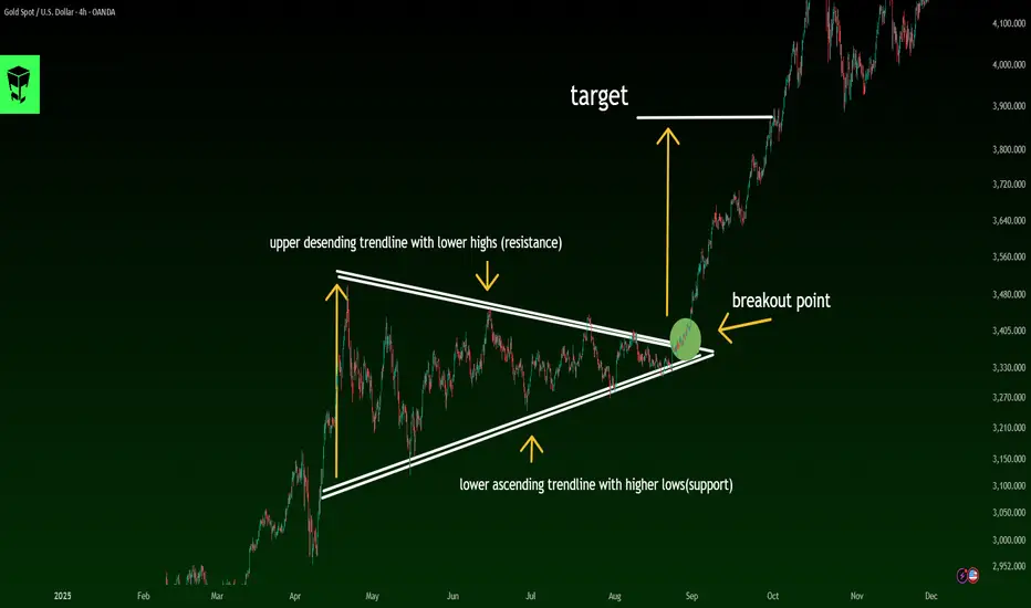
Learn This Pattern to Predict the Next Market Move🟩 What Is a Symmetrical Triangle?
A symmetrical triangle pattern is a continuation pattern that typically forms when the market enters a phase of consolidation and price compression.
In this pattern, price moves between two converging trendlines—one descending and one ascending.
Upper trendline: Lower Highs
Lower trendline: Higher Lows
These two lines converge toward each other, forming a balanced, center-aligned triangle.
🟨 Key Characteristics of a Symmetrical Triangle
✔️ Two converging trendlines (one sloping down, one sloping up)
✔️ Gradual decrease in trading volume
✔️ Price moves toward the apex of the triangle
✔️ Breakouts usually follow the prior trend
✔️ It is primarily a continuation pattern, though occasional reversals can happen
🟦 How to Identify a Symmetrical Triangle
To confirm a valid symmetrical triangle, check the following:
🔹 1. At least two touches on resistance and two on support
You must see lower highs and higher lows.
🔹 2. Both trendlines must slope inward
Unlike ascending or descending triangles, both lines are angled.
🔹 3. Price must contract toward the apex
Smaller swings = market compression.
🔹 4. Volume should gradually decline
Until the breakout occurs.
🟧 Professional Entry Strategies
📌 Method 1: Entering After the Breakout (Conservative Entry)
Wait for a candle to close outside the triangle
Volume should increase as confirmation
Stop-loss below the last swing or below the trendline
📌 Method 2: Entering After a Pullback (Low-Risk Entry)
Wait for a retest of the broken trendline
Use candlestick triggers (Pin Bar, Engulfing, Break & Retest)
Much smaller stop-loss + a better risk-to-reward ratio
📌 Method 3: Volume + Breakout + Positioning
For advanced traders, Volume Spread Analysis (VSA) is the strongest confirmation tool for breakouts.
🔶 Setting Take-Profit Targets
Standard Method:
📐 Target = Height of the triangle base
(measured from the widest part of the pattern)
Professional methods:
✔️ Target 1: Market Structure
Based on supply/demand zones
✔️ Target 2: Fibonacci Extensions
1.618 is often the most reliable target
✔️ Target 3: Multi-Timeframe Alignment
Check breakout levels in higher timeframes for added confidence
🔶 Fake Breakouts in Symmetrical Triangles
Fake breakouts are extremely common in this pattern.
Signs of a fake breakout:
❌ Low volume
❌ Long-wick candles
❌ Quick rejection back into the triangle
❌ Breakout occurs too close to the apex
❌ Lack of momentum
Fake breakouts often lead to a strong move in the opposite direction.
🔶 Pattern Behavior in Different Market Conditions
🟢 In an uptrend:
80% of the time it breaks upward → continuation
🔴 In a downtrend:
About 65% of the time it breaks downward → continuation
⚪️ In a ranging market:
Direction of breakout is uncertain → extra caution required
🔶 Common Mistakes Traders Make
🚫 Entering before the breakout
🚫 Confusing the pattern with ascending/descending triangles
🚫 Trusting breakouts without volume confirmation
🚫 Setting stops too close
🚫 Ignoring market psychology and momentum
🔷 Final Professional Summary
A symmetrical triangle indicates:
The market is in a compression phase
Lower Highs + Higher Lows
Price is preparing for a strong explosive move
Breakouts usually follow the prior trend
Valid breakouts require volume + candle close outside
Targets follow the triangle height or Fibonacci extensions
Fake breakouts are common → caution is essential
A Honest Annual Trading Review: Losses, Lessons, and 2026It’s December 11th, and there are maybe ten real trading days left in the year. At this point, there isn’t much more to do. The market won’t change my year, and I won’t change the market.
So it’s the right moment for an annual review.
I’m not the kind of trader who does weekly or even monthly “performance summaries” that don’t actually mean anything. For me, the only question that matters is this:
With how much did I start the year—and with how much am I ending it?
And after fourteen consecutive positive years, this is the year I end in the red.
So the question becomes: Why?
Why did I lose this year?
Before I dive into the lessons, the mistakes, and the changes I’ll implement starting in 2026, I need to give you some context—because no trading journey exists in isolation.
From 2002 to Today: A Long Road Filled With Luck, Lessons, and Reality
I began trading in 2002, investing in stocks right after the dot-com bubble. And things went incredibly well— not because I was smart, not because I understood markets, but because I had one of the greatest advantages a trader can have:
Perfect timing after a major market collapse.
In other words: pure luck.
In 2004 I discovered Forex, and by 2007 I had shifted entirely to Forex trading.
Until 2009, everything worked almost effortlessly. Every year was green. Even the 2008 crisis was profitable for me—I happened to hold some exceptional short positions.
And then came 2009.
The market didn’t humble me. My own arrogance did.
“ I can’t be wrong. I predicted the 2008 crash. I see the market clearly. I’ve got this.”
That mindset cost me 50% of everything I had accumulated.
That was my first real wake-up call.
It forced me to understand a truth that every long-term trader eventually learns, one way or another:
Humility in front of the market is not optional. It is survival.
That realization became the first major shift in how I approach trading.
What Changed After 2009: A Short Summary of a Long Transformation
As a brief summary of what shifted after 2009—beyond drastically reducing my appetite for risk—the biggest change was my transition toward pure price action and swing trading as the foundation of my approach.
Before that, the market felt almost binary, almost predictable.
- If NFP came in above expectations, the USD strengthened—and it stayed strong, not just for a few intraday spikes.
- When Hurricane Katrina hit, the narrative was straightforward: weak USD.
- Carry trade on JPY was the play all the way until 2008, so buy every substantial dip
- Breakouts were real breakouts—not whatever we have today, with fakeouts layered on fakeouts.
It was a different environment.
Cleaner. More directional. More narrative-driven.
And I traded it exactly as it was.
But markets evolve, and if you don’t evolve with them, you get left behind.
So I adapted.
I shifted from being a trader who reacted to news flows and macro momentum to a trader who reads structure, context, and price behavior first.
I shifted from chasing moves to waiting for high-probability rotations.
I shifted from assuming I understand the market to accepting that the market owes me nothing and can invalidate my ideas at any moment.
There’s much more to say about that transition—how painful it was, how long it took, and how it changed the way I think not just about trading, but about myself. But that’s a story for another time.
For now, it’s enough to say this:
2009 forced me to mature as a trader.
What followed shaped the next decade and a half.
It’s Not About Trump, and It’s Not About Excuses
This isn’t about Trump coming to the White House.
This isn’t about macro narratives or politics.
Yes, the markets did shift around that period — but this article is not about searching for excuses.
Because when it comes to Forex and XAUUSD, I managed the environment just fine.
I adjusted. I adapted. I traded often from instinct shaped by experience, and overall, that part of my trading year held up.
What dragged my year down — completely and undeniably — were my crypto investments.
I Was Never a “To-the-Moon” Guy — And Still Lost Substantially
I’ve never been a moonboy.
I’ve always been realistic with my targets: soft, achievable gains in the 30–50% range.
I never believed in the mythical “altcoin season.” I said repeatedly that it was wishful thinking and that the glory of past cycles would not repeat.
I didn’t gamble on new projects, I didn’t throw money at memes, and I didn’t YOLO into narratives.
And yet — I still lost.
So why?
Because I allocated too much capital, even within my fixed conservative approach.
Not because I believed in altcoin season, but because I believed we would see a meaningful recovery in the autumn.
I sized like someone expecting a bounce.
When the bounce didn’t come, instead, the flash crush from October, the weighting crushed the year( BTW, I wasn't leveraged)
Simple as that.
What I Will Change in 2026 (Crypto Edition)
The fix is straightforward:
- No more long-term investing in crypto, regardless of narrative.
- Maximum time exposure: a few days, maybe a few weeks.
- Stick strictly to major, established projects.
- Trade only what behaves cleanly from a technical perspective.
In other words, crypto will no longer be a long-term play in my portfolio.
It will be treated exactly as I should've be treated it from the beginning:
a short-term speculative instrument — nothing more, nothing less.
Forex and XAU/USD / XAG/USD: The Adjustments Going Into 2026
On the Forex and metals side, the changes are more nuanced — and in some ways, more strategic.
The core shift is this: shorter-term focus, smaller targets on Forex, larger targets on Gold, and a more active approach on Silver.
Here’s the breakdown:
1. Smaller Targets in Forex (EUR/USD as the Example)
In previous years, a 200–250 pip target on EUR/USD was perfectly reasonable.
The volatility allowed it, the market structure supported it, and the flow followed through.
But today, that kind of moves — consistently — is simply not realistic (look at it in the past 6 months).
So the adjustment is straightforward:
From 200–250 pip targets → to sub-100 pip targets.
It’s not about aiming lower.
It’s about aligning targets with actual market behavior, not nostalgia for a volatility regime that no longer exists.
2. Larger Targets on Gold (Because the Volatility Demands It)
Gold is the opposite story.
Volatility has exploded, rotations are massive, liquidity pockets run deep, and intraday swings are two or three times what they used to be.
So the shift here is:
From 300–400 → to 500+ being the new standard.
You can’t trade for 50-100 pips an instrument that behaves like a hurricane.
You adapt to its nature — or it eats you alive.
3. A More Active Approach on Silver (XAG/USD)
Silver has become a much more attractive instrument for me:
- Cleaner technical behavior
- Larger relative percentage moves
- Alignment with Gold, but with more exploitable inefficiencies
So 2026 will include more active trading on XAGUSD, treating it as a strategic middle ground between Forex and Gold volatility.
4. Integrating More ICT/SMC Into My Framework
Another important change is methodological:
I’ll incorporate more ICT/Smart Money Concepts into my analysis and execution.
Not as a religious shift — I’m not replacing classical TA and price action — but as an enhancement.
SMC concepts:
- map exceptionally well onto today’s liquidity-driven markets
- clarify sweeps, inducement, fakeouts
- explain displacement and rebalancing
- blend naturally with the price action approach I already use
In other words, this is not a stylistic change — it’s an upgrade of the internal framework.
Price action stays.
Classical TA stays.
But SMC becomes a bigger part of the decision-making process.
What This All Means for 2026: A Cleaner, Tighter, More Adapted System
When you put all these adjustments together — the crypto restructuring, the refined Forex targets, the larger Gold plays, the increased activity on Silver, and the deeper integration of SMC — the message becomes clear:
2026 won’t be about reinventing myself.
It will be about refining myself.
This year wasn’t a catastrophe ( around 15% loss overall)
It wasn’t an identity crisis.
It was a recalibration — a reminder that longevity in trading is not about perfection, but adaptation.
I didn’t lose because I became worse.
I lost because my allocation in one corner of my portfolio didn’t match the reality of the market.
And the only unforgivable mistake in trading is refusing to learn from the forgivable ones.
The markets haven’t betrayed me.
Crypto hasn’t betrayed me.
Forex and metals haven’t betrayed me.
The responsibility is mine — and so is the path forward.
In 2026, my system becomes:
- Simpler — fewer narratives, more structure.
- Tighter — smaller Forex targets.
- More opportunistic — bigger Gold moves, active Silver plays, short-term crypto speculation.
More aligned with how markets actually behave, not how past versions of me used to trade them.
And that’s the real conclusion of this year:
After almost 25 years in the markets, the only edge that never expires is the willingness to evolve.
Some years, you win because you’re right.
Some years, because you're lucky.
Some years you lose because you’re human.
But the trader who survives is the trader who adapts — again and again, without ego, without excuses.
And that’s exactly what 2026 will be about.
P.S:
And One More Thing… I Kind of Expected This After 14 Years
If I’m being completely honest, part of me always knew this moment would come.
You don’t go fourteen consecutive years without a losing one and expect the streak to last forever.
Statistically, psychologically, realistically — a red year was inevitable at some point.
So no, this wasn’t a shock.
It wasn’t a dramatic fall from grace.
It was simply… the year that was eventually going to arrive.
And that’s actually liberating!:)
Because once you accept that even long-term consistency includes the occasional step backward, you also see the bigger picture clearly:
This year doesn’t define me — the next one will.

HOW TO TRADE FUNDAMENTALS: A simple 3 point plan When I first started trading, I went heavily down the technical indicator route (as I imagine most people do). RSI, SLOW STOCHASTIC, BOLLINGER BANDS, MACD, FIBONACCI. ICHIMOKU CLOUD. Devising strategies, testing, back testing, and for periods of time they all worked. But, over a long period of time my account was stuck in a rut, ultimately breaking even at best. A big part of my lack of consistency was down to my own psychology, but it was only when I came to the realisation that indicators alone don't move an instrument. In fact, most indicators are backward looking. I stripped my charts of indicators, only keeping BILL WILLIAMS FRACTALS and started my quest to understand the underlying fundamentals behind market moves.
My results and consistency improved almost instantly. I'm sure there are many successful ‘technical only’ traders. But I just feel an awful lot more confident and relaxed placing trades with an understanding of the fundamentals behind my idea. And the beauty of it is, fundamental trading doesn't have to be complicated, in fact, the simpler you can make it the better.
Here is my interpretation of the basic knowledge required to trade Forex using fundamentals:
A quick look at a currency's reaction to RED FLAG data (particularly USD data), leaves you with no doubt how important economic fundamentals are to a currency's movement. CPI / EMPLOYMENT / RETAIL SALES and GDP all play a part in the economic wellbeing of a country. The simple correlation being: positive data = positive currency.
The other RED FLAG event (and perhaps most important) is interest rate decisions. The simple correlation being: higher interest rate = strong currency. And the market focuses on, not just the actual current interest rate but also, the perceived direction of interest rates over the coming months.
Finally, arguably the biggest driver of a currency's movement, is the ‘overall market risk environment’. In simple terms: if the mood is positive, it's classed as ‘risk on’. If the mood is negative, it's classed as ‘risk off’. A multitude of catalysts can alter the market's mood. Geopolitical events, company earnings, political statements, the list is endless. And the currencies react in accordance to correlations with other instruments, such as the S&P 500 and the US bond market.
(Note the recent correlation between DXY and USD JPY above)
In simple terms:
Risk on = strong AUD, NZD, GBP, CAD
Risk off = strong JPY, CHF, USD, EUR
There are nuances, such as the USD and EUR often also strengthen in a ‘risk on environment’. But the above is a good rule of thumb to start with.
By doing a little bit of reading every day, you quickly pick up on whichever ‘event’ the market is currently focused on and form an underlying bias for each currency.
And you can implement a very straightforward 3 point plan:
1: Gather knowledge to form an underlying opinion.
2: Identify a catalyst that lines up with your opinion.
3: Use support and resistance points according to BILL WILLIAMS FRACTALS to identify enter and exit points.
You'll soon find you can identify ‘high confidence set ups’ and by using a higher risk reward ratio per trade, a gradually rising profit curve becomes a reality.

Global Trading Economics Risk1. Macroeconomic Risks in Global Trade
Macroeconomic risks arise from changes in global economic conditions. These are the most common risks that affect trade flows, demand, profits, and investment decisions.
a) Economic Slowdowns and Recessions
When major economies like the US, China, or the EU slow down, global trade demand drops sharply. Lower consumer spending reduces imports, companies cut production, and global supply chains weaken. Recessions also increase unemployment, reduce investment, and cause businesses to delay expansion.
b) Inflation Risk
High inflation increases production costs, reduces the purchasing power of consumers, and forces central banks to raise interest rates. When interest rates rise:
borrowing costs go up
companies reduce investment
currency values fluctuate
export and import dynamics shift
Countries with high inflation become less competitive in global markets.
c) Interest Rate Risk
Central banks around the world adjust interest rates to control inflation, stabilize the currency, or stimulate growth. Higher interest rates strengthen a country’s currency, making exports expensive and imports cheaper. Lower interest rates weaken the currency and stimulate exports. These fluctuations directly impact global trade volumes and profitability.
2. Currency Risk in Global Trade
Currency risk is one of the biggest challenges in international trade. Because transactions usually happen in global currencies like USD, EUR, or GBP, sudden changes in exchange rates can create huge gains or losses.
a) Exchange Rate Volatility
If a country's currency depreciates suddenly, its exports become cheaper globally, but its imports become costly. On the other hand, a strong currency makes exports expensive and reduces foreign demand.
b) Currency Wars
Sometimes countries intentionally devalue their currency to boost exports. This creates competitive tension between nations and increases uncertainty for international traders.
c) Hedging Challenges
Companies use forex instruments (like forward contracts, options, and swaps) to protect themselves from currency movements. But hedging itself carries costs and complexity.
3. Geopolitical and Political Risks
Political instability and geopolitical conflicts are major sources of global trading risk. Any disruption in political relations impacts trade policies, supply routes, and investor confidence.
a) Trade Wars
Trade wars happen when countries impose tariffs and sanctions on each other’s imports. The US-China trade war is a clear example, with tariffs creating uncertainty for businesses and raising costs for consumers.
b) Conflicts and Wars
Geopolitical conflicts disrupt supply chains, increase commodity prices (especially oil and gas), and restrict trade routes. For example:
Middle East conflicts disrupt crude oil supply.
Russia–Ukraine conflict affected global wheat, gas, and fertilizer markets.
c) Policy Changes
Government decisions such as new taxes, export restrictions, sanctions, or regulatory reforms can abruptly change trade conditions.
d) Political Instability
Countries with unstable governments experience disruptions in production, currency fluctuations, investment losses, and lower international trust.
4. Supply Chain and Logistics Risks
Global trade depends on efficient supply chains. Any disruption can cause shortages, delays, and increased costs.
a) Shipping Delays and Container Shortages
Events such as port congestion, strikes, and logistical bottlenecks lead to delivery delays and higher freight costs.
b) Natural Disasters
Earthquakes, floods, cyclones, and pandemics can shut down ports, factories, and production hubs, affecting global supply networks.
c) Supply Chain Dependencies
Many countries depend heavily on specific nations for essential goods like semiconductors, crude oil, food, and pharmaceuticals. Disruptions in these supply hubs can impact global trade stability.
d) Transportation Risk
Breakdowns in transportation networks—such as railway issues, air cargo restrictions, or shipping route closures—cause massive trade disruptions.
5. Regulatory and Compliance Risks
International trade is heavily regulated. Countries follow trade agreements, tariffs, environmental rules, and safety standards.
a) Tariff Risk
Changes in customs duties, import taxes, and trade barriers can alter the profitability of cross-border sales.
b) Trade Agreement Risk
Countries may withdraw from agreements (like Brexit), renegotiate tariffs, or impose new conditions.
c) Compliance Risk
Businesses must follow:
environmental standards
labor laws
product quality rules
customs documentation
Non-compliance leads to fines, shipment delays, or bans.
6. Technological Risks in Global Trading Economics
Technology plays a critical role in modern trade, but it also introduces new risks.
a) Cybersecurity Threats
Hackers target:
financial transactions
supply chain software
logistics systems
digital shipping documents
A cyberattack can halt operations and compromise sensitive data.
b) Automation and AI Risks
Automation increases efficiency but also creates job losses and inequality. Over-reliance on AI systems can escalate risks if they malfunction.
c) Digital Trade Barriers
Countries sometimes restrict data transfers or impose digital taxes, affecting companies operating globally.
7. Commodity Market Risks
Global trade heavily depends on commodities like crude oil, natural gas, metals, and agricultural produce.
a) Price Volatility
Commodity prices fluctuate due to demand-supply imbalances, geopolitical tensions, weather conditions, or speculation. High volatility affects production costs and profit margins.
b) Resource Dependency
Countries dependent on a single commodity face extreme risk when prices fall (e.g., oil-exporting nations during a crude price crash).
8. Environmental and Climate Risks
Climate change is becoming one of the most significant long-term global trading risks.
a) Extreme Weather
Storms, droughts, and floods disrupt trade, damage crops, and shut down industries.
b) Carbon Taxes and Emission Rules
Global environmental regulations are changing how companies operate. Carbon taxes increase costs for exporters, especially in energy-intensive industries.
c) Sustainability Pressure
Consumers and governments demand eco-friendly production. Companies that fail to adapt face loss of market access.
9. Global Financial Market Risks
Financial markets influence trade through stock market performance, liquidity conditions, and investor sentiment.
a) Credit Risk
Companies and governments rely on global financing. Liquidity crises or credit downgrades increase borrowing costs.
b) Banking Risk
Banking collapses or regulatory failures impact trade finance, currency markets, and investor confidence.
10. Risk Management in Global Trading Economics
Companies and investors use several strategies to manage global trading risks:
Hedging using futures, options, and swaps
Diversifying markets and suppliers
Setting up supply chain redundancies
Political risk insurance
Strong financial planning
Digital security systems
Scenario analysis and stress testing
Effective risk management ensures long-term stability and profitability in global trade.
Conclusion
Global trading economics risks are unavoidable in today’s interconnected world. They emerge from economic cycles, political tensions, currency movements, supply chain disruptions, commodity volatility, and environmental changes. For traders, investors, and businesses, understanding these risks and adopting effective risk-management strategies is crucial to surviving and succeeding in global markets.

Swap Trading Secrets1. What Is a Swap?
A swap is a contract between two parties to exchange cash flows or financial obligations for a specified period. These exchanges typically involve interest rates, currencies, commodities, or credit risks.
Think of a swap like this:
You have one type of cash flow.
I have another.
We exchange them because each of us prefers the other’s structure.
This exchange helps both parties balance risk, stabilize cash flows, or lock in profits.
Swaps are custom-designed, traded over the counter (OTC), and not listed on exchanges.
2. Major Types of Swaps
To understand swap trading secrets, you first need to know the main types used globally:
1. Interest Rate Swaps (IRS)
Most common type.
Party A pays a fixed rate.
Party B pays a floating rate.
Useful for:
Hedging interest costs.
Managing debt efficiently.
2. Currency Swaps
Exchange principal + interest in different currencies.
Useful for:
Reducing currency risk.
Accessing foreign loans at cheaper rates.
3. Commodity Swaps
Fixed vs floating commodity prices.
Useful for:
Hedging input costs (oil, metals, agri).
Locking profit margins.
4. Credit Default Swaps (CDS)
Insurance against bond default.
Useful for:
Hedging credit risk.
Speculating on company survival.
5. Equity Swaps
Exchange equity returns for interest or another equity index.
Useful for:
Gaining exposure without owning the asset directly.
3. Why Swaps Are Considered a “Secret Weapon”
Swaps provide powerful advantages that many traders do not see:
A. Hidden Leverage
Institutions gain exposure to markets:
WITHOUT owning assets,
WITHOUT large upfront capital.
This makes swaps an efficient way to amplify returns.
B. Off-Balance-Sheet Benefits
Swaps can shift risks without moving assets on books, making financial statements look cleaner.
C. Customization
Unlike futures, swaps are tailor-made:
Amount
Duration
Payment structure
Asset type
Currency
This gives institutions almost unlimited flexibility.
D. Access to Better Pricing
Banks and hedge funds use swaps to:
Access lower foreign interest rates
Reduce borrowing costs
Hedge exposures cheaply
This pricing advantage is one of the biggest swap trading secrets.
E. Tax Optimization
Some institutions use swaps to:
Receive returns without triggering capital gains
Change income types for tax benefits
4. How Institutions Actually Use Swap Trading
Now let’s explore the real-world secrets of how swaps are used.
Secret 1: Hedging Interest Rate Risk Like a Pro
When interest rates rise or fall, companies with loans face huge cost changes.
So they use Interest Rate Swaps:
If expecting rates to rise → pay fixed, receive floating.
If expecting rates to fall → receive fixed, pay floating.
This stabilizes their cash flows.
Example:
A company with a floating-rate loan fears rising rates.
They enter a swap to pay 5% fixed and receive floating.
If floating rates shoot to 8%, the swap saves them millions.
Secret 2: Currency Swaps for Cheaper Global Loans
Corporations often borrow in foreign currencies.
But banks offer different interest rates in different countries.
So companies use currency swaps to borrow where rates are cheaper, then swap back to their local currency.
Example:
An Indian company might borrow yen at 1% instead of rupees at 7%, then swap obligations with a Japanese firm.
This cuts financing cost dramatically.
Secret 3: Equity Exposure Without Buying Shares
Hedge funds love equity swaps because they:
Get full market returns
Avoid ownership reporting
Avoid voting rights
Avoid taxes on buying/selling stocks
Can build secret positions
This is how some funds take huge equity bets without showing them publicly.
Secret 4: Commodity Swaps to Lock Prices Years Ahead
Airlines, manufacturers, and refiners use commodity swaps to stabilize costs.
Example:
An airline may fix jet fuel prices for three years through swaps, eliminating volatility.
This ensures consistent profit margins regardless of market swings.
Secret 5: Credit Default Swaps for Hidden Speculation
CDS contracts let traders “bet” on whether a company will default.
Professionals use CDS to:
Hedge corporate bond exposure
Take leveraged positions on credit quality
Profit from market panic or recovery
Some hedge funds made billions during the 2008 crisis via CDS trades.
5. Secret Trading Strategies Using Swaps
Let’s break down advanced strategies used in swap trading.
A. Swap Spread Trading
Traders exploit differences between:
Swap rates
Government bond yields
If swap spreads widen or narrow unexpectedly, traders enter opposite positions to profit from mean reversion.
B. Curve Steepening / Flattening Strategies
Traders use interest rate swaps to bet on the shape of the yield curve.
Steepener: receive fixed (long end), pay fixed (short end)
Flattener: opposite
These are used when expecting macroeconomic shifts.
C. Currency Basis Arbitrage
Banks exploit differences between:
Currency forward rates
Interest rate differentials
Swap rates
This arbitrage generates low-risk profits.
D. Synthetic Asset Exposure
Traders use swaps to create:
Synthetic bonds
Synthetic equity positions
Synthetic commodities
This avoids capital requirements and tax implications.
E. Hedged Carry Trades
Funds borrow in low-rate currencies and swap into higher-rate currencies while hedging currency risk.
This generates predictable “carry” income.
6. Key Risks in Swap Trading
Swaps are powerful, but they carry risks:
1. Counterparty Risk
If your swap partner defaults, you lose.
(This is what happened with Lehman Brothers.)
2. Liquidity Risk
Swaps cannot be easily sold like stocks.
3. Interest Rate / Market Risk
If the market moves against your swap position, you face large losses.
4. Valuation Complexity
Swaps require mark-to-market calculations.
5. Legal & Operational Risk
Documentation errors can cause disputes.
7. Why Retail Traders Rarely Use Swaps
Swaps require:
Large contracts
Institutional relationships
Legal agreements
Creditworthiness
Sophisticated pricing models
However, retail traders indirectly benefit through:
Mutual funds
ETFs
Banks
Derivative products
These institutions use swaps behind the scenes to improve performance.
Conclusion
Swap trading is one of the financial world’s most powerful, secretive, and flexible tools. Institutions use swaps to hedge risk, create leverage, optimize taxes, reduce financing costs, and structure sophisticated trading strategies across interest rates, currencies, commodities, and credit.
Even though retail traders rarely trade swaps directly, understanding them gives you insights into how the world’s largest financial players operate. If you understand swap dynamics, you gain a deeper understanding of global money flows, risk management, and institutional market behavior.
Recessions and Recoveries in the Global Market1. What Is a Recession?
A recession is a significant decline in economic activity that lasts for months or even years. It is generally marked by:
Falling GDP
Rising unemployment
Decline in consumer spending
Drop in corporate profits
Turbulence in financial markets
Reduced industrial production
In the modern globalized world, recessions rarely stay confined within one country because trade, capital flows, and supply chains are all interconnected.
2. Causes of Global Recessions
Recessions can have many triggers, and sometimes a combination of several. The common causes include:
a) Financial Crises
Banking system failures or credit crunches reduce lending and investment.
Example: The 2008 Global Financial Crisis began with subprime mortgages in the U.S. and spread worldwide through global banking linkages.
b) High Inflation
When inflation rises too quickly, central banks raise interest rates to control it. Higher rates increase borrowing costs and slow down economic activity.
Example: Multiple central banks tightened monetary policy drastically in 2022–2023 due to inflation spikes.
c) Geopolitical Conflicts
War, economic sanctions, territorial tensions, and global political instability disrupt trade and energy markets.
Example: Russia–Ukraine war disrupted global oil, gas, and wheat supply.
d) Supply Chain Disruptions
Shortage of components (like semiconductors), transportation bottlenecks, or pandemics disrupt manufacturing.
Example: COVID-19 lockdowns that halted global production.
e) Asset Bubbles
Overvalued housing markets, stock markets, or crypto markets can crash, reducing wealth and investor confidence.
f) Sharp Changes in Commodity Prices
A sudden spike in oil or a crash in metal prices can hurt economies dependent on these resources.
Most global recessions occur when multiple regions slow down simultaneously, creating a domino effect through trade, finance, and currency markets.
3. How Global Recessions Spread Across Markets
In a highly connected global economy, economic distress can travel across borders through several channels:
a) Trade Linkages
When one major economy slows, it imports less. Export-dependent countries immediately feel the impact.
Example: China's slowdown affects Southeast Asia, Africa, Latin America, and Europe.
b) Financial Markets
Stock markets around the world react almost instantly to negative global news.
Banks reduce cross-border lending.
Foreign investors withdraw money from emerging markets, weakening their currencies.
c) Commodity Prices
Lower demand reduces oil, metals, and agricultural prices, hurting producer economies.
d) Currency Markets
During recessions, investors move towards “safe-haven” currencies like USD, JPY, or CHF.
This can weaken emerging market currencies and make imports costlier.
e) Investor Sentiment
Fear spreads faster than data.
When global confidence falls, everyone—from households to corporations—cuts spending.
This chain reaction makes global recessions deeper and more synchronized.
4. Impact of Recessions Across Sectors
Recessions do not hit all sectors equally. Some are highly sensitive, while others remain relatively stable.
Highly Affected:
Automobiles
Real estate
Consumer discretionary
Metals and mining
Banking and finance
IT services (due to lower corporate spending)
Less Affected or Often Resilient:
Consumer staples
Pharmaceuticals
Healthcare
Utilities
Gold and safe-haven commodities
This difference in sectoral impact is why investors rebalance portfolios during recessions.
5. The Recovery Phase — How Economies Bounce Back
A recovery is the period after a recession when economic activity begins improving. It can be slow, fast, or uneven depending on:
Government policies
Central bank interest rate cuts
Consumer confidence
Global geopolitical stability
Technological shifts
Commodity price movements
Key signs of recovery include:
Rising GDP numbers
Falling unemployment
Stabilizing stock markets
Improvement in industrial production
Increase in global trade
Business expansion and hiring
Recoveries are often driven by renewed optimism and government stimulus.
6. Types of Economic Recoveries
Economists classify recoveries based on the shape of the economic rebound:
a) V-Shaped Recovery
Fast decline followed by a strong and quick rebound.
Example: India’s post-COVID recovery in 2021.
b) U-Shaped Recovery
Economy stays at the bottom for some time before recovery begins.
c) W-Shaped Recovery
Double dip: recovery begins, fails, and restarts.
Often caused by uncertainty or premature policy tightening.
d) L-Shaped Recovery
The worst type — a steep fall followed by stagnation for a long time.
Example: Japan’s “Lost Decade.”
e) K-Shaped Recovery
Some sectors recover strongly, while others lag.
Seen in many countries after COVID-19.
Understanding these patterns helps investors anticipate market behavior.
7. Role of Governments and Central Banks
During recessions, policymakers play a critical role in stabilizing the economy.
a) Fiscal Policies
Governments may:
Reduce taxes
Increase spending on infrastructure
Provide subsidies
Offer unemployment benefits
Stimulate demand through relief packages
b) Monetary Policies
Central banks:
Cut interest rates
Inject liquidity
Purchase government bonds
Relax bank lending norms
These actions aim to reduce borrowing costs, encourage investment, and boost consumption.
8. Impact on Global Financial Markets
Recessions often lead to:
a) Stock Market Declines
Investors sell risky assets due to uncertainty.
Bear markets can last months or years.
b) Bond Market Rally
Government bonds become attractive because they are safer.
c) Currency Volatility
Safe-haven currencies appreciate, while emerging market currencies weaken.
d) Flight to Gold
Gold rises as investors look for security.
e) Drop in Corporate Earnings
Lower profits reduce equity valuations.
During recovery, the opposite happens — risk assets rise, commodity prices stabilize, and currencies normalize.
9. Lessons from Past Global Recessions
a) The world is more interconnected than ever.
A recession in one large economy spreads quickly.
b) Excessive debt creates fragility.
Corporate, household, and government debt levels determine how deep a recession becomes.
c) Innovation accelerates recoveries.
Technology, digitization, and new business models often drive post-recession growth.
d) Policy timing is crucial.
Early stimulus shortens recessions; delayed response deepens them.
10. Conclusion
Recessions and recoveries are natural parts of the global economic cycle. Although they bring uncertainty, disruptions, and market volatility, they also create opportunities for restructuring, innovation, and long-term growth.
In today’s interconnected world, understanding how recessions spread, how recoveries unfold, and how markets respond is essential for traders, investors, and businesses. Those who stay informed, diversify wisely, and adapt to economic shifts often emerge stronger when the next recovery begins.
