#Nifty - 6,000 Point move on Cards? 32K or 19K?Date: 09-02-2026
#Nifty - Expecting 6,000 points move in the coming days.
The moves will be wild and strong. R
The range will be bigger
Upside level is coming at around 32,000 and the downside is coming around at 19,000.
The pivot point for the Futures level is at 25726.
Will share the detailed levels for those who are interested and just say HI in inbox.
#Nifty #Nifty50 #TradingView #NiftyFutures #Futures
Pivot

Box Theory LITE — Free Market Structure VisualizerI’ve built Box Theory LITE, a streamlined Pine Script® v6 indicator for futures, stocks, and indices (MES, ES, NQ, SPY, TSLA, and more).
This free version focuses on visualizing key daily levels with a clean overlay of:
• Previous Day High/Low (PDH/PDL)
• Daily Box projection for breakouts/reversals
• Opening Ranges, pivots, multi-timeframe swings (hourly/4H)
• EMAs, Bollinger Bands, VWAP
💡 Why LITE:
It’s perfect for beginners or traders who want quick visual context without extra alerts or signals. Think of it as the foundation for understanding market structure.
⚡ Want More?
I now have two PRO versions:
• Box Theory PRO — adds signals, alerts, presets, and advanced risk management for daily trades.
• Box Theory PRO Weekly — tailored for weekly options spreads, giving you high-level structure and setup insight.
If you’re interested in unlocking these PRO tools, send me a message on TradingView. I guide traders through setup, presets, and subscription info personally.
Start with LITE, master your charts, and see why PRO can give you an edge.

How to Use the Pivot Zones Indicator by StewdamusA brief walk-through on how I use my AI crafted "Pivot Zones" indicator to trade. I will be sampling Google on the daily here with the chart replay.

MNQ: De-Risking Into NFP After Trendline FailureTLDR
Early-year strength → positioning likely crowded
30m trendline loss + failure below weekly VWAP suggests short-term de-risking
Weekly pivot acts as a natural downside reference into NFP
After a strong start to the year, I’m leaning toward short-term de-risking into NFP, not because the trend is broken, but because positioning + timing matters.
On the 30m MNQ:
We’ve lost the rising trendline that guided the recent leg higher.
Price has failed back below weekly VWAP (red), which has acted as dynamic support throughout the move.
That combination suggests momentum cooling, not outright bearish continuation yet.
With NFP approaching, this looks like a risk-off pause rather than aggressive selling. Markets often lighten exposure ahead of high-impact data, especially after early-year gains.
Levels I’m watching:
Acceptance below weekly VWAP keeps pressure on.
A move toward the weekly pivot zone would make sense as a natural de-risking target.
Reclaiming VWAP would invalidate the pullback thesis and reopen upside.
Bias:
Short-term defensive / de-risking into NFP
Bigger-picture trend still intact unless structure continues to deteriorate
Not predicting the number. Just respecting positioning.

BTC Thanksgiving MapBTC walks into the Thanksgiving session strong: we’ve broken out of last week’s grind and are now holding above 90k after a clean impulse up. ETF flows have stopped bleeding, macro is slowly leaning toward 2025 cuts, but holiday liquidity is thin - moves can overshoot in both directions.
For today I treat 90–90.5k as the pivot.
Above it, I respect the breakout and look for continuation into 91.5–92k, with a possible extension into the 92–93k resistance band where I expect supply and will take profits.
If we lose 90k and start accepting below, I switch to defense and respect a mean-reversion into 89–89.5k, with a deeper flush possible toward 87–88k if sentiment sours.
One or two trades at these extremes are enough for me - I am not interested in chasing chop in the middle of the range. Map, not signal.

Sideways Risk Until Breakout ClearsHDN is showing some promise here, but the reaction at this level is critical. Price has pulled back to the top of the range and bounced, yet there’s still no clear signal that the pullback has fully run its course. Extra caution is warranted, especially since price dipped below the macro 50% level, a key area that often defines broader trend strength.
Given these conditions, the prudent play is to stay conservative and wait for confirmation. A clean break and close above $1.415, ideally accompanied by rising volume and wider candle spreads, would signal genuine strength. While this approach may mean giving up a portion of the early gains, it ensures you’re buying into momentum rather than risk. Without that confirmation, price could easily slip back into the range and churn sideways for longer.
If the above plays out, TP 1 would be just below the EQ of supply structure and LVN zone as marked. From here, there isn't much resistance until ATH. For SL trail with higher weekly swing lows to capture the move.

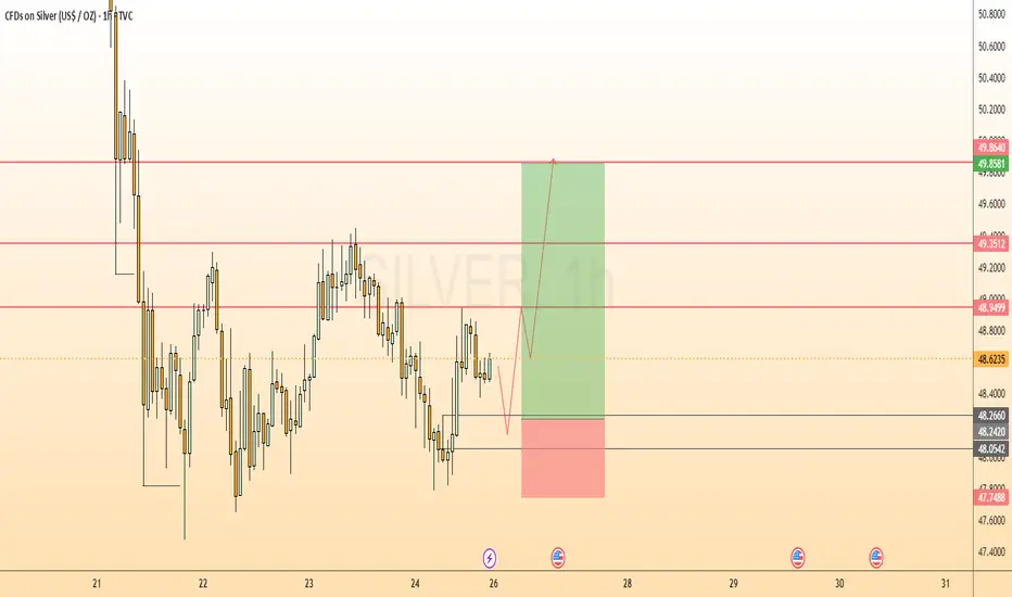
SILVER UpdateNext move on the way, focus on proper risk management & stay disciplined. Wishing you successful trades..!
Key Reason:
1. 1H Bullish OB formation.
2. BISI still in pending.
3. From this zone possible bullish move expected.
Let's see how it will work.

EURUSD Short: Targeting the 1.1560 Demand ZoneHello, traders! The prior market structure for EURUSD was a complex downward wedge, from which the price eventually broke out and entered the current consolidation range. This range has been established between the 1.1795 supply 2 level and a demand zone at the lows, with the price action rotating between these two key boundaries.
Currently, the auction is at a critical inflection point. After bouncing twice from the demand zone at the bottom of the range, the price has rallied back up to test the key horizontal supply at the 1.1670 level. After a brief test, the price has been rejected from this area, showing that sellers are in control here.
My scenario for the development of events is a continuation of this decline from the supply level. I believe this rejection confirms the range is still active and that the next logical move is a rotation back down to the lows. In my opinion, the bearish initiative from this rejection will be strong enough to push the price to the demand zone. The take-profit is therefore set at 1.1560. Manage your risk!

Bitcoin can Reverse Sharply After this CorrectionHello traders, I want share with you my opinion about Bitcoin. The market structure for Bitcoin has turned decidedly bearish in the short term, following a significant breakdown from its recent triangle consolidation pattern. This corrective phase began after a failed rally to a new all-time high near 126000, which led to a prolonged and volatile period of price action, including a sharp drop to 102000. Currently, following the resolution of the recent triangle to the downside, the price of BTC is in a clear downward movement. In my mind, this final decline is a capitulation move that is heading towards a major area of historical support. I expect that the price will fall into the main buyer zone. I think that a strong and confirmed reversal from this zone will signal that the entire corrective phase is complete and that buyers are ready to re-take control for the next major trend. This would present a significant long opportunity. Therefore, I have placed my TP for this reversal scenario at the 116000 level, targeting a key area of prior price action and a logical first objective for a new rally. Please share this idea with your friends and click Boost 🚀
Disclaimer: As part of ThinkMarkets’ Influencer Program, I am sponsored to share and publish their charts in my analysis.

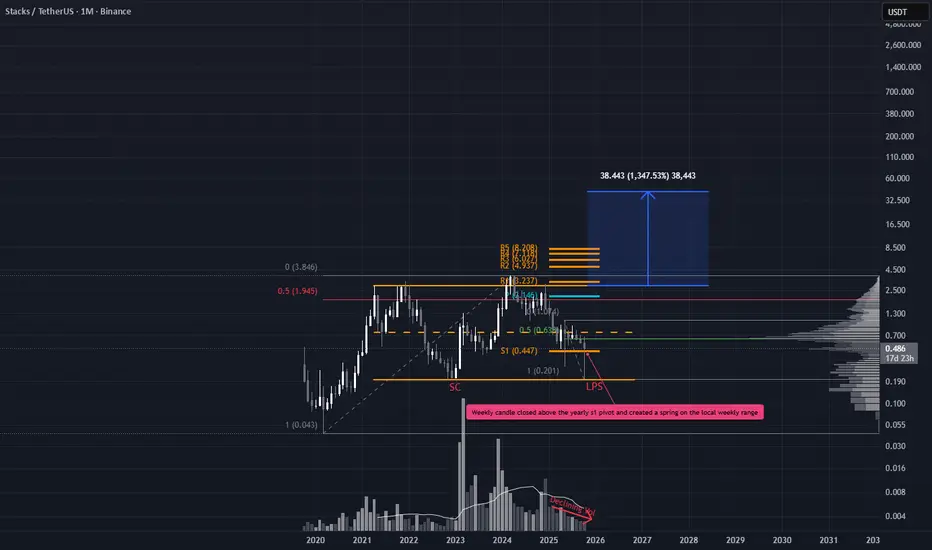
Smart Money Absorbs as Max Pain Setup UnfoldsSTX has been quietly range bound for nearly four years, but the recent price action demands attention. While most alts printed fresh lows during the October 10th liquidation flush, STX held firm its wick didn’t breach the Selling Climax (SC), and volume surged. This Last Point of Support (LPS) signals strong demand and potential smart money presence (weekly timeframe).
Trade Scenarios
Option 1: Immediate Entry
Entry: Current price
Stop Loss: Just below the LPS
Targets:
TP1: Yearly pivot + major 50% level
TP2: If price breaks the range high, a projected range extension gives a minimal target of ~$42
These targets may seem ambitious, but they’re derived directly from the chart structure, no hopium, just data.
Option 2: Pullback Entry
Entry: Wait for a pullback near the EQ of the large wick
Stop Loss: Based on daily TF structure
Targets: Same as Option 1
Bitcoin may Rally Back Towards the 118000 ResistanceHello traders, I want share with you my opinion about Bitcoin. The market for Bitcoin has experienced extreme volatility recently, with a powerful rally to a new all-time high near 126000 being completely erased by a sharp, news-driven decline down to 101000. This dramatic price swing has reset the market structure. Since that low, however, the price of BTC has staged a significant recovery, breaking back above the major 109500 support level and showing strong signs of a bullish reversal. Currently, the asset is in a minor corrective phase after this initial powerful rebound. In my mind, the strong reversal from the lows indicates that the sell-off was overdone and buyers are now re-engaging. I expect that the price will make a small corrective movement down to retest the major support level around 109500. I think a successful defense of this level, which also aligns with the buyer zone, will confirm the recovery is sustainable and will trigger the next major rally. Therefore, I have placed my TP at the 118000 resistance level, targeting the top of the prior consolidation range. Please share this idea with your friends and click Boost 🚀
Disclaimer: As part of ThinkMarkets’ Influencer Program, I am sponsored to share and publish their charts in my analysis.

Euro will potentially Fall to 1.1680 After a Fake RallyHello traders, I want share with you my opinion about Euro. The market dynamic for the Euro has shifted from bullish to corrective after the price broke down from a prior upward channel. This structural change has led to the formation of a large downward pennant, a consolidation pattern that has been guiding the price of EURUSD lower. The market is currently trading near the resistance line of this pennant, with volatility compressing as it approaches the apex, signaling that a significant move is imminent. In my mind, an immediate breakout from this pennant could be a deceptive move designed to trap buyers. I expect that the price may initially break out to the upside and rally towards the major 1.1800-1.1780 seller zone. I think this rally will fail upon testing this significant area of historical resistance, creating a 'bull trap'. A confirmed and strong rejection from this seller zone would validate the overarching bearish scenario and likely trigger a sharp reversal to the downside. Therefore, I have placed my TP at the 1.1680 level, representing a logical objective for the decline that would follow such a failed breakout. Please share this idea with your friends and click Boost 🚀
Disclaimer: As part of ThinkMarkets’ Influencer Program, I am sponsored to share and publish their charts in my analysis.

Simple Trade Plan on Small Cap StrengthConfirmed, BU/LPS in Play
Another promising small cap chart showing strong technical alignment. After a healthy pullback, price has now printed a significant Higher Low (HL) right at the confluence of two major 50% retracement levels (macro and local). This zone has historically acted as a magnet for liquidity and trend continuation.
Adding to the bullish case:
We've seen a Jump Across the Creek (JAC), signaling strength
Followed by a clean Back Up / Last Point of Supply (BU/LPS), confirming the retest and potential for markup
Trade Strategy
Simple Execution Plan:
Entry: Current levels offer a solid entry opportunity
Stop Loss: Just below the BU/LPS zone. If price breaks below, reassess as this could signal a failed breakout or fakeout
Take Profit: Initial TP just below the R2 yearly pivot
Trend Management: Potential Trail stop loss beneath each new swing low to stay aligned with trend structure and maximize upside

TLX is Approaching a Pivotal JunctureWhile the prevailing trend remains bearish, a short-term relief rally wouldn’t be surprising given current price dynamics. If the price rallies toward the ~$20 level and faces a strong rejection, that would likely confirm a significant bearish Lower High, reinforcing the downtrend.
Scenario 2 envisions a break above $20, potentially driven by "positive news" that fuels retail optimism. In this case, we may see distribution by smart money, quietly offloading positions while retail investors chase perceived upside.
Scenario 3, while less probable in my view, involves a period of reaccumulation followed by a breakout. Though unlikely, it’s important to remain open-minded and balanced—markets often defy expectations.

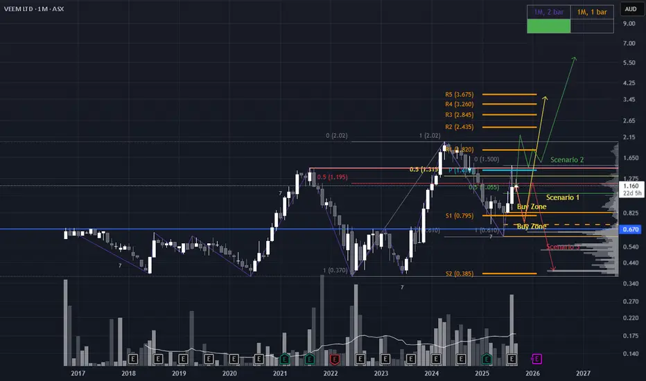
Three Paths for VEEM: Pullback, Breakout, or BreakdownScenario 1 (yellow line): Strategic Pullback to Value Zone
Price retraces to the ~$0.67 region, aligning with a Low Volume Node (LVN) and the Fair Value Gap from the June candle. A bullish reversal candle in this zone would signal a high-probability long setup, suggesting accumulation at a key structural level.
Scenario 2 (green line): Breakout & Reaccumulation Above Resistance
The most bullish scenario unfolds if price decisively breaks and closes above the major resistance at $1.50. A successful reaccumulation above this level would confirm strength, offering a textbook pullback entry for continuation higher.
Scenario 3: (red line) Rejection & Macro Lower High
Price pulls back but fails to hold above the ~$1.16 zone, facing rejection. A subsequent break of the recent lows would confirm a macro lower high (LH), shifting the bias toward bearish continuation and invalidating bullish setups.
XAUUSD: The Correction Phase BeginsHello everyone, here is my breakdown of the current Gold setup.
Market Analysis
From a broader perspective, the price of Gold has been in a strong uptrend since breaking out of a prior Downward Channel. This entire bullish phase has been developing within the confines of a large broadening wedge, a pattern that indicates expanding volatility as price makes higher highs and higher lows.
Currently, the price is at a critical point, testing the Broadening Resistance Line at the very top of this wedge. This test comes after a very strong and steep upward impulse, which often suggests that a trend might be overextended and due for a correction.
My Scenario & Strategy
My scenario is a tactical short, based on the idea that this strong rally is due for a healthy pullback. Trends rarely move in a straight line forever, and the resistance line of this multi-week wedge is a high-probability area for sellers to step in.
I'm looking for the price to make one final, small push higher and then show a clear sign of rejection. The primary target for this corrective fall is 3500 points. As you noted, this is an intermediate target, not the major Support 1, making it a logical first objective for a pullback.
That's the setup I'm tracking. Thank you for your attention, and always manage your risk.

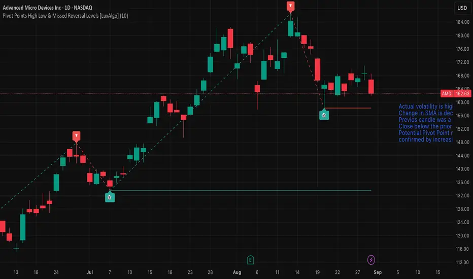
AMD — Watch for Pivot Reversal or Trend ContinuationMarket view
Actual volatility is high, confirmed by the Volatility Bars indicator.
The rate of change in the SMA is decreasing, suggesting momentum is weakening.
The previous candle was a Doji, indicating short-term indecision.
Price closed below the prior day’s low, adding bearish pressure.
A potential Pivot Point reversal is forming.
This reversal setup is confirmed by increasing Convolution Probability, supporting a higher chance of a directional move.
Trade plan
Long (trend continuation): buy on a break above the August 19, 2025 open.
Short (reversal): sell on a break below the pivot reversal at 158.25.
Stop-loss and position sizing: use volatility-based stops (e.g., ATR multiple) and risk no more than a small fixed percentage of capital per trade.
XAUUSD Short: Sellers to Maintain Control at 3380 SupplyHello, traders! The macro structure for the XAU price auction has been defined by two critical pivot points, establishing a wide and volatile consolidation range. A major pivot point high was formed at the 3390 supply zone, while a subsequent pivot point low anchored the market at the 3300 demand zone. All price action since has occurred between these two dominant control zones, transitioning the market into a state of balance.
Currently, the price action is contracting within a large symmetrical triangle, signaling a compression of volatility. The auction is now at a critical inflection point, as it is directly testing the upper boundary of this formation. This area represents a powerful confluence of resistance, where the descending supply line and the horizontal 3380 - 3390 supply zone intersect, providing a key battleground for market participants.
The working hypothesis is a short scenario, predicated on sellers successfully defending this resistance confluence. It is anticipated that the price will make a final push into the supply zone before being rejected. A confirmed failure to break higher would validate the triangle's integrity and initiate a full rotation to the downside. The take-profit is therefore set at 3330, targeting the high-liquidity area where the ascending demand line converges with the horizontal demand zone. Manage your risk!

22/08/25 Gold Swing LevelsLosses recovered
Set your alerts. Watch the 5 mins (1 min if price spiking)
22/08/25 levels are marked
Always, price action determines trade.
Trade parameters
Entry on 5 min chart
Sl: 20-40pips
TP: 2-4x SL

21/08/25 Gold Swing LevelsLosing day yesterday.
Set your alerts. Watch the 5 mins (1 min if price spiking)
21/08/25 levels are marked
Always, price action determines trade.
Trade parameters
Entry on 5 min chart
Sl: 20-40pips
TP: 2-4x SL

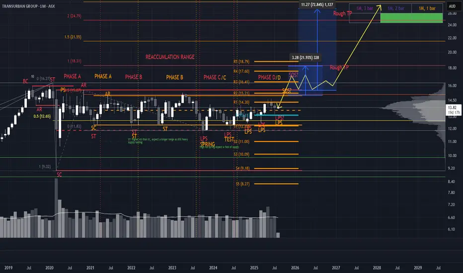
Two Ranges, One Breakout: TCL’s Wyckoff-Gann ConfluenceCurrently tracking two distinct Wyckoff ranges on TCL, each color-coded for clarity. The structure is clean despite a few lines—each range tells a story.
Accumulation Zones
Key buying opportunities are emerging at the LPS (Last Point of Support), marked by higher lows. These are classic signs of strength and absorption.
Resistance & Breakout Potential
Expect notable resistance around $15.55, but a breakout is likely. We’re approaching a Gann 4th-time breakout setup, which historically carries strong momentum. If price reaches this zone with expanding volume and wide candle spreads, it adds conviction for a Sign of Strength (SOS) and a potential pullback to retest.
Targets & Confluence For take-profit zones, I’m watching:
Yearly pivots
Range extensions from both Wyckoff structures (100%, 150%, 200%)
Gann extensions for harmonic targets
This setup blends structure, volume dynamics, and time-price symmetry. If the breakout confirms, TCL could offer a textbook Phase E markup.
*please note no time analysis is done, just looking at pathing
Strategic Reaccumulation Zone – NXT’s Next Move Is CriticalNXT is at a pivotal level and shouldn’t be overlooked. Price has rallied strongly off a clean April hammer, which aligned with:
Yearly S1 pivot
Macro 50% level (projected from ATL to ATH)
High volume confirmation
This confluence marked a powerful reversal. Price has now reached the 50% resistance zone from the ATH and April low. What happens next will likely define the longer-term trajectory.
Scenario Modeling
Scenario 1 – Most Bullish
Price breaks and holds above $14.48
Reaccumulation above this level
Sets up a challenge of ATH and potential price discovery
Scenario 2 – Strategic Pullback
Missed the April low? This offers a second chance.
Pullback to the Yearly S1 pivot (dynamic tool—watch where the local top forms)
A higher low here = ideal entry with strong R:R
Scenario 3 – EQ Demand Zone Entry
Price dips into the EQ zone of the April wick
Bullish candle off this level = high-quality entry
Converges with macro 50% ATL–ATH projection
will take much longer for price to challenge ATHs
Scenario 4 – Breakdown Risk
April low breaks
Downside targets: $6.96 and $5.78
Takeaway: This is a step-by-step reaccumulation watch. Let price reveal intent—each scenario offers a unique R:R profile. Stay nimble, stay strategic. I will update the chart when price settles
*please note, arrows are not time analysis
