Rectangular Breakout GALGAL is forming a well-defined rectangle base in the 530–535 zone after a corrective phase. Bullish RSI divergence suggests seller exhaustion and a potential reversal. A breakout above the rectangle will be the first confirmation of strength; a sustained move above 562 should further accelerate upside momentum.
Stop-loss: 520 on hourly close.
🎯 Target 1 (T1): 570 → R:R ≈ 1:3
🎯 Target 2 (T2): 630 → R:R ≈ 1:6
Structure favors continuation once the rectangle is decisively broken.
Rectanglepattern

Bullish potential detected for WAMEntry conditions:
(i) higher share price for ASX:WAM along with swing up of indicators such as DMI/RSI, and
(ii) observing market reaction around the $1.795 resistance area.
Depending on risk tolerance, the stop loss for the trade would be:
(i) below the rising 30 day MA (currently $1.775), or
(ii) below the recent swing low of $1.755 of 11th December, or
(iii) below the rectangle low of $1.74 of 19th November.

GBPAUD higher bearish expected
OANDA:GBPAUD RECTANGLE pattern, we have and break of CHANNEL, price is make bounces on sup zone (violet doted), currently price in DESCENDING CHANNEL.
Here for new week higher bearish expecting.
SUP zone: 2.02000
RES zone: 1.99600, 1.99100

a long consolidation / sideways box.CEPB Analysis
Closed at 37.48 (12-01-2026)
a long consolidation / sideways box.
Crossing 40 - 41 with Good Volumes &
sustaining it may lead the price towards 59 - 60.
Otherwise, it may continue its sideways movement, with
a Channel Bottom around 21 - 22.

USDJPY higher bearish expectations
FX:USDJPY price in RECTANGLE pattern, we having bearish push from yesterday, currently here only bearish continuation for next periods expecting.
SUP zone: 157.000
RES zone: 153.800, 152.400

USDCAD higher bearish from here expected
USDCAD trend based analysis, we are have break of RECTANGLE, in last days we can see domination of CAD and price is come here again in RECTANGLE and price also is in DESCENDING CHANNEL,
from here expecting higher bearish trend.
SUP zone: 1.40500
RES zone: 1.39500, 1.39000

GBPUSD still bullish expecting
FX:GBPUSD what's next, trend based analysis, we can see break of RECTANGLE, on top line of rectangle we have created and TRIANGL pattern.
From here having still bullish expectations.
SUP zone: 1.31600
RES zone: 1.33400, 1.33800

USDCHF bearish view
OANDA:USDCHF wahts next, price moving in RECTANGLE, in this week having some signs CHF can continue domination.
We are see break of zone today, having bearish view here.
SUP zone: 0.79700
RES zone: 0.78600, 0.78300

Salik Stock Reversal Alert-A Hidden Gem in Dubai’s Stock Market!Hello Traders!
Today’s analysis is on Salik Company PJSC (DFM), one of Dubai’s most watched stocks. UAE markets are full of hidden opportunities, and this chart highlights one of them. After forming a strong Rectangle Pattern for months, the stock finally gave a clean Breakout , followed by a Bullish Engulfing retest candle , a classic sign of buyers returning with strength.
Why this setup is special?
Rectangle pattern breakout after long consolidation shows trend resumption potential.
Bullish engulfing pattern adds confirmation of renewed momentum.
Multiple timeframe structure supports higher targets with low downside risk.
Levels to Track:
The best entry zone remains around 5.80–5.90 AED , where strong support and bullish engulfing confirmation align. The first short-term target is placed at 6.25 AED , followed by a medium-term target near 6.60 AED , and a positional level of 6.99 AED . Long-term investors can aim for the major holding target around 8.00 AED . A stop loss below 5.37 AED should be maintained to protect positions.
If you want to catch these kinds of early setups before they explode, make sure you follow closely, (Analysis By @TraderRahulPal ). More analysis & educational content is shared regularly on my profile. Sometimes one strong setup can shift your entire month’s momentum. If this helped you, don’t forget to like and follow for regular updates.
Disclaimer:
This analysis is for educational purposes only and should not be taken as financial advice. Please do your own research or consult your financial advisor before investing.

Ethereum – Calm Before the Next Leg Up?Ethereum had a disappointing start in 2025.
After pushing above $4,000 in mid-December 2024 — with headlines full of "$10K ETH coming!" — the new year began around $3,500, and what followed was a slow bleed.
By early April, Ethereum printed a shocking low at $1,380 — a level few believed was even possible.
But the bounce from there? ⚡
It was explosive — nearly +100% in just one month, with price topping around $2,700.
Since then, we’ve been consolidating — and that’s completely normal after such a vertical move.
🔍 So, what’s next?
Technically, ETH is forming a rectangle, a structure that often resolves as a continuation pattern.
The spike down to the $2,300 zone on May 19th was telling — buyers stepped in aggressively and pushed price back above $2,500, which now acts as a comfort zone for bulls.
📌 Conclusion
I’m looking to buy dips, ideally near $2,550, and my target is the $3,500 zone.
No need to reconsider the bullish outlook as long as price holds above $2,300.

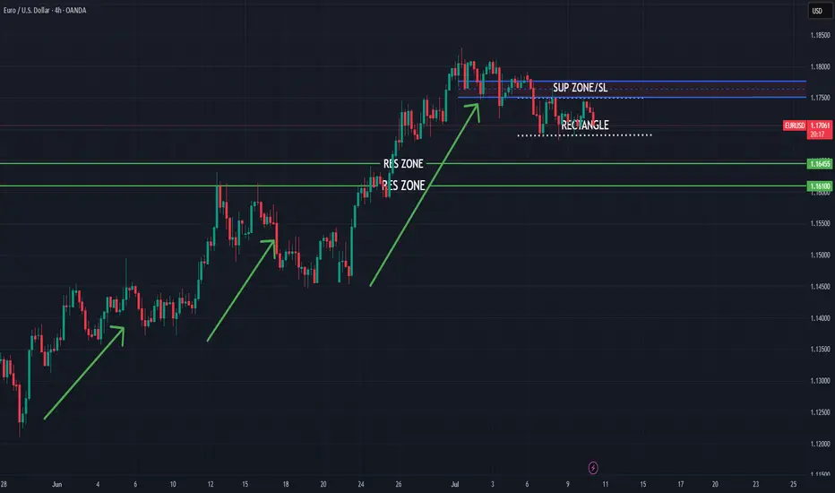
EURUSD bearish push expected
FX:EURUSD trend based analysis, few bullish pushes we are have in last periods, currently expecting from here short bearish push.
SUP zone: 1.17500
RES zone: 1.16450, 1.16100
Has it Bottomed Out or Bottom yet to come?Seems like it bottomed out around 101400 - 105000
Next Expected Reversal Level
93728 - 94188

GBPAUD bearish view for new week
OANDA:GBPAUD from first analysis from 26.Mart we are folow situation, i am make updates, we are not have bearish trend confirmation, price is make new bullish push on start of April.
Currently from start of last week price is start showing bearish signs. We have now 4h rectangle pattern visible, from here in new week expecting still bearish continuation.
SUP zone: 2.12000
RES zone: 2.04000, 2.00500

NESTLEIND - Range Bound -Box BreakOut -DailyThis is a technical analysis chart of **Nestle India Ltd. (NSE: NESTLEIND)** on a **daily timeframe**, and here's a breakdown of what it's showing:
---
### 📊 **Price Action and Pattern**
- **Range Bound (Accumulation)**: From around **November 2024 to mid-April 2025**, the price was consolidating between approx **₹2,135 (support)** and **₹2,342 (resistance)** — a classic **rectangle consolidation pattern**.
- **Breakout**: The stock has recently **broken out of this range** and is currently trading around **₹2,416.60**, suggesting a **bullish breakout**.
---
### 🔍 **Measured Move**
- The chart shows a **measured move target**:
- Rectangle height: ~**₹210.85**
- Breakout level: ~**₹2,342**
- **Target price** after breakout: ~**₹2,555.75** (highlighted in green)
This implies a potential **upside of 9%** from the breakout level.
---
### 🔊 **Volume Analysis**
- Noticeable **increase in volume during the breakout**, which confirms the **validity of the breakout**.
- Volume spikes have historically aligned with key price movements in this stock.
---
### 📌 **Key Levels**
- **Support**: ₹2,342 (previous resistance), and below that ₹2,135
- **Resistance**: ₹2,555, and further up at ₹2,765 – ₹2,778 (previous highs)
---
### 🧠 **Conclusion**
- **Bullish bias** post-breakout from the rectangular base.
- Potential for move towards **₹2,555**, with **volume support**.
- Traders might look for:
- Pullback to ₹2,342 for entry
- Tight stop-loss below support
- Target near ₹2,555 or partial booking en route
---

GBPCAD bearish view
OANDA:GBPCAD whats next?, we are have two times bounce on trend line,
currently on D is visible DESCENDING TRIANGL,
in triangl we have RECTANGLE PATTERN 4h which is breaked,
below rectangle pattern we have on lower TF better visible BEARISH FLAG pattern 1h (violet doted), which currently looks breaked,
here expecting bearish push now till next trend zone.
SUP zone: 1.85000
RES zone: 1.82250, 1.81600

EURCAD time for revers?
OANDA:EURCAD whats next, EC last one month we are have bullish run, currently price is in zone, technicals lower TFs are strong bearish, +we are have and BOC week before.
My view here is price is saturated and we can see fall now.
SUP zone: 1.57500
RES zone: 1.53900, 1.53400

AMOC Egypt has a good trading opportunity to 8.9Daily chart
The stock EGX:AMOC is trading in a channel between lines R and S, so the opportunity to buy near support S and sell near resistance line R (at around 8.9)
Technical indicators RSI and MACD are supporting the bullish view.
Closing above 9.0 for 3 days, the target will be 10.5
Closing above 10.9 for 2 weeks, the target will be 12
Below line S is considered a stop loss level, as the next down target will be 6.0
Note : Always keep a profit protection level, and raise it as the price goes up.

USDCHF - Important BreakoutHello Traders !
The USDCHF price formed a rectangle pattern
Currently, The resistance level is broken.
So, I expect a bullish move📈
----------------
TARGET: 0.86500🎯

Kirloskar Pneumatic Company Ltd Rectangle BreakoutKirloskar Pneumatic Company Ltd
Rectangle Breakout
Possibility of 400 points move from here if, 1450-1475 level holds.
Tight stop loss can be placed at 1375 level for medium term.
Refer Chart.

pepe → tiny correctionhello guys!
Chart Overview:
- after the price made a symmetrical triangle, it broke the top line
- it is forming a range or rectangle right now!
Trend Analysis:
- Pepe is in compression now
- we can consider an upcoming downward!
Price Patterns:
- There are two potential correction zones within the rising trend:
1. Around the $0.0000107 level.
2. Between 0.0000099 and $0.0000094.
Bullish Trend Confirmation:
- if the range area breaks down it will confirm the downward movement
✎Actionable Insights:
- you can take a risk and enter the short position right now and put two previous area as a target!
- or you can wait until the range breaks down then get a short position until the blue area will be touched!
___________________________
✓✓✓ Always do your research.
❒❒❒ If you have any questions, you can write them in the comments below, and I will answer them.
❤︎ ❤︎ ❤︎And please don't forget to support this idea with your likes and comment

Which way for Ocado?Stage 1 base forming for Ocado, almost perfect rectangle, with multiple touches at 370 support.
Is this a chance to go long, or will it break to the downside? wait and see.
Do your own research (DYOR) and this is not a solicitation to make as trade.

PREMEXPLNGood Volume Buildup.
Rectangular Pattern.
Good for Short term and Long term.
Do Like ,Comment , Follow for regular Updates...
Disclaimer : This is not a Buy or Sell recommendation. I am not SEBI Registered. Please consult your financial advisor before making any investments . This is for Educational purpose only.

Qinetiq breaks out after 4 yearsBreaking out of rectangle patter formed since Feb 20 should mean an upside target of 648.
Good results & defence industry make it more resilient in the face of other factors affecting the economy (e.g. election and recession).
Do your own research and this is not a recommendation to trade in this stock.
