S&P 500 Extreme Breadth Reading! Caution!Why It Matters
Strong breadth = healthy rally, broad participation → more sustainable trend.
Weak breadth = top-heavy rally, fragile momentum → prone to correction.
Think of it like an airplane:
If all four engines (hundreds of stocks) are pushing, you can climb easily.
If one engine (a few mega-caps) is doing all the work, you can stay aloft — but not for long!
CAUTION! is in order!
Click boost, follow, comment nicely for more authentic, no BS, raw analysis. Let's get to 6,000 followers. ))
RSP

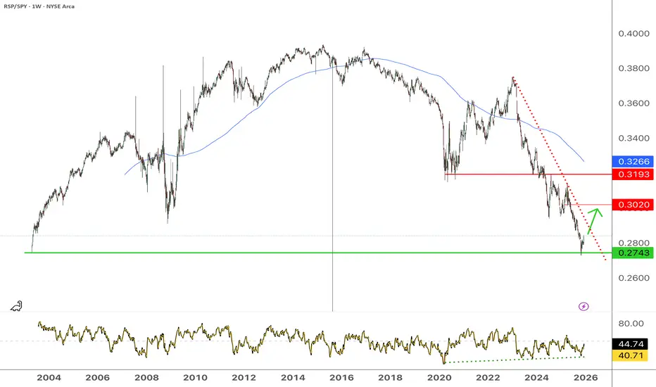
US large caps starting to underperform (RSP/SPY)S&P500 Equal weight / S&P500 (RSP/SPY) has rebounded from the 0.27 level, corresponding from its low in 2003. Expecting a rise towards at least 0.30, possibly even 0.319, as long as the low is holding. Therefore large caps tech stocks should underperform the index over the next few months.
The coming collapse of the carry trade part 2I have held off for a few weeks now to post this chart . Reason the timing I think now this should be seen as i called a top at 161.8 last year . we are now approaching the ABC targets in a double zig zag up to form a major top in Liquidity as we started to see by the crashing of BITCON in Bitcoin I am only looking for an wave A up to 96 and then down and then Up to peak at 106 zone to complete The head n shoulder top . best of trades Wavetimer

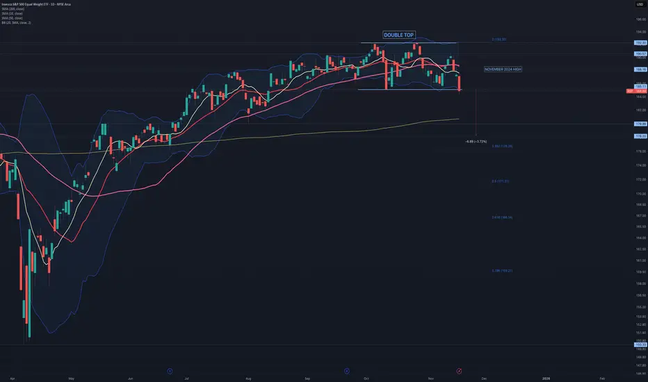
$RSP: Double TOP formation It is concerning that AMEX:RSP has formed a double top. If confirmed, the target price is set at 178. A breakdown of AMEX:RSP will face no obstacles until reaching 180, which is a demand zone and coincides with the rising 20-day simple moving average.
I'm betting on the rise of the S\&P 500, therefore I'm betting oWe broke through the local level and are confidently moving toward the all-time high.
We are also above all moving averages, which gives us additional confidence in our trade.

COMPLETED 5 of 3 or C RSI bearish Non confirmation The chart is now labeled as COMPLETED . Please also take note of The HUGE difference in QQQ to QQQE and SPY to RSP . Best of trades Wavetimer 115 % short

SUPER CYCLE TOP SOON IGV WAVE 5 The chart posted is by far the strongest chart within the market and has a clean wave structure from an Elliot Wave view . I have now taken a position for the last wave and will exit and go 100 % short all markets once the 5th wave has reached the targets min 106.7 to ideal target is 111 zone this should be seen based on my work in spiral cycle top is due 2.5 TD days from today with the alt on June 6/9 best of trades WAVETIMER

RSP Spiral cycle peak 5/16 EXIT The chart posted is the RSP SP 500 EQUAL WEIGHTED the two high based on spirals are due to peak on Friday late . We should have a short term top and the begin a pullback for wave 4 . Best of trades WAVETIMER

RSP and WHY I AM BULLISH STILL197/199 target The chart posted is the sp 500 equal weighted RSP has dropped to a trend line dated back to march 23 2020 . I have three clean points and all are major . Elliot Wave calls for a final 5th wave to end this advance in the area of 198 plus or minus 1.25 Fib relationship and PUT /CALL as well as most of my spiral and cycles point to the final advance to a Bull market top is now setup . BULL MARKETS TOP ON GOOD NEWS > Best of trades WAVETIMER

Second Buy signal in my PUT/CALL model For the next 8 TD from this morning we have 7 more up days in this signal I would NOT be short or Long PUTS in RSP IWM QQQ SPY Best of trades WAVETIMER


US Markets Cleared For A 13% to 24% Rally - Get SomeThis video highlights why I believe the US markets are ready to make a big move higher over the next 12 to 24+ months.
Many people suggest the markets will crack or crash, or we will experience some black/grey swan event. I'm afraid I have to disagree with this belief.
Yes, there is always a chance we will see some market event. However, to disrupt the US/global economy, there would have to be some event that disrupts the world, not just one or two smaller countries.
I do believe the US is making a broad transition into the 21st century, and new leadership (Govt) is required to make that happen.
But I also believe the seeds have been planted for exponential growth over the next 10-20+ years - and many traders are too focused on the crash dummies to see the real potential.
Watch this video. Share your comments if you like.
I believe we will see pullbacks and rotations on the way up - but I don't think we'll see any big crash event until after 2031 (or later).
Get some. This is going to be BIG.
#trading #research #investing #tradingalgos #tradingsignals #cycles #fibonacci #elliotwave #modelingsystems #stocks #bitcoin #btcusd #cryptos #spy #es #nq #gold

SPY/QQQ Plan Your Trade July 15-19 - US Broad-Sector RallyHappy Sunday.
Last week, I updated my SPY Cycle Pattern predictions, highlighting what I expected to happen over the next 15+ trading days. Even though it is almost impossible to accurately predict future price trends, ranges, and Daily close levels, I think I've done a pretty good job setting accurate expectations over the past 15+ trading days with my SPY Cycle Patterns.
This weekend, as I was analyzing this week and beyond, something became visible that alerted me to a broad market capital shift taking place. For more than 90+ days, I've warned traders that capital will move away from high-flying tech and other symbols to identify undervalued, ignored, and depressed stocks that still have fairly solid fundamentals/earnings.
Last week, we saw several stocks, most commonly shown on RSP (the equal-weighted S&P 500 ETF), break away from a flagging formation and shoot upward - gapping as it rallied. This is an obvious function of capital actively seeking new opportunities in ignored, undervalued, and depressed stock symbols. This is capital moving more evenly across the US stock market, attempting to ride the next wave higher.
In my opinion, this new Broad-Sector rally phase may continue to push the SPY/QQQ much higher than everyone expects. As a result, it could change how the SPY Cycle Patterns reflect the pending rally, contraction, and continued rally throughout the next two weeks.
Watch this video to learn more.
If I had to make a new, fresh analysis of what I expect after this big capital shift in the markets, I would move my upper price targets a bit higher and expect price to continue a stronger melt-up over the next 10 to 20+ days (throughout Q2:2024).
Get some.
#trading #research #investing #tradingalgos #tradingsignals #cycles #fibonacci #elliotwave #modelingsystems #stocks #bitcoin #btcusd #cryptos #spy #es #nq #gold

Thin AIR OEX I am now 33% long puts The sp 100 has reached into the fib relationship of a major top the sp 500 has Entered the min 5510 to 5531 RSI bearish setup I had hoped and the word is HOPED we print 5554 /5585 BUT cycles are running out and the Fang sector aka AAPL targets and msft in the lower end of super cycle targets .are being met . SOX has reach a perfect 1.618 and we saw the turn a second time . this shows the math is in control and that the fractals forming . Wavetimer I am now long march 485 qqq puts and spy 565 560 puts and RCL

RSP is now in wave 5 as stated it should The chart posted is the RSP index for the SP 500 equal weight index . last week I said it needed to rally still in a 5th up. I am waiting for confirmation of the End of the 5th .It is a 5 wave rally as I said at the oct low major short squeeze . I do see this as the end of wave B just above the 2022 top . This is the bearish wave count.. The Alt would then see this rally to end on april 2nd for the end of a bigger wave 3 top all wave counts show a very deep and sharp break is now just ahead NEXT DATE is MAY 2could we see a sharp drop into april 10/12 and then rally ??? will we see sell in may and go away ?? . Best of Trades WAVETIMER

RSP ready to ROCK N ROLL target 161.84All models are in very very deep over sold and the NYSI is nearing the 500 area this is what I had hoped for . the markets are now ready to Squeeze the last of shorts and trap most every bull on this next move . The NYSI will setup a perfect NON -CONFIRMATION
Put/call buy signal on 2 and 4 hour models is givenThe 20 hr moving avg on the 2hr and 4 hr bar has now given me a BUY signal as traders have run to the otherside of the BOAT from greed to fear in a very short time I am now 50% net long from a 100 % short do not be short until jan 11

$RSP & $RUT performing better at the moment, vs $SPXAMEX:RSP vs AMEX:SPY
Equal weight vs regular #SP500
We can see that equal weight has been performing better
Russell 2000
TVC:RUT is no longer stuck in a rut :)
It had a fake breakout in the daily charts in August but look at it now.
That weekly is looking Nicely!
We've stated a few times that we believed these 2 would be moving better than normal averages.
We also said TVC:DJI would keep leading, it has. Another new All time high.
Another call, NASDAQ:NDX should surpass, it's more aggressive.
RSP performing better than $SPX, good news for breadthThe AMEX:SPY is underperforming AMEX:RSP (equal weight SP:SPX ).
This means that underperformers could very well pick up the slack & outperform the Big 7 going forward. They have been performing well.
The Volatility Index TVC:VIX is down on the day BUT up from open.
Will the moving avg's push it lower or do we get some sort of support here? This is a MAJOR SUPPORT level!
TVC:VIX rarely gets close to oversold, let alone oversold.
AMEX:SPXS AMEX:SPXL #stocks

30%+ of $SPX = 10 companies, last time this high was 99Good Evening everyone.
While AMEX:RSP , equal weight AMEX:SPY , did well recently, the ten largest stocks are now making up more than 30% of the CBOE:SPX , wow!
However, it's been at a higher percentage than that before.
1999/2000 & in the early 90's, was around 40%
TVC:VIX hit a new low and it is likely hitting MAJOR SUPPORT, solid yellow line.
#stocks

S&P 500 Equal Weight ETF (RSP) ~ December 4H SwingAMEX:RSP chart analysis/mapping.
RSP ETF rally representing S&P market breadth - offering legitimacy to overall market strength & further indication of healthy stock rotation, instead of "Magnificent 7" concentration.
Trading scenarios:
Continuation rally #1 = ascending trend-line (white) / descending trend-line (light blue) confluence zone.
Continuation rally #2 = multiple gap fills / 78.6% confluence zone.
Shallow pullback #1 = 61.8% Fib / ascending trend-line (green dashed).
Shallow pullback #2 = gap fill / 50% Fib / 200MA confluence zone.
Deeper pullback #1 = gap fill / 38.2% Fib confluence zone.
Capitulation #1 = descending trend-line (white) / gap fill / ascending trend-line (light blue) / 23.6% Fib confluence zone.

$NDX & $SPX momentum slowing down hardNASDAQ:NDX looks a little short term toppish.
Look at weekly NASDAQ:QQQ ;
Considering that the Nasdaq 100 went higher the RSI is much lower than previous top. Shows a serious slowdown in momentum.
Ditto for CBOE:SPX
However, the equal weight AMEX:SPY seems to have some room to go.
AMEX:RSP

IWM has now ended the 1st ABC up decline now in waveB The chart posted is the IWM Russell 2000 tracking etf . As the forecast called for an ABC rally back to just above 181 we should now see a 3 wave decline to about 171/165 focus on 167 area over the next 2 weeks and then rally in a 5 wave structure from that low about dec 4 to the 10 th low into a peak at .618 at the 185.7 to 187.10 area about dec 24th to dec 29th Before the next very clear leg down in the BEAR market The market could holdup to jan 10 to the 17th some what but after that the data get very very neg in the Business cycle
