ETHUSD | TRENDLINE BREAKHello Traders,
In the last couple of candlesticks price on the 4H, price broke the trendline with a large Bearish candlestick, giving the signal that price is going to dip down to the next significant level $150.00 from the sell zone and with further confluence, price is currently forming a bearish pin bar, giving a further bearish bias.
Regards.
Note: This is not a financial advice, it is for informational purpose.
Search in ideas for "CANDLESTICK"

BTCUSD, my candlestick indicator is presenting an entry pointHi guys, this strategy is for those who trade STIXEX candlesticks. If you are not familiar with STIXEX, it allows you to place trades on whether the next candlestick will be red or green, its that simple. The interesting fact about candlesticks is that in the long run, there are always the same number of green and red candlesticks, regardless if the market is going up or down. So when the number of, for example, green candles rises above the mean (for example there are 55 green candles out of the last 100 candles), this gives us an opportunity to start placing trades on red candles in the anticipation that the number of red/green candles will revert back to the mean (50/50). And that’s what my simple indicator is showing at the moment, there are 55 green candles out of the last 100 candles. So now, every time when new red candle forms, I will place a trade that the next one will also be red. I will trade until I am up by 300% (STIXEX pays fixed 100% payouts on winning trades) or until red/green ratio of the last 100 candles goes back to 50/50 (50 red and 50 green candles out of the last 100). I will keep updating this post, so you can follow me along.
If you are not familiar with “color options”, ask me in the comments section or join a chat right here on tradingview - candle color options.
Please follow, like and comment !

A Follow up to: “Adjustments for Better Readings & VSA vs BTC"When a trend approaches its end, we typically observe the formation of a buying or selling climax. That was certainly the case during Wyckoff’s era. Everything he described—market manipulation, signals, footprints—remains relevant today. But you know what that also means: if it's out there, it’s old news.
Yes, this is still happening, but we need to acknowledge that this information is no longer exclusive. And when a method becomes well-known—especially among retail traders—it can be used against them. Wyckoff himself hinted at this: the manipulators can and do use these same technical patterns to deceive. His real message?
“Keep an open mind.”
📉 In our current BTC chart, we’re seeing a textbook example of potential manipulation. A selling climax is visible—normally a sign of trend exhaustion and a bullish reversal. But is that really the case here? Did the downtrend truly end?
On the 1-Hour timeframe, both the RSI and volume indicators suggest otherwise: a bearish continuation seems more likely.
🧱 We're also witnessing a real-time formation of a Double Top pattern, taking shape since June 6. Measured by body candle spreads (excluding wicks), we observe four touches within a key price rectangle. These align with a known candlestick pattern: the Tweezer Top, commonly associated with bearish reversals.
What’s more, all of this is happening within a supply zone—actually three marked zones on the chart. The most recent zone shows signs of offloading pressure, amplified by both the Double Top and bearish candlestick formations.
And I haven’t even touched on the rejection wicks or how bearish volume spikes are gaining strength. That’s where the principle of Effort vs. Result comes in—remember, nothing in the market is free.
📊 In line with our past two posts, note how price action (PA) shows equal highs while RSI diverges, reinforcing earlier signals. The signs are stacking up.
So, the critical question now is:
Are we heading below the $100.718 level for a confirmed Head & Shoulders pattern?
Or is this just a retest before another move?
If this way of reading the market resonates with you and you want to go deeper—whether it’s building confidence or spotting signals before they play out—I work with a small circle of traders sharing TA privately on a daily basis. Feel free to reach out.
Till next time be well and trade wisely!

Silver MatrixSilver has been in a downward pointing "shape" with a resistance on the top as a force pointing down, while being supported in a "cup" shaped support that can become resistance on the up if it is broken down.
The levels in this project are potential support/resistance zones in the future, where potential pivot points can occur (marked examples in the past). Similar candlestick patterns can also appear near the Big Thick rectangles which are Power Influence Zones, while the slim longer rectangles can direct potential pivot points or temporary consolidation support resistance levels. The smaller rectangles could turn out to be simple milestones in the path of the price.
The most important aspect of this project and approach is following the price action near the shapes which can trigger a pivot point signal or a continuation after a break and test.

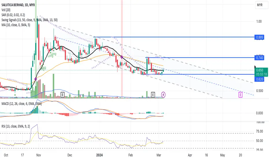
A Reversal Pattern!The candlestick pattern indicates a reversal pattern where the price having a positive momentum towards the MA line without significant in trading volume. Therefore, a precaution for a potenticial price reversal.
The price channel indicator provide the upper and lower bound of the price range during a market trend. The indicator uses the highest highs and lowest lows to form the channel, with the upper and lower lines representing support and resistance areas
MACD and RSI indicate a positive signal hence confirming the price momemtum towards next price resistance.
Let's SALUTE in WL and watch out for price uptrend towards next price peak resistance with result in volume above the MA line.
R 0.740
S 0.620
Bitcoin can go Down to 🟢Support zones🟢⏰(4-Hour)⏰👋Hi, everyone. I hope you have a great weekend.
💡Bitcoin is in a corrective phase during the last two weeks, but sudden Pump and Dump movements have shown that it makes it a little difficult for traders, so that a 🐮 Bull trap 🐮 was formed above the 🔴 Resistance zone($35,280_$34,830) 🔴.
💡Perhaps one of the reasons for the sudden movements during the last two weeks is low Trading Volume , although low Trading Volume is one of the characteristics of the correction phase .
🏃♂️Bitcoin is currently moving in the 🔴 Resistance zone($35,280_$34,830) 🔴, and if we look at the last three 4-hour candles of Bitcoin, the Three Black Crows Candlestick Pattern is clearly visible.
📚 Three Black Crows Candlestick Pattern :
🔸The Three Crows pattern is a bearish reversal pattern that consists of three bearish long-bodied candlesticks.
🔸Each of the three candlesticks should be long-bodied bearish candlestick; each candlestick's opening price should be lower than the previous candlestick’s opening price.
🔸It is a bearish reversal pattern; therefore, it should be considered only when it appears after an uptrend.
🔸The Three black crows candlestick pattern signals weakness in an ongoing uptrend and the potential reversal to the downtrend.
🔔I expect Bitcoin to fall at least to the 🟢Support zone($34,200_$34,000)🟢 and the Support line , and if these areas fail, it will attack the ⬇️lower⬇️ 🟢Support zone($33,680_$33,140)🟢 . If the 🟢Support zone($33,680_$33,140)🟢 is broken, we can expect Bitcoin to fall further to around $32,000 .
❗️⚠️Note⚠️❗️: An important point you should always remember is capital management and lack of greed.
Bitcoin Analyze ( BTCUSDT ), 4-hour time frame ⏰.
Do not forget to put Stop loss for your positions (For every position you want to open).
Please follow your strategy; this is just my Idea, and I will gladly see your ideas in this post.
Please do not forget the ✅' like '✅ button 🙏😊 & Share it with your friends; thanks, and Trade safe.

An Uptrend Pattern!The candlestick pattern indicates a continuous price uptrend towards the MA20 line backed with high volume.
Precaution because the last candlestick indicates a "shooting star" candle, hence, the probability of price correction between the trendline channel or potential resistance area around the price range of the candle.
The MACD confirms the price uptrend towards the next price resistance.
The RSI indicates a fresh buying interest in the stock.
Let's put KAB in WL and watch out for continuous price movement toward the next price resistance backed with volume.
R 0.470
S 0.425

Da Bears and Gold-1hr candlestick This area showed potential to become a double bottom.
The white line is the yesterday's daily close. You can see how two Hammers were created.
This formation ended up being just part of a bounce of a larger bearish move.
The candle immediately following the second hammer is a large Bearish Engulfing which closed right at the level of support. The next candle has no upper wick and was able to push down. The Daily support now turned resistance.
If this Bearish momentum continues, we could see Gold continue to drop several hundred dollars.

EURUSD sells There was a pullback after the initial downside move on EURUSD and today, we will look to sell.
The best entry opportunity would be a rejection of the 1,0050 level.
Stops should be placed above 1,0100 and the target remains 0,9800!
Entries only after confirmation from the candlesticks!

3 White soldiers in inverted H&S pattern formationHello everyone,
This is updated review for chart you can see below
The inverted Head and shoulders ( just painted out as I was previously expecting.
But what is good on it is actuall support by three white soldiers candlestick pattern on that Monthly chart whhich is forming
We are far away from monthly closing but if it is about to close like it is or higher then ...
What does it mean ?
1)What Is a Head And Shoulders Pattern?
A head and shoulders pattern is a chart formation that appears as a baseline with three peaks, the outside two are close in height and the middle is highest. In technical analysis, a head and shoulders pattern describes a specific chart formation that predicts a bullish-to-bearish trend reversal. The head and shoulders pattern is believed to be one of the most reliable trend reversal patterns. It is one of several top patterns that signal, with varying degrees of accuracy, that an upward trend is nearing its end.
2)What is Inverse Head And Shoulders?
An inverse head and shoulders, also called a "head and shoulders bottom", is similar to the standard head and shoulders pattern, but inverted: with the head and shoulders top used to predict reversals in downtrends. This pattern is identified when the price action of a security meets the following characteristics: the price falls to a trough and then rises; the price falls below the former trough and then rises again; finally, the price falls again but not as far as the second trough. Once the final trough is made, the price heads upward, toward the resistance found near the top of the previous troughs.
3)What Do Three White Soldiers Mean?
Three white soldiers is a bullish candlestick pattern that is used to predict the reversal of the current downtrend in a pricing chart. The pattern consists of three consecutive long-bodied candlesticks that open within the previous candle's real body and a close that exceeds the previous candle's high. These candlesticks should not have very long shadows and ideally open within the real body of the preceding candle in the pattern.
4) What Do Three White Soldiers Tell You?
The three white soldiers candlestick pattern suggests a strong change in market sentiment in terms of the stock, commodity or pair making up the price action on the chart. When a candle is closing with small or no shadows, it suggests that the bulls have managed to keep the price at the top of the range for the session. Basically, the bulls take over the rally all session and close near the high of the day for three consecutive sessions. In addition, the pattern may be preceded by other candlestick patterns suggestive of a reversal, such as a doji.
Bitcoins dominance is on the other side very likely to drop lower as it paints exactly the opposite pattern the bearish one Head and Shoulders
5) The Difference Between An Inverse Head and Shoulders and a Head and Shoulders
The opposite of an inverse head and shoulders chart is the standard head and shoulders, used to predict reversals in up-trends. This pattern is identified when the price action of a security meets the following characteristics: the price rises to a peak and then falls; the price rises above the former peak and then falls again; finally, the price rises again but not as far as the second peak. Once the final peak is made, the price heads downward, toward the resistance found near the bottom of the previous peaks.
ChaChain
-------------
Disclaimer:
I´m not registered or licensed in any jurisdiction whatsoever to provide investing advice or anything of an advisory or consultancy nature, and therefore I´m unqualified to give investment recommendations. Always do your own research and consult with a licensed investment professional before investing. This communication is never to be used as the basis of making investment decisions, and it is for entertainment purposes only.
KEYWORDS
trading, bitcoin , bitcointrading, profitable trading, profittrading, profit trading, secret, divergence, bull divergence, bear divergence, divergencetrading, divergence trading, trading strategy, how to trade bitcoin , bitcoin trades, bitcoin trading, make profit, take profit, trading strategy, trading technique, successful, successful trader, successful technique, successful strategy, successful secret, how to trade, trend analysis, technical analysis , indicators, rsi , relative strenght index, let it rain, successful life, easy strategy, easy trading, easy technique, make money, crypto investing, investing, crypto, cryptocurrency, cryptocurrencies, mentoring, money, chartart, beyond technical analysis

BTC aims for a deeper correctionBy closing below the body of the previous candlestick, the 1W red candle confirmed the last hangman. Moreover, we are still experiencing RSI above the 70 level, after reaching its ATH. Historically, it always leads to a pullback toward the 30-70 zone. It is pretty rare, that this candlestick formation is followed by further growth (didn't happen on BTC peaks yet), so deepening of the pullback is even more plausible right now than one week ago. Since this signal is very obvious, I expect a small earthquake here, even toward the realm of 50% of the entire impulse, considering it started in March 2020 (green zone, 23-26k) at some moment, and further even the deeper towards 2017 all-time high, but no further than 16k (based on retracements). Both these zones seems to provide good long opportunities
Before it will happen, I'd expect an attempt to see last bullish attempt, since on 4h chart we encountered a hammer supported ith low RSI and high volume. More or less at the top of last week wick, the show supposed to start

SPX: Will we defeat the ATH? Let's see here...Hello traders and investors! So, SPX is doing some interesting movements! Let’s what’s going on.
First, we failed in defeat the ATH, which is the black line. But SPX didn’t lose the purple line we talked about yesterday, which is a previous bottom . In a bull trend, supports offer opportunities to buy, and the buyers where there to hold the price.
Ok, but the movement was not strong enough to hit the ATH again, and it left some huge shadows above the two last candlesticks. And right now, SPX is in a decisive point.
If it loses the purple line again, the odds are that it will trigger a bearish pivot that could lead to a sharper pullback. But if defeats the ATH, the trend will resume as usual.
Now, let’s see the daily chart for more clues:
Today’s candlestick is bullish and could be a Piercing Line candlestick pattern. If it were closer to the 21 ema, would be a buy for sure. Right now, since it is close to the ATH, I think is just a bullish candlestick, and nothing changes.
Only if SPX loses today’s candle low or the purple line we talked about in the hourly chart we will a further pullback. Until then, SPX will just go up without rest.
Now, if we see a pullback, the red line is a natural target for SPX, as the 21 ema. If we see a bullish sign near any of these points, is just opportunity to buy, or buy more/again. And if you found this idea interesting, please, support it! And I invite you to follow me to keep in touch with my daily analyses. I don’t post too much, so, I won’t bug you.
There’s nothing indicating that the trend will reverse. There are no bearish pivots, no descending tops and bottoms, nothing. A pullback is more believable, but since the bull trend is so strong, we can’t count too much on it. Tomorrow we will have more clues.
Recent public trades (links below):
XP: +30%
AAPL: +10%
LB: +45%
UKOIL: +62%
Congratulations to all of you, my dear subs, who believed in my trading methodology, and challenged the world by being a bull! We deserve to celebrate!
BECOME A MEMBER!
Remember to follow me , I’m a trader who uses the classic technical analysis (barely any indicator, just the candles and the volume). Like this idea if it helped.
Thank you very much.
* LIKE this idea and FOLLOW me, because:
- Here, you will see clean charts;
- Trades with clear risk management;
- The best of Dow Theory, Price Action and Candlestick psychology;
- Chart patterns with statistics. *
* My name is Nathan, I'm a trader and portfolio manager and I'm here to LEARN. Leave your COMMENT and FOLLOW me to keep in touch. *

Does The Long Term Bullish Momentum Has Ended?Last week’s candle on USD/CAD has ended with an engulfing candlestick pattern.
This weekly candlestick is red from the beginning to the end.
After the price compressed vertically and took all the buyer’s orders on the way up. It dropped back to the origin of the compression.
This drop created last week’s candlestick which engulfed the previous 12 candlesticks.
However, the price still does not break the uptrend support line on the weekly chart.
Still, we are unable to say that the momentum has changed. If the price does break the uptrend support line, then we can say that the long term momentum has changed from bullish to bearish.
In this case, I’ll wait for the price to retrace the supply above and sell there. If the price does not break the uptrend support line, then the supply above will be too risky for sell position since the momentum remains bullish.

30/6/25 Monday to Influence Monthly Candlestick Close
Thursday’s candlestick (Jun 26) was a bull bar closing near its high.
In our last report, we said traders would see if the bears could create more follow-through selling, or if the market would form a pullback higher instead.
The market attempted twice to create follow-through selling intraday, but the moves lacked follow-through selling. The market closed higher for the day in relatively low momentum trading.
The bulls hope the 3980 breakout point area and the 20-day EMA will act as support. So far, the market is holding around this area.
They hope to get a retest of the Jun 20 high, even if it only forms a lower high.
They must create strong bull bars to show they are back in control.
The bears want the spike up to form a major lower high (vs April). So far, this is the case.
They want a resumption of the broad bear channel and the third leg down with the first two legs being Jan 17 and May 8.
If the market trades higher, they want the follow-through buying to be weak, with overlapping candlesticks, and long tails above candlesticks. They want it to form a lower high vs Jun 20.
They must create follow-through selling trading below the 20-day EMA to increase the odds of a resumption of the broad bear channel.
Production for June should be more or less around May's level. July should be more or less around June's level.
Refineries' appetite to buy so far looks decent.
Export: Looks decent in the first 25 days +6%
For tomorrow (Monday, Jun 30), traders will see if the bulls can create a follow-through bull bar closing near its high. If they can, the June monthly candlestick will close with a bigger bull body, which may increase the odds of July trading at least slightly higher.
Or will the market trade lower, creating a more neutral or slightly bearish June monthly candlestick instead?
Andrew

TSLA: Turning Bullish Again.• TSLA stock looks impressive, as it is doing an important reaction today, trying to reject the Hanging Man candlestick pattern from Monday;
• In theory a Hanging Man pattern is a famous top signal, however, evidence suggests that this pattern acts as a bullish continuation roughly 59% of the time (BULKOWSKI, Thomas. Encyclopedia of Candlestick Patterns, p. 365);
• Now, TSLA is trying to resume the bullish momentum. To reject any possible top signal, it is important to see it breaking Monday’s high as soon as possible - otherwise, it might lose momentum;
• What’s more, it seems it is heading to its next technical target, the open gap at $177.
• The weekly chart suggests a bounce to higher levels, maybe to the purple trend line again;
• This thesis will be valid as long as the daily chart maintains its bullish bias, and keeps above its 21 ema;
I’ll keep you updated on this. Remember to follow me to keep in touch with my daily analysis.

AAPL: Bullish REVERSAL ahead? KEY POINTS to watch this week! 🤓• AAPL is reacting above a key support level;
• In the weekly chart, we see a Hammer candlestick pattern, which was triggered this week. This points to a possible bounce on AAPL;
• The technical target for a Hammer is the projection of the candlestick’s height in the direction of the breakout, this means, something around $138;
• In the daily chart, there’s no clear bullish reversal structure on AAPL yet, but we can use Fibonacci to set the next key resistance levels;
• The 50% retracement is around $137, which is quite close to the Hammer’s target in the weekly chart. Therefore the area around $137 - $138 is a key dual-resistance area;
• To not frustrate this thesis, it is important for AAPL to remain above the $128. If it loses it again, it might be problematic. I’ll keep you updated on this, as usual.
Remember to follow me to keep in touch with my daily analyses!

USDJPY - Will You Short it?Will you short this kind of setup? Sell zone set up at the brim of the entire setup; since I've been waiting for a counter-trend move, and this validates it, why not?
Take note there is no candlestick pattern confirmation or RSI at Overbought. Something to take note of.

EURJPY - Bullish SharkShark Pattern is the most tricky Harmonic Patterns, I will have to wait for candlestick close at 1pm(GMT +8) to decide if this is the trade for me.

The Bulls are in Control! 😀Hey Traders,
As you can see on the daily candles of Litecoin (LTC). The All Candlestick Pattern has revealed there was a candle with a long longer shadow. This is when the bulls bring the price action to a lower close of the bears sell off indicating control of the bulls. Very good chance to buy in!
Safe Trading,
-Pulkanator

AAPL: One of the RAREST candlestick patterns I ever saw on it!Hello traders and investors! Let’s see how AAPL is doing today!
Since it hit our last target, it has been going up nicely, and it seems nothing can stop from filling the next gap at $ 172.31. Since it broke the resistance at $ 168, this point should work as a support level in the future.
The trend is clearly bullish, and there is no bearish sign around. In addition to the support at $ 168, we have the 21 ema in the 1h chart to hold the price, if it drops.
In the daily chart, AAPL is doing 7 bullish candlesticks, and it is going up for 7 days straight. This is a rare event, and although I saw AAPL going up more than 7 days straight in the past (2017), it wasn’t only bullish candlesticks. When was the last time you saw AAPL going up more than 7 days in a row, doing only bullish candlesticks? Tell me, if you can (because, honestly, I can't).
This movement is incredible, and even if it corrects from here, the 21 ema in the daily chart is there to hold the price. Again, there’s no sign it’ll do a pullback, but let’s not panic if it does.
I’ll keep you guys updated on this, so remember to follow me to not miss any of my future analyses on AAPL!

Trade Journal: Long BIG - 1/15/2020I went long BIG based on the Bullish Candlestick Patterns and the chart pattern on the 30m timeframe. In the past 2 days, BIG has printed 2 Inside Day Candlesticks in a row near highs. These candlestick patterns are a predictor of future volatility and usually prices goes in the direction of the current trend. Zooming into the 30m timeframe, a flag pattern is forming right above the previous breakout trendline. Furthermore, price is clearly rejecting this trendline with high volume hammer candlesticks. I went long BIG at 29.85 with a stop loss at 29.15 below the previous low. My target on the trade is 34.00.
In hindsight, I probably hit the trigger too early on this trade. Price is currently right below a strong level of resistance at 30.50 and looked like it rejected this area on Monday. When I start new trades, I usually want to see no nearby levels of resistance where the price could have trouble (Clear skys). I should have waited for this resistance to be cleared or skipped this trade. Depending on the price action tomorrow, I may choose to close this position early.

#EURCAD selling possibilityHello, dear traders and friends. Let's take a closer look at the EURCAD chart and examine the potential selling opportunity in this pair together.
Firstly, we can clearly observe a bearish trendline in the 1-hour timeframe, connecting lower highs. This trendline suggests the possibility of a bearish bias for this currency.
Secondly, when you examine the Daily timeframe for this pair, you'll notice that the price broke above the bearish trendline last week but failed to follow through and has since consolidated around the bearish trendline. This appears to be a false breakout.
Furthermore, the price's bullish moves seem to occur in a corrective manner, indicating a lack of clear intention for a bullish move, at least for now.
For a more conservative trading approach, you can consider waiting for a bearish breakout of the short-term bullish trendline or simply waiting for a candlestick confirmation to validate a downward movement.
It's also worth noting that there's a possibility that the price may test the previous top formed and extract liquidity from there before reversing to the downside.
by the way If you've found this analysis helpful, please take a moment to like, comment, or share your thoughts with me.

#AUDNZD selling opportunity
Hello, dear traders and colleagues. I wish you all a successful trading week.
Let's examine the AUDNZD chart to identify a potential selling opportunity.
As you can observe, the price is currently testing the upper boundary of a bearish channel, which has been acting as a resistance following an extended rally. Recent price movements in the past two days show signs of exhaustion, further increasing the likelihood of a bearish move.
Additionally, by examining the daily candlestick, you'll notice that we've experienced upside rejections in the last two days, indicating the presence of selling pressure.
To initiate a sell position on this pair, we would prefer to witness another upward movement, aimed at clearing liquidity from above the horizontal arrow we've marked on the chart. Subsequently, we'll look for a break below the short-term bullish trendline that has kept the price elevated during the recent bullish movement.
