The CORRECT way to trade chart patterns - Head & ShouldersSimplified psychology of chart patterns:
Traders learn chart patterns but are to impatient to wait for them to show up in the right places. The point of learning to spot patterns is to be in a position to enter a reversal before price takes off. The KEY to trading chart patterns is to only trade them when inside a channel. The attempt to enter into a position should be up against the top or bottom of a channel (selling the tops, buying the bottoms).
UNDERSTAND HOW PRICES MOVE:
Prices move in levels, creating new levels above or below a current level. These levels can be formed sideways or diagonal. It will do this on every time frame until it reaches a point it can't break through. When a breakout of a channel occurs, price will continue in a given direction until it forms a new top or bottom, which creates a whole new level. Price will continue to trade inside this newly formed channel (from top to bottom) until enough momentum is created to push price OUTSIDE the level. The same process will restart.
UNDERSTANDING HOW TO ENTER A TRADE:
The higher time frame trend should be the direction a trader intends to enter. Once channels are identified, a trader should be watching for well known chart patterns to form on lower time frames AT THE CHANNEL'S top (if trend is down) or bottom (if the trend is up). THE EXIT STRATEGY should be approached similarly. For example, if the entry was LONG (at the bottom of a channel), then the trader should anticipate selling half of the position at the TOP of the current channel once a newly forming chart pattern paints a picture of weakness.
CONCLUSION:
Chart patterns are only useful within identifiable channels/levels. The highest probability to win a trade is entering into a chart pattern that is formed at the tops or bottoms of these channels.
Exiting portions of the position should be approached the same way, in anticipation of chart patterns being formed on smaller time frames at tops/bottoms of channels/levels.
Search in ideas for "Chart Patterns"


Harmonic and Chart Patterns in ONE IndicatorChart Patterns and Harmonic Patterns using just ONE indicator!
This is a automatic scanner for well know patterns like Head and Shoulder to get started. I'm planning to add more patterns in the near future. It works as follows:
1. Is going to plot the pattern on the chart, lines in blue
2. Is going to show you when the pattern has finished to form, triangles and diamonds
3. It is possible to get an alert when the pattern has form
For example: is going to give a possible entry when the price has broken the trend line of the two shoulders if we take the Head and Shoulder pattern as an example.
Please let me know in the comments if you would like to have more patterns.
======================================================
This versions supports:
1. Head And Shoulder Pattern
- Show possible entries when the trend formed by the shoulders has been broken
2. Bat Harmonic Pattern
- Show Possible Reverzals Zones in green or red boxes
- Alerts when any pattern has form
- Can be used on any instrument
======================================================
======================================================
Next Versions:
- All the harmonic patterns
- Triangles
- Elliot Waves impulses
- Double Top and Bottom
- Triple top and bottom
- Rising and Falling Wedge
- The cup and the handle, etc
- ABCD pattern
Let me know in the comments if you would be interested in something like this please. I'll appreciate your feedback.
thanks

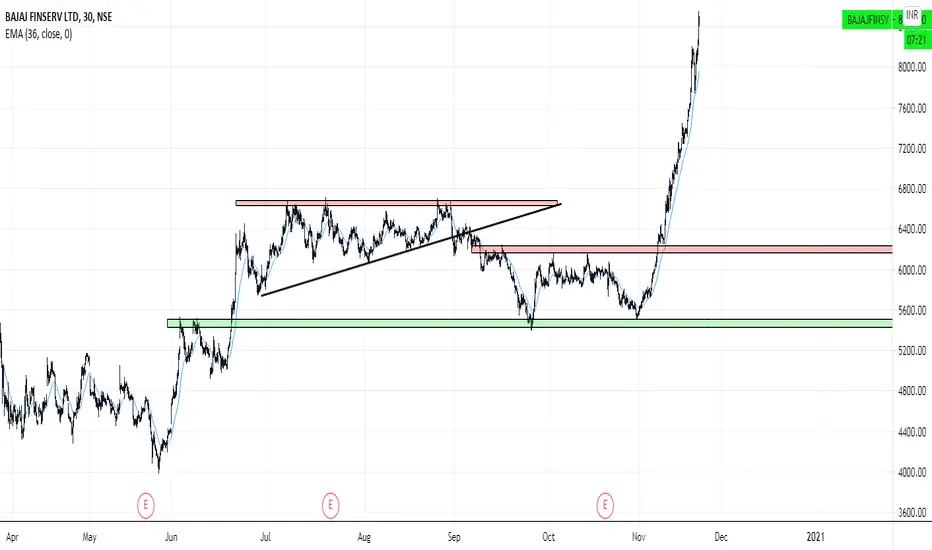
REPUSD Chart PatternsChart patterns outlined on chart
This current move up should lead to further continuation up
Although, this is purely a chart that displays chart patterns rather than a price prediction
I am pretty bullish on Augur though
Enjoy

CHART PATTERNS USE TO WORK( just studying and trying to learn )
Let's see if the basic chart patterns work!
I've lost sats or $ so many times because of avoiding basic chart patterns indications!
All comments and corrections are veeeryy welcome!! Thank you a lot!
Good Luck to all of you guys!!
Very, very, very hard times are coming...

chart patternsA chart pattern is a shape within a price chart that helps to suggest what prices might do next, based on what they have done in the past. Chart patterns are the basis of technical analysis and require a trader to know exactly what they are looking at, as well as what they are looking for.
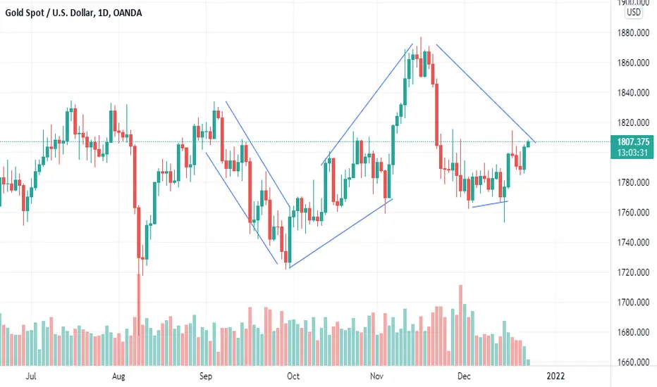
Chart Patterns Tutorial Technical AnalysisThis video is an overview of Fibonacci golden ratio chart patterns for those who are new to trading, crowd psychology, and/or for those who aren't sure what any of this means.
I am particularly fascinated by the fact that certain world events and media FUD are aired in accordance with certain fibonacci zones, which is contributing to an in-depth exploration of the hive-mind hypothesis beyond what could merely be trading reaction to support/resistance zones without macro global influence involvement.
I hope to eventually chart a time frame of media events and compare how they line up within the various golden ratio zones.

Chart Patterns to know ! (Educational Post)One of the most important skills for successful trading is Forex chart patterns analysis. Learning to recognize price formations on the charts is an essential part of the Forex strategy of every trader. Then, it is vital that you learn about these figures, their meaning and how you can use them to your advantage.

XAAUSD - Creativity and Designchart patterns don't come to everyone
you need to have a certain eye for design
capture the big picture and ride the trends among the range
trade the range among the trade

Chart Patterns of EthereumBITSTAMP:ETHUSD
Different Chart Patterns highlighted on daily timeframe of BITSTAMP:ETHUSD .


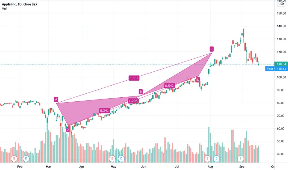
Chart patterns still suggest a downturn, possible breakout soon.If you look at the chart patterns, we still have a bear flag, and a rising (kinda) wedge. When you combine this with the blow off top (after parabolic rise), the odds are still in favor of the bears. On the other hand, this is reminding me if what happened around 7.5k, its good to remember this is a bull market and the correction might not happen at all. Regardless, it looks like we are near the end of a wedge so a breakout is about to happen soon.

BTC Chart PatternsChart Patterns on BTC
- Resting at minor support of 8.3k level
- Ascending Broadening Wedge broken downside
- Next Support level => 7.8k level followed by 7.2k level of double top target
_______________________________________________________________
Join us on Telegram : t.me
Follow us on Twitter: twitter.com

CHART PATTERNS . TRIANGLES, DOUBLE TOPSThe best way to have a good trading is to follow simple chart patterns

Analyzing Indian Energy Exchange Ltd (IEX) Chart PatternsAnalyzing Indian Energy Exchange Ltd (IEX) Chart Patterns: An In-Depth Guide to Potential Breakout and Wave Structure
The attached chart of Indian Energy Exchange Ltd. (IEX) illustrates three significant chart patterns that suggest a potentially strong bullish outlook. These patterns, namely the Head and Shoulders (Inverse), Triangle, and Cup and Handle, collectively indicate a powerful upward momentum upon successful breakout, especially if the price crosses the previous high of ₹317.90. This price level could signal the onset of a primary third wave under the Elliott Wave Theory, traditionally known as one of the strongest waves in a bull cycle.
1. The Triangle Pattern
The Triangle pattern on this weekly chart appears to have formed over a substantial period, signifying a consolidation phase where the price fluctuates within narrowing boundaries. The triangle structure generally signifies indecision in the market but also an accumulation phase. As this pattern nears its apex, a breakout becomes more probable, offering a potential directional cue.
Interpretation: A breakout from this triangle, especially if accompanied by significant volume, can indicate a strong trend continuation or reversal. In this case, as it converges with other bullish patterns, a breakout above ₹317.90 could signal strong upward momentum.
Psychological Implication: The Triangle pattern, especially when extended over a lengthy timeframe, can build up energy that often results in a sharp move in the breakout direction. This makes it a critical level for traders to monitor.
2. The Inverse Head and Shoulders Pattern
An Inverse Head and Shoulders pattern is visible, typically recognized as a bullish reversal signal. The pattern here consists of a Left Shoulder, Head, and Right Shoulder:
Formation Explanation:
The Left Shoulder represents an initial decline and subsequent rebound.
The Head forms as a deeper decline followed by another recovery, marking the lowest point and potential reversal zone.
The Right Shoulder signals a less severe dip, indicating waning selling pressure.
Breakout Point: The neckline (marked by the breakout point) lies near the resistance at ₹317.90. A decisive breakout beyond this neckline can signal a reversal from bearish to bullish.
Target Projection: The target from this pattern is typically estimated by measuring the distance from the Head to the neckline and projecting it upward from the breakout point. In this case, a successful breakout above the neckline could push the price towards the next psychological targets around ₹400-₹450.
3. Cup and Handle Pattern
The Cup and Handle is another prominent bullish continuation pattern forming on this chart. This pattern suggests a temporary consolidation before a potential breakout to the upside. Here’s how it has formed:
Cup Formation: The rounded shape of the Cup signifies a slow bottoming process, indicating that buyers are regaining control.
Handle Formation: The Handle is a short consolidation period, often a slight pullback, representing a pause before a potential upward breakout.
Breakout Potential: A breakout above the top of the Handle, which aligns closely with the ₹317.90 resistance level, often leads to significant upward momentum. The target is typically estimated by measuring the depth of the Cup and projecting it from the breakout point.
Key Resistance and Target Levels
Immediate Resistance: The crucial level to watch here is ₹317.90, the recent high, as it serves as a convergence point for all three patterns. A breakout above this could trigger aggressive buying interest.
Projected Targets:
Short-term target: ₹375
Medium-term target: ₹425-₹450, aligning with the upper levels suggested by the patterns.
Elliott Wave Analysis: Potential Main 3rd Wave
The Elliott Wave Theory classifies price movements in five-wave patterns in the direction of the primary trend, where the third wave is often the strongest. Assuming the structure here aligns with Elliott Wave principles:
Wave 1: The initial rally.
Wave 2: A corrective pullback, forming the base for Wave 3.
Wave 3: Upon crossing ₹317.90, the main third wave could be in play. This wave is often the longest and most powerful in an impulsive sequence, potentially driving prices significantly higher.
Volume Confirmation
A breakout accompanied by strong volume would further validate these patterns, indicating that institutional interest and retail enthusiasm are backing the move. Volume is crucial for confirming the strength and sustainability of any breakout.
Conclusion
This chart presents a technically compelling case for a bullish breakout if IEX can overcome the resistance at ₹317.90. The convergence of the Triangle, Inverse Head and Shoulders, and Cup and Handle patterns enhances the probability of an upward breakout, potentially aligning with a powerful third wave under the Elliott Wave Theory.
Investors and traders should monitor ₹317.90 closely, as a breakout above this level could set IEX on a path towards ₹375 and potentially ₹450. However, it’s essential to manage risk, especially with initial stops below critical support levels. Volume confirmation will be key to ensuring the strength of any move beyond ₹317.90.

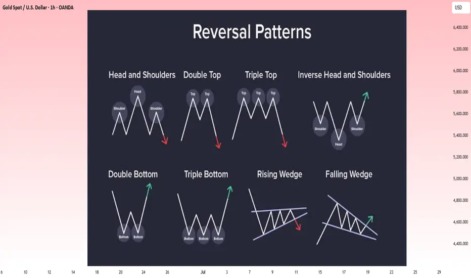
Reversal chart Patterns: A Complete Beginner’s Guide📚 Reversal chart Patterns: A Complete Beginner’s Guide
Reversal patterns signal that the current price trend may soon change direction. Recognizing them early can help traders prepare for potential market shifts. Below are the most common reversal patterns, each explained in a simple, structured way.
1️⃣ Head and Shoulders (Bearish Reversal)
What it is: Appears after an uptrend and signals a possible move downward.
How to spot it: Left Shoulder: Price rises, peaks, then falls. Head: Price rises again,
reaching a higher peak, then drops. Right Shoulder: Price rises once more but peaks
lower than the head. Neckline: A support line drawn through the lows of the left and right shoulders. Why it matters: A break below the neckline suggests sellers have taken control,
increasing the probability of a downtrend.
2️⃣ Double Top (Bearish Reversal)
What it is: A two-peak pattern signaling the end of an uptrend.
How to spot it:Price rises to a high (first top), retraces, then rises again
to a similar high (second top). The trough between the tops acts as key support.
The pattern is confirmed when price breaks below that support. Why it matters:
Failure to break higher on the second attempt suggests buying pressure is fading
often leading to a decline.
3️⃣ Triple Top (Bearish Reversal)
What it is: Similar to the Double Top, but with three peaks at roughly
the same level. How to spot it: Three attempts to break above the same
resistance level, each followed by a pullback. A break below the lowest point
between the tops confirms the pattern. Why it matters: Multiple failed breakouts
reinforce the idea that resistance is strong and sellers are likely to push price downward.
4️⃣ Inverse Head and Shoulders (Bullish Reversal)
What it is: The upside-down version of the Head and Shoulders,
signaling a possible move upward after a downtrend. How to spot it:
Left Shoulder: Price falls, bottoms, then rises. Head: Price falls further
to a deeper low, then rebounds. Right Shoulder: Price drops again, but bottoms
higher than the head. Neckline: A resistance line drawn through the highs of the left
and right shoulders. Why it matters: A breakout above the neckline suggests buyers are
gaining strength increasing the probability of an uptrend.
5️⃣ Double Bottom (Bullish Reversal)
What it is: A two-trough pattern signaling the end of a downtrend.
How to spot it: Price falls to a low (first bottom), rebounds, then falls
again to a similar low (second bottom). The peak between the bottoms serves
as resistance. The pattern is confirmed when price breaks above that resistance.
Why it matters: Shows that buyers are stepping in at the same level twice, indicating
a strong support zone and potential trend reversal upward.
6️⃣ Triple Bottom (Bullish Reversal)
What it is: Similar to the Double Bottom, but with three troughs
at roughly the same level. How to spot it: Three failed attempts to break
below a key support level. A breakout above the highest point between the bottoms
confirms the pattern. Why it matters: Repeated support tests without breakdown suggest sellers are losing control, paving the way for a bullish move.
7️⃣ Rising Wedge (Bearish continue)
What it is: A narrowing upward-sloping price range that often precedes
a downward breakout. How to spot it: Both highs and lows are rising, but the
lows are rising faster. The wedge narrows over time. A confirmed breakdown happens
when price falls below the lower trendline. Why it matters: The slowing momentum in
higher highs signals buyer exhaustion, increasing the odds of a bearish reversal.
8️⃣ Falling Wedge (Bullish continue)
What it is: A narrowing downward-sloping price range that often precedes an
upward breakout. How to spot it: Both highs and lows are falling, but the lows are
falling more slowly than the highs. The wedge narrows over time. A breakout above the
upper trendline confirms the reversal. Why it matters: The slowing pace of lower lows suggests sellers are weakening, making a bullish reversal more likely.
💡 Trading Tip:
Reversal patterns are more reliable when confirmed by additional indicators like volume spikes, RSI divergence, or MACD crossovers. Always use proper risk management to protect your capital.
EURCAD ABC BULLISH PATTERN Hello and welcome to an insightful journey into the world of trading chart patterns, where we'll explore how to analyze and leverage patterns like a professional trader. Whether you're new to trading or looking to refine your skills, understanding chart patterns can provide valuable insights into market trends and potential opportunities.
The Power of Chart Patterns:
Chart patterns are visual representations of market behavior, formed by the collective actions of traders. They offer a way to identify potential trends, reversals, and price targets. By recognizing these patterns, you can gain a competitive edge in the markets.
Symmetry ABC Bullish Pattern on EURCAD:
Today, we'll focus on a specific example: the Symmetry ABC Bullish Pattern observed on the EURCAD daily chart. This pattern consists of three distinct legs: A, B, and C.
Leg A: The initial bullish move.
Leg B: The corrective phase, often retracing part of the move from Leg A.
Leg C: The continuation of the bullish trend, exceeding the high of Leg A.
By identifying these legs, we can project potential price targets using Fibonacci extension levels. In our EURCAD example:
100% Target: At 1.50836 - representing a full extension of Leg A projected from the end of Leg B.
127% Target: At 1.52451 - a more ambitious target indicating strong momentum.
162% Target: At 1.54518 - the most aggressive target, suggesting significant bullish potential.

Understanding Forex chart patternsUnderstanding Forex chart patterns is of significant importance in the markets for several reasons:
Price Patterns : Forex chart patterns provide valuable insights into price movements and trends. They represent recurring formations or configurations that occur on price charts, indicating potential future price action. By recognizing these patterns, traders can identify potential entry and exit points, enabling them to make informed trading decisions.
Technical Analysis : Chart patterns form an essential component of technical analysis, a popular approach used by traders to analyze and forecast price movements. Technical analysis relies on the study of historical price data, including chart patterns, to identify trends, support and resistance levels, and potential price reversals. By understanding chart patterns, traders can apply technical analysis techniques effectively.
Trend Identification : Chart patterns help traders identify the prevailing market trend. They can indicate whether the market is experiencing an uptrend (higher highs and higher lows), a downtrend (lower highs and lower lows), or a consolidation phase (sideways movement). Recognizing the trend can assist traders in aligning their strategies with the prevailing market conditions.
Entry and Exit Points : Forex chart patterns can signal potential entry and exit points for trades. For example, a bullish reversal pattern, such as a double bottom or an inverted head and shoulders, may suggest a buying opportunity. Conversely, a bearish reversal pattern, such as a double top or a descending triangle, may indicate a potential selling opportunity. Understanding these patterns enables traders to time their trades more effectively.
Risk Management: Chart patterns play a crucial role in risk management. By identifying support and resistance levels, traders can determine optimal stop-loss and take-profit levels. They can also assess the risk-reward ratio for each trade based on the potential price targets indicated by the patterns. This helps traders set realistic profit targets and manage their risk exposure accordingly.
Confirmation of Analysis : Forex chart patterns can provide confirmation for other technical analysis tools and indicators. For instance, if a chart pattern aligns with a moving average crossover or a trendline breakout, it strengthens the validity of the trading signal. Traders often use a combination of indicators and chart patterns to increase the accuracy of their analysis and improve their trading decisions.
Market Psychology: Chart patterns reflect the collective psychology of market participants. They illustrate the battle between buyers and sellers and provide insights into market sentiment. By understanding these patterns, traders can gain a deeper understanding of market dynamics and anticipate potential price movements driven by market sentiment shifts.
In closing, understanding Forex chart patterns empowers traders with the ability to analyze price movements, identify trends, determine entry and exit points, manage risk, and gain insights into market psychology. It is a valuable skill that can enhance trading strategies and improve overall trading performance.

BTC unbeatable bullish chart patterns Hi dear community members and my loyal followers. I hope you are fine.
I would like to bring your attention to this macro analysis with innumerable and beautiful bullish chart patterns.
As you remember 6-8 months ago when BTC bottomed at 17.5K/a real bottom/ in June 2022 and 15.5K/spring/ in November 2022 with double bottom I publish a lot analyses and told you BTC bottomed and we are going to 28-30K.
Back that time I published weekly Megaphone bullish chart pattern with 85K target/link below this analyis/, also I posted weekly falling wedge chart pattern with targets as well. Today I want to add 3 more chart patterns to those 2. BTC fromed daily bullish megaphone chart pattern, Inverse Head and shoulder chart pattern and reverse descending chart pattern.
I'm bullish on BTC in 2023-2024 and expect min 48-52K in 2023 maybe 60-62K.
BTW if you check all my previous analyses you we'll see how I nailed all major moves from 15.5K till now.
If you ckeck my previous analyses you will understand besides these chart patterns what are other factors that make me think so and stay bullish. For short term as I posted in my previous analyses I don't expect BTC to drop below 25K, that is my worst case scenario, I even think BTC bottomed at 26.6K maybe could drop to 26K with wick taking out liquidity below 26.5K.
I expect BTC to pump to 35-37K zone and fill weekly FVG.
Below this analysis I will post targets for the above mentioned chart patterns.
If you like my analyses don't forget to like, retweet, comment, follow me for further updates.
I will appreciate any single like, comment and follow. Have a good day, I wish you good trades and huge profits.
